THALIS: Human-Machine Analysis of Longitudinal Symptoms in Cancer Therapy
←
→
Page content transcription
If your browser does not render page correctly, please read the page content below
© 2021 IEEE. This is the author’s version of the article that has been published in IEEE Transactions on Visualization and
                                               Computer Graphics. The final version of this record is available at: xx.xxxx/TVCG.201x.xxxxxxx/

                                                                       THALIS: Human-Machine Analysis of
                                                                     Longitudinal Symptoms in Cancer Therapy
                                                               Carla Floricel, Nafiul Nipu, Mikayla Biggs, Andrew Wentzel, Guadalupe Canahuate,
                                                                 Lisanne Van Dijk, Abdallah Mohamed, C.David Fuller, and G.Elisabeta Marai
arXiv:2108.02817v1 [cs.HC] 5 Aug 2021

                                               Fig. 1. THALIS analysis of longitudinal symptom data. A) Association Rule Diagram panel, showing here association-rule-mining (ARM)
                                               relationships among the most frequent late-stage symptoms; rules are represented using bubbles, with size and color encoding the
                                               support and lift metrics. B) Symptom trajectory panel—filament plots encode here mean rating values per therapeutic combination, with
                                               more frequent observations in the acute stage (left-end) than in the late stage (right-end). C) Sketch of areas affected by the selected
                                               symptoms (dry mouth and taste). D) Cohort symptom panel showing via summarization with shade and height the percentile rating
                                               distribution. E) Correlation matrix showing associations with the selected symptom. Image cropped and edited for in-print legibility.

                                               Abstract—Although cancer patients survive years after oncologic therapy, they are plagued with long-lasting or permanent residual
                                               symptoms, whose severity, rate of development, and resolution after treatment vary largely between survivors. The analysis and
                                               interpretation of symptoms is complicated by their partial co-occurrence, variability across populations and across time, and, in the case
                                               of cancers that use radiotherapy, by further symptom dependency on the tumor location and prescribed treatment. We describe THALIS,
                                               an environment for visual analysis and knowledge discovery from cancer therapy symptom data, developed in close collaboration with
                                               oncology experts. Our approach leverages unsupervised machine learning methodology over cohorts of patients, and, in conjunction
                                               with custom visual encodings and interactions, provides context for new patients based on patients with similar diagnostic features and
                                               symptom evolution. We evaluate this approach on data collected from a cohort of head and neck cancer patients. Feedback from our
                                               clinician collaborators indicates that THALIS supports knowledge discovery beyond the limits of machines or humans alone, and that it
                                               serves as a valuable tool in both the clinic and symptom research.
                                               Index Terms—Temporal Data; Application Motivated Visualization; Life Sciences; Mixed Initiative Human-Machine Analysis

                                        1 I NTRODUCTION
                                        Thanks to advances in therapeutic care, nowadays cancer patients may                long-lasting or permanent residual sequelae, whose severity, rate of
                                        survive for years after treatment. However, they are plagued with                   development, and resolution after treatment vary largely between sur-
                                                                                                                            vivors [16, 97, 98]. At the same time, patient questionnaires and elec-
                                                                                                                            tronic health records storing such patient responses are leading to larger
                                         • C. Floricel, N. Nipu, A. Wentzel, and G.E. Marai are at the University of        than ever oncological symptom data collections. These symptom data
                                           Illinois at Chicago. E-mail: cflori3@uic.edu.
                                                                                                                            collected from cohorts of patients [84] offer important information
                                         • M. Biggs and G. Canahuate are at the University of Iowa.
                                                                                                                            that can improve clinical decision-making and individual care delivery
                                         • L.V. Dijk, A. Mohamed, C.D. Fuller are with the MD Anderson Cancer
                                           Center at the University of Texas.
                                                                                                                            both during and after treatment [69, 77], and could be critical for the
                                                                                                                            efficient detection and resolution of longitudinal symptoms. These
                                         Manuscript received xx xxx. 201x; accepted xx xxx. 201x. Date of Publication       factors have led to healthcare provider demands to better understand
                                        xx xxx. 201x; date of current version xx xxx. 201x. For information on              symptom development and prevention based on cohort data.
                                        obtaining reprints of this article, please send e-mail to: reprints@ieee.org.          However, the meaningful interpretation at the individual patient level
                                        Digital Object Identifier: xx.xxxx/TVCG.201x.xxxxxxx                                of symptom repositories is plagued by data and analysis issues that
                                                                                                                            have prevented their practical use in clinical care. These issues include

                                                                                                                        1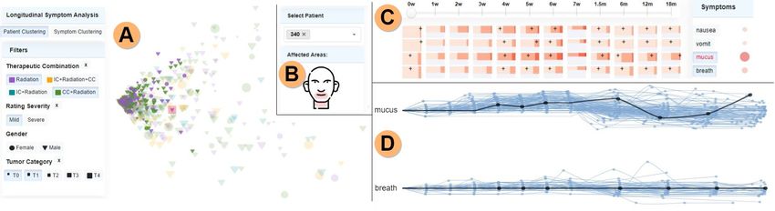
the wide range of symptoms, their partial co-occurrence, their vari-             ings in these works include conventional representations such as his-
ability among patients and across time, and, in the case of head and             tograms [8], bar charts [60], time-series plots [33,47], matrices [23, 66],
neck cancers (HNC) and other cancers that employ radiation therapy,              radial charts [35], and scatterplots [58]. Similarly, our work builds on
further symptom dependency on the anatomical location of the tumors              patient cohort data, however, our focus is on interpreting individual
and the course of therapy prescribed. To explore these issues, symp-             patient data in the context of similar patients, and contributing visual
tom cluster research aims to identify co-occurring symptoms and to               encodings and workflows which improve the human-machine analysis
understand the underlying mechanisms that drive these clusters, often            of symptom data.
using machine learning [74, 86]. At the same time, HNC analysis re-              Human-Machine Integrated Cohort Cluster Analysis. Cohort anal-
sults based on factor analysis (e.g., PCA) do not always scale to larger         ysis uses unsupervised learning methods such as factor analysis (e.g.
patient datasets [10]. Furthermore, due to methodological limitations,           PCA), partitional (e.g. K-means), or hierarchical (e.g. agglomerative)
symptom research analyzes either individual symptom evolution or                 clustering. Cluster analysis is traditionally visualized using methods
symptom clusters at a single timepoint. Consequently, there is growing           such as scatterplots [73], matrices [82], radar charts [69], dendro-
interest in alternative machine learning approaches for this type of             grams [28], and heatmaps [1]. Temporal clustering is an open problem
longitudinal data. Last but not least, these approaches need to make             in symptom research due to the issue of missing data [6, 65, 90]. Addi-
sense in an applied healthcare setting and need to be actionable by              tionally, cancer patient clustering takes into account clinical variables
clinicians. Therefore, there is also growing interest in mixed human-            such as the disease stage, treatment plans, medication, treatment toxi-
machine analysis, and a need to leverage and balance computational               city etc. [64, 103]. For HNC patients, Wentzel et al. have introduced
and human effort for symptom data analysis.                                      spatially-informed distance measures and clustering approaches to
   In this work, we present an interactive data mining environment               group patients based on similarity [25, 97, 99], although they did not
to support the clustering, exploration, and analysis of longitudinal             consider symptom data. Gunn et al. [34] and Rosenthal et al. [85] have
symptoms collected from cohorts of cancer patients. Our approach                 studied specifically symptom burden for HNC patients by clustering
intertwines association-rule and factor analysis unsupervised models             patients based on reported symptom ratings and clinical covariates to
with custom visual statistical encodings and visual analysis, in order to        find similarities between symptoms and HNC patients using heatmaps
estimate the longitudinal symptom evolution of an individual patient, in         and cluster heatmaps, but do not consider temporal data, nor do they
the context of cancer therapies and similar patients. This visual analysis       analyze patients that underwent specific treatments, respectively. In
methodology was successfully developed through an interdisciplinary,             contrast, our approach explores groups of similar patients based on
remote, geographically-distributed collaboration.                                symptom load, while also capturing temporal changes in their symp-
   This work contributes: 1) a description of the application domain             toms. Moreover, we consider the impact of different treatment plans.
data and tasks, with an emphasis on the multidisciplinary development               Cohort analysis often relies on domain expert interaction to help
of clustering tools for symptom data in cancer therapy; 2) the design            support human-machine integrated workflows. For more general clus-
of a novel blend of data mining and visual encodings to predict and              tering, several interfaces have afforded user interaction for iterative
explain longitudinal symptom development, based on an existing cohort            re-clustering and visualization of unstructured cluster data [13, 14],
of patients; 3) the description of customized interactive encodings: in-         although these rely on generic abstract encodings such as scatterplots.
teractive association-rule diagrams, filaments, and percentile heatmaps;         Other tools support model building for biostaticians [20], although
4) an implementation of this approach in a visual symptom explorer               these do not consider spatial or temporal outcomes, and are targeted
named THALIS: THerapy Analysis of LongItudinal Symptoms (Fig. 1);                towards statisticians and not clinicians. Angelelli et al. [5] proposed an
5) a qualitative evaluation by domain experts using an existing head             interactive system for hypothesis generation with retrospective cohort
and neck symptom repository; 6) a start-to-end description of the de-            study data using a data-cube-based model that used linked views for
sign process and of the lessons learned from this successful, multi-site         spatial and nonspatial data. Other applications have integrated interac-
remote collaboration.                                                            tive interfaces with application-specific visual encodings with linked
                                                                                 views [32, 96, 98] to support active collaboration between data analysts
2 RELATED WORK                                                                   and domain experts. However, none of these approaches consider tem-
Electronic Medical Records and Cohort Visualization. Electronic                  poral changes in outcome data or nuanced quality of life outcomes, and
Medical Records (EMR) store patient longitudinal information, often              do not account for missing data.
in the form of time series. In general, time-series visualization has            Rule Visualization. Association rules have been visualized via scat-
utilized point graphs, circle graphs, line graphs [41], parallel coordi-         terplots, matrix views, node-link representations, mosaic plots, and
nate plots [45], or stacked bar charts and their variations [3] to encode        parallel coordinates plots, as indicated by two surveys [12, 46], and
time-oriented nominal, ordinal or quantitative data, including in can-           also as grouped matrices [39]. More generally, rule-based modeling
cer [76,89,104]. For EMR data, Plaisant et al. have introduced personal          and visualization are common across domains that seek to understand
patient summary visualization using timelines [80, 93, 94], or matrix-           causality. Colored shapes have been used to indicate information flow
based representations [23]. Loorak et al. [60] proposed a stacked bar            in interacting processes [27]. In biological modeling, interactive node-
graph approach to explore patients’ treatment processes, while Baum-             link visual representations have been used for rule-based intracellular
gartl et al. [8] explored storyline visualizations from EMR to detect            biochemistry [31, 87]. Visual causal vectors have been used to indicate
pathogen outbreaks. Rogers et al. [83] showed outcome trajectories of            causality between data elements [95], and animated causal overlays
different patient procedures using line charts. However, most of these           have been used to highlight causal flows and to indicate the relative
approaches are not scalable for large EMR datasets. Wong et al. have             strength of the causal effect [7]. Whereas our work seeks to identify
employed summarization techniques to overcome issues of scale via                temporal relationships among data based on association rules, these
tree-based encodings [102] and Sankey-based representations [101],               relationships are not necessarily causal, and they have different features
while Karpefors’s tendril plot [51] introduced a clustered timeline view         than biochemical pathways.
of outliers and trends for dense clinical trial data. However, none of
these approaches include details about individual patients. In contrast,         3 BACKGROUND
we consider scalable encodings for patient cohort data, and indicate             HNC Therapy and Symptom Collection. HNC treatment is a com-
incomplete data and uneven time steps.                                           plex, longitudinal process that utilizes a variety of therapies, and whose
   In healthcare, patient cohort visual analysis applications span dis-          cornerstone is radiotherapy. For example, patients may be prescribed
ease evolution statistics extracted from EMRs [42, 101], cohort history          chemotherapy first (induction therapy), and then radiotherapy, or they
comparison [9, 17, 105], inter-cohort medical image attribute com-               may be prescribed both chemotherapy and radiotherapy concomitantly.
parison [56, 72, 88], survival risk analysis in cancer [69], and cohort          The type of treatment prescribed can result in both short-term (acute, or
heterogeneous medical data analysis [5, 91]. As often the case in                during treatment) symptoms and in long-term (late, or after treatment)
clinician-driven visual analysis based on statistics, the visual encod-          or even permanent sequelae affecting the patient’s quality of life.

                                                                             2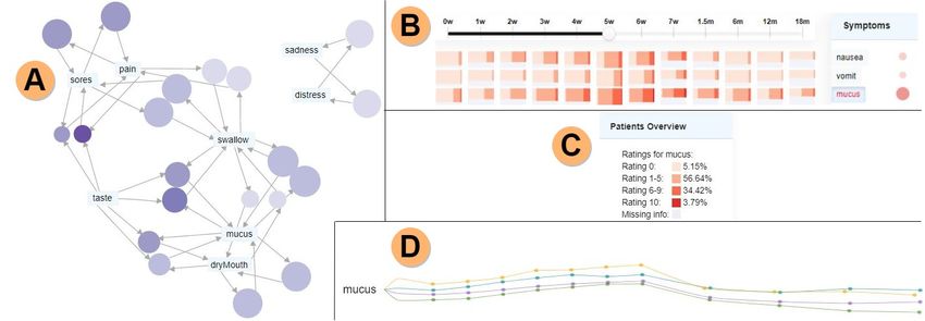
© 2021 IEEE. This is the author’s version of the article that has been published in IEEE Transactions on Visualization and
       Computer Graphics. The final version of this record is available at: xx.xxxx/TVCG.201x.xxxxxxx/
   In addition to clinical and imaging data [26], continuous efforts at           decide on changes in the specifications. Moreover, because this ap-
MD Anderson have included over 1000 patients in a standardized symp-              proach was designed around developing interfaces that can be shared
tom and quality of life monitoring program. The questionnaires are                and designed remotely during the COVID-19 pandemic, our approach
collected on paper at discrete time points, i.e., weekly at the time of the       proved to be an effective alternative to approaches that rely on in-person
treatment appointment. The questionnaires are based on MDASI (MD                  group meetings. Additionally, because the ACD paradigm is focused
Anderson Symptom Inventory) [18], a multisymptom patient-reported                 on supporting the collaborators’ activities, our collaborators stayed mo-
outcome measure for clinical and research use. MDASI’s thirteen core              tivated to continue to attend meetings even during circumstances that
items include symptoms found to have the highest frequency and/or                 required remote meetings and exceptional work conditions for clinical
severity in patients with various cancers and treatment types, whereas            practitioners [78].
the additional MDASI-HN inventory [84] considers nine symptoms
specific to HNC, such as swallowing difficulties, and six additional              4.2 Activity and Task Analysis
symptoms that interfere with major activities of daily life, such as              THALIS serves oncologists who have experience in symptom research.
enjoyment of life. The compliance rates within head and neck trials               Our collaborators also had extensive experience using basic unsuper-
are between 60% and 90%. However, these patient-generated health                  vised machine learning methods such as factor analysis via principal
data have not been utilized so far in direct patient care, due to a lack of       component analysis (PCA), which they had used to determine that
computational hybrid analytics connecting therapy with the side effects           symptom burden varies over time and over patient populations. How-
and health state of the patient.                                                  ever, PCA results obtained on smaller datasets did not generalize on
Symptom Clustering Research. Cancer patients experience multiple                  larger datasets, so over the course of the project, the group’s interests
co-occurring symptoms often related to each other and to the therapy              shifted from PCA to alternative approaches. Furthermore, predicting
applied; however, much of symptom clustering research focuses on                  the symptom trajectory of an individual patient in the clinic based on
single symptoms. In contrast, the term ”symptom cluster” (SC) denotes             the population data in the repository was not possible computationally
two or more interrelated symptoms that develop together and may                   because of data issues. Additionally, the oncologists expressed frustra-
or may not be caused by the same underlying mechanism. Several                    tion due to repeated patient failures in following instructions aimed to
studies have identified symptom clusters in cancer patients [4, 21, 29],          reduce the symptom burden, such as following a prescribed regimen
though symptom cluster research is still an emerging field. The two               of swallowing exercises or taking the prescribed pain medication. The
most common methods used to determine SCs are: factor analysis                    physicians felt that having the means to explain to patients a predicted
(e.g., principal component analysis, i.e., PCA) [53, 55, 86] and cluster          symptom trajectory, in the context of other patients, could be beneficial
analysis (e.g., hierarchical agglomerative clustering) [30, 37, 44, 75].          in terms of therapy adherence.
However, these approaches have not dealt with changes in symptoms                    Accounting for evolving requirements and specifications, we sum-
over time, which remains an elusive goal.                                         marize the project activities and their corresponding visual analysis
   Association Rule Mining (ARM), introduced by Agrawal and Srikant               tasks as follows:
in 1994 [2], is an alternative unsupervised data mining method, used to              A1. Analyze alternative symptom clustering approaches, and apply
identify interesting relationships within data. ARM has been applied to           them to an existing symptom dataset
risk management and marketing [36, 52], and more recently, in clinical                • T1.1. For each approach, show similar patients, based on symp-
settings [57], although not in symptom clustering.                                       tom severity at a specific time point
                                                                                      • T1.2. For each approach, detect correlations among symptoms,
4 DESIGN
                                                                                         during and after treatment
4.1 Collaboration Setting and Design Process                                          • T1.3. For each approach, detect patient outliers and trends
Our system was developed through a remote collaboration between                      A2. Analyze longitudinal symptom progression in the dataset, with
three different research groups over the course of two years. During this         particular emphasis on the acute versus late stage of symptoms, and
collaboration, our visual computing research group worked closely with            different therapy options
oncology and data mining experts. The core team includes 3 radiation                  • T2.1. Analyze the patient symptom trajectories as a whole, by
oncology experts with clinical and research experience, a senior data                    therapy type, and by stage
mining expert, a data-mining graduate student, and a team of visual                   • T2.2. Compare symptom trajectories by therapy type
computing researchers with varying expertise. Our team met weekly to                  • T2.3. Summarize symptom ratings for the entire cohort, by stage
produce informative, mixed machine-human analyses of longitudinal
symptom data collected from HNC patients who were undergoing                         A3. Map an individual patient to its relevant cohort, and explain
treatment at the MD Anderson Cancer Center in Houston, Texas. This                their longitudinal symptom trajectory in the context of the cohort in an
work is part of a longer, six-year-long collaboration between the lead            actionable manner
investigators who had been working together on a series of related                    • T3.1. Show an individual patient in the context of the cohort
projects using oncology patient data.                                                 • T3.2. Display demographic and diagnostic patient data, and
   Due to the long-term and remote nature of our collaboration, spanned                  indicate patients with similar diagnostic attributes
on three sites, we employed team-science principles [69]. Our design                  • T3.3. Display the anatomical locations affected by a symptom
process blended an agile design process based on regular team meetings                • T3.4. Filter a patient’s symptoms by association rule
along with an Activity-Centered-Design (ACD) approach to the design
of the visualization system [68]. The ACD paradigm is an extension                    Our evaluation describes example workflows centered on these activ-
of human-centered-design, with emphasis on user activities and work-              ities. Non-functional requirements included a request for the A3 data
flow. We note that in the ACD paradigm, the value of a tool depends               to be displayed in a manner amenable to audiences with low visual
on the value of the activity, not only on the number of people who                literacy, awareness of variability in symptom ratings across patients,
use the tool (e.g., a tool serving the two researchers who will find a            and awareness of missing data.
cure for Alzheimer’s has no lesser value than a tool serving a larger             4.3 Data Analysis
population who are selecting pet names) [70]. Thus, the ACD paradigm
is particularly well suited for tools in scientific research, particularly        In accordance with the ACD paradigm for data visualization [68],
when we consider the scarcity of trained domain experts, as opposed               the project requirements were based on a starter dataset, which was
to the large availability of untrained users, and the importance of slow          then expanded during the duration of the project. Patients who had
thinking [49], including scaffolding.                                             completed fewer than two questionnaires were not included in the
   Through a series of iterations, the research team met to define func-          analysis. The final dataset included 699 HNC patients.
tional specifications, prototype the interface, evaluate prototypes, and             For each patient, two types of information were recorded: 1) Patient
                                                                                  demographics and diagnostic data, which covered three attribute types:

                                                                              3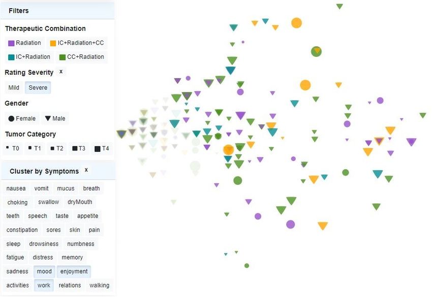
quantitative data (e.g., age, weight, or the total radiation dose); ordinal
data (disease stage), and nominal data (e.g., therapeutic combination);
and 2) Longitudinal symptom data, as time-series attributes with quan-
titative values (ratings for 28 symptoms) over a maximum of 12 time
points. The symptoms were further grouped in three categories: core
symptoms common for all cancer types (fatigue, disturbed sleep, dis-
tress, pain, drowsiness, sadness, memory, numbness, dry mouth, lack
of appetite, shortness of breath, nausea, and vomiting), HNC specific
symptoms (difficulty swallowing, difficulty speaking, mucus in throat,
difficulty tasting food, constipation, teeth/gum issues, mouth/throat
sores, choking, and skin pain), and ratings of symptoms’ interference
with daily life (work, enjoyment, general activity, mood, walking, rela-
tionships). The symptoms were rated on a 0-to-10 scale ranging from
”not present” (0) to ”as bad as you can imagine” (10) for the core and
HNC specific items, and from ”did not interfere” (0) to ”interfered
completely” (10) for the interference items. Each patient rated all 28
symptoms during a questionnaire completion (time point).
    The dataset included a total of 12 time points. Because of the desired
longitudinal aspect of the analysis, we separated these points into three         Fig. 2. Custom scatterplot of patients at a specific time point, for a
categories: baseline (week 0), acute stage (on-treatment period), and             selected rating severity. Left position is associated with a lower symptom
late stage (>= 6 weeks after treatment). For acute time points during             burden, calculated based on the symptoms selected in the list. Shape,
treatment, data was collected every week (at most 7 weeks), while                 size, and color encode demographic, diagnostic, and therapy features
after treatment, time points data was collected at lower granularity, at          (see legend). In this example, highlighted patients correspond to the high
6-weeks, and 6-, 12-, or 18-months post-treatment. Previous timepoint             rating severity group, indicating that the three symptoms selected (mood,
values were substituted for missing values; missing baseline values               enjoyment, and walk) severely affect the vast majority of patients across
(i.e., for the first timepoint) were marked with 0. Patients with no              all therapies, genders, and tumor sizes. Outliers are easily noted.
symptoms recorded during the acute or late phases were not included
in the analysis for that time frame.
                                                                                  patient-symptom matrix to group patients based on their raw symptom
4.4 Environment Design                                                            ratings. After alternative clustering with complete and average link-
The design followed a parallel prototyping approach [22], a method                ages, we found that Ward’s method generated larger, more informative
proven to lead to better design results by opening up the visual en-              groups of high symptom patients, which made sense to the clinicians.
coding and interaction space, which in turn elicits more detailed and             We identified two patient groups with high and low symptom burden
constructive feedback than in serial prototyping. THALIS was imple-               (T1.1). This two-group clustering was preferred by clinicians, who
mented in Python and JavaScript with the D3.js library [11]. The top              found it easier to compare two groups instead of more. The axes of the
design is based on coordinated multiple views of the data, in order               scatterplot correspond to the first two components obtained by applying
to support both layering and separation of information and workflow               PCA to the patient-symptom matrix. Clusters for a specific time point
components, and the ability to integrate visually heterogeneous data. A           are extracted and displayed, while clusters for different timepoints can
main clustering panel allows the analysis of patient groupings based              be investigated via the time slider, which will update the scatterplot.
on similarity (Fig. 2), respectively the analysis of symptom groups via              The scatterplot was customized to separately capture acute and late
association rule mining (Fig. 1.A). A second main panel supports the              symptom burden distribution as identified by the symptom clusters, and
longitudinal analysis of patient symptoms (Fig. 1.B), in coordination             to reflect via marker color, shape, and size the therapeutic combination
with the other panels. The remaining panels supports explicitly the               administered to each patient, their gender, and their disease stage (T3.2)
context-analysis of cohort symptom data. The panels are connected                 (Fig. 2). The data can be filtered by attributes, and filtering operations
through explicit filtering operations, brushing and linking.                      update the other views. A filtering control panel serves double duty, by
                                                                                  also providing the plot legend. This customized scatterplot encoding
4.4.1 Clustering Panel                                                            effectively captured the symptom distribution across the patient popula-
Because of the experts’ interest in activities A1 and A3, the clustering          tion, patient outliers, and therapeutic distribution across the data (T1.1,
panel shows a therapy cluster view of patients (Fig. 2). Alternatively,           T1.3, T2.3).
the panel shows an association graph view of symptoms (Fig. 1.A),                    To assess the symptoms’ impact on clustering, we also provide an
illustrating the two main clustering approaches of this project (A1).             option for dynamically recalculating the clusters based on user-selected
These views are coupled with computational modules for clustering.                subsets of symptoms (Fig. 2) and update the scatterplot accordingly.

Therapy Cluster View. In prior research, the clinicians had analyzed              Association Rule Diagram View. Driven by the factor analysis limita-
a subset of the patient data using factor analysis and had identified             tions discussed earlier, this project pursued Association Rule Mining
distinct groups of patients with high, medium, and low symptom burden,            (ARM) as an alternative, novel approach to symptom cluster analysis
depending on the therapeutic combination, which they had illustrated              (A1). ARM is an unsupervised data mining technique for identifying re-
via heatmaps and dendrograms. However, they were also aware that                  lationships within the data [2]. In marketing applications, an association
the heatmap representation did not illustrate well outliers in the patient        rule in the form X → Y indicates the pattern that if a customer purchases
dataset, nor did it support well individual patient analysis, and they            X, they will also purchase Y , where the patterns are extracted from
were also not confident about the therapeutic distinction between these           relational data expressed as transactions. Similar to the strong positive
groups. We agreed that a scatterplot view, color-mapped to the different          correlations found between items in a supermarket basket, relationships
therapies, would serve activities A1 and A3 better, by capturing more             within clinical data can help identify disease comorbidities [43, 54, 57].
clearly individual patients and cohort patterns in the data.                         In this project, we extended the potential of ARM to symptom clus-
   We first organized the symptom ratings into a patient-symptom ma-              tering applications. To this end, we adapted the most common ARM
trix for the selected time point, where each element (i, j) corresponds           method to our problem: the Apriori algorithm [2], for frequent item-set
to the score given to symptom j by patient i at that time point. Prior            mining and association rule learning. In our approach, the symptoms ex-
research in symptom cluster for HNC [34] had applied hierarchical                 perienced at each time point by each patient are treated as a transaction.
clustering using Ward’s method [48] with Euclidean distance on the                The algorithm first identifies frequent symptoms to determine sets of

                                                                              4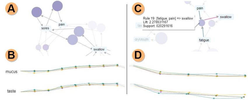
© 2021 IEEE. This is the author’s version of the article that has been published in IEEE Transactions on Visualization and
Computer Graphics. The final version of this record is available at: xx.xxxx/TVCG.201x.xxxxxxx/
Fig. 3. Acute vs. late phase analysis. A) Association rule diagram for the acute phase. Rules are filtered based on support (frequency) and lift
(dependency between symptoms); other rules are faded in the background. B) Mean rating value filament plots for all therapies, with the acute phase
highlighted. All therapies follow similar trajectories for both mucus and taste, and towards the end of the acute phase, taste has a considerable
increase in ratings for all therapies. C) Association rule diagram for the late phase, showing the antecedents (fatigue, pain) and consequent (swallow)
for rule 14. D) Mean rating value filament plots, showing a slightly different trajectory for IC+Radiation.
Table 1. Example of 3 transactions containing 4 symptoms: fatigue,
drowsiness, pain, and swallow. σ (X ∪ Y )
λ (X,Y ) =
tid items σ (X) × σ (Y )
001 fatigue, drowsiness
002 pain, drowsiness where (X ∪Y ) refers to transactions that contain both X and Y . E.g.:
003 fatigue, pain, swallow
σ ({fatigue,drowsiness})
λ ({fatigue}, {drowsiness}) = σ ({fatigue})×σ ({drowsiness})
symptoms that co-occur with high certainty and then extends to larger We applied ARM to each of the acute stage and the late stage
symptom sets. Table 1 contains an example of three ”transactions” (T1.2,T3.4), and empirically chose to illustrate the top 20 rules yielded
from our data. Transactions were extracted from existing question- by this approach, because only a small number of rules were of clinical
naires. Missing ratings for a symptom within a questionnaire implied interest. We chose minimum values for the support and lift metrics that
that the symptom was not included in the transaction. If a patient was were suitable for frequent and interdependent symptoms.
missing an entire questionnaire, no transaction was generated for that From the many possible encodings of ARMs [38], we selected a
patient. The ARM was performed using all the available data and no node-link representation (Fig. 1.A), which was deemed by clinicians to
data imputation was performed. be more friendly to broader audiences (A3), and a good fit for the rela-
We followed Agrawal and Srikant’s proposed association rule [2] in tively small number of nodes. Graphs are laid out using a force-directed
the form: layout algorithm based on statistical multidimensional scaling [39, 79],
X →Y which results in nodes with high degree being placed centrally. Con-
sistent with this encoding, which is closest to humans arranging nodes
which indicates that if a patient suffers from symptom X (the an- manually [92] or when locating connected clusters [81], the layout is
tecedent), they will also be affected by symptom Y (the consequent). fixed. Other layouts have been tested: the dot layout output a tree-
Based on the first transaction in Table 1, such a rule can be: like representation, deemed less desirable, whereas the Distributed
Recursive Layout and the Fruchterman-Reingold Layout [19] resulted
{fatigue} → {drowsiness}
in cluttered diagrams. We followed established design principles for
where {fatigue} is the rule antecedent and {drowsiness} is the con- network visualization [71]: circles encode rules, with larger size and
sequent. For itemsets larger than this pairwise example (e.g., last deeper shade denoting higher rule support and lift, respectively, whereas
transaction in Table 1), either the antecedent or the consequent could rectangles encode symptoms. Incoming edges for a node indicate which
contain multiple items. item(s) appear in the antecedent of an association rule, whereas out-
Two standard measures, support and lift, are tuned to filter the going arrows indicate item(s) in the consequent. Because the rule
association rules by a minimum value. Support is the measure of how directionality is meaningful, rules containing the same sets of symp-
often the transactions contain both X and Y , in our case, how frequently toms are treated as separate nodes in the graph. Clicking on a rule
sets of symptoms X and Y occur together. The support of a subset of highlights the antecedents and consequents of the rule, whereas click-
symptoms S is defined by: ing on a symptom highlights the rules containing that symptom and
all the other symptoms in those rules (Fig. 3.C). Rules can be further
|S| filtered out based on support and lift levels (Fig. 3.A).
σ (S) =
|T | 4.4.2 Symptom Trajectory Panel
where |S| is the number of transactions that contain all the symptoms in Designing an appropriate encoding for the symptom longitudinal data
set S and |T | is the total number of transactions in the dataset. In Table 1, (A2) turned out to be particularly challenging, primarily due to the
σ ({fatigue, drowsiness}) = 31 as both symptoms appear together in 1 nature and richness of the temporal data, the acknowledged variability
out of 3 transactions. in ratings across patients, and the missing or uneven time points, which
Lift is the measure of the importance, or strength of the rule, and it were expected in this context. The design process explored a wide
shows how more frequently than we’d expect by random chance do X range of possible temporal encodings, many of which suffered from
and Y appear together. Lift is defined as: scalability issues and, after several sessions, focused on a promising
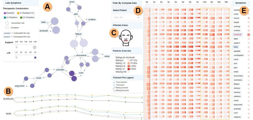
5Fig. 4. Symptom burden analysis. A) Patients in the mild symptom burden cluster, having tumor categories T0 and T1 (current patient, 340, is
highlighted in red), with all other patients faded. B) The anatomical sketch shows that the mouth and neck areas are affected by the selected
symptoms (mucus, breath) for the current patient. C) The patient’s ratings are shown by black marks. In this case, the patient had a low rating for
mucus at the first assessment (0 weeks), while at the end of the observation period (18 months post-treatment) the rating increased. D) Filament
plots encoding symptom trajectories for the selected symptoms, for the patients filtered in the scatterplot. One filament per patient shows the
temporal development for that symptom; black filaments mark the current patient, confirming the mucus rating increase in the late stage.
encoding called a ”tendril plot” [51]. A tendril plot is a visual summary time points; the surveillance period is represented on each filament
of the incidence, significance, and temporal aspects of adverse events until the last recorded time point for each patient. We account for the
in clinical trials, in which individual temporal threads, one per each time ratio between the acute (1 week) and late (months) stages, so the
patient, emanate from a common root and shoot upwards and curl either distances illustrated for the acute time points are smaller as opposed
to the left or to the right depending on whether the next event in the to the late time points. Hovering over a filament greys out all the
timeline was adverse or an improvement. For clinical trial data, tendrils other filaments in the plot. This interaction helps in the comparison of
were shown to create beautiful, compact, naturally clustering pathlines symptom trajectories for the same patient, and via brushing and linking
illustrating the positive or negative evolution of each group of patients. with the other views, in highlighting the additional patient data (T3.1).
The clinicians had also seen this representation and thought it could This compact representation helps in the analysis of symptom evolu-
work (T1.2, T2.2). Whereas promising on paper, unfortunately, the tion trends, by clearly indicating the overall symptom burden (low/high).
tendril implementation did not yield similarly clean illustrations for The representation also helps in spotting outlier trajectories that should
the symptom data, because of the much smaller number of time points, be further evaluated and facilitates the discovery of steady vs. variable
the variability in therapeutic sequences, and the variability in patient progression of symptoms. The panel includes two such filament plots,
outcomes, which are not typical of clinical trials. supporting the side-by-side comparison of different symptoms for se-
Numerous design variations yielded a new custom temporal en- lected patient groups. To further enhance visual support, during the
coding, which we call a filament plot (Fig. 4.D). Filament plots also evaluation of the acute period in the entire THALIS environment, the
emanate from a common root, then proceed in a left-to-right direction acute time periods are highlighted in the filament plots, and vice versa
aligned with the time sequence. Wider timesteps, typical for late stage, for the late period (Fig. 3.B and Fig. 3.D).
are accordingly more widely spaced. Each filament represents the full In order to better support activities A1 and A2, an additional option
observation period for a specific patient, with dots along the filament uses the same filament encoding, this time with the color mapped to
to indicate time stamps. To account for inter-patient rating variability, the therapy type, to capture the mean trajectory per each therapeutic
the curvature degree for the filament at each time step encodes the rela- combination (Fig. 1.B). Since in the therapy case the symptom mean
tive change from the previous rating, where upward rotation indicates ratings across the population bear meaning, the filaments are spread out
worsening symptoms (rating increase), and downward rotation shows according to the mean ratings per therapy (T2.1). This therapy-analysis
symptom amelioration (rating decrease). option helps estimate what treatment plans are less symptomatic, or on
To calculate the rotation, if patient p is located at position (xt , yt ) at the contrary, conduct to high symptom burden. In addition, to satisfy
timestep t for a symptom with rating r, we compute the next position activity A3, the current patient’s filament is highlighted in black in
(xt+1 , yt+1 ) at timestep t + 1 by first calculating the horizontal rotation each plot (Fig. 4.D). Whereas reliable automated symptom prediction
angle as: is an unsolved problem in symptom research, THALIS supports human-
θmax · ∆rt+1 machine analysis via trajectory views of similar patients.
θ=
2 · ∆rmax
4.4.3 Cohort Symptom Panel
where θ max is the total maximum rotation allowed, whose value is set The last panel explicitly supports activities A1 and A3, and provides
to 3π
4 ; ∆rt+1 is the rating difference between t + 1 and t: an abstract summary of the entire temporal symptom data. As in other
fields [61], and as indicated by our activity analysis, this summary pro-
∆rt+1 = r(t + 1) − r(t);
vides context for a specific datapoint, but does not lead the investigation.
and ∆rmax is the maximum difference between two rating values which The panel comprises a percentile heatmap, a correlation matrix, and an
is 10 in our case. Negative differences between ratings (i.e., rating anatomical sketch (Fig. 1).
decreases) produce negative angle values for θ . The percentile heatmap (Fig. 1.D) is a custom representation show-
Next, we want to rotate θ degrees relative to the horizontal line ing the rating distribution of individual symptoms over time, for the
P1 P2 defined by the points P1 = (xt , yt ) and P2 = (xt + l, yt ) where l entire patient cohort (T2.3). We arrived at this representation after
quantifies the time elapsed between t + 1 and t. A higher l indicates exploring a variety of alternatives such as stacked line plots, parallel
that more time passed between t + 1 and t (i.e., late vs acute). Finally, coordinates plots, and radar charts, guided by feedback from collabora-
we rotate P2 around P1 by θ degrees. tors. We settled on a matrix-based layout due to its compactness and to
For missing data during the observation period, the associated points its ability to support small multiple plots. Each row corresponds to a
are not represented, and we consider no rating change from the previous symptom, with rows grouped by symptom category, and each column
6© 2021 IEEE. This is the author’s version of the article that has been published in IEEE Transactions on Visualization and
Computer Graphics. The final version of this record is available at: xx.xxxx/TVCG.201x.xxxxxxx/
Fig. 5. Symptom cluster diversity analysis. A) Symptom association graph for the acute phase showing mucus and swallow correlate with many
symptoms. Note that the network layout is fixed, and that by construction it places centrally nodes with high degree. B) The percentile heatmap
shows a spread of high ratings for mucus along the whole observation period. C) Summary panel for mucus showing that among patients who
reported ratings for week 5 during treatment, more than 95% noted mucus as a present symptom. D) Mean rating filament plot emphasizing rising
ratings at the end of the acute phase, especially for the IC+Radiation+CC treatment.
corresponds to a time point. Each cell in this matrix is a horizontal bar 5.1 Case I: Symptom-Burden Analysis in Radiotherapy
graph showing via shade the percentage of patients reporting within a The study seeked to assess the impact of therapy on symptom burden
specific range (0, 1-5, 6-9, or 10) for that symptom, at that time point. on this set, and took place before our development of the associative
The bar height maps the percentage of individuals from the entire co- rule model. The oncologists were originally hoping to replicate pub-
hort who reported the symptom ratings at that time point. The current lished analysis results obtained on significantly smaller cohorts of 80
patient is indicated in this heatmap by cross markers (Fig. 4.C) (T3.1). to 270 patients [28, 50, 85]. Using the system over the course of several
This encoding proved to be an intuitive way of showing what symptoms sessions showed, however, that those clustering results were not gener-
produce a higher burden for patients, and when, as well as to indicate alizable to the larger cohort, and so the investigation shifted focus to
how many patients were affected by these symptoms from the entire discovering and analyzing outliers in terms of patient characteristics
cohort (T1.2, T2.3). and symptom trajectories. The study workflow started directly with
To support exploration driven by a specific patient (A3), a dropdown the therapy scatterplot panel (Fig. 4.A) (T1.1, T3.2). At first glance,
selection box is also provided (Fig. 4.B). A selection in this box high- most patients were visibly grouped in the left-center part of the plot,
lights the patient data across panels (Fig. 4). A timeline selector further suggesting strong similarity. Filtering the patients (T3.1) based on their
allows the selection of a particular time point in the data (Fig. 4.C), and rating severity revealed that this group corresponded to a mild-rating
further interface elements allow selection and analysis of sets of similar severity cluster. Further filtering by therapy and tumor category, the
patients. Additionally, a compact correlation matrix (Fig. 1.E), along experts noted that most of these patients were treated with radiation
with the percentile heatmap, supports T1.2, by showing the strength of with or without concurrent chemotherapy (CC) and, not surprisingly,
the correlation between a selected symptom and all other symptoms, presented a small tumor size and a low symptom burden at the end of
with circles encoding Spearman’s coefficient via color and size. Finally, the observation period. They concluded that for this group, the therapy
because a discussion of task T3.3 revealed that patients tend to point plan did not effectively impact the quality of life. Next, the oncologists
to the location of their symptoms, an anatomical sketch (Fig. 1.C) sup- examined whether a smaller set of symptoms, as in their prior studies,
ports visual anchoring based on anatomy. Regions in the head and neck would correlate with patient groupings (T1.1, T1.3). To this end, they
affected by the selected symptoms are highlighted in this sketch. filtered data by daily interference symptoms, including, for example,
{mood, enjoyment, and work} (Fig. 2). This time, they found that
5 EVALUATION AND RESULTS
almost a third of the patients suffered from high symptom burden in
Because no design approach is failproof, although ACD has higher this symptom group.
success rates than HCD (63% compared to 25%) [68], we evaluated Encouraged by this finding, the analysis moved swiftly to the fila-
THALIS through a combination of multiple demonstrations and case ment plots (Fig. 4.D), to examine the symptom trajectories (T2.2). The
studies involving domain experts, namely a senior data mining special- plots captured a general trend in most symptom trajectories, namely, a
ist and three senior clinical radiation oncology experts. Whereas we rating decrease post-treatment, with the exception of {numbness, mem-
recognize these experts as co-authors, not all of them were involved in ory, breath}. Moreover, these three symptoms, along with nausea and
the development process at all stages. Two case studies were completed vomit, exhibited a steady symptom development, with fewer patient
during separate, dedicated sessions, in addition to regular feedback outliers or drastic rating changes over time (T1.2). There was, in fact,
sessions. Because the designers and evaluators were in different loca- no correlation between the temporal outliers in the filament plots and
tions, and due to COVID-19 constraints, these sessions were conducted the therapy scatterplot outliers. This finding indicated that patients ex-
remotely using screen sharing and note-taking. The oncology experts perienced steady ratings for these five symptoms over time, regardless
directed the exploration using the think-aloud method, while the first of overall symptom burden or therapy treatment. This observation was
author was driving the interface according to their instructions. Both of notable interest, and so the analysis moved to examine the cohort
case studies analyze a set of 699 HNC patients, which was significantly context (T2.3). Using the percentile heatmap (Fig. 1.D) and the correla-
larger than prior clinician analyses, and span all activities, A1-A3. tion matrix, our collaborators noted that groups of symptoms such as
Qualitative feedback was also provided during weekly design-driven {swallow and dry mouth}, or {taste, appetite, constipation, and sores}
sessions and was used to improve the overall design of THALIS. showed higher ratings over time, suggesting possible interrelationship
or causative factors between these symptoms. For example, when
7Fig. 6. Late symptom cluster analysis. A) Symptom association graph showing drowsiness as a central symptom for the late phase. The connection
between sleep and drowsiness is expected, as these two symptoms are known to be a factor in dangerous muscle-mass loss. B) The filament plots
show mean rating values, with the late phase highlighted, and the acute phase faded. Notably, in the case of sleep and drowsiness, IC+Radiation is
the therapy associated with higher symptom ratings, and it is noticeably different from the other therapy plans.
selecting dry mouth, the panel indicated strong correlations between lighting the treatment phase of interest (acute/late) (Fig. 3.B, Fig. 3.D)
dry mouth and {mucus, choking, and swallow}, but also with {taste, (T2.1). The plots showed that the trends were remarkably conserved
drowsiness, and fatigue} as well. Finally, the anatomical sketch layout over time between therapies, even though their magnitudes might dif-
(Fig. 1.C) emphasized which head and neck locations are affected by fer. To achieve a better understanding, the option to separate the fila-
the selected symptoms (T3.3). In this case, we noted that both dry ments based on the starting mean rating (baseline) was used (Fig. 1.B,
mouth and taste affected the mouth area. The oncologists are planning Fig. 5.D) which showed a difference in the symptom burden between
studies to verify this set of symptom cluster hypotheses. therapies for the association-identified symptom groups. For example,
in the case of {taste} and {mucus}, in both acute and late phases, the
5.2 Case II: Symptom Cluster Diversity highest rated treatments were IC+Radiation+CC (induced chemother-
This study aimed primarily to explore the value of associative rule apy, radiation, and concurrent chemotherapy) and IC+Radiation, while
mining in longitudinal symptom analysis (T1.2). Examining the as- CC+Radiation and Radiation alone were rated lower. Noticeably, in the
sociation diagrams, the oncologists were stunned to find surprising case of {drowsiness, sleep}, IC+Radiation was remarkably separated
symptom clusters during and post-treatment; in particular, 8 common from the other treatment plans (Fig. 6.B). The oncologists concluded
symptoms for the acute stage (Fig. 5.A), with two strongly coupled sub- this case study and the associative approach were a gold mine for their
groups: {distress, sadness}, and {swallow, pain, sores, taste, mucus}; symptom research, by highlighting the diversity of symptom clusters
and respectively, 12 frequent symptoms during the late part of the treat- over time.
ment (Fig. 1.A), showing symptom clusters such as {taste, dry mouth},
and {sores, pain}. The experts were impressed to see that the {sores, 5.3 Expert Feedback
pain} cluster is strongly associated with {taste} in the acute phase, Because THALIS used participatory design, feedback from the domain
while in the late phase, there is a connection between {drowsiness, experts is implicitly reflected in the final design choices we report.
sleep} (Fig. 6.A), which is known to be a factor in dangerous muscle- Here, we focus instead on expert feedback related to the current system.
mass loss. The {taste, dry mouth} cluster in the late phase supported The current version of THALIS yielded excellent feedback from the
our collaborators’ previous findings. However, the connection between oncology team, often indicating a shift in thinking about their work.
{fatigue, drowsiness} in the late phase and the centrality of {mucus} We report sample feedback, in relation to our activity analysis A1-A3:
(Fig. 5.A), as well as the {taste, sores} connection within the acute (A1, A3) Quote from the most senior oncologist: I gotta be honest,
graph was unexpected. ”In our group, we have established this arc every time I meet with you guys and we see these visualizations, I get
from taste to dry mouth in late stage, but we haven’t thought of the taste so much material for future research. In general, to be fair, my focus in
to sores link in the acute phase. That is striking.” clinical practice [and in helping patients] tends to be on dry mouth and
The ability to highlight a particular symptom (T3.4) or rule and to swallowing. I say ”We’re going to talk about dry mouth and swallowing,
filter the rules based on their support and lift (Fig. 3.A, Fig. 3.C) were cause these two are really bad”, and ”then there’s all the other stuff”.
found essential during the exploration, by helping our collaborators And then I see this [the ARM and heatmap and filaments], and here’s
to figure out which symptoms were more persistent or more depen- this other stuff, that is usually at my periphery, but I don’t focus on,
dent on each other. For instance, {fatigue, drowsiness} were the most although patients do mention it. If I were sitting with a patient and I’d
common symptoms (based on their support) and {activities, work} the look at this interface and ARMs—I get it, hey, there’s actually a LOT
most dependent on each other (based on their lift) in the late phase of moving parts here [beyond dry mouth and swallowing], and they’re
(Fig. 1.A). Insights observed from the symptoms association graphs related, and they have different time sources. It’s sobering.
were further extended using the percentile heatmap (Fig. 1.D), reveal- (A1, A2) Both case studies had the team exclaim, on multiple occa-
ing the spread of high ratings for {taste} and {fatigue} over the whole sions, about being ”blown away”, ”surprised by that”, ”that [symp-
patient supervision period (T2.3). Moreover, because {mucus} was tom] spread over time just jumps out at you”, ”This entire ARM ap-
usually perceived as an acute symptom, the experts found it remark- proach is so different [from the approach we’ve followed in our past
able that a large number of patients experienced {mucus} during the research on symptom clusters]. I want to stick a flag in the ground with
late period as well (Fig. 6). The mean value filament plots were used the ARM work, and look at dose to organs and use ARM to see dose-to-
to show the mean ratings per time point for each therapy while high- swallowing correlation, based on this spatial structure underneath”,
8© 2021 IEEE. This is the author’s version of the article that has been published in IEEE Transactions on Visualization and
Computer Graphics. The final version of this record is available at: xx.xxxx/TVCG.201x.xxxxxxx/
”This interface and the ARM provide great preliminary data for so many with the core client interests. Because of this alignment with their
grants [projects] right off the bat!”, ”Really impressed”, and ”[This core activities, we had significant buy-in from clients, providing us
relationship] is not intuitive, so it’s very interesting. And I wouldn’t with the ability to stay on task and make steady progress, propelled by
have thought about it. But now, it makes perfect sense. Duh!”, ”The activity-relevant insights in several meetings. The approach furthermore
[filament view] is such a great asset for the interface.” resulted in a successful remote collaboration, and an eagerness to adopt
(A3) The clinician oncologists: ”[THALIS’s] ability to go from pa- THALIS in the clinic.
tient to population is fantastic, I really love it, it’s exactly what I need”, L2. Use visual scaffolding to introduce custom, novel visual encod-
”I like that when a patient is with [CDF], they want percentages, e.g., ings. Through many design iterations, our solution converged towards
66% of patients have normal appetite after 12 months, and [THALIS] custom encodings, such as filaments and the percentile heatmap. These
shows that”, ”When I see a patient, this [taste-dry mouth] association compact encodings are scalable (in the case of filaments, through filter-
in the late phase is the default picture I have in my mind. But here I see ing), and effectively serve the original design aims. We were able to
that also fatigue connects to drowsiness, and that these symptoms show introduce these encodings through visual scaffolding [67] over many
up in the acute phase as well, and that I really need to discuss these meetings with domain experts: small, gradual changes from one it-
issues with my patients.” ”I can share [this view] with my patients, to eration to the next. From the other end of the spectrum, established
explain that pain and swallowing and fatigue are really tightly related— encodings such as scatterplots and node-link diagrams have greater
we don’t know if it’s causation, but they definitely show up together, so adoption chances in low visual literacy environments. A mix of novel
could you please, please, take your pain and anti-inflammatory meds, and standard encodings, when following visualization design principles,
and could you please do the swallowing exercises we’ve talked about?” may facilitate encoding adoption.
L3. In XAI (explainable AI), emphasize domain sense and action-
6 DISCUSSION ability. In healthcare applications like THALIS, that blend visual
The case studies and the domain expert feedback demonstrate encodings with alternative AI methodology such as ARM, we found
THALIS’s value in bridging the gap between machine and human that transparency in the AI model [59] was not enough to make the
analysis, and its ability to help generate novel insights. Our integrated model trustworthy. Beyond transparency, our model outputs, in their
approach is able to capture longitudinal differences between acute node-link representation, made sense to the domain experts because
and late stages, while detecting outliers and trends in the symptom THALIS did not contradict their clinic knowledge, and although it did
and therapy data. More importantly, our approach supports individual not confirm earlier findings on smaller cohorts, the experts appeared to
patient analysis, while handling a large cohort both computationally gain trust in it. At the same time, it was essential to make this AI model
and visually. Through an ACD approach, and as indicated by the ex- actionable: cohort-based analyses are useful in symptom research, but
pert feedback, THALIS successfully serves the core interests of its in the clinic, the emphasis is on the individual patient, their therapy, and
audience. In conjunction with the clustering panel, the symptom as- their likely symptom trajectory. Building an integrated machine-human
sociation rule view, the filament plots, and the cohort symptom panel system that explicitly supports the need to act on the patient’s care
enabled discovering interesting relationships in the data, and in several served our project well.
cases lead to unexpected but insightful results. Furthermore, THALIS
couples multiple customized novel visual-encodings with symptom 7 CONCLUSION
clustering algorithms in the background, enabling the domain experts In this work we described the activity-centered design of THALIS, a
to explore multiple scenarios and test their hypotheses in real-time. Its novel environment to support the integrated human-machine analysis
use of a multi-view paradigm supports flexible analytical workflows of longitudinal symptom clusters as a function of cancer therapy. We
that leverage computational power and human expert knowledge. described the application domain data and activities with an emphasis
Through close collaboration with domain experts, our solution intro- on the multidisciplinary development of clustering tools for symptom
duces compact, customized visual encodings for the symptom data: a data in cancer therapy. We also introduced a novel blend of data min-
filament encoding and a percentile heatmap. The percentile heatmap ing and visual encodings to predict and explain longitudinal symptom
scales well with the number of subjects, by design, at the cost of summa- development based on an existing cohort of patients and described
rization. Whereas the inherent scalability of filaments with the number customized interactive encodings: interactive association-rule graphs,
of items shown is limited, these encodings successfully abstract the filaments, and percentile heatmaps. The evaluation of the resulting
cohort data with the help of similarity-based filtering operations, which mixed workflows and encodings over an existing head and neck can-
are appropriate in this context; for hundreds of dense observations, as cer symptom repository with domain experts proves the value of this
common in other problems, tendrils [51] offer a better solution. In integrated approach for both symptom research and work in the clinic.
further terms of scalability, the ARM graph can provide rules for any Last but not least, we summarized the design lessons learned from this
number of time points in the late and acute time periods. Still, the successful, multi-site, remote collaboration. We hope these lessons will
graph representation for association rules is suited for a smaller number help other designers who tackle similar design problems and challenges
of rules (less than 100 [39]). The scatterplot and correlation matrix in human-machine integrated visual analysis.
are time point specific, so any number of plots could be generated.
On the other hand, some views are prone to clutter. Some of these ACKNOWLEDGMENTS
encodings may have limited generalizability beyond this application The authors are partially supported by the U.S. National Institutes
domain. In the case of filaments, they work in this application because of Health, through awards NIH NCI-R01CA258827, NIH NCI-
there is a significant correlation between similar patients’ trajectories R01CA214825, and NIH NCI-R01CA2251, and by the US National
and because our application emphasizes relative trajectory changes as Science Foundation, through awards NSF-IIS-2031095, NSF-CDSE-
opposed to absolute values. This type of correlation and relativity may 1854815 and NSF-CNS-1828265. We thank all members of the Elec-
not be true across application domains. However, our custom encodings tronic Visualization Laboratory, and all members of the MD Anderson
can be repurposed for other longitudinal problems that feature missing Head and Neck Collaborative Group.
data, as in astronomy or biology [40, 62, 63, 87]. Future work includes
longitudinal clustering, applying the ARM approach on sequential data, R EFERENCES
and interactively changing ARM metrics and the number of rules. [1] S. S. Abdullah, N. Rostamzadeh, K. Sedig, A. X. Garg, et al. Visual ana-
Reflecting upon this successful design experience, we extract three lytics for dimension reduction and cluster analysis of high dimensional
main lessons for designers dealing with similar problems: electronic health records. Inform., 7(2), 2020.
L1. Use an activity-centered design process, in particular in remote [2] R. Agrawal and R. Srikant. Fast Algorithms for Mining Association
collaborations. In our experience, following a design process focused Rules in Large Databases. In Proc. 20th Int. Conf. Very Large Data Bases
on activities as opposed to humans, from requirements engineering to (VLDB), p. 487–499. Morgan Kaufmann Publishers Inc., 1994.
the evaluation against these activities, allowed us to align this project
9You can also read