THE WAY - VODAFONE - Warriors
←
→
Page content transcription
If your browser does not render page correctly, please read the page content below
THE        WAY

THE
WAY

VODAFONE
WARRIORS
CONTENTS
1. INTRODUCTION         10. PHOTOGRAPHIC TREATMENT
2. OUR HISTORY          11. PLAYER USAGE
3. OUR PURPOSE          12. SPONSOR LOCK-UP
4. ORGANISING IDEA      13. PARTNER LOCK-UP
5. OUR VALUES           14. OUR COLOURS
6. OUR LOGO             15. POUTAMA
7. INCORRECT USAGE      16. WARRIORS TYPEFACE
8. BRAND PROGRESSION    17. GRADIENT
9. HEADLINES & LAYOUT   18. ALL IN CAMPAIGN
Since our inception in 1995, the Vodafone Warriors have been a talisman for
innovation, energy and perseverance. Today, the organisation exists to inspire
through its work and enigmatic flair on and off the field.

The Vodafone Warriors’ Design and Brand Guidelines have been developed not
only as a way to better understand the Vodafone Warriors brand and how it should
be positioned, but also to provide a source that can be referenced and used for a
variety of creative works.

By following the Design and Brand Guidelines, we will ensure that the brand
remains consistently strong and recognisable for our fans, partners and
organisation as a whole.

                                                                                    1.
HISTORY
Etched in New Zealand sports fans’ minds is the date the dream of a team in the big league became
reality. It was March 10, 1995 when, on a balmy night, foundation captain Dean Bell led the originally-
named Auckland Warriors onto Ericsson Stadium in front of one of the most hyped-up crowds ever
seen in New Zealand. It was an unforgettable experience for all who were there and the massive
television audience throughout New Zealand and Australia.

Along the way since the Vodafone Warriors have stitched together a sporting story like no other New
Zealand has seen. The country’s longest-running professional sporting franchise opened the way for a
raft of sports to follow a similar path into Australian competitions while rugby union’s franchise-styled
professional competition began a year after the Warriors’ debut.

In a competition regarded as one of the most exacting there is – many believe it is unrivalled as the
toughest – the Vodafone Warriors have twice reached the NRL grand final, won the minor premiership
once, qualified for the NRL finals eight times and clinched three under-20 premierships.

                                                                                                            2.
PURPOSE
A distilled essence of our core operating purpose. This is our answer to the question - “why do we exist?”
We exist to inspire those around us – our fans, our community, our partners and our people.
We are relentless in our mission to instil a sense of hope and the ability to dream while igniting
the passion of our people deep in their hearts.
“TO INSPIRE HEART AND HOPE”
3.IDEA
What is it that we are tr ying to achieve in ever y thing that we do? What core theme
do we rever t back to in order to check the line of our course? If ever y thing we do is
centred around this core idea, then we cannot move our line or our standards of our
brand. All you must ask is - does this inspire?
INSPIRE
4.VALUES
What does it mean to be a Warrior ? What are the attributes of our people,
the values they hold highest in their pursuit of excellence?
Blue: Our Identity, Our Spirit, Our Home
G reen: We are Trailblazers, Innovators, We Bring the New
Red: Our People, The Lifeblood of who we are and who we represent
White: Our Mana, Our S trength, Our Unwavering Commitment
5.LOGO
The Vodafone Warriors logo is a sacred emblem that reinforces everything
we, as an organisation, stand for.
The logo is to be used in full colour at every instance except where all other
logos are monotone or when the artwork calls for monotone.
It is to be used in its full form and is never to be cropped, warped, stretched
or mis-coloured other than what is presented here. The minimum safe zone
around the logo is the height of the “R” around all sides.
CLE AR SPACE
Respecting the clear space and minimum size requirements is
extremely important. These guidelines have been developed in
order to protect the integrity of the primary logo and should be
followed at all times.
An appropriate amount of clear space is necessary around
the logo in order to separate the logo from other graphic
elements, ensuring the maximum amount of visibility. In the
case of the primary logo, the clear-space minimum is equal to
the width of the “R”.
6.USAGE
Manipulating logos is harmful to one’s brand and hinders effective
1. 2. 3. 4. 5. communication. Please be mindful of this when using the primary
logo and avoid these common examples of incorrect logo usage:
DO NOT:
1. Stretch or distort the logo in any way
2. Alter the colours of the logo
6. 7. 8. 9. 10. 3. Apply 3D effects to the logo
4. Invert logo colours
5. Rotate the logo
6. Add a drop shadow effect
7. Add elements to the logo
8. Cover any part of the logo with any elements
9. Skew the logo
10. Use out-of-date logos.
7.1995 1999 2002 2015
PROGRESSION
From the star t, the Vodafone Warriors tiki has positioned the club as a unique product of
New Zealand in an other wise Australian competition. The links with Maori culture showcase
a Warrior who lives with mana. Over time, the logo has changed but the core elements remain
true to the club’s values and purpose.
From 2001 through to 2018, the club boasted core colours of black and red. However, in line with the
club’s values and in a move to reinforce our identity, a decision was made ahead of the 2019 season
to go back to our original colours. This decision has been made for the long-term and, as outlined
earlier in this guide, the club’s core colours are aligned with our values.
2016 2019 2020
8.I
WARRIORS
II I
A ll re s e r ve d - s e at s e a s o n The width of the “ I ” on its side & LAYOUT
m e m b e r s hi p s ju s t $19 9 is the distance between each line.
III
The headline is always in TP2 Bold uppercase, It can be set left, centre or right aligned with
memberships@warriors.kiwi kerning open to a maximum of +80 and a minimum of +40, is set in a black text box and can
also be in the heritage colours. The text box has overlap by 4pnts on the margin and 6pnts
on the open side. It is 6pnts both sides when centre aligned. The leading is the depth of the
stroke of the letter.
The subheading 1 is TP2 Medium, sentence case, or CAPS, both with kerning open to a
maximum of +80 and a minimum of +40 and sits beneath the headline from the black header
box at the distance of the height of the subheader font. Sub headers are used in match-day,
WARRIORS
merchandise, internal and general print and digital assets.
The Subheading 2 is TP2 Medium, sentence case, with kerning open to a maximum of +80
A ll re s e r ve d - s e at s e a s o n and a minimum of +40 and sits beneath the sub header 1. Sub header 2 is used in match-day,
merchandise, internal and general print and digital assets
m e m b e r s hi p s ju s t $19 9 when a URL or fine print is needed.
The body copy is always TP2 Regular, sentence case with kerning open to a maximum of +60
memberships@warriors.kiwi and a minimum of +20 and is used for body copy, URL’s on print posters and digital adverts.
Kearning =40TREATMENT
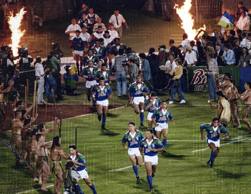
The 2020 Vodafone Warriors photographic treatments are designed to highlight and show the
brand in line with our values. In a case where a player is being shown, there must be three current
players and they must have equal hierarchy in the image. Players and staff must not be shown in an
aggressive or unsporting manner and must be shown in a way that reflects the club’s values outlined
in this document. We have the Photoshop filters available on a Dropbox link upon request.
1 . Full colour with a texture gradient being used as an overlay but never covering or partially covering
the face or Vodafone Warriors logo.
2 . The Poutama is to be used as a passive texture usually in the negative spaces in the images and
not directly across the face of any player and usually seen at 50% transparency with a “colour burn”
photoshop overlay.
3 . The gradient is used to enhance a game-day action shot in conjunction with the Poutama and other
graphic elements for social media etc.
4 . The photos are treated with a “high pass” and have a “grunge” or “dust” texture added with
a “subtract” overlay.
10.USAGE
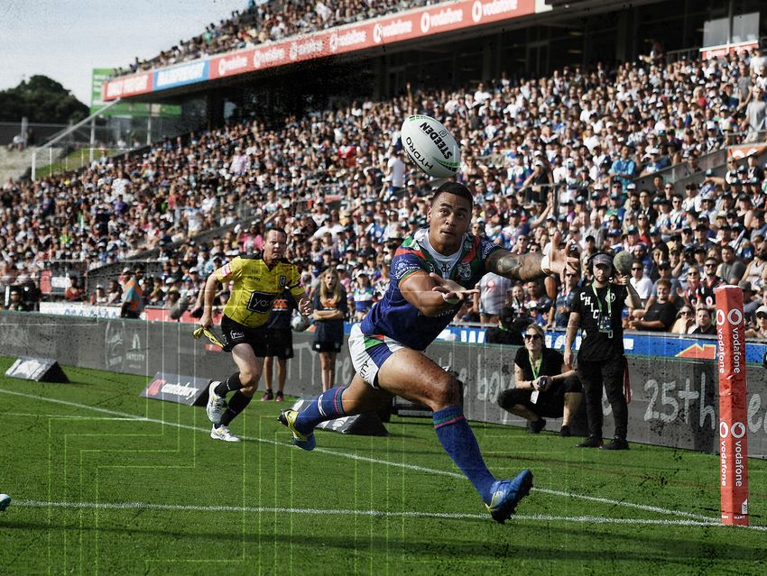
Our players epitomise what it means to be a Vodafone Warrior.
Below are a series of rules we have put in place with regards to usage of their images to ensure it reflects our core values.
Mana is a key pillar in our value system. Players must be shown representing this trait which includes being tolerant,
patient, unwavering, resolute, persistent, committed, dedicated, staunch.
Humility is a core trait of a Vodafone Warrior. Please refrain from sharing content portraying us as arrogant or smug.
When in doubt, please ask. We do caution against using our players for slapstick or situations where they may be made fun of.
While fun is okay, we also want to showcase our athletes as professional.
Our players are high performance athletes. Please keep this in mind when using food or other materials in campaigns
which may contradict this statement. Rude and/or profane material will not be tolerated.
The rule of three No individual towers above the rest. The three-player rule is a minimum.
Use current players Promotional materials should feature most currently contracted Vodafone Warriors.
Requesting players Please keep in mind that a lot of factors are considered when the Vodafone Warriors allocate players.
Therefore your preferred players may not always be available.
Front of camera performance If any acting is required, please keep it in context. These players are appearing in their role
as rugby league players, not as individual personalities.
Partner conflicts Any use of images/collateral branding needs to be free of items that may conflict with Vodafone Warriors
partners, likewise for any products that are used at any promotional appearances.
Player appearances A minimum of two players must be requested to attend promotions/events. For any event where material is
going to be used in a creative campaign, they must attend in a minimum of three. Players are not expected to do any “prolonged”
public speaking.
Events and shoots Please explain what you would like to get out of the event to enable players to be fully briefed. For any event/
shoot involving the Vodafone Warriors, please draft a run sheet specifying the activities to be undertaken, number of people
CORRECT USAGE INCORRECT USAGE attending, media and who the dedicated point of contact will be.
11.LOCK-UP
The 2020 Vodafone Warriors sponsor lockup follows closely the NRL’s 2020 branding guidelines in respect
to the use and treatment of sponsors’ lockups and logos by having monotone logos for a cleaner, simpler look.
This avoids clashes in differing sponsors’ logo colours. It also shows up better on digital and print formats.
12.LOCK-UP
The 2020 Vodafone Warriors partner lockup follows closely the sponsor lock-up guideline in respect
to the use and treatment of sponsors’ logo by having a monotone logo for a cleaner, simpler look.
This avoids clashes in differing sponsors’ logo colours. It also shows up better on digital and print formats.
The partner logo is always on the right and is separated by a dividing line, the thickness of the “I” in the Warriors logo.
The logos are never to exceed the height or base of the dividing line.
13.COLOURS
The 2020 Vodafone Warriors official club colours are drawn directly from the home jersey
and draw from the original 1995 team colours.
Please use the colour chart below to ensure correct colour usage.
COLOUR MAKE-UP COLOUR DISTRIBUTION
PANTONE
2756C
R19 G3 3 B103
C1 M99 Y89 K0
PANTONE
3 4 8C
R19 G13 3 B8 3
C97 M22 Y10 0 K9
PANTONE
4 85C
R230 G57 B5 8
C1 M99 Y89 K0
PANTONE
WHITE
R225 G225 B225
C0 M0 Y0 K0
PANTONE
BL ACK
R0 G0 B0
C0 M0 Y0 K10 0
14.The Poutama graphic device, which will be employed in our 2020 creative, is a direct link to our
heritage as New Zealanders and is seen on our playing jerseys as a grip tex ture and ex tensively
throughout the training clothing range. Poutama is a stepped pat tern of tukutuku panels and woven
mats and symbolises genealogies as well as the various levels of learning and intellectual achievement.
POUTAMA
1 . (noun) stepped pattern of tukutuku panels and woven mats - symbolising genealogies and also the
various levels of learning and intellectual achievement. Some say they represent the steps which
Tane-o-te-wananga ascended to the topmost realm in his quest for superior knowledge.
_ _
15.T 2 TYPEFACE
The 2020 Vodafone Warriors official typeface is “TP2”. Please see page X for layout and correct usage.
Please email Bodie, Leighton or Tim to request these fonts.The 2020 Vodafone Warriors secondary typeface
is “Easy core” as a secondary typeface used sparingly as a header or statement piece in print or social media
AaBbCcDdEeFfGgHhIiJjKkLlMmNnOoPpQqRrSsTtUuVvWwXxYyZz applications. Please see page nine for layout and correct usage.
Please email Bodie, Leighton or Tim to request these fonts.
AaBbCcDdEeFfGgHhIiJjKkLlMmNnOoPpQqRrSsTtUuVvWwXxYyZz
AaBbCcDdEeFfGgHhIiJjKkLlMmNnOoPpQqRrSsTtUuVvWwXxYyZz
AaBbCcDdEeFfGgHhIiJjKkLlMmNnOoPpQqRrSsTtUuVvWwXxYyZz
1234567890
1234567890
1234567890
1234567890
Easycore
AaBbCcDdEeFfGgHhIiJjKkLlMmNnOoPpQqRrSsTtUuVvWwXxYyZz
1234567890
16.The 2020 Vodafone Warriors gradient device makes use of the club’s blue and green and is used primarily
as a background colour device and sometimes as a colour filter across player action photography.
PANTONE®
2756C
R19 G33 B103
C1 M99 Y89 K0
PANTONE®
348C
R19 G133 B8 3
C97 M22 Y10 0 K9
17.CAMPAIGN
“All In” Is the Vodafone Warriors’ largest brand campaign in a number of years. The
campaign, which integrates, video, social and outdoor advertising, was launched in
October, 2019. “All In” captures in one short phrase the essence of what it means to
be part of the Vodafone Warriors – be that as a fan, partner, supporter or member
of our community. The lead phrase encapsulates what the brand, players and fans
are all about. It is an overarching brand narrative which galvanises hope, inspires
action and restores mana into the Vodafone Warriors brand.
We compel our people to ask themselves one simple question: Are you in or are you
out? Inevitably all that will be left are those who are...
warriors.kiwi
18.VODAFONE WARRIORS Contacts B o d i e Fr i end Bod i e @ w arriors. kiw i L e ig hto n Cor bet t L e i g h to n @w a rriors. kiw i Tim Co s s e ns T i m@ w a rriors. kiw i
You can also read