Unfolding - A library for interactive maps
←
→
Page content transcription
If your browser does not render page correctly, please read the page content below
Unfolding - A library for interactive maps

    Till Nagel1,2 , Joris Klerkx2 , Andrew Vande Moere3 , and Erik Duval2
                         1
                          Interaction Design Lab, FH Potsdam
                                 mail@tillnagel.com
                   2
                     Department of Computer Science, KU Leuven
                    {joris.klerkx,erik.duval}@cs.kuleuven.be
         3
             Department of Architecture, Urbanism and Planning, KU Leuven
                       andrew.vandemoere@asro.kuleuven.be

        Abstract. Visualizing data with geo-spatial properties has become more
        important and prevalent due to the wide spread dissemination of devices,
        sensors, databases, and services with references to the physical world.
        Yet, with existing tools it is often difficult to create interactive geovi-
        sualizations tailored for a particular domain or a specific dataset. We
        present Unfolding, a library for interactive maps and data visualization.
        Unfolding provides an API for designers to quickly create and customize
        geo-visualizations. In this paper, we describe the design criteria, the de-
        velopment process, and the functionalities of Unfolding. We demonstrate
        its versatility in use through a collection of examples. Results from a user
        survey suggests programmers find the library easy to learn and to use.

        Keywords: toolkits, maps, geovisualization, information visualization,
        interaction design, programming

1     Introduction
Until the extensive digitalization of geo-spatial data, cartographic prod-
ucts have been nearly exclusively created by cartographers, geographers,
and scientists from other disciplines with a spatial context. Nowadays,
interactive maps and geo-visualizations are prevalent on the internet, on
navigation devices and smartphones, as well as on large-scale multitouch
displays in exhibitions and public spaces. Similarly, interactive or ani-
mated maps are used increasingly to communicate facts or stories related
to geo-spatial information in various application domains [1].
    Areas are ranging from social networks to mobility patterns to data
journalism to many more. For example, Dodge et al [2] argue that there
is a “spatial turn” in social sciences, and that researchers are exploiting
the geo-spatial components of large data to understand spatial relations
and interactions. They describe interactive geographic visualization as an
essential research tool. MoMA Design curator Antonelli sees visualiza-
tion as one of the central design disciplines [3], and demonstrates current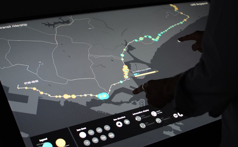
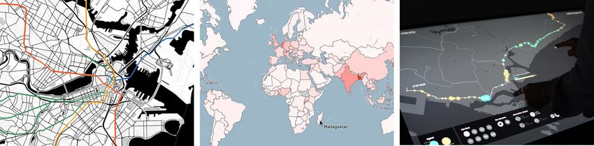
Fig. 1. Three applications created with Unfolding: An animated map showing subways
in Boston (left), an interactive choropleth map showing population density (middle),
and a visualization showing ridership in Singapore for a multitouch tabletop (right)

trends with eight examples of “highest quality of design”, of which six
use geo-spatial data visualized on maps. Moreover, there is an increase in
the interest of the general public, among others due to the wide-spread
use of location based apps for smartphones. Due to the recent ‘creativity
boom’, in which “novel types of graphic [...] and interaction were being
applied to new data and new scenarios” [4], different user groups should
be encouraged to experiment in the geovisualization field.
    But while interactive geovisualization is useful in a variety of domains,
the tools that can be employed to generate the visualizations are either
cumbersome to use, or lack the appropriate functionalities. There is an
increasing need for interactive maps and geovisualizations, and many am-
ateurs and non-GIS researchers are now creating and customizing geo-
spatial data representations. In order to support a democratization of
tools and technology we developed the Unfolding library.
    With our library we strive to support three different purposes, i.e.
(i) having a simple API that is easy to learn and use, (ii) support creat-
ing prototypes to quickly visualize data and to rapidly test novel inter-
action techniques, and (iii) building applications for a broader audience.
We chose to implement Unfolding as a Processing library, and are go-
ing to introduce Processing and explain our reasoning for choosing it
in Section 4.3. Since its inception, Unfolding has been used in course
assignments, research projects and commercial products. The iterative
development of Unfolding was guided by the needs of, and with constant
feedback from the library users.
    The remainder of this paper is structured as following: We give an
overview on related work (Section 2), and describe our design goals (Sec-
tion 3). In Section 4 we introduce the Unfolding library, its interaction
and visualization features, and our design rationales. We demonstrate its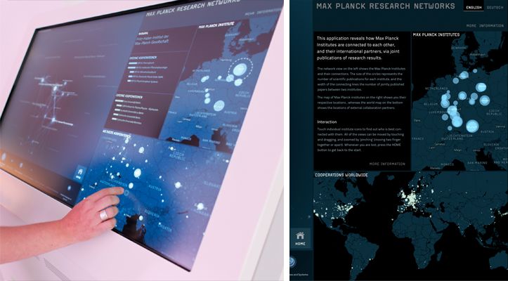
usefulness with exemplary applications for each of the three purposes,
and summarize the results of a user survey in Section 5.

2     Related Work
In the following we examine software and tools for the creation of interac-
tive geovisualizations. We describe their different goals, and how they are
only partly fitting for the purposes we aim to support. We discuss their
advantages and drawbacks, and describe how they differ from Unfolding.

2.1    GIS software
Standard geographic information systems (GIS) foremost aim is to sup-
port analyzing geospatial data, but often do not allow extensive adapta-
tion and simplification for a non-GIS-experts audience. Researchers in
the field of geovisual analytics have argued that software “should be
lightweight, easily deployable and usable, rather than huge and com-
plex like current GIS.” [5]. There is the need for less complex software
which encourages interactivity [6], and supports interactions facilitating
a knowledge construction process [7].
    Thanks to easier tools for creating customized maps since the release
of Google Maps and other web mapping services there are more and more
interactive maps created by persons who have no expertise in GIS. This
kind of map mashups needs little or no programming to visualize informa-
tion spatially [8]. While such mashups often only include dots on a map or
other basic display techniques, the mashup principle of re-using existing
technology has been described as a means to rapidly create prototypes
for geovisualization [9]. Simpler web-based GIS applications support se-
lected visualization (e.g. IndieMapper [10]) or interaction techniques (e.g.
GeoCommons [11]), and customization to a certain degree.
    Generalized, GIS software facilitates in-depth analytics, but is com-
plex, has a high learning curve, and is intended for experts. Mashup tools
are easy-to-use, suitable for quick data exploration, and intended for non-
experts, but only allow employing a fixed set of techniques. An approach
to fill this gap is the geoviz toolkit [12], which offers a graphical user in-
terface (GUI) for users without programming expertise, yet it targets an
audience of GIS experts.
    Effective geo-visualizations employ established techniques, but tailor
the visualization to the application domain and to the specific dataset.
Thus, custom visualizations have to be created with toolkits or with soft-
ware libraries.
2.2 Visualization and map libraries
The Java GIS library GeoTools provides extensive functionality for geospa-
tial data, and aims to support developing complex spatial data processing
applications [13], but is targeted to professional software developers.
In recent years, multiple libraries have been published with the intent
to allow designers and web developers to create interactive visualizations.
As we are not aware of surveys on modern visualization libraries aimed at
these new user groups, we chose an online collection [14], of which 12 out of
43 tools include map or other geo-spatial components. Data visualization
libraries such as d3 [15] or Prefuse [16] aim to supporting general purpose
visualizations and include a broad spectrum of techniques. With this,
however, they tend to not focus on the geospatial area.
Dedicated map libraries such as Leaflet [17] or Polymaps [18] offer
functionality to create interactive maps, and display geo-spatial data.
These libraries have proven value in practice, which is also why design
and functionality of Unfolding were guided by them. However, they are in-
tended exclusively for a web environment, and thus only partially support
more advanced interactive applications such as exhibits for large multi-
touch devices. Furthermore, they are not developed for the Processing
environment, which prevents the usage in existing Processing projects,
and reduces the applicability for less advanced users (see Section 4.3).
We are aware of three libraries providing basic map functionality for
Processing. Their purpose is to provide rudimentary mapping features: all
of them offer the display of a geo-referenced map, with conversion methods
between geo-locations and Cartesian screen coordinates and vice versa.
The geomap library by giCentre [19] provides functionality to load and
display Shapefiles, a standard file format for GIS data. It allows interac-
tive feature picking, and color coding, e.g. for choropleth maps (a thematic
map with its areas shaded according to a data value). Google Mapper [20]
allows downloading a Google map section and storing it as single image.
Unlike Unfolding, none of these Processing libraries provide zooming and
panning, multiple coordinates map views, or other more advanced fea-
tures. Lastly, ModestMaps [21] is an extensive map and geovisualization
JavaScript library for the web, for which a port to Processing was created
in 2008. The main JavaScript library has many of the features missing
in the other Processing map libraries, but the port for Processing is not
actively developed, and only supports some of the basics. However, the
tile-handling mechanism was mature and feature rich, which we therefore
used as basis for Unfolding’s own tile-handling functionality.3 Design Goals
This section introduces the design goals of Unfolding, and how the library
enables developers4 (i) to easily create simple sketches5 with interactive
maps, (ii) to quickly implement prototypes, and (iii) to create sophisti-
cated visualizations, or even extend Unfolding’s functionality.
For these purposes, Unfolding was developed with the main goals of
learnability, simplicity, and extensibility. To support the first goal, the
library comes with extensive documentation, mostly in the form of tu-
torials and example code. The documentation can be found both online
at http://unfoldingmaps.org as well as in the downloadable distribution.
The library uses a simple programming interface (API) to support the
second goal. Library users can create interactive maps in very few lines
of code (see Code sample 1). And thirdly, the library provides reusable
components, and employs a software architecture allowing to extend its
functionality in order to create advanced visualizations.
3.1 Task areas
We identified design goals and requirements, based on the experience from
our own design projects, from our teaching, and collected as feedback from
external users of the library, and grouped them into three main task areas.
These groups partially converge, and are not necessarily strictly disjoint,
but are useful nonetheless to refer back to and to describe how we aim
to support the dominant tasks of the target audience. We describe the
activities, user groups, and typical use cases.
i Learning Includes all activities in which developers learn how to
display geo-spatial data. Users in this group mostly create simple
sketches where they show markers on an interactive map. They use it
for experiments and small projects.
ii Prototyping Includes all activities in which library users explore and
understand geo-spatial data in an iterative data visualization design
process. This also includes to quickly prototype sketches to try out
new visualization or interaction ideas. Developers include both begin-
ners and advanced users.
4
This paper differentiates between developers or library users for Unfolding library
developers, and end users for persons using applications created with Unfolding.
5
This paper uses the term sketch as introduced by Reas and Fry [22] where small
programs act as software sketchbook allowing to quickly explore different ideas.iii Creating Includes all activities in which library users create larger
projects. This can be for design studies by researchers to be able
to evaluate novel techniques. This also can be for commercial or art
projects where developers create complex geovisualizations.
All library users – that is persons creating visualizations or interactive
applications with Unfolding – must have programming skills, ranging from
beginner (learning) to intermediate and expert level (prototyping and
creating). All of them have in common, that they not necessarily have
expert geography or cartography knowledge.
Overall, Unfolding is developed to have a gentle learning curve, i.e.
empowering to create standard visualizations in a few lines of code, and
to create more complex visualizations when users are accustomed and
more experienced with the library.
3.2 Design process of Unfolding
Since the first version of Unfolding in 2008, we continuously gathered
feedback from library users. In the process of designing Unfolding its
functionality was based on the lessons learnt from class room usage, and
on the requirements of our own case studies in visualization. We follow the
argument of Heer et al [16], and see iterative development, an established
method for designing HCI, to be also a valuable design process for software
libraries. In this vein, we discuss how the utilization of Unfolding in each
task group helped the progress of Unfolding, and how the feedback from
developers with different expertise levels helped us to balance learnability
and functionality.
Learning. Since 2009 Unfolding has been used in six courses at Fach-
hochschule Potsdam, and two at IUAV University of Venice by the au-
thors. Besides, it has been endorsed in various coursed at international
universities (e.g. Carnegie Mellon, ITP, MIT), with departments ranging
from interaction design to computer science to urban studies. The use in
courses and workshops for teaching basics on geospatial data visualization
allowed us to observe how beginners were using the library, and simplify
the API and improve the documentation.
Prototyping. In early stages of designing an application, quick visual
representations of geo-spatial data help to understand them. While these
data loading and visualization methods can be implemented with other
software or libraries, Unfolding provides them too in order to support
library users all the way from learning up to creating. In addition, users
have employed Unfolding to create geovisualizations with the purposeto prototype and evaluate new techniques. Unfolding aims to bridge the
gap between traditional and novel visualizations by easing the creation of
rapid design experiments.
Creating. Comments and suggestions from advanced users employing
Unfolding in research, design, and commercial projects helped us refine
existing and add frequently demanded features. Furthermore, successful
design projects can act as flagship and inspire new groups of users.
4 The Unfolding library
The features of our map library include zooming and panning, multi-touch
functionality, dynamic map tile handling, an event system, multiple co-
ordinates map views, standard and custom markers, loading of various
geo data formats, and more. This section describes selected basic interac-
tions and visualizations methods, demonstrate its features and usage by
examples, and explains our design rationales.
The code samples in 4.1 are to demonstrate the usage of the library
in order to implement some of the fundamental functionality. This is to
show how the basics are achievable in just a few lines of code, as stated
in one of our design goals. For longer code examples we deem a paper not
as the most appropriate form, and refer to the example section on our
web page.
4.1 Interaction & Visualization
Unfolding supports basic techniques for interactive maps such as zoom
and pan, but also other common but slightly more advanced techniques
such as Overview+Detail, i.e. showing a large scale map view while keep-
ing the context by displaying the selected region on a large scale map.
Basic map. In just three lines of code library users can create an in-
teractive map. The map is displayed in a default style with cartographic
data from OpenStreetMap [23] and tiles from CloudMade [24].
UnfoldingMap map = new UnfoldingMap(this);
MapUtils.createDefaultEventDispatcher(this, map);
map.draw();
Code sample 1. Creating an interactive map in UnfoldingTo use another map style, developers can specify a different provider as
second parameter when creating an UnfoldingMap. Our library provides
eight pre-configured map tile providers for educational purposes. Develop-
ers can also create their own map provider to use customized map styles
adapted to the requirements of their visualization. For instance, if the
objective of the map is to support general spatial recognition while being
discreet enough to not hinder the display of the data and interface layers,
a minimal style with selected geographical features could be employed.
Basic interactions. By creating the default event dispatcher (as shown
above), end users already can interact with the map. They can pan the
map by dragging it with the mouse, or by using the arrow keys on the
keyboard. Using the mouse wheel zooms in or out, which also works by
pressing + or - keys. Double-clicking on the map centers it around that
location, and zooms in one level. These basic interaction patterns were
based on studies for map interactions ([25], [26]) and well-established
design patterns for navigating and browsing [27].
Basic interactions with markers, i.e. visual representations of geo-
graphic features or data entries, are also provided out of the box. These
include selecting and highlighting markers by clicking or tapping on them.
More sophisticated interactions such as brushing and linking have to be
implemented by the developers, but can employ Unfolding’s event mech-
anism.
Multitouch interactions. Unfolding also provides interaction handling
for multitouch devices. To turn on this feature developers have to regis-
ter Unfolding’s multitouch handler, which maps gesture input to map
manipulation methods.
We focused on simple navigation patterns (e.g. pinch to zoom, drag
to pan, tap to select) to support end users interact with the maps in ways
more laymen have experience with, due to the wide-spread dissemination
of smartphones and tablet computers with multitouch capabilities.
Visualizing data on a large-scale multi-touch surface allows the ap-
plication of natural interaction techniques to engage a broad audience.
Unfolding supports a high fluidity of the visualizations, with smooth
transitions and low responsive times, in order to create enjoyable user
experiences. See the project descriptions in Section 4.2 for examples of
visualizations on multitouch tables.Visualization features. Developers can use Unfolding’s built-in marker
mechanism to display geo-spatial data on the map. When end users inter-
actively change the map area, or when the map is animated, latitude and
longitude of the locations are converted to the correct screen positions,
in the background.
Location berlinLocation = new Location(52.5, 13.4)
Marker berlinMarker = new SimplePointMarker(berlinLocation);
map.addMarker(berlinMarker);
Code sample 2. Adding a location marker to display
Unfolding provides a default marker style, and has point, line, and
polygon markers out of the box. Besides these markers, developers can
also create multiple markers consisting of two or more markers of any
kind, or use various connections representing some relationship between
markers.
UnfoldingMap map;
void setup() {
map = new UnfoldingMap(this);
MapUtils.createDefaultEventDispatcher(this, map);
List features = GeoRSSReader.loadData(this, "quakes.xml");
map.addMarkers(MapUtils.createSimpleMarkers(features));
}
void draw() {
map.draw();
}
Code sample 3. A Processing sketch loading and displaying earthquakes on an inter-
active map. The earthquake data comes from the U.S. Geological Survey institution
provided in the GeoRSS format
The library also allows reading standard formats for geospatial data,
and automatically creating the respective graphical representations. The
provided data readers support basic functionality, and do not fully imple-
ment the respective specifications. The GeoJSON parser supports most
features, while the GeoRSS reader supports only Simple and W3C Geo,
but not GML, and the GPX reader only enables reading track points. The
aim was not to re-implement functionality developers can use and inte-
grate from more sophisticated GIS libraries, but to enable getting quickresults in a rapid prototyping approach. By building upon the Processing
framework, developers can easily create own data readers. For example,
Fig. 1(left) shows the display of subway lines in Boston, in which the
geospatial routes as well as the train schedules comes from General Tran-
sit Feed Specification (GTFS) files provided by the transport authority.
The marker style can be customized, or completely implemented anew
by the designers. The second option allows using data glyphs such as
donut charts or any other data display technique (see Fig. 3). By mapping
a value to the brightness value of a polygon marker, one can create simple
choropleth maps. The example in Fig. 1(middle) shows an interactive
version displaying population density of the world. End users can select
single countries by hovering over (one of) the country’s polygons, and
additional data is display on demand.
4.2 Example projects
The following two Unfolding projects were selected to represent the spec-
trum of how the library can be used, and to exemplify various advanced
features of Unfolding.
Fig. 2. Visualization of research networks on a multitouch table (left) with two Un-
folding maps showing institutions (clipping right)Max-Planck-Research Networks. A visualization of research net- works on a multitouch table [28]. It uses three coordinated multiple views: one showing a network with institutions and their connections based on co-published papers, and two maps showing the locations of institutions in Germany and the world (see Fig. 2). Tapping on an institution in any view highlights it in all other views. The maps are implemented with Un- folding, and use custom styled map tiles. The application uses Unfolding’s multitouch capabilities in order to allow end users to slide for panning and to pinch for zooming the maps. Brushing and linking interactions can be developed with Unfolding’s event system to coordinate multiple maps. Fig. 3. Visualization of public transit ridership in Singapore, using Unfolding’s built-in multitouch interactions for map manipulations Live Singapore. A visualization of public transit ridership in Singa- pore [29]. It shows bus passenger flows in three coordinated visualizations (map, time chart, arc diagram), and allows users to interactively explore bus lines and areas of interest (see Fig. 3). Unfolding was used for the map view and for the display of the geo-spatial data glyphs. Interactions with the map are restricted to the city state of Singapore, i.e. when an end user pans or zooms outside of that area, the map gently animates back. One of the challenges in developing this visualization was to create
a performant data display method in order to keep high responsiveness on
every user interaction. End users can slide through the time dynamically
which is directly reflected in the geo-spatial markers. Unfolding supports
traversing the visualization pipeline in an efficient way, so that after users
adapt the time range the data gets newly aggregated and displayed nearly
instantaneously.

4.3   Design rationale
In this section we explain the reasoning for our design decisions in devel-
oping Unfolding.

Simplified Java dialect. Processing is a programming language to cre-
ate interactive graphics, which is used for learning, prototyping, and pro-
duction [22], and “targets an audience of computer-savvy individuals who
are interested in creating interactive and visual work through writing soft-
ware but have little or no prior experience” [30]. It has a large and active
community, with many libraries providing particular additional function-
ality if needed. Furthermore, Processing is beneficial for more advanced
developers: in comparison to visualization libraries which often use high
level programming languages, and an elaborate component structure, Pro-
cessing provides a low level graphic based environment. The flexibility
to investigate and develop new visualization and interaction techniques
usually requires relatively low level programming and considerable devel-
opment time [9]. With Unfolding we aim to support this flexibility while
reducing the complexity.
    One drawback for more advanced developers is the very simple editor
(due to the aim of not overwhelming beginners), with nearly no features
of modern Integrated Development Environments (IDE), such as code as-
sistance. To circumvent this, Unfolding provides its library for Processing,
as well as for full Java IDEs such as Eclipse.

Tile-based. Users know and expect the interaction possibilities of online
maps. Tile-based maps are a established way of providing zoom and pan
functionality. It furthermore enables to select from a huge range of existing
map styles, or customize styles with existing tools. The library uses the
so-called Slippy Map technique [23], which uses a tile-based algorithm
with pre-rendered map tiles for fixed geographical locations in different
provided zoom levels. This is used widely for online web map services (e.g.
Google Maps), and custom map styling applications (such as CloudMade
[24], TileMill [31]). While map tiles technically support other tile sizes or other map projections, typically the same size of 256x256px, and the same Spherical Mercator projection is used. This restricts geovisualizations to a subset, but simplifies the handling. By using such tiles, non-GIS-experts can easily use existing web tiles or custom map styles, and not care about an own map server stack. Desktop-based. For creating sophisticated geovisualization applications, i.e. for big sets of data, or creating multitouch interactions for exhibitions, the use of the Java based programming language Processing includes the ability to use OpenGL for high performance visualizations of tens of thou- sands of visual elements. While web technology such as WebGL more and more includes these abilities, it still needs more advanced programming skills, and extensive knowledge of the newest browser developments at the moment. Another reason for using a desktop based programming lan- guage is the ability to employ large-scale interfaces, such as visualizations on interactive multitouch tabletops. Simple software architecture. While one of the principles of Pro- cessing and many Processing libraries is to provide most methods in a single class for easier access, this comes with a cost: the API itself be- comes unstructured and bloated, and the functionality more complex to extend. Similarly, visualization libraries offer lots of functionality, and while they can be extended it tends to be difficult. This is due to the complex software architecture, where new components need to adhere to the sophisticated class structure. The advantage is that – after learning the deeper parts of the API and implementing new features correctly – an integrated component can profit from existing mechanisms, e.g. inter- action or transition patterns. In Unfolding, we intended combining the simplicity of Processing with proven design patterns in software architec- ture to achieve the extensibility of other libraries. One of our aims was to create a clear Unfolding API enabling beginners to create own sketches showing geo-spatial data, while at the same time allowing more advanced developers to enhance functionality in a reusable way. Documentation. To support good learnability, the library comes with extensive documentation, mostly in the form of tutorials and example code. The basic API documentation comes in standard JavaDoc format, and describes the methods of Unfolding. We followed Robillard [32], who proposed to use examples, and categorized them in snippets (short code
examples), tutorials (code examples with prose), and applications (longer
code examples from actual applications). We distribute various examples
in the Unfolding library. On the website we additionally publish tutorials
and example applications, so beginners can use or copy these code samples
directly in their sketches.

4.4    Summary

In summary, Unfolding provides functionality to handle geo-spatial data
and display them on interactive tile-based maps by using reusable com-
ponents in Processing. Unfolding is not just a collection of existing visu-
alizations; it provides the foundation to create interactive maps, and a
basic set of reusable components for building customized or novel geovi-
sualizations.

5     Evaluation

In this section we demonstrate the usefulness of Unfolding by presenting
selected projects, and describing our user survey and its results. We also
give some numbers indicating the library’s acceptance.

5.1    Applications

We follow the argument of the authors of the widespread Protovis visual-
ization library that one of the main values of a toolkit is in the design and
dissemination of successful visualizations [33]. We collected 40 projects
which were publicly accessible on the web and referred to the Unfold-
ing website, or were described in publications. From these, we selected
notably successful projects as examples for each of the three task groups.
    Learning. Student projects have won student competitions (Tweet-
ography [34] is the Winner of the Harvard Conant Prize for “Best Non-
Traditional Project”, and Foreign Domestics [35] is one of the winners of
the Visualizing Marathon 2012), or have been featured in design maga-
zines (LiquiData [36] in Weave magazine [37]).
    Prototyping. An example of using Unfolding as a prototyping tool
to quickly analyze data-sets is an animation of viewers of TED talks [38].
Various research projects have employed Unfolding to create interactive
prototypes to be able to develop and evaluate novel visualization and
interaction methods (e.g. [39], [29]). In a visualization for exploring geo-
spatial networks a new interaction technique for solving the fat-finger
problem was introduced. Their user study showed that end users could
casually interact with the system and were satisfied with the ease of use
of this multitouch visualization [29].
Creating. In the last group, successful design projects were publicly
exhibited (e.g. Max-Planck-Research Networks [28], a visualization of re-
search networks on a multitouch table, or The Quiet Walk, a system for
sonic exploration of urban space [40]). A commercial project for visually
analyzing tax-free sales on an airport [41] has been featured in Cairo’s
book on visualization [42].
Overall, we believe these Unfolding applications demonstrate com-
pelling real-world usage.
5.2 Dissemination
Unfolding was publicly released in August 2011, and the first public ver-
sion (0.8) was downloaded over 3000 times in the following twelve months.
The next version (0.9) was published end of September 2012 and down-
loaded over 2200 times in the first three months (as per 31st December
2012). While these numbers are just a single measurement, it indicates
that Unfolding is widely used, and well accepted. (For instance, the au-
thors of the Prefuse library mention in [16] it had been downloaded 1300
times after the alpha-release.)
5.3 User survey
We ran a user study as an online survey after the design and implementa-
tion of the second release of Unfolding. The purpose of the survey was to
gather feedback on library and feature usage, and measure satisfaction on
several aspects such as learnability and suitability. A secondary intention
was to gather feedback in order to further improve Unfolding.
Survey design. The questionnaire consisted of sections on the partic-
ipant’s background and prior experience, on the projects they used Un-
folding for, and on their satisfaction with the library’s features and use.
The survey is partly based on an ISO standard to evaluate software
quality [43], and partly on the System Usability Scale (SUS) to collect the
subjective rating of the library’s usability [44]. We adapted the phrasing
in order to have precise yet not overly formal questions. The drawback is
that we did not adhere to the standard, and would not be able to compare
our results with the usability of other systems. As we have not found otherstudies on visualization libraries using SUS, we deemed this as acceptable.
We mainly tried to keep the survey form brief. We encouraged participants
to give comments and constructive criticism, by providing free-form text
fields with open questions (e.g. “Do you have any suggestions on how to
improve Unfolding?”). All these aspects were based on recommendations
to increase response rate in online surveys [45].
We used a 5-point Likert scale for satisfaction (ranging from “Highly
satisfied” to “Not at all satisfied”), and for agreement to given state-
ments (ranging from “Strongly agree” to “Strongly disagree”). Overall,
the survey contained 12 multiple choice, 7 Likert-scale grid, and 6 open
questions. Test participants from our group needed circa 15 minutes to
fill out the complete form.
The survey was designed as an online questionnaire, was accessible
under a public URL, and ran for 10 days in early December 2012. All
responses were anonymous.
Participants. As our intention was to gather feedback from persons
familiar with Unfolding, we chose library users as potential participants.
These persons identified themselves by being active in the Unfolding com-
munity, be it on the forum, having published their Unfolding projects on-
line, or having contacted us with questions before. We invited 93 persons
via e-mail, from which 32 participated (34% response rate). This of course
means we did not collect feedback from developers who decided against
Unfolding, which might have biased the satisfaction results. However, we
announced the survey on the Unfolding website and in the Processing
community forum, via which we received another 5 responses. Overall,
this resulted in a total of 37 survey submissions.
Participants were from all age groups (16% under 24, 44% 25-34, 31%
35-44, 9% over 45 years), and nearly half of them students (41%). They
stated their expertise mainly in Design (21 participants) and Visualization
(18 p.), with Software Development (15 p.), Data (10 p.) and GIS (2 p.)
as runner-ups (participants could enter more than one area). They self-
assessed their skill level mostly not as novices, with 25% expert, 41%
advanced, 25% intermediate, and 9% beginner skills.
Survey Results. In the following, we present how satisfied participants
were with Unfolding’s usability and features, and discuss some further
results.
Participants were mostly highly satisfied or satisfied with Unfolding’s
learnability, understandability, and suitability (see box plots in Fig. 4).Fig. 4. Satisfaction with Unfolding
Fig. 5. Agreement with statements
They also agreed to the statements that Unfolding is feature rich, and
has a well designed API (Fig. 5).
Nearly all participants were highly satisfied or satisfied with Unfold-
ing’s basic features (such as displaying maps (97%), or enabling zoom and
pan interaction (91%)). However, fewer participants were satisfied with
more advanced functionality such as displaying labels (51%) or loading
geo-spatial data (54%). While these numbers still indicate a majority of
users being satisfied, we assume a connection to the documentation of
these more advanced features.
Most participants were highly satisfied or satisfied with examples
(62%) and tutorials (53%). This reflects our decision of focusing on these
sections for learning Unfolding (cf 4.3). However, participants were not
fully satisfied with the API documentation (38% highly satisfied or sat-
isfied). This suggests that even though studies have shown developers
use examples and tutorials to learn a new API, and re-use existing code
snippets to quickly create own prototypes [32], library users expect a
complete and well-written interface description, in any case. Three par-ticipants suggested improving the documentation in our general free-form
comment field.
More than half the participants had some prior experience with GIS
software (19% use it often, 19% occasionally, and 22% at least once).
Besides the Google Maps API (57%) few have used other map libraries
often or occasionally (9% Leaflet, 12% Open Layers, 12% PolyMaps, 15%
ModestMaps). However, around one third or more have used these li-
braries at least once (28% L, 40% OL, 31% PM, 46% MM, respectively).
To the question why Unfolding was chosen over other libraries, free-form
responses included the Processing environment (e.g. “well integrated with
Processing”), and the ability for quick prototyping (e.g. “it’s quite easy to
get results quickly”, “It allowed me to dump geo data directly on a map
in less than an hour”). Three participants named the integration with
TileMill as reason. We did not expect the latter, as other libraries also
allow this. We assume this is due to a tutorial about Unfolding’s TileMill
functionality which was linked on well-known visualization blogs.
Participants used Unfolding for visualizations ranging from student to
research to commercial projects. They achieved what they planned (81%
agreed or strongly agreed), and found Unfolding to be helpful in doing so
(87%).
Overall, participants were highly satisfied (53%) or satisfied (38%)
with the library. Most participants (88%) plan to use Unfolding in the
future (with 6% not, and the rest don’t know).
6 Conclusion
We presented the Unfolding library to create interactive maps and geo-
visualizations. Both creating our own applications, as well as collecting
feedback from visualization projects by others has helped us to adapt the
library, and to repeatedly refine its function range. The results from our
user survey prove that Unfolding achieved our design goals. Most partici-
pants were highly satisfied or satisfied with our library. We see the use in
various courses, in student, research and commercial projects as further
indicator for the learnability and usability of the library.
Overall, we have shown that Unfolding is beneficial for learning, pro-
totyping, and creating interactive maps and geovisualizations.
7 Acknowledgments
We like to thank Felix Lange, and all other library contributors. We also
thank the users of Unfolding, especially students from FH Potsdam andfrom IUAV University of Venice for their feedback, and the participants
of the survey. And we like to thank the anonymous reviewers for their
helpful feedback.
References
1. Heidmann, F.: Interaktive Karten und Geovisualisierungen. In Weber, W.,
Burmester, M., Tille, R., eds.: Interaktive Infografiken. Springer, Heidelberg (2013)
43–74
2. Dodge, M., Perkins, C., Kitchin, R.: Mapping modes, methods and moments.
In Dodge, M., Perkins, C., Kitchin, R., eds.: Rethinking Maps: New frontiers in
cartographic theory. Routledge, London (2009) 220–243
3. Antonelli, P.: States of Design 01: Visualization. Domus 946 (April 2011)
4. Dykes, J., Andrienko, G., Andrienko, N., Paelke, V., Schiewe, J.: GeoVisualization
and the Digital City. Computers, Environment and Urban Systems 34(6) (2010)
443–451
5. Andrienko, G., Andrienko, N., Demsar, U., Dransch, D., Dykes, J., Fabrikant, S.,
Jern, M., Kraak, M., Schumann, H., Tominski, C.: Space, time and visual analytics.
International Journal of Geographical Information Science 24(10) (2010) 1577–
1600
6. Wisniewski, P., Pala, O., Lipford, H., Wilson, D.: Grounding geovisualization
interface design: a study of interactive map use. In: Proceedings of the SIGCHI
conference on Human Factors in Computing Systems Extended Abstracts, ACM
(2009) 3757–3762
7. Jones, C., Haklay, M., Griffiths, S., Vaughan, L.: A less-is-more approach to
geovisualization–enhancing knowledge construction across multidisciplinary teams.
International Journal of Geographical Information Science 23(8) (2009) 1077–1093
8. Batty, M., Hudson-Smith, A., Milton, R., Crooks, A.: Map mashups, Web 2.0 and
the GIS revolution. Annals of GIS 16(1) (2010) 1–13
9. Wood, J., Dykes, J., Slingsby, A., Clarke, K.: Interactive visual exploration of a
large spatio-temporal dataset: reflections on a geovisualization mashup. Visualiza-
tion and Computer Graphics, IEEE Transactions on 13(6) (2007) 1176–1183
10. IndieMapper. http://indiemapper.com/
11. GeoCommons. http://geocommons.com/
12. Hardisty, F., Robinson, A.: The geoviz toolkit: using component-oriented coordi-
nation methods for geographic visualization and analysis. International Journal of
Geographical Information Science 25(2) (2011) 191–210
13. Turton, I.: Geo Tools. In Hall, G., Leahy, M., eds.: Open Source Approaches in
Spatial Data Handling. Volume 2 of Advances in Geographic Information Science.
Springer, Heidelberg (2008) 153–169
14. DataVisualization.ch Selected Tools. http://selection.datavisualization.ch
15. Bostock, M., Ogievetsky, V., Heer, J.: D3 Data-Driven Documents. Visualization
and Computer Graphics, IEEE Transactions on 17(12) (2011) 2301–2309
16. Heer, J., Card, S., Landay, J.: Prefuse: a toolkit for interactive information visual-
ization. In: Proceedings of the SIGCHI conference on Human factors in computing
systems, ACM (2005) 421–430
17. Leaflet. http://leaflet.cloudmade.com/
18. PolyMaps. http://polymaps.org/
19. GeoMap. http://www.gicentre.org/geomap/20. Google Mapper. http://googlemapper.pt.vu/
21. Modest Maps. http://modestmaps.com/
22. Reas, C., Fry, B.: Processing: programming for the media arts. AI & Society 20(4)
(2006) 526–538
23. Haklay, M., Weber, P.: Openstreetmap: User-generated street maps. Pervasive
Computing, IEEE 7(4) (2008) 12–18
24. CloudMade. http://cloudmade.com/
25. Harrower, M., Sheesley, B.: Designing Better Map Interfaces: A Framework for
Panning and Zooming. Transactions in GIS 9(2) (2005) 77–89
26. You, M., Chen, C., Liu, H., Lin, H.: A usability evaluation of web map zoom and
pan functions. International Journal of Design 1(1) (2007) 15–25
27. Tidwell, J.: Designing interfaces. O’Reilly Media (2010)
28. Stefaner, M., Warnow, C.: Max Planck Research Networks. http://
max-planck-research-networks.net/
29. Nagel, T., Duval, E., Vande Moere, A.: Interactive exploration of geospatial net-
work visualization. In: Proceedings of the SIGCHI conference on Human Factors
in Computing Systems Extended Abstracts, ACM (2012) 557–572
30. Reas, C., Fry, B.: Processing: a programming handbook for visual designers and
artists. Mit Press (2007)
31. TileMill. http://tilemill.com/
32. Robillard, M.: What makes APIs hard to learn? Answers from developers. Soft-
ware, IEEE 26(6) (2009) 27–34
33. Bostock, M., Heer, J.: Protovis: A graphical toolkit for visualization. Visualization
and Computer Graphics, IEEE Transactions on 15(6) (2009) 1121–1128
34. Patel, S., Sun, W.: Tweetography. http://tweetography.herokuapp.com
35. Foreign Domestics. http://visualizing.org/visualizations/
foreign-domestics
36. Friedrich, G., Grass, L., Pietsch, C., Ikuye, D., La Baume, P.: Liquidata. http:
//liquidata.org/en/
37. Kiefer, C., Nagel, T.: Neue Sichtbarkeit. Weave magazine (6) (2011)
38. TED Talks - A Visual Map. http://blog.ted.com/2012/09/28/
who-else-is-watching-tedtalks-a-visual-map/
39. Nagel, T., Heidmann, F., Condotta, M., Duval, E.: Venice Unfolding: a tangible
user interface for exploring faceted data in a geographical context. In: Proceed-
ings of the 6th Nordic Conference on Human-Computer Interaction: Extending
Boundaries, ACM (2010) 743–746
40. Altavilla, A., Tanaka, A.: The Quiet Walk: Sonic Memories and Mobile Cartogra-
phy. In: Proceedings of the 9th Sound and Music Computing Conference. (2012)
41. Tulp, J.W.: Tax Free Retail Analysis Tool. http://tulpinteractive.com/
projects/tax-free-retail-analysis-tool/
42. Cairo, A.: The Functional Art: An introduction to information graphics and visu-
alization. New Riders (2012)
43. ISO 25010: Systems and Software Quality Requirements and Evaluation (2011)
44. Brooke, J.: SUS-A quick and dirty usability scale. Usability evaluation in industry
189 (1996) 194
45. Nulty, D.: The adequacy of response rates to online and paper surveys: what can
be done? Assessment & Evaluation in Higher Education 33(3) (2008) 301–314You can also read