Unleashing Potential of Graphs for Oncology Trials - LexJansen
←
→
Page content transcription
If your browser does not render page correctly, please read the page content below
PhUSE US Connect 2018
Paper DV08
Unleashing Potential of Graphs for Oncology Trials
Manoj Pandey, Ephicacy Lifescience Analytics, Bangalore, India
ABSTRACT
Graphical representation of data is always instrumental in analysis and interpretation of complex clinical data. One of
the multifaceted therapeutic area is oncology dealing with tumors. Usually in oncology trials, overall drug response is
analyzed using the RECIST criteria. The graphical representation of the RECIST criteria elaborates the intricacies of
the finer data points of the tumor responses. The different graphical representation brings out different pivotal points
of the tumor response data.
This paper will discuss the different kinds of graphs like Kaplan-Meier plots, waterfall plots, swimmer plots, spider
plots, bar and forest plots with the help of SAS Graph procedures.
INTODUCTION
Graphical representation of data is always instrumental in analysis and interpretation of complex data. In oncology,
survival plot is commonly used to demonstrate the progression-free survival (PFS), overall survival (OS) and other
end points. Other types of graphs can also be used to visualize the RECIST criteria responses. W aterfall plot is used
to depict the tumor growth or shrinkage. Other types of graphs can be used to show the individual patient tumor
response change over time. Forest plot is used to show the effect of covariates on the primary outcome. Similarly, a
simple bar graph can also be used to depict the change in lesion diameter over time.
In this paper, I have demonstrated the different types of graphs used in oncology trials and how these graphs can be
generated by using SAS®. These graphs are generated with help of SAS® 9.4 ODS Statistical Graphics (SG)
procedures and Graph Template Language (GTL).
BAR GRAPH
Bar graphs are simple graphs which visualize categorical data by using rectangular bars. The height or length of
these bars are proportional to the values that they represent. These bars can be displayed vertically or horizontally.
Bar graphs usually show the comparison between the different categories.
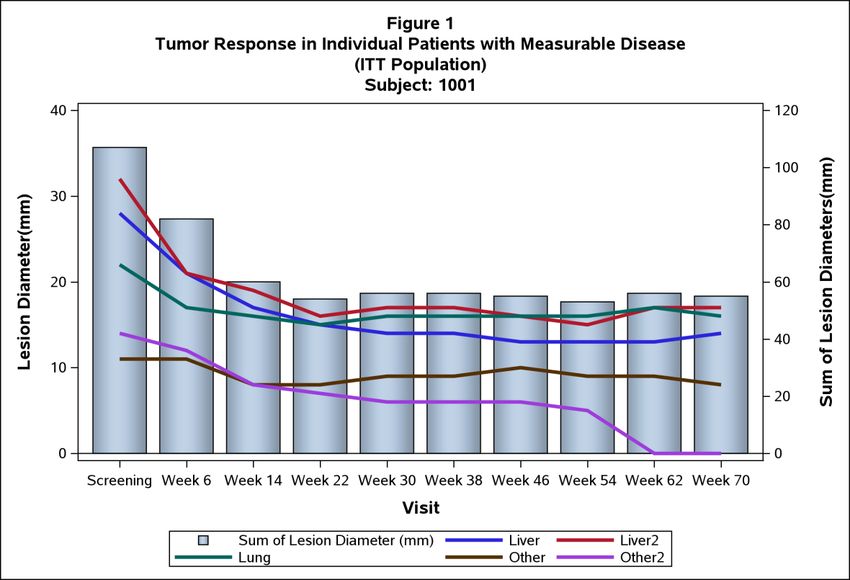
In the below example (Figure 1), a bar graph is used to display the change in sum of lesion diameter and lesion
diameter results over time, for a single subject. For more than one subjects it can be generated by creating a macro.
This can be easily generated by using GTL procedure. Below is the snippet of dataset used in GTL procedure. The
graph also displays a secondary y axis that represents the Sum of Lesion diameter for the subject.
.
Table 1: Snippet of data set used for Bar Graph
1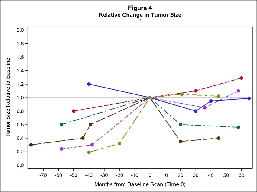
PhUSE US Connect 2018

Code for Figure 1

Proc Template;
     Define statgraph bar;
     dynamic xvar yvar _group patientid;
     Begingraph;
         Entrytitle "Figure 1";
           Entrytitle "Tumor Response in Individual Patients with Measurable Disease";
            Entrytitle "(ITT Population)";
             Entrytitle "Subject: " "1001";
             Layout overlay/ yaxisopts=(label="Lesion Diameter(mm)"
               labelattrs=(weight=bold size=11) linearopts=( viewmin=0.0
               thresholdmin=1 thresholdmax=1))
              y2axisopts=(label="Sum of Lesion Diameters(mm)"
                labelattrs=(weight=bold size=11) linearopts=( thresholdmin =1
                thresholdmax =1))
             xaxisopts=(label="Visit" labelattrs=(weight=bold size=11)) ;
              barchart x=visit y=SUMLD/yaxis = y2 skin=modern name="ser" barwidth=0.8;
              seriesplot x= visit y=trstresn/ group=tuloc name="series"
              lunettes=(pattern = solid thickness = 3 );
           discretelegend "ser" "series";
           Endlayout;
     Endgraph;
     End;
Run;

Proc Sgrender data=bar template=bar;
Run;

Figure 1: Bar Graph displays Lesion Diameter for Measurable Disease

                                                   2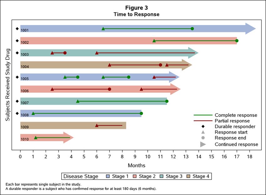
PhUSE US Connect 2018

WATERFALL PLOT
Waterfall plot is a very common and widely used plot in Oncology trials. The idea of a waterfall plot is to show the
individual patient’s response to the therapy or drug. It shows the maximum percentage change in tumor
measurement after therapy. A waterfall plot looks like an ordered bar, where each vertical bar represents an
individual patient or subject’s response and that can be further sub grouped by colors or symbols for easy
visualization. Individual patient response is sorted in descending order from left to right for easy interpretation of the
maximum percentage change in tumor measurement or response. Tumor response can be easily interpreted as
shrinkage if it is below the baseline (negative) and tumor progression if it is above the baseline (positive). The length
of these vertical bars is proportional to the percentage change in tumor response. In this plot (Figure 2), we could
add the different colors for each response (e.g., complete response, stable disease, partial response, progressive
disease etc.) to get more clarity about the responses. The general convention is to represent each subject on the
horizontal axis.
The optimal percentage of change in the sum of target lesion dimensions is calculated and sorted by decreasing
values of percent change. Below is the snippet of dataset, used for waterfall plot.

Table 2: Snippet of dataset used for Waterfall Plot

Code for Figure 2

Title1 'Figure 2' ;
Title2 'Tumor Response in Patients with Measurable Disease';
Title3 '(ITT Population)-Waterfall Plot';

Proc Sgplot data=Tumor nowall noborder;
     Vbarparm category=patientid response=change / group=label
     Datalabelattrs=(size=5 weight=bold) groupdisplay=cluster clusterwidth=1;
     Refline 20 -30 / lineattrs=(pattern=shortdash);
     Xaxis label= "Patient ID";
     Yaxis values=(60 to -100 by -20) label= "% Change from Baseline in Sum of
     Diameters";
     Keylegend / title='' location=inside position=topright across=1 border;
Run;

                                                            3
PhUSE US Connect 2018
Figure 2: Waterfall Plot displays Individual patient tumor response
Maximum progression in tumor
Maximum shrinkage in tumor
SWIMMER PLOT
A swimmer plot is a very effective and powerful visual tool to display the multiple pieces of information of an
individual patient in a single plot. In general, it tells “a story” of study drug effect(s) on tumor response for the
individual patient.
In this example a swimmer plot shows different pieces of information about the individual patient’s tumor response
which are on X-axis, e.g., 1) duration of response (0 to 18 months), 2) when response started and ended, or
responses are still ongoing, 3) whether these responses are complete or partial and 4) what is the disease stage at
baseline. The Y-axis displays the individual subjects that received the study drug. Swimmer plot is sorted by the
individual patient’s response duration in ascending. A longer duration of treatment would suggest the better
tolerability and treatment outcomes. Different type of symbols and colors are used to depict the individual patient’s
response to study drug. Swimmer plot is more effective to visualize small number of patient’s tumor response with
duration, but it becomes cluttered and uninformative if too many variables are included. It shows a clear graphical
display of duration of individual response and shows which patient continues to benefit from the treatment.
4PhUSE US Connect 2018
Table 3.1 Snippet of data set used for Swimmer Plot
Table 3.2. Snippet of annotation data set used in Swimmer Plot
Code for Figure 3
Title1 'Figure 3';
Title2 'Time to Response';
Footnote1 J=l h=0.8 'Each bar represents single subject in the study.';
Footnote2 J=l h=0.8 'A durable responder is a subject who has confirmed response for
at least 180 days (6 months).';
Proc Sgplot data= swimmer dattrmap=attrmap nocycleattrs;
Highlow y=patientid low=low high=high / highcap=highcap type=bar group=stage fill
nooutline
Lineattrs=(color=black) name='stage' barwidth=1 nomissinggroup transparency=0.3;
Highlow y=patientid low=startline high=endline / group=status
lineattrs=(thickness=2 pattern=solid) name='status' nomissinggroup attrid=status;
Scatter y=patientid x=start / markerattrs=(symbol=trianglefilled size=8
color=darkgray) name='s' legendlabel='Response start';
Scatter y=patientid x=end / markerattrs=(symbol=circlefilled size=8
color=darkgray) name='e' legendlabel='Response end';
Scatter y=ymin x=low / markerattrs=(symbol=trianglerightfilled size=14
color=darkgray) name='x' legendlabel='Continued response ';
Scatter y=patientid x=durable / markerattrs=(symbol=diamondfilled size=6
color=black) name='d' legendlabel='Durable responder';
Scatter y=patientid x=start / markerattrs=(symbol=trianglefilled size=8)
group=status attrid=status;
Scatter y=patientid x=end / markerattrs=(symbol=circlefilled size=8)
group=status attrid=status;
Scatter y=patientid x=low /DataLabel=patientid DataLabelattrs=(Color=black)
markerattrs=(size=0);
Xaxis label='Months' values=(0 to 20 by 1) valueshint;
Yaxis reverse display=(noticks novalues noline)label='Subjects Received Study
Drug' min=1;
Keylegend 'stage' / title='Disease Stage';
Keylegend 'status' 'd' 's' 'e' 'x' /noborderlocation=inside position=bottomright;
Run;
5PhUSE US Connect 2018
Figure 3: Swimmer Plot displays Time to response.
SPIDER PLOT
A spider plot is yet another way to visualize the changes in tumor response of individual patients over time. Basically,
the spider plot is a series plot but when the data represented generates a pattern of these series, it plots like legs of
spider. In Figure 4, each leg of the spider represents a unique patient and horizontal reference line at 1 on Y axis
shows the baseline relative value. In spider plot, pre-treatment (negative values on X axis) and post-treatment
(positive values on X axis) tumor responses can be easily compared to baseline (0) for individual patient level, and
thus the data plotted in percentage change from baseline over the period for the individual patient evaluation. We
can add additional information by exploring the line color and line style. Though, there could be missing information
in spider plot if a patient is dead early in the trial. Therefore, the spider plot is good to show the qualitative
assessment of individual patient tumor response. These plots are less interpretable if larger number of patients are
displayed because it will be difficult to follow the individual lines, especially when they overlapped and crossed with
each other.
This plot will help to avoid the scenario of values getting missed out in the display. The usefulness of this graph
stems from the fact that it tells a story of what happens to each of these tumors over time, while the waterfall plot
focuses on the best response measure only.
Table 4: Snippet of dataset used for Spider Plot
6PhUSE US Connect 2018
Code for Figure 4
Title1 "Figure 4";
Title2 "Relative Change in Tumor Size";
Proc Sgplot data=tumor noautolegend;
Series x=dur y=size / lineattrs=(thickness=2)
group=patientid markers markerattrs=(symbol=circlefilled size=8);
Refline 1.0;
Yaxis label="Tumor Size Relative to Baseline" values= (0 to 2 by .20);
Xaxis label="Months from Baseline Scan (Time 0)" values=(-100 to 100 by 10)
valueshint;
Run;
Figure 4: Spider Plot displays relative change in tumor size
Baseline relative value
Baseline
KAPLAN-MEIER PLOT
Mostly, phase III Oncology trials are often done to detect a progression-free survival or overall survival endpoint.
Kaplan-Meier (KM) plot remains one of the best visualization tools for survival analysis data in oncology trials. This
plot was introduced by Edward L. Kaplan and Paul Meier in 1958.In oncology trials, the effect of a study drug is often
assessed by measuring the number of patients who survived or those free of progression/ disease after the therapy
or treatment over a period. It allows the comparison of survival outcomes (eg; alive/dead, free of disease/relapsed) in
different groups over time. To generate the KM plot, first step is to calculate the KM estimates with the help of Proc
Liftest procedure which needs the three key elements, namely, 1) serial time, 2) status of serial time (0=censored,
1=event) and 3) treatment group (1=group 1, 2=group2 etc.). Second step is graphing the outputted data with SAS
GRAPH procedures and options.
In this example, the KM plot is generated by using ODS template with GTL graph template. This plot shows the
survival rate by time in months for two treatment groups. The summary statistics can be displayed within the graph.
Below is the snippet of survival dataset.
7PhUSE US Connect 2018
Table 5: Snippet of data set used for Kaplan-Meier Plot
Code for Figure 5
Proc Template;
Define statgraph SurvivalPlot;
Begingraph / designwidth=8in designheight=5in;
Entrytitle 'Figure 5'/ textattrs=(size=8);
Entrytitle 'Kaplan-Meir Curves for Duration of Progression-free Survival
(PFS)'/ textattrs=(size=8);
Entrytitle 'ITT Population' / textattrs=(size=8);
Layout lattice / rowweights=(0.75 .05 .08);
Layout overlay /
Xaxisopts=(Label="Duration of Progression-free Survival (Months)"
type=linear offset min= .05 offsetmax= .05 labelattrs=(size=8pt
weight=bold) tickvalueattrs=(size=7pt weight=bold)
linearopts=(viewmin=0 viewmax=70 tickvaluelist=(0 7 14 21 28 35 42 49 56
63 70)))
yaxisopts=(Label="Progression-free Survival (%)" linearopts=(viewmin=0
viewmax=100)
labelattrs=(size=8pt weight=bold) tickvalueattrs=(size=7pt weight=bold)
linearopts=(viewmin=0 viewmax=100 tickvaluelist=( 0 10 20 30 40 50 60
70 80 90 100)));
Stepplot x=time y=survival / group=stratum name='s';
Scatterplot x=time y=censored / GROUP=stratum name='c'
markerattrs=(symbol=squarefilled size=5); referenceline y=50/
Lineattrs=(pattern=shortdash);
Mergedlegend "c" "s" / location=inside halign=right valign=top
order=columnmajor down=2 border=false valueattrs=(size=8pt)
Pad=(top=5 bottom=5);
Endlayout;
Layout overlay;
Entry halign=left 'Number of subjects at Risk' /pad=(left=0 )
Valign=bottom textattrs=(size=8pt);
Endlayout;
Blockplot x=tatrisk block=atrisk / class=stratum display=(values label)
Valuehalign=start valueattrs=(size=8) labelattrs=(size=8);
Endlayout;
Endgraph;
End;
Run;
Proc Sgrender data=survival template=Survivalplot;
Run;
8PhUSE US Connect 2018
Figure 5: Kaplan-Meier Plot displays Progression-free Survival
Median survival for TRT A Median survival for TRT B
FOREST PLOT
A forest plot is designed to illustrate the relative treatment effect of a study drug or therapy by providing a visual
representation of the amount of variation between the groups. Traditionally, forest plots have been used in Meta-
analysis to show the variability across studies. Forest plots are useful in considering the behaviors of subgroups in
larger dataset. For example, the benefit of treatment may be small for in large sample but separating out and
analyzing the effect of treatment in different subgroups may sometimes identify those who may benefit more.
In figure 6, for each subgroup are displayed on y axis and for each subgroup there is a square box which depicts the
hazard ratio and horizontal line represents the 95% confidence interval of hazard ratio. A vertical line at 1, on x axis
represents the null hypothesis. The direction of the effect of treatment depends on which side of central line the
central point lies. Inserting the table of results in graph gives it more effective and quick interpretation of results. The
overall summary of effect of treatment is represented by the diamond symbol.
Table 6: Snippet of data set used for Forest Plot
9PhUSE US Connect 2018
Code for Figure 6
Proc Template;
Define statgraph Forestplot;
Dynamic _bandcolor _headercolor _subgroupcolor;
Begingraph;
Entrytitle 'Figure 5'/ textattrs=(size=8);
Entrytitle 'Forest Plot for Duration of Radiographic Progression-free
Survival (rPFS)-Subgroup Analysis'/ textattrs=(size=8);
Entrytitle 'ITT Population'/ textattrs=(size=8);
Entrytitle '';
Layout lattice / columns=5 columnweights=(0.3 0.1 0.1 0.325 0.175);
Sidebar / align=top;
Layout lattice / rows=2 columns=4 columnweights=(0.23 0.1 0.35 0.15)
Backgroundcolor=_headercolor opaque=true;
Entry textattrs=(size=8 weight=bold) halign=left "Subgroup";
Entry textattrs=(size=8 weight=bold) halign=left "Treatment A";
Entry textattrs=(size=8 weight=bold) halign=left "Treatment B";
Entry textattrs=(size=8 weight=bold) halign=left "Hazard Ratio 95% CI";
Entry textattrs=(size=8 weight=bold) halign=left "";
Entry textattrs=(size=8 weight=bold) halign=left "N (Events)";
Entry textattrs=(size=8 weight=bold) halign=left "N (Events)";
Endlayout;
Endsidebar;
Layout overlay / walldisplay=none
Xxaxisopts=(display=none linearopts=(viewmin=0 viewmax=20))
Yaxisopts=(reverse=true display=none tickvalueattrs=(weight=bold));
Referenceline y=ref / lineattrs=(thickness=15 color=_bandcolor);
Highlowplot y=obsid low=zero high=zero / highlabel=heading
lineattrs=(thickness=0) labelattrs=(size=8 weight=bold);
Highlowplot y=obsid low=zero high=one / highlabel=subgroup
Lineattrs=(thickness=0) labelattrs=(size=8 );
Endlayout;
Layout overlay / xaxisopts=(display=none)
Yaxisopts=(reverse=true display=none) walldisplay=none;
Referenceline y=ref / lineattrs=(thickness=15 color=_bandcolor);
Scatterplot y=obsid x=zero / markercharacter=trta
Markercharacterattrs=graphvaluetext markercharacterattrs=(size=7.5);
Endlayout;
Layout overlay / xaxisopts=(display=none)
Yaxisopts=(reverse=true display=none) walldisplay=none;
Referenceline y=ref / lineattrs=(thickness=15 color=_bandcolor);
Scatterplot y=obsid x=zero / markercharacter=trtb
markercharacterattrs=graphvaluetext markercharacterattrs=(size=7.5);
Endlayout;
Layout overlay /xaxisopts=(labelattrs=(size=8pt) label='Treatment A Treatment B'
linearopts=(tickvaluepriority=true tickvaluelist=(0.0 0.5 1.0 1.5 2.0 2.5)))
Yaxisopts=(reverse=true display=none) walldisplay=none;
Referenceline y=ref / lineattrs=(thickness=15 color=_bandcolor);
Scatterplot y=obsid x=mean / xerrorlower=low xerrorupper=high
Markerattrs=(symbol=squarefilled size=8);
Scatterplot y=obsid x=dia / xerrorlower=low xerrorupper=high
Markerattrs=(symbol=diamondfilled size=9);
Referenceline x=1 ;
Referenceline x=0.5 / lineattrs=(pattern=shortdash);
Referenceline x=1.5 / lineattrs=(pattern=shortdash);
Referenceline x=0.5 / lineattrs=(pattern=shortdash);
Referenceline x=1.5 / lineattrs=(pattern=shortdash);
Endlayout;
10PhUSE US Connect 2018
Layout overlay / x2axisopts=(display=(tickvalues) offsetmin=0.25 offsetmax=0.25)
Yaxisopts= (reverse=true display=none) walldisplay=none;
Referenceline y=ref / lineattrs= (thickness=15 color=_bandcolor);
InnerMargin / align=right;
AxisTable y=obsId value=ci / display=(values);
EndInnerMargin;
Endlayout;
Endlayout;
Endgraph;
End;
Run;
Proc Sgrender data=Forest template=Forestplot;
dynamic _bandcolor='cxf0f0f0' _headercolor='cxd0d0d0';
Run;
Figure 6: Forest Plot displays the results of subgroup analysis
11PhUSE US Connect 2018
Comparison between different types of graphs
Types of Graph Pros Cons
Bar graph Easy to generate and interpret the Takes more space as compare to
results other plots
Waterfall plot Summaries the best overall response Only shows one
in the individual patient response/measurement in time and
tumor response which may not
show the actual patient benefit in
terms of overall survival or
progression free survival
Swimmer plot Shows tumor response and time Become uninformative if the more
duration of response subjects are included
Spider plot Shows the tumor response across all Difficult to interpret if too many
time rather than specified time subjects are included and does not
allow for formal statistical inference
Kaplan Meier plot Shows the estimation of survival and It’s a univariate analysis, which
comparison between groups does not include the other effects
on drug
Forest plot Determine the effects of Could give the false interpretation if
groups/subgroups on drugs and also there are small number of
displays the efficacy results with datapoints with in sub groups
inserted table
CONCLUSION
This paper has highlighted some of the plots that have emerged as useful tools to enhance the data visualization
and interpretation of complex patients’ outcome/results in oncology trials. Despite the complexity of oncology data,
the conventional (eg; Kaplan-Meier plot) and novel (eg; spider and swimmer plot) representation of data
visualization, along with some customization can tell a complete story of the oncology end points, such as overall
survival (OS), progression free survival (PFS), objective response rate (ORR), percentage change in tumor size etc.
SAS graphical procedures (SG Procedures/GTL) and SAS/GRAPH Annotate facility provide the flexibility to
programmers to generate these customized graphs.
REFERENCES
• Past PharmaSUG Conference Proceedings. Available at http://w ww.pharmasug.org/proceedings.html.
• https://www.ncbi.nlm.nih.gov/pmc/articles/PMC5017943/
• http://support.sas.com/resources/papers/proceedings16/7520-2016.pdf
• Matange, Sanjay. “Clinical Graphs using ODS Graphics.”
CONTACT INFORMATION
Your comments and questions are valued and encouraged. Contact the author at:
Name: Manoj Pandey
Company: Ephicacy Lifescience Analytics Pvt. Ltd., India
Address: 2nd Main Rd, Sarvobhogam Nagar, Arekere
City / Postcode: Bangalore, Karnataka 560076
E-mail: manoj.pandey@ephicacy.in
Web: http://www.ephicacy.com/
Brand and product names are trademarks of their respective companies.
12You can also read