User Experience Case Study January 2020 - Carly Addison
←
→
Page content transcription
If your browser does not render page correctly, please read the page content below
User Experience Case Study ∙ January 2020
Overview
 Brideside is a bridal eCommerce company based in Chicago with in-person boutiques in four
 cities across the country. Most brides come to the site to either start searching for bridesmaids
 dresses (usually by color or price) or to book an in-person appointment.

 The Request Why? My Role UX Methods Used
 Brideside came to They felt is was outdated, clunky UX Researcher Heat Map Study
me and told me they and not as many users were UX/UI Designer Recorded Session Study
wanted research and purchasing directly from the site as Heuristic Evaluation
 a re-design of their they hope (rather than placing Competitive Analysis
 product-specific directly with consultant).
 Discussion Guide
 page.
 User Interviews
 Many users were using the Chat
 feature for help while browsing. User Interview Report
 Upon discussing with CS team, Usability Testing
 they said it was often around sizing, Wireframing
 length and color of the dress. Prototyping
 High-Fidelity Mockups
PHASE 1

User Research /
Research methods used.

 1. Study Heat Map 2. Heuristic Evaluation 3. User Interviews
 and Recorded Sessions Implement tried-and-tested Essential for understanding WHY
 I was able to watch users go best practices. users had frustrations or
 through the sign up process and encountered road blocks. Crucial to
 where they slowed down in the understanding their motivations
 process. and goals for signing up in the first
 place.

4. Usability Testing on Current 5. Competitive Analysis 6. Stakeholder Interviews
 Website and Re-design (During Ideation) Helped me gain clarity around
 Helped me identify and visualize Helped me understand length of dresses and delivery
 where users encounter pain points conversion rate, or lack there dates.
 or road blocks in completing their of, and how long users spend
 original goal. on certain pages.
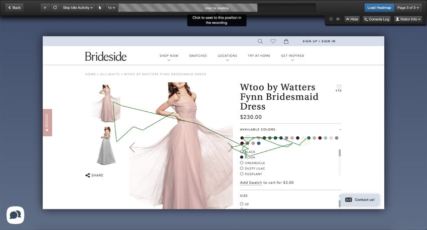
Heat Map and Recorded Sessions
 INSIGHTS
 1. Users were spending a long time
 looking through the colors. Many of
 them paused or hovered around the
 thumbnail images when the colors
 didn't match up (left).
 2. A common trend was users scrolling
 through the sizes, clicking the size
 chart, closing and going to reviews.
 Rarely were they quick to select a
 size.
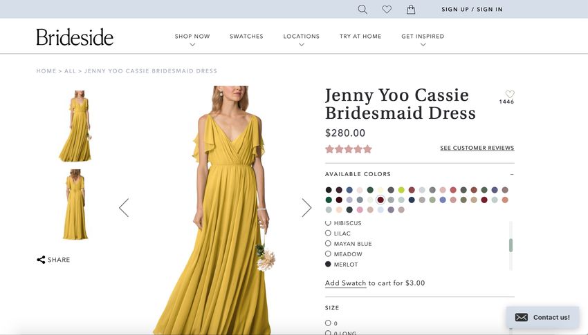
UX Best Practices / Brief Heuristic Evaluation

 INSIGHTS
 1. Image not accurately displaying the
 selected color.
 2. This dress comes in 44 colors. The color
 thumbnails are too small to get an idea
 4
 of the color and the list is a long scroll.
 Users should be able to find their
 preferred color quickly.
 3. So there is a Fit rating, but what is the
 criteria? Does middle mean it’s perfect
 fit or 3/5 points?
 4. To really show off the product, a
 2 product page should have several
 1 images taken from multiple angles, to
 give customers some perspective of the
 5
 size, color and shape.
 5. Remember the business and user goal
 for visiting this page: ideally to
 purchase. The ‘Add [dress] to Cart’ CTA
 2 is not above the fold. Note: in my re-design,
 my CTA is below the fold (after size and color), but
 now above fit and description.
User Interviews Hardest thing was looking at the colors because colors
 online are skewed versus real life.
NUMBER OF USERS INTERVIEWED

I interviewed 12 female Brideside customers.
 My main factors in deciding on a dress were price and
AGE
 then color. I wanted to be considerate of my girls’
The users interviewed ranged from 25 to 37
years of age, with the average age being 29. budgets.

GEOGRAPHICAL LOCATION

New York City (5), Chicago (3), San Francisco Comparing similar colors between designers: one has a
(1), Scottsdale (1), Charlotte (1), Atlanta (1)
 true blush, but another has a different blush. Description
 of the color would have been helpful.
DISCUSSION GUIDE
1. What was your goal when you originally
 visited the Brideside site for the first
 time? When trying on bridal dresses, it’s upsetting or alarming
2. What factors did you take into to find out your dress size is larger than your street size.”
 consideration when choosing your dress
 or bridesmaid dresses?
3. If you did purchase a dress through
 Brideside, what was your experience
 around sizing and fit?
Usability Testing on Current Website

TASKS
1. Add 3 swatches in a gray color palette to your cart.
2. Choose a dress that you like and then figure out what size
 you would order.
3. How would you know whether to order a Regular or a Long
 in that dress?
4. How would you find plus-size dresses?
5. How would you rush an order, if need be?
6. What is the expected delivery date of that dress? Do you
 have any questions around this delivery date?
7. Select your favorite color of that dress.
Score MEDIUM ISSUE
Figuring out what size you would be in a
certain dress.

USABILITY FINDINGS
3/6 users confidently told me what size they would order.
 • 2/6 users recognized their sizes will vary designer to designer.
 • 2/6 users expressed concern or disappointment that bridal sizing is
 smaller than streetwear.
 • 4/6 users said they would be between two sizes.
 • 6/6 used the size chart.
 • 2/6 users wish the size chart directed them to the Fit Section.
 • 5/6 users found reviews to be helpful but found Overall Fit to be
 confusing and wished there were other sections like Quality of Material
 and weight.

ANALYSIS
Lots of hesitation around sizing. Many wish there was some sort of
disclaimer about going up a size and getting alterations.

RECOMMENDATIONS
• Make note of the Fit section within the size chart to direct the user
• Add more categories to the review section to they can compare women
 with similar measurements
• Create a Bridal-wear Disclaimer section
 • Wedding-wear typically requires alterations.
 • Every designer uses a different size chart based on their own patterns.
 • Wedding-wear typically runs smaller than every-day dress sizes. It is
 common to go up a size or two.

When trying on bridal dresses, it’s upsetting or alarming to find
out your dress size is larger than your street size.”
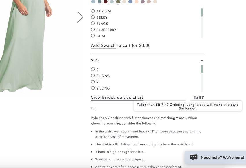
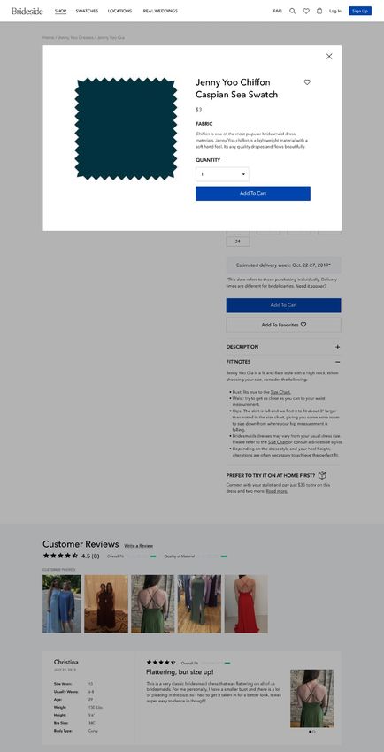
Score MINOR ISSUE
Choosing a color.

USABILITY FINDINGS
4/4 users were able to tell me which color they preferred best.
 • 3/4 users mentioned how small the color thumbnails are.
 • 2/4 users noticed that the selected color wasn't reflected correctly in
 the picture.
 • 2/4 users wish they could have favorited a color swatch so they could
 compare them later on.
 • 1/4 users said a description of the color would have been helpful
 since a lot of them are similar.

ANALYSIS
Ultimately all users were able to select a favorite color, but had some
difficulty.

RECOMMENDATIONS
• Make thumbnails larger
• Re-design list of colors as a dropdown rather than scroll.
• Ensure the colors are correctly rejected.
• Add a "View Swatch / Favorite Swatch” feature.

 I click on the color Cloud but it's still stuck on Seaglass.”
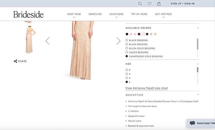
Score MINOR ISSUE
Deciding if you would be a Regular or a Long.

USABILITY FINDINGS
4/6 users were able to determine if they were Tall or Regular.
 • 5/6 users found the Tall? hover section.
 • 3/6 users were unsure if they should account for heels or not
 • 2/6 users were unsure if 5’7” should order a Regular or a Tall
 • 1/6 users were unsure if this was specific to Jenny Yoo dress or for all
 dresses

ANALYSIS
Most users assumed if they are 5’7” or shorter would order a Regular but it
isn’t very clear.

RECOMMENDATIONS
• Make the Tall description stand out more, visually.
• Make the copy extremely clear. What differentiates a Tall from a Regular?
• Incorporate “in the shoes you will wear” into the verbiage.
• Make sure to update length information for each Designer

I don’t feel like I’m tall but it depends on the
shoe if I would need to get a tall.”
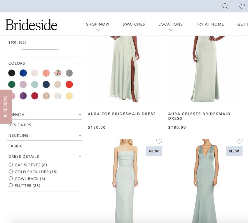
Score MAJOR ISSUE
How would you find plus-size dresses?

USABILITY FINDINGS
0/3 users could easily find plus size dresses.

• 1/3 looked for a section under Collection that says Plus Size
• 1/3 expected to see something like “Extended Sizes” under Shop Now
• 3/3 had to go into the actual dress detail page to see if the dress comes in size 14 or
 higher

ANALYSIS
There is no filtering system for finding plus size dresses. A user has to go into each
individual dress and look at the size chart measurements. This is not supportive to our
entire user population.

RECOMMENDATIONS
• Under Shop all dresses, create a filter called Extended Sizes or Additional Sizing and
 include:
 • Plus size, maternity and long
• Specify what constitutes “Plus size”. Is it size 14 and over?

Finding a dress that accommodates everyone is a
big deal.”
PHASE 2

Insights and Themes 1
Key Insights and Themes

 1. Plus-size women have 2. Users aren't getting 3. There is confusion
no way of filtering dresses enough information to around choosing dress
 to suit them. decide on a dress size. length.

 4. There is uncertainty and 5. Color is not accurately
 surprise around bridal sizing represented and the
 versus regular clothing. thumbnails are too small.
Understanding the Problem

 Through my research, it became apparent that a high rate of users are not adding a dress to
 their cart because they are left with a lot of questions around color and sizing.

How might I design a product page that helps answer questions users have around sizing and
 color of the dress they are viewing, so that they feel more confident placing into their cart?
PHASE 3

Feature Ideation and Design 8
Feature Brainstorming

 Plus-size women Choosing dress Choosing dress Confusion around Color depiction
 size length bridal sizing
 Show plus-size models More product images

If price difference, make
 Offer users to purchase
 a measuring tape
 ✨Differentiate between
 Tall and Regular
 Explanation of why
 bridal sizing runs small
 from different angles

 transparent Dress modeled on
 different skin tones
Specify what constitutes ✨ Add additional
 categories to the
 If price difference, make
 transparent
 ✨
 Explain that alterations
 ✨ are often necessary
 “Plus size” Reviews Make color icons larger ✨
 Have cutoff points such Enter event date and

 ✨
Under Shop all dresses, Make note of the Fit as “If over 5’9” order a give suggested date to Color correctly reflected
 create a filter called section within the size Long” get alterations by on model
✨Extended Sizes and
 include Plus size,
 chart to direct the user
 Incorporate the shoes Make it clear that each Give each color name an
 Maternity and Long Fit predictor tool user will be wearing Designer has a different description
 size chart
 List what size the model Add a "View Swatch /
 is wearing Bridal Q&A Favorite Swatch”
 ✨ feature
What are the competitors doing?

 Disclaimers around
Plus-size filter? Categories in Reviews Tall vs. Regular Length Selecting a Color
 Alterations

 Measurements, bust No dropdown, but
 size, fit with criteria, Option to add extra
 Yes Yes option to Shop
 review, size ordered length
 more in this color

 Height, weight,
 measurements, bust Reflected correctly,
 Yes size, fit, review, size No No multiple model
 ordered, color images
 ordered

 Overall fit with
 criteria, wedding
 Thumbnail nice
 location, theme,
 Yes No No size, nice drop
 season, # guests, age
 down list
 range, event type,
 body type

 Reflected correctly,
 Body Type, Event,
 nice drop down list,
 Yes Height, Product Fit, No No
 multiple model
 Rating
 images
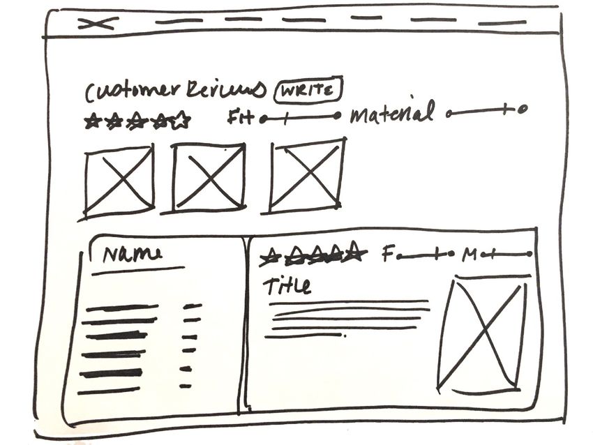
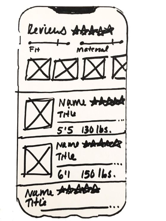
Low-fidelity Wireframes to High-fidelity

Low-Fidelity sketches of the Review feature High-Fidelity Mockup of the Review feature
INSIGHT TO DESIGN DECISIONS
 8
1. Ensure that color is represented 1
 7
 correctly. Also provide more
 than two angles of the dress.
2. Provide clarity between Long
 and Regular dress.
3. Avoid confusion by
 incorporating "in the shoes you 3

 intend to wear.” 5

4. Add new review categories to
 users can make a more
 educated decision on their size.
5. Move goal-oriented CTA as close
 to the top as possible.
 2
6. Under Fit notes, add verbiage 6

 about alterations.
7. Add a color swatch feature
 without product page that
 allows user to see color larger
 and allows them to read about
 material and Add to Favorites.
8. Usability best practice: to
 ensure user can find a color
 quickly, increase thumbnail size
 and create a color dropdown.
 4
PHASE 4

Build and Test ;
Usability Testing on Re-Design
INSIGHT TO DESIGN DECISIONS
1. “I'm confused what the delivery date means. It says 'for individuals’”.
2. “Would be nice if colors had a reference point, like “Sapphire / Navy".
3. “I like that I can view the swatch up close before ordering”.
4. "My dress is a 20 and I normally wear a 10. I'm not surprised by this
 because I've been in so many weddings, but if people don't know
 that bridal sizing is different, would be helpful to include”.
Next Steps <
Next Steps

 1. Document 2. Iterate based 3. Another round 4. Pass off to 5. Start
 usability testing on on insights from of usability developers implementing
re-designed features usability test testing second tier features
 such as additional
 model photos
You can also read