Visual Prominence as Perceived in Photographs and In-Situ - gis.Point
←
→
Page content transcription
If your browser does not render page correctly, please read the page content below
286                                                                                             Full Paper

Visual Prominence as Perceived in Photographs
and In-Situ
James Palmer1, Robert Sullivan2
1Scenic   Quality Consultants, Burlington, VT/USA ꞏ palmer.jf@gmail.com
2Argonne   National Laboratory, Lemont, IL/USA

Abstract: Current visual simulation guidelines for major developments in the UK recommend using
base photographs taken with a 75 mm effective focal length (EFL). This recommendation is made in
spite of the geometric laws of perspective. Nonetheless, there is some research comparing photographs
to in-situ views supporting this guideline, though these studies do not attempt to explain why this en-
largement is necessary. This paper compares the visual prominence of in-situ observations to judgement
made viewing photosimulations and as-built photographs with 50 mm and 75 mm EFLs.
Keywords: Simulation, visual impact assessment, landscape perception

1      Introduction
In public hearings considering whether to permit proposed wind energy development, it is
common to hear condemnations of the visual simulations as not accurately representing how
the project will look. To address this problem THE HIGHLAND COUNCIL (2016) proposed re-
placing the standard of a 50 mm lens on a full-frame digital camera (as per Highland Council
guidance in 2009) with a 75 mm effective focal length (EFL) for the preparation of photo-
graphic-based visualizations of wind energy development. The Council’s current standards
were issued in 2016 and include the following statements:
      “These Standards were informed by extensive research and field-testing by officers
      and responded to growing demands for visual formats that were more representa-
      tive, could be clearly and easily understood, were accessible to all parties and could
      be relied upon by planning officers, committee members and the public […].” (THE
      HIGHLAND COUNCIL 2016)
      “Changes and modifications are intended to clarify and improve the standards and
      are as follows: … Images for visual impact assessment have been standardised to a
      focal length of 75 mm for both on-shore and off-shore wind farms.” (THE HIGHLAND
      COUNCIL 2016)
The documented empirical evidence supporting a standard that changes from a 50 mm to a
75 mm EFL is based on a study by HUNTER & LIVINGSTONE (2012). That study surveyed
more than 300 participants at nine landscape viewpoints and asked them which of seven pho-
tographs taken with EFLs from 50 mm to 110 mm in 10 mm increments “provided the most
realistic representation of the scale and distance to a specific focal point” (HUNTER & LIV-
INGSTONE 2012, 2). The survey results indicated that participants thought an EFL between
70 mm and 80 mm provided the most realistic representation. Based on the survey results,
the authors recommended using a 75 mm EFL for wind energy project simulations. In addi-
tion, the study also recommended that images be printed on A3 paper and held at a “comfort-
able” (HUNTER & LIVINGSTONE 2012, 24).viewing distance, though the study did not inves-
tigate viewing distance and did not specify a particular distance or range of distances as

Journal of Digital Landscape Architecture, 5-2020, pp. 286-294. © Wichmann Verlag, VDE VERLAG GMBH ꞏ
Berlin ꞏ Offenbach. ISBN 978-3-87907-690-1, ISSN 2367-4253, e-ISSN 2511-624X, doi:10.14627/537690030.
This article is an open access article distributed under the terms and conditions of the Creative Commons
Attribution license (http://creativecommons.org/licenses/by-nd/4.0/).
J. Palmer, R. Sullivan: Visual Prominence as Perceived in Photographs and In-Situ 287 “comfortable” (ibid.). It also should be noted that these were ordinary countryside views, and they did not include wind turbines or other development normally associated with visual im- pacts. A contemporaneous book by MACDONALD (2012), a photographer and architect, made the same recommendation that base photographs for single-frame visual simulations use a 75 mm EFL, which has subsequently been adopted by SCOTTISH NATURAL HERITAGE (2017) and more recently by the LANDSCAPE INSTITUTE (2019) for representing wind farms. Oddly, the LANDSCAPE INSTITUTE (2019) recognizes that a 50 mm EFL image printed at a size of 260 mm × 390 mm on A3 paper and held at 542 mm is “mathematically correct” (14), but states that when such an image is “held at comfortable arm’s length, the scale of the viewed image is smaller than reality” (ibid.). PALMER et al. (2017) were unable to replicate HUNTER & LIVINGSTONE’S finding using sim- ilar landscape views. Their result indicated that the optimal EFL was slightly longer than 50 mm. In a second study, PALMER (2019) found that students held a simulation of off-shore wind energy development printed on a tabloid (approximately A3) sheet at 460 mm, or closer than the “mathematically correct” correct 594 mm. In other words, the viewing geometry should have made the turbines appear larger, not “smaller than reality.” These results suggest that additional research is necessary to understand how best to represent visual change and its impacts to the public and decision makers. In a study comparing post-construction panoramic and single-frame photographs of an on- shore and offshore windfarm taken at 50 mm, 75 mm and 90mm EFLs, TAKACS & GOULDEN (2019) obtained results similar to HUNTER & LIVINGSTONE (2012), i. e., 75 mm EFL photos were judged to best portray the wind farms. However, other studies have found the geome- tries of visual and pictorial space to be similar (ERKELENS 2018), and that a view is best represented by a photo taken with a 50 mm EFL lens printed to fill an A3 sheet of paper held at the appropriate viewing distance (BANKS et al. 2014). In this paper we suggest a new direction for considering the conundrum of why photographic simulations are not representing the in-situ visual experience of proposed development accu- rately. Specifically, we consider in-situ ratings (from two viewpoints) of 18 transmission towers constituting the Dominion Power Surry-Skiffes Creek Whealton Transmission Line Project (SSCW). The 500 kV SSCW transmission line crosses the James River in Virginia, USA. The four tallest structures near the center of the crossing were clearly visible from both viewpoints. Two of these structures measured 297 ft (90.5 m) high, and two were 277 ft (84.4 m) high. The in-situ ratings are compared to ratings of the photographic simulations from the SSCW project’s visual impact assessment (VIA) (STANTEC 2014). The in-situ ratings were also compared to ratings of photographs taken of the as-built project during the in-situ field- work, both using EFLs of 50 mm and 75 mm. 2 Methods A team of seven visual resource and three natural resource professionals conducted fieldwork from July 23 to 25, 2019 in order to evaluate draft National Park Service (NPS) procedures to evaluate visual impacts. This evaluation involved observing and assessing the visual ef- fects of the SSCW project, including the visual prominence of the constructed project from eight viewpoints using the scale in Table 1, which is adapted from SULLIVAN et al. (2014).
288                                                Journal of Digital Landscape Architecture ꞏ 5-2020

Table 1: Visual prominence scale
 Level    Project Visibility
   0      Not Visible
   1      Visible only after extended, close viewing; otherwise not visible.
          Visible when scanning in general direction of study subject; otherwise likely to be missed
      2   by casual observer.
          Visible after brief glance in general direction of study subject and unlikely to be missed
      3   by casual observer.
          Plainly visible, could not be missed by casual observer, but does not strongly attract vis-
          ual attention, or dominate view because of apparent size, for views in general direction of
      4   study subject.
          Strongly attracts visual attention of views in general direction of study subject. Attention
      5   may be drawn by strong contrast in form, line, color, or texture, luminance, or motion
          Dominates view because study subject fills most of visual field for views in its general
          direction. Strong contrasts in form, line, color, texture, luminance, or motion may con-
      6   tribute to view dominance.

Two of the viewpoints evaluated in the field were selected for further evaluation: VP 09 is
from a roadside pull-out with interpretive signage on the Colonial Parkway, which is a Na-
tional Scenic Byway and All-American Road that is part of the Colonial National Historical
Park. VP15 is a view from the entrance to the main house at Carter’s Grove Plantation, which
is a National Historic Landmark and is listed on the National Register of Historic Places.
Both views are toward the four largest SSCW structures in the center of the river. The nearest
visible structure is 3.5 mi (5.6 km) from VP09 and 1.8 mi (2.9 km) from VP15, as shown in
Figure 1. An in-situ evaluation of these simulations determined that the scale of the structures
was depicted accurately, though there were various other minor errors. The photographs of
the as-built project taken during the fieldwork closely matched the viewpoints and views
simulated in the VIA.
The VIA simulations were prepared by Truescape USA, Inc., using a 50 mm EFL; the as-
built photos also used a 50 mm EFL. These images were cropped to a 75 mm EFL using a
template and methods described by SCOTTISH NATURAL HERITAGE (2017).
All four images were printed on tabloid (11 x 17 in; 279 × 432 mm) premium color copy
paper with a Xerox WorkCentre 7800 Series copier. A number identifying the condition for
each image was printed in the left margin.
Ten participants used the visual prominence scale to rate the 8 images (VIA simulations and
as-built photographs at two viewpoints with 50 mm and 75 mm EFL) at a workshop on Oc-
tober 27, 2019 during the Visual Resource Stewardship Conference. The workshop con-
cerned using intercept surveys as part of a VIA, and the rating occurred prior to a discussion
about the use and presentation of visual material during a survey. The eight images were
distributed in random order to the group, who passed them around until everyone had rated
all the images. Participants were told to view the images in a way that felt comfortable –
sometimes this was held up at arm’s length perpendicular to the line of sight, and other times
participants were seated and the images viewed obliquely on a table surface. This instruction
to view the images in a comfortable manner follows the recommendations of HUNTER &
LIVINGSTON (2012) and MACDONALD (2012).
J. Palmer, R. Sullivan: Visual Prominence as Perceived in Photographs and In-Situ 289
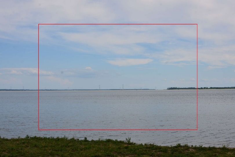
Fig. 1: 50 mm EFL lens photo of existing condition at VP15; red square shows
75 mm EFL
3 Results
The field team unanimously agreed that the in-situ ratings of visual prominence at both sites
was level 5 – Strongly attracts visual attention of views in general direction of study subject.
Attention may be drawn by strong contrast in form, line, color, or texture, luminance, or
motion. The mean visual prominence ratings based on the simulations and as-built photo-
graphs with 50 mm and 75 mm EFL are given in Table 2 and shown in Figure 2, which
includes 90 % confidence interval error bars for comparison to the in-situ rating. An inspec-
tion of these error bars indicates that the visual prominence ratings of the simulations and as-
built photographs with a 50 mm EFL are lower than observed in the field, but that with a
75 mm EFL they are similar or higher than what was observed in the field.
Table 2: Visual prominence ratings
VIA Simulation As-Built Photo
VP EFL Mean Std Dev n ±90% CI Mean Std Dev n ±90% CI
09 50 4.95 0.832 10 0.48 4.60 0.738 10 0.43
09 75 5.60 0.516 10 0.30 5.00 0.667 10 0.39
15 50 4.35 1.001 10 0.58 3.80 1.135 10 0.66
15 75 4.85 1.001 10 0.58 5.05 0.896 10 0.52
Note: Confidence intervals are calculated with two-tailed critical value of t, df = n – 1290 Journal of Digital Landscape Architecture ꞏ 5-2020
Fig. 2: Visual prominence ratings made in the field, of simulations and as-built photos using
a 50 mm and 75 mm EFL lens with 90 % confidence intervals
Properly speaking, the error bars cannot be used to compare simulations to as-built photos,
or 50 mm to 75 mm EFL because they are related images and not independent of each other
(CUMMING et al. 2007). However, paired t-tests can be used for such comparisons. Table 3
compares the visual prominence ratings of the simulations to the as-built photographs for
each EFL at each site. The results are mixed with two statistically significant results, but no
clear pattern.
Table 3: Difference in visual prominence between simulations and as-built photos by EFL
VP EFL t p
09 50 mm 1.172 0.271
09 75 mm 3.674 0.005
15 50 mm 2.538 0.032
15 75 mm -0.6124 0.555
Note: df = 9
Table 4 compares the visual prominence ratings of the 50 mm and 75 mm EFLs. In this case
it is clear that viewing simulations of photographs with a 75 mm EFL results in a statistically
significant higher visual prominence rating than viewing simulations of photographs with a
50 mm EFL.
Table 4: Difference in Visual Prominence between 50 mm and 75 mm EFL for Simulations
and Photos
VP Media t p
09 Simulation –2.751 0.022
09 As-built Photo –2.753 0.022
15 Simulation –1.861 0.096
15 As-built Photo –6228 0.000
Note: df = 9J. Palmer, R. Sullivan: Visual Prominence as Perceived in Photographs and In-Situ 291
4 Conclusions and Discussion
Though the sample sizes are small, there are clear trends from these results. First, the visual
prominence ratings made in-situ are higher than for the ratings of the simulations and as-built
photographs taken with the 50 mm EFL. However, with a 75 mm EFL this difference dimin-
ished to a level that is not statistically significant. While this finding is consistent with
HUNTER & LIVINGSTON (2012), they made no attempt to explain their findings. MACDONALD
(2012) accepts the relevance of perspective geometry to photography and acknowledges that
the initial use of “separate (50 mm) single frame images […] did give a reasonable represen-
tation of the landscape scale” (5). He believes the confusion and claims of misleading repre-
sentation began with the practice of using digitally stitched panoramic simulations. The prob-
lem he identified is that “the viewing distance was not stated and when it was added to the
burgeoning technical data, there was no explanation of what it was or how to apply it” (ibid.).
Rather than address the problem he identified – simulations are not held perpendicular to the
line of sight and at their picture plane distance – his “solution” was to magnifying the image
to 150 % its original size.
4.1 What Is the “Problem” and What Is the Best “Solution”?
MACDONALD describes the problem of misinterpreting simulations this way:
“After carrying out observations on how the public viewed displayed images and
environmental statements at public exhibitions, the main cause of the problem be-
came clear. Because this viewing methodology was never explained or understood
they were in effect, unwittingly viewing a misleading image which considerably
reduced the potential visual impact, similar to the way the photographer had been
misled by the panoramic images several years before. When questioned afterwards
about the viewing distance, most people were completely unaware of it and those
who glanced at the technical information considered it to be data for professionals
only.” (MACDONALD 2012, 7)
It appears part of the “problem” is that the public does not read information about viewing
photosimulations, understand its importance, or follow the instructions. Significantly, MAC-
DONALD (2012) acknowledged that 50 mm EFL single-frame photosimulations “did give a
reasonable representation of the landscape scale” (5) and that LANDSCAPE INSTITUTE (2019)
recognizes they are “mathematically correct” (4). This suggests that it is critical when view-
ing simulations that viewing distance affects the perception of scale of objects in the simula-
tion, that there is a correct viewing distance for the simulation, and it must be viewed from
that distance to perceive scale accurately.
However, given the evidence that several studies have shown that viewers perceive 75 mm
EFL images to most realistically depict the landscape and objects within the landscape, the
issue may not simply be one of properly depicting scale. There may be other factors at play
when judging the representational accuracy of simulations. Alternatively, the perception of
scale may involve more than simply judging the apparent size of an object relative to its
surroundings. Principles from ecological psychology may shed some light on these concerns.292 Journal of Digital Landscape Architecture ꞏ 5-2020
4.2 Should Ecological Validity Be a Central Consideration for Visual
Simulations Guidelines?
Ecological psychology rejects the dualism between an organism and the environment, assert-
ing instead that characterization of the environment is only meaningful when mindful of the
organism. We directly perceive information in the optic array from an object about what it
affords us; as we move, the changing view provides information about the object’s invariant
properties. This recognition is central to GIBSON’s (1979) ecological psychology.
However, as WILSON & GOLONKA (2013) observe:
“Pictures of objects do not afford the same things as the objects themselves. Interact
with a coffee cup, and a picture of a coffee cup; they provide very different oppor-
tunities for interaction. You cannot drink out of a picture of a coffee cup; you cannot
hold it by the handle because it has no handle!”
A photograph is a frozen moment in the visual experience of a landscape – literally a “snap-
shot” of some portion of the information available in the optic array. However, it does not
represent motion of objects in the scene, or our motion in the landscape over time; these are
critical to understanding affordances. Because photomontage simulations do not depict object
or viewer motion, they may affect people’s perception of distance within the image, and ei-
ther directly or indirectly affect visual prominence. MACDONALD (2012) recognizes that “our
ability to assess distance within the 3D world which surrounds us would in turn give us a
sense of scale and this would become even more apparent as we move through the landscape,
because more distant objects appear to move more slowly” (3). Because photosimulations do
not allow for viewer movement, they may also affect viewers’ ability to judge distance and
therefore scale. SULLIVAN et al. (2012) found that wind turbine blade motion contributed
significantly to visual prominence of wind turbines at distances of up to 15 mi (24 km); others
have identified wind turbine blade as a significant attractor of visual attention and a factor
that increases perceived visual contrast from wind facilities (BISHOP & MILLER 2007).
Furthermore, the accuracy of the photographic record of physical properties such as color,
texture, and sharpness may suffer from less than optimal camera and printer settings that
affect contrast and resolution (detail) of the image. This is not simply an issue of viewing the
photographs from the wrong viewing distance. Landscape photos are often less sharp and
show less contrast than is observed in the field (SULLIVAN et al. 2012). SCOTTISH NATURAL
HERITAGE (2006) suggests the camera’s inability to replicate the full contrast range visible
to the human eye is a “key limitation of photographs in replicating the human experience.”
Humans judge distance to objects in the landscape in part by assessing the effects of atmos-
pheric perspective, the decrease in contrast between an object and its background as distance
increases. As distance increases, the colors of the object become less distinct and shift toward
the background color, usually blue or gray. Atmospheric perspective is an important cue for
an observer to determine relative distance of objects in the landscape. The loss of sharpness
and lower contrast of photographs relative to in-situ viewing may exaggerate the effects of
atmospheric perspective, thus may affect the perception of scale and distance to objects in
the landscape, making them appear farther away than they actually are.
Our experience observing the SSCW structures is more understandable when considered
from the ecological perspective. The photographic portrayals of the impacting structures do
not have the vividness or vitality that is observed in-situ. There is too little contrast betweenJ. Palmer, R. Sullivan: Visual Prominence as Perceived in Photographs and In-Situ 293 the transmission structures and the sky. It is difficult to understand the full scale of the struc- tures from a static view; this problem is enhanced because the structures are unusually large and beyond what is normal experienced in that landscape. We believe that these factors may be a primary source of public dissatisfaction with photo- graphic visualizations. If this is the case, then enlarging the depicted impacting structures in simulations to make them more prominent may be an inappropriate way to compensate for the weaknesses of photographic media. We suggest that additional research is needed to tease apart the causes for why photographic visualizations are not representing in-situ impressions. In particular, we suggest investigating whether virtual or augmented reality displays that in- corporate motion provide a better representation of the information available from the land- scape’s optic array. In conducting these investigations, it is critical that they include in-situ observations as the standard for comparison. These issues and others affecting the accuracy of visual simulations are discussed by Sullivan in Apostol et al. (2017). The number and complexity of the issues involved might lead to the conclusion that evaluation of visual impacts represented in technically accurate photosimu- lations should be primarily the responsibility of trained visual impact assessment profession- als. The basis for this conclusion would rest on the assumption that the public's assessment of photosimulations should be discounted, until it has been demonstrated that they are able to properly interpret and observe the requirements for proper viewing distance as well as understanding the limitations of photography-based simulations discussed here and else- where. Alternatively, VIAs could be required to contain a clear description of how to properly view photosimulations so that they are seen as geometrically accurate portrayals, and to explain the reasoning for this need. The VIA could also be required to discuss the inherent limitations of photosimulations in accurately simulating the in-situ visual experience. Presentation of this information would be particularly important at public meetings and other stakeholder engagement activities where the simulations would be presented. Finally, we feel it should become standard practice that the photosimulations are peer re- viewed for technical accuracy and proper presentation instructions and related information. If they are found inadequate by peer review, the simulations should be removed from the record and the permitting process stopped until corrected. References APOSTOL, D., PALMER, J., PASQUALETTI, M., SMARDON, R. & SULLIVAN, R. (Eds.) (2017), The Renewable Energy Landscape. London: Routledge. https://doi.org/10.4324/9781315618463. BANKS, M. S., COOPER, E. M. & PIAZZA, E. A. (2014), Camera focal length and the perception of pictures. Ecological Psychology, 26 (1-2), 30-46. BISHOP, I.D. & MILLER, D. R. (2007), Visual Assessment of Off-shore Wind Turbines: The Influence of Distance, Contrast, Movement and Social Variables. Renewable Energy, 32, 814-831. CUMMING, G., FIDLER, F. & VAUX, D. L. (2007), Error bars in experimental biology. The Journal of Cell Biology, 177 (1), 7-11.
294                                          Journal of Digital Landscape Architecture ꞏ 5-2020

ERKELENS, C. J. (2018), Multiple photographs of a perspective scene reveal the principles of
   picture perception. Vision, 2, 26. doi:10.3390/vision2030026.
GIBSON, J. J. (1979), The Ecological Approach to Visual Perception. Houghton Mifflin Co.,
   Boston, US.
HUNTER, P. D. & LIVINGSTONE, D. F. (2012) The effect of focal length on perception of scale
   and depth in landscape photographs. Implications for visualization standards for wind
   energy developments. Final report to The Highland Council. Sterling University, Sterling,
   UK.
LANDSCAPE INSTITUTE (2019), Visual Representation of Development Proposals. Landscape
   Institute, London, UK. https://www.landscapeinstitute.org/visualisation/ (03.03.2020).
MACDONALD, A. (2012), Wind farm Visualization: Perspective or Perception? Whittles Pub-
   lishing, Dunbeath, UK.
PALMER, J. F. (2019), The Best Paper Format and Viewing Distance to Represent the Scope
   and Scale of Visual Impacts. Journal of Digital Landscape Architecture, 4-2019, 142-151.
PALMER, J. F., VANDERHEYDEN, V., ALVES, G. & SISMANI, G. (2017), Best focal length to
   represent a landscape view using a single-frame photograph. Journal of Digital Landscape
   Architecture, 2-2017, 236-243. doi:10.14627/537629024.
SCOTTISH NATURAL HERITAGE (2006), Visual Representations of Windfarms: Good practice
   guidance. Scottish Natural Heritage, Inverness, UK.
SCOTTISH NATURAL HERITAGE (2017), Visual Representation of Wind Farms: good practice
   guidance (version 2.2). Scottish Natural Heritage, Inverness, UK.
STANTEC (2014), Visual Effects Assessment for the Proposed Dominion Virginia Power
   Surry to Skiffes Creek 500 Kv Transmission Line Project. Stantec, Glen Allen, VA.
SULLIVAN, R. G., KIRCHLER, L. B., LAHTI, T., ROCHÉ, S., BECKMAN, K., CANTWELL, B. &
   RICHMOND, P. D. (2012), Wind turbine visibility and visual impact threshold distances in
   western landscapes. Conference Proceedings of the 37th Annual NAEP Conference. May
   Portland, OR.
SULLIVAN, R. G., ABPLANALP, J. M., LAHTI, S., BECKMAN, K. J., CANTWELL, B. L. & RICH-
   MOND, P. (2014), Electric transmission visibility and visual contrast threshold distances
   in western landscapes. Conference Proceedings of the 39th Annual NAEP Conference.
   April 7 – 10, 2014, St. Petersburg, FL.
TAKACS, B. & GOULDEN, M. C. (2019), Accuracy of wind farm visualizations: The effect of
   focal length on perceived accuracy. Environmental Impact Assessment Review, 76, 1-9.
THE HIGHLAND COUNCIL (2016), Visualisation Standards for Wind Energy Developments.
   The Highland Council, Inverness, UK.
WILSON & GOLONKA (2013), The affordances of objects and pictures of those objects. Feb-
   ruary 28, 2013. https://psychsciencenotes.blogspot.com/2013/02/the-affordances-of-ob-
   jects-and-pictures.html (03.03.2020).
You can also read