Visual Rhetoric Applied To The Newspapers: The graphic speech and the hidden language of the pages
←
→
Page content transcription
If your browser does not render page correctly, please read the page content below
Visual Rhetoric Applied To The
Newspapers: The graphic speech and the
    hidden language of the pages
                             Ivana Raquel Ebel∗

Índice
Introdução . . . . . . . . . . . . . . . .      .   .   .   .   .   .   .   .   .   .   .   .   .    2
1 Historical influences and perception          .   .   .   .   .   .   .   .   .   .   .   .   .    4
 1.1 Two possibilities of rhetoric . . . .      .   .   .   .   .   .   .   .   .   .   .   .   .    7
2 Rhetoric and Visuals . . . . . . . .          .   .   .   .   .   .   .   .   .   .   .   .   .    8
 2.1 Ethos, Pathos and Logos . . . . .          .   .   .   .   .   .   .   .   .   .   .   .   .    9
 2.2 Visual Rhetoric . . . . . . . . . .        .   .   .   .   .   .   .   .   .   .   .   .   .   11
 2.3 Rhetoric figures . . . . . . . . . .       .   .   .   .   .   .   .   .   .   .   .   .   .   14
 2.3.1 A general classification . . . . .       .   .   .   .   .   .   .   .   .   .   .   .   .   16
Final Considerations . . . . . . . . . .        .   .   .   .   .   .   .   .   .   .   .   .   .   30
References . . . . . . . . . . . . . . . .      .   .   .   .   .   .   .   .   .   .   .   .   .   32

                                    Abstract

    The five centuries of expertise in use paper and ink to spread news
assured some levels of communication that are behind the published
texts. Inside the newspapers is a hidden speech, able to communicate
ideas and even to guide or manipulate the reader’s attention to one or
other article. This language configures the visual rhetoric of the news-
papers and happened in two different levels: one more superficial, indi-
cated by the typography, the images and all sort of the elements which
  ∗
      M.A. Digital Media. Bremen University / University of Arts Bremen – Germany
2 Ivana Raquel Ebel
configures the graphic project of the brand. The second one occurs in
a more deeply level and is more than the simple juxtaposition of the e-
lements. It is able to configure a new level of speech, using rhetoric
figures and creating new layers of significance inside a newspaper’s
printed page.
Key-words: Journalism, Newspapers, Visual Rhetoric, Rhetoric,
Layout.
Introdução
rhetoric can be defined as the speech created by the layout,
V ISUAL
despite of the content and the articles in a printed newspaper. In
essence, it is the non-verbal communication that is determinate by the
choice of the elements which are going to compound the visual details
of the page. In the printed editions – and among of 500 years of tech-
nical developments – the visual rhetoric became an important part of
the speech: even helping to determinate the position of a specific news-
paper on the market. It is also possible to identify two distinct types of
rhetoric: one related to the graphical choices (as the fonts, the paper, the
images, etc.) and another one, a bit more sophisticated, which emerges
by the internal organization on the page, creating figures of speech and
playing with the reader.
Hurlburt (1989, p. 92) wrote that the process of design is a bit more
than a mere arrangement of the elements inside a blank page. For Col-
laro (2000, p. 155), more than a simple juxtaposition of the elements,
the design must be attractive and encourage the reading. That can be
translating as a tip: a good newspaper design is absolutely relate to the
skills and to the ability in combining the principles of visual commu-
nication. “Visual communications of any kind, whether persuasive or
informative, from billboards to birth announcements, should be seen as
the embodiment of form and function: the integration of the beautiful
and the useful” (Rand, P. apud Pires, 2005, p. 126)
That combination was defined by Bonsiepe (1997) as infodesign, the
addition of information design and information management: “A new
category of graphic design is going to gain its proper profile step by step.
[. . . ] It is still in the making and not yet clearly defined.” Also, there are
www.bocc.ubi.ptVisual Rhetoric Applied To The Newspapers 3
three functions that graphic images perform: symbolic, epistemic and
aesthetic (Aumont, 1997). Symbolic means that the image stands for,
or represents, something else. “The something else might be a god, an
idea, or a cultural value [. . . ]” (Barnard, 2005, p. 13). Epistemic ima-
ges are those that convey information about the world and its contents.
“The nature of the information communicated by an epistemic image
can vary enormously and Amount includes road maps, landscapes, and
portraits among his examples”(Barnard, 2005, p. 13).
The visual rhetoric applied to the graphic design deals especially
with the third group. “Aesthetic images are those intended to please the
spectator or to produce in the spectator specific sensations” (Barnard,
2005, p. 13). This function cannot be disconnected from the idea of
art: the image aiming to produce some aesthetic effect. The art works
and even the advertisement are normally dealing with these concepts.
In the newspapers, it could not be so explicit, but it is also present and,
to achieve the best results, must be intentional. However, the theory is
not enough to assure a good result.
“Obviously, theory and practice are different. Theories are
not directly applicable to practice, and practice is not an
application of a theory. The relationship between these two
fields is more complex and makes mutual instrumentalisa-
tion prohibitive. Theory needs to avoid the danger of abs-
tractness and head for the purported lower levels of prac-
tice. Practice, in turn, must not isolate itself in contingency
and one-sided directness” (Bonsiepe, 1997, p. 4)
Base on this assertion, it is clear that the process of construct a lay-
out could not be just accidental. It is necessary to consider the mix
of art – in the meaning of creativity – and the technical rules, but the
main focus is keep in mind that the design is an intentional process. It
means to deal with a sort of possibilities able to promote the reading,
to hierarchies, coordinate, emphasize and, in a deep analyses, even to
dissimulate the information.
With this in mind, to understand the graphic speech or the visual
rhetoric inside the newspaper design, it is necessary also consider the
evolution of the media in general. However, the basis of modern design
www.bocc.ubi.pt4 Ivana Raquel Ebel
theory and the principles of almost all ideas of modern design imple-
mented in the last 50 years were described at the end of the 20th decade
by the Parisian printer Alfred Tolmer, in a book sold out named Mise
En Page: The Theory and Practice of Lay-Out (Tolmer, 1931).
“As walk on an acrobatic line, the art of layout is the art
of equilibrium. However, it cannot be express as simply as
a mathematical calculation. The artist stays in equilibrium
using an umbrella or a stick, not with the mathematical for-
mulas. The sense of stability, the right or the wrong way
to do things, the volume of air necessary for breathing, the
most satisfactory way to combine the elements in a thea-
trical scene, a page of a book, a poster - all these things
are, essentially, a matter of sensitivity” (Tolmer, 1920 apud
Hurlburt, 1989, p. 62)1
1 Historical influences and perception
At the beginning, when the printed pages started to be popular – after
the Gutenberg press, created in 1440 (“Inventor Johannes Gutenberg
Biography,” n.d.) – the press tried to copy the human write, creating
layouts that emulated the copyist job (Giovannini, 2003), as will be de-
tailed latter. That similarity with the manual work was using to improve
the credibility. Nowadays, to be effective, the message and the layout
must be born at the same time. The first printed materials, also, used
to present long and linear histories and the newspapers introduced a
new schematic organization. “Historically, the newspaper design break
1
Original quote in Portuguese: “Tal como caminhar numa corda de acrobacia, a
arte do layout é a arte do equilíbrio. Isto, todavia, não pode ser expresso simplesmente
como um cálculo matemático. O acrobata mantém-se firme com o auxílio de uma
sombrinha ou de uma vara e não com a utilização de fórmulas. O senso de estabilidade,
a maneira certa e errada de fazer determinada coisa; o volume de ar necessário à
respiração; o modo mais satisfatório de combinar os elementos de um cenário teatral,
de uma página, de um livro, de um cartaz – todas essas coisas são essencialmente uma
questão de sensibilidade”
www.bocc.ubi.ptVisual Rhetoric Applied To The Newspapers 5
down the book linearity: it is the presentation of several stories in a
mosaic system”2 (Silva, 1985, p. 13).
In addition to this non-linear disposition, the paper production cri-
sis and the Second World War influenced the newspaper design: both
required the articles to be shortest and objectives. The lines to transmit
the information collected on the field were quite precarious during that
time and the main information has to be concentrating in the first lines
(the origin of the journalistic term lead): if the connection stopped du-
ring the transfer, the main information will be arrived safe at the news-
room. About the paper, space also means cost and cost means the ne-
cessity of more advertisement to maintain the financial health of the
news’companies. News must be short to allow the publicity space to be
larger in a period when paper turns more expensive. However the big
stories had their summit during the 60’s and the 70’s with the New Jour-
nalism, the option for short articles are again a predominant concept.
Along of the years, publicity increases its importance. Today is pos-
sible to observe a homogenization of the newspapers design, as also as
a reflection of the demands from the commercial areas. The advertising
agencies need the standardizing columns to fit the same layout in dif-
ferent vehicle. This similarity, however, is not an isolated process. This
transformation reflects the social and economic moment. The layout
has changed to attract the audience. If before the creativity was limited
by the technological resources, nowadays is the opposite: it is necessary
to select the resources among thousands of possibilities to not harming
the harmony and to promote a clear and efficient communication.
Nevertheless, the design does not represent a universal language.
The meaning or the interpretation does not depend only from the origi-
nal message, but also from the receiver experiences (M. Joly, 2003). For
the present research, the focus is only on the occidental press, mainly
the German scenario: considering the traditional reading from the top
to the bottom, from the first to the last page. Even with this agreement,
designers still must care: only displaying data do not means to share or
transmit information.
A simple example serves to illustrate the process of trans-
2
Original quote in Portuguese: “A página do jornal teria quebrado a linearidade
do livro, isto é, apresentando, de forma simultânea, várias histórias, em sistema de
mosaico”
www.bocc.ubi.pt6 Ivana Raquel Ebel
forming data into information and information into useful
knowledge. Timetables are characterizing as lists of data.
These raw —and that means disordered— data about train
numbers, departure times, arrival times, routes etc. become
information when they are structured, that is when they pass
from a state of high entropy to a state of low entropy. Al-
ready here design intervenes by presenting data so that they
can be perceived and received. Once information is or-
ganized, it needs to be assimilated by an interpreter who
knows what train connections are and — moreover — who
is in a situation in which these information address a cer-
tain concern. The next step of transforming these bits of in-
formation into knowledge occurs when a user internalizes,
interprets and uses the information, that is, translates infor-
mation into action. It should be evident that the way data
and information are presented is of crucial importance for
enhancing, understanding and facilitating effective action
(Bonsiepe, 2000b, p. 2).
In addition, the composition in a mosaic, presented in the newspa-
per, allows, in a certain way, the public to get involved in the formation,
creating new combination and meanings. McLuhan (2003) points that
the news magazines are preeminently mosaic in form and this layout of-
fers not just a window for the world, like the old picture magazines, “but
presenting corporate images of society in action. Whereas the specta-
tor of a picture magazine is passive, the reader of a news magazine
becomes much involved in the making of meanings for the corporate
image” (McLuhan, 2003, p. 204).
According to Mouillaud & Pôrto (2002), the mosaic design gene-
rated the headlines in the same way the cities generated the showcases
and placards. In a parallel analysis, people can choose to enter or leave
a store, to see the window or total ignore a place: the same occurred
with the news. The article which will be reading or the one that will be
ignoring is a matter of choice and competition for the attention. Also,
the organization is not more only related to the text structure, in short
sequences and heterogeneous. The unit does not belong to an internal
organization, but to the external design.
www.bocc.ubi.ptVisual Rhetoric Applied To The Newspapers 7
It is important to mention that this vision could be a collective pro-
cess – everybody can see the same object – but the understanding al-
ways gets personal characteristics that are related to several reasons:
the physical position of the observer, the cultural background, etc. It
is also possible to interpret that the articles, titles and headlines, pho-
tos, graphics, illustrations, subtitles, colors and other elements are not
the totality of the information. They are components of the denotative
band. In other hand, the set of all these elements can create another
image: the image of the page. That image, in its turn, can be strongly
improving by a connotative meaning. Designers can use their tools to
establish a parallel process of an intrinsic communication, but able to
give verisimilitude to the text and increase the power of the message.
Overall, it is necessary understand the both situation: at first, de-
signer’s tools can create a new meaning, meanwhile each tool have its
own sense, as an isolated piece. Designers that are working without this
perception can also generate some misunderstood: starting with some
message to be communicated and, in the end, express something com-
pletely different. It can happened not only because a bad combination of
typology or another traditional element. Also the format, colors, black
and white, borders, and all the other non-textual elements have signifi-
cance itself in the composition of the visual rhetoric.
The fundamental condition to operate the tools it is focus at the ac-
curacy of the information: the objectivity of the signs is the main rule to
avoid false interpretations. Joly (2004) also said that the designers must
know that any language can be absolutely denotative. To deal with those
possibilities it is fundamental to domain the basis of all components in
an isolated way. According to Ferry (2006), the basic design of the
newspaper has evolved over the years, reflecting the changing habits of
the reading public and the competition within the industry for a limited
number of readers. The design of the newspaper follows the basic prin-
ciple of any static image. “These are shape, color, and proportion, use of
space, composition, balance, and font size/shape”(Ferry, 2006, p. 26).
1.1 Two possibilities of rhetoric
All things considered, another light on the newspapers design can emer-
ge: there are two possibilities of visual rhetoric within every single
www.bocc.ubi.pt8 Ivana Raquel Ebel
page. The first one can be characterized as the visual plan of the news-
paper itself: the set of specific elements that are pre-determinate in the
newsroom’s manuals to define the visual identity of the vehicle. The
color, size and fonts of the headlines, titles, text; the maximum size of
the pictures; the politics around the hierarchy of the articles: all the
details are responsible to compound the first rhetorical sphere.
These aspects are normally defined even before the release of the
first edition of the newspaper and, on the already existing publications,
are largely discussed in each renovation. They also can reflect, in a
certain way, the ideology of the vehicle: full of colors, just printed in
black or the choice of the paper quality. The following section will
explain each one of these elements: a brief historical overview and the
necessary information to recognize them inside the pages and, later one,
in the web editions.
However, the visual rhetoric is not just related on these choices. The
organization of the elements inside the page is connected to this first
sphere, but also to the possibility to create another layer of significance.
Thus, the organization of the elements inside the page – the notions of
Gestalt and some ideas related the page orientation, for example, are
fundamental to understand the second sphere of visual rhetoric.
This second possibility is related to the construction of an internal
speech that can go further than the first idea expressed by newspaper
graphic’s plan or the addition of the elements. It is related to the act
of create an internal and hidden speech, full of visual parallels with the
traditional rhetorical figures, as will be detailed and classified later.
2 Rhetoric and Visuals
The word Rhetoric derives from Greek rhètotikè, ‘the art of speaking’,
and it overlaps in modern English with ‘oratory’, a word of Latin ori-
gin that denotes skills in public speaking. “Its classical origins help to
define it as an ‘art of using language to persuade or influence’ and its
‘body of rules’. (. . . )[R]hetoric is not only a term we might apply to
the speech or writing (. . . ), it also connotes an ‘art’ in which one can be
trained”(Richards, 2008, p. 3).
Some of the first theoretical observations regarding the rhetoric are
credited to Socrates around the century 5th BC. However there was not
www.bocc.ubi.ptVisual Rhetoric Applied To The Newspapers 9
one ‘inventor’ of the discipline, but several scholars studying different
concepts and its evolutions, as philosophic rhetoric, sophistic rhetoric
or scholastic rhetoric (Taylor, 1972). “Some concept of rhetoric, under
different names, can be found in many ancient societies. In Egypt and
China, for example, as in Greece, practical handbooks were written to
advise the reader how to become an effective speaker”(Kennedy, 1994,
p. 5).
The discipline has the studies of Aristotle as one of its more influen-
tial documentation and the following observations are mainly taking his
fundaments as guidance. The main observations of Aristotle are com-
piled in the book Rhetoric (Aristotle, 2010), a compilation of lectures
given over forty years (c.367–323) (Sloane, 2001, p. 476). The philoso-
pher introduced the concept of rhetoric as art, and spread this knowledge
in the ancient Greece. “The idea that persuasive speech and writing can
be theorized as an art, a body of rules, is represented in the handbooks
that thrived in fifth – and fourth-century BC Athens and in first-century
BC Rome” (Richards, 2008, p. 3). For Aristotle, the speech is more than
a simple arrangement of sentences and can be more successful if exe-
cuted by the ones who know deeply the rules for play with words. “It is
clear, then, that rhetorical study, in its strict sense, is concerned with the
modes of persuasion” (Aristotle, 2010, p. 5). And the persuasion is the
characteristic that he defines as art. “The modes of persuasion are the
only true constituents of the art: everything else is merely accessory”
(Aristotle, 2010, p. 3).
2.1 Ethos, Pathos and Logos
The Aristotelian studies locate the source of the credibility and conse-
quent persuasion in three distinct areas of the speech: ethos, pathos e
logos: “some are in the character [ēthos], and some in disposing the lis-
tener in some way [pathos], and some in the argument [logos] itself, by
showing or seeming to show something”(Aristotle apud Sloane, 2001,
p. 477).
Ethos is related to the previous position, the current ideology and
the position of the speaker. “The speaker has to create his own credi-
bility; he has to maintain a moral linkage between himself and his con-
tent”(Zhu, 2005, p. 13). The ethos is responsible to the first empathy
www.bocc.ubi.pt10 Ivana Raquel Ebel
between the public and the speaker and creates the initial credibility
that inspires the audience to follow the speech. According to Richards’
(2008, p. 180) definition, is “the mild or calm emotions that an orator
enacts, often at the start of a speech, in order to affect an audience’s
impression of this or her trustworthy character”.
The pathos is related to the use of the emotions to persuade, aiming
to create sympathy or the identification of the public with the speaker.
“Aristotle, in sum, considers pathos as a physically embodied, psycho-
logically compulsive will-to-act - a state that has a sort of rationality, or
a dynamic that is loosely describable as a counterpart to the ’syllogistic’
process of inference and response in propositional reasoning"(Gross &
Walzer, 2008, p. 81). Also, pathos “refers both to strong emotions such
as anger or pity, and the techniques used for their arousal, usually at the
end of a speech” (Richards, 2008, p. 184).
The last area is logos, which Aristotle relates with the rational con-
tents of the speech. It is also can be interpreted as the rational plea, con-
nected to the verbal structure of the arguments, the part of the speech
that aims to prove a point. “(. . . )[L]ogos is an element of persuasion,
which is discovered or worked up, an artistic means of influencing an
audience – persuasion based on ‘truth or apparent truth’”(Sloane, 2001,
p. 477).
Taking all of it into consideration, it is possible to say that the effi-
ciency of a speech – oral or even visual, as it will be discussed in the next
section – does not depend of one element isolated. “The art of rhetoric
is, in part, the intelligent selection of the sources in each area (ethos,
pathos, logos) for a particular subject (...)"(Enos & Agnew, 1998, p.
73). And it is not just the addition of elements in a pre-structured way.
It is related to the context, the verisimilitude, the emotions, the con-
tent, the organization and can be considered, in the end, as an artistic
expression.
In rhetorical scholarship, the table of patterns was literally
understood as a toolbox for orators. When planning a
speech or presentation, orators of Cicero’s times selected
the appropriate figures from this source depending on the
topic they were talking about. For example, a topic of high
pathos like peace and war, nation, or passion demanded pat-
terns of high potential for emotional arousal like metaphor,
www.bocc.ubi.ptVisual Rhetoric Applied To The Newspapers 11
climax, or exclamation”(Joost, Buchmüller, & Englert,
2008, p. 3)
2.2 Visual Rhetoric
The achievement of this desirable persuasion – and influence – is com-
monly associated to the politic sphere, but the applicability of the rheto-
rical tools is not limited to this circle. It was around the 70’s that the
images are introduced to the scope of the rhetoric. At first, the photo-
graphy started to be observed under the possibility of being analyzed
as a medium which contain a speech. Television, movies and adver-
tisements also were putting under the rhetorical evaluation along of the
years, but even nowadays, the literature around the layout of the news-
papers as a rhetorical speech is insipient.
According to Foss (2005), in 1970, during the National Conference
on Rhetoric, convened by the Speech Communication Association, the
participants were encouraged to expand the studies of the rhetoric to
fields that were not normally covered by the discipline. As a result of the
call, “[t]he participants went on to suggest that a rhetorical perspective
‘may be applied to any human act, process, product, or artifact’ that
‘may formulate, sustain, or modify attention, perceptions, attitudes, or
behavior’”(Sloan et al., 1971, p. 220 apud Foss, 2005, p. 141). It was
the opening of a window for new horizons, were the visual aspects were
immediately took into consideration.
The well named Encyclopedia of Rhetoric (Sloane, 2001) does not
offer a specific entry for visual rhetoric. The topic is discussed inside the
“Modern Arrangement”. However, since the first definition of the entry
is clear that the visual approach can be considered one of the rhetori-
cal fields: “Arrangement concerns how parts of a text (whether spoken,
written, or visual) can be defined, how they can be related to each other
in a hierarchy, and how they can be ordered so that an audience expe-
riences them in a certain sequence or configuration”(Sloane, 2001, p.
53). Specific to the visual rhetoric, the observations are related to the
“disposition of static parts, rather than the sequencing of effects in time,
becomes salient in the creation and interpretation of visuals such as il-
lustrations, photographs, diagrams, emblems, drawings, or computer
screens”(Sloane, 2001, p. 58).
www.bocc.ubi.pt12 Ivana Raquel Ebel
The description allows a further investigation on the scope of visual
rhetoric, and mainly, the definitions points to the understanding of the
visual appeals and its influences on the viewers. “In these types of stu-
dies, scholars analyze the ways in which culturally shared values and
assumptions are utilized in persuasive communication, and how these
shared values and assumptions influence viewers’ responses to mass-
produced images”(Hill & Helmers, 2004, p. 26). However, it is neces-
sary to keep in mind that the concept of rhetoric is not related to every
visual object, as same it is not referring to every amount of the words.
The speech – oral or visual – depends on the organization and the in-
ternal structure, and must have the clear intention of communicate an
idea. “In other words, three markers must be evident for a visual ima-
ge to qualify as visual rhetoric. The image must be symbolic, involve
human intervention, and be presented to an audience for the purpose of
communicating with that audience”(Foss, 2005, p. 144).
Transposing this concept to the newspapers design, two assertions
immediately emerged. First, that the visual project of the newspapers
– the pre-defined patterns for fonts, columns, image stile, lines, spaces,
etc. – constitutes itself in a programed rhetoric. Second, that all the
pages intend an internal organization, but not all of them uses the rheto-
ric elements to construct an internal speech. The rhetoric which emerges
from the page organization – when it is observed as a whole, as an image
– must be intentional.
Hill & Helmers (2004, p. 27) offered a comparison that can be
adapted to turn easier to understand the importance of the visual rheto-
ric. They remember that in the traditional rhetoric, the situations are
normally complexes, and involve commonly more than one speaker,
working to convince an audience about one specific point of view. “In
many of these situations, the audience is faced with a bewildering array
of elements to consider – elements that may include statistics, charts and
graphs, anecdotes and other narratives, items of physical evidence, and
abstract ethical and philosophical arguments” (Hill & Helmers, 2004,
p. 27). During the speech, each one of these elements plays a different
role in order to convince the audience. In the newspapers it is the same.
In the composition of the layout, the designer must display wisely all
the elements available in order to catch the attention of the reader and
sell the history that are being telling.
www.bocc.ubi.ptVisual Rhetoric Applied To The Newspapers 13
Each of these elements can be potentially important to create the
image of the page. “Visual rhetoric is pervasive, in part, because it is
powerful. Visual messages are volatile, eliciting positive and negative
responses simultaneously. The familiar expressions ‘Seeing is belie-
ving’ and ‘A picture is worth a thousand words’ capture their high ethos
appeal”(Campbell & Huxman, 2008, p. 263). They can change the
relation between the information and the receptor, creating a stronger
impression and, as the traditional rhetoric phases, touching the target
group through logos, ethos, and pathos. “But a full theoretical treat-
ment of visual persuasion will involve not only identifying individual
variables that appear to strengthen visual appeals in certain situations,
but also attempts to explicate the processes by which images exert their
rhetorical influences” (Hill & Helmers, 2004, p. 26).
In the actual context, the visual language acquires a volume of sig-
nificance without precedents. Almost all of the communication pro-
cesses are based on the images and less only on the speech. “(...)[V]i-
sual messages are pervasive and threaten to eclipse the influence of the
spoken and written word in the twenty-first century”(Campbell & Hux-
man, 2008, p. 263). The convergence of the communication leads to an
integration of features and even the traditional media based on the oral
tradition (as the radio, for example) is now receiving the addition of
textual, iconographical and visual information (through digital stations
or internet based broadcast, etc.). This emphasis on the visual confirms
the importance of the design. Also, as already discussed, the layout can
drive the audience attention and even go further: “Images invite viewers
to draw their own conclusions; they do no argue explicitly” (Campbell
& Huxman, 2008, p. 265).
Based on the Gruszynski (2000) thoughts, came the idea that the
graphical design praxis – and its metamorphosis during the history –
adds around itself adjectives, practices, and information that allow its
definition as a specific field or research. It is an activity that involves
the social, the technical and meanings: a process of the visual signs ar-
ticulation which has the objective to produce a message – considering
the informative, aesthetics and persuasive aspects – using a sort of pro-
cedures and tools. The emphasis, again, is the intentions of the design.
“Patricia Sullivan studied the visual markers for navigating texts and ar-
gued that in published documents both words and images contribute to
www.bocc.ubi.pt14 Ivana Raquel Ebel
meaning, pointing out that through technology writers must learn how
to ‘take control of the page’”(Sullivan 1997 apud Lauer & Pender, 2003,
p. 141).
However, sometimes there is not just one meaning and it is possi-
ble to interpret the visual rhetoric images of the newspaper in different
ways. Inside the rhetorical studies, some special structures are deeply
detailed and can help on the images interpretation: they are the figures
of rhetoric, also known as the figures of speech. “This is a generic term
for all figurative language, for linguistic effects which involve either a
substitution of one word for another that affects meaning (tropes), or a
change in syntactic structure for emphasis or ornament (figure of speech
or scheme)” (Richards, 2008, p. 183).
The following section will detailed some of the principal figures
from the traditional rhetoric and create their parallel to the visual
speech. The concepts will receive the addition of practical samples,
collected randomly among newspapers with the intention to clarify the
theoretical explanations. And they are exactly it: samples. Some of
them could be integrated to more than one item, but the intention is just
reveal the main idea – or one of the ideas – implicit on the page. The
possibility of diverse interpretation is open and it is not an isolated chal-
lenge: “The ambiguity of visual rhetoric also means that it can produce
an excess of meaning (. . . )"(Campbell & Huxman, 2008, p. 266).
2.3 Rhetoric figures
The definition of the rhetorical figures can be specified as “the art of
fake speech”(Durand, 1970 apud Dyer, 1982, p. 159). It goes into two
levels of language: proper and figurative and the rhetorical figures play
the role of managing the transposition between the two levels and open
unlimited possibilities to the creativity. “The figuring of speech reveals
to us the apparently limitless plasticity of language itself”(Quinn, 1993,
p. 2). Also the rhetorical figures can be specified transgressions to
the normal language, a violation to the denotative expectations. “The
violations could be against the ‘normal’ use of language or the norms
of logic, morality, social rules, and physical reality”(Durand, 1970 apud
Dyer, 1982, p. 160).
There are several definitions for the figures of rhetoric, mainly poin-
www.bocc.ubi.ptVisual Rhetoric Applied To The Newspapers 15
ting to the unusual configurations or variations of the regular order
and structure of the sentences of the speech. However, in the classi-
cal rhetoric, the figures of rhetoric are originally divided in trope and
schemes (Corbett & Connors, 1999). The first category is related to
the differentiated usage of the words, in a deviation of the literal senses
in the way that they are positioned or combined in a sentence. The
schemes are related to the grammatical abstractions and intentional
changes. “(...)[S]chemes comprised the figures that arranged words into
schematized patterns of foregrounded regularity of form, syntactic or
phonetic”(Zhang, 2005, p. 87).
FIGURE 1: Classical rhetoric divides the
figures of speech in tropes and schemes
To summarize, the figures of rhetoric are responsible to break the
linearity of the speech, changing the rhythm and stimulating the au-
dience. “(...)[W]hen a speaker adds a figure to a persuasive message,
the audience should infer that the speaker judges the audience to be in-
sightful and able to comprehend the figure’s meaning”(E. F McQuarrie
& Phillips, 2008, p. 44). In the newspapers design, this invitation could
be even more provocative: the reader has to participate of the process
interpreting the message and getting the hidden significance that is be-
hind the disposition of the elements. Whereas it does not mean that the
design could be ambiguous: as same as in the oral speech, the figures
of rhetoric have a specific function.
For this reason, the use of rhetorical figures to construct the speech
must be moderated. The excess of them could have the undesirable ef-
www.bocc.ubi.pt16 Ivana Raquel Ebel
fect of to make the audience lost. “If a speaker uses [figures] sparingly
and only as occasion demands, they will serve as a seasoning to his
style and increase its attractions. If, on the other hand, he strains after
them overmuch, he will lose that very charm of variety which they con-
fer"(Instituto Oratoria IX.iii.4 apud E. F McQuarrie & Phillips, 2008,
p. 44). The same principle can be translated to the graphic design: the
figures of speech can provide the necessary emphasis to the message,
but the addition of elements without parsimony will be prejudicial to
the structure and the well understanding.
The list of figures of speech is long and probably never will be com-
plete. The names, the way to group them and the subdivisions for each
specific construction changes according to the scholar and could easily
cross the barrier of hundreds. The idea of the present research is not to
discuss all of them, but the main ones who can configure a consistent
basis to show how they can be applied during the newspapers’design.
For that reason, three main references will be taking into consideration
and will be the guidance for the classification of the figures of rhetoric:
the work of Dyer (1982) and the two original publications of Durand
(1970; 1978) – written in French – that also are the basis for the men-
tioned Dyer’s compilation.
2.3.1 A general classification
Barthes (apud Dyer, 1982) offered a modern revision for the traditional
separation among tropes and schemes and suggests classifying the rhe-
torical figures in two types: metabolas and parataxis. The first group is
based on the substitution of one expression for another (e.g. metaphors,
metonyms, and puns). The second, parataxis, is “based on the relation-
ship between elements in a discourse (such as a sentence) that is, on
the modification of ‘normally’ existing relationships between succes-
sive elements (e.g. ellipses, parallelism, alliterations)” (Dyer, 1982, p.
160).
www.bocc.ubi.ptVisual Rhetoric Applied To The Newspapers 17
FIGURE 2: Barthes (apud Dyer, 1982) suggests the division of the
figures of speech between metabolas and parataxis
Going further, Durand (1970) suggests a simplification and deve-
loped a possibility to compare the figures of rhetoric with mathematics’
operations. From this idea, all of them can be included in one of two
main groups: a) according to the nature of operation; and b) according
to the relation which unites the variable elements. In the first group,
the mathematical basis is again evident. They are, again, divided accor-
ding two main functions: figures of addition or suppression. Inside the
figures of suppression, the author point two possible situations: substi-
tution or exchange.
www.bocc.ubi.pt18 Ivana Raquel Ebel
FIGURE 3: For Durand(1970), the figures of speech can be
organized in two main categories in the same time
All the figures, in the same time, belong to a second main category
– according to the nature of the relation - Durand (1970 apud Dyer,
1982, p. 161): “identity (uniquely same relations), similarity (at least
one same), difference (uniquely other relations), opposition (at least one
opposed relation), and false similarity (as in paradox and ambiguity)”.
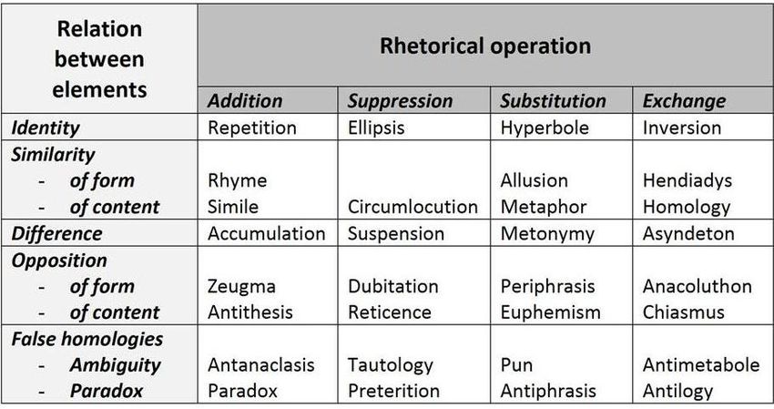
From this perspectives, came the Table 1, following, in which the main
representative figures of each category are mentioned.
www.bocc.ubi.ptVisual Rhetoric Applied To The Newspapers 19
TABLE 1: Table extract from Durand(1970, apud 1982, p. 162), which shows
the relation of the figures between the two main possible categories – the
relation between the elements and the rhetorical operation
2.3.1.1 The relation between elements and the rhetorical operation
This section will go deeper in the categories expressed in the table and
will detail the most common figures inside one of them, transposing the
equivalent visual to the newspaper design. It is important to mentioned
that Durand (1970; 1978) and Dyer (1982) developed the studies re-
lating the visual parallels to the advertisement. There are publications,
already mentioned, dealing with the visual rhetoric in some elements of
the newspapers – analyzing the pictures, for sample, mainly going in
the direction of a semiotic perspective. But the application to this theo-
retical perspective, considering the newspapers page as a unique image,
represents a new approach.
The examples collected are just illustrations to turn possibility to
understand the visual parallel, but they do not limit its extension. Also,
they are positioned into the category that reveals one of its evident fi-
gures of rhetoric, but they can carry more than one in a deep analysis.
The section will follow the Durand’s schemes, presented in the Table 3.
www.bocc.ubi.pt20 Ivana Raquel Ebel
2.3.1.1.1 Figures of addition
The name of this category is self-explanatory. The concept of addition
inside the visual rhetoric scope is not far from the Math. According
to Durand (1970) it is characterized by the repetition of an element or
by the position of this element on the speech, appearing both in the
beginning and in the end of the sentence, as sample. Inside this category,
the author points as example figures as: assonance, rhyme, alliteration,
anaphora, etc. Also, the figures of addition are differentiated by some
special characteristics as will be pointed:
a) Repetition – “Repetition is a special case of addition as it consists
of the adding of identical elements” (Durand, 1970 apud Dyer,
1982, p. 160). There are many figures in traditional rhetoric
which are compound by addition: adnominatio (repetition of a
word with a change in letter or sound), anaphora (repetition of
the same word or group of words at the beginning of successive
clauses), assonance (repetition of vowel sounds), and other sam-
ples. In a comparison to the visual expression of the repetition,
Dyer (1982, p. 162) mentioned “some ads consist of a repeated
visual image in order to show how the same product works over
a time period”.
In the newspapers, the use of the addition could have two main pos-
sibilities: to give the same importance to different elements in order
to tell a history or, as a creative alternate, to suppress the missing of
an image strong enough to domain the cover page of the day. In both
situations, the idea is the replication of the main element of the page.
b) Similarity – Durand (1970 apud Dyer, 1982) defines a figure of
similarity as an ensemble of elements which some are carriers of
similitude and others of difference. Figures as simile (compari-
son between two things using like or as), pleonasm (the use of
superfluous or redundant words), and internal rhyme (using two
or more rhyming words in the same sentence) can be enumerated
as examples. Taylor (1972, p. 126), in addition, suggest that
the simile appears when “comparing in one point things not com-
monly linked to each other”.
www.bocc.ubi.ptVisual Rhetoric Applied To The Newspapers 21
It must be clear that the similar element must be stronger than the
differences, avoiding constituting an opposition. In a visual parallel, the
newspapers presents this figure when the page tries to put emphasis on
the points that two or more histories (or characters, images, etc.) have
in common. It is also a resource to promote a comparison among two
different ideas, enforcing the sense of how closer they are from each
other.
c) Accumulation – “When a message contains a number of different
elements it is a figure of accumulation and can convey the idea
of abundance and quantity or disorder and chaos” (Dyer, 1982,
p. 165). In a classical rhetoric, accumulation can be described
as a summarization of previous arguments in a forceful manner.
Taylor (1972, p. 128) offers another name for the accumulation fi-
gures and categorize them as synathroismos. According to the au-
thor, they can be represented as “[g]athering together things dis-
persed through the oration”(Taylor, 1972, p. 128). Other figures
of speech are also included in this group: enumeratio (a form
of amplification in which a subject is divided, detailing parts,
causes, effects, or consequences to make a point more forcibly),
merism (referring to a whole by enumerating some of its parts)
and epitrochasm (which work as a summary of points), as sam-
ples.
For the newspapers, the idea of accumulation can be representing as
a complementary idea of the repetition and similarity, presented above.
The main difference is that the accumulation uses different related ele-
ments to create the representation of the unit. It could be expressed by
the dissecting of small parts of an object or even by the combination of
distinct images around the same theme to express the idea.
d) Opposition – Dyer (1982, p. 165) suggests an opposition can e-
xist at the level of form or content. “For example, the same scene
in and ad can be presented in the same style but set in two diffe-
rent countries or centuries”. Antithesis is one of the most popular
versions of the opposition: it is the juxtaposition of opposing or
contrasting ideas. “Antithesis, favored by many speakers when
persuading, places contrasting ideas side by side for emphasis and
www.bocc.ubi.pt22 Ivana Raquel Ebel
rhythm. Arranged this way, the contracting ideas provide a sharp
and forceful way of measuring difference”(Zhang, 2005, p. 133).
To characterize the antithesis, the elements must be antonyms.
Another figure included in the opposition is the Litotes, which is
characterized by the emphasis on the magnitude of a statement by
denying its opposite (Taylor, 1972, p. 107).
Both figures open a large possibility of application on the news-
papers rhetoric. Showing opposites elements both histories can have
evidence. Or even one of the histories – or the side of the same fact
– can have more evidence of the other, by the choose way to display
the elements inside the page. This figure allows the contraposition of
values in a hidden way: both articles can have the same space in a page,
but when they are printed side by side, the judgment of the reader can
be strongly directed by the design.
e) Double meaning (ambiguity) and paradox – These figures play
with the opposition between appearance and reality. In double
meaning one apparent similarity is, in fact, a real difference. In
paradox, one apparent difference means a real identity or same-
ness – a difference in form hidden a similar content (Dyer, 1982,
p. 167). “Showing wonder when affirming a thing that appears
incredible; affirming as true a statement which seems self-contra-
dictory” (Taylor, 1972, p. 114).
Pun (a play on words that will have two meanings), paronomasia
(words that are similar in sound but with different meanings) and irony
(use of word in a way that conveys an opposite or different meaning than
its usual significance) can be included in the present category. These fi-
gures are not strange for the journalism, despite the idea that the news-
papers must present exclusively the facts. To play with images and title,
to pretend one situation describing another are some of the practical
applications of the double meaning.
2.3.1.1.2 Figures of suppression
Back to the comparison between the rhetoric and math, the name “fi-
gures of suppression” reveals itself the main definition of the idea. They
www.bocc.ubi.ptVisual Rhetoric Applied To The Newspapers 23
occurred when “one or more elements in (. . . ) are suppressed, excluded
on concealed” (Dyer, 1982, p. 161). The authors argue that they are less
common in the advertisements than the figures of addition; however it
will be easier to identify them inside the newspapers design.
If in one hand the advertisements’option are in the direction of e-
xaggerate despite on left the empty space for the public complete, the
newspapers can benefit by the unsaying words or unprinted images in
order to tell the history with emphasis, counting with the reader to in-
terpret the intended meaning.
a) Ellipsis – Dyer (1982, p. 170) explains ellipsis as the opposite of
repetition: “In the latter the same element is present many times
in succession, in the former an element is missing or left out”.
The figure represents the notion of expressing an idea without
expressing it literary. It “is a subtractive metataxeme that deletes
parts of sentences or clauses for the sake of economic brevity.
It issued in public signs (e.g., No Smoking), military language,
advertisements, as well as in poetry (. . . ). Its effect ranges from
clear-cut brevity to intended obscurity”(Sloane, 2001, p. 249).
This figure is an interesting resource for the newspaper. It is the
chance to deal in a connotative way with topics or images that can be
uncomfortable for the reader, as violent episodes. However, the appli-
cation is not limited to this situation. The creativity to use this figure
can count with the complementarity principle of the Gestalt, already
explained, in order to turn a part of an element as a reference to the
figure in its total.
b) Circumlocution – “(. . . )[A] part of an object is missed out, but
it is linked to another element through relationship or similarity”
(Dyer, 1982, p. 170). In traditional rhetoric the same figure is
describe as "talking around", that means a topic by substituting or
adding words. It can be expressed as showing a history with some
deviances: talking about the theme without represent it explicitly.
Different of the Ellipsis, it is not related to the idea of the conti-
nuity, but to the premise of showing one object to remind another
idea. This figure of speech is also closer to the idea of Periphrasis,
which will be detailed later. Taylor (1972, p. 118) defines it as:
“Expressing the meaning in a roundabout manner”.
www.bocc.ubi.pt24 Ivana Raquel Ebel
The newspapers can have benefit from using these figures to create
some sort of not explicit comparison – as will be explained latter – but
mentioning different points of a history to remind the existence of the
others.
c) Suspension – When a part of a message is intentionally hiding
to create an expectation, a suspension can be noted. “This figure
consists of holding back part of a message”(Dyer, 1982, p. 170).
All sort of teasers in the advertisement are included inside the
visual parallel for this figure. However, for the newspapers, is also
possible to create the suspension. The idea is to ask a question for
the reader, invite him to discovery the news article as the answer.
It aims to touch the curiosity and catch the attention to the reader
not telling facts, but emphasizing the missing points of the visual
speech.
d) Tautology – However it can be initially confused with a figure of
repetition, once it represents somehow a pleonasm, in the tauto-
logy the redundancy is not obvious and, because of that, the ob-
viously interpretation is intentional missing, suggesting it as fi-
gure of suppression. Dyer (1982, p. 171) explains that even the
words could be repeated, but with a difference sense that could be
not clear at the first sight. In the second look, the idea appears – or
just the word. It could sound, at first, redundant, because the dif-
ferent sense is not obvious. “Repeating the same word or phrase
or the same idea in other word in an ‘unprofitable and wearysome’
way”(Taylor, 1972, p. 131).
As same as the newspapers can play with the irony, they can use
the tautology to show a creative approach to some histories. The ima-
ges can confirm the texts, even if they can look diverse or even merely
illustrative at the first sight.
e) Preterition – To explain this figure, Dyer (1982, p. 171) point
some applications in advertisement as sample: “Visually, preteri-
tion can be seen in gestures of false modesty: a woman’s arm
crossed in front of her breasts or a nude model covering her eyes
with her hands; and ins ads where the product is only half seen
www.bocc.ubi.ptVisual Rhetoric Applied To The Newspapers 25
or presented in silhouette or outline only”. It can be interpreted
in visual also as the intentional missing of some objects or part
of them. The selection of showing some parts and not others is
also a case of preterition. For the newspapers, it is an alternative
to show taboo images or even to build the idea of sensual without
being explicit.
2.3.1.1.3 Figures of substitution
Again, there is a classification in which the name helps to understand
the context. It represents the replacement of one expected element for
another, and has different categories to explain the possibilities.
a) Identical substitution – It is represented by the substitution of one
element for another identical, using resources as emphasis, accent
and other visual similar as colors, style and even size to turn its
replacement evident. For Dyer (1982, p. 171), it is, sometimes,
a matter of degree. “The use of exaggeration (hyperbole), accent,
emphasis, and understatement (lilotes) are all devices whereby
the element stays the same but it is made by degree or two bigger,
more emphatic, or smaller”.
It could configure a smart solution for the newspapers. Illustrations
can be a good parallel: they can provide the extra focus on determinate
area of the image. The same is valid for colors (one colorful element
in a black and white construction). The newspapers can also represent
an element that in the reality does not exist – using the other elements
inside the page in order to create the illusion of the substitution.
b) Substitution of similar elements – Metaphor is the most impor-
tant figure of traditional rhetoric that can be including in that cate-
gory. It “(. . . )is the transfer of a word from one object to another.
A word may be transferred in four ways: from an animate to an
animate object; or from an inanimate to an inanimate object; or
from an animated to an inanimate object; or from an inanimate to
an animated object” (Copeland & Sluiter, 2009, p. 29). Metaphor
is also a comparison: “(. . . ) a metasememe that is constituted by
a substitution of similarities”(Sloane, 2001, p. 511).
www.bocc.ubi.pt26 Ivana Raquel Ebel
In essence, the metaphor suggests that something is using out of
the denotative meaning, to suggest a link and an analogy between two
elements (Zhang, 2005). Transposing to the visual, it allows the abs-
traction of ideas or feelings that are sometimes immaterial, but can be
transposing to the page.
c) Substitution of a different element – The use of an associated
detail to represent an idea, also the part as a whole, are charac-
teristics of the traditional language figure named metonymy or
synecdoche. Metonymy is what might be called transnominatio
or a change of names. There are many varieties of this trope.
It may signify what is contained by the container or the reverse
(Kendall, 1991).
For the newspapers, it could be an interesting idea to use a fragment
to represent the whole or just a part of an object to represent a history. It
can be used in a matter of force the reader to think about the substitution
or even to allow the illustration of a topic that normally will offer an
extra challenge for the designers.
d) Substitution of an opposing element – Dyer (1982) points three
figures of traditional rhetoric to describe this category: periphra-
sis, euphemism, and antonomasia. “The Greek term periphra-
sis (Lat. circumitio, circumloquium), whose literal meaning is
‘roundabout of words’, designates a discursive phenomenon that
substitutes a word, in a given context, by a textual unit that is se-
mantically equivalent”(Sloane, 2001, p. 588). This figure is also
related to the decoration of the speech, which can be amplified or
ornamented.
In addition, the euphemism is also mentioned as an element of op-
position: it is represented by turning the speech softer, removing the
harshness by the utilization of a more agreeable term to replace one
unpleasant expression. “In certain registers, euphemist is more cons-
ciously exploited in the mitigation of unpleasant subjects by associa-
tive engineering to promote a more positive or brighter image”(Zhang,
2005, p. 225). The antonomasia, the third figure of speech inside this
category, is the way to describe a proper name – as person, a character, a
www.bocc.ubi.ptVisual Rhetoric Applied To The Newspapers 27
place – by using the characteristics associates and turning immediately
possible to recognize it. “Substituting an epithet for a proper name.
(. . . ) Denoting the possession of a quality by a proper name readily
associated with it”(Taylor, 1972, pp. 72 - 73). One sample is the term
“Big Apple” to refer to New York.
The newspapers can gain a lot by using this kind of substitution.
Inside the text, it represents a creative way for text variations, but even in
the visual, this rhetorical element offers advantages. It allows dealing in
a more confortable way with sensate, personal and even private matters.
e) False homology – The humor is the essence of this visual rhetoric
category. The main idea is to promote the substitution of one
element for another with a funniest presence. “Puns are plays
on words involving the humorous use of words to suggest diffe-
rent meanings”(Dyer, 1982, p. 176). It is also associated to the
paronomasia, which “(. . . ) is a kind of wordplay”(Sloane, 2001,
p. 572).
There are several applications to the newspaper design, especially
in the sections that normally allow a bit more of sense of humor, as the
entertainment sections. However, it is possible to use the humor even to
deal with questions that are more serious, as the samples following will
show.
2.3.1.1.4 Figures of exchange
There are several figures of rhetoric with its visual parallel that can be
classified inside this category, each one with specific characteristics as
will be detailed. Mainly, in common, they are related not by the re-
placement of elements, as occurs in the substitutions. They are more
connected to the exchange of positions or functions of one or more ele-
ment inside the page.
a) Inversion – “This figure is similar to repetition; the elements
in a discourse may be identical but their order may be modi-
fied”(Dyer, 1982, p. 176). It means that one element could belong
to a page in a traditional composition, but for instance, it is posi-
tioned in another context. It is also can be applied to the image. It
www.bocc.ubi.ptYou can also read