Netflower: Dynamic Network Visualization for Data Journalists - ifs.tuwien.ac.at
←
→
Page content transcription
If your browser does not render page correctly, please read the page content below
Eurographics Conference on Visualization (EuroVis) 2019 Volume 38 (2019), Number 3
M. Gleicher, H. Leitte, and I. Viola
(Guest Editors)
netflower: Dynamic Network Visualization for Data Journalists
C. Stoiber1 , A. Rind1 , F. Grassinger1 , R. Gutounig2 , E. Goldgruber2 , M. Sedlmair3 , Š. Emrich4 and W. Aigner1
1 St. Poelten University of Applied Sciences, Austria
2 FH JOANNEUM – University of Applied Sciences, Graz, Austria
3 University of Stuttgart, Germany
4 drahtwarenhandlung, Landsiedl Popper OG, Austria
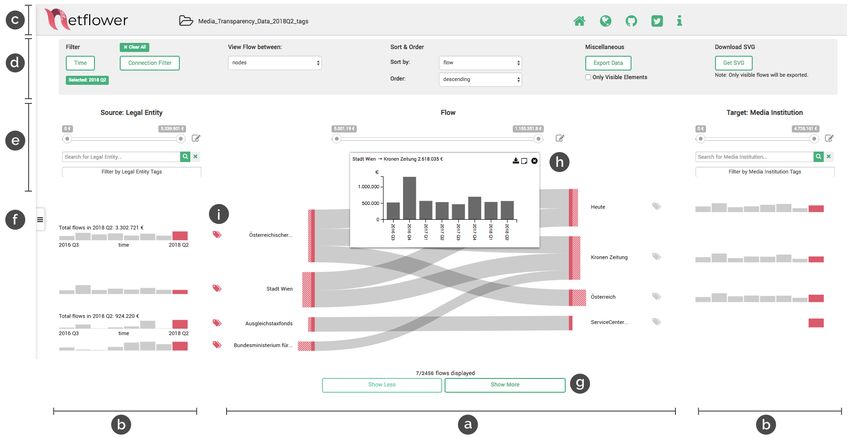
Figure 1: The visual exploration tool netflower supports journalists in investigating quantitative flows in dynamic network data for story-
finding. The example above shows the media transparency dataset which tracks quarterly money flows between government institutions and
media outlets. The main visualization is a Sankey diagram (a) showing the flows between legal entities and media institutions. Bar chart
sparklines on both sides (b) give a temporal overview of outgoing (source nodes) and incoming money (target nodes). To load more data
than visible at first glance, the “show more” and “show less” buttons (g) can be used. An on-demand bar chart (h) is provided to show the
temporal evolution of one particular flow. Tags can be assigned to the nodes on both sides (i) and then filtered for. Below the header area (c),
netflower provides functions for filtering, sorting and ordering (d, e). Moreover, a notebook is integrated into a sidebar (f) for investigative
provenance.
Abstract
Journalists need visual interfaces that cater to the exploratory nature of their investigative activities. In this paper, we report on
a four-year design study with data journalists. The main result is netflower, a visual exploration tool that supports journalists
in investigating quantitative flows in dynamic network data for story-finding. The visual metaphor is based on Sankey diagrams
and has been extended to make it capable of processing large amounts of input data as well as network change over time. We
followed a structured, iterative design process including requirement analysis and multiple design and prototyping iterations
in close cooperation with journalists. To validate our concept and prototype, a workshop series and two diary studies were
conducted with journalists. Our findings indicate that the prototype can be picked up quickly by journalists and valuable
insights can be achieved in a few hours. The prototype can be accessed at: http:// netflower.fhstp.ac.at/
CCS Concepts
• Human-centered computing → Visualization design and evaluation methods;
c 2019 The Author(s)
Computer Graphics Forum c 2019 The Eurographics Association and John
Wiley & Sons Ltd. Published by John Wiley & Sons Ltd.
This is the accepted version of the following article:
Stoiber, C., Rind, A., Grassinger, F., Gutounig, R., Goldgruber, E., Sedlmair, M., Emrich, Š., & Aigner, W. (2019).
netflower: Dynamic Network Visualization for Data Journalists. Computer Graphics Forum, Special Issue EuroVis 2019,
38(3). In press.
which will be published in final form at http://onlinelibrary.wiley.com.
This article may be used for non-commercial purposes in accordance with the Wiley Self-Archiving Policy.C. Stoiber et al. / netflower: Dynamic Network Visualization for Data Journalists
1. Introduction and background deeper exploratory data analysis of the MTD, see [RPNA16]. We
We live in a world in which it is increasingly important to under- selected the MTD as a representative example because (i) it is pub-
stand complex socio-economic and ecological phenomena to facil- licly available, (ii) it has a non-trivial scale, (iii) journalists are fa-
itate well-informed decisions. Journalists play an important role in miliar with the topic, and (iv) it is regularly updated which makes
this endeavor by uncovering hidden patterns and relationships to it possible to add current stories during and after the design study
inform, enlighten and entertain. With the ever-growing amount and project possible.
availability of data, it becomes crucial for journalists to use ele-
ments of data science in their work. This trend has led to the advent Design study contribution: Although such dynamic, weighted
of the emerging field of Data-Driven Journalism (DDJ) which in- and directed graph structures can be found in many data-
volves computer-supported data-based reasoning as well as interac- journalistic areas (and also in many other application domains), we
tive visualization [AGO∗ 17]. Although DDJ has received attention found that the current tool support for these is scarce. Surprisingly,
from different communities and has found its way into a number of there are not many visualization systems that do, in fact, support
well-known news organizations such as the New York Times and the visual exploration of dynamic networks at a more general level
the Guardian, the majority of journalists still face significant obsta- (see Sec. 7). General tools such as Tableau [tab] mainly focus on
cles inhibiting the utilization of data for their work. Four years ago, multivariate data, while standard network visualization tools such
we set out to work with this user group with the goal of understand- as Gephi [gep] do not support dynamic networks well enough.
ing their needs and interests better, and to investigate the potential To help bridge this gap, we report on the design, development,
value that interactive visualization can contribute to their work. In and evaluation of netflower (dynamic network flow explorer) to
this paper, we report on a design study from this process. support data journalists in their analysis tasks. Over the last four
years, we collaborated closely with different groups of target users,
Flows in dynamic networks: Our design study focuses on analyz-
iteratively forming a better understanding of the problem as well as
ing dynamic network data which we found to be a very common
designing and evaluating the netflower tool to address it. Method-
data type faced by our target users. Journalists may, for example,
ologically, we specifically relied on interviews and design work-
wish to analyze a social network in terms of how communication
shops, which we thought would work well for our time-pressured
(edges in the network) and important actors (nodes) change over
target audience. Through this process, we eventually arrived at a
time. Often, these networks additionally include quantitative flows
design that leverages (i) Sankey diagrams [Sch08], as an easy-to-
between nodes, such as money flows between organizations, migra-
understand idiom for weighted dynamic graphs, (ii) a set of well-
tion flows between countries, or transfer payments between sports
crafted analysis workflows tailored towards journalists’ needs, as
clubs.
well as (iii) first onboarding techniques that help users get started
These flows can be conceptualized as time-dependent edge quickly.
weights in a directed network [RPNA16]. Edge weights are typi-
In summary, the main contributions of this work are:
cally non-negative quantitative attributes that count or sum up fea-
tures from individual events occurring in the course of a year, quar- • a problem characterization with data and task abstractions (see
ter, or month. The network is dynamic both in terms of its struc- Sec. 3)
ture (nodes and edges can appear or disappear over time) and its • the design of netflower which is described in Sec. 4; a visual ex-
quantitative flows (weights changing over time) [vLKS∗ 11]. The ploration tool that enables journalists to understand phenomena
time-oriented aspect of the data can be characterized as instants that can be phrased as dynamic, weighted graphs,
on a discrete, interval-based, linear time domain with granularities • the results of four workshops and two diary studies in which dif-
for quarter and year [AMST11]. Some of these networks are bipar- ferent versions of the tool were used and tested with journalists
tite, i.e., their nodes can be divided into two disjoint sets and each (see Sec. 6), and
edge connects nodes of different sets. The Austrian media trans- • a set of general lessons learned which we derived from our
parency dataset (MTD) distinguishes government nodes that spend project, such as supporting journalists in visual exploration and
money from media nodes that receive money. In contrast, a mi- story-finding, and using empowerment workshops as an appro-
gration dataset can have the same country as source and target of priate method to evaluate visualization designs with journalists
migration flows. For some datasets, it is possible to further break (see Sec. 8).
up flows into different categories by attribute, such as the type of
spending or the legal status of a migrant.
2. Methods
In the following, we will use the Austrian media transparency
dataset (MTD) [RTR18] as a representative real-world example to As is common for design studies, we followed a process of itera-
illustrate the design of netflower. MTD means open government tive design and evaluation to address a particular domain problem
data that reports money spent by Austrian governmental bodies by involving collaborators and users from the domain [SMM12].
on advertisement and media sponsorship. Currently, data are avail- We decided to validate the netflower prototype based on workshops
able for 8 quarters (Q3/2016–Q2/2018) comprising 18,302 quar- and diary studies. The workshops were chosen as an incentive for
terly money flows (in total, without missing values). These flows journalists to reach out to busy domain experts. Diary studies were
connect 825 different legal entities (e.g., federal ministries, cities, aimed at evaluating the netflower system in a more realistic set-
economic chambers, government-owned companies) to 1,545 dis- ting, while again considering the experts’ tight schedule. A time-
tinct media institutions (e.g., newspaper, TV, radio, online). For a line illustrating netflower’s development and the iterative validation
c 2019 The Author(s)
Computer Graphics Forum c 2019 The Eurographics Association and John Wiley & Sons Ltd.C. Stoiber et al. / netflower: Dynamic Network Visualization for Data Journalists
Requirements & Reflection &
Tasks Analysis Conceptual Design Prototyping v1 Prototyping v2 Final Tool Bug fixing
2015 2016 2017 2018 2019
4
2
2
W
W
W
In
W
In
D
or
te
or
or
or
ia
te
ks
r
ks
ks
ry
ks
r
vi
vi
ho
ho
ho
ew
ho
St
ew
p
p
u
p
p
s
s
di
4
2
3
1
es
Figure 2: Timeline of netflower’s development and validation phases from 2015 to end of 2018
phases is shown in Figure 2. After beginning with the requirement accompany these tools. After that, we went into more detail when
and task analysis in 2015 with four semi-structured interviews in it comes to the example dataset and explored which aspects are of
May, we produced paper prototypes and mockups. We revised these special interest (e.g., temporal and relational). Finally, we specif-
based on a follow-up interview with two of the domain experts. In ically asked questions about visualization approaches, i.e., which
2016, we started to develop a functional prototype v1 and tested this techniques and tools the journalists are familiar with based on a set
prototype in two workshops involving two students and three jour- of examples we prepared.
nalists. After the first evaluation phase, we integrated the feedback
we received and further improved the prototype, resulting in proto-
3.2. Results
type v2. A third workshop (six participants) was then conducted to
test v2. Between the third and fourth workshop with journalists, we All four interviewees knew the MTD but only one of them had
conducted two diary studies, using v2 simultaneously. Finally, the actively worked with the dataset towards creating a news article. A
finished tool was evaluated in a workshop setting (three journal- preliminary analysis has been reported in [NRA∗ 16].
ists). The participants of all workshops differed from each other, According to our interviewees, data journalists in Austria have
from the interviewees, and the diary study participants. basic computer literacy as well as basic statistical knowledge (cp.
Additionally, we used the SUS questionnaire [Bro13] as a stan- [Bra11]). The exploration and research phase was organized de-
dardized usability score for our evolving prototype but found that pending on the journalists’ personal preferences and skills. The
the results were not conclusive due to the small number of partici- interviews indicated that journalists are comfortable with combin-
pants for this quantitative instrument and the ensuing limited gen- ing different tools such as Microsoft Excel, Google Spreadsheets
eralizability. Hence, we concentrated on qualitative feedback of our for data analysis and other tools such as Evernote [eve] for storing
domain experts. notes, which were found during the exploration or research phase.
Furthermore, the research documentation has been reported to be
In the following section, we report on the results of this itera-
in both electronic and paper forms. A commonly followed standard
tive design process. We present the problem characterization and
workflow or specific user description could not be identified on the
abstraction we derived, the design decisions that governed our pro-
basis of the conducted interviews. Due to the investigative charac-
cess, and the evaluation results from the studies.
ter of their work, the interviewed journalists have to deal with a
wide range of data sources originating from various other domains.
3. Problem characterization and abstraction However, deadlines and lack of time (and resources) for extensive
analysis are also limitations to data-intensive news work. When it
In the first phase of the netflower design study, we conducted inter-
comes to visualization techniques, standard business charts such as
views [LFH09] with four data journalists to obtain a good under-
bar charts, line plots or pie charts were mentioned as being known
standing of our target group’s analysis and workflow requirements.
and used. The journalists stated that they prefer easy-to-use inter-
faces and visualizations. The journalists reported that they usually
3.1. Method and participants carry out the research phase on a news story alone. The next steps of
designing infographics and drafting the final article are then mostly
To collect a first set of design requirements, we conducted semi-
done in teams of two to three people.
structured interviews [LFH09] with four data journalists (I1–4) in
2015. The interviews were approximately one hour in duration and The interviewed journalists either start from a story idea and sub-
were performed either in person or via video call. All of the sur- sequently search data to support the evidence, or they start from
veyed journalists were male and had more than 10 years of ex- data and develop a story idea revolving around their findings. Be-
perience in journalism. In addition to their journalistic activities, fore writing a story, however, they would conduct interviews be-
three of them teach journalism or data journalism at different uni- cause it is their journalistic responsibility to compare information
versities in Austria. Throughout the interviews, we used the MTD from multiple sources. In this process, data analysis helps them
to guide participants through a potential scenario. In this context, to identify possible interview partners. One interviewee also men-
we investigated how the journalistic process is structured, how it tioned that data-based insights help him to get more time for inves-
is documented, which tools are used, and what potential problems tigation approved.
c 2019 The Author(s)
Computer Graphics Forum c 2019 The Eurographics Association and John Wiley & Sons Ltd.C. Stoiber et al. / netflower: Dynamic Network Visualization for Data Journalists
In general, data journalists browse their data to discover out- RQ7 Data protection: Journalists are concerned with keeping their
liers and other anomalies. Exploring the MTD, a possible starting data analysis confidential until they publish their story. Thus, a
point would be a legal entity or media institution that shows abrupt solution should store the state of analysis locally - and not on a
changes in the sum of money spent or received, or a varying num- server.
ber of edges, e.g., “why was so much money spent?” (I3). For some
On the whole, four of the seven identified key requirements
stories, they would apply filters to focus on the geographic region
(RQ1–3, 6) relate directly to visualization and interaction de-
where their newspaper is based. Or they would focus on a time pe-
sign. More precisely, RQ1 suggests the selection of familiar visual
riod: “Look at the numbers, when was something introduced and
metaphors, RQ2 relates to visual scalability, RQ3 is about time-
when was it advertised” (I1), “is the data contradicting ifself, did
oriented visualization and interaction capabilities, and RQ6 calls
the advertisements really take place at the time that they were re-
for integrated provenance. RQ4 and RQ5 emphasize the integra-
ported” (I4). The journalists are interested in relating these findings
tion into the journalistic workflow, and RQ7 highlights an impor-
to their background knowledge or external data sources. All inter-
tant prerequisite to ensure user acceptance.
viewees stated that they would organize nodes into groups (e.g., by
political party, by media holding companies). One journalist (I2)
also suggested an automatic grouping function. 4. Conceptual Design
Based on the requirements described above, we designed netflower
3.3. Design requirements
and iteratively refined it based on the feedback and suggestions of
Based on these results, we identified seven key requirements (RQ): journalists during a series of workshops. Here, we present the main
RQ1 Ease of use: The interviewees emphasized that tools for data design decisions that led to netflower’s final design which was also
journalists need to be easy to use. Traditional chart types such as used in the fourth workshop.
bar charts are preferred. More advanced visualization and inter- Color concept: To keep the interface simple and straightforward
action concepts need to be either self-explanatory or explained (RQ1), we chose a clear and reduced visual design and used only
thoroughly. two main colors for the whole application. Green is used for all user
RQ2 Managing large numbers of nodes: A data analysis tool such interface elements, while pink is used to highlight the important
as netflower would typically be needed for networks of non- results and data elements in the visualization interface.
trivial scale, commonly with 200 to 3,000 nodes. In order to
provide an overview, it is necessary to either filter the data or Onboarding: To further reduce the learning curve (RQ1), it be-
to form meaningful groups. came one of our core goals – in the course of the workshops – to
RQ3 Development over time: The discussed datasets are often col- make netflower as self-explanatory as possible. Based on feedback
lected on a regular basis (i.e., quarterly) and the interviewees ex- from the workshops, we decided to include a variety of onboarding
pressed particular interest in this temporal aspect. They would content, including introductory video material, screenshots and de-
investigate patterns or anomalies in the numbers and weights of scriptive text. These different media address the onboarding needs
flows over time in correlation with their knowledge of events in of journalists.
the respective period. They also indicated that comparisons be-
Data import: A dedicated data loading screen allows users to
tween consecutive quarters might not be as meaningful because
choose a file from the file system, to retrieve it from the web via
seasonal fluctuations could obscure long-term trends.
URL, or to select a sample dataset. Even though netflower works
RQ4 Simple data import: Data journalists need to be capable of
with network data internally, journalists can load their data into a ta-
analyzing their own data with netflower, which is why the prepa-
ble in the comma-separated values (CSV) format. Easy inclusion of
ration of data should not constitute a hurdle. For this reason,
their own data is a critical step in the journalists’ workflow (RQ4).
a widely used format that can be edited with standard office
Each row of the table corresponds to one edge of a category be-
software (e.g., spreadsheet) should be preferred over specialized
tween a source node and a target node at a time step with a given
database or graph analysis solutions.
weight. In the MTD, for example, one row contains the flow of
RQ5 Export of results: Data journalists would not use their analy-
the “advertising” category from “Stadt Wien” to “Kronen Zeitung”
sis tool to produce charts for their audience because media com-
in Q2/2018. While this format contains redundancy, it allows jour-
panies have standardized tools and corporate styles for this pur-
nalists to prepare their own data using standard spreadsheet tools
pose. For example, one interviewee suggested that an interface
(RQ4) in an easy-to-use fashion (RQ1). The metadata specified in
to Datawrappper [dat] could be provided. To facilitate this work-
the table headings are also used in the user interface (e.g., to label
flow, netflower should allow the export of filtered and annotated
target nodes as “media institution”). Explanations and data tem-
data to widely used formats.
plates are provided to further increase the ease of use (RQ1). An-
RQ6 Analytic provenance: All interviewees expressed the need to
other crucial aspect that is realized here is the protection of sensible
take notes and make annotations. However, they largely use spe-
data. All loaded data is only stored locally in each client’s browser
cial note-taking solutions such as Evernote [eve] or an analog
database (RQ7).
booklet. The sharing of notes was required by only one intervie-
wee (I1), while two (I2, I3) stated that it was not required due Visualization design: The main visualization uses a Sankey dia-
to small team sizes. Two interviewees suggested a history mech- gram to show the time-dependent directed network with weighted
anism that documents the research process and allows users to edges, ordered by edge weights (see Figure 1). Sankey diagrams are
revisit points in research. typically used to visualize flows of energy or material throughout
c 2019 The Author(s)
Computer Graphics Forum c 2019 The Eurographics Association and John Wiley & Sons Ltd.C. Stoiber et al. / netflower: Dynamic Network Visualization for Data Journalists
processes [RHF05] and have also been used for representing net- ordering it in either ascending or descending order (d), (iii) limiting
works (e.g., [RB10, SGW18]). Following various discussions with the data elements by applying value filters to the source, flow and
journalists and visualization experts, we nevertheless decided to use target (RQ2) (e), (iv) searching for a particular data element in the
Sankey diagrams for this purpose as they nicely balance usability source and also in the target by using the search box (e), and (v) se-
and expressiveness for our target audience. Sankey diagrams com- lecting a particular node to have a closer look on it in filtered form.
bine the more regular layout of matrix-based representations that Furthermore, exporting and documentation options are provided.
includes positional encoding with the more explicit representation Users can export the data of the currently visible area, which will
of vertices and edges of node-link diagrams, while avoiding color create a .csv file with the current, filtered dataset. Alternatively, the
as a less suitable visual variable for edge weights. With this more complete dataset can be exported as a whole. Moreover, the user
intuitive setup, Sankey diagrams seem to be more suitable for ca- can create a scalable vector graphics (SVG) file from the current
sual users as well (RQ1). view in order to use the visualization directly (RQ5).
In Figure 1, we present an example of the Austrian media trans- Tags: We found that journalists sometimes have certain ways of
parency dataset showing money flows between legal entities and grouping the data in mind. To support this task, users can use tag-
media institutions. We make a small amount of the data available ging to organize and group both source and target nodes in net-
at first glance, so as not to overwhelm the user (RQ2). Therefore, a flower. Tags can be added in the source file or by adding them di-
default space on the screen for the Sankey diagram is defined where rectly in the interface by clicking the tag icon next to each node
the flow can be visualized efficiently. Another reason to reduce the (see Figure 1 (i)). With the tag filter below the search bar, users can
amount of data is related to performance. We encoded information reduce the dataset to predefined or self-defined tags (single or mul-
using both hidden and visible data elements and hatched areas in tiple). Moreover, an aggregated view can be achieved by switching
juxtaposition with the nodes of the Sankey diagram (see Figure 3). from a display of nodes to a display of flows between tags (RQ2).
The area of the hatched rectangle indicates the amount of hidden
elements. When hovering over the node, a tooltip appears showing Notebook: To meet requirement RQ6 (analytic provenance), we
integrated a notebook that allows for tracking insights and explo-
ration paths. We expected this to be particularly important as jour-
nalists would often get interrupted in their workflow and need to be
able to easily resume any analytic processes. Furthermore, repro-
ducibility is imperative as a pillar of guaranteeing journalistic in-
tegrity. In the interface, the notebook is integrated into the sidebar
(Figure 1 (f)). To comply with RQ7, the notebook is implemented
Figure 3: A node’s area encodes the total weights of all ingoing or
on the client side and saved in the local storage. The notes can also
outgoing edges. The hatched area represents the portion of flows
be saved as a .txt file and can be re-uploaded in the notebook.
not currently displayed on the screen.
the amount of money currently visible on the screen, the amount
currently not shown, and the total amount of outgoing money. It 5. Implementation
is possible to load more elements on demand by clicking “Show
More” or “Show Less” (see Figure 1 (g)). Netflower is a client-side based web application (http://netflower.
Based on the given data structure of dynamic, directed, and fhstp.ac.at/) and does not rely on a server to process or store data,
weighted network data, we integrated a combination of differ- which ensures local storage of the data (RQ7). In order to prevent
ent common visualization techniques to cover the temporal aspect data loss upon refreshing or navigation and to make the data per-
(RQ3). First, the temporal evolution of one particular flow is dis- sistent when closing the browser or turning off the computer, we
played after clicking its Sankey edge using a bar chart in a popup use localStorage [loc] and IndexedDB [ind] which are included in
window (see Figure 1 (h)). Second, we use bar chart sparklines to a wide range of modern browsers. This allows the application to
represent the amount of outgoing and incoming money over time access a database that is related to the main storage and the phys-
per node on both sides of the Sankey diagram. To avoid cluttering ical storage on each user’s computer, providing not only the local
the interface, textual annotations are displayed only on demand. but also the temporal flexibility needed by many journalists. So far,
When hovering over a sparkline, a legend as well as axis descrip- we specifically target the Chrome browser as it has the best perfor-
tions are shown. mance and allows for all data to be processed on the client side.
Filtering, sorting, ordering: Journalists often have concrete hy- Netflower is designed using the Phovea Framework [pho], an
potheses regarding the data they want to start working with. There- open-source visual analysis platform developed as part of the
fore, it is critical to filter, sort and order the data. By default, these Caleydo project [cal]. Netflower requires only the pure client
operations work globally and influence the entire visualization view side of the Phovea Framework as well as TypeScript [typ] with
(see Figure 1). In particular, netflower supports: (i) filtering data in D3.js [BOH11] to render the visualizations. In addition, several
time (RQ3) and by the categories of connection, provided that such smaller extensions or utility libraries are used, such as Bootstrap
a category attribute is in the loaded dataset (Figure 1 (d)), (ii) sort- [boo] for consistent styling and sankey.js [san] for enhancing the
ing the data by total amount of source, target and flow as well as default D3 library and creating the main visualization.
c 2019 The Author(s)
Computer Graphics Forum c 2019 The Eurographics Association and John Wiley & Sons Ltd.C. Stoiber et al. / netflower: Dynamic Network Visualization for Data Journalists
6. Validation and results Workshop 3: A total of eleven persons participated in the third
workshop and six of them (3 male, 3 female) were part of our study
From 2017 to 2018, we organized four empowerment workshops
for netflower (a managing editor, three journalists, a consultant in
as part of a larger program that seeks to further educate Austrian
the field of digital marketing, a business consultant). In this work-
journalists (see Figure 2). Our primary goal was to evaluate the
shop, the adapted prototype version two (v2) was tested.
netflower prototype’s usability based on a qualitative user study.
Furthermore, two diary studies were conducted in 2018. The fol- Workshop 4: Three journalists (1 female, 2 male) participated in
lowing subsections describe the methods we used as well as their the last workshop and all of them tested netflower. In this context,
results. we adapted the concept to create a more practical workshop with
only a short introduction session to DDJ. The aim of this workshop
was to gain feedback on the final version of netflowerand to identify
6.1. Empowerment workshops new datasets and use cases for dynamic network data. We deemed
The main underlying purpose of the four workshops was to teach the latter important in order to learn about the transferability of net-
journalists basic DDJ skills, using netflower as an example of a flower to other journalistic questions, pinpointing netflower’s value
data analysis tool. This enabled us to gain valuable feedback about beyond the datasets we focused on.
the design of the prototype, while at the same time imparting skills
regarding data journalism such as data analysis and visualization. 6.1.2. Results
In addition to netflower, our workshops also included other aspects
of the larger analysis pipeline, such as Microsoft Excel or Google Above all, the findings of the workshops helped us to gradually
Spreadsheet to clean data, and Datawrapper [dat] as well as High- improve the netflower prototype. We report on the qualitative feed-
charts [hig] to present results. The workshop participants were di- back in the next paragraphs. All quotes used in the paper have been
vided into two groups. One group worked with the netflower pro- translated from German by the authors.
totype and the other one with off-the-shelf tools. Participants were Our qualitative analysis indicated that the visual presentation of the
free to choose which group they wanted to join. data makes the exploration of dynamic network data easier as com-
pared to the analysis in tools such as Google Spreadsheet or Mi-
6.1.1. Method and participants crosoft Excel. For instance, participants in workshop 2 commented:
“You start with an assumption in the netflower tool and you can
The workshops were made up of a theoretical and a practical part.
see if it can be verified – visually. Without the visual presentation,
During the theoretical part, the participants received an introduc-
you start to extract the data from the .csv file and then you may
tory overview of data journalism, data analysis, and visualization in
realize that you are on the wrong track.” (P1) Another participant
general. In the second, practical part, participants engaged in data
emphasized that netflower “gives an overview of the data with vi-
analysis and visualization. At the beginning of the practical part,
sual help” (P2). Another person said: “The tool can also be used
we introduced netflower and explained its features. The use of Mi-
for fact-checking and for generating new perspectives and claims
crosoft Excel/Google Spreadsheet was also briefly demonstrated.
to a given topic.”(P3) In workshops 3 and 4, the participants also
For each of the workshops, we provided a number of datasets (e.g.,
highlighted the advantage of netflower to see the data visually and
Austrian media transparency dataset [RTR18], UNHCR migration
therefore gain first insights more easily and quickly. On the whole,
data [UNH18], farm subsidies [Agr18], and OECD aid develop-
the observations showed that it was easy for participants to cor-
ment [OEC18]).
rectly read the Sankey diagram and bar chart sparklines. This find-
Following the practical part of using the netflower prototype for ing was interesting for us as it helped us to better understand the
exploring the data, the participants were asked to complete a ques- level of visual literacy of our target audience.
tionnaire. A System Usability Scale (SUS) [Bro13] and qualita-
Sorting & ordering: Prototype v1 did not provide sorting or fil-
tive questions were used to gain feedback. Additionally, handwrit-
tering for nodes or flows, e.g., sorting by source, target nodes or
ten notes were taken during the observation to collect feedback
flows, as well as ordering them either ascendingly or descendingly.
and problems in the use of netflower. The prototype was gradually
During workshop 2, participants strongly expressed the need for
adapted between the individual workshops based on the feedback
these functions. E.g., one participant stressed: “I would like to sort
and problems identified in the course of these.
the legal entities and media as well as the money flows, so that I
Workshop 1 – pilot test: Workshop 1 served as a pilot test of the can see the largest money flow between institutions.” Based on the
study and was conducted with eight journalism students (4 male, feedback of the workshop and the knowledge of visualization lit-
4 female). Two of the eight (1 female, 1 male) participated in our erature [Mun14] regarding the importance of filtering, sorting and
study and used version one (v1) of the netflower prototype for data ordering, we included different filter and sorting options in v2.
analysis.
Tagging: Additionally, participants in workshop 2 claimed: “I
Workshop 2: Eight (female) persons participated in the second would like to group nodes, for example grouping media such as
workshop, and again three of them used netflower prototype v1. ‘Krone, derStandard and Kurier’ to a group of daily newspapers.”
The participants came from the fields of public relations (PR), jour- As a result of these user needs, we enhanced the netflower proto-
nalism, and PR consulting. In workshop 2, the prototype (v1) was type to include the function of grouping nodes via tags (see Figure
still at an early stage and its features were limited (no sorting, or- 1 (i)).
dering, grouping, or exporting).
c 2019 The Author(s)
Computer Graphics Forum c 2019 The Eurographics Association and John Wiley & Sons Ltd.C. Stoiber et al. / netflower: Dynamic Network Visualization for Data Journalists
Figure 4: This figure presents a screenshot of one of the journalist diary studies showing the OECD aid development dataset [OEC18] in
netflower. Our journalist participant investigated money flows originating from Austria to receiving countries (on the right of the visualiza-
tion). The journalist opened the details of the flow Austria-Ukraine, thus learning that the money flow increased over time. The sparklines on
the left and right show overall money flows to or from the respective countries over time and are not restricted to the current selection.
Notebook: Based on the feedback gathered during the prob- 6.2. Diary studies
lem characterization (see Sec. 3), the interviewees highlighted
the need for a notebook where interesting facts and ideas can be On the basis of the prototype (v2), two diary studies [LFH10] were
documented during data exploration. An unexpected result was conducted in July and August 2018. The following subsection de-
that although the notebook was added, none of the participants in scribes the procedure and results.
all of the four workshops made use of this integrated notebook.
Export: In workshops 2 and 3, we observed that participants 6.2.1. Method and participants
had problems creating datasets based on their acquired insights and
Two diary studies [LFH10] were conducted with two female jour-
were confused about how to use these results for presentation tools
nalists (J1–2), both experienced in DDJ. Both journalists were un-
such as Datawrapper [dat] or Highcharts [hig]. For this reason, we
der 30 years of age and each of them worked for a large news-
integrated export functions for the full dataset with altered tags in
paper. Both have experience in this field based on their studies of
the next version of our prototype (v2).
more than five years. In their daily work, they focus on Content
In workshop 3, participants articulated the need to select a single Management and Feuilleton as well as on implementing data jour-
node in the Sankey diagram to focus on a particular entity and go nalistic projects in various fields. In order to give them concrete
into more detail in the analysis. This function has been included in access points, we provided a variety of datasets for potential anal-
the final version of the tool. In workshop 4, we observed that this yses: the Austrian media transparency dataset [RTR18], UNHCR
function was used quite often. In this workshop, we had no further migration data [UNH18], farm subsidies [Agr18], and OECD data
feature requests and participants reported only a limited number of aid development [OEC18]. Both journalists decided to use the
of minor issues regarding headings and descriptions. We saw this OECD aid development (2008–2017) dataset for their exploration
as a sign of stability in our design process, meaning that netflower with netflower because of the relevance of the topic. These data
had reached a level of usability that made it fit for unguided use by include Official Development Assistance (ODA) commitments by
journalists in the wild. EU countries covering data of 2008–2017.
Based on the answers of the questionnaire, participants described We instructed the participants to explore the data with netflower
their knowledge in the use of Microsoft Excel or Google Spread- in order to identify interesting aspects which they might write a
sheet as good (9 of 12 participants). This self-assessment was, how- story about. We aimed to keep the setup of the study as realistic
ever, in contrast to our observations in the workshop which revealed as possible. To achieve this, we gave the participants no personal
a lot of difficulties in using MS Excel and Google Spreadsheet. introduction to the tool. Instead, we wanted to see whether the on-
Based on our qualitative observations, we consider the analysis tool boarding strategies we developed based on the workshop feedback
literacy of our target audience to be rather low. would be sufficient to get started. In particular, these strategies ex-
plained all the features with screenshots, textual descriptions and
Take-home messages:
videos. All of them were offered on netflower’s landing page. In
• Due to its visual representation of the data, netflower is easier to case the participants required assistance, however, they were able
use than analysis tools such as Google Spreadsheet or Microsoft to contact us by e-mail or telephone at any time. During the in-
Excel. teraction with the tool, our subjects were asked to document their
• The integrated notebook was not used. experiences and overall feedback in a diary. The participants then
• The data export function is crucial for supporting the journalists’ sent their feedback via e-mail in the form of textual descriptions
workflow from exploration to presentation (Figure 5). and, in some cases, screenshots.
c 2019 The Author(s)
Computer Graphics Forum c 2019 The Eurographics Association and John Wiley & Sons Ltd.C. Stoiber et al. / netflower: Dynamic Network Visualization for Data Journalists
6.2.2. Results Data-driven journalism: Many recent examples of data-intensive
newswork [AGO∗ 17] such as the Panama Papers [ICI17a] and the
The main feedback put forward by both journalists was that the
Paradise Papers [ICI17b] have underlined the importance of inte-
tool was simple, self-explanatory and very easy to use. The filtering
grating elements of data science into the journalistic workflow. We-
and sorting options were highlighted as helpful for exploration and
ber and Rall analyze the change in the production of news through
the participants said that netflower provided all the features that
the advent of visualization methods which are not traditionally part
they needed. We saw this as an indication that our workshop-based,
of a journalist’s toolbox [WR12]. The importance of visualizations
iterative design approach worked well.
in journalistic works was already addressed in the past, e.g. visu-
In the diary, one of the journalists documented the following alization for storytelling was emphasized by Kosara and Mackin-
comments regarding the visualization techniques used and informa- lay [KM13] and Lee et al. [LHRIC15]. Segel and Heer [SH10] ex-
tion shown: “Pretty cool, actually, so you can compare how much plored 58 narrative visualizations from online media. Hullman et al.
one country spends on another compared to what it spends on de- [HD11] systematically investigated how visualization techniques
velopment aid overall.” (J1). Figure 4 shows an exemplary step in can be used as a rhetoric device. Satyanarayan and Heer [SH14a]
the exploration of this journalist. deal with the connection of data visualization and the journalistic
necessity of storytelling by developing the Ellipsis model which
The other journalist (J2) stated that continuous work with the was designed and tested with the respective user group. Many visu-
tool was pretty self-explanatory for most questions that arose in alization design environments have been developed to support data
the course of the work. Furthermore, this journalist highlighted the journalists in storytelling such as Lyra [SH14b], TimeLineCura-
user-friendliness of the tool: “The explanations on how to use filters tor [FBM15], and Timeline Storyteller [BLR∗ 17]. However, these
were easy to understand. In general, you are guided well through tools use visualization for the presentation of results, while our
the tool – from data import to the visualization itself and the ex- work focuses on data exploration for story identification.
port of the data” (J2). The journalists emphasized the importance
of exporting data to use these for the presentation of their insights: Beyond the scope of presentation, it is, in fact, becoming more
“The export also worked well, i.e., if I now decided on a concrete and more common to use data analysis for the identification of
story, I could easily drag it into a visualization tool and then create topics and the number of available analysis tools for journalists is
a graphic” (J1). Without this feature, the workflow of the data jour- growing (e.g., OpenRefine [VW13], Trifacta Wrangler [KPHH11],
nalist would be interrupted and therefore the netflower tool might Breve [CJC18], Mirador [Col16], and wtfCSV [DB16]). In many
be not be used. cases, journalists with advanced knowledge and skills in working
with data science are the exception rather than the norm [Bra11].
The journalists stated that they worked with netflower for ap- To make data science more easily accessible for journalists in a
proximately two hours. However, this time span was interrupted more general sense, such tools need to utilize simple and easy-
again and again, as they could only spend a limited amount of time to-understand visual interfaces that cater to the exploratory nature
due to time restrictions in the newsroom. of the journalists’ activities, for example to allow the incorpora-
A particularly surprising finding was that none of the partici- tion of unconfirmed data that can be used for further investiga-
pants actually used our onboarding strategies. They never watched tion [KCCW09, UK15]. A prominent example of such a tool is
the videos or made use of the introductory descriptions we pro- Overview which allows journalists to analyze large bodies of doc-
vided, especially for first-time users. What is more, the subjects uments [BISM14]. Beyond tables and texts, however, tool support
did not ask for help during the diary studies. On the one hand, this for journalists is scarce. Despite the increasingly complex and het-
further supports the thesis that netflower is usable indeed. On the erogeneous data that journalists face, such as dynamic network
other hand, however, it indicates that the simple onboarding tech- data, we are aware of only two enterprise-level platforms for vi-
niques we used might not be effective measures to get users started. sual analytics for this type of data, Influent [JLGW14] and Linku-
Although strongly requested in our workshops, this finding would rious [lin]. As far as we know, there are no dedicated visualization
be in line with the large body of literature [BCM86] proving that tools that could be readily applied by the participants of our work-
manuals are mostly ignored. shops.
Take-home messages: Dynamic networks: Our work focuses on visualizing dynamic
networks with quantitative flows over time. Many visualization
• The netflower interface is self-explanatory.
techniques have demonstrated the general value of using interac-
• The participants never used the integrated onboarding strategies.
tive visualization to explore time-oriented data [AMST11] and net-
• The export of data was emphasized as important for the presen-
work data [BBDW16, HSS15, KPW14, vLKS∗ 11]. For example,
tation of the insights.
van Ham and Perer [vHP09] use full-text search and a degree-of-
interest function to show the relevant parts of a large network in a
node-link representation. In contrast, RelEx [SFMB12] is based on
7. Related work
a matrix representation of dense directed networks for automotive
We review related work from two angles. From our application per- engineering. Sankey diagrams are often used in engineering to dis-
spective, we discuss current visual analysis tools in the context of play the flow in a directed network [RHF05]. In social network
DDJ. From an abstract angle, we discuss how the state of the art in analysis, Sankey diagrams often depict the development of net-
the visualization of dynamic networks relates to our work. work communities over time [RB10, RTJ∗ 11, MJF15, VBAW15].
c 2019 The Author(s)
Computer Graphics Forum c 2019 The Eurographics Association and John Wiley & Sons Ltd.C. Stoiber et al. / netflower: Dynamic Network Visualization for Data Journalists
Provenance
Introduction &
Onboarding
Theory & Visual Story
Data finding Export presentation
Exploration
Data
Import
Preparation Exploration & Story finding Presentation
Figure 5: It takes many different steps to write a data-driven story and present the results to an audience. Starting out by finding a topic,
then collecting the data sources, data cleaning (preparation) and analysis (exploration & story finding) as well as building, visualizing and
publishing (presentation) the product [UK15]. The netflower prototype focuses on supporting journalists in the exploration and story-finding
phase of their work.
These approaches visually encode how nodes ‘flow’ between com- do not cater to journalists’ needs in story identification. Since
munities between two time points, whereas netflower displays edge 2013, the open source software project Medientransparenz Aus-
weights (e.g., money spent) during a time interval and their changes tria [SBSV] has been providing an interactive online tool that shows
over time. Graph Comics [BKH∗ 16] provide a vocabulary to com- the complete MTD. Rind et al. [RPNA16] built a dashboard that
municate dynamic networks. While these works provide interest- presents the different aspects on one interactive screen. Further-
ing discussions on visualizing dynamic networks in general, our more, BiCFlows [SGW18] conducted their user study on the MTD
work specifically focuses on the role of time-dependent quantita- without its temporal dimension. Apart from that, there is some
tive flows in such networks. press coverage on the data and a couple of articles are accompa-
nied by interactive web infographics (e.g., derStandard.at [Ham15],
The combination of time and quantitative flows in large net-
Paroli Magazin [Lan13]).
works is still an open challenge for visualization research [NAR15].
Only a few visualization designs exist that tackle this problem: In short, while some research has been carried out on flows in
The TimeArcTree [GBD09] technique visualizes dynamic directed large dynamic networks, no design studies have been found that
weighted networks and allows for the aggregation of nodes based target data journalists working with such data. The existing visual-
on their hierarchy. Visual Adjacency List [HBW14] is a compact ization approaches are either too limited, too complex, or tailored
network visualization technique that encodes topology by color to different tasks, thus leaving many of the journalists’ needs unad-
and also supports dynamic directed weighted networks. EgoSlider dressed.
[WPZ∗ 15] and egoLines [ZGC∗ 16] are two approaches for ego-
centric social network analysis based on dynamic networks that can 8. Reflection, limitations, and future work
also have weights and direction. DOSA [vdEvW14] is an approach
for the exploration of large networks with multivariate data on the The results of the workshops and the diary studies showed that
nodes and edges. In this approach, the analyst needs to start with the visual representation of the data can support journalists in vi-
all nodes visible as a point cloud and interactively defines selections sual exploration and story-finding (see Figure 5). The participants
in order to get an overview. While these works focus primarily on emphasized the benefit of exploring the data in a visual form in-
the visualization techniques themselves, respectively the applica- stead of gaining insights from the raw data using table-based tools
tion for ego-centric social network analysis, our work contributes a such as Microsoft Excel or Google Spreadsheet. In our qualitative
design study in close collaboration with practitioners this area. study, we focused on the usability of netflower. For streamlining
more detailed design aspects, it would be helpful to add quanti-
In this design study, we worked with the media transparency tative evaluations with larger numbers of participants and scripted
dataset (MTD, cp. Sec. 1), which is structured as a large bipar- tasks. A comparative study of different tools would be interesting
tite network. Some recent visualization designs also focus on such as well. Finally, also even more tightly embedded, long-term case
networks. In essence, these approaches contribute automated clus- studies [SP06] covering several months of real use in a media outlet
tering of nodes based on network topology. VIBR [CXDR18] uses would help to assess the domain value of netflower.
the minimum description length principle for clustering and visu-
In our 4-year iterative process of working with journalists, we
alizes the clusters as an adjacency list. WAOW-Vis [PFH∗ 18] hi-
characterized a common workflow in the way these journalists in-
erarchically clusters the nodes with the multiscale dimensionality-
tegrate data into their processes. We built netflower to directly sup-
reduction technique HSNE and visualizes the clusters in a node-
port this process and we share it here to allow others to use it as
link diagram. BiCFlows [SGW18] uses biclustering and presents
a framework for other journalistic visualization projects. Figure 5
the results in a Sankey diagram.
shows the resulting workflow. At the center, we indicate the role
Considering related work that deals with the same dataset that netflower plays in this process by supporting users in visual
(MTD), we identified three approaches. However, these projects exploration and story-finding. Before the exploration phase starts,
target casual users browsing the open-government dataset and the journalists find themselves in a preparation phase during which
c 2019 The Author(s)
Computer Graphics Forum c 2019 The Eurographics Association and John Wiley & Sons Ltd.C. Stoiber et al. / netflower: Dynamic Network Visualization for Data Journalists
they search and/or collect data and develop (first) theories with dition, they have the option to filter the data by tags that are either
which to challenge the data. We know from the literature in the field added manually or loaded together with the data. While such an
of DDJ that the term workflow is generally used when it comes to approach does not follow the classic “overview first” principle
data-driven journalism [UK15]. Uskali et al. [UK15] identified the [Shn96], it is similar to the approaches already tested by DOSA
following steps: “finding a topic, collecting the data sources, clean- [vdEvW14] and by van Ham and Perer [vHP09]. One possible
ing and analyzing, building & visualizing and publishing the prod- direction for future research is the addition of clustering or com-
uct” [UK15]. The exploratory analysis of large amounts of data munity detection methods [CXDR18, PFH∗ 18, RC18, SGW18]
with the aim of finding a topic is a central step. The workflow as well as the evaluation of these clusters by data journalists.
presented in Figure 5 is inspired by the sensemaking loop for in- RQ3 Development over time: netflower presents time-oriented as-
telligence analysis [PC05] and the storytelling process by Lee et pects as bar charts, both for nodes and for flows. It is also pos-
al. [LHRIC15]. It provides a first example of a workflow adapted sible to change the time periods displayed in the central Sankey
to DDJ. diagram. If the Sankey diagrams of two different periods are to
be compared, the journalist would need to open netflower in a
In workshop 4, we brainstormed journalistic datasets, topics and
second browser window and take care that the filters are syn-
use cases based on the given data structure of the dynamic net-
chronized. A dedicated comparison mode would be an option
work. One of our early concerns with focusing on directed, dy-
for future work.
namic, weighted networks was that this focus might be limited to
a small set of questions relevant for journalists. In workshop 4, we RQ4 Simple data import: netflower loads its data from a single,
were very pleasantly surprised that, in a very short amount of time edge-based CSV file which can be prepared in a spreadsheet
(30 min.), participants were able to identify 27 potential new top- program. The loading screen provides detailed information and
ics, datasets and use cases that are relevant for them and could be example files on how the data should be arranged. In the first
explored with netflower. Mentioned topics included traffic streams three workshops, participants worked primarily with the pro-
from country to country, European Song Contest statistics, and in- vided sample data. Participants in the fourth workshop had no
vestments in rural areas. These questions point to many interesting difficulties preparing their own data for an import into netflower.
future directions for studying network visualization in the context RQ5 Export of results: netflower not only allows the export of
of journalism. flows and individual time series in CSV format, but also the ex-
port of the full dataset with custom set tags as well as the gen-
Our target user group of journalists and especially those who are eration of a SVG file from the currently visible data flow. This
interested in data-driven journalism are a small group of experts. fulfills the design requirement and was appreciated by the test
Moreover, they are subject to very tight schedules. Thus, 12 jour- persons.
nalists taking part in our qualitative studies provides good cover- RQ6 Analytic provenance: In the requirement-gathering phase,
age. We found that the empowerment workshops were an appro- most interviewees stated very strongly that they preferred dedi-
priate method to evaluate the netflower prototype with journalists. cated note-taking tools. To achieve that, netflower provides basic
The participants worked intensively with the prototype. Most of notebook features in an expandable sidebar. Furthermore, net-
the participants spent around 80 minutes with the prototype with flower tracks interaction in a log file which could be used to
some breaks in between. They were very focused on gaining in- reconstruct the research process. However, it is not possible to
sights and visualizing their findings. Therefore, the documentation bookmark or save a system state to revisit it later. During the
of the feedback and problems during the participants’ observations workshops and diary studies, the simple provenance functions
and mentoring yields relevant and interesting qualitative results to were not adopted and neither did the participants express the
gradually improve the prototype. need for more sophisticated functions. netflower shares this lim-
Next we will compare the current state of netflower with the re- itation with a large number of visualization tools. Nevertheless,
quirements defined during problem characterization, thus establish- given the importance of journalists’ accountability, an integrated
ing the paths ahead. note-taking and history function might be a valuable future ad-
dition [SKS∗ 08, XAJK∗ 15].
RQ1 Ease of use: Over the duration of the project, the usability RQ7 Data protection: netflower is built as a web application that
of netflower reached a good level of maturity. Furthermore, the communicates only with a server to provide the web page and all
prototype is accompanied by a clear onboarding guide with text resources it needs. The data added by the users is never stored
and videos. What we observed in the diary studies with the two on a server, neither are the notes. This feature was appreciated
journalists was that they never used the onboarding concepts we by participants of the workshops.
had created (videos, screenshots and textual descriptions). On
the one hand, this indicates that the netflower tool is easy to use
and self-exploratory for journalists. On the other hand, however, Further research should be undertaken to explore how netflower
more research is need to explore in depth which onboarding con- can be integrated into the daily routine of data journalists. There-
cepts are efficient and why this kind of help is not used at all. fore, more diary studies as well as instrumentation are needed to
RQ2 Managing large numbers of nodes: By default, netflower evaluate this aspect.We implemented a logging function, capturing
shows only the latest (time factor) and largest (quantitative fac- the interactions of the participants during their use of netflower.
tor) flows in the dataset when loading new data. Journalists can However, the logging of data has not yielded any interesting results
choose to display more data, use various filters, or change the so far and more work is needed in this respect.
sorting and/or ordering in order to refine the visible flows. In ad-
c 2019 The Author(s)
Computer Graphics Forum c 2019 The Eurographics Association and John Wiley & Sons Ltd.You can also read