Visualisation of trip chaining behaviour and mode choice using household travel survey data
←
→
Page content transcription
If your browser does not render page correctly, please read the page content below
Visualisation of trip chaining behaviour and mode choice using
household travel survey data
Citation for published version (APA):
Wallner, G., Kriglstein, S., Chung, E., & Kashfi, S. A. (2018). Visualisation of trip chaining behaviour and mode
choice using household travel survey data. Public Transport, 10(3), 427-453. https://doi.org/10.1007/s12469-
018-0183-5

DOI:
10.1007/s12469-018-0183-5

Document status and date:
Published: 01/12/2018

Document Version:
Accepted manuscript including changes made at the peer-review stage

Please check the document version of this publication:
• A submitted manuscript is the version of the article upon submission and before peer-review. There can be
important differences between the submitted version and the official published version of record. People
interested in the research are advised to contact the author for the final version of the publication, or visit the
DOI to the publisher's website.
• The final author version and the galley proof are versions of the publication after peer review.
• The final published version features the final layout of the paper including the volume, issue and page
numbers.
Link to publication

General rights
Copyright and moral rights for the publications made accessible in the public portal are retained by the authors and/or other copyright owners
and it is a condition of accessing publications that users recognise and abide by the legal requirements associated with these rights.

 • Users may download and print one copy of any publication from the public portal for the purpose of private study or research.
 • You may not further distribute the material or use it for any profit-making activity or commercial gain
 • You may freely distribute the URL identifying the publication in the public portal.

If the publication is distributed under the terms of Article 25fa of the Dutch Copyright Act, indicated by the “Taverne” license above, please
follow below link for the End User Agreement:
www.tue.nl/taverne

Take down policy
If you believe that this document breaches copyright please contact us at:
openaccess@tue.nl
providing details and we will investigate your claim.

Download date: 30. Apr. 2021
Visualisation of trip chaining behaviour and mode choice using
household travel survey data

Abstract
Planning for transport infrastructure requires forecasting of future travel demand. Various factors such as
future population, employment, and the travel behaviour of the residents drive travel demand. In order
to better understand human travel behaviour, household travel surveys – which require participants to
record all their trips made during a single day or over a whole week – are conducted. However, the daily
travel routines of people can be very complex, including routes with multiple stops and/or different
purposes and often may involve different modes of transport. Visualisations that are currently employed
in transport planning are, however, limited for the analysis of complex trip chains and multi-modal travel.
In this paper, we introduce a unique visualisation approach which simultaneously represents several
important factors involved in analysing trip chaining: number and type of stops, the quantity of traffic
between them, and the utilised modes of transport. Moreover, our proposed technique facilitates the
inspection of the sequential relation between incoming and outgoing traffic at stops. Using data from the
South-East Queensland Travel Survey 2009, we put our developed algorithm into practice and visualise
the journey to work travel behaviour of the residents of inner Brisbane, Australia. Our visualisation
technique can assist transport planners to better understand the characteristics of the trip data and, in
turn, inform subsequent statistical analysis and the development of travel demand models.

JEL Codes: R29, R41 & R42

Keywords: Trip chain; Multi-modal travel; Trip scheduling; Human travel behaviour;
Visualisation; Household Travel Survey.

 1
1. Introduction
Effective transport planning is crucial for building modern, productive, and environmentally
sustainable cities and regions. Therefore, understanding the travel activities of the population is
of particular importance as it helps to guide the planning of transport infrastructure and services
in order to make our communities better places to live. Visualisation techniques used in the field
of transportation planning aim to represent the complex nature of human travel activities. They
are a means to facilitate and clarify the understanding of multifaceted information in relation to
transportation. Transportation visualisation, according to Manore (2007), can be defined as “any
progressive visual means of representing static or temporal spatial and geometric information”.
In the context of transport planning, visualisation techniques are an important aspect not only
for analysing data (e.g., by means of Geographic Information Systems – GIS) but also for clearly
conveying the outcomes of transportation planning to policy makers or the general public. Lately,
visualisations in transportation are also increasingly employed in interactive public transport
journey planners such as the journey planner of London (Transport for London), the Public
Transport Victoria journey planner (Public Transport Victoria), the Rail travel planner Europe (Rail
Europe – Rail travel planner Europe), or the TransLink Journey planner Brisbane (TransLink
Journey Planner) to name but a few examples.

While individual trips have long served as the basic unit for analysing travel behaviour, there has
been a shift of focus to journeys – so-called trip chains – as those are deemed to better reflect
the actual travel demands (Ma et al. 2014). Trip chaining arises for several reasons including the
desire of people to search for ways to perform multiple activities in a single journey within less
time and travel distance (Shiftan 1998; Hensher and Reyes 2000). Trip chaining behaviour
constitutes a complex phenomenon influenced by a variety of variables (McGuckin and
Murakami 1999; Ma et al. 2014) such as household characteristics. This is further complicated by
the fact that the individual trips themselves can be complex and often involve different or
multiple modes of transport. Islam and Habib (2012) state that trip chaining and mode choice are
two critical factors influencing various patterns of urban travel demand. In many instances
increasing the complexity of trip chains leads to higher auto dependency (Strathman et al. 1994;
Wallace et al. 2000; Ye et al. 2007) and to spreading the urban peak periods (Ye et al. 2007; Habib
et al. 2009). Generally, trip chaining is prevalent among workers in urban areas. Analysis of trip
chains so far has mainly concentrated on the home-to-work commute (McGuckin and Murakami
1999; Primerano et al. 2008). The mandatory work journey serves as an important anchor in
many households around which the daily travel activity is scheduled (Hensher and Reyes 2000;
Xianyu 2013). Most of the previous Journey to Work (JTW) studies applied statistical analysis to
understand the proportions and types of trip chains (e.g., McGuckin and Murakami 1999;
Primerano et al 2008; Islam and Habib 2012) or to estimate the role of various demographic or
socioeconomic characteristics on the daily travel behaviour (e.g., Strathman et al. 1994; Hensher
and Reyes 2000; Ma et al. 2014).

Understanding such multi-modal trip chaining through an appropriate visualisation technique has
become an increasingly important aspect in transport planning to optimise public transport and

 2
to contribute to sustainable urban transportation (Fiorenzo-Catalano et al. 2004). However,
visualisation techniques currently employed in transport planning mostly focus on depicting the
quantity of trips between zones, for example, by means of choropleth or pie chart maps
(Corcoran et al. 2009; Xu et al. 2011) or by using desire lines (Xu and Milthorpe 2010). Other
visualisations, in turn, focus on the travel between different stations but often restrict
themselves to single modes of transport, such as rail or bus travel (Xu et al. 2011; Nagel et al.
2014). Thus, these visualisations are limited for analysing series of trips or multi-modal trips.

The visualisation technique introduced in this paper aims to provide an overview of human travel
behaviour and to facilitate the analysis of such multi-modal travel and trip chaining. Its aim is to
convey how different activities using different modes of transport are linked together during a
trip (or trip chain) in order to reach a destination in a single picture. As a use case we visualise
the JTW travel behaviour of residents of inner Brisbane based on Household Travel Survey (HTS)
data of South East Queensland (SEQ) from 2009.

The remainder of this paper is structured as follows. After highlighting our research objectives
and significance, we provide a detailed literature review of existing studies on trip chaining and
multi-modal human travel behaviour and the employed visualisation approaches. Section 3 gives
a detailed description of the algorithm and the graphical representation. Section 4 provides a
brief description of the study area and the employed data. In Section 4 we also apply the
visualisation approach to data from the SEQ Travel Survey 2009 (SEQTS09) and interpret the
results. Before the paper is concluded in Section 6, Section 5 discusses implications of the
developed visualisation approach in theoretical and practical settings as well as the runtime of
the algorithm. Section 5 also explores avenues for future research.

1.1 Research Objectives
Our literature review presented in Section 2 suggests that there has been little research on a
systematic way of visualising HTS data to provide an overview of the complexity of trip making
such as trip chaining and travel mode choice (single or multi-modal). This paper contributes to
filling this gap by proposing a visualisation technique that can be used to analyse trip chains,
multi-modal travel, or both in combination. To achieve this goal this paper makes the following
contributions:
 - It provides a review of visualisation techniques currently employed in studies dealing with
 trip chaining and multi-modal travel behaviour.

 - It proposes a new visualisation technique for analysing complex human travel behaviour,
 specifically trip chaining and multi-modal travel. For this purpose, the visualisation shows
 several important variables such as frequency of trips, mode choice, as well as the number
 and succession of stops in a single drawing.

 - It demonstrates the applicability of our approach by applying it to real world HTS data
 from Brisbane, Australia from 2009 to highlight how transport planners and agencies can
 benefit from it.

 3
1.2 Research Significance
This study aims to make a contribution to the complex task of modelling trip behaviour. Our
proposed visualisation can help to unlock stories behind the trip data or present information in
an easy to digest manner and, in turn, can aid transport planners in forming hypothesis for
subsequent statistical analysis. It can also inform the creation of transport models used in urban
studies to forecast travel demand and travel behaviour (Bhat and Koppelman 1999). Commonly
used models like agent-based modelling (Monteiro et al. 2014) or tour-based travel demand
modelling (Omer et al. 2010) rely on personal trip data. Understanding how trips are performed
is therefore essential for building such models.

2. Literature Review
This section demonstrates various visualisation methods that were adopted in previous studies
concerned with trip chaining and/or travel mode choice (single or multi-modal).

Using 2011 census data on modes of travel to work in England and Wales, Leveson (2013) used
bar charts, stacked bar charts, and pie charts to compare different modes of travel and their
changing patterns over the years. Adopting a different approach, Xu and Milthorpe (2010)
analysed JTW travel patterns in Sydney using data from 1981 to 2006. Besides using bar charts
to compare the share of different modes of travel and line charts to depict the relation between
trip length and distance between home and workplace, desire lines were used to visualise the
traffic volumes between origin-destination pairs. Taken together, these desire lines can be
viewed as a (directed or undirected) weighted graph with the weights representing the traffic
volume. Xu et al. (2011), in turn, focused specifically on the analysis of travel patterns of rail users
based on data from the Sydney Household Travel Survey. Again, stacked bar and line charts were
used for analysing trip lengths. In addition, pie chart maps – pie charts superimposed over a map
– were created to visualise the modes of transport used to access the stations (e.g., by bus or on
foot). Using Nationwide Personal Transportation Survey data, McGuckin and Murakami (1999)
investigated the types of trip chains made by adult men and women. This study made use of bar
charts to compare the trip chaining behaviour between men and women on their home-to-work
or work-to-home journey with respect to the number and purpose of stops on their trips. Unlike
the above studies, which made use of static charts, Nagel et al. (2014) proposed a multi-touch
tabletop application to analyse specific aspects pertaining to bus travel in Singapore’s bus
network. For example, a map representation was used to show the number of alighting and
boarding passengers at the different bus stops by means of two concentric circles. In addition,
arc diagrams were used to depict the number of passengers travelling between stops to assess
passenger flow and connectivity of bus stops. Recently, Sun et al. (2016) discussed visualisation
methods for representing aggregated passenger flow characteristics between stations using the
Shanghai Metro as a use case. A radial node-link diagram was used to convey the amount of
passenger flow between stations. However, unlike our visualisation intermediate stops are not
discernable. In general, the studies mentioned above either focus only on a single mode of travel
 4
or on the utilization of different transport modes whereas our concern is to also facilitate the
analysis of multi-modal travel. It shows how different modes of transport are linked together
during a trip (or trip chain) to reach a destination.

While above-mentioned studies explored either trip chaining or multi-modal travel behaviour,
other studies analysed both (McGuckin et al. 2005; Walle and Steenberghen 2006; Golob and
Hensher 2007; Hensher 2007; Ye et al. 2007; Currie and Delbosc 2011; Islam and Habib 2012;
Harney and Rajoo 2015). For example, McGuckin et al. (2005) used bar and stacked bar charts to
examine the percentage of stops during commutes to comprehend trip chaining trends in the
United States. Harney and Rajoo (2015) analysed how intermediate stops, mode choice, and
timing of trips differ depending on the tours undertaken in the South East Queensland and Cairns
regions. 3D surface plots were used to depict the temporal distributions of the tours. Golob and
Hensher (2007) as well as Hensher (2007) used three-year Sydney travel survey data to
investigate senior citizens’ trip chaining travel activity (either work or non-work centric trips).
Line graphs were employed to illustrate the average home-based trip chains based on different
demographic attributes such as age, gender, living circumstance, trip purpose, complexity of
trips, and mode. Similarly, Ye et al. (2007) examined the relation between mode choice and trip
chaining behaviour in the context of multi-stop (complex) vs. single-stop (simple) trips. Their
results suggest that the complexity of the trip chaining patterns drives mode choice. Table 1
offers on overview of studies including the various visualisation techniques used to represent
data.

Table 1 Previous studies related to trip chaining or multi-modal travel behaviour or both
 Author & year Study location Data used Subject Analysis Visualisation
 method technique(s)
 Leveson (2013) England & Wales Census Data, Method of travel to Descriptive Bar charts, stacked
 2011 work statistical analysis bar charts, pie
 charts, choropleth
 maps
 Xu et al. (2011) Sydney, AU Sydney Mode share Descriptive Bar charts, stacked
 Household (single), access statistical analysis bar charts, line
 Travel Survey mode to rail station, graphs, scatter
 trip length plots, tables, pie
 chart maps
 Xu and Sydney, AU JTW Data Mode share (single Descriptive Bar charts, stacked
 Milthorpe (1981 - 2006) or multiple) & trip statistical analysis bar charts, pie
 (2010) length charts, line graphs,
 pie chart maps,
 desire lines
 McGuckin et al. US Nationwide trip chaining Descriptive Bar charts, line
 (2005) Personal patterns & travel statistical analysis graphs, tables
 Transportation patterns of
 Survey 1995 & commuters
 National HTS
 2001
 Walle and Belgium Belgian Mobility Trip chaining & Regression model Bar charts,
 Steenberghen Survey, 1998- mode choice choropleth maps
 (2006) 1999

 5
McGuckin and US Nationwide Trip chaining Descriptive Bar charts
 Murakami Personal behaviour between statistical analysis
 (1999) Transportation men & women
 Survey, 1995
 Currie and Melbourne, AU Melbourne Complexity of trip Statistical Bar charts
Delbosc (2011) Household chaining behaviour significance
 Travel Survey analysis using t-
 Data, 1994- test
 1999
 Harney and SEQ & Cairns, AU SEQ and Cairns Mode choice, trip Descriptive Stacked bar charts,
 Rajoo (2015) Travel Survey timing, length & statistical analysis 3D surface plots,
 purpose of stops tables
Hensher (2007) Sydney, AU Sydney Individual trip Statistical Line graphs
 Household chaining travel analysis, nested
 Travel Survey, activity logit model
 2002-2004
 Golob and Sydney, AU Sydney Trip chaining travel Multiple Line graphs
Hensher (2007) Household activity correspondence
 Travel Survey, analysis
 2002-2004
 Alsnih and Sydney, AU Sydney Mode of travel, trip Descriptive Tables
Hensher (2005) Household chaining patterns of statistical analysis
 Travel Survey, aging people
 2002
 Islam and Switzerland Six-Week Travel Hierarchical trip Structural Tables
 Habib (2012) Diary Data, chaining & mode equation
 2003 choice modelling (SEM)
 Primerano et Adelaide, AU Household Trip chaining Descriptive Tables
 al. (2008) Travel Surveys behaviour of statistical analysis
 Metropolitan households
 Adelaide, 1999
 Xianyu (2013) Beijing, CN Household Trip chaining & Co-evolutionary Tables
 Travel Surveys, mode choice of the approach
 2005 home-based work combining two
 tour multinominal logit
 models
 Strathman et Portland, OR, US Household Trip chaining Logit model Tables
 al. (1994) Travel Survey,
 1985
Ye et al. (2007) Switzerland Swiss Mode choice & Tour-based & Tables
 Microcensus complexity of trip activity based
 Travel Survey, chaining patterns travel demand
 2000 modelling
 systems
 Philip et al. Kerala, IN Interviews Mode choice Multinominal Pie charts
 (2013) based on behaviour logit model
 questionnaire
Ma et al. (2014) Beijing, CN Beijing Activity Trip chaining Multinominal Scatter plots, spider
 Diary Survey logit models graphs, choropleth
 2007 & Land maps, tables
 Use Data

 6
As Table 1 shows, most of the studies used either descriptive statistics or advanced statistical
techniques to perform their analysis. However, mainly bar charts, pie charts, scatter plots, line
graphs, or simple tables were used to visualise data such as the percentage of used travel modes
and the stops/number of legs per trip chain, sometimes in combination with the activities at each
stop. It also shows that it is uncommon to find visualisation techniques specifically intended for
visualising trip-chains (single or complex), activities, and/or mode choice (single or multi) in
transportation research. Furthermore, it is rare to find studies that focus on trip chaining and
multi-modal travel behaviour simultaneously. Hence, our goal is to facilitate the analysis of multi-
modal travel, that is, how different modes of transport are linked together during a trip (or trip
chain) in order to reach a destination by means of a visualisation technique specifically designed
for this purpose.

Apart from the scientific literature reviewed above there are also several tools for visualizing
trips. For example, TransCAD (Caliper Corporation) is a transportation planning software, which
provides different visualisation methods (e.g., pie chart maps or weighted node-link diagrams
superimposed over maps). These can be used to analyse, for instance, trip generation and
distribution. The JTW Visualiser (Bureau of Transport Statistics, New South Wales) is an
interactive tool for visualising trip flows. In contrast to TransCAD it does not use map-based
representations but makes use of a radial graph layout to show the outgoing or incoming traffic
between a certain region of interest and other suburbs. When selecting an edge, the utilized
modes of travel are depicted next to the graph using bar charts. However, as the bar charts are
only displayed for the current selection it is not easy to compare the modes of travel for different
origin-destination pairs. While the JTW Visualiser shares the abstract representation of trips with
our approach, its focus on binary links between suburbs makes it not well suited for analysing
trip chains. Another publicly available interactive data visualisation facility is offered by the
Victorian Integrated Survey of Travel & Activity (Department of Economic Development, Jobs,
Transport and Resources 2016) which allows users to explore Melbourne’s JTW information by
region (inner, middle, and outer) and mode of transport. JTW data is represented by interactive
bar and pie charts. While this visualisation method allows users to compare mode choice for JTW
by region it only shows summary statistics. It does not provide information on the complexity of
trip chains and about which modes are used for which legs of the JTW. Both aspects are
addressed by our proposed visualisation.

From a more general perspective, this work shares certain similarities with flow maps. These flow
maps have long been used in cartography to represent movements of objects from one location
to another. A well-known example of such a flow map was drawn in 1861 by Charles Joseph
Minard to visualise Napoleon’s Russian campaign of 1812 (Tufte 2001). In recent years, different
flow map layout approaches (Phan et al. 2005; Verbeek et al. 2011) have been developed.
However, flow maps show the flow between a single source and several destinations and
consequently resemble a tree structure, where flow can split into distinct branches but not rejoin.
As such flow maps are limited for the purpose of analysing trip chaining as passengers can arrive
at a certain location from different points of origins. Alternatively, Sankey diagrams (Riehmann
et al. 2005) are another way to visualise quantities of flow. Sankey diagrams have traditionally
been used to visualise energy, gas, heat, or water distribution and flow or cost transfers between

 7
processes. Recently they have also been adopted to other domains and applications (Rosvall and
Bergstrom 2010; Wongsuphasawat and Gotz 2012; Perer and Wang 2014). In contrast to flow
maps, Sankey diagrams not only visualise the splitting but also the merging of flows and thus can
be used to represent directed weighted graphs. Thus they would be more appropriate for our
purposes. However, like flow maps, Sankey diagrams do not represent the relation between
incoming and outgoing flow at a single node, an issue we address with our proposed visualisation.
Table 2 Comparison between commonly used representations for depicting information about trips or mode choice
 Visualisation technique Description Used by, e.g.,

 Tables

 Chain type frequency % Tabular representations to, Strathman et al. (1994) and Primerano
 Home-Work 2,120 22 e.g., list frequencies of et al. (2008) to depict the frequency of
 Home-School 1,590 19 different trip chains. various trips chains.
 Home-School-Work 378 3.7
 Home-Park-Work 201 2
 Home-Shop-Work 1,189 12

 Choropleth maps
 Choropleth maps shade areas Leveson (2013) to visualise census data
 in proportion to a certain of England and Wales from 2011.
 variable, e.g., public transport
 use.

 Desire lines
 Desire lines indicate the Xu and Milthorpe (2010) to represent
 magnitude of traffic between journey to work data from Sydney, AU
 regions, superimposed over a from 1981 to 2006.
 map.

 Radial graph layout
 Radial graph layout showing the JTW Visualiser of the Bureau of
 the outgoing or incoming traffic Transport Statistics of New South
 between a certain region of Wales from 2011 to show JTW flows
 interest and other regions. between districts (accessible online:
 Bureau of Transport Statistics) and Sun
 et al. (2016) to visualise passenger flow
 between subway stations.

 8
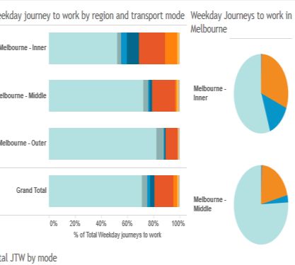
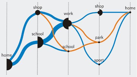
Charts and diagrams
 Various kinds of charts to show the Victorian Integrated Survey of
 frequencies, percentage Travel & Activity to represent weekday
 distributions, etc. JTW data from 2012 and 2013 in
 Melbourne, AU in an interactive
 fashion (accessible online: Department
 of Economic Development, Jobs,
 Transport and Resources).

 Droplet maps
 Droplet maps show the Andrienko et al. (2013) to analyse
 ordering relations between personal driving data collected through
 different places. GPS.

Perhaps the approach most similar to ours is the use of droplet maps as discussed in Andrienko
et al. (2013). Droplet maps show the different locations along parallel vertical axes connected by
lines that convey the magnitude of flow between the places. These maps allow the analysis of
drivers’ trips in order to see temporal or ordering relations between different places (e.g., home,
work, or shopping places). However, it does not distinguish between different modes of travel
and similar to Sankey diagrams the relation between incoming and outgoing flow is not
deducible.

Table 2 visually compares commonly used representation techniques in the context of trip
chaining and multi-modal travel analysis. In summary, we can say that many of these
visualisations focus on representing summary statistics or concentrate on depicting the overall
traffic between areas. In general, these visualisation techniques are thus not well suited for
representing trip chaining and travel mode choice simultaneously.

In contrast to existing techniques, this paper presents a visualisation technique aimed at
analysing trip chaining data and which overcomes shortcomings of existing approaches when it
comes to displaying complex multi-modal trips (or trip chains). It makes use of node-link diagrams
to graphically show how stops within a trip are connected and which modes of transport are used
for the various legs of a journey. Such graphs can, for example, be of use for city planners as they
show detailed information about travel data in a single drawing.

3. Visualisation Approach
Our visualisation technique provides an aggregated view of the trip scheduling behaviour of
people by constructing a directed weighted graph from HTS data and then visualising this graph
using node-link diagrams to show how people concatenate various activities (or modes of

 9
transport) on their journey toward a destination (e.g., journey to work). Each node corresponds
to a stop that people make, either to change the mode of transport or to engage in an activity
(e.g., shopping). It is important to note that nodes do not correspond to geographical locations
or physical facilities. In this paper the term 'node' refers particularly to the types of facilities
provided. For example, all different shops visited during the first stop on a trip will be represented
by the same node, although in reality they might be different shops at different locations. Nodes
with multiple incoming and outgoing edges are split into sub-nodes to convey the sequential
relation between the arriving and departing traffic flows. Edges show the means of transport
people use to travel from one stop to another. The volume of traffic (weights) is conveyed
through the width of the edge and the size of the nodes.

3.1 Algorithm
Figure 1 provides an overview of the principal steps involved in creating an aggregated trip-
scheduling graph. In brief, HTS data is first filtered according to user-definable criteria (e.g.,
weekday, origin) and converted into a graph structure which is then laid out in a left-to-right
fashion. Subsequently, nodes with more than one incoming and more than one outgoing edge
are split and edges are merged to reduce visual clutter later on. In the last step, the graph is
visualised. In the following the different stages are discussed in detail.

For the purpose of exposition we focus on the JTW. As mentioned earlier, however, the algorithm
can be applied to other types of journeys such as journey to school or journey to home as well.
In the following, we assume that we have an input database (e.g., HTS dataset) that contains a
record for each trip taken by a person in a household, where a trip can contain multiple stops. In
this discussion a stop is defined as a change in mode or purpose.

Fig 1 Overview of the principal steps of visualisation algorithm

Step 1: The process starts by extracting all stops from the input database which belong to a trip
(or trip chain) originating at the respondent’s home and ending at the respondent’s workplace
and which match certain criteria (e.g., only trips conducted on a weekday or only trips originating
in a certain neighbourhood). For each trip segment, the type of the origin (e.g., accommodation,
transport place), the type of the destination, the stop number, the mode of travel (e.g., walking,
public bus), and the ID of the trip the segment belongs to are retrieved from the database. For
all except the last trip segment of a trip, the destination of one trip segment is the origin of the
next segment.

 10
G (a) (c) (e) G’ (b) (d) (f) Fig 2 Splitting of nodes to convey the sequential relation of incoming and outgoing traffic flow. a) initial graph derived by extracting trip segments from a household travel survey, b) reduced graph obtained by replacing parallel edges with a single weighted edge, c) and d) graph and reduced graph after node-splitting to counteract ambiguities which arise due to ’junction nodes’, e) and f) graph and reduced graph after merging edges that lead to the same node. Step 2: The information gathered during Step 1 is used to derive a directed acyclic multigraph, formally G = (N, E) where N is a set of weighted nodes and E is a multiset of directed edges, i.e., multiple edges between the same two nodes are permitted. Nodes represent the various types of places visited during a trip. To be more precise, N is partitioned into n+1 subsets N = N 0 N1 N n , Ni N j = , i j (1) with n being equal to the number of trip segments of the longest trip. The nodes in each subset Ni, except N0, represent the types of the destination places of the i-th trip segment. Note, that N0 as well as Nn contain only a single node, as all trips have the same origin and destination type in common, i.e., the respondents home and workplace. A specific type of place can only appear at most once in each Ni. The weight of a node is given by the number of people who visited the associated type of stop at some point during a trip. For example, if three people stopped at a bus station after the second trip segment, then the node "bus station" in N2 has a weight of three. Edges E N N = (u, v) | u N i , v N j , j = i 1 (2) depict the trip segments, pointing from the origin u to the destination v of the trip segment. Each edge is further associated with the trip ID the segment belongs to, the stop number, and the travel mode. Figure 2a shows an example how a graph may look like after this step. Step 3: In this step, a reduced graph G' = (N, E') is derived from G by replacing parallel edges (i.e., edges between the same two nodes) with a single weighted edge, with the edge’s weight being equal to the number of parallel edges (Figure 2b). Each weighted edge e in E' also maintains a list of the individual edges which are aggregated by e. This information will be used for colouring the edges later in the process (see Section 3.2). G' will be used for visualisation purposes, whereas calculations on the graph structure itself are performed on the more detailed graph G. 11
Step 4: Once G' has been derived we obtain a two-dimensional embedding of G' by using the layout algorithm of Sugiyama (Sugiyama et al. 1981) – a graph drawing algorithm which is well suited for directed acyclic graphs, as it is the case in our setting. Moreover, Sugiyama’s heuristic addresses several aesthetic criteria for drawing graphs, among others, minimization of edge crossings, uniform distribution of nodes, and uniform direction of edges (Healy 2013) and thus produces graph layouts which enhance readability. The Sugiyama heuristic arranges nodes in layers, generally along horizontal lines, with edges going from top to bottom but for our purposes we arrange nodes in columns with edges proceeding from left to right. Secondly, as nodes represent the stops made during a trip we want to ensure that all stops at a particular stage of a trip are not scattered over different layers but are instead located in the same layer to increase the clarity of the graph. Therefore, nodes are preassigned to layers, that is, all nodes of a subset Ni are confined to the i-th layer. Step 5: After the layout of G' has been determined some ambiguities need to be resolved which arise due to people arriving at a stop from different locations and leaving for different places. Consider, for example, the case depicted in Figure 2a. People are arriving at the train station (at the centre of the graph) either by train from another train station or by walking from a car park and then travel onwards with another train or on foot. From this representation, however, it is not clear how the individual stages are chained together as it is not possible to discern how the incoming and outgoing edges are related to each other. For example, one could get the impression that somebody was walking to the train station and then continued walking although this was not really the case. To prevent such misinterpretations, nodes with more than one incoming and more than one outgoing edge in G' (called junction nodes henceforth) are split into several nodes and incident edges are rerouted as follows. Let n N be a junction node and let m be the number of incoming edges of n in G' then n is split into m sub-nodes ns1, ns2, …, nsm. Let I(n) further be the set of incoming edges connecting nodes ni1, ni2, …, nim with n in G and O(n) be the set of outgoing edges of n in G. At this point it should be emphasized that the splitting itself is performed in the underlying graph G as the rerouting of an outgoing edge requires knowledge of its preceding edge leading to n. An incoming edge e=(nik, n) I(n), 1 k m is then rerouted to (nik, nsk) and an outgoing edge e=(n, no) O(n) with preceding edge f = (nik, n), that is fstopNr = estopNr - 1 and ftripID = etripID, is rerouted to (nsk, no). The weights of the newly created sub-nodes are set to the number of incoming edges after rerouting. The resulting graph is depicted in Figure 2c. Note that the splitting is performed after layouting to ensure that the sub- nodes of a junction node are placed close to each other (the Sugiyama heuristic, however, attempts to distribute nodes uniformly and may even place associated sub-nodes apart from each other). Hence, sub-nodes are vertically centred around the position of their respective junction node in G' with the vertical order of the sub-nodes chosen in such a way to minimise edge crossings of incident edges (Figure 2d). Step 6: In this step, rerouted outgoing edges starting at different sub-nodes but leading to the same end node are bundled at a merge node as shown in Figure 2e. This is done to avoid cluttering the resulting visualisation with multiple edges running alongside each other, especially 12
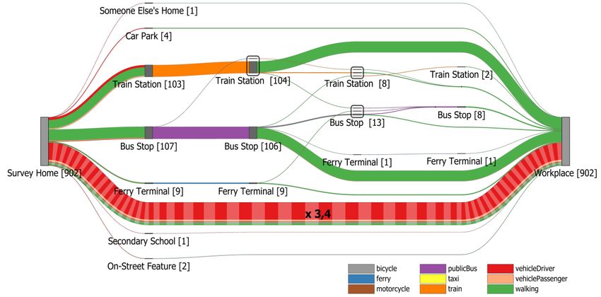
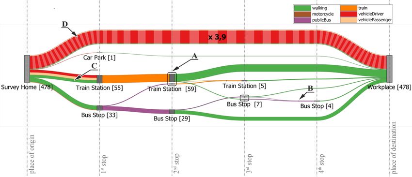
~ if the end node is located far away (cf. Pupyrev et al. 2011). More precisely, let E be the set of outgoing edges which connect different sub-nodes ns of a junction node with a specific adjacent ~ node no then each e~ = (n , n ) E ,1 k m is rerouted to (ns , n ), where n is the new sk o k M M merge node. Furthermore, a new edge between nM and no inheriting all attributes of e ~ (e.g., mode of transport) is created. Finally, edges in G' are updated accordingly to reflect the changes made to G (Figure 2f). Step 7: The graph resulting from Step 6 is visualised as described in the next section. 3.2 Visual Representation Figure 3 shows how the developed visualisation technique represents multi-modal travel behaviour. The figure is based on 478 trips. The resulting graphs are to be read from left to right with the node in the first column representing the origin of the trip (or trip chain), the nodes in the second column representing all different types of stops people encountered at their first stop toward their destination, the nodes in the third column showing all different types of places when stopping for a second time and so forth. Fig 3 Graphical elements of the visualisation. The size and thickness of nodes and edges reflect the number of people. A) a junction node split into several sub-nodes to visualise how the previous stop affects the onward journey, B) edges originating at the same ’junction node’ and sharing the same destination are merged to reduce edge clutter, C) the colouring of edges reflects the percentage share of different modes of transport, D) edges whose size have been limited are visually differentiated with a stripe pattern. The label of the edge provides an indicator of the actual width. Each node has a label which shows the type of the place and the number of people who stopped there. The size and thickness of nodes and edges correspond to the number of people. Sub-nodes due to the splitting of a junction node are surrounded by a grey border to visually indicate their grouping (see Figure 3, Label A). Edges originating at the same ‘junction node’ and sharing the 13
same destination are merged to reduce edge clutter (Figure 3, Label B). Merge nodes are
rendered using a black vertical line to highlight that edges are merged at that point into a single
edge and are not running alongside each other.

The algorithm can be easily adapted to handle different shapes for nodes such as circles or
rectangles. However, depending on the shape the edge routing may need to be slightly adjusted
to reduce overlappings in the proximity of a node. In this paper, we will restrict the discussion to
rectangles. The height of the rectangle is proportional to the weight of the node (i.e., number of
people passing through a place). Edges are drawn using piecewise cubic Bezier curves (edges
returned by the Sugiyama heuristic can consist of multiple segments to prevent edge-node
overlaps) with the width of the curve being linearly proportional to the edge weight. In case of
rectangular nodes, the control points of a curve are set in such a way that the curve is entering
and leaving a node horizontally. The vertical order of the outgoing edges corresponds to the
vertical order of the positions of their respective end nodes to circumvent edge crossings.
Incoming edges at the target are ordered in similar fashion as are edges converging at a merge
node. As the outgoing flow matches the incoming flow at each node (the exception being the
start and target location) the edges sum to the same height.

As all edges are pointing from the left to the right, we follow the recommendation of Holten and
van Wijk (2009b) and omit arrowheads as an indicator of direction. Their user study has shown
that arrowheads should be avoided whenever possible as user performance is quite low with
them, probably due to occlusion and visual clutter caused by the arrowheads. Edges are rendered
in order of decreasing width, i.e., thinner edges are rendered on top of thicker edges such that
they lie over the thicker edges where they cross. This way occlusions of thinner edges by thicker
edges are reduced. We also make use of alpha blending as suggested by Holten and van Wijk
(2009a) to emphasise individual edges in areas with a high density of edges. In addition, edges
are colour-coded to reflect the travel mode. For that purpose, we used an established colour
scheme for qualitative data from ColorBrewer (Harrower and Brewer 2003). If different modes
of transport have been used to reach a destination from the same origin, the curve is divided into
sections with each section representing one mode of transport. The width of a section is
proportional to the percentage share of the transport mode. For example, the stretch labelled C
in Figure 3 has been covered in approximately equal shares by driving, as passenger in another
vehicle, or by walking.

As nodes and edges are scaled in relation to the number of people, popular routes are visually
accentuated. Nevertheless, the scaling of edges and nodes can be challenging due to possible
large variations in traffic volumes, for example, when a few trips (or parts thereof) are being
taken by a disproportionately large number of people (such as the direct home-to-work trip).
Using linear scaling with a scaling factor that scales down the width of such dominant edges to a
reasonable size would cause the other less popular edges to be too thin to remain readable. Using
a larger scaling factor, on the other hand, would lead to some very thick edges which would
occlude large parts of the graph. On this account, we have chosen to impose an upper limit on
the edge widths. Edges that are affected by this limit are visually distinguished with a stripe
pattern as illustrated in Figure 3 (Label D). The multiplier on the edge is displayed to provide an

 14
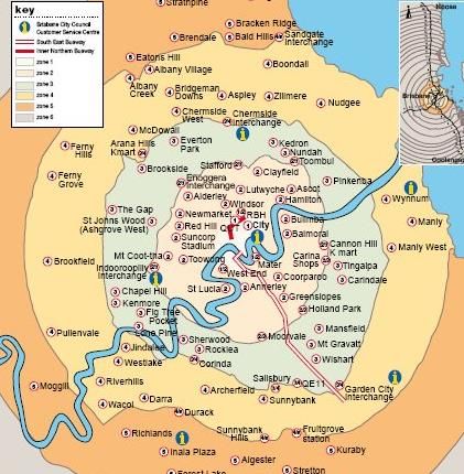
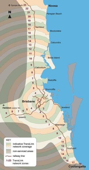
indicator of the actual width. Logarithmic scaling would have been another alternative to
compress the large range of values. However, it may make it more difficult to visually assess the
differences in traffic volume. Moreover, if logarithmic scaling is used, the sum of the edge widths
of the incoming edges will, in general, not be equal to the sum of the edge widths of the outgoing
edges at a node. This can give the observer the false impression that the number of people
changes at a node or merge node.

4. Case Study Brisbane
The city of Brisbane, Queensland’s capital, serves as a case study to illustrate our approach.
Brisbane is located within the SEQ region of the state. Brisbane, comprising 189 suburbs, has a
population of about 1.1 million as of 2009 (Queensland Government, 2010). The TransLink
Division of Queensland Department of Transport and Main Roads delivers transit throughout
SEQ, including Brisbane City, via operator contracts. The SEQ region includes 23 transit zones of
which the City of Brisbane encompasses the five innermost zones (Figure 4). This study focuses
on the travel behaviour of residents living in inner Brisbane, which comprises TransLink’s travel
zones 1 to 3.

Fig 4 Left: TransLink's 23 travel zones of the SEQ area. Right: Inner areas of Brisbane City (zones 1 to 3). Source:
https://translink.com.au

4.1 Study Area and Data
The SEQTS09 data (Department of Transport and Main Roads, 2009) are utilised to demonstrate
the applicability of our approach for trip chain and multi-modal travel analysis. The SEQTS09
database contains information about the day-to-day travel behaviour of persons living in
approximately 10,000 randomly sampled private residential households within the Brisbane
Statistical Division, the Gold Coast City Council, and the Sunshine Coast Regional Council area.
The data were collected during a ten-week period from late April to late June in 2009 using self-
 15
completion questionnaires. Each household was assigned a specific day for which to fill out the
questionnaire.

Table 3 Excerpt from the trip table of the SEQTS09 database for two persons. ORIGPLACE2 and DESTPLACE2
represent the type of place of the origin and destination. TIMEMODE indicates the mode with the longest travel time
for a trip. Places as well as transport modes are number coded in the database.
 PERSID TRIPID TRIPNR TRIPSTAGES ORIGPLACE2 DESTPLACE2 TIMEMODE ...
 Y09H040119P01 Y09H040119P01T01 1 1 201 504 1 ...
 Y09H040119P01 Y09H040119P01T02 2 1 504 508 1 ...
 Y09H040119P01 Y09H040119P01T03 3 1 508 301 1 ...
 Y09H040119P01 Y09H040119P01T04 4 1 301 201 1 ...
 Y09H020138P02 Y09H020138P02T01 1 3 201 301 7 ...
 Y09H020138P02 Y09H020138P02T02 2 3 301 201 7 ...
 Y09H020138P02 Y09H020138P02T03 3 1 201 103 1 ...
 Y09H020138P02 Y09H020138P02T04 4 1 103 201 1 ...
 ... ... ... ... ... ... ... ...

Table 4 Excerpt from the stops table of the SEQTS09 database showing the stages for the two 3-stage trips from
Table 3. MAINMODE indicates the mode of transport.
 TRIPID STOPID STOPNR ORIGPLACE2 DESTPLACE2 MAINMODE ...
 Y09H020138P02T01 Y09H020138P02S01 1 201 103 1 ...
 Y09H020138P02T01 Y09H020138P02S02 2 103 103 7 ...
 Y09H020138P02T01 Y09H020138P02S03 3 103 301 4 ...
 Y09H020138P02T02 Y09H020138P02S04 4 301 103 4 ...
 Y09H020138P02T02 Y09H020138P02S05 5 103 103 7 ...
 Y09H020138P02T02 Y09H020138P02S06 6 103 201 1 ...
 ... ... ... ... ... ... ...

The dataset contains detailed information for each trip taken by one person of a household. A
trip, as stored in the database, represents a one-way travel from an origin to a destination for a
single purpose but may involve several modes of transport (stages). For each stage, several
features such as start-time, type of the origin and destination, and mode of transport are
recorded. All trips conducted by a single person over a day are numbered in chronological order.
Table 3 and Table 4 show small excerpts from the dataset for two people. For example, the
person with the ID Y09H040119P01 undertakes 4 trips with a car (TIMEMODE=1) on a single day
with each trip consisting only of one stage (no change of transport). However, the person makes
two stops at educational institutions (504 and 508) on the way from home (201) to work (301).
In this case, the JTW thus consists of three trips. In contrast, person Y09H020138P02 does not
stop on its way to work to pursue some other purpose but needs to make use of three modes of
transport (TRIPSTAGES = 3). First, the person drives (MAINMODE = 1) to a train station (103) then
takes the train to another train station before walking (MAINMODE = 4) the rest of the way to
the workplace. After work, the person returns back home using the same way.

Based on household trip data we derived trip chains from home to work. In addition, we assigned
each household its related public transport zone (1 to 3) based on its geographic area, indicated
by Statistical Area Level 1 (SA1) codes, stored in the SEQTS09 database. Some SA1 zones are,
however, relatively large and may intersect more than one public transport zone. In that case,
the public transport zone covering most of the area of that SA1 zone was used as the public
transport zone for the entire SA1 area.

 16
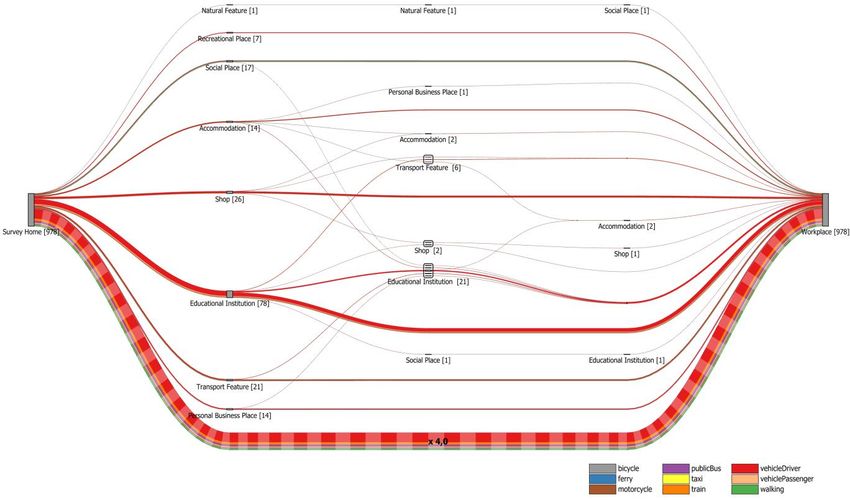
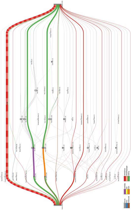
4.2 Results

Fig 5 JTW trip chains undertaken by residents in inner Brisbane (zones 1 to 3, based on 978 journeys)

The results presented in this section make use of the SEQTS09 dataset. To begin with, Figure 5
provides an overall view of trip chains from residents living in inner Brisbane (zones 1 to 3) during
weekdays on their JTW. Each intermediate node reflects a category of location (indicated by the
label below each node) at which people stopped during their work commute. In this example we
used the course classification provided by the SEQTS09 dataset which distinguishes between ten
different types of locations (e.g., educational institution, shop, accommodation). The numbers in
brackets indicate how many people make the stop. Please note that each trip (= edge between
two stops) represented in this graph may itself consist of multiple stages travelled by different
modes of transport, i.e. be a multi-modal trip (see also Figure 6 and 7). For that reason, we
adopted the longest time-mode. This means that the mode used for the longest time of the trip
contributes to the colouring of the aggregated edges.

It is evident from Figure 5 that most of the people (~82%) did not make any additional stop on
their way to work. About 50% of the people who went directly to work used their own vehicle
for their journey, followed by about 25% of the people who used public transport (train and bus
combined). Other transport modes such as walking or bicycle are used far less often to go directly
to work. If people decide to make additional stops on their way to work then they mostly used
their own vehicle. The convenience of a private vehicle possibly accounts for the relatively low
use of public transport. This finding also aligns with previous studies (Strathman et al. 1994; Bhat

 17
1997; Hensher and Reyes 2000; Ye et al. 2007). However, none of the trip chains contains more
than three intermediate stops. The second most frequent class of trip chain is that with a single
intermediate stop. Of these, the most common trip chain is Home—Educational Institution—
Workplace with people stopping at an educational institution, for instance, to drop off their
children at school. The second most frequent trip chain with a single stop, Home—Shop—
Workplace, includes a visit to some sort of shop, for example, to buy something to eat before
going to work. This is followed by trip chains where people make a stop at some accommodation
or transport feature (e.g., to pick-up a co-worker) or to visit a social place. Interestingly, in the
latter case (Home—Social Place—Home), walking is a popular alternative to the private vehicle.
Trip chains with two intermediate stops are few in number with people stopping at two
educational institutions constituting the majority of cases. Trip chains with three stops are very
uncommon.

Fig 6 Multi-modal journeys of people going directly from their homes to work (zones 1 to 3)

As mentioned earlier, Figure 5 only visualises the trip chains without showing details of the
intermediate stages of the trips. Figure 6 illustrates to what degree residents of inner Brisbane
engage in multi-modal travel while commuting to work. It provides a detailed breakdown of
multi-modal direct Home—Workplace trips (the most common trip chain according to Figure 5).
Intermediate nodes in Figure 6 depict transfer locations. Labels again show the type of location
but this time the more detailed classification provided by the SEQTS09 dataset was adopted to
distinguish between different types of transport features (e.g., bus stop, train station). According
to Figure 6, most of the surveyed households which do not pursue any activities during their JTW
do not engage in multi-modal travel at all. They normally use a single mode of transport to go to
work. Again, in this case residents prefer their own vehicle but cycling, walking, or travelling as
vehicle passenger are also used, although to a much lesser extent. If public transport is part of
the work commute then mostly only a single public transport service is used. Typically mainly
either a bus or a train with ferries only playing a marginal role. When the main leg is made of a
single bus or train ride, people usually walk to and from the stops. It will be noted that the

 18
proportion of commuters who use their own vehicles to go to a railway station is greater than
that for those who go to bus stations. This may be due to the fact that train stations are located
farther apart from each other than bus stations. A large proportion of people takes a single train
to the destination station, while others take up two trains. Everyone completes the last leg of the
journey from the station to the workplace on foot. If people go to a train station with a public
bus then they do so to catch a train for their next part of the journey before walking the rest of
the way.

While Figure 6 focuses on multi-modal direct home-to-work trips, Figure 7 offers an integrated
view of both trip chaining behaviour and mode choice. People are making at most six
intermediate stops although work commutes with more than three intermediate stops are
exceptional. Two intermediate stops, on the other hand, are quite common. These trip chains
mainly arise from people who rely on public transport and who walk from and to the bus and
train stations. In terms of modes of transport, mainly car followed by bus and train are the
preferred modes. Public ferries, for instance, only play a very minor role for the daily work
commute.

5. Discussion
Our proposed visualisation method simultaneously represents several variables (e.g., number
and types of stops) which contribute to the complexity of trip chains as well as the frequency of
occurrence of trip chains, the concatenation of stops made during a trip chain, and peoples
preferred modes of travel. Its purpose is making the interrelations between mode choice and trip
chaining behaviour more tangible. It may help transport planners to better appreciate and
identify travel demands, for example, to ensure that public transport meets the demands of the
residents. Moreover, our visualisation method can clearly indicate the number of people visiting
specific locations on their way to work (or between any other two locations). The complexity of
trip chaining often leads to higher car dependency. Our proposed visualisation technique can, for
example, assist town planners or the city council authority in planning land-use around
transportation hubs. For instance, mixed-use land development and multi-purpose activity
centres allow people to fulfil a variety of activities at a single location. This may encourage
travellers to fulfil their desire of activities at a single location and discourage them to undertake
additional trips. This, in turn, can contribute to reducing car dependency and traffic congestions.
The versatility of our approach also allows for easy inclusion of additional data such as SA1 level
codes. Hence, it equips researchers with the ability to zoom into the travel specifics of a certain
area or to easily identify travel mode choice of a subset of the population and the dynamics
behind the mode choice. Consequently, transport planners can use this information to evaluate
the availability of public transport of an area along with land-use development to encourage
people to reduce car travel and instead rely on other sustainable means of transportation.
Besides being useful for analysing trip chaining and mode choice we can also see potential of our
approach for communicating the data to policy-makers. At this point it is worth noting that
although we used HTS data as input, other data sources can be used as well as long as they can
be mapped to the graph structure described in Section 3.1.

 19
Fig 7 Integrated view of all multi-modal JTW trip chains conducted by residents of inner Brisbane on weekdays.

 20
For example, smart card data or data collected by electronic fare payment systems could be used
to visualise passenger flow in public transportation systems.

In terms of runtime, the proposed algorithm is mainly dominated by the complexity of the
Sugiyama layout algorithm when the time taken to import the data (e.g., from a database or file)
is excluded. The runtime of the Sugiyama layout itself depends on the running times of the
algorithms used for its individual phases. Assuming that the fastest available algorithms for each
phase are used, the algorithm has a time complexity of (| || ’| | ’|) (see Eiglsperger et al.
2005 for an in-depth discussion). However, as the layouting is performed on the reduced graph
 ’ which has considerable fewer edges than and because the number of nodes of ’ is
typically small this should not be problematic. Nevertheless, if necessary, more efficient
implementations such as the one proposed by Eiglsperger et al. (2005) are available and could
be used instead as well.

The second major factor influencing the overall runtime of our approach is the time complexity
of the crossing reduction step which takes place after the splitting of junction nodes. This
reduction is currently performed using the greedy-switch heuristic proposed by Eades and Kelly
(1986), which has a time complexity which is quadratic in the number of nodes to be switched
(Bastert and Matuszewski 2001). Besides, as the reduction is carried out for the sub-nodes
of each junction node separately, with | | usually being small this should not be a seriously
limiting factor. Moreover, if runtime is a concern then other heuristics with near-linear time
complexity can be considered (see Bastert and Matuszewski (2001) for a discussion of different
heuristics and their runtime and quality trade-offs). All other steps can be implemented in linear
time. As such the algorithm is applicable to larger datasets such as the one used in this paper as
well, especially because the runtime is not directly dependent on the number of individual trips
to be processed but rather on the number of edges in the reduced graph, whereby usually
| ’|
In terms of space requirements, we maintain two graphs – and ’ – in parallel, requiring
 (| | + | |) + (| | + | ’|) space. Please note that the number of nodes and thus the visual
complexity of the resulting graph is partly influenced by the number of types of places which are
distinguished. In Figure 5, as pointed out above, we directly used the course classification of the
SEQTS09 dataset which differentiates between ten types of places. Some of these places are,
however, rarely visited during the work commute (e.g., recreational place or natural feature). If
desired by the analyst such seldom visited places may be merged together. By doing so, edges
connecting these types of places also become thicker which might make it also easier to see the
modal differentiation.

One challenge in visualizing HTS data is the complexity of factors influencing the travel choices of
people. A multitude of variables has been recognized to influence the travel behaviour, including
individual or household characteristics (e.g., age, gender, marital status, presence of children, or
number of vehicles per household) and geographical area (Hensher and Reyes 2000; Ma et al.
2014; McGuckin and Murakami 1999). While we focused on analysing JTW patterns of residents
living within certain public transport zones in the above case study, these other characteristics
can be used as well to generate individual graphs for certain segments of the public. For example,
separate JTW graphs for males and females or individual graphs for each district in a city. For
comparison purposes, these graphs could then be visualised side-by-side by using small
multiples.

Similarly, there exist a number of attributes which can be used for describing and understanding
trip chains and multimodal travel. Our visualisation currently represents an important subset of
these attributes, such as frequency of trips, mode choice, and number of stops. However, there
exist other attributes (e.g., purpose, travel time, or distance travelled) which should also be
considered for inclusion. Small multiples could, for example, also be used to generate graphs
based on travel time or distance. Currently it is also not apparent from the visualisation which
activities people pursue at the different locations. Activities, however, play an important role in
activity-based approaches to travel behaviour analysis (Xianyu 2013). For example, a commuter
may not necessarily stop at a train station to catch a train but to withdraw money from an ATM.
One possibility to show such information could be by colouring the nodes in proportion to the
purpose of the stop. However, we refrained from doing so mainly for two reasons. 1) As we are
concerned with nominal data it is important that the colours are reliably distinguishable be the
human observer (cf. Silva et al. 2011). Research suggests that humans can rapidly perceive about
five to ten different colours (see Ware 2004). The SEQTS09 dataset we used, however,
differentiates between at least 10 purposes which would have approximately doubled the
amount of colours or one and the same colour would have to be used for different categories. 2)
As the nodes can be rather small the percentage share of the different activities may be hard to
assess visually. Such information could, for instance, be displayed by tooltips. Tooltips may also
be used to display more detailed information on demand (e.g., exact percentage shares for the
different modes of transport). As part of future work we are thus considering to develop the
visualisation into an interactive system which allows users to access detailed information on
demand and offers them the possibility to compare multiple trip scheduling graphs using small
multiples. We are also considering ways to incorporate temporal attributes into the visualisation.

 22
You can also read