2021 // BRAND GUIDELINES - eCampusOntario
←
→
Page content transcription
If your browser does not render page correctly, please read the page content below

2021 // BRAND GUIDELINES
01 // THE BRAND
TERMS AND CONDITIONS

The eCampusOntario brand is a valuable      These eCampusOntario Branding Guidelines      Please allow a minimum of five (5) business
asset of eCampusOntario.                    define consistent guidelines and standards    days for the review process to occur. Please
                                            for using the logos and imagery ascribed to   submit materials and direct any questions
As a partner, you are required to comply
                                            the eCampusOntario brand and apply to all     about use of eCampusOntario branding to
with these eCampusOntario Branding
                                            advertising and promotional materials.        communications@ecampusontario.ca
Guidelines. It is essential that you
ensure that all personnel responsible for   eCampusOntario asks to review and
producing ads, direct mail pieces and       approve the content of any advertisement,
other promotional materials review them,    collateral or promotional materials
understand them and implement them          containing the eCampusOntario wordmark,
properly and consistently.                  logo or imagery prior to it being released.

                                                                                                              2021 // BRAND GUIDELINES // PAGE 2
01 // THE BRAND
BUT, WHAT IS A BRAND?

More than a name or a logo. More than a       and in the quality of the customer’s            alone—communicates something to
website. And more, ultimately, than what      experience in using a branded service           someone about the eCampusOntario brand.
the website does.                             or product.
                                                                                              When the brand’s messages are developed
What the website does may change, after       But the brand’s representation                  ad hoc, focused solely on the needs of
all–or be succeeded by some other service     communicates other, less obvious aspects        the moment, they have no lasting impact
that’s better, faster and less expensive.     of the brand that are just as important. A      and represent a shortsighted use of scarce
                                              clear promise, for example, that is important   marketing dollars.
The guidelines that govern communications
                                              and memorable to customers. A distinctive,
for the eCampusOntario services are part of                                                   But when messages are delivered within
                                              recognizable personality that is inseparable
a much larger effort—to build awareness,                                                      a consistent framework and reinforce the
                                              from the brand itself, informing not only
understanding and preference for the                                                          brand’s promise and personality, their
                                              advertising and communications but
eCampusOntario brand. To build a brand                                                        impact can be leveraged to boost awareness
                                              behavior as well.
that endures.                                                                                 and heighten brand recognition and
                                              Achieving the goal of an enduring               preference. Promotional dollars work twice
A brand is a shorthand representation—
                                              brand requires a conscious, coordinated,        as hard, serving short-term goals as well.
often communicated in a single word or
                                              consistent approach to communications
symbol—of everything a company is, does
                                              and behavior. That approach is based on
and stands for. That representation can be
                                              the understanding that every choice and
seen most clearly in promotional messages
                                              every decision—not advertising or collateral

                                                                                                                 2021 // BRAND GUIDELINES // PAGE 3
01 // THE BRAND
PERSONALITY

Brands, like people, have personalities. The   Rather, we should use them as a filter or   The eCampusOntario brand is:
most successful brands understand that a       a standard against which to measure our
                                                                                           Well-informed
distinctive personality can not only make      communications and our behavior.
                                                                                           The eCampusOntario brand is street smart,
a brand promise more believable. It can
                                               To enhance recognition and memorability     alert to change and able to distinguish
also make a brand and its promise more
                                               for the eCampusOntario brand, these         what’s important from what’s not.
memorable, enhancing its stature and
                                               attributes of our brand personality
building customer loyalty, adding weight to                                                Confident
                                               must become a part not only of every
the brand’s competitive position.                                                          The eCampusOntario brand is focused on
                                               communication we produce, but of
                                                                                           the task at hand. It knows it can deliver
The words that define the eCampusOntario       everything we are and do.
                                                                                           everything you need it to.
brand personality are not words we should
use to describe our company, our products                                                  Approachable
or our brand.                                                                              The eCampusOntario brand knows it’s an
                                                                                           ally to education and a resource you can
                                                                                           depend on without taking it too seriously.
                                                                                           That’s why it’s so likeable.

                                                                                                               2021 // BRAND GUIDELINES // PAGE 4
02.0 // WORDMARK & LOGO
VARIATIONS

The wordmark is the most common and may            55° Angle            18° Angle                        55° Angle
be used in most circumstances. Although
should the layout offer plenty of white space or
be an especially vertical layout, the hero logo
may be appropriate.
The wordmark should be set in either the top
left or bottom left. Never on the right.           Primary (Horizontal) Wordmark

The icon logo is used for social media badges,
favicons, app icons and other situations that                                       Icon (Square) Logo
call for a tiny mark.
It is also incorporated within sub-brands to
reinforce the eCampusOntario association.
Other logos should be placed next to the
eCampusOntario logo.

                                                                                        2021 // BRAND GUIDELINES // PAGE 5
02.1 // WORDMARK & LOGO
CLEAR SPACE

To preserve the eCampusOntario logo’s
integrity, always maintain a minimum
                                              25%
clear space around the logo. This clear
space isolates the logo from competing
graphic elements such as other logos, copy,                                   100%
photography or background patterns that
may divert attention. The minimum clear
space for the eCampusOntario wordmark is
defined using the “M” in the wordmark.
The icon will often sit with a badge.
Maintain a 25% border around it. If the “e”
is 100 PX alone, it will be 150 PX with its
white border.

                                                    2021 // BRAND GUIDELINES // PAGE 6
02.2 // WORDMARK & LOGO
SIZE
The eCampusOntario logo retains its visual
strength in a wide range of sizes. However,
when the logo is reproduced in print too
small, it is no longer legible and its impact MIN HEIGHT = 30 PX / 6 MM
is diminished. The minimum size of the logo When used as a footer that is not intended
to draw attention this is an acceptable size.
for print is determined by the height, which
should never be reproduced in a size smaller
than 5 mm height for the wordmark, 20mm
height for the hero logo. DANGER HEIGHT = 20 PX / 5 MM
At this size you will notice the mark begins
to lose it’s legibility. This is the absolute
smallest it can be reproduced.
2021 // BRAND GUIDELINES // PAGE 702.3 // WORDMARK & LOGO
MISUSE
Incorrect use of the eCampusOntario logo
compromises its integrity and effectiveness.
The examples of logo misuse are not Don’t seperate the wordmark Don’t stretch the logo disproportionatley.
comprehensive; they are only a small sample
of possible misuses of the eCampusOntario
logo.
To ensure accurate, consistent reproduction
of the eCampusOntario logo, never alter, Don’t use non-brand colors on the wordmark Don’t change the proportions of elements.
add to, or attempt to recreate it. Always
use the approved digital artwork, available
from the eCampusOntario Creative
Communications team.
Avoid using “eCampus Ontario” (two Don’t rearrange elements of the logo Don’t use the logo on an angle
words) or “eCampus” (short form) to refer
to eCampusOntario.
Don’t combine elements in new ways Don’t stack logos
2021 // BRAND GUIDELINES // PAGE 802.4 // WORDMARK & LOGO
WORDMARK PLACEMENT
Whenever possible, the eCampusOntario
logo should appear in the upper left
corner, in full color (aubergine), on a white
background. Consistent placement in this
location on communications materials helps
build awareness of the eCampusOntario
brand.
Clear space from the top and left edge is
equal to the letter “M,” as illustrated in the
diagram. If the logo cannot be placed in the
upper left corner, an acceptable alternate
placement is the lower left corner. Be sure
to maintain an equal amount of clear space
from the bottom and right edges.
2021 // BRAND GUIDELINES // PAGE 903.0 // VISUAL LANGUAGE
WE BUILD IT TOGETHER
The eCampusOntario brand’s graphic style more enterprise level audience (i.e., Organization-focused illustration should
is a flexible system of elements that visually administrators, leaders, industry, education reflect the strategic, system-level benefits of
represent immediate access to the flow professionals, IT executives, etc.). eCampusOntario.
of information. This is illustrated through
End-user refers to eCampusOntario services End-user applications should communicate
colour, typography, tone of voice and
marketed to individuals belonging to the advantages of supporting and
photography.
eCampusOntario members: educators, participating in eCampusOntario initiatives.
The wordmark and logos can be used across librarians, support staff, students, etc., User colour palette stresses livelier, more
both organization-to-organization and as well as the general public. Because animated colours. Illustrations should focus
end user communications when applied in communications for eCampusOntario more on authentic imagery that represents
conjunction with appropriate colours and services can often vary between these two real activities and events, and the actual
illustration. areas, slightly different design styles are people who participate in them.
recommended.
When applying the eCampusOntario brand’s Always keep in mind which market segment
graphic elements, especially photography Organization communications should a design is meant to communicate with, and
and illustration, it is important to distinguish emphasize eCampusOntario services, apply the eCampusOntario brand’s house
between organization-oriented and end expertise and commitment to members. style to create the most effective application
user-focused applications when possible. To help reflect this, the colour palette possible. These are guidelines, not adamant
Organization-focused materials promote should rely on darker, more serious colours rules.
eCampusOntario solutions to a typically that reference the logo more directly.
2021 // BRAND GUIDELINES // PAGE 1003.1 // VISUAL LANGUAGE
COLOUR
The eCampusOntario logo should be
reproduced in color whenever possible.
The purple (Aubergine) is the primary colour.
White is the most effective background
on which to reproduce the colour logo
because it provides a clean, crisp contrast Spot logo, 4-color logo, RGB logo – for use on Black logo – for use when color Full-reverse logo – for use when white or light colour
for the logo’s color and elements. If white backgrounds or where there is sufficient
contrast between the logo and the background for
reproduction is not an option. backgrounds are not an option. When placed on top
photographic or patterend backgrounds.
colour reproduction is not available or is reproduction.
not a viable option, the logo should be
reproduced either in solid black or as a full-
reverse in white on a black background.
2021 // BRAND GUIDELINES // PAGE 1103.1 // VISUAL LANGUAGE
COLOUR AUBERGINE STEEL GRASS TANGERINE
RGB RGB RGB RGB
R30 G26 B52 R107 G164 B184 R118 G136 B29 R241 G180 B52
CMYK CMYK CMYK CMYK
C97 M100 Y15 K72 C56 M8 Y9 K21 C46 M6 Y100 K42 C0 M32 Y87 K0
The primary colour palette consists of HEX# 1E1A34 HEX# 6BA4B8 HEX# 76881D HEX# F1B434
Aubergine (purple) and Tangerine (yellow).
Tangerine is used as a non-dominant
accent colour in headers, backgrounds,
PANTONE® MULTIPLY X2 MULTIPLY X2 MULTIPLY X2
and images. Tangerine plays a larger role 5255
in digital messaging than print. Steel
(blue) and Grass (green) should be used PANTONE® PANTONE® PANTONE®
for sub-titles and secondary messaging, 549 7496 143
and colour variation for small images and
highlights within illustrative graphics.
For 4-color process printing, refer to the
CMYK values shown here. For on-screen 75%
and web applications refer to the RGB/
HEX values specified.
50% 75% 75% 75%
The colors shown throughout this manual have not been evaluated by PANTONE for accuracy and
may not match the PANTONE Color Standards. PANTONE is a registered trademark of Pantone,
Inc. Variations in color may occur, but try to match the eCampusOntario color palette as closely as
possible. For 4-color printing, use the CMYK values as a beginning reference. Print vendors may
have their own values and formulas for matching PANTONE colors in 4-color process, but the goal 25% 10%5%
10% 5% 50% 50% 50%
should always be to match the PANTONE standard of the eCampusOntario color palette. Color
variations may also occur on-screen as a result of different screen calibrations and/or software
applications being used.
2021 // BRAND GUIDELINES // PAGE 1203.2 // VISUAL LANGUAGE
TYPOGRAPHY - AKA FONTS
Aa Aa
To help provide a consistent, unified Frutiger LT Std - 45 Light Frutiger LT Std - 47 Light Condensed
look in the eCampusOntario brand’s use abcdefghijklmnopqrstuvwxyz abcdefghijklmnopqrstuvwxyz
of typography, the Frutiger LT typeface ABCDEFGHIJKLMNOPQRSTUVWXYZ ABCDEFGHIJKLMNOPQRSTUVWXYZ
1234567890!@#$%^&*()_+?{}|\ 1234567890!@#$%^&*()_+?{}|\
should be used on all communications for
eCampusOntario services. The sans serif of
Aa Aa
Frutiger is simple yet distinctive and supports Frutiger LT Std - 55 Medium Frutiger LT Std - 57 Medium Condensed
the eCampusOntario brand. abcdefghijklmnopqrstuvwxyz abcdefghijklmnopqrstuvwxyz
ABCDEFGHIJKLMNOPQRSTUVWXYZ ABCDEFGHIJKLMNOPQRSTUVWXYZ
Frutiger can be used in long and/or text 1234567890!@#$%^&*()_+?{}|\ 1234567890!@#$%^&*()_+?{}|\
heavy printed documents. It is the most
legible font in this scenerio.
Aa Aa
Frutiger LT Std - 65 Bold Frutiger LT Std - 67 Bold Condensed
A safe web font when Frutiger is not
abcdefghijklmnopqrstuvwxyz abcdefghijklmnopqrstuvwxyz
available is Arial.
ABCDEFGHIJKLMNOPQRSTUVWXYZ ABCDEFGHIJKLMNOPQRSTUVWXYZ
1234567890!@#$%^&*()_+?{}|\ 1234567890!@#$%^&*()_+?{}|\
2021 // BRAND GUIDELINES // PAGE 1303.3 // VISUAL LANGUAGE
TONE OF VOICE
The eCampusOntario voice is an essential
component of the eCampusOntario brand. It
To aid in presenting a consistent tone
across communications, an editorial style
Always keep in mind
may express an attribute, feature or benefit
of an eCampusOntario service, but it does
guide has been developed for use on
emails, advertising, brochures and other
which market segment
this in shorthand— with a simple word or a communications. It is available by request
short phrase that also expresses the brand’s from the communications team. a design is meant to
essence.
Additional information about tone and style communicate with.
The eCampusOntario audience is comprised for social media, crisis communications,
of educators, academic leadership, industry and general communications is available for
and students. Based on this audience, our employee referral.
tone of voice in communications is positive,
friendly, and professional. The tone
established by copy and imagery should be
consistent.
2021 // BRAND GUIDELINES // PAGE 1403.4 // VISUAL LANGUAGE
PICTURES TELL A THOUSAND WORDS
Imagery plays an important role in the the
eCampusOntario brand’s graphic style,
identifying eCampusOntario services and
showing them in brand colour and style.
In addition to the wordmark and logos,
there are two other categories of imagery
that can be used in communications:
(1) Icons and (2) Photography.
Here are examples of these kinds of imagery
These two graphics are end-
with some general style guidelines to ensure
user focused. For use in
consistent brand presentation.
communications targeted
towards users or sections within
documents talking about users.
2021 // BRAND GUIDELINES // PAGE 1503.5 // VISUAL LANGUAGE
ICONOGRAPHY
WEB
2021 // BRAND GUIDELINES // PAGE 1603.6 // VISUAL LANGUAGE
PHOTOGRAPHY
eCampusOntario is smart and
innovative, its photography
should reflect this attitude.
Whenever possible, pictures with End-user photography should
a hint of brand colours should be bright and cheerful. Light
be used: a hint of orange in the backgrounds evoke hope.
model’s hair, a twinkle of blue in
their eyes, or dark blue tones in the
background.
Organization-focused photography
should have a darker background,
creating a higher contrast and
more authoritative tone.
18° Angle
2021 // BRAND GUIDELINES // PAGE 1703.7 // VISUAL LANGUAGE
SHAPES, GRADIENTS & OVERLAYS
The “egg” shape is a key tool of the
eCampusOntario brand kit. It’s the shape
of the logo and may be used as a graphic
element or a frame for photography. For
accessibility reasons, use of graphic elements
is generally not encouraged.
The 18 degree angle in the wordmark
shown gives way to the Tangerine “slice.”
This rectangle may appear with or without
rounded corners in a variety of weights.
When the eCampusOntario wordmark
requires a rectangle background, the
“slice” should be utilised.
2021 // BRAND GUIDELINES // PAGE 1803.7 // VISUAL LANGUAGE
SHAPES, GRADIENTS & OVERLAYS 100% Tangerine
These two primary shapes can be utilised in 18° Angle
layouts. If used with a gradient, it is made
up of the same brand colour combined with
a 50% tint of itself on an 18 degree angle.
When multiplying or shading a brand colour,
overlay a colour with itself once, or overlay
Steel with Tangerine, creating Grass in the
space between.
50% Tangerine
2021 // BRAND GUIDELINES // PAGE 1904.0 // SUB-BRANDING
SUB-BRAND LOGO BUILDING
55.5° Angle
Use this guide to set distance
This “e” represents not only the traditional
prefix of “electronic” but also doubles as a SXD
reflection of education. The circle around it
represents Ontario. This gives strengths to all LAB
Minimum clearance
education initiatives in Ontario and should is defined by the 12.25° Angle
“e” logo Use this guide to align characters
always be reflected as such.
FONT: Frutiger Black Italic 76 Take note of some of the techniques used above.
LEADING: as shown above 40/34pt
TRACKING: default: +50pt - Sliced the bottom edge of the “S” to align with “L”
Start with a tracking set above. Now slightly adjust - Reduced the width of the “D”
kerning to align characters to each other. Also try to
even out the tracking to achieve a greater balance. - Cut the “L” to align with “A”
- Adjusted the kerning of all letters to balance
2021 // BRAND GUIDELINES // PAGE 2004.1 // SUB-BRANDING
LOGO SPACING
Clear space is an important element to
consider in all layouts especially when
locking up with the parent ECO logo.
In this case we double the amount of Parent and child lockup
regular spacing.
Both lockups should be aligned left
whenever possible. If a layout demands
the lockup to be aligned to the centre
this may also be permitted. Do not align Always leave a minimum of this much space
between the logos and any other elements
these lockups to the right.
Parent logo, child logo and “Ontario logo” lockup
Minimum clearance between the edge of the
asset and the other logos is defined by the
“m” character in the eCampus logo
2021 // BRAND GUIDELINES // PAGE 2104.2 // SUB-BRANDING
PARENT LOGO AND ONTARIO LOGO LOCKUP
eCampusOntario and the Government of Always leave a minimum of this much space
Ontario maintain a Communications protocol between the logos and any other elements
which states that eCampusOntario will identify
itself as funded by the Government of Ontario
in all communications projects. In visual identity,
this means that the eCampusOntario logo and Parent logo, child logo and “Ontario logo” lockup
the Ontario logo are placed side by side on web
Minimum clearance between the edge of the asset and the other logos is defined by the
properties, published materials, etc. “m” character in the eCampus logo. Separated with a 0.5” line between the two logos.
The Ontario logo should always be positioned
to the right of the eCampusOntario logo, using Minimum Sizes
a minimum clearance space equal to “m” Print
To ensure legibility, the printed
character in the eCampus logo, separated with logo must never be reproduced
a 0.5” line between the two logos. smaller than 0.75” (19mm) wide
for print applications
If you have any questions about correct Digital
The minimum size for digital
display of the Ontario logo please contact Print Digital use is 180pixels wide. This
digital size is based upon high-
communications@ecampusontario.ca resolution (retina) displays.
When designing for lower-
resolution digital displays, the
logo can appear at a minimum
1.25” 0.75” 180 px of 90 pixels wide
2021 // BRAND GUIDELINES // PAGE 2204.2 // SUB-BRANDING
RULES TO LIVE BY
The “e” logo is still the primary logo of all
sub-brands and may appear on its own or Do NOT display a sub-brands logo
text on its own without the “e” logo.
along with the sub-brand name.
The sub-brand name on the other hand may
never be displayed alone without the “e”
logo
2021 // BRAND GUIDELINES // PAGE 2304.3 // SUB-BRANDING
APPLYING YOUR BRAND
Colours have symbolic meaning, and can be
used to evoke emotions or set a tone.
Sub-brands are always welcome to use
black, white, and aubergine, a colour Sub-brands may appear in ECO Aubergine, black or white. Or There is a maximum character length of 12.
you may choose to establish a unique combination of colours The ideal character length is less than 8.
eCampusOntario uses to reflect strength to use with one specific sub-brand. This combination should
always start with the ECO colour palette. Sub-brands should When possible, it is also preferable to have a
and trust. not appear in other colours in the eCampusOntario brand. longer word on the bottom.
If a sub-brand has distinct traits or values
and wishes to reflect unique features, it
may differentiate itself through the use of
a colour palette that is related but distinct
Adding black to a colour is called Adding white to a colour is called
from the eCampusOntario colours. a shade. This will darken the colour a tint. This will lighten the colour
and make give it more strength and and make it appear more soft and
boldness. receptive.
For example, a sub-brand may wish to
develop a more dynamic colour profile to
indicate speed of service. In this case, an
orange palette (with related shades and MULTIPLY X4 PANTONE® 75%
143
tints) may be created to reflect “speed.”
MULTIPLY X2 50%
2021 // BRAND GUIDELINES // PAGE 2404.3 // SUB-BRANDING
APPLYING YOUR BRAND
The colour orange, for example,
may be selected to reflect the traits
of speed and value.
Creating a sub-brand colour palette serves
to distinguish it among the family while still Find OER Impact About Contact
maintaining the core eCampusOntario DNA.
When used to target a specific user group
it will also enhance the message and help Find your book, fast and free
communicate a specific goal. Search our collection of open texbooks and other open
resources. The curated collection aligns with top subject
In this case creating a darker colour palette areas in post-secondary education and features reviews
from experts and educators across Canada.
evokes strength, boldness and independence.
SEARCH NOW MORE SERVICE
The logo’s circular shape could also be used with cropped images,
which further reflects the connection with the parent brand.
2021 // BRAND GUIDELINES // PAGE 2505.0 // DIGITAL BADGING
VISUAL FORM
Content Section
The eCampusOntario digital badge shape
is designed to echo the eCampusOntario
logo and serves to strengthen its brand
recognition. The form is then altered to fit
content in both the upper right and lower
left sections.
Content Section
2021 // BRAND GUIDELINES // PAGE 2605.1 // DIGITAL BADGING
BREAKDOWN
When creating a badge, follow these 30px
measurements based on a badge created at
Issuer Logo, aligned right
a width of 400 pixels.
30px
Dimensions of the image within the icon
may vary, but should not fully cover the
eCampusOntario icon.
Note that the image may have colour but
should not be predominantly coloured. Subject icon (HCD)
225x225 px
Always produce badges as vector graphics square container
for easy re-scaling.
Indicating an hour count on the badge is
225 px
optional, depending on the requirements
of the learning activity. Module or Course Title
Frutiger 65 Bold - 20/20 Human-Centered Design
Use Frutiger font. Module year and duration
Frutiger 55 Roman - 30/20
10px
2019 - 32HRS
400 px
2021 // BRAND GUIDELINES // PAGE 2705.2 // DIGITAL BADGING
TINY BADGE (ALTERNATE)
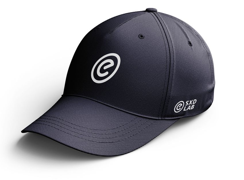
When the badge is displayed smaller than 150 SXD
LAB
px., use a tiny badge. To create the tiny badge
follow these steps:
First remove the module/course title, date,
and duration.
Second enlarge the subject icon from 225px.
SXD LAB
to 250px. Human-Centered Design
The tiny badge should still have its module/ Subject icon (HCD)
2019 - 32HRS
250x250 px
course title, date and duration appear in close square container
proximity to each other.
SXD
LAB
SXD LAB 250 px
Human-Centered Design
2019 - 32HRS
100 px
400 px
2021 // BRAND GUIDELINES // PAGE 2805.3 // DIGITAL BADGING
DIMENSIONS & FORMATS
Badges are created at a width of 400 pixels
in a vector format (.AI .EPS .SVG)
This allows the badge to be scaled up and
reproduced in any size without suffering a
loss in quality.
One common digital display size is 200px.
width. The design has been created to Human-Centered Design
2019 - 32HRS
appear clean and legible in this size.
When the badge needs to be displayed 200 px
smaller, please refer to the tiny badge.
The badge may be displayed down to a size
of 100px but must include the name of the SXD
LAB
SXD LAB
organization that issues the credential (i.e., Human-Centered Design
Human-Centered Design
the Issuer), as well as the name and badge
title in text form either to its right or below. 2019 - 32HRS 2019 - 32HRS
100 px
400 px
2021 // BRAND GUIDELINES // PAGE 2905.4 // DIGITAL BADGING
SUBJECT ICONS
The subject icons differ from more detailed
iconography referred to in section 3.10. They
must be very simple in order to remain visible
at smaller sizes.
They are used to reflect the concept covered
in the module or course itself.
As for size and alignment, each module or
course may use some liberty to best reflect
5 px stroke
content. weight of flame
Aligning the graphic for visual appeal is more
important than having it perfectly centered. 175 px
225 px
One constant among all icons is a simple line
drawing with a 5px. stroke weight.
400 px
2021 // BRAND GUIDELINES // PAGE 3005.4 // DIGITAL BADGING
SUBJECT ICONS
The subject icon reflects the topics covered Human-Centered Design
This icon represents the principles of HCD
Igniter
Starting a fire in a new industry, or solving
in the course or module itself. The idea is to and mindsets used to create innovative
solutions, experiments, and prototypes.
a problem with innovative concepts? This
icon is for you.
make the subject or content of the course or
module more memorable through creative
and appropriate use of illustration.
As for size and alignment, each course or
module may use some liberty to best reflect
their content.
Aligning the graphic for visual appeal is more
important than having it perfectly centered.
One constant among all icons is a simple line
drawing with a 5px stroke weight.
2021 // BRAND GUIDELINES // PAGE 3106.0 // DESIGN EXECUTION
SIGNATURE: PRINT
To help provide a consistent, unified look
in the eCampusOntario brand’s use of
typography here are some signature lock-
ups for use in printed material.
All communication projects and advertising 372 Bay St. 14th Floor,
Toronto, ON, M5H 2W9
must include the Ontario logo. Always ecampusontario.ca
position the eCampusOntario logo to the
left of the Ontario logo, using a space Align Left
equal to the width of the trillium symbol.
On personal communications, inclusion is
optional.
372 Bay St. 14th Floor,
372 Bay St. 14th Floor, Toronto, ON, M5H 2W9
Toronto, ON, M5H 2W9 ecampusontario.ca
ecampusontario.ca
Align Left Align Left
2021 // BRAND GUIDELINES // PAGE 3206.0 // DESIGN EXECUTION
SIGNATURE: EMAIL
To help provide a consistent, unified
look in the eCampusOntario brand’s // Sammy Sampleton
Good morning Sam,
use of typography here is a signature Marketing & Communications
416.555.1234 Lorem ipsum dolor sit amet, consectetur adipiscing elit,
lock-up for use in email. sed do eiusmod tempor incididunt ut labore et dolore
magna aliqua. Netus et malesuada fames ac turpis egestas
sed tempus. Sit amet dictum sit amet justo donec enim
diam.
372 Bay St. 14th Floor
Toronto, ON, M5H 2W9 Odio morbi quis commodo odio aenean sed adipiscing.
ecampusontario.ca Volutpat sed cras ornare arcu dui vivamus arcu. Facilisis
volutpat est velit egestas dui id. Senectus et netus
et malesuada. Enim ut sem viverra aliquet eget. Quis
varius quam quisque id diam. Arcu ac tortor dignissim
// Sammy Sampleton
Marketing & Communications
416.555.1234
372 Bay St. 14th Floor
Toronto, ON, M5H 2W9
ecampusontario.ca
2021 // BRAND GUIDELINES // PAGE 33372 Bay St. 14th Floor, Toronto, ON, M5H 2W9
ecampusontario.caYou can also read