7 Onboarding Lessons Top Travel Apps - from the - Apptimize
←
→
Page content transcription
If your browser does not render page correctly, please read the page content below

7 Onboarding Lessons
       from the
  Top Travel Apps
INTRODUCTION

Travel apps face a unique problem trying to get users to stick.

Most people do not book flights or make hotel reservations each month. They travel at
most a couple of times a year. That means that successful travel apps have to do more
than target people who are actually traveling. They have to provide value that extends
beyond a single vacation or business trip.

If you want to make it as a travel app, you face some steep competition. Established
industry giants like Expedia and Priceline have massive advertising budgets that they can
tap into for new user acquisition. In 2014, Priceline’s advertising budget was a whopping
$2.6 billion, while Expedia’s was $1.6 billion.

The best mobile travel apps do not sink precious cash into an arms-race for installs and
promotions. Instead, they make their apps inherently sticky by driving users to the core
value, faster.

This begins with onboarding, the process of setting up first-time users to be successful
within your app.

In this white paper, we break down the onboarding flows of seven of the top mobile travel
apps in the Google Play and Apple App store. We analyze critical onboarding lessons, as
well as suggestions for further experimentation that you can take and apply to your own
app.

DISCLAIMER: Any screenshots of apps featured in this document are publicly accessible and are reproduced here for
commentary and educational purposes under fair use guidelines. Each screenshot includes a source with a link to the
website or a link to the App Store/Google Play page of the app. Inclusion in this document does not imply an
endorsement of Apptimize by the featured apps.

                                      www.apptimize.com | contact@apptimize.com                                       2
1. HOPPER: AGGRESSIVELY DRIVE VALUE

Hopper is a travel app that helps you find airplane flight deals by using data to analyze
and predict airfare flights. Its mobile app was named by Google as one of the most
beautiful apps of 2016.

Hopper’s original onboarding flow used a standard three-screen tutorial to show users
how the app worked:

            HOPPER’S ORIGINAL THREE SCREEN ONBOARDING TUTORIAL

                                        Source: Hopper

The team at Hopper found that most users didn’t want to read about how Hopper
worked. They wanted to try it for themselves. To improve its onboarding flow, the team
could have followed conventional wisdom, and simply reduced the number of screens in
its onboarding flow. Instead, they took a more aggressive path.

According to Pantelis Korovilas, Hopper’s Lead Product Designer, they had three main
goals for doing so:

 1. Get users to pay closer attention to welcome screen copy by asking for notification
    permissions early—and explaining why Hopper needs them.

 2. Build awareness of how notifications and the core action of “watching flights” in-app
    were tied to saving money on Hopper.

 3. Increase permissions acceptance rate.

                             www.apptimize.com | contact@apptimize.com                      3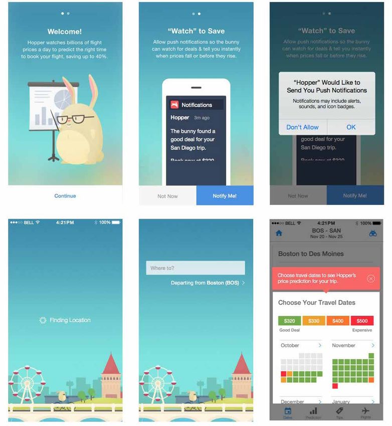
Hopper’s first test was to cut the number of tutorial screens from three down to two. They
upped the ante by using one of these screens to ask for permission to send push
notifications:

     HOPPER ASKS FOR PUSH NOTIFICATION PERMISSION IN THEIR NEW FLOW

                                        Source: Hopper

Rather than simply requesting notification permissions through Apple’s native pop-up,
Hopper’s new welcome screen primes new users for the ask. It explains that notifications
are used to notify users when flight prices fall or rise.

While this new onboarding flow improved conversion metrics further down the funnel,
the team found during testing that too many people were dropping off upon reaching
the welcome screen. Hopper’s final onboarding sequence solved this problem elegantly:
They allowed users to opt-out of notifications with a “Not Now” call-to-action.

             Don’t bury key value points late into the user flows,
                   but surface them as early as possible.

                             Pantelis Korovilas
                           Lead Product Designer, Hopper

                             www.apptimize.com | contact@apptimize.com                       4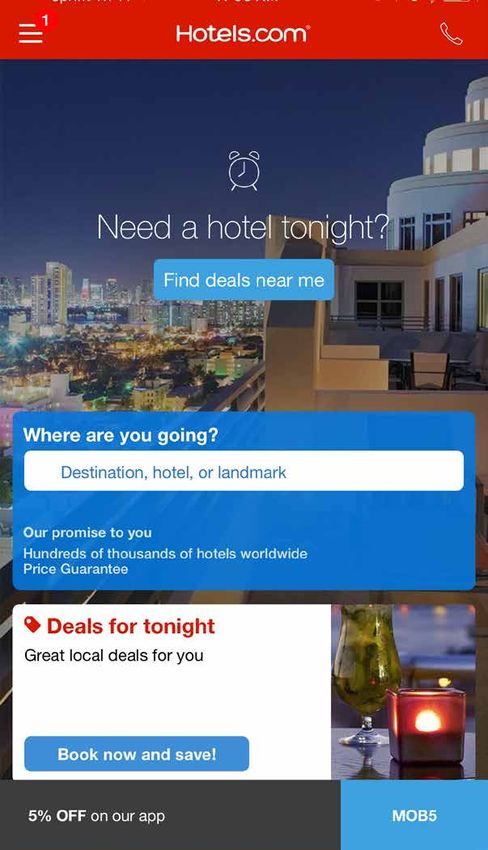
HOPPER’S FINAL ONBOARDING FLOW TEACHES NEW USERS HOW TO USE THE APP

                                     Source: Hopper

Users who were wary of enabling notification were immediately prompted to allow them
later—after they had completed the core action of “watching a flight.”

                           www.apptimize.com | contact@apptimize.com                   5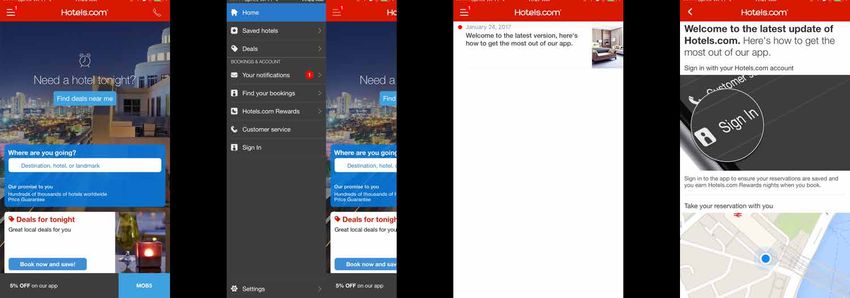
2. AIRBNB: PERSONALIZE ONBOARDING

Airbnb, the online marketplace for short-term rentals, is a famously data-driven business
that has leveraged word-of-mouth growth to become a $1B+ business.

There is inherent friction to downloading an app on the App Store. When a user receives
a referral link to download an app and is taken to the App Store, the connection between
where they came from and where they end up is severed.

Airbnb’s referral program cleverly works around this with its mobile app. During
onboarding, most users open the app onto a sign-up screen, where they can sign up
for an account, skip onboarding, or log in to the app:

                        AIRBNB’S NORMAL ONBOARDING FLOW

                                  Source: Airbnb Engineering Blog

Users who download the app from a referral link, however, are deep-linked to a specific
referral screen in-app. This screen shows them a picture of the friend who sent the
referral, as well as how much money in travel credit they get for signing up.

                             www.apptimize.com | contact@apptimize.com                      6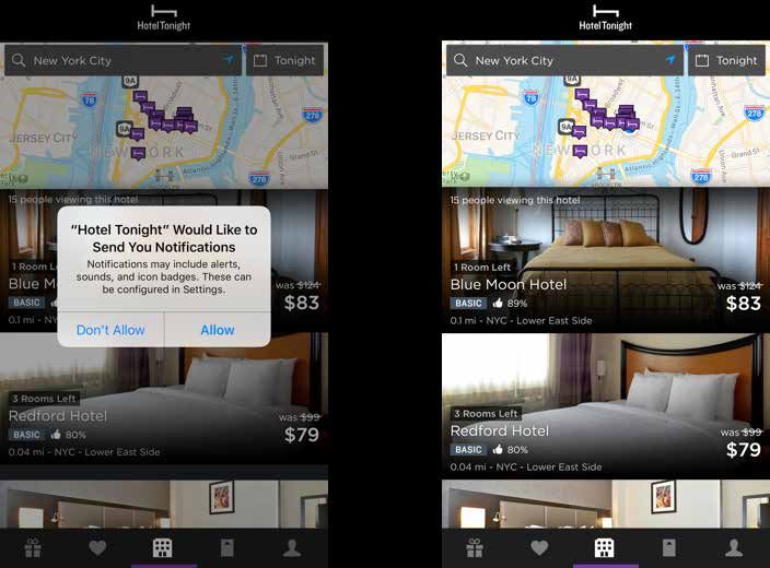
AIRBNB’S REFERRAL ONBOARDING FLOW

                                  Source: Airbnb Engineering Blog

Through careful testing and measurable growth strategies, the Airbnb was able to in-
crease bookings via referral by over 25% within certain markets.

           Set measurable goals, plan metrics and logging, build
            the product with instrumentation, measure impact,
                                  iterate.

                               Jason Bosinoff
                                Director of Engineering, Airbnb

The team continued to test strategies to drive even more referral sign-ups by:

 • Creating address book import features to make referrals easier

 • Increasing shares of referral messages by making referral easier to find in-app

 • Increasing conversions in-app by allowing referring users to send reminder messages
   to invited users

                             www.apptimize.com | contact@apptimize.com                   7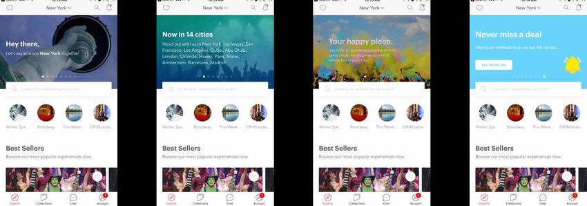
3. HEADOUT: SHOW VALUE IN CONTEXT

Headout is an app that helps you have more fun while you travel, by showing you tours,
activities, and local attractions wherever you might be. It’s a mobile tour-guide
replacement.

Headout has a simple onboarding flow that is designed to get notification permissions
from users, so that it show them attractions nearby. Notice how Headout asks users for
these permissions. Rather than relying on the default iOS permissions request, Headout
has built its own:

          HEADOUT USES CUSTOM PERMISSION SCREENS IN THEIR FLOW

                                      Source: Headout

Instead of pushing users through a mandatory 4-screen onboarding flow, Headout keeps
the welcome sequence short. The app uses material design cards on the homescreen to
show the app’s deeper functionality:

      HEADOUT’S MATERIAL DESIGN CARDS HIGHLIGHT THE APP’S FEATURES

                                      Source: Headout

                            www.apptimize.com | contact@apptimize.com                    8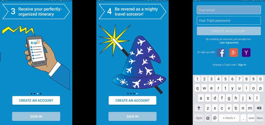
These cards take users through the app’s key features, like featured cities and popular
attractions. Users can swipe between cards on their own time to learn more, or tap on a
card to go to a specific section of the app.

Still, asking for notifications and geotag permissions early on during onboarding can be a
high source of friction. In the Travel category, approximately 53% of users opt-out of push
notifications. If you’re building an app like Headout, you could try to increase permissions
acceptance by running this simple test:

 • Control: Existing onboarding flow

 • Variant A: Ask for notification permissions only

 • Variant B: Ask for geolocation permissions only

 • Variant C: No permissions

                            www.apptimize.com | contact@apptimize.com                          9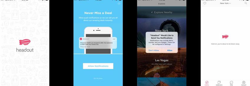
4. HOTELTONIGHT: DON’T FORCE SIGN-UPS

HotelTonight is a mobile app that uses geolocation to help customers find last-minute
hotel deals. Over the past year, the company has facilitated over $300 million in gross
revenue bookings, and is profitable.

HotelTonight currently has a dead-simple onboarding flow:

 1. Animated HotelTonight Loading Screen

 2. Request locations permissions

 3. Request notifications permissions

 4. Opens home page, where users can browse hotels by scrolling down

                        HOTELTONIGHT’S ONBOARDING FLOW

                                        Source: HotelTonight

                            www.apptimize.com | contact@apptimize.com                     10
Unlike it’s competitors, HotelTonight doesn’t follow the conventional travel app flow of
forcing new users to sign-up for an account. Amanda Richardson, VP of Product at
HotelTonight, tested the app to discover that their business model was more suited to
e-commerce, where people add something to a shopping cart and then “create an
account”, rather than the other way around.
According to a Google study, 65% of users searching for something on mobile are
looking for the most relevant information regardless of brand. If an app doesn’t satisfy
their needs, they are 40% less likely to come back. Hotel Tonight users are not trying to
sign up for an account right away. They want to find deals on hotels, and Hotel Tonight’s
onboarding flow takes them there, right off the bat.
Audrey Tsang, the company’s Director of Product, told Apptimize that the ability to rapidly
A/B test has allowed the company to “move faster, iterate faster, and take a few more
risks.”
If you were to A/B test Hotel Tonight’s onboarding flow, you might try something like this:
• Control Flow: Existing flow, with location permissions triggered on the loading screen,
and notifications permissions triggered on the home screen
• Variant A: Include a “primer” screen before asking for location permissions that
explain how Hotel Tonight will use location data to help users
• Variant B: Move the notification permissions screen to later in onboarding, and ask for
location permissions on the home screen of the app
www.apptimize.com | contact@apptimize.com 115. HOTELS.COM: FOCUS ON CORE ACTIONS DURING ONBOARDING
Hotels.com is a website for booking hotel rooms, owned by Expedia. Its mobile app
allows users to book hotel rooms, and receive last-minute deals on rooms.
Hotels.com doesn’t use a mandatory in-app tutorial. Instead, new users open the app
onto a home screen, with various different calls to action, from Find deals near me to
Book now and save! In the top-left corner of the mobile app, a red circle with the number
“1” on a hamburger menu is the start of Hotels.com’s equivalent of a welcome
sequence:
HOTEL.COM USES NOTIFICATIONS TO ONBOARD NEW USERS
Source: Hotels.com
Users tap on the hamburger icon and are taken to a slide-out navigation menu. Another
glowing red “1” indicates notifications, directing users to an in-app message that explains
how to use the app. The message describes how to do everything from sign-up for a
Hotels.com account in-app, to how to search for a deal.
This onboarding sequence might confuse some users because it tasks them with too
many things to do at once.
Helping your users focus on what to do next is value
you’re providing. Think of it that way.
S. C. Moatti
Former Facebook Product Leader
www.apptimize.com | contact@apptimize.com 12If you’re building a mobile app like Hotels.com, instead of bombarding users with a bunch
of different options, focus on identifying one core action that will cause users to derive
maximum value. Start with the home screen of your app:
HOTEL.COM’S WELCOME SCREEN
Source: Hotels.com
Say that user data reveals that mobile users “finding a nearby deal” is a core in-app
action that drives retention. A/B test how you can drive users to this core action on your
home screen, by testing the number of CTAs you use:
• Control: 3 CTAs— Find deals near me, Book now and save!, and 5% OFF on our app
• Variant A: Use 2 CTAs— Find deals near me, and Book now and save!
• Variant B: Use 1 CTA— Find deals near me
Try to drive more users to your core action, faster—actually booking a hotel room.
www.apptimize.com | contact@apptimize.com 136. GOOGLE TRIPS: TAILOR YOUR ONBOARDING TO USER BENEFITS
Google Trips is a free mobile app that helps people plan and manage trips. You can use it
to book hotels, read restaurant reviews, organize your tickets, manage reservations, and
find tourist attractions.
What makes Google Trips special is that it’s integrated with your Google Account. All the
places you’ve saved on Google Maps appear automatically in Google Trips. Flight tickets
and reservations that have been emailed to your Gmail account also appear in-app. This
is followed by a standard, three-screen onboarding tutorial:
GOOGLE TRIP’S ONBOARDING FLOW
Source: Google Trips
At any point in the tutorial, users can skip by clicking on the Get Started call-to-action.
Meanwhile, the copy of each tutorial screen does a good job of highlighting the specific
benefits of the app.
Google Trips is actually a pretty complicated mobile product—it draws from other
Google services like Gmail and Google Maps to work. The tutorial sequence is helpful
for explaining this to new users in a simple and easy-to-understand way. Instead of
describing specific features, the tutorial frames everything around the benefits to the
user (stress-free planning and all your trip details in one spot.)
If you had an app like Google Trips, you could run this A/B test to see if a shorter wel-
come sequence gets more users into the app:
• Control: Three-screen onboarding tutorial
• Variant A: Two screen onboarding tutorial or replacing the Get Started call-to-action
www.apptimize.com | contact@apptimize.com 147. TRIPIT: ELIMINATE UNNECESSARY STEPS
Tripit is a mobile travel itinerary and trip planning app. Tripit is owned by Concur, a
company that helps provide travel and expense services to businesses.
Tripit uses a four-screen tutorial to onboard users before directing new users to sign-up
for a TripIt Account:
TRIPIT’S ONBOARDING FLOW
Source: Tripit
Tripit’s onboarding tutorial does not do a good job of showing users value. It shows how
users can use TripIt, but does not get into why users would want to. Let’s break down
each step of the tutorial sequence:
1. Receive a travel confirmation email
2. Forward that email to plans@tripit.com
3. Receive your perfectly-organized itinerary
4. Be revered as a mighty travel sorcerer!
www.apptimize.com | contact@apptimize.com 15Following the tutorial sequence, users are prompted to sign-up for an account, using their
email, Facebook, Google+, or Yahoo Login. Some users are unlikely to remember screen
#2 (Forward that email to plans@tripit.com) once they are in the app. Tripit might be
better served skipping the onboarding tutorial, and showing users how they would
actually accomplish this action in-app.
While #4 (Be revered as a mighty travel sorcerer!) adds some fun to the tutorial sequence,
it does not serve any other function and might create unnecessary friction for new users
who just want to get started.
If you were trying to improve TripIt’s onboarding flow, you would definitely want to test a
variety of different onboarding flows:
• Control: Four-screen onboarding tutorial, with sign-up at end
• Variant Flow 1: Three screen onboarding tutorial, that cuts out “step 4”
• Variant Flow 2: Remove the onboarding tutorial, and start with a sign-up screen
You might further test onboarding by testing TripIt’s sign-up screen. Rather than including
four different options to sign-up for an account, you could test which options drive the
highest sign-ups and cut the rest.
www.apptimize.com | contact@apptimize.com 16WHERE TO NEXT?
The last thing you want to do when you’re on vacation is to pull out a laptop to search
your email for flight information, or the address of your hotel. The rise of mobile travel
apps has changed the way that people travel. They allow people to spontaneously find
attractions and also place last-minute bookings.
But there are still limitations. According to a Google Study, only 23% of leisure travelers
are confident that they can find the same hotel and flight information on their mobile
phones as on a desktop.
We’ve broken down the onboarding flows of some of the most popular mobile travel apps
out there. Feel free to take the test suggestions above, and modify and tweak them to
improve your own app.
About Us
Apptimize is the best-in-class mobile app optimization platform for enterprise and SMBs.
Our SDK can be found on over 1.2 Billion app downloads, across 75 countries.
Key Features
A/B
Native A/B Tests Feature Flags Instant Updates
Run experiments within minutes Excercise complete control Launch changes and promotions
using our drag and drop Visual and manage risks at every directly to your app without
Editor and programmatic testing. stage of new feature rollouts. using any code.
Some of the top companies use Apptimize to improve and grow their apps
www.apptimize.com | contact@apptimize.com 17www.apptimize.com | contact@apptimize.com
You can also read