A Case for Design Localization: Diversity of Website Designs in 44 Countries - Computer Science & Engineering
←
→
Page content transcription
If your browser does not render page correctly, please read the page content below
A Case for Design Localization: Diversity of Website
                        Designs in 44 Countries

                         Manuel Nordhoff, Tal August, Nigini A. Oliveira, and Katharina Reinecke
                           Paul G. Allen School of Computer Science & Engineering, DUB Group
                                                 University of Washington
                                   {nordhoff,taugust,nigini,reinecke}@cs.washington.edu
ABSTRACT                                                                                          they need to decide whether localizing their website is in-
Adapting the visual designs of websites to a local target au-                                     deed needed: Do the website designs in a specific country
dience can be beneficial, because such design localization in-                                    differ from those in their own? To inform their decision, they
creases users’ appeal, trust, and work efficiency. Yet designers                                  may turn to the literature, which offers contradictory findings.
often find it difficult to decide when to adapt and how to adapt                                  While some studies found that aesthetic preferences and web-
the designs, mainly because there are currently no guidelines                                     site designs differ between countries [50, 41, 10, 13], research
that describe common website designs in various countries.                                        has also found that the design of university websites does not
We contribute the first large-scale analysis of 80,901 website                                    significantly differ between countries, and that “rather than
designs across 44 countries, made available via an interactive                                    being a forum for different cultures, the Web has promoted
web-based design catalog. Using computational image metrics                                       the emergence of a cosmopolitan online culture” [55]. One
to compare the ~2,000 most visited websites per country, we                                       problem is that prior results are based on subjective analyses of
found significant differences between several design aspects,                                     small samples of websites and usually focus on specific web-
such as a website’s colorfulness, visual complexity, the num-                                     site categories. For example, Stenger et al. [55], who found
ber of text areas and the average saturation of colors. Our                                       that web designs across countries do not significantly differ,
results contribute a snapshot of web designs that users in 44                                     analyzed 40 university websites for each of four cultural di-
countries frequently see, showing that the design of websites                                     mensions from 10 countries. Cyr and Trevor-Smith [13], who
with a global reach are more homogenized compared to local                                        found many differences between website designs, compared
websites between countries.                                                                       90 municipal sites from three countries. Prior comparisons
                                                                                                  rarely factored in what Internet users mostly see (i.e., what
ACM Classification Keywords                                                                       the most popular websites are), and are often too old to be a
H.5.m. Information Interfaces and Presentation (e.g. HCI):                                        reliable source of information. To help companies and design-
Miscellaneous                                                                                     ers decide whether to pursue design localization, a large-scale
                                                                                                  study of current website designs is needed.
Author Keywords
                                                                                                  Second, if designers decide to adapt their websites, they still
Website design; Localization; Quantified Aesthetics
                                                                                                  need to find out what design elements to change. They can turn
INTRODUCTION
                                                                                                  to marketing reports that provide an overview of competitors
                                                                                                  (e.g., [40]), but these reports do not include concrete design
Design localization involves adapting visual aspects of a user
                                                                                                  guidelines. The same holds for literature that has reported on
interface to other countries, such as the layout and overall aes-
                                                                                                  design differences between countries (e.g., [14]), which, for
thetics, beyond simply changing the language [24]. The pro-
                                                                                                  the most part, only provides fuzzy design guidelines derived
cess is time-consuming and expensive [48], but research has
                                                                                                  from comparisons between few countries.
shown that it is worthwhile [52, 17]. In particular, research has
demonstrated that people in different countries have varying                                      To fill this gap, we analyzed a data sample of 80,901 websites
visual preferences for website designs [50] and that adapting                                     from 44 countries, including the ~2,000 most visited URLs
the visual designs of websites to specific countries and cultures                                 per country. To enable objective comparisons between website
can improve user satisfaction and work efficiency [49].                                           designs, we quantified each website’s aesthetics by computing
                                                                                                  a set of 32 image metrics, such as the colorfulness, visual com-
However, companies and designers face two challenges when
                                                                                                  plexity, the number of image and text areas, and the saturation
deciding whether and how to pursue design localization. First,
                                                                                                  of colors.
Permission to make digital or hard copies of all or part of this work for personal or             Our findings show significant differences between the visual
classroom use is granted without fee provided that copies are not made or distributed
for profit or commercial advantage and that copies bear this notice and the full citation
                                                                                                  design of the ~2,000 most visited websites per country and
on the first page. Copyrights for components of this work owned by others than ACM                that the design of websites with a global reach are much more
must be honored. Abstracting with credit is permitted. To copy otherwise, or republish,           homogenized compared to local websites between countries.
to post on servers or to redistribute to lists, requires prior specific permission and/or a
fee. Request permissions from permissions@acm.org.                                                More specifically, we make the following contributions:
 CHI 2018, April 21–26, 2018, Montreal, QC, Canada
© 2018 ACM. ISBN 978-1-4503-5620-6/18/04. . . 15.00
DOI: https://doi.org/10.1145/3173574.3173911

                                                                                              1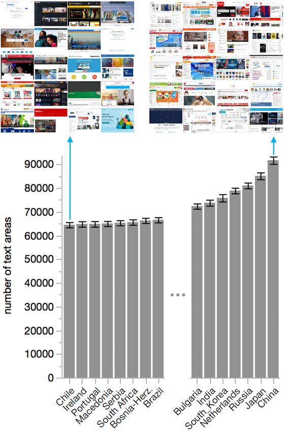
Website design diversity across 44 countries: Our work                   guidelines suggested. They also did not have a high number
shows that, broadly, website designs are different across coun-          of internal links, which Marcus and Gould found common
tries; however, websites with a global reach (i.e., websites             in Russia and India. Such differences in findings are likely
that have users from multiple countries) usually do not sig-             due to changing designs over time (Marcus and Gould’s study
nificantly localize their designs, while being among the most            was published in 2000, while Goyal’s study is from 2012), a
popular in every country. The results suggest that (1) adapting          focus on specific website categories (e.g., Goyal et al. ana-
web designs to the visual norms of a specific country is needed          lyzed only governmental websites), and due to insufficiently
in some cases, but that (2) a website’s purpose, reputation, and         large and representative website samples overall. Our work
network effect can trump the need for design localization.               addresses these concerns by analyzing a large number of differ-
                                                                         ent website categories, comparing the designs between several
Tangible design guidelines for specific countries: Using
                                                                         countries, and contributing an updated snapshot of webdesign
computational image metrics, we conducted quantitative com-
                                                                         trends.
parisons between the designs of the most popular websites
from 44 countries to detect visual differences. The results can          In contrast to the work mentioned above that compared ex-
help designers determine how to localize the designs of their            isting websites, researchers have also analyzed how visual
websites.                                                                preferences might differ between countries. For example,
                                                                         Canadians were shown to prefer less colorful interface designs
A website design catalog: We developed an interactive tool,
                                                                         than do Nigerians [47]. Simialrly, Cyr [12] found significant
available at http://www.juxtapose.labinthewild.org, that pro-
                                                                         differences between the visual preferences of users from eight
vides access to our library of website screenshots and their
                                                                         countries. Reinecke and Gajos [50] confirmed and extended
corresponding image metric scores (e.g., the website’s average
                                                                         these findings by studying the visual preferences of around
saturation). Users can browse and sort the data to compare               40,000 participants from more than 200 countries. Their work
how specific image metrics manifest themselves in the website            resulted in quantified models of visual appeal that can predict
designs in different countries.                                          a person’s visual preference for a given website depending on
A snapshot of current web design: Our analysis and public                the person’s country, age, gender, and education level. Re-
dataset (available at http://www.juxtapose.labinthewild.org)             searchers have also found that preferences can be influenced
provide the foundation for future research, such as conducting           by a person’s prior experience with and exposure to design [20,
a longitudinal analysis to determine changes in web designs              8], suggesting that visual preferences are dynamically chang-
on a global level or between countries.                                  ing over time. This is also suggested by the results of a re-
                                                                         cent analysis on the evolution of website design over the last
RELATED WORK                                                             decades [7]. The findings confirm that people tend to like de-
Aesthetic appeal is a fundamental visual design goal and an im-          signs that they have been previously exposed to – an exposure
portant factor in the decision making of website visitors [56].          effect that means that familiar designs might be more likely to
It influences their ability to build trust [35], their willingness       be perceived as appealing compared to unknown designs [61].
to further engage [44], their mental workload [5], and their             To cater to such diverse visual preferences, research suggests
purchase intentions [16, 22]. A positive aesthetic judgment              to not only localize a website’s language, but also its de-
was also found to increase the perceived credibility of web-             sign [24, 48]. One way to achieve this is by referring to the
sites [52]. In combination with good usability, aesthetics               aforementioned design guidelines (e.g. [41, 10]), which com-
facilitate the evaluation of content, resulting in faster reaction       pared websites from different countries and cultures. However,
times [30]. Clear and orderly designs, as described with the             these studies were usually based on small samples and are
notion of classical aesthetics [33] have been found to improve           often outdated given that website designs change over time [7].
perceived usability [57]. Similarly, expressive aesthetics de-           Designers can also find information about country-specific
scribe creative and novel designs, which can invoke curiosity            design preferences in marketing reports [46], online maga-
due to a perceived novelty of the site [33].                             zines [53], handbooks [34, P. 71-76] and blogs [4]. However,
Website Design and Design Preferences Between Countries
                                                                         these resources usually provide vague guidelines, such as “If
                                                                         your core market is any of the Arabic countries, bear in mind
Prior work has mostly compared websites at a small scale. For
                                                                         that they read right to left.”
example, Callahan [6] compared 20 university websites from
8 countries and found similarities in the layout, structure, and
differences in the use of graphical elements like colors, images         Quantification of Website Design
and animations. Marcus and Gould [41] examined websites                  Due to the intangible nature of the design guidelines discussed
from 10 different countries and produced guidelines for the              above, researchers have increasingly attempted to quantify
design localization of websites based on Hofstede’s cultural             aesthetics in order to predict individual visual preferences [54,
dimensions. These guidelines were only partly confirmed by               62, 43, 2]. For example, Reinecke and Gajos [50] collected
Goyal et al. [19] when comparing governmental websites                   2.4 million visual appeal ratings from people with diverse
from 5 countries. While Goyal et al. found similar differences           demographic and geographic backgrounds and correlated these
in the design between websites in the US and China, they did             ratings with a number of image metrics pertaining to the visual
not find the design guidelines confirmed for Brazil, Russia and          complexity and colorfulness of websites. Their results include
India. In particular, the website samples from Brazil, Russia,           quantified website design guidelines according to what people
and India did not have as many images as Marcus and Gould’s              find most appealing. Our work aims to extend this work by

                                                                     2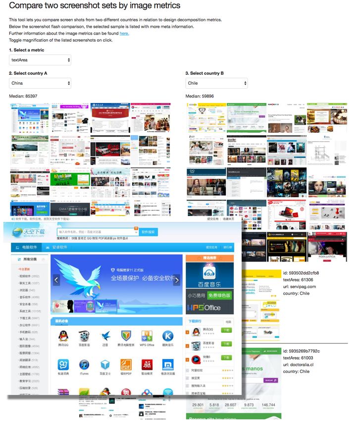
showing what website designs Internet users are currently              in our dataset, they are not fully reliable as numerous URLs
most frequently exposed and analyzing how this might differ            are assigned to wrong categories. We therefore did not include
from people’s visual preferences.                                      them in our main analysis and instead relied on manually com-
                                                                       paring whether the distribution of categories differed between
A DATASET AND TOOL FOR WEBSITE COMPARISONS                             countries (they only did so for a minority of countries).
To enable statistical comparisons of website designs between           There are several other options for obtaining the data needed
countries, we first collected a dataset of website URLs from           for our study, such as the free and crowdsourced DMOZ
44 countries, took screenshots of these websites, and quan-            database [15], the WhoIs records [37], NetCraft [39], or Simi-
tified their visual design with computational image metrics.           larWeb [40]. However, these services either did not fulfill our
To facilitate a visual analysis of the screenshots, including          requirements for obtaining the website diversity, popularity,
comparisons of specific image metrics between countries, we            and access times for each URL (Netcraft and WhoIs), or they
additionally built a web-based tool. We will describe these            lacked a rigorous methodology for ranking websites based on
different steps and artifacts in the following sections.               their popularity (SimilarWeb and DMOZ).
Dataset of Website URLs
                                                                       Image Metrics to Quantify Website Aesthetics
To compare the designs of the most frequently visited websites         To enable comparisons between websites, we first took screen-
between a variety of countries, we purchased a dataset of the
                                                                       shots of all 88,000 website URLs in our dataset using the
top 2000 website rankings for each of 44 countries listed in
                                                                       WebKit tool PhantomJS [23]. Around 10% of our URLs
Figure 2 using the API provided by the Alexa Top Sites (ATS)
                                                                       contained dynamic content, such as videos, which were not
service [26]. We chose the same 44 countries studied in [50]
                                                                       properly captured by PhantomJS. For these URLs, we retook
to allow comparisons between their results (which focused on           the screenshots with SlimerJS [29], which renders the con-
differences between users’ visual preferences) and our own             tent in a real browser; the tool is therefore slower, but able
study (which focuses on what designs users are exposed to).            to capture dynamic content. All screenshots were taken with
We additionally decided to cap the number of websites at 2000          a size of 1024x768. While this format does not capture the
per country to obtain a large enough sample to include both            entire website as a user would see when scrolling down (or
more and less visited sites (given that the average user visits        with a higher resolution), it enables us to compare the website
less than 100 websites in a month [9]).                                designs using statistical image metrics, which would otherwise
The dataset includes several metrics that enable us to define          be flawed given the varying website lengths. A positive side
popularity scores on both a country and a global level: First,         effect of this choice is that it measures what most users see
the popularity rank and access frequency on a global and               at first sight, which has been subject to numerous previous
a country level enable us to distinguish between websites              research studies [36, 35, 51, 50, 58].
which are popular only within a country and those which                To quantify the visual design of all websites in our dataset, we
reach a global audience (e.g., a website from one provider             computed a set of 15 image metrics (listed in Table 1) for each
which is popular in numerous countries). The ATS service
                                                                       screenshot using the algorithms provided by the open source
provides statistically meaningful numbers for rankings above
                                                                       project VizWeb [42]. For each screenshot, we calculated its
rank 100.000 since the data quality and therefore accuracy
                                                                       perceived colorfulness and perceived visual complexity based
of the rank formula increases or decreases synchronously to            on computational models first introduced in [51]. The out-
the traffic of a website. The data is derived from website             come of this calculation is a score between 1 (lowest com-
owners who use the ATS service and millions of Internet users          plexity/colorfulness) and 10 (highest complexity/colorfulness).
who installed browser extensions which collect Internet usage          Colorfulness and visual complexity are highly predictive of vi-
data, like the Alexa Toolbar [25]. The popularity rank on a            sual appeal [50]. They are also two design aspects that people
global and country level is aggregated from a website’s unique         notice at first sight [51].
visitor count and the URL requests made by individual users.
Higher combinations of both numbers lead to higher ranks. To           The computational models of perceived colorfulness and per-
enable an efficient comparison of a country’s global reach, we         ceived visual complexity were developed based on subjective
calculated a website’s global score by averaging its country           ratings of website screenshots and can almost accurately pre-
ranks across all countries for which it appears in the top 2000        dict a person’s perception of these design aspects [51]; the
websites. For any country where the website was not included           results of the models are therefore valuable to compare an over-
in the top 2000, we added a country rank of 2000 (the lowest           all design impression. To explain specific design differences
possible rank).                                                        between our websites in more detail, we supplemented these
                                                                       two metrics with additional image metrics from Reinecke et
We supplemented the ATS data with information about each
                                                                       al. [51] used as independent variables in the models of per-
website’s category, which indicates its purpose, such as
                                                                       ceived colorfulness and perceived visual complexity (listed
whether it is an e-commerce site, a news provider, or social
                                                                       in Table 1). This allowed us to derive design comparisons,
network. Our aim was to control for differences in website             such as “Websites in country X use more saturated colors than
designs depending on their purpose [28]. The categories were           those in country Y”, which is more detailed than comparing
obtained using the service WebShrinker [38], which uses ma-            their overall colorfulness.
chine learning and human feedback to categorize websites and
has a distinct set of top level categories, such as shopping and       From the 88,000 website URLs in our dataset, we removed
news and media. Note that while the categories are included            6,408 entries for which we could not obtain screenshots. We

                                                                   3
STUDY
Using the dataset and our Juxtapose tool introduced in the
previous section, we conducted a comparative analysis of
website designs in 44 countries. Four underlying research
questions guided our analysis:
1. How does the visual design of the 2,000 most popular web-
sites differ across countries?
2. Do globally popular websites differ across countries?
3. How do local websites across countries differ from the
average global website design?
4. How do local websites differ across countries?
Analysis
To answer our first question, how website designs differ across
countries, we ran analyses over the entire dataset. While our
dataset corresponds to the 2000 most popular websites per
country, the average Internet user is likely only exposed to
a small subset of these sites, since Internet users rarely visit
more than 100 websites per month [9]. However, depending
on a person’s interests, these 100 websites do not necessar-
ily consist of the 100 most popular websites. Instead, a user
could spend their time on generally less popular websites, or
distribute his/her time between websites at the top and at the
bottom of our dataset. We therefore employed a resampling
Figure 1. The interactive website design catalog, showing two selected technique to better represent a user’s experience on the web in
countries compared by the average number of text areas. One screenshot a given country. We sampled the data 1,000 times per country.
from the details list is magnified. Each sample included 100 websites randomly drawn from the
2,000 websites per country, for which we then calculated the
mean value for a given metric (e.g., for colorfulness). We
computed a one-way ANOVA over the resampled dataset. To
then removed 689 entries for which we were unable to com- identify top differing country pairs, we conducted post-hoc
pute image metrics, resulting in a total number of 80,901 analyses using Tukey’s tests for pairwise comparisons [59].
website screenshots along with their country-specific ranking All p-values were adjusted for multiple hypotheses testing
and the computed image metrics. Of the 80,901 websites that using Benjamini Hochberg correction [3]; effect sizes of our
we analyzed, 57% were represented in more than one country. findings use Cohen’s d [32]. Note that the resampling reduced
Hence, the distinct count of URLs in our dataset is 37,856 (an variance in our dataset, increasing the effect sizes of differ-
average of 1,839 unique entries per country, sd = 100). ences between countries and likelihood of significance. We
utilized our tool Juxtapose to observe visually salient differ-
ences of our analyses.
Visual Comparison of Websites Between Countries
To answer our second question, we began by defining what
While the image metrics described above enable us to empiri-
constitutes a global website. The global score by itself does
cally compare website designs, we additionally wanted to eval- not tell us whether the website is truly global; in order to de-
uate whether the results of the statistical analysis correspond fine this, we needed to find a threshold for the global score that
to visually discernible differences between the website screen- defines the number of countries in which a website appears. To
shots. To enable these additional analyses, we developed find this threshold, three authors from three different countries
Juxtapose (http://juxtapose.labinthewild.org), an interactive coded all website URLs with global vs. local based on their
design tool shown in Figure 1. Juxtapose’s main functionality own knowledge of the sites and their brands and later resolved
is the comparison of website designs between two countries. any discrepancies by discussing specific websites. The major-
Users can select specific image metrics and observe similar-
ity of global sites were identified to be among those that have
ities and differences between these countries both with the
a global score of 400 or less; hence, we define a global website
help of summary statistics that the tool reports, and with the
as a website with a maximum score of 400. We conducted
help of 20 website samples from each country. Researchers
one-way ANOVAs to compare global players in each visual de-
and designers can use Juxtapose to (1) further understand sign metric between countries, and again applied a Benjamini
our statistical results by visually comparing websites between Hochberg correction for multiple hypotheses testing.
countries and according to different image metrics, (2) extend
our results by analyzing differences between the websites of We addressed question three, how local websites differ from
various countries not captured by our image metrics, and (3) an average global website design, by excluding all global
gain inspiration for designing websites for specific countries. websites from each country and collecting them into a separate
4Figure 2. The mean scores of perceived visual complexity and perceived colorfulness (computed using the perceptual models from [51]) for the 2000
most popular websites in each of 44 countries, sorted by visual complexity. The scale for the models ranges from 0 (low) to 10 (high).
subset. We compared this subset (and its previously computed of significantly differing pairs was due to the reduced variance
image metrics) against the local websites of each country using that resampling the dataset provided. For example, the previ-
one-way ANOVAs and Tukey tests. ous comparison between the visual complexity of Irish and
Russian websites on the original (not resampled) dataset had
For question four, how local websites differ across countries,
an effect size of d = 0.47. The difference was small enough
we resampled our dataset again with only local websites for that it was barely visually noticeable when comparing the
each country and calculated one-way ANOVAs and Tukey websites around the mean scores from both countries using
tests on this resampled local dataset. Juxtapose.
Results For colorfulness, the lowest average score was for websites
in the Netherlands (m = 2.78, sd = 0.10) and the highest was
Differences in Website Designs for China (m = 3.28, sd = 0.11, t1998 = 105.49, p < .0001,
Our first question asked how website designs differ across d = 4.62). Again, the difference was small and barely visually
countries. The results from ANOVAs across the resampled noticeable when comparing the screenshots.
dataset showed a significant variation of website designs
between countries in the model scores for overall colorful- Part of the reason why these differences were not visually no-
ness (F43,43956 = 834.55, p < .001) and visual complexity ticeable is that the colorfulness and complexity models factor
(F43,43956 = 931.26, p < .001). Website designs also varied in a variety of sub-metrics. Any differences between these
significantly across all image sub metrics, as shown in Table 1. sub-metrics can be balanced out by human perception. For ex-
The results suggest that when looking at all top 2000 websites ample, when looking at a group of websites at once, the models
per country, website designs show statistically measurable may provide similar scores for websites that are all complex or
differences in their colorfulness, visual complexity, and other colorful for different reasons, muddying the visual comparison
sub-metrics. due to differing scores on sub metrics within each screenshot.
To find out which metrics provide the most visually noticeable
To find out which countries have significantly different website differences between the website designs of different coun-
designs, we conducted follow-up analyses using Tukey’s tests. tries, we therefore turned to our sub-metrics. The sub-metric
The results revealed that 86% of all country pairs differed most visually noticeable in the context of visual complexity
in average visual complexity and 87% for colorfulness. The was number of text areas (see Figure 3), which measures the
fact that most countries, but not all, differed in their website overall occurrence of text across an image [51]. The number
complexity and colorfulness can also be seen in Figure 2. of text areas positively impacts complexity scores, meaning
Figure 2 also shows that the variation between website col- the higher the average text area score, the more complex the
orfulness and complexity between countries was less than 1 website layout.
point on a 10-point scale. Irish websites had the lowest aver- The number of text areas differed most between websites in
age visual complexity score (m = 4.12, sd = 0.17) and Russian Chile (m = 64306.12, sd = 4561.85) and China (m = 91869.59,
websites had the highest (m = 4.87, sd = 0.14, t1998 = −107.25, sd = 6572.84, t1998 = −108.94, p < .0001, d = 4.87). The
p < .0001, d = 4.80). The large effect sizes and high number
5Table 1. Overview of the results of ANOVAs. Column "all websites" reports on differences between the top 2,000 websites between countries; col-
umn "global" reports on differences between 3,551 websites that have global reach. The sub-metrics contribute to perceived visual complexity and
colorfulness as found in the perceptual models in [51].
Image Metric Explanation all websites global websites
(p < .0001) (p > .05, n.s.)
Visual Complexity
Perceived complexity score predicted perceived visual complexity based on [51] F43,43956 = 895.72 F43,3462 = 0.19
Number of leaves the number of leaves of a space-based decomposition F43,43956 = 464.61 F43,3507 = 0.24
Number of text areas the number of leaves classified as text F43,43956 = 1202.48 F43,3507 = 0.31
Number of non-text areas the number of leaves classified as non-text F43,43956 = 420.86 F43,3507 = 0.10
Number of text groups the number of horizontal groups of text characters F43,43956 = 898.41 F43,3507 = 0.25
Number of image areas the number of image areas (adjacent images count as one) F43,43956 = 1705.94 F43,3507 = 0.35
Colorfulness [45] average saturation of pixels as chroma divided by lightness F43,43956 = 277.15 F43,3507 = 0.63
Hue the average pixel value for hue in the HSV color space F43,43956 = 516.653 F43,3507 = 0.17
Colorfulness
Perceived colorfulness score predicted perceived colorfulness based on [51] F43,43956 = 763.75 F43,3462 = 0.40
Saturation the average pixel value for saturation F43,43956 = 509.47 F43,3507 = 0.30
Colorfulness [21] measures the average color difference of pixels against grey F43,43956 = 174.45 F43,3507 = 0.59
Number of image areas the number of separate images F43,43956 = 1705.94 F43,3507 = 0.35
Number of quadtree leaves the number of leaves of a quadtree decomposition using minimum F43,43956 = 1569.79 F43,3507 = 0.72
color entropy as a criterion for division
Number of text areas the number of leaves classified as text F43,43956 = 1202.48 F43,3507 = 0.31
Number of non-text areas the number of leaves classified as non-text based F43,43956 = 420.86 F43,3507 = 0.10
statistical difference corresponds to a noticeable variation be- 2000 websites per country were near the top of these rankings.
tween the amount of text in Chilean and Chinese websites, as Global websites made up an average of 40.51% (sd = 9.02%)
shown in Figure 3. of the top 100 websites in each country. The Netherlands had
the highest percentage, with 55.56% of its top 100 websites
The most visually noticeable difference between sub metrics
classified as global players, while Russia had the lowest with
that contribute to the perceptual colorfulness model was satu- 15%. Given that the top 100 websites per country constitute the
ration, which measures the average pixel value of saturation most popular websites with regards to their traffic, these higher
in an image [51], and is positively correlated with the color- percentages show that a decent portion of website traffic is
fulness score. The countries whose websites differed most for occupied by global players in most of the countries analyzed.
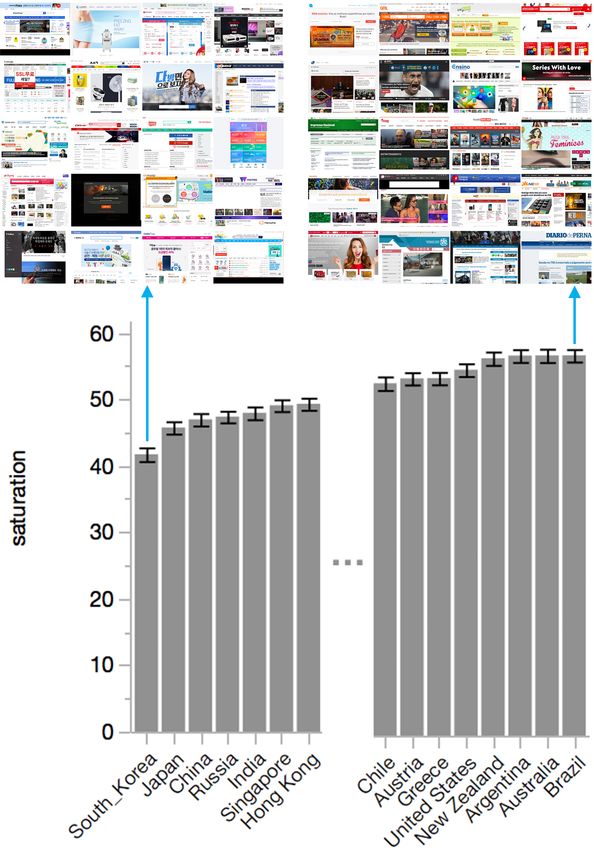
saturation were South Korea (m = 41.74, sd = 3.82) and Brazil
(m = 57.12, sd = 4.34, t1998 = 84.09, p < .0001, d = 3.76). The website designs of these global players did not sig-
Figure 4 compares South Korea and Brazil websites, showing nificantly differ in their visual complexity (F43,3462 = 0.19,
that the average saturation of a site noticeably differs between p = 1.00) or colorfulness (F43,3462 = 0.40, p = 1.00), nor
the Brazilian websites (right) compared to the South Korean were there any significant differences between the websites for
websites (left). Similar to China, South Korean websites also any of the sub-metrics (see Table 1). These results suggest that
featured many more text areas (though the average number although there are examples of international companies that
was slightly lower than that of Chinese websites) and more localize their websites to specific countries, such as Adobe or
white space. Brazilian websites, in contrast, showed larger SAS [27], the majority of global players do not adapt their
image areas and more saturated colors, albeit less so than the website designs to other countries. For example, we did not
Chilean websites shown in Figure 3. observe any design changes between countries for the websites
of Google and YouTube. Combined with our finding that these
Our tool Juxtapose lists the average scores for all image met-
global websites predominantly ranked among the top 100 web-
rics and for all countries in our dataset, enabling designers to sites in each country, our result suggests that most users are
look up specific differences between countries that they may exposed to the relatively homogeneous website designs of
choose to design for. global companies on a regular basis.
Differences Between Global Website Designs
Our second research question asked whether globally popular
Countries that differ from Global Design
websites differ across countries. Using the criteria for global
Our third question asked how countries’ local websites differ
players described in the analysis section, we selected a subset
from the average global website design. If we found countries
of 3,551 websites to analyze.
with websites that differed from the overall global websites,
On average, these global websites made up 4.45% (sd = 0.26%) this would suggest that some countries buck a global design
of the top websites per country, with Japan having the highest trend. We selected all global websites and combined them
percentage (5.26%) and Russia having the lowest (3.52%). into a single subset. The country samples were reduced to
The overall low fraction of global websites among popular only include locally popular websites and compared to the
websites in each country could suggest that global players do subset which represents a global website design average. This
not dominate the web in any of our 44 countries; however, analysis was made on the original, not resampled, dataset in
many of the global companies whose websites made the top order to make accurate comparisons to percentage statistics.
6Figure 4. Comparison of a random sample of websites from South Korea
and Brazil. Websites shown have roughly the same saturation value as
Figure 3. Comparison of a random sample of websites from Chile and the average website from South Korea (left, m = 41.74, se = 1.04) and
China. Websites shown have roughly the same number of text areas as Brazil (right, m = 57.12, se = 1.05). Error bars show the standard errors.
the average website from Chile (left, m = 64306.12, se = 1104.03) and
China (right, m = 91869.59, se = 1571.99). Error bars show the standard
errors.
Local websites differed significantly in visual complexity
(F43,43956 = 957.02, p < .0001) and colorfulness (F43,43956 =
Russia (m = 4.90, sd = 1.50) was the top country whose web- 833.63, p < .0001). The top differing country pair for visual
sites differed from the global subset (m = 4.21, sd = 1.45) in complexity was Ireland (m = 4.12, sd = 0.17) and Russia (m =
visual complexity (t1945 = −4.20, p < .01 , d = 0.46). The 4.90, sd = 0.15, t1998 = −110.04, p < .0001, d = 4.92). For
second top differing country in website visual complexity was colorfulness, the top differing pair was the Netherlands (m =
China (m = 4.89, sd = 1.75, t1540 = 4.89, p < .01, d = 0.39). In 2.79, sd = 0.11) and China (m = 3.30, sd = 0.11, t1998 = 108.59,
average number of text areas, Chinese websites (m = 92924.89, p < .0001, d = 4.86). The differences were again relatively
sd = 64576.13) also differed significantly from the global sub- small (less than 1 point on a 10-point scale for both color-
set (m = 66184.76, sd = 45642.03, t1731 = 5.09, p < 0.001, fulness and visual complexity). However, while the overall
d = 0.42), although no other countries did. Russia and China perceived colorfulness and visual complexity were similar,
also scored among the countries with the lowest number of local websites in different countries strongly vary between
global players in their top 100 most popular websites. Russia their number of text areas, images areas, and saturation.
was first with 15% of global players in the top 100 websites,
Local websites also differed significantly in saturation
and China second with 20%.
(F43,43956 = 582.72, p < .0001) and average number of text ar-
eas (F43,43956 = 1273.10, p < .0001). The countries whose
Differences Between Local Website Designs websites differed most for saturation were South Korea
Our final question asked how local websites differ across coun- (m = 40.68, sd = 3.62) and Argentina (m = 57.41, sd = 4.36,
tries. To look at only local websites, we excluded all global t1998 = 93.39, p < .0001, d = 4.18). For saturation, the coun-
player websites when resampling our database. tries whose websites differed most were Chile (m = 64488.22,
7sd = 4422.47) and China (m = 92805.68, sd = 6662.27, dataset. It is possible that Russians actually prefer simple
t1998 = −111.98, p < .0001, d = 5.01). websites but that this is not reflected in local design trends. If
this is the case, users might not be provided with websites that
The similar results to the overall website comparison were they find most appealing, most trustworthy, and usable [35],
expected due to the relatively small global subset excluded and website owners might forgo the chance to optimize the
(only an average of 4.45% of each country’s websites). The success of their site. More work is needed to further shed light
results strengthen our previous findings that differences exist on these differences between a country’s average visual appeal
between countries’ website design and show that they are and its average website design.
mainly driven by differences between the designs of local
websites. In contrast, global websites are a homogenized, but The number of text areas and the average saturation of colors
popular, subset within each country’s diverse set of website reveal clear visual differences between countries: While there
designs. are statistically significant differences between the website de-
signs of all 44 countries that we analyzed in numerous design
SUMMARY AND DISCUSSION metrics, we especially found visually discernible differences
The aim of this paper was to provide a snapshot of current between the number of text areas and the average saturation of
website designs comparing 44 countries. In particular, we colors. These variations were most noticeable between China
investigated whether designers should localize their websites, and Chile (with China’s websites exhibiting a significantly
and if yes, which design elements they should adapt to local higher number of text areas than Chile) and between Brazil
preferences. In the following, we discuss our main findings: and South Korea (with Brazilian websites having a signifi-
cantly higher average saturation of colors than South Korean
Design localization is needed between some countries: Our
websites).
results indicate that design localization is needed between
some countries, but that there are a number of countries with Variations between websites’ overall colorfulness and visual
relatively similar website designs. This also suggests that the complexity (as computed by perceptual models first presented
decision to perform design localization needs to be made on a in [51]) across countries were relatively small, with the largest
case-by-case basis; if a Chilean designer aims to localize for difference being less than one point on a 10-point scale. While
the Irish market, they might not have to change the number previous work showed that even a 0.5-point difference between
of text areas given that both of these countries were found to a website’s perceived colorfulness and visual complexity can
have low number of text areas. However, if the same designer have a large positive or negative impact on a person’s first
localizes for the South Korean, Japanese, or Chinese markets, impression of a website’s visual appeal [51, 50], we were nev-
for example, the differences are much more profound and ertheless surprised to find relatively small differences between
addressing them will enable the localized designs to blend website designs across many countries. This result suggests
in with the local design trends. According to Reinecke et that there are only few countries that buck an international
al. [51], such adaptations can result in a significant increase in design trend. The finding is in contrast to those of prior work
visual appeal, making the localized website more likely to be (e.g. [41, 19]), which has repeatedly found larger differences
perceived as trustworthy and usable by local users. between website designs in different countries. There are
two possible explanations for the divergences in results: First,
Interestingly, we found that the websites from culturally sim-
while prior work has manually annotated websites to compare
ilar countries (e.g., anglo-saxxon, European, or East Asian
their designs, we used computational image metrics, which
countries) are often similar in their visual complexity, colorful-
might be more robust to human bias, but less sensitive to pick-
ness, number of text areas, and saturation. For example, Japan,
ing up on design differences. Second, website designs might
China, and South Korea usually ranked close together on vari-
be homogenizing. This could be due to the increasing presence
ous image metrics, such as the number of text areas (high), the
of templates and frameworks, such as Twitter’s bootstrap, or
average saturation of colors (low), or the visual complexity
because designers might increasingly draw inspiration from
(high). Websites from the United States, New Zealand, and
globally popular designs. For example, in line with theories
Australia were among those with the highest saturation (along
on the priming effects of frequent exposure to website de-
with Brazil and Argentina) and scored among the middle of
signs [20, 8, 7, 61], the presence of common website designs
all countries for visual complexity and number of text areas.
might decrease design diversity over time. In general, prior
This is similar to the findings in Reinecke and Gajos [50] who
work has found that website design undergoes trends [7, 18].
showed that neighboring countries often share similar visual
We therefore assume that website designs follow these trends
preferences for certain website designs. In addition, our re-
independent of country borders, with the exception of a few
sults show that visual preferences often go hand in hand with
countries in which the websites remain fairly isolated in their
local website designs. For example, according to [50], the
own design.
average Chilean prefers a visual complexity of 4.56, which
closely matches the average visual complexity of the top 2000 The designs of global websites are relatively similar across
websites in Chile (4.55). However, in other cases, our results countries: We also found that most users are exposed to the
show a mismatch between people’s website design preferences relatively homogeneous website designs of global companies,
and the website designs that they are exposed to. For example, which often rank among the top 100 websites in each country.
Russians were found to prefer websites with a very low visual These global players dominate the popularity ranking in most
complexity [50]. In contrast, our findings show that Russian countries, making up an average of 40.51% of the top 100
websites are those with the highest visual complexity in our
8websites in each country. Their designs do not significantly In addition, future work could extend existing attempts to
differ when looking at any of our image metrics, such as visual understand how website design changes over time [7, 31, 18]
complexity, colorfulness, number of text areas, or saturation. by conducting longitudinal analyses of design diversity for
This indicates a homogenized, globally popular, website de- the most popular websites around the world. Monitoring how
sign. Comparing example screenshots, we found that many of diversity is affected by the (presumably increasing numbers
these globally popular websites, such as Google, YouTube, or of) designs of global players could indicate whether design
Reddit, do not localize their design. Their global reach and localization is a promising investment, or if people align more
popularity, while evidently ignoring country-specific aesthetic and more with a global design taste. Our snapshot of current
preferences, suggests that potential benefits of design localiza- website designs lays the foundation for such analyses.
tion might be outperformed by brand recognition and network
Based on our dataset, it is also possible to investigate country-
effects.
specific design elements and characteristics beyond the image
The websites in countries with the lowest percentage of global metrics that we used for our analysis, such as the content of
players differ most from global design trends: When com- images, or the location of specific design elements. This could
paring the design metrics of all countries with the subset of result in more fine-grained design guidelines and add to our
global players, we found that only websites in China and Rus- results as well as to prior research (e.g., [1, 41]) by providing
sia were significantly different from global designs in their designers with guidelines and templates for the creation of
visual complexity—the two countries that also had the low- localized website designs.
est percentage of global players (around 3.52% of the top
2000 websites for Russia and 4.39% for China). Both of these CONCLUSION
countries are known for internet censorship [60, 11]; addi- We contributed a large-scale analysis of current website de-
tionally, China has increasingly invested in efforts to retain signs in 44 countries. Our results demonstrate that website
local customs and arts, such as by supporting local artists and designs significantly differ between countries, and that these
companies. Our findings indicate that decreasing the num- differences are predominantly driven by variations in the de-
ber of global website designs—such as through censorship, signs of local websites. In contrast, global websites that are
reducing the number of foreign business, or supporting local popular in a number of different countries often do not localize
businesses—increases the diversity of local designs. In these their designs.
environments, any priming effects from frequent exposure to
website designs or designers following specific design trends Our work allows designers to determine whether to adapt their
might strengthen local designs. website to another country and how to do that. In order to sup-
port these decisions, we provided findings that suggest when it
is worthwhile adapting (e.g., to appear more “local” in a given
country), a dataset that includes tangible image metrics that
Limitations and Future Work can serve as design guidelines, and a tool that allows visually
Our study has several limitations: First, we were unable to comparing websites from our 44 countries. These guidelines,
obtain robust website category data. While we ensured that orchestrated with other important website localization aspects,
all countries had similar percentages of specific website cate- like translation, content, image composition, color interpreta-
gories (by manually checking the dataset), there is a chance tion, and symbols, will point designers into the direction of
that some of the detected differences are due to diverging frac- successful solutions.
tions of categories (e.g., one country having a higher number
of news paper sites than entertainment sites) rather than due Our contributions will help designers engage with target audi-
to actual design differences. In addition, we cannot make pre- ences across the world, and adapt in an ever changing online
dictions on the average website design in a given category and ecosystem of local and global aesthetics.
how they might differ across countries. Second, we defined
local websites as those that do not have a global reach, thereby DATASET AND TOOL
excluding global websites even if they might be considered as We make available our dataset and tool at http://juxtapose.
local designs in a specific country (e.g., Google in the US). In labinthewild.org.
some countries, this can slightly change the average website
design scores that we report on. Third, we did not include ACKNOWLEDGEMENTS
additional characteristics, such as the origin of a website, the This project was funded by NSF award 1651487.
default language, or the market the website aims at, which
could further help to investigate local design preferences. REFERENCES
1. Tanveer Ahmed, Haralambos Mouratidis, and David
Our results also laid the foundation for much future work. Preston. 2008. Website design and localisation: A
Because we focused on comparing website designs in various comparison of Malaysia and Britain. International
countries, our study did not enable us to additionally evaluate Journal of Cyber Society and Education 1, 1 (2008),
whether these website designs do in fact correspond to people’s 3–16.
visual preferences. We hope to use our website dataset to
investigate whether these websites align with people’s visual 2. Ahamed Altaboli and Yingzi Lin. 2011. Objective and
preferences, and to find out about potential reasons for why Subjective Measures of Visual Aesthetics of Website
they might not. Interface Design: The Two Sides of the Coin. Springer
9Berlin Heidelberg, 35–44. 16. Andrea Everard and Dennis F. Galletta. 2005. How
https://doi.org/10.1007/978-3-642-21602-2_4 Presentation Flaws Affect Perceived Site Quality, Trust,
3. Yoav Benjamini and Yosef Hochberg. 1995. Controlling and Intention to Purchase from an Online Store. Journal
the false discovery rate: a practical and powerful of Management Information Systems 22, 3 (2005), 56–95.
approach to multiple testing. Journal of the royal 17. Boudhayan Ganguly, Satya Bhusan Dash, Dianne Cyr,
statistical society. Series B (Methodological) (1995), and Milena Head. 2010. The effects of website design on
289–300. purchase intention in online shopping: the mediating role
4. Oliver Bock. 2017. The Essential Guide To Website of trust and the moderating role of culture. International
Localization. (2017). https://phraseapp.com/blog/posts/ Journal of Electronic Business 8, 4-5 (2010), 302–330.
the-essential-guide-to-website-localization/. 18. Gili Korman Golander, Noam Tractinsky, and Ilanit
5. Jens Bölte, Thomas M. Hösker, Gerrit Hirschfeld, and Kabessa-Cohen. 2012. "Trends in Website Design,". AIS
Meinald T. Thielsch. 2017. Electrophysiological Transactions on Human-Computer Interaction (2012),
correlates of aesthetic processing of webpages: a 169âĂŞ189. http://aisel.aisnet.org/thci/vol4/iss3/1
comparison of experts and laypersons. PeerJ 5 (June 19. Nitesh Goyal, William Miner, and Nikhil Nawathe.
2017). https://doi.org/10.7717/peerj.3440 Cultural Differences Across Governmental Website
6. Ewa Callahan. 2005. Cultural similarities and differences Design. In Proc. ICIC’12.
in the design of university web sites. Journal of 20. Jan Hartmann, Alistair Sutcliffe, and Antonella De
Computer-Mediated Communication 11, 1 (2005), Angeli. 2008. Towards a Theory of User Judgment of
239–273. Aesthetics and User Interface Quality. ACM Trans.
7. Wen Chen, David J. Crandall, and Norman Makoto Su. Comput.-Hum. Interact. 15, 4, Article 15 (Dec. 2008), 30
2017. Understanding the Aesthetic Evolution of Websites: pages. DOI:http://dx.doi.org/10.1145/1460355.1460357
Towards a Notion of Design Periods. In Proc. CHI’17.
21. David Hasler and Sabine E. Suesstrunk. 2003. Measuring
ACM, New York, NY, USA, 5976–5987.
Colourfulness in Natural Images. 5007 (06 2003), 87–95.
http://doi.acm.org/10.1145/3025453.3025607
8. Aline Chevalier, Anne-Claire Maury, and Nicolas 22. Marc Hassenzahl. 2004. The interplay of beauty,
Fouquereau. 2014. The influence of the search goodness, and usability in interactive products.
complexity and the familiarity with the website on the Human-computer interaction 19, 4 (2004), 319–349.
subjective appraisal of aesthetics, mental effort and 23. Ariya Hidayat. 2017. PhantomJS headless WebKit
usability. Behaviour & Information Technology 33, 2 browser simulation. (2017). http://phantomjs.org.
(2014), 117–132.
24. Zhang Hua, Maria Taslim, and Matt Keating. 2014. Same
9. Nielsen Company. 2010. Nielsen Provides Topline U.S. but Not the Same: How Much Do We Look into It for
Web Data for March 2010. (2010). Localization Design?. In Proceedings of HCI Korea
https://tinyurl.com/ya5rgm7o. (HCIK ’15). Hanbit Media, Inc., South Korea, 83–87.
10. Jack Cook and Mike Finlayson. The impact of cultural http://dl.acm.org/citation.cfm?id=2729485.2729499
diversity on web site design. SAM Advanced 25. Alexa Internet Inc. 2017a. The Alexa browser extension.
Management Journal (????), 15–23. (2017). https://www.alexa.com/toolbar.
11. Charles Crabtree, Christopher Fariss, and Holger Kern. 26. Alexa Internet Inc. 2017b. The Alexa Top Sites Service.
2015. Truth Replaced by Silence: Private Censorship in (2017). https://www.alexa.com/topsites.
Russia. In NYU CESS 8th Annual Experimental Political
Science Conference. 27. Konstantin Dranch James Austin. 2016. Only 11 of 80
companies localize web content. (2016).
12. Dianne Cyr. 2013. Website design, trust and culture: An https://tinyurl.com/y7u6r5hj.
eight country investigation. Electronic Commerce
Research and Applications 12, 6 (2013), 373–385. 28. Jeff Johnson. 2014. Designing with the Mind in Mind,
Second Edition: Simple Guide to Understanding User
13. Dianne Cyr and Haizley Trevor-Smith. 2004. Interface Design Guidelines (2nd ed.). Morgan
Localization of Web design: An empirical comparison of Kaufmann Publishers Inc., San Francisco, CA, USA.
German, Japanese, and United States Web site
characteristics. Journal of the Association for Information 29. Laurent Jouanneau. 2017. SlimerJS scriptable browser.
Science and Technology 55, 13 (2004), 1199–1208. (2017). https://slimerjs.org.
14. L.C. de Castro Salgado, C.F. Leitão, and C.S. de Souza. 30. Nahye Kim, Bonseung Koo, Jaehwa Yoon, and Kwangsu
2012. A Journey Through Cultures: Metaphors for Cho. Understanding the Formation of User’s First
Guiding the Design of Cross-Cultural Interactive Systems. Impression on an Interface Design from a
Springer London. Neurophysiological Perspective - EEG Pilot Study. In
15. DMOZ. 2017. Directory Mozilla. (2017). Proceedings of HCI Korea.
http://dmoztools.net/.
1031. Ranjitha Kumar, Arvind Satyanarayan, Cesar Torres, 45. S N Yendrikhovskij, F J J Blommaert, and Huib Ridder.
Maxine Lim, Salman Ahmad, Scott R. Klemmer, and 1998. Optimizing color reproduction of natural images.
Jerry O. Talton. 2013. Webzeitgeist: Design Mining the (01 1998).
Web. In Proc. CHI’13. ACM, New York, NY, USA,
46. Unbabel News. 2014. Why you should localize your
3083–3092. http://doi.acm.org/10.1145/2470654.2466420
website. (2014). https://tinyurl.com/ycyv8pp9.
32. Daniel Lakens. 2013. Calculating and reporting effect
47. Kiemute Oyibo, Yusuf Sahabi Ali, and Julita Vassileva.
sizes to facilitate cumulative science: a practical primer
2016. An Empirical Analysis of the Perception of Mobile
for t-tests and ANOVAs. Frontiers in Psychology 4
Website Interfaces and the Influence of Culture.. In PPT@
(2013), 863. DOI:
PERSUASIVE. 44–56.
http://dx.doi.org/10.3389/fpsyg.2013.00863
48. Pei-Luen Patrick Rau and Sheau-Farn Max Liang. 2003.
33. Talia Lavie and Noam Tractinsky. 2004. Assessing
Internationalization and localization: evaluating and
dimensions of perceived visual aesthetics of web sites.
testing a website for Asian users. Ergonomics 46, 1-3
International journal of human-computer studies 60, 3
(2003), 255–270.
(2004), 269–298.
49. Katharina Reinecke and Abraham Bernstein. 2011.
34. Dave Lawrence and Soheyla Tavakol. 2006. Balanced
Improving Performance, Perceived Usability, and
website design: optimising aesthetics, usability and
Aesthetics with Culturally Adaptive User Interfaces.
purpose. Springer Science & Business Media.
ACM Trans. Comput.-Hum. Interact. 18, 2, Article 8 (July
35. Gitte Lindgaard, Cathy Dudek, Devjani Sen, Livia 2011), 29 pages. DOI:
Sumegi, and Patrick Noonan. 2011. An Exploration of http://dx.doi.org/10.1145/1970378.1970382
Relations Between Visual Appeal, Trustworthiness and
50. Katharina Reinecke and Krzysztof Z. Gajos. 2014.
Perceived Usability of Homepages. ACM Trans.
Quantifying Visual Preferences Around the World. In
Comput.-Hum. Interact. 18, 1, Article 1 (May 2011), 30
Proc. CHI’14. 11–20.
pages. DOI:http://dx.doi.org/10.1145/1959022.1959023
http://doi.acm.org/10.1145/2556288.2557052
36. Gitte Lindgaard, Gary Fernandes, Cathy Dudek, and J.
51. Katharina Reinecke, Tom Yeh, Luke Miratrix, Rahmatri
Brown. 2006. Attention web designers: You have 50
Mardiko, Yuechen Zhao, Jenny Liu, and Krzysztof Z.
milliseconds to make a good first impression! Behaviour
Gajos. 2013. Predicting Users’ First Impressions of
& Information Technology 25, 2 (2006), 115–126. DOI:
Website Aesthetics with a Quantification of Perceived
http://dx.doi.org/10.1080/01449290500330448
Visual Complexity and Colorfulness. In Proc. CHI ’13.
37. Whois API LLC. 2017. WhoIsXmlAPI. (2017). 2049–2058.
https://www.whoisxmlapi.com/.
52. David Robins and Jason Holmes. 2008. Aesthetics and
38. Web Shrinker LLC. 2017. WebShrinker content Credibility in Web Site Design. Inf. Process. Manage. 44,
categorization. (2017). https://www.webshrinker.com/ 1 (Jan. 2008), 386–399. DOI:
content-categorization-api-network-providers/. http://dx.doi.org/10.1016/j.ipm.2007.02.003
39. Netcraft Ltd. 2017. Netcraft Internet Security and Data 53. Julia Rozwens. 2014. How to conduct website
Mining. (2017). https://www.netcraft.com/. localization. (2014). https://www.smashingmagazine.com/
2014/12/how-to-conduct-website-localization/.
40. SimilarWeb LTD. 2017. SimilarWeb. (2017).
https://www.similarweb.com/. 54. Mirjam Seckler and Alexandre N. Tuch. 2012. Linking
Objective Web-design Factors to Facets of Subjective
41. Aaron Marcus and Emilie West Gould. 2000.
Aesthetic Perception. In Proceedings of the 7th Nordic
Crosscurrents: Cultural Dimensions and Global Web
Conference on Human-Computer Interaction: Making
User-interface Design. interactions 7, 4 (July 2000),
Sense Through Design (NordiCHI ’12). ACM, New York,
32–46. DOI:http://dx.doi.org/10.1145/345190.345238
NY, USA, 809–810.
42. R. Mardiko. 2017. Collection of image metric computers. http://doi.acm.org/10.1145/2399016.2399159
(2017). https://bitbucket.org/rmardiko/vizweb.git.
55. Hélène Stengers, Olga De Troyer, Martine Baetens,
43. Aliaksei Miniukovich and Antonella De Angeli. 2014. Frank Boers, and A Mushtaha. 2004. Localization of Web
Visual impressions of mobile app interfaces. In Sites: Is there still a need for it. In international
Proceedings of the 8th Nordic Conference on workshop on web engineering (held in conjunction with
Human-Computer Interaction: Fun, Fast, Foundational. the ACM HyperText 2004 conference), Santa Cruz, USA.
ACM, 31–40.
56. Meinald T. Thielsch, Iris Blotenberg, and Rafael Jaron.
44. Morten Moshagen and Meinald T. Thielsch. 2010. Facets 2014. User Evaluation of Websites: From First
of visual aesthetics. International Journal of Impression to Recommendation. Interacting with
Human-Computer Studies 68, 10 (2010), 689 – 709. DOI: Computers 26, 1 (2014), 89–102.
http://dx.doi.org/10.1016/j.ijhcs.2010.05.006 +http://dx.doi.org/10.1093/iwc/iwt033
11You can also read