A GUIDE TO MOBILE EMAIL - UNDERSTANDING THE WHAT, HOW & WHY - www.ezymsg.com
←
→
Page content transcription
If your browser does not render page correctly, please read the page content below

A GUIDE TO MOBILE EMAIL
UNDERSTANDING THE WHAT, HOW & WHY

                                    www.ezymsg.com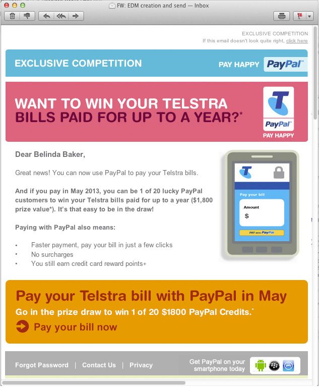
TABLE OF CONTENTS
EMAILS OPENED ON MOBILE?					1
Email open market share 2011 - 2013

WHAT DOES THIS MEAN?						2
FIRST THINGS FIRST							2
From and Subject Lines
Pre Header Text

DECIDING ON AN EMAIL DESIGN APPROACH?		                 4
1. Mobile Aware/Scalable/Mobile First
2. Fluid Design
3. Responsive/Adaptive

MEDIA QUERY SUPPORT						7
A RECAP ON THE DESIGN APPROACHES			                     8
WHICH APPROACH IS RIGHT FOR YOU?			                     9
How mobile friendly is your current email design?

THE VERDICT								10
Best case scenario

IN THE MEANTIME							10
Mobile Email Design Principles
EMAILS OPENED ON MOBILE?
If you send email newsletters, it’s likely that a growing percentage of your subscribers are
reading your messages on an iPhone, tablet or similar.

The explosive growth of mobile email opens is really astonishing. According to email market share
statistics while mobile opens are holding steady around 43% in Q1 this year, two years ago (in Q1 of
2011), mobile opens were just a blip at barely 10%. That’s an incredible 330% change over two years!
And that massive growth had to come from somewhere: desktop clients have seen a 44% decrease and
webmail share has shrunk about 22%. (Litmus, April 2013)

                  EMAIL OPEN MARKET SHARE 2011 - 2013

According to recent email analytic statistics conducted by Litmus, the mobile open rate was at 43%.
This means that both business and consumer audiences are reading more email on their phones and
tablets—and using their fingers and thumbs to navigate.

                                     Email Opens: March 2013
                                     Mobile:
                      Desktop        Smartphones (iPhone, Android) and tablets
                       32%
        Mobile
         43%                         Desktop:
                                     Installed email programs (Outlook, Apple Mail)

                   Webmail           Webmail:
                    25%
                                     Email accessed through a web browser (Gmail, Hotmail, Yahoo)

                                                                                                       1
                                                                            www.ezymsg.com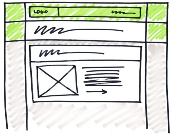
WHAT DOES THIS MEAN?
So what does this explosive growth of mobile mean for your email designs?

What this means for designers is that getting your email newsletter to display optimally on mobile devices is
just as important as ensuring it can be read in long-standing email clients like Outlook and Gmail.

In this guide, we’ll look at ways you can improve the mobile email experience and cover design
considerations when planning your newsletter.

FIRST THINGS FIRST
We live in a society where first impressions count...and this theory applies too when considering email.

There was a recent survey done on consumer views on email marketing and the question asked was ‘If you
get a mobile email that doesn’t look good, what do you do?’. Almost 70% of consumers surveyed said they
would delete it. Therefore it’s clear that the user experience matters. Mobile users are interacting on a touch
screen, on a small screen and more than likely don’t have your full attention. Whatever we can do to create
a better user experience for these consumers is going to positively effect their perception of your brand,
increase the usability of your email and create an overall more fulfilling experience.

From and Subject Lines
From Name
The first thing clients will come across is your
From name. This is undoubtedly one of the most
important aspects to consider when planning your
email. You only have about 25 Characters on the
iPhone for this From name to display. Make sure it
is familiar, recognisable and clear.

Subject line
On most phones an email Subject Line will only
display the first 35 characters. Therefore you need
to make this clear, concise and to the point if you
want to help get your email opened.

Pre Header
This is the first bit of text in the top of your email
which gets pulled out and then displayed in your
mobile inbox preview pane. It is becoming more
common to try and customise what appears here by
placing your call to action or most important text at
the top of the email.

                                                                                                                  2
                                                                               www.ezymsg.com
Pre Header Text
An example of how pre header text can help the mobile user experience is shown below.

If you employ the steps above, you will be giving your email campaign the best possible start in getting your
client’s attention and getting your email opened.

TIPS ON THE SENDER                                       TIPS ON SUBJECT LINE
Choose a regular ‘From Address’ and ‘From Name’ to       Ensure the subject line accurately communicates
use for your emails; this will usually be your name      to the recipient what the email is about whilst also
and/or your organisation’s name. This will ensure        providing an incentive where possible to open the
that these details become familiar to readers so         email and read more.
they easily identify the emails relevance and ideally
will add you to their address book.                      Ensure the subject line does not create friction
                                                         and anxiety for the reader that might ultimately
                                                         discourage the recipient from opening the email.

                                                                                                                3
                                                                             www.ezymsg.com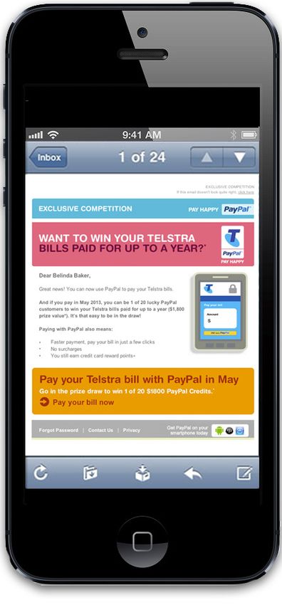
DECIDING ON AN EMAIL DESIGN APPROACH?
There are several design methods which could be used when trying to make your emails more mobile
friendly. However there is no one best method and it is something that may also need to be revaluated over
time depending on time, resources and knowledge of the process.

1. Mobile Aware/Scalable/Mobile First
This is the first step in mobile email design and probably the best place to start. There is no additional
coding required in this process, no multiple versions, but is simply an email that has been intended to render
well on a mobile first and then it will also look good on all other devices.

When taking a Mobile Aware approach things to consider are:

î Single-column layouts that are no wider than 500 to 600 pixels work best on mobile devices. They’re
  easier to read, and if they fall apart, they’ll do so more gracefully.
î Links and buttons should be large and have a minimum target area of 44 × 44 pixels. Nothing is more
  unusable than clouds of tiny links on touchscreen devices.
î The minimum font size displayed on iPhones is 13 pixels. Keep this in mind when styling text, because
  anything smaller will be upscaled and could break your layout. Alternately, you can override this
  behaviour in your style sheet (do so with care).
î More than ever, keep your message concise, and place all important design elements in the upper
  portion of the email, if possible. Scrolling for miles is much harder on a touchscreen than with a mouse.

                                                                                                              4
                                                                              www.ezymsg.com
2. Fluid Design
A Fluid design email is one that is always viewed at 100% width on whatever device it is seen on.

When taking a Fluid approach things to consider are:

î Technically it’s fairly simple to set up. All the containers and tables need to be set with a percentage
  width.
î Works well with simple designs that are mostly text based and use limited imagery. Complex designs
  with lots of imagery and multi column layouts will not work as well with a fluid design as it’s harder to
  control how the layout renders on smaller devices.
î You loose some of the control when it comes to design with this approach however it offers some of the
  most flexibility in adapting to the device it’s viewed on.
î This type of design can work well with automated email campaigns where the content is streamed in
  from a data source. With automated campaigns you need the design to be flexible to allow for possible
  changes in content amount and therefore having the design adapt accordingly.

                                                                                                              5
                                                                             www.ezymsg.com
3. Responsive/Adaptive
Responsive email designs use CSS and media queries to render two different layouts depending on the size
of the screen the email is opened on. CSS media queries can auto-adjust the layout, content and text size of
an email depending on the screen size of the device it is being read on. In addition, images can be swapped
out or completely disabled, images & buttons can be resized, and colors can be changed. While responsive
design requires two designs and extensive coding, they are they only truly “mobile first” strategy; however,
not all mobile environments support media queries.

When taking a Responsive approach things to consider are:

î Allows for the greatest flexibility when viewing emails on mobile.
î Detailed planning needs to be given to the creation of the desktop design incorporating flexible grid
  based layouts, flexible imagery and content which can then be altered easily in the mobile state. In
  effect, you need to consider two completely separate designs when creating a responsive email.
î Requires extensive and complex coding. Media Queries are similar to conditional statements that
  enable alternate states in your email.
î Not all environments support media queries.

A TIP ON PLANNING THE EMAIL DESIGN
Once you have an email design figured out, believe
it or not, we suggest going back to pen and paper
to do some quick sketches of how the framework
could be created. Sketch out the newsletter, dicing
up the design into simple rows and columns. This
short exercise could save you a lot of valuable time
when it comes to coding up the template, because
you know where each design element would live
within the table structure.

                                                                                                               6
                                                                             www.ezymsg.com
Media Query Support
When using media queries in your design it’s important to consider that to date, there are no “mobile
email standards” and compatibility varies across devices. You should therefore plan for an “images off”
environment, use the preheader/snippet text to your advantage and remember that clear concise content is
key. Here is a chart showing compatibility across some of the most popular mobile devices:

                                 DEVICE                                  COMPATIBLE
                                   iPhone                                       Yes

                                    iPad                                        Yes

                                 iPod Touch                                     Yes

                       Android 2.1 Eclair native client                         No

                       Android 2.2 Froyo native client                          Yes

                    Android 2.3 Gingerbread native client                       Yes

                Android 4.0 Ice Creme Sandwich native client                    Yes

                     Android 4.1 Jelly bean native client                       Yes

                 Android Outlook Exchange via native client                     No

                             Android Gmail app                                  No

                               iOS Gmail app                                    No

                     Yahoo Mail 1.4.6 & 2.0 Android app                         No

                     Microsoft Surface tablet (Hotmail)                         Yes

                            Windows Mobile 6.1                                  No

                             Windows Phone 7                                    No

                        Windows Phone 7.5 (Mango)                               Yes

                              BlackBerry OS 5                                   No

                              BlackBerry OS 7                                   Yes

                               BlackBerry Z10                                   Yes

                              Palm webOS 4.5                                    Yes

                                                                                                           7
                                                                          www.ezymsg.com
A RECAP ON THE DESIGN APPROACHES
With all the possible design approaches for mobile email, lets take a quick recap on your options and what’s
involved.

                                     Mobile Aware / Scalable
      Key Points                    Best For                   Not For                  Skills Needed
 l   One Layout               ü When you’re ready       û A complete mobile         l   No additional coding
 l   Single column              for a change                responsive solution         required
     320px - 500px            ü Don’t have high                                     l   Standard email
 l   Large text and             resources                                               editing skills within a
     buttons                                                                            WYSIWYG editor
 l   Generous white
     space
 l   Clear calls to action
 l   Short, concise body
     copy

                                                    Fluid
      Key Points                    Best For                   Not For                  Skills Needed
 l   Use percentages for      ü Emails with lots of     û Complex designs           l   Some HTML coding
      widths                    texts and just a few    û Emails that require a         required to adjust
 l   Adapts to fill the         images                      lot of design control       table widths within
     screen it’s viewed on;   ü Automated                                               the design
     text wraps                 campaigns
     automatically            ü Emails that need
 l   Most effective for         moderate flexibility
     simple layouts             with layout and
                                mobile rendering

                                       Responsive / Adaptive
      Key Points                    Best For                   Not For                  Skills Needed
 l   Requires detailed        ü Emails that require     û The fainthearted.         l   Extensive CSS and
      planning                  the greatest              Requires complex              HTML coding skills
 l   Uses CSS and               flexibility when          coding                    l   The ability to test
     media queries              viewing on mobile       û The resource poor.            and view emails in
 l   Detects screen size      ü Heavy mobile              Time consuming                multiple
     and enables alternate      audience                  and requires                  environments
     states accordingly       ü Travel alerts, mobile     rigorous testing
                                apps, tech companies

                                                                                                                  8
                                                                              www.ezymsg.com
WHICH APPROACH IS RIGHT FOR YOU?
Before making a decision, it’s important to understand your audience and what devices they are using
to read your emails.
Your audience is the best guide when it comes to your email marketing strategy. Finding out which devices
people read your emails on is now really easy to do in EzyMsg. Just check out the Device Split in the new
reports.
If the number of people reading your email on mobile devices is low then you probably don’t need to change
anything with your current email design – at least for now anyway. Just remember that more and more
people are reading their email on mobile devices so keep an eye on your Device Split with future campaigns.
On the other hand, if the mobile number is high (or is showing signs of an upwards trend) then some further
action is probably required. What that action is can be determined by looking at this next question.
How mobile friendly is your current email design?
When testing your email across multiple email clients and devices, pay close attention to how the email
renders. Does the text look too small and difficult to read? Do you need to scroll sideways in order to see the
main offer and call to action? Are the links grouped too closely together so that the reader can’t easily touch
them?
If the answer to any of the above questions is “yes” then a redesign is probably a good idea. At the very least
you should tweak your email design to make it mobile friendly.
Furthermore, you need to weigh the effort needed to redesign with a realistic view of your content and
production timeline, and pick an approach that makes sense for your brand. For example, certain emails in
a program might be just fine with an aware approach, but a higher traffic welcome message or special offer
could benefit from a few responsive elements.
9
www.ezymsg.comTHE VERDICT
Whatever approach you decide to use, make sure you plan for the long term.
It isn’t simply tweaking the code of a single email, it’s optimizing your entire email marketing framework,
so make sure you plan thoroughly, code & design, and TEST TEST TEST your new approaches to see what
resonates with your audience best.
Best case scenario
Use both options together (mobile aware + responsive) so that if the media query isn’t supported in a
specific client, it’ll still look great no matter what device it’s opened on!
IN THE MEANTIME
Start employing these ‘best practices’ for mobile email design when creating your next mobile-friendly email
and you’ll be off to a good start.
Mobile Email Design Principles
î Support the subject line with a creative , useful or helpful preheader.
- Call to action
- Special offer
- Reminder
- Clickable/measurable
î Create touch-friendly links and buttons
î Include a clear CTA
î Use short, direct copy
î Increase font sizes
- Body copy 16px+
- Headlines 22px
- Buttons 44px by 44px
î Create content hierarchy
î Use a one-column layout
î Optimise the left hand side for Android
- Pertinent information
- Call to action
- Links
î Tappable touch targets
î Bullet proof buttons that don’t rely on an image
î Test, test, test
DON’T: Group links closely together
DON’T: Forget to make landing pages mobile-friendly too!
10
www.ezymsg.comFor further information please contact:
www.ezymsg.com
support@ezymsg.com
Unit 1B, 27 Sinclair Street, Arundel
4214 Australia
+61 1300 399 674
+61 07 55 030 651
www.ezymsg.comYou can also read


