A Sticky End: Lessons Learned From Toronto's 2017 Real Estate Bubble
←
→
Page content transcription
If your browser does not render page correctly, please read the page content below
SPECIAL REPORT APRIL 2018

A Sticky End:
Lessons Learned
From Toronto’s
2017 Real Estate
Bubble

Executive Summary
In 2017, the Toronto real estate market started the year with home prices up
34% in March over the previous year then saw prices tumble 18% in just four
months when the bubble burst. What was behind Toronto’s rapid house price
appreciation, why did prices fall so rapidly and how were consumers affected by
this market volatility?

Despite arguments from the real estate industry that Toronto’s housing bubble
was driven by supply-side constraints, the data suggests otherwise — a closer
look at population growth and new construction figures relative to the period in
question do not suggest a likely explanation.

On the other side of the equation, the Greater Toronto Area (GTA) saw a surge
in demand beginning in 2015, with sales up 29% above the GTA’s ten-year trend
by 2016, with evidence to suggest that speculative investment activity played a
significant role.

 • During the first quarter of 2017, investors accounted for at least
   16.5% of all purchases of low-rise houses in the GTA, a 65% increase
   year-over-year. Increases differed greatly within the GTA, with York
   Region’s Newmarket and Richmond Hill accounting for the highest
   level of investor activity at 34% and 28%; in 2012, such activity
   was 7% and 9%.

 • Examination of the data suggests that investors were comfortable
   buying and renting out homes with rent yields that did not cover monthly
   carrying costs due to their speculation that rising capital appreciation
   would offset any such losses; rates of negative monthly cash flow varied
   across the GTA with Richmond Hill and Markham at the high end with
   an average loss of $2,488 and $2,444 and Oshawa and Ajax at the lower
   end with an average loss of $594 and $644.

A STICKY END: A REALOSOPHY SPECIAL REPORT                                          2
• Demand fell significantly during the second half of 2017, due to wors-
   ening affordability and the introduction of a foreign buyer tax, and the
   market saw a rapid decline of prices from a median price of $765,00 in
   March to $626,000 in July, a decline of 18% in four months, faster than
   the declines seen in the U.S. housing crisis which began in 2006.

 • At least 988 households were directly affected by the collapse of GTA
   home prices, with an estimated $135 million in market value lost in
   135 days, resulting in these consumers suffering immediate financial
   losses and incurring the risks of lawsuits. This figure includes 866
   properties that were sold to buyers unable to complete transactions
   after prices fell which were subsequently sold for an average of $140,200
   less; areas that saw the highest level of investor activity saw the
   highest level of losses with York Region’s Richmond Hill and Newmarket
   declining $317,091 and $238,866 respectively. These figures only include
   properties that we were able to assess directly; hundreds more are likely
   to have been negatively affected.

 • Prices in the GTA did not continue to decline as they did in the U.S.
   housing crises, instead levelling out by July 2017 with experts predicting
   a price plateau in the months to come.

 • The negative impact of the bubble has not been confined to directly
   affected consumers — housing affordability, already a challenge in the
   GTA, has been worsened with average prices in the GTA at 28 times
   annual rents by the end of 2017, less affordable than San Francisco,
   Los Angeles and New York.

A STICKY END: A REALOSOPHY SPECIAL REPORT                                       3
ABOUT THE AUTHOR

John Pasalis is the President of Realosophy Realty
Inc., a Toronto real estate brokerage which uses
data analysis to advise residential real estate
buyers, sellers and investors.

A frequent commentator on the Toronto housing
market and real estate consumer and industry
issues, John has contributed to the Globe and
Mail, CBC, the Wall Street Journal and other media,
government and industry organizations. He most
recently advised the Government of Dubai on
international best practices for the real estate
sector and was cited in the Bank of Canada’s June
2017 Financial System Review.

John holds a B.Sc. in Economics from the University
of Toronto and is currently completing a Doctorate
of Business Administration at the University of
Toronto and Henley Business School.

Contact John

john@realosophy.com

647-347-7325
Yes, Toronto, That Was a Bubble

2017 saw the first decline in Toronto home prices since the 2008 slowdown
driven by the U.S. subprime mortgage crisis —and the first Toronto real estate
bubble since 1989.

While the impact of this bubble was not on the same level as the property price
drops seen in the U.S. in 2008, we should not overlook its significance. Buyers
and sellers today risk failing to learn from —and avoiding —the experiences of
buyers and sellers hardest hit in 2017.

While Toronto residents have been hearing (largely premature) warning signs
about Toronto’s real estate bubble from economists and analysts for well over
ten years, a change in the data suggested a legitimate cause for concern in the
last few years.

Between January 2013 and March 2017, median prices of all properties
(including houses and condos) in the Great Toronto Area (GTA) nearly doubled
from $392,000 to $765,000 —an astonishing rate of growth in just over four
years. At the peak of the market in March 2017, prices had increased by 34%
over the previous year.

Then, the market turned on a dime. Prices fell by 18% in just four months —
faster than the hardest-hit U.S. markets like Miami, Las Vegas and Phoenix
after the peak of their bubbles in 2006.

So, what happened? Why did prices rise as high and as fast as they did and why
did they fall so fast after the peak?

In this special report, we look at potential explanations for the volatility and
examine the data to identify the most likely explanations.

A STICKY END: A REALOSOPHY SPECIAL REPORT                                          5
Why Does It Matter?

At a high level, we expect our government to introduce policies to help improve
housing affordability and prevent volatility in the future —but they can’t formu-
late (and we can’t evaluate) their proposed solutions without understanding
what caused the problem in the first place.

On a personal level, if you are considering buying or selling a home, having a
better understanding of the housing market is key to making better real estate
decisions.

If you believe the real estate industry (as represented by the Toronto Real Estate
Board (TREB) and the Ontario Real Estate Association (OREA)) explanation that
the rapid price rise was due to a lack of supply of properties to buy then you are
more likely to believe that prices can only go up in the near future because our
governments and builders cannot solve supply-side problems in the short term.

If, on the other hand, you believe that speculative buying may have been behind
the rapid rise in property prices (a concern raised by the Bank of Canada and
by us at Realosophy) then you’ll be more cautious about how you act in the real
estate market. For example, you’ll do more research into the neighbourhoods
that have shown the highest rates of speculation and tend to be more vulnerable
to price declines as the market cools and adjust your strategies to better
protect yourself.

A STICKY END: A REALOSOPHY SPECIAL REPORT                                            6
The Ride Up:
What (or Who) Drove Up Prices?
Before we look at what happened over the past couple of years in the Toronto
area estate market, it’s worth hitting pause to take a longer look.

Over the past decade in the Toronto area, media headlines have trumpeted
record breaking sales and ever higher prices while bearish economists and
analysts have been warning about a slowdown just as long. But looking back
to 2005, we see that the number of resale property sales (those sold by home
owners rather than new construction sold by builders) in the GTA over a ten year
period has been relatively steady — with two slight deviations in 2007 and 2008,
the first partly driven by an increase in demand in the City of Toronto before a
new municipal land transfer tax was introduced and the second largely a side
effect of the U.S. subprime mortgage crisis. Aside from those two years, the
number of sales has been relatively consistent.

Sales started to deviate significantly from their ten-year average in 2015
when they were up 15%, and in 2016, when they were up 29% above the ten
year average.

Number of Residential Sales - GTA

A STICKY END: A REALOSOPHY SPECIAL REPORT                                          7
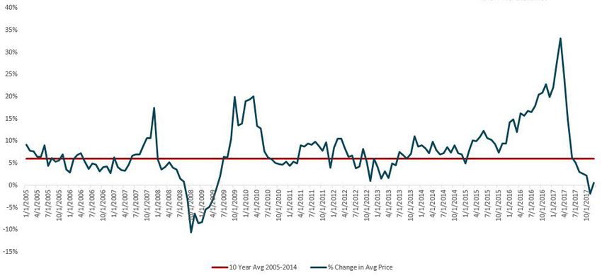
Looking at the rate of change in property prices since 2005, we find that prices
were appreciating at roughly 6% per year on average. Prices did not deviate
from this average until they surged and then dipped in the final few months of
2007 and most of 2008. A steep appreciation in late 2009 and early 2010, driv-
en by renewed confidence in the Toronto area real estate market once the worst
of the U.S. financial crisis had passed, pushed prices back up to pre-crisis levels.

Year over Year % Change in Average Price — GTA

Aside from these periods just before and after the crisis, the change in prices
was relatively balanced; there were months when price growth would deviate by
as much as 4–5% from the average, but these were generally short-term trends
not dramatic shifts in the market.

The growth in average prices started to deviate from its long-term trend in April
2016 when prices were up 16% over the previous year, an upward trend that
continued in the next year and eventually hit a peak in March 2017 when house
prices had appreciated by a striking 34% over the previous year.

A STICKY END: A REALOSOPHY SPECIAL REPORT                                              8
So, What Caused the Rapid Price Appreciation?

Population Growth

A common and long-standing explanation for rapid price growth is that many
people want to live in Toronto, fuelling strong demand for homes.

But when we look to 2016 and 2011 Census to measure the change in population
in the Toronto Census Metropolitan Area (CMA), we see that Toronto’s popula-
tion grew at its slowest rate in over twenty years —the opposite trend we would
expect to see given the argument for increased demand.

Population Change – Toronto CMA

A STICKY END: A REALOSOPHY SPECIAL REPORT                                         9
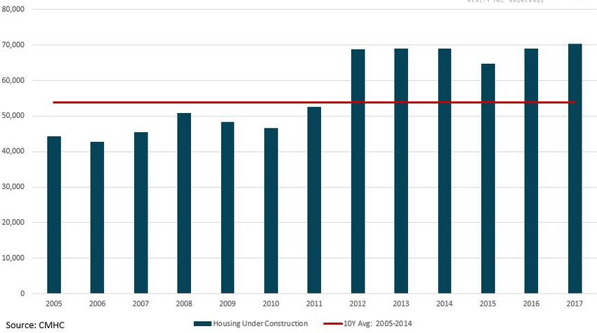
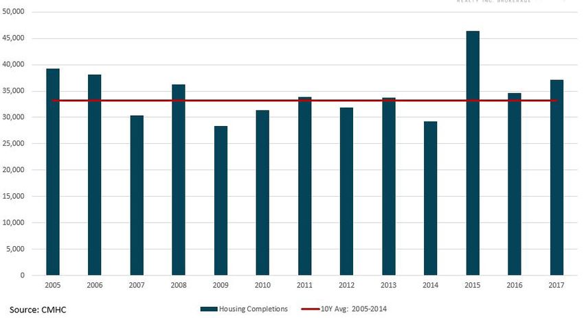
Housing Supply

Another common explanation for rapid price increase is a shortage of supply of
new properties in the Toronto area, which suggests that demand for properties
outpaces the existing stock for sale, driving up prices. This argument, favoured
by most real estate industry associations, claims that regulations on new
construction prevent builders from building enough homes to meet demand.

But new housing completions (the number of newly built properties completed
each year) between 2015 and 2017 were well above the ten-year average when
prices rose between 2015 and Q1 2017.

Housing Completions — Toronto CMA

A STICKY END: A REALOSOPHY SPECIAL REPORT                                          10
The number of properties under construction were also well above the ten-
year average.

Housing Under Construction — Toronto CMA

This is not to suggest that there are no constraints on the supply of homes in
the GTA — supply constraints were likely a factor in prices rising by 6% per year
over the past 10+ years. But there was no sudden decline in supply of homes in
2016 and 2017 that could explain the rapid price appreciation experienced.

Psychology
A lesser-discussed factor in real estate market behaviour is psychology.

Prominent economists Karl Case and Robert Shiller, who have been studying the
behavior of buyers in boom and post boom markets since the late 1980s, have
found that during boom periods there is a heightened excitement about real
estate which results in exaggerated expectations about how much prices will
grow by each year (Case and Shiller, 1988; Case and Shiller, 2003).

Buyers begin to believe that prices have ‘nowhere to go but up’ and rely on
simplistic rationales for why including two identified by Case and Shiller as far

A STICKY END: A REALOSOPHY SPECIAL REPORT                                           11
back as the late 1980s: “Lots of people want to live here” and “There is just not
enough land available.”

These biased assumptions about prices can influence the market in two ways,
both leading to more price acceleration.

One way is by provoking panic buying as buyers rush into the market out of
fear that ‘it’s now or never’ — if they don’t buy now they’ll never be able to afford
a property later (because they expect prices to keep going up). Once in the
market, they may also feel like they have to ‘pay what the market wants.’ When
Case and Shiller’s survey described instances of buyers lining up to make offers
on properties, properties receiving multiple offers from buyers, some for more
than asking price, and asked buyers why they thought this was happening, the
most common response from buyers in booming markets was that “there is
panic buying and price becomes irrelevant.”

In a market where house prices are rising by 20% per year as they were in the
GTA in late 2016, it is reasonable to conclude that buyers might have panicked,
fearing that the $700,000 home they are looking at today would be $770,000
in six months. It should be noted that while there is anecdotal evidence of
such panic buying during the peak of the GTA market, we lack evidence from
formal surveys.

The other way biased assumptions about future price growth can impact the
market is by spurring more people to buy properties purely for investment
purposes rather than as a place to live. In a market where house prices are rising
20% or more, investors believe that the $700,000 property they’re buying today
is going to be worth at least $840,000 a year from now. For many investors, this
represents a potential return on investment rarely found elsewhere; for example,
if they made a 20% down payment on a $700,000 property ($140,000) and
the property went up in value by $140K in one year, their return would be 100%
(before transaction costs), a doubling of their money in a year.

With many in the real estate industry corroborating their simplistic
rationalizations, few buyers and investors have reason to question their biased
assumptions — both groups begin rushing into the market and price starts
becoming irrelevant.

A STICKY END: A REALOSOPHY SPECIAL REPORT                                               12
Caught Between Bears and Bulls

   One of the factors that has likely contributed to the overconfidence home
   buyers and investors have had in the GTA housing market was that after ten
   years of hearing from various analysts and industry actors that any fears
   were unfounded and that prices would always keep rising, people began to
   tune out any talk of bubbles.

   On the flip side, bubble theorists who have been predicting the complete col-
   lapse of the market for the past ten years or longer, lost credibility. Even more
   dangerously, they damaged the credibility of a counterposition that seemed
   to remain the same no matter how numbers changed, leaving consumers
   deaf to warnings based on credible analysis such as when Bank of Canada
   Governor Stephen Poloz warned in June 2017 that the rapid price increases
   in Toronto housing markets had “an element of speculation to them.”

A Closer Look at Investor Demand

Understanding how the demand and behaviour of investors has changed over
time can give us some insight into one of the factors that may have influenced
prices. Many of the cities in the U.S. that experienced the most rapid growth
in house prices during the boom that preceded the 2008 subprime crisis
experienced a significant rise in demand from investors.

Investors are a natural part of any market, but they can be a sign of a potential
problem in a real estate market when investor demand grows rapidly and inves-
tor behaviour suggests that they are buying strictly for capital appreciation. This
type of rise in demand can help push prices higher than they otherwise would
have been and also creates instability should prices start to fall, as investors
have been found to default on their mortgage debt at a higher rate than end
users (Haughwout et al., 2011).

A STICKY END: A REALOSOPHY SPECIAL REPORT                                              13
I began to notice a significant shift in the motivation of buyers in 2016 when
nearly half of the people coming to our brokerage were interested in buying
single family homes as investment properties rather than as a place to live in. In
some cases, these investments were being made by parents who were buying
homes for their elementary school-aged children because of the fear that their
children will never be able to afford a home in the future.

When we walked them through the numbers and showed them that the rent
they could earn wouldn’t cover their monthly expenses and mortgage payments,
most of these buyers didn’t care. They felt it was worth losing roughly $1,000
per month on these costs (often referred to as ‘carrying costs’) because they
were convinced that the $800,000 home they would be buying would be worth
at least $100,000 more the following year.

These anecdotal experiences led us to research the impact investor demand
might be having on the GTA’s real estate market. The results of this research,
published in our March 2017 report Freeholds on Fire: How Investors are Driving
Up House Prices in the Greater Toronto Area, aimed to quantify investor demand
for single family houses in the GTA real estate market from 2012 to 2016 and to
measure the return on these investments.

The report measured this type of investor demand by analyzing all sales of low-
rise houses (detached, semi-detached and rowhouse) on TREB’s Multiple Listing
Service (MLS) database system, which contains details for the vast majority of
resale properties being advertised for lease or sale in the Toronto area, and then
checking to see if that same property was subsequently listed for lease on the
MLS by the new owner.

A STICKY END: A REALOSOPHY SPECIAL REPORT                                            14
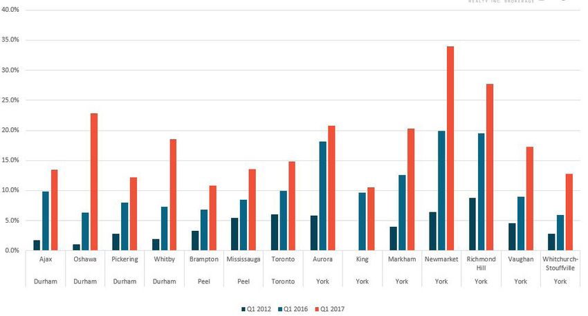
Taking a similar approach, the chart below shows the percentage of low-rise
houses purchased in first quarter of 2012, 2016 and 2017 that were subse-
quently listed for lease on the MLS in the same calendar year. We are focussing
specifically on the first quarter because this period marks the peak of Toronto’s
real estate bubble in 2017; by the second quarter, the market had started to cool
down significantly and demand from investors had also also declined (as we will
see later on in this report). Measuring this against 2012 data allows us to see
the long-term change in investor demand and against 2016 data, year-over-
year change.

Percent of Homes Purchased by Investors

In 2012, this type of investor demand accounted for 4.8% of all low-rise houses
purchased during the first quarter, climbing to 10% in 2016 and 16.5% in 2017, a
65% increase over the previous year.

In 2017, York Region continued to be the most popular region for these investors
and in four municipalities, they accounted for more than 20% of sales with
Newmarket topping the list at 34%, followed by Richmond Hill at 28%. In 2012,
such investors accounted for 7% and 9% of sales in Newmarket and Richmond
Hill respectively.

A STICKY END: A REALOSOPHY SPECIAL REPORT                                           15
Whitby and Oshawa in Durham Region saw the biggest year-over-year increase
in such investor sales from 2016 to 2017, with sales more than doubling in
Whitby and jumping from 6.3% to 23% in Oshawa.

It’s important to note that the above methodology excludes investors who
bought a low-rise house and rented it privately (as opposed to advertising it for
lease on the MLS) or left it vacant as well as owners who decided to hold on to
their current house as an investment property rather than selling it after they
moved, but despite these shortcomings, it offers some insight into a minimum
level of investment in low-rise houses in the GTA.

Looking at the total increase in low-rise house sales from 2015 to 2016, we
found that investors accounted for 43% of this increase.

Looking at the increase in the number of low-rise sales between Q1 2017 and Q1
2016, we found that investors accounted for 171% of this increase — without this,
overall sales would have fallen during the first quarter of 2017. It appears that
towards the end of the bubble, regular buyers started to pull out of the market
while investors were still rushing in.

An important consideration when looking at the demand from investors is to
determine how rational these investments were. Most real estate investors
typically look for properties that are at least cash flow neutral, which is to say
that the monthly rental income covers all the ‘carrying costs’ of the property
including mortgage payments. Properties that have a negative cash flow can
be more speculative because it suggests that the investor is buying strictly for
property price appreciation — they are prepared to lose money each month in
the belief that the loss will be more than covered by the potential capital gain.
The larger the negative cash flow, the more speculative the purchase.

Because our methodology is driven by paired transactions of low-rise house
sales and leases, we know the price and property taxes paid and rent earned for
each. Assuming a 35% property down payment, a mortgage rate of 2.8% (also
the rate used in our March 2017 report) and a 25-year mortgage amortiza-
tion period, we were able to estimate whether rental income would cover
carrying costs.

In 2016, 95% of the investment properties purchased were not making enough
money in rent to cover the operating costs and projected mortgage payments

A STICKY END: A REALOSOPHY SPECIAL REPORT                                            16
for the property. The average investment property was short $1,121 each month,
a figure which ballooned to $1,650 in the first quarter of 2017 due to the rapid
increase in house prices with little change in rents earned.

The municipalities in York Region were among the worst performers in the GTA
with Richmond Hill and Markham showing an average monthly negative cash
flow of $2,488 and $2,444 respectively during the first quarter of 2017; the
average price of investment properties purchased during the first quarter of
2017 was $1,438,241 and $1,397,118 respectively and average rents were $2,417
and $2,323.

The municipalities in Durham Region were among the least worst performers
with Oshawa and Ajax showing the lowest monthly negative cash flow of $594
and $644 respectively.

   What About Condos?

   Condominium research firm Urbanation performed a similar analysis
   for resale condominiums to that used by Realosophy to analyze resale
   houses. Senior Vice President Shaun Hildebrand found that in Q1 2017,
   11% of all condos purchased in the GTA were leased during the same
   calendar year, an increase from 7% the year before. The average price
   paid in Q1 2017 was $475,388, 23% higher than the previous year
   and average rents were $1,950, up 6%. In calculating the average
   monthly cash flow, they found that condos investments were losing an
   average $176 per month in 2016, which climbed to $424 in 2017.

                                                                     2016                     2017

           % of Units Purchased by investors                          7%                       11%

                       Average Price                              $385,307                  $475,388

                       Average Rent                                 $1,836                   $1,950

                     Average Cashflow                               $(176)                   $(424)

     Source: Urbanation. Figures assume a 2.8% mortgage interest rate, a 25-year mortgage amortization period
           and a 25% property down payment and factored in property taxes and condo maintenance fees.

A STICKY END: A REALOSOPHY SPECIAL REPORT                                                                       17
The rapid rise in investor demand coupled with their rising negative cash flow suggests that a speculative mood hit Toronto — reflected in investors who appeared to believe they could make easy money by buying what they perceived to be a safe and secure asset, single-family homes — and may have been a key driver of the rapid growth of house prices in the GTA. Foreign Buyers Most discussions about rapid house price growth typically include questions about the impact of foreign ownership. Unfortunately, the Ontario government only started collecting data on foreign buyers after they introduced their non-resident speculation tax in late April 2017 — a 15% tax on properties purchased by non-residents — so it is difficult to answer what impact foreign buyers may have had on the market before that. One possible explanation for the rapid increase in sales and prices in late 2016 and early 2017 is that following the BC government’s introduction of a foreign buyer tax in July 2016, much of the foreign capital that was flowing to Vancouver moved to Toronto — contributing to our rapid increase in prices, but without data this remains only a theory. We do know that between April 24th and May 26th the Ontario government reported that 7.2% of real estate transactions in the City of Toronto and 9.1% in York Region involved at least one foreign entity. If we assume that these proportions reflect the number of properties purchased by foreign buyers before the tax was introduced then it suggests that foreign buyers likely did have an impact on the GTA’s real estate market in 2016 and early 2017. It’s worth noting that in 2016 sales had increased by just 11.7% over the previous year and this was enough to push our market into bubble territory with price growth surging to 20%. This means that the 7% and 9% of properties purchased by non-residents in Toronto and York Region respectively was significant enough to have an impact on prices. A STICKY END: A REALOSOPHY SPECIAL REPORT 18
But foreign buyers may have had a bigger impact on the real estate market
than suggested by their percentage of transactions. The Canadian newspaper
The Globe and Mail, through a Freedom of Information request, found some
interesting differences between the behavior of resident vs non-resident buyers
(Mahoney 2017):

  		 In the four months after the Ontario government began charging
     a 15-per-cent tax on residential purchases by foreign buyers in the
     Toronto region, non-citizens paid on average $977,611 for homes
     compared with $659,470 for Canadians and permanent residents
     — or 48.2 percent higher.

This may be due to several factors — foreign buyers may be stronger partici-
pants in luxury markets and may pay more for properties than local buyers do
— which may help explain why homes in many York Region municipalities, where
demand from foreign buyers was the highest, appear more overvalued than
in the rest of the GTA. And it may help explain why the median house price in
Richmond Hill in 2017 was 63% more expensive than Whitby when the median
household income in Richmond Hill is 15% lower than Whitby. Again, this may be
due to several factors—Richmond Hill may have more households reporting less
income and may have more vacant homes—which are suggestive of a higher
presence of foreign investors.

More data and research is required to better understand the impact foreign
buyers may have had on the GTA real estate market.

A STICKY END: A REALOSOPHY SPECIAL REPORT                                         19
The Costly Ride Down In March 2017, Ontario’s Finance Minister Charles Sousa indicated that the provincial government was considering introducing a tax on properties purchased by foreign buyers in the GTA along with other measures to cool the real estate market. Eight months earlier in July 2016, the BC government introduced a 15% tax on properties purchased by foreign buyers which quickly cooled the market for single family homes. Fears of a similar chilling effect coupled with sky high house prices led many GTA sellers to scramble to put their homes on the market in March before a foreign buyer tax was officially announced. During the last two weeks of March, the GTA’s real estate market began to change quite dramatically. Multiple offers on homes where 15-20 buyers would compete had been the norm for the first two and a half months of 2017, but by late March houses were getting only 3-5 buyers competing on offer nights and by mid-April many houses were getting no offers at all on their offer night. The market turned in a matter of weeks. By the time the Ontario Government announced their Fair Housing Plan — a set of policies that aimed to cool the GTA real estate market which included a 15% tax on non-resident buyers — sales were already on their way down. When we noticed the rapid shift in the GTA market we began tracking changes in sales and new listings weekly to get a better sense of how the market was moving. This approach gave us a timelier look at how rapidly the housing market was changing when compared to looking at monthly figures and offers some insight into why prices declined as quickly as they did. A STICKY END: A REALOSOPHY SPECIAL REPORT 20
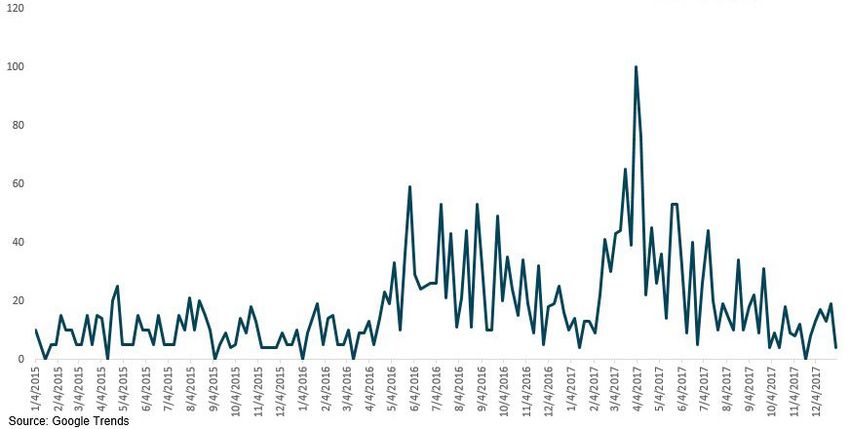
The chart below shows the year-over-year changes in the number of new listings
during the first half of 2017.

Percentage Change in New Listings - GTA

During the first two months of 2017, new listings were down on a year-over-year
basis. By the last two weeks of March and the first week of April new listings
of low-rise properties surged by roughly 50-60% year-over-year. After taking a
short pause the week of Easter — new listings climbed by over 80% year-over-
year. This surge in new listings was one of the key factors that led to the rapid
cool down in the GTA real estate market. It’s also one of the major differences
between how Vancouver and Toronto’s real estate markets responded to the
introduction of a tax on foreign buyers — Vancouver’s market did not see a
dramatic surge in new listings.

The other factor that cooled the GTA real estate market was a rapid decline in
sales. By early April, buyers had learned that median house prices appreciated
by 34% year-over-year during the previous month. We can see the fears that
many buyers must have had about the real estate market by looking at Google
searches for the term “real estate bubble” in Toronto which peaked the first
week of April.

A STICKY END: A REALOSOPHY SPECIAL REPORT                                           21
Google Searches for the term “Real Estate Bubble” from users in Toronto, Canada

This bubble-like appreciation coupled with buyer fatigue and fears that a foreign
buyer tax might cool the housing market the way it did in Vancouver drove many
buyers out of the market.

The chart below shows year-over-year change in sales during the first
half of 2017.

Percentage Change in Sales - GTA (Year over Year, Freehold)

A STICKY END: A REALOSOPHY SPECIAL REPORT                                           22
The surge in new listings provided some relief for desperate buyers during the
end of March with sales up 50%, but by the third week of April sales were down
20% year-over-year and continued to fall further and by mid-June they were
down 46% year-over-year.

The mood of the market had changed quite dramatically. During the first
quarter, the feeling among buyers was that if they didn’t buy immediately they
were going to be priced out. The fear of missing out was a big factor influencing
both home buyers and investors.

In May, these same buyers who were anxious during the first few months of
2017 had either hit pause on their home search or were being very patient and
selective if they remained active. Buyers now had many properties to choose
from — there was no rush to make an offer.

This sudden shift in the market put a lot of pressure on sellers who had recently
purchased another property and needed to sell their own property.

For many recent years in the GTA, any buyer who already owned a house or
condo would typically buy their new home first and then list their existing home
for sale. This was common because buying a home was likely to take months be-
cause of strong competition amongst buyers while selling was quite easy due to
the same high demand from buyers — homes were selling in weeks. This entailed
some risk because virtually all buyers would have to sell their current home in
order to be able to afford the home they just purchased — very few buyers can
afford to own two homes at once — but this risk was seen as minimal because
of how hot the GTA real estate market was. Once the market started to rapidly
cool down in the spring and summer of 2017, this assumption no longer held.
Suddenly sellers were feeling anxious — not only had bidding wars disappeared,
they were starting to wonder if they would even get a single offer.

A STICKY END: A REALOSOPHY SPECIAL REPORT                                           23
Sellers under pressure were forced to accept offers well below the price they
were expecting, and below what comparable homes recently sold for, in order
to be able to finance the purchase of their new home. While many did manage
to sell their home and take possession of their new home, some were caught off
guard by the sudden slow down and suffered financially as a result.

Sellers who couldn’t sell their home in the spring/summer or couldn’t sell for
the price the market was suddenly willing to pay because it wouldn’t leave them
with enough money to finance the home they had just purchased were forced to
walk away from the latter, losing their buyer deposits and incurring the risk of
being sued by the seller, causing a domino effect of transactions that failed to
close (transfer ownership).

Because of these changing market dynamics prices fell quite quickly in a very
short period of time. In March, the median price for a home peaked at $765,000
and by July it had tumbled to $626,000, an 18% decline in just four months.
While it’s not normally a good practice to compare prices in such a short time
period because of seasonal differences between busy and slow period, this
was notable as historical GTA prices rarely showed a significant drop from
March to July.

The rapid decline in prices also put pressure on those who recently bought a
home. When their banks went to appraise their homes in June or July just before
they were scheduled to take possession, buyers were informed that the home
they had paid $900,000 for in April was now worth $800,000. Buyers either had
to make up the difference in cash or walk away from the deal which would mean
losing their buyer deposit and incurring the risk of being sued by the seller.

Some buyers found the money to close, other buyers backed out and in
some cases buyers and sellers negotiated a middle ground in which the seller
accepted a lower price than what was originally agreed to in order to ensure the
buyer would stay in the deal.

A STICKY END: A REALOSOPHY SPECIAL REPORT                                          24
Collapse in Prices

When considering the 18% decline in GTA home prices it’s worth noting that
property prices typically don’t decline as quickly as they did in Toronto in 2017.
Prices tend to be sticky on the way down (Case, 2008). To see how rapid the
GTA’s decline was, the chart below shows the number of months it took various
U.S. cities to see their house values fall 18% after reaching their local peaks
between 2005-2006. The Case-Shiller Index was used to identify the month
when values peaked in each city along with the number of months it took values
to fall by 18%. We’ve added Toronto’s 4-month 18% decline in median house
prices as a point of comparison.

Number of Months after Peak for Values to Fall 18%

On average, the U.S. cities in the chart above took 20 months for prices to fall
18% with Miami experiencing the quickest decline 12 months after the peak. All
of the U.S. cities included saw property values peak during the second half of
2006 and all but New York saw values fall 18% (or more) well before the collapse
of Lehman Brothers in September 2008.

While GTA property prices did fall much faster than in most U.S. cities following
their bubble, the declines in the GTA appear to have been contained to a
four month period — prices levelled out after August. The U.S. declines may
have been more gradual but as a whole were much worse with many of the
hardest-hit cities seeing values fall by over 50% from their peak.

A STICKY END: A REALOSOPHY SPECIAL REPORT                                            25
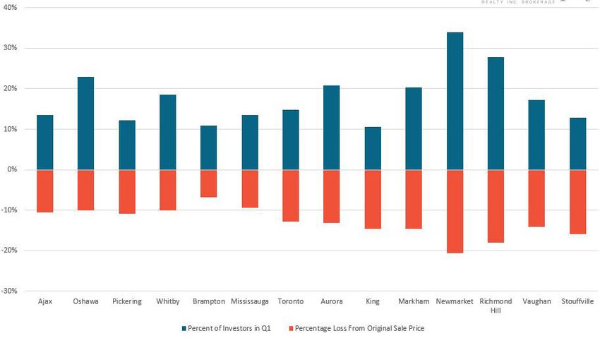
How 988 Households lost $135 Million in 135 Days

While not as grave as the 2008 U.S. collapse, Toronto’s rapid 30%+ appreciation
in the first quarter of 2017 followed by a rapid 18% decline in prices is a remind-
er of how reckless Toronto’s real estate market had become — a recklessness
that imposed real costs on consumers.

In the previous section, we discussed the buyers that had to walk away from the
homes they purchased at the peak of the market when they couldn’t sell their
current home or when banks appraised the home they purchased for far less
than what they paid for it.

In many cases, these properties were subsequently listed for sale on the MLS
and were purchased by another buyer. By looking at low-rise homes that sold
in 2017 and checking to see if the same house was subsequently resold by the
same owner in the same year or the first quarter of 2018 we can gain some
insight into the number of failed transactions and the difference in a property’s
value at the peak and when it was eventually resold. While this approach does
not capture all failed transactions — for example, any house that didn’t sell after
its original sale failed would be missed in this analysis — it still offers valuable
insight into how a rapid downturn in prices can impact buyers and sellers.

We found that out of all properties with multiple sales in the given time period,
866 failed to close after initially being sold, eventually selling to another buyer
later in the year. On average, the second price was $140,200 less than the price
received earlier in the year.

We found an additional 122 sellers who sold for a price that was lower than what
they bought it for earlier in the year, for an average of $107,325 less.

The average percentage decline in prices for these combined 988 properties
was 12%, but we found significant variability across the GTA. In Newmarket,
prices declined 21% from their original sale price, or $238,866 while Richmond
Hill saw prices fall 18% or $317,091 from their original sale price.

A STICKY END: A REALOSOPHY SPECIAL REPORT                                              26
Brampton saw the most modest price decline with prices falling 7% or $54,502,
followed by Milton at 8% or $68,207 and Mississauga at 9% or $91,907.

Interestingly, these numbers correspond to the investor figures we looked at
earlier in this report — the areas with the biggest declines had the most signs of
investor activity.

Percentage Loss vs Percentage of Investors

Combined, these 988 properties lost a total of $135 million in market value in
135 days — the average number of days between the first and second sale for all
these transactions.

This is likely a small subset of the transactions that failed to close in 2017.
Our analysis found another 1,784 properties that were sold in 2017 that were
subsequently listed for sale either in the same year or during the first quarter
of 2018 and did not sell. We did not go through the process of evaluating these
transactions individually to see what proportion of these listings were listings
for transactions that had fallen through vs transactions where the buyer took
possession but for some reason decided to list their house for sale shortly after
taking possession.

A STICKY END: A REALOSOPHY SPECIAL REPORT                                            27
Is the Decline in Prices Being Overstated?

   When considering a decline in home prices, it’s worth noting that the Teranet
   National Bank House Price (HPI) Index — another measure of property price
   changes in the GTA — shows very different numbers from TREB. While TREB
   median prices show that prices fell by 18% four months after the peak, the
   HPI index shows that prices fell by just 7%, introducing some uncertainty
   about the extent to which prices have changed.

   The HPI differs from TREB data in two main ways. The first is that HPI reports
   on a transaction once it has ‘closed’, meaning title for the property has been
   transferred from owner to owner while TREB reports a sale once a property
   is sold and has yet to close, or in other words, pending sales. The second
   is that the HPI attempts to measure the change in prices by using what’s
   called a ‘repeat sales methodology’. This approach calculates how much each
   home that sold has appreciated since it last sold and then combines the
   different appreciation rates over different time periods for the thousands of
   homes that sold in a given month in an index that attempts to show the true
   change in values.

   Because HPI data is more readily available and perceived to be a better ap-
   proach to measuring true changes in values, analysts may be more inclined
   to use HPI data than TREB’s median home price data. However, HPI data may
   understate how prices changed both leading up to and after the peak. First,
   the hundreds of transactions that didn’t close and were subsequently relisted
   for sale later in the year — a period which includes the peak prices paid in
   January to May — were never factored into the HPI.

   Among the properties that did eventually close, in many cases buyers and
   sellers renegotiated the sale price down because of the decline in the market
   and to ensure the transaction closed. In these situations, TREB would have
   reported the higher sale price in their data while the HPI would have reported
   on the reduced price negotiated just before closing.

A STICKY END: A REALOSOPHY SPECIAL REPORT                                           28
In both cases, the HPI didn’t completely capture the peak prices paid from
   March to May and thus likely understated the peak of the market.
   Indeed, as part of the HPI’s methodology, paired transactions that show
   extreme price changes are filtered out as this data is assumed to reflect
   material changes to properties (e.g., due to a substantial renovation or
   destruction such as through fire or flooding). This means that in cases
   where transactions were closed and resold in a short period of time,
   properties that showed a rapid decline in prices may have been filtered
   out given that the annualized decline would likely have appeared too
   extreme for the HPI model. Given this, the HPI is less able to reflect rapid
   and extreme price changes in the market so caution should be used when
   applying it to understand changes in home prices in these instances.

A STICKY END: A REALOSOPHY SPECIAL REPORT                                         29
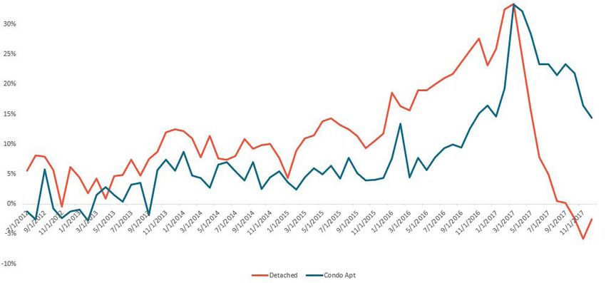
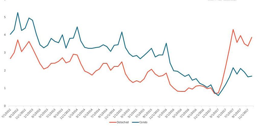
A Sticky Ending
The GTA real estate market ended the year by moving in different directions
depending on property type and geographic location.

Detached Houses vs Condo Apartments

The surge in new listings and decline in sales in the early spring and summer
months were seen in all home types, but it had a bigger effect on the detached
home market.

At the peak of the bubble in March, both detached homes and condos had less
than one month of available inventory for sale. By July, the condo market had
roughly two months of available inventory while the market for detached houses
had four months of inventory.

Months of Inventory — GTA

This sudden and more dramatic increase in inventory in the detached home
market put more downward pressure on detached prices relative to condos. The
median price for a detached house fell 19% from a peak of $1,023,000 in March
to $832,500 in July. By the end of the year in December, the median price for a
detached house was down 4% to $812,500 year-over-year.

A STICKY END: A REALOSOPHY SPECIAL REPORT                                         30
Condo prices on the other hand continued to soar straight through 2017 with
few signs of cooling. While the rate of appreciation has declined since the first
quarter of 2017, by the end of the year in December, the median price for a
condo apartment was $446,250, up 16% year-over-year.

We can see the relative differences in average price change between condos and
detached houses in the chart below.

Year Over Year Percent Change in Average Price — GTA

On the surface, this disparity between the supply of houses as measured by the
months of inventory and the change in average prices for detached homes vs
condos doesn’t make a lot of sense.

On the supply side, condo apartments have the highest volume of units in the
pipeline among all home types. The GTA has 105,000 condo apartments under
development which are scheduled to be delivered during the next five years,
adding a significant number of units to the existing stock of 321,500 condo
apartments in the GTA (Burda et al., 2017).

On the demand side, a recent survey by TREB and the Toronto Region Board of
Trade found that detached homes are the most desired type of housing in the
GTA with 51% of buyers indicating it as their top choice. The survey also found
that 81% of buyers do not want to buy a condo.

If detached homes are the most popular type of housing and if condos have
the highest number of new units in the pipeline why are detached homes the

A STICKY END: A REALOSOPHY SPECIAL REPORT                                           31
most over-supplied type of home in the resale market today? Why are detached
houses the only type of home that has seen prices fall year-over-year and why
have condo prices continued to appreciate in 2017 even after the bubble burst?

The most likely explanation for the dynamics we are seeing is a flight to
affordability, with consumers being pushed to condos due to lower price, and is
a symptom of a property market that continues to be overvalued.

Detached houses are the most oversupplied home type and have seen the most
significant decline in values since the peak because they are the most expensive
home type. Detached houses are likely unaffordable for many GTA home buyers
who are moving down the price ladder to more affordable types of housing like
semi-detached houses, row houses and condos.

Geographic Differences

When looking at the regional differences across the GTA, York Region stands
out as the area that had the most available inventory towards the end of the
year, particularly in the detached segment. By the end of November, all seven
municipalities in York Region had between 5 to 8 months of inventory of
detached houses on the market — well above the 2.6 average of the other GTA
municipalities. November was used rather than December as we tend to see a
bigger seasonal impact on supply and demand in December due to the holiday
season which often skews these metrics.

Months of Inventory — GTA
Detached Houses November 2017

A STICKY END: A REALOSOPHY SPECIAL REPORT                                          32
One of the main drivers behind this geographic disparity may be the relative
differences in how affordable and how overpriced each of the municipalities are.
If we take a simple Price-to-Rent ratio for detached houses, we see significant
differences across municipalities.

Price To Rent Ratio — GTA (Detached Houses, 2017)

The median price for a detached house in Oshawa in 2017 was $546,027 and
the median rent was $1,880 (or $22,560 annually), a price-to-rent ratio of 24.
Compare this to Richmond Hill where the median price for a detached house in
2017 was $1,500,000 and the median rent was $2,350 (or $28,200 annually), a
price-to-rent ratio of 53, which is more than double that of Oshawa. Looking at
these relative differences another way — a home in Richmond Hill costs nearly
three times more than a home in Oshawa but the median rent in Richmond Hill
is only 24% more than in Oshawa. Why does it cost so much more to own than
rent in Richmond Hill?

There could be a number of possible explanations for this. As discussed earlier,
demand from foreign buyers was much stronger in York Region (Richmond Hill)
than in Durham Region (Oshawa) and foreign buyers tend to purchase more
expensive houses than local residents.

These relative differences are important for home buyers to understand because
research has shown that neighbourhoods within the same city can appreciate at
very different rates (Guerrieri et al., 2013). The differences we are seeing in the
months of inventory and price-to-rent ratio by municipality suggests that house
prices are likely to decline at different rates across the GTA.

A STICKY END: A REALOSOPHY SPECIAL REPORT                                             33
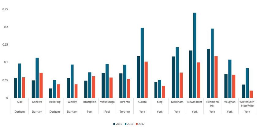
Change in Investor Demand

Comparing the demand from investors during the third and fourth quarters of
the previous three years, we see that investor demand fell significantly during
the second half of 2017.

Percent of Homes Purchased by Investors Q3 and Q4

The above percentages refer to all low-rise houses that sold during the third and
fourth quarters of each year that were subsequently listed for lease during the
same period or during the first two months of the next year.

This methodology is different from the one used during the first quarter
because we can only look at data for the first two months of 2018 so it will likely
understate the percentage of investors because properties that were purchased
by investors late in the fourth quarter but not listed for lease until after February
of the following year would not be captured in our analysis. While these
percentages are not strictly comparable to those reported for the first quarter,
they give us some insight into changes in investor demand year-over-year.

Affordability

Figuring out when the current price of homes is justified by economic funda-
mentals like immigration and income growth and when they are disconnected
from such fundamentals is a question that has troubled economists for

A STICKY END: A REALOSOPHY SPECIAL REPORT                                               34
decades; even today there is no single universally accepted approach to
answering this question.

There are two commonly-used approaches: The first looks at the price of homes
relative to local economic variables such as changes in income, population
growth, and land constraints. The second compares the user cost of owning a
home relative to the cost of renting. A detailed analysis using either approach is
beyond the scope of this report, but we can consider the two most commonly
used ratios that serve as a quick proxy for this type of analysis — the price-to-
income ratio and the price-to-rent ratio.

The price-to-income ratio compares the median price for a home in a city to
the median household income. The assumption with this ratio is that home
prices should not rise too high above the median household income because
homes are assets financed through that income. If prices climb too high, more
will find themselves unable to afford to buy a home given their income. In a
balanced market, we would expect prices to be between 3 to 5 times the median
household income.

In their 2018 Housing Affordability Survey, Demographia International ranked
Toronto among the least affordable cities in the world with median house prices
at 7.9 times the median household income (Cox and Pavletich 2018). This
report was based on data from the third quarter of 2017 when the median house
price in the GTA was $645,800 and median household income was $81,300.

GTA residents may have a hard time imagining a time when local real estate
was affordable, but in Demographia’s first survey in 2004 the median price for a
house in the GTA was only 3.9 times the median household income.

The price-to-rent ratio is calculated by taking the median price for a home in a
given period and dividing that by the median rent (annualized). The rationale
with this metric is that if home prices get too expensive relative to what it costs
to rent a home, prices may be overvalued. A price-to-rent ratio in the 15 to 20
range is relatively balanced; ratios above 20 suggest that house values may be
overpriced relative to the cost of renting.

When comparing the price-to-rent ratio for all home types in the GTA against
the price-to-rent ratio estimated by Zillow for the largest metropolitan areas

A STICKY END: A REALOSOPHY SPECIAL REPORT                                             35
in the U.S., the GTA has the highest price-to-rent ratio at 28 followed by San
Francisco at 22.

It is important to note that Zillow’s price-to-rent ratio is based on their estimate
of the value and rent of all residential properties while the ratio for Toronto is
based on the actual median sale and rent prices for all transactions (houses and
condos) in 2017.

Price To Rent Ratios 2017

High house prices relative to incomes and rents are likely one of the factors
contributing to the decline in GTA home sales during the second half of 2017,
particularly the detached home segment of the market where prices are
the highest.

A STICKY END: A REALOSOPHY SPECIAL REPORT                                              36
How will House Prices Change in the Future?

By the end of 2017, median house prices in the GTA were down from peaks
reached earlier in the year, but were up slightly on a year-over-year basis. This
means that the 18% decline in house prices experienced in 2017 only eliminated
the three months of appreciation from January 2017 to March 2017, the tail end
of Toronto’s real estate bubble.

By August 2017, the imbalance between supply and demand seen after the first
quarter had levelled out and prices have remained relatively flat since. This is
where we are starting to see the price ‘stickiness’ we normally expect to see in
cooling housing markets.

While it’s impossible to predict how house prices will change in the future,
barring any major economic shocks, house prices are likely to remain relatively
flat in the short term. This may sound counterintuitive if we believe that GTA
house prices appear overvalued relative to rents and incomes, but house prices
can remain overvalued for a long time because they’re sticky on the way down
unlike in other asset markets (Case, 2008).

In equity markets, prices adjust immediately when demand falls. In real estate
markets, a decline in demand is typically accompanied by a rise in inventory
followed by a slow decline in prices. Sellers are typically slow to adjust their
prices down for several reasons: Firstly, sellers have a tendency to want the peak
prices gained by their neighbours and are prepared to wait longer as accepting
anything less is perceived as a loss. When sellers do reduce their prices, they’re
more likely to reduce their price very gradually, hoping to find the right buyer
(Case and Shiller, 2003).

This phenomenon isn’t just driven by stubborn sellers. Unlike in most markets,
the supply of houses is heterogenous — no two homes are alike. Demand from
buyers and the value they are willing to assign to certain features of a home is
also heterogenous — every buyer wants and values things slightly differently.
This makes the seller’s approach — gradually reducing their prices — the optimal
pricing strategy in a slowing market (Lazear, 2012).

This helps to explain why even though GTA house prices continue to look
overvalued, prices have remained relatively flat since August and why many
analysts expect this trend to continue into 2018.

A STICKY END: A REALOSOPHY SPECIAL REPORT                                            37
What Can You Do If You Are Buying?

If you’re considering buying a home the best advice is to really understand the
market you’re buying in.

As discussed earlier in this report, the GTA real estate market is moving in very
different directions depending on home type and geographical location.

In a changing market, where you buy matters even more because prices are
and will likely continue to move in different directions in different areas within
a city area.

Many of the areas we highlighted in our March 2017 report as being the most
vulnerable due to high rates of speculation are the hardest hit today. Knowing
what to look for in the housing market has allowed many of our clients to make
smarter decisions even when they were buying in volatile markets in York
Region. Some hit pause on their home search in anticipation of the price decline
that followed; others made lower offers on homes that factored in a 20% decline
from the peak.

What Can You Do If You Are Selling?

Our sellers were also able to make more informed decisions. When they got
offers on their homes in late May, just as the market was cooling, that were 5%
below what they were expecting, we were able to show that the market was
not moving in their favour and that holding out for a higher offer may result
in their having to accept an even lower offer than the one they were currently
considering.

In June and July, we heard from other sellers who, desperate because their
homes weren’t selling, had wished they had received the same advice — they
regretted not accepting the offers they had received earlier.

As this report outlines, the housing market can be volatile, changing dramati-
cally in a matter of weeks, making it imperative to understand the underlying
dynamics of your particular market so you can make good decisions — and avoid
bad ones — when buying and selling.

A STICKY END: A REALOSOPHY SPECIAL REPORT                                            38
References

Burda, C., Haines, G. & Hildebrand, S. (2017). Bedrooms in the Sky.
Is Toronto Building the Right Condo Supply? Ryerson City Building Institute:
Ryerson University.

Case, K. E. (2008). The Central Role of Home Prices in the Current
Financial Crisis: How Will the Market Clear? Brookings Papers on Economic
Activity, (2), 161-193.

Case, K. E. & Shiller, R. J. (1988). The Behavior Of Home Buyers In
Boom And Post-Boom Markets. National Bureau of Economic Research
Cambridge, Mass., USA.

Case, K. E. & Shiller, R. J. (2003). Is There a Bubble in the Housing Market?
Brookings Papers on Economic Activity, (2), 299-362.

Cox, W. & Pavletich, H. (2018). 14th Annual Demographia International Housing
Affordability Survey: 2018 Demographia.

Genesove, D. & Mayer, C. (2001). Loss aversion and seller behavior: Evidence
from the housing market. The Quarterly Journal of Economics, 116 (4), 1233-1260.

Guerrieri, V., Hartley, D. & Hurst, E. (2013). Endogenous gentrification and
housing price dynamics. Journal of Public Economics, 100, 45-60.

Haughwout, A., Lee, D., Tracy, J. S. & Van der Klaauw, W. (2011). Real Estate
Investors, The Leverage Cycle, And The Housing Market Crisis.

Lazear, E. P. (2012). Why do Inventories Rise When Demand Falls in Housing and
Other markets? Singapore Economic Review, 57 (2), 1250007-1-1250007-32.

Mahoney, J. (2017). Foreign buyers paying almost 50 per cent more for
properties in Toronto region after tax. The Globe and Mail.

A STICKY END: A REALOSOPHY SPECIAL REPORT                                          39
You can also read