Assessing Variation in Air Quality Perception: A Case Study in Utah
←
→
Page content transcription
If your browser does not render page correctly, please read the page content below
Utah State University
DigitalCommons@USU
All Graduate Plan B and other Reports                                                                              Graduate Studies

5-2018

Assessing Variation in Air Quality Perception: A
Case Study in Utah
Karen Jayne Mendenhall
Utah State University

Follow this and additional works at: https://digitalcommons.usu.edu/gradreports
     Part of the Geography Commons

Recommended Citation
Mendenhall, Karen Jayne, "Assessing Variation in Air Quality Perception: A Case Study in Utah" (2018). All Graduate Plan B and other
Reports. 1237.
https://digitalcommons.usu.edu/gradreports/1237

This Report is brought to you for free and open access by the Graduate
Studies at DigitalCommons@USU. It has been accepted for inclusion in All
Graduate Plan B and other Reports by an authorized administrator of
DigitalCommons@USU. For more information, please contact
dylan.burns@usu.edu.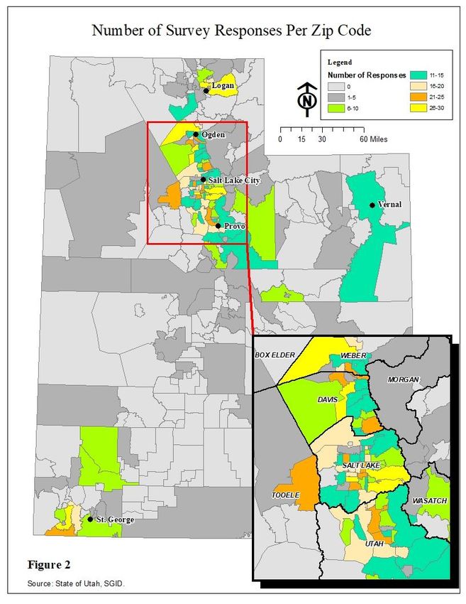
ASSESSING VARIATION IN AIR QUALITY PERCEPTION:
              A CASE STUDY IN UTAH

                           by

                  Karen J. Mendenhall
                     March 6, 2018

          A capstone report submitted in partial
      fulfillment of the requirements for the degree

                           of

        MASTER OF NATURAL RESOURCES

                 Committee Members:
                Dr. Peter D. Howe, Chair
                  Dr. Christopher Lant
                  Dr. Nancy O. Mesner

             UTAH STATE UNIVERSITY
                      Logan, Utah
                          2018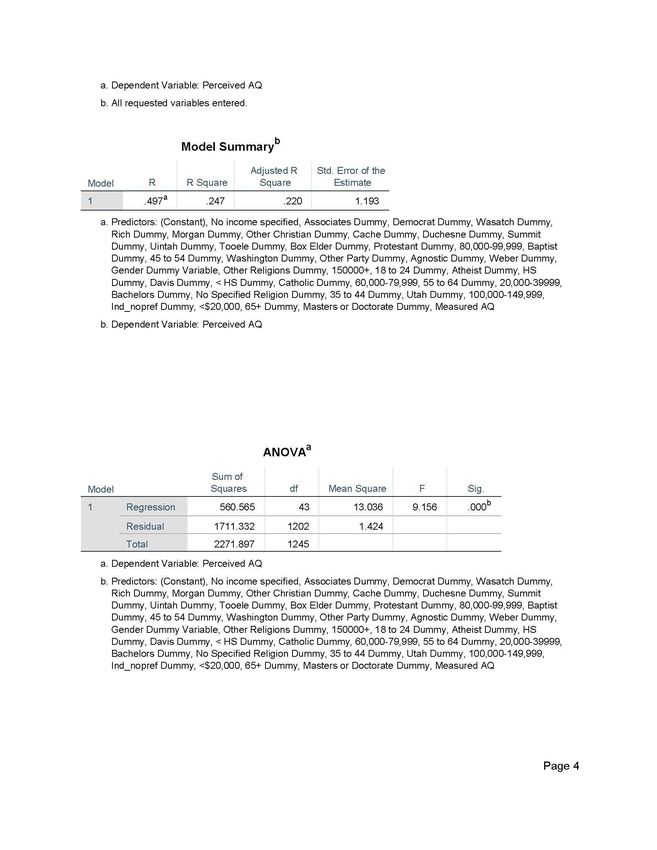
ABSTRACT

        In recent years, Utah has experienced poor air quality due to pollution-trapping winter
inversions and summer ozone pollution. The resulting impacts of poor air quality include health
issues, reduced visibility, economic impacts and ecological impacts. Utah’s topography and
exploding urban population are factors which increase human exposure to these adverse impacts
of air pollution. It is important for State and local governments to understand how people
perceive air quality so that clean air campaigns target those who are most likely to foster pro-
environmental behaviors. An analysis was conducted using data from a state-wide survey
conducted in July 2017. The survey focused on the public perception of climate change and air
pollution. This study focused specifically on how people perceived the worst air quality day in
their local area within the last year. Responses were compared to measured air quality data at
respondents’ nearest monitoring station. Data was mapped using Geographic Information
Systems (GIS) and a regression analysis was also conducted to understand how socioeconomic
factors played a role in air quality perception. The analysis found that residents of Salt Lake and
Davis Counties reported experiencing the worst local air quality, followed closely by Weber and
Utah Counties. Gender, political party, education and income were socioeconomic factors that
influenced perceptions of poor air quality.

                                                 1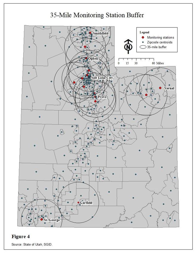
TABLE OF CONTENTS
                                                                                                                                      PAGE

ABSTRACT ................................................................................................................................... 1
TABLE OF CONTENTS ............................................................................................................. 2
CHAPTER 1 INTRODUCTION ................................................................................................. 4
   1.1       Problem Statement ......................................................................................................... 4
   1.2       Background Information ............................................................................................... 5
      Air Pollution in Utah ............................................................................................................... 5
      How is Air Quality Measured? ................................................................................................ 7
      How is Air Quality Monitored? ............................................................................................... 8
   1.3       Air Quality Laws and Regulations ............................................................................... 8
      The Clean Air Act .................................................................................................................... 8
      Utah State Implementation Plan.............................................................................................. 8
   1.4       Goals and Objectives .................................................................................................... 10
CHAPTER 2 METHODS........................................................................................................... 13
   2.1       Surveying Air Quality Perception .............................................................................. 13
   2.2       Spatial Analysis ............................................................................................................ 15
      Sensitivity Analysis ................................................................................................................ 15
      Data Quality .......................................................................................................................... 15
      Nearest Monitoring Stations .................................................................................................. 18
   2.3       Measured Air Quality Data ......................................................................................... 18
   2.4       Comparing Air Quality Data ...................................................................................... 21
   2.5       Quantitative Analysis ................................................................................................... 21
      Questions to Answer .............................................................................................................. 21
CHAPTER 3 RESULTS & DISCUSSION ............................................................................... 28
   3.1       Descriptive Survey Results .......................................................................................... 28
   3.2       Spatial Results .............................................................................................................. 30
   3.3       Quantitative Results ..................................................................................................... 32
CHAPTER 4 CONCLUSIONS .................................................................................................. 35
ACKNOWLEDGEMENTS ....................................................................................................... 37
REFERENCES ............................................................................................................................ 38
APPENDIX A .............................................................................................................................. 42
                                                                      2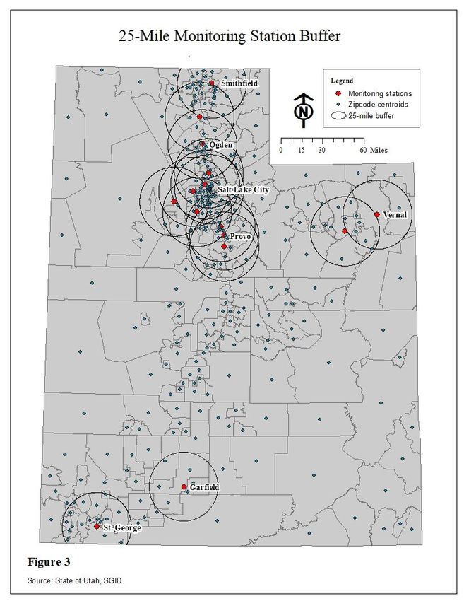
APPENDIX B .............................................................................................................................. 51

LIST OF FIGURES
Figure 1 - EPA Air Quality Monitoring Stations in Utah ............................................................... 9
Figure 2 - Number of Survey Respondents Per Zip Code ............................................................ 14
Figure 3 - 25-Mile Monitoring Station Buffer .............................................................................. 16
Figure 4 - 35-Mile Monitoring Station Buffer .............................................................................. 17
Figure 5 - Nearest Monitoring Stations to Each Zip Code ........................................................... 19
Figure 6 - Average Perceived Local Air Quality by Zip Code ..................................................... 22
Figure 7 - Worst Measured Air Quality Index Data by Zip Code ................................................ 23
Figure 8 - Difference Between Perceived and Measured Air Quality by Zip Code ..................... 24
Figure 9 - AQI Responses for the Worst Day During the Past Year ............................................ 28

LIST OF PHOTOS
Photo 1 - Utah Inversion ................................................................................................................. 6

LIST OF TABLES
Table 1 – Air Quality Thresholds Established by the EPA ............................................................ 7
Table 2 - Worst AQI Designations at Each Utah Monitoring Station .......................................... 20
Table 3 - Consolidated Categories for Predictor Categorical Variables ....................................... 26
Table 4 - Age Ranges for Survey Respondents ............................................................................ 29
Table 5 - Income Ranges for Survey Respondents ....................................................................... 30
Table 6 – Air Quality Accuracy Scores for Surveyed Zip Codes ................................................. 32
Table 7 - β Coefficients for Counties with Statistically Significant Differences from Salt Lake
County ........................................................................................................................................... 34

                                                                         3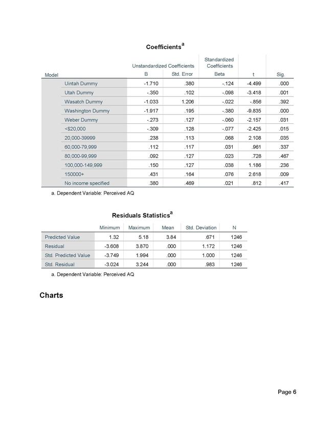
CHAPTER 1 INTRODUCTION

1.1 Problem Statement

         The quality of the air we breathe is important on a local scale because it affects how we
live and is critical for our health. The effects of poor air quality can have social, economic and
ecological impacts. Diminished well-being, increased health-care costs and loss of workdays are
all attributed to breathing polluted air (Ainsaar et al., 2015; Heo, J. et al, 2016; Hausman et al.,
1984). Air quality in Utah has become a major topic of concern for the public and local policy
makers in recent years. During Utah winters, regional high-pressure and snow-covered valley
floors contribute to temperature inversions (Wang et al., 2015) where pollution is trapped close
to the valley surface by a warm air layer higher in the atmosphere. Utah’s populated valleys are
surrounded by mountains that act like a bowl, blocking airflow and contributing to stagnant,
polluted air. During Utah summers, invisible ground level ozone poses serious health risks (Utah
DEQ, 2016; Utah Department of Health, 2018). Ozone levels rise when human-generated
chemicals react to sunlight creating unhealthy air conditions. These air quality phenomena have
led to growing attention in the media and throughout the healthcare system, generating questions
about the effectiveness of air quality regulation at the Federal and State levels (Penrod, 2018).

        Regulation is a vital tool for industry, businesses and individuals to help improve the
quality of the environment. Bryce Bird, Director of the Utah Division of Air Quality (DAQ) has
stated that the division has focused on getting reductions in industrial air pollution, but it isn’t
enough (2017). The Utah DAQ has conducted sensitivity analysis showing that if all industrial
emissions were eliminated, Utah still could not meet attainment standards because transportation
and area sources constitute most of the emissions (Bird, 2017; Utah DAQ, 2016). Therefore,
individuals may need to start changing their personal behaviors to have an impact on air
pollution. An understanding of how people perceive air quality at a local scale is essential for
those developing local air quality regulations (i.e., cities, counties, and regional government) and
incentives to help individuals change their behavior. Lay people form perceptions of
environmental risks that affect their responses to the risks; such risk perceptions provide
important contextual information that expert studies may lack (Slovic, 1987). This research aims
to identify factors influencing air quality perception in Utah by looking at the following: 1)
spatial variation of perception; 2) how people perceive air quality in relation to measured data;
and 3) if socioeconomic variables influence people’s air quality perception.

        The joint insights of the public and experts provide valuable contributions to improving
air quality regulation. Identifying where the public perceive the highest risk will help local
policymakers target populations that are more likely to practice pro-environmental behaviors.
This could happen by tailoring policies, regulations, media campaigns and advertising to groups
that perceive air quality as a threat and where measured data exhibit hazardous conditions. In
conjunction with this, education programs can be adapted for local area concerns, rather than on
a statewide scale. Once this has been successful, government leaders can then target those
populations that are more skeptical about air quality problems. Improvements to air quality at
the local scale will in turn have a bearing on the state’s overall health.

                                                 4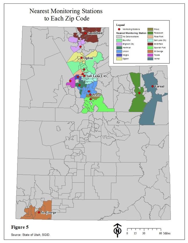
1.2 Background Information

Air Pollution in Utah

         Air pollution is any gas or particulate matter that is added to the atmosphere by natural or
human-made activities, having adverse impacts to humans and the environment (Centers for
Disease Control and Prevention, 2018; Marquit, 2008). Natural sources of air pollution include
dust, smoke from wildfires, volcanic activity and biological processes in nature. Human-caused
pollutants are generated from mobile, area and point sources. Mobile sources are primarily cars,
trucks and airplanes. Area sources originate from home heating, agricultural burning, harvesting,
construction, and wildfires. Point sources include power plants, refineries, and manufacturing
facilities.

        During Utah winters, atmospheric conditions typically exhibit a layer of cool air above a
layer of warm air (temperatures decreasing with altitude) that mix and distribute pollutants
between layers. However, after snowstorms these air layers are reversed or ‘inverted’
(temperatures increasing with altitude) when snow reflects, rather than absorbs heat from the
sun. Warm air above acts like a lid, trapping unhealthy pollutants in the cold air layer close to
the valley floor (Salt Lake City, 2017). High mountains that surround the Wasatch Front
exacerbate the problem when cold air flows from mountain peaks into the valleys. Regional
topography creates a barrier preventing unhealthy air from dispersing out of the valleys, as
shown in Photo 1. Pollutants generated by various sources become trapped and produce
unhealthy air conditions. Particulate matter (PM) is the pollutant of major concern during
inversions. PM is a mixture of solid particles and liquid droplets found in the air (U.S. EPA,
2017a). PM can be categorized as either PM10 or PM2.5. PM10 includes dust, pollen or mold
particles that can be seen with the naked eye and are less than 10 micrometers in diameter. PM2.5
includes fine inhalable particles such as organic compounds and metals that are less than 2.5
micrometers in diameter. Inhaling PM10 and PM2.5 is hazardous because it can get deep into the
lungs and bloodstream (U.S. EPA, 2017a).

        During Utah’s summers, air is hot and still. Vehicle emissions and industrial facilities
creating nitrogen oxide (NO2) and volatile organic compounds (VOC’s) react with sunlight to
create ground-level ozone (Utah DEQ, 2016). This type of ozone is not visible but can create
hazardous health conditions, particularly during the early afternoon and evening hours. People
are often unaware of ozone’s hazardous levels because it is an invisible pollutant and they are
less likely to perceive a problem (Nickerson, 2003).

        Particulate pollution during inversions and ground-level ozone both result in detrimental
impacts to people’s health, visibility, and the State’s economy and ecology. Beard et al. (2012),
identified increased rates of asthma related emergency department visits during inversion days
throughout Salt Lake County, Utah from 2003 - 2008. In addition, there is scientific evidence
that breathing polluted air can lead to loss of intelligence, attention deficit disorders, heart
disease, increased rates of autism, cancer and increased infant mortality rates (Pope et al., 2009
& 2013; Mustafić et al., 2012).

                                                 5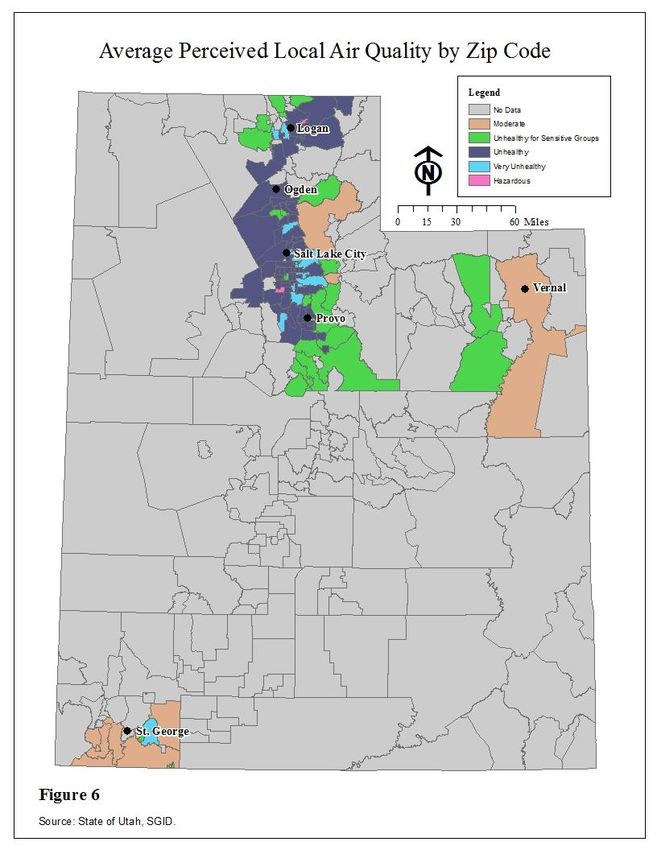
Photo 1 - Utah Inversion
             Source: http://www.cleanair.utah.gov/winter/ inversions.htm

       Haze degrades visibility in Utah’s urbanized valleys in winter and also affects more
remote areas of the State. Haze is caused when sunlight hits tiny pollution particles in the air,
which reduces the clarity and color of what we see (U.S. EPA, 2017b). Utah Governor Gary
Herbert has expressed concern that poor visibility dampens Utah’s tourism industry and deters
businesses from locating in Utah (Herbert, 2017). Degraded visibility has become a problem in
many of the State’s national parks, particularly Canyonlands National Park (U.S. EPA, 2016a).
Utah’s national parks rely on scenic resources to attract tourist revenue; therefore, haze may have
negative impacts on visitor spending.

        Poor air quality can have big impacts to Utah’s economy. Small amounts of pollution
have been shown to reduce worker productivity by just over four percent (Zivin et al., 2012).
Hausman et al. (1984) explain that an increase in suspended particulate matter also contributes to
a ten percent increase in work days lost, impacting the employee, businesses and the economy as
a whole. It is the EPA’s opinion that clean air and a healthy economy go hand in hand. The
agency states that “Economic welfare and economic growth rates are improved because cleaner
air means fewer air-pollution-related illnesses, which in turn means less money spent on medical
treatments and lower absenteeism among American workers” (U.S. EPA, 2011).

        Air quality is also an important component of Utah’s ecosystems. The combination of
the chemical components of pollutants, weather conditions and sensitivity of resources can
directly and indirectly lead to environmental degradation (National Park Service, 2017).
Vegetation can become discolored and stunted by ozone. Streams become acidified, negatively
affecting aquatic species habitat and health. Increased inputs of fixed nitrogen to natural waters
can significantly contribute to eutrophication problems. Soil nutrient availability is decreased
and rock formations eroded as a result of acid deposition (National Park Service, 2017). In urban
settings, building surfaces become eroded and discolored because of acid rain and particulate
matter buildup.

                                                 6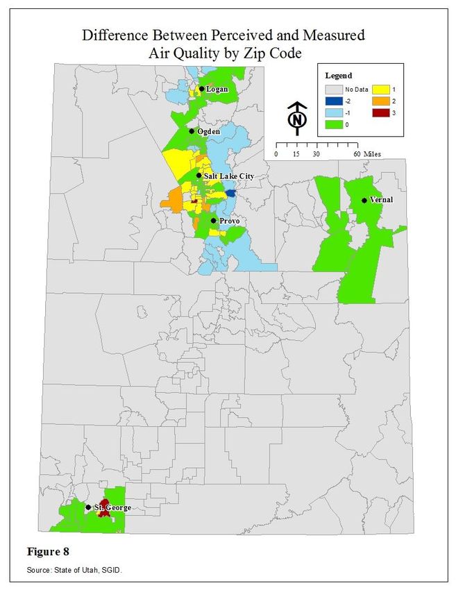
The resulting impacts of poor air quality: health issues, reduced visibility, economic
impacts and ecological impacts, all contribute to perceptions of air quality by individuals. They
are an important component of air quality perception.

How is Air Quality Measured?

        Air quality is typically measured and reported using an Air Quality Index (AQI). The
index tells people how clean the air is on any given day, focusing on health impacts after a few
hours of breathing the air. The AQI is calculated for four of the air pollutants regulated by the
Clean Air Act (1970): ground level ozone, particle pollution, carbon monoxide, and sulfur
dioxide (U.S. EPA, 2014). Each of these pollutants has an established national threshold to
protect people’s health. AQI values range from 0 to 500. According to the EPA, when the AQI
exceeds 100, it exceeds the threshold established by the EPA for healthy air and may adversely
affect sensitive groups such as children and those with respiratory conditions. An AQI value of
300 would have serious health effects for everyone exposed (U.S. EPA, 2014). Table 1 shows
the AQI thresholds established by the EPA.

       Various public and private agencies including the Utah Department of Environmental
Quality, The Utah Division of Air Quality, Utah Department of Health, AirNow.gov and
Intermountain Healthcare use the AQI to provide timely information to the Utah public through
media.

                       Air Quality Thresholds Established by the EPA

   Air Quality Index Value      Levels of Health Concern            Colors

   When the AQI is in this      … air quality conditions are:       … as symbolized by this
   range...                                                         color

   0 to 50                      Good                                Green

   51-100                       Moderate                            Yellow

   101 - 150                    Unhealthy for Sensitive Groups      Orange

   151 - 200                    Unhealthy                           Red

   201 - 300                    Very Unhealthy                      Purple

   301 - 500                    Hazardous                           Maroon
  Table 1 – Air Quality Thresholds Established by the EPA

                                                 7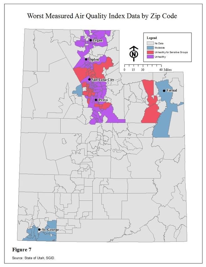
How is Air Quality Monitored?

        The EPA uses outdoor monitoring stations throughout the United States to document
ambient pollutant levels for NO2, Ozone, PM2.5, PM10 and VOC’s. Under the EPA’s guidance,
State, local and tribal government develop and operate these networks. The monitoring stations
that the EPA utilizes in Utah are shown in Figure 1. Most of the monitoring stations that the
EPA uses in Utah are operated by the Utah Division of Air Quality (DAQ). The DAQ operates a
21-station monitoring network throughout the State. Half of DAQ’s monitoring stations collect
pollutant data, the other half collect only meteorological data. According to the Utah
Department of Environmental Quality (DEQ), the stations are located to be, “representative of
local and regional pollution levels” (Utah DEQ, 2017). The information collected from these
monitoring stations are used to calculate air quality, health advisories, winter wood burning
conditions and summer season action day alerts. Data from these stations are compared to
National Ambient Air Quality Standards, which policymakers then use to develop pollution
reduction strategies (Utah DEQ, 2017).

1.3 Air Quality Laws and Regulations

The Clean Air Act

        The Clean Air Act is a Federal law that was enacted in 1970. The Act gives the EPA the
authority to establish National Ambient Air Quality standards (NAAQ’s) for the nation and limit
hazardous pollutant emissions. The original goal of the Act was for each State to attain the
NAAQ’s by 1975 and to have each state form a State Implementation Plan (SIP) to control
industrial pollutants (EPA, 2017c). Many areas of the country, including Utah, did not meet the
NAAQ’s by the 1975 deadline, therefore amendments were made to the Act in 1977 and 1990 to
adjust goal deadlines (EPA, 2017c). The 1990 amendment required technology-based standards
for “major sources” in each state. According to the EPA, “Major sources are defined as a
stationary source or group of stationary sources that emit or have the potential to emit 10 tons per
year or more of a hazardous air pollutant or 25 tons per year or more of a combination of
hazardous air pollutants” (2017c). The EPA monitors major pollution source data every eight
years to assess if risk is occurring and/or if standards need to be revised for these sources.
Violations of the Clean Air Act can result in fines and/or up to 15 years in prison if convicted
pursuant to 18 U.S.C. 357. In the event of a second offense, penalties may be doubled (Statute:
42 U.S.C. 7413(1)).

Utah State Implementation Plan

        The process of amending and revising SIP’s has become an iterative process as air quality
regulations have evolved over the years. According to the Utah DAQ, Utah submitted a SIP to
the EPA in January 1972 which was revised by the EPA in areas where it was lacking (2017a).
The State was successful in reducing pollutants up until the required attainment dates, but not
sufficiently to meet the NAAQS. The Utah DAQ (2017a) indicates that no reduction was noted
for particulate matter. As explained previously, the Congress recognized that many States were
not achieving successful pollutant reductions, therefore they required each state to identify

                                                 8
Figure 1 - EPA Air Quality Monitoring Stations in Utah
9non-attainment areas that exhibited high pollutant levels from measured data. The Utah SIP was
revised to reach NAAQS by December 1982 for particulate matter and carbon monoxide (DAQ,
2017a). The State was also required to adopt technology to control hydrocarbon releases to meet
ozone standards (DAQ, 2017a). Air quality monitoring data, emissions inventories, meteorology
and topography were used to determine that Salt Lake, Davis and Utah Counties did not meet
attainment standards (DAQ, 2017a).
A further revision to the SIP occurred to extend the attainment deadline to 1987 and Utah
committed to inspect motor vehicles and require that maintenance occur on those vehicles that
did not meet minimum requirements (DAQ, 2017a). Lawsuits between citizens groups and the
EPA followed during the 1990’s and further revisions to the PM10 requirements were mandated
by the EPA. Utah County and Salt Lake County met PM10 attainment standards from 1993 to
2003 (DEQ, 2006).
In 2006, 24-hour PM2.5 attainment standards were reduced from 65µg/m3 to 35µg/m3
(DAQ, 2017b). In 2009, the EPA determined that Davis, Salt Lake and Utah County were
unable to meet these revised 24-hour PM2.5 standards and as a result, Utah’s Moderate Area
SIP’s were developed.
In 2009, the EPA designated three areas of the State as nonattainment areas for the 2006
24-hour PM2.5 standard, including Logan, Salt Lake City and Provo. In 2013 the State was
required by a D.C. Circuit Court of Appeals ruling to publish a new SIP for PM2.5 non-attainment
areas and reclassified them as Moderate Areas. According to Utah DAQ, “Utah resubmitted its
three PM2.5 plans and was required to demonstrate that each area would either attain the standard
by December 31, 2015, or that it would be impracticable to do so even after applying all
reasonable control measures” (Utah DAQ, 2017c).
In May 2017, the EPA reclassified the Salt Lake City and Provo non-attainment areas
from Moderate to Serious for the 2006 24-hour PM2.5 NAAQS (Utah DAQ, 2017d). New
Serious Area SIP’s were developed in 2017 and required that NAAQS demonstrate attainment
by the end of 2019 (Utah DAQ, 2017d). If the State doesn’t meet this deadline, it can apply for a
five-year extension with the caveat that more stringent measures are implemented in these areas
(Utah DAQ, 2017d). In addition to the Moderate Area SIP requirements, Serious Area SIP’s
incorporate: a) updated emission inventories including a base year (2014) and an attainment
year; b) evaluation and adoption of control measures for direct PM2.5; c) application of Best
Available Control Technology to attain pollutant limits; d) an attainment demonstration date
(initially 2019); and resubmission of Serious Area SIPs if attainment fails (Utah DAQ, 2017d).
1.4 Goals and Objectives
This capstone focused on the influence that local setting (proximity and place) and
socioeconomic factors have in forming air quality perceptions in Utah. I sought to improve
knowledge about public perceptions of air quality in Utah by linking spatial information with
primary survey data on public perceptions. As explained above, Utah has accurate and
widespread air quality data throughout the state that is accessible through the EPA website. We
might expect that there would be a strong correlation between measured air pollution and greater
10awareness of environmental risk, particularly in urban areas (Elliott et al., 1999). However,
Dworkin and Pijawka (1982) found that the people in Toronto, Canada, were insensitive to
changes in their local air quality when they were surveyed. Brody et al. (2004), explained that
the disconnect that Dworkin and Pijawka found may have been attributed to what is known as a
“halo effect,” where “...individuals are reluctant to attribute high levels of air pollution to their
neighborhood or home area.” It was my goal to see if there is correlation between Utahns’
location and perceived air quality, or if a “halo effect” is occurring. I did this by using
Geographic Information Systems (GIS) to map perceptions throughout the state. I then
conducted a regression analysis to understand the influence of multiple factors together (Section
V. Methods for description of spatial and quantitative analysis). If there is a strong relationship
between perceptions and measured air quality, then feedbacks between perceptions and behavior
could be facilitated by policymakers and other communicators. In other words, people could be
encouraged to respond to the poor air quality they experience by changing their behavior.
However, if there is less of a relationship between measured air quality and perceptions, then
communicators may need to first understand what factors are influencing perceptions to develop
appropriate behavior-change messages. Those with strong negative attitudes towards air quality
may be harder to coerce into pro-environmental behaviors. This analysis aimed to identify
places where perceptions differed from measured data, providing guidance for targeting
communication campaigns geographically.
Utahns’ air quality perceptions may not only be a function of measured air pollution or
geographic location. Social and cultural experiences may play an important role in how people
perceive air quality. Variables such as gender, age, education, income, race and longevity in an
area may influence air quality perception. Lai and Tao (2003) conducted research on
environmental threat levels for people in Hong Kong, China. Their results indicated that women,
older people, and less educated individuals are more likely to consider environmental hazards as
threatening compared to men who are younger and have more education. In contrast, Howel et
al. (2002) conducted a study in north-east England on the role that place has on air quality
perception. When they looked at gender, they consistently found little or no difference between
perceptions. However, they did find that older people tended to rate local air quality as poor.
They attributed this to older people having memories of bad air pollution in the past (Howell et
al., 2002). Tiefenbacher and Hagelman (1999) conducted a study in Texas that suggested
income is positively correlated with proximity to sources of air pollutants. In the same study, the
authors found that counties in Texas with higher percentages of minority populations had higher
pollution emissions. In another study in Texas, Chakraborty et al. (2001) found that personal
perception of air quality health risks was significantly higher for non-Hispanic Black and
Hispanic residents, compared to non-Hispanic Whites. Some research indicates that the degree
of perceived air pollution is associated with lower household incomes and deprived economic
communities are more likely to perceive poor air quality (Kim et. al (2012), Bickerstaff and
Walker (2001)). There is very little scientific information on the role that religious affiliation
plays on air quality perception. This study aimed to see if religion was a significant factor in
how respondents perceived air quality. I planned to see if, aside from measured pollution levels
and geography, these socioeconomic variables play a role in forming perception. I did this by
comparing socioeconomic indicators to air quality perception.
11As explained previously, the AQI is an essential tool that the public can use to assess air
quality risks and take measures to protect their health. The EPA requires that metropolitan areas
with populations of 350,000 or greater are required to report the AQI at least five days per week
to the public (U.S. EPA, 2016b). The EPA encourages local agencies to provide this information
in as many ways as possible to the public, including television, newspaper, radio, phone, web
pages and social media.
Given that agencies are required to report AQI information in urban areas, I anticipated
that perceptions of air quality in urban areas would be more accurate than in rural areas because
access to AQI may play a role in how perception is formed. I did not think that gender would
influence perception, nor did I anticipate that religious or political affiliation would have a
bearing on perception like it may with an issue such as climate change that has become strongly
politically polarized. The research indicates that respondents with less education are more likely
to perceive air pollution as a threat than higher-income groups and I anticipated that they would
be more aware of poor local air quality. Similarly, I thought that lower-income respondents may
be more aware of air pollution because they tend to live in areas closer to industry and point
source pollutants.
12CHAPTER 2 METHODS
2.1 Surveying Air Quality Perception
This study uses data from a survey of Utah residents conducted by Drs. Layne Coppock
and Peter Howe at Utah State University, supported by the Utah Agricultural Experiment
Station. Qualtrics, a national survey company based in Provo, Utah, was contracted by Utah
State University to administer the survey in July 2017. Human subjects Institutional Review
Board approval was obtained from Utah State University. The survey asked the public about
their perceptions of climate change and air quality as well as demographic information (age,
gender, race, education level, zip code, and political and religious affiliation). Respondents
completed the survey between July 20, 2017 and July 26, 2017. Qualtrics used a quota sample of
respondents from online panels across different geographic locations and demographics who had
agreed to complete surveys. The panels mimicked a representative survey of the population of
Utah and approximated a random sample. There were 1,508 total responses to the survey. The
survey was completed entirely online, therefore there was a risk that some populations were
under sampled, such as the elderly, low income populations or those in geographic areas without
internet access. To address these sampling biases, results were weighted by age, gender,
education and income to match their respective population proportions in the state. Additionally,
although this was a statewide survey, we anticipated that 85-90% of the respondents would be
from the Wasatch Front because that is the most densely populated region of the state. Figure 2
shows that as predicted, most survey respondents lived along the Wasatch Front in Weber,
Davis, Salt Lake and Utah counties.
The Qualtrics survey asked multiple questions regarding air quality and climate change.
For the purposes of this research, I focused on the following question regarding air quality
perception:
Q 3.2 Consider the air quality in your local area and think about the one day during the past
year when the air quality was the worst. How would you label the air quality on that day?
A. Good
B. Moderate
C. Unhealthy for sensitive groups
D. Unhealthy
E. Very Unhealthy
F. Hazardous
Answers to this question directly relate to the AQI categories provided by the EPA, as
shown in Table 1. Prior to analyzing the survey responses to air quality perception, a spatial
sensitivity analysis was conducted on zip code locations to measure the uncertainty of results
(see Section 2.2, Spatial Analysis).
13Figure 2 - Number of Survey Respondents Per Zip Code
142.2 Spatial Analysis
To compare perceived air quality to measured data, respondents needed to be assigned to
their nearest air quality monitoring station. Zip codes were chosen as geographic boundaries to
compare perception with measured air quality data because it helped develop more precise
conclusions about perception than at a broader level (like county or region). Respondents only
provided their zip codes (not physical addresses), therefore the centroid for each zip code was
chosen as the geographic point from which linear measurements were taken to monitoring
stations. As a result, there was slight variation in distances from a monitoring station, but
responses would be from within the same zip code. Several survey respondents reported zip
codes that were in Phoenix, Arizona and Las Vegas, Nevada, therefore they were removed from
the dataset prior to spatial or statistical analysis. Respondents that did not answer survey
question 3.2 (see Section 2.1, Surveying Air Quality Perception) were also removed prior to
analysis.
Sensitivity Analysis
A sensitivity analysis in the distance bands used to associate measured air quality with
responses was conducted to help develop more meaningful conclusions from the data given the
geographic factors associated with perception. I began by using a 25-mile buffer, under the
approximation that in northern Utah one can see approximately 25 miles in the distance from the
foothills of the mountains on the Wasatch Front (where most respondents live). A 25-mile buffer
was tested around each monitoring station to see which zip code centroids were captured (see
Figure 3). In all, 156 zip code centroids, and 1,257 respondents were covered by the 25-mile
buffer. As Figure 3 shows, there is substantial overlap along the Wasatch Front buffers and most
of central and southwestern Utah are not covered at all.
To see if a larger buffer would capture more respondents, a 35-mile radius was tested (see
Figure 4). The 35-mile buffer encompassed 191 zip code centroids and 1,278 respondents. This
was only a 1.7 % increase from a 25-mile buffer, or an additional 21 respondents. This
difference is primarily comprised of responses from Heber and Cedar City with 6 and 9
responses respectively, all other zip codes having two or less responses. Given that the larger
35-mile buffer creates redundancy, particularly along the Wasatch Front where most survey
respondents live, the 25-mile buffer was used to improve accuracy of the study and eliminate
responses that were too far from a monitoring station.
Data Quality
The Garfield monitoring station only had EPA data available between July 2016 and
December 2016. Although this monitoring station encompassed 12 zip code centroids, no survey
respondents were captured within the 25-mile buffer and only three were captured within the 35-
mile buffer. Given the incomplete air quality data and very small number of responses, this
monitoring station and associated responses were eliminated from the study. After the
elimination of the Garfield monitoring station, 149 zip codes remained to be analyzed within the
25-mile buffer zones, covering 1,254 respondents. From this point onward, only zip codes that
15Figure 3 - 25-Mile Monitoring Station Buffer
16Figure 4 - 35-Mile Monitoring Station Buffer
17were located within the 25-mile buffer of selected monitoring stations (all but Garfield) and that
had responses to survey question 3.2 were considered in the spatial analysis.
Nearest Monitoring Stations
I used the ESRI ArcGIS “Near” tool to identify the nearest monitoring station to each zip
code centroid. This function calculated the shortest distance as-the-crow flies between each
centroid and monitoring station location. Figure 5 shows which zip codes are associated with
which monitoring station.
There were problems associated with using the ‘Near’ method, in that it did not account
for regional topography of the landscape. For example, Park City is located along the Wasatch
Back (east of the Wasatch mountain range), and the nearest monitoring station is Salt Lake City.
From Park City, mountains completely block the view of the Wasatch Front (west of the
mountain range), where the nearest monitoring station is located. If there were another
monitoring station on the east side of the mountains, I would have adjusted the function to co-
locate Park City zip codes to that, but in this case, there was not. Air quality differs in these two
locations, so air perception conclusions are not able to control for local measured air quality for
zip codes along the Wasatch Back.
I encountered a similar problem with the Roosevelt and Vernal monitoring stations when
using the ‘Near’ function. The zip code polygon for Vernal is shaped irregularly and as a result,
the centroid was located on the western edge of the polygon. This resulted in the Vernal zip
code (84078) being assigned to the Roosevelt monitoring station. I assumed that the people who
responded from this zip code lived in the Vernal city limits or in very close proximity, therefore
this zip code’s nearest monitoring station was manually changed and assigned to the Vernal
monitoring station to improve accuracy.
Despite the potential inaccuracies of using this method, I deemed it the simplest, most
unbiased method to systematically provide locations for the majority of zip codes I was
analyzing.
2.3 Measured Air Quality Data
The EPA produces a database (the AQS DataMart) that allows the public to view daily
statistics for multiple pollutants at specific monitoring stations throughout the United States
(EPA, 2017d). State, local and tribal agencies are required to submit air quality data to EPA
every quarter, but most do so daily as data become available (EPA, 2017b). The EPA has a
network of 16 monitoring stations in Utah that it received data from in 2016 and 2017. The
network is more comprehensive than the Utah DAQ, therefore all AQI data was collected
directly from the AQS Data Mart rather than from the Utah DAQ. This allowed for all data in
this study to be consistent.
18Figure 5 - Nearest Monitoring Stations to Each Zip Code
19The database was used to select PM2.5 as the focal criteria pollutant because AQI values
utilize PM2.5 levels as a benchmark. The calendar year, State and monitoring station are selected
as criteria to obtain the data from the EPA’s AQS DataMart.
Question 3.2 of Qualtrics survey asked respondents to reflect on the worst air quality day
in their local area over the past year, as discussed in Section 2.1, Surveying Air Quality
Perception. The survey began on July 20, 2017 and ended on July 26, 2017, therefore, I
analyzed air quality data results between July 20, 2016 and July 26, 2017 at each of the Utah
monitoring stations to cover the full year and the time that the survey was being conducted.
Summarized results are shown in Table 2.
Table 2 shows that each monitoring station is assigned an EPA site identification number.
I assigned a station code to each monitoring station consisting of the station’s first two letters to
keep the data organized and reduce error. The worst daily AQI value was found at each of the
stations (U.S. EPA, 2017d) and categorized based on the EPA’s AQI values shown in Table 1.
The date of the worst AQI was also recorded. It should be noted that every monitoring station
had a complete set of data throughout the year except for Garfield. The Garfield monitoring
station only had data from 2016. As explained in Section 2.3, Spatial Analysis, this monitoring
station was eliminated as a source of air quality information.
Worst AQI Designations at Each Utah Monitoring Station Between July 2016 and July 2017
EPA Site Station Max Worst AQI
ID Station Name Code AQI AQI Designation Date
490030003 Brigham City BC 153 Unhealthy 2/2/2017
490050007 Smithfield SM 167 Unhealthy 2/2/2017
490110004 Bountiful BO 126 Unhealthy for Sensitive Groups 12/30/2016
490130002 Roosevelt RO 114 Unhealthy for Sensitive Groups 2/4/2017
490170101 Garfield GA 25 Good 7/26/2016
490351001 Magna MA 104 Unhealthy for Sensitive Groups 1/31/2017
490353006 Salt Lake City SL 151 Unhealthy 12/30/2016
490353010 Rose Park RP 130 Unhealthy for Sensitive Groups 2/2/2017
490353013 Herriman HE 128 Unhealthy for Sensitive Groups 1/31/2017
490450004 Tooele TO 99 Moderate 10/15/2016
490471004 Vernal VE 76 Moderate 1/31/2017
490490002 Provo PR 154 Unhealthy 1/31/2017
490494001 Lindon LI 155 Unhealthy 1/30/2017
490495010 Spanish Fork SF 161 Unhealthy 2/1/2017
490530007 St George SG 97 Moderate 6/25/2017
490570002 Ogden OG 162 Unhealthy 7/4/2017
Table 2 - Worst AQI Designations at Each Utah Monitoring Station
The number of responses from each zip code varied between zero and 29. To make
comparisons between zip code AQI perception and the measured AQI at each monitoring station,
zip code responses were averaged and rounded to the nearest number (1 = ‘Good’, 2 =
‘Moderate’, 3 = ‘Unhealthy for Sensitive Groups’, 4 = ‘Unhealthy’, 5 = ‘Very Unhealthy’, and 6
20= ‘Hazardous’). The average was used to reflect the severity of the responses. The mode was not
used because several zip codes had only two responses making the mode difficult to calculate.
Average perceived air quality by zip code is shown in Figure 6.
2.4 Comparing Air Quality Data
After each zip code had a monitoring station assigned, the worst AQI value at each
monitoring station was also identified for each zip code. Figure 7 shows the worst measured
AQI values at each of the co-located zip codes. Having the average perceived air quality and the
measured air quality for each zip code allowed for a direct comparison to see any differences
occurred.
Actual measured data was subtracted from the average perceived data for each zip code,
resulting in an accuracy score. Figure 8 shows the difference between measured and perceived
air quality. Positive numbers indicated that respondents overestimated pollution. The higher the
number, the less accurate their perception was. A score of zero indicated that respondents
perceived air quality accurately – there was no difference between their perception and the
measured air quality data. Negative scores indicated that respondents underestimated pollution
levels in their local area. The lower the number, the less accurate perception was. Perceived,
measured, and accuracy score data for each analyzed zip code can be found in Appendix A.
2.5 Quantitative Analysis
As discussed in Section 1.4, Goals and Objectives, scientific literature indicates that
socioeconomic factors may influence air quality perception. Several questions were asked that
could be answered by conducting a quantitative analysis on the survey data. For this study the
questions I aimed to answer were as follows:
Questions to Answer
1. How well do the measures of gender, age, education, political affiliation, religion,
county location, and income predict the accuracy of air quality perception?
2. How much variance can be explained by a multiple linear regression model that
includes geographic and socioeconomic predictors?
3. Which is the best predictor of perceived air quality: measured data, gender, age,
education, political affiliation, religion, county location, or income?
Descriptive statistics were used to describe the demographics of survey respondents.
Responses that did not provide age were removed from the analysis. Race or ethnicity was not
included in the statistical analysis, because as described in Section 3.1, General Survey Results,
an overwhelming majority of respondents identified themselves as white or Caucasian.
Meaningful relationships would therefore be hard to determine because of limited racial/ethnic
variation.
21Figure 6 - Average Perceived Local Air Quality by Zip Code
22Figure 7 - Worst Measured Air Quality Index Data by Zip Code
23Figure 8 - Difference Between Perceived and Measured Air Quality by Zip Code
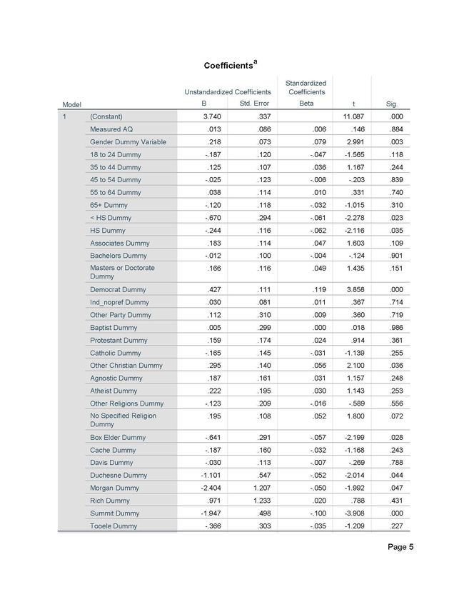
24Multiple linear regression was used to determine the influence of factors, or predictor variables, associated with perceived of air quality (dependent variable) in Utah. Some variables may have similar relationships to the outcome and it is useful to investigate this while controlling for the other variables. Statistical analyses were performed using IBM SPSS. For this multiple linear regression, statistical significance was considered at the p
Consolidated Categories for Predictor Categorical
    Variables Used in Multiple Regression Analysis
 Independent Variable        Consolidated Categories
 Gender                      Male &Female
 Political Party             Republican
                             Democrat
                             Independent/no preference
                             Other
 Education Level             < High school
                             High school
                             Some college no degree
                             Bachelor’s
                             Masters/Doctorate
 Religion                    Protestant
                             Catholic
                             Baptist
                             LDS/Mormon
                             Other Christian
                             Agnostic
                             Atheist
                             Other religion
 County                      Box Elder
                             Cache
                             Davis
                             Duchesne
                             Morgan
                             Rich
                             Summit
                             Salt Lake
                             Tooele
                             Uintah
                             Utah
                             Wasatch
                             Washington
                             Weber
 Age                         18 to 24
                             25 to 34
                             35 to 44
                             45 to 54
                             55 to 64
                             65+
 Income
Once the data had been consolidated and grouped appropriately, the multiple linear
regression model was run. The program required that for predictor variables with more than two
categories, a reference category be omitted from the inputs as a baseline to compare the other
categories to. The reference categories for each predictor variable were chosen based on the
largest number of responses from each variable as follows: 1) Age - 25 to 34 (302 responses); 2)
Education – Some college no degree (330 responses); 3) Political party – Republican (478
responses); 4) Religion – LDS/Mormon (659 responses); 5) County – Salt Lake (520 responses);
and 6) Income - $40,000-$59,999 (236 responses). When interpreting the output coefficients
from the model, all coefficients are compared to these reference categories rather than the
constant in the output table. Output data from the multiple linear regression is provided in
Appendix B.
27CHAPTER 3 RESULTS & DISCUSSION
3.1 Descriptive Survey Results
Figure 9 shows that 5.4% of the survey respondents perceived their local worst air quality
day during the previous year to be good; 13.6% responded that air quality was moderate; 28.2%
answered that air quality was unhealthy for sensitive groups; 18.4% of the respondents believed
that the air quality was unhealthy; and 22.7% responded that air quality was very unhealthy.
11.6% also felt that the worst air quality day in their locale was hazardous.
Hazardous 11.6%
Very Unhealthy 22.7%
Unhealthy 18.4%
Unhealthy for Sensitive Groups 28.2%
Moderate 13.6%
Good 5.4%
0% 5% 10% 15% 20% 25% 30%
Percentage
Figure 9 - AQI Responses for the Worst Day During the Past Year
The responses indicate that people were more likely to consider air quality unhealthy or
worse than they were to consider it good or even moderate. Beyond personal experience, there
may be additional factors that contribute to individual perceptions such as air quality reporting
on the news, electronic billboards providing air quality index data to motorists, people living in
dominantly urban areas where pollutants are higher, or perhaps families with school children are
aware of restrictions for recess time when air quality reaches an unhealthy threshold.
Survey Demographics
As discussed in Section 1.4, Goals and Objectives, there have been previous studies that
analyzed the links between demographics and air quality perception. Demographic data
including gender, age, race, education, political party affiliation, religion, and income are
described for survey participants.
More women responded to the survey than men. Females accounted for 61% of survey
respondents and 39% were male.
28Table 4 shows the age ranges for survey respondents within the 25-mile sensitivity
analysis boundary. Respondents that did not provide birth year were removed from the statistics
below.
Age Ranges for Survey Respondents
Age Range Number of % of Total
Survey Respondents
Respondents
18-24 169 13.6
25-34 302 24.2
34-44 232 18.6
45-54 152 12.2
55-64 194 15.6
65+ 197 15.8
TOTAL 1,246 100%
Table 4 - Age Ranges for Survey Respondents
The largest number (24.2%) of overall responses came from the 25 to 34-year-old age
group. The lowest number of responses was from the 45 to 54-year-old age group. Response
numbers were fairly well distributed between age groups. The possibility of under-sampling
older age groups because of decreased internet access does not appear to have been a problem.
Respondents overwhelmingly identified themselves as white or Caucasian for the survey
(87%). This is slightly more than the U.S. Census Bureau data (2016) which indicates that 78.8%
of people residing in Utah are of white or Caucasian (not Hispanic) origin. Non-white
respondents accounted for only 13% of the sample, and of that Hispanics accounted for the
largest proportion at just 5% and Asians the second largest minority group at 3%. Minority
percentages aligned with Census Bureau statistics (2016).
Education levels ranged from less than high school to masters or doctorate degrees
among survey respondents. A very small number of respondents (1.5%) had a less than high
school education. Those with a high school diploma represented 13.6% of respondents, and the
largest group of respondents had some college with no degree (26.5%). Respondents with an
associate degree accounted for 13.7% of respondents, 25.2% had a bachelor’s degree, and 19.5%
had a masters, doctorate, or professional degree.
Survey respondents identified with a variety of political parties. Registered voter survey
respondents within the 25-mile sensitivity buffer were made up of 38% Republicans, 17%
Democrats, 13% Independents, and 1% ‘Other’. Thirty-one percent of respondents were not
registered voters. Given that Utah has been a traditionally Republican state, these numbers could
be considered surprising, particularly the high number of registered Independent voters.
A broad diversity of religious affiliations were represented as part of the survey.
However, the dominant religion of respondents was LDS/Mormon (62.1%). Several other
Christian denominations were identified including: Baptist (1.7%), Protestant (5.5%), Catholic
(8.4%), Other Christian (8.3%), and Eastern Orthodox (0.7%). Agnostic (6%), and Atheist
29(4.3%) respondents had smaller representation. Jewish (0.9%), Hindu (0.7%), Buddhist (0.7%)
and other non-Christians (1.1%) had the smallest number of responses, and there were no self-
identified Muslims who responded to the survey. These results are not surprising given that Utah
has a predominantly LDS/Mormon population.
Annual income ranges varied from less than $20,000 to over $150,000. Table 5 shows
the income categories with associated number of respondents and percentages.
Income Ranges for Survey Respondents
Income Range # of Respondents % of Respondentsfor St. George, these zip codes generally have far less vehicle traffic and are at higher elevations
which hinder the collection of pollutants close to the valley floors. St. George generally has
better winter air quality because of a warmer climate and the topography does not lend itself to
winter temperature inversions. None of the zip codes included in the analysis identified the
worst air quality day as being ‘Good’.
Figure 7 visually represents the measured air quality data for the nearest monitoring
station to each zip code. Like Figure 6, the majority of zip codes along the Wasatch Front
exhibited measured air quality at the ‘Unhealthy for Sensitive Groups’ and ‘Unhealthy’ levels.
Zip codes in the St. George area had ‘Moderate’ air quality on the worst air quality day, as did
Vernal and Tooele. No zip codes had ‘Good’, ‘Very Unhealthy’, or ‘Hazardous’ measured air
quality on the worst air quality day during the previous year.
As Figure 8 shows, from a geographic perspective there may be some relationship
between where people live and the accuracy of their air quality perceptions. Respondents with
the most accurate perceptions (an accuracy score of zero) lived in a wide variety of zip codes
across the State. However, respondents who slightly underestimated air quality (an accuracy
score of -1 or -2) appear to be located along the Wasatch Back (Coalville, Morgan, Park City,
Heber, and Midway) and south Utah County (Spanish Fork, Payson, and Santaquin) as well as
the Tremonton and Riverside areas in northern Utah. These respondents may reflect more
positively on the air quality outlook because they live in more rural areas where pollution may
not be as visible as in urban areas. Zip codes that slightly overestimated air quality (accuracy
score = 1 or 2) were located along the Wasatch Front, particularly in Davis, Salt Lake and Utah
counties. This is not a surprise given that these are the areas where inversion conditions are most
likely to occur because of topography and higher vehicle emissions because of population
concentration. One zip code in the St. George area also identified air quality as being worse than
it was. This zip code is in the Zion National Park area. Zion National Park is in a narrow
canyon that receives thousands of visitors in vehicles every year. Local residents may be more
sensitive to air pollutants as a result of visibility and smell from vehicle emissions that would not
normally occur in rural areas.
Table 6 shows that almost all zip codes had accuracy scores of -1, 0 and 1. Fifty zip
codes had an accuracy score of zero indicating that respondents accurately perceived the air
quality in their local area. Fewer zip codes (32) slightly overestimated the actual air quality in
their area and twenty zip codes slightly underestimated the air quality in their local area. This
indicates that on the whole, Utahns are fairly good at estimating what the air quality conditions
actually are. There were a few zip code outliers that exhibited either extreme underestimation or
extreme overestimation of air quality in their local area. Zip code 84060 (Park City) had an
accuracy score of -2. Zip codes 84009 (South Jordan Daybreak area) and 84779 (Virgin/Zion
National Park) showed extreme overestimation of their local air quality. As mentioned in
Section 2.2, Spatial Analysis, Park City’s nearest monitoring station is Salt Lake City which may
not have been an accurate representation of measured air quality data in the local area, hence the
outlier.
31You can also read