BRAND IDENTITY GUIDE 2021 - Switcher Studio
←
→
Page content transcription
If your browser does not render page correctly, please read the page content below
BRAND IDENTITY GUIDE 2021
Brand Identity Guide 2021                           1
Brand Identity Guide
THANK YOU FOR REVIEWING THIS IMPORTANT DOCUMENT.
Used properly, the guidelines found within it will help maintain graphic and message continuity, protect our logo assets,
and help us build powerful, relevant messaging across a broad array of media.

WHY IS THIS NECESSARY?
Proprietary logos, approved typefaces, the visuals we choose and the words we use — every part of our brand is an important
part of our whole brand. That’s why it’s extremely important that we use each very carefully. Following the guidelines and
rules in this style guide will help us speak with a single, influential voice to generate bold, engaging communications, build
strong bonds with our audiences, and protect our brand for years to come.

NEED APPROVED FONTS, LOGOS, GRAPHIC ELEMENTS, OR
ADDITIONAL INFORMATION?
Contact: Chelsea Grider
Senior Visual Designer | Switcher Studio
Telephone: 502-418-5138 | Email: chelsea@switcherstudio.com
In this Guide
INTRODUCTION                    BRAND TYPEFACE
6    SWITCHER’S STORY           21   PRIMARY TYPEFACE
8    BRAND VOICE                21   SECONDARY TYPEFACE
9    BRAND POSITIONING

                                COLOR USAGE
LOGO                            23   BRAND COLOR PALETTE
11   PRIMARY LOGOTYPES
11   ALTERNATIVE LOCKUPS
                                BRAND VISUALS
12   BLACK AND WHITE VERSIONS
13   CLEAR SPACE                26   GRAPHIC PATTERNS

13   MINIMUM SIZE               27   PHOTOGRAPHY

14   CORRECT LOGO USAGE         28   IDENTITY

15   INCORRECT LOGO USAGE       29   DIGITAL MEDIA

ICON SYSTEM
17   ICONOGRAPHY
18   ICON COLOR USAGE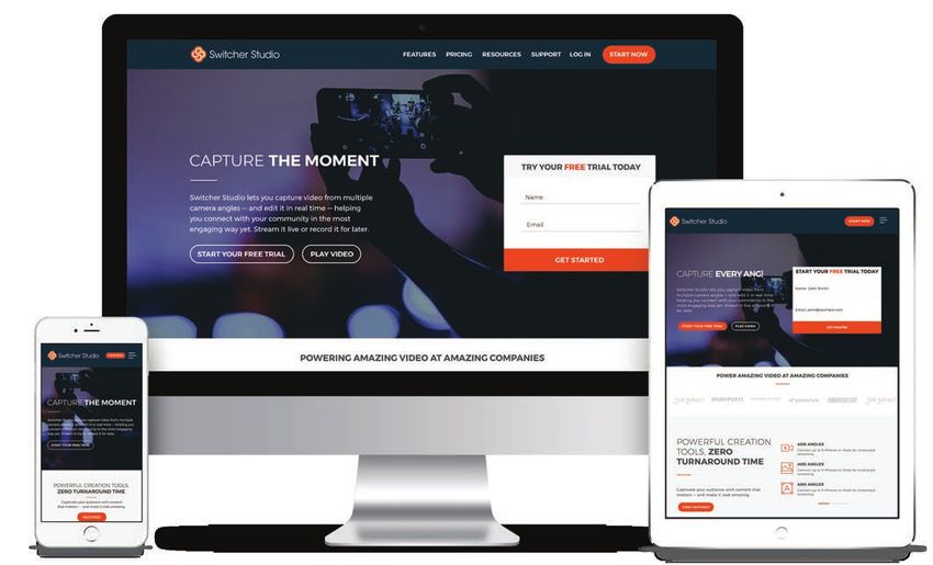
Switcher’s Story
By 2014 — before Meerkat and Periscope and Facebook Live — Switcher co-founders Nick and Dan were all in
with live video. For four years the guys had run an agency that helped businesses create and stream online
video. But they’d noticed a problem: Going live — and doing it well — was prohibitively expensive for most
businesses. Their clients kept losing steam when they saw how costly and tricky the video equipment could be.

Nick and Dan set out to change that. Partnering with fellow co-founders Ernesto, Matt, and Gabe (a video app
developer in Switzerland), they launched Switcher Studio, a mobile video-creation platform, later that year.
Switcher help creators and companies produce stunning, polished live shows with the devices they already
owned. It could sync up to 4 iOS devices (now 9), letting creators switch angles, edit live, and stream anywhere.
Within the year, Facebook Live launched — a major milestone in bringing livestreaming to the masses — and
Switcher Studio was named an official Facebook Live launch partner.

Switcher continues to grow. Since 2016, we’ve raised more than $1 million in investments, and in 2018, we
hit $1 million in revenue. We’ve also announced new partnerships with Microsoft Stream and LinkedIn. Our
original team of five has grown to 15 full-time employees with offices in Louisville, Kentucky, and Yverdon-les-
Bains, Switzerland. And our original passion for live video has spread as well. Switcher now has users creating
amazing videos in more than 118 countries, and we think that is just the beginning.

Brand Identity Guide 2021                                                                                           6
Brand Voice
SOCIAL                                                           SIMPLE
Video brings people together, no matter how far apart            We strive to remove complexity, allowing more people
they are. It lets us share experiences, stories, opinions, and   to create more video, faster. We’ve designed powerful
information — connecting and changing us collectively.           features to work like simple ones, doing away with the
Whether people are creating or consuming Switcher                headaches involved in old-school video editing. We’ve
Studio content, they are interacting with each other,            slashed the time between ideation and realization — and
engaging with multiple perspectives, and building                between creation and consumption. When we talk about
community. When we talk about Switcher, we emphasize             Switcher, we do so in a clear, approachable way, building
its social nature and ability to unite people across             confidence among creators.
distances.

                                                                 IMAGINATIVE
LIMITLESS                                                        We live to unleash people’s imaginations — including our
We believe that creativity should be boundless, so we strive     own. This means enabling new and unique ways to turn
to take creators to places they’ve never gone before. We         ideas into reality. We give people the tools they need to
do this by equipping them to create video from anywhere,         create any live video they can imagine and then to share
without the constraints of typical productions. That means       it with the world. (As we always say, if you can dream it,
trying new techniques, tackling problems, and sharing            you can stream it.) When we talk about Switcher, we invite
knowledge with each other. When we talk about Switcher,          people to dream big and realize their creative goals.
we convey the ways in which we and our users are pushing
the boundaries of what’s possible with mobile devices.

Brand Identity Guide 2021                                                                                                     8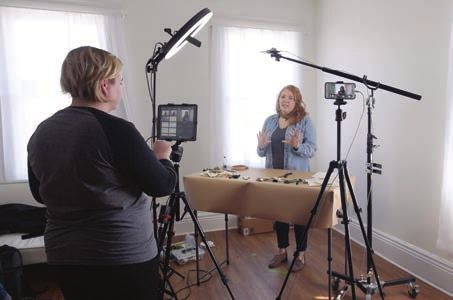
Brand Positioning
We make it simple to capture life in the moment from multiple points of view to engage with your community.

PURPOSE: We believe in the power of video to bring people together and that life seen from multiple
perspectives is more captivating, moving and rewarding.

AUDIENCE: For everyone with a voice, a view, or story.

CONTENT TO CONNECT PEOPLE
WE BELIEVE IN THE POWER OF VIDEO.

We believe in its unparalleled ability to reach, connect, and bring people together. We believe that people
should be making more, not less video. We believe that life seen from multiple perspectives is more
captivating, more moving, and more rewarding.

CONNECTING PEOPLE.

That’s ultimately what we are doing. But not just in the consumption of video. We think that making video
should also be collaborative and that there shouldn’t be a limit to the number of places and perspectives we
draw on. We believe that the best things in life are captured (and shared) in the moment. We believe in a future
where everyone is able to tell the stories that matter to them without limits. We want to bring people together
to create, as well as to consume, content that matters.
our LOGO
PRIMARY LOGOTYPES
These are the go-to logos for all brand communications. It's a trademark to help viewers easily identify the Switcher
brand. It is essential that the logo is always applied with care and respect.

® Registration Number: 5,716,244

ALTERNATIVE LOCKUPS
The Switcher brand also has a typographic-only mark (1) and an icon mark (2). These are to be used particularly in
situations where legibility at small screen sizes becomes an issue. The Switcher information lockup (3) should be
standard when information needs to be listed on any type of form, email.

                                                                                                         SWITCHER STUDIO

                                                                                                         1205 East Washington Street, Suite 117
                                                                                                         Louisville, Kentucky 40206
                                                                                                         switcherstudio.com

Brand Identity Guide 2021                                                                                                                         11
BLACK & WHITE VERSIONS When using the Switcher logo on dark backgrounds, simply inverse the logo to a complete white. When color cannot be used, simplify the mark by using all black. BLACK VERSIONS WHITE VERSIONS Brand Identity Guide 2021 12
CLEAR SPACE
To ensure the prominence and legibility of the logo, always surround it with a field of clear space. Clear space isolates
the logo from competing graphic elements such as text or photography that may divert attention from the logo.

This area is measured using the height of the capital S in the logo, as shown. No other graphic elements, typography,
rules, or images should appear inside this clear space.

MINIMUM SIZE
Minimum size refers to the smallest dimensions allowed for the Switcher Studio logo. The minimum sizes for each
configuration of the logo are listed below.

  For print: 0.75" minimum                For print: 1" minimum                For print: 0.25" minimum
For web: 60 pixel minimum             For web: 100 pixel minimum              For web: 30 pixel minimum

Brand Identity Guide 2021                                                                                                   13
CORRECT LOGO USAGE
 The logo can be placed on a background with one of the colors from the primary or secondary color palette, as well as
 white, black, or gray. Here are examples of the logo applied in these instances.

 The logo can also be placed on images, but there must be enough contrast between the image and logo for
 acceptable readability. In most instances, the logotype should be used in white when placed on imagery. except
 when the background is bright enough for the type to be rendered in color.

Brand Identity Guide 2021                                                                                                14
INCORRECT LOGO USAGE
The Switcher logo should not be adjusted or edited in any way. Here are some examples of what not to do:

1   Do not change the colors of the logo.
2    Do not place elements in the logo clear space.
3    Do not condense, expand, or distort the logo unproportionally.
4    Do not add a drop shadow, bevel and emboss, inner glow, or any other text effects to the logo.
5    Do not adjust the placement of the logo icon.
6    Do not place the logo on top of an image with poor contrast and readability.
7    Do not resize any individual elements of the logo.
8    Do not rotate the logo.
9    Do not crop the logo.

1                                                4                                            7

2                                                5                                            8

                 STA RT YOUR 14-DAY FREE TRIAL

3                                                6                                            9

Brand Identity Guide 2021                                                                                  15
icon SYSTEM
Iconography
Various sets of icons were created to represent menu items within the Switcher Studio app and for
switcherstudio.com. These icons may never substitute the main logo but may be used across the entire brand.
Incorporating icons into layouts is a great way to break up large portions of text and images. They also make
content more visual and easily digestible. Switcher icons are made with light line strokes and are most often
created in any brand color other than black.

Create an icon in a 0.4 square-inch space with a 1-pt stroke weight. Some icons may be taller or wider, but the
scale should feel comparable. Once made, the strokes should be outlined before scaling up or down in size.

Note: Do not edit any individual element of the icons.

                                                                                                                  USE CASES

                                                                                                                  FEATURES

                            A
                                                                      A B C
                                B

Brand Identity Guide 2021                                                                                                     17
Icon Color Usage The icon system may appear in its traditional color scheme or in any of the primary or secondary branding colors, as well as black, white, and gray. Brand Identity Guide 2021 18
brand TYPEFACE
Primary Typefaces
Consistent use of typography helps to make the brand identity strong and cohesive across all applications. The
typeface Montserrat was selected to complement the voice and tone of Switcher's brand. This typeface is a
websafe font with flexibility built in ― there are a range of styles within the font family. Omnes is the supporting
font, acting as the body copy or alternate subhead styles.

MONTSERRAT                  ABCDEFGHIJKLMNOPQRSTUVWXYZ                            OMNES              ABCDEFGHIJKLMNOPQRSTUVWXYZ

Aa                                                                                Aa
                            abcdefghijklmnopqrstuvwxyz                                               abcdefghijklmnopqrstuvwxyz
                            (.,:;?!@#$%^&*) 0123456789                                               (.,:;?!@#$%^&*) 0123456789

                            ABCDEFGHIJKLMNOPQRSTUVWXYZ                                               ABCDEFGHIJKLMNOPQRSTUVWXYZ
                            abcdefghijklmnopqrstuvwxyz                                               abcdefghijklmnopqrstuvwxyz
                            (.,:;?!@#$%^&*) 0123456789                                               (.,:;?!@#$%^&*) 0123456789

 SECONDARY TYPEFACE                                                               VERDANA            ABCDEFGHIJKLMNOPQRSTUVWXYZ

                                                                                  Aa
                                                                                                     abcdefghijklmnopqrstuvwxyz
                                                                                                     (.,:;?!@#$%^&*) 0123456789
Verdana is a good option when primary brand fonts, Montserrat and
Omnes, are unavailable and a standard font must be used.

Brand Identity Guide 2021                                                                                                         21
color USAGE
Brand Color Palette
OVERVIEW
Our color palette has three sets: primary, secondary, and tertiary, each with its own mix of colors. Lean heavily
on the primary orange, but use supporting sets to build color schemes that are complementary and balanced.
White, black, and gray are also allowed to be used in combination with these colors.

                                                                                      60%             RULE OF THUMB
PRIMARY                                                                                               A robust color palette
                                                                                                      provides lots of design
                                                                                                      options, but thoughtful
                                                                                                      consideration and
                                                                                                      restraint must be
                                                                                                      exercised to make sure
                                                                                                      we don’t lose our visual
                                PMS    Pantone 1655C
                                CMYK   1 | 82 | 99 | 0                                                identity.
                                RGB    237 | 86 | 35
                                HEX    #ED5623                                                        At left is a general guide
                                                                                                      for making effective
                                                                                                      choices as you use color
                                CMYK 95 | 71 | 53 | 55   CMYK 4 | 2 | 2 | 0           30%             in compositions. This isn’t
SECONDARY                       RGB 4 | 44 | 59
                                HEX #042C3B
                                                         RGB 242 | 242 | 243
                                                         HEX #F2F2F3
                                                                                                      meant to imply a strict
                                                                                                      mathematical distribution
                                CMYK 93 | 58 | 47 | 28   CMYK 0 | 70 | 53 | 0                         of the colors on the
                                RGB 12 | 79 | 96         RGB 243 | 112 | 34                           page; rather, these ratios
                                HEX #0C4F60              HEX #F37022
                                                                                                      should help your layout
                                                                                                      pass a squint test.
                                                                                      10%
TERTIARY                        #1EBDC1        #138F99   #515151       #3F4E57

Brand Identity Guide 2021                                                                                                           23
brand VISUALS
Graphic Patterns
 The Switcher icon pattern can be used on a variety of different collateral all across the brand. The pattern can
 even be used with type or imagery placed on top.

 SWITCHER GRADIENTS

   #0C4F60                                                    #042C3B        #F37022                                #ED5623

Brand Identity Guide 2021                                                                                                     26
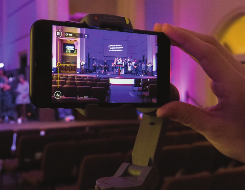
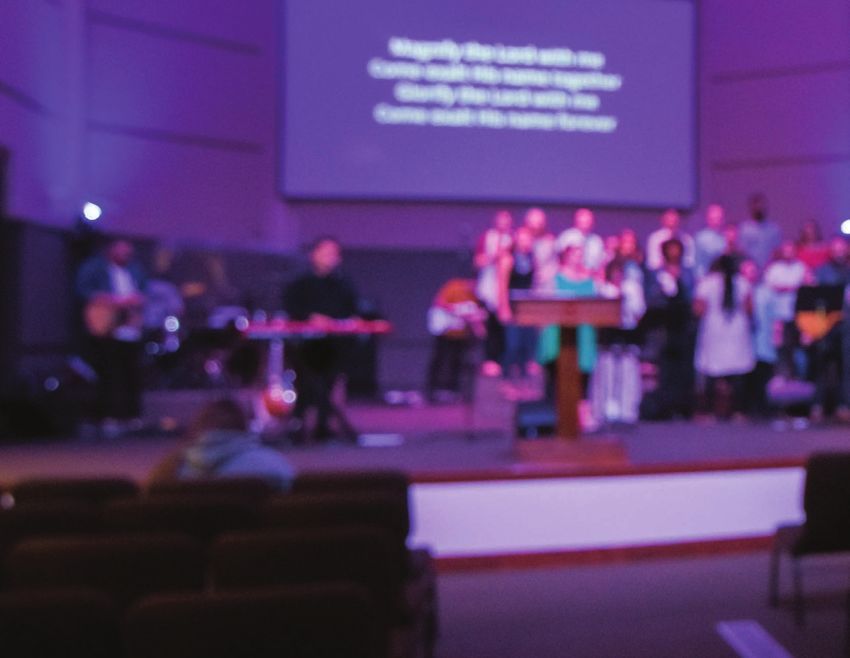
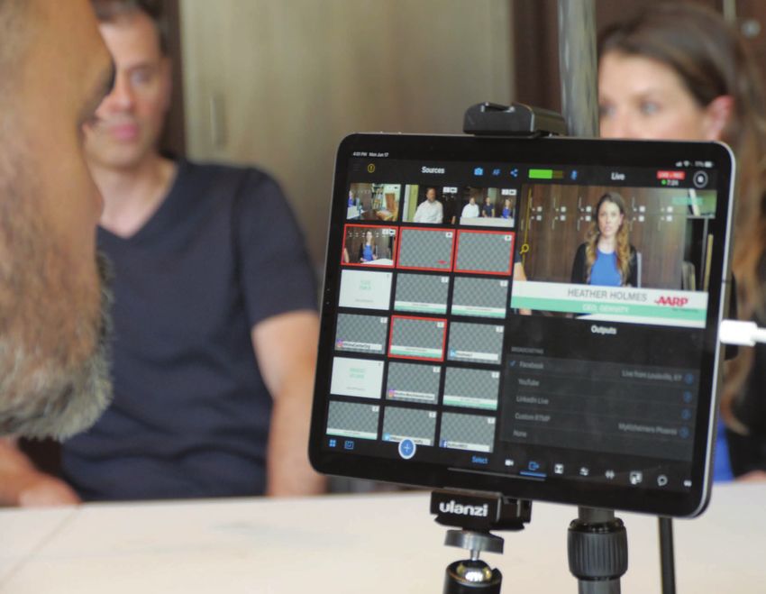
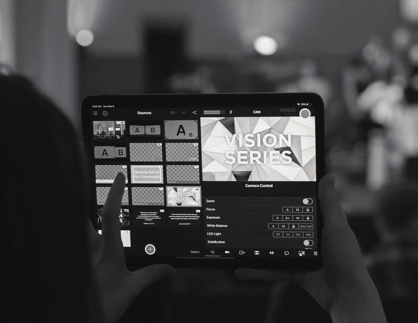
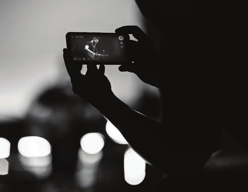
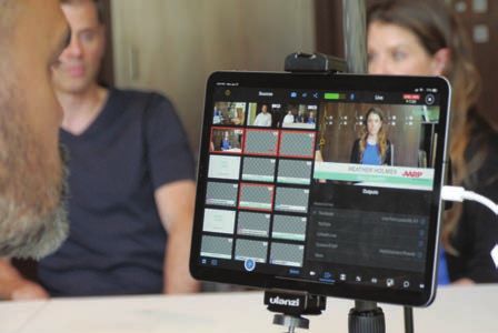
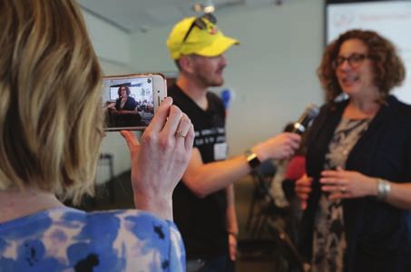
Photography
Photography helps carry Switcher's brand and voice. Provided are examples that help portray the Switcher
image. In general, photography should convey a feeling of authenticity to viewers. Avoid being too flashy or
excessively staged, but use, the camera and light should with purpose.

Brand Identity Guide 2021                                                                                      27
Identity

                            1205 E. Washington St., Ste 117
                            Louisville, KY 40206

                                                              JOHN SMITH
                                                              300 Cornelia Street
                                                              New York City, NY 12345

Brand Identity Guide 2021                                                               28
Digital Media WEBSITE New layout design for the Switcher Studio website. Design is responsive and will adapt to devices of varying screen sizes. Brand Identity Guide 2021 29
You can also read