Documentation - Dyvelopment
←
→
Page content transcription
If your browser does not render page correctly, please read the page content below

Documentation
    Mar 2021

   THEME BY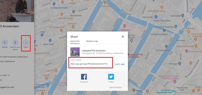
Preface
Theme Nova is the ultimate Lightspeed theme with unique features, designed to bring your
Lightspeed shop to the next level. Nova has special focus on mobile first design, high page
speeds, higher conversion rates and quality which gets your shop the best of the best. The theme
is designed to be a perfect fit for every kind of store, but we have made 4 default presets for you
to give you a head start. Of course you can change the whole color scheme and change all the
settings.

To name a few special features that Nova offers you:

    •     Super fast page speeds
    •     Advanced Quick shop and Quick (live) cart features
    •     Unique! Product shop the look features
    •     Unique! You can sell product bundles as a product
    •     Unique! Product daily deal timers
    •     Unique! Automatic related products
    •     Custom ‘Our stores’ page for different store locations
    •     Custom shopping cart design for even higher conversion rates
    •     Custom design for blog pages
    •     Custom design for the customer service page
    •     Support for size charts or other extra product information

Would you like to receive more information about Nova, its possibilities, or tailor made
changes? Feel free to contact Dyvelopment.

Phone:           +31 (0)24 2022 185
E-mail:          support@dyvelopment.com

                                                                                                 2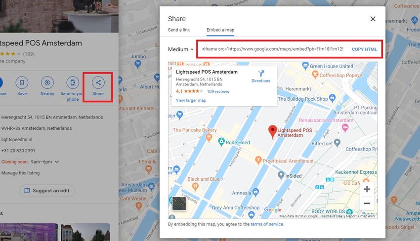
Table of contents
1. Installation ................................................................................................................................................. 5

2. Enable custom template data ................................................................................................................. 6

3. Image dimensions .................................................................................................................................... 7

4. Special features......................................................................................................................................... 9

   Custom sale labels .................................................................................................................................... 9

   Youtube video’s ......................................................................................................................................... 9

   Countdown timers .................................................................................................................................. 10

   Shop the Look – Bundles as a product................................................................................................. 11

   Combining Bundels, Timers and labels ............................................................................................... 14

   Size chart feature .................................................................................................................................... 15

   Navigation & menu bar .......................................................................................................................... 17

   Homepage video ..................................................................................................................................... 19

   Homepage Highlights ............................................................................................................................. 20

   Homepage Slider..................................................................................................................................... 22

   Sub Banners............................................................................................................................................. 23

   Homepage products ............................................................................................................................... 24

   Homepage Shop the Look ..................................................................................................................... 27

   Lookbook Category ................................................................................................................................. 29

   Homepage promo banner ..................................................................................................................... 31

   Homepage Brands Slider ....................................................................................................................... 31

   Homepage Categories ............................................................................................................................ 32

   Automatic Related Products .................................................................................................................. 33

   Store locator / Our stores ...................................................................................................................... 34

5. Settings..................................................................................................................................................... 39

   1. Typography .......................................................................................................................................... 39

   2. General colors ..................................................................................................................................... 39

   3. Header .................................................................................................................................................. 40

   4. Sub header........................................................................................................................................... 40

   5. Short USP’s ........................................................................................................................................... 41

                                                                                                                                                                 3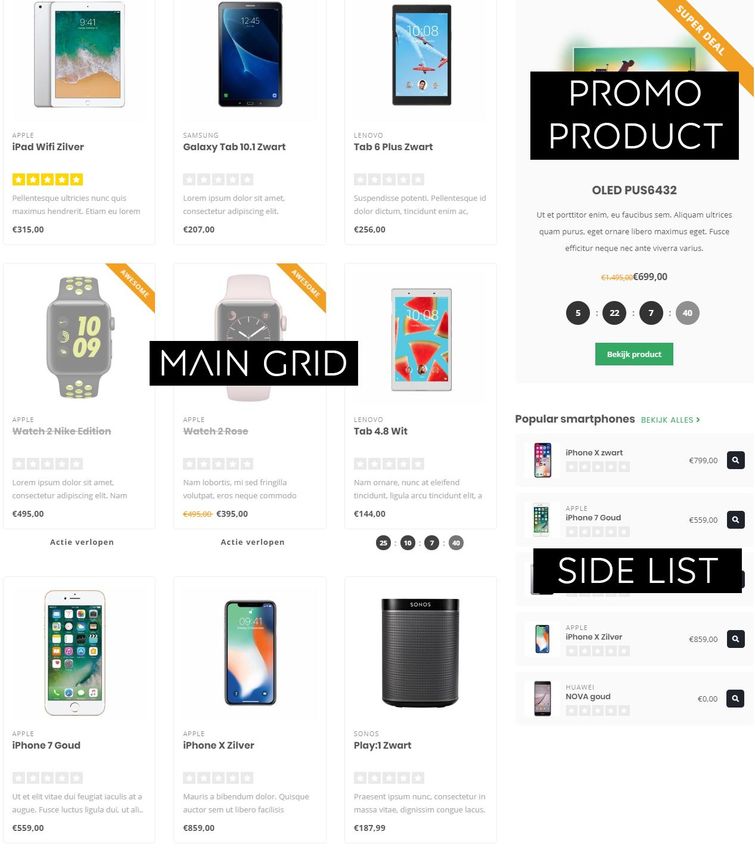
6. Large USP’s .......................................................................................................................................... 41

   7. Notification bar ................................................................................................................................... 42

   8. Navigation ............................................................................................................................................ 42

   8.1. Navigation – Vertical Categories .................................................................................................... 42

   8.2. Navigation – Horizontal Navbar ..................................................................................................... 43

   9. Homepage video ................................................................................................................................. 44

   10. Homepage Highlights ....................................................................................................................... 44

   11. Homepage Slider .............................................................................................................................. 44

   12. Sub banners ...................................................................................................................................... 44

   13. Homepage products......................................................................................................................... 44

   14. Homepage Instashow App .............................................................................................................. 45

   15. Homepage shop the look ................................................................................................................ 45

   16. Homepage Promo Banner .............................................................................................................. 46

   17. Homepage text ................................................................................................................................. 46

   18. Footer ................................................................................................................................................. 46

   18.1 Footer – Widgets ............................................................................................................................. 46

   18.2 Footer - Social.................................................................................................................................. 46

   19. Customer service .............................................................................................................................. 47

   20. Our stores .......................................................................................................................................... 47

   21. General settings ................................................................................................................................ 47

   22. Homepage settings .......................................................................................................................... 47

   23. Image settings ................................................................................................................................... 48

   24. Categories .......................................................................................................................................... 48

   25. Product features ............................................................................................................................... 49

   26. Product collection grid ..................................................................................................................... 50

   27. Product timer .................................................................................................................................... 51

   28. Cart features ...................................................................................................................................... 51

   29. Blog features ..................................................................................................................................... 51

   30. Google shop review stars ................................................................................................................ 52

Contact ......................................................................................................................................................... 53

                                                                                                                                                                  4
1. Installation
To install Theme Nova browse to the Lightspeed Theme store. (Backoffice > Design > Theme
Store). There you can search for theme Nova and select it from the list.

Here you can choose between 4 different preset settings called “Default” (Gadgets), “Fashion”,
“Drinks” and “Home & Living”. With these preset settings you can get the look & feel from our demo
shops. Of course you can change the design with a few easy tweaks to your own liking.

When you would like to install the Default preset, but also like to have a Promo banner like in the
Fashion preset? No problem, you can set this up later in your own shop from within the design
settings.

                                                                                                 5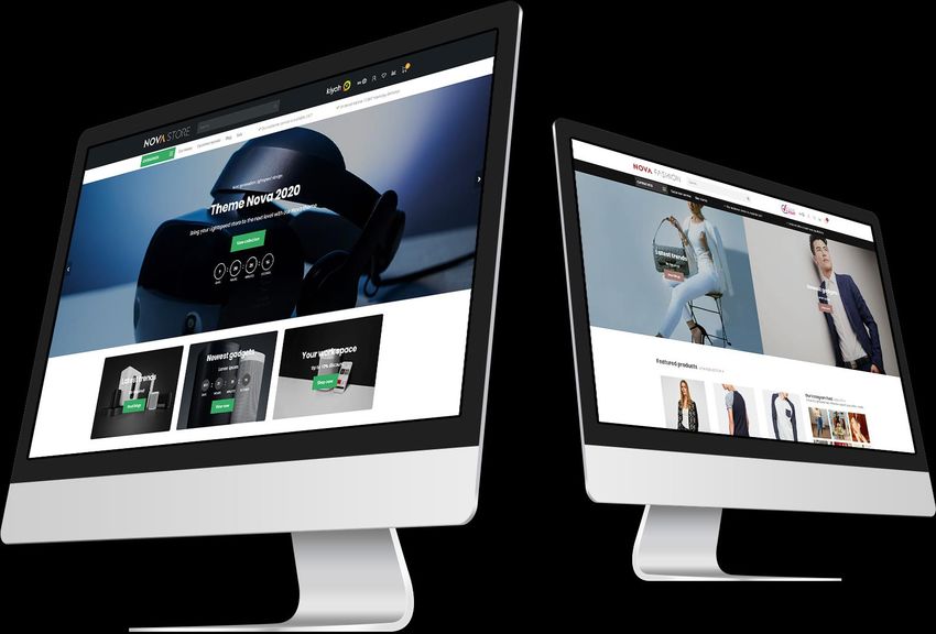
2. Enable custom template data
Some features in this theme make use of the extra template data fields in backoffice products,
called Data 01, Data 02 and Data 03. By default these fields are invisible in your backoffice. You can
make this fields visible through Settings > Workflow > Custom template data.

After enabling this setting you will see three extra text fields under the “Custom Template Data”:
Data 01, Data 02 and Data 03.

You can use these fields for your own product label, a countdown timer, a bundle as a product, a
Youtube video or a size chart. These features will be explained in detail in chapter 4.

                                                                                                    6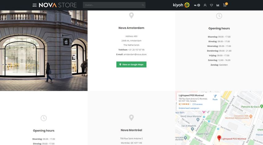
3. Image dimensions
While filling the theme with your images, banners and product photo’s it’s good to know which
image sizes to use for the best visual experience. Below you’ll find the recommended image sizes
per feature in pixels.

Please keep in mind that images in banners (like in sliders, highlights and video’s) are set to
fill up the background space. This means that because of the responsive view, some edges
are cropped off because the lack of space. These images are meant for decoration and we
don’t recommend to put the text in the images themselves.

Homepage slider
You can choose the dimensions of the homepage slider yourself as long as the slider’s minimum
width is 1290 pixels in width. If you choose to enable the full width slider, we advise to use a width
of 1600 pixels. In our demo store we use a slider image of 1600x600 pixels. You can also choose
your own height for the slider (full height, large or medium)

Recommended sizes for full width:
Full height:             1900 x 1060 pixels
Large:                   1900 x 800 pixels
Medium:                  1900 x 400 pixels

Recommended sizes for non-full width:
Full height:             Not supported
Large:                   1290 x 600 pixels
Medium:                  1290 x 400 pixels

Homepage sub banners
We advise to use images with a size of 920x400 pixels.

Homepage video
You can also choose the video dimensions yourself. We advise to use a 1080p or 720p resolution
video. The theme will fill the reserved video space in ratio until the edges are filled.

Homepage Highlights
For the large highlights we recommend a size of 600x900 pixels. For medium highlights a size of
600x600 pixels, and for small highlights a size of 600x390 pixels.

Homepage Promo Banner
If you enable the full width promo banner we advise to use a size of 1900x600 pixels. If you don’t
use the full width banner we advise to use a size of 1290x400 pixels

                                                                                                    7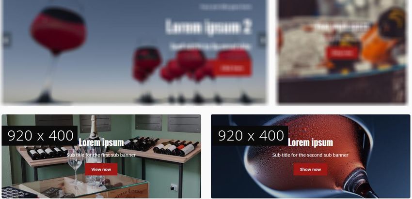
Brand images
The theme uses images with a size of 280x180 pixels. We advise to keep a bit of white space around
the brand in the image itself to prevent multiple brand images on a page from cluttering due to
the lack of white space.

Category images
We advise a size of 600x600 pixels. You can choose the size yourself, but make sure it’s a square
ratio.

Product images
The theme can handle all kinds of product image dimensions, but for the best experience we
recommend 1040x1200 pixels.

Logo
Our theme is really smart, so you can choose a logo size yourself as well. We do recommend to not
make it higher than 70 pixels, or wider than 400 pixels.

                                                                                                8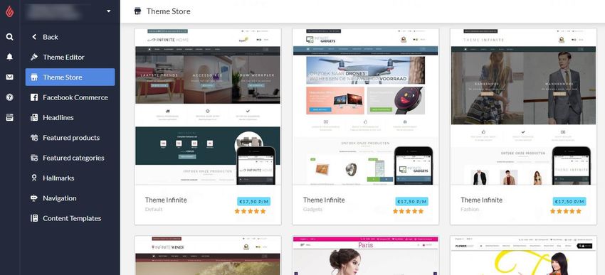
4. Special features
In this chapter we explain how certain features in the theme work. When we refer to the design
settings, we refer to the settings under Backoffice > Design > Customize theme. We explain the
other general design settings in chapter 5.

CUSTOM SALE LABELS
                                    You can enter a custom label on a product block by entering
                                    your label text in the product field “Data 01”. For more
                                    information please see page 6.

                                    If you want to use the Data 01 field for more than only a
                                    custom sale label? Like a countdown timer or a bundle as a
                                    product? You can simply separate these features with a |
                                    character. For more information see page 14.

YOUTUBE VIDEO’S
                                              To show a Youtube button on the product page,
                                              you can enter the full Youtube URL in the product
                                              field “Data 03”. The video URL should look
                                              something like this:

                                              https://www.youtube.com/watch?v=Ov4pYp60B18

                                              If you don’t see the Data 03 field please see page 6
                                              for more information.

                                                                                                9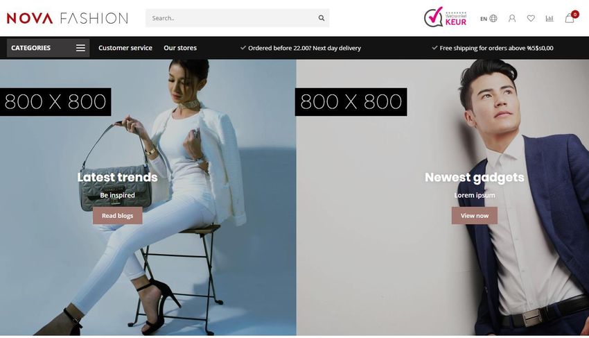
COUNTDOWN TIMERS

You can set a countdown timer per product and hide the add to cart button when the timer has
expired.

To activate the countdown timer, open a product in the backoffice and scroll down to the custom
Data 01 text field. If you don’t see this field please see page 6.

In this field you’ll have to enter a piece of text starting with “ Timer: “. After that you’ll have to add
an American date with shorthanded month names finished with a time notation in the format of
hour:min:sec. An example of a correct timer would be Timer: Jul 6 2021 15:00:00.

If you enter the timer incorrectly it will possibly not work as it should.

                 Possible months                                Example timers in Data 01
                        Jan                                     Timer: May 5 2020 00:00:00
                        Feb                                     Timer: Oct 29 2021 12:30:00
                        Mar                                     Timer: Feb 14 2021 21:45:00
                        Apr
                        May
                        Jun
                         Jul
                        Aug
                        Sep
                        Oct
                        Nov
                        Dec

                                                                                                       10
SHOP THE LOOK – BUNDLES AS A PRODUCT
Backoffice > Design > Customize Theme > 25. Product settings
Theme Nova offers you a feature to sell a product bundle just as a normal product. This feature is
also used to sell a Shop the Look product. With this feature the contents of product bundle will be
shown where normally the product variants would be shown.
If you don’t have the product bundles module active for your eCom subscription (for example if
your store is located in North America), you can also choose to use the product’s related products
for this feature. However, the big “add to shopping cart” button to add all products to your
shopping cart at once will disappear, and of course also the related products ‘as is’ won’t be visible
since they’re being used for this feature.
Option 1: With product bundles (recommended, default)
Step 1:
In your backoffice, create a product with the price of 0 EUR/USD and enter all other product details
as you would normally do (title, text, images etc.). It’s important that you set the price 0 to avoid
double costs for your customers. This product is going to be the main product. You’ll later add a
product bundle to this main product.
Please note: you can’t add multiple bundles to the main product, only the main bundle.
11Step 2:
Create a product bundle under Backoffice > Products > Product bundles.
Enter a random bundle title for your own reference and set the discount to 0%. This way the
product price later on depends on the actual products within the bundle.
Next enable the settings that allow discount being applied to the bundle and add the individual
products to the bundle you want to sell in the main product.
Step 3:
Add the main product created in step 1 to this product bundle.
Step 4:
Now the only thing left is telling the theme the main product should behave as a ‘bundle as a
product’ page. To do so open the main product in the backoffice and scroll down to the Data 01
field. Here add the text “ Bundle: “ followed by the total price of the product bundle. Separate the
decimals of the price with a dot.
An example Data 01 value is bundle:199.95 for bundle of €199,95.
12Option 2: With related products
Step 1:
Under Backoffice > Design > Customize theme > 25. Product Settings change the setting Bundles
as a product (shop the look) type to Related products.
Step 2:
Create a new product as you would do normally (with title, text, images etc.), and give it a price of
all articles added up together.
Step 3:
Scroll down and add your related products.
Step 4:
Now the only thing left is telling the theme the main product should behave as a ‘bundle as a
product’ page. To do so open the main product in the backoffice and scroll down to the Data 01
field. Here add the text “ Bundle: “ followed by the total price of the product bundle. Separate the
decimals of the price with a dot.
An example Data 01 value is bundle:199.95 for bundle of €199,95.
13COMBINING BUNDELS, TIMERS AND LABELS
Combining a deal timer with a custom label or bundle as a
product in Data 01?
That’s also possible. We’ve explained before how to set up a custom
label, deal timer or a bundle as a product with the Data 01 field. Every
feature is separated easily with a | character in the Data 01 field:
1. Timer: Dec 12 2020 22:00|Super Deal
2. Awesome Deal|Bundle: 179.99|Timer: Dec 25 2021 00:00:00
3. Bundle: 185.90|Timer: Jan 01 2021 14:00:00
14SIZE CHART FEATURE
Step 1:
Create a custom text page under Backoffice > Content > Pages. You can name the page what you
want, the important part is that the URL field is always filled with the word “sizechart”. Without this
URL the theme won’t be able to retrieve your page content.
You can enter your own table through the Lightspeed text editor, but if you want you could also
use this feature for other content than a size chart. Just make sure the URL is always filled with the
word sizechart.
An example HTML code for the sizechart can be found on the next
page. You can copy/paste this in the text editor with the code view
button.
Step 2:
Enable the design setting “Show size chart button” under 25. Product Settings.
15When you enable this setting there will appear a button on the product page to view the size chart
in a popup/overlay. You can also choose to only show the size chart button on selected product
pages. In that case you have to fill the product Data 02 field with the word “sizechart” to show the
button for that product.
Example HTML code sizechart
How do I measure the right size?
Lorem ipsum dolor sit amet, consectetur adipiscing elit. Maecenas vitae nulla ut
mi cursus mattis et sit amet enim. Cras metus felis, congue at quam ultrices,
eleifend viverra justo. In finibus tincidunt sem, sed imperdiet ipsum lacinia
pellentesque. Fusce sagittis dignissim erat, mattis eleifend massa gravida in.
International
Confection size
Breast size (cm)
Taille (cm)
Waist (cm)
XXS3274 - 7761 - 6383 - 86
XXS3274 - 7761 - 6383 - 86
XXS3274 - 7761 - 6383 - 86
XXS3274 - 7761 - 6383 - 86
XXS3274 - 7761 - 6383 - 86
XXS3274 - 7761 - 6383 - 86
XXS3274 - 7761 - 6383 - 86
XXS3274 - 7761 - 6383 - 86
16NAVIGATION & MENU BAR
Backoffice > Design > Customize theme > 8. Navigation
Nova has a feature which gives you the option to choose between a vertical flyout navigation
button or a default horizontal menu bar.
Vertical flyout navigation (8.1 – Vertical categories)
You can also choose a different navigation mode, that instead of a multi-level mouse over
submenu, gives you one big mega menu. All sub category levels are visible at once in the mega
menu.
Horizontal menu bar (8.2 – Horizontal navbar)
17Custom navigation items
In Nova you can add extra navigation links in the header. When enabling the vertical fly out
navigation, these will be shown in the sub header on the right side of the categories button. When
enabling the horizontal menu bar, the links are simply added as extra navigation items next to your
shop categories.
Important! To make your custom links visible, make sure to enable the design setting Show
custom links under Header > 8. NAVIGATION.
Step 1:
To add your custom links, go to Backoffice > Design > Navigation. Here you can click on the
default (main) navigation to edit it. Note: they key always has to be called main.
Step 2:
Click add link:
Now you can add a custom link for every enabled shop language.
Tip:
To link to your own custom text page (e.g.
your Our Stores page) it’s best to choose the
type URL. This gives you an easy way to
copy/paste the URL from your browser’s
address bar into the custom URL field.
18HOMEPAGE VIDEO
Backoffice > Design > Customize Theme > 9. Homepage Video
You can show your own MP4 video on the shop’s homepage. You can upload this video yourself
under Backoffice > Tools > Files. After uploading you’ll see the URL of the file which you can copy
and paste in the settings field for the homepage video URL.
We advise to use a 720p or 1080p video with a small file size (not too many megabytes) to prevent
long loading times for your visitors.
19HOMEPAGE HIGHLIGHTS
Backoffice > Design > Customize Theme > 10. Homepage Highlights
The image dimensions we’ve used in our demo stores can be found below in the black markings.
20Slider in Highlights
If you’ve enabled the homepage slider, this setting places your slider in the first two highlights
instead of a standalone slider. The first two highlight images will obviously not be shown anymore.
Highlight size
With this setting you can alter the height of your Highlights. In the example below (Default/Gadgets)
we use the size small.
Countdown timers
Please see page 10 for more information about setting up a timer.
21HOMEPAGE SLIDER
Backoffice > Design > Customize Theme > 11. Homepage Slider
Slider type
We advise to set the slider images as a background image so you can enter your own text with the
other settings. If you want to embed your own text In the images you can set the slider type to
“only images without custom text”. Then the images will shrink according to the screen size.
The setting “Only images without custom text” does not work when you choose to place the slider
in the highlights.
Slider Image
Here you can set the image for the slider carousel. Please note: It’s not possible to set a different image
per language by default.
Hence we advise you to use the slider type Background images with custom text if you want text
in your slider have multiple languages enabled.
Countdown timers
Please see page 10 for more details about setting up a timer.
22SUB BANNERS
Backoffice > Design > Customize Theme > 12. Homepage Sub Banners
Banner position: below the homepage highlights
Banner position: right side of the homepage products
23HOMEPAGE PRODUCTS
Backoffice > Design > Customize Theme > 13. Homepage Products
24Choose your products per grid / list
You can choose your own type of products for the main grid products, side list products and bottom
grid products.
Featured products
These are the products you can choose and sort yourself under Backoffice > Design > Featured
products.
Popular and New products
These products are generated automatically by the Lightspeed algorithm and can’t be changed by
yourself.
25Custom products in the side list
In the side list you have the possibility to show the 5 first products from a custom category page.
To enable this, set the type for side list products to custom products. Then you can enter the last
part of the URL path in the custom category URL field.
When for example, you have the URL https://www.myshop.com/gadgets/smartwatches you’ll only
have to enter /gadgets/smartwatches in this field.
Side list custom category sorting
You can set the sorting method for the custom products yourself. For example the first 5 most
popular products, or the 5 first default (manual sorting) products.
Promo product
Under the setting promo product view enabled you can enable the first featured product (see
previous page) to show as a highlighted promo product.
26HOMEPAGE SHOP THE LOOK
Backoffice > Design > Customize Theme > 15. Homepage Shop the Look
To add a Shop the Look product to the homepage first set up the bundle as a product as described
on page 11.
Once you’ve created this product, add it to Backoffice > Design > Featured products and make
sure the product is placed on top of the list.
27After you’ve added this product to the top of the featured products list, you can enable the design
setting Looks on the homepage under 15. Homepage Shop The Look.
28LOOKBOOK CATEGORY
Backoffice > Design > Customize Theme > 24. Category settings
To set up a category as a lookbook, first create a shop category and fill it with products just as
you’re used to.
Next, open this category in the backoffice and search for the category ID number in the address
bar of your web browser. This is the number at the end of the URL. For example 5421245.
29Finally, browse to your design settings and scroll to 24. Category settings. Here you can enable the
lookbook feature and enter the category ID you’ve copied from your browser’s address bar. If you
have multiple lookbook categories you can separate the ID’s with a comma
30HOMEPAGE PROMO BANNER
Backoffice > Design > Customize Theme > 16. Homepage Promo Banner
This theme provides a feature to place a custom banner below the products on your homepage.
You can also place your own text with buttons on this banner.
HOMEPAGE BRANDS SLIDER
To add the brand slider to the homepage activate the design setting “Homepage brands”. After that
upload your brand images in Lightspeed under Products > Brands. Be aware that the slider
duplicates brand images if there are too few.
With the design setting Brands homepage under 22. Homepage settings you can enable or disable
this homepage brands slider.
31HOMEPAGE CATEGORIES
The categories on the homepage are selected the same way as the homepage products by
browsing to Backoffice > Design > Featured categories.
32AUTOMATIC RELATED PRODUCTS
Backoffice > Design > Customize Theme > 25. Product settings
Nova gives you the possibility to show automatically generated related products on the product
detail page. Nova scans the deepest category layer of the main product, and sorts the results based
on popularity. Then it shows the (max.) 6 first products from this category.
E.g.: When a product is connected to Household > Interior > Lighting the deepest category
lighting will be scanned.
Please note: automatic related products are only generated when there are no
manual related products attached to the main product.
33STORE LOCATOR / OUR STORES
Nova also gives you the possibility to (by default) set up to three store locations in a custom
designed Our Stores page.
Step 1: Create the text page
The first step is creating a new text page under Backoffice > Content > Text pages. You can give
it any name you like, but make sure that on the bottom of the page, the URL value is set to stores.
If you don’t set this value to the word stores, Nova doesn’t know when to load the page.
Step 2: Enter store location details
Under Backoffice > Design > Customize Theme > 20. Our stores you can set all store details (like
addresses and contact information) per store. We’ll explain more on the forthcoming pages.
34Settings per store
Image
Here you can set an impression image of your store’s location. We advise a vertical image size of
840x1040 pixels. Please keep in mind that this image is for a global impression, and depending on
the screen size, image details may be cropped.
Please note: when using a Google Maps embed location, this image is overwritten by the map.
Name or location
This is the name of the store location, and could also be the name of the city it’s located.
Address
Here you can set the store address. This field supports HTML code. To enter a new line in this
value, you can enter the html code . For example: Address Line 1My second line. Please
note: remove possible spaces around the tag for the best result.
Google Maps URL
Entering a value will show a button for this location, that opens up a new Google Maps window set
to the store’s location URL. You can easily copy/paste this URL from Google Maps when you click
the share button in Maps:
Google Maps Embed Iframe
With this setting you can show an embedded Google Maps for your store location instead of an
image. Please carefully read the next pages, where we’ll explain in detail how to set this up.
35Entering the Google Maps Embed Iframe
Usually you would easily copy/paste the full HTML embed code generated by Google Maps into the
settings field. Unfortunately Lightspeed eCom has a character limit on the design setting fields,
which results in cut-off and incorrect HTML code. Therefore a workaround is needed to make sure
the full code can be copy/pasted.
Fortunately the translation feature in Lightspeed doesn’t have this character limit. This way we can
use the custom translations as a workaround to enter the full HTML code.
Step 1: Copy the Google Maps embed iframe code
When clicking the share button on Google Maps, you’ll see a embed a map tab next to the send a
link tab. After clicking on this tab, you can copy the HTML code by clicking on the COPY
HTML button.
The copied piece of code should look like .
36Step 2: Create a custom translation
Under Backoffice > Content > Translations click the button Add custom translation. For the
translation key enter map_embed_1. Later on, for other store locations, you can use map_embed_2
or map_embed_3.
Next, enter the iframe HTML code snippet from step 1 for all languages and click the create button.
Step 3: Enter the translation key into the setting Google Maps Embed Iframe
Now, when you go back to the design setting Google Maps Embed Iframe, you can enter the
translation key you’ve just created. For example map_embed_1.
Nova now ‘translates’ this translation key automatically to your Google Maps frame!
37Tip! To add a link to your store locator in the navigation bar, please read page 18
for a detailed explanation.
385. Settings
In this chapter you’ll find a more detailed explanation on the different design settings. You can find
these settings under Backoffice > Design > Customize theme.
All text values you’ve entered can be translated through the Lightspeed translations module under
Backoffice > Content > Translations.
1. TYPOGRAPHY
Titles
Choose the font to use for titles and headings.
Body
Choose the font to use for all other text.
Body font size
Here you can set the body font size in pixels. We advise a value of 13 or 14 for the best results.
Body font style
Choose the font weight of the body text
Button font style
Choose the font weight for button text.
2. GENERAL COLORS
Color body
This is the general text color in your shop.
Highlight color
This color is used as a highlight color for some elements throughout the theme.
Button color
The background color for buttons.
CTA Button color
The background color of (larger) important Call To Action buttons, like the Add to Cart button.
Small button color
This is the background color used for smaller and secondary buttons. Also the background color
for the active variant block when variant blocks are enabled.
393. HEADER
Background color
Here you can set the background color of the header bar.
Text color
This has effect on the text and icon color in the header bar. If you’re using a dark header
background, make sure to set a light text color.
Logo
This is the place to upload your logo.
Logo mobile
If you want, you can set a smaller logo which will be shown on smaller mobile devices. For example
only a logo icon instead of a full-text logo. We advise a maximum width of 250 pixels for this logo.
Hallmark image
Here you choose between some pre-defined hallmark images in different color schemes. If your
hallmark isn’t in this list you can set the type to custom hallmark image. Then you can upload your
own image. We advise a max. height of 70 pixels for your custom hallmark image.
Hallmark URL
Here you can enter the URL to make your hallmark image clickable.
Search bar in white
By default the search bar is semi transparent. If this conflicts with your color scheme, or you don’t
like this for some other reason, you can enable this setting to show the search bar as a default
white box with light grey border.
4. SUB HEADER
Default amount of USP’s
This is the amount of carousel Short USP’s that are visible by default in the sub header. Depending
on the amount of custom navigation items (see page 17 & 18) you can choose to show less, or more
USP’s by default. If you have a lot of custom navigation items set, the USP’s are probably squished
40together and will (unintentionally) jump to multiple lines of text. Choosing to show less default
USP’s gives them more breathing space and will make them look nicer.
Background color
The background color of the full sub header bar.
Text color
This is the text color for all items, including the USP’s, in the sub header.
USP’s icon color
This is the color for the icon’s next to the USP’s.
Show bottom border
Enabling this setting shows a light grey border below the sub header. This is a good idea when for
example, you have a white sub header and a white body background.
5. SHORT USP’S
These are the USP’s shown in the sub header bar. The icons for the short USP’s are the same as
the one that you can set at the Large USP’s. In stead of a title and sub title, you only have one line
of text for the short USP’s.
6. LARGE USP’S
These are the Unique Selling Points of your store, and are shown on the product pages and the
category page sidebar.
You can set up to 4 USP’s with an icon, title and sub title. You can find and select your USP icons
from the following website https://fontawesome.com/icons?d=gallery&m=free. Only the free icons.
When you’ve found the icon you’re looking for, you can click it to open its page. This will show you
a page that looks something like here below (in this case for the icon address-book):
41Next you can copy the piece of HTML code (in the red marking) that starts with
and ends with . For example:
7. NOTIFICATION BAR
In this bar you can show a special notification to your visitors. For example a notification about
some SALE event. The notification will be show below the sub header.
Notification name
This is the internal system name for your notification, the user won’t see this. It’s used to keep track
of when a user has clicked away a notification.
8. NAVIGATION
Navigation mode
You can choose between a vertical flyout button navigation or a standard horizontal menu bar.
Please see page 17 for more information.
Show custom links
Enabling this setting will also show you custom links in the navigation, created under Backoffice >
Design > Navigation > Main.
8.1. NAVIGATION – VERTICAL CATEGORIES
Here you can set up the vertical navigation menu.
Navigation type
You can choose between a navigation that consists of multiple fly out layers (multi-level mouse-
over) or one big overview called mega menu.
42Navigation type multi level mouse-over
Navigation type mega menu
8.2. NAVIGATION – HORIZONTAL NAVBAR
Here you can set up the horizontal menu bar
Background
The background color for the full menu bar.
Text color
The text color of the items in the menu bar.
Sub navigation background
The background color for the sub navigation fly-out.
Sub navigation text color
The color of the items in the sub navigation fly-out.
43Enable borders
This will show a thin border at the top and blow the menu bar.
Border color
And here you can set the color of these two borders.
Navbar type
You can choose between:
• Mega menu: Shows a big and wide sub navigation where a lot of items are shown in one
big overview;
• Small menu: a standard small fly-out menu with sub categories only visible when the
mouse is hovering that category.
Font style
Here you can choose between a thin, normal or bold font for the main menu bar.
Navbar letter spacing
How many white space (in pixels) do you want between the letters in the main menu bar? We advise
0 to1 pixel.
9. HOMEPAGE VIDEO
Please see page 19 for more information.
10. HOMEPAGE HIGHLIGHTS
Please see page 20 for more information.
11. HOMEPAGE SLIDER
Please see page 22 for more information.
12. SUB BANNERS
Please see page 20 for more information.
13. HOMEPAGE PRODUCTS
Please see page 24 for more information.
4414. HOMEPAGE INSTASHOW APP
More information about this app can be found here:
https://www.lightspeedhq.com/ecommerce/store/apps/instashow-lightspeed-instagram-feed/
Step 1
Install the Instashow app under Backoffice > Apps > App Store. From here you can search for
Instashow.
Step 2
Once installed and logged into the app’s dashboard, you can configure the widget to your own
liking. If you have any questions or need support, please contact the app developer directly at
https://elfsight.com/
Step 3
Copy the widget short code:
And paste this in the setting field for the Instashow widget code:
15. HOMEPAGE SHOP THE LOOK
Here you can set a homepage Shop The Look product. The product that will be shown is the first
product you’ve set under Backoffice > Design Featured products.
4516. HOMEPAGE PROMO BANNER
Please see page 27 for more information.
17. HOMEPAGE TEXT
Here you can set different homepage heading titles.
18. FOOTER
Logo
Here you can choose to set a specific logo image in the footer, instead of your company name as
text.
Store description
This is a short text description shown in the footer, below you company name or logo.
Payment icons style
Here you can set the color scheme of most payment icons. Quite handy when you have a dark or
light footer, so the icons won’t disappear in the background color.
18.1 FOOTER – WIDGETS
Here you can set a Kiyoh or Feedbackcompany widget to show in the footer.
Kiyoh widget
Here you can enter you complete Kiyoh HTML widgetcode.
The Feedbackcompany widget
Here you can set your Feedbackcompany Widget. To do so, copy your widget’s UUID code into this
field. You can find this code in your widget’s HTML code under uuid: ‘xxx-xxxxxx-xxxxxxxxxxxxxx-xxx’.
The value between quotes, can be copied and pasted in the settings field. For example: 2df0e44f-
254b-4f8b-beca-2c48ea1fe2f7.
18.2 FOOTER - SOCIAL
Here you can easily set up your social media buttons that will be shown as icons in the footer. To
disable a social media icon, simply set an empty value in the settings field.
4619. CUSTOMER SERVICE
These are specific settings for the Customer Service page.
Custom service page
With this setting you can enable the custom designed customer service page. This custom page
replaces the default Lightspeed service page. All settings in this category only have effect on the
custom service page. We encourage you to leave this setting enabled.
Enable view our stores button
When using the ‘Our stores’ features (under 20. Our stores) you can show an extra button on the
customer service pages that links to the Our Stores page.
Main store image
Here you can set a custom image as an impression of your store. This image is shown above the
main company details.
Main address, zip code, city, phone number & email address
These details are you main contact details and are shown in both the footer and customer service
page.
20. OUR STORES
Here you can enter all store details like addresses, opening hours etc. for your Our Stores page
(max. 3 stores – for more stores please contact us).
Please see page 34 for a detailed explanation on setting up your store locator page.
21. GENERAL SETTINGS
Enable banner overlays
Enabling this setting shows a semi transparent layers on top of some banners so the white text is
more readable.
Shadow effect on mouse over
This setting shows a subtle shadow effect when hovering some (product) blocks with your mouse.
Sidebar on text pages
This setting enables the side bar with categories and USP’s also on your text pages.
22. HOMEPAGE SETTINGS
Here you can enable or disable some of the homepage features.
4723. IMAGE SETTINGS
Here you can choose if your images should be resized to always fit, or that they should be cut off
if they don’t fit perfectly. You can also in which ratio your product images should be shown (square
or vertical).
24. CATEGORIES
Categories of the collection type are categories with an overview of products. Categories of the
catalog type are categories with an overview of sub categories.
Show amount of products
In the sidebar you can enable or disable to show the amount of products in a certain category.
Pagination type
Here you can choose between a standard pagination (with page numbers below the category) or a
‘Load more products’ button. Enabling the Load more button will retrieve the products live from the
background without any page refresh – which provides a better user experience.
Collection view type
Here you can choose between a standard category page with sidebar, or a Clean type which only
shows the products and no other distraction.
Collection text position
Choose the text position on collection pages. These are the category pages with an overview of
products.
Show collection image next to text content
Enabling this setting shows the category image on the left side of the category content text.
Products next to each other
Here you can set the amount of product blocks that are shown next to each other per row, on the
category pages.
Product filters position
Here you can choose to show the filters either as a toggle slide-out button (default), or if you want
to show all filters in the left sidebar. On mobile devices the filter is always only visible by clicking
the Filters button.
48Catalog text position
Choose the text position on catalog pages. These are the category pages with an overview of sub
categories instead of products.
Show catalog image and short description
Shows the short description in a grey field and the category image on top of the collection page.
Enable lookbook
Choose to enable the Lookbook view for selected categories
Lookbook category ID’s
Here you can enter the category ID’s for the categories you want to apply the lookbook view on.
See page 29 for more information.
25. PRODUCT FEATURES
Here you can enable or disable different product features that apply mostly on the product detail
page.
Automatic related products
Please see page 33 for more information.
Show delivery time
Here you can choose how you want to show the delivery times on the product page. You can either
set a custom text visible in all products, or choose to show the delivery time connected to a product
in the backoffice.
Delivery time custom text
This is the text being displayed when you choose to show the custom delivery text on all product
pages.
Show variants as blocks
This setting changes variant dropdown menu’s on product pages to every variant in its own block.
Show out of stock variant blocks as disabled
Shows the variant block as disabled when the variant is out of stock. Only works for manual
variants, not product option sets or matrices.
Bundle as a product (shop the look) type
Here you can choose which feature should be used for the ‘bundle as a product’ products. Product
bundles are the best choice, but if you don’t have this module in your eCom shop you can also
choose to use the related products. Please see page 11 for more information.
Bundle as a product: allow individual sale
On bundle as a product pages, this setting shows a small add to cart button next to each bundle
product.
49Show size chart button
Please see page 15 for more information.
Show stock status
Shows if a product is in or out of stock.
Show stock level quantity
When ‘show stock status’ is enabled together with the product stock tracking, the amount of items
in stock is shown as well.
Enable reviews
Enables or disables the product reviews feature.
Yotpo reviews ID
If you’re using Yotpo product reviews, you can enter you Yotpo ID/key in here.
Show full titles
This will show the full product titles including their brand name.
Show product brands
Shows connected brands on the product page.
Enable sticky add-to-cart bar
Enables the sticky always shown ‘Add to cart’ bar on product pages, even while scrolling.
26. PRODUCT COLLECTION GRID
Boxed product (grid) blocks with border
Shows a subtle grey border around the product gird blocks on the homepage and category pages.
Enable quick order
Shows an add to cart button and quantity field below product blocks, so customers can order really
quickly
Show sale labels
When you give discount to a product, this shows a label with the word “Sale” in it.
Show sale label percentage
Also shows the discount percentage in the SALE label.
Rotated (sale) labels
With this setting you can rotate the sale labels by 45 degrees on the right side of the product grid
blocks. To achieve the best results we recommend to also enable the setting Boxed product blocks
with border.
50Product blocks white background
With this setting your product blocks always have a white background, even when you change the
body background color. In most cases we advise to enable this setting for the nicest results.
27. PRODUCT TIMER
Here you can set up the countdown timer colors and disable expired deals if you want.
28. CART FEATURES
Enable free shipping notice
You can show your customers a notification in the cart, telling them for how much more they have
to order to receive free shipping.
Free shipping notice
Here you can set the text to display to the customer when the order will be shipped for free.
Amount to free shipping
Here you can set the amount that a customer has to spend before the free shipping notification is
displayed.
Enable custom cart
Enables the custom designed shopping cart page instead of the default Lightspeed cart page. We
highly recommend leaving this setting enabled.
Enable upsell products in popup cart modal
When you enable this setting, the live ‘Added to shopping cart’ popup will show the cart page upsell
products instead of the cart page related products.
29. BLOG FEATURES
Enable sidebar on overview page
When enabled, a sidebar on the blog pages is shown, containing the latest articles, tags and
optional Twitter feed.
Twitter feed profile
To enable the Twitter feed in the blog page sidebar, you simply put in the name of the Twitter
account in this field. For example: @daxdasilva.
5130. GOOGLE SHOP REVIEW STARS
Our template supports (shop) review stars in the organic search results of Google. In these settings
you’ll have to fill in what your score is, the maximum reachable score, the amount of reviews and
the amount of reviews.
52Contact
Any questions or suggestions? Or if you would like to have some custom made changes to your
design, or custom solutions in general? Please feel free to contact us to see what we can do for
you.
Phone: +31 (0)24 2022 185
Mail: support@dyvelopment.com
Web: http://www.dyvelopment.com
Opening hours
Mo / Fr: 09:00 - 17:00
53You can also read


