Conceptual Model of an Application for Automated Generation of Webpage Mobile Versions
←
→
Page content transcription
If your browser does not render page correctly, please read the page content below
TEM Journal. Volume 6, Issue 4, Pages 877-882, ISSN 2217-8309, DOI: 10.18421/TEM64-30, November 2017.

           Conceptual Model of an Application for
            Automated Generation of Webpage
                      Mobile Versions
                  Todor Rachovski 1, Stanka Hadzhikoleva 1, Emil Hadzhikolev 1
                  1
                      Plovdiv University Paisii Hilendarski, Faculty of Mathematics and Informatics,
                                          236 Bulgaria Bul., Plovdiv, Bulgaria

   Abstract: Accessing webpages through various types of           have shifted from creating an artistic design that
mobile devices with different screen sizes and using different     appeals to consumers to a relatively simple design
browsers has put new demands on web developers. The main
challenge is the development of websites with responsive
                                                                   that looks good on a variety of mobile devices. The
design that is adaptable depending on the mobile device used.      change was dictated by search engines that gave
The article presents a conceptual model of an app for              priority to "content over packaging". In summary, we
automated generation of mobile pages. It has five-layer            can distinguish three strategies for mobile web
architecture: database, database management layer, business        design: responsive web design, an approach that
logic layer, web services layer and a presentation layer. The
database stores all the data needed to run the application.        adapts page layout based on the screen size; adaptive
The database management layer uses an ORM model to                 web design, a strategy that optimizes the webpage
convert relational data into an object-oriented format and         according to the capabilities of the device; and
control the access to them. The business logic layer contains      separate site in which two sites are built, one for
components that perform the actual work on building a
mobile version of the page, including parsing, building a
                                                                   desktops and one for mobile [2].
hierarchical model of the page and a number of                        The term Responsive Web Design was created by
transformations. The web services layer provides external          Ethan Marcotte. It means design of a website that,
applications with access to lower-level functionalities, and the   without changing the code, is visualized equally well
presentation layer is responsible for choosing and using the       on different devices with different resolutions -
appropriate CSS. A web application that uses the proposed
model was developed and experiments were conducted.                mobile phones, tablets, personal computers and
   Keywords: Responsive Design, Automated Generation of            laptops (https://ethanmarcotte.com).
Mobile Pages, Mobile Website.                                         The following understanding is also common - it is
                                                                   a design that provides optimal web page visualization
1. Introduction                                                    and easy interaction with it, suitable for various
                                                                   mobile devices, with different screen resolutions -
  In recent years, there has been a steady tendency to             laptops, tablets, smartphones, etc. The purpose of this
increase access to websites through mobile devices                 adapting is to minimize the need for resizing and
with the purpose of viewing information, shopping,                 scrolling the screen [21].
learning and other business activities. This places                   Responsive web design uses three primary
high requirements on web developers. Their efforts                 techniques: CSS3 media queries (allows for delivery
                                                                   of tailored styles to suit the browser environment),
DOI: 10.18421/TEM64-30
                                                                   Fluid-grid layouts (еnables the underlying page grid
https://dx.doi.org/10.18421/TEM64-30                               to scale nicely, using relative proportions rather than
                                                                   fixed pixel dimensions), and Fluid images and other
Corresponding author: Stanka Hadzhikoleva,                         media (enables images and video to scale effectively
Plovdiv University Paisii Hilendarski, Faculty of
                                                                   within the grid) [14] and [9].
Mathematics and Informatics,Plovdiv, Bulgaria
Email: stankah@gmail.com
                                                                      There are many benefits to using a responsive
                                                                   design. From a business perspective, a better
Received: 19 September 2017                                        consumer experience often results in higher profits.
Accepted: 08 November 2017                                         A number of search engines, including Google,
Published: 27 November 2017
                                                                   consider responsive design as a part of the algorithm
          © 2017 Todor Rachovski, Stanka                           for site ranking in keyword search results. Something
Hadzhikoleva, Emil Hadzhikolev; published by                       more - Google ranked mobile optimized sites higher
UIKTEN. This work is licensed under the Creative                   when searching on a mobile device [5]. The company
Commons Attribution-NonCommercial-NoDerivs 3.0                     offers a web analytics tool that verifies whether the
License.
                                                                   web page has responsive design, highlights design
The article is published with Open Access
                                                                   weaknesses and identifies resources with information
at www.temjournal.com

TEM Journal – Volume 6 / Number 4 / 2017.                                                                           877
TEM Journal. Volume 6, Issue 4, Pages 877-882, ISSN 2217-8309, DOI: 10.18421/TEM64-30, November 2017.

about optimization (search.google.com/test/mobile-        administrative access to the website server. Such
friendly).                                                applications are bMobilized (www.bmobilized.com),
   The design of a huge part of the websites              Mobify       (www.mobify.com),         Duda      Mobile
developed before the "mobile era" has not been            (www.duda.co), goMobi (www.gomobi.info) and
updated for various reasons – lack of financial           more. This type of applications build automatically a
resources, insufficient awareness of the advantages       mobile version of an ordinary web page through
of creating a mobile version, low priority in using the   several steps: menu recognition; automatic choice of
Internet as a channel for communication and               appropriate mobile view; creating mobile styles;
marketing, etc. Some of these websites have high          adding plugins. At a later stage, the user can
value for their users but cannot be conveniently          independently, through visual tools, indicate multiple
viewed through mobile devices. This puts the task of      additional settings: specify the menu blocks and the
developing web tools to convert webpages into a           main content; choose a different mobile view; set
mobile-friendly format. This includes a variety of        styles; add different buttons to the site, implemented
transformations - the dimensions of webpage               as plugins – telephone, email, location map, contacts,
elements must be presented in percentages, not in         links to social networks and sharing links, animated
pixels; images must be sized against the display; the     images (click to call, click to e-mail, click to map,
web page design must be formatted according to a          contact bar, social bar, share bar, carousel) and many
specific style developed for the specific type of         more.
mobile device; mobile versions of pages should be            When independently developing a new mobile
made "lighter" by removing different items as mobile      version, one can use different frameworks that offer
browsers do not support some technologies (such as        responsive design. Some of them are free and easy to
Flash, Java and other plugins), they do not have          use. One way to create a responsive design is through
much memory, etc. [1], [4] and [11]. Additional           the use of responsive CSS, such as W3.CSS.
efforts should be made to ensure faster loading of the    W3.CSS facilitates the development of websites that
mobile applications [10].                                 look good on screens of any size - desktops, laptops,
   The limitations and difficulties in using responsive   tablets or phones [20]. Bootstrap is a popular
web design are related to various aspects. There is no    framework. It uses HTML, CSS and jQuery to create
universal screen resolution that suits all mobile         responsive web pages (www.getbootstrap.com).
devices [19]. This implies different approaches to        Other well-known HTML 5 mobile frameworks are:
adapting the content of webpages for visualization on     jQTouch       (http://jqtjs.com),    jQuery      Mobile
different mobile devices. Following the trends in         (http://jquerymobile.com),                         Wink
development of semantic web, the HTML 5 standard          (http://winktoolkit.org),                      Titanium
supports a number of specialized semantic elements.       (http://www.appcelerator.com),               PhoneGap
They allow the analysis of a web page structure and       (http://phonegap.com),          DHTMLX            Touch
content. Such are the elements section, nav, article,     (https://dhtmlx.com/touch/) etc. [18].
aside, hgroup, and others [3].                               Developers can also use libraries for automated
   The article presents a conceptual model of an          creation of a mobile version of a site. This is, for
application for converting an ordinary webpage to a       example, PHPMobilizer. To use it, one must install
mobile one. It has a multilayered architecture that       the classes on one’s own server, in a subdomain of
allows flexible expansions and independent changes        the existing website [13]. W3C DAP is a device API.
in functionalities, as well as their use by external      It is a client - side API, written in JavaScript, that
applications.                                             enables the development of web applications that
                                                          interact with device hardware, sensors, services and
2. Tools for building responsive design websites          applications such as the camera, microphone,
                                                          proximity sensors, native address books, calendars
  Modern trends in mobile application development         and other (https://www.w3.org/2009/dap/). The use
outline a variety of requirements: the option to          of responsive design patterns gives reusable ideas
distribute the apps through multiple channels using       and solutions [8] and [12]. [6] describes an
different operating systems, application scalability      automated processor for web content to mobile-
based on cloud services, focus on security, and more.     optimized content transformation. The technology is
[7]. The basic requirement, however, is related to the    patented and aims to provide a solution for
use of responsive design.                                 automatical transformation of a desktop website into
  There are a number of software tools that               mobile-optimized content. Input may be provided by
automatically create a mobile version of a site.          a user who interacts with the system by simply
Generally, it takes uploading modules that convert        entering a website address, or may be provided in an
and store the generated mobile version of the site        automated way using a software programming
onto the server where the site is hosted. This implies    interface method.

878                                                                 TEM Journal – Volume 6 / Number 4 / 2017.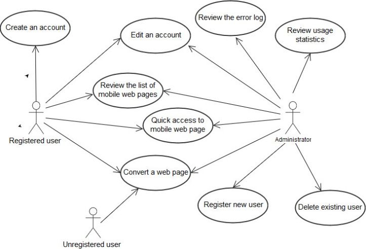
TEM Journal. Volume 6, Issue 4, Pages 877-882, ISSN 2217-8309, DOI: 10.18421/TEM64-30, November 2017.

3. Basic requirements and functionalities                    •   To store the built mobile versions of
                                                                 webpages so that when a web page is
  In the context of the ever-changing requirements               reopened, instead of re-converting it, the ready
and standards for websites, imposed by both users                mobile version would be loaded (in case the
and search engines, we have set the following basic              content of the web page has not been
requirements to the technology being created:                    changed);
                                                             •   To collect information about errors in the
  •     To support responsive design for different               conversion process with the purpose of
        types of mobile devices with different screen            eliminating them in the future development of
        resolutions and for different browsers;                  the technology;
  •     To allow the addition of styles for new mobile       •   To be open for future expansions and
        devices, incl. ones with non-standard sizes              changes, its components should be reusable,
        and resolutions;                                         replaceable     and/or   usable     by      other
  •     To have an intuitive user interface;                     applications, etc.

Fig.
 1.

                     Main use cases

  The main types of the application users are:             4. Application Model
administrator, registered user and unregistered user.
The unregistered user is authorized to enter                  The architecture we offer is multilayered and
webpages URLs and view the visualizations                  includes: Database, Database management layer,
generated for a mobile device. In addition, registered     Business logic layer, Web services layer and
users can view the mobile pages generated by them.         Presentation layer.
When a new webpage is requested, first a check is              1. The Database stores all data for app users,
done to verify whether the page has a mobile version       generated mobile pages, error log, and some
in the database, and if it does, and its content is        statistics. To ensure greater flexibility and scalability
unchanged, the saved mobile version is loaded. The         and to enable data recording without a predefined
administrator has full rights to manage the                scheme, it is appropriate to use non-relational
application. He can review the error log and usage         databases (NoSQL).
statistics, register new users and remove existing             2. The database management layer is based on
ones. The main use cases are illustrated with the          the concept of ORM technology (Object-relational
UML diagram in Fig. 1                                      mapping) for data conversion using object-oriented

TEM Journal – Volume 6 / Number 4 / 2017.                                                                    879
TEM Journal. Volume 6, Issue 4, Pages 877-882, ISSN 2217-8309, DOI: 10.18421/TEM64-30, November 2017.

           Fig. 2. Application model                                          Fig. 3. Web page

programming languages. It contains information
about accessing the application to the database,
presentations of database information in the form of
classes and objects, etc. The layer creates a "virtual"
object database that can be easily manipulated by
means of a particular programming language without
the need for additional processing.
    3. The business logic layer contains the
components that perform the actual work on building
the mobile page. The main component of this is the
HTML parser which performs the analysis of the
original web page, creates a tree-structure object
model, optimizes the webpage objects and builds an
intermediate, non-stylized version of the web page.
    4. The web services layer receives the
processed information from the business logic layer,
converts it into JSON format, and transmits it to the
presentation layer for further processing. This layer
defines interfaces to access to web services and hides
the details of the business process to build the JSON                 Fig. 4. Web page mobile version
file. It enables third-party access to JSON files,
respectively for applying styles developed by other         The advantage of using this architecture is that it
providers.                                                maintains a high level of abstraction, it is open,
    5. The presentation layer is responsible for          easily expandable and flexible.
choosing and using the CSS style appropriate for the        The created algorithm for converting an ordinary
mobile page being built, depending on the mobile          webpage into a mobile one includes the following
device used.                                              basic steps:

880                                                                 TEM Journal – Volume 6 / Number 4 / 2017.
TEM Journal. Volume 6, Issue 4, Pages 877-882, ISSN 2217-8309, DOI: 10.18421/TEM64-30, November 2017.
1. Reading the web page - the user enters a 6. Conclusion
web page URL, the application validates the address
and retrieves the web page. Adapting the “pre-mobile-era” websites to modern
2. Parsing the web page where the analysis and requirements for responsive design is one of the
processing of information is performed using an major challenges for web developers. In general, the
HTML parser and a hierarchical object model of the task can be solved in two ways - complete rewriting
web page elements is built. of the web site to build a responsive design or
3. Generating a model suitable for styling. At creating a new mobile version of the site. A
this point, all elements of the hierarchical object compromise for users of such sites is the use of
model are subjected to further processing. Objects applications – shells that automatically generate a
are recognized and recorded in a correlation table mobile version of the web page appropriate for
containing information about the main structural viewing on the particular device used.
components (page title, language, meta data, links, The article presents a multilayered conceptual
main content, etc.). A web page presentation suitable application model of an application for automated
for visualization through different styles is generated generation of mobile pages. It parses a web page,
in JSON format. creates a hierarchical object model of the page and
4. Visualization. A style that conforms to the presents it in JSON format. JSON files are accessible
mobile device parameters is applied to the webpage through web services and can be used for third-party
and it is visualized in the client's browser. formatting by applying CSS styles. It uses an ORM
technology to provide flexible presentation of
database data in object format and easy manipulation.
5. Experiments The model presented was tested by building a
A prototype was created to test the proposed model prototype.
[15]. The application uses the MongoDB NoSQL The proposed technology is suitable for building a
database. Database processing and management is plug-in that integrates into browsers of mobile
done through the ORM platform Microsoft Entity devices. This can automatically launch the process of
Framework 6. The web services layer uses an building and visualizing a mobile version of a web
established REST technology - Microsoft WCF page and „hiding“ the details about the application's
(Windows Communication Foundation). The work from the user.
presentation layer is implemented using Microsoft
ASP .NET MVC 6 (for webpage development with Acknowledgements
an MVC design template) and AngularJS 1.3
(JavaScript frame with MVVM design template). The work is partly funded by SP17-FMI-005 and MU17-
Fig. 3. and Fig. 4. show screenshots from a FMI-007 projects at the Research Fund of the Plovdiv
conducted experiment. Fig. 3. shows a view of a web University "P. Hilendarski".
page from the Plovdiv University website, and Fig. 4.
presents the mobile version automatically generated References
by the app.
Building a responsive design of a website is not a [1]. Borowska, P. & Laurinavicius, T. (2014). Mobile
panacea. There are many large sites that support Design Book. Amazon Digital Services LLC.
complex functionalities and contain large amounts of [2]. Cazañas, A. & Parra, E. (2016). Strategies for Mobile
Web Design, International Conference on Information
information. Making a responsive design for such
Systems and Computer Science 2016, Nov 24-26,
sites is not always possible. In cases like these "light" 2016, Quito, Ecuador.
mobile versions that contain only the basic [3]. Frain, B. (2015). Responsive Web Design with
information are created. Similar experiments were HTML5 and CSS3. Packt Publishing. ISBN:
carried out at the Plovdiv University: building a 1784398934.
mobile university system [16] and mobile [4]. Giurgiu, L., & Gligorea, I. (2017, June). Responsive
management and administration of e-learning in Web Design Techniques. In International conference
Moodle [17]. KNOWLEDGE-BASED ORGANIZATION (Vol. 23,
No. 3, pp. 37-42). De Gruyter Open.
[5]. Webmaster Central Blog. (2013). Changes in
rankings of smartphone search results. Retrived
from: https://webmasters.googleblog.com/2013/06/ch
anges-in-rankings-of-smartphone_11.html , (accessed
07 August 2017).
TEM Journal – Volume 6 / Number 4 / 2017. 881TEM Journal. Volume 6, Issue 4, Pages 877-882, ISSN 2217-8309, DOI: 10.18421/TEM64-30, November 2017.
[6]. Hashmi, A. (2014). Automated Processor For Web [15]. Rachovski, T., Hadzhikolev, E. & Hadzhikoleva, St.
Content To Mobile-Optimized Content (2017). Software application for generating mobile
Transformation, Patent Application Publication, Pub. versions of webpages, Scientific Session "Days of
No.: US 20140089786 A1, Pub. Date: Mar. 27, 2014. Science 2017" of the Union of Scientists - Plovdiv,
[7]. Kasakliev, N. (2015). Contemporary trends in Plovdiv, 2-3 November 2017 (in print).
development of mobile applications, Computer [16]. Rachovski, T., Kovatchev, B. & Totkov, G. (2012).
Science and Communications Journal, 2(4), 96-105. Towards a Mobile University System, Scientific
[8]. Marcotte, E. (2015). Responsive Design: Patterns and Works of USB-Plovdiv, Series B, Natural Sciences
Principles, A Book Apart Publ., 2015, ISBN: 978-1- and Humanities, Plovdiv, 25-26 October 2012.
937557-33-1. [17]. Rachovski, T., Totkov, G. & Enkov, Sv. (2011).
[9]. Marcotte, E. (2011). Responsive Web Design, A Book Mobile management and administration of e-learning
Apart Publ., 2011, ISBN: 978-0984442577. in Moodle. IV National Scientific Conference 2011,
[10]. Matsudaira, K. (2013). Making the mobile web Science and Higher Education Federation at Plovdiv
faster. Communications of the ACM, 56(3), 56-61. HEI, USB-Plovdiv, p. 117-121, ISSN: 978-954-9449-
[11]. McWherter, J. & Gowell, S. (2012). Professional 44-0.
Mobile Application Development. Wrox Publ. ISBN: [18]. Smutný, P. (2012, May). Mobile development tools
1118203909. and cross-platform solutions. In Carpathian Control
[12]. Neil, T. (2014). Mobile Design Pattern Gallery: UI Conference (ICCC), 2012 13th International (pp. 653-
Patterns for Smartphone Apps, O'Reilly Media Publ., 656). IEEE.
2014, ISBN: 978-1449363635. [19]. Subić, N., Krunić, T., & Gemović, B. (2014).
[13]. PHP Mobilizer. (2017). Retrived Responsive web design-Are we ready for the new
from: https://code.google.com/archive/p/phpmobilizer age. Online Journal of Applied Knowledge
/downloads , (accessed 8 August 2017). Management, 2(1 s 95).
[14]. Power, M. (2012). Delivering Web to Mobile, JISC [20]. W3.CSS. (2017). W3.CSS Tutorial. Retrived
Observatory Techwatch Report, version 1.0, May from: https://www.w3schools.com/w3css/ ,
2012. (accessed 05 August 2017).
[21]. Wikipedia. (2017). Responsive web design.
Retrived from:
https://en.wikipedia.org/wiki/Responsive_web_design
(accessed 05 August 2017).
882 TEM Journal – Volume 6 / Number 4 / 2017.You can also read


