Index Exchange Brand Guidelines - VERSION 2.0 - AUGUST 2020
←
→
Page content transcription
If your browser does not render page correctly, please read the page content below
Index Exchange
Brand Guidelines
V ERS ION 2.0 — AUGUST 2020

I N DE X EXC H A N GE B RAND G UID E LINES                                                                                                                                            2

Table of Contents

                                             Our Brand............................................................................................................................3
                                             Logos....................................................................................................................................4
                                             Color...................................................................................................................................13
                                             Typography.......................................................................................................................16
                                             Photography....................................................................................................................18
                                             Iconography.....................................................................................................................19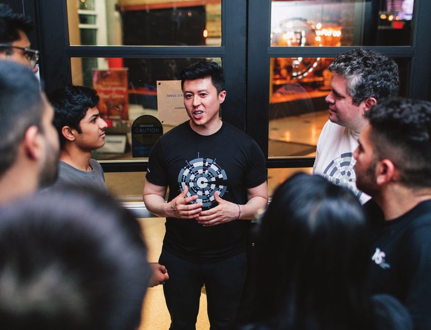
OU R B R A N D                        3

Our Brand
Philosophy

Seated at the intersection of
advertising and technology,
Index Exchange was built to
make things simple. Our brand
mirrors the company’s founding
pillars of authenticity, intention,
sophistication, and transparency.
Like our technology solutions, the
Index Exchange brand provides a
personalized and approachable
user experience. We’re the Ad
Exchange that media companies
and Marketers trust.

LOGO S                                4

Our Logo

Also known as the squares, our logo
should be the primary presentation
of our brand. Built with internal
harmony, the squares have a
symmetrical relationship between
them that signifies growth, motion,
and progress. The squares should
be used wherever possible, however,
when branding in markets where we
are less known, the expanded logo
should be used.

Download logos here

LOGO S                                       5

Let It Breathe

                                         x
                                 x

Our logo is given the
space it deserves.
                                     x
Imagine an invisible “bounding
box” equal to the height (here
shown as “x”) of the logo that
surrounds it entirely.
LOGO S                                6

Logo Do’s

Correct colors
Our logo looks best in blue, black,
and white.

LOGO S                                                              7

Logo Don’ts                           TRADEMARK    BREATHING ROOM

1. Trademark
    Don’t use the squares with a      DISTORTION   BACKGROUND

    trademark if it is not legible.
2. Breathing Room
    Don’t use the logo without
    ample breathing room.
3. Distortion
    Don’t use a distorted logo.
4. Background
    Don’t place the squares
    against a complex graphic or
    background.
LOGO S 8
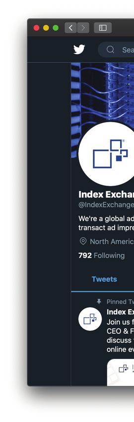
Social Icon
Construction
Andrew
@acasale
Alex Gar
@agardn
When using the squares as a social Will Doh
@wrdohe
media profile image, ensure that
there is adequate breathing room
within any container.
LOGO S                                 9

Expanded Logo

Our full text logo is impactful, and
is specifically used when we want to
make a statement in international
markets or at engagements where
we are less known. It is to be used
sparingly and when the squares do
not suffice.
LOGO S                                        10

Let It (Also) Breathe

                                      x

                                  x

                                          x

Let the expanded logo breathe —
space around it communicates
openness and precision.
LOGO S 11 Expanded Logo Do’s Correct colors Our expanded logo looks best in blue, black, and white.
LOGO S                                                                                           12

Expanded                             TRADEMARK                 BREATHING ROOM

Logo Don’ts

1. Trademark                                     TRADEMARK                     BREATHING ROOM

    Don’t use the expanded
    logo with a trademark if it is   DISTORTION                BACKGROUND

    not legible.
2. Breathing Room
    Don’t use the logo without
    ample breathing room.
3. Distortion
    Don’t use a distorted logo.
4. Background
    Don’t place the expanded logo
    against a complex graphic or
                                                  DISTORTION
    background.
C OLO R 13 Color Palette Our choice of colors, like our logo, is intended to express our most cherished ideals. While the squares do this through their structure and order, our colors set the tone of our identity through the emotional response they elicit in our audience.
C OLO R                                                   14

                                       ICE WHITE
                                       R255 G255 B255
                                       C0 M0 Y0 K0
                                       HEX #FFFFFF

Primary Colors

                                       INDEX BLUE
                                       PMS 7687C
                                       R29 G66 B138
                                       C79 M52 Y1 K27
                                       HEX #1D428A

                                       BLUE JAY
                                       PMS 282C
                                       R4 G30 B66
                                       C100 M90 Y13 K68
Ice White should be the dominant       HEX #041E42
color in most cases, with Index Blue
as the primary accent. Blue Jay and
Night Sky can serve to ground the
                                       NIGHT SKY
duo and add contrast and emphasis
                                       PMS BLACK 6C
wherever needed, and the other
                                       R0 G0 B0
colors in our collection should be     C0 M0 Y0 K100
used sparingly and only in small       HEX #000006
quantities when appropriate.
C OLO R 15
GREY JAY 90% 80% 60% 40% 20%
PMS 537C / 7543U
R174 G190 B204
C15 B7 Y0 Y0
HEX #AEBECC
Secondary Colors BRIGHT SKY
PMS 299C / 2995U
90% 80% 60% 40% 20%
R44 G172 B226
C81 M24 Y0 K11
HEX #2CACE2
WINTERGREEN 90% 80% 60% 40% 20%
PMS 7478C / 7478U
R136 G229 B193
C41 M0 Y16 K10
HEX #88E5C1
RAPTOR PURPLE 90% 80% 60% 40% 20%
PMS 265C / 266U
R130 G89 B247
C47 M64 Y0 K3
HEX #8259F7
VIOLA 90% 80% 60% 40% 20%
PMS 2715C / 2715U
R143 G142 B248
C42 M43 Y0 K3
HEX #8F8EF8
Our secondary colors are to be
used to add a spark in an otherwise
HEADER TAG PINK 90% 80% 60% 40% 20%
straightforward design. They should
PMS 213C
almost never be utilized as the R222 G57 B110
C0 M92 Y18 K0
dominant color. 100% saturation is HEX #DE396E
preferred in most cases.T Y PO GR A P H Y 16
Aa Bb Cc
Primary Font:
Adelle Sans
We chose Adelle Sans for its clean, ABCDEFGHIJKLMNOPQRSTUVWXYZ THIN
simple construction as well as the
abcdefghijklmnopqrstuvwxyz Titles, Headings, and Body Copy
versatility it affords with its various
weights. These weights can be used
in a variety of different ways, with ABCDEFGHIJKLMNOPQRSTUVWXYZ SEMI BOLD
some examples listed on this page. abcdefghijklmnopqrstuvwxyz Headings, Subheadings, and Emphasis
We like our collateral to be visually
powerful, intellectually elegant, and ABCDEFGHIJKLMNOPQRSTUVWXYZ BOLD
above all timeless. abcdefghijklmnopqrstuvwxyz Subheadings, Emphasis, and AttributionsT Y PO GR A P H Y 17
Aa Bb Cc
Secondary Font:
Arial
As a complement to our signature
typeface, Arial should be used in ABCDEFGHIJKLMNOPQRSTUVWXYZ REGULAR
instances where Adelle Sans is not abcdefghijklmnopqrstuvwxyz Titles, Headings, and Body Copy
available. Arial comes packaged
with the installation of any
Microsoft Office product (including ABCDEFGHIJKLMNOPQRSTUVWXYZ BOLD
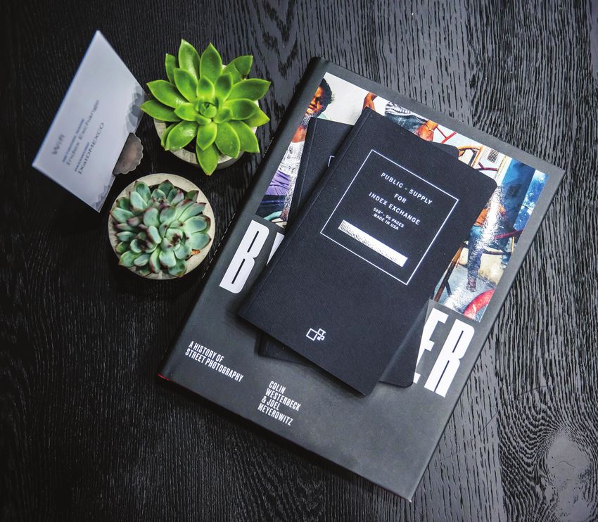
Powerpoint, Word, etc.). abcdefghijklmnopqrstuvwxyz Subheadings, Emphasis, and AttributionsPH OTO GR A P H Y 18 Photography Style Our photography should reflect the originality of our spirit at Index Exchange. The imagery we select is clean, bright, elegant, natural, and authentic.
I C O N O GR A P H Y                      19

Our Icon Library

We utilize line icons to illustrate our
story in a more simple, visual way.
Our icons make presentations and
other collateral approachable, and
easy to follow.
Questions? Please contact creative@indexexchange.com

                    ©2020 INDEX EXCHANGE
You can also read