Linking Geosocial Sensing with the Socio-Demographic Fabric of Smart Cities
←
→
Page content transcription
If your browser does not render page correctly, please read the page content below
International Journal of
              Geo-Information

Article
Linking Geosocial Sensing with the Socio-Demographic Fabric
of Smart Cities
Frank O. Ostermann

                                           Department of Geo-Information Processing, University of Twente, 7500AE Enschede, The Netherlands;
                                           f.o.ostermann@utwente.nl

                                           Abstract: Technological advances have enabled new sources of geoinformation, such as geosocial
                                           media, and have supported the propagation of the concept of smart cities. This paper argues that a
                                           city cannot be smart without citizens in the loop, and that a geosocial sensor might be one component
                                           to achieve that. First, we need to better understand which facets of urban life could be detected by
                                           a geosocial sensor, and how to calibrate it. This requires replicable studies that foster longitudinal
                                           and comparative research. Consequently, this paper examines the relationship between geosocial
                                           media content and socio-demographic census data for a global city, London, at two administrative
                                           levels. It aims for a transparent study design to encourage replication, using Term Frequency—
                                           Inverse Document Frequency of keywords, rule-based and word-embedding sentiment analysis,
                                           and local cluster analysis. The findings of limited links between geosocial media content and socio-
                                           demographic characteristics support earlier critiques on the utility of geosocial media for smart city
                                           planning purposes. The paper concludes that passive listening to publicly available geosocial media,
                                           in contrast to pro-active engagement with citizens, seems of limited use to understand and improve
                                           urban quality of life.


                                           Keywords: geosocial media; user-generated geographic content; smart city; smart citizen; social
Citation: Ostermann, F.O. Linking
                                           sensing; replication; reproducibility
Geosocial Sensing with the
Socio-Demographic Fabric of Smart
Cities. ISPRS Int. J. Geo-Inf. 2021, 10,
52. https://doi.org/10.3390/ijgi1002
                                           1. Introduction
0052
                                           1.1. Motivation
Academic Editor: Hartwig                        This research is grounded in the notion that smart cities based only on (machine)
H. Hochmair                                sensors and the (machine) computation of sensor input will remain “dumb” cities, because
Received: 7 November 2020                  they do not take the socio-spatial dimension of the citizens into account (the term “citizen”
Accepted: 20 January 2021                  can include the connotation of having certain exclusive (political) rights, i.e., potentially
Published: 27 January 2021                 marginalizing groups such as (undocumented) migrants; this study argues that every
                                           inhabitant of a city has equal rights to it [1], and thus uses “citizen” in its most inclusive
Publisher’s Note: MDPI stays neutral       meaning). Nevertheless, rejecting new technological developments and their use in society
with regard to jurisdictional claims in    and by citizens is no solution either, because so many of our daily activities are now
published maps and institutional affil-    happening entirely online or are guided by location-based services. This leads to closer
iations.
                                           interaction between the physical world and the digital dimension, which a geosocial sensor
                                           might help to capture [2].
                                                A geosocial sensor captures information from social media and social networks that is
                                           linkable to a physical place, e.g., through coordinate metadata or mentions of place names.
Copyright: © 2021 by the author.           Such a geosocial sensor might reveal layers of urban fabric and spatial practices that are
Licensee MDPI, Basel, Switzerland.         inaccessible by other means. Collective urban imaginaries continue to be an important
This article is an open access article     dimension of urban life, and geosocial media reflect and shape our perception of urban
distributed under the terms and            space and urban places [3].
conditions of the Creative Commons
                                                When considered with an understanding of the interplays between digital and physical
Attribution (CC BY) license (https://
                                           urban geographies, a geosocial sensor might support more pro-active, citizen-driven
creativecommons.org/licenses/by/
                                           urban planning, departing from current top-down conceptualizations of urban planning.
4.0/).

ISPRS Int. J. Geo-Inf. 2021, 10, 52. https://doi.org/10.3390/ijgi10020052                                      https://www.mdpi.com/journal/ijgi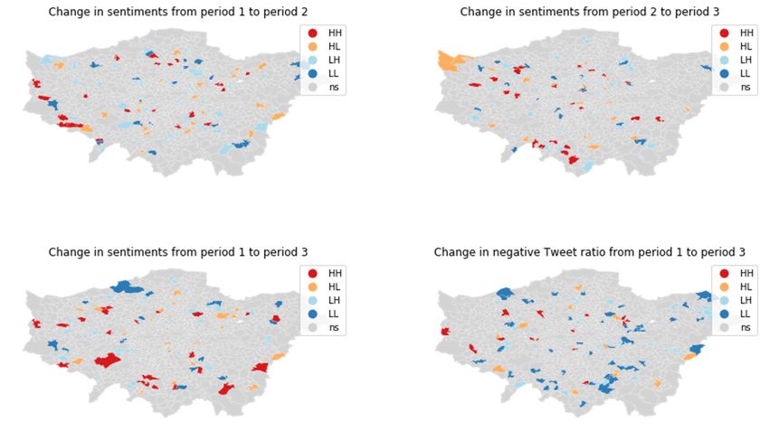
ISPRS Int. J. Geo-Inf. 2021, 10, 52                                                                                               2 of 22

                                      Capturing a sense of place and social capital requires spatialization for improving urban
                                      planning that currently relies on artificial administrative boundaries [4,5]. Although
                                      technology allows for much greater participation of citizens and inhabitants than ever
                                      before, it can also erect new barriers and a digital divide [6] by requiring specific (digital)
                                      skills to participate, and by emerging exclusionary community practices.
                                              Geosocial media could support an assessment of various goals and indicators of well-
                                      being, such as UN sustainable development goals or quality of life (QoL), because they
                                      integrate into the daily lives of citizens. Other work has shown that dedicated interfaces for
                                      interaction do not always work better: for example, [7] presents five different case studies
                                      around Dublin and conclude that “crowd-sourced spatial data appears to rarely extend
                                      beyond what can be produced from one or two clicks of a mouse, highlighting the need for
                                      a facility to automatically geo-tag photographs from smartphones onto the evolving map.
                                      [ . . . ], workshops have highlighted that interactive online mapping tools must address
                                      both a digital divide and a ‘map-literacy divide’ [ . . . ]”, confirming that interfacing urban
                                      intelligence is anything but trivial [8]. Before using geosocial media in any sensing capacity,
                                      we need to understand at least three issues better.
                                              First, how does geosocial media usage vary over space and time, and what are
                                      its interactions and interrelations in production and consumption? Such information is
                                      necessary to calibrate the geosocial sensor for longitudinal (comparing developments over
                                      time) or cross-sectional (comparing cities) analyses.
                                              Second, how does geosocial media relate to urban and socio-demographic charac-
                                      teristics, which we know about or acquire by other means, e.g., traditional census data?
                                      Without a deeper understanding, we cannot distinguish correlation from causation, nor
                                      identify spurious correlations detected by highly sensitive, sophisticated quantitative
                                      analysis methods.
                                              Third, what is its relationship with the geographic features of urban space, i.e., discrete
                                      and vague places? Administrative partitions in particular continue to be of importance
                                      in the discussion and implementation of any policy. Without such knowledge, we risk
                                      overlooking patterns because of the modifiable areal unit problem (MAUP) and apply
                                      interventions at the wrong scale or location.
                                              Understanding what geosocial media can and cannot show us supports the develop-
                                      ment of much needed mechanisms for government and public actors to use crowdsourced
                                      and volunteered geographic information to complement or update official data. Remaining
                                      critical and transparent is crucial: many critiques of geosocial media point out that much
                                      research follows a techno-optimistic motivation, where finding something seems more
                                      important than validating its veracity, meaning and utility [9]. When we view the smart
                                      cities of the future as coded and benchmarked cities [10,11], we need to ensure that citizens
                                      can participate and benefit beyond the simple provision of ever-increasing volume of data
                                      for the smart city algorithms [12].
                                              The next section argues that, by now, we have evidence that geosocial media usage is
                                      related to certain demographics and that we can detect certain content, but that we cannot
                                      use it in isolation from other data sets, and that we do not know enough yet how geosocial
                                      media content relates to social fabric of a city.

                                      1.2. Related Work
                                           There is a large and growing research body on geosocial media usage in urban envi-
                                      ronments. The studies can be loosely grouped into addressing three main questions:
                                           First, who contributes? Most studies rely on inference from location about contributors,
                                      which is risky, because the where part of geosocial media is not always reliable (see below).
                                      Few studies try to find out more about contributors from the posts themselves, such as
                                      links between Twitter usage and age and occupation [13], or income and education of
                                      contributors [14]. Spatially varying demographics are discernible from Tweets [15], but
                                      much of the information or conclusions are also available from traditional census data, and
                                      for novel insights, a more fine-grained analysis would be needed [16].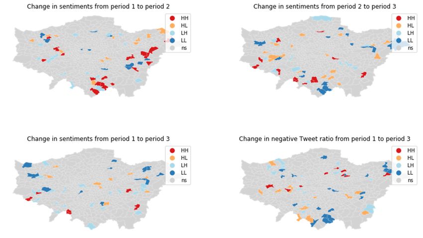
ISPRS Int. J. Geo-Inf. 2021, 10, 52                                                                                            3 of 22

                                            Second, what can we learn from the combinations of who, where, when and what?
                                      Several studies aim to find functional regions or sense of place beyond the administrative
                                      boundaries [17–19], either without prior knowledge of placenames [20], or by using existing
                                      placenames as starting point [21]. However, results often confirm some aspects of what
                                      we already know from other sources about a neighborhood. Using Foursquare check-ins,
                                      pioneering work by [22] identified spatio-semantic clusters. However, platforms such
                                      as Foursquare or TripAdvisor [23] as primary data sources can be problematic, because
                                      they focus on commercial points of interest and act as a gate-keeper to the potential
                                      activities that can be detected. Other approaches [24] try to add semantics from analysis
                                      of the geographic context. [25] investigated spatio-temporal and semantic clusters of
                                      Tweets with some success but remained critical about the explanatory power of the found
                                      clusters and the dependence of the outcomes on the choice of hyperparameters. Several
                                      studies, e.g., [26–28], used Latent Dirichlet Allocation for detecting spatially-bound topics
                                      in geosocial media, while [29] proposed a spatial variation of Term Frequency—Inverse
                                      Document Frequency (TF-IDF).
                                            Third, how does the content relate to the reality on the ground, or ground truth?
                                      Workplace-related activities can be grounded more reliably in space and time than resi-
                                      dential activities [30]. Investigations into the information geographies in London [31] and
                                      Los Angeles [32] show correlations between information density of areas and their socio-
                                      economic characteristics, but the model performances also show that other, unaccounted
                                      factors play significant roles. This contrasts with [33], who found that areas in California
                                      with more affluent and white population could explain higher Tweet counts. However,
                                      differences in methods (e.g., normalization of Tweet count by workday population) could
                                      explain this. At the regional scale of US county level, there are large variations in socio-
                                      demographic biases of the Twitter user base [34]. At neighborhood scale, action spaces of
                                      Twitter users are very different between “white” and “black” users in Louisville, Kentucky,
                                      prompting the authors to suggest better integration of social theory in Twitter-based re-
                                      search [35]. Again for London, [28] investigated Twitter topics and their relationship with
                                      many user and area characteristics. However, there is little information on the validation
                                      of the found topics. While socio-economic status and sentiments seem to correlate posi-
                                      tively, other studies of sentiments and socio-demographic variables are inconclusive, e.g.,
                                      showing that during disasters, more affluent counties have more Twitter activity, but that
                                      otherwise no clear correlations between sentiment and socio-demographic variables are
                                      visible [36]. Other research [37] even found a partly negative correlation between happiness
                                      and health, i.e., the happier, the unhealthier. At the scale of entire cities, [38] conducted
                                      a massive study on the relationship between “Twitter happiness” and demographic and
                                      place characteristics, and [39] investigated nation-wide sentiments towards a historic event
                                      (Women’s March 2017).
                                            There is also a growing body of literature that critically examines the validity and
                                      meaningfulness of the presented results: on the representativeness of data and transfer-
                                      ability of results, [40] investigated relationships between socio-demographic census data
                                      and non-English speakers in Houston, Texas and warned about sweeping statements made
                                      on the basis of geosocial media because of non-stationarity. Further, only 75% of geoso-
                                      cial media were local in nature [41]. This is compounded by overlapping themes, topics
                                      and events and outlier Tweets, leading to warnings about using geosocial media without
                                      a-priori deeper understanding [42]. This is supported by a comparison of three sentiment
                                      analysis methods in [43], who argue that sentiment detection from Tweets is too unreliable
                                      to use in planning contexts.
                                            Regarding QoL indicators, the rich literature, e.g., [44,45] rarely used location-based
                                      networks [46] or geosocial media. One of the opportunities of geosocial media is to
                                      find information on perceived and real problems, supporting small-area estimations and
                                      enriching traditional large-area statistics and labor-intensive surveys such as [47]. Ref. [48]
                                      found differences in QoL perceptions in Tweets from Bristol, but also warn against using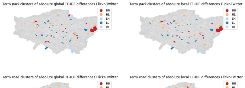
ISPRS Int. J. Geo-Inf. 2021, 10, 52                                                                                             4 of 22

                                      Twitter as a proxy for surveys, although Tweets might help to detect issues that QoL
                                      surveys struggle to detect.
                                          In summary, the relationship between geosocial media creation and content, and the
                                      underlying urban processes [49] in the context of smart cities [50] need further investigation.
                                      The current work is still inconclusive about correlations and patterns and fragmented in
                                      geographic case studies of various periods of investigation.

                                      1.3. Research Objectives
                                           The previous section has presented the motivation for a large and diverse research
                                      agenda and has argued that much of the current work on geosocial media in urban contexts,
                                      while methodologically sound and advanced, lacks deeper evaluation and validation, and
                                      thus remains idiographic and difficult to compare. Further, the diversity of findings is
                                      compounded by the quickly changing nature of geosocial media use and platforms, calling
                                      for more longitudinal and cross-sectional studies.
                                           An important objective of this work is to embed and relate it with similar studies and
                                      provide sufficient information for other researchers to challenge the findings with different
                                      methodology or different data. This paper also aims to address, but cannot hope to solve
                                      on its own, the important question when results are similar enough so that we can claim a
                                      successful replication, thus allowing us to conclude something about the generalizability
                                      or transferability of studies, and the volatility of geosocial media. This study, therefore,
                                      continues prior work and builds on existing data and experience where possible, e.g., by
                                      partially replicating aspects of [31]. This paper focuses on two questions that are guided by
                                      the desire to utilize geosocial media for urban policymaking:
                                      1.   What are the criteria for a geosocial sensor based on geosocial media to be used as a
                                           smart city “sensor”?
                                      2.   What is the relation between content or sentiments of geosocial media and socio-
                                           demographic indicators (e.g., of deprivation) at two different administrative scales
                                           over time and space?
                                           This study addresses RQ1 through a literature study and qualitative evaluation of the
                                      quantitative analysis results of RQ2.
                                           RQ2 requires aspatial and spatial analysis methods. Because our understanding of
                                      geosocial media and noisy and unstructured data is still limited, the most sophisticated
                                      methods may not be automatically the most suitable ones. Rather, established and well-
                                      understood methods, combined with a careful evaluation, may deliver the most robust and
                                      thus “best” results. The analysis will use the global city of London, UK, as a case study,
                                      because of the ample open census and (English language) geosocial media data available,
                                      and the rich literature with which to compare the outcomes of this study. While this study
                                      obviously also relates to issues of privacy and ethical (good) governance, these are beyond
                                      the scope of this paper.

                                      1.4. Paper Structure
                                           After this section described the motivation and intention of the paper, the next section
                                      on materials and methods presents the data sets and methods used in the analysis. The
                                      third section on results presents the main findings, while a fourth section discusses both
                                      analysis approach and results in context and concludes the paper. All scripts and other
                                      materials supporting replication or reproduction are available as supplementary materials
                                      in a public repository [51].

                                      2. Materials and Methods
                                      2.1. Data Sets
                                           The first step is to query suitable geosocial media data sources. The number of publicly
                                      available geosocial media sources has been in decline, with Twitter and Flickr remaining
                                      two main sources. This study’s query used a bounding box covering the greater London
                                      area (lower left corner at [−0.489,51.280], and upper right corner at [0.236,51.686]), accessing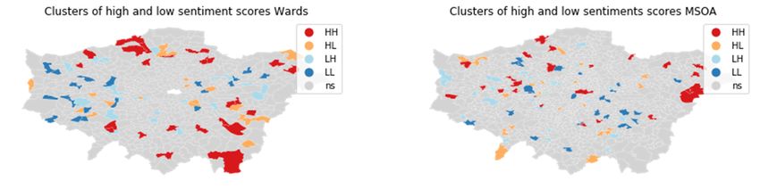
ISPRS Int. J. Geo-Inf. 2021, 10, 52                                                                                              5 of 22

                                      the Twitter Streaming API, the Flickr Search API, and socio-demographic data from the
                                      London Datastore [52].

                                      2.1.1. Twitter Data
                                            The Twitter data collection uses an Amazon Web Services EC2 instance running a
                                      Python script (TwitterStreamingAPI_London.py) to access the Twitter Streaming API. The
                                      search query is the bounding box without keyword filtering. All returned Tweets are saved
                                      as original JSON objects in text files. The script is restarted every hour to prevent data loss
                                      by occasional breakups of the connection. Over the entire period of almost three years
                                      (11 July 2017 until 30 June 2020), less than 2% of the time the connection did not record any
                                      data. Given a total retrieved data volume of 5,806,420 Tweets, this loss seems negligible.
                                            There is still some ongoing disagreement in the literature over sampling and the false
                                      negative rate when using the free Twitter API access. According to the available documen-
                                      tation and some experimentation, Twitter does no random or stratified sampling on results
                                      for the regular Streaming API endpoint (not to be confused with the statuses/sample and
                                      Decahose API endpoints, which provide a random sample of 1% and 10%, respectively).
                                      Further, the Streaming API returns an error code if the consuming service does not manage
                                      to keep up, which was never reached in this case. For this query, we can therefore assume
                                      that the data set is sufficiently complete.
                                            All Tweets were inserted into a PostgreSQL 11/PostGIS 2.5 database, converting the
                                      latitude/longitude fields into point geometries, and removing any duplicates. [51] contains
                                      a text file (Tweet_IDs.csv) with all Tweet IDs, conforming with Twitter Terms of Service (ToS)
                                      and privacy regulations. Any replication attempt can use these Tweet IDs to reconstruct
                                      the data set.
                                            To improve classifier performance, this study experimented with several ways to
                                      flag bots and advertisement accounts and exclude them from further analysis. A two-
                                      step approach was chosen: The first step takes advantage of the fact that many bots use
                                      stationary locations and Tweet with a high frequency. It counts the number of Tweets for
                                      each user coming from the same coordinates on the same day, and then marks all user
                                      accounts as bots who have more than 10 such Tweets. This first step results in 0.46% of all
                                      users having Tweets marked as bots, accounting for 22% of all Tweets, which is remarkably
                                      similar to [31]. The second step looks at the source field in Tweet metadata, and through
                                      manual validation identifies several additional bot or advertisement accounts, raising the
                                      total of bot Tweets to 26.5%, with a total of 4,265,248 non-bot Tweets remaining. The exact
                                      SQL commands are found in bot_identification.sql. The subsequent analyses use only Tweets
                                      marked as non-bots.

                                      2.1.2. Flickr Data
                                            The Flickr data set comprises the period from 2004 until the first half of 2020 (including)
                                      for an area including all of London.
                                            Data until 2014 were provided by the GIScience Center of the University of Zurich (see
                                      acknowledgements). From 2015 onwards, this study used a Python script (FlickrSearchAPI_
                                      London.py) that retrieved the same metadata during the first half of January and July for
                                      the preceding half year (i.e., 01 January until 30 June, and 01 July until 31 December,
                                      respectively) to account for “late uploaders”. The script uses the same bounding box to
                                      retrieve all metadata including raw tags, before removing all duplicates and replacing
                                      special characters such as line feeds or tabs with spaces, saving everything in tab-separated
                                      text files.
                                            In total, this study uses metadata from 6,730,535 Flickr images. For replication, it is
                                      advisable to retrieve the metadata again and compare the result set with the provided
                                      Flickr photo IDs (Flickr_IDs.csv), because users might have deleted or changed photos and
                                      metadata in the meantime. All metadata were inserted into a PostgreSQL 11/PostGIS
                                      2.5 database, converting the coordinate fields to a geometry.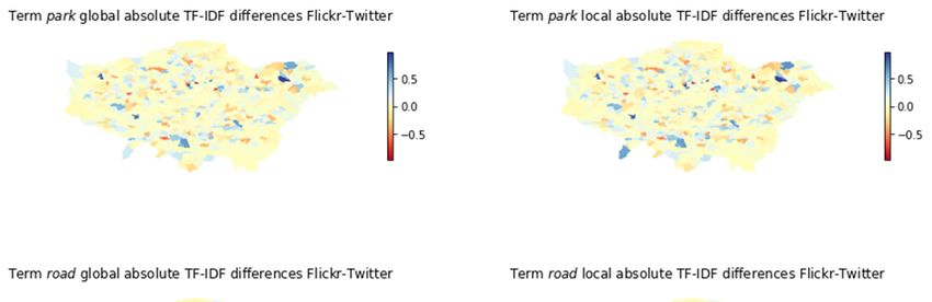
ISPRS Int. J. Geo-Inf. 2021, 10, 52                                                                                             6 of 22

                                      2.1.3. Socio-Demographic Data
                                           All administrative data (boundaries and socio-demographic statistics) were retrieved
                                      from [52] (For all maps, the following is therefore applicable: “Contains National Statistics
                                      data © Crown copyright and database right [2015]” and “Contains Ordnance Survey data
                                      © Crown copyright and database right [2015]”). Currently, this analysis uses 2011 statistical
                                      boundaries at the Medium Super Output Area (MSOA) and ward level. For the purposes
                                      of the analysis, these files were loaded into the same PostgreSQL 11/PostGIS 2.5 data base
                                      using the shp2psql importer tool and transformed from EPSG 27,700 to 4326 (WGS84), like
                                      the geosocial data sets.
                                           This study uses three sources of socio-demographic data: First, MSOA census data for
                                      2011; second, indices of multiple deprivation (IMD) for 2019; third, the London Output
                                      Area Classification (LOAC) for 2011.
                                           All the above socio-demographic data were available in Excel spreadsheets, with the
                                      variables of interest (see following section) as columns of the administrative units (rows).
                                      Several manual selection and filtering steps were necessary to create text files that could be
                                      ingested easily by the analysis libraries. Unfortunately, neither the manual steps nor the
                                      output can be provided in [51] for reasons of copyright, but they can be reverse-engineered
                                      from the provided code.

                                      2.2. Methods and Processing
                                           To address RQ1, a qualitative analysis and interpretation is based on the literature
                                      of Section 1.2 and the results of the case study. A keyword-based TF-IDF analysis of
                                      geospatial semantics and correlation analysis and spatial analysis on the relation between
                                      socio-demographic indicators and geosocial media sentiments address RQ2. The workflow
                                      has four main steps:
                                      1.   Use a dictionary of descriptive terms and calculate (spatial) TF-IDF scores (Section 2.2.1).
                                      2.   Test several sentiment classifiers and validate results with manual inspection of a
                                           random sample of Tweets (Section 2.2.2).
                                      3.   Apply chosen sentiment analysis methods to full Twitter data set and correlate and
                                           model with socio-demographics (Section 2.2.3).
                                      4.   Continue with spatial and temporal analysis for both (spatial) TF-IDF and sentiments
                                           (Section 2.2.4).
                                           To determine in which MSOA or ward a Tweet or image is located. For this, the point
                                      geometries of Tweets and images are intersected with the MSOA and wards polygons, and
                                      their codes added to the Tweet and image metadata. This leaves 6,257,702 Flickr images
                                      and 3,585,742 non-bot Tweets for further analysis.

                                      2.2.1. Semantics with Spatial TF-IDF
                                           In order to aggregate semantics of individual posts for an area such as MSOAs,
                                      this study builds on previous work [20,53], and uses a controlled dictionary and lexical
                                      matching approach. The controlled dictionary contains terms relating to activities, elements,
                                      and qualities of places. For use in this study, the original three sets were combined by
                                      stemming the terms (using the NLTK Porter stemmed) and removing duplicates, resulting
                                      in 470 terms (compare terms_stemmed.txt).
                                           Next, Python scripts ({Flickr, Twitter}BuildTermVectors.py) parsed, tokenized, and
                                      stemmed the Tweet text field and the concatenated Flickr image title, description and
                                      Flickr tags fields for matches with the dictionary terms. Any found terms were added to a
                                      term vector for each individual Tweet or Flickr image metadata.
                                           To find out which terms describe an (administrative) area particularly well, this
                                      analysis implements the well-known TF-IDF measure to identify terms, and investigates
                                      whether their descriptiveness is local or global by adopting the spatial TF-IDF analysis
                                      as described by [29], distinguishing between a global TF-IDF (all areas are used in the
                                      calculation) and local TF-IDF (only the neighboring areas are used). A geosocial sensor
                                      useful for local planning should be able to pick up local signals from geosocial media.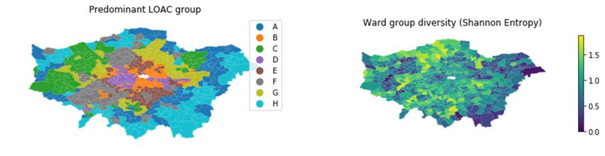
ISPRS Int. J. Geo-Inf. 2021, 10, 52                                                                                            7 of 22

                                      Thus, if a term has a high TF-IDF score in an administrative area, it can be interpreted to be
                                      descriptive (called semantic uniqueness in [29]) of that area because it does not appear in
                                      many other areas. If the global TF-IDF score is high, it is descriptive of London. If the local
                                      TF-IDF score is high, it is descriptive for that neighborhood.
                                             The Jupyter notebook TF-IDF_computation.ipynb uses the SciKit-learn library to com-
                                      pute global and local TF-IDF scores. In total, 4,656,821 Flickr images have at least one found
                                      term, compared to 2,583,022 Tweets. Then TF-IDF_analysis.ipynb compares the top-ranking
                                      (i.e., most descriptive) 5 terms per MSOA, by following these steps for both global and
                                      local TF-IDF:
                                      1.   Find Top-5 terms per MSOA (i.e., rank terms according to TF-IDF scores per MSOA
                                           and choose the five highest).
                                      2.   Count frequencies of all terms being in an MSOA Top-5 and then sum the reverse of
                                           those ranks (i.e., ranked first counts as a score of 5, ranked second as 4, etc.), to rank
                                           the terms according to their frequency of appearance in the MSOA Top-5.
                                      3.   For the 5 terms ranked highest in step 2, look up their global and local scores in
                                           each MSOA.
                                      4.   Compare the global and local TF-IDF scores of those overall top-ranked terms.
                                          Step 4 uses the stats module from the SciPy package to compare the two matched
                                      samples: First, to measure how well global and local TF-IDF scores agree, i.e., a correlation
                                      analysis using Spearman’s rho, Wilcoxon signed rank, and Kendall–Tau. Second, to test
                                      whether global and local TF-IDF scores are significantly different (not belonging to the
                                      same population), i.e., a paired z-Test (assuming normality because of large sample size).

                                      2.2.2. Sentiments from Geosocial Media
                                            One facet of geospatial semantics are sentiments expressed in geosocial media. A
                                      manual investigation of Flickr metadata showed that only a minority of textual content
                                      expressed sentiments, and therefore this study focuses on Twitter data. Ref. [54] identified
                                      several sentiment analyzers (OpinionLexicon, SentiStrength, SO-CAL, AFINN, VADER) as
                                      similar in performance for geosocial media, while [55] identified differences in performance
                                      over various data sets. The performance of labMT [56] is similar to VADER [37].
                                            Taking into account license restrictions, active development, and results from [57], this
                                      study tests three approaches: TextBlob as simple baseline, sentiment140 with TF-IDF and
                                      logistic regression (TF-IDF+LR from hereon) as example for word-embedding approaches,
                                      and the Python implementation of VADER [58] as an example for rule-based lexical ap-
                                      proaches that performed well in [54]. The translation of output scores into sentiment classes
                                      initially follows the suggestions in the documentation and literature.
                                            To test the performance of the sentiment analyzers, a random sample of 10,000 Tweets
                                      was fed to each classifier. From the result set, a stratified sample of 500 of each sentiment
                                      class (negative, positive, neutral) was manually evaluated (compare sentiment_computation.py).
                                      Because the performance evaluation of the classifier is not the objective of this work, a
                                      single rater is deemed sufficient. Based on the outcomes, the actual sentiments for the
                                      Twitter data are computed.
                                            The individual sentiment scores are aggregated using the arithmetic mean at the
                                      MSOA and ward level. This analysis can be found in the sentiment_analysis.ipynb.

                                      2.2.3. Sentiments and Socio-Demographic Indicators
                                           The results from spatial TF-IDF and sentiment analysis were then examined for
                                      correlations using Spearman’s rho with the census variables in the following Table 1 (all
                                      similar to [31]; for details, see notebooks mentioned in Section 2.2.2):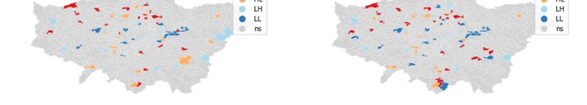
ISPRS Int. J. Geo-Inf. 2021, 10, 52                                                                                                  8 of 22

                                      Table 1. Census variables used.

                                           Variable                                        Explanation
                                        age_0-15_perc
                                        age_16-29_perc
                                        age_30-44_perc           Percentage of that respective age group in residential population
                                        age_45-64_perc
                                         age_65_perc
                                          qual_4min        Percentage of highest level of qualification (Level 4 qualifications and above)
                                          hh_1p_perc                         Percentage of single-person households
                                         hh_cpl_perc                          Percentage of two-person households
                                       hh_cpl_kids_perc                Percentage of two-person households with children
                                         BAME_perc                 Percentage of Black, Asian, and Minority Ethnic residents

                                           The assumption is that demographic variables could reflect and impact on living con-
                                      ditions and thus indirectly on detectable sentiments. Additionally, the analysis examined
                                      correlations with the IMD for 2019. Because the IMD are reported at the Lower Super
                                      Output Area (LSOA) level, they were aggregated (arithmetic mean) at the MSOA level.
                                           The last socio-demographic variables are the super-groups found in the LOAC. The
                                      LOAC groups residents according to multiple socio-demographic variables at three levels:
                                      Super-groups, groups, and sub-groups. This analysis starts with the 8 super-groups:
                                      Intermediate Lifestyles, High Density and High Rise Flats, Settled Asians, Urban Elites,
                                      City Vibe, London Life-Cycle, Multi-ethnic Suburbs and Ageing City Fringe. These super-
                                      groups allow a more holistic perspective on socio-demographics than individual variables.
                                      They are available at Output Area (OA) and ward level. Aggregating Tweets at OA is not
                                      desirable, because too many OAs have a Tweet count too low for robust statistical analysis.
                                      Although there are fewer wards than MSOA, they are comparable in scale, and using both
                                      MSOA and wards also enables us to check for outcomes for the MAUP. To operationalize
                                      the LOAC super-groups, this study determines the predominant (i.e., the most populous)
                                      super-group per ward, and the Shannon entropy diversity index to describe how varied
                                      the ward is in terms of super-groups.
                                           To examine whether the wards with different predominant super-groups are also
                                      different in terms of sentiments, the average sentiments are compared for one continuous
                                      dependent variable (sentiment score), one discrete independent variable (predominant
                                      super-group) and 8 independent samples (the super-groups). If homogeneity of variance
                                      and normality do not hold, the analysis uses the Kruskal Wallis test, otherwise a one-
                                      way ANOVA.
                                           This was followed by ordinary least squares (OLS) linear regression modeling for
                                      predicting sentiment scores at the MSOA level based on selected variables. The OLS
                                      modeling is the first step in line with the paper’s secondary objective of providing a
                                      baseline analysis, before more advanced methods are applied. The hypothesis here is that
                                      lower IMD corresponds to lower unhappiness, and that some socio-economic variables or
                                      LOAC super-groups might predict sentiment scores. If appropriate, the analysis will model
                                      sentiments using Geographically Weighted Regressions if there is spatial autocorrelation in
                                      the OLS regression results (compare [59]).

                                      2.2.4. Spatial Distributions and Changes over Time
                                           Concerning TF-IDF analysis, while nominal variables such as terms can be represented
                                      as dummy variables in spatial clustering, the results are not as reliable, and the number of
                                      terms is high. Thus, all investigations used the aggregated (overall) Top-5 terms that can
                                      be found in both Flickr and Twitter, and considered both local and global ones, starting
                                      with a visual exploration of differences in scores, followed by a spatial analysis of clusters
                                      using local Moran’s I, using the PySAL library.
                                           The analysis then used the same approach to examine spatial clusters of positive and
                                      negative sentiments through local Moran’s I, on both ward and MSOA level to check for
                                      the influence of MAUP. Finally, this study investigates the changes over time in sentiments
ISPRS Int. J. Geo-Inf. 2021, 10, 52 9 of 22
between time periods in terms of percentage of change, followed by a spatial clustering
analysis of those changes (again Local Moran’s I). All analysis of spatial and temporal
patterns can be found in spatial_temporal_analysis.ipynb.
3. Results
3.1. Criteria for a Geosocial Sensor
The requirements for a geosocial sensor resemble those of existing remote sensors
and other forms of data captures: first, we need to know how when and where the sensor
can pick up any data at all, i.e., which parts of the population use social media when and
where. Second, we need to know which wavelengths we can detect and which not, i.e.,
what information we can find, extract, or infer from detected social media content. Third,
we need to know the precision and accuracy of the signals that it picked up, i.e., how
reliably we can classify social media into particular topics etc. More than a decade ago,
none of these requirements were fulfilled, because the uncertainties were simply unknown
and unquantified. Building on the literature, it is possible to assess how well the current
situation fulfills the necessary requirements for a geosocial sensor, forming the basis for a
discussion in Section 4. The assessment’s structure follows established quality measures.
A recurring theme is the heterogeneity and bias in geosocial media data: contrary
to traditional data collection, geosocial media are an opportunistic data collection ap-
proach [60] that does not guarantee a certain level of coverage and quality (compare [61]
for a recent overview of quality assessment). This main issue of coverage (or represen-
tativeness, or completeness) concerns all dimensions (spatial, temporal, demographic).
We can retrieve Tweets only from locations where people who use Twitter are, and who
have opted into the location feature. This double limitation renders Twitter insufficient
for use as the only data source, even if numbers are high enough for statistical inference
and hypothesis testing. A lack of spatial and temporal coverage can be addressed by
comparing the geosocial data with other data sources and applying post-stratification
measures. Demographics is more difficult because we still do not know enough about
geosocial media users. Biases can be estimated based on the style of Tweets or location.
Since we can expect for the future that a larger share of the population will be active on at
least one social network platform, if only because younger generations grow up with them
and likely to continue using them, we can try to address demographic biases by combining
as many platforms (sources) as possible. Still, issues of demographic coverage always need
to be considered, and are likely to reduce fitness-for-use in many cases.
Another problem for using geosocial media in evidence-based policy making is their
volatility, or lack of guaranteed availability: geosocial media are hosted on privately-
owned platforms with often restrictive and changing ToS. This is further complicated from
a reproducible research point of view since users can delete content. While this issue could
be mitigated by scraping and storing as much content as possible, such data management
strategy often violates not only ToS but also privacy laws and ethical research standards.
At the moment, there seems to be an unsolvable issue with availability and volatility. As
long as this issue remains, geosocial media cannot become the only, or maybe not even
primary, source of data.
Any quality issues of consistency (or comparability between data subsets) are partially
related to the internal volatility (e.g., content fields change like Twitter’s text field), but
also the external volatility with new platforms emerging and others declining. One could
argue that this has stabilized in the past years. However, a motivation for this research
is the scarcity of longitudinal studies. Concerning comparability and consistency, more
research is needed to understand this better, but this is often hindered by the mentioned
lack of reproducibility [62].
Accuracy (positional accuracy for time and space, and thematic accuracy for content)
and the related concept of credibility (often linked to lineage or provenance) have been a
focus of much research. Accuracy is least of a problem for the temporal dimension because
the time stamp of geosocial media posts is usually reliable. Furthermore, the related qualityISPRS Int. J. Geo-Inf. 2021, 10, 52 10 of 22
issue of timeliness (or latency) forms less of a problem since most geosocial media are
published in (near) real-time. Thematic accuracy (e.g., whether a Tweet is on-topic and
truthful) certainly is an issue, but also depends strongly on the research interest. However,
sentiment analysis is still prone to miss human irony or more complex negations (e.g., a
sentence about many negative things preceded by a “despite” or similar) and ambiguous
or conflicting emotions. Positional accuracy is a difficult issue at finer granularities because
instead of using coordinates, many geosocial media now use place-names at sometimes
coarser granularities (compare Section 4). Geographic resolution and temporal accuracy
need to match research interest. Issues of accuracy can be addressed with proper methods
such as probabilities for location and topic or theme, and manual validation whether we
can detect what we are interested in.
Overall, uneven coverage, issues of availability, and consistency seem the most serious
problems, while accuracy and credibility turned out to be less of a problem than originally
thought years ago. However, a related problem is that of noise, or spam and advertisements,
which make it difficult to find the needle in the haystack. The following sub-sections
address several of these issues.
3.2. Geosocial Semantics and Socio-Demographic Indicators
The TF-IDF investigation of Flickr terms revealed that from the overall top-ranking
five terms, four are present in both global and local results (park, road, station, square), with
hill only being in the global overall Top-5, and garden only being in the local overall Top-5.
This shows a remarkable similarity between terms that are descriptive at the very local
level (an MSOA and its neighbors), and the entire study area level.
This is also reflected when looking at correlations between local and global TF-IDF
scores: all Spearman’s rho at the level of MSOAs are significant at p < 0.01 and strongly
positively correlated. The non-parametric Wilcoxon test reveals that we can reject for more
than half of the MSOA that they come from the same distribution at the p < 0.01 level, and
fewer with the parametric T-Test (full results in Flickr_TF-IDF_stats_glocal.csv).
Comparing overall summed ranks of terms with a Kendall–Tau test shows a strong
positive correlation (tau = 0.89) that is statistically significant (p < 0.001), even after remov-
ing terms that have neither local nor global Top-5 ranks (tau = 0.87, p < 0.001).
For Twitter, there are higher correlations between local and global TF-IDF scores (see
Twitter_TF-IDF_stats_glocal.csv) than for Flickr, and the overall top-ranking five terms are
the same for the local and global TF-IDF analysis (love, day, new, park, road), although the
terms themselves are clearly different from Flickr. Kendall–Tau results for overall Top-5
term scores are similar to Flickr (tau = 0.90 for all terms, and tau = 0.86 for those with Top-5
rankings; p < 0.001 for both).
In summary, there are no meaningful differences between global and local TF-IDF
scores for Twitter data, and only minor differences in Flickr caused by a few terms, neither
of them suggesting further analysis. However, Flickr Top-5 terms are all about geographic
features, compared to only two for Twitter. Together with Flickr’s overall higher share of
data with coordinates, this supports the assumption that there is more explicitly geographic
information on Flickr than on Twitter.
The last analysis step is to investigate linkages between the found terms and socio-
demographic indicators. This step considers only the two overall top-ranking terms shared
by Flickr and Twitter (park and road) as candidates. While roads may be related to traf-
fic noise, air pollution and road accidents and have an impact on expressed sentiments,
the ubiquity of roads throughout the study area suggests investigating park instead. The
uneven distribution of actual parks in the study area means that the term park has the
potential to reflect underlying socio-economic conditions [63]. However, the analysis found
no correlations between any of the socio-demographic variables, and an OLS regression
analysis produces no useful models or informative output. Likewise, comparing (correlat-
ing) local and global park scores with IMD 2019 does not show any meaningful correlations
(all values < |0.1|), nor statistically significant ones (all p > 0.05).ISPRS Int. J. Geo-Inf. 2021, 10, 52 11 of 22
3.3. Sentiments and Socio-Demographic Indicators
Moving to sentiment analysis, the performance of the Textblob sentiment analysis is
overall not impressive and its accuracy is low. Table 2 shows that the TF-IDF+LR using the
sentiment140 training set also has a lower accuracy (55%) than expected. The main cause
seems to be neutral Tweets that are classified as negative or positive, even after adjusting
the probability thresholds.
Table 2. Validation of initial TF-IDF+LR sentiment classification.
Manual Classification
Algorithmic Classification Grand Total
Negative Neutral Positive
Negative 292 177 31 500
Neutral 20 381 99 500
Positive 0 192 308 500
Grand Total 312 192 308 1500
VADER initially did not recognize certain emojis. Unfortunately, even after fixing this
(vaderSentiment_mod.py), its accuracy is only 68%, like TF-IDF+LR mostly due to neutral
Tweets being classified as either positive or negative (compare Table 3 below).
Table 3. Validation of initial VADER sentiment classification.
Manual Classification
Algorithmic Classification Grand Total
Negative Neutral Positive
Negative 293 191 16 500
Neutral 7 491 2 500
Positive 7 256 237 500
Grand Total 307 938 255 1500
An important outcome of the manual evaluation is that despite the brevity of Tweets,
it is often impossible to define one clear sentiment per post, because many express both
positive and negative sentiments, e.g., “it was a great time in London, so sad to leave” or
“what a great party, totally wasted now”. Fortunately, a Tweet classified as either positive
or negative is very rarely the opposite.
The final sentiment analyzer used in this study includes only English-language Tweets
and combines both classifiers, using threshold values gained empirically from exploring
the results of the manually validated samples:
Any Tweet with a VADER score lower than −0.1 and a TF-IDF+LR positive sentiment
score lower than 0.25 is classified as Negative (value = 0), while any Tweet with a VADER
score higher than 0.1 and a TF-IDF+LR positive sentiment score higher than 0.90 is classified
as Positive (value = 2). Any remaining Tweets were classified as neutral or unclear Tweet
(value = 1).
The combined rules (see Table 4) provide a notably improved accuracy of 83% through-
out the samples, although a fifth of those classified as positive are neutral, and to a lesser
extent vice versa. Accuracy and precision are highest for negative predicted sentiment and
lowest for positive predicted sentiment. Because the classes are not evenly split in reality
(as opposed to the stratified validation sample), actual accuracy might be lower. However,
it will still be higher than without combination, and is considered sufficient.ISPRS Int. J. Geo-Inf. 2021, 10, 52 12 of 22
Table 4. Validation of combined sentiment classification.
Manual Classification
Algorithmic Classification Grand Total
Negative Neutral Positive
Negative 446 52 2 500
Neutral 14 411 75 500
Positive 1 107 392 500
Grand Total 461 570 469 1500
The results for non-bot, English-language Tweets that originate from within an MSOA
are: 40,107 negative, 2,595,365 neutral and 618,490 positive. The low number of negative
Tweets is surprising, even when taking possible misclassifications as neutral into account.
The analysis used the aggregated (mean) sentiments per MSOA (thus, higher scores
mean more positive sentiments). Concerning correlations with the socio-demographic
variables, there are few notable correlations (listing only those with a coefficient >= |0.1|):
negative with children and teenagers (−0.13), young adults (−0.1), and BAME percentage
(−0.22); positive with older adults (0.1), higher qualification (0.12), households of couples
(0.14), and house prices (0.13). These are not surprising and are all statistically significant
(p < 0.01).
There is small negative correlation with IMD 2019 scores, i.e., higher sentiment scores
mean lower IMD index (Spearman’s rho −0.13, Pearson r −0.12, both at p < 0.001). However,
again the correlation seems too small to warrant further investigation or modeling.
The modeling of average sentiment value with OLS regressions uses the same variables
as [31], but has very low R2-scores (R2 = 0.05). Even after removing MSOAs with low
Tweet counts and focusing on core socio-demographic covariates, the R2-values do not
increase. Another option uses the original floating point sentiment scores instead of the
rule-based three classes and calculates a negative Tweet ratio, i.e., the ratio of negative
Tweets vs. All Tweets, to check whether the low absolute count of Tweets has an influence.
However, overall, the outcomes do not improve significantly, with all R-squared for OLS
regression remaining below 0.1. Results are thus not very encouraging, and do not suggest
continuation with Partial Least Square Regression or Geographically Weighted Regression.
Looking at the LOAC, Table 5 below shows that wards where super-group C (Settled
Asians) is predominant have the lowest average sentiment score, the highest negative
Tweet ratio, as well as the lowest Shannon entropy score (thus being comparatively homo-
geneous). Super-group H (Ageing City Fringe) wards have the highest sentiment average
but comparatively low Shannon entropy. Super-group D (Urban Elites) wards have the
lowest negative Tweet ratio, but this could be a result of super-group D being prominent in
central locations, which might coincide with a high number of (positive) tourist Tweets.
Wards with predominant super-groups E (City Vibe) and F (London Life-Cycle) have higher
Shannon entropy and are thus comparatively diverse, and also have relatively high average
sentiment scores (for full per-ward statistics, see sentiments_groups_wards.csv).
Table 5. Predominant London Output Area Classification (LOAC) groups and sentiments.
Predominant Tweet Negative Tweet Negative Average Average VADER Avg TF-IDF+LR Shannon
Group Count Count Tweet Ratio Sentiment Score Positive Score Entropy
A 1012.54 19.42 0.02 1.18 0.33 0.74 0.95
B 7927.45 99.54 0.01 1.17 0.30 0.75 1.02
C 1849.19 42.72 0.02 1.15 0.29 0.73 0.74
D 36,185.93 348.89 0.01 1.18 0.33 0.76 0.94
E 4491.02 56.06 0.01 1.18 0.32 0.76 1.12
F 3277.74 53.75 0.02 1.19 0.34 0.75 1.16
G 2125.75 31.34 0.02 1.17 0.31 0.74 0.95
H 1009.00 13.14 0.02 1.19 0.35 0.75 0.87ISPRS Int. J. Geo-Inf. 2021, 10, 52 13 of 22
When testing whether wards with different predominant super-groups have also
different average sentiments, Kruskal–Wallis and one-way ANOVA test results are all at
p < 0.001, providing initial evidence that average sentiments between wards with different
predominant super-groups have significantly different values. Post-hoc Dunn and Conover
tests using Holm correction show the following differences between super-groups at the
0.01 significance level:
Negative Tweet Ratio: D from all others
Average Sentiment: C from E, F and H
Average VADER score: A from B, C, F and H
Average TF-IDF+LR positive score: C from D, E and H
Shannon entropy: C from A, B, E, F and G, and pairings D-F, E-H and F-G
In summary, super-groups C and H are more frequently different in pair-wise compar-
isons than others, except for Shannon entropy. Super-group D is notably different only in
TF-IDF+LR sentiments and overall negative Tweet ratio.
Thus, wards with different predominant super-groups show differences in sentiments,
with C having consistently low scores and high negative Tweet ratio. However, the overall
differences are so small that any modelling is not promising.
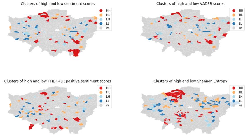
3.4. Geosocial Semantics in Space
This section compares the spatial distribution of park and road TF-IDF scores at local
and global levels between Flickr and Twitter.
A visual exploration of differences between all global and local Flickr Top-5 terms
does not show any clear spatial patterns. For Twitter, the spatial distribution between local
and global scores also seems very similar, as can be expected from the high correlation
between the two.
A visual analysis in Figure 1 of the differences between Flickr and Twitter global and
local scores for park shows a specific spatial pattern, but global park scores seem similar
between Flickr and Twitter, while local scores show larger differences between Flickr
and Twitter.
Concerning road, there are major differences between Flickr and Twitter at the global
(London-wide)
ISPRS Int. J. Geo-Inf. 2021, 10, x FOR PEER REVIEW level for central and peripheral MSOAs: In central MSOAs, road as descrip-
14 of 23
tive term is more relevant (higher TF-IDF score) for Twitter than for Flickr, while in the
periphery this is reversed (higher TF-IDF scores for Flickr).
Figure 1. The absolute global and local TF-IDF score differences between Flickr and Twitter for road and park.
Figure 1. The absolute global and local TF-IDF score differences between Flickr and Twitter for road and park.
A quantitative spatial cluster analysis of the common terms park and road has incon-
clusive results. A global Moran’s I analysis does not find statistically significant clustering
or dispersion. A local Moran’s I (see Figure 2 below) finds significant hot and cold spots
of differences in TF-IDF scores, but most clusters consist of few MSOAs, and the hot andISPRS Int. J. Geo-Inf. 2021, 10, 52 14 of 22
Figure 1. The absolute global and local TF-IDF score differences between Flickr and Twitter for road and park.
AA quantitative
quantitative spatial
spatial cluster
cluster analysis
analysis of
of the
the common
common terms terms park
park and
and road
road has
has incon-
incon-
clusive results. A global Moran’s I analysis does not find statistically significant clustering
clusive results. A global Moran’s I analysis does not find statistically significant clustering
or dispersion. A
or dispersion. A local
local Moran’s
Moran’sII(see(seeFigure
Figure2 2below)
below)finds
findssignificant
significant
hothot and
and cold
cold spots
spots of
of differences in TF-IDF scores, but most clusters consist of few MSOAs, and
differences in TF-IDF scores, but most clusters consist of few MSOAs, and the hot and cold the hot and
cold
spotsspots are scattered
are scattered throughout
throughout the study
the study area.
area. An An investigation
investigation whether
whether park ispark is cor-
correlated
related with green
with urban urban might
green might be futile
be futile because
because therethere are many
are many place
place names
names with with “Park”
“Park” in
in their
their name,
name, which
which may
may havefound
have foundtheir
theirway
wayininthe
thegeosocial
geosocialmedia
media text
text and metadata,
and thus are “correct” but due to changing urban landscape do not refer to any actual
green anymore.
Figure 2. Spatial
Figure 2. Spatial clusters
clusters(local Moran’sI, I,p <
(localMoran’s pbut apart from
sentiment scorea (I
clear homogeneous
= 0.014, positive
p = 0.28) are not. cluster in the north west of the study, there
are noFigure
clear patterns
3 shows to distinguish.
that for local Moran’s I, while sentiment scores seem to be somewhat
higher in the periphery than in the center, clear patterns are difficult to distinguish. The
diversity (or homogeneity) of LOAC super-groups at ward level is more clearly patterned,
ISPRS Int. J. Geo-Inf. 2021, 10, 52 but apart from a clear homogeneous positive cluster in the north west of the study,15there of 22
are no clear patterns to distinguish.
Figure 3. Spatial clusters (local Moran’s I, p < 0.05) of sentiment scores and LOAC diversity.
A visual comparison between the results for wards and MSOA in Figure 4 shows
that, although wards and MSOA are not that different in size and areas, the MAUP still
Figure 3. Spatial clusters
leadsclusters (local
to very(local Moran’s
different I, p < 0.05) of sentiment scores and LOAC diversity.
outcomes.
Figure 3. Spatial Moran’s I, p < 0.05) of sentiment scores and LOAC diversity.
A visual comparison between the results for wards and MSOA in Figure 4 shows
that, although wards and MSOA are not that different in size and areas, the MAUP still
leads to very different outcomes.
Figure 4. Comparison of spatial clusters (local Moran’s I, p < 0.05) of sentiment scores for wards and MSOA.
Figure 4. Comparison of spatial clusters (local Moran’s I, p < 0.05) of sentiment scores for wards and MSOA.
3.6. Developments over Time
One problem for an analysis of changes over time is to find sensible periods to compare.
While it may
Figure 4. Comparison of spatial be tempting
clusters to use
(local Moran’s I, pthe entire
< 0.05) data set and
of sentiment calendar
scores years,
for wards this analysis uses
and MSOA.
time periods similar to those in [31], i.e., 1 October until 31 May, because the omission of
months June to September allows to avoid very large events which often happen during
the summer months, as well as minimize the effects of tourist peak season. Thus, there are
three periods (P1-3) to investigate differences in sentiments (absolute scores, negative Tweet
ratios) between periods on an MSOA basis, comparing P1- > P2, P2- > P3 and P1- > P3.
Overall, as Table 6 below shows for wards with more than 10 Tweets, there is a
slight increase in sentiment scores from P1 to P2, while there is not much change from
P2 to P3. We also see a pronounced decline in number of Tweets from P2 to P3, possibly
due to a change in Twitter API that stopped supporting precise GNSS coordinates (see
also Section 4). While it may be counter-intuitive that some MSOA report an increase in
sentiment scores yet also a rise in negative Tweets ratio, this can be explained by more
positive Tweets (i.e., a polarization of sentiments).Tweets (i.e., a polarization of sentiments).
Table 6. Sentiments and their changes (in percentage points) per ward over time periods. Sent = Sentiment, P = time period,
NTR = negative Tweet ratio.
ISPRS Int. J. Geo-Inf. 2021, 10, 52 16 of 22
Count Count Count Sent P1 -> Sent P2 -> Sent P1 -> NTR P1 -
Sent P1 Sent P2 Sent P3
P1 P2 P3 P2 P3 P3 > P3
mean Table 6.
1508.01Sentiments and their
1137.16 changes (in percentage
716.90 points)
1.15 per ward
1.20 over time
1.20 periods. Sent
4.58 = Sentiment,
0.32 P = time period,
4.70 0.11
std NTR = negative Tweet
10,805.94 ratio.
8773.74 4822.94 0.06 0.08 0.08 7.10 7.33 7.91 1.56
min 12.00
Count P1 8.00
Count P2 Count P3 5.00
Sent P1 0.94
Sent P2 0.91
Sent P3 0.90
Sent P1 -> P2 −25.00
Sent P2 -> P3 −25.78
Sent P1 -> P3 −26.85 −1.00
NTR P1 -> P3
25% mean 155.00 1508.01 121.00
1137.16 716.90 84.00 1.15 1.11
1.20 1.15
1.20 1.154.58 0.57 0.32 −3.27 4.70 0.50 0.11 −0.64
50% std 10,805.94
373.00 8773.74
291.00 4822.94 197.00 0.06 0.08
1.15 0.08
1.20 1.207.10 4.31 7.33 0.32 7.91 4.43 1.56 −0.16
min 12.00 8.00 5.00 0.94 0.91 0.90 −25.00 −25.78 −26.85 −1.00
75% 25% 902.00
155.00 614.00
121.00 84.00 472.00 1.11 1.18
1.15 1.24
1.15 1.240.57 8.27 −3.27 4.08 0.50 8.70 −0.64 0.20
50% 373.00 291.00 197.00 1.15 1.20 1.20 4.31 0.32 4.43 −0.16
max 75% 259,828 902.00 212,996 472.00 112,079
614.00 1.18 1.63
1.24 1.53
1.24 1.578.27 32.26 4.08 38.46 8.70 37.84 0.20 13.43
total max 942,507 259,828 212,996
710,722 112,079 448,063 1.63 1.53 1.57 32.26 38.46 37.84 13.43
total 942,507 710,722 448,063
TheThe
detection of change
detection clusters
of change requires
clusters requiresusing
usingthe
thefull
fulldataset
dataset(including
(includingwards
wards with
fewer
withthan 10 Tweets),
fewer since otherwise
than 10 Tweets), there there
since otherwise are too
aremany “islands”
too many (areas
“islands” without
(areas neigh-
without
bors). Figure 5Figure
neighbors). shows5 the local
shows theMoran’s I for changes
local Moran’s in both
I for changes wards
in both wardsandandMSOA.
MSOA.
Figure 5. Comparison of spatial clusters (local Moran’s I, p < 0.05) of changes in sentiment scores over time for MSOAs.
Figure 5. Comparison of spatial clusters (local Moran’s I, p < 0.05) of changes in sentiment scores over time for MSOAs.
A few clusters improved in sentiment while others decreased. No clear patterns are
discernible. To check for the occurrence of MAUP, the analysis also computes clusters of
changing sentiments again at ward level.
The outputs shown in Figure 6 are distinctly different from those of the MSOAs,
suggesting a strong MAUP influence. A visual comparison with the predominant LOAC
super-groups in Figure 7 does not suggest any clear patterns. Overall, the results do not
encourage a deeper analysis of spatio-temporal patterns with more advanced methods.You can also read