The binomial of interaction and visualization in digital news media: consolidation, standardization and future challenges
←
→
Page content transcription
If your browser does not render page correctly, please read the page content below
The binomial of interaction and
   visualization in digital news media:
   consolidation, standardization and
   future challenges
   Pere Freixa; Mario Pérez-Montoro; Lluís Codina

  Nota: Este artículo se puede leer en español en:
  http://www.profesionaldelainformacion.com/contenidos/2021/jul/freixa-perez-codina_es.pdf

   How to cite this article:
     Freixa, Pere; Pérez-Montoro, Mario; Codina, Lluís (2021). “The binomial of interaction and visualization in
     digital news media: consolidation, standardization and future challenges”. Profesional de la información, v. 30,
     n. 4, e300401.
     https://doi.org/10.3145/epi.2021.jul.01
                                                                                             Invited article received on May 31st 2021

                     Pere Freixa *                                                    Mario Pérez-Montoro
                     https://orcid.org/0000-0002-9199-1270                            https://orcid.org/0000-0003-2426-8119
                     Universitat Pompeu Fabra                                         Universitat de Barcelona
                     Departament de Comunicació                                       Fac. d’Informació i Mitjans Audiovisuals
                     Roc Boronat, 138                                                 CRICC Research Center
                     08018 Barcelona, Spain                                           Melcior de Palau, 140
                     pere.freixa@upf.edu                                              08014 Barcelona, Spain
                                                                                      perez-montoro@ub.edu

                     Lluís Codina
                     https://orcid.org/0000-0001-7020-1631
                     Universitat Pompeu Fabra
                     Departament de Comunicació
                     Roc Boronat, 138. 08018 Barcelona, Spain
                     UPF Barcelona School of Management
                     Balmes, 134. 08008 Barcelona, Spain
                     lluis.codina@upf.edu

Abstract
Interaction and visualization together yield an interesting, fruitful, and promising combination for producing content in
digital news media. In an era in which the press no longer exclusively provides the news, interaction and visualization
combined in innovative products for the public are powerful value propositions for the media. Together, they are capa-
ble of winning readers’ loyalty and engagement, both of which are crucial for the media’s sustainability. In this work, we
present a review of the literature and formulate the theoretical bases for this binomial pairing and its main components,
which, we argue, should be available to citizens, the interests of whom journalism must defend if it aspires to be viable.
Keywords
Interactive visualizations; Digital journalism; Cyberjournalism; Online media; InfoVis; Digital media; Interactive docu-
mentary; Journalistic innovation; Interactive storytelling.

   Funding
   This work is part of the project “Interactive storytelling and digital visibility in interactive documentary and structu-
   red journalism”. RTI2018-095714-B-C21 (Micinn/Feder). Spanish Ministry of Science, Innovation and Universities.

e300401                                                    Profesional de la información, 2021, v. 30, n. 4. e-ISSN: 1699-2407      1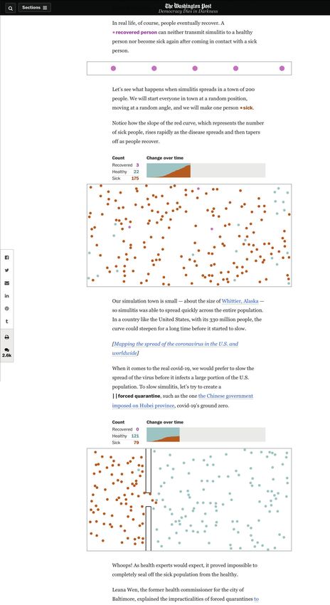
Pere Freixa; Mario Pérez-Montoro; Lluís Codina

1. Introduction: the binomial of interaction and visualization, a successful pairing
On 23 March 2020, just a few days after the WHO declared the world Covid-19 pandemic, Navid Mamoon and Gabriel
Rasskin, two students from Carnegie Mellon University, launched CovidVisualizer, an interactive visualization application
for practically real-time consultation, using a 3D recreation of the globe, of the number of Covid-19 victims and people
affected in every country in the world (Figure 1). In just a few weeks it had 70 million users. CovidViualizer is just one
of numerous interfaces (Jacob, 2020; Cascón-Katchadourian, 2020; Pérez-Montoro, 2021) that have been created to
facilitate understanding and with which to consult the statistical data constantly being recorded about the pandemic.
Its success is the result of its authors’ skill in designing a device that efficiently combines visualization and interaction.
Interactivity, in other words, enables users to explore maps and to establish their own visual narrative.
The media, national agencies and research centres have
used interactive resources to construct a narrative of             Interactivity enables users to explore
the epidemic with a focus on the aspects about it that             maps and to establish their own visual
are considered most significant (Danielson, 2020). They            narrative
have offset biased information (Bowe; Simmons; Mat-
tern, 2020) and used visualizations as models with which to forecast the pandemic’s evolution (Chen et al., 2020), often
revealing how hard it is to standardize and to validate sources of information (Ferrer-Sapena et al., 2020).
Pairing interactivity and visualization as a binomial enhances the media’s credibility and increases engagement with
users, as it places them at the core of processes of access, dialogue, and relation with data through interfaces (McKenna
et al., 2017; Pérez-Montoro; Freixa, 2018).
Thus, for example, in social communication, in contrast with traditional media in which the text of an article of jour-
nalism might have told a story using graphs and images to back it up or to endorse what was being narrated, these no
longer play such a secondary role in new digital media. Because of their interactive nature, these visual products now
occupy a predominant place in telling a story (Pérez-Montoro, 2018). That, at least, is the aspiration of media such as
The New York Times, the 2020 targets of which included improving visuals in reports and exploring new dynamics of
audience interaction (Leonhardt et al., 2017).
Recognizing the core significance of interaction and visualization in increasingly rich and complex information processes
allows for reappraisal of both the practices and the systems that we establish for them to take place. The digital ecosys-
tem has generated its own dynamics that call into question the relationships established among information, what is
perceived as narrative, the curation of diverse contents and forms of access, consumption, and participation. It also
makes it possible to explore what roles the agents who interact and engage with information should, can or are required
to play: journalists, documentalists, information curators, audiences, researchers, informing communities, media, and
receiving society (Freixa; Pérez-Montoro; Codina, 2020). Emphasizing the core significance of pairing interaction and
visualization also raises questions about how digital text, in a broad sense, is defined, designed, produced, consumed
and analysed: multimedia, mutable, modifiable and transmedia.
Use of interactive visualizations in the media has become common practice. They have been consolidated largely be-
cause of the standardization both of their
formats and of their development, which is
a factor that has allowed for a reduction in
production costs and more widespread use
in newsrooms, as simplification of proces-
ses has facilitated their application by edi-
tors and journalists who do not have spe-
cific training in programming or interaction
design.
The consolidation of standardized interacti-
ve resources in most newsrooms has relea-
sed centres of journalistic innovation from
the tasks of producing informative content
that generally hitherto occupied them. This
general circumstance is yielding some inte-
resting consequences:
- First, the standard use of interactive vi-
  sualizations in all kinds of media plays a
  significant role in enhancing the litera-
  cy of the newsrooms themselves and,
  particularly, of the audience (Brescia-
                                                   Figure 1. CovidVisualizer interactive real-time data visualization application.
  ni; Eppler, 2015). The understanding of          https://www.covidvisualizer.com

e300401                                                     Profesional de la información, 2021, v. 30, n. 4. e-ISSN: 1699-2407      2
The binomial of interaction and visualization in digital news media: consolidation, standardization and future challenges

  maps, graphics, and interactive galleries is becoming                Pairing interactivity and visualization as
  standard practice and expanding among users, who
                                                                       a binomial enhances the media’s credi-
  would otherwise probably be unaware of their poten-
  tial for articulating informative narratives.                        bility and increases engagement with
- Second, it gives research centres the freedom to con-                users, as it places them at the core of
  centrate on investigating, exploring, and imagining a                processes of access, dialogue, and rela-
  new generation of interactive audio-visual resources,                tion with data through interfaces
  which are the methods of communication we shall dis-
  cover and use in the coming decade.

2. The history of interactivity and visualization of information in the media
It is commonly accepted that digital technologies have triggered the transformation of the media and the process of
digital convergence, which has been consolidated through the establishment of Internet and social networking sites as
a new media ecosystem. Traditional and digital native media have colonized digital space and turned it into the core axis
of the media and the stage upon which most information processes are currently articulated. Journalism and journalists
have observed both very significant change in their work routines and a transformation of the medium, channels and the
methods of designing, producing and transmitting content. Digital media have incorporated interactivity as a defining
element, perceiving it as a principle that articulates different functions and technologies used in communication proces-
ses. In Jensen’s now classic definition, interactivity is
        “a measure of a media’s potential ability to let the user exert an influence on the content and/or form of the
        mediated communication” (1998, p. 201).
Interactivity has become an essential concept for understanding a medium characterized by a constant dialogue of
inputs and outputs among all the agents and actors involved in it, exchanges that define the medium itself: information
that is exchanged, stored, and processed, procedures that mutually feedback to one another to offer a system that
enables users to experience and become involved in the information and be part of it (Winograd, 1997). Interaction is
considered a value inherent to the medium that, to a greater or lesser extent, characterizes digital text. It is the rheto-
rical element that differentiates digital text from other formats. It defines exploration as a way of dealing with the text
(Aarseth, 1997) and, in the experience of receiving it, allows the narrative value of the explored content to be perceived
through it (Ryan, 2004; Cover, 2006). Kate Nash and Richard Walsh characterized interactive work by its capacity to
permit the emergence of content in the viewer’s process of exploration and interpretation (Walsh, 2011; Nash, 2014).
For most authors, interactivity and participation define the specificity of the digital medium (Boczkowski, 2004; Young;
Hermida; Fulda, 2017). Interactivity has been defined on the basis of the semantic capacity of markup language that
allows for hypertext and, subsequently, hypermedia links and nodes, a perspective that is established and posited in
Nelson and Landow (Nelson,1983; Landow, 1991) and that has been constantly reformulated and expanded (Pavlik,
2001; Aston, 2003, and others). Interactivity, as an inherent element of computational communication, is one of the
technological characteristics that have defined and conditioned digital communication and has allowed for the definition
of tools and resources for dialogue, in the form of platforms and protocols, procedures and processes. Communication
models have thus been defined (Schultz, 1999; Mcmillan, 2002). Despite the different rates of implementation and
development (Bachmann; Harlow, 2012; Barredo-Ibáñez; Díaz-Cerveró, 2017), interactivity actually forms part of the
current media ecosystem, even though its use has been shown to be limited and, in some cases, more marginal than
effective (Palau-Sampio; Sánchez-García, 2020).
Despite their joint presence in a many current areas of              Emphasizing the core significance of pai-
journalism, interaction and visualization have not always            ring interaction and visualization also
operated as a binomial pair. The presence of representa-
tions of information pre-dates the use of interaction in
                                                                     raises questions about how digital text,
information processes. It was the job of art departments             in a broad sense, is defined, designed,
in the traditional media to construct the graphics and               produced, consumed and analysed
infographics that accompanied texts and that, to a large
extent, were intended more to catch the eye than as a source of information (Cairo, 2012). It is, however, also in the
process of digitization and transformation from the analogue media system to the digital media ecosystem that different
ways of visually representing information have assumed crucial importance. In the cybermedia, their use has increased
significantly and become one of the main strategies currently employed by the media to tell stories (Segel; Heer, 2010;
Klanten; Ehmann; Schulze, 2011; Chen; Guo, 2020) and to convert data sources into visual information (Weber; Rall,
2012; Pentzold; Fechner, 2020). In contrast with traditional media in which the text of a journalistic article might have
told a story using graphs or visualizations to back it up or prove what was being narrated, in new digital media these no
longer play this secondary role. Because of its interactive nature, these visual products now occupy a predominant place
in storytelling (Pérez-Montoro, 2018; Kalatzi; Bratsas; Veglis, 2018).
The value of visualization lies in its contemplation of meanings and uses that transcend narrative. Because of increa-
sing definition, resolution, and size of screens, particularly on mobile devices, and the implementation in new devices

e300401                                                      Profesional de la información, 2021, v. 30, n. 4. e-ISSN: 1699-2407   3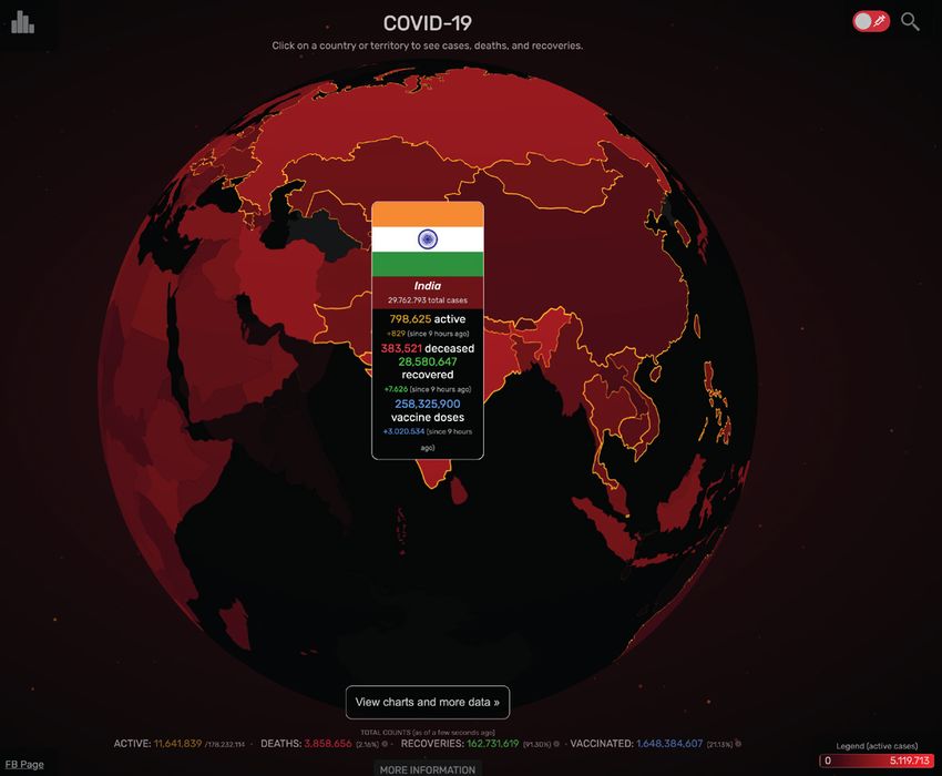
Pere Freixa; Mario Pérez-Montoro; Lluís Codina

of better resources for gestural
interaction, unrestricted visual
content can be offered, and
this plays an important part
in catching the attention of
and attracting users. For many
media, mobile devices have
become the main screen for
communication with users (En-
gebretsen; Kennedy; Webber,
2018). In the complex scena-
rio of cybermedia, in which it
is still unclear which business
models will last and which will
not, offering freely accessi-
ble information visualizations
plays a key role in marketing
plans to win audiences that
may subsequently consume                Figure 2. Interactive visualization showing the relationship established between the number of deaths
other paid content or purchase          due to a bullet shot and the years left to live, taking into account the statistical data of the deceased.
subscriptions. Visualizations of        Created by Periscopic, a company specialized in interactive data visualizations for the media.
                                        https://guns.periscopic.com/?year=2013
information, with their analyti-
cal and narrative power, can help to attract and keep new users. Thus, for example, some digital media (some of which,
but not all, are native), as a strategy, offer a limited number of these types of high-quality products for free, after which
the user decides whether it is worth paying and continuing to access these exclusive quality content (Figure 2).
Several authors such as Plaisant (2004) and Smiciklas (2012) confirm the economic return on the investment made in
the development (ROI) of visualizations for the cybermedia that include them. Basically, and among other consequen-
ces, content that includes visualizations or infographics prompt a significant increase in user interactivity on social media
with respect to that content. In some areas, such as political communication, their inclusion has not only increased in
recent years but has also marked a change of this sub-genre of news in which they play a crucial role, not only to attract
attention, but also as a narrative strategy (Amit-Danhi; Shifman, 2018).
The boom in the presence of interactive visualizations in cybermedia has not been accompanied by a significant increase
in academic studies or specific research that offer a better understanding of their multiple dimensions. Although today’s
cyberjournalism is characterized, among other things, by an intensive use of visualization to tell stories, scientific pro-
duction and theoretical contributions are neither significant in number nor in importance. Of the scientific literature
about data analysis and science, only 0.5% is devoted to data storytelling and data journalism (Ojo; Heravi, 2018).
Moreover, most of this scant production focuses on the study of these types of strategies based on analysis of just a
few cases or specific products or on analysis of the production in a specific country or city. Examples of the former can
be found in the work of Alexander and Vetere (2011), Stikeleather (2013) and Pouchard, Barton and Zilinski (2014),
and others. Significant studies that deal with geographical analysis include those that analyse the development of the
practice of these special types of proposals in Sweden (Appelgren; Nygren, 2014), Norway (Karlsen; Stavelin, 2014), and
Belgium (De-Maeyer et al. 2015), the United Kingdom (Knight, 2015) and the United States (Parasie; Dagiral, 2013; Fink;
Anderson, 2014; Parasie, 2015).
There is only one small series of proposals that has addressed this area of study from a broader or more systematic pers-
pective. These can be classified into three large groups. The first of these groups includes proposals that attempt analysis
focused mainly on the representative capacity –sometimes not in the context of journalism– of data visualization (Tufte,
1983; Few, 2012; and Cairo, 2017b; and others). The second group proposes dichotomous analysis and the division of
current visual works into two large groups, in accordance with criteria associated with their architectural structure such
as the browsing system they use (McKenna et al., 2017).
As an alternative, there are also proposals that approach these productions from a polyhedral perspective. The propo-
sals from the third group are therefore grouped together: faceted analyses that attempt to explain the phenomenon
of visualization in the cybermedia. These proposals adopt different perspectives or different criteria (facets) to simul-
taneously classify the same set of objects (the classification domain), thus increasing their explanatory power over and
above simple hierarchical analyses.
Some faceted studies do attempt to cover this analysis                         For most authors, interactivity and par-
of visual narratives with data (including Segel; Heer,
2010; and Lee et al., 2015). There are, however, expla-                        ticipation define the specificity of the
natory limitations to these proposals as they do not in-                       digital medium

e300401                                                              Profesional de la información, 2021, v. 30, n. 4. e-ISSN: 1699-2407        4
The binomial of interaction and visualization in digital news media: consolidation, standardization and future challenges
clusively and simultaneously address all, but rather just For many media, mobile devices have
a part, of the characteristics of these visual productions.
become the main screen for communi-
They contemplate aspects such as narrative genre, visual
narrative, narrative structure, and interaction, while lea- cation with users
ving out and not analysing all the dimensions related to
architectural aspects (organizational, navigational, and labelling systems, mainly) and the visualization-story ratio (Pé-
rez-Montoro, 2018).
3. Research and standardization. Tools and resources for digital newsrooms
The consolidation of interactive visualizations in digital newsrooms is largely due to the standardization of a series of
basic resources that writers and editors now generally have at their disposal. In designing the news, in addition to texts,
authors may also contemplate the use of interactive visualization resources with which to present the audience with the
data gathered, images and the archive material consulted while preparing the information. For many professionals, the
use of visualizations has been possible because of the
“the development of easy-to- use software, helping non-specialist journalists to make their own simple visualiza-
tions” (Engebretsen; Kennedy; Webber, 2018, p. 10).
These resources may be semantic (maps, time-
lines, bar graphs, etc.) or morphological (orde-
red by format, type, duration, etc.). Producing
interactive information mainly involves the task
of assembling modular resources. The authors
of the items decide on both the content to be
presented and the hierarchy with which the in-
terface is organized. Some methods of construc-
ting an interactive narrative, such as parallax
scrolling (Freixa et al., 2014; Córdoba-Cabús,
2020), are very well-established, have proven
to be effective in different areas and specialities
(Tulloch; Ramon, 2017) and provide the basis
for many large-format items (Hiippala, 2017;
Dowling, 2019), also referred to as literary
journalism (Jacobson; Marino; Gutsche, 2015)
or narrative journalism (Van-Krieken; Sanders,
2019).
The emergence of data visualization as inte-
ractive resources led to the incorporation of
specialists in newsrooms (Ferreras-Rodríguez,
2013). The development of specific applications
has, however, prompted a gradual reduction in
their cost and difficulty of implementation. The
use of maps or timelines, to name two of the
currently most broadly used interactive visua-
lizations for geolocating and temporizing infor-
mation, require decreasingly specialized equip-
ment in newsrooms. The media have numerous
tools for facilitating the creation and incorpora-
tion of visualizations in the body of the news.
Good examples of these are Datawrapper,
Maps4news, both of which are paid solutions,
although there also exist free applications like
StoryMap and both free and paid solutions such
as Google Flourish.
https://www.datawrapper.de
https://maps4news.com
https://storymap.knightlab.com
https://flourish.studio
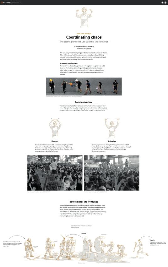
The specialization or non-specialization of Figure 3. Interface with interactive visualizations of the report “Why outbreaks like
newsrooms and the incorporation of specialized coronavirus spread exponentially, and how to ‘flatten the curve’”, created by The
Washington Post on March 14, 2020.
profiles have both been a significant feature of https://www.washingtonpost.com/graphics/2020/world/corona-simulator
e300401 Profesional de la información, 2021, v. 30, n. 4. e-ISSN: 1699-2407 5
Pere Freixa; Mario Pérez-Montoro; Lluís Codina

the process of establishing interactive resources in digi-             The boom in the presence of interacti-
tal media (Ribas; Freixa 1997; Soler-Adillon et al., 2016;
                                                                       ve visualizations in cybermedia has not
Caminero-Fernández; Sánchez-García, 2018). At the
start of this century, the high cost and the training re-              been accompanied by a significant in-
quirements greatly limited how widely they were used.                  crease in academic studies or specific re-
Standardization of resources has therefore been one of                 search that offer a better understanding
the challenges pursued by research centres and journa-                 of their multiple dimensions
lism innovation laboratories in recent years, as has the
simplification of implementation procedures.
International research centres and innovation laboratories such as the MIT Open Documentalism Lab, the BBC News
Lab, the Reuters Institute, and the Nieman Foundation, to mention the most obvious, have explored the potential of
visualization and interaction resources as a major part of the design of new formats of journalism (Salaverría, 2015;
López-García, Rodríguez-Vázquez; Pereira-Fariña, 2017). Projects that use interactive visualizations
        “directly enhance both data literacy and legibility, and at the same time, they stimulate user participation” (Uric-
        chio, 2016, p. 24).
The Reuters Institute predictions for 2021 appear to confirm those forecasts:
      “The Washington Post’s coronavirus simulator was its most viewed story ever and helped make the case for the
      establishment of a new department of seven journalists which will start this year” (Newman, 2021, p. 11).
The BBC Lab has been performing the Optimo project, which is a tool for transforming textual stories into visual and in-
teractive narratives, designed for mobile telephones (Caswell, 2019). Research into innovation in journalism has become
a productive area that addresses different dimensions (Paucar-Carrión; Coronel-Salas, 2019; García-Avilés, 2021) which
significantly include experimentation with the narrative forms possible with digital medium and networks, one of the
areas of innovation with the greatest potential for growth.

4. Making the invisible accessible and visible. Limitations and problems
The binomial pairing of interaction and visualization in the media would be incomplete without mention also of the
information that feeds the news items, information that can be both self-produced or collected from one or seve-
ral sources (Guallar; Codina, 2018). Visualization of information has grown so rapidly because of its effectiveness in
transforming hard-to-interpret and to-analyse content into visual representation. What is known as data journalism is
formalized on screen through visualizations, which are becoming increasingly interactive (Burmester et al., 2010). As
mentioned previously, visual information not only attracts the audience’s attention, but also effectively makes it possible
to view complex data (Cairo, 2017a). The transformation of complex sets of information and data into interactive visual
resources gives rise to problems of a different kind such as legibility (Uricchio, 2016), opacity (Zamith, 2019), and diffi-
culty in accessing data sources and/or verifying them (Porlezza; Splendore, 2019; Lewis; Al Nashmi, 2019). Journalism
and multimedia documentaries turn data into narratives through which they can be explained and contextualized. The
process, however, involves decision-making about the formalization, functionality and legibility of the sources and these
aspects can cause the audience to lose capacity for interpretation, reading and access (Appelgren, 2018).
Converting complex data and information into visualizations is not always an easy task, particularly when visualization
entails expressing graphically equations, formulas and algorithms that act on the data. Although interactive visualiza-
tions have amply proven their ability to turn this type of information into audio-visual narrative, several authors have
sounded warnings about the possibilities of bias and error in such visualizations, which McNutt, Kindlmann and Correll
(2020) refer to as visualization mirages.
The apparent accuracy of representations on a graph              Producing interactive information main-
about Covid-19 or about electoral results, to mention
some recent examples, may conceal errors that yield              ly involves the task of assembling modu-
misleading results, which often go unnoticed by the au-          lar resources
thors themselves. These may be due to problems with
backup data, or source data, with which there may be issues because of bias, because they are incomplete or because
they have been wrongly combined (Tang; Wu; Li, 2019), and what are known as dirty data (Kim et al., 2003) which requi-
re tools and verification processes (Kasica; Berret; Munzner, 2020).
Errors can occur:
- even if correct and well-coded data sources are available during the visualization design process;
- because are the result of interaction that causes frustration on account of its ineffectiveness, or that satisfies neither
  readers’ expectations nor fulfils the data’s potential (Appelgren, 2018);
- due to the complexity of the item and its interactive potential are not explored by a significant volume of readers
  (Young; Hermida; Fulda, 2017);
- because of reading or interpretation errors.

e300401                                                      Profesional de la información, 2021, v. 30, n. 4. e-ISSN: 1699-2407   6
The binomial of interaction and visualization in digital news media: consolidation, standardization and future challenges

The most common errors in the design of interactive vi-                          What is known as data journalism is
sualizations include classic infographic problems such as
                                                                                 formalized on screen through visualiza-
misuse or manipulation of scale, a process that accen-
tuates the appearance because of inadequate or exces-                            tions, which are becoming increasingly
sive data, which is known as hidden uncertainty. Table 1                         interactive
shows the errors most commonly encountered by diffe-
rent authors according to the four categories listed.
Table 1. Malpractice, mirages, and most common errors in interactive visualizations

        Area                               Error                                                   Effect caused

                        Lost or repeated registrations            Incorporation of data or inexact groupings in the visualization.
                                                                  Some statistical parameters can yield atypical values, generally at the ends of
                        Atypical or abnormal values
                                                                  the graphs, which can distort interpretation of the graphs.
 Backup data: elici-                                              Unspecific coding or overly interpretable allocation criteria may yield ambi-
 tation, curatorship,   Attribution errors                        guous data sets, which may lead to significant biases when combined with
 and screening                                                    other indicators in multiple comparisons.
                                                                  Excessive and inadequate. The choice of significant samples to demonstrate
                                                                  a certain hypothesis may give rise to HARKing (hypothesizing after the results
                        Sample size
                                                                  are known). In other situations, imbalance among groups of values may raise
                                                                  doubts about the results of multiple comparisons.
                                                                  The visualization contains decorative elements that could be interpreted as
                        Graphic noise
                                                                  misleading information.
                                                                  The design chosen for the visualization does not allow for good distribution of
 Design of the          Overlays
                                                                  the data and there are content overlaps that affect understanding.
 visualization
                                                                  Grouping content by area may lead to incorrect or difficult visual comparisons,
                        Uncertainty                               just as amplification or modification of the scale may lead to errors in data
                                                                  interpretation.
                        Insubstantiality                          Interactivity with visualization is irrelevant and does not add meaning.
                                                                  The behaviour of the interaction does not provide the user with a perception
                        Loss of agency                            of agency. It does not allow users to construct their own itinerary or to create a
                                                                  personalized interpretation.
                                                                  Interaction with the interactive resource does not allow consultation and
                        Inaccessible interaction
 Interaction                                                      access to the supporting data.
                                                                  In scenarios in which users could offer opinion, content or their own experien-
                        Limited participation                     ce arising from interaction with the resource, the system does not provide for
                                                                  feedback.
                                                                  The system records browsing data, asks users for opinions, and compiles
                        Invisibility in participation             information provided by them, but does not offer feedback either through
                                                                  visualization or other mechanisms.
                                                                  The visualization design tools offer default combinations intended to make
                        Default biases                            work easier for authors. Depending on how they are used, however, the results
                                                                  may be erroneous because of their poor adaptation to the data sets.
                                                                  The choice of a single visualization option turns users into a homogeneous
                        Inaccessible visualizations               group. Viewing problems or deficient devices may cause misinterpretations
 Interpretation and                                               and reading errors.
 reading                                                          When observing sets of visualizations, initial interpretations tend to condition
                        Anchor effect and reading errors          the later readings. Possible variations in visualizations may go unnoticed by
                                                                  users.
                                                                  The audience context conditions interaction and reading of interactive visuali-
                        Interpretive and confirmation biases      zations. Confirmation bias occurs when viewers look at data that confirm their
                                                                  hypotheses or preconceptions, and the evidence in its entirety is ignored.
Source: Own elaboration from McNutt, Kindlmann and Correll (2020), Uricchio (2016), Cairo (2017a), Zamith (2019), Appelgren (2018), and Porlezza
and Splendore (2019).

Interactive visualizations reveal the duality of their function by allowing not only a clearly authorial function of an ex-
planatory nature, but also the enormous exploratory potential of audiences (Barlow, 2014, Kirk, 2016). The promise of
exploration remains one of the conflicting aspects of interactive journalism and data journalism, discerned as a possibly
oversized scenario (Domingo, 2008) that lies somewhere between what could be and what eventually actually is.

5. Challenges of innovation and future trends
The standardization of interactive visualization resources is facilitating access to these media by non-specialized news-
rooms and small and medium-sized media. This circumstance is also accompanied by increasing knowledge among
journalists of the communication possibilities and potential of visualizations. Greater ease of execution and general

e300401                                                              Profesional de la información, 2021, v. 30, n. 4. e-ISSN: 1699-2407               7
Pere Freixa; Mario Pérez-Montoro; Lluís Codina
improvement in training (in narration with data, in interactive potential, in type and function of visualizations) makes it
likely that, in the coming years, interactive visual resources are likely to become commonplace and used fully in digital
newsrooms.
5.1. Complex visual and interactive narratives
For Albers (2015), complex narratives are those that offer users the chance to establish comparisons of relationships
and different data (flat information) and visualizations that establish a certain information flow and require a defined
reading sequence (information flow process). Their classification is still conditioned by difficulties of description. In the
study by Córdoba-Cabús (2020), for example, one type of complex visualization, which requires users to enter values or
variables, is classified in the other section as it is hard to reduce them to a single dominant element. Specialists such as
Cairo (2012) and McCandless (2014) defend the capacity of complex visualizations as a resource that allows concepts
and information to emerge through the conversion of interrelated data sets.
Complex visualizations, however, pose significant challenges, basically associated with the difficulties involved in co-
rrectly articulating multiple comparisons and giving them visual coherence, narrativity and rigour, and ensuring that the
audience interacting with them understands them properly. Some experiences place advances in visualizations at the
confluence of these resources with augmented reality (Aitamurto et al., 2020; Tejero-Calvo et al., 2020) and with im-
mersive non-fiction in virtual reality (De-la-Peña et al., 2010; Wang; Gu; Suh, 2018), which are environments that encou-
rage the perception of presence and greater
interaction of audiences (Roberts, 2018).
5.2. Interactive visualizations in news-
rooms
Not only does the incorporation of com-
plex interactive visualizations offer a chan-
ce to communicate with audiences, but
their development and implementation in
newsrooms is helping journalists to obtain
data and information. The production of
complex visualizations enables newsrooms
to research data analysis, interrelationships
among data and the possible ways in which
they may become effective visualizations
(Howe et al., 2017; Engebretsen; Kennedy;
Weber, 2018). Newsrooms have incorpora-
ted data visualization tools as further resour-
ces with which to select content and design
news (Wang; Diakopoulos, 2021).
In long journalistic formats, such as interac-
tive documentaries or large-format reports,
in which multimedia contents are combined
with one another to offer readers an inte-
ractive narrative experience (Freixa, 2018),
the traditional phases of ideation, data ga-
thering, and production of information have
changed considerably. Processes, which in-
volve teamwork, often become intermingled
and provide mutual feedback (Planer; Godu-
lla, 2020). Visualizations and prototypes are
part of the process.
5.3. Optimization and SEO of interactive
resources
Digital journalism, to be sustainable (Apabla-
za-Campos; Codina; Pedraza-Jiménez, 2018),
needs to reach its audiences through diffe-
rent platforms and particularly through the
results pages of search engines and of social
media such as Facebook and Twitter. Althou- Figure 4. Interactive report Visualizing the Hong Kong protests, from Reuters, showing
different uses of image processing and analysis. He was awarded an OJA award in 2020.
gh the ideal situation would be for the news
http://graphics.reuters.com/HONGKONG-EXTRADITION-CROWDSIZE/0100B05W0BE/
to be consumed on the portal of the medium index.html
e300401 Profesional de la información, 2021, v. 30, n. 4. e-ISSN: 1699-2407 8The binomial of interaction and visualization in digital news media: consolidation, standardization and future challenges
itself, readers use the platforms mentioned above as in- The standardization of interactive visua-
termediary channels. A significant amount of traffic there-
lization resources is facilitating access to
fore arrives through digital platforms and, mainly, through
Google’s search engine and its mobile applications such these media by non-specialized news-
as Google Discover. What this tells us is that digital media rooms and small and medium-sized media
should invest resources in the what is known as Search
Engine Optimization, or by its popular acronym SEO, to ensure that their productions reach their addressees in peak condi-
tion (Codina et al., 2016, Pérez-Montoro; Codina, 2017).
Fortunately, for some time now the best journalism has not followed the dreadful practice of “writing for Google”, but
has rather considered and adapted to the characteristics of the digital medium. This is the same what once occurred in
journalism with radio and television. With SEO, newsroom journalists should understand the characteristics of the digital
medium and, in particular, should have a proper conceptual knowledge of the algorithms that affect the visibility of news
in search engines and in applications such as Discover or in Facebook or Twitter newsfeed.
In turn, the strategic SEO managers in each newsroom should help writer journalists to choose the best news focus and
in matters such as the use of keywords, or how to apply the principles of twin nomenclature –journalistic and SEO– with
the help of metadata, among other resources (Lopezosa et al., 2020). The essential idea is for the SEO to ensure that the
best journalism reaches its natural audience, without the quality of the news or medium’s productions being affected by
anything that is not of use to society. It is this society that the medium represents and whose interests it should defend
first and foremost in order to justify itself in an era of abundant information and the loss of the media’s news exclusivity.
5.4. Standardization and specialization
In a recent study, Link, Henke and Möhring (2021) call into question improvements brought by interactive visualizations
insofar as the credibility of the message of journalism is concerned. They nonetheless note that the audience perceives
a better reading experience because of interaction with interactive visualization resources. The potential of interactive
visualizations to arouse interest and to motivate readers is broadly demonstrated in the media (Lee; Kim, 2016; Greu-
ssing; Kessler; Boomgaarden, 2020) and in specialist areas such as medical communication (Oh; Hwang; Lim, 2020).
The appeal of interactive visualizations and their greater capacity to motivate may convince digital media enough to use
them more and to make a commitment to them. The predominance of simple visualizations (Loosen; Reimer; De-Sil-
va-Schmidt, 2017; Young; Hermida; Fulda, 2017) highlights how visualization creation tools have penetrated newsrooms
on a fairly general basis and have allowed for some standardization of basic interactive visualizations such as timelines,
interactive charts and maps, and interactive infographics and animations.
To date, only a small number of digital media with specialized teams in data journalism, structured journalism, large
format journalism and interactive documentary have committed themselves to further development of the commu-
nicative potential that interactive visualizations can bring to cybermedia. Improvement in the development of specific
applications and easier access to reliable and contrasted data sources will allow –bearing in mind the evolution in recent
years– for general use of real-time visualizations, now possible because of Covid-19, and for more complex visualizations
in an increasing number of digital newsrooms.
6. Conclusions
We have examined the different perspectives that in-
fluence the binomial pairing of interaction and visua- The potential of interactive visualiza-
lization analysed in our research. We have established tions to arouse interest and to motivate
that both interaction and visualization will have a huge readers is broadly demonstrated in the
impact on the future of digital journalism.
media
This pairing can help to build audience loyalty and to
demonstrate the media’s commitment to its readers and to the society it is supposed to represent and whose interests
it is required to defend.
Interaction and visualization, together with other elements not considered here because of obvious limitations of space,
such as solutions journalism or structured journalism, to mention two other areas, therefore both represent a fruitful
field of research for academics and offer a range of opportunities for professionals.
7. References
Aarseth, Espen J. (1997). Cybertext: Perspectives on ergodic literature. Maryland: Johns Hopkins University Press. ISBN:
978 0 8018 5579 5
Aitamurto, Tanja; Aymerich-Franch, Laura; Saldívar, Jorge; Kircos, Catherine; Sadeghi, Yasamin; Sakshuwong, Sukolsak
(2020). “Examining augmented reality in journalism: Presence, knowledge gain, and perceived visual authenticity”. New
media & society, online first.
https://doi.org/10.1177/1461444820951925
e300401 Profesional de la información, 2021, v. 30, n. 4. e-ISSN: 1699-2407 9Pere Freixa; Mario Pérez-Montoro; Lluís Codina Albers, Michael J. (2015). “Infographics and communicating complex information”. In: Marcus Aaron (ed.). Design, user experience, and usability: Users and interactions, pp. 267-276. Cham: Springer. https://doi.org/10.1007/978-3-319-20898-5_26 Alexander, Stephanie; Vetere, Colleen (2011). “Telling the data story the right way”. Healthcare financial management, v. 65, n. 10, pp. 104-110. https://go.gale.com/ps/anonymous?id=GALE%7CA274025520 Amit-Danhi, Eedan R.; Shifman, Limor (2018). “Digital political infographics: A rhetorical palette of an emergent genre”. New media & society, v. 20, n. 10, pp. 3540-3559. https://doi.org/10.1177/1461444817750565 Apablaza-Campos, Alexis; Codina, Lluís; Pedraza-Jiménez, Rafael (2018). “Newsonomics in the interactive era: Dimen- sions of sustainability in the news media”. In: Pérez-Montoro, Mario (ed.). Interaction in digital news media. Cham: Palgrave Macmillan (Springer), pp. 115-146. Appelgren, Ester (2018). “An illusion of interactivity: The paternalistic side of data journalism”. Journalism practice, v. 12, n. 3, pp. 308-325. https://doi.org/10.1080/17512786.2017.1299032 Appelgren, Ester; Nygren, Gunnar (2014). “Data journalism in Sweden: Introducing new methods and genres of journa- lism into “old” organizations”. Digital journalism, v. 2, n. 3, pp. 394-405. https://doi.org/10.1080/21670811.2014.884344 Aston, Judith Y. (2003). Interactive multimedia: an investigation into its potential for communicating ideas and argu- ments. [Doctoral thesis]. London: Royal College of Art. Bachmann, Ingrid; Harlow, Summer (2012). “Interactividad y multimedialidad en periódicos latinoamericanos: avances en una transición incompleta”. Cuadernos de información, n. 30, pp. 41-52. https://doi.org/10.7764/cdi.30.421 Barlow, Mike (2014). Data visualization: A new language for storytelling. Sebastopol, CA: O’Reilly Media. ISBN: 978 1 491 94503 2 Barredo-Ibáñez, Daniel; Díaz-Cerveró, Elba (2017): “La interactividad en el periodismo digital latinoamericano. Un aná- lisis de los principales cibermedios de Colombia, México y Ecuador (2016)”. Revista latina de comunicación social, n. 72, pp. 273-294. https://doi.org/10.4185/RLCS-2017-1165 Boczkowski, Pablo J. (2004). “The processes of adopting multimedia and interactivity in three online newsrooms”. Jour- nal of communication, v. 54, n. 2, pp. 197-213. https://doi.org/10.1093/joc/54.2.197 Bowe, Emily; Simmons, Erin; Mattern, Shannon (2020). “Learning from lines: Critical Covid data visualizations and the quarantine quotidian”. Big data & society, v. 7, n. 2, 2053951720939236. https://doi.org/10.1177/2053951720939236 Bresciani, Sabrina; Eppler, Martin J. (2015). “The pitfalls of visual representations: A review and classification of com- mon errors made while designing and interpreting visualizations”. Sage open, v. 5, n. 4. https://doi.org/10.1177/2158244015611451 Burmester, Michael; Mast, Marcus; Tille, Ralph; Weber, Wibke (2010). “How users perceive and use interactive infor- mation graphics: An exploratory study.” IEEE Proceedings of the 14th international conference information visualization (IV 10), London, pp. 361-368. https://doi.ieeecomputersociety.org/10.1109/IV.2010.57 Cairo, Alberto (2012). The functional art: An introduction to information graphics and visualization. Berkeley: New Ri- ders. ISBN: 978 0 321834737 Cairo, Alberto (2017a). “Visualización de datos: una imagen puede valer más que mil números, pero no siempre más que mil palabras”. El profesional de la información, v. 26, n. 6, pp. 1025-1028. https://doi.org/10.3145/epi.2017.nov.02 Cairo, Alberto (2017b). Nerd journalism: How data and digital technology transformed news graphics. Barcelona: Uni- versitat Oberta de Catalunya. http://openaccess.uoc.edu/webapps/o2/handle/10609/66768 Caminero-Fernández, Lidia; Sánchez-García, Pilar (2018). “El perfil y formación del ciberperiodista en redacciones nati- vas digitales”. Hipertext.net, n. 16, pp. 4-15. https://doi.org/10.31009/hipertext.net.2018.i16.04 e300401 Profesional de la información, 2021, v. 30, n. 4. e-ISSN: 1699-2407 10
The binomial of interaction and visualization in digital news media: consolidation, standardization and future challenges

Cascón-Katchadourian, Jesús-Daniel (2020). “Tecnologias para luchar contra la pandemia Covid-19: geolocalizacion,
rastreo, big data, SIG, inteligencia artificial y privacidad”. El profesional de la informacion, v. 29, n. 4, e290429.
https://doi.org/10.3145/epi.2020.jul.29
Caswell, David (2019). “Editorial innovation in news”. BBC News Lab. Medium.com, 14 February.
https://medium.com/bbc-news-labs/editorial-innovation-in-news-fcf3aaf3d288
Chen, Baoquan; Shi, Mingyi; Ni, Xingyu; Ruan, Liangwang; Jiang, Hongda; Yao, Heyuan; Wang, Mengdi; Song, Zhen-
hua; Zhou, Qiang; Ge, Tong (2020). “Visual data analysis and simulation prediction for Covid-19”. International journal
of educational excellence, v. 6, n. 1, pp. 95-114.
https://doi.org/10.18562/IJEE.055
Chen, Zhirui; Guo, Wenchen (2020). “Innovative research on the improvement of visual quality of data journalism in
China: Visual language and interaction design”. Journal of physics: Conference series, 1518 012030.
https://doi.org/10.1088/1742-6596/1518/1/012030
Codina, Lluís; Iglesias-García, Mar; Pedraza-Jiménez, Rafael; García-Carretero, Lucía (2016). Search engine optimiza-
tion and online journalism: The SEO-WCP framework. Barcelona: UPF. Departamento de Comunicación. Serie Editorial
DigiDoc.
https://repositori.upf.edu/bitstream/handle/10230/26098/codina_search_2016.pdf
Córdoba-Cabús, Alba (2020). “Estándares de calidad en el periodismo de datos: fuentes, narrativas y visualizaciones en
los Data Journalism Awards 2019”. Profesional de la información, v. 29, n. 3, e290328.
https://doi.org/10.3145/epi.2020.may.28
Cover, Rob (2006). “Audience inter/active: Interactive media, narrative control and reconceiving audience history”. New
media & society, v. 8, n. 1, pp. 139-158.
https://doi.org/10.1177/1461444806059922
Danielson, Megan (2020). “Notable maps visualizing Covid-19 and surrounding impact”. Medium, 12 March.
https://blog.mapbox.com/notable-maps-visualizing-covid-19-and-surrounding-impacts-951724cc4bd8
De-la-Peña, Nonny; Weil, Peggy; Llobera, Joan; Giannopoulos, Elias; Pomés, Ausiàs; Spanlang, Bernhard; Friedman,
Doron; Sánchez-Vives, María V.; Slater, Mel (2010). “Immersive journalism: immersive virtual reality for the first-person
experience of news”. Presence, v. 19, n. 4, pp. 291-301.
https://doi.org/10.1162/PRES_a_00005
De-Maeyer, Juliette; Libert, Manon; Domingo, David; Heinderyckx, François; Le-Cam, Florence (2015). “Waiting for
data journalism”. Digital journalism, v. 3, n. 3, pp. 432-446.
https://doi.org/10.1080/21670811.2014.976415
Domingo, David (2008). “Interactivity in the daily routines of online newsrooms: Dealing with an uncomfortable myth”.
Journal of computer-mediated communication, v. 13, n. 3, pp. 680-704.
https://doi.org/10.1111/j.1083-6101.2008.00415.x
Dowling, David (2019). Immersive longform storytelling: Media, technology, audience. New York: Routledge. ISBN: 978
1 138595422
Engebretsen, Martin; Kennedy, Helen; Weber, Wibke (2018). “Data visualization in Scandinavian newsrooms. Emerging
trends in journalistic visualization practices”. Nordicom review, v. 39, n. 2, pp. 3-18.
https://doi.org/10.2478/nor-2018-0007
Ferreras-Rodríguez, Eva-María (2013). “Aproximación teórica al perfil profesional del ‘Periodista de datos’”. Icono 14, v.
11, n. 2, pp. 115-140.
https://doi.org/10.7195/ri14.v11i2.573
Ferrer-Sapena, Antonia; Calabuig, José-Manuel; Peset, Fernanda; Sánchez-del-Toro, Isabel (2020). “Trabajar con datos
abiertos en tiempos de pandemia: uso de covidDATA-19”. Profesional de la información, v. 29, n. 4, e290421.
https://doi.org/10.3145/epi.2020.jul.21
Few, Stephen (2012). Show me the numbers. Oakland: Analytics Press. ISBN: 0970601972
Fink, Katherine; Anderson, Christopher W. (2015). “Data journalism in the United States”. Journalism studies, v. 16, n.
4, pp. 467-481.
https://doi.org/10.1080/1461670X.2014.939852
Freixa, Pere (2018). “Content access, storytelling, and interactive media”. In: Pérez-Montoro, Mario (ed.). Interaction in
digital news media, pp. 9-31. Cham: Palgrave Macmillan.
https://doi.org/10.1007/978-3-319-96253-5_2

e300401                                                     Profesional de la información, 2021, v. 30, n. 4. e-ISSN: 1699-2407   11
Pere Freixa; Mario Pérez-Montoro; Lluís Codina

Freixa, Pere; Pérez-Montoro, Mario; Codina, Lluís (2020). “Active audiences and structured journalism: Questions,
doubts and good practices”. In: Peña-Fernández, S.; Meso-Ayerdi, K.; Larrondo-Ureta, A. (eds.). Active audiences: Em-
powering citizens? Discourse in the hybrid media system. McGrawHill. ISBN: 978 84 48620035
Freixa, Pere; Sora, Carles; Soler-Adillon, Joan; Ribas, J. Ignasi (2014). “Snow fall y A short history of the highrise: dos
modelos de comunicación audiovisual interactiva del New York Times”. Textual & visual media, n. 7, pp. 185-206.
https://textualvisualmedia.com/index.php/txtvmedia/article/view/89
García-Avilés, José-Alberto (2021). “Review article: Journalism innovation research, a diverse and flourishing field
(2000-2020)”. Profesional de la información, v. 30, n. 1, e300110.
https://doi.org/10.3145/epi.2021.ene.10
Greussing, Esther; Kessler, Sabrina-Heike; Boomgaarden, Hajo G. (2020). “Learning from science news via interactive
and animated data visualizations: An investigation combining eye tracking, online survey, and cued retrospective repor-
ting”. Science communication, v. 42, n. 6, pp. 803-828.
https://doi.org/10.1177/1075547020962100
Guallar, Javier; Codina, Lluís (2018). “Journalistic content curation and news librarianship: Differential characteristics
and necessary convergence”. El profesional de la información, v. 27, n. 4, pp. 778-791.
https://doi.org/10.3145/epi.2018.jul.07
Hiippala, Tuomo (2017). “The multimodality of digital longform journalism”. Digital journalism, v. 5, n. 4, pp. 420-442.
https://doi.org/10.1080/21670811.2016.1169197
Howe, Jeff; Bajak, Aleszu; Kraft, Dina; Wihbey, John (2017). “Collaborative, open, mobile: A thematic exploration of best
practices at the forefront of digital journalism”. SSRN 3036984.
https://doi.org/10.2139/ssrn.3036984
Jacob, Rachel (2020). “Visualising global pandemic: a content analysis of infographics on Covid-19”. Journal of content,
community & communication, v. 11, pp. 116-123.
https://doi.org/10.31620/JCCC.06.20/09
Jacobson, Susan; Marino, Jacqueline; Gutsche, Robert E. (2015). “The digital animation of literary journalism”. Journa-
lism, v. 17, n. 4, pp. 527-546.
https://doi.org/10.1177/1464884914568079
Jensen, Jens F. (1998). “Interactivity: Tracking a new concept in media and communications studies”. Nordicom review,
n. 19, pp. 85-202.
https://www.nordicom.gu.se/en/tidskrifter/nordicom-review-11998/interactivity-tracking-new-concept-media-and-
communication-studies
Kalatzi, Olga; Bratsas, Charalampos; Veglis, Andreas (2018). “The principles features and techniques of data journa-
lism”. Studies in media and communication, v. 6, n. 2, pp. 36-44.
https://doi.org/10.11114/smc.v6i2.3208
Karlsen, Joakim; Stavelin, Eirik (2014). “Computational journalism in Norwegian newsrooms”. Journalism practice, v. 8,
n. 1, pp. 34-48.
https://doi.org/10.1080/17512786.2013.813190
Kasica, Stephen; Berret, Charles; Munzner, Tamara (2020). “Table scraps: an actionable framework for multi-table data
wrangling from an artifact study of computational journalism”. IEEE Transactions on visualization and computer gra-
phics, v. 27, n. 2, pp. 957-966.
https://doi.org/10.1109/TVCG.2020.3030462
Kim, Won; Choi, Byoung-Ju; Hong, Eui-Kyeong; Kim, Soo-Kyung; Lee, Doheon. (2003). “A taxonomy of dirty data”. Data
mining and knowledge discovery, v. 7, n. 1, pp. 81-99.
https://doi.org/10.1023/A:1021564703268
Kirk, Andy (2016). Data visualization. A handbook for data driven design. London: SAGE. ISBN: 978 1 526468925
Klanten, Robert; Ehmann, Sven; Schulze, Floyd (2011). Visual storytelling: Inspiring a new visual language. Berlin: Ges-
talten. ISBN: 978 3 899553758
Knight, Megan (2015). “Data journalism in the UK: A preliminary analysis of form and content”. Journal of media prac-
tice, v. 16, n. 1, pp. 55-72.
https://doi.org/10.1080/14682753.2015.1015801
Landow, George P. (1991). HyperText: the convergence of contemporary critical theory and technology. Baltimore: Johns
Hopkins University Press. ISBN: 978 0 801842801

e300401                                                 Profesional de la información, 2021, v. 30, n. 4. e-ISSN: 1699-2407   12
The binomial of interaction and visualization in digital news media: consolidation, standardization and future challenges

Lee, Bongshin; Riche, Nathalie-Henry; Isenberg, Petra; Carpendale, Sheelagh (2015). “More than telling a story: Trans-
forming data into visually shared stories”. IEEE Computer graphics and applications, v. 35, n. 5, pp. 84-90.
https://doi.org/10.1109/MCG.2015.99
Lee, Eun-Ju; Kim Ye-Weon (2016). “Effects of infographics on news elaboration, acquisition, and evaluation: Prior
knowledge and issue involvement as moderators”. New media & society, v. 18, n. 8, pp. 1579-1598.
https://doi.org/10.1177/1461444814567982
Leonhardt, David; Rudoren, Jodi; Galinsky, Jon; Skog, Karron; Lacey, Marc; Giratikanon, Tom; Evans, Tyson (2017).
Journalism that stands apart. The report of the 2020 Group.
https://www.nytimes.com/projects/2020-report/index.html
Lewis, Norman P.; Al-Nashmi, Eisa (2019). “Data journalism in the Arab region: Role conflict exposed”. Digital journa-
lism, v. 7, n. 9, pp. 1200-1214.
https://doi.org/10.1080/21670811.2019.1617041
Link, Elena; Henke, Jakob; Möhring, Wiebke (2021). “Credibility and enjoyment through data? Effects of statistical in-
formation and data visualizations on message credibility and reading experience”. Journalism studies, v. 22, n. 5, pp.
575-594.
https://doi.org/10.1080/1461670X.2021.1889398
Loosen, Wiebke; Reimer, Julius; De-Silva-Schmidt, Fenja (2020). “Data-driven reporting: An on-going (r)evolution? An
analysis of projects nominated for the Data Journalism Awards 2013-2016”. Journalism. v. 21, n. 9, pp. 1246-1263.
https://doi.org/10.1177/1464884917735691
López-García, Xosé; Rodríguez-Vázquez, Ana-Isabel; Pereira-Fariña, Xosé (2017). “Competencias tecnológicas y nuevos
perfiles profesionales: desafíos del periodismo actual”. Comunicar, v. 25, n. 53, pp. 81-90.
https://doi.org/10.3916/C53-2017-08
Lopezosa, Carlos; Codina, Lluís; Díaz-Noci, Javier; Ontalba, José-Antonio (2020). “SEO and the digital news media: From
the workplace to the classroom”. Comunicar, v. 63, pp. 65-75.
https://doi.org/10.3916/C63-2020-06
McCandless, David (2014). Knowledge is beautiful: Impossible ideas, invisible patterns, hidden connections. New York:
Harper Collins. ISBN: 978 0 062188229
McKenna, Sean; Henry Riche, Nathalie; Lee, Bongshin; Boy, Jeremy; Meyer, Miriah (2017). “Visual narrative flow: Ex-
ploring factors shaping data visualization story reading experiences”. Eurographics conference on visualization (EuroVis),
v. 36, n. 3, pp. 377-387.
https://docplayer.net/103936570-Visual-narrative-flow-exploring-factors-shaping-data-visualization-story-reading-
experiences.html
Mcmillan, Sally J. (2002). “A four-part model of cyber-interactivity: Some cyber-places are more interactive than others”.
New media & society, v. 4, n. 2, pp. 271-291.
https://journals.sagepub.com/doi/10.1177/146144480200400208
McNutt, Andrew; Kindlmann, Gordon; Correll, Michael (2020). “Surfacing visualization mirages”. In: Proceedings of the
2020 CHI Conference on human factors in computing systems, 16 pp. ISBN: 978 1 4503 6708 0
https://doi.org/10.1145/3313831.3376420
Nash, Kate (2014). “Clicking on the world: documentary representation and interactivity”. In: K. Nash; C. Hight; C. Sum-
merhayes (eds.) New documentary ecologies, pp. 50-66. Palgrave Macmillan. ISBN: 978 1 137 31049 1
Nelson, Theodor H. (1983). Literary machines: The report on, and of, Project Xanadu, concerning word processing, elec-
tronic publishing, hypertext, thinkertoys, tomorrow’s intellectual revolution, and certain other topics including knowled-
ge, education and freedom. Self-edited. 1992 edition by Mindful Press. ISBN: 978 0 893470623
Newman, Nic (2021). Journalism, media, and technology trends and predictions 2021. Oxford: Reuters Institute, Univer-
sity of Oxford.
https://reutersinstitute.politics.ox.ac.uk/journalism-media-and-technology-trends-and-predictions-2021
Oh, Jeeyun; Hwang, Angel-Hsung-Chi; Lim, Hayoung-Sally (2020). “How interactive data visualization and users’ BMI
(body mass index) influence obesity prevention intentions: The mediating effect of cognitive absorption”. Health com-
munication.
https://doi.org/10.1080/10410236.2020.1791376
Ojo, Adegboyega; Heravi, Bahareh (2018). “Patterns in award winning data storytelling”. Digital journalism, v. 6, n. 6,
pp. 693-718.
https://doi.org/10.1080/21670811.2017.1403291

e300401                                                     Profesional de la información, 2021, v. 30, n. 4. e-ISSN: 1699-2407   13
You can also read