Weaving a Carpet from Log Entries: A Network Security Visualization Built with Co-Creation
←
→
Page content transcription
If your browser does not render page correctly, please read the page content below
Weaving a Carpet from Log Entries:
A Network Security Visualization Built with Co-Creation
Johannes Landstorfer* Ivo Herrmann* Jan-Erik Stange* Marian Dörk* Reto Wettach*
Department of Design at the University of Applied Sciences Potsdam, Germany
ABSTRACT wider scan and a more open form of exploration. Commercially
We created a pixel map for multivariate data based on an analysis available tools that feature rich graphical user interfaces (GUIs)
of the needs of network security engineers. Parameters of a log started only recently to include more specifc visualizations, be-
record are shown as pixels and these pixels are stacked to repre- yond high-level line graphs, histograms, and pie charts [13].
sent a record. This allows a broad view of a data set on one screen Then again, for data scientists and visualization experts the feld
while staying very close to the raw data and to expose common of network security is usually unfamiliar and hard to enter: log
and rare patterns of user behavior through the visualization itself fles are not self-explanatory but require substantial background
(the “Carpet”). Visualizations that immediately point to areas of knowledge, such as which server response code refers to which
suspicious activity without requiring extensive fltering, help net- situation. Therefore, A deep immersion into the topic is required.
work engineers investigating unknown computer security inci- Our intention with this research is to bring network security engi-
dents. Most of them, however, have limited knowledge of ad- neers and visualization designers together so that we can develop
vanced visualization techniques, while many designers and data visual analytics tools that take the expertise of both groups into
scientists are unfamiliar with computer security topics. To bridge account.
this gap, we developed visualizations together with engineers, fol- The contributions that we want to present in this paper are two-
lowing a co-creative process. We will show how we explored the fold: to explore a structured way of collaboration between security
scope of the engineers' tasks and how we jointly developed ideas and visualization experts and to fnd a customized form of visual-
and designs. Our expert evaluation indicates that this visualization ization with this process. More concretely, we contribute
helps to scan large parts of log fles quickly and to defne areas of 1 insights and requirements from security experts for early
interest for closer inspection. phase, explorative visualizations,
2 experiences and fndings from applying a co-creative process
Keywords: Pixel-oriented techniques, task and requirements anal- to the development of data visualizations,
ysis, multidimensional data, network security and intrusion.
3 an adapted form of a pixel map that we call the “Pixel Carpet”
Index Terms: • Human-centered computing~Information visual- which allows to display multivariate datasets (for low numbers
ization • Human-centered computing~Participatory design of variables),
• Human-centered computing~Visualization design and evaluation 4 a visual highlighting mechanism based on value frequency and
methods similarity.
According to Munzner’s nested model for visualization evalua-
1 I N TR O tion [23], we contribute a domain problem characterization for
Network security engineers frequently inspect large log fles, for network security visualization and a data/operation abstraction for
example, to check automatically generated alerts, confgure auto- visually analyzing network log fles. Before we get to the visual-
matic systems, or investigate an unfamiliar incident that might be ization, we describe our co-creation process that we tried to apply
a new type of attack. Automated scanning and alerting systems across Munzner's model and our results. We discuss issues of both
perform the bulk of the routine detection work on log fles. How- aspects towards the end of the paper.
ever, for issues that cannot be solved satisfactorily and to look for
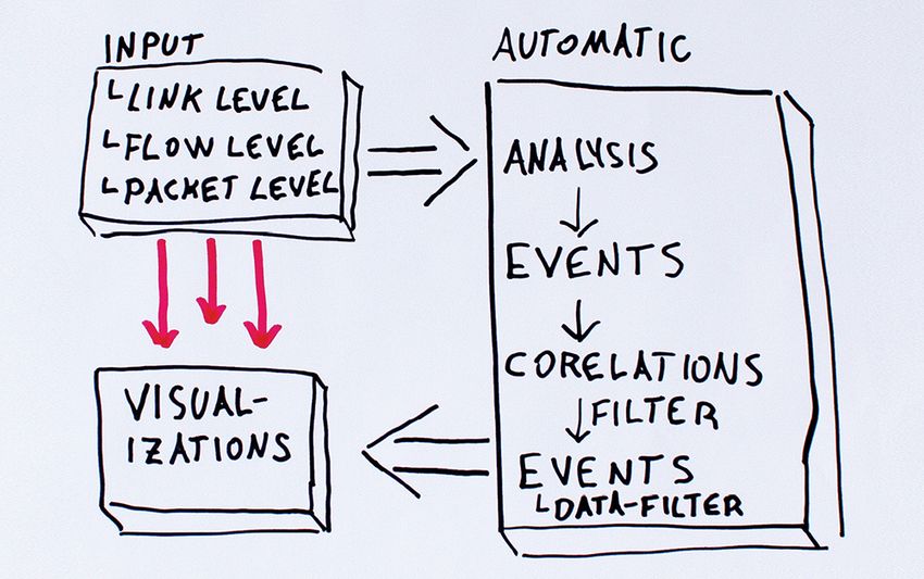
undetected malicious activity, engineers need (and want) to ex- 2 A CO - CR E AT I V E AP P R O A C H T O DAT A VI S U A L I Z AT I O N
plore raw data themselves. In the following section, we briefy elaborate on specifcs differen-
Data visualization can pose effective means to help with these tiating our approach from other work, then report about individual
tasks by supporting both automatic processing and human in- steps of our process, and fnally describe the user goals and design
volvement, as a substantial body of research shows [6]. However, requirements extracted together with the stakeholders. We provide
security engineers are often not familiar with advanced visualiza- general guidelines based on the refection of our experiences in
tion techniques or the research has not yet found its way into section 8.
widely available products [1], [24]. They mostly flter manually
and with little cognitive support through vast amounts of data be- 2.1 Motivation
cause they are well-versed in command line-based text mining Innovation methods that involve the intended users early on are an
tools (and because these tools are often lightweight yet robust). established part of today's product development as well as visual-
This is especially ineffective when less clear incidents need a ization research [24], [29]. We wanted to extend the “classic set”
of ethnographic methods and feedback sessions (as in e.g. [5],
*E-mail: [21]) by elements from co-creation. The core idea of co-creation is
{landstorfer, ivo.herrmann, stange, doerk, wettach}@fh-potsdam.de to not only research about and design for a target group but to
make them part of the team and design together with them [27].
Co-creation techniques typically focus on creating/making some-
thing together and aim at gaining insights by discussing the result-
ing artifacts. The intended benefts are a better understanding be-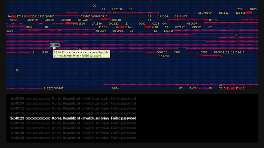
tween groups with different traditions and “languages”, namely
network security practitioners, security research, data visualiza-
tion, and interface design. Furthermore, an even deeper involve-
ment of all stakeholders, a broader spectrum of ideas, and a “built-
in” validation: if the users take part in the design process, the de-
signs are more likely to meet their needs.

2.2     Process and Methods
To build up domain understanding, extract insights, and jointly
create new ideas we conducted interviews, made observations,
and an ideation workshop. We describe further steps later, such as
visualization design (section 4) and feedback sessions (section 5).
2.2.1 Interviews and Observations
Our core group consisted of 7 different people from 6, mostly sci-
entifc, institutions. Professional backgrounds were network secu-        Fig. 1: A security researcher mapping his ideas for a cross-
rity engineer, network administrator, security researcher, in opera-     institutional monitoring system during the ideation workshop.
tive as well as managing roles. We enlarged the team later, espe-
cially for the workshop session.                                         tical about automated detection systems. Some said they were too
   Our questions referred to the workplace and tool setup, impor-        resource heavy and expensive, for some “they keep admins busy
tant data types, typical tools and processes for incident manage-        with false positives” (also in [1]). In general, they did not like that
ment, and the role of visualizations in their work. Examples are:        the internal mechanics of these systems are often hard to under-
“What data do you usually work with during a usual day? What             stand, thus alerting decisions diffcult to reconstruct, resulting in a
role do raw data (such as NetFlow) play in contrast to generated         loss of control. “If it's not transparent, it might be better to stay
alerts?” “What kind of visualization are you familiar with in your       with the raw data.” While all had automated systems in place, they
professional environment? Where do you use it? Where do you              wished to combine them with tools dedicated to human pattern
prefer a raw/text view on your data?” We tried to avoid direct           recognition and decision making. This discussion was particularly
questions about which visualization they wanted, as the answer re-       intense during the “data picnic” at the ideation workshop.
lies very much on the existing knowledge of the interviewees                 The security engineers might not know exactly what they are
about visualizations. Instead, we deducted common tasks, implicit        looking for when they start an inspection: “Analysis tools should
and explicit needs, and the role of visualization from their state-      encourage the use of gut feelings, e.g. through highlighting anom-
ments and our observations.                                              alies,” as one interview partner put it. It is their experience and in-
   We could combine only half of the interviews with observations        tuition during an explorative inspection that often guides them to
on location due to the limited availability of the busy experts and      suspicious incidents. Additionally, log fles can come from any
the sensitive nature of the domain. We were particularly interested      place and various devices in a network during an investigation.
in the physical setup of a workplace (such as number and arrange-        This causes a high variety of data structures that need to be inves-
ment of screens, personal and “public” screens), location of and         tigated. “The complicated part is: how to choose the right flter
relation to colleagues, communication devices, analog means such         settings? How to fnd the right characteristics? This needs some
as white boards, and further details that the interviewees might         trial and error, an iterative approach.”
take for granted.                                                           Considering their workfow, the network engineers were more
   We summarized the fndings from our interviews and refected            focused on ex-post incident analysis than on, e.g. live traffc mon-
the identifed needs with the interviewees to avoid misinterpreta-        itoring. This relates to the wish for exploration which can hardly
tions. We also included a refection on requirements later on in our      be done in real-time and aims more for detecting e.g., hidden root
ideation workshop.                                                       causes. Based on this use case, we can also assume that some
2.2.2 Ideation Workshop                                                  “framing” information can be used to limit the amount of data
                                                                         (such as a time range, IP ranges, etc.). For the sake of complete -
As input for our one day workshop, we used needs and statements          ness, we also want to mention that long term correlations or other-
from the interviews, market research on security data visualiza-         wise long ranging searches still require huge amounts of data to
tion, and further material contributed by the participants. The goal     be parsed.
was to come up with a visualization idea for an individually se-            Discussions and output of the needs and requirements analysis
lected problem. The participants sketched out their ideas (Fig. 1),      touched many topics, from raw data information to e.g. team col-
presented, commented, and refned, in single and team sessions.           laboration. We bundled goals to form different coherent threads of
We also clustered the workshop results to identify common direc-         conversations and research efforts but the full scope is beyond the
tions (see 2.3 for details). Creating ideas for selected challenges in   scope of this paper. In the following, we want to focus on a tool
groups helped to build up mutual understanding as a side effect.         that supports user-driven, exploratory, post-incident analysis. It
   Half of the day, a group of participants worked directly with         would complement the automatic systems that scan for the more
their computers on data sets that we asked them to bring to the          well known attacks and do the bulk of routine checks.
workshop (we called this session the “data picnic”). The idea was
to create sketchy visualizations or at least an early analysis tool      2.4      Requirements for Our Visualization
for one of the data sets. Besides, the participants would share tools
and strategies which would facilitate later collaboration.               Based on the high-level goals discussed before, we worked out
                                                                         key design requirements (DR). It is a synthesis from smaller ideas
2.3      High-Level User Goals                                           that the workshop participants came up with and refned.
                                                                           DR1: Display raw data. Security experts had a strong prefer-
In many larger computer networks, intrusion detection systems            ence for retaining easy access to unprocessed or hardly processed
(short: IDS) scan for signatures of known attacks and issues. In         log data that could complement automatic warning tools. With the
various situations, the security experts told us that they were skep-
help of a compact visualization, security experts want to inspect       expert. The other was a suspected public key theft. Public keys are
the data on their own in the hope to fnd patterns that the algo-        usually stored on a computer and used instead of a password.
rithms missed. They wished for raw data to be readily available as      They are too complex to be guessed. We had to look for an “ac-
context information to assess automatically generated alerts.           cepted public key”, where the other parameters or the context
   DR2: Visualize extrema. Either the exception or the food of          were unusual.
data are suspicious. While many current tools highlight mass ef-          This log fle was also meant to be a “training” or “test” fle:
fects, the security engineers were also looking for solutions that      while it would be possible to solve the use case itself automati-
support the investigation of targeted attacks with “low profle”,        cally, we wanted to develop our visualization with the help of a
i.e. few events. A consequence for visualizations is to highlight       well known challenge.
rare events over frequent ones.                                           To fnd evidence about malicious activity, we needed to inspect
   DR3: Encourage explorative analysis. Stumbling across                complex data: multi-variate data, where one record has several pa-
anomalies besides the known and obvious can be a strength of hu-        rameters, and also multi-event data, where only a combination of
man perception [32]. The visualization must strive to show a large      records indicates malicious behavior.
range of events that the human eyes can scan. It should present
events by their parameters and avoid classifying – the goal is to       3.2      Apache Access Log
leave decisions about classifcation to the human operator. The          The Apache (web server) access log records requests from clients,
tools should further offer elements for fexible manipulation of         most commonly when someone accesses a web page, with im-
views and user defnable flters.                                         ages, stylesheets, etc. We used logs from the web presence of a
   DR4: Combine overview and quick fltering. Visual tools               medium sized company (146,655 lines spanning seven days) and a
should help to stay in context, correlate events, fnd patterns. Our     private website (4,481 lines, one day; 33,060 lines, seven days).
participants wanted to have a fuid interaction when investigating       With the standard logging settings, there were eight different vari-
an incident, for fltering out items they are interested in and          ables: source IP/host, time stamp, URL (i.e. requested resource),
switching back to an overview when needed. For a visualization,         response code (which tells whether the request was acknowledged
this means as much log records on one screen as possible to fnd         or produced some kind of error), bytes sent, and user agent. For
patterns at large but also quick access to single records to inspect    most of our work, we chose host, response code, URL, and the
and flter them whenever necessary.                                      time stamp. With these parameters, we can answer who did what
   DR5: Support various log fle types. The use case in focus can        with which result. We added the source country for each IP via a
include a diverse set of log fles of various data types and data        IP-to-geolocation service.
structures. Well labeled and structured data sets allow for mean-          Recorded activities in Apache logs are more diverse and the
ingful semantics in the visualization. As the security engineers fre-   communication is less restricted. We worked with a security engi-
quently face unlabeled data sets, they recommended a straightfor-       neer and a web master, who wanted to investigate the activities on
ward tool instead that would not require them to structure the data     their web server. A deducted use case is to fnd attackers via traces
before they could “see something”.                                      in this log when they try to get access to restricted fles. This will
                                                                        be a rare event as regular visitors only access public fles. Another
3 T E S T D ATA S E T S A N D US E CA S E S                             example are calls of scripts with unusual parameters, such as SQL
When we went into more concrete design activities, we relied on         injections to break into an application running on the web-server.
our collaborating security experts to pick a relevant data set. They
chose an ssh log fle because it is frequently inspected after inci-     4 P I X E L CA R P E T S F O R MU LT I VA R I AT E DAT A
dents and ssh servers are very important access points into net-        Based on the data and the design requirements elaborated before,
works [34]. Besides, it was good to start with because of its fewer     we developed a visualization in the form of a pixel map. Next, we
felds and clearly defned use cases. As we discussed data sets and       discuss our design decisions regarding visual mapping and inter-
use cases throughout the project, we later added a web server           action.
(Apache) access log [31]. Web server logs can help understand se-
curity breaches involving the application layer which our experts       4.1      Reasons For a Pixel Map
reported has become more relevant in recent years.                      Early ideas for a tool that puts raw data visualizations next to au-
                                                                        tomatically fltered alerts already arose during the workshop
3.1     SSH Log
                                                                        (called the “split screen”, Fig. 2). Building on this and the strong
Our ssh log captures the login activity via the ssh protocol to a       requirement for a transparent tool (regarding the processing of
server of a large scientifc institution. Our specifc set was from a     raw data, DR1) that invites for exploration (DR3), we were look-
previous incident analysis and we knew already that it contained        ing for a way to bring lots of data records onto one screen (DR4).
two successful breaches. Stripped down to the entries relevant for      We found pixel maps [14] particularly appealing as we deal with
login violations, it contains 13,199 lines (7 days). From the seven     very large datasets, require decent overview, and did not want to
parameters of each record, we selected time stamp, log message          conceal details by binning the data. They offer the best “data to
(authentication method and whether it was successful), source IP,       space ratios” by using the smallest building block on a computer
and user name for our visualization as they are most relevant for       screen (1 pixel) per data record, at least in the extreme. For high
detecting login violations. Source port and destination port num-       density displays (>100 pixels per inch), the minimum size has to
bers, and protocol were not relevant or constant.                       be adjusted.
   Together with the fle, we got two “challenges” from the secu-           Overview is important when the security engineer needs to ex-
rity engineer working with us on this phase. One was to fnd a           plore the dataset frst and does not know what to look for initially
“brute force attack”, i.e. an attacker tries a series of passwords      (DR3). With several hundred thousand lines recorded per day, tra-
(usually via a computer program) and when she guesses the pass-         ditional displaying techniques fail this task [20].
word, she will be granted access. In the log, we would see a series        Binning would be a common technique to visually compress a
of failures, followed by an “accepted password” indicating the          dataset: aggregating several data records and representing them
success. The difference between failures from typos of a legiti-        just with their average value (the most common form for this is a
mate user and a (usually scripted) brute force attack are not al-       histogram). But when looking for exceptions and outliers (DR2),
ways clearly assessable and then require inspection by a security       this technique can blur away the rare and hence important records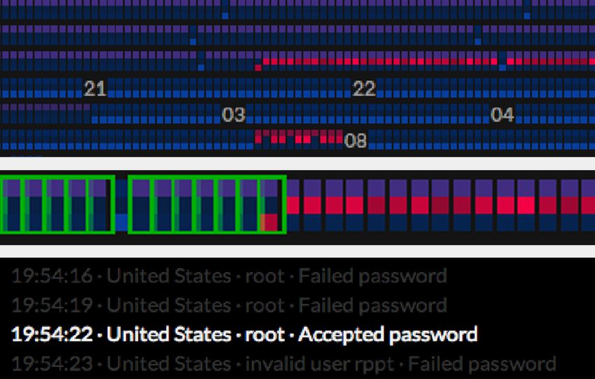
quickly. Additionally, binning works best for numeric values. But
in network security, most values are categorical in nature (e.g.
IPs) which have no average value and are therefore hard to bin.

4.2      Carpet Layout and Multi-Pixel Structure
We decided to give three parameters of a record their own pixels,
creating columns of “multi-pixels” per record (see Fig. 3). For the
ssh analysis, three parameters are suffcient and it is easy to read.
An example for such an analysis is the detection of a dictionary
attack. Source country and user name would stay the same but log
message changes from “failed password” to “accepted password”.
We built the multi-pixels as vertical columns and arranged them
from left to right. As Fig. 3 shows, each record is lined up after
the other, each pixel representing the value by color, with line
breaks as the screen layout or the application requires. This allows
an intuitive fow of reading from old (top left) to new (bottom
                                                                       Fig. 2: One of the sketches where the workshop participant wanted
right, for western reading habits). The result of this layout, to-
                                                                       to have a direct visualization of raw data (red arrows),
gether with the coloring, is what we call the “Pixel Carpet”.
                                                                       complementing an automated analysis.
   Triple pixels decrease our “data record to space ratio” from 1/1
to 1/3 but we gain a much better insight into details (we need to
balance DR1 and DR4). For the Apache log, we also tested fve
parameters per record. To enhance readability and to better sepa-
rate the multi-pixels, we added a padding of one pixel horizontally
and four pixels between the lines. We usually worked with 16
screen pixels per data item (4×4) because pixels are better read-
able and easier accessible with a mouse for additional info on
hover (Fig. 3). This results in a “data/space ratio” of 3/80 includ-
ing the padding. On a medium sized screen with a resolution of
1600×1200 (1.920.000 Pixels), we could show 24.000 entries at a
“three parameter-resolution” simultaneously. For larger datasets,
this can be reduced down to one pixel for data points and
paddings (two to separate lines), yielding a ratio of 3/10. A magni-
fying tool for the cursor will then be necessary, such as a fsh eye
(more on scalability in section 7).

4.3      Color Mapping
While the focus on pixels is space effcient, it limits the parame-
ters available for visual mark-up. Pixel color is the most important
option. Outlines/borders and patterns, as two examples, require
their own pixels just for making them visible. A distinct color for
each value would be a good option, but human perception is quite       Fig. 3: A look at the construction of the Pixel Carpet with multi-
limited in freely discerning colors, ruling out this option [32].      pixels and the “implementation” at screen resolution. One “column”
   We want rare values to stand out and frequent values to fade        is representing one data record.
into the background (DR2). For this, we colorize pixels based on
the value frequency in the dataset, similar to a heat map. We focus       Coloring by value frequency can result in two different parame-
on parameters, i.e. frequency is calculated for each parameter in      ter values, such as two different user names, having the same
relation to all other values of this parameter in the dataset, inde-   color because they occur equally often. Especially when these pix-
pendently of the record it belongs to (also independently of the       els appear next to each other, this misleads the user to (intuitively)
occurrences of other parameters). Example: if “accepted pass-          think the two values were identical. To avoid this impression, we
word” can be found fve times in all log message felds of the           vary colors for different parameter values by small random
dataset, this is its frequency and determining its color, regardless   changes in the luminance. Two pixels that stand for values of
of the values for source IP or URL in the corresponding records.       equal frequency will thus vary slightly but noticeably. This is also
   To map frequencies onto color values, we started with counting      possible because the exact frequencies are not important for the
the occurrence of each parameter across the data set. We then seg-     security expert whose main goal is getting a general understand-
mented this frequency distribution into ten slices of varying          ing of the dataset and fnding regions of interest.
“width”: the frst group consists of the rarest 0.5% of frequencies,       We implemented a straightforward algorithm for our experi-
the next color for frequencies up to 2%, then in increasing steps      ments with the aim to make its mechanics transparent and gain the
from 5%, 10%, 20%, 32%, 46%, 62%, 80% to the most frequent             users' trust. We do not rely on felds that only occur in specifc
parameters. We did so to “sharpen” the rare groups that we are         logs so that the color mapping works for quite different types of
most interested in and have a more coarse representation of fre-       log fles (DR5).
quent values. We then created 10 different colors between bright
red and dark blue by segmenting the hue and luminance “dis-            4.4     Exploration and Filtering
tances” between these colors in a HSL (hue, saturation, lumi-
nance) color model into equal steps. Finally, we mapped the            Complementing the visual representation of the Pixel Carpet, we
groups from the value frequency to the corresponding color, with       now describe its interaction techniques designed with the aim to
red for rare and blue for frequent (as in Fig. 3).                     support open exploration of log fles (DR3 and DR4).
Fig. 4: Video showing the main interactive techniques currently implemented for the Pixel Carpet: highlighting of identical records, tool tips and
clear text display, and fltering/removal on click. The numbers in the Carpet refer to the hours from the time stamp. Two consecutive numbers
mean that all records in between got fltered away. (Data from ssh log fle, IP addresses replaced for publication).
4.4.1 Highlighting Identical/Similar Records
Hovering over a multi-pixel representing a single record, all other frequent and thus uninteresting log records. The colors for the
records with identical parameters are highlighted (Fig. 4). This dataset will be recomputed based on the frequencies of all data re-
dynamic effect complements the static visualization: where the vi- maining on display (Fig. 4). With some of the values removed, the
sualization makes regional similarities catch attention, such as range of frequencies (we could also say “dynamic range”) gets
several rare records forming a red block, the highlighting tool smaller. The limited set of (discernible) colors can then be spread
fnds matches across the whole set. This reveals activity over time. across a narrower band of frequencies, letting smaller differences
Via checkboxes in the interface, users can choose which param- show up. This makes the flter actually a sort of zoom into the
eters are taken into account for the matching: maybe they want to data.
inspect a series of login attempts and want to see whether there 4.4.4 Additional Binning
were any successful guesses. They then switch off matching on
log message and the tool will highlight all entries with the same For some log fles (especially our Apache ones), highlighting just
source country (or source IP), same user name, but any kind of identical values can be too strict. For example, logs of dynami-
log message. With this highlighting tool, users can inspect ele- cally generated websites will contain records of many slightly
ments and verify hypotheses that they built based on their visual varying requests. A strict coloring would render all of these re-
impression. quests as very rare and red (Fig. 7 top), while in fact, they are all
part of the published online resources. For this reason, the visual-
4.4.2 Clear Text Display ization allows to “summarize” variations via text matching. All of
Besides highlighting similar records, the hover operation also the affected parameters will be considered “the same”, represented
shows a clear text display of the corresponding log record (DR1), by the same color (Fig. 7 bottom). In effect, this bins the parame-
as a tool tip and in a dedicated log fle window below the visual- ters. As mentioned in the previous section, this helps to fnd the
ization (Fig. 4). The log fle window also shows the neighboring abnormal activity and separate it from just individual but legiti-
log lines to provide more context and allow for faster reading. The mate requests. A simple text flter as in our demonstrator, how-
users could even scroll through the log fle via the visualization, ever, is hardly capable of reliably differentiating trusted URLs
but the power of the visual representation is a non-linear reading. from malicious requests in practice.
In effect, the users get a quick overview over the contents of the
4.5 Color patterns encoding activity
dataset. Experienced network engineers know many IP addresses
and user names in their network. They can put the values they fnd Our idea is that different “classes” of records become easily visi -
in context and thus classify them swiftly and precisely. ble to the human eye when we colorize the individual parameters
(i.e. pixels) of each record (i.e. multi-pixel). Certain combinations
4.4.3 Filtering records of colors within a multi-pixel would then indicate certain activity.
Clicking on a multi-pixel will remove all entries with identical pa- These combinations can be found quickly when visually scanning
rameters from the visualization. The users can get rid of, e.g., very the Pixel Carpet (DR1).This is clearly visible in the ssh log fle: there are two types of
“entirely frequent” entries with three blue pixels (Fig. 5). Closer
inspection (details in 4.4 Exploration and Filtering) reveals that
one is a service the institution installed, the other is a brute force
attack on “root”. While we initially thought that the attack should
look more alarming, our security expert agreed with the modest
appearance as the attack obviously did not succeed (otherwise it
would have a red bottom pixel for an “accepted password”). We
can also see a record in Fig. 5 with a pink middle pixel, which
comes from an attack that tries out user names. Another example
shows the same intention but originating from a computer from a
different country.
Besides single record classifcation, the Pixel Carpet also allows
to view records in context (DR4). Especially in the quite homoge-
nous ssh log fle example, we can observe time spans “full” of
regular behavior and then one record standing out because of a
Fig. 5: Specifc color combinations that represent specifc activities
colored pixel. Or we have series of malicious activities that are
on an ssh server: regular access (left), password guessing (middle),
visible as reddish blocks or even stretches of color (also in Fig. 5). user name guessing (right)
For an Apache log fle, the initial appearance is less clear. To a
large part, this is due to the huge variety of normally available re-
sources such as web pages and images. While this might hide
smaller items and single records, we can see high frequency activ-
ity and repeatedly occurring events very clearly in Fig. 6. This
way, patterns evolve from a log fle visually that would be hard to
recognize with other techniques, especially with the traditional
“plain text and grep” method. To better separate truly suspicious
activity from the diversity of legitimate activities such as the case
for URLs in web-server logs, we also created a special binning
mechanic, by which the security expert can infuence the coloring
(details in 4.4).
Finding “classes” of activity from the visual appearance already
works to a certain extent but also has its limits. The algorithm we
apply for color mapping is straightforward but also rather basic.
Evaluating a “group” of records that come from the same Fig. 6: Detail view on a large Apache access log fle. Note the
IP/user,would allow a second pass for fne tuning colors or inten- bands of similar activity. In the upper right corner, close to hour 10,
sities. If, in an ssh-example, “root” would “normally” log in via there is a block of rare records.
key-fle but now logged in (successfully) via password, this “ac-
cepted password” is very abnormal, while other users might login
via password regularly. In “7 Discussion”, we discuss how col-
orizing by value frequency could be replaced with more sophisti-
cated mechanics to (pre)discover anomalies.
5 E VA L U AT I O N
The co-creation process comprised a continuous feedback loop,
throughout which our collaborators informed the design of the vi-
sualization with their observations and feedback. In the following,
we summarize the most important fndings we gained with regard
to the Pixel Carpet visualization.
5.1 Expert Feedback on the Pixel Carpet
5.1.1 Setup of Feedback Sessions Fig. 7: Effects of “binning” different values of a parameter together.
In this phase, we worked with people or groups from four differ- In this case, we instructed the color mapping to treat all jpeg
ent organizations. Two took part in our interviews and workshop: images (as part of the URL) as if it was one and the same. While
one person was responsible for network planning and computer each image on its own is rarely accessed (indicated by red pixels in
security at a scientifc supercomputing centre (#1) and the others the top band), jpegs in general are a usual request (blue pixels in
were product managers from a security appliance vendor (#2). the bottom band).
Two people joined later: a security manager in a company for
electronic payment (#3) and a system and security administrator worked in a team of two and took notes. Later, we analyzed our
of a medium sized company (#4). Each evaluation session was fndings in categories such as general security strategies at this or-
one to one, on location or web based with screen sharing. We ganization, feedback on the visualization, and feedback on the in-
briefy explained how the visualization got generated and how the teraction and the software interface.
main tools worked and then let the experts explore the visualiza- With interviewees #1 and #3, we also discussed different ap-
tion and the datasets. All participants investigated ssh- and proaches to visualizing the ssh log fle that also evolved from the
Apache-examples. Each session took between one and two hours same co-creative process: parallel coordinates and a combination
and got audio recorded if allowed by the interviewee. We also of scatter plot and slope graphs.5.1.2 Important Overarching Findings
In case of the ssh log fle, the experts could quickly check wide
spread, automated login attempts with the help of pixel colors and
the highlighting tool. These are usually turned away by the au-
thentication system (”failed password”) but in one case, the at-
tempt was successful. The change in the colors of the multi-pixels
at the end of one of the series caught the attention of expert #1
early on in the investigation : “The 'accepted password'-pixel
stands out clearly.” (Fig. 8) The login with the (most likely) stolen
key fle was initially harder to see. It came to light when the ex-
pert fltered away all records he knew were legitimate and from
trusted machines. It gave itself away by its rare source IP.
Considering the color mapping algorithm, experts #2 and #4
wanted to have a better “semantic” differentiation, i.e. a “failed
password” should not resemble an “accepted password”. They
would prefer two clearly distinct color hues.
Investigating and interpreting the Apache log fles turned out to Fig. 8: Detecting a successful brute force attack in an ssh log: the
red pixel in the lowest row of a multi pixel indicates a rare value,
be more complicated to start with. As mentioned earlier, it is quite
while the other parameters appear to stay the same (top). The
diverse in regards of visitors (source countries), web-server re-
highlighting tool reveals a series of attempts (middle, enlarged),
sponse codes, and resources (URLs) accessed. Binning trustwor- confrmed by the clear text output (bottom).
thy entries together and/or removing them from display was
highly effcient, although the experts missed regular expressions
and what they can actually see. Generally, the participants re-
and boolean search to better specify their flter criteria. After some
sponded interested and favorably to the interface: “I have never
flter iterations, the visualizations cleared up. The log from the pri-
seen something like this, which I mean in a positive way.” (#2)
vate web-server showed huge amounts of requests that were obvi-
The mechanics of fltering and binning needed some explanations
ously checking for fawed plugins and potential misconfgura-
from our side.
tions: a typical preparation for attacks on applications. Several ex-
All experts agreed that the visualization was particularly suited
perts suggested to save their manually constructed flters to apply
for the inspections of log fles after an incident (”post mortem”
them automatically in future sessions. Even more, They liked the
analysis) and “when you don't know (yet) what you are looking
idea to construct a flter this way with visual and interactive sup-
for” (#3). It would even help understand unfamiliar datasets be-
port, a feature they were missing in their IDS rules creation tools.
cause of the clear and easy to understand visualization mechanics.
The web master #4 commenting on this use case wished for an
They admitted that log fle inspection was known as an important
option to automatically classify “legitimate visits”, “search engine
measure that they should perform more often but see as too te-
robots”, and everything else. The multi-pixels themselves were
dious. “Continuous monitoring should still be done by automated
ambiguous in this area. The two experts #1 and #3 pointed out
scanners. But if I had a tool like this, I would certainly look at
that they liked the visualization because they stayed in control of
logs more often.” (#4)
classifcation, and that no automated system had fltered the data
by some hidden algorithms. But they also stated that they pre- 6 R E L AT E D WO R K
ferred a tool that shows more and requires less clicks. This topic
needs careful balancing. For the approach described here, we fo- After we have laid out the key idea of the Pixel Carpet and the co-
cused not on making the root causes of incidents immediately creative approach that led us to it, we want to put it into context
clear from the visualization but to fnd areas of interest and get a with existing approaches.
“feeling” for the dataset. Our aim was guiding the focus of the ex- Livnat et al. combine several visualization techniques (circular
perts so that they fnd the items to inspect more quickly, not clas - layout, network graph, geographical maps) to reveal various kinds
sifying the dataset automatically. of relations and anomalies [19]. Their main goal is situational
Due to space constraints, we do not discuss the alternative visu- awareness, i.e. the big picture, but they also allow access to traffc
alizations (parallel coordinates and scatter plot variant) in greater details. The remarkable effectiveness of their tool comes from a
detail Two key differences are: In contrast to the Pixel Carpet, design tailored to fow records (e.g. network topology) that would
they do not show events in chronological order which we found not easily translate to web server logs (our DR5). In contrast to
important to understand activities. The parallel coordinates need that, Humphries et al. follow a log type agnostic approach with
at least user input in the form of brushing to detect patterns. Espe- ELVIS [10], which features smart mechanics to determine the
cially with the huge number of different values in the Apache log, type of data felds and to propose adequate (basic) visualizations.
both approaches suffered from overplotting. These basic mini visualizations already provide some statistical
overview on a per feld level. They can be easily combined (drag
5.1.3 Additional Findings and drop) to form new visualizations. While the feld extraction
It turned out that the experts could comment best on Pixel Carpets and statistics features are promising, the Pixel Carpet brings over-
based on data from their own networks (the dataset itself, how- view capabilities and a chronological view that are less developed
ever, could be unknown to them or previously uninspected). Data in ELVIS.
from other systems still revealed patterns to our test participants Phan et al. [25] rely on external triggers to start an investigation
but it was harder to classify them: activity that is normal in one with their system “Isis”. Once the investigation is narrowed down
system can be exceptional in another. Regularly repeating patterns to a single IP, they offer a smart matrix view to analyze and recon-
can originate from a script that the administrators implemented struct the course of events. While their display of time in an “ordi -
themselves or from an automated attack from the outside. nal space” is similar to the Pixel Carpet, it needs signifcant flter-
The frst time the participants saw the Pixel Carpet, it was quite ing before it shows up and details are revealed.
unfamiliar to all experts. As the highlighting tool reacts on hover, Phan et al. [25] and even more Xiao et al. [35] describe in detail
they were drawn towards exploring how the visualization works how the analyst is involved in the classifcation of events. Ro-gowitz and Goodman have the notion of a “human in the loop” We provide a case study that implements participatory elements,
[26] that describes a man and machine system that combines the something that Meyer et al. wish to happen more in this domain.
pattern recognition abilities of both and includes a feedback
mechanism for iterative analysis. This resonates with the require- 7 DISCUSSION
ments that our interview partners had (DR1, DR3). Shneiderman
emphasizes that the system's operations should be transparent to 7.1 Moving to Larger Data Sets
the people so they can trust the results and take on responsibility For most of our exploration, we worked with excerpts containing
for the conclusions they draw [28]. less than 10,000 lines which is over a magnitude below the in-
Conti et al. [3] and Weseloh [33] propose pixel maps directly tended target application at larger data centers. We worked with
for computer security visualizations. They use a simple form with datasets exceeding the available screen size and one general fnd-
one (data) dimension and a single color. Especially Conti et al. ing is that the coloring algorithm works better the more data it
point out, how this solution lets patterns emerge visually and thus covers (the larger the mass, the more the exceptions stand out).
supports human pattern recognition. Both visualizations are em- We did not investigate “big data” issues in practice, mainly be-
bedded into analysis tools that at least in parts are used in produc- cause of the considerable engineering efforts required, instead our
tive workfows. Interaction with these visualizations, however, ap- interest was in rapid prototyping of visualizations. We do not pro-
pears to be limited to viewing results and retrieving clear text/con- pose the Pixel Carpet as “frst line of defense”, e.g. in live moni-
text information. Direct manipulation in the sense of visual analyt- toring. We rather think that it is used to explore alerts with vague
ics seems not to be implemented (DR4), such as fltering from indications, which means that the range of time windows or ma-
within the visualization or dynamically displaying flter matches, chines (IPs) is already somewhat limited. The advantage (e.g.,
something that our user group found very valuable. Chung et al. over the previously discussed “Isis” [25]) is that the indicator can
[2] show pixel oriented techniques for big security data sets, using be quite imprecise because of the overview capabilities of the
a very large physical screen for overview with smaller, individual Pixel Carpet. Beyond that, we see several options for visual com-
screens for detail inspection. They do not discuss the option of pression techniques that try to preserve small values, such as
stacking pixels and instead distribute different aspects over differ- anomalies (e.g. [12]). The Pixel Carpet can also be combined into
ent views. other visualizations without giving up its advantages (Fisher et al.
Pixel maps are fairly straightforward visualizations and have provide ideas in this direction [8]). Assuming that most security
been around for a long time. This enabled us to build on a stack of engineers work in dedicated offces, we also see the option to in-
work, such as Keim et al. [14] and Lammarsch et al. [17]. Keim et crease the number of physically available pixels by working with
al. have thoroughly researched display techniques and applica- a wall of screens (building on Chung et al. [2]) 
tions and offer sophisticated ways to map data to various visual-
ization properties (x, y coordinates, display sections, color, inten- 7.2 Human and Machine Based Detection
sity). They usually distribute parameters of a record into different As laid out before, the system should prepare and present the
“sub windows” of their display. It is easier to read but makes it data with the goal to harness human pattern detection. Major deci-
harder to fnd differences in combinations of parameters. sions should be left to the user to provide room for exploration
In our approach, we integrated those parameters, which brings and intervention. User-driven does not mean purely manual: We
us closer to the idea of Levkowitz' Color Icons [18]. This concept have an early and fairly simple algorithm already in place to “pre-
suggests to create matrices of pixels, with one matrix representing process” the data in our current proposal. Researching more pow-
one entry of a multi-dimensional dataset. The advantage is that a erful algorithms, including cluster analysis and anomaly scoring
whole data record is shown close together. As Levkowitz points (as, e.g. in [11]) and selecting one that fts with our goals is an im-
out, this improves revealing patterns and relationships when com- portant area for future improvements. The Pixel Carpet is meant to
bined with the matrices of the rest of the data, without the need for complement highly automated systems (such as IDS) in a future
user activity, such as brushing. We found huge amounts of matri- security workbench as it has been suggested in on of the work-
ces visually confusing, however, and limited ourselves to a single shops (Fig. 2) . We need to carefully balance automated process-
“column” of pixels per dataset entry. ing, visualization, and user control.
Working with categorical data (such as source countries) in Based on our experience with ssh- and apache-log fles, we see
pixel maps needs some transformations as pixel color is easiest testing with a broader user base and a wider set of use cases as a
mapped to numerical values. Keim et al. have shown an imple- useful next step. A structured comparison, e.g. with the “sub win-
mentation in [15] but it is quite limited in the number of cate- dow” approach of Keim [14], is necessary for assessing specifc
gories it can hold so that we saw room for improvement. features of the Pixel Carpet. A formalized evaluation process also
While pixel maps are mostly used because of their overview ca- complements the more empathic co-creation very well and corre-
pabilities, Janetzko et al. put their focus on highlighting anomalies sponds to the “validation” requirements of Meyer et al. [22].
[11]. The results from their expert evaluation indicate that analysts While continuous feedback is a part of co-creation anyways, the
can fnd anomalies quickly and easily (DR2) while maintaining distinct levels of their “Nested Model” will help to create focused
overview and their orientation in time (DR4). We also share the sessions at the right moment.
chronological pixel arrangement with their work but extend it to-
wards stacked pixels and the work with categorical data. 7.3 Insights into Co-Creation in Data Visualization
Visualization projects and research follows user centered design
From our work as designers, we had experience with several of
principles on a regular basis [5], [16], [20]. Meyer et al. have de-
co-creative methods. Some more general principles of co-creation
fned a profound framework for the process and the validation of
held true also for the area of data visualization, such as profting
important steps [22]. They have also defned a set of roles that a
from highly diverse teams, fast exchange of information, no hier-
larger data visualization project can involve and that need to col -
archies, and an encouraging and inspiring atmosphere. Asking ev-
laborate for optimal results [16]. It involves the domain experts
eryone to work visually with pen and paper (instead of, e.g., writ-
and visualization experts, of course, but also specialists for high-
ing down requirements) also helped to output frst ideas and to get
throughput computing. Truly participatory processes are still quite
to their essence.
rare in this feld. The occurrences we found in security visualiza-
Then again , we had not put enough effort in integrating data
tion (e.g. [9]), described the techniques and results quite briefy.
into these “analog” exercises, which lead to overly optimistic as -sumptions in the sketches about data structures or values. For more weight than how many fnd it relevant (group sizes are com- evaluation (and refnement), a “quick and dirty” tool or method to paratively small, too). check an idea would be necessary. So far, we are still looking for a Data acquisition and inspection. Try to get real-world data method that is quick and accessible enough to ft into a fast paced, sets from your target users that are typical and relevant for them. trial and error-based ideation workshop. Take care of this as early as possible as privacy and the sensitive This became also apparent in the subgroup directly focusing on information contained may pose considerable and time-consuming software tools and trying to put together analysis code during the hurdles. Investigate the data with the tools of your choice to get an workshop. We had underestimated the amount of time it takes for understanding of its structure and quality (McLachlan et al. even getting a common understanding of the structure and contents of set up their own monitoring tools in their network [21]). the data. Starting with programming more or less from scratch un- Ideation. Brainstorm and sketch ideas together. Pen and paper der these conditions and within few hours turned out to be impos- are quick and easily accessible. They are well suited to frame sible. The participants reported that the intensity of fruitful ex- ideas and describe the goals for a tool. Ideation tasks for these ses- change in this session was extremely high. Without the “crazy en- sions must be well defned and “entry barriers” kept low to en- deavor” of live coding, it might not have happened. An improve- courage all participants (example schedules and tools in [29]). ment for future meetings would be to work with a single dataset, Ideas from data. Work and sketch with data as a “material” that everyone can analyze beforehand, possibly already write code early on and incorporate it into creative sessions. Characteristics fragments for it , and also to have more modular data analysis and and challenges of real data are valuable input for new solutions. visualization tools in place. In many cases, some features of a As it takes considerable amounts of time to familiarize with a data dataset must be extracted algorithmically to create a really mean- set, workshop participants should get the (same) data sets before- ingful visualization on top of it. hand and inspect them as a “homework”. This requires digital Data can be considered the original material a visualization is tools which bring their own challenges for joint creative work. crafted from, data comes frst, visualizations should match its con- Software that accepts a wide range of data types and offers a large ditions. We have to pay attention, however, so that the rather ab- number of presets seems promising, such as Tableau [30]. stract data sets do not damp the generation of concrete ideas in the Prototyping and validation. Focus on the aspects (such as de- early phases. Distilling data structure, some special features or sign requirements) you want to validate frst with early versions of defning challenges could be a way to get it integrated produc- the visualization. Adapt your questions and evaluation methods to tively. It is also worth mentioning that getting hands on datasets of the state and focus of your sketches (s. Munzner et al. for ade - reasonable size and quality from the domain in question needs quate methods [23]). Rapid prototyping methods have been de- enough time to solve organizational, technical, or privacy ques- scribed at length so that you can choose what fts your needs and tions. Putting datasets right into the early ideation processes is a taste. Depending on the skill set of your stakeholders, they might highly promising strategy for adapting the co-creative approach. be even able and willing to contribute their own code modules. 8 P R I N C I P L E S F O R CO - CR E AT I O N I N DAT A VI S U A L I Z AT I O N 9 CONCLUSION Based on our experiences and the refection of what worked and We have shown how the visualization approach of a pixel map what did not (s. section 7.3), we formulate tentative guidelines for variant can turn unlabeled data into an image that makes this data a co-creative approach to data visualization projects. They are or- easier to survey and inspect. With different multivariate datasets ganized roughly by project phases but loops and iterations are a we explored how to better show their structures and the activity typical feature of this approach. patterns they contain. Our proposal also encompasses interactive Recruiting. Try to establish a team of volunteers (stakeholders) tools that allow users to analyze their data visually. that can commit enough time to participate in the process. You do The intended audience of network security engineers welcomed not want to “touch and go”, obtaining an interview and continuing this visual approach to “their” log fles because it allows them to on your own. McLachlan et al. have a good description of chal- understand large amounts of logs more quickly and fnd patterns lenges in recruiting highly busy experts and in iteratively adding they could not fnd with their current tools. The early prototype new stakeholders [21]. that we describe in this paper led to valuable suggestions for im- Domain understanding. Get immersed into the topic as deeply provements and new extensions. as possible. We used the ethnographic methods of interviews and Throughout the process, we involved security experts as user observations as described by D'Amico et al. [5]. An even better group and experienced how valuable continuously available con- approach is to aim for a shared understanding on both sides (secu- sultants and feedback partners are. As visual analytics becomes rity and visualization) through joint, explorative, hands-on cre- even more important with large datasets (“Big Data”), new expert ation sessions (D'Amico et al. propose “hypothetical scenario con- tools need to be developed. They can only be effective (and ac- struction”, Sanders has a more in-depth description and argument cepted) when visualization specialists understand the domain ex- in [7]). Discuss how your collaborators work with data, and try to perts' needs so that they can design appropriate tools. pin down the results precisely as use cases. It forces you to be very clear about the individual steps and details, and structures the ACKNOWLEDGMENTS process into operational modules (D'Amico proposes Cognitive We want to thank our interview participants from the computer Task Analysis [5], Cooper has tasks as part of his Goal Directed security domain for sharing their knowledge with us. Special Design [4]). thanks to Leibniz Super Computing Centre for helping with test Requirement defnition. Defne and refne challenges with all datasets and intense discussion and support. We are also grateful stakeholders, ideally in a face-to-face workshop. Achieving a to the students and teachers at Potsdam University of Applied sci- common understanding is extremely valuable to focus further ef- ences for their help and reviews, and to the conference reviewers forts. Converging on a few essential requirements with a diverse for their detailed and valuable feedback. This work has been sup- team, however, is not always possible. Defning the goals together ported by the German Federal Ministry of Education and Re- also strengthens commitment for the process ahead (also reported search (BMBF) under support code 01BP12303; EUREKA- i n [9]). It might be worth noting that this co-creative way of re- -Project SASER. quirement distillation builds on communication rather than quanti- tative evaluation. Why and how something is relevant is given
You can also read