Prices and inflation in the UK - A new dataset - Occasional Paper - Centre for ...
←
→
Page content transcription
If your browser does not render page correctly, please read the page content below
Occasional Paper

No.55
February 2021

Prices and inflation in the UK -
A new dataset

Richard Davies
Abstract This paper presents a new dataset of 41 million UK consumer prices, providing facts on the frequency, size and timing of price changes between 1988 and 2020. The micro data are the ‘price quotes’ of individual consumer products that make up the official Consumer Prices Index (CPI) for the UK. Prices are recorded between January 1988 and December 2020 and cover a wide-ranging selection of items including food and drink, homewares, furniture and appliances, motoring supplies and fuels as well as a range of services. The extended time coverage allows a comparison of historic shocks, including the ERM crisis, 2008 financial crash and 2016 EU referendum, with the Coronavirus pandemic. The long-run facts fit closely with the pattern of nominal rigidities seen in other countries. Overall, state-dependent rather than time-dependent pricing models are consistent with UK firm behaviour, and the data show strong support for the notion that prices are ‘volatile while anchored’ as in the more recent menu cost models. The facts show the extraordinary experience of 2020, which was the most volatile year, in terms of pricing, since at least 1991. Keywords: EU referendum, covid-19, consumer prices, inflation JEL: E12; E31; E32; E51; E52; E58 I am grateful to Rowan Kelsoe and Rhiannon Sage at the Office for National Statistics for their advice on data access, and the cleaning and assumptions I have used to create the panel data set used in this paper. Henry Overman, Steve Machin, Nikhil Datta and Josh de Lyon provided helpful comments. Pete Klenow, Virgiliu Midrigan and Diego Perez gave helpful steers on an earlier incarnation of this work. The data have been compiled as part of ongoing research and are available via my web site. Files and code for charts and tables can be found at www.richarddavies.io/prices and https://github.com/RDeconomist/prices. Richard Davies, Bristol University and Centre for Economic Performance London School of Economics. Published by Centre for Economic Performance London School of Economics and Political Science Houghton Street London WC2A 2AE All rights reserved. No part of this publication may be reproduced, stored in a retrieval system or transmitted in any form or by any means without the prior permission in writing of the publisher nor be issued to the public or circulated in any form other than that in which it is published. Requests for permission to reproduce any article or part of the Occasional Paper should be sent to the editor at the above address. R. Davies, submitted 2021.
SUMMARY
This paper presents a new dataset of 41 million prices, recorded in the UK between January
1988 and December 2020. The data cover consumer items including food and drink,
homewares, furniture and appliances, motoring supplies and fuels as well as a range of
services. The paper makes four contributions.

 • First, it describes a new publicly available database of consumer prices. The files are
 cleaned and corrected versions of raw historical records. The data improve the official
 CPI micro data for research and long-term price comparison purposes. A data annex
 sets out in detail the shortcomings and recording errors in the raw data and how they
 were corrected. The data is openly available and has many potential applications both
 to researchers and teachers. To access the data and notes on using it, visit my website
 or GitHub page. 1

 • Second, it provides a set of stylised facts on price rigidity, using the January 2020 up-
 date of the long-run price quotes database. The database sheds new light on when and
 by how much firms change their prices. These descriptive statistics are compared to
 similar findings for the US and EU countries and contribute to the literature on price
 dynamics, the cost of inflation, and business cycles. (Klenow and Malin, 2010;
 Nakamura and Steinsson, 2018).

 • Third, a perspective on the emerging impact of Covid-19 on prices and inflation. At
 present this is unclear: some real-time micro data pricing studies have pointed to
 hidden inflation; the official CPI inflation measure has been falling. The CPI data
 show a large increase in price changes—both cuts and rises—with a contemporaneous
 increase in the net balance of cuts. This simple measure is a strong predictor of
 inflation. This links to other work on the short-term price effects of Covid-19 tracked
 in real time. (Jaravel and O’Connell, 2020; Cabral and Xu, 2020).

 • Fourth, price and inflation heterogeneity in the UK. I show how headline measures of
 inflation mask differential experience in terms of price rigidity, volatility and price
 distribution by item, region and firm. This links to the literature on ‘price
 morphology’ (Kaplan and Menzio, 2016). The emerging regional differences, while
 mild at present, may be important for the calculation of regional real wages. (Costa
 and Machin, 2019).

1
 I am grateful to Rowan Kelsoe and Rhiannon Sage at the Office for National Statistics for their advice on the
data, and for considering and commenting on the corrections I have imposed on the official data – any mistakes
in this process are mine alone.

 1
I. INTRODUCTION
The technical language of macroeconomics can often seem divorced from the real-world
questions people face. One exception to this stands out: prices. The public are engaged with
prices—of consumer goods, the exchange rate, nominal wages—in a way that is not true for
any other types of economic measure. Prices are fascinating for academic economists too.

The reason is that seemingly simple questions—for example, when, why and by how much
firms change their prices—have huge implications. Price rigidities determine how monetary
policy operates and how macroeconomic models work. Sticky prices help us understand of
exchange-rate pass through, and the development of real wages.

Pricing studies have come to the fore internationally over the past 15 years because of the
availability of new ‘micro’ data. This data tracks prices charged at an individual firm level.
This paper sets out and summarises a new micro data on UK consumer prices, showing that
the UK’s experience—in terms of the way price rigidities operates—is very close to the US
and other advanced economies. Pricing trends, in other words, may be common.

As pricing micro data becomes more readily available, it has the potential to help answer
several live questions in economics. These include:

 • Real-time analysis. Studies that aim to help policymakers track the price implication
 of shocks in (close to) real time. (e.g. Jaravel and O’Connell, 2020)
 • Pricing puzzles. In particular, the “missing” (i.e. the absence of expected, and model
 predicted) inflations and deflations of 2009 and 2012-14 respectively. (e.g. Ball and
 Mazumder, 2011; Hall 2011 and Heise et al 2020).
 • Price morphology. The distribution of prices for individual goods and how they vary
 over time. (Kaplan and Menzio, 2015).
 • Business cycles – regional perspectives. The development of inflation, real wages
 and business cycles (e.g. Golosov and Lucas, 2007) more recently analysed at a sub-
 national level. (Hazell et al 2020).
 • Measurement questions. The emergence of free goods, and the implication of this
 for the measurement of prices, inflation, and GDP. (Brynjolfsson, 2019).
 • Central Bank policy levers. The potential for new targets for central banks,
 including price level targets. (Bodenstein et al, 2019).

These are international puzzles, many of which have an interesting UK variant. Pre-Covid
Britain had shifted to a low-inflation, low-pay growth and low-unemployment, pattern of
growth. Our economy has reacted in puzzling ways—no net trade reaction to two large
depreciations, for example. There are live questions about the micro-data studies of firms,
including mark-ups, competition, and business demographics. On top of this, new measures
and models may be needed as we recover from Covid-19, the biggest economic shock in
living memory.

 2
II. THE LITERATURE
The timing and size of price changes are a foundational question in macroeconomics. Sticky
prices or ‘nominal rigidities’ are at the heart of explanations of why monetary policy has an
impact on the real economy (i.e. the degree of monetary ‘non-neutrality’) with implications
for the trade-offs between output and inflation, and the behaviour of business cycles. This
means estimates and models of price rigidity are key elements in models used for policy
analysis (Taylor, 2016).

Given the importance of this question, there is a long history of papers that investigate why
and when firms adjust their prices. Theoretical models have empirical predictions which can
be tested against newly available micro data. Key models, with their main idea and broad
predictions are set out below (Table 1).

 Table 1 Price rigidity: models and predictions
 Models Ideas and predictions
 Time dependent Idea: Firms can only change prices in certain periods.
 Calvo (1979) Prediction: Staggered price setting. Large price changes when changes do
 occur. ‘Time dependent’ price changes.
 Menu costs, traditional Idea: Firms face a cost when changing prices; this can be interpreted as the
 Sheshinski and Weiss (1977) cost and effort of reprinting and issuing menus.
 Prediction: Irregular price changes, large ‘state dependent’ price changes as
 firms’ prices ‘catch-up’ with changes in the economy.
 Menu costs, new Ideas. There are economies of scale in changing prices, there are different
 Midrigan (2011), Kehoe and costs when changing a price temporarily or permanently.
 Midrigan (2015) Prediction: Price changes common but prices quickly return to a reference
 level, changes to a new reference level are less common.
 Rational inattention Idea. Firms face information processing constraints—they are limited in the
 Mackowiak and Wiederholt attention that they can devote to setting prices.
 (2009). Prediction. Prices change in response to idiosyncratic conditions, reacting
 faster and more quickly to them than aggregate shocks.

 Sticky information Idea. No cost of adjusting prices, but costs of accessing and processing
 Mankiw and Reiss (2001). information about the economy, which diffuses slowly.
 Prediction. Price changes common, but not always in line with the most up-
 to-date information about the economy
 Kinked demand Idea: Firms hold prices constant for competitive reasons, fearing loss of
 Dupraz (2017) customers.
 Prediction: Prices more likely to change if they have recently changed, more
 flexible in markets where consumers can easily compare prices.
 Price points. Idea. Firms aim to have prices at certain reference prices.
 Knoteck (2010). Prediction. Prices will gravitate to reference points (such as £9.99) and be
 stickier when at reference points.

Empirical work on pricing also has a rich tradition. The first study on the frequency of prices
changes was undertaken 90 years ago, in an examination of US wholesale price data (Mills,

 3
NBER 1927; Wolman, 2007). Since data on consumer prices was difficult and costly to
collect early studies focused on wholesale prices, or consumer prices relating to single
products or from one type of firm. In the 1980s, for example, it was popular to look at the
prices of newspapers and magazines. See Cecchetti (1985, 1986), Fisher and Konieczny
(2006), Mussa (1981), and Weiss (1993).

Over the past twenty years, the use of large scale ‘micro’ datasets to study prices has become
more common. This research has shed new light on longstanding questions, finding errors in
official statistics or providing (close to) ‘real time’ analysis of the impact of policy or
exogenous shocks. Researchers typically use one of four sources:

 • Official CPI data. Using the underlying micro data collected by government agencies.
 This approach is the topic of this paper and discussed in detail below.

 • Proprietary scanner data. For example, Weinstein et al (2013) uses a huge proprietary
 data set collected by Nikkei—5 billion observations—examine Japan’s inflation
 (finding significant differences between actual inflation and the published CPI). More
 recently, scanner data analysed by Jaravel and O’Connell (2020) showed a sharp
 reduction in sales (i.e. fewer price reductions) which contributed to a spike in inflation
 following the initial Covid-19 lockdown. 2 Their early analysis was that stagflation—
 i.e. rising prices coupled with falling output—was a potential risk. Since stagflation is
 such a difficult phenomenon for macroeconomic policymakers to offset, this shows
 the importance of using rapidly approaches to understanding price dynamics.

 • Self-collected data. This approach involved prices ‘scraped’ from internet sites. For
 example, the Billion Prices Project founded in 2008 collects such data from retailers
 across the world daily. The micro data has led to many findings, including correcting
 inflation rates for Argentina. See www.thebillionpricesproject.com and Cavallo and
 Rigobon (2016).

 • Large-scale surveys. Questionnaires that that ask firms how and why they change
 their prices. Surveys of this kind are often organised by central banks, Fabiani et al
 (2005).

Papers using CPI micro data
The widespread use of official CPI data began around 15 years ago. Several country studies
were undertaken by ECB-funded researchers as part of the “Inflation Persistence Network”

2Using 13.4m transaction observations they find that Covid-19 is broadly inflationary, with a reduction in the number of products whose
prices were falling. The scanner data, from the Kantar FMCG Purchase Panel, has the benefit of including quantities as well as prices, and
goes back as far as 2013. By comparison the CPI data has fewer products in total, a broader coverage of product types, and a longer run
perspective allowing historical comparisons.

 4
and reviewed by Dhyne et al. (2006). 3 A similar vintage study for the US is Nakamura and
Steinsson (2006).

The countries studied in the mid-2000s produced a set of useful benchmarks (Klenow and
Malin, 2010). Ten stylised facts (below, the ‘KM’ facts) based on discussion of the US and
the Euro Area are that4:

 KM1. Prices change at least once a year.
 KM2. Sales and product turnover are often important for micro price flexibility.
 KM3. Reference prices are stickier and more persistent than regular prices.
 KM4. Substantial heterogeneity in the frequency of price change across goods.
 KM5. More cyclical goods change prices more frequently.
 KM6. Price changes are big on average, but many small changes occur.
 KM7. Relative price changes are transitory.
 KM8. Price changes are typically not synchronized over the business cycle.
 KM9. Neither frequency nor size is increasing in the age of a price.
 KM10. Price changes are linked to wage changes.

In comparison with the US and euro-area, relatively little has been published covering the
UK economy. Yates, Hall and Walsh (2000), report survey results from a panel of 654 UK
companies interviewed in late 1995. The survey found that, for the median firm prices were
reviewed monthly and had been changed twice in the year before the survey; they also
observed that time of the year was more important than the state of the economy in justifying
a price change. This was taken as early evidence that models of time- rather that state-
dependent price adjustment were consistent with firms’ price-setting behaviour.

The first UK study to use newly available CPI data for the UK was conducted by Bank of
England economists, (Bunn and Ellis, 2011). Examining 11m observations covering the
period 1996 to 2006 they presented five stylised facts (below, the BE facts).

 BE1. An average of 19% of prices changed each month, falling to 15% if sales were
 excluded.
 BE2. The probability of price changes was not constant over time.
 BE3. The price of goods changed more frequently than the price of services.
 BE4. The distribution of price changes was wide. A significant number of changes
 are relatively small, and close to zero.
 BE5. Prices that change more frequently tend to do so by less.

3Several studies were published in the mid-2000s as statistical agencies began to release the underlying price quotes used to calculate
national CPIs. Examples are Alvarez and Hernando (2004) [Spanish CPI], Aucremanne and Dhyne (2004) [Belgian CPI], Baharad and Eden
(2004) [Israeli CPI], Baudry et al. (2004) [French CPI], Bils and Klenow (2004) [US CPI] Dias et al. (2004) [Portugese CPI and PPI].
4
 For evidence on the euro area see Hobjin et al (2006).

 5
Most recently, Kryvtsov et al (2018) presents an analysis of UK CPI data between 1996 and
2015. They key addition of their paper is discussion of the distribution of prices and its
evolution over time. At the same time price changes become more dispersed around the time
of the 2009 and 2011 recessions. The interpret this as suggesting that economic turmoil tends
to trigger price adjustments across all firms.

This paper extends the coverage of the UK literature in three relates ways. First, by taking the
available window back to 1988, adding 8 years of comparable data covering an important and
volatile period in UK macroeconomic history. Second, by bringing the analysis up to date,
with coverage of both the Brexit (2016) and Covid-19. Third, by providing an open-source
repository for the data and stylised facts, which are updated each month.

The remainder of the paper proceeds as follows. Section II explains the data. Section III
provides UK results, comparing them to those for the US, and Covid-19 with previous crises.
Section IV examines price heterogeneity by region and firm type. Section V concludes. The
Annex discusses data construction and cleaning in detail.

III. THE DATA
The data are monthly records of prices collected by the Office for National Statistics (ONS)
and known as ‘price quotes’. Each observation contains information on the item sold, its
quantity or weight, its regional location, the shop and shop type (the size of the
establishment) it is sold in, and whether it was offered at a sale or regular price. A typical
example would be ‘APPLES – COOKING PER KG’ sold in London by a given store. The
names of the shops are anonymised an identifier allows prices to be compared, by shop, over
time.

The files cover the months between February 1988 and December 2020. The earliest years
have some gaps: two months (July 1998 and February 1989 have no data) and one month
(April 1989) has limited observations (around 25% of the neighbouring months). After
appending the monthly files, the final raw dataset has 45m price observations.

Extensive work has been undertaken to clean and correct the data. This includes standard
cleaning steps (e.g. deletion of obvious errors).. I also imposed several assumptions and
assertions to improve the time-series properties of the data, with the aim of making it more
useful for research, policy and teaching purposes. These steps have been checked with the
ONS, but any errors are mine and researchers seeking to recreate the official CPI should use
the raw files. My cleaning steps, set out in detail in the Annex, include:

 • Correct prices recorded incorrectly. A number of items feature ‘steps’ in their
 distribution between consecutive time periods. In many cases this is due to the
 incorrect recording of a size/weight change. These prices are wrong. I adjust them
 (changing the prices, rather than the item’s description).

 6
• Convert prices to offset weight and measure changes. Several items—Apples, is
 one example—exist in the data under two measures (in this case lb and kg) that do not
 overlap. I adjust the imperial prices to align them with metric. Any prices that feature
 such an adjustment are excluded from the calculation on month-on-month price
 changes over the adjustment window.
 • ‘Knit together’ price series. Some prices with identical descriptions are recorded as
 separate (and therefore non-comparable) items. I check these item by item, appending
 price series whose distributions match. Combining records in this way reduces the
 number of unique items (which I argue is falsely high) and lengthens the time-series
 coverage of those that remain.
 • Delete observations that are recording errors. The data feature outliers—prices
 that are in the tails of the distribution but are reasonable—these are dealt with using
 standard techniques (some calculation exclude the top and bottom 5% of prices, for
 example). There are also observations that are not statistical outliers but recording
 errors (6 eggs, being sold for over £100, for example). I drop these.

The result is a panel dataset containing 41m observations, at the item-shop-region level. That
is, in the results that follow I am using prices of the form where ∈ [1, 395] denotes the
month 5, ∈ [1, 1343] denotes the unique item, ∈ [1, 3668] denotes the shop code and ∈
[1, 13] a geographical marker denotes the 12 ‘NUTS-1’ regions of the UK plus a supra-
regional ‘catalogue collections’ region.

The consumer price basket is regularly updated to reflect spending patterns and so the list of
CPI items changes over time. Over the 32-year sample many goods enter (e.g. DVDs) and
many exit (e.g. local newspapers, VHS videos) so the panel is unbalanced, as is common in
national CPIs. Despite this churn there are a large sample of goods and services that are
present for long time spans.

To consider the richness of this data and its potential applications it is worth comparing it to
the lowest level CPI classes which are often used by researchers (for example, in the
inflationary impact of the EU referendum see Breinlich et al, 2017). There are 84 COICOP
classes that make up the CPI, including for example “meat”. In this paper the lowest level
series is the item-shop-region triplet, of which there are 140,000 meaningful series. Rather
than a nation-wide CPI for ‘meat’ researchers can examine the price of a specific type of beef
(rump steak), in the South West, in a particular shop.

5
 In the years covered (1988 to 2020), there are three missing months (January 1988, August 1988 and February
1989) in the raw ONS data.

 7
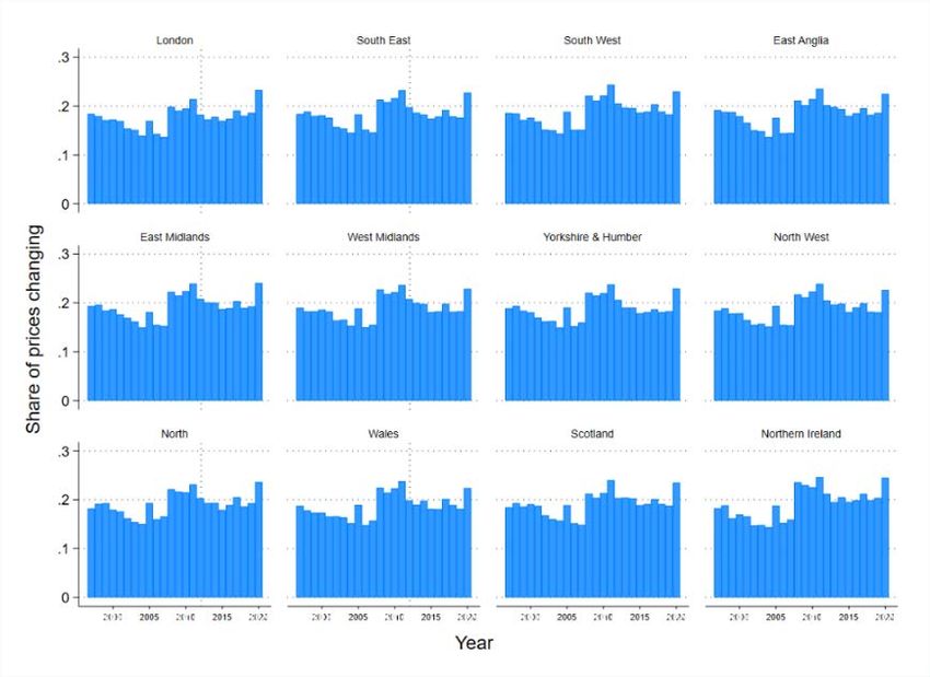
IV. NEW FACTS – THE FREQUENCY AND SIZE OF PRICE CHANGES
This section provides new long-run facts on price patterns in the UK, setting them in the
international context and using previous US and UK studies as a benchmark (Klenow and
Malin, 2010; Bunn and Ellis 2009). Table 2 summarises the results. The similarity in long run
patterns between the UK and other countries, suggests that the UK’s readily available micro
data may help gauge likely price and inflation experience in other countries.

Basic facts
The UK micro data show that price changes are common, and there is no evidence of
downward price rigidity. Over the 32-year sample 81% of prices with a comparable previous
monthly price were the same, with 19% having changed. 6 Of the prices that changed, 45%
were reductions and 55% were increases.

Chart 1. Proportion of monthly prices changing.

Note: The three large spikes (>40% of prices changing) are months in which VAT rates were changed i.e. there
was a step function in the taxes firms faced. This is discussed further below.

Price changes are often much larger than those justified by inflation. The average annual rate
of inflation over the sample is 2.7% and the month-to-month price changes are large when
compared to price adjustments needed to offset this, with the median monthly rise close to

6
 The figures in this paragraph and the table below are the long-run averages excluding the Covid-19 period, i.e. all data up
to March 2020.

 8
13%. 7 At the same time there are many small price changes: over a fifth of the price changes are less than 5% of the base price. 8 At an annual horizon, the pattern of price changes is different. A firm is more likely to have changed the price of an item, with 42% of prices changing over the course of a year. While month-on-month price cuts are almost as common as price rises, just 35% of year-on-year price changes are reductions. Finally, over a year the size of price changes is like to be smaller, with the median increase close to 8%. Table 2 Comparison of stylised facts KM-BE facts UK Data KM1. Prices change at least once a year. Most prices change at least once a year. A small share (13%) of prices ‘flat line’ over a year. BE1. An average of 19% of prices changed The average 1988-2020 is 18% of which 10% are rises each month between 1996 and 2006. and 8% are cuts. KM2. Sales and product turnover are often There is significant evidence of both official sales, and important for micro price flexibility. de-facto sales (in the form of ‘V-shaped’ prices). BE1. Monthly price changes falling to 15% if The ratio of price changes falls to 13% if sales (and sales were excluded. recoveries from sales) are excluded. KM3. Reference prices are stickier and more When an item is at a reference price (especially a persistent than regular prices. ‘rounded’ price) it is less likely to change. Prices which have moved away from previous reference prices tend to gravitate back to them. KM4. Substantial heterogeneity in the There are significant differences both between and frequency of price change across goods. within COICOP division. BE3. The price of goods changed more Goods and services prices differ in many ways. Goods frequently than the price of services. have a wider distribution, change more frequently and change in both directions. Services prices change slowly and tend to ‘ladder’ upward, with price reductions rare. KM5. More cyclical goods change prices Prices frequently for goods with procyclical more frequently. consumption patterns, including consumer durables (televisions, washing machines, dishwashers). But: • Some goods with no cyclical consumption patterns— fresh food—change very frequently. • The most flexible prices are for consumer fuels (kerosene, petrol) – these prices change almost continuously. KM6. Price changes are big on average, but Price changes are large on average. The median price many small changes occur. change is higher than that justified by inflation. 7 The average annual rate of inflation given here is CPIH for 1989-2019 inclusive. Source: ONS. 8 22% of recorded month-on-month price changes are within +/- 5% of the previous price. 9
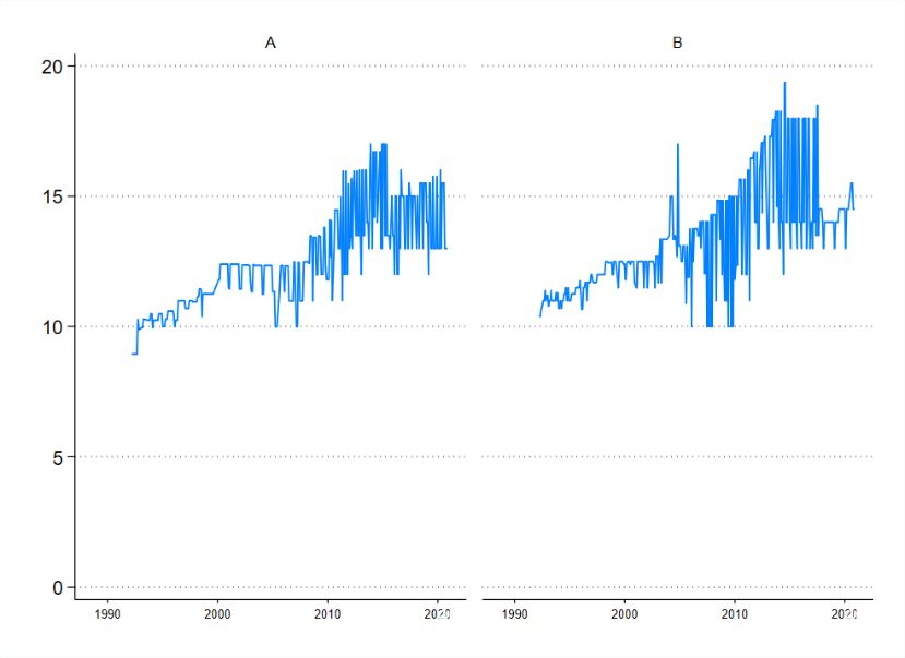
BE. The distribution of price changes was Still, around 20% of price changes are below 5%. wide. A significant number of changes are relatively small, and close to zero. KM7. Relative price changes are transitory. Relative price changes are transitory, large and tend to rest on short-term deviations from a set price. KM8. Price changes are typically not There is no clear pattern linking GDP growth rates and synchronized over the business cycle. the number of directions of price changes. The probability of price changes varies over time. It BE2. The probability of price changes was not tends to increase aftershocks (economic or policy), and constant over time. exchange rate depreciations. Also: • VAT changes cause significant jumps in the probability of price changes. KM9. Neither frequency nor size is increasing Frequency and size are decreasing in the age of a price. in the age of a price. One exception is that prices that last one year are likely to jump. Many firms impose a c5% increase every 12 months. BE. Prices that change more frequently tend to do so by less. o There is no clear relationship between frequency prices change and the size of change when they do. KM10. Price changes are linked to wage o The geographic marker in the UK data allows the changes. comparison of prices at a regional level. Price and wage levels are correlated. Regional heterogeneity in wage changes is larger, and not correlated with, regional price flexibility. Key: Fact matches that seen in the US/EU • New fact. o Differs from previous finding / requires further investigation. Sales and references prices As in the US studies and previous UK evidence, sales make a significant contribution to price flexibility. The ONS provides a marker to track the prevalence of sales. There are around 2.3m markers for sale, and just over 700,000 that mark the recovery from a sale. Defining ‘regular’ prices as those that are neither on sale, nor just ending a sale, the proportion of monthly price changes falls to 13.3%. In addition to the official sales tag, I filter the data for de facto sales by identifying ‘V- shaped’ price patterns. Following Nakamura and Steinsson (2008) I define these as a price with a one month cut before returning to its previous price. There are around 425,000 of these V-shaped prices, of which the ONS’s official sales marker captures around 70%. Most official sales tend not to be ‘V-shaped’ lasting longer than a month—this is intuitive, clearance sales, for example, may last for many months. 9 Recent studies for the US have shown that prices, while flexible, are also strongly anchored, due to the prevalence of ‘reference’ or ‘anchor’ prices that items repeatedly return to (Midrigan and Kehoe, 2015). This phenomenon—both volatile and anchor—can seem 9 Almost half of the sales prices (820,000) do not reflect a reduction on the previous month’s price, indicating an extended sale. In addition, several extended sales are only marked as sales in the first month. 10
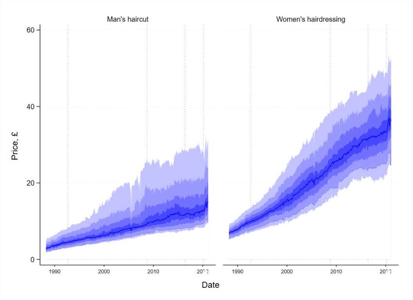
puzzling and is also a strong feature of the UK data. As an example, the chart below shows
the price of a bottle of Whisky sold in two shops in London between 1990 and 2020 (Chart
2). Flexibility is a clear feature, seen in the jagged lines as prices rise and fall. At the same
time, there is a clear tendency of prices to return to certain anchor levels—£10, £12, £15 and
£18—which increase slowly over time. 10

Chart 2. Reference prices: Bottles of Whisky, 1992-2020

Notes: Chart shows the price for a bottle of whisky sold in two London shops.

The anchor or reference prices that are most used by firms are intuitive. The five most
common prices—£1, £10, £0.99, £2 and £9.99—appear over 1.5m times and account for
more than 5% of all prices in the data. By contrast, prices just over a whole pound are
extremely rare.11 (The prevalence of 99p prices is declining over time, perhaps because these
prices are less important in on-line shopping.) When an item is priced at a 99p or whole
pound price, its price is less likely to change: across the whole data set 74% of prices with a
comparable previous month are unchanged. For whole pound and 99p prices 81% are
unchanged, for other prices 69% are unchanged. This is consistent with the ‘price points’
theory set out in Table 1 above (Knoteck, 2010)

I examine more formally the tendency of UK prices to gravitate back to previous levels.
Klenow and Malin (2010) define a “comeback” price as a price level which has been seen at
least once in the past 12 months (but was not the previous month’s price) and a “novel” price
as a level at which a good has not been sold in the past 12 months.12 Novel prices are

10
 This is consistent with models such as Kehoe and Midrigan (2014) in which individual goods may be very flexible when
examined at high-frequency there is, at the same time, low-frequency price stickiness. Both these results are in line with the
previous CPI study for the UK (Bunn and Ellis, 2011).
11
 The top 944 prices account for 90% of the data. £1.01 occurs just 4,340 times (the 757th most common price).
12
 I generalise this creating a measure, “repeat”, which asks how many times a price has been since in the past year. (So a
novel price has a repeat measure of 0; a price that has been seen in each and every month has a repeat score of 12).

 11
relatively rare in the UK data, representing just 18% of prices. By contrast fully 70% of
prices are comeback prices in the UK micro data. This is consistent with models in which
firms face costs of maintaining prices away from recognised reference levels.

Price changes by item type
A striking feature of the data is the heterogeneity—both short and long-term—in pricing
patterns by type of item being sold. Table 3 shows price flexibility using the ‘COICOP’
classification division (United Nations, 2018).13 The most flexible prices are for alcohol and
tobacco, of which over a quarter of prices change each month.14 The least flexible are
restaurants and hotels where less than 10% of prices change between typical months.

 Table 3 Price flexibility by division

 Division Prices CPI Weight Changes Up Down

 Alcohol & tobacco 1,686,665 32 27.6% 17.9% 9.7%

 Food & drink 8,644,429 79 23.8% 13.0% 10.8%

 Household & furniture 4,153,236 51 20.8% 10.6% 10.2%

 Clothing & footwear 5,467,306 50 20.3% 9.3% 10.9%

 Transport 1,410,191 120 18.5% 11.2% 7.3%

 Communication 103,039 17 17.7% 8.1% 9.6%

 Recreation & culture 3,160,340 136 16.6% 8.1% 8.5%

 Miscellaneous 2,512,890 77 14.4% 8.1% 6.3%

 Utilities, fuels & housing 1,138,471 296 12.8% 7.9% 4.9%

 Health 588,953 22 9.5% 6.0% 3.5%

 Restaurants & Hotels 3,620,405 96 9.2% 7.4% 1.8%

 Notes: These figures are for the pre-Covid period, i.e. February 1988-Feburary 2020. CPI weights are out of
 1000. The numbers presented are the February 2020 update. ONS (2020).

The divisions themselves contain large differences in price flexibility at an individual item
level. Within food and drink, for example, the proportion of prices varies from over 50% for
cauliflower, lettuce and tomatoes, to under 12% (pork piece, peanuts, dried fruit). This,
perhaps, is due to the urgency to sell fresh products that will spoil if on the shelf for an
extended period.

13
 This is the Classification of Individual Consumption According to Purpose published by the UN which almost all
countries’ statistical agencies follow.
14
 Throughout I use shortenings of the official COICOP divisions. In this case the full division is “Alcoholic beverages,
tobacco and narcotics.”

 12
The most striking difference in price pattern is between goods and services. This cuts across
the COICOP divisions. Goods prices are much more likely to change month-on-month than
services, changing 20% of the time versus 8% for services. There are differences in direction:
goods prices are equally likely to rise and fall (10.4% and 9.4% respectively) whereas
services prices are much more likely to rise than fall (6% and 1.6% respectively). And there
are differences in size: the median price rise (cut) for goods is 13% (-17%) whereas for
services it is 5% (-7%). These differences are intuitive: a 20% or even 50% price cuts for
goods is a familiar occurrence. For services, a typical pattern is flat line pricing with
occasional 5% price rises. Chart 3 plots the distribution of price changes for goods and
services.

 Chart 3. Distribution of price changes by goods and services

 Notes: Estimate of the distribution of the size of price changes (m-o-m), entire pre-Covid
 sample.

Cyclicality and durability
International evidence suggests goods with more pro-cyclical consumption patterns change
prices more often. In the US CPI, for example, prices changes are more common for goods
the consumption of which varies positively with the economic cycle (Klenow and Malin,
2010). Examples of procyclical consumption growth in the US include transport (cars,
airfares) and clothing. Durability and perishability also seem to matter. Evidence for Europe
points to durable items (white goods, for example) being more flexible. In addition, fresh
(fruit and vegetables) and raw (meat and fish) items are found to be more flexible than dried
or preserved foods.

My new results for the UK cohere with international evidence. In particular:

 13
• Prices frequently for goods with procyclical consumption patterns. This includes
 consumer durables (televisions, vacuum cleaners) and white goods (washing
 machines, dishwashers).
 • Some goods with no cyclical consumption patterns also change very frequently.
 Many of these are fresh foods that perish quickly: strawberries, grapes and cucumbers
 being some of the fastest changing prices (all over 50%).
 • The most flexible prices are for consumer fuels. For example, kerosene prices change
 over 90% of the time, and petrol prices over 60% of the time. These fast-moving
 prices have a tight distribution, suggesting they are determined by a mark-up over
 wholesale prices.

Relative price changes – size and duration
The data allows the examination of relative price changes. Tracking these questions is
important since it helps distinguish the importance of firm-level verses economy-wide
shocks. In the US, researchers have found transient relative price changes: that is, price
changes that are dispersed across firms (i.e. lots of idiosyncratic changes) and are often
temporary (Klenow and Kryvtsov, 2008; Kehoe and Midrigan, 2008).

On way to examine this question is how sales—both official and de-facto—operate
(Nakamura and Steinsson, 2008). In the UK:

 • Sales are short. Most official sales, i.e. those marked as a sale and captured as such in
 the ONS data, last one (65%) or two (20%) months. The weighted average sales
 duration is 1.67 months, in line with evidence for the US. In addition ‘V shaped’
 prices, i.e. unofficial sales of one month in duration, are common.
 • Price changes associated with sales are large. The median price change in the first
 month of a sale is -21%. After this, most sales involve firms holding their prices at the
 new sale price (the median price change is zero, and the mean close to zero).
 • Prices often revert to previous levels when sales end. After sales, the largest share of
 prices (40%) return to exactly their pre-sale level. Around 20% remain at a price
 lower than the original price (but not the sale price). Intriguingly, almost 30% of
 prices return to a higher price once a sale is completed.

 Put together this suggests transitory relative price changes are common. Firms selling the
 same product in the same region often vary their prices. The tends to suggest
 idiosyncratic shocks and motivations are important in determining prices. Firms setting
 prices for temporary, idiosyncratic, reasons rather than in response to macro shocks is a
 feature of the ‘rational inattention’ models set out in Table 1 above.

Age – hazard functions
The relationship between the ‘age’ of a price—i.e. how long a price has been held the same—
and the size and frequency of price changes is an important question, since many pricing

 14
models predict a positive relationship. The intuitive idea is that a price can be ‘stuck’—that
is, not at its optimal level—due to the costs of changing prices. During this period shocks or
information can accumulate. Then, when prices are free to change, either exogenously (as in
Calvo, 1983) or when a firm can change prices cheaply (as in, for example, Dotsey et al.
1999) there can be a sudden ‘release’: prices are more likely to change, and to change by
more.

International evidence finds only weak correlation between size and age (Klenow and
Kryvtsov, 2008; Álvarez and Hernando, 2004). Hazard rates are found to be downward
sloping for the first few months of a price, then flat (Nakamura and Steinsson, 2008). I
calculate the age of a price and examine the association with the frequency and size of price
changes. In particular:

 • Frequency of price changes. In general, the frequency of price changes falls with the
 age of a price: price changes that are new or 1 month old are most likely to change,
 with the likelihood decreasing with age. There is one exception: after 11 consecutive
 months of being ‘held’ prices are almost twice as likely to rise than at 10 or 12
 months. This is intuitive, reflecting once-yearly repricing. Price changes at a yearly
 horizon are smaller, with a median close to 5%. There is no pattern of price cuts at a
 yearly horizon. This suggesting many firms use a simple rule of thumb, raising prices
 by around 5%, once per year.

 • Size of price rises. From age 2-24 months, there is no correlation between the age of a
 price and the size of price change once a price change occurs. The exception is prices
 that are ‘new’ (i.e. age 0 or 1) which exhibit much larger median price changes. This
 is consistent with sales and V shaped prices, and evidence on transitory relative
 pricing set out above

 • Size of price cuts. For price cuts there is no relationship between the size of the
 reduction and the age of the price. This includes prices that are ‘new’. The is
 consistent with the lack of short-term price spikes (i.e. ꓥ shaped prices) in the data.

These facts can help discriminate between pricing models. If pricing is time-dependent (as in
a Calvo-type model) then price-length spell is exogenous. Over time, firms are hit by shocks
of various kinds and their desired prices move further away from current prices. For some
firms the differences between current and desired prices become large. This ‘pent up’ price
pressure means we should expect larger price rises after a long spell at a set price. By contrast
with state-dependent pricing firms still face costs, but the decision not to change prices is
endogenous. That is, the current price may not be their unconstrained desired price, but given
the cost of changing their menus, prices are always at their desired levels. In this world, as in
the UK evidence, we would not see large jumps in price after long periods at a set price.

 15
Table 4. Age, frequency and size of price changes
 Age Prices Down Up Level Size (cuts) Size (rises)
 0 8,353,673 15.0% 19.3% 65.7% -14.9% 18.2%
 1 4,967,689 11.4% 11.8% 76.8% -16.7% 11.8%
 2 3,490,418 8.9% 8.8% 82.3% -16.5% 9.4%
 3 2,641,739 8.0% 8.1% 84.0% -16.0% 7.7%
 4 2,047,385 6.7% 6.7% 86.6% -16.7% 7.3%
 5 1,645,678 5.5% 6.5% 88.0% -14.7% 6.8%
 6 1,358,600 4.6% 6.0% 89.4% -14.3% 6.3%
 7 1,137,892 4.5% 6.5% 89.0% -14.3% 6.2%
 8 955,167 3.8% 5.4% 90.7% -15.0% 6.3%
 9 814,294 3.7% 5.2% 91.1% -15.0% 6.5%
 10 695,556 3.7% 5.9% 90.4% -16.7% 6.1%
 11 580,075 3.4% 9.4% 87.2% -12.5% 5.3%
 12 478,550 2.7% 5.2% 92.1% -14.3% 6.1%
 13 418,638 2.7% 4.4% 92.9% -14.3% 7.0%
 14 370,721 2.5% 4.1% 93.4% -13.3% 7.1%
 15 329,177 2.5% 4.9% 92.6% -14.5% 7.1%
 16 290,113 2.4% 3.7% 93.9% -16.4% 7.5%
 17 259,668 2.3% 3.8% 93.8% -14.0% 7.7%
 18 232,236 2.1% 3.5% 94.4% -14.3% 7.8%
 19 208,467 2.3% 4.3% 93.4% -14.4% 7.7%
 20 185,590 2.1% 3.4% 94.5% -14.3% 7.7%
 21 166,399 2.0% 3.4% 94.6% -13.8% 7.7%
 22 149,045 2.1% 3.8% 94.1% -15.8% 8.0%
 23 130,038 2.3% 5.3% 92.4% -14.3% 7.1%
 24 1,342,328 1.5% 2.8% 95.7% -13.3% 9.1%
 Notes: Size refers to the median price change, given a price change in that direction.

A related question is the relationship between the frequency and size of price changes. The
single study for the UK found a positive relationship: using data for 1996 to 2006 they find
that the median price change rises from around 2% with prices that are 4 months old, to 4-5%
for prices that are 24 months old (Bunn and Elliss, 2009). Over the period 1988-2020 I find
no clear relationship between frequency and size. Correlation coefficients between the share
of prices changing for a good and both the mean and median percentage absolute change in
price are low. The variance of price change is higher with fast-changing goods.

In summary these new facts accord closely with previous findings for the US and Euro Area.
This suggests that the UK data, which is more readily available that than in other countries
may be indicative of their price and inflation experience. For macro modellers, the evidence
supports state-dependent over time-dependent pricing, and menu-cost models in which
anchor or reference prices are important.15

15
 The implication of for exchange rate pass through are important also, and an avenue for future research with
this data. For evidence on the US, see Gopinath and Itskhoki (2010).

 16
The next two sections look in detail at two related questions: the timing and size of price
changes versus the economic cycle and various shocks, and the role that wages play in
pricing decisions.

V. TIMING: CYCLES CRASHES AND PANDEMICS

This section examines the role of business cycles and shock in price setting. This question is
important both for understanding the implications of these shocks, and to help distinguish
between different models of price setting. For example, a lack of synchronization with the
business cycle would tend to suggest firm-level shocks are more important and that time-
dependent pricing models best describe firm behaviour. For the US evidence points to weak
synchronisation over the long run (i.e. moderate business cycle movements) but a ‘surge’ in
price movements with the 2008 recession (Klenow and Malin, 2010). This suggests looking
at acute periods of stress may be helpful.

Two large (pre-Covid) shocks—the ERM crisis and the GFC
For the UK, pre-Covid, two stress periods provide interesting comparators. First, the
Exchange Rate Mechanism (ERM) period, in which the UK adopted a fixed exchange rate
later abandoning it following a large-scale currency crisis in the autumn of 1992 (Cobham,
1997). Second, the GFC. Britain was at the forefront of the global crash, with UK banks
having evolved to be highly concentrated, thinly capitalised, and reliant on short-term
funding (Davies et al, 2010). These two periods are compared to Covid-19 in Table 5 and
summarised briefly below.

 Table 5 Comparing crises, crashes and pandemics
 ERM GFC EU Referendum Covid-19
 Event (1990-92) (2007-09) (2016-2017) (2020-)
 GDP -2% -6% 0% -22%

 Inflation 9.2% 4.8% 2.6% 0.5%

 Exchange rate -20% -40% -16% -7%

 Unemployment rate 10.6% 8.5% 4.7% 5%

 Notes: GDP is peak to trough in quarterly volume of output (ONS: ABMI). Inflation is peak CPIH inflation (ONS: L550), and current
 inflation for Covid-19 period. Unemployment is peak unemployment rate for age 16 and over and latest rate for Covid (ONS: MGSX,
 Feb 2021 data: Sep-Nov 2020). The exchange rate tracks depreciations and is the peak to trough fall in the Sterling ERI during these
 periods, with not all windows the same size (BoE: XUDLBK67). The “Brexit” shock is hard to date. The numbers here refer to the year
 following the referendum result of June 2016 (inflation rose from close to 0 to 2.6%); the Sterling ERI fell from 87 to 73 over the course
 of 4 months.

 17
• ERM. The period 1990-92 was a volatile one for the UK. There was a recession
 (1990) and a currency crisis (1992). The general level of inflation was also
 considerably higher in this period—averaging 6.7% annually—than in any year since.
 This shows up in the micro pricing data, particularly in the run up to the ERM exit.
 During the spring of 1992 price changes began to pick up, with a 10-percentage point
 increase in the number of prices rising. At the same time, there was a similar rise in
 the number of firms cutting prices immediately following the ERM exit. In summary,
 the UK experienced short-term price volatility, and a shift in relative prices.
 • GFC. The GFC generated significant price volatility. A greater share of prices were
 cut in 2008 than in any other year of the pre-Covid sample. This was a strong
 downturn in the UK—the worst since the First World War—with firms across sectors
 cutting prices in response. At the same time, many firms began to raise prices. Some
 companies, particularly those importing inputs, will have faced higher costs as sterling
 depreciated. Tight corporate credit conditions in the UK, and a rise in global oil prices
 during this period also likely increase firms’ costs. For the UK household the result
 was an increase in both price cuts and price hikes—the GFC thus led to a shift in
 relative prices, similar to that seen with the ERM crisis.
 • Brexit. The EU referendum result of June 2016 confounded political polls. The shock
 result led to a revaluation of UK growth prospects (Dhingra et al, 2017). Sterling
 depreciated by 10% in a week, falling 20% by the end of the year. 16 The price series
 that underlie the UK producer price index (PPI) show that the prices of specific types
 of inputs including foods, dairy and chemicals all rose in line with the depreciation of
 sterling. The CPI micro data showed that many firms took steps to offset this, with the
 frequency of year-on-year price changes stepping up: in the year running up to the
 vote, around 23% of the prices had risen, a year on from it 34% had; the share of
 annual price reductions dropped from 20% to 15%. This is in line with previous
 findings, Breinlich et al (2017). In short, the Brexit shock was unlike the ERM and
 GFC in that it was straightforwardly inflationary: more prices went up, and fewer
 went down.

16
 The result was a shock: on the day of the vote, June 23rd, political betting sites were strongly predicting that the majority of UK voters
would want to remain in the EU.

 18
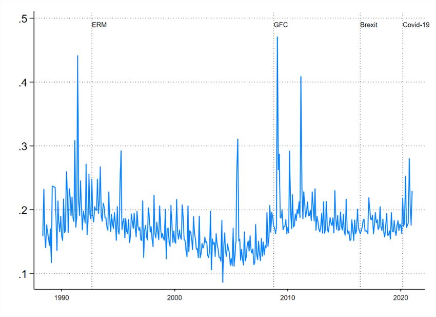
Chart 4. Year-on-year price changes, 1988-2020

Notes: The chart shows the proportion of prices with a comparator one year previously that have risen and
fallen when compared on a yearly basis.

VAT shifts
The monthly price change series feature several extreme spikes. The three largest peaks, each
of them months in which more than 40% of price rise, are explained by tax changes. VAT
rose from 15% to 17.5% on 1st April 1991, it was cut to 15% on 1st December 2008, and
increased to 20% (from 17.5%) on 4th January 2011. These months all experienced a surge in
price changes. 17

The VAT data show the high degree of price responsiveness to sales taxes in Britain. The
way taxes are levied may play a role here: in the UK listed consumer prices include tax, while
in the US taxes are added at the till. This means that from the perspective a UK business
listed consumer prices are ‘gross’: the true return from the sale is the price minus the tax
amount. There are implications for tax pass through: a shop that holds its price constant when
VAT rises faces a loss. Several studies have looked at VAT pass through: Karadi and Reiff
(2015), examine Hungarian data across 123 stores (focussing on processed foods) and find
flexible but asymmetric responses to VAT changes.

In addition to price rises following a tax hike there is evidence of downward flexibility in the
UK. Following the December 2008 VAT reduction almost 40% of prices were cut. This was

17 The most volatile months in terms of pricing are December 2008 (47%, of which 37% cuts), April 1991 (41%, of which 41% rises), and

January 2011 (41%, of which 30% rises).

 19
far higher than price cuts seen in other months, or in December in other years. The UK data
are indicative of immediate and symmetric pass-through, at least initially.

The data also point to an interesting phenomenon. Shortly (3 months) after the 2008 VAT cut
an unusual number of prices rose, eradicating the previous price reductions. A similar pattern
has appeared with VAT cuts introduced as part of the Covid stimulus package (see
accompanying brief). It is unclear what is happening here. One possibility is that some firms
cut prices in response to the widespread pressure to pass on the tax break, only to raise price
back to previous levels shortly afterward. This would be consistent with significant evidence
of ‘anchor’ prices, discussed below.

VI. PRICES AND WAGES – REGIONS AND FIRM TYPES
There are many reasons to expect price and wage changes to be linked. Wages are an
important source of firms’ costs and are adjusted relatively infrequently in most firms. This
means that across firms we would expect those with higher labour costs as a proportion of
overall costs to adjust their prices relatively slowly. In addition, wages represent consumers’
ability to pay, so we might expect firms based in regions where wages are growing more
strongly to raise their price more frequently.

International evidence points to the importance of labour market conditions for price changes.
Klenow and Malin (2010) find that firms in labour-intensive sectors adjust prices less
frequently. By matching US goods to the manufacturing industries they are produced in
Peneva (2009) shows that labour intensity is negatively associated with the frequency of price
changes. More recently, Kaplan and Menzio (2015), study US prices distributions between
2004-2009 and show that households with fewer employed members pay lower prices and do
this by visiting a larger number of stores. This would suggest that firms in low wage or low
employment locations should charge lower prices.

Full answers to these questions are topics for further research. To provide some preliminary
clues I use the regional and firm characteristics available in the UK data.

Regional pricing and regional wages
The UK data provide a ‘shop code’ identifier. Using this I calculate the national average price
for all firm-item pairs on every date (that is, the mean price a firm is selling an item at across
all its regions of operation). Most firms in the data (2,932 or 71%) operate in just one region.
These firms are likely to be small and provide few price quotes.

By contrast a relatively small number of firms (443) are active in all 12 regions, but these
firms provide over 90% of the price quotes. This means the price data allow good within-firm
regional comparisons—i.e. a given price in the data is likely to have a comparator being sold
by the same firm somewhere else in the UK.

 20
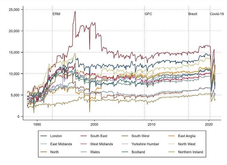
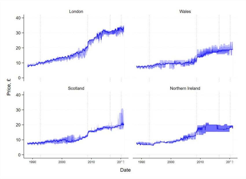
Table 6 Regional activity of firms providing price quotes
 Regions active Firms Price records Firms share Share
 1 2,932 155,628 71% 0.38%
 2 127 47,688 3% 0.12%
 3 102 55,755 2% 0.14%
 4 147 128,992 4% 0.31%
 5 48 106,093 1% 0.26%
 6 34 41,093 1% 0.10%
 7 64 119,766 2% 0.29%
 8 98 159,151 2% 0.39%
 9 89 207,634 2% 0.51%
 10 30 68,756 1% 0.17%
 11 41 1,385,870 1% 3.38%
 12 318 23,496,928 8% 57.30%
 13 125 15,036,256 3% 36.67%
 Total 4,155 41,009,610

I next calculate, for each price reported by a multi-region firm, the distance of the price from
the firm’s relevant national average price. Multi-region firms vary their prices. Comparing
prices for the same good in different locations reveals that 48% of goods are sold at
nationally uniform prices, with the remainder sold at prices that vary by location. UK firms
thus impose a ‘price premium’ in some areas, and lower prices in others. Chart 5 plots the
distribution of these premia, by firm, in London and Wales. As we would expect, higher
prices higher price premia) are more common in London than in Wales.

Chart 5. Price premia London and Wales

Notes: Estimate of the distribution of price premia (the % difference between a firm’s regional price and its mean-UK
price) for Wales and London. Prices with zero premia are excluded.

 21
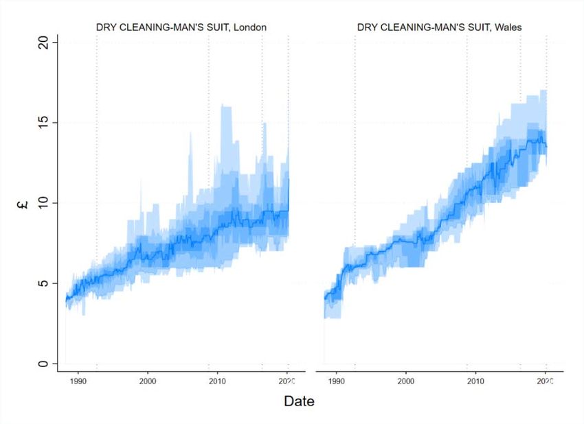
These item-level premia can be aggregated to provide a composite measure of price
discrepancies at a regional level. These differences in price levels are associated with
spending power. The average price premium is 4.4% in London. In Wales comparable firm-
item prices are 3.9% below the national average. These differences are correlated with
household disposable incomes (Chart 6). This measure suggests multi-region firms vary their
prices systematically by region.

Chart 6. Average price premia and household income, UK regions

Notes: Scatter of the mean price premium for a region (entire sample) against a measure of household disposable income.
Source: ONS, Gross disposable household income (GDHI) by NUTS1 region, UK, 2016.

The data suggest factors other than wages are at play. For example, the price distributions for
some goods fit poorly with the pattern described above. For example, Chart 7 plots the price
distribution of a service: dry-cleaning charges. Wales has lower income levels and growth
rates, but the price distribution is higher and faster growing. The sources of these
discrepancies would be interesting future research.

 22
Chart 7. Varying price level change and spread: dry cleaning in London and Wales.

Notes: Plot of the distribution of prices. Colours refer to deciles. The coloured region is the 10th to 90th deciles. The solid
blue line is the median.

Price changes and firm size
The micro data allow three indirect measures of size to be created. First, I look at the number
of price observations the ONS collects from firms: this ranges from below 10 to hundreds of
thousands. Second, I examine the regional span of a firm’s operation: quotes from some firms
represent just one region, other firms provide prices for every region of the UK—a measure
of geographic scope. The third measure is the number of distinct items that prices are
collected for from a particular firm—i.e. the scope of its ‘menu’. This ranges from 1 to over
1000. These measures of firm size are all imperfect but offer interesting clues as to the nature
of the firm providing the price quotes.

On all three measures price flexibility rises as firms get bigger (Charts 8 and 9). That is: when
a firm is operating in more regions or offering more products it is more likely to change its
prices. There is considerable heterogeneity among smaller firms, with some hardly changing
any prices, and others being the most active in altering pricing. As firms get bigger, the
distribution tightens—the regularity of price changes is much more similar among firms that
are active across many regions and/or sell many products.

 23
You can also read


