Measuring excess mortality: the case of England during the Covid-19 Pandemic - John Muellbauer and Janine Aron INET Oxford Working Paper No. 2020-11
←
→
Page content transcription
If your browser does not render page correctly, please read the page content below
Measuring excess mortality: the case of England
        during the Covid-19 Pandemic

            John Muellbauer and Janine Aron

                     5th May 2020

         INET Oxford Working Paper No. 2020-11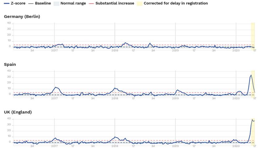
Measuring excess mortality: the case of England during the Covid-19 Pandemic

John Muellbauer and Janine Aron, INET@Oxford, 5 May 2020

Summary:

Analysing excess mortality - the count of deaths relative to what would normally have been expected
- is highly relevant for policy-makers during a pandemic. The UK now has the highest recorded number
of deaths attributed to Covid-19 in Europe. The more robust data on excess mortality make even
grimmer reading. These excess mortality data can both overcome the problem of misdiagnosis or
under-reporting of Covid-19-related deaths and pick up ‘collateral damage’ from other health
conditions, untreated because the health system might have been overwhelmed by Covid cases. This
article compares measures and analyses published excess mortality scores. EuroMOMO produces the
most systematic comparative tracking of excess mortality in Europe. Of the 24 countries or regions
covered, England had the highest peak weekly excess mortality in total, and also for the most
vulnerable age group (the over-65s), and, strikingly, for the 15-64 age group. For the last group, which
should be less at risk, the relative record for England is nearly 3 times worse than the next worst-
ranked country, Spain (German data suggest mortality well within the normal range). While different
reasons for England’s divergent pattern are explored, more research is urgently needed.

A simple weekly measure of excess mortality is the P-score defined as the number of excess deaths
divided by the number of ‘normal’ deaths, for example defined by the average for the corresponding
week over the previous 5 years. The article argues that national statistical offices such as the UK’s ONS
should be publishing weekly P-scores of excess mortalities for the constituent countries, regions, sub-
regions, down to a local authority level to help understand the pandemic and inform policy. The more
complex ‘Z-score’ measure published by EuroMOMO, is standardised by dividing excess deaths by the
standard deviation of deaths to capture uncertainty around the weekly death count under normal
conditions. However, if the weekly data variability is lower in one country compared to another, then
the Z-score may overstate the apparent relative size of excess deaths. Spot checks by the P-score
measure support the conclusion that England has the most serious incidence of excess mortality of
the comparator countries or regions analysed by EuroMOMO. The article argues that the P-scores as
well as Z-scores should be produced by EuroMOMO to aid more systematic comparability across
countries and guide epidemiological studies and social and economic policy.

Why is it important to examine excess mortality data?

Excess mortality is a count of deaths relative to what would normally have been expected. When there
is a pandemic, deaths rise sharply, but the reasons for these deaths are often not accurately recorded.
For instance, people die at home without a doctor being present and the death certificate may not
attribute the cause of death correctly. Thus, the death count attributed to Covid-19, for example from
the Johns Hopkins website 1, is likely to significantly undercount the full impact on deaths of the
pandemic. In order to compare the experience of different countries, where the degree of under-
recording may differ, it is important for policy-makers to examine the more robust measures that are

1
 See webpage: COVID-19 Dashboard by the Center for Systems Science and Engineering (CSSE), Johns Hopkins
University.

John Muellbauer and Janine Aron, 5-May-20                                                           1/13
expressed relative to the benchmarks of ’normal’ deaths, from excess mortality analysis. Normal death
rates will reflect persistent factors such as the age composition of the population, the incidence of
smoking and air pollution, the prevalence of obesity, poverty and inequality, and the normal quality
of health service delivery.

The excess mortality data overcome two problems present in the conventional reporting of Covid-
related deaths. Excess mortality data avoids the miscounting from misdiagnosis or under-reporting of
Covid-related deaths. The official death statistics from the virus depend on an effective testing regime
for each country, coverage of the social care and home deaths as well as hospitals, and effective
reporting mechanisms; even then, there may be lags in the data. Excess mortality data also include
‘collateral damage’ from other health conditions, untreated because the health system might have
been overwhelmed by Covid-19 cases. The excess mortality statistics are likely to be conservative, as
the Financial Times observes, since mortality from events such as traffic accidents and occupational
injuries may have fallen. 2 These excess mortality data can be used better to understand the full social
and economic consequences of Covid-19 pandemic.

How is excess mortality measured and who measures it?

National statistical agencies such as the ONS publish actual weekly deaths and some benchmarks of
past ‘normal’ deaths. The ONS gives benchmarks for ‘England’ and for ‘England and Wales’ (from
which Wales can be deduced), defined as the average of the previous five years’ deaths. There are no
published benchmarks for more granular or disaggregated data, such as for other sub-regions or cities.
Using the weekly historical data, researchers could calculate such benchmarks with some effort. To
obtain cross-European comparisons requires resorting to a time-consuming collating of similar data
from all the individual agencies - unless the Z-scores compiled by EuroMOMO for 24 countries and
regions are used, see Box 1, and of which more below. Note that EuroMOMO do not report actual
excess figures at the country level, only Z-scores. In the U.S., the National Centre for Health Statistics
is publishing data on excess deaths and P-scores but defining excess deaths not as deviations from
‘normal’ deaths but as deviations from ‘normal’ deaths plus a margin that takes the uncertainty of the
data into account. 3 At the geographical level, their data include counties as well as states and they
also disaggregate by gender, age and ethnicity. The NCHS is setting an international standard for
statistical agencies elsewhere, though reporting lags in some localities appear to be more severe than
in many European countries.

Give the importance of such comparisons, as explained above, and the difficulties in accessing official
data in the most relevant formats, in the last fortnight at least three separate journalistic endeavours
have engaged in the very time-consuming effort of collecting and presenting excess mortality data,
see Table 1. For example, the Financial Times presents recent snapshots of numbers of excess deaths,
and the P-score or percentage of deaths from all causes that are above ‘norma’l deaths, where the
latter are an average of the years 2015-2019. The Economist shows figures and graphics for excess
deaths but not P-scores.

2
 See “Global coronavirus death toll could be 60% higher than reported”, Financial Times, 26 April, 2020.
3
 See webpage: “National Center for Health Statistics”, Centers for Disease Control and Prevention (CDC), US
Government.

John Muellbauer and Janine Aron, 5-May-20                                                               2/13
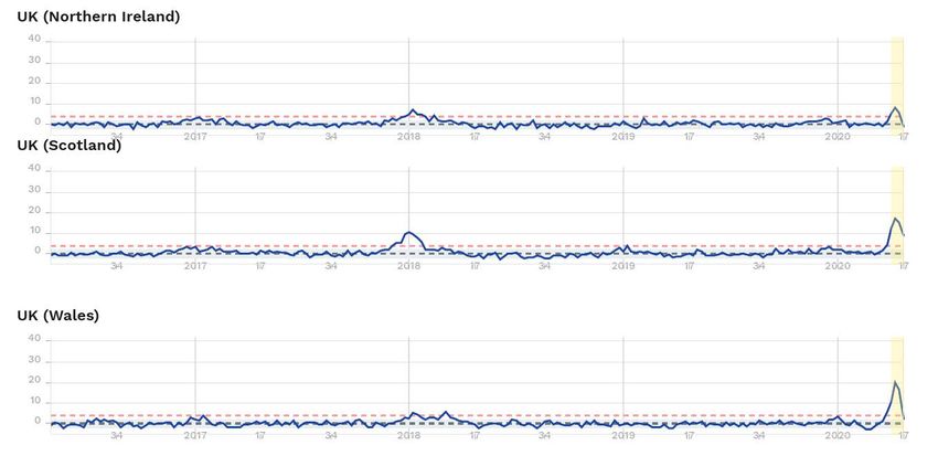
Table 1: Three journalistic endeavours to examine comparative excess mortality data for Europe, the UK and
the US, and other countries 4
 Source        Measure         Period of     Benchmark     Locations compared        Updated     First
                               measure-                                                          publication
                               ment                                                              date
      The       Numbers of       Weekly;       “Expected       England and Wales        Yes.       16 April
  Economist        excess       approxim-       deaths”,     (and London, SE and                    2020.
                  deaths.          ately        averages     W Midlands), France
                                monthly in   ranging from (and 3 regions), Spain
                                one table;    2 to 5 years     (and Madrid and 2
                                monthly for                 regions), Netherlands,
                                 Jakarta.                       Belgium, Sweden,
                                                             Austria; Jakarta, New
                                                               York city; Istanbul;
                                                            Italy (Lombardy only).
      The       P-score and     One week.      Historical     England and Wales,     Yes, with     26 April
   Financial    numbers of                    average of      Italy – a subset (and  extended       2020.
     Times         excess                     deaths over     Bergamo province),      country
                 deaths. *                    2015-2019.    France (and 1 region), coverage.
                                                                 Spain, Portugal,
                                                             Netherlands, Austria,
                                                                Belgium, Sweden,
                                                           Switzerland, Denmark;
                                                                  New York City,
                                                                 Madrid, Jakarta,
                                                              London, Stockholm;
                                                                Ecuador (1 region
                                                                      only).
   The New        P-score       Weekly or     Average of       U.S. States, France,   Unclear.     28 April
 York Times (percentage          monthly,        deaths,         Spain, Germany,                    2020.
                   above        differs per       data-     Ecuador, Netherlands,
                normal) and country. For      dependent,        Belgium, Sweden,
                numbers of       the U.S.     & differing    Switzerland, Norway,
                   excess       states, for   by country.     Denmark; New York
                  deaths.        March 9-     5-years for   City, Jakarta, Istanbul.
                                 April 11.      the U.S.
Notes: *Some of the FT’s published P-scores look unreliable as the data and graphics do not match.

As noted above, timely measures of weekly excess mortality in Europe are published by EuroMOMO 5,
and offer one way of comparing the mortality patterns between different time-periods and between
countries. Z-scores standardise data on excess deaths by scaling by the standard deviation of deaths.
Box 1 explains the exact calculation used to create a Z-score. The most recent data are adjusted for
delays in registration. EuroMOMO do not publish or graph the raw mortality figures at the country
level and do not publish the standard deviations used in their calculations. However, they graph the
Z-scores for each country back to 2016 providing a useful visual guide to their variability, and also
graph their estimated confidence intervals. The recently published estimates of P-scores in

4
  See “Tracking Covid-19 excess deaths across countries”, The Economist, 16 April, 2020, and Tozer: “Measuring
the true toll of the pandemic”, 24 April, 2020. For the Economist, Tozer measures excess deaths from the week
the first 50 Covid deaths were reported, to around April 12. Also see “Global coronavirus death toll could be 60%
higher than reported”, Financial Times, 26 April, 2020; “46,000 Missing Deaths: Tracking the True Toll of the
Coronavirus Outbreak”, The New York Times, 30 April, 2020.
5
  EuroMOMO is a European mortality monitoring entity, aiming to detect and measure excess deaths related to
seasonal influenza, pandemics and other public health threats. Official national mortality statistics are provided
weekly from the 24 European countries and regions in the EuroMOMO collaborative network, supported by the
European Centre for Disease Prevention and Control (ECDC) and the World Health Organization (WHO).

John Muellbauer and Janine Aron, 5-May-20                                                                   3/13
newspapers give just a recent snapshot, so that the context of historical variability provided by
EuroMOMO is missing.
Box 1: Measures of excess deaths: comparing and contrasting the Z-score and the P-scores
Denote the number of weekly deaths by x.
The P-score is defined as follows:
(x minus the expected value of x for the population), divided by the expected value of x for the population
A variant P-score (U.S. National Center of Health Statistics) is defined as follows:
(x minus the upper threshold for the expected value of x for the population), divided by the upper threshold
for the expected value of x for the population.
The upper threshold is defined as the expected value plus the 2.5% confidence interval for this
expected value. This takes into account uncertainty created by the natural variability of x.
The Z-score is defined as follows:
(x minus the expected value of x for the population), divided by the standard deviation for the population of x
around its expected value.
EuroMOMO estimate the expected value of each country’s weekly deaths using data for the previous
five years, taking seasonal factors and trends into account.
For count data, like the weekly deaths, x, a Poisson distribution is likely to be a reasonable
approximation to the underlying probability; the estimated Z-scores of EuroMOMO take this into
account. *
Graphs published for each country show the weekly Z-scores since 2016 compared to their usual
range of -2 to +2, the approximate 95% confidence interval. Around 2.5% of observations would thus
usually have a Z-value in excess of 2. The Z-score equals 4 line is also shown (in red), corresponding
to a ‘substantial increase’: under usual conditions the Z-value would exceed 4 only around 0.003% of
the time.
The graphs show a substantially greater number of deviations of Z-scores ’exceeding 2’ and ‘exceeding
4’, than one would expect. The main reason is that to fit the baseline, EuroMOMO chose only the
period of the year when it is assumed that additional processes (e.g. Winter influenza and Summer
heat waves) leading to excess deaths are not likely to happen. Normal variability is thus measured
after excluding these seasons. **
* The Poisson is a discrete probability distribution that expresses the probability of a given number of events occurring in
a fixed interval of time if these events occur with a known constant mean rate and independently of the time since the last
event. The calculation is described in Farrington et al. (1996). As the data are probably not time-independent, the claimed
probabilities associated with different Z-values are likely to be only approximate.
** See EuroMOMO webpage: “Methods”.
John Muellbauer and Janine Aron, 5-May-20 4/13While the P-scores, as, for example, published by the Financial Times, give a percentage deviation of the count of deaths from an historical average, the Z-scores give a measure that is less straightforward for a wider audience to grasp, namely a deviation relative to the variability of the data. If the natural variability of the weekly data is lower in one country compared to another, then, as noted above, the Z-score could lead to exaggeration of excess mortality compared to the more easily interpretable P- score. Unfortunately, we only have P-scores for a few countries, regions and cities, in snapshots as published by the Financial Times and the New York Times, for example. The Office for National Statistics (ONS) in the UK publishes both the actual deaths and the ‘normal’ deaths based on an historical average, so that the P-scores of excess deaths could be calculated for the whole of England and the whole of Wales. However, they do not give disaggregated data for sub-regions for ‘normal’ deaths, only for actual deaths. Hence, all we have on a comparative basis for Europe and the UK are the comprehensive Z-scores unless all national sources are consulted individually. These Z-scores yield interesting insights for the UK analysed in this article. Some selective comparisons made below with P-scores, reveal that England had the highest number of excess deaths from both measures of all the European countries or regions covered. A first look at data for England: total figures and the over 65s While UK deaths attributed to Covid are the highest in Europe, the excess death data are likely to be more robust for the reasons given. England’s outcomes are the worst of the 24 countries or states for which EuroMOMO reports Z-scores. It is followed by Spain, Belgium, Netherlands, Italy and France. The total measure for all age groups up to the week ending 26 April 2020 (called week 17 by EuroMOMO), reveals that at the peak in week 15, England’s Z-score was 39.7 and in week 16 it was 36.9. 6 These Z-scores correspond approximately to ONS data on the week ending April 17, of 21,182 deaths in England, compared to the ‘normal’ number of 9787 (based on the average of the previous 5 years). Excess deaths thus, were 11,395, or more than twice the expected number. Adding up the daily totals of reported Covid-19 deaths in English hospitals from the ONS gives a weekly total for the week ending April 17 of 4140. Covid-19 deaths that occurred in care homes and at home, and unusual deaths due to other reasons, including the perceived or actual lack of access to the NHS, would account for the difference between the ‘headline’ count of Covid deaths in hospitals and the total of excess deaths of 11,395. The peak rate of excess deaths in England for the most vulnerable age group, the over-65s is also the highest for the 24 countries or regions compared. We make selected comparisons of Z-scores for the UK with Germany (represented by Berlin) 7 and Spain, shown in Figure 1, drawn from EuroMOMO’s full set of graphics. Within the UK, Northern Ireland has the lowest relative excess mortality as represented by Z-scores for this age group, while Scotland and Wales are in an intermediate position. They lie far below excess mortality shown for England, and substantially below Spain, Belgium, 6 For comparison, the peak scores for other poor performers in brackets were Spain (34.7), Belgium (29.4), Netherlands (24.1), Italy (22.7) and France (21.8). In contrast, the Z-scores for Berlin were well below 2 in all the weeks of March and April. 7 Germany in the EuroMOMO scores is represented by Berlin and the state of Hesse (capital Frankfurt). These two Länder (provinces) are in the middle of the range of Covid-19 infections per head, with Bavaria (for which there is no Euro MOMO score) being the most severely affected. See the Robert Koch Institute COVID-19- dashboard for German data. John Muellbauer and Janine Aron, 5-May-20 5/13
Netherlands, Italy and France. 8 England has higher peak excess mortality than Spain, while Germany’s
are well within the normal range. The impact of the usual winter-influenza across Europe appears to
have been lighter than in earlier years, helping to account for the low excess mortality data for
Germany and for many of the smaller countries in Europe. Although Italy initially dominated the
headlines for Covid-19-related deaths, it ranked only fifth for peak excess mortality figures for the
over-65s, and substantially below Belgium, Netherlands and France.

Figure 1: A snapshot of the Z-scores for the 65+ age group from the EuroMOMA dataset

8
 The peak scores were Spain (34.1), Belgium (30.7), Netherlands (25.1), Italy (23.6) and France (22.0). In contrast,
the Z-scores for Berlin were 1 or below in all the weeks of March and April.

John Muellbauer and Janine Aron, 5-May-20                                                                     6/13
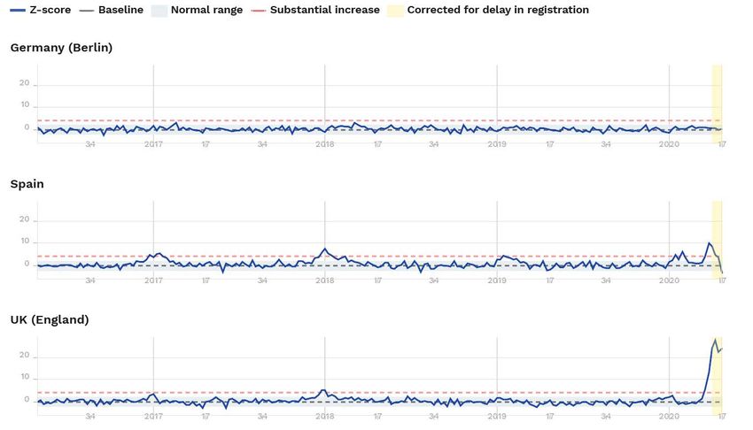
What can be learned from the within UK comparisons of these Z-scores? London’s international
connectedness and the timing and London-centric location of the spread of the infection are likely to
have been major factors in explaining England’s far worse performance. Another factor was the
undeniably late response by policy-makers and a collective failure in preparedness across the public
health system, especially in testing capability and personal protection equipment for health workers,
see below. That the regions further from London fared better throughout underlines the role of timing
and London-centric factors. Since the regional spread of the disease lagged behind London, when the
social distancing and lock-down measures were eventually introduced, they were the more effective
in the regions. In London, these measures came too late to prevent the high level of excess deaths. A
fascinating observation is that a clear downturn in excess mortality in Northern Ireland, Scotland and
Wales preceded the downturn in England, even though it is plausible that the incidence of the virus
was later than in England. It is circumstantial evidence on the effectiveness of timely social distancing
and lockdown measures.

Excess mortality for the 15-64 age group: the English outlier

More disturbing is the comparative story for the 15-64 age group, where England’s relative record in
excess mortality in the Covid-19 era is particularly poor. At its peak (i.e. in the week with the highest
excess mortality) , it is 2.7 times worse than the weekly peak in next worst country, Spain, almost 4
times worse than France and Belgium, and almost 5 times worse than Italy’s peak weekly excess
deaths in the age group. 9 The death rate from Covid is strongly age-related and is always far lower for
the 15-64 age group than for those aged 65 and over. Within the UK, peak excess deaths for Wales
look only slightly above what EuroMOMO call the ‘substantial’ level of Z=4, marked as the red line in
the charts, while those in Scotland and Northern Ireland are below that level, see Figure 2. However,
for England, the excess death rate for the 15-64 age group, though lower than for those aged over 65,
is strikingly higher than in other countries or regions in Europe. The 15-64 age group includes the mass
of the working age population. Moreover, England appears to be the only country in Europe and the
rest of the UK, for which deaths had not fallen back below the level Z=2 by week 17 (i.e. the week
ending April 26), but was still 24.1. This is concerning and baffling.

Are there useful comparative lessons from other countries?

Germany’s better comparative record gives some clues to explain the far worse performance of
England and some other countries. Important were the early large-scale testing and contact tracing,
trust in the government’s social distancing guidelines and the fact that many of the initially infected,
returning from skiing holidays were young and fit. 10 Germany developed the first coronavirus test in
mid-January 11 and ensured that capacity to manufacture large quantities of the test kits was rapidly
rolled out. Germany has more than three times as many hospital beds and intensive care beds than
the UK, and many more ventilators. Patients were admitted into hospitals at a much earlier stage if
they were unable to shake off the symptoms within the course of a week. Many cities introduced
‘coronavirus taxis’, enabling medical staff to visit patients at home and take a test. If positive, the GP
would then be in touch every other day to enquire about the development of the disease. If someone
experienced breathing problems, they were sent straight to hospital where beds and, if need be,

9
  The peak scores are Spain 10.0, France 7.2, Belgium 6.9, Italy 5.6, Netherlands 5.0, while within the UK, the
peak scores are England 27.4, Northern Ireland 2.8, Scotland 3.7 and Wales 5.4.
10
   See “A German exception?”, The New York Times, 4 April, 2020.
11
   See “Covid-19: Why Germany’s case fatality rate seems so low”, British Medical Journal, 7 April, 2020.

John Muellbauer and Janine Aron, 5-May-20                                                                7/13
ventilators, were available. It seems that Germany built up stocks of personal protective equipment
(PPE) for health workers earlier than other countries. 12

Figure 2: A snapshot of the Z-scores for the 14-64 age group from the EuroMOMA dataset

12
     For the U.S. record, see “Why America ran out of protective masks”, 27 March, 2020.

John Muellbauer and Janine Aron, 5-May-20                                                     8/13
The interaction of multiple factors is likely to account for Germany’s better record. If health workers are effectively protected, not only do fewer of them become sick, affecting the delivery capability of the health system, but many fewer patients are infected. People are then less fearful of the risk of catching the virus from medical staff when seeking medical attention for other conditions. In the UK, there has been a sharp reduction in people seeking medical attention for heart attacks, strokes and other life-threatening conditions accounting for part of the surge in excess deaths in the UK. Reinforced by the much-repeated ‘protect our NHS’ mantra, patients showing symptoms, including of breathlessness, 13 were encouraged to manage at home, when in Germany or South Korea they would have been routinely admitted. This policy difference helps account for the far higher death rates among Covid-19 patients admitted to UK hospitals. A further worry is that some extra deaths caused by late medical attention will show up in future years. If the infection rate in the general population had been suppressed through early testing, tracing and isolation (TTI), then the demand on scarce PPE and intensive care resources would have been less and UK residents better protected. Generally speaking, excess mortality connected with Covid-19 mainly affects the tail of the distribution of existing vulnerability across the population, that is, older people and those with pre-existing health conditions. With greater incidence of the virus, average vulnerability increases across the population, shifting the mean of the distribution of vulnerability to the right, increasing the proportion that fall into the most vulnerable tail, including in the 15-64 age group. Then too, the risk of infections being passed to the most vulnerable of all, in care homes, is greatly increased. 14 Excess mortality in care homes could also explain part of excess mortality in the age group 15-64 in England, as the care home population consists not only of the elderly but of other vulnerable individuals. Until systematic sampling using antibody-based tests of the population in different countries at a considerable scale has occurred 15, it will not be known how the comparative rates of infection in the population differ between countries. Only then will it be clear how far mean vulnerability for the English population has shifted compared to that in other countries. It is possible that a higher incidence of the virus across the population in England compared to other countries could account for the extreme incidence of excess deaths not only among those aged 65 and over, but for the 15-64- year age group. However, there could also be other factors contributing to the high comparative level of excess mortality in England. One hypothesis concerns ethnic differences in the incidence of Covid-related deaths. 16 Data from the ONS on age-corrected mortality rates by location show much higher Covid- related death rates in places with the greatest economic deprivation.17 It is likely that underlying health is worse in these areas and that low-paid key workers, more exposed to potential infection, live there in disproportionate numbers. Then a greater degree of inequality in incomes and in access to decent housing in England - compared to many European countries - could be partly culpable. These factors are particularly pertinent to the 15-64 age group. 13 See “The infection that’s silently killing coronavirus patients”, The New York Times, 20 April, 2020. 14 See “Inside UK care homes: why the system is failing its coronavirus test”, The Financial Times, 24 April , 2020. 15 See “A Workable Strategy for Covid-19 Testing: Stratified Periodic Testing rather than Universal Random Testing”, INET, Oxford, 22 April, 2020. 16 See “Is ethnicity linked to incidence or outcomes of Covid-19?”, BMJ, 20 April , 2020, and “Ethnic minorities dying of Covid-19 at higher rate”, The Guardian, 22 April, 2020. 17 See webpage: “Deaths involving COVID-19 by local area and socioeconomic deprivation: deaths occurring between 1 March and 17 April 2020”, ONS. John Muellbauer and Janine Aron, 5-May-20 9/13
Insufficient attention to warnings from critics and scientific experts

There is widespread agreement among critics of the UK government’s policy response that two key
failures were not investing in adequate supplies and distribution logistics of PPE 18 and in testing
facilities at the beginning of the crisis. The late recognition of the need to provide care homes with
PPE and tests has received much recent attention. A third factor was the late and initially unclear
application of social distancing and delay in lock-down measures, see Sridhar (23 March) 19 and Horton
(28 March) 20 and the comprehensive account by Guardian journalists. 21 Perhaps the most puzzling
decision of all was the abandonment of testing, tracing and isolation on 12 March to follow
temporarily the false trail of counting on ‘herd immunity’ to slow the spread of the virus. 22 The
argument advanced is that the number of infections was overwhelming the capacity to test and trace.
If that was the case, it should have been even more urgent to implement stringent social distancing
measures, instead of which major crowd events such as the 5-day Cheltenham Festival were allowed
to proceed in that week.

Anderson et al. (6 March) 23 had by that stage already analysed the key factors in the dynamics of the
spread of Covid-19. To quote: “What has happened in China shows that quarantine, social distancing,
and isolation of infected populations can contain the epidemic. [Our italics.] This impact of the Covid-
19 response in China is encouraging for the many countries where Covid-19 is beginning to spread.
However, it is unclear whether other countries can implement the stringent measures China
eventually adopted. Singapore and Hong Kong, both of which had severe acute respiratory syndrome
(SARS) epidemics in 2002–03, provide hope and many lessons to other countries. In both places, Covid-
19 has been managed well to date, despite early cases, by early government action and through social
distancing measures taken by individuals”. A widely-circulated article by Pueyo (10 March) drew
convincingly on an array of international evidence to call for early action to flatten the curve of the
pandemic, following the example of Asian countries.24 Indeed, he argued, citing evidence from China,
that even one day of delay could cost as many as 40 percent more excess deaths. The mass gatherings
in England permitted in the week of 12 March are thus likely to have cost many lives. Criticism of the
herd immunity idea, allowing mass gatherings and delaying a lockdown was immediate, see Financial
Times 25 and Guardian, 26 followed by a letter to the Lancet on 17 March by 36 distinguished medical
and public health experts. 27 The notion that following a laissez-faire policy to protect the economy
was the right choice was also condemned in CEPR’s second e-book on 18 March: “Covid-19 economic
crisis: Act fast and do whatever it takes”, and in articles within, some of which had been circulated

18
   See “How poor planning left the UK without enough PPE”, The Financial Times, 1 May, 2020.
19
   See “Britain had a head start on Covid-19, but our leaders squandered it”, The Guardian, 23 March, 2020.
20
   See “COVID-19 and the NHS—“a national scandal”, The Lancet, Comment, 28 March, 2020.
21
   See “Revealed: the inside story of the UK's Covid-19 crisis”, The Guardian, 29 April, 2020.
22
   See “Britain had a head start on Covid-19, but our leaders squandered it”, The Guardian, 23 March, 2020.
23
   See “How will country-based mitigation measures influence the course of the COVID-19 epidemic?”,
Anderson et al. (2020), The Lancet.
24
   See “Coronavirus: Why You Must Act Now.’” Online blog, Tomas Pueyo, March 10, revised March 19, 2020.
25
    See “Johnson under fire as coronavirus enters dangerous phase”, The Financial Times 12 March, 2020.
26
   See “Coronavirus: science chief defends UK plan from criticism”, The Guardian, 13 March, 2020.
27
   See “Evidence informing the UK’s COVID-19 public health response must be transparent”, The Lancet, 17
March, 2020.

John Muellbauer and Janine Aron, 5-May-20                                                             10/13
earlier (Baldwin and Weder Di Mauro, 2020). There was then a rapid change of course, after the
alarming implications of the pandemic modelling at Imperial College were released on 16 March. 28
Conclusion: EuroMOMO and national statistical agencies should publish improved measures of
excess mortality
EuroMOMO deserves commendation for its major contribution to producing timely and systematic
comparative measures of excess mortality across Europe. However, the Z-score measure of excess
mortality it publishes is less accessible to a wide audience, including policy-makers, than a P-score.
While the Z-score measures excess deaths (i.e. actual minus ‘normal’ deaths) as a ratio to a standard
deviation of deaths, the P-score measures excess deaths as a ratio to the number of ‘normal’ deaths.
As the death count and the standard deviation of deaths are not published by EuroMOMO at the
country level, it is harder to interpret the social and economic implications of Z-scores. P-scores,
especially if accompanied by graphics of the time profile of actual and ‘normal’ deaths, are more
salient and interpretable. For a particular country or location, the historical pattern of variation of Z
and P-scores will be very similar, but for cross-location comparisons, they can differ. The reason is that
the ratio of the standard deviation of deaths to ‘normal’ deaths (the coefficient of variation) will differ
across locations. Where it is low, Z-scores can look more extreme in a cross-country comparison (i.e.
much higher) than P-scores. For example, it is possible that the Z-score might exaggerate the degree
to which England is different from other regions and countries if its coefficient of variation of deaths
were low. A test of this hypothesis is whether the P-scores confirm that England is an outlier.
For countries with smaller populations, the death data are likely to be noisier. This might contribute
to an explanation of why the Z-scores for many smaller countries look quite benign. Note that in the
EuroMOMO analysis, Germany is represented by Berlin and the state of Hesse, rather than the whole
country of 82 million, and so is also in the smaller population category. England’s larger population
could also be part of the reason why it looks so much worse than Wales, Scotland and Northern
Ireland.
As a spot-check, P-scores defined as the proportionate deviation of actual deaths from the average
for the same week for the previous five years for all ages for England and for Wales can be calculated,
from data published by the UK’s ONS. For England, the latest published ONS figures 29 for the week
ending April 17 yield a P-score of 1.16, while for Wales it is 0.77. Thus, for England, deaths were 116
percent above normal, while for Wales they were 77 percent above normal. By comparison, for Spain,
the peak P-score computed from data reported by the New York Times was around 1.12, and for
Belgium, around 0.96. 30 These spot checks by the P-score measure thus support the conclusion that
England had the highest peak rate of weekly excess deaths of the comparator countries or regions
from EuroMOMO. It would be very useful to have more systematic cross-country comparative
information on P-scores as well as Z-scores.
The practice by EuroMOMO of publishing graphics of time series of Z-scores for the past four years or
so is also very helpful in interpreting their natural weekly variability and so guiding their interpretation:
one would pay less attention to a temporarily high Z-score if the historical pattern were also very
28
See “Report 9: Impact of non-pharmaceutical interventions (NPIs) to reduce COVID-19 mortality and
healthcare demand”, Ferguson et al. (2020), 16 March, 2020.
29
See the webpage: “Deaths registered weekly in England and Wales”, Office for National Statistics.
30
See “46,000 Missing Deaths: Tracking the True Toll of the Coronavirus Outbreak”, The New York Times, 30
April, 2020.
John Muellbauer and Janine Aron, 5-May-20 11/13variable. This visualisation helps interpret the confidence intervals also shown on the EuroMOMO graphics and similar practice should be followed for published P-scores, including at national statistical agencies. There is no good reason why EuroMOMO could not report confidence intervals for P-scores similar to the confidence intervals it reports for Z-scores. While the Covid-19 pandemic is new, the simple excess deaths count of weekly deaths minus the average of deaths for the corresponding week for the previous 5 years works well. However, in 2021, when high death rates in 2020 themselves enter the 5-year average, the simple measure will become less satisfactory. However, in future years it can be modified by excluding 2020 from the 5-year average. Statistical modelling can also be used to derived more sophisticated ‘normal’ or expected death measures, and their corresponding P- and Z-scores. To end on a cautionary note that affects all the weekly measures of excess mortality, it is important to examine excess mortality in a longer-term perspective. If, as argued by Spiegelhalter 31, the main impact of Covid-19 is simply to shift forward the date of death by a few months for those close to death because of underlying poor health, then a peak in weekly deaths should be followed by a trough in the following months. For the Netherlands and France, the weekly Z-scores do show evidence of falling below normal levels following recent peaks. At the extreme, it is conceivable that a 6- or 12- month moving average of deaths compared to normal levels might then show no deviation at all. Comparing such data for England with those from other countries or regions will be an important task for the future to assess Spiegelhalter’s hypothesis and measure the longer-term toll of the pandemic. Another way of assessing the toll is to try to measure total years of life lost. Then, even in the extreme case envisaged by Spiegelhalter, in which the 12-month moving average or cumulated deaths showed no deviation outside the normal range, total years of life lost would show an upturn. If national statistical agencies regularly publish monthly, 3-month, 6-month and 12-month moving averages, as well as weekly P-scores, this would be an important addition to our ability to interpret data on the pandemic. 32 Moreover, forecasting P-scores from epidemiological models on different scenarios for ending lockdown measures, different interventions on social distancing, on the wearing of facemasks and on different degrees of economic recovery, should be an important aid to formulating policy. A study which forecasts the one year ahead mortality is Denaxas et al. (2020), pre- print online, 23 March, 2020. Granular data by location within countries and between countries need to be produced and made easily accessible for this kind of research and forecasting. One example of research based on this kind of granular data is by Ciminelli and Garcia-Mandicó (2020). They analyse daily death registry data for over 1000 Italian municipalities, which suggest that deaths registered as Covid capture only about half of excess deaths. They find strong evidence that locations where mass testing, contact tracing, and at-home care provision was introduced experienced lower numbers of excess deaths. Belloc et al. (2020), caution against drawing simplistic conclusions from cross-country correlations and they too stress the need for granular, comparable data. 33 The social and economic benefits of research based on such data are likely to be enormous. A lucid analysis by Gourinchas (2020), online on 15 March, of the benefits of flattening the Covid-19 curve to bring it within the capacity of the health system to cope, to give time to build up that capacity 31 See “How much ‘normal’ risk does Covid represent?”, Spiegelhalter, Winton Centre for Risk and Evidence Communication, Cambridge, 21 March, 2020. 32 In the case of the ONS, the latest update of their research plans, dated 21 April, 2020, suggests only a limited agenda for investigating excess deaths: see the webpage, Statement of upcoming analysis on deaths and coronavirus (COVID-19). 33 See “Cross-country correlation analysis for research on COVID-19”, Belloc et al. (2020), CEPR, London. John Muellbauer and Janine Aron, 5-May-20 12/13
and to develop medical treatments to improve health outcomes, has been widely accepted. 34 It has
been followed by recent work on how to end lockdowns and develop a roadmap to pandemic
resilience (e.g. Favero et al. (2020) and Edmond Srafa Center, April 20 35), a set of issues with which
policymakers almost everywhere are struggling, and in some countries, cautiously beginning to feel
their way. The provision of timely, regularly updated and comparable data on excess mortality by
national and international statistical agencies should be high on the agenda. It is not enough to leave
this to hard-working journalists.

Acknowledgements

We are grateful to Eric Beinhocker and David Vines for comments.

References

Anderson, Roy M., Hans Heesterbeek, Don Klinkenberg and T Déirdre Hollingsworth. 2020. “How will country-
based mitigation measures influence the course of the Covid-19 epidemic?” The Lancet 395 (10228): 931-934,
21 March.

Baldwin, Richard and Beatrice Weder di Mauro (Eds.) 2020. Mitigating the Covid Economic Crisis: Act Fast and
Do Whatever It Takes, CEPR e-book, Centre for Economic Policy Research, London, 18 March 2020.

Denaxas, Spiros, H. Hemingway, L. Shallcross, M. Noursadeghi, B. Williams, D. Pillay, L. Pasea, A. González-
Izquierdo, C. Pagel, S. Harris, A. Torralbo, C. Langenberg, W. Wong, and A. Banerjee. 2020. “Estimating excess
1- year mortality from COVID-19 according to underlying conditions and age in England: a rapid analysis using
NHS health records in 3.8 million adults.” 10.13140/RG.2.2.36151.27047.

Belloc, Marianna, Paolo Buonanno, Francesco Drago, Roberto Galbiati and Paolo Pinotti. 2020. “Cross-country
correlation analysis for research on Covid-19.” VOXEU, Centre for Economic Policy Research, London, 28 March
2020.

Ciminelli, Gabriele and Sílvia Garcia-Mandicó. 2020. “COVID-19 in Italy: An analysis of death registry data”,
VOXEU, Centre for Economic Policy Research, London, 22 April 2020.

Farrington, C.P., N.J Andrews, A.D. Beale and M.A. Catchpole. 1996. “A statistical algorithm for the early
detection of outbreaks of infectious disease.” J. R. Statist. Soc. A 159: 547-563.

Favero, C., A. Ichino, and A. Rustichini. 2020. “Restarting the economy while saving lives under Covid-19.”
DP14664, Centre for Economic Policy Research, London, April.

Gourinchas, Pierre-Olivier. 2020. “Flattening the Pandemic and Recession Curves.” In Richard Baldwin and
Beatrice Weder di Mauro (Eds.) Mitigating the Covid Economic Crisis: Act Fast and Do Whatever It Takes, CEPR
e-book, Centre for Economic Policy Research, London, 18 March 2020.

34
     See “Flattening the Pandemic and Recession Curves”, also in Gourinchas (2020).
35
     See “Roadmap to Pandemic Resilience”, The Edmond J. Safra Center for Ethics.

John Muellbauer and Janine Aron, 5-May-20                                                                    13/13
You can also read