Methods and open source toolkit for analyzing and visualizing challenge results
←
→
Page content transcription
If your browser does not render page correctly, please read the page content below
www.nature.com/scientificreports
OPEN Methods and open‑source toolkit
for analyzing and visualizing
challenge results
Manuel Wiesenfarth1*, Annika Reinke2, Bennett A. Landman3, Matthias Eisenmann2,
Laura Aguilera Saiz2, M. Jorge Cardoso4, Lena Maier‑Hein2,5* & Annette Kopp‑Schneider1,5
Grand challenges have become the de facto standard for benchmarking image analysis algorithms.
While the number of these international competitions is steadily increasing, surprisingly little effort
has been invested in ensuring high quality design, execution and reporting for these international
competitions. Specifically, results analysis and visualization in the event of uncertainties have been
given almost no attention in the literature. Given these shortcomings, the contribution of this paper
is two-fold: (1) we present a set of methods to comprehensively analyze and visualize the results of
single-task and multi-task challenges and apply them to a number of simulated and real-life challenges
to demonstrate their specific strengths and weaknesses; (2) we release the open-source framework
challengeR as part of this work to enable fast and wide adoption of the methodology proposed in this
paper. Our approach offers an intuitive way to gain important insights into the relative and absolute
performance of algorithms, which cannot be revealed by commonly applied visualization techniques.
This is demonstrated by the experiments performed in the specific context of biomedical image
analysis challenges. Our framework could thus become an important tool for analyzing and visualizing
challenge results in the field of biomedical image analysis and beyond.
In the last couple of years, grand challenges have evolved as the standard to validate biomedical image analysis
methods in a comparative m anner1,2. The results of these international competitions are commonly published in
prestigious journals3–8, and challenge winners are sometimes awarded with huge amounts of prize money. Today,
the performance of algorithms on challenge data is essential, not only for the acceptance of a paper, but also for
the individuals’ scientific careers and the opportunity that algorithms might be translated to a clinical setting.
Given the scientific impact of challenges, it is surprising that there is a huge discrepancy between their impact
and quality control as demonstrated by a study on biomedical image analysis c ompetitions2. Challenge report-
ing is usually poor, the design across challenges lacks common standards and challenge rankings are sensitive
to a range of challenge design parameters. As rankings are the key to identifying the challenge winner, this last
point is crucial, yet most publications of challenges ignore it. Instead, the presentation of results in publications
is commonly limited to tables and simple visualization of the metric values for each algorithm. In fact, from all
the challenges that were analyzed in2 and had their results published in journals (n = 83), 27% of the papers
only provided tables with final ranks or figures summarizing aggregated performance measures. This is critical
because crucial information on the stability of the ranking is not conveyed. Only 39% of the analyzed challenges
provided boxplots in their publications. This type of plot will be our most basic tool. Consider for example the
two example challenges c_random and c_ideal depicted in Fig. 1. The rankings of these challenges are identical,
although the distributions of metric values are radically different: for the challenge c_random, there should in
fact be only one shared rank for all algorithms, because the metric values for the different methods were drawn
from the same distribution (for details see “Assessment data”). In contrast, the first ranked algorithm of challenge
c_ideal is the clear winner.
Overall, our study of past challenges revealed that advanced visualization schemes (beyond boxplots and other
basic methods) for providing deeper insights into the performance of the algorithms were not applied in any of
the papers. A possible explanation is the lack of standards for challenge data analysis and visualization. Closest
1
Division of Biostatistics, German Cancer Research Center (DKFZ), Im Neuenheimer Feld 581, Heidelberg 69120,
Germany. 2Division of Computer Assisted Medical Interventions (CAMI), German Cancer Research Center
(DKFZ), Im Neuenheimer Feld 223, 69120 Heidelberg, Germany. 3Electrical Engineering, Vanderbilt University,
Nashville, TN 37235‑1679, USA. 4School of Biomedical Engineering and Imaging Sciences, King’s College London,
London WC2R 2LS, UK. 5These authors contributed equally: Lena Maier-Hein and Annette Kopp-Schneider. *email:
m.wiesenfarth@dkfz-heidelberg.de; l.maier-hein@dkfz-heidelberg.de
Scientific Reports | (2021) 11:2369 | https://doi.org/10.1038/s41598-021-82017-6 1
Vol.:(0123456789)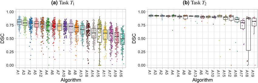
www.nature.com/scientificreports/

                                            Figure 1.  Dot- and boxplots for visualizing the assessment data separately for each algorithm. Boxplots
                                            representing descriptive statistics for all test cases (median, quartiles and outliers) are combined with
                                            horizontally jittered dots representing individual test cases.

                                            related work is given by Eugster et al.9 and Eugster et al.10 and some of their ideas are incorporated in the toolkit.
                                            Demšar11 presents simple diagrams for visualizing the results of post-hoc tests. Furia et al.12 and Eugster et al.10
                                            use relationship graphs also referred to as Hasse diagrams to visualize relationships between algorithms made
                                            by pairwise tests. Gratzl et al.13 use parallel coordinates plots to visualize rankings based on different attributes.
                                            Further work on visualizing different possible rankings are provided in Behrisch et al.14 and Han et al.15. However,
                                            we are not aware of application of any prior work in the field of challenge data analysis.
                                                The purpose of this paper is therefore to propose methodology along with an open-source framework for
                                            systematically analyzing and visualizing results of challenges. Our work will help challenge organizers and
                                            participants gain further insights into both the algorithms’ performance and the assessment data set itself in
                                            an intuitive manner. We present visualization approaches for both challenges designed around a single task
                                            (single-task challenges) and for challenges comprising multiple tasks (multi-task challenges), such as the Medical
                                            Segmentation Decathlon (MSD)16.
                                                The paper is organized as follows: “Data and data processing” presents the data used for the illustration and
                                            validation of our methodology along with the data analysis methods that serve as prerequisite for the challenge
                                            visualization methods. “Visualization for single-task challenges” and “Visualization for multi-task challenges”
                                            then present visualization methods for single-task and multi-task challenges, respectively, addressing the stability
                                            (effect of data variability) and robustness (effect of ranking method choice) of the challenge results. “Open-source
                                            challenge visualization toolkit” introduces the open source framework in which we implemented the methodol-
                                            ogy. An application to the MSD challenge in “Results for the medical segmentation decathlon” illustrates the
                                            relevance of the methods in real world data. Finally, we close with a discussion of our findings in “Discussion”.

                                            Data and data processing
                                            Computing a challenge ranking is typically done using the following elements:

                                            • The challenge metric(s) used to compute the performance of a participating algorithm for a specific test case,
                                              where a test case encompasses all data (including the reference annotation) that is processed to produce one
                                              result,
                                            • The m challenge task(s),
                                            • The p competing algorithms,
                                            • The nk , k = 1, . . . , m, test cases for each task and
                                            • A rule on how to deal with missing values that occur if an algorithm does not deliver a metric value for a
                                              test case. Typically the value is set to an unfavorable value, e.g., 0 for a non-negative metric in which larger
                                              values indicate better performance.

                                            Note that we use the term ‘assessment data’ in the following to refer to the challenge results and not to the (imag-
                                            ing) data given to challenge participants. Further, we will use the term ’metric’ as an equivalent to performance
                                            measure and thus is not related to the mathematical definition.
                                               The further course of this section introduces the data used for this paper (“Assessment data”) along with the
                                            basic methodology used for generating (“Ranking methods”) and comparing (“Comparison and aggregation of
                                            rankings”) rankings and for computing ranking stability (“Investigating ranking stability”).

                                            Assessment data. We use three assessment data sets corresponding to three different (simulated and real)
                                            challenges for this manuscript: two simulated challenges (c_ideal and c_random) to illustrate the analysis and
                                            visualization methodology and one real challenge, c_real, to apply our method to a complex real-world example.

          Scientific Reports |   (2021) 11:2369 |                https://doi.org/10.1038/s41598-021-82017-6                                                     2

Vol:.(1234567890)
www.nature.com/scientificreports/
c_ideal: best‑case scenario with ideal assessment data. We generated synthetic assessment data in which the
ranking of the five algorithms A1 to A5 is clear and indisputable. Artificial metric values are generated to be
between 0 (worst) and 1 (best) and can be thought of e.g. mimicking the Dice Similarity Coefficient (DSC)17
measurements which are often used within medical image segmentation tasks to assess the overlap between
two objects and which generate values between 0 and 1. We simulated n = 50 uniform samples (representing
challenge test cases) from [0.9, 1), [0.8, 0.9), [0.7, 0.8), [0.6, 0.7) and [0.5, 0.6) for algorithms A1 , A2 , . . . , A5,
respectively.
c_random: fully random scenario where differences are due to chance. 250 random normal values with a mean
of 1.5 and variance 1 were drawn and transformed by the logistic function to obtain a skewed distribution on
[0, 1]. These were then assigned to algorithms A1 to A5, resulting in n = 50 test cases. Thus, there is no systematic
difference between the algorithms, any difference can be attributed to chance alone.
c_real: real‑world assessment data example. We apply the visualization methods to a real-world example, using
challenge results from the MSD challenge16, organized within the scope of the Conference on Medical Image
Computing and Computer Assisted Interventions (MICCAI) 2018. The challenge specifically assesses generali-
zation capabilities of algorithms and comprises ten different 3D segmentation tasks on ten different anatomical
structures (17 sub-tasks due to multiple labels in some of the data sets). For illustration purposes, we selected 9
of the 17 (sub-)tasks, all from the training phase of the MSD, labeled T1 to T9. Our analysis was executed using
all participating algorithms A1 to A19 and the DSC as performance measure. Since the aim of the present paper
is to exemplify visualization methods and not to show performance of algorithms, the challenge results were
pseudonymized. For algorithms not providing a DSC value for a certain test case, this missing metric value was
set to zero.
Ranking methods. Many challenges produce rankings of the participating algorithms, often separately for
multiple tasks. In general, several strategies can be used to obtain a ranking, but these may lead to different
orderings of algorithms and thus different winners. The most prevalent approaches are:
• Aggregate-then-rank: The most commonly applied method begins by aggregating metric values across all
test cases (e.g., with the mean, median or another quantile) for each algorithm. This aggregate is then used
to compute a rank for each algorithm.
• Rank-then-aggregate: Another method begins, conversely, with computing a rank for each test case for each
algorithm (‘rank first’). The final rank is based on the aggregated test-case ranks. Distance-based approaches
for rank aggregation can also be used (see “Comparison and aggregation of rankings”).
• Test-based procedures: In a complementary approach, statistical hypothesis tests are computed for each
possible pair of algorithms to assess differences in metric values between the algorithms. The ranking is then
performed according to the resulting relations (e.g.,11) or according to the number of significant one-sided
test results (e.g. for illustration, see Supplementary Discussion in2). In the latter case, if algorithms have the
same number of significant test results, then they obtain the same rank. Various test statistics can be used.
When a ranking is given, ties may occur, and a rule is required to dictate how to manage them. In the context of
challenges, the rank for tied values is assigned the minimum of the ranks. For example, if the two best algorithms
get the same rank, they are both declared winners. Generally, the larger the number of algorithms is, the greater
the instability of rankings for all ranking methods and the more often ties occur in test-based procedures.
Comparison and aggregation of rankings. Comparison of rankings. If several rankings are available
for the same set of algorithms, the rankings can be compared using distance or correlation measures, see e.g.18.
For a pairwise comparison of ranking lists, Kendall’s τ19 is a scaled index determining the correlation between
the lists. It is computed by evaluating the number of pairwise concordances and discordances between ranking
lists and produces values between −1 (for inverted order) and 1 (for identical order). Spearman’s footrule is a
distance measure that sums up the absolute differences between the ranks of the two lists, taking the value 0 for
complete concordance and increasing values for larger discrepancies. Spearman’s distance, in turn, sums up the
squared differences between the ranks of the two lists20, which in this context is closely related to the Euclidean
distance.
Consensus rankings. If the challenge consists of several tasks, an aggregated ranking across tasks may be
desired. General approaches for derivation of a consensus ranking (rank aggregation) are a vailable21,22, such as
determining the ranking that minimizes the sum of the distances of the separate rankings to the consensus rank-
ing. As a special case, using Spearman’s distance produces the consensus ranking given by averaging ranks (with
average ranks in case of ties instead of their minimum) across tasks for each algorithm and ranking these aver-
ages. Note that each task contributes equally to the consensus ranking independent of its sample size or ranking
stability unless weights are assigned to each task.
Investigating ranking stability. The assessment of stability of rankings across different ranking methods
with respect to both sampling variability and variability across tasks (i.e. generalizability of algorithms across
tasks) is of major i mportance2. This is true particularly if there is a small number of test cases. In this section, we
will review two approaches for investigating ranking stability.
Scientific Reports | (2021) 11:2369 | https://doi.org/10.1038/s41598-021-82017-6 3
Vol.:(0123456789)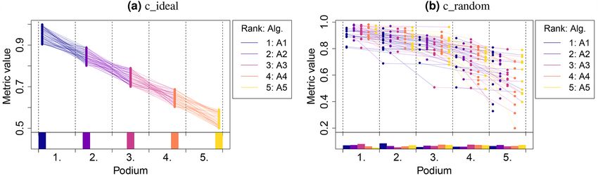
www.nature.com/scientificreports/

                                            Figure 2.  Podium plots9 for visualizing assessment data. Upper part: participating algorithms are color-coded,
                                            and each colored dot in the plot represents a metric value achieved with the respective algorithm. The actual
                                            metric value is encoded by the y-axis. Each podium (here: p = 5) represents one possible rank, ordered from
                                            best (1) to worst (here: 5). The assignment of metric values (i.e. colored dots) to one of the podiums is based on
                                            the rank that the respective algorithm achieved on the corresponding test case. Note that the plot part above
                                            each podium place is further subdivided into p ‘columns’, where each column represents one participating
                                            algorithm. Dots corresponding to identical test cases are connected by a line, producing the spaghetti structure
                                            shown here. Lower part: bar charts represent the relative frequency at which each algorithm actually achieves
                                            the rank encoded by the podium place.

                                            Bootstrap approach. For a given ranking method, the bootstrap distribution of rankings for each algorithm
                                            (providing asymptotically consistent estimates of the sampling distributions of their rankings) may be used to
                                            assess the stability of an algorithm’s ranking with respect to sampling variability. To this end, the ranking strategy
                                            is performed repeatedly on each bootstrap sample. One bootstrap sample of a task with n test cases consists of
                                            n test cases randomly drawn with replacement from this task. A total of b of these bootstrap samples are drawn
                                            (e.g., b = 1, 000). Bootstrap approaches can be evaluated in two ways: either the rankings for each bootstrap
                                            sample are evaluated for each algorithm, or the distribution of correlations or pairwise distances (see “Compari-
                                            son and aggregation of rankings”) between the ranking list based on the full assessment data and based on each
                                            bootstrap sample can be explored (see “Ranking stability for a selected ranking method”).

                                            Testing approach. Another way to assess the uncertainty in rankings with respect to sampling variability is to
                                            employ pairwise significance tests that assess significant differences in metric values between algorithms. As this
                                            poses a multiple comparison problem leading to inflation of family-wise error rates, an adjustment for multiple
                                            testing, such as Holm’s procedure, should be applied. Note that, as always, the lack of statistical significance of a
                                            difference may be due to having too few test cases and cannot be taken as evidence of absence of the difference.

                                            Visualization for single‑task challenges
                                            The visualization methods for single-task challenges can be classified into methods for visualization of the assess-
                                            ment data itself (“Visualizing assessment data”) and the robustness and stability of rankings (“Ranking robustness
                                            with respect to ranking method”, “Ranking stability for a selected ranking method”). This section presents the
                                            methodology along with the relevant sample illustrations computed for the synthetic challenges described in
                                            “Assessment data” and “c_random: fully random scenario where differences are due to chance”. To ensure that
                                            the presentation is clear, we have used explanatory boxes that show a basic description of each visualization
                                            method positioned directly under the corresponding sample plots. In all of the visualization schemes, algorithms
                                            are ordered according to a selected ranking method (here: aggregate-then-rank using mean for aggregation).

                                            Visualizing assessment data. Visualization of assessment data helps us to understand the distribution of
                                            metric values for each algorithm across test cases.

                                            Dot‑ and boxplots. The most commonly applied visualization technique in biomedical image analysis chal-
                                            lenges are boxplots, which represent descriptive statistics for the metric values of one algorithm. These can be
                                            enhanced with horizontally jittered dots, which represent the individual metric values of each test case, as shown
                                            in Fig. 1. In an ideal scenario (c_ideal), the assessment data is completely separated and the ranking can be
                                            inferred visually with ease. In other cases (here: c_random), the plots are less straightforward to interpret, specifi-
                                            cally because dot- and boxplots do not connect the values of the same test case for the different algorithms. A test
                                            case in which all of the methods perform poorly, for example, cannot be extracted visually.

                                            Podium plots. Benchmark experiment plots9, here referred to as podium plots overcome the well-known issues of
                                            dot- and boxplots by connecting the metric values corresponding to the same test case but different algorithms.
                                            Figure 2 includes a description of the principle and how to read the plots. In an ideal challenge (c_ideal; Fig. 2a),
                                            one algorithm (here: A1) has the highest metric value for all test cases. Consequently, all dots corresponding to
                                            podium place 1 share the same color (here: blue). All other ranks are represented by one algorithm and therefore
                                            one color. In contrast, no systematic color representation (and thus no ranking) can be visually extracted from

          Scientific Reports |   (2021) 11:2369 |                https://doi.org/10.1038/s41598-021-82017-6                                                      4

Vol:.(1234567890)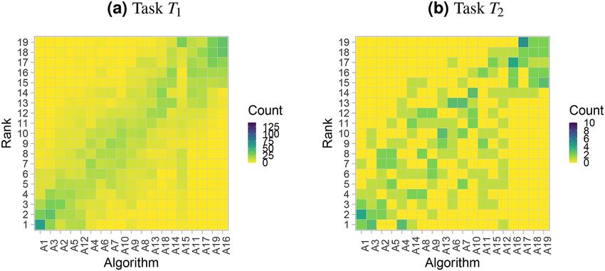
www.nature.com/scientificreports/
Figure 3. Ranking heatmaps for visualizing assessment data. Each cell i, Aj shows the absolute frequency of
test cases in which algorithm Aj achieved rank i.
Figure 4. Line plots for visualizing the robustness of ranking across different ranking methods. Each algorithm
is represented by one colored line. For each ranking method encoded on the x-axis, the height of the line
represents the corresponding rank. Horizontal lines indicate identical ranks for all methods.
the simulated random challenge, as illustrated in Fig. 2b. It should be mentioned that this approach requires
unique ranks; in the event of ties (identical ranking for at least two algorithms), random ranks are assigned
to the ties. This visualization method reaches its limit in challenges with large numbers of algorithms and is
particularly suited in case of a limited number of test cases. Otherwise, dot- and boxplots mentioned before are
preferable to ensure clarity.
Ranking heatmap. Another way to visualize assessment data is to use ranking heatmaps, as illustrated in Fig. 3.
These heatmaps abstract from the individual metric values and contrast rankings on a test-case basis (‘rank first’)
to the results of the selected overall ranking method. A dark color concentrated along the diagonal indicates
concordance of rankings. In general, a higher contrast of the matrix implies better separability of algorithms.
This visualization method is particularly helpful when the number of test cases is too large for an interpretable
podium plot.
Ranking robustness with respect to ranking method. Recent findings show that rankings are largely
dependent on the ranking method a pplied2. One could argue, however, that if a challenge separates algorithms
well, then any ranking method reflecting the challenge goal should yield the same ranking. We propose using
line plots, presented in Fig. 4, to investigate this aspect for a given challenge. In an ideal scenario (Fig. 4, left), all
of the lines are parallel. In other instances, crossing lines indicate sensitivity to the choice of the ranking method.
Ranking stability for a selected ranking method. In “Investigating ranking stability”, we identi-
fied two basic means for investigating ranking stability: bootstrapping and the testing approach. This section
describes different ways to present the data resulting from these analyses.
Visualizing bootstrap results. An intuitive way to comprehensively visualize bootstrap results are blob plots, as
illustrated in Fig. 5. As the existence of a blob requires an absolute frequency of at least one, a small number of
Scientific Reports | (2021) 11:2369 | https://doi.org/10.1038/s41598-021-82017-6 5
Vol.:(0123456789)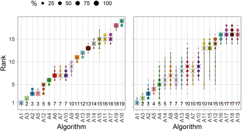
www.nature.com/scientificreports/
Figure 5. Blob plots for visualizing ranking stability based on bootstrap sampling. Algorithms are color coded,
and the area of each blob at position Ai , rank j is proportional to the relative frequency Ai achieved rank j
(here across b = 1000 bootstrap samples). The median rank for each algorithm is indicated by a black cross. 95%
bootstrap intervals across bootstrap samples (ranging from the 2.5th to the 97.5th percentile of the bootstrap
distribution) are indicated by black lines.
Figure 6. Violin plots for visualizing ranking stability based on bootstrapping. The ranking list based on the full
assessment data is compared pairwise with the ranking lists based on the individual bootstrap samples (here
b = 1000 samples). Kendall’s τ (cf. “Comparison and aggregation of rankings”) is computed for each pair of
rankings, and a violin plot that simultaneously depicts a boxplot and a density plot is generated from the results.
blobs typically indicates higher certainty, as illustrated in Fig. 5a. In contrast, many blobs of comparable size
suggest high uncertainty, see Fig. 5b.
Violin plots, as shown and described in Fig. 6, provide a more condensed way to analyze bootstrap results.
In these plots, the focus is on the comparison of the ranking list computed on the full assessment data and the
individual bootstrap samples, respectively. Kendall’s τ is chosen for comparison as it has an upper and lower
bound (+1/ − 1). In an ideal scenario (here c_ideal), the ranking is identical to the full assessment data rank-
ing in each bootstrap sample. Hence, Kendall’s τ is always equal to one, demonstrating perfect stability of the
ranking. In c_random, values of Kendall’s τ are very dispersed across the bootstrap samples, indicating high
instability of the ranking.
Testing approach summarized by significance map. As described in “Investigating ranking stability”, an alter-
native way to assess ranking stability is significance testing. To visualize the pairwise significant superiority
between algorithms, we propose the generation of a significance map, as illustrated in Fig. 7. To this end, any
pairwise test procedure and multiplicity adjustment can be employed, as for example Wilcoxon signed rank
tests with Holm’s adjustment for multiplicity or Wilcoxon-Nemenyi-McDonald-Thompson mean rank tests11
which are widely used in this context. However, note that latter mean rank tests have been criticised23 because
they do not only depend on the pairs of algorithms compared but also on all other included algorithms. Thus,
results for all algorithms may change if algorithms are dropped or added. Furthermore, the Friedman test (and
mean rank test) is a generalization of the sign test and possesses the modest statistical power of the latter for
many distributions24. The Wilcoxon signed rank test does not have these shortcomings and is therefore used in
the following.
In an ideal scenario (c_ideal), ordering is optimal and all algorithms with smaller rank are significantly better
than algorithms with larger rank, leading to a yellow area above and a blue area below the diagonal, respectively.
The high uncertainty in c_random is reflected by the uniform blue color.
Scientific Reports | (2021) 11:2369 | https://doi.org/10.1038/s41598-021-82017-6 6
Vol:.(1234567890)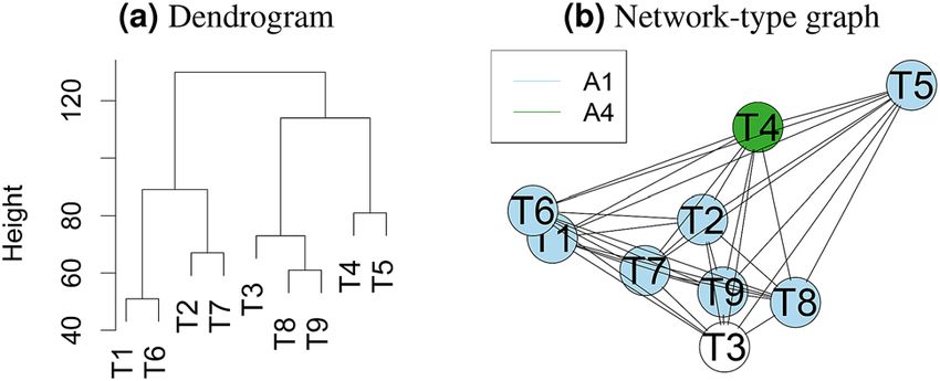
www.nature.com/scientificreports/

                                  Figure 7.  Significance maps for visualizing ranking stability based on statistical significance. They depict
                                  incidence matrices of pairwise significant test results e.g. for the one-sided Wilcoxon signed rank test at 5%
                                  significance level with adjustment for multiple testing according to Holm. Yellow shading indicates that metric
                                  values of the algorithm on the x-axis are significantly superior to those from the algorithm on the y-axis, blue
                                  color indicates no significant superiority.

                                  Visualization for multi‑task challenges
                                  Several challenges comprise multiple tasks. A common reason for this is that a clinical problem may involve solv-
                                  ing several sub-problems, each of which is relevant to the overall goal. Furthermore, single-task challenges do not
                                  allow us to investigate how algorithms generalize to different tasks. This section is devoted to the visualization
                                  of the important characteristics of algorithms (“Characterization of algorithms”) and tasks (“Characterization
                                  of tasks”) in such multi-task challenges. As most methods are based on the concepts presented in the previ-
                                  ous section, the illustration is performed directly with real world data (see “Assessment data”). Algorithms are
                                  ordered according to a consensus ranking (see “Comparison and aggregation of rankings”) based on average
                                  ranks across tasks.
                                      Note that the described setting could also be transferred to a single-task challenge with multiple metrics
                                  which are the equivalent to different challenge tasks.

                                  Characterization of algorithms. Multi-task challenges can be organized in different ways. Many chal-
                                  lenges focus on a specific clinical use case in which, for example, the first task would be to detect an object
                                  with a follow-up task to segment the detected object (e.g.25). Other challenges may deal with a specific type of
                                  algorithm class, like segmentation and multiple tasks would deal with applying the methods to different objects,
                                  for example segmenting different organs (e.g.16,26). Independent from the nature of multi-task challenges, it may
                                  be interesting to compare algorithm performance across tasks or to see whether the different task types lead to
                                  different rankings. We propose two methods for analyzing this:

                                  Visualization of ranking variability across tasks. If a reasonably large number of tasks is available, a blob plot
                                  similar to the one shown in Fig. 5 can be drawn by substituting rankings based on bootstrap samples with the
                                  rankings based on multiple tasks. This way, the distribution of ranks across tasks can be intuitively visualized as
                                  shown in Fig. 16. All ranks that an algorithm achieved in any task are displayed along the y-axis, with the area
                                  of the blob being proportional to the frequency. If all tasks provided the same stable ranking, narrow intervals
                                  around the diagonal would be expected.

                                  Visualization of ranking variability based on bootstrapping. A variant of the blob plot approach illustrated in
                                  Fig. 5 involves replacing the algorithms on the x-axis with the tasks and then generating a separate plot for each
                                  algorithm as shown in Fig. 17a. This allows assessing the variability of rankings for each algorithm across multi-
                                  ple tasks and bootstrap samples. Here, color coding is used for the tasks, and separation by algorithm enables a
                                  relatively straightforward strength-weaknesses analysis for individual methods.

                                  Characterization of tasks.        It may also be useful to structure the analysis around the different tasks. This
                                  section proposes visualization schemes to analyze and compare tasks of a competition.

                                  Visualizing bootstrap results. Two visualization methods are recommended to investigate which tasks separate
                                  algorithms well (i.e. lead to a stable ranking). Bootstrap results can be shown per task in a blob plot similar to
                                  the one described in “Ranking stability for a selected ranking method”. Algorithms should be ordered according
                                  to the consensus ranking (Fig. 17b). In this graph, tasks leading to stable (unstable) rankings are indicated by
                                  narrow (wide) spread of the blobs for all algorithms.
                                      Again, to obtain a more condensed visualization, violin plots (as presented in Fig. 6) can be applied separately
                                  to all tasks (Fig. 18). The overall stability of the rankings can then be compared by assessing the locations and
                                  lengths of the violins.

Scientific Reports |   (2021) 11:2369 |                https://doi.org/10.1038/s41598-021-82017-6                                                    7

                                                                                                                                               Vol.:(0123456789)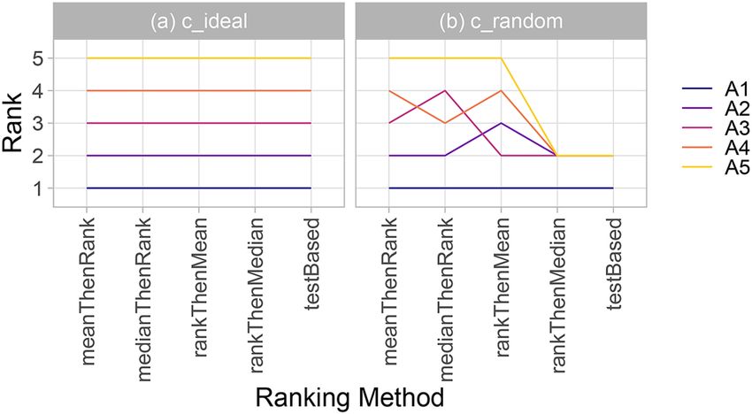
www.nature.com/scientificreports/
Figure 8. Dendrogram from hierarchical cluster analysis (a) and network-type graphs (b) for assessing
the similarity of tasks based on challenge rankings. A dendrogram (a) is a visualization approach based on
hierarchical clustering, a method comprehensively described in27. It depicts clusters according to a distance
measure (here: Spearman’s footrule (see “Comparison and aggregation of rankings”)) and an agglomeration
method (here: complete agglomeration). In network-type graphs (b)9, every task is represented by a node,
and nodes are connected by edges, the length of which is determined by a distance measure (here: Spearman’s
footrule). Hence, tasks that are similar with respect to their algorithm ranking appear closer together than those
that are dissimilar. Nodes representing tasks with a unique winner are color coded by the winning algorithm. If
there is more than one first-ranked algorithm in a task, the corresponding node remains uncolored.
Figure 9. challengeR as a toolkit for challenge analysis and visualization: summary of functionality.
Cluster analysis. There is increasing interest in assessing the similarity of the tasks, e.g., for pre-training a
machine learning algorithm. A potential approach to this could involve the comparison of the rankings for a
challenge. Given the same teams participate in all tasks, it may be of interest to cluster tasks into groups where
rankings of algorithms are similar and to identify tasks which lead to very dissimilar rankings of algorithms.
To enable such an analysis, we propose the generation of a dendrogram from hierarchical cluster analysis or a
network-type graph, see Fig. 8.
Open‑source challenge visualization toolkit
All analysis and visualization methods presented in this work have been implemented in R and are provided to
the community as open-source framework challengeR. Figure 9 summarizes the functionality of the framework.
The framework also offers a tool for generating full analysis reports, when it is provided with the assessment
data of a challenge (csv file with columns for the metric values, the algorithm names, test case identifiers and
task identifiers in case of multi-task challenges). Details on the framework can be found on https://github.com/
wiesenfa/challengeR. We have observed that the toolkit has already been used by several users for challenge
evaluation28,29 and algorithm v alidation30 in general. Other authors have adopted concepts from the toolkit, such
as bootstrapping for investigating ranking v ariability31.
Results for the medical segmentation decathlon
To assess the applicability of our toolkit, we applied it to a recently conducted multi-task challenge (cf. “Assess-
ment data”) involving 19 participating algorithms and 17 different (sub-) tasks. Due to length restrictions, we
limited the illustration of single-task visualization tools to two selected tasks: T1, which has many test cases and
a relatively clear ranking, and task T2, which has a small number of test cases and a more ambiguous ranking.
1000 bootstrap samples were drawn to assess ranking variability.
Scientific Reports | (2021) 11:2369 | https://doi.org/10.1038/s41598-021-82017-6 8
Vol:.(1234567890)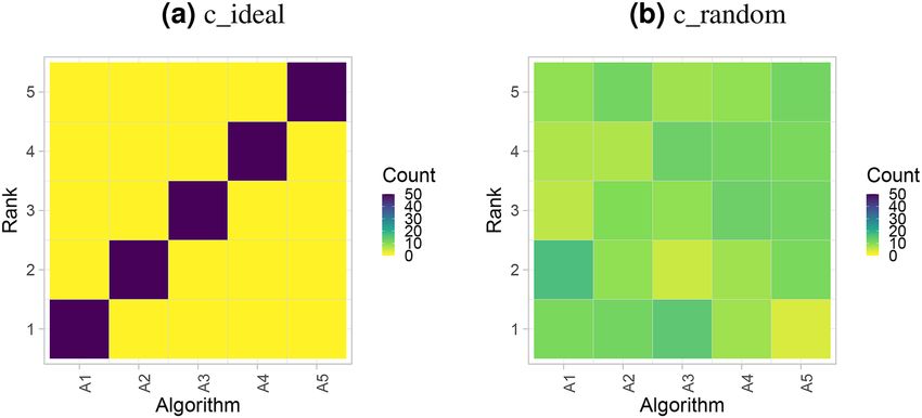
www.nature.com/scientificreports/
Figure 10. Dot- and boxplots visualize the raw assessment data for selected tasks of the MSD.
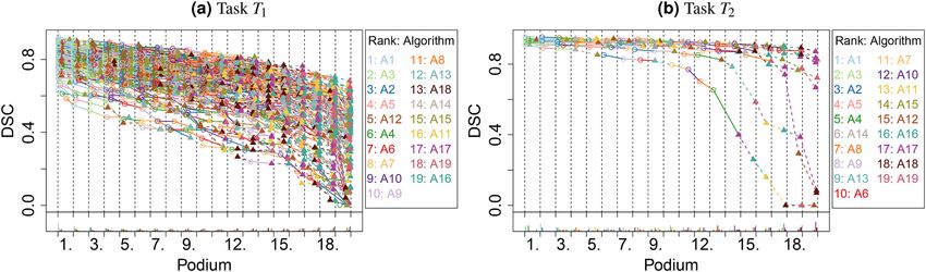
Figure 11. Podium plots visualize the assessment data for selected tasks of the MSD. T1/T2: task with stable/
unstable ranking. In addition to the color scheme, algorithms A1–A10 are marked with circles and solid lines
and algorithms A11–A19 with triangles and dashed lines.
Visualization of results per task. In all of the plots, the algorithms are ordered by a test-based procedure
(called significance ranking in the following) for the specific task, performed based on the one-sided Wilcoxon
signed rank test at 5% significance level.
Visualization of assessment data. The dot- and boxplots for task T1 (Fig. 10a) show a large number of test cases,
and the quartiles suggest a relatively clear ordering. This is far less evident in Fig. 10b for task T2, which only
contains ten test cases and almost perfect metric values of most algorithms. In both tasks, a number of outliers
are obvious but it remains unclear whether they correspond to the same test cases.
In the podium plot for T1 (Fig. 11), both the color pattern of the lines and the bar charts suggest a clear ranking
for the best and the worst algorithms. The first ranked algorithm, A1, was among the first three best performing
algorithms for almost all test cases. The fifth-last ranked algorithm ( A15) did not submit a valid segmentation
result in numerous test cases, and hence these DSC values were set to 0, resulting in a high frequency at podium
place 19. All other algorithms provided a valid value, which could be deduced from the often steep decline of
the lines that end in the point corresponding to A15 with DSC = 0. The podium plot for T2 (Fig. 11b) shows that
many of the algorithms perform similarly for most of the test cases. Evidently, the assessment data were not suf-
ficient to determine a clear ranking of the algorithms. Intriguingly, there are three test cases where algorithms
perform very differently, and final rankings might be strongly affected by these test cases given the small number
of test cases for this task.
Finally, Fig. 12 shows the assessment data in the ranking heatmap. A relatively clear diagonal is observed in
the left panel for task T1, and this underlines the stable ranking. The right panel shows a more diverse picture
with test cases achieving a wider variety of ranks. The first and last couple of algorithms nevertheless show less
variation in their results and stand out from the other algorithms.
Visualization of ranking stability. The almost diagonal blob plot shown in Fig. 13 suggests that task T1 leads to
relatively clear ranking, whereas T2 shows less stable separation of the algorithms. In T1, the winning algorithm
A1 is ranked first in all bootstrap samples, as is apparent from the fact that no other dot is shown, and the 95%
bootstrap interval consequently only covers the first rank. Only the bootstrap interval of algorithm A2 occasion-
ally covers the first rank (which is thus the winner in some bootstrap samples, together with A1). The rank dis-
Scientific Reports | (2021) 11:2369 | https://doi.org/10.1038/s41598-021-82017-6 9
Vol.:(0123456789)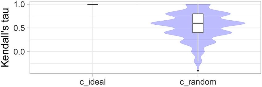
www.nature.com/scientificreports/

                                            Figure 12.  Ranking heatmaps for selected tasks of the MSD display the assessment data.

                                            Figure 13.  Blob plots for selected tasks of the MSD visualize bootstrap results. T1/T2: task with stable/unstable
                                            ranking. Ranks above algorithm names highlight the presence of ties.

                                            tributions of all algorithms are quite narrow. In contrast to this relatively clear picture, the blob plot for T2 shows
                                            far more ranking variability. Although A1 ranks first for most of the bootstrap samples, the second algorithm
                                            also achieves rank 1 in a substantial proportion. Most of the algorithms spread over a large range of ranks, for
                                            instance the 95% bootstrap interval for A5 covers ranks 4–13. The four last-ranked algorithms separate relatively
                                            clearly from the rest. Interestingly, all of the algorithms achieved rank 1 in at least one bootstrap sample. This
                                            occurred because significance ranking produced the same result for all algorithms, which were thus assigned to
                                            rank 1 in at least 13 bootstrap samples. Note that bootstrapping in case of few test cases should be treated with
                                            caution since the bootstrap distribution may not be a good estimate of the true underlying distribution.
                                                The violin plots shown in Fig. 18 illustrate another perspective on bootstrap sampling. They show the distribu-
                                            tion of correlations between rankings based on the full assessment data, and each bootstrap sample in terms of
                                            Kendall’s τ for all tasks. A narrow density for high values suggests a stable overall ranking for the task. Focusing
                                            on tasks T1 and T2, this again confirms that T1 leads to stable ranking and T2 leads to less stable ranking.
                                                The significance map in Fig. 14 confirms that task T1 provides a clear ranking of the algorithms with the two
                                            top ranked algorithms separating from the remaining algorithms, while in T2 the uncertainty is too large to
                                            provide a meaningful ranking. Note that the fact that A1 ranks higher than A3 according to significance ranking
                                            in T1 does not imply that A1 is significantly superior to A3 as revealed by the significance map.

          Scientific Reports |   (2021) 11:2369 |                https://doi.org/10.1038/s41598-021-82017-6                                                     10

Vol:.(1234567890)
www.nature.com/scientificreports/
Figure 14. Significance maps for selected tasks of the MSD for visualizing the results of significance testing.
Figure 15. Line plots for visualizing rankings robustness across different ranking methods.
Scientific Reports | (2021) 11:2369 | https://doi.org/10.1038/s41598-021-82017-6 11
Vol.:(0123456789)www.nature.com/scientificreports/
Figure 16. Blob plots for visualizing ranking stability across tasks. Consensus rankings above algorithm names
highlight the presence of ties.
Figure 17. Rank distributions of each algorithm across bootstrap samples stratified by algorithm (a) and task
(b).
Figure 15 depicts ranking lists from different methods, confirming that in T1, rankings are relatively robust
across ranking methods. Rankings in T2 depend far more on the ranking method. Furthermore, many algorithms
attain the same rank in the test-based procedure, a pattern which is often observed in challenges with unclear
ranking. Interestingly, ranking according to average DSC (mean-then-rank) leads to a considerably different
Scientific Reports | (2021) 11:2369 | https://doi.org/10.1038/s41598-021-82017-6 12
Vol:.(1234567890)www.nature.com/scientificreports/
Figure 18. Violin plots for comparing ranking stability across tasks arranged by median Kendall’s τ.
ranking than (nonparametric) test-based ranking, suggesting that the outlying test cases mentioned in “Visu-
alization of results per task” have a strong impact on the former ranking.
Visualization of cross‑task insights. All nine tasks in the real world assessment data set were used as an
example for multi-task analyses. As previously mentioned, an aggregation (consensus) of rankings across tasks is
needed to order the algorithms along the x-axes or in panels. For the present example, we have taken the average
rank after significance ranking on a task basis (see “Visualization of results per task”) as consensus.
Characterization of algorithms. The first visualization of stability of rankings across tasks is provided in Fig. 16.
The plot illustrates that A1 almost always ranks first across tasks and only ranks third a few times. The other
algorithms achieve a large range of ranks across tasks, apart from the last ranked algorithms, which perform
unfavorably in most tasks.
The blob plot of bootstrap results across tasks (Fig. 17a) gives detailed insights into the performance of each
algorithm. The first ranked algorithm ( A1) is almost always among the winners in each task, and only task T4
stands out; as such, it is very stable. A1 never attains a rank worse than four. Although the second-ranked algo-
rithm ( A2) performs worse than A1, it consistently attains top ranks as well, apart from T4 . Despite A3, A4 and
A5 being among the winners in some tasks, they show vastly variable metric values across tasks. Medium-ranked
algorithms are either in the midrange in all tasks (e.g., A9), or perform reasonably well in a few tasks and fail in
others (e.g., A10).
Characterization of tasks. To visualize which tasks separate algorithms well (i.e., lead to a stable ranking), we
have rearranged the data from Fig. 17a and have shown the bootstrap results for all algorithms separately by task,
see Fig. 17b. From this plot, we can see that task T1 apparently leads to stable rankings (but not necessarily on the
diagonal, i.e., different from the consensus ranking), whereas rankings from tasks T2 and T9 are far more variable,
or at least this is the case for medium-ranked algorithms.
Another view of the bootstrap results is provided by violin plots (see Fig. 18), which show the distribution
of Kendall’s τ between the ranking based on the full assessment data set and the ranking for each bootstrap
sample. Tasks T1, T3 and T5 provide very stable rankings for all algorithms; T4 , T6 and T7 are slightly less stable
overall because a subset of algorithms does not separate well. T2, T8 and T9 yield the least stable ranking overall.
The similarity/clustering of tasks with respect to their algorithm rankings is visualized in a dendrogram and
network-type graph in Fig. 8. In both cases, Spearman’s footrule distance is used and complete agglomeration
is applied for the dendrogram. Distances between nodes are chosen to increase exponentially in Spearman’s
footrule distance with a growth rate of 0.05 to accentuate large distances. While the dendrogram suggests two
major clusters of tasks, the network-type graph highlights that T5 in particular seems to be different from the
remaining tasks in terms of its ranking. It also highlights A1 as the winner in most tasks.
Discussion
While the significance of challenges is growing at an enormous pace, the topic of analysis and visualization of
assessment data has received almost no attention in the literature to date. In this context, the contributions of
this paper can be summarized as follows:
1. Methodology : To our knowledge, we are the first to propose a systematic way to analyze and visualize the
results of challenges in general and of multi-task challenges in particular.
2. Open source visualization toolkit (challengeR32): The methodology was implemented as an open-source R33
toolkit to enable quick and wide adoption by the scientific community.
3. Comprehensive validation: The toolkit was applied to a variety of simulated and real challenges. According to
our results, it offers an intuitive way to extract important insights into the performance of algorithms, which
cannot be revealed by commonly applied presentation techniques such as ranking tables and boxplots.
Scientific Reports | (2021) 11:2369 | https://doi.org/10.1038/s41598-021-82017-6 13
Vol.:(0123456789)www.nature.com/scientificreports/
While the assessment of uncertainty in results is common in many fields of quantitative analysis, it is surprising
that uncertainty in rankings in challenges has seemingly been neglected. To address this important topic, this
work places particular focus on the analysis and visualization of uncertainties.
It should be noted that visualization methods often reach their limit when the number of algorithms is too
large. In this case, data analysis can be performed on all algorithms, but visualization can be reduced to a top list
of algorithms, as facilitated by our toolkit.
Whereas the methodology and toolkit proposed were designed specifically for the analysis and visualization
of challenge data, they may also be applied to presenting the results of comparative validation studies performed
in the scope of classical original papers. In these papers it has become increasingly common to compare a new
methodological contribution with other previously proposed methods. Our methods can be applied to this use
case in a straightforward manner. Similarly, the toolkit has originally been designed for the field of biomedical
image analysis but can be readily applied in many other fields.
In conclusion, we believe that our contribution could become a valuable tool for analyzing and visualizing
challenge results. Due to its generic design, its impact may reach beyond the field of biomedical image analysis.
Received: 12 June 2020; Accepted: 11 January 2021
References
1. Russakovsky, O. et al. Imagenet large scale visual recognition challenge. Int. J. Comput. Vis. 115, 211–252 (2015).
2. Maier-Hein, L. et al. Why rankings of biomedical image analysis competitions should be interpreted with care. Nat. Commun. 9,
5217 (2018).
3. Menze, B. H. et al. The multimodal brain tumor image segmentation benchmark (brats). IEEE Trans. Med. Imaging 34, 1993–2024
(2014).
4. Heimann, T. et al. Comparison and evaluation of methods for liver segmentation from CT datasets. IEEE Trans. Med. Imaging 28,
1251–1265 (2009).
5. Chenouard, N. et al. Objective comparison of particle tracking methods. Nat. Methods 11, 281 (2014).
6. Ulman, V. et al. An objective comparison of cell-tracking algorithms. Nat. Methods 14, 1141 (2017).
7. Sage, D. et al. Quantitative evaluation of software packages for single-molecule localization microscopy. Nat. Methods 12, 717
(2015).
8. Maier-Hein, K. H. et al. The challenge of mapping the human connectome based on diffusion tractography. Nat. Commun. 8, 1–13
(2017).
9. Eugster, M. J. A., Hothorn, T. & Leisch, F. Exploratory and inferential analysis of benchmark experiments. Technical Report 30,
Institut fuer Statistik, Ludwig-Maximilians-Universitaet Muenchen, Germany (2008).
10. Eugster, M. J., Hothorn, T. & Leisch, F. Domain-based benchmark experiments: Exploratory and inferential analysis. Austrian J.
Stat. 41, 5–26 (2012).
11. Demšar, J. Statistical comparisons of classifiers over multiple data sets. J. Mach. Learn. Res. 7, 1–30 (2006).
12. Furia, C. A., Feldt, R. & Torkar, R. Bayesian data analysis in empirical software engineering research. IEEE Trans. Softw. Eng.https://
doi.org/10.1109/TSE.2019.2935974 (2019).
13. Gratzl, S., Lex, A., Gehlenborg, N., Pfister, H. & Streit, M. Lineup: Visual analysis of multi-attribute rankings. IEEE Trans. Visual
Comput. Graphics 19, 2277–2286 (2013).
14. Behrisch, M. et al. Visual comparison of orderings and rankings. EuroVis Workshop on Visual Analytics 1–5 (2013).
15. Han, D. et al. Rankbrushers: Interactive analysis of temporal ranking ensembles. J. Visual. 22, 1241–1255 (2019).
16. Cardoso, M. J. Medical segmentation decathlon (2018). https://medicaldecathlon.com. Accessed Aug 2019.
17. Dice, L. R. Measures of the amount of ecologic association between species. Ecology 26, 297–302 (1945).
18. Langville, A. N. & Meyer, C. D. Who’s# 1?: The Science of Rating and Ranking (Princeton University Press, Princeton, 2012).
19. Kendall, M. G. A new measure of rank correlation. Biometrika 30, 81–93 (1938).
20. Qian, Z. & Yu, P. Weighted distance-based models for ranking data using the R package rankdist. J. Stat. Softw. Articles 90, 1–31
(2019).
21. Lin, S. Rank aggregation methods. Wiley Interdiscip. Revi. Comput. Stat. 2, 555–570 (2010).
22. Hornik, K. & Meyer, D. Deriving consensus rankings from benchmarking experiments. In Advances in Data Analysis (eds Decker,
R. & Lenz, H. J.) 163–170 (Springer, Berlin, 2007).
23. Benavoli, A., Corani, G. & Mangili, F. Should we really use post-hoc tests based on mean-ranks?. J. Mach. Learn. Res. 17, 152–161
(2016).
24. Zimmerman, D. W. & Zumbo, B. D. Relative power of the Wilcoxon test, the Friedman test, and repeated-measures anova on
ranks. J. Exp. Educ. 62, 75–86 (1993).
25. Sirinukunwattana, K. et al. Gland segmentation in colon histology images: The glas challenge contest. Med. Image Anal. 35, 489–502
(2017).
26. Jimenez-del Toro, O. et al. Cloud-based evaluation of anatomical structure segmentation and landmark detection algorithms:
Visceral anatomy benchmarks. IEEE Trans. Med. Imaging 35, 2459–2475 (2016).
27. Hastie, T., Tibshirani, R. & Friedman, J. The Elements of Statistical Learning: Data Mining, Inference and Prediction 2nd edn.
(Springer, Berlin, 2009).
28. Ross, T. et al. Comparative validation of multi-instance instrument segmentation in endoscopy: Results of the robust-mis 2019
challenge. Med. Image Anal. 101920, 20 (2020).
29. Daza, L. et al. Lucas: Lung cancer screening with multimodal biomarkers. In Multimodal Learning for Clinical Decision Support
and Clinical Image-Based Procedures 115–124 (Springer, Berlin, 2020).
30. Ayala, L. et al. Light source calibration for multispectral imaging in surgery. Int. J. Comput. Assist. Radiol. Surg. 20, 1–9 (2020).
31. Isensee, F., Jäger, P. F., Kohl, S. A., Petersen, J. & Maier-Hein, K. H. Automated design of deep learning methods for biomedical
image segmentation. arXiv:1904.08128 (arXiv preprint) (2019).
32. Wiesenfarth, M. challengeR: A Toolkit for Analyzing and Visualizing Challenge Results (2019). R package version 0.1. https://g ithub.
com/wiesenfa/challengeR. Accessed June 2020.
33. R Core Team. R: A Language and Environment for Statistical Computing (R Foundation for Statistical Computing, Vienna, 2019).
Acknowledgements
Open Access funding enabled and organized by Projekt DEAL. We thank Dr. Jorge Bernal for constructive
comments on an earlier version.
Scientific Reports | (2021) 11:2369 | https://doi.org/10.1038/s41598-021-82017-6 14
Vol:.(1234567890)www.nature.com/scientificreports/
Author contributions
M.W. is the lead developer for the open-source toolkit and wrote the manuscript. A.R. implemented the open-
source toolkit and wrote the manuscript. B.A.L. provided feedback and suggestions for the different graphs and
proof-read the manuscript. M.E. and L.A.S. implemented the open-source toolkit and proof-read the manuscript.
M.J.C. provided the data for the Medical Segmentation Decathlon challenge and proof-read the manuscript.
L.M.-H. initiated and coordinated the work and wrote the manuscript. A.K.-S. initiated and coordinated the
work, implemented the first version of the open source toolkit’s methods and wrote the manuscript.
Funding
Open Access funding enabled and organized by Projekt DEAL. This work was supported by the Surgical Oncol-
ogy Program of the National Center for Tumor Diseases (NCT) and the Helmholtz Association of German
Research Centres in the scope of the Helmholtz Imaging Platform (HIP).
Competing interests
M.J.C. is a founder and owns shares in Braiminer, ltd. B.A.L.’s work has been funded by Incyte and 12 Sigma. He
is a cofounder and co-owner of Silver Maple, LLC. He has received travel funding in the past 12 months from
SPIE, IEEE, and IBM. The other authors declare no competing interests.
Additional information
Correspondence and requests for materials should be addressed to M.W. or L.M.-H.
Reprints and permissions information is available at www.nature.com/reprints.
Publisher’s note Springer Nature remains neutral with regard to jurisdictional claims in published maps and
institutional affiliations.
Open Access This article is licensed under a Creative Commons Attribution 4.0 International
License, which permits use, sharing, adaptation, distribution and reproduction in any medium or
format, as long as you give appropriate credit to the original author(s) and the source, provide a link to the
Creative Commons licence, and indicate if changes were made. The images or other third party material in this
article are included in the article’s Creative Commons licence, unless indicated otherwise in a credit line to the
material. If material is not included in the article’s Creative Commons licence and your intended use is not
permitted by statutory regulation or exceeds the permitted use, you will need to obtain permission directly from
the copyright holder. To view a copy of this licence, visit http://creativecommons.org/licenses/by/4.0/.
© The Author(s) 2021
Scientific Reports | (2021) 11:2369 | https://doi.org/10.1038/s41598-021-82017-6 15
Vol.:(0123456789)You can also read