Neighborhoods, Perceived Inequality, and Preferences for Redistribution: Evidence from Barcelona
←
→
Page content transcription
If your browser does not render page correctly, please read the page content below
Neighborhoods, Perceived Inequality, and Preferences for
                     Redistribution: Evidence from Barcelona∗
                                           JOB MARKET PAPER
                                         Gerard Domènech-Arumí†

                                       First Version: October 2020
                                       This Version: April 2, 2021
                                  Click here for the most recent version

                                                      Abstract

             I study the effects of neighborhoods on perceived inequality and preferences for redistri-
         bution. Using administrative data on the universe of dwellings and real estate transactions
         in Barcelona (Spain), I first construct a novel measure of local inequality — the Local Neigh-
         borhood Gini (LNG). The LNG is based on the spatial distribution of housing within a city,
         independent of administrative boundaries, and building-specific. I then elicit inequality per-
         ceptions and preferences for redistribution from an original large-scale survey conducted in
         Barcelona. I link those to respondents’ specific LNG and local environments using exact ad-
         dresses, observed in the survey. Finally, I identify the causal effects of neighborhoods using
         two different approaches. The first is an outside-the-survey quasi-experiment that exploits
         within-neighborhood variation in respondents’ recent exposure to new apartment buildings.
         The second is a within-survey experiment that induces variation in respondents’ information
         set about inequality across neighborhoods. I find that local environments significantly influence
         inequality perceptions but only mildly affect demand for redistribution.

       Keywords: Inequality, Gini, Redistribution, Housing
       JEL Codes: D31, D63, O18

   ∗
     I want to especially thank my main PhD advisor, Daniele Paserman, as well as my co-advisors, Ray Fisman and
Johannes Schmieder, for their time and extremely helpful insights, feedback and guidance throughout this project and
the PhD. I also thank Manuel Bagues, Sam Bazzi, Matteo Bobba, Matteo Ferroni, Martin Fiszbein, Tania Gutsche, Kevin
Lang, Etienne Lehmann, Gedeon Lim, Clara Martínez-Toledano, Max McDevitt, Yuhei Miyauchi, Dilip Mokherjee,
Thomas Pearson, Linh To, Esteban Rossi-Hansberg, and Silvia Vannutelli, as well as participants at the IEB Seminar and
BU Empirical Micro Lunches and Reading Groups for their helpful comments and suggestions at different stages of the
project. I also want to thank John Cavanagh for providing excellent research assistance, as well as Sara Fernández from
Idealista and Marta Espasa and Claudi Cervelló from the Agència Tributària de Catalunya for allowing me access to
their data. I gratefully acknowledge financial support from “la Caixa” Foundation (ID 100010434), under agreement
LCF/BQ/AN14/10340020, from the Abdala fund at Boston University Institute for Economic Development and the
Tobin Project at different stages of the project. All errors are mine.
   †
     Boston University, Department of Economics. E-mail: domenech@bu.edu
1   Introduction
Perceptions are strong predictors of individual behavior. Individuals that perceive their country as
unequal or with low social mobility tend to hold a favorable view towards redistribution (Alesina
et al. 2018b, Gimpelson and Treisman 2018). In contrast, those who believe that society is fair, with
high social mobility, or with many immigrants, are less willing to redistribute (Alesina et al. 2012;
2018a). Perceptions may be subjective, but they ultimately impact policy.
    Local environments are likely to shape perceptions. Neighborhoods are key determinants of
a wide variety of outcomes and constitute the physical space in which a relevant share of social
interactions take place (Bayer et al. 2008, Chetty et al. 2018, Wellman 1996). Our knowledge about
the origin of perceptions may still limited, but it is reasonable to expect neighborhoods also to
influence them (Hauser and Norton 2017).
    Local inequality may directly influence beliefs about inequality, and therefore also affect pref-
erences for redistribution. The connection through neighborhoods is intuitive, and recent research
provides suggestive evidence in its favor (Cruces et al. 2013, Minkoff and Lyons 2019, Xu and Garand
2010). However, establishing causality is challenging. Individuals’ locations are not random, and
their beliefs about inequality and redistribution could substantially weigh in their choices. For
example, those with a strong distaste for inequality — which could correlate with redistribution
attitudes — may deliberately avoid highly unequal neighborhoods in a city. Consequently, looking
at the raw correlation between local environments and perceptions or demand for redistribution
could be misleading in the presence of endogenous sorting. In this paper, I combine two different
identification strategies with a rich array of survey and administrative data to study the causal
effects of neighborhoods on perceived inequality and preferences for redistribution.
    I start by introducing a novel measure of local inequality that captures disparities in dwelling
characteristics (e.g., space or value) in the immediate surroundings of a building. I call this measure
Local Neighborhood Gini (LNG).
    I subsequently construct the LNG for Barcelona and a sample of large Spanish cities by combin-
ing data from the Spanish Cadastre and administrative data from the Catalan Tax Authority (ATC).
The Cadastre data comprises detailed information and the precise geolocation of the universe of
real estate in Spain. The ATC data contains records on the universe of real estate transactions in
Catalonia from 2009 to 2019, including the price and unique Cadastre identifier for each transac-
tion. Thus, by combining both datasets and applying machine learning methods, I can predict
the market value of all dwellings in Barcelona. I can then compute the LNG, a measure of local
inequality specific to each building in my sample.
    I conducted an original large-scale online survey in Barcelona to elicit inequality perceptions
and demand for redistribution. To measure perceived inequality, I build from Eriksson and Simp-
son (2012) and Chambers et al. (2014) by estimating respondents’ perceived income distribution
and compute the implied Gini. I measure demand for redistribution from an adaptation of a ques-
tion in the General Social Survey (GSS), in which respondents face the trade-off between public
services and social benefits and taxes. The survey records participants’ exact addresses, which

                                                  2
allows me to link individual responses to their dwelling-specific estimate of local inequality (i.e.,
the LNG) and other neighborhood characteristics. Consequently, the survey provides the structure
to identify the link between local environments, perceptions, and preferences for redistribution.
   Local inequality is positively associated with perceived inequality in narrowly defined neigh-
borhoods but not with demand for redistribution. The relationship is strongest restricting the
attention within 200 meters of respondents’ dwellings, when one additional standard deviation
(SD) in LNG translates into a 4% increase in perceived inequality, and it remains positive within
500 meters. The association with demand for redistribution is negligible and, if anything, negative.
Nevertheless, results also show that left-wing individuals are more prone (13.5%) to reside in the
least unequal areas of a neighborhood, which calls for some caution in interpreting the previous
associations as causal. If there is endogenous sorting on observables, unobservable factors could
play a role as well.
   I exploit quasi-experimental variation within neighborhoods induced by the recent rise of new
apartment buildings to get at causality. Identification hinges on the assumption that individuals
who have resided in the area for long enough are unlikely to have sorted into their current locations
based on a hypothetical rise of an apartment building in the future. Survey respondents exposed
to a new apartment building are significantly more likely to perceive higher inequality levels (7%
more) and somewhat more likely to demand higher redistribution (2.5% more). The effects are
robust to several variations in the baseline empirical specification. They are also unlikely to be
driven by individuals sorting into the neighborhood before the treatment or by individuals leaving
the area following the new building’s construction.
   I complement the previous approach to identification by using an embedded experiment within
the survey designed to shock respondents’ information set about local inequality across neigh-
borhoods. The survey setting guarantees pure randomization of the treatment exposure across
participants, thereby credibly identifying its effects on perceptions and demand for redistribution.
The treatment shifts perceived inequality and demand for redistribution by approximately 2%,
but effects are not significant. I also document that the statistically zero effect masks significant
heterogeneity along some dimensions — most importantly, education, income, origin, and district
of residence. I argue that results are consistent with the hypothesis that what is close is more
relevant.
   Collectively, results confirm that local environments significantly influence perceived inequality
and (to a lesser extent) demand for redistribution. Effects are stronger when exploiting variation
from narrowly defined neighborhoods, highlighting the importance of the spatial dimension in
determining, at least, beliefs about inequality.
   This paper directly speaks to the literature studying the determinants of perceived inequality.
Recent work suggests that individuals perceive more inequality when they are less accepting of
preexisting hierarchies in society (Kteily et al. 2017); when they are more exposed to media coverage
on inequality-related topics (Diermeier et al. 2017, Kim 2019); or when they live in more unequal
environments (Franko 2017, Minkoff and Lyons 2019, Newman et al. 2018, Xu and Garand 2010).

                                                   3
This paper actively contributes to this strand of research in two ways. First and foremost, it is the
first paper to identify a causal link between local environments and inequality perceptions. In the
past, research has documented associations between perceptions and neighborhood characteristics.
Albeit suggestive, they could not be strictly interpreted as causal.1 Secondly, the paper also attempts
to characterize the “relevant” spatial scope of local environments by inspecting the aggregation
level in which perceived and actual inequality are most highly correlated. In line with Sands
and de Kadt (2019), descriptive and quasi-experimental results suggest that the “relevant” local
neighborhood is narrow.
    Secondly, this paper contributes to the well-established literature studying the connection
between perceptions and preferences for redistribution. This work’s underlying motivation is the
idea that perceptions could (potentially) be as important in the decision-making process as the
actual objects they are built upon. Initially, the focus was mostly placed on mobility perceptions —
or prospects for upward mobility (POUM), in the terminology of the literature (Benabou and Ok
2001, Piketty 1995). However, there has been a significant widening in the array of objects studied as
potential drivers in recent years. Among others, these have included perceptions on immigration
(Alesina et al. 2018a; 2021), social mobility (Alesina et al. 2018b), relative income (Cruces et al.
2013, Fernández-Albertos and Kuo 2018, Fisman et al. 2018, Hvidberg et al. 2020, Karadja et al.
2017), fairness (Alesina and Angeletos 2005, Alesina et al. 2012), and inequality (Engelhardt and
Wagener 2014, Gimpelson and Treisman 2018, Niehues 2014). The contribution of this paper to
this strand of work is on three fronts. First, it provides evidence on the causal link between local
environments and preferences for redistribution. As in Sands and de Kadt (2019), but in contrast
with Sands (2017), the relationship appears to be overall weak.2 Second, the quasi-experimental
approach followed in identification — more usual in urban economics (Autor et al. 2014, Chyn 2018,
Diamond and McQuade 2019) — represents a methodological departure from what is common in
the distributional preferences literature, which typically exploits variation generated in surveys or
lab experiments. Finally, the quasi-experimental setting allows me to study the causal effects on
actual electoral outcomes, in addition to standard survey proxies of demand for redistribution.
    Finally, this paper contributes to the literature on the measurement of inequality. This research
is mostly descriptive and typically combines a wide variety of data sources — such as survey and
administrative data — to produce estimates of inequality, usually at the country level, over long
time horizons, and with a strong focus on cross-country comparability (Alvaredo and Saez 2009,
Blanco et al. 2018, Martínez-Toledano 2020, Piketty and Saez 2003; 2006; 2014). In more recent
years, the attention has shifted towards a more local measurement of inequality, with a particular
focus on cities (Fogli and Guerrieri 2019, Glaeser et al. 2009). The reason for the shift is likely a
   1For example, in Buenos Aires, Cruces et al. (2013) showed that perceived income rank at the national level was
correlated with actual income rank at the neighborhood level. Minkoff and Lyons (2019) showed that individuals living
in more “income diverse” (but not income unequal) neighborhoods in New York perceived a higher income gap between
“the rich and everyone else”.
   2The former (latter) paper “shocks” local environments by randomizing the presence of a luxury car in South
Africa (poor-looking person in Boston) in a field experiment. Both papers measure demand for redistribution using
respondents’ support for a tax on millionaires.

                                                         4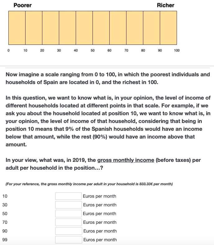
combination of the increased availability of high-quality readily-usable data for research and the
recognition that social interactions and local environments matter for both short and long-term
outcomes (Algan et al. 2016, Chetty and Hendren 2018, Gould et al. 2004; 2011, Kuhn et al. 2011,
Ludwig et al. 2013).
      This paper follows that trend by introducing the LNG, a novel measure of local inequality
with several appealing properties. First of all, the LNG is truly independent of administrative
boundaries — a longstanding obstacle present even when data availability is at granular levels
of aggregation (e.g., census tracts), and that significantly complicates performing analysis over
time (Openshaw and Taylor 1979, Wong 2009). Secondly, this is the first paper that primarily uses
geolocated real estate data to construct a measure of inequality. This particular type of data is
precisely what enables independence from administrative boundaries. Thirdly, the LNG can be
interpreted as a measure of local housing consumption inequality. For welfare, one could argue
that we ultimately care about consumption. Also, housing typically represents a large fraction of
total household expenditures, and, relative to other forms of consumption, its definition is likely
to be more stable over time. Thus, the LNG is informative about inequality in a relevant aspect
of living standards. Lastly, the LNG is a measure that is, by construction, easily harmonized and
replicable across contexts. Similar data exists in countries outside Spain, and its nature guarantees
a high degree of homogeneity across settings.3
      The rest of the paper is organized as follows. Section 2 formally introduces the LNG and outlines
the steps to construct it using the Spanish real estate administrative data. Section 3 describes the
sample and the design of the survey. Section 4 explores the descriptive association between local
environments, perceptions, and demand for redistribution. Section 5 gets at causality by exploiting
the variation in local neighborhoods induced by new apartment building constructions. Section
6 exploits the within-survey experiment as a complementary approach to identification. Finally,
Section 7 concludes.

2     The Local Neighborhood Gini: a novel measure of local inequality
2.1      The spatial distribution could matter: intuition
Local inequality could be a critical determinant of inequality perceptions. To provide intuition for
the LNG and this hypothesis, consider the two abstract Cities depicted in Figure A1 — City 1 and
City 2. Each polygon represents a dwelling. The number in its interior represents the value (or
size).
      First of all, note that both cities contain exactly four large/high-value dwellings and eight
small/low-value dwellings, with values of 100 and 50, respectively. Therefore, it must be the case
that any measure of inequality will describe both cities as equally unequal. For example, computing
a standard Gini index would yield a value of 0.167. Let us now look at the two dwellings colored in
    3The key elements required to construct the LNG are the exact location of the real estate and some information about
its characteristics (e.g., size), and these leave very little room for arbitrary definitions.

                                                           5
dark-green at both cities’ eastern border. They both have the same value/size (50) and are located
in equivalent coordinates within their respective cities. However, the disparity in the composition
of their respective local neighborhoods — defined as the set of immediately adjacent dwellings
(and colored in light-green) — is apparent. While all the neighboring dwellings in City 1 are of
the same value, those in City 2 are not. We can see this very clearly by computing the Gini index
of these two dwellings’ local neighborhoods, delivering values of 0 and 0.167 in City 1 and 2,
respectively.
Now suppose that households were immobile and isolated from others in the rest of the city.
Suppose interactions were limited to only the closest neighbors. In that scenario, it would be
reasonable to think that each dwelling’s local neighborhood plays a significant role in determining
inequality perceptions. Citywide inequality would be completely irrelevant. After all, a household
in one corner of the city could only know about another household located in the opposite corner
through close neighbors’ interactions. Of course, in reality, individuals are not immobile, and they
certainly interact with others outside their immediate neighborhood. However, as long as they
spend some fraction of their time at home,4 or as long as interactions of some form occur at the
neighborhood level, the previously outlined mechanism should play some role.5
2.2 The Local Neighborhood Gini (LNG)
The LNG captures a dimension of housing inequality in the immediate local environment of a
dwelling. To construct it, one first has to decide on the relevant dimension of inequality to study.
The choice set will depend on the data available. Given the type of information required to
construct the LNG (geolocated real estate data), housing space is likely to be a common element
in this set. Housing values could also be a natural option if observed. Secondly, one has to decide
on the spatial scope of the neighborhood or, in other words, on how “local” a local neighborhood
ought to be. The LNG defines a local neighborhood as the set of properties contained within an
r-meter buffer around the dwelling.6 The application at hand should guide the choice. The LNG
is simply the Gini index of that local neighborhood.
2.3 Construction in practice: data
Spanish Cadastre data: The primary data source to construct the LNG for Barcelona (and other
Spanish cities) is the Spanish Cadastre (Catastro), a registry of the universe of the real estate present
in the country that is maintained and regularly updated by the Spanish Ministry of the Treasury for
4Using mobile phone data, Athey et al. (2020) report that an average American spends about 40% of the time at home.
5This is indeed the case. For example, Wellman (1996), in the context of Toronto, shows that close neighbors account
for a significant share of contacts. Bayer et al. (2008), in the context of Boston, shows that interactions at the city-block
level can have positive effects in the marketplace, for example, in terms of job referrals.
6While the idea of defining a local neighborhood by “drawing a circle” around some point is not new (Lee et al.
2008, Reardon and O’Sullivan 2004), in practice, all attempts to implement such an approach had to ultimately rely
on aggregated data (e.g., at the census tract level). The LNG is based on geolocated housing data and, therefore, can
circumvent this problem.
6taxation purposes.7 The Cadastre data is exceptionally detailed and accurate. For every real estate
unit in the country (e.g., an apartment), one can observe the exact location, size (in square meters),
year of construction, years in which the unit was subject to renovations (if any), and the primary use
(e.g., residential, retail, or cultural). The data also contains the GIS cartography available for each
municipality in the country, with all the real estate precisely geolocated. The dataset is updated
twice per year by the Ministry of the Treasury, usually in February and August, and it offers a
precise snapshot of the real estate in the country at the time of the update. All the information
previously described is publicly available.8 The complete data also contains information on the
owner of every property and its estimated market value (valor catastral). However, this information
is restricted.
With the Cadastre data alone, it is possible to compute the LNG capturing dispersion in
dwelling space. However, I was also interested in obtaining an additional estimate of inequality
in dwelling value — probably closer to traditional wealth inequality. To that end, I merged the
Cadastre data with real estate transactions data from the Catalan Tax Agency (Agència Tributària de
Catalunya, ATC).
ATC administrative data: This dataset contains information on the universe of real estate transac-
tions in Catalonia from January 2009 to December 2019. The data source is the property transfer
tax (Impuesto de Transmisiones Patrimoniales, ITP), a tax levied on real estate transactions between
homeowners and new buyers. This tax only applies to transfers of used property.9 During this
period, over 275,000 transactions occurred, 65,000 of which took place in Barcelona. For each
transaction, the data contains the property’s value, some of its characteristics (e.g., size or year
of construction), its geographic coordinates, and, critically, the Cadastre identification code. This
latter feature makes it possible to easily link the Cadastre and the ATC data and assign a price tag
to all the dwellings transferred in this period.10 Unlike the Cadastre, this dataset is confidential.11
Other data sources: In the dwelling value estimation process, I complemented the previous two
sources with demographic data from the Municipal Registry (2009-19); the 2011 Census; income
data from INE’s Atlas de distribución de renta de los hogares (2017); rental price data from the Ministry
of Transportation (2017) and the Barcelona City Council (2009-19); and public transportation data
from Barcelona Transportation Authority (2019).
7The data does not include the real estate located in the Basque Country and the Navarra regions, as these have a
special taxation regime.
8The data can be downloaded at https://www.sedecatastro.gob.es/.
9A different tax — the Impuesto sobre Actos Jurídicos Documentados (IAJD) — is levied on the acquisition of new
property.
10The Cadastre code in the ATC data links a transaction to a building in Catalonia, but not to the exact unit within
that building. To effectively link both datasets, I looked for the best match using the other information available in the
ATC. Namely, the year of construction/renovation, quality of the unit, and size (square meters).
11It was first used in Garcia-López et al. (2020). Access is granted by the ATC subject to their approval.
72.4 Construction in practice: dwelling value estimation
I used the Ranger package in R to implement Breiman (2001)’s Random Forest algorithm and
predict the (log) price of each dwelling in Barcelona.12 The prediction made use of the roughly
65,000 real estate transactions that occurred in Barcelona in 2009-19. I combined the ATC data
with all the information from the census, registry, and other sources — 157 variables in total —
to implement the random forest.13 The prediction error (Out of Bag Root Mean Squared Error,
OOBRMSE) of the algorithm was 0.1437.14 The most important variable in the prediction (by
a magnitude of almost 3) was the dwelling’s size (square meters). Other variables with a high
relevance in the prediction included the median income in the census tract, the median selling
price per square meter at the district level, the transaction year, the quality of the apartment,15 and
the year of construction.
2.5 Construction in practice: methodology
I construct the LNG in five steps. First, a building plot in a city is selected.16 Second, r is chosen,
and a buffer with an r meter radius is drawn from the plot’s centroid. The present research
question calls for a small r. However, the intention was to let the data speak on how local a local
neighborhood ought to be. Thus, I constructed the LNG for several buffers, ranging from 100
meters to one kilometer. In the third step, all the plots whose centroids intersect with the buffer
are selected. All the dwellings in these plots constitute the building’s “local neighborhood”. This
step is illustrated in Figure 1. In the fourth step, the Gini index for the local neighborhood is
computed, thus summarizing the dispersion in dwelling values (or sizes) in the area surrounding
the selected plot. This is the LNG of the plot.17 Finally, steps one through four are repeated for
every plot in every city considered. Figure 2 illustrates the variation in LNG for the iconic Eixample
neighborhood in the city of Barcelona. Figure A2 shows the variation in the entire city.
2.6 The LNG compared to income inequality in Spanish cities
Table B1 provides a comparison between different inequality measures defined at the city level
(whenever possible). In that table, Income Gini is the standard Gini coefficient calculated from
12Several studies suggest that random forests typically overperform standard hedonic price regressions and other
machine learning methods such as LASSO (Čeh et al. 2018, Fan et al. 2006, Mullainathan and Spiess 2017).
13At first, with no parameter tuning. The process was then repeated, implementing some tunning. The final prediction
grew 500 trees, nine nodes, an 80% sample split, 42 variables to split in each node, and allowing the algorithm to decide
on each variable’s importance based on the reduction of node impurity after each split.
14Other studies predicting house values achieved OOBRMSEs of 0.12-0.16 (Čeh et al. 2018, Fan et al. 2006, Mullainathan
and Spiess 2017). Therefore, the performance of my prediction is slightly inferior to those. This underperformance is
likely to be explained by the fact that the number of rooms in the dwelling (a variable with typically a high explanatory
power) is not observed in the Cadastre.
15Apartment quality is a categorical variable capturing the overall quality of a unit (in a scale from 1 to 10).
16A plot is the area underneath a building.
17The LNG varies at the building/plot level, but all dwellings within the building and surrounding buildings (of the
local neighborhood) are used when computing the Gini index.
8the 2018 Encuesta de Condiciones de Vida (ECV) microdata.18 The measure reflects pre-tax income
inequality in 2018, the latest available in the data. Citywide Value and Space Gini reflect the
dispersion in predicted dwelling values and actual dwelling space across the city. Mean LNG
(Value and Space) reflect the mean LNG (r = 100) across city dwellings. Value Gini and Mean LNG
(Value) are only available for Barcelona as that is the only city in the sample covered in the ATC
data.
The first take away from the table is that pre-tax income inequality is high in these cities’
regions, and always above Value Gini (in Barcelona) and Space Gini. At least three reasons could
explain this. First, income is theoretically unbounded and more volatile than dwelling sizes (and
therefore possibly dwelling values too). Second, space is scarce in cities, even when is possible to
increase density (e.g., by building taller buildings). Third, preferences over housing consumption
are likely to be non-homothetic. Those at the top might be more prone to invest in assets other
than real estate once a certain amount of dwelling consumption is attained (Albouy et al. 2016,
Couture et al. 2019, Yang 2009).
The second main takeaway is that citywide value/space inequality is above the mean LNG. To
interpret this result, it is helpful to go back to the toy example in Figure A1. In that example, both
cities have a City Gini of 0.167, but they substantially differ in their Mean LNG. While the Mean
LNG is 0.161 in City 2, the respective value is only 0.091 in City 1, or about 43% smaller. The reason
for that discrepancy lies in the differential spatial distribution of dwellings within the city or, in
other words, in the differential level of residential segregation. Local inequality and segregation
are essentially two sides of the same coin (Glaeser et al. 2009). Hence, even if not formally defined
in this paper, the gap between city Gini and Mean LNG is informative about the level of housing
segregation present in the city.
3 The survey
3.1 Sample
Netquest, a market-research company based in Barcelona, carried out sample recruitment. Field
work started on May 28 and was completed on June 9, 2020. Each respondent completing an
estimated 15-minute long survey received approximately three USD (in “koru points” — a virtual
currency).19 Given the nature of the research questions, I instructed Netquest to sample respon-
dents from all (10) districts and (73) neighborhoods in Barcelona while maintaining a balanced
sample in terms of gender, age, and socio-economic status to the extent possible. In total, 1,444
respondents completed the survey. However, 114 of them had to be discarded due to different
18The ECV is part of the Luxembourg Income Study (LIS).
19The final median completion time was 18 minutes. Netquest compensated all respondents participating in the
survey, even if not completing it, as a way to maintain the high-quality of its online panel.
9reasons.20 The final sample includes 1,330 individuals.21
Table 1 shows the comparison between the Netquest sample and the target population in
Barcelona. The sample is reasonably well-balanced in terms of age, marital status, rental status,
employment status, and household characteristics, but not so much in terms of gender (males
overrepresented), origin (foreign-born are underrepresented), education (university graduates are
overrepresented),22 and ideology (left-wing individuals are overrepresented).23 Table B2 shows the
geographical distribution of the sample across districts and neighborhoods. Representation across
all districts and neighborhoods was achieved, and its geographic balance is good. However, some
districts are slightly underrepresented (Ciutat Vella, Les Corts), while others are overrepresented
(Sants-Montjuïc, Sant Martí).
3.2 Design: eliciting perceived inequality and preferences for redistribution
Preferences for redistribution: I measure Preferences for redistribution using the Spanish trans-
lation of the following question:
“Some people think that public services and social benefits should be improved, even at the expense of
paying higher taxes (on a scale from 0 to 10, these people would be at 0). Others think that it is better to pay
fewer taxes, even if this means having fewer public services and social benefits (these people would be at 10
on the scale). Other people are in between. In which position would you place yourself?”
The choice of the question responds to two reasons. First and foremost, this is the adaptation
of a question in the General Social Survey (GSS) that others have previously used to study distri-
butional preferences (e.g., Alesina and Giuliano 2011).24 The specific adaptation was carried out
by the sociologists working at the Spanish Centro de Investigaciones Sociológicas (CIS) and has been
used in several of their surveys, including the Encuesta Social General Española, an adaptation of the
entire GSS survey in the Spanish context. Therefore, this question allows for a good framing of
results in the context of the existing literature.25 Second, translating survey questions to different
languages can be problematic at times due to information potentially lost in translation or to mis-
leading wording. Having a suitable option already translated into the Spanish language was an
important motivation for the choice.
20Ninety-nine because they could not be matched to a valid address. The most common reasons were: the participant
introduced a ZIP code from outside Barcelona, typos in the address, and the inexistence of the address. Fifteen because
some inconsistencies between their responses and Netquest’s records were detected (e.g., in the gender or age of the
participant).
21The survey can be accessed from the following link:
https://bostonu.qualtrics.com/jfe/form/SV_d0TvD2V8DV8tzWl. Appendix D contains a detailed description of the
entire survey and the complete list of questions translated in English.
22Note that this statistic comes from the 2011 census, and therefore the imbalance is probably not so exaggerated.
23Note that part of the imbalances are common features of online samples, typically composed of younger and more
educated individuals.
24The exact question in the GSS reads: “Some people think that the government in Washington should do everything to
improve the standard of living of all poor Americans (they are at point 1 on this card). Other people think it is not the government’s
responsibility, and that each person should take care of himself (they are at point 5). Where are you placing yourself on this scale?".
25Values from the question were rescaled so that a 10 represents maximum demand for redistribution.
10Perceived inequality: I measure perceived inequality by eliciting respondents’ perceived income
distribution first. I then compute the implied Gini coefficient of the distribution. Figure 3 shows the
question used. Specifically, after explicitly defining income and indirectly introducing the notion
of income distribution in two previous questions,26 I asked respondents about their perceived
incomes at the percentiles 10, 30, 50, 70, 90, and 99. From those, I could back up the entire
distribution by applying linear interpolation. Obtaining the corresponding Gini index (or any
other standard measure of inequality) is then straightforward. A similar approach is followed in
Eriksson and Simpson (2012) and Chambers et al. (2014), where they measure perceived inequality
by computing the ratio of perceived income/wealth between the percentiles 80 and 20.27
I chose to elicit the income (and not wealth) distribution for the following reasons. First,
describing income is more straightforward and does not require using words such as “asset” or
“debt”. Second, relative to wealth, individuals are more likely to have a better idea of others’
incomes and salaries. Third, the timing of the survey coincided with the Spanish tax season
(April-July). That meant that personal and household income should have been salient at the time
of the survey as almost everyone has to file for the income tax. In contrast, very few individuals
file for the wealth tax.28 Finally, most of the literature studying the relationship between inequality
and distributional preferences has focused on income rather than wealth (Gimpelson and Treisman
2018, Karadja et al. 2017, Niehues 2014).
The median respondent did reasonably well in guessing the shape of the actual income distri-
bution. Figure 4 shows the distribution of perceived income across the different percentiles surveyed.
For example, the median perceived income in the 10th percentile is 500 euros, whereas the actual
income in that percentile is 446 euros (Encuesta de Condiciones de Vida, 2018). Nonetheless, it is the
case that incomes are substantially overestimated at the top of the distribution — particularly in the
percentiles 90 and 99.29 Figure 4 strongly suggests that respondents’ took the question seriously
and that answers contain meaningful information.
Figure 5 shows the distribution of perceived inequality in the sample. The mean (median)
Perceived Gini is 0.45 (0.42), above the actual Gini (0.36). The main source of discrepancy is the
substantial overestimation of income at the top.30
26All questions avoid complex words such as “percentile” or “distribution”. Instead, I introduce the notions for these
by talking about (and showing) a scale that orders households in the country by income.
27Eriksson and Simpson (2012) asked the question: “What is the average household wealth, in dollars, among the 20% richest
households in the United States?” Chambers et al. (2014) asked the same question, but eliciting income instead of wealth.
28The reason for that is a high minimum exemption threshold, currently set at 700,000 euros of net wealth. Very few
individuals or households surpass it, to the extent that, in 2018, there were only 77,397 wealth tax filers in Catalonia
(Agencia Tributaria 2018b). In contrast, also in Catalonia in 2018, there were 3,655,487 income tax filers (Agencia
Tributaria 2018a).
29Chambers et al. (2014) also document substantial overestimation of incomes at the top.
30In Appendix C, I explore heterogeneity on perceived income and inequality along the observable characteristics of
respondents.
114 Descriptive results
4.1 The determinants of perceived inequality and preferences for redistribution
I start by studying the determinants of perceived inequality and demand for redistribution in
Table 2. In this table, and all tables throughout the paper, I standardize all continuous variables to
facilitate the comparability of results.
Columns 1 and 2 show that males, college graduates, higher-income households, and left-wing
individuals significantly perceive more inequality. District fixed effects do not seem to matter. For
example, relative to a right-wing individual, left-wingers perceives approximately 25% of a SD
more inequality (4.5 points, 10% of the variable mean).31 This result is consistent with Chambers
et al. (2014), which finds that (in the US) liberals significantly perceive more inequality.32 To the
best of my knowledge, no existing studies show how inequality perceptions correlate with other
individual characteristics. Therefore, I cannot compare my results with a benchmark.
Ideology is the most important determinant of demand for redistribution. Perceived inequality
is also relevant. I explore the correlations between preferences for redistribution and individual
characteristics in Columns 3-5. Column 5 suggests that, relative to right-wing individuals, left-
wingers demand approximately 75% of a SD more in redistribution (1.75 points, 27% of the mean).
This result is consistent with what Alesina and Giuliano (2011) (AG11) and others typically find.
Perceived inequality is another major determinant, albeit its relative importance is significantly
smaller (about five times smaller). These findings are consistent with previous research (Gimpelson
and Treisman 2018, Niehues 2014). The direction in the correlation for the other determinants
generally goes in the same direction as well. Comparing them with AG11, the sign coincides when
looking at gender (females generally more willing to redistribute), religion (religious individuals
less willing to redistribute according to the World Value Survey), employment status (unemployed
more willing to redistribute). In AG11, the sign for age and marital status flips across specifications,
but it is typically not statistically different from zero. The sign does not coincide when looking
at college graduates and higher-income individuals (both typically less willing to redistribute
in AG11).33 Table B3 studies the relationship between Preferences for Redistribution and other
major drivers according to the literature. All correlations have the expected sign, and inequality
perceptions appear to be among the most prominent determinants.
Overall, the correlations presented in the table are consistent with our knowledge about beliefs
on inequality and demand for redistribution.34
31Left-wing is an indicator taking a value of 1 if the individual responded a value between 0 and 4 to the following
question: “When talking about politics, it is common to use the expressions “left” and “right”. On a scale from 0 to 10, where 0
means “very left-wing” and 10 “very right-wing”, where would you place yourself?”.
32According to their measure (the 80/20 income ratio), liberals perceive up to 30% more inequality than conservatives
(Figure S3 in their Appendix).
33Although not shown in the table, this is explained by heterogeneity along the ideology dimension. Higher-income
and highly educated left-wing individuals are more favorable towards redistribution. The opposite (non-significant) is
true for right-wing individuals.
34Appendix C explores heterogeneity on these two variables along several individual characteristics.
124.2 LNG, perceived inequality, and preferences for redistribution
Perceived inequality: I start investigating the association between local and perceived inequality
by estimating the following model:
0
Yi = βLN G(r)i + Xi γ + δi(j) + i (1)
where Yi is individual’s i perceived inequality (Perceived Gini), LN G(r) is the LNG with an r-meter
buffer associated with the dwelling of the respondent. Xi is a battery of controls that include age,
log household income, household size, and indicators for female, foreign-born, college education,
married, religious, left-wing ideology, home-renter, and unemployed. δi(j) is an indicator taking
the value of 1 if individual i resides in district j. Finally, standard errors are clustered at the
neighborhood level.35
Table 3 shows the OLS estimates of Equation 1 with the definition of local neighborhoods
(characterized by r) broadening across columns, ranging from a 100 meters buffer around the
respondent’s dwelling and up to one kilometer. The first (last) six columns show the estimates
without (with) controls. Figure 6 plots the same regressions coefficients to better visualize the
pattern that emerges in the table.
In narrowly defined neighborhoods (r ≤ 500), the relationship between LNG and perceived
inequality is positive. For example, when r = 200 (Column 8), a 1 SD increase in LNG yields a
significant shift in Perceived Gini of approximately 10% of a SD (translating into 1.8 points in that
variable, or 4% of the mean). The sign quickly decays and eventually flips as the neighborhood’s
definition gets wider (as r increases). These results mean that more actual (local) inequality
is associated with more perceived (aggregate) inequality, consistent with the idea of individuals
extrapolating from local environments. Also, the decaying pattern suggests that what is close is
more relevant.
Comparing the results with and without controls does not yield significantly different conclu-
sions. Keeping r fixed, the β estimate obtained with or without controls is virtually unchanged.
Thus, results suggest that, even in the presence of residential sorting, the effects of local inequality
on perceived inequality are relatively homogeneous, at least conditional on observables. That
does not imply that unobservables are irrelevant, but the little movement in the estimates after the
inclusion of controls points in that direction (Oster 2019).
Preferences for redistribution: Table 4 studies the relationship between local inequality (LNG)
and distributional preferences by re-estimating Equation 1 with Preferences for Redistribution as
dependent variable. The structure of this table is analogous to Table 3. Figure 7 plots the regression
coefficients.
There is a mild negative relationship between the level of aggregation at which the LNG
is defined (captured by r) and preferences for distribution, similarly to Table 3. In this instance,
35Barcelona has 10 districts (districtes) divided in 73 neighborhoods (barris).
13though, the relationship between the two is only mildly positive (and not significant) when r = 100.
By expanding the spatial scope of the neighborhood (r), the association quickly flips signs.
The results are not inconsistent with local inequality affecting demand for redistribution
through perceptions. Results in Table 2 (Column 5) indicated that demand for redistribution
increases by approximately 14% of a SD (0.33 points) following a 1 SD shift in Perceived Gini. Col-
umn 8 in Table 3 suggests that perceived inequality would increase by approximately 10% of a
SD (1.8 points) following a 1 SD increase in LNG. This shift in perceived inequality would only
translate into an increase in demand for redistribution of 0.033 points (1.4% of a SD, or 0.5% of
the mean). The implied coefficient (0.0014) is actually contained within a 95% confidence interval
of the point estimate in Column 8.36 Therefore, the relatively weak association between local and
perceived inequality, and between perceived inequality and demand for redistribution, can explain
the essentially null relationship between local inequality and demand for redistribution from Table
4.37
The inclusion of controls matters, especially in broadly defined neighborhoods. When r is
small, the difference in a given column comparison (with and without controls) is not statistically
significant. However, when r > 500, the difference between becomes apparent. Specifically,
the relationship between local inequality and redistribution preferences, when no controls are
included, is negative and precisely estimated. This suggests that sorting might be playing a role
in this instance. I explore this hypothesis in Table B4, where I regress the LNG associated with
individuals’ dwellings on their observable characteristics while varying r across specifications.
Sorting along ideology can explain the previous pattern. Table B4 makes clear that ideology
is the primary individual characteristic that varies as the neighborhood’s spatial scope broadens.
When the neighborhood is narrowly defined, there are no significant differences across individuals
in practically any dimension.38 However, as the definition of local neighborhoods widens, it soon
becomes clear that left-wing individuals are less likely to be represented in the more unequal
parts. To get a sense of the magnitude of the sorting, Column 5 (r = 750) implies that, in a local
neighborhood that is 1 SD more unequal than average (+4.7 points in LNG), left-wing individuals
are approximately 13.5% less likely to be represented. This finding is consistent with left-wing
individuals disliking inequality more than conservatives (Napier and Jost 2008), and suggests the
presence of significant sorting along this characteristic. Importantly, left-wing individuals are
generally more in favor of redistribution (Table 2). Therefore, not controlling for this individual
36This is also true for the rest of the estimates in the last six columns. These would be: 0.008, 0.0014, 0.008, 0.0031,
−0.003, −0.0074.
37Sands and de Kadt (2019), in the context of South Africa, construct a measure of income inequality aggregating the
census tracts contained within 500 meters to one kilometer around the dwellings of their respondents. They find that 1
SD increase in their local inequality measure is associated with a 0.8pp (a small effect). Also similar to this paper, they
find that aggregations above one kilometer yield a negative relationship.
38At r = 100, older and single individuals are somewhat more likely to reside in locally unequal neighborhoods (10%
significance level).
14characteristic biases the estimates in Table 4 downwards.39
Overall, results show a positive association between local and perceived inequality, but virtually
no relationship between local inequality and demand for redistribution. Furthermore, the latter
appears to be (if anything) negative, mainly when local neighborhoods are broadly defined and
when ideology is not taken into account. That may seem a counterintuitive result, but it is partly
explained by residential sorting along ideology. Consequently, there are reasons to be skeptical
of the simple correlations (particularly regarding demand for redistribution). To get at causality,
it is necessary to find a setting with exogenous variation in local inequality. This paper explores
two avenues. First, within-neighborhoods variation generated from the rise of new apartment
buildings (in the next section). Second, between-neighborhoods experimental variation generated
from a shock in the information set about local inequality (in Section 6).
5 Quasi-experimental approach: new building treatment
5.1 Identification and empirical strategy
The first approach to shocking local environments exploits within-neighborhood variation caused
by the rise of new apartment buildings close to respondents’ homes. Figure 8 illustrates the
intuition behind this approach to identification in an extreme but clear example. The top panel
there shows an apartment building in Barcelona. As suggested by the image and confirmed by
the Cadastre data, all apartment units in that building (and in the one just behind) are relatively
similar. This is reflected in a low LNG (0.02, r = 100) associated with that building in that year
(2012). The bottom panel shows the same apartment and its surroundings three years later, in
2015. The reader will note that, most noticeably, a new and modern apartment building was
constructed over a former parking lot. The new units are considerably larger and of better quality
and, therefore, the LNG (r = 100) of the old building in that year jumped to 0.23 — representing a
tenfold increase relative to 2012. Based on the stark contrast between the two buildings, the new
construction is likely to disrupt the way dwellers in the older building see their neighborhood. This
approach exploits shocks of this nature by taking advantage of the fact that survey respondents’
exact addresses are observed.
Following the intuition illustrated in the previous example, I estimate the model below:
0
Yi = βT reatedi + Xi γ + δi(j) + i (2)
where Yi is an outcome variable of interest (e.g., perceived inequality) of individual i. T reatedi
is an indicator variable taking the value of 1 if the individual resides within 350 meters of a new
apartment built in the previous three years before being surveyed (2017, 2018, or 2019). Xi and
δi(j) are defined as in Equation 1.
39Even if not shown in the table, that is effectively the case. Controlling for the full battery of observables except
ideology, yields a negative (and often significant) relationship between LNG and demand for redistribution (especially
as r increases).
15Figure 9 offers a visualization of the identification strategy. It shows a map of Barcelona divided
by its ten districts. A red symbol represents the exact location of a new apartment constructed in
2017-19. The orange circumferences surrounding each symbol represent a 350-meter buffer around
a new construction. All individuals in the sample located within one of those buffers are defined
as treated. The rest serve as controls.
In words, the identification assumption is that, conditional on the battery of controls, new
buildings’ locations are not systematically related to any unobservable characteristic of individuals
within a district. If that holds, then β causally identifies the effect of new constructions on the
outcomes of interest — perceptions and redistribution preferences.
Identification is plausible. The treatment exploited in this setting is the rise of a new apartment
building. It is not the construction of new museums, churches, or other iconic buildings. Tens of
apartment buildings are constructed every year all across the city. Moreover, to address the poten-
tial threat of individuals strategically locating in neighborhoods that are “improving” faster over
time relative to others in the city (gentrification), the baseline specification restricts the attention
to individuals that have lived in the same dwelling for at least five years. In robustness, I further
extend the residency requirements and restrict my attention to property owners — arguably less
mobile than renters.
The 350-meter buffer choice responds to the local nature of the treatment. Section 4.2 suggested
that the “relevant” spatial scope of a local neighborhood might be somewhere between 200 and
500 meters. 350 is the middle point. Also, individuals residing in the area close to a new building
are likely to notice it, but that is probably not true for those living significantly farther.
The three-year treatment time-window responds to small clusters of new constructions that
appear over short periods. Over extended horizons (5-10 years), new constructions are scattered
all across the city. However, as Figure 9 makes clear, a local neighborhood treated in 2019 is
also likely to have been treated in 2018 or 2017. Thus, defining an individual as untreated when
a new apartment was constructed close by just one year earlier might bias the treatment effects
downwards if those persist longer than one year.
New building treatment and local inequality: Table 5 investigates the effects of the treatment
on local inequality. Given that dwelling prices are estimated from real estate transactions on used
(i.e., not new) properties,40 predictions are likely to substantially underestimate the value of new
houses or apartments — and hence the change in local inequality induced by the new apartment
building.41 Therefore, in addition to looking at the average effects on local inequality in dwelling
value in Columns 1-3, I also look at changes in dwelling space inequality in Columns 4-6. Across
rows, I vary r and the distance to enter the treatment sample jointly, from 200 to 500 meters.
Local inequality increases following the rise of a new apartment building. This is true for both
40See Section 2.4.
41Even when Year of Construction is one of the variables included in the estimation algorithm. To accurately predict the
value of a newly constructed dwelling, transaction data on new dwellings should be incorporated into the estimation
sample.
16value and space, but the shift is only significant for space. In terms of the magnitude, baseline
results (in Columns 2 and 4) suggest that being exposed to a new apartment building increases
local inequality in value (space) by approximately 8% (32%) of a SD. These roughly translate into
+0.73 (+0.26) percentage point increase in the LNG, or 6% (130%) of the mean.42 The effects are
not too different when considering events within 200 or 500 meters instead (Columns 1, 3, 4, and 6).
Covariate balance: The covariate balance between treatment and control samples is good. Panel
A in Table B5 shows that both groups are not significantly different in terms of any observed
characteristic.
5.2 New building treatment, perceived inequality, and preferences for redistribution
Perceived inequality: Table 6 investigates the effects of the new apartment building treatment
on perceived inequality. Across the table, odd columns show the estimates of some variation of
Equation 2 without the battery of controls. Even columns include controls.
Exposure to a new apartment building increases perceived inequality. Column 2 (the baseline
specification) shows an average treatment effect of approximately 17% of a SD, translating into
an increase in Perceived Gini of about 3 points (7% of the mean). Columns 3-6 further restrict
the sample to individuals that have resided in the same dwelling for at least 10 or 15 years to
alleviate concerns on hypothetical anticipatory effects. The rationale is that moving into a (local)
neighborhood anticipating the rise of a new apartment building ten years into the future seems
implausible. By applying these restrictions, the magnitude slightly increases to 17-20% of a SD,
translating into an increase of 3-3.5 points in Perceived Gini. Therefore, results are inconsistent
with anticipatory effects. To address the concern of displacement effects (individuals moving after
the rise of a new building), columns 7-10 explore heterogeneity along rental status. The rationale
is that, relative to renters, moving costs are likely to be substantially higher among homeowners
(e.g., they might have a mortgage).43 We should therefore be less worried about this concern in
the homeowners sample. Results in these last columns suggest slightly stronger effects among
homeowners — although point estimates across columns are neither qualitative nor statistically
different from each other. The treatment effect is stable around 17% of a SD. Estimates in Columns
7 and 8 are less precise due to the significantly smaller renters sample relative to homeowners.
Hence, results are inconsistent with large displacement effects.
Preferences for redistribution: Table 7 investigates the effects of the new apartment building
treatment on preferences for redistribution. It has the same structure as Table 6.
The treatment has a mild (positive) effect on demand for redistribution. Baseline results from
Column 2 show that recent exposure to a new apartment building increases the demand for
redistribution by approximately 7% of a SD (0.16 points, or 2.5% of the mean). However, the
42As argued earlier, the effects on local value inequality are likely to represent a lower bound.
4342% of homeowners in the sample have pending payments on their dwelling.
17You can also read