PERCEPTION AND REALITY - IMPACTS OF CLIMATE CHANGE - The Global Warming Policy Foundation Report 46 - The ...
←
→
Page content transcription
If your browser does not render page correctly, please read the page content below

I M PA C T S          OF        C L I M AT E   CHANGE
PERC E P T I O N A ND REA LITY
Indur M. Goklany

  The Global Warming Policy Foundation
  Report 46

Impacts of Climate Change: Perception and Reality
Indur M. Goklany

Report 46, The Global Warming Policy Foundation
© Copyright 2021, The Global Warming Policy Foundation

ISBN 978-1-8380747-3-9

Contents
The Climate Noose: Business, Net Zero and the IPCC's Anticapitalism
Rupert
AboutDarwall
        the author	                                                                         iii
Report 40, The Global Warming Policy Foundation
1.     The standard narrative 	                                                              1
2.     Extreme weather events
ISBN 978-1-9160700-7-3                                                                        2
3.Copyright
©      Area2020,
             burned  by wildfires
                 The Global Warming Policy Foundation                                       10
4.     Disease	                                                                            11
5.     Food and hunger	                                                                    12
6.     Sea-level rise and land loss	                                                       14
7.     Human wellbeing	                                                                    15
8.     Terrestrial biological productivity	                                                23
9.     Discussion	                                                                         27
10. Conclusion	                                                                            28
Note	                                                                                      30
References	                                                                                31
Bibliography	                                                                              34
About the Global Warming Policy Foundation	                                                40

About the author
Indur M. Goklany is an independent scholar and author. He was a member of the US delegation
that established the IPCC and helped develop its First Assessment Report. He subsequently served
as a US delegate to the IPCC, and as an IPCC reviewer.
‘The effects of global inaction are startling       ‘Now I think America is learning lessons on
…Around the world, we are seeing heat               the importance of ecology…on the east
waves, droughts, forest fires, floods and           coast, floods, and on the west coast, [for-
other extreme meteorological events, ris-           est] fires’.
ing sea levels, emergencies of diseases                                              The Dalai Lama5
and further problems that are only premo-
nition of things far worse, unless we act
and act urgently.‘
                                           ‘2015 was a record-breaking year in the US,
                          His Holiness, The Pope1
                                           with more than 10 million acres burned,’
                                           he told DW in an interview. ‘That’s about 4
                                           million hectares, or an area of the size of
‘Climate change is happening now and to the Netherlands or Switzerland’.
all of us. Every week brings a new example        Jason Funk, Union of Concerned Scientists6
of climate-related devastation. No country
or community is immune…
Such events are becoming more frequent,
more severe and more widespread and ‘More than 70 health organisations signed
will become even worse unless we act a statement that, among other things,
urgently, now.                              calls for a move away from fossil fuels. The
                                            groups cite storm and flood emergencies,
It is clear that climate change threatens
                                            chronic air pollution, the spread of dis-
decades of development progress and
                                            eases carried by insects, and especially
places in jeopardy all our plans for inclu-
                                            heat-related illnesses.’
sive and sustainable development.
                                                                                Inside Climate News7
From increased poverty and food inse-
curity, to growing water stress and accel-
erated environmental damage, climate
change is a clear and present threat.’
                                                 ‘Mounting evidence points to the fact that
          UN Secretary General, António Guterres climate change is already affecting agri-
                                                2

                                                 culture and food security, which will make
                                                 the challenge of ending hunger, achiev-
                                                 ing food security, improving nutrition and
‘Mr Guterres noted that the climate crisis promoting sustainable agriculture more
has generated ‘turbocharged’ hurricanes difficult…
and storms, which are occurring with
                                                 Changes in climate are already undermin-
greater intensity and frequency.’
                                                 ing production of major crops (wheat,
                                       UN News3 rice and maize) in tropical and temperate
                                                 regions.’
                                                             Food and Agriculture Organization of the
                                                              United Nations (FAO), International Fund
‘Climate change is creating catastrophic
                                                          for Agricultural Development (IFAD), United
wildfires.’                                                   Nations Children’s Fund (UNICEF), World
            Carly Phillips, World Economic Forum4           Food Programme (WFP) and World Health
                                                                                 Organization (WHO)8
1.     The standard narrative
The standard narrative regarding climate change, as
represented by the quotes on the opposite page, from
some of the world’s most influential people and institu-
tions, is that climate change is already increasing the fre-
quency and intensity of extreme weather events (EWEs)
and wildfires, reducing available water and crop yields,
increasing diseases, hunger, poverty and human mortal-
ity, and reducing productivity of the biosphere and the
habitat available for species. It is claimed that these and
other climate change impacts are diminishing human
and environmental wellbeing, and will reduce them fur-
ther unless ‘drastic measures to achieve as quickly as pos-
sible zero net greenhouse gas emissions’ are taken.9
      This paper considers whether data on climate-sen-
sitive indicators are consistent with this narrative. Spe-
cifically, it examines empirical trends in extreme events,
wildfires, water availability, vector-borne diseases, and
some indicators of human and environmental wellbeing,
such as economic development, poverty rates, life expec-
tancy, biological productivity, and cropland per capita.
Since climate change is a global phenomenon, the paper
focuses primarily on indicators at the global scale. But
it will also examine trends for the US, to a lesser extent
China and India (which together comprise over a third
of humanity), and, where readily available, aggregated
data from developing or low-income countries. However,
one should recognise that the existence of a trend in one
country (or section of the globe) is not indicative of a
global trend.
      Moreover, because climate change should not be
confused with fluctuations in the weather, the focus
will be on long-term trends. Ideally, the temporal record
examined should be long enough to, firstly, capture
a change in climate. Climate is often defined in terms
of 30-year averages. Thus, it should be long enough to
define at least two non-overlapping 30-year periods. Sec-
ondly, it should also encompass at least one, if not more,
full periods encompassing any significant atmospheric
or oceanic cycle(s) that could significantly affect the phe-
nomenon for the region under examination. For example,
the Atlantic Multidecadal Oscillation, which, it has been
theorised, can affect precipitation and droughts on both
sides of the Atlantic and hurricane activity in the North
Atlantic Basin, has a 60–80 year period.10 Thus, ideally, the
temporal record for determining trends for that region
should be long enough to span a few of these periods.
      Unless explicitly noted, I will use ‘climate change’
synonymously with ‘greenhouse gas induced climate
change’.
       1
2.                           Extreme weather events
                                    According to the Intergovernmental Panel on Climate Change
                                    (IPCC), human activities have warmed the globe about 1°C since
                                    preindustrial times.11 Beyond exacerbating heat waves, climate
                                    change, it is claimed, has increased the frequency and/or inten-
                                    sity of various EWEs such as cyclones (known as hurricanes in the
                                    Americas, and as typhoons in Asia and the Pacific), which would
                                    increase weather-related deaths and economic losses. This section
                                    examines empirical trends in:
                                                     • the various categories of EWE
                                                     • related mortality and economic losses.

                                    Extreme temperatures
                                    According to the latest IPCC assessment,12 ‘since about 1950 it is
                                    very likely that the numbers of cold days and nights have decreased
                                    and the numbers of warm days and nights have increased overall
                                    on the global scale, that is, for land areas with sufficient data. It is
                                    likely that such changes have also occurred across most of North
                                    America, Europe, Asia and Australia’. Thus, heatwaves should have
                                    increased for these areas, while cold waves should have declined.
                                    However, it has low-to-medium confidence in historical trends in
                                    daily temperature extremes in Africa and South America over this
                                    period, either because data are insufficient or trends are mixed.13
                                    It should also have noted that the period from 1950 to the present
                                    is only a small sliver of Earth’s history.
                                         In some of the regions with longer records and wider cover-
                                    age, empirical data reveals that heatwaves were more extreme in
                                    the past, for example in the US in the 1930s, when atmospheric
                                    carbon dioxide concentrations were only 75% of those today (see
                                    Figure 1).14 Moreover, newspaper accounts from Australia from the
                                    same period and the 19th century provide evidence of extreme
                                    heatwaves whose intensity and extent exceeded the official
                                    meteorological records, which are of recent vintage.15 Also, proxy
                                    records for China indicate that although extremely cold winters
                                    between 1500 and 1900 were more frequent than those after
                                    1950, ‘the intensity of regional heat waves, in the context of recent
                                    global warming, may not in fact exceed natural climate variability
                                    seen over the last 2000 years’.16

                                                            10
Figure 1: Heatwaves for the
USA.
                                 Heatwave magnitude index

                                                            8
Source: USGCRP (2017), p. 191,
Figure 6.4.
                                                            6

                                                            4

                                                            2

                                                            0
                                                            1900    1920   1940    1960         1980   2000

                                                                    2
Cyclones
                                        Figure 2 is a plot of all hurricanes (top panel) and major hurricanes
                                        (bottom panel) hitting the US from 1900 through 2017. Neither
                                        shows an increasing trend.
                                                            8
Figure 2: Hurricanes land-                                      All hurricanes
falling in the continental
USA, 1851–2018.                                             6

                                      Number of landfalls
Note in particular the 12-year
‘drought’ of major hurricanes
                                                            4
from 2005–2017. Source: National
Hurricane Research Division. See
also Klotzbach et al. (2018).                               2
    Linear trend

                                                            0
                                                                1870        1910   1950   1970   1990   2010

                                                                Major hurricanes
                                                            4
                                      Number of landfalls

                                                            3

                                                            2

                                                            1

                                                            0
                                                                 1870       1910   1950   1970   1990   2010
                                        This is consistent with a 2012 review, which found no significant
                                        increase in the frequency or intensity of all or major hurricane-
                                        strength landfalling cyclones for either the globe or the five major
                                        hurricane-spawning basins (North Atlantic, northeastern Pacific,
                                        western North Pacific, northern Indian Ocean, and the Southern
                                        Hemisphere).17
                                             Similarly, as shown in Figure 3, there are no upward trends
                                        in hurricanes’ accumulated cyclone energy (ACE), an approxi-
                                        mate measure of their cumulative energy (or their destructive
                                        potential).18 This is true globally, and also individually for the
                                        Northern and Southern Hemispheres.

Figure 3: Global and north-
ern hemisphere ACE.
24-month running sums. Global
and Northern Hemisphere data
are as indicated on the figure. The
Southern Hemisphere is effec-
tively the gap between the two
lines. Source: https://policlimate.
com/tropical/, based on update
of Maue (2011).

                                                                        3
Tornadoes
                                    Over the years, there has been a substantial increase in the num-
                                    ber of tornadoes reported and/or observed in the contiguous US.
                                    This increase is attributed to a combination of improved detection
                                    technologies (e.g. Doppler radar) and an increase in the number of
                                    trained observers.19
                                         The stronger the tornado, the less the likelihood that it would
                                    have escaped detection in earlier times. Therefore, tornado trends
                                    are more appropriately based on trends in stronger tornadoes.
                                    Figure 4 shows the trend in severe (F3) and devastating or worse
                                    (F4 and F5) tornadoes for the contiguous US from 1950 to 2017.
                                    Clearly, strong tornadoes have, if anything, been declining over
                                    time.
Figure 4: Strong tornadoes                   100
in the USA, 1950–2017.
Source: S. Hinson, NOAA, personal
                                             80
communication, 2019.

    F3
    F4–F5                                    60
                                    Number

                                             40

                                             20

                                              0
                                              1950   1960   1970     1980     1990     2000      2010

                                    Floods
                                    It is generally accepted that climate change should increase global
                                    precipitation and, indeed, it has. It is a small step to then speculate
                                    that floods have become more prevalent. But, as a recent paper
                                    – entitled ‘If precipitation extremes are increasing, why aren’t
                                    floods?’ – notes, ‘evidence for increases in flooding remains elu-
                                    sive. If anything, flood magnitudes are decreasing’.20
                                           This statement is consistent with the Climate Science Special
                                    Report, which notes that ‘The IPCC [Fifth Assessment Report] did
                                    not attribute changes in flooding to anthropogenic influence
                                    nor report detectable changes in flooding magnitude, duration,
                                    or frequency’.21 This is supported by an investigation of annual
                                    maximum daily streamflow data from 9213 stations across the
                                    globe, which showed that there were more stations with signifi-
                                    cant decreasing trends than significant increasing trends. Thus
                                    evidence for the hypothesis that flood hazard is increasing is limit-
                                    ed.22 There is therefore something of a paradox: increasing precipi-
                                    tation but reduced flooding. The explanations put forward include
                                    decreases in antecedent soil moisture, decreasing storm extent,
                                    decreases in snowmelt and snow extent, and changes in land cov-
                                    er.23
                                                     4
In the United States, ‘Trends in extreme high values of stream-
                                        flow are mixed…Analysis of 200 US stream gauges indicates areas
                                        of both increasing and decreasing flooding magnitude but does
                                        not provide robust evidence that these trends are attributable to
                                        human influences’.24 This finding is supported by a study of 1204
                                        ‘minimally altered’ catchments in North America and Europe,
                                        which found ‘no compelling evidence for consistent changes over
                                        time in major-flood occurrence’.25 The same study observed that
                                        flood occurrence seemed to have a closer relationship with the
                                        the Atlantic Multidecadal Oscillation – a cyclic climatic phenom-
                                        enon – than with time (which, over the past century or more, may
                                        be viewed as a surrogate for carbon dioxide levels or global tem-
                                        peratures).
                                        Droughts
                                        For the contiguous US, the trend in drought from August 1895 to
                                        July 2019 has, if anything, been downward (Figure 5).26 This trend
                                        has been associated with long-term precipitation increases.27

Figure 5: Drought as meas-
                                                        2
ured by Palmer Z-index
for the contiguous US,12-
month averages, August,                                 1
1895-July, 2019.
                                      Palmer Z-index

Source: Brown indicates a
drought, whereas green indicates                        0
no drought (relative to the mean).
The blue line is the trend. Source:
NOAA, 2019.                                            −1

                                                       −2

                                                            1900   1920   1940   1960   1980   2000

                                                                   5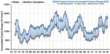
Moreover, ‘by geographical scale and duration, the Dust Bowl era
                                       of the 1930s remains the benchmark drought and extreme heat
                                       event in the historical record’.28
                                            At the global scale, the IPCC notes that there is low confi-
                                       dence in any trends in drought.29 This suggestion was confirmed
                                       by an analysis of precipitation data from 1980 to 2012, which
                                       found a significant positive trend in the land area under drought
                                       in the Southern Hemisphere but no significant trend in the North-
                                       ern Hemisphere or, more importantly, the entire globe.30 A similar
                                       study found no increase in global area under drought from 1982
                                       to 2012.31 Figure 6 shows total global area under drought from
                                       1950–2018.32 It suggests phase or instrumental changes in the
                                       early 1980s, but no subsequent increase in the drought area.

Figure 6: Global drought                        40
1950–2018.                                             Moderate
Percentage of global land area                         Severe
(excluding ice sheets and deserts)              30     Extreme
in drought, by severity, based on
self-calibrating Palmer Drought
Severity Index. Inset: each month
                                      Percent

of 2018. Source: Barichivich et al.             20
(2019, S40).

                                                10

                                                0
                                                1950              1970        1990              2010

                                             It has also been hypothesised that the intensification of the
                                       hydrological cycle due to climate change would lead to dry areas
                                       becoming drier and wet areas wetter. However, an analysis of
                                       global data sets for evapotranspiration, precipitation and poten-
                                       tial evaporation from 1948 to 2005 found that ‘over about three-
                                       quarters of the global land area, robust dryness changes cannot
                                       be detected.33 Only 10.8% of the global land area shows a robust
                                       ‘dry gets drier, wet gets wetter’ pattern, compared to 9.5% of
                                       global land area with the opposite pattern, that is, ‘dry gets wet-
                                       ter, and wet gets drier.’ In other words, the hydrological cycle is
                                       not obviously becoming more intense.
                                             Moreover, a review of paleoclimate data shows that today’s
                                       droughts are not particularly remarkable when placed in histori-
                                       cal context. The paper says, ‘megadroughts reconstructed over
                                       north-central Europe in the 11th and mid-15th centuries rein-
                                       force other evidence from North America and Asia that droughts
                                       were more severe, extensive, and prolonged over Northern Hemi-
                                       sphere land areas before the 20th century’.34
                                             More importantly, concerns about drought are driven by
                                       concerns that people will run out of water to drink, grow crops
                                       and meet other human and environmental needs. These worries
                                       are magnified by the fact that populations continue to grow. Nev-
                                       ertheless, access to safer water has actually increased (Figure 7),
                                                        6
100
Figure 7: Access to clean
water, 1990–2015.
Percentage of population with
access to improved water sources
for various countries and coun- 80
try-groups. Source: WDI (2019).
Percent
World
South Asia
India 60
China
Less developed countries
Sub-Saharan Africa
40
1990 1995 2000 2005 2010
as have crop yields worldwide (Section 5). In other words, notwith-
standing increasing pressures on water supplies, society’s ability
to provide the services humans demand directly or indirectly from
water has, paradoxically, increased, probably because of techno-
logical improvement, driven by economic development, which
makes better technologies more affordable.35 This suggests that
analyses of the impacts of climate change should go beyond cli-
mate’s biophysical effects and consider human adaptability.
Mortality
Since, as we have just seen, the frequency, duration and intensity
of EWEs has not increased, one might expect global death rates
from all such events to be more or less constant. But in fact, as
Figure 8 shows, since the 1920s, global death rates from all EWEs
have declined by 98.9%. More remarkable is the fact that annual
deaths from such events have decreased by 96.1% over this period
despite a more-than-tripling of the population. Notably, the vast
majority of these reductions occurred before climate change
became a concern for the public and policymakers (arguably no
earlier than the signing of the 1992 Rio Declaration). This suggests
that autonomous adaptation driven by wealth and technologi-
cal change is a natural human response to perceived threats, and
should be incorporated into estimates of future climate change
impacts.36
Figure 8: Average annual 600
deaths and death rates
from all EWEs, 1900–2018.
Source: Updated from Goklany
(2009b), using WDI (2019) and 400
EM-DAT (2019).
Deaths (thousands)
Death rate (per million)
200
0
1900s 1920s 1940s 1960s 1980s 2000s
7To put this into context, the average annual death toll from
all EWEs in 2010–2018 was 19,021. This is only 0.035% of the cur-
rent global all-cause annual death toll of about 55 million (WHO,
2016). Despite this, EWEs clearly receive a disproportionate share
of publicity.
The above estimate (0.035%) also represents only a small frac-
tion of deaths attributable to abnormal temperatures. Each loca-
tion appears to have an optimum temperature at which mortality
is a minimum,37 and this appears to vary between the 60th percen-
tile of the average daily temperature for some tropical countries to
more than the 90th percentile in some temperate countries.38 Fig-
ure 9 shows that most of the optimum temperatures are clustered
between the 78th and 93rd percentiles.
Figure 9: Optimum average Brazil
daily temperature at which Thailand
Taiwan
mortality is minimized, Spain
expressed as a percentile Italy
of the average daily tem- Canada
perature distribution. Total
Source: Gasparrini et al. (2015), India
except for India, from Fu et al. Australia
(2018). The total bar is based on China
the aggregate deaths for coun- USA
tries in blue. Japan
South Korea
UK
Sweden
0 20 40 60 80
Percent
Many more deaths are attributable to abnormally cold than
to abnormally warm days (see Figure 10). An analysis of over 74
100
million deaths at 384 locations in 13 countries suggested
93 that
89 90
deaths from abnormal
83 83cold 84 86 times more common than
are 17
90 79 81 81 82
78 deaths from abnormal heat. Even in a warm country like India, the
80
ratio is nearly 14.39 It has also been estimated that extreme cold
70 60 60 62
and hot temperatures are together responsible for less than 1% of
60
total mortality, nine times less than abnormal temperatures.40
50
40 India
Figure 10: Ratio of deaths
30 attributable to colder-
Australia
Brazil
20 than-optimum versus Canada
10 those attributable to China
Italy
0 warmer-than-optimum Japan
temperatures. South Korea
Spain
Source: Gasparrini et al. (2015), Sweden
except India, from Fu et al. (2018). Taiwan
The total bar is based on the Thailand
UK
aggregate deaths for countries in USA
dark blue. Total
0 10 20 30
Ratio
8There is substantial evidence of a decline in mortality from
heat in several countries in recent years, suggesting adaptation
and/or acclimation. The relative risk associated with high tem-
peratures declined significantly between 1993 and 2006 in the US,
Japan, and Spain;41 the decline in Canada was not significant, and
in certain other countries the changes have been small or of low
statistical power. Interestingly, the authors found that risk to the
US population ‘seems to be completely abated in 2006 for sum-
mer temperatures below their 99th percentile’. Another study
found that, notwithstanding any urban heat island effect, there
was a 80% decline in US mortality rates on hot days during the
20th century.42
Societies may adapt better to heat rather than cold. A study
of 53 communities in Japan and Korea found that the relative risk
of mortality declined over time for heat waves, but apparently
increased for cold waves.43 And an analysis of trends in country-
specific temperature-attributable mortality fractions not only
confirmed that cold-related mortality substantially exceeds heat-
related mortality,44 it also found that despite warming trends,
heat-related deaths decreased over the study period in 7 of the 10
countries studied. The trends in cold-related mortality were less
consistent, with 5 countries showing a decrease, and 1 an increase.
Finally, it has been shown that winter is warming faster than
the other seasons, and that nighttime temperatures have warmed
more than daytime.45 These changes are consistent with expec-
tations of climate change and suggest that, ceteris paribus, in
the future, the reduction in deaths from cold should exceed the
increase in deaths from heat.
Economic losses
Figure 11 shows that global economic losses from EWEs as a pro-
portion of GDP from 1990–2018 have been declining. For the US,
once data have been adjusted to account for growth in population,
assets at risk and GDP, there is apparently no long-term increase
in economic losses from hurricanes,46 floods,47 or tornadoes.48 An
analysis of losses from weather-related disasters in China between
1985 and 2014 tells a similar story.49
0.5
Figure 11: Global weather
losses as percent of global
GDP, 1990–2018. 0.4
Source: Pielke, Jr (2019), avail-
able at https://rogerpielkejr.
com/2019/01/10/tracking-prog- 0.3
Percent
ress-on-disasters-2018-update/
Linear trend 0.2
0.1
0
1990 1995 2000 2005 2010 2015
93. Area burned by wildfires
One of the risks of climate change is that it might exacerbate
wildfires. This would then affect forests, other ecosystems, human
health, and water quality, among other things.50 However, it
appears that wildfires probably burned more area in the past
– both before 1930 and in the pre-industrial era.51 Analyses of
charcoal in ice cores, lake and marine sediments, and tree-rings
suggest that levels of fire activity vary greatly over the centuries,
but ‘generally fire occurrence increased to a peak around 1850
before declining to [present day] levels’.52 It also appears that the
current acreage burned in wildfires is substantially smaller for Cali-
fornia specifically, and the globe generally:
On longer timescales Mallek et al. suggest that [present day]
burned area is just 14% of [pre-industrial] burned area in Califor-
nia, and Arora and Melton suggest an overall global decline of
25–30% in burned area since the [preindustrial era]. This decline
in fire is a result of human activity: e.g., passive fire suppression
from landscape fragmentation limits the spread of fires, while
active fire suppression management and legislation aimed to
improve air quality offset any potential anthropogenic increase
in accidental fire ignitions.53
A recent review of satellite data found that the global burned
area declined by between 16 and 33% between 1998 and 2015.54
With respect to the USA, Figure 12 indicates more land area
was burned by wildfires from the 1920s through the 1950s than
at present, peaking at four to five times current levels during the
1930s, which also saw the worst heatwaves in the US over the past
century (see Figure 1). This suggests that, while weather may have
an influence, factors such as land management and fire suppres-
sion may be more important in determining the area consumed
annually by wildfire.
60
Figure 12: Area burned by
wildfire, US, 1926–2017.
Source: US National Interagency
Fire Center (2018), https://www.
40
Million acres
nifc.gov/fireInfo/fireInfo_statistics.
html.
20
0
1920 1940 1960 1980 2000
104. Disease
Warming, it is claimed, could increase the impact of climate- and
weather-sensitive diseases. These include diarrheal diseases, as
well as diseases transmitted or mediated by organisms whose life-
cycles are sensitive to temperature, the presence of water or other
climatic/weather factors.
The impact of diseases is measured in two different ways: mor-
tality, and the global burden of disease (GBD), which is a measure
of useful life lost due to being ill. GBD is measured in disability-
adjusted life years lost, or DALYs.
Parasitic and vector-borne disease
In the period 2000–2016, GBD for parasitic and vector-borne
diseases declined by 42%.55 Of the 13 diseases listed under this
category by the WHO,56 only dengue bucked the trend, but it is a
relatively uncommon illness, representing just 6% of the category
total in 2016. It is noteworthy that Zika, another dread disease fre-
quently linked with climate change, does not even merit an entry
on the WHO breakdown of the diseases in the category.
Malaria accounted for approximately 72% GBD of the cate-
gory in 2016, and 76% in 2000,57 so it is a reasonable surrogate
for such diseases. In 2017, it accounted for 1.1% of global deaths,
23% below its rate in 1990.58 Figure 13 indicates that the global
crude death rate for malaria declined by 96% from 1900 to 2017.
The decline for the US (not shown) was even more spectacular.
In 2016, there were 5 malaria deaths in the US,59 a rate of 0.0016
deaths per 100,000 population. In 1900, the rate was 7.9, so there
has been a reduction of 99.8%.60 Figure 13 shows that there have
also been remarkable improvements elsewhere: the age-stand-
ardised death rates for China, India and Sub-Saharan Africa have
declined by 55%, 48% and 41% respectively, from 1990–2017.61
These improvements can be attributed to improved public health,
the result of economic development, better science and technol-
ogy, and its wide dissemination. Similar to death rates from EWEs
(Figure 8), most of the improvements predate concern about cli-
mate change. They testify to humanity’s ability to adapt to and
reduce the impact of adversity.
location
Figure 13: Malaria death
250
(a) (b)
rates.
Crude death rate per 100,000
100
China
(a) Global malaria death rate (per 200
100,000 population), 1900–2017
ASDR (1990 = 100)
80
and (b) Age-standardised death
India
rates for selected countries/
150
regions 1990–2016. Sources: 60
Sub-Saharan Africa - WB
WHR (1999), p. 50, for 1900–1970;
100
1990–2017 (IHME 2019), visited 40
January 6, 2020.
50
Sub-Saharan Africa 20
India
China
0 0
1900 1940 1980 2020 1990 2000 2017
2016
12Moreover, the prevalence of malaria is far more sensitive to the
quality of public health systems and socioeconomic conditions
than to climate, as demonstrated by the recent upsurge in malaria
in Venezuela, even as it fell in the rest of South America.62 During
the first decade of the 21st century, malaria prevalence in that
country had stabilised at around 1.5 per 1000 inhabitants; by 2017
it had increased sixfold,63 representing more than half of the cases
in the Americas, and 20 times its share in 2000.64
Diarrheal diseases
Diarrheal diseases accounted for 5.6% of global deaths in 1990
and 2.8% in 2017: a halving. Figure 14 shows that between 1990
and 2017, the age-standardised death rate for these diseases
decreased everywhere. Going further back, crude US death rate
from ‘diarrhea and enteritis’ was 133.2 per 100,000 in 1900,65 and
2.7 per 100,000 in 2017 from diarrheal diseases.66,67 Notwithstand-
ing minor differences between the two classification schemes, the
numbers indicate a large decline in deaths since the start of the
20th century.
250
Figure 14: Death rates from
diarrheal diseases, 1985–
2017.
Death rates per 100,000 popu- 200
lation, age-standardised. CSSA,
ESSA, SSSA, WSSA are central,
eastern, southern and west-
Death rate per 100,000
ern SSA, respectively. Source: 150
OWID, https://ourworldindata.
org/grapher/diarrheal-dis-
ease-death-rates, visited April 16,
2019.
100
India
Sub-Saharan Africa: West
Sub-Saharan Africa: East
Sub-Saharan Africa: Central
Sub-Saharan Africa: South 50
China
USA
World
0
1985 1990 1995 2005 2010 2015
5. Food and hunger
Among the numerous concerns regarding climate change is that
it could reduce crop yields and therefore global food supplies,
which, in turn, could increase hunger and malnourishment. How-
ever, cereals, excluding what is used to make beer, provide 45% of
global food calories,68 and data from the UN show that at least from
1961 onwards, cereal yields increased in every geographical area
of concern: China, India, the Least Developed Countries, and the
Low-Income Food Deficit Countries (Figure 15a). This has, over the
long term, helped increase food supplies per capita (Figure 15b)
13
0
1
2
3
4
5
6
7
8
9
0
1
2
3
4
5
6
7
8
9and reduced the prevalence of chronic hunger or undernourish-
ment (Figure 15c). While there may be year-to-year fluctuations
(due to weather, not climate change), none of these figures sug-
gest a sustained decline in food security, despite steady increases
in carbon dioxide and any warming.
Overall changes in yields and food supplies over what might
be considered to be approximately the period of global warming
are summarised in Table 5.1. Global cereal yields have tripled, and
food supplies per capita have increased by 31% since 1961. The
table also shows more recent changes in the prevalence of chronic
hunger. These have declined markedly.
Figure 15: Improving food (a)
situation since 1961 80
(a) Cereal yields, 1961–2016;
(b) Food supply, 1961–2013;
(c) Prevalance of hunger, 2000– 60
000 hg/ha
2016 (3-year centred moving
average). LDC = Least Developed
Countries; LIFDC = Low Income 40
Food Deficit Countries. Source:
FAOSTAT (2019).
20
USA
China
India 0
1965 1975 1985 1995 2005 2015
LIFDCs 4
(b)
LDCs
World
3
000 kcal/capita/day
2
1
0
1965 1975 1985 1995 2005 2015
40
(c)
Percentage undernourished
30
20
10
0
1965 1975 1985 1995 2005 2015
14Table 1: Improvements in cereal yields, food supplies and hunger
Change in: China India US LDC LIFDC World
% change
Cereal yield, 1961–2017 405 234 228 87 155 201
Food supplies per capita, 1961–2013 120 22 28 21 22 31
Proportion chronically hungry, 1989–1991 −45 −19 NE −30 −17 −28
to 2015–2016
NE = no estimate provided. Source: FAOSTAT (2019).
Most of the increase in yields is due to the use of fossil fuel
dependent technologies. First, nitrogenous fertilisers are derived
directly or indirectly from the Haber-Bosch process, which uses
natural gas – or in China, coal – as its energy source. It has been
estimated that the Haber-Bosch process is responsible for 48% of
the world’s food production.69 Second, synthetic pesticides, which
also use fossil fuel products as their feedstocks, are vital. Without
them crop yields would be reduced by 26–40%.70 These two tech-
nologies alone have increased food production by over 150%.71
6. Sea-level rise and land loss
Another concern is that seas will rise and inundate coastal areas,
severely affecting, if not endangering, coastal and island popula-
tions through floods, storm surges, contamination of water sup-
plies, and loss of living space and agricultural lands. And, indeed,
the seas have been rising for much of the twenty centuries since
the last ice age. However, virtually all of this rise – over 120,000 mm
– predates human fossil fuel use. Sea-level rise (SLR) is normal dur-
ing an interglacial, like the period we are in. One should expect,
therefore, that climate change would accelerate SLR.
It is suggested that global mean sea level (GMSL) has been ris-
ing at a rate of around 3 mm per year since 1993, with an accelera-
tion of 0.084 ± 0.025 mm/year2.72 The IPCC’s Fifth Assessment notes
that the current rate of SLR is higher than the mean rate during
the 20th century, but this may be a fluctuation rather than a real
acceleration because:
• The records are very short, especially compared to the length
of oceanic cycles that could affect SLR.
• GMSL ‘rose between 1920 and 1950 at a rate comparable to
that observed since 1993’
• There have been ‘previously reported multi-decadal varia-
tions of mean sea level’.73
Nevertheless, one should expect that beaches and low-lying
islands would have shrunk because of SLR. However, a study of
the state of the world’s beaches indicates that only 24% of them
are eroding at rates exceeding 0.5 m per year, while 28% are grow-
ing and 48% are stable.74 It also found that erosion rates exceed
155 m per year along only 4% of the world’s sandy shorelines,
whereas 6% are growing at more than 5 m per year. This finding
is consistent with a recent analysis that found that ‘Earth’s surface
gained…33,700 km2 of land in coastal areas’.75 While this is a minis-
cule increase relative to the global land area, it is inconsistent with
the notion that land (in aggregate) is disappearing.
Other counterintuitive results include the recent finding that
coral atolls do not seem to be shrinking either. An analysis of 30
Pacific and Indian Ocean atolls, including 709 islands, revealed
that no atoll larger than 10 ha was becoming smaller and that the
vast majority of islands were either stable or increasing in area.
Only 11% were contracting.76 It has also been shown that the 101
islands of the atoll nation of Tuvalu have expanded in area by 3%
between 1971 and 2014, despite the fact that local sea level rose
at twice the global average rate.77
Finally, Bangladesh is frequently cited as a country that is
threatened by SLR. However, a study of its coastline using 30 years
of Landsat (satellite) images revealed that the rate of accretion
was slightly higher than the rate of erosion, resulting in a net gain
of 237 km² between 1985 and 2015. The rate of increase is small,
but quite a contrast to received wisdom.78
7. Human wellbeing
Climate change is said to be a threat to human wellbeing.79 The
previous sections have shown that trends in many of the factors
that might directly affect human wellbeing have, contrary to the
standard narrative, actually improved. In this section, I consider
some of the broader indicators of human wellbeing to see if these
have worsened, as would be expected per the standard climate
narrative. The indicators concerned cover the areas of economic
development, life expectancy, health, poverty, human develop-
ment, and access to amenities such as electricity, the Internet, and
mobile phones.
Economic development and life expectancy
Two of the broadest indicators of human wellbeing are economic
development and life expectancy. Notably, these were two of
the three measures used in the UN’s original Human Develop-
ment Indicator. Economic development, for which I will use GDP
per capita as a surrogate, is a measure of material wellbeing and
standard of living. Equally importantly, increases in GDP per capita
correlate with improvements in a wide range of other indicators of
human wellbeing:
• income and wealth
• declines in infant, child and maternal mortality
• reductions in involuntary hunger, child labour, and poverty
• improvements in health status as well as educational status
and achievement
• expenditures on health, and research and development.80
16Meanwhile, life expectancy, probably the single most important
indicator of human wellbeing, reflects changes in:
• infant, child, and maternal mortality
• health (and healthcare)
• sanitation
• access to clean water.
However, because it is theoretically possible for it to increase even
as health status deteriorates, I also consider a measure in which
life expectancy is discounted for years spent in poor health. How-
ever, these so-called ‘health-adjusted’ life expectancy (HALE) val-
ues are based on subjective determinations regarding the severity
of different diseases so the values for HALE should be treated cau-
tiously.
Figure 16a shows changes during the fossil fuel era in GDP
per capita, life expectancy, population, and annual carbon dioxide
emissions per capita – an approximate surrogate for fossil fuel use
per capita – for the world.81 The latter can be used as an approxi-
mate82 marker to identify when industrialisation commenced in
earnest for the geographic area under consideration (the whole
world in this figure). Global atmospheric carbon dioxide concen-
tration is also shown because it is an indicator for the amount of
climate change that has (or should have) occurred. It helps the
reader determine whether wellbeing indicators have declined as
Figure 16: Carbon dioxide 7 140 1.5 14.0 50
(a) Global
and human welfare.
(a) World and (b) China. Updated 5.6 112 1.2 11.2 40
from Goklany (2012a). Indicators
of human welfare are: changes
in GDP (per capita at PPP in 2011 4.2 84 0.9 8.4 30
USD), population and life expec-
tancy. Carbon dioxide is repre- 2.8 56 0.6 5.6 20
sented by changes in emissions per
capita and global concentration.
All changes versus 1800 value, or 1.4 28 0.3 2.8 10
nearest alternative date. Note that
in 1800, emissions per capita were
negligible.Sources citation in main 0 0 0 00
text. 1800 1900 2000
1.20 140 2.5 12 70
(b) China
Changes in carbon dioxide:
Concentration (ppm) 0.96 112 2.0 9.6 56
Emissions per capita (t carbon)
0.72 84 1.5 7.2 42
Changes in human welfare:
Life expectancy
Per-capita GDP (000 2011$) 0.48 56 1.0 4.8 28
Population (billions)
0.24 28 0.5 2.4 14
0 0 0 0 0
1800 1900 2000
17global carbon dioxide concentrations (and, presumably, tempera-
tures) have increased.83
Figure 16a also shows that human wellbeing has increased
in parallel with the increase in fossil fuel use. Moreover, both life
expectancy and GDP per capita increased despite a ramp-up of
the population. This observation undermines the fundamental
premise underpinning demands to reduce carbon dioxide emis-
sions, namely, that those emissions are reducing wellbeing in mul-
tiple ways: improving wellbeing and increasing population are the
very definition of a species’ success, so long as a habitable envi-
ronment is maintained (see Section 8). The corresponding graph
for China (Figure 16b) affirms these findings, as do the graphs for
the US, UK, France, India, the Less Developed Countries, and sub-
Saharan Africa (not shown). The increases in life expectancy and
GDP per capita for China in the late 20th and early 21st centuries,
which roughly parallel increases in carbon dioxide per capita, are
particularly dramatic.
Curiously, given the large estimates of the death toll associ-
ated with outdoor air pollution, one may have expected that air pol-
lutants in combination with carbon dioxide would have reduced
life expectancy during the period of high carbon dioxide growth
for a nation, that is, from the late 1990s to the present. It has been
estimated that in 2010, outdoor air pollution, mostly from PM2.5,
led to 1.36 million deaths in China and 645,000 deaths in India.84 If
these estimates, which are based on statistical associations rather
than hard cause-of-death data from death certificates, are accu-
rate, then for 2010, 14.8% of all deaths in China and 7.0% in India
were due to outdoor air pollution.85 Nevertheless, there is no hint
of any decline in life expectancy during the period when fossil fuel
use and therefore presumably outdoor air pollution were growing
rapidly (see Figure 16b).
Table 2 indicates that, despite substantial increases in PM2.5
exposures, life expectancies in both countries increased substan-
tially. This indicates that deaths from outdoor air pollution do not
substantially decrease life expectancy, are overestimated, or they
are more than overwhelmed by all the factors associated with eco-
Table 2: Life expectancy, PM2.5 exposure and CO2 concentrations, 1990–2010.
1990 2010 % increase
China PM2.5 exposure* (μg per m3) 57.8 69.5 20
Life expectancy, total (years) 69.3 75.2 9
India PM2.5 exposure* (μg per m3) 81.3 95.8 18
Life expectancy, total (years) 57.9 66.6 15
CO2 Atmospheric concentration (ppm) 354 390 10
* population-weighted mean annual exposure. Source: World Development Indicators, April 24, 2019.
18nomic development and energy use that improve life expectancy,
or some combination of these factors.
Further support for this observation comes from the fact that
comparing a list of Chinese cities ranked by the Air Quality Index
versus rankings by life expectancies (both for 2018) reveals no
correlation between the two lists. For example, Shanghai, Suzhou
and Nanjing are ranked 1st, 2nd and 3rd by life expectancy but
10th, and 13th and 12th by AQI.86 Notably, Beijing is 10th by life
expectancy but 28th by AQI. In fact, of the top 20 cities in terms
of life expectancy, 11 are not even listed among the top 45 cities
in terms of AQI. According to Wikipedia’s list of Chinese cities by
life expectancy, ‘Most cities with high life expectancy are located
in the Yangtze River Delta, Pearl River Delta and Beijing-Tianjin
region’. These are among the most industrialised (and urbanised)
areas, not just in China, but anywhere in the world.
Poverty rate
As economic development has advanced around the world, abso-
lute poverty has declined. Figure 17 shows that in 1820, a billion
people – 84% of the global population – lived in absolute pover-
ty.87 By 2015, this had dropped to 10%. Thus fewer people live in
absolute poverty today than in 1820, despite a sevenfold increase
100
Figure 17: Trends in global (a) Number (b) Percentage
poverty, 1820–2015. 2
(a) Number and (b) percentage 80
of people in ‘absolute’ poverty.
Sources: Bourguignon and
Morrisson (2002; solid lines); WDI 60
(2019; dotted lines).
Billions
Percent
1
40
20
0 0
1800 1900 2000 1800 1900 2000
Figure 18: Decline in
poverty rate, China, India, 60
South Asia, Sub-Saharan
Africa, and the World,
1977–2015.
Source: WDI (2019). 40
2000
Percent
Sub-Saharan Africa
China
20
India 1500
South Asia
World
0
10001975 1980 1985 1990 1995 2000 2005 2010
20
500in population. Figure 18 shows poverty rates declined across most
of the world from 1977 onward.
Notably, the fastest declines in the global poverty rate
occurred in the past three decades, coinciding with rapid increases
in atmospheric carbon dioxide, due mainly to the explosion in fos-
sil fuel use in China (Figure 16b) and, to a lesser extent, India. Con-
sistent with the notion that economic development and energy
consumption are positively correlated, these two countries also
saw a more rapid reduction in their poverty rates than the world
as a whole during this period (Figures 17 and 18).
Health-adjusted life expectancy
Health-adjusted life expectancy (HALE) accounts for the fact that
a longer life does not necessarily equate to a healthier life. HALE is
calculated by adjusting life expectancy (LE) downward to account
for the amount of time people spend in a diseased or disabled
condition, taking into account the severity of the disease or dis-
ability. However, in contrast to LE, HALE estimates are rather sub-
jective, in particular with regards to the weight assigned to each
80 80
Figure 19: Life expectancy (a) (b)
for Africa, South East Asia,
Europe, and the World, 70 70
2000–2016.
(a) LE and (b) HALE. Sources: WHO
(2019). 60 60
Years
Europe
World 50 50
South-east Asia
Africa
40 40
30 30
2000 2004 2008 2012 2016 2000 2004 2008 2012
disease condition or disability. Figure 19 shows that LE and HALE
have been increasing, more or less monotonically, since 2000.88
In fact, HALE in virtually every area today exceeds unadjusted
life expectancy from a generation or two ago (Table 3).
Table 3: HALE in 2016 versus LE in 1950.
LE in 1950 HALE in 2016 2016 HALE above LE of
China 41.0 68.7 1986
India 32.0 59.3 1992
US 68.2 68.5 1951
World 49.0 63.3 1981
CO2 concentration (ppm) 311 404
Sources: Figures 6.1–6.4, WHO (2019).
21Notably, there was a marked LE inequality between Africa
and the rest of the world in 2000, but the difference, of 15.7 years,
had shrunk to 10.8 years by 2016. Similarly, the inequality in HALE
decreased from 14.1 to 9.5 years over this period,89 confirming ear-
lier findings that human wellbeing has been globalised.90
7.4 Human development index
The human development index (HDI) is a measure developed by
the UN Development Programme to compare levels of human
development in different geographical areas; it aggregates values
for GDP per capita, life expectancy, and level of education, so as
to emphasise that there is more to human wellbeing than wealth.
Figure 20 illustrates the trend in HDI for the world, USA, China,
India, the LDCs and sub-Saharan Africa between 1990 and 2017.
Figure 20: Trends in HDI, 1.0
1990–2017.
Human development index
Source: UNDP, at http://hdr.undp. 0.8
org/sites/default/files/2018_
human_development_statistical_
update.pdf, visited May 12, 2019. 0.6
USA
World 0.4
China
India
0.2
Sub-Saharan Africa
Less developed countries
0
1990 2000 2010
Table 4 indicates the percentage increase in HDI for various
countries and country groups over the same period. Contrary to
what might be expected if climate change is a significant, and
negative, determinant of human wellbeing, these show that HDI
Table 4: Trends in HDI, 1990–2017
HDI 1990 HDI 2017 % increase
LDCs 0.35 0.52 51
SSA 0.40 0.54 35
India 0.43 0.64 50
South Asia 0.44 0.64 45
China 0.50 0.75 50
East Asia and Pacific 0.52 0.73 42
Arab states 0.56 0.70 25
Latin America and Caribbean 0.63 0.76 21
Europe and Central Asia 0.65 0.77 18
USA 0.86 0.92 7
World 0.60 0.73 22
Source: UNDP, at http://hdr.undp.org/sites/default/files/2018_human_development_statistical_
update.pdf, visited May 12, 2019.
22has improved virtually everywhere. In fact, of the 186 countries
for which the UN provides data for 1990–2017, only three – Syrian
Arab Republic, Libya and Yemen, all in the throes of civil wars –
failed to improve their HDI.91
Table 4 also indicates that, for the most part, but not invari-
ably, human wellbeing, as measured by the HDI, advanced more
rapidly in the lesser developed areas than in the more developed
worlds. In other words, by this measure as well, inequality has
been shrinking for the most part.
7.5 Other quality of life indicators
Access to electricity, the Internet and mobile phones are the hall-
marks of modernity and advance individual wellbeing and quality
of life.
Electricity allows individuals to use energy in their personal
environment without polluting it (although it can result in sub-
stantial pollution at or near the point of generation). It provides
round-the-clock lighting, air conditioning, and refrigeration. It can
also be used for heating, cooking, and running appliances, com-
puters, other electronic devices, and machinery. Because of its
centrality to modern existence, its loss is often rightly considered
to be an emergency. Following natural disasters, restoration or
maintenance of electricity is usually a priority.
Mobile phones and the Internet not only connect us to friends,
relatives, and associates, they provide us with almost instant access
to information. They can also increase resilience and help reduce
the impacts of natural disasters by allowing warnings to be broad-
cast widely and rapidly and responses to be organised.92 They
can increase public safety, and mobile phones are often given to
children as a precautionary measure.93 They save users innumer-
able hours that would otherwise have been spent researching,
shopping, or wrestling with problems and identifying solutions.
In other words, like lighting, they have allowed human beings to
‘expand’ the time they have (to use or misuse, as desired).94
23Figure 21 shows trends in access to electricity, and Internet
and mobile phone usage from 1990 onward for China, India, the
US, the Less Developed countries, sub-Saharan Africa and the
world. They indicate that the proportions of people with access to
these amenities are increasing rapidly, and converging to the lev-
els seen in the US. This is therefore yet another example of shrink-
ing inequality around the world.
Figure 21: Access to modern
amenities
100
(a) Electricity, 1990–2016 (b)
Internet 1990–2016 (c) Mobile
telephones 1990–2017. Source: 80
WDI (2019).
Percent
USA 60
China
Less developed countries 40
India
Sub-Saharan Africa 20
World
0
1990 2000 2010
100
80
Percent
60
40
20
0
1990 2000 2010
120
100
Per hundred population
80
60
40
20
0
1990 2000 2010
248. Terrestrial biological productivity
Greening of the Earth
In the popular narrative, climate change will exacerbate droughts
and desiccate vegetation, the Earth will turn brown and wildfires
will consume the landscape.95 However, satellite data directly con-
tradicts this story. It shows the world has become greener and
more productive as atmospheric carbon dioxide concentration
has increased (see Figure 22). But for the narrative, this would be
unremarkable, since it has been known since de Saussure’s 1804
publication, Recherches Chimiques sur la Végétation, that plants
grow by absorbing carbon dioxide from the atmosphere. Moreo-
ver, as shown in Sections 2 and 3 respectively, droughts and wild-
fires are no more frequent or extensive than in the past. In fact,
this greening confirms Arrhenius’ prediction that higher carbon
dioxide levels would ‘raise the intensity of vegetable life’.96
Satellite data shows that from 1982 to 2009, 25–50% of global
vegetated area had become greener while only 4% had become
browner.97 This is mostly due to carbon dioxide fertilisation, which
increases the rate of photosynthesis and water-use efficiency of
most plants, but also to nitrogen deposition, climate change, and
to land use change.
In addition, global leaf area has increased at a rate of 2% or
more per decade from 2000 to 2017.98 The greening occurred dis-
proportionately in China and India, which accounted for 25% and
7% of the global net increase in leaf area respectively, despite only
having 7% and 3% of global vegetated area respectively. Green-
ing came mainly from forests (42%) and croplands (32%) in China,
and croplands (82%) in India, suggesting that the greening is from
reforestation and agricultural practices (e.g. fertilisers and multi-
Figure 22: Change in leaf area across the globe, 1982–2015.
Source: R Myneni.
Percentage changecropping). If so, then it is consistent with the increased agricultural
yields shown in Figure 15.
Contrary to prevailing wisdom, tree cover globally has
increased by over 2 million km2 between 1982 and 2016, an
increase of 7%.99 Global bare ground cover decreased by more
than 1 million km2, a reduction of 3%, most notably in agricultural
regions in Asia. 60% of all land use/cover changes were associated
with direct human activities and 40% with indirect drivers such
as climate change. These results indicate that there has been net
reforestation and net de-desertification, partly due to climate
change.
Productivity has been shown to have increased significantly
from 1982 to 2011 in nearly half of global grasslands, while declin-
ing significantly in only a tiny proportion (1.5%).100 Global gross
primary productivity (i.e. carbon uptake) increased along with
greenness over the same period, at a rate of 0.6 ± 0.2% per year.
This change was driven mainly by an increase in plants’ water use
efficiency, an expected but underemphasised consequence of
higher atmospheric carbon dioxide concentrations.101 More than
half of the world’s vegetated land showed significant positive
trends.
The increased productivity from higher rates of photosynthe-
sis and water use efficiency due to higher carbon dioxide concen-
trations means that the biosphere is producing more plant matter
per unit of land and per unit of water. In other words, there is more
food for all organisms, even under water-stressed conditions. In
other words, the Earth should be able to sustain larger amounts of
biomass: more representatives of every species of plant and ani-
mal and, possibly, more species. It should also become more resil-
ient to drought, a chronic problem that is detrimental to virtually
all life forms.
This suggestion seems to find support in a study by Stein-
bauer et al. (2018), who reviewed 145 years of plant surveys on
European mountain-tops and found
…a continent-wide acceleration in the rate of increase in plant
species richness, with five times as much species enrichment
between 2007 and 2016 as fifty years ago…This acceleration is
strikingly synchronised with accelerated global warming and is
not linked to alternative global change drivers. The accelerating
increases in species richness on mountain summits across this
broad spatial extent demonstrate that acceleration in climate-
induced biotic change is occurring even in remote places on
Earth, with potentially far-ranging consequences not only for
biodiversity, but also for ecosystem functioning and services.102
Similarly, various analyses of species diversity in mountain
regions – from the Andes,103 the Austrian Tyrol,104 and the Eastern
Himalayas105 have found increased species diversity, directly con-
tradicting claims that greenhouse gas-induced warming would be
detrimental to biodiversity.
27Terrestrial habitat and biodiversity loss
Habitat saved through increase in agricultural productivity
Since the start of the Industrial Revolution in around 1750, global
population has increased approximately tenfold, from about 800
million to almost 8 billion. The need to feed and clothe these bil-
lions has led to a massive conversion of natural habitat to agricul-
tural lands (including lands for crops and pastures). The resulting
habitat loss is generally acknowledged to be the primary threat to
terrestrial species conservation.106
Fortunately, agriculture has become more productive in
the last few decades, a development which has contained habi-
tat loss.107 Figure 23 indicates that, despite continued growth in
global population and food supplies per capita, agricultural land
area peaked around 2000.108 Between 1961 and 2013, global pop-
ulation increased from 3.1 billion to 7.2 billion (a 133% increase)
and per-capita food supplies increased by 31%. Yet agricultural
land only increased by 8%, from 4.5 to 4.8 billon hectares (Bha).
This implies that, on average, one hectare of agricultural land pro-
duced 2.8 times as much dietary energy in 2013 as it did in 1961.109
Had agricultural productivity remained at its 1961 level and all
else remained the same, then agricultural land would have had to
increase to 13.7 Bha to meet the current demand for dietary ener-
gy.110 But that is more than the global area of potentially produc-
tive land that exists today: land that is neither barren, nor covered
by permanent snow and glaciers, namely, 11.3 Bha.111 These calcu-
lations also imply that increased productivity since 1961 has saved
8.9 Bha from conversion to agricultural uses.112
Note that the assumption that all else remains the same implies
that agricultural technology is frozen at its 1961 level; in other
words, that no new technologies are adopted and nor is there an
increase in the penetration of existing technologies. The calcula-
tion also assumes that new agricultural land would be just as pro-
ductive as existing agricultural land. This is unlikely, since the most
productive lands are most likely already in use. This means that
the figure of 8.9 Bha saved is an underestimate.
Figure 23: Habitat saved
from conversion to agricul- 2 16
Population, food supply per capita (1961 =1)
ture because of increased (a) (b)
productivity since 1961.
(a) Growth in population and
Agricultural land (billion ha)
12
food supply per capita. (b) Land
required to deliver food supply
in (a) with/without technological
advances. Source: Calculated 1 8
from FAOSTAT (2020).
Population
Food supply per head 4
Land requirement:
No new technology
Actual
0 0
Habitat saved 1960 1980 2000 2020 1960 1980 2000
28You can also read