Probing neural networks with t-SNE, class-specific projections and a guided tour
←
→
Page content transcription
If your browser does not render page correctly, please read the page content below
Probing neural networks with t-SNE, class-specific projections
                                                               and a guided tour
                                                                Christopher R. Hoyt                     Art B. Owen
                                                                Stanford University                  Stanford University
                                                                                         July 2021
arXiv:2107.12547v1 [cs.LG] 27 Jul 2021

                                                                                          Abstract
                                                  We use graphical methods to probe neural nets that classify images. Plots of t-SNE outputs
                                              at successive layers in a network reveal increasingly organized arrangement of the data points.
                                              They can also reveal how a network can diminish or even forget about within-class structure as
                                              the data proceeds through layers. We use class-specific analogues of principal components to
                                              visualize how succeeding layers separate the classes. These allow us to sort images from a given
                                              class from most typical to least typical (in the data) and they also serve as very useful projection
                                              coordinates for data visualization. We find them especially useful when defining versions guided
                                              tours for animated data visualization.

                                         1    Introduction
                                         Probing is a term used to describe certain exploratory analyses of neural networks. It allows the user
                                         to see what happens as the number of layers used [1] or amount of training time taken [14] increases.
                                         Nguyen et al. [13] consider changes to both depth and breadth of networks. One could also study
                                         changes to a network as the volume of training data increases.
                                             Alain and Bengio [1] investigate networks of L layers by passing the output of the first ` < L layers
                                         through a specially retrained softmax layer as the ` + 1’st and final layer. They can then study the
                                         progress that the network makes as layers are added. They have the interesting observation that the
                                         information content in layer ` + 1 can be less than what is in layer ` but not more, and yet accuracy
                                         may improve because the information has a better representation at later layers.
                                             In this work, we present some tools for graphically probing neural nets. The nets we study as
                                         examples are designed to classify an image into one of K classes. Instead of passing the output of
                                         an intermediate layer through a special softmax layer we explore each layer’s output visually. First,
                                         we run t-SNE [17] on the outputs of intermediate layers. Sometimes we see interesting phenomena
                                         in the intermediate layers that have disappeared by the final layers. For instance, within-class clus-
                                         tering could be evident in the early layers but forgotten by the final layer without harming the final
                                         classification accuracy that the network was trained to optimize.
                                             Next, we look at principal components (PC) projections of intermediate layer results. By watching
                                         how those change from layer to layer we can see how the group separations evolve. The PC projections
                                         have the advantage that we can project additional points, such as held out data points, onto their
                                         coordinates. This is different from t-SNE where including additional points would change the mapping
                                         of all the points. Also, PC mappings are deterministic given the data, and hence more reproducible,
                                         while the t-SNE images are randomly generated. We do not always see the neural collapse phenomenon
                                         from [14]. That analysis predicts that the neuron outputs for different categories will end up as roughly
                                         spherical clusters at the corners of a simplex. Instead of clusters we often see ellipsoids extending
                                         from such a corner towards the origin. Neural collapse predicts an angle of about 90 degrees between
                                         clusters. We see that this emerges as layers progress, but in early layers than angle can be much less.

                                                                                               1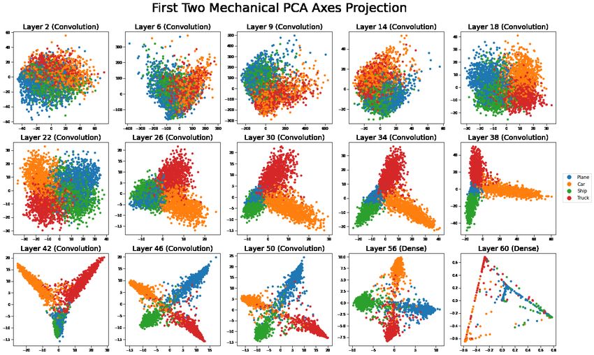
In intermediate layers we often see angles much greater than 90 degrees as if hard to separate classes
are being treated as opposites.
    When there are many classes, principal components trained on all of them can make it harder to
spot patterns among a few commonly confused classes. We could get better resolution by defining
principal components tuned to one subset of classes. That, however, requires a separate PCA analysis
for every subset of variables. We have found it beneficial to define one class-specific vector per output
class in a way that is analagous to the PC eigenvectors. Then each subset of categories comes with
a prescribed set of vectors for projection. Similar class-specfic vectors were previously studied by
Krzanowski [11] but that work was not about visualization. We can also use these vectors to rank
input images from most typical to least typical members of their respective classes. Note that typical
is defined with respect to the set of images gathered for training and those images might not remain
typical when an algorithm is deployed.
    We also consider some animated tours [2, 3] of data at each level where we probe. Li et al. [12]
previously used grand tours on the output of a neural network. In the terminology of [3] our tours
are guided tours: we select pairs of interesting projections and interpolate between them. We develop
guided tours based on class-specific projections of data including looks at intermediate layers.
    We use two well studied neural networks as running examples. One is the CIFAR-10 dataset [9] of
sixty thousand 32 by 32 color images selected from 10 classes consisting of four mechanical groups (e.g.,
airplanes and automobiles) and six animal groups (e.g., cats and dogs). For this we use the network
and trained weights from https://github.com/geifmany/cifar-vgg which utilizes the VGG model with
15 layers. VGG stands for the ‘visual geometry group’ at Oxford who developed the architecture.
The other example is the fashion-MNIST data with sixty thousand 28 by 28 grayscale images selected
from 10 classes of clothing items (like trousers and pullovers), which was then subsequently padded
out with zeros along the edges to become 32 by 32 images with three channels. For this we consider
the ResNet50 network architecture [8] with weights initialized from ImageNet pretraining [6].
    The outline of this paper is as follows. Section 2 gives background about the neural networks we
explore. Section 3 shows a use of t-SNE for probing. We can see how class separation progresses as
the layers increase. Section 4 defines our class-specific vectors and compares plots in those coordinates
to principal components plots. Section 5 describes our class-specific tours. It include still shots of
the tours and a link to animated versions. Section 6 describes how our class-specific vectors can
potentially identify separations of groups within a single classification.

2    Image data sets, architectures, and
The network we use for CIFAR-10 from https://github.com/geifmany/cifar-vgg has thirteen
convolution layers and two fully connected layers that we study. Those are layers

                          ` = 2, 6, 9, 14, 18, 22, 26, 30, 34, 38, 42, 46, 50, 56, 60

of that network. Figure 1 shows their positions in the overall architecture. We probed the network
outputs at these layers by passing the output from layer ` through a specially trained final softmax
layer. Figure 2 plots the accuracy attained this way versus the layer indices. What we see is that the
accuracy on test data increased up to layer 30, and subsequent layers did not improve it by much.
The accuracy on the training data saturated at 100% by layer 18. In a Shapley value analysis (to be
reported elsewhere) we found that of these layers, layer 2 was most important for ultimate accuracy.
At layer 2, the network is not anywhere near it’s final accuracy.
    For fashion-MNIST we used the ResNet50 architecture from [8] which has 177 layers. See Figure 3.
We probed the network at the outputs of the sixteen convolution / identity blocks, corresponding to
layers
                  ` = 17, 27, 37, 49, 59, 69, 79, 91, 101, 111, 121, 131, 141, 153, 163, 173.

                                                      2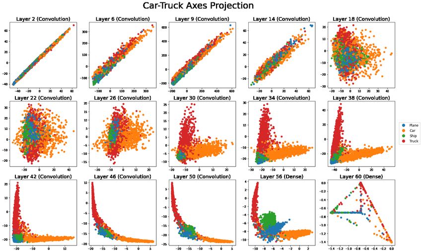
Dropout Block                 VGG15 Model

             Block Input                   Model Input

             Conv2D(3x3)                  Dropout Block       0.3 Dropout
                ReLU                      Pooling Block       Rate
              BatchNorm
                                          Dropout Block
               Dropout
                                          Pooling Block
                Output
                                          Dropout Block
                                          Dropout Block
                                          Pooling Block
                                                              0.4 Dropout
            Pooling Block                 Dropout Block
                                                              Rate
                                          Dropout Block
             Block Input                  Pooling Block

            Conv2D(3x3)                   Dropout Block
               ReLU                       Dropout Block
             BatchNorm                    Pooling Block
            MaxPool(2x2)
                                           Dropout(0.5)
                Output                       Flatten
                                            Dense(512)
                                              ReLU            0.5 Dropout
                                           BatchNorm          Rate
                                           Dropout(0.5)
                                            Dense(10)
                                             Softmax

                                              Output

Figure 1: The model architecture for the VGG15 model. The model consists of thirteen convolution
layers and two dense layers, creating fifteen natural checkpoints for the model overall. Refer to
https://github.com/geifmany/cifar-vgg for more specific details on the model architecture.

                                               3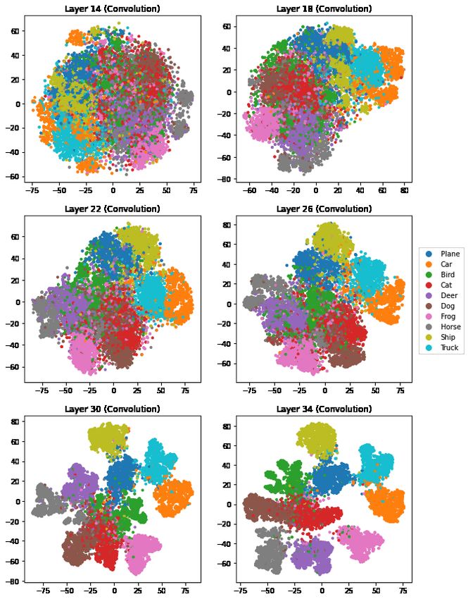
Figure 2: Intermediate accuracies of the models used for the CIFAR10 and FashionMNIST datasets
using a logistic regression trained on a random subset of n = 10, 000 samples from the training dataset.
We plot the accuracy of the model versus layer with one curve for the training inputs and another for
the test inputs.

                                                    Predicted class
          True class   plane    car   bird    cat    deer     dog   frog   horse   ship   truck
               plane     924      2     20     4          3     0     1       3     36       7
                 car       3    972      0     0          0     1     0       0      5      19
                bird      13      0    929    11         16    10    11       5      5       0
                 cat       5      0     24   848         12    88    14       3      4       2
                deer       3      0     12    16        946    10     5       8      0       0
                 dog       2      2     11    68         11   895     2       6      1       2
                frog       4      1     14    12          2     5   961       0      1       0
               horse       5      1      9     6          8    12     0     958      0       1
                ship       7      0      2     4          1     1     1       0    979       5
               truck       9     26      0     2          1     2     0       1     12     947

                 Table 1: This is the confusion matrix for the CIFAR10 test data.

The accuracy attained by adjoining a softmax layer after layer ` is plotted versus ` in Figure 2. There
we do not see the rapid initial gain in accuracy versus `. We attribute this difference to that network
having been initialized with values from training on ImageNet [6].
   The confusion matrix for the CIFAR10 data is in Table 1. Separating cat images from dog images
appears to be the hardest task. Trucks and cars are also frequently confused with each other. Many
planes are labeled as ships but the reverse is less common. Table 2 shows the confusion matrix for the
FashionMNIST data. Coats and pullovers are commonly confused with each other as are ankle boots
and sneakers, while shirts are confused with four other classes.

3    Probing with t-SNE
An alternative to training an `+1’st layer is to use t-SNE on the N ×M` matrix of output at layer `. The
t-SNE algorithm produces a lower dimensional representation of the points, that like multidimensional
scaling [16, 10, 5] seeks to have low dimensional interpoint distances be representative of the original

                                                    4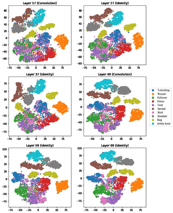
Identity Block                              ResNet50 Model

                        Block Input                                 Model Input

            Conv2D(1x1)           Conv2D(1x1)                      Conv2D(7x7)
             BatchNorm             BatchNorm                        BatchNorm
               ReLU                                                   ReLU
                                                                   MaxPool(3x3)
            Conv2D(3x3)
             BatchNorm                                              Conv. Block
               ReLU                                                Identity Block
                                                                   Identity Block
            Conv2D(1x1)
             BatchNorm                                              Conv. Block
                                                                   Identity Block
                           Add                                     Identity Block
                           ReLU                                    Identity Block
                       Block Output
                                                                    Conv. Block
                                                                   Identity Block
                                                                   Identity Block
                    Convolution Block
                                                                   Identity Block
                        Block Input                                Identity Block
                                                                   Identity Block
            Conv2D(1x1)           Conv2D(1x1)
             BatchNorm             BatchNorm                        Conv. Block
               ReLU                                                Identity Block
                                                                   Identity Block
            Conv2D(3x3)
             BatchNorm                                               AvgPool
               ReLU                                                  Dense(10)
                                                                      Softmax
            Conv2D(1x1)
             BatchNorm                                             Model Output

                           Add
                           ReLU

                       Block Output

Figure 3: ]The model architecture for the ResNet50 model. The model starts off with an initial
processing section, and then proceeds with a series of 16 residual units (the identity and convolution
blocks). As we progress through the blocks, we decrease the width and height of the inputs and
increase the number of channels. Refer to [8] for more specific details on the model architecture.

                                                  5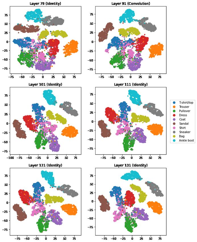
Predicted class
  True class    t-shirt/top   trouser   pullover   dress   coat   sandal     shirt   sneaker   bag   ankle
 t-shirt/top           873         1         12      12       4          1     94         0      3       0
     trouser             1       987          1       6       1          0      2         0      2       0
    pullover            15         1        879      10      43          0     51         0      1       0
       dress            14         6          7     919      26          0     26         1      0       1
        coat             0         0         55      24     878          0     43         0      0       0
      sandal             0         0          0       0       0        983      0        15      0       2
        shirt           86         3         47      19      69          0    768         0      8       0
     sneaker             0         0          0       0       0          8      0       973      0      19
         bag             3         2          1       1       3          1      2         3    983       1
 ankle boot              0         0          0       0       0          5      1        32      0     962

                Table 2: This is the confusion matrix for the FashionMNIST test data.

higher dimensional interpoint distances. It also emphasizes smaller interpoint distances as in local
multidimensional scaling [4]. The algorithm proceeds without knowing the classifications of the data or
even the number K of levels of the categorical response. Following [7] we projected the M` dimensional
points onto their first 50 principal components before running t-SNE. The t-SNE algorithm involves
some randomness. Its criterion is also invariant to rotations or reflections of the point clouds. In
order to make the images more nearly comparable we used the same random seed at each layer.
Furthermore, the practice of projecting the intermediate outputs down to the same dimension, 50,
using PCA in each case makes the starting points for the layers more closely aligned with each other
than they would otherwise be. The lone exception to the above description is for the output of layer
60 of the VGG15 model for the CIFAR10 dataset. This output is 10-dimensional as it is the output
of the entire network with one value per class. In this case, we use all 10 dimensions in the t-SNE
algorithm. Because t-SNE’s criterion is dominated by small interpoint distances, the precise location
and orientation of a cluster well separated from the rest of the data could be strongly influenced by
the random seed. The relative position of clusters that overlap or nearly do is likely to be a more
stable feature.
    Figures 4, 5, and 6 show t-SNE outputs for the fashion-MNIST data. These images depict the held
out, testing data, not the training data. Up to and including layer 49, the images for ‘bag’ clearly plot
as two disjoint and even widely separated clusters. Inspection in Section 6 reveals that there are two
kinds of bag image, one that we could call purses and another that mixes clutchs and satchels. By
purse images we mean those with handles/straps that are well separated from and above the rest of
the bag. The clutchs don’t have straps, while the satchels have straps that are nearly adjacent to the
rest of the bag. Interestingly, by about layer 91 the two ‘bag’ groups have connected and by around
layer 163 or 173 they appear to have merged into one. The loss function used in training does not
reward the network for noticing that there are two kinds of bag and, as it happens, that distinction
weakens or even disappears from the t-SNE plot.
    In Section 6 we use a method of ranking images from most like their own class to least like their
own class. We find that there are also two very different kinds of sandal images and possibly two
very different kinds of trouser images. Figures 14, 15 and 16 there depict examples of extreme bags,
sandals and trousers.
    We also see in Figures 4, 5, and 6 that the trouser and to a lesser extent bag images are already well
separated from the other classes by layer 17. The footwear groups (sandals, sneakers, and ankle boots)
start very connected with one another until sandals separate by layer 69, and the sneakers and ankle
boots separate from one another by layer 101. Similarly, the upper body wear classes (t-shirt/tops,
pullovers, dresses, coats, shirts) start out well merged, and only really separate out from one another
towards the very end at layer 173.

                                                    6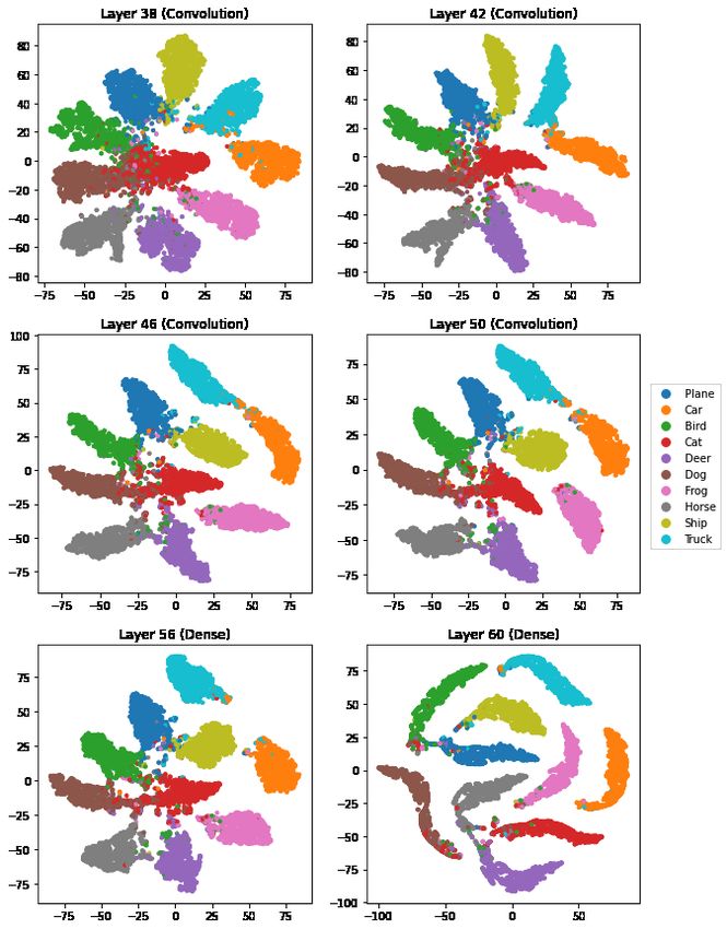
Figure 4: t-SNE output for FashionMNIST data after layers 17, 27, 37, 49, 59, and 69. The types of
these blocks are listed above in the titles.

                                                7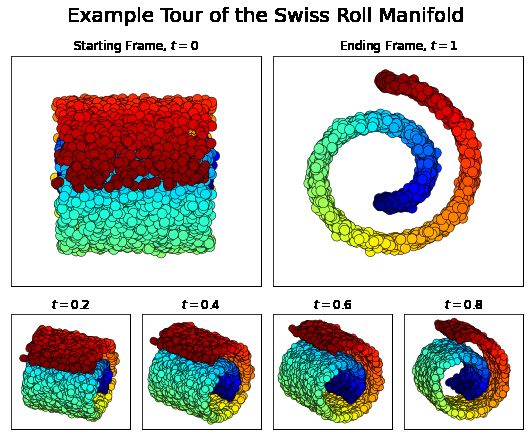
Figure 5: t-SNE output for FashionMNIST data after layers 79, 91, 101, 111, 121, and 131. The
types of these blocks are listed above in the titles.

                                             8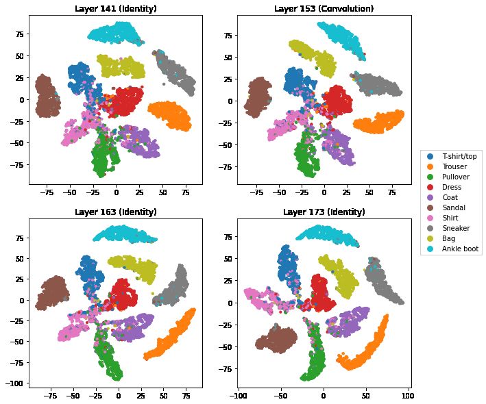
Figure 6: t-SNE output for FashionMNIST data after layers 141, 153, 163, and 173. The types of
these blocks are listed above in the titles.

    Figures 7 and 8 show the corresponding t-SNE plots for the CIFAR-10 data at 12 different output
layers ranging from layer 14 to layer 60. A striking difference in these figures is that in the early layers
(14 and 18) the points are not at all separated into disjoint clouds. Recall that the fashion-MNIST
network was initialized to weights from training in ImageNet. The network for CIFAR-10 by contrast
was trained from a random start. By layer 30 we start to see groups forming though there is still a
lot of overlap. Cats and dogs remain closely connected up to and including layer 56, the second last
one shown. Recall that from the confusion matrices, separating cats from dogs is especially hard.
    By the final layer 60, the 10 classes are very well separated in a two dimensional view, forming
narrow and bent clusters. There are still errors in the classification. Many of those points plot within
clusters for another category, very often near one of the tips and very often nearer the center of the
image. That latter pattern was more pronounced for FashionMNIST. In the t-SNE for layer 60, cat
and dog clusters are well separated but some of the cat images are at one end of the dog image cluster.
On inspection we find that these points were misclassified but with high confidence.

                                                     9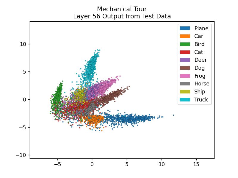
Figure 7: t-SNE output for CIFAR10 data after layers 14, 18, 22, 26, 30, and 34. The types of these
layers are listed above in the titles.

                                                10
Figure 8: t-SNE output for CIFAR10 data after layers 38, 42, 46, 50, 56, and 60. The types of these
layers are listed above in the titles.
114 Class specific vectors
While t-SNE is powerful and evocative, the spatial placement of individual points is hard to interpret.
A principal components analysis offers some alternative functionality. Given the data, the PC mapping
is not random, so the position of points is more reproducible and in particular, the closeness of clusters
is not subject to algorithmic noise. Second, having constructed principal components for one set of
data, we can project additional data onto them. For instance we could define principal components
using the training data and, retaining those eigenvectors, project test data into the same space.
The data we use are X ∈ RN ×M and Y ∈ {0, 1, . . . , K − 1}N . The matrix X changes from layer
to layer as does M , while Y remains constant. Each column of X represents the output from one
neuron in the layer under study. P We center these outputs by subtracting the mean from each column
N
of X. That way we ensure that i=1 xi = 0 ∈ RM where xi ∈ RM is the i’th row of X expressed as
a column vector.
We are interested to see the arrangements among commonly confused classes. For instance, it is
of interest to see the relative arrangements among the mechanical images because there are frequent
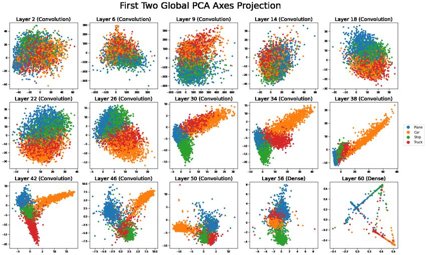
errors within those classes. Figure 9 shows the global principal components plots for the outputs of
only the groups of ships, planes, cars, and trucks in CIFAR10. What we see there is that projecting
all ten classes at once yields a lot of overlap. We get a better view from PC plots based on just those
classes as in Figure 10. There we see that in the later layers the four classes plot as lengthy ellipsoids
from a common origin.
We see that the last pre-softmax layers are mostly consistent with neural collapse [14] in that the
vectors for most pairs of groups are nearly orthogonal to each other by the later layers. The clouds
do extend towards the origin where we see some overlap.
We also see that in layers 30 to 42, the data for images of planes projects to nearly the origin in the
first two principal components. Only later do the planes clearly stand out from the other mechanical
classes. Layer 60 reflects data after the softmax transformation and it shows clearly that most points
have at most one or two non-negligible possibilities because the points are mostly projected from a
tetrahedral wireframe pattern.
It is a nuisance to redefine the principal components for every subset of variables that we might
wish to explore. We prefer to define class-specific projections of the data. For each k ∈ {0, 1, . . . , K −1}
we choose a one-dimensional projection especially representative of class k, as described below, and
then view the data in projections given by two of those vectors. Class-specific vectors were studied
by [11]. That work did not look at them for visualization.
Let Nk be the number of indices i with Yi = k. The matrix Xk ∈ RNk ×M has all the xi for
which Yi = 1. Now we choose a special vector θk ∈ RM forP cluster k. There are several choices. We
could take θk to be the unit vector proportional to (1/Nk ) i:Yi =k xi the mean vector for cluster k.
A second choice is the unit vector θk = arg maxkθk=1 θT XkT Xk θ. The third choice is the first principal
component vector of Xk . This differs from the second choice in that we must recenter Xk to make its
T
rows have mean zero, yielding X̃k . Then θk maximizes θT X̃k X̃k θ over unit vectors θ ∈ RM . Below
we work with the third choice. The vectors we get characterize the principal direction of points within
each point cloud, not differences in the per class means.
When we take the within-class principal component vector we have also to choose its sign. If θ is
the first principal component vector then −θ has an equal claim to that label. We choose the sign so
that the mean of the data for class k has a larger inner-product with θ than the global mean has.
Using class-specific projections, we make scatterplots of Xθk ∈ RN versus Xθk0 for pairs of classes
k 6= k 0 . These plots show one point per sample. Figure 11 shows the mechanical images plotted
in the space defined by the car versus plane vectors. This is a projection but not an orthogonal
projection into R2 because θk and θk0 need not be orthogonal. In the early layers, the class-specific
projections produce highly correlated scatter plots. This is largely because the vectors θk and θk0
start out correlated. In later layers, points vary greatly in the projections from their own class and
much less in the other projections. The class-specific asxes for cars and trucks start off approximately
12Figure 9: Projections from the top two principal components in a global PCA for all activation layers,
visualizing the planes, cars, ships, and trucks in CIFAR10.
Figure 10: Projections from the top two principal components in a PCA involving only the mechanical
groups (planes, cars, ships, and trucks) for the outputs of all activation layers, visualizing the planes,
cars, ships, and trucks in CIFAR10.
13Figure 11: In each plot, the vertical axis has data projected on the class-specific vector for ‘car’
images and the horizontal axis uses the class-specific vector for ‘truck’ images. The points are for the
plane, car, ship, and truck images in CIFAR10.
parallel start to become nearly orthogonal by layer 18 (though the point clouds still overlap a lot).
By layer 30 we see meaningful separations among the points. In layers 46 and 50 it appears that the
angle between those clouds is more than 90 degrees. This is confirmed by a tour image (in Section 5)
that makes an orthogonal projection of the data into the plane spanned by those two vectors. We
also observe that in layers 46, 50, and 56, while the car and truck axes are nearly perpendicular, the
clusters of points for these two groups “bend” into one another where they meet.
Car and truck images are fairly similar. At layer 30, we see that trucks tend to plot at positive
values along the car axis. By layer 46, trucks are now plotting at negative values along the car axis.
The intervening layers have been configured to push those classes farther apart. Planes and ships do
not proceed through such a process. Instead they have near zero projections along both car and truck
directions through training.
5 Class specific guided tour
A tour of X ∈ RN ×M is an animated sequence of projections (also commonly referred to as frames)
of X into RN ×d , where d is typically a small value such as 2 or 3. The best known of these is the
grand tour [2] which generates a sequence of such projections designed to explore the space of all
projections by eventually getting close to every point in the manifold of projections from RM to Rd .
That manifold is quite large, so it can take a long time to get close to every view. Therefore specific
tours have been developed to make a more focussed exploration of views. Simple tours generally
consist of moving along a sequence of projections using interpolated paths between sequential pairs of
projections of interest. The resulting animation rotates smoothly between these pairs. The technical
procedure is outlined in Section 4.1 of Buja et al. [3]. Planned tours refer to tours where the (usually
finite) sequence of frames are predetermined.
14To visualize the data, we choose to explore the space created by the span of the ten class-specific
vectors. For ease of computation, we fit a PCA with a single component to the class specific data
Xk ∈ RNk ×M to acquire the principle axes θk ∈ RM and the decomposition of the data onto the
class-specific axis (X − 1x̄T k )θk , where 1 ∈ R
N
is the all ones vector.. At this point, we flip the
value of θk via products with negative one so that the class mean has a larger dot product with
θk than the global mean, or equivalently that (x̄ − x̄k )T θk < 0 where x̄ ∈ RM is the global mean.
Aggregating this information, we then have collected X 0 = [(X − 1x̄T T
1 )θ1 , . . . , (X − 1x̄K )θK ] ∈ R
N ×K
0
as well as Θ = [θ1 , . . . , θK ]. We then center X so that the columns have means zero, producing
X̃ 0 = (X − 1x̄T )Θ, which is used as the data to produce the class-specific pair plots.
To produce the tours that leverage the class specific vectors θk , we apply the technique used in
[3] and project the data X into the space spanned by the K class-specific vectors since K is usually
much smaller than M . Note that we cannot use tours on (X − 1x̄T )Θ directly since this is not an
orthogonal projection of the original centered data X − 1x̄T . To get around this, we perform the
QR-decomposition Θ = Qθ Rθ with Qθ ∈ RM ×K and Rθ ∈ RK×K . We then visualize the projection
of the data (X − 1x̄T )Qθ . If K is much smaller than M and that the class-specific vectors are linearly
independent, we can compute this efficiently as (X − 1x̄T )Θ · Rθ−1 since we already have (X − 1x̄T )Θ
from the computation for the class specific pair plots.
In the case that the K class-specific vectors are not linearly independent, special considerations
need to be made. While most layers do not have this issue, the output layers, such as layer 60 in the
VGG15 model, ordinarily do. This is because the output is 10-dimensional with the constraint that
the ten components need to add up to one, and thus the space spanned by the ten class specific axes
is at most 9-dimensional. In this case, we again compute the QR-decomposition Θ = Qθ Rθ , but we
now force Qθ ∈ RM ×r and Rθ ∈ Rr×K where r is the rank of Θ and calculate (X − 1x̄T )Qθ directly.
In either case, we note that Rθ = QT θ Θ implies that the columns of Rθ = [r1 , . . . , rK ] are the
projections of each of the class-specific vectors to the space spanned by all of the class-specific vectors.
Doing so, we can condense all information about tours in the space spanned by the class specific
vectors down to the projections (X − 1x̄T )Qθ and Rθ = QT θ Θ of the data and the class specific vectors
respectively.
For an animated view of the see
https://purl.stanford.edu/zp755hs7798.
Figure 12 shows still images of frames that can be seen on an example toy Swiss Roll dataset. Figure
13 shows frames that can be seen when exploring the VGG15 and ResNet50 models for both training
and testing intermediate outputs.
For the CIFAR10 dataset, we visualize planned two-dimensional tours inspired by the class specific
vectors. One option is to consider a grand tour-like approach, where we generate a collection of two-
dimensional frames by picking them uniformly at random from the set of such frames embedded in
the space spanned by the ten class specific vectors. A second option is to restrict our attention to
two-dimensional frames that are generated from pairs of the class-specific vectors by using frames of
the form [θj , θk0 ] where θk0 is the component of θk that is orthogonal to θj in order to explore the
centered data X − x̄. Note that we can equivalently use frames of the form [rj , rk0 ] where rk0 is the
component of rk orthogonal to rj to explore (X − 1x̄T )Qθ for better computational efficiency. For
example, we consider a mechanical tour, where we use the frames generated by the pairs plane versus
truck, car versus truck, car versus ship, and plane versus ship.
In general, we see that the planned tour strategy works much better compared to the grand tour-
like strategy in the sense that the planned tours creates animations that are more interpretable and
show more interesting features. For example, for layer 56 in the grand tour-like approach, we can see
some key features of the network. We see that the ten groups form comet like formations that point
away from a shared common core. However beyond this, it is difficult to tell any relational information
between the clusters. In contrast, for layer 56 in the mechanical tour approach, we see that the comets
are much more clearly defined and we can extract additional information from the plots. For example,
we notice that for each frame, all classes have comets that generally point upwards and to the right.
15Figure 12: The plots show a possible path that could be seen on a tour on the Swiss Roll Manifold
[15]. We start from a top-down perspective at t = 0 to a side-on perspective by t = 1. At each
t ∈ [0, 1] we move between these two perspectives with constant speed.
We also note that there is quite a bit of curvature within particular pairs, like how the truck points
appear to bend into the cars three seconds in. We also note that at this point, the other eight groups
overlap quite a bit. In contrast, for the frame of trucks vs planes at the very start, we notice that the
trucks and planes points form orthogonal comets, and the rest of the eight groups spread out much
more from one another.
This can also be seen in layer 30 within the VGG15 model, where the grand tour-like approach has
comet like formations moving away from a common core, but the planned tour showcases how these
spokes are typically orthogonal. For the car versus truck frame, we note that all of the eight other
groups mainly cluster around the origin, meaning that they have negligible components in the class
specific axes associated with cars and trucks. In comparison, for the plane versus ship axis, we see
that most of the groups tend to stick to the origin. The lone exception is cars, which has a distinctly
negative ship component. These are distinct features that are much harder to visualize within the
grand tour-like approach.
We perform a similar visualization for FashionMNIST intermediate outputs within the ResNet50
model. Again we consider a grand tour-like approach, selecting randomly generated frames from the
span of the ten principal axes. We also consider two planned tours where we look at frames generated
by pairs of class specific vectors. The first tour is composed of pairs of classes that are rarely confused
for one another: t-shirt/tops versus ankle boots, trousers versus ankle boots, trousers versus bags,
and t-shirt/tops vs bags. The second tour is composed of classes that are associated with upper-body
clothing: t-shirt/tops versus shirts, pullovers versus shirts, pullovers versus coats, and t-shirt/tops
versus coats.
When we visualize these tours, we see that the same trends as the CIFAR10 data persist. For
example, in layer 141 of the grand tour-like approach, we again notice that the different groups form
comet like shapes. However, beyond this, it’s hard to observe any trends about how the comets are
16Figure 13: The plots show frames shown within the mechanical tour of the intermediate outputs of
the VGG15 model (top row) and the ResNet50 model (bottom row). We can see several differences
both between the two models as well as with the intermediate outputs of the training (left column)
and testing data (right column).
oriented about one another in space. When we move towards the rarely confused and upper-body
planned tours, we can see other interesting features within the data. For layer 141 of the upper-body
tour, we observe that bags and sandals have no component along the class specific vectors associated
with t-shirt/tops, pullovers, shirts, or coats. However, we see that trousers, ankle boots, and sneakers
all have fairly positive components along these vectors. Visualizing the rarely confused planed tour of
layer 141, we notice that for the frame generated by the ankle boot and trouser class specific vectors,
coats have a very large component in both of these vectors, while most other groups have components
much closer to zero. We also notice that when we shift to the frame generated by bags and trousers
that unlike other groups, bags will form two comet like clusters pointed in opposite directions. These
features seen in the planned tours are generally harder to discover within the grand tour-like approach.
There are major differences between the VGG15 and ResNet50 models. One major difference is
in how the intermediate points for the testing data compare to the training data. In the VGG15
model, we notice that in later layers that the class specific clusters from training data will form
comets pointing away from a shared core, but their tails will overlap with one another. In contrast,
the training data will have a similar shape and position, but their tails will not reach as far down and
thus do not overlap. This can be seen prominently in layer 50 of the mechanical tour amongst the
testing data and training data. This same effect can be seen to a much more limited extent in the
ResNet50 model for layer 153 for the training data and the testing data for the pullovers class, but
the effect is not as common among the other groups and layers. This is likely an indicator that the
VGG15 model is more overtrained compared to the ResNet50 model.
A second difference is in the shape of the arms. We notice that in general, the comet-shapes for the
class specific clusters for the ResNet50 model are fairly sharp and extend out fairly far. Specifically,
we see fairly sharp arms for the rarely confused tour on the intermediate training output for layer
17151 and for layer 163. We note that the arms frequently extend out as more than 100 away from the
origin, and become extremely sharp, especially on layer 163. In contrast, with layer 42 and layer 56 of
the mechanical tour on the intermediate training data, we notice that the arms only extend out to at
most 40, and the arms are much thicker. This is especially pronounced in layer 56 where the comets
are much shorter and wider.
The final difference is in how fast the arms form. We notice that in the ResNet50 model, the arms
have formed as early as layer 49 for the training data in the rarely confused tour, which is only about
a fourth of the way through the model. Although some classes haven’t well differentiated well from
others, some groups like bags and trousers have already spread away and formed arms away from
the center. In contrast, the arms develop much later in the VGG15 model. We only see the arms
clearly develop by about layer 30 for the training data in the mechanical tour, which is about halfway
through the model.
6 In-group Clustering
In our t-SNE plots we saw strong evidence of two kind of bag images. That evidence was present
in intermediate layers but had disappeared by the final layers. In this section we use class-specific
projections to make a systematic search for such subclusters and also identify examples of extreme
images so a human can interpret them.
At each intermediate layer we project the observations from class k on the vector θk to rank images
from most typical of their class to least typical. We normalize Nk values to have mean zero variance
one when taken over all ten classes, not just class k. so that they have mean square one.
Figure 14 shows those histograms for the images of bags. A bimodal pattern becomes clear by layer
27 if not earlier, and then becomes quite pronounced. By final layer the modes are not very separated,
nearly touching. Recall that in the t-SNE plot those points had merged into a single cluster. The top
panel in Figure 17 shows images of the bags at the extreme ends of the histogram for the final layer.
These represent two quite different kinds of image. Although the final histogram is less bimodal than
the earlier ones we still see two very different image types. It is intuitively reasonable that these bag
images look different in early network layers that are forming image features. It is also plausible that
a network trained to distinguish bags from other image types without regard to what type of bag they
are would in its later layers treat them similarly. It would take further research to understand why
the gap closes so late in the pipeline instead of earlier.
The class-specific projection gives us a tool to look for subclasses. Figure 16 shows histograms
for trouser images. There we see no bimodal structure and Figure 17 shows no especially striking
difference between the most and least typical trouser images.
Figure 15 shows layer by layer histograms for images of sandals. The sandal images are bimodal
at intermediate layers despite the t-SNE images not placing the images into two clear groups. As with
bags, these histograms become much less bimodal at later layers. The bimodality disappears much
earlier for sandals than for bags. The histograms for sandals become more skewed. From Figure 17
we see a sharp distinction between the types of sandals. The histogram is distinguishing flat ones
from high healed ones.
In this section we have looked for two kinds of image by checking the extreme entries in a linear
ordering. We expect that more elaborate clustering methods could work when an image class has
three or more types. Our main point is that looking at intermediate layers gives additional insights.
7 Conclusions
We have presented some graphical methods for probing neural networks layer by layer. In doing so we
saw that some clustering within a class can become muted or even disappear as data progress through
layers.
18Figure 14: Histograms of the intermediate outputs for test images labeled as bags for the outputs of
the 16 residual units in the FashionMNIST network.
We devised class-specific projections and found that they can help identify differences among
image types within a class. We had to make several choices in defining class-specific projections. We
believe that our choices are reasonable but we also believe that other choices could reveal interesting
phenomena.
The class-specific projections also provide very focussed looks at point clouds when incorporated
into dynamic projections (tours). We saw a big difference between the organization of early layer
outputs when comparing a network that was trained using transfer learning from ImageNet and one
that was trained from a random start. We saw a variant of neural collapse wherein the outputs form
ellipsoidal clusters instead of spherical ones.
19Acknowledgments
This work was supported by a grant from Hitachi Limited and by the US National Science Foundation
under grant IIS-1837931. We thank Masayoshi Mase of Hitachi for comments and discussions about
explainable AI.
References
[1] G. Alain and Y. Bengio. Understanding intermediate layers using linear classifier probes. Tech-
nical report, arXiv:1610.01644, 2016.
[2] D. Asimov. The grand tour: a tool for viewing multidimensional data. SIAM journal on scientific
and statistical computing, 6(1):128–143, 1985.
[3] A. Buja, D. Cook, D. Asimov, and C. Hurley. Computational methods for high-dimensional
rotations in data visualization. Handbook of statistics, 24:391–413, 2005.
[4] L. Chen and A. Buja. Local multidimensional scaling for nonlinear dimension reduction, graph
drawing, and proximity analysis. Journal of the American Statistical Association, 104(485):209–
219, 2009.
[5] M. A. A. Cox and T. F. Cox. Multidimensional scaling. In Handbook of data visualization, pages
315–347. Springer, 2008.
[6] Jia Deng, Wei Dong, Richard Socher, Li-Jia Li, Kai Li, and Li Fei-Fei. Imagenet: A large-scale
hierarchical image database. In 2009 IEEE conference on computer vision and pattern recognition,
pages 248–255. Ieee, 2009.
[7] L. Derksen. Visualising high-dimensional datasets using PCA
and t-SNE in Python. https://towardsdatascience.com/
visualising-high-dimensional-datasets-using-pca-and-t-sne-in-python-8ef87e7915b,
2016. Updated April 29, 2019.
[8] Kaiming He, Xiangyu Zhang, Shaoqing Ren, and Jian Sun. Deep residual learning for image
recognition. CoRR, abs/1512.03385, 2015.
[9] Alex Krizhevsky. Learning multiple layers of features from tiny images, 4 2009.
[10] J. B. Kruskal. Multidimensional scaling. Number 11. Sage, 1978.
[11] W. J. Krzanowski. Between-groups comparison of principal components. Journal of the American
Statistical Association, 74(367):703–707, 1979.
[12] M. Li, Z. Zhao, and C. Scheidegger. Visualizing neural networks with the grand tour. Distill,
5(3):e25, 2020.
[13] T. Nguyen, M. Raghu, and S. Kornblith. Do wide and deep networks learn the same things?
uncovering how neural network representations vary with width and depth. Technical report,
arXiv2010.15327, 2020.
[14] V. Papyan, X. Y. Han, and D. L. Donoho. Prevalence of neural collapse during the terminal phase
of deep learning training. Proceedings of the National Academy of Sciences, 117(40):24652–24663,
2020.
[15] J. Tenenbaum, V. Silva, and J. Langford. A global geometric framework for nonlinear dimen-
sionality reduction. Science, 290(5500):2319–2323, 2000.
20[16] W. S. Torgerson. Multidimensional scaling: I. Theory and method. Psychometrika, 17(4):401–
419, 1952.
[17] Laurens Van der Maaten and Geoffrey Hinton. Visualizing data using t-SNE. Journal of machine
learning research, 9(11), 2008.
21Figure 15: Histograms of the intermediate outputs for test images labeled as sandals for the outputs
of the 16 residual units in the FashionMNIST network.
22Figure 16: Histograms of the intermediate outputs for test images labeled as trousers for the outputs
of the 16 residual units in the FashionMNIST network.
23Figure 17: The most extreme examples of three groups along their group specific axis as intermediate
outputs of the last residual unit (layer 173) for FashionMNIST.
24You can also read