Step by Step Guide Improvement Science - Last updated: 14 May 2021 CEC Ref: D21/11427 - Clinical ...
←
→
Page content transcription
If your browser does not render page correctly, please read the page content below
Improvement Science
Step by Step Guide
Last updated: 14 May 2021
CEC Ref: D21/11427

Improvement Science Step by Step Guide
More information at CEC Website: http://www.cec.health.nsw.gov.au/quality-improvement/improvement-academy/quality-improvement-tools
Evaluation: Please provide feedback about this document via email to CEC-Academy@health.nsw.gov.au.
NSW Health Staff can log details about their Quality Improvement Project into the CEC QIDS platform.
NB: Some steps may need to be revisited as your team progresses through this improvement process.
Step 1 Common errors in selecting quality improvement projects
• No one is interested in the problem.
Decide on the process that needs • The problem is not a strategic priority for the organisation.
improving • Selecting a solution to implement rather than a problem to investigate.
• Selecting a process in transition – ie manual to electronic process.
• Not defining a manageable scope of the project ie too large.
• Selecting a problem beyond your authority or outside your area of
influence.
Task
Decide and document the process that needs improving:
• What is the problem you want to solve?
• How do you know it’s a problem?
• Who else thinks it’s a problem?
• Do you have support/approval to use this problem for your quality
improvement project?
These can go in the top left corner of your driver diagram.
QIDS: Key information into GENERAL > Title, Standard, Background and
Rationale.
Step 2 Project Sponsors
• High level person/s - who do not work directly on the project, but can
Form teams: oversee and provide support and guidance.
i) Project sponsor • Report project progress to project sponsors on a regular basis
ii) Project team (eg every 2 months).
Project Team
• Gather people with the right expertise:
People from all areas of the process under review.
Ensure it’s an interdisciplinary team.
Include a consumer (or interview consumers).
Include a quality advisor.
Appoint a team leader.
Task
Document the names/positions of:
i) the people you will have as your project sponsor/s
ii) project team members
These can go in the bottom left corner of your driver diagram.
QIDS: Key information into GENERAL > Team Members.
Step 3 When the team has agreement about the process that needs improving,
develop an aim statement.
Develop an aim statement To help shape your aim statement, discuss:
• What are we trying to accomplish?
• What would success look like?
• How will we measure success?
An aim statement needs to follow the SMART criteria and:
• Specific - clearly state what you are trying to accomplish.
• Measurable - focus on a measurable outcome.
• Achievable - make sure it ‘can and should be done’.
• Result Oriented - set an aspirational, ambitious stretch goal.
• Time Scheduled - include a completion date
Example Check that your aim statement specifies a:
By June 20XX, Ward 6 South will reduce patient fall • Time frame: By June 30 2022.
incidents by 50%. • Measurable stretch goal: 100% of patients will…
• Criteria: Will be screened for…
Remember:
• Scope: The target population - hospital X or ward Y.
An aim statement should NOT include a ‘solution’.
Task
Document your SMART Aim statement.
This can go on the left side of your driver diagram.
QIDS: Key information into GENERAL > Project Aim / Goal, Key words.
2
Step 4                                                    A literature search is essential to help you:
                                                          • identify best practices for the problem under review
Perform a literature review                               • prevent reinventing the wheel
                                                          • gather potential change ideas and ideas for measures.
                                                          What key words will you search on?
                                                          • Time efficiency - 1 or 2 team members perform this task.
                                                          Task
                                                          • What key words will you search on in your literature review?
                                                          • How will your literature review be conducted and by whom?
                                                          • What resources are available to you that may help your team complete a
                                                            thorough review?
                                                          QIDS: Upload information into TEAM DOCUMENTS

Step 5.1                                                  A flowchart (also called a process map) is a diagram showing each step
                                                          and decision in a process. When a team charts a patient journey through the
Flowchart the current process                             process under review it allows for a common understanding of the steps and
                                                          decisions made by staff and consumers. A flowchart can also identify gaps,
                                                          variations, unreliability, bottlenecks, opportunities for improvement as well as
                                                          highlight the complexity of healthcare systems and processes.
                                                          Task
                                                          On a new piece of butcher’s paper, draw a flowchart of the CURRENT process.
                                                          • Chart the process from start to finish.
                                                          • Include every step and every decision point. Remember to use the
                                                            appropriate symbols.
                                                          • At each step, ask ‘Does this usually happen?’
                                                          QIDS: Draw a flowchart - select OTHER DIAGRAMS > New Diagram.

Remember:
Flowchart the current process - DO NOT chart what
you think ‘should’ happen. You can do that later in the
project when you have finally fully implemented
change.

Step 5.2                                                  Baseline and diagnostic data: A flowchart can also highlight areas where
                                                          baseline or historic data may need to be collected to demonstrate:
Collect baseline and diagnostic data                      a) current reliability of particular steps in the process
                                                          b) diagnostic data to confirm where, when, why, who, what and how the
                                                             problem occurs.
                                                          Quality tools such as run charts, pareto charts and histograms can be used
                                                          to plot the baseline and diagnostic data. See the chart section later in this
                                                          document.
                                                          Task
                                                          • Review your flowchart, focussing on the process points.
                                                          • For each process point, determine the baseline data you would like to collect
                                                            to gain a better understanding of the process and its current reliability.
                                                          • Use the 5Ws and 1H to assist.
                                                          Note:
                                                          You may find you want to change your Aim Statement / problem to work on
                                                          after you have completed your flow chart and collected some
                                                          baseline/diagnostic data as you may discover that the problem may not exist or
                                                          be as serious as you initially thought.

Step 6.1                                                  Brainstorming in silence with sticky notes is an effective way of quickly
                                                          generating ideas from all team members.
Brainstorm the problem causes using                       • Have the flowchart and any baseline/diagnostic data and literature available
sticky notes                                                for the team to refer to.
                                                          • Use one sticky note per idea and as many sticky notes as needed.
                                                          • Themes to help brainstorming further: Are any of the causes of the problem
                                                            to do with: Education, communication, environment, people/staff, materials,
                                                            equipment/machines, measures, policies, documentation, supplies etc?
                                                          • Remind the team to focus on the causes of the problem, not the solution.
                                                          • Be specific and use complete sentences rather than words. Eg ‘Education
                                                            not available to patients’ rather than ‘Education’.

                                                                   3
Step 6.2                                Once you have identified some of the causes of your problem, use the Five
                                        Whys technique to find the root cause:
Brainstorm using the Five Whys          1. State the problem.
                                        2. Ask ‘WHY’ does it exist?
                                        3. Document the answer and again ask ‘WHY’ does it exist?
                                        4. Repeat until you reach the ‘root cause’.
                                        Tips for using the Five Whys:
                                        • When attempting to solve a problem, a common error is to stop too soon
                                           when looking for the cause. Be sure to continue asking why until the ‘root
                                           cause’ is identified.
                                        • It is easy to take the first or second simple answer, blinded by the symptoms,
                                           or settle for the first 'apparent' cause. Keep in mind that the first cause
                                           offered is almost never the real ‘root cause’.
                                        • It's important to find the real cause or causes of a problem, not just
                                           symptoms. When the root cause is discovered you can take effective action
                                           to remove the cause and prevent the problem occurring.
                                        Task
                                        • As a team, brainstorm the causes of the problem using sticky notes. Don’t
                                          forget to focus on the ‘causes’ not ‘solutions’. Stick the notes on a flat
                                          surface.
                                        • Use the Five Whys to identify the root cause of the problem or problems?

Step 7.1                                To create an affinity diagram the team needs to sort the sticky notes into
                                        categories.
Create an affinity diagram              1. Read all the sticky notes and sort them into logical categories
                                           (themes/groups). You will generally have between two and eight categories.
                                        2. Re-read all the sticky notes and remove any absolute double-ups and
                                           collapse similar ideas together. Make sure team members agree on the
                                           double-ups before removing.
                                        3. Assign category headings.
                                        The category headings become primary drivers.
                                        The sticky notes under each heading are your secondary drivers.
                                        Task
                                        • Read the sticky notes and sort them into logical categories. Remember to
                                          remove double-ups and collapse similar ideas.
                                        • Assign a category heading to each group.

Step 7.2                                Turn your affinity diagram into a driver diagram:
                                        1. Spin the affinity diagram 90 degrees.
Spin the affinity diagram to create a   2. Re-sort the sticky notes to the correct orientation. The PRIMARY DRIVERS
driver diagram                             are in column 1 and the SECONDARY DRIVERS are in column 2.
                                        3. To the left of the sticky notes, add the problem, the aim, and team details
                                           including project sponsors and team members.
                                        4. Working from left to right, draw relationship arrows:
                                           • from secondary drivers to relevant primary driver(s)
      1                                    • from primary drivers to the aim statement.
                                        Task
                                        • Spin the affinity diagram to create a driver diagram following the steps
                                          above.

                                                           2                                      3

                                        QIDS: Key information into DRIVER DAIGRAM

                                                 4
Step 8 (OPTIONAL)                    A formal driver diagram has primary and secondary drivers reflecting the action
                                     that needs to be taken to affect the aim statement. To achieve this, drivers can
Re-word each primary and secondary   be re-worded using words such as improve, increase, decrease, commence
driver                               and cease.

Step 9                               For each secondary driver, the team brainstorms, or researches from literature,
                                     specific change ideas (interventions to test via PDSA) to address the driver.
Brainstorm change ideas              • For each change idea decide exactly:
                                        • What is going to be trialled?
                                        • How it is going to be trialled?
                                     • The ideas are documented on the driver diagram, in a new column, to the
                                        right of the secondary drivers.
                                     • Relationship arrows connect the change ideas to the relevant secondary
                                        driver. Some change ideas will address more than one driver.
                                     Task
                                     • For each secondary driver on the driver diagram, brainstorm, or research
                                       from literature, specific change ideas to address the driver.
                                     • Add a new column, to the right of the secondary drivers titled ‘Change
                                       Ideas’.
                                     • Add the change ideas in the new column drawing relationship arrows from
                                       each change idea to the relevant secondary driver(s).

Step 10                              After brainstorming, you have many change ideas (possible solutions). The next
                                     step is to decide which ideas should be tested via the PDSA cycle as a priority.
Assess priority of change ideas      Assess each change idea to determine ease of testing/implementation and
                                     impact:
                                     • Ease of implementation - will it be EASY or HARD to implement?
                                        • Will it cost a lot?
                                        • Can it be tested relatively soon?
                                        • Will it take: hours, weeks or months to test/implement?
                                        • Will many people have to be re-trained/educated?
                                     • Impact on the aim - will it have HIGH or LOW impact on the Aim
                                        Statement?
                                        • How much will the change idea effect the problem, aim statement and
                                            outcome measures?
                                     Note: Just because a change idea may be considered hard to implement does
                                     not mean it should be a low priority PDSA. Some of the hard interventions
                                     maybe the most important ones to test.
                                     Task
                                     • Add a new column PDSA PRIORITY to the right of the change ideas on your
                                       driver diagram.
                                     • For each change idea, ask:
                                       • Will the impact on the project aim be HIGH or LOW?
                                       • Will the ease of implementation or testing be EASY or HARD?
                                     • Record the impact and ease of implementation on the driver diagram.
                                     • Prioritise which change ideas to test via the PDSA cycle, listing the top five.

                                              5
Step 11                                              Conduct small tests of change using the PDSA concept on relevant (high
                                                     priority) change ideas. Start on a very small scale, for example one patient or
Test change ideas via PDSA cycles                    one staff member then progress to 3 patients, 5 patients etc. Implementation
                                                     of the new process cannot occur until the new process is highly reliable.
                                                     Four stages of a PDSA:
                                                     1. Plan your change:
                                                        • What you are going to change?
                                                        • What do you predict will happen?
                                                        • Who is going to do it?
                                                        • When and where will it be done?
                                                        • Data: How will you measure it?
                                                     2. Carry out the plan and observe, measure and record the data.
                                                     3. Study the data and anecdotes and summarise what was learned.
                                                     4. Act on the data: What changes will you make in the next PDSA cycle?
                                                     Task
                                                     Plan change idea tests including:
                                                     1. Change idea being tested:
                                                     2. Cycle/test number:
                                                     3. Objective of the test:
                                                     4. What is being tested?
                                                     5. Prediction of the test (what is predicted to happen when the test is carried
                                                        out?)
                                                     6. Who will be involved in the test, including who will coordinate it:
                                                     7. Where will the test be performed?
                                                     8. When will the test be performed?
                                                     9. Tasks to be completed before the test can commence.
                                                     10. Measures/data (How will you know if the test is a success? How will you
                                                         measure it? What data, feedback will be collected)?
                                                     QIDS: Key information into PDSA CYCLES

Step 12                                              In order to measure the overall progress of your quality improvement project the
                                                     following major types of measures need to be considered:
Devise measures                                      • Outcome measures - have a direct impact on the aim.
                                                         How much and by when?
                                                     • Process measures - have an indirect impact on the aim.
                                                         How much and by when?
                                                     • Balancing measures – ‘knock on’ or ‘side effects’ - factors to watch out for
                                                         that may be impacting your project or being impacted by your project.
                                                     Also consider diagnostic measures that assist you to diagnose the causes
                                                     of/reasons for the problem. These can be graphed in a pareto chart or
                                                     histogram.
                                                     Task
                                                     Devise some outcome and process measures for the project and think about
                                                     whether there are any balancing measures to consider:
                                                     • Review your aim statement and devise one or more outcome measures for
Examples:
                                                       your improvement project.
Outcome measure:
Number of patient falls per month.                   • Devise process measures for the change ideas being tested via PDSA
How much: Reduce by 50%.                               cycles.
By when: 12 months.                                  • Consider any knock-on or side effects of your project and if necessary,
                                                       devise balancing measures to measure the impact of these.
Process measure:                                     • Add the measures to your driver diagram.
% of patients who have an assessment on admission.
How much: 100%                                       QIDS: Key information into MEASURES.
By when: 5 months.
Balancing measure:
Staff satisfaction levels.
Step 13                                              Do you already have some data or do you need to collect it?
                                                     How, who, when and where will you collect your data?
Collect data and measure impact                      Will you use quantitative or qualitative data?
                                                     Consider the tools you will use to collect and plot data and help you better
                                                     understand the process ie:
                                                     • Tally sheets - to collect data.
                                                     • Run charts or statistical process control charts.
                                                     • Pareto charts (for diagnostic stage).
                                                     • Histograms (for diagnostic stage).
                                                     • Scatter plots (for diagnostic stage).
                                                     QIDS: Key information into CHARTS.

                                                              6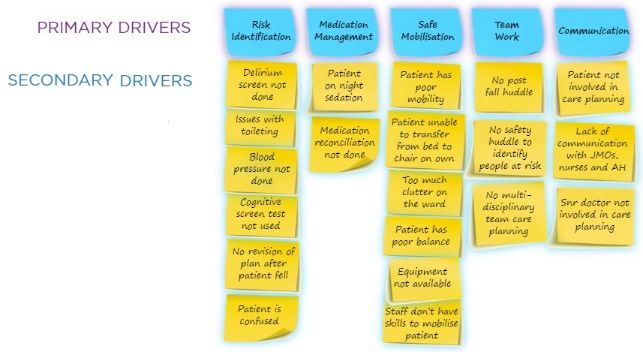
Step 14                                                        Sustain the gains:
                                                                Do you have a plan to ensure the improvement is not lost? Do you have a plan
 Sustain the gains and spread the                               to continue with measurement?
 Improvement                                                    Scale up:
                                                                Have you tested the new process during the evening and night shift?
                                                                Active spread:
                                                                • Do you have a plan to roll out your project in other areas?
                                                                Passive spread:
                                                                • ACI Innovation Exchange http://www.aci.health.nsw.gov.au/ie
                                                                • Quality awards
                                                                • Present at conference
                                                                • Poster
                                                                • Journal article
                                                                Complete the British NHS Sustainability Survey and score your project? The
                                                                closer the score to 100, the better chance of successful sustainability.
                                                                Review the IHI Seven Spreadly Sins to ensure you have the correct approach
                                                                via http://www.ihi.org/resources/Pages/Tools/IHISevenSpreadlySins.aspx

References:
1) NSW Health GEM Workstar – CPI module.
2) www.ihi.org
3) The Improvement Guide (2nd Edition) by G. Langley, R. Moen, K. Nolan, T. Nolan, C. Norman & L. Provost

The Model for Improvement and PDSAs
Numerous improvement methodologies are used nationally and internationally, to improve processes of care or patient outcomes.
Improvement Science is a commonly used methodology to address identified problems in the clinical area. It involves identifying, defining
and diagnosing a problem, before developing change ideas and implementing interventions that may address the identified issues.
Change ideas are then tested using small-cycle testing called “Plan, Do, Study, Act” (PDSA) cycles. (1) (2)
It is important to measure the impact of changes in order to verify that your interventions have made a difference. PDSA cycles were
originally known as the Shewhart cycle, “Plan, Do, Check, Act”, and based on manufacturing models. They were later modified by
Edwards Deming to PDSA cycles. (3)
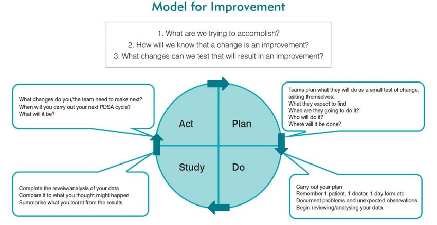
There are three main concepts to consider when undertaking improvement. This is demonstrated well with the Model for Improvement
below. (1) (2) This model was developed by Associates for Process Improvement and is used by the Institute for Healthcare Improvement
(IHI) as their framework to guide improvement work. (4)

                 Figure 1: Model for Improvement and PDSA (image adapted) (also see CEC Clinician’s Guide to Quality & Safety chapter 5)

Video
Consider watching these short videos from the IHI:
1. Model for Improvement Part 1 - 3 minute video http://www.ihi.org/education/IHIOpenSchool/resources/Pages/AudioandVideo/Whiteboard3.aspx
2. Model for Improvement Part 2 - 3 minute video http://www.ihi.org/education/IHIOpenSchool/resources/Pages/AudioandVideo/Whiteboard4.aspx
3. PDSA Part 1 - 4 minute video http://www.ihi.org/education/IHIOpenSchool/resources/Pages/AudioandVideo/Whiteboard5.aspx
4. PDSA Part 2 - 4 minute video http://www.ihi.org/education/IHIOpenSchool/resources/Pages/AudioandVideo/Whiteboard6.aspx

References
• Nolan T, Resar R, Haraden C, Griffi n FA. Improving the Reliability of Health Care. IHI Innovation Series white paper. 2004; Boston: Institute for
   Healthcare Improvement. Available from: http://www.ihi.org/resources/pages/ihiwhitepapers/improvingthereliabilityofhealthcare.aspx
• Langley GJ, Moen RD, Nolan KM, Nolan TW, Norman CL, Provost LP. The Improvement Guide: A Practical Approach to Enhancing Organizational
   Performance 2009.
• Moen RD, Norman CL. Circling Back: Clearing up myths about the Deming cycle and seeing how it keeps evolving. Quality Progress. American Society
   for Quality, November, 2010 Available from: http://www.apiweb.org/circling-back.pdf
• How to Improve [internet]. Cambridge MA: Institute for Healthcare Improvement; 2016. Available from:
   http://www.ihi.org/resources/Pages/HowtoImprove/default.aspx
• CEC Clinician’s Guide to Quality & Safety chapter 5.
                                                                          7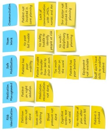
Charts to consider for outcome, process, balancing and diagnostic measures
Reference: The Health Care Data Guide - Learning from Data for Improvement by Lloyd Provost & Sandra Murray
 Run Chart                                   A Run Chart shows the manner in which measurement (data points) vary over time or
                                             between observations. An annotated run chart includes explanations of the shifts or trends in
                                             the data points and where change ideas have been tested via PDSA cycles. A Run Chart
                                             works best if there are 10 or more data points. There are Run chart rules which help you
                                             interpret the data:
                                             1. Trend: >5 data pts up or down. Like values do not add or break a trend.
                                             2. Shift: >6 data points above or below the center line. Values on center line do not add to
                                                 or break a shift.
                                             3. Too many or too few runs: Use table to calculate (see next page). Too few runs can be a
                                                 signal of improvement. Too many (saw tooth) can indicate there are 2 separate process
                                                 (may need to stratify data or use 2 separate run charts).
                                             4. Astronomical data point: outlier.
                                             A run chart is an effective tool to graph outcome, process and balancing measures.
                                             See the CEC Website for more information about Run Charts, Run Chart Rules and an
                                             Excel template for you to download and start plotting your data:
                                             https://www.cec.health.nsw.gov.au/Quality-Improvement-Academy/quality-improvement-
                                             tools/run-charts
                                             QIDS: Key data into CHARTS then select Run Chart.`

 Pareto Chart                                A Pareto Chart is a very powerful tool for showing the relative importance of problems. It’s a
                                             bar chart in descending order. Information can be collected initially in the form of a Tally
                                             Sheet via an audit and the data displayed in a Pareto Chart. A more complex Pareto chart
                                             with a cumulative and 80% line can also be used. A Pareto Chart is an effective tool to assist
                                             you in diagnosing the causes of your problem. It also works best if there are at least 30
                                             observations.
                                             See the CEC Website for more information about Pareto charts and an Excel template for
                                             you to download and start plotting your data. Pareto chart:
                                             https://www.cec.health.nsw.gov.au/Quality-Improvement-Academy/quality-improvement-
                                             tools/pareto-charts
                                             QIDS: Key data into CHARTS then select Pareto Chart.

 Histogram                                   A Histogram is a bar graph of the frequency distribution of measurements. The information
                                             can be collected in the form of a Tally sheet initially and then displayed in the form of a
                                             Histogram that will effectively highlight the interval that is most frequently occurring. A
                                             Histogram works best if there are at least 30 observations. It is an effective tool to assist you
                                             in diagnosing your problem.
                                             See the CEC Website for more information about Histograms and an Excel template for you
                                             to download and start plotting your data. Histogram:
                                             https://www.cec.health.nsw.gov.au/Quality-Improvement-Academy/quality-improvement-
                                             tools/histogram
                                             QIDS: Key data into CHARTS then select Histogram.

 Monthly Webinar                             Dates of monthly webinars to explain run charts, pareto charts and histograms can be found
                                             on the calendar on the CEC Website.

 Control Chart                               APPLIED MEASUREMENT A Control Chart, also known as a Shewhart Control Chart or
                                             Statistical Process Control Chart (SPCC) is a chart used to determine if a process is in a
                                             state of statistical control or how much variation exists in the data / process. Like a Run chart,
                                             the Control Chart is a graph of data over time. It uses a center line (mean) and control limits
                                             (sigma limits) to determine if the data is displaying common or special cause. The sigma
                                             limits are used to determine the Upper Control Limit (UCL) and Lower Control Limit (LCL) and
                                             are usually set at 3 sigma limits above/below the mean (similar to 3 Standard Deviations). A
                                             Control Chart works best if there are at least 12 data points (20 data points for I Charts and
                                             Xbar&S Chart)). Control Chart Rules help you interpret the data:
                                             1. Trend (>6 consecutive data points all going up or down). Like values do not add or break
                                                a trend.
                                             2. Shift (>8 consecutive data points above or below the center line). Values on center line do
                                                not add to or break a shift.
                                             3. Two out of 3 consecutive data points near (outer one-third) of control limit.
                                             4. A single point outside the control limits.
                                             5. Fifteen (15) consecutive data points close to the center line (in inner one-third of chart).
                                             There are specific Control Charts for different types of data / situations:
                                             • Attribute (discrete) data (non-conformities or defects): C Chart (# of incidents), U Chart
                                                (rate per 1000…), P Chart (%), T Chart (time between rare incidents) and a G Chart
                                                (number of events between rare incidents). These charts need at least 12 data points.
                                             • Continuous data (measures): I Chart (AKA X Chart) & X Bar & S Chart used to graph
                                                data such as time (minutes, hours, days, LOS), $, volume or throughput (# surgeries,
                                                patients seen in a clinic), height, weight, temperature etc. These charts need at least 20
                                                data points.
                                             Special software is required to easily produce Control Charts ie: Minitab, IHI QI Charts or QI
                                             Macros etc.
                                             Advanced Measurement Workshops are held several times a year at the CEC to teach
                                             participants how and when to use Controls Charts and how to interpret the data. Dates of
                                             workshops be found on the calendar on the CEC Website
                                             QIDS: Key data into CHARTS then select Control Chart.

                                                         8
Run Chart Rule: Too Many or Too Few runs
    Table for checking for Too Many or Too Few runs (The Health Care Data Guide by L Provost & S Murray page 80)

         TOTAL NUMBER OF DATA                      LOWER LIMIT                            UPPER LIMIT
            POINTS ON CHART                    FOR NUMBER OF RUNS                     FOR NUMBER OF RUNS
        (NOT FALLING ON MEDIAN)            (FEWER THAN THIS IS TOO FEW)              (GREATER IS TOO MANY)

                10                                       3                                       9
                11                                       3                                       10
                12                                       3                                       11
                13                                       4                                       11
                14                                       4                                       12
                15                                       5                                       12
                16                                       5                                       13
                17                                       5                                       13
                18                                       6                                       14
                19                                       6                                       15
                20                                       6                                       16
                21                                       7                                       16
                22                                       7                                       17
                23                                       7                                       17
                24                                       8                                       18
                25                                       8                                       18
                26                                       9                                       19
                27                                       10                                      19
                28                                       10                                      20
                29                                       10                                      20
                30                                       11                                      21
                31                                       11                                      22
                32                                       11                                      23
                33                                       12                                      23
                34                                       12                                      24
                35                                       12                                      24
                36                                       13                                      25
                37                                       13                                      25
                38                                       14                                      26
                39                                       14                                      26
                40                                       15                                      27
                41                                       15                                      27
                42                                       16                                      28
                43                                       16                                      28
                44                                       17                                      29
                45                                       17                                      30
                46                                       17                                      31
                47                                       18                                      31
                48                                       18                                      32
   • Too few runs can be a signal of improvement.
   • Too many runs (saw tooth) can indicate there are two separate process (may need to stratify the data or plot
     in two separate charts).

                                                                 9
Driver diagram starter kit and template at:
https://www.cec.health.nsw.gov.au/Quality-Improvement-Academy/quality-improvement-tools/driver-diagrams

References
• You Tube videos from NHS Improving Quality:
  • Driver Diagrams Lesson 1 of 3 - Introduction
     https://www.youtube.com/watch?v=2mBpJIzzYI8
  • Driver Diagrams Lesson 2 of 3 - Reasons to use driver diagrams
     https://www.youtube.com/watch?v=xXRym4aFLa4
  • Driver Diagrams Lesson 3 of 3 - How to develop a driver diagram
     https://www.youtube.com/watch?v=BhY-rw9ejDk
• Driver Diagram References:
  • https://webarchive.nationalarchives.gov.uk/20201029185708/https:/improvement.nhs.uk/resources/driver-diagrams-
     tree-diagrams/
  • https://www.weahsn.net/qi-toolkit-driver-diagrams/
• PDSA References:
  • http://www.ihi.org/resources/Pages/HowtoImprove/ScienceofImprovementTestingChanges.aspx

                                                         10
How to find the QI Academy Web pages on the CEC Website www.cec.health.nsw.gov.au
References - Excellent books you may want to consider purchasing if you want to learn more
The Improvement Guide (2nd Edition)
The Health Care Data Guide. Learning from Data for Improvement
by G. Langley, R. Moen, K. Nolan, T. Nolan, C. Norman & L. Provost
By Lloyd Provost & Sandra Murray
Other References on the CEC Website
CEC Clinician’s Guide to Quality & Safety CEC Masters Clinician’s Guide to Quality & Safety
Major Reference: The Improvement Guide (2nd Edition) by G. Langley, R. Moen, K. Nolan, T. Nolan, C. Norman & L. Provost.
Evaluation: Please provide feedback about this document via email CEC-Academy@health.nsw.gov.au
11You can also read


