TAPTAP COVID-19 REPORT - Geospatial Analysis
←
→
Page content transcription
If your browser does not render page correctly, please read the page content below
TAPTAP COVID-19 REPORT

                             TAPTAP COVID-19 REPORT
                                Geospatial Analysis
1
                                         COUNTRY: SPAIN
                                 DATE: FEBRUARY 2020 - APRIL 2020

    taptapdigital.com                                               TAPTAP Digital S.L. | 2020
TAPTAP COVID-19 REPORT

    ABOUT TAPTAP

    TAPTAP Digital is a marketing and advertising technology company founded in 2010 that services global markets in more than 80 countries.
    Through its proprietary platform Sonata, TAPTAP offers solutions based in geospatial and audience intelligence applied to advanced
    audience profiling, dynamic advertising activation and measurement of online and offline results.

    Sonata Location Intelligence (Sonata Li) is the system within the Sonata platform that empowers multivariate analysis of static and dynamic
    data sources in real time to generate audience indexes and indicators to identify behavior at the geographic level.

    Sonata operates by integrating first and third party anonymous data such as mobile phone navigation, geo positioning data, census data,
    statistical data and other dynamic sources to perform a holistic and comprehensive geospatial analysis in real time. TAPTAP and its
    collaborators provide independent analysis based on non-identifying data that has been provided and verified within the current European
    Community legal framework based on consent.

    STUDY OVERVIEW

    In the current context of global confinement, TAPTAP has developed an initial study to understand the relationship between mobility and the
    evolution of the pandemic.

    For this study TAPTAP has collaborated with big data and artificial intelligence experts at the Carlos III University of Madrid and companies
    Predicio and Tamoco who provide high frequency and precision location data.

    This first report focuses on Spain from the time mobility restrictions were announced due to COVID19 until April 2020. We developed
    multivariable indexes that analyze vulnerability of each province according to mobility, population composition and points of interest
    like hospitals, pharmacies and grocery stores. Where the cause and effect relationship is not always immediately apparent or direct, it is
    necessary to conduct a continuous analysis over time. We will, therefore, publish an additional report in the coming weeks that provides
    greater continuity to the analysis.

    We think it is very relevant to understand the link between the return to commercial and consumer activity and the evolution of the pandemic
    in the coming weeks. The reduction of confinement will therefore be a cause for additional monitoring as it could lead to additional outbreaks
2   which likewise affect economic recovery.

    ABOUT THE DATA

    Privacy:

    Location and mobility data has been provided by the Sonata technology owned by TAPTAP Digital SL. Sonata is an advanced marketing
    platform that provides access to anonymized mobility data which is collected with due consent through the legal framework provided by
    the General Data Protection Regulation (GDPR). The data is collected from users who have chosen to provide access to their location data
    and have undergone processes that allow anonymization and prevent data from being linked to an individual. Precise location data has also
    been supplied by providers like Predicio or Tamoco who participated in this study. The necessary measures have been taken in every case to
    ensure that the data processed for the implementation of this report is anonymized. Read more about the data and methodology.

    Devices for this representative sample were active for part of February, during the entire month of March and part of April 2020. The resulting
    sample is roughly 2% of the total population of Spain which represents approximately 300 million data points for the duration of the 6 week
    study, and is highly representative of the national population.

    GENERAL ANALYSIS

    The multivariable indexes presented show the evolution, behavior and trends of several key indicators and the relationship between them
    with respect to the pandemic. They provide a composite image for the analysis of each geographic area, population group or trend which will
    provide valuable information for the staggered reactivation of commercial activity.

    The results of the study are presented in 4 sections:

    1.   COVID-19 official data around cases, hospitalizations, deaths, UCI patients and recovered patients.
    2.   User Behavior (Mobility) Indicators of changes in population habits in the context of COVID19.
    3.   Demographics and social variables: identification of the risk of each territory and natural vulnerability rates depending on the
         composition of its inhabitants.
    4.   Geographic Context: Points and areas of interest with high demand or saturation that can expose the population or condition their
         habits. User density by area and by point of interest.

    taptapdigital.com                                                                                                  TAPTAP Digital S.L. | 2020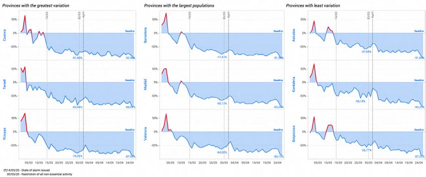
TAPTAP COVID-19 REPORT

    POST COVID19 CONSUMPTION

    We are at an unprecedented moment, where there is no roadmap, presenting a very complex dilemma for many institutions. Ensuring
    the personal health of citizens means the destruction of the economy, employment and economic engine of any country, production and
    consumption. For this purpose, TAPTAP, as an ally of large brands and institutions for the execution of data-driven advertising communication
    campaigns, understands that indicators in behavior, both physically and digitally of consumers, as well as those of consumption, are key
    to being able to understand the relationship of the gradual reactivation of the economy with respect to future pandemic developments.
    Likewise, we understand that there will be a new post-COVID19 consumer, with altered shopping habits. Therefore, as we produce complex
    multivariate analyses, which allow us to correlate different data sources, we will enrich the vision of the consumer, their habits and their
    relationship with brands and institutions with the goal of predicting consumer behavior in relation to the current and future situation.

    CONCLUSIONS

    1. Confinement measures have succeeded in reducing overall mobility across every province in Spain roughly 80%; however, to properly
    quantify reduction in mobility, a baseline must be calculated and incorporated into the mobility analysis. A baseline is likewise necessary to
    create quantitative correlations between reduced mobility and COVID19 indicators, economic changes and policy changes - especially as
    mobility restrictions relax.

    Takeaway: While organic mobility is different per province, mobility generally dropped from a baseline of 25km per day to 5km per day,
    nationally.

    2. Each COVID public policy announcement has a measurable effect on mobility. The baseline can help us: 1) Understand which policies have
    the greatest effects 2) Observe the time it takes for the effect to be seen

    Takeaway: Daily traffic continued to decline for 5 days after the initial state of alarm. The restriction of all non-essential activity started to
    significantly affect mobility about 5 days later, and, as expected, had the greatest impact on mobility.

    3. Quarantine policies have a measurable effect on COVID cases, hospitalizations and deaths.

3   Takeaway: The data indicates that quarantine policies require about 15 days to effect the reduction of total new cases and new deaths

    4. Analyzing indicators affecting the evolution of the virus or of the risk in a particular geographic area in an isolated manner could lead
    to incorrect conclusions or biased assessments. Multivariable indexes produce a more comprehensive analysis. According to population
    density, Madrid and Bareclona represent the most risk of contagion in Spain; however, introducing other variables like density of at risk
    population, especially relative to the capacity for coverage of critical points of interest (Hospitals, Pharmacies, Supermarkets), we recognize
    that unexpected provinces may require additional protection measures or mobility restrictions.

    Takeaways
    •   Castellón, Cantabria and Guipúzcoa have the highest concentration of at risk populations in proportion to total population.
    •   Toledo, Segovia, Salamanca or Navarra have less hospital coverage per vulnerable population.

    5. Using a baseline1 to perform a hyperlocal analysis, or observing the foot traffic in the immediate radius of a particular POI, will help us
    understand physical consumption patterns triggered by the new normal. Understanding consumption patterns will help businesses and
    brands better communicate with the new consumer. Likewise, monitoring changes in digital navigation, not only across content categories,
    but also with regard to other indicators like network connection informs consumption patterns.

    Takeaway: Internet traffic has jumped by 400% and the fastest growing categories are entertainment and online shopping. Online
    consumption in the confinement is roughly the same on every day of the week, but Wednesday and Thursday see slightly lower consumption.

    1. Baseline. The baseline is the average value of the mobility in the 15 - 20 days prior to the lockdown.

    taptapdigital.com                                                                                                     TAPTAP Digital S.L. | 2020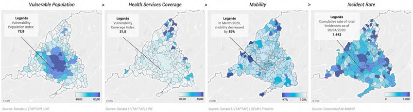
TAPTAP COVID-19 REPORT

    Geographic Analysis - Dynamic Data
    POPULATION MOBILITY
    Fig. 1. Week over week mobility variation in March 2020, Per Province. Source: Sonata LI (TAPTAP) | UC3M | Predicio

    Analysis of the average mobility per user and province (daily KMs). Certain provinces are more dispersed than others, which naturally
    requires more mobility. However, as the confinement evolves, mobility among all provinces homogenizes, with minimal movement
    everywhere.

    Fig. 2. Variation of national mobility, Spain. Source: Sonata LI (TAPTAP) | UC3M | Predicio

                                                                                                         In this graph we can observe the mobility
                                                                                                         changes relative to a baseline of pre-COVID19
                                                                                                         data. A baseline is a benchmark figure used to
                                                                                                         measure standard movement patterns allowing
                                                                                                         us to identify changes and patterns.

                                                                                                         In this case, the baseline is the average value
                                                                                                         of the mobility in the 15 - 20 days prior to the
                                                                                                         lockdown.

4

    Fig. 3. Variation of national mobility. Source: Sonata LI (TAPTAP) | UC3M | Predicio

    Average mobility rates change from 25 km per day to only 5 km per day with respect to the baseline, which is an 80% reduction in
    mobility.

    Each policy announcement is followed by a decrease in weekly mobility even though patterns in all provinces are slightly different.
    Cuenca and Teruel are the areas with the least reduction in mobility where Asturias and Cantabria are the provinces with most variation
    in mobility.

    taptapdigital.com                                                                                                         TAPTAP Digital S.L. | 2020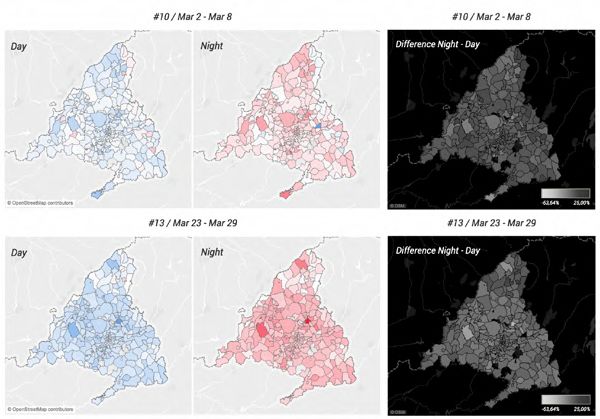
TAPTAP COVID-19 REPORT

    OTHER INDICATORS

    Variation in weekend versus weekday mobility
    Fig. 4. National mobility variation between weeks 10 and 13, Spain. Source: Sonata LI (TAPTAP)        During a typical week, user mobility on
    | UC3M | Predicio                                                                                     weekdays is roughly double that on weekends.
                                                                                                          In confinement, however, there is a minimal
                                                                                                          percentage difference between weekends
                                                                                                          and weekdays (10-15%), and overall distance
                                                                                                          travelled falls below 10KM per day.

    Fig. 5. Changes in digital traffic density per zip code and daypart between weeks 10 and 13.          Using Madrid as an example, the maps show
    Madrid, Spain. Source: Sonata LI (TAPTAP)                                                             the differences in traffic density per zip code
                                                                                                          between day and night as indicated by mobile
                                                                                                          device location.

                                                                                                          The blue graph shows the density of users
                                                                                                          during the day, whereas the red graph shows
                                                                                                          total density at night, per zip code.

                                                                                                          The negative (greyscale) graph shows the sum
                                                                                                          difference between day and night. Lighter areas
                                                                                                          indicate less change from day to night, darker
                                                                                                          areas more.

                                                                                                          Week 10 shows a greater disparity between day
                                                                                                          and night, especially in peripheral zip codes,
                                                                                                          which are usually more commercial than
                                                                                                          residential.
5
                                                                                                          In week 13, when confinement is widespread,
                                                                                                          the traffic per each zip code between day and
                                                                                                          night are largely the same - as is indicated by
                                                                                                          the homogeneous colors in the negative graph.

    Fig. 6. COVID-19 Mobility and hospitalizations, Spain. Source: Sonata LI (TAPTAP) | Ministerio de Sanidad | UC3M | Predicio | Tamoco

    We use a logarithmic scale (a way to represent exponential increases in data without skewing results to the outliers) to measure the
    rate of mobility against the rate of hospitalizations. The multivariable analysis determines that the rate of hospitalizations starts to
    plateau about 15 - 20 days after the quarantine began, indicating that it takes about this long to see benefits from the policy.

    Each policy announcement is followed by a decrease in mobility which represents a correlation between mobility and therefore
    hospitalizations.

    taptapdigital.com                                                                                                            TAPTAP Digital S.L. | 2020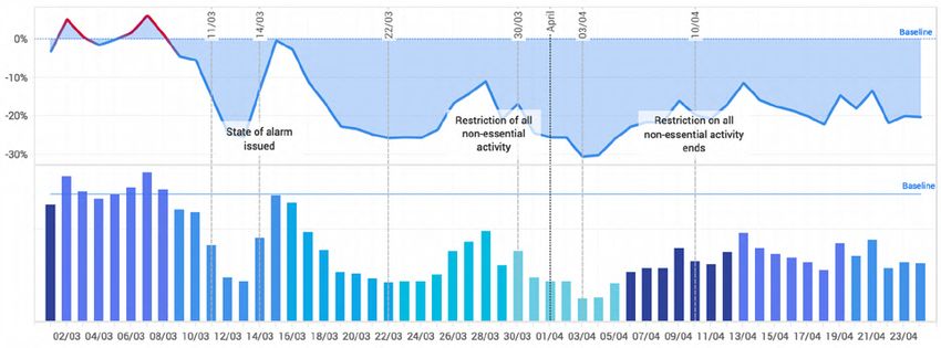
TAPTAP COVID-19 REPORT

    Geographic & Population Analysis
    Analysis Vulnerable Demographics

    The following four graphs show the distribution of the population by total volume, and then by age bracket.

    Fig. 7. Distribution of the total population, Per Province                      Fig. 8. Distribution of the vulnerable population, Per Province

    Fig. 9. Distribution of youth population, Per Province                          Fig. 10. Distribution of the adult population, Per Province
    Source: Sonata LI (TAPTAP) | INE

6
    Figure 8 shows the classification of each province per proportion of vulnerable population (ages 65+). Even though their total population is
    low, Castellón, Cantabria and Guipúzcoa have a higher percentage of vulnerable population and therefore represent a higher risk.

    Fig. 11. Index of population type by age group and total volume. Source: Sonata LI (TAPTAP) | INE

    As is represented in figures 7-10, using multivariable indices allows us to analyze the data against more than one factor. Figure 11 for
    example shows the data incorporating both the total volume of the vulnerable population, but also the proportion (%) of vulnerable
    population with respect to the total. Madrid, Barcelona and Castellon still represent a risk for the vulnerable population, but with a
    multivariable index, Valencia and Málaga move to the top of the list.

    taptapdigital.com                                                                                                            TAPTAP Digital S.L. | 2020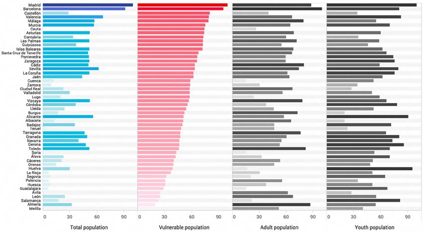
TAPTAP COVID-19 REPORT

    CONTEXTUAL ANALYSIS: POINT OF INTEREST COVERAGE

    Incorporating mobility data on the density of different points of interest (POIs) helps us see that areas with fewer POIs require more
    mobility and that areas with higher user saturation by POI can generate an increased risk of exposure to the virus.

    Hospital and health services coverage per population density and age

    Fig.12. Index of hospital coverage per total population density. Source: Sonata   Fig. 13. Index of hospital coverage per population volume and age
    LI (TAPTAP) | INE                                                                 bracket. Source: Sonata LI (TAPTAP) | INE

    For example, the number of hospitals per region is not necessarily
    a significant figure in isolation. A more telling ratio is the volume
    of hospitals, or any POI, relative to the fixed volume of population it
    serves, or coverage of the POI. For example, in figure 13, we measure
    hospital coverage per each age group. Rioja, Teruel and Albacete have
    sufficient hospital coverage with respect to total population density,
    but because their vulnerable population index is not high, they may
7   have an advantage. Alternatively, Toledo, Segovia Salamanca and
    Navarra may be at a disadvantage according to the indexes.

    NOTE: Neither number of hospital beds nor ad hoc hospitals in centers like
    IFEMA were taken into consideration for these coverage rates

    Fig. 14. Hyperlocal Analysis: Traffic in Severo Ochoa Hospital in Leganes
    (Madrid). Source: Sonata LI (TAPTAP) | UC3M | Predicio

    Geo-level analysis can be studied in aggregate form per territory, but
    also at a hyperlocal level.

    In the graph, individualized data by POI (Hospital Severo Ochoa in
    Leganes) allows us to analyze the user traffic in the area and compare
    it with its reference mean, or Baseline.

    taptapdigital.com                                                                                                       TAPTAP Digital S.L. | 2020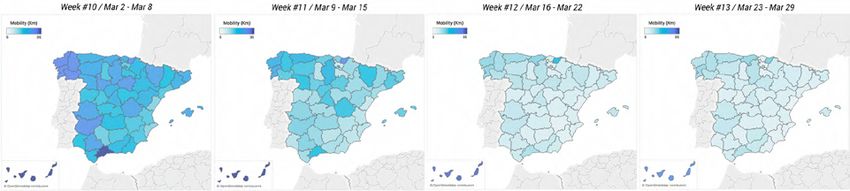
TAPTAP COVID-19 REPORT

    Pharmacy coverage per population density

    Fig. 15. Index of pharmacy coverage per population density. Source: Sonata   Fig. 16. Index of pharmacy coverage per population volume and age
    LI (TAPTAP) | INE                                                            bracket. Source: Sonata LI (TAPTAP) | INE

    Barcelona and Madrid lead in population density in Spain, but have
    less pharmaceutical coverage per person. In contrast, Avila, Zamora
    and Castellón have higher pharmaceutical coverage rates relative to
    the vulnerable population index, so may be better equipped to meet
    demand.

    Fig. 17. Hyperlocal Analysis: Traffic in a residential pharmacy in Madrid,
    Spain. Source: Sonata LI (TAPTAP) | UC3M | Predicio

8

    The hyperlocal analysis of the pharmacy shows that while foot
    traffic drops below the baseline after the state of alarm is issued,
    it experiences consistent increases and decreases in traffic, not a
    continuous drop. This is likely because pharmacies are a fundamental
    service that address healthcare.

    taptapdigital.com                                                                                                  TAPTAP Digital S.L. | 2020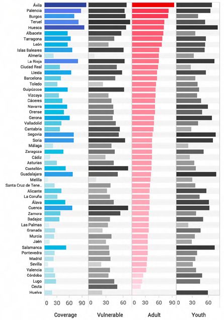
TAPTAP COVID-19 REPORT

    Supermarket and food services coverage per population density

    Fig. 18. Index of supermarket coverage per population density.               Fig. 19. Index of supermarket coverage per population volume and age
    Source: Sonata LI (TAPTAP) | INE                                             bracket. Source: Sonata LI (TAPTAP) | INE

    La Rioja, Avila and Cádiz have the highest supermarket coverage
    per population density. If we incorporate into the analysis the index
    of adult population (the group most likely to visit the supermarket),
    Ávila, Alemería and Albacete have the most coverage. The lower the
    coverage of these POIs, the higher rate of mobility it can generate.

    Fig. 20. Hyperlocal POI Analysis: Traffic in an Alcobendas (Madrid, Spain)
    supermarket. Source: Sonata LI (TAPTAP) | UC3M | Predicio

9

    The hyperlocal point of interest analysis for a supermarket in
    Alcobendas provides different insights. It shows that even though
    markets are among the POIs most visited, the total traffic has
    significantly dropped below the baseline by 90%.

    taptapdigital.com                                                                                                   TAPTAP Digital S.L. | 2020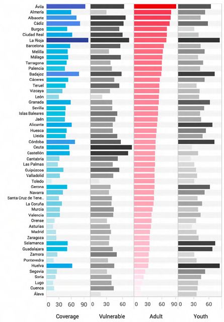
TAPTAP COVID-19 REPORT

     Coverage of transportation stations per population density

     Fig. 21. Index of transportation stations coverage per population density.             Fig. 22. Index of transportation stations coverage per population volume
     Source: Sonata LI (TAPTAP) | INE                                                       and age bracket. Source: Sonata LI (TAPTAP) | INE

     Fig. 22 shows that Castile and León have the highest coverage rate of
     transport services per adult population, the segment most likely to use
     these services. Madrid and Barcelona have less coverage compared
     to population density and therefore may have higher demand for these
     services which raises the risk of contagion.

     Fig. 23. Hyperlocal POI Analysis: Traffic in Atocha Station (Madrid, Spain). Source:
     Sonata LI (TAPTAP) | UC3M | Predicio

10

     This graph shows hyperlocal foot traffic for one of the busiest train
     stations in Madrid. Traffic has dropped to nearly 90% below the
     baseline.

     taptapdigital.com                                                                                                                TAPTAP Digital S.L. | 2020
TAPTAP COVID-19 REPORT
Multivariable Analysis
COVID NATIONAL ANALYSIS
Fig. 24. Evolution of cases, deaths, hospitalizations, recovered and ICU patients. Cumulative Data. Source: Ministerio de Sanidad
Fig. 25. Mobility and COVID-19 Indicators. Source: Sonata LI (TAPTAP) | Ministerio de Sanidad | UC3M | Predicio | Tamoco
11
Both deaths and new cases peak around April 1 – about 2 weeks after the activation of quarantine measures – and then begin to decline.
As new cases always precede deaths, the rate of new cases slows faster than the death rate, but both follow the same downward trend.
Although the pace of new deaths is a consequence not only of mobility, the peak of deaths appears approximately 15 days after
mobility falls in a stable pattern.
Cumulative cases and deaths per autonomous community
Fig. 26. Rate of cumulative incidents. Source: Ministerio de Sanidad Fig. 27. Casos acumulados y muertes por CCAA. Source: Ministerio de Sanidad
When examined against geographics, you can monitor the evolution of the pandemic according to contextual, population or mobility variables
to understand more about how the pandemic develops and establish relationships between variables.
taptapdigital.com TAPTAP Digital S.L. | 2020TAPTAP COVID-19 REPORT
COVID REGIONAL ANALYSIS
The next sequence shows data from the 3 blocks of analysis: Demographics (vulnerability measured by age), Geo Context (hospital coverage)
and Behavior (user mobility). Using Leganés, a Spanish city with high incident rates, as a reference, a very strong correlation between the 3
blocks and the rate of exposure emerges.
Fig. 28. Correlation between indicators, Leganes (Madrid) Source: Sonata LI (TAPTAP) | INE
With these datasets we are able to build a multivariable index that explains and foresees possible degrees of infection per geographic area.
12
taptapdigital.com TAPTAP Digital S.L. | 2020TAPTAP COVID-19 REPORT
Audiences. Behavioral Changes
DIGITAL BEHAVIOR
Fig. 29. variation of digital traffic with a 3G/4G connection. Source: Sonata LI (TAPTAP)
The baseline here represents the average number of devices using cellular networks to provide internet connectivity prior to COVID. Post-
confinement, connections to a mobile network dropped by about 30%, while wifi connections increased. As wifi is most common at home
or at work, and data is used on the go, we assume that this change is due to a decrease in mobility.
After April 12, network connections grew, which could indicate more mobility after the initial confinement.
Fig. 30. Shopping Center Purchases in City Fig. 31. Shopping Center Purchases in City Fig. 32. Purchases in Confinement.
Peripheries, Pre-Confinement. Centers, Pre-Confinement. Source: Sonata LI (TAPTAP)
13 Source: Sonata LI (TAPTAP) Source: Sonata LI (TAPTAP)
Concentrated Behavior Pre-Confinement Seasonality patterns no longer apply to
purchase behavior
Prior to confinement, behavior at the physical point of sale is concentrated on the
weekend and more pronounced in shopping centers than urban areas. Individual and shopping behavior does not
follow traditional patterns. The days with
Nearly half the physical purchases made are done in just two days of the week. low activity become days with more visits,
while weekends are the same or even below
the daily average.
The linear nature of shopping habits show
it is no longer a leisure activity.
taptapdigital.com TAPTAP Digital S.L. | 2020TAPTAP COVID-19 REPORT
APPENDIX:
Working With Location Data: A Technical Perspective
The aforementioned location data is collected anonymously via mobile applications that have location services enabled. In each device,
operating systems (like iOS & Android) merge multiple data types like GPS, WiFi or Bluetooth to provide accurate latitude and longitude
coordinates, the most precise being a single GPS pinpoint (used for this study). To facilitate rapid technological analysis of location data,
these pinpoints are converted into a geohash, which is a universal coding system used to identify locations at varying levels of precision
and size. The latitude and longitude point(s) are hashed into a tile or block that can contain few or many points, according to the point of
interest or in this case, the scope of the study. In addition to facilitating analysis, geo hashing has the dual benefit of protecting user privacy
by essentially zooming out from their pinpoint location, injecting what is called, noise. The collaborators conducting this study selected
a geohash that preserves individual privacy but ensures the accuracy of the study within tens and hundreds of meters depending on the
analysis in question. A technique known as Gyration Radius was used to measure the distance each device has moved from its path center
which is its most common location (like a residence). This technique allows us to calculate the number of KM moved throughout the day.
A Representative Sample
To ensure the accuracy and value of the study, a sample of location data (and device data) representative of the Spanish population was
used. To arrive at this sample, TAPTAP and its collaborators curated and filtered data from millions of devices with billions of location data
signals. To be able to provide a valuable and precise mobility analysis, only devices that generated multiple data signals from different
sources at varying windows of time throughout the entire day (thereby exhibiting a genuine change of location versus a micro movement like
a change of room) were applied to the study. The data is variable and temporal by nature as it changes according to the features of the mobile
application, device operating system and user consumption patterns. To bypass the temporal nature of the data, we work with data partners
like Tamoco or Predicio who refresh location data every few minutes (around 100 - 200 daily signals per unique device) tantamount to at least
5 location data samples per device per day. The resulting output of the accumulation of these moving parts, which include anonymous user
ID hash, time, location as well as additional, non-personal metadata and location accuracy, is a location object (location event). The location
object is the individual unit, composed of all of these parts, that enables us to analyze the data collectively for each location.
14
taptapdigital.com TAPTAP Digital S.L. | 2020TAPTAP COVID-19 REPORT
EUROPE I AFRICA I NORTH AMERICA I SOUTH AMERICA
15
taptapdigital.com TAPTAP Digital S.L. | 2020You can also read