TECHSAGE TOOL: HEURISTIC ANALYSIS (V1)
←
→
Page content transcription
If your browser does not render page correctly, please read the page content below

Telepresence Heuristic Evaluation for Adults Aging with Mobility
               Impairment. Proceedings of the Human Factors and Ergonomics Society
               Annual Meeting, 61(1), 16–20. doi: 10.1177/1541931213601499

     T

TechSAge Tool: Heuristic Analysis (V1)
Rehabilitation Engineering Research Center on
Technologies to Support Aging-in-Place for People with
Long-Term Disabilities (RERC TechSAge)
rercTechSAge.org

                             Correspondence concerning this report may be addressed to:
                                              | Wendy A. Rogers (wendyr@illinois.edu)
                                                 | Tracy L. Mitzner (tracy@gatech.edu)

                                                                     Suggested Citation
                             TechSAge (2019). TechSAge Tool: Heuristic Analysis (V1).
                          Rehabilitation Engineering Research Center on Technologies to
                           Support Aging-in-Place for People with Long-Term Disabilities.

                                                                      Acknowledgments
                     The contents of this tool were developed under a grant from the
                     National Institute on Disability, Independent Living, and Rehabilitation
                     Research (NIDILRR grant number 90REGE0006-01-00) under the
                     auspices of the Rehabilitation and Engineering Research Center on
                     Technologies to Support Aging-in-Place for People with Long-Term
                     Disabilities (TechSAge; www.rerctechsage.org). NIDILRR is a Center
                     within the Administration for Community Living (ACL), Department of
                     Health and Human Services (HHS). The contents of this tool do not
                     necessarily represent the policy of NIDILRR, ACL, or HHS, and you
                     should not assume endorsement by the Federal Government. We
                     thank Megan Bayles for her significant contribution to the
                     development of this tool.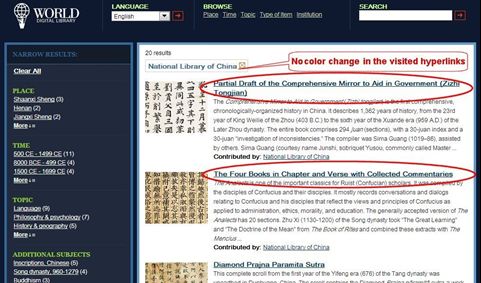
Table of Contents
Introduction ........................................................................................................................................................ 4
Table 1. Nielsen’s Ten Usability Heuristics................................................................................................... 5
Table 2. Scoring Guidelines For Nielsen’s Ten Usability Heuristics ........................................................ 6
Figure 1. Example of a scoring sheet for a heuristic evaluation............................................................... 6
Heuristic Evaluation: Good and Bad Examples ........................................................................................... 7
Principle 1: Visibility of system status .......................................................................................................... 7
Principle 2: Match Between System and the Real World............................................................................ 9
Principle 3: User control and freedom ......................................................................................................... 10
Principle 4: Consistency and Standards ..................................................................................................... 11
Principle 5: Error Prevention ......................................................................................................................... 13
Principle 6: Recognition Rather than Recall ............................................................................................... 15
Principle 7: Flexibility and Efficiency of Use .............................................................................................. 17
Principle 8: Aesthetic Minimalist Design ..................................................................................................... 18
Principle 9: Help Users Recognize, Diagnose, and Recover from Errors ............................................. 19
Principle 10: Help and Documentation ........................................................................................................ 20
Working with Older Adults With Disability .................................................................................................. 22
Assistive Technologies .................................................................................................................................. 22
Instructional Materials .................................................................................................................................... 22
Visuals, Audio, and Text................................................................................................................................. 22
World Wide Web Consortium (W3C) and Web Accessibility Initiative (WAI) ........................................ 23
Table 3. User Agent Accesibility Heuristics................................................................................................ 23
Publication Example ....................................................................................................................................... 24
Summary ........................................................................................................................................................... 26
Resources ......................................................................................................................................................... 27
References ........................................................................................................................................................ 28
TechSAge Tools Overview
  TechSAge has designed this tool series to provide its readers with guides
  on how to conduct various aspects of human factors research. The tools
  have a focus on including the target population of adults aging with
  disabilities. TechSAge Tools are designed to:
  1) Introduce a variety of research methods, procedures, and protocols
  2) Provide guides and “how tos” about implementation
  3) Discuss considerations specific to working with adults aging with
  disabilities
  4) If applicable, recommend appropriate wording to describe the method in
  publications
  5) Point to reliable resources for more in-depth information about the
  method, procedure, ore protocol presented in the tool

  This TechSAge tool is designed to give an overview of what a Heuristic
  Evaluation is, how to score it, and how to detect heuristic violations.
  Heuristic evaluations make the design of systems more usable, however,
  this tool goes further by suggesting additional accommodations to be
  made by designers who are developing or evaluating systems for older
  adults with disabilities is also discussed.

Heuristic Analysis
INTRODUCTION
    Heuristic evaluation is a process that entails examining the design of a
    user interface and judging its compliance with a list of predefined
    principles. These principles are used as a benchmark, helping the
    evaluators to identify potential usability issues that users may encounter
    (Nielsen & Molich, 1990). There are multiple heuristics but a commonly
    used set from the human factors literature is Nielsen’s Ten Usability
    Heuristics (Nielsen & Molich, 1990; Nielsen, 1994). Nielsen developed ten
    principles (see Table 1); each principle is scored on a 0-4 scale to
    determine the current usability status (see Table 2). Scoring sheets are
    recommended to be used to provide context for the reasoning of each
    score (Figure 1). We have developed a “TechSAge Tool Heuristic Analysis
    Scoring” excel template. The excel template and example files are
    available from authors on request.
TABLE 1. NIELSEN’S TEN USABILITY HEURISTICS
Heuristic Principle             Definition

Visibility of system status     Users should be informed what is going on with the
                                system through appropriate feedback

                                The image of the system perceived by users and
Match between system and
                                presentation of information on the screen should
the real world
                                match the model users have about the system

User control and freedom        Users should not have the impression that they are
                                controlled by the system

Consistency and standards       Users should not have to wonder whether different
                                words, situations, or actions mean the same thing.
                                Design standards and conventions should be followed

Error prevention                It is always better to design interfaces that prevent
                                errors from happening in the first place

Recognition rather than         The user should not have to remember information
recall                          from one part of the system to another

Flexibility and efficiency of   Both inexperienced and experienced users should be
use                             able to customize the system, tailor frequent actions,
                                and use shortcuts to accelerate their interaction

Aesthetic and minimalist        Any extraneous information is a distraction and a
design                          slowdown

Help users recognize,           Error messages should be expressed in plain
diagnose, and recover from      language (no codes), precisely indicate the problem,
errors                          and constructively suggest a solution

Help and documentation          System should provide help when needed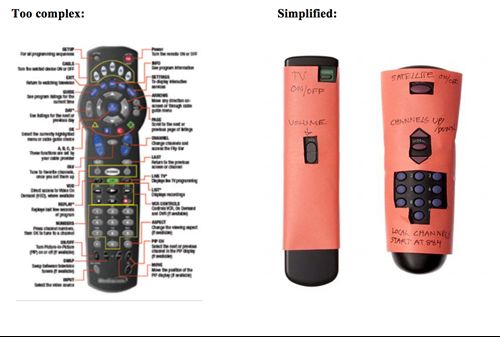
TABLE 2. SCORING GUIDELINES FOR NIELSEN’S TEN USABILITY
HEURISTICS
Scoring

0                             Do not agree that this is a usability problem

1                             Cosmetic problem

2                             Minor usability problem

3                             Major usability problem (important to fix)

4                             Usability catastrophe (imperative to fix)

             Figure 1. Example of a scoring sheet for a heuristic evaluation.
Below we present good and bad examples of design related to each of
    Nielsen’s 10 principles. This can be used to provide more context for
    Nielsen’s Heuristics. These examples can also be used to train new
    evaluators who will be involved in evaluations. Each principle has two
    short paragraphs, one for a good example and one for a bad,
    accompanied by images to illustrate the concepts.

HEURISTIC EVALUATION: GOOD AND BAD EXAMPLES

    Principle 1: Visibility of system status

    GOOD: The user should know what is processing within the system. A
    well-represented example of this heuristic is the loading circle for the
    Facebook application on smartphones represented in Figure 2. This
    animation allows the user to understand that the page is loading—should
    this circle not be present, the user may think they cannot get the page to
    refresh when, in fact, the page is refreshing.

                         Figure 2. Smartphone Facebook Application
BAD: An example that exemplifies bad visibility of system status is the
portable charger pictured in Figure 3. This is a prime example for bad
usability as there is not a way to tell if the portable charger itself is charged
(Miller, 2016).

                             Figure 3. Portable Charger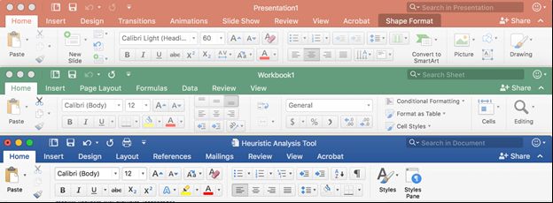
Principle 2: Match Between System and the Real World

GOOD: It is important that the design of a product does not violate our
understanding of the world. For example, if you want a user to know that
their trash bin on their laptop is full—you display it as a full trash as
opposed to an empty one, as represented in Figure 4 (Liyanage, 2016).

                            Figure 4 Full Recycling Bin

BAD: Users may assume that dragging the disk icon to the trash would
delete their files on that disk. In the example in Figure 5, the secondary
function of the trash icon (disk ejector) is overextended beyond its more
immediate connotation of deletion (Mediati, 2016).

                         Figure 5 Eject Secondary Function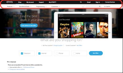
Principle 3: User control and freedom

GOOD: The user should have the freedom to navigate, change, go back,
or fix any aspect for which they made a mistake. For example, when we
delete an email on accident in Gmail, it gives us a message to undo the
deletion just in case it was a mistake (Figure 6; Rengifo, 2018).

                        Figure 6 Gmail Undo Email Deletion

BAD: When viewing a product listing on Amazon (Figure 7), there is no
clear indication of how to cancel your listing-- the user is only prompted to
submit their listing (Ortega, 2010).

                     Figure 7 Amazon Product Information Order
Principle 4: Consistency and Standards
GOOD: Consistency and standards refers to keeping concepts the same
throughout the product. For example, the navigation bar should always
appear the same and stay in the same place. A good example is how
Microsoft tools all have a consistent menu bar for the different Microsoft
Office applications (e.g., PowerPoint, Word, Excel; Figure 8).
Figure 8. Microsoft Tool Banners
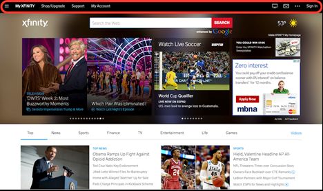
BAD: As represented in Figures 9, 10 and 11, there is a violation of the
consistency and standards principle as each main menu changes
depending on the page that the user is on. This violates having
consistency between windows, making the website harder to navigate
(Wong, 2019.)
Figure 9. Xfinity Website Inconsistent Menu 1Figure 10 Xfinity Website Inconsistent Menu 2 Figure 11. Xfinity Website Inconsistent Menu 3
Principle 5: Error Prevention
GOOD: Error prevention is an aspect that should be used to help users
catch themselves making a mistake before it is too late. A good example
of this, is with Microsoft Word. If the user attempts to exit a file that has not
been saved yet, it provides the option to cancel the exit and save the
document (Figure 12).

                      Figure 12. Microsoft Word Warning Message

Another form of error prevention is the red underlining for misspelled
words (Figure 13).

                        Figure 13. Underline Warning Message

BAD: The following bad example is an example from a Google Form
(Figure 14). Screenshot A shows a prompt as it is presented to the user.
There is no indication of any word/character constraints for the user’s
response. If the user were to prepare a lengthy response in a separate
document and then copy it over to the form, they would be met with an
error message shown in Screenshot B. The form does notify the user of
the error before they try to submit the form, but it does not clearly indicate
the response field constraints before the user starts typing. A better design
would indicate the allowable number of characters for the response as
well as display a character counter so the user can see how many
characters they have used as they are typing.
Figure 14. Google Form Constraints
Principle 6: Recognition Rather than Recall
GOOD: This heuristic principle suggests that, anywhere possible, one
should not assume the user remembers what symbols mean within a
website. It is the job of the product designer to make the product as easy
to use as possible, this includes lessening the memory load for the user.
An example of how to properly reduce user memory load can be found in
Figure 15. Google will render the prior searches completed when the user
begins to type a sentence/question.

                 Figure 15. Google Search Engine (Liyanage, 2016).
BAD: Shown in Figure 16, an image of the National Library of China, the
links that have been clicked on in prior searches did not change their
color, which typically indicates that the link has already been viewed.
Without the change in coloring, the user must remember which links they
visited and which they did not. (A Pilot Evaluation of the World Digital
Library, 2019).
Figure 16. National Library of China Hyperlink ViolationPrinciple 7: Flexibility and Efficiency of Use
GOOD: This principle suggests that the product being designed should be
easily tailored to the user and allow freedom to control settings,
appearance, and much more, in order to provide autonomy to the user
within the product. Chrome does this by allowing the users to add
extensions to the webpage for quick links/tools the user uses most. For
example, the google scholar and citation extensions can be used to
facilitate creating American Psychological Association citations, and
convert a normal google search into a scholar search without having to re-
enter search terms (Figure 17).
Figure 17. Google Chrome Extensions
BAD: In this example, Figure 18, the “Medicine Units” is required to be in
milligrams (mg), which causes a limitation for input. This limits the
flexibility should the user need to enter a different unit of measurement
(UTHealth, 2019).
Figure 18. Medicine Units Restricted to ‘mg’Principle 8: Aesthetic Minimalist Design
GOOD: Having a minimalist design will make the product easier to use
and the objective of the product clear. Wikipedia search engine, shown in
Figure 19, is a good example of this as it is clear that you need to select
your language and then simply type in what you want to search on the
website.
Figure 19. Wikipedia Homepage
BAD: A bad example, represented in Figure 20, shows that there are too
many buttons on the remote control, which can distract from the main
features that are used the majority of the time. On the right, there is an
example of what a simplified version of the remote could look like.
Figure 20. Remote Control Complex and SimplifiedPrinciple 9: Help Users Recognize, Diagnose, and Recover from
Errors
GOOD: Errors are going to be inevitable, even if correct precautions have
been made to avoid them. Thus, when a mistake is made there needs to
be help so the user can understand what went wrong and what needs to
be done to correct the problem. This happens often when entering
usernames and passwords to log into websites. Below, in Figure 21, is an
example from MailChimp (Rengifo, 2018).
Figure 21. MailChimp Login Page
BAD: Figure 22 presents a bad example of Principle 9 because the error
message offers no understandable information about the issue above the
system level (Pande, 2018).
Figure 22. Vague Error MessagePrinciple 10: Help and Documentation
GOOD: A user interface should allow the user to autonomously get
through the website. This means that there should be no prior training or
education necessary to retrieve information. However, if a user does
become lost within the site or screen, then there should be proper help.
Below is an example of GoDaddy’s help page, Figure 23, which provides
frequent issues as well as a search engine (Liyanage, 2016).
Figure 23. GoDaddy Help PageBAD: If a user is lost within a product, the steps they need to take for
assistance should be clear. A bad example of help and documentation can
be found on the mobile application for LinkedIn (Figure 24). On their home
screen, there is no location to go to find help (even if you click through all
the main navigation buttons located on the bottom of the screen). You can
see in Figure 12 there is no help button.
Figure 24. LinkedIn Website with no Help ButtonWORKING WITH OLDER ADULTS WITH DISABILITY
Assistive Technologies
Design changes may need to be made to ensure a system is usable for
persons with disabilities, such as adults aging with disability. It is important
to keep in mind that systems should be compatible with assistive
technology, such as screen readers and captioning software. In one study,
including head-controlled keyboard/mouse and text-to-speech software
options for reading documents aloud improved usability of online shopping
services and accessing health-related information (Lawhon, Ennis, and
Lawhon, 1996). While assistive technology is not explicitly stated in
Nielsen’s usability guidelines, the need to be compatible with assistive
technology is consistent with the ‘user control and freedom’ and ‘flexibility
and efficiency of use’ principles.
Instructional Materials
Nielsen’s usability principle of ‘help and documentation’ is described as
having a system provide help when needed. There are a range of
accessibility barriers for older adults with disabilities. Disabilities, such as
blind/low vision, deaf or hard of hearing, psychological disabilities,
cognitive disabilities, motor impairments, and memorability can raise
unique barriers for technologies. By providing help and documentation,
you can reduce the user’s need to recall information. A possible solution to
addressing users with cognitive impairments is to present them with
simple and usable guides (Ilyas, 2012). Although some might require a
user guide, using the user guide can assist those with a range of cognitive
abilities.
Visuals, Audio, and Text
Using multimodal information to present an aspect of an interface, such as
icons, diagrams, vocal explanation, and text for important aspects of an
interface aids users who may have hearing, visual, or cognitive
impairments. Moreover, multimodal information benefits users without
impairments as well.World Wide Web Consortium (W3C) and Web Accessibility
Initiative (WAI)
There are laws in place for web accessibility in the United States. The
Worldwide Consortium (W3C) and Web Accessibility Initiative (WAI)
programs have developed a set of heuristics to make websites accessible
to all users, including adults aging with disabilities. User Agent
Accessibility Guidelines were developed to make user agents accessible
to people with disabilities. These guidelines are made primarily for web
developers to be applied to technologies used to render websites but they
are generally good concepts to follow for technology developments, as
well.
The heuristics for User Agent Accessibility Heuristics are presented in
table 3 (UAAG 2.0). More information on these specific heuristics can be
found in the resources section.
TABLE 3. USER AGENT ACCESIBILITY HEURISTICS
Heuristic Description
Principle 1: Perceivable Users can access agent output
Principle 2: Operable Users can communicate with the user agent
Principle 3: Understandable Allowing the user to easily operate the agent
Principle 4: Access Allow the user to adjust the agent to their preferences
with controls
Principle 5: Comply Compliance with WCAG guidelinesPUBLICATION EXAMPLE
TechSAge researchers have conducted heuristic analyses to assess the
potential usability barriers for different types of technologies for adults
aging with impairments. An example of this is described in the journal
article, ‘Telepresence Heuristic Evaluation for Adults Aging with Mobility
Impairment’ shown in Figure 25.
Figure 25. Wu, Thomas, Drobina, Mitzner & Beer, 2017
This article describes the method used for their heuristic analysis in Figure
26. Also, from this same journal article, we show an example of the
discussion section in Figure 27, in which the heuristic analysis is
described.Figure 26 Method
Figure 27. Discussion Section (Wu et al., 2017)

SUMMARY
   This TechSAge tool, although not comprehensive, was designed to be a
   quick guide for illustrating heuristic evaluations. This tool has described
   what a Heuristic evaluation is, why it is used, and how it can assist in
   identifying potential usability issues. Also included was an example of how
   to track scoring for the principles. Further, the tool provided examples of
   Nielsen’s ten principles for heuristic evaluations that can be used to help
   evaluators identify potential usability threats. Finally, the tool discusses
   heuristics that can improve accessibility for those with disabilities, as well
   as improve usability for all users.
RESOURCES
 •   Iterations in the Design Process (Rengifo, 2018)
         o https://blog.prototypr.io/iterations-in-the-design-process-41bd8d01f244
         o Rengifo, E. (2018, March 28). Iterations in the Design Process. Retrieved from
            https://blog.prototypr.io/iterations-in-the-design-process-41bd8d01f244.
 •   Visability of System Status: The Good and the Bad (Miller, 2016)
        o http://sp16.cs179.org/2016/03/08/visibility-of-system-status-the-good-and-the-
            bad/
        o Miller, A. (2016, March 8). Visibility of System Status: The Good and The Bad.
            Retrieved from http://sp16.cs179.org/2016/03/08/visibility-of-system-status-the-
            good-and-the-bad/.
 •   10 Usability Heuristics Explained (Liyangage, 2016)
        o https://medium.com/@erangatl/10-usability-heuristics-explained-caa5903faba2
        o Liyanage, E. (2016, October 1). 10 Usability heuristics explained. Retrieved from
           https://medium.com/@erangatl/10-usability-heuristics-explained-caa5903faba2.
 •   Amazon Fails on Heuristic ‘User Control and Freedom’ (Ortega, 2010)
       o https://usabilitygal.com/2010/04/30/amazon-fails-on-heuristic-%E2%80%98user-
          control-and-freedom%E2%80%99/
       o Ortega, L. M. (2010). Amazon fails on heuristic 'user control and freedom'.
          Retrieved from https://usabilitygal.com/2010/04/30/amazon-fails-on-heuristic-
          ‘user-control-and-freedom’/.
 •   Match between the system and the real world with examples (Pande, 2018)
        o https://uxgorilla.com/match-between-system-and-real-world/
        o Pande, J. (2018, October 5). Match Between System and Real World: Nielsens
           Heuristics by UX Gorilla. Retrieved from https://uxgorilla.com/match-between-
           system-and-real-world/.
 •   General Design Principles for EHRs (UTHealth, 2019)
       o https://sbmi.uth.edu/nccd/ehrusability/design/guidelines/principles/
       o UTHealth. (2019). General Design Principles for EHRs. Retrieved from
           https://sbmi.uth.edu/nccd/ehrusability/design/guidelines/principles/.
 •   A Pilot Evaluation of the World Digital Library, 2019?
        o https://wdlevaluation.weebly.com/6-recognition-rather-than-recall.html
        o A Pilot Evaluation of the World Digital Library. (2019). Retrieved from
            https://wdlevaluation.weebly.com/.
 •   Principle of Consistency and Standards in User Interface Design. (2019). The
     Interaction Design Foundation. (Wong, 2019)
         o https://www.interaction-design.org/literature/article/principle-of-consistency-and-
            standards-in-user-interface-design
         o Wong, E. (2019, October). Principle of Consistency and Standards in User
            Interface Design. Retrieved from https://www.interaction-
            design.org/literature/article/principle-of-consistency-and-standards-in-user-
            interface-design.
 •   User Agent Accessibility Guidelines (UAAG 2.0)
        o https://www.boia.org/blog/user-agent-accessibility-guidelines
REFERENCES
Ilyas, M. (2012). A Study of Web Accessibility Barriers for Older Adults, and
Heuristics Evaluation of Email Websites Based on Web Accessibility
Heuristics for Older Adults by AARP. Emerging Trends in Computing and
Information Sciences, 3, 806–813. Retrieved from
https://pdfs.semanticscholar.org/2d69/273f87bc99604a3c8e92dfa444f2f
80e6c0.pdf?_ga=2.36973544.950542008.1573074377-
1102824737.1573074377
Lawhon, T., Ennis, D., & Lawhon, D. C. (1996). SENIOR ADULTS AND
COMPUTERS IN THE 1990s. Educational Gerontology, 22(2), 193–201.
doi: 10.1080/0360127960220205
Liyanage, E. (2016, October 1). 10 Usability heuristics explained. Retrieved from
https://medium.com/@erangatl/10-usability-heuristics-explained-
caa5903faba2.
Mediati, N. (2016, January 29). How to eject a disk properly on OS X. Retrieved
from https://www.macworld.com/article/3012984/how-to-eject-a-disk-
properly-on-os-x.html.
Nielsen, J., & Molich, R. (1990). Heuristic evaluation of user interfaces.
Proceedings of the SIGCHI Conference on Human Factors in Computing
Systems Empowering People - CHI 90. doi: 10.1145/97243.97281
Nielsen, J. (1994, December 18). 1994 Web Usability Study: Article by Jakob
Nielsen. Retrieved from https://www.nngroup.com/articles/1994-web-
usability-report/.
Wu, X., Thomas, R. C., Drobina, E. C., Mitzner, T. L., & Beer, J. M. (2017).
Telepresence Heuristic Evaluation for Adults Aging with Mobility
Impairment. Proceedings of the Human Factors and Ergonomics Society
Annual Meeting, 61(1), 16–20. doi: 10.1177/1541931213601499You can also read