The impact of COVID-19 on Brighton and Hove: a statistical evaluation
←
→
Page content transcription
If your browser does not render page correctly, please read the page content below
The impact of COVID-19 on Brighton and
     Hove: a statistical evaluation

                           Published: July 2020

                  0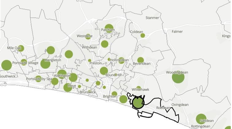
Contents

  1.   Introduction                                       Page 2

  2.   Executive summary                                  Page 3

  3.   What the data reveals about Brighton and Hove      Pages 4-16

  4.   Numbers assessed through NHS helplines up to 9     Page 4
       July 2020

  5.   Confirmed cases of COVID-19 in Brighton and Hove   Pages 5-7

  6.   Deaths linked to COVID-19 in Brighton and Hove     Pages 7-13

  7.   Potential impacts of COVID-19 on hospitals         Pages 13

  8.   R Number and Growth rates in Brighton and Hove     Page 14

  9.   Impact of COVID-19 on care homes in Brighton and   Page 15
       Hove

  10. Impact of COVID-19 on mental health in Sussex       Page 15-16

  11. Annex A: a summary of the national picture          Pages 17-19

  12. Annex B: a summary of the wider reported impacts    Page 20
      of COVID-19 on BAME communities and individuals
      with a learning disability
  13. Glossary of some terms used in the report           Page 21

  14. How to contact Healthwatch                          Page 22

                                     1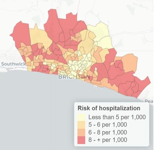
1. Introduction
What does national and local data reveal about how
  the coronavirus has impacted on our city, its
             residents, and services?
Since the coronavirus was recognised as a global pandemic, and particularly since
lockdown was announced in England on 23 March, we have been presented with an
ever-increasing amount of data describing the impacts of the virus (COVID-19). But
what does this data say about the impacts for our city and its residents? What are
transmission rates like in in our city, and how many people have sadly died,
directly or indirectly, from the virus? Have certain areas of the city been more
affected than others? Which groups have been adversely affected, if any? And what
has been the impact on our local hospitals and social care services?

In an attempt to answer these questions, Healthwatch Brighton and Hove has
examined a range of published data examining the wider health and societal
impacts of the coronavirus (COVID-19). Healthwatch has not produced any of the
data shown in this report and we identified most of the data on the UK
government, NHS and Office for National Statistics websites.

Unsurprisingly, making sense of the available data is challenging for a number of
reasons which are important to understand:
   • Data/reports often cover different time periods.
   • Data is analysed with a specific focus, meaning that comparisons or
      conclusions are hard, if not impossible, to make.
   • Data relies on how the raw dated is recorded. For example, data showing
      deaths related to COVID-19 only includes cases where this is specifically
      mentioned on the death certificate; whilst numbers of COVID-19 cases are
      only those which have been confirmed by a test. This means that the data
      does not fully reflect the whole picture i.e. there will be many more
      suspected cases involving COVID-19.
   • There are often delays in the data being reported.
   • The published data is rapidly changing. For example, in July, the
      government altered the way it reported on the number of confirmed cases
      of COVID-19 for each local authority. This resulted in a higher overall
      number of cases for Brighton and Hove, from 489 on 25th June to 764 on 2nd
      July. This change did not however represent an increase in new cases as the
      revised data was backdated. This demonstrates how rapidly the data is
      changing.
   • Much of the available data reflects the national picture only and has not
      been recreated locally.

Our report focusses on data pertinent to Brighton and Hove but we have also
included some national and regional data in Annex A, although this is limited.

The data described in this report is accurate as at the date of writing (July 2020).
And the picture we present will undoubtedly change.

                                          2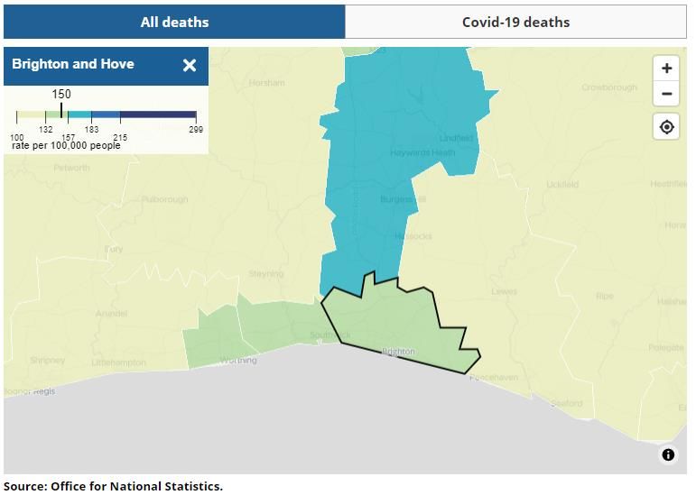
2. Executive summary of statistical data: July 2020
                  CONFIRMED CASES

                  As at the 15 July, the number of confirmed COVID-19
                  cases in the city stood at 779 (out of a local
                  population of 290,885). This is based on tests
                  conducted in both NHS and commercial laboratory
                  settings.

                  Data source: UK Government

                  NUMBER OF DEATHS

                  As at the 3 July, the number of deaths where COVID-
                  19 was mentioned on the death certificate, stood at
                  158. The total number of deaths (any cause up to 3
                  July) in the city as this date was 1,169. Data
                  source: Office for National Statistics

                  Separate data on the number of deaths occurring in
                  the period 1 March to 31 May 2020, indicates that
                  the Woodingdean area recorded the highest number
                  of deaths within the city, with 14 deaths. – Data
                  source: Office for National Statistics

                  LOCAL HOSPITALS

                  As at 15 July, 147 deaths were registered of patients
                  who had sadly died in hospitals within the Brighton
                  and Sussex University Hospital NHS Trust. These are
                  patients who had tested positive for COVID-19. Data
                  source: NHS England

                  Separate data has predicted where residents of the
                  city are at highest risk of hospitalisation from COVID-
                  19. The data suggests areas such as Saltdean,
                  Woodingdean, Mile Oak, Westdene and Hove
                  seafront. Data source: Oxford University

                  CARE HOMES

                  As at 9 July, 44 care homes in Brighton and Hove had
                  reported a suspected or confirmed outbreak of
                  COVID-19 to Public Health England. There are 92
                  care homes in our city. There is no indication of
                  whether the reported outbreaks were confirmed,
                  are still active or have been resolved.

                  Data source: UK Government
                                3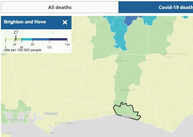
3. What the data reveals about Brighton and Hove
2.1     The first thing to note is that Healthwatch has identified fewer data
        publications showing the impact at the local level, so it is not possible to
        explore the full impact which COVID-19 has had on our city. For example,
        we have not been able to identify local data showing daily death rates or
        hospital admissions and discharges related to COVID-19, although this is not
        to say that the data is not available.

Covid-19 – key statistics for Brighton & Hove

2.2     In July, local data around COVID-19 since March 2020 was published on the
        Brighton and Hove Council website, including:
        a) the number of times people have been assessed through NHS helplines as
            having symptoms of COVID-19
        b) the number of confirmed cases of COVID-19
        c) the number of deaths in 2020 in Brighton & Hove.

2.3     The graphs (see below) are updated daily during the week, except for the
        number of deaths which is updated weekly.

Numbers assessed through NHS helplines up to 14 July 2020
2.4     Graph one below shows the number of assessments carried out by NHS
        helplines (111 and 999 phone calls and 111 online) for people who were
        assessed as having symptoms of COVID-19. The figures show the number of
        assessments and not the number of people who contacted the NHS. This
        data is an important early warning indicator and health experts have shown
        a strong association between changes in these figures and changes in the
        number of deaths from COVID-19 that happen 16 days later. The graph
        clearly shows the decline in assessments since March 2020.

Graph one: NHS 111/999 calls and 111 contacts, Brighton and Hove

This data is published daily by NHS Digital.
                                               4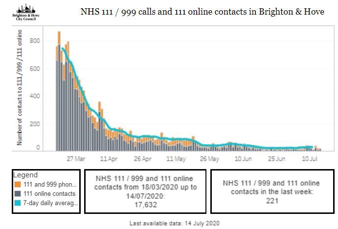
Confirmed cases of COVID-19 in Brighton and Hove

2.5    Graph two shows the number of confirmed COVID-19 cases in the city. It
       gives a rolling 7-day average which is a better indication of local trends than
       daily figures, which can go up and down a lot. This includes testing data
       from two of the four government pillars. Pillar 1 tests are those conducted
       within the NHS, and pillar 2 are those carried out by commercial
       laboratories (please refer to the glossary section for more information about
       pillars). The average numbers of confirmed cases have declined since April
       and remained low overall. Because numbers are low (no greater than 20
       over a 7-day period) then even a slight increase can reflect as a spike but
       this does not however represent a surge in new cases.

Graph two: confirmed COVID-19 cases, Brighton and Hove

This data is published by the Public Health England.

Brighton and Hove compared with other local authorities

2.6    In addition to the data published by the Council, the Local Government
       Association has produced a tool which allows comparisons between Brighton
       and Hove and the average of other English councils of the number of
       confirmed hospital cases of COVID-19. This data is collated by Public
       Health England and published on the Coronavirus (COVID-19) cases in the UK
       Dashboard.

2.7    We have included two graphs and one table which show data up to early
       July. These show the number of people affected by COVID-19 per 100,000 of
       the population. The population for Brighton is 290,885.
                                             5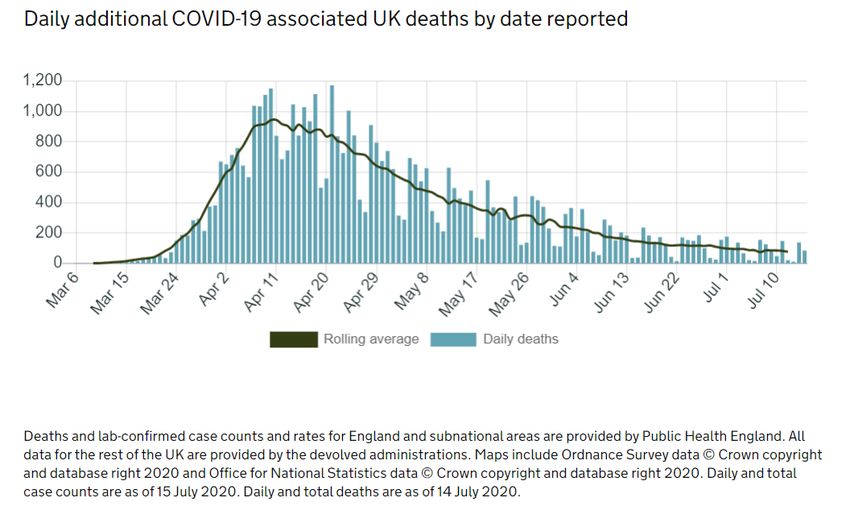
2.8   Table one and graph three shows that the cumulative (total) number of
      COVID-19 cases per 100,000 of the population is lower than the national
      Local Authority median. They show that numbers of reported COVID-19
      cases from hospitals in Brighton and Hove have remained lower than the
      median since reporting began.
2.9   Graph four shows the number of daily confirmed cases per 100,000 of the
      population. The peaks in the graph are misleading as the data relates to
      very small numbers of cases overall, and an increase of one or two cases can
      show what appears to be a peak in the graph.
Table one: Cumulative cases of COVID-19 (6 July)

Graph three: cumulative cases of COVID-19 per 100,000 people (11 July)

                                         6
Graph four: daily confirmed cases of COVID -19 per 100,000 people, Brighton and Hove
(11 July)

Deaths linked to COVID-19 in Brighton and Hove

2.10   Graph five (taken from the Brighton & Hove City Council key statistics
       website), and table 2 show:
       - The number of deaths of Brighton & Hove residents where COVID-19 was
          recorded on the death certificate (yellow)
       - The number of deaths with no mention of COVID-19 (grey)
       - The average number of deaths for the equivalent weeks in 2014-2018
          (blue)
       - The blue lines show if there are more deaths this year than on average.

2.11   The data shows the number of deaths by the week in which the death
       occurred, and include deaths registered up to eight days after they occurred
       (the date on the graph indicates the week ending on that date). This means
       the numbers are revised if more deaths are registered later which occurred
       in previous weeks.

2.12   The data indicates that the number of deaths related to COVID-19 has
       remained relatively low: the highest weekly count was 26 deaths recorded
       in the week ending 17 April 2020. The weekly number of COVID-19 deaths
       has been reducing since the end of May and have been averaging five or
       fewer since then. Graph 5 clearly shows the number of additional deaths
       which have been attributed to COVID-19, and that total deaths exceeded
       the previous 4-year average (2014-2019) in 11 of the 15 weeks shown.

                                         7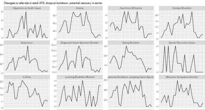
Graph five: deaths in Brighton and Hove (3 July)

Data is published by the Office for National Statistics.

Table two. The data shown in Graph 5 is also summarised in the table below.

   Week          COVID deaths         Non-COVID            Weekly total   5-year average
   ending          in week          deaths in week          number of       deaths per
                                                             deaths        week 2014-
                                                                              2018
 3.7.20                 1                  22                  23              37.2
 26.6.20                4                  38                  42               38
 19.6.20                2                  37                  39              28.4
 12.6.20                3                  23                  26              37.8
 5.6.20                 2                  22                  24               35
 29.5.20                5                  36                  41              35.6
 22.5.20                6                  29                  35               39
 15.5.20               17                  28                  45              35.2
 8.5.20                14                  39                  53              40.2
 1.5.20                14                  25                  39               37
 24.4.20               19                  42                  61               38
 17.4.20               26                  46                  72               42
 10.4.20               21                  42                  63              40.6
 3.4.20                16                  47                  63               42
 27.3.20                6                  54                  60              39.2

                                              8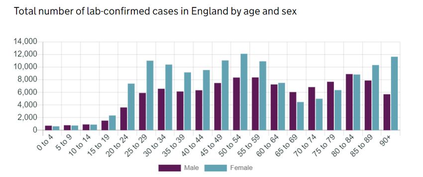
Death rates per 100,000 of the population

2.13. Another way of examining the data is to look at death rates per 100,000
      of the population. An interactive map produced by the Office for National
      Statistics allows us to see the death rates linked to COVID-19 per 100,000 of
      the population as well as all deaths registered regardless of cause for
      Brighton and Hove. This is shown in table three below where we have
      included rates for surrounding areas (this is not to provide a comparison
      which cannot be made given the different geographical areas, population
      densities and demography). Maps one and two provide a pictorial
      representation of this data.

      Table three: death rates per 100,000 people
                           Rates of deaths    All deaths (any
                           related to COVID   cause) per
                           per 100,000        100,000
                           population         population
      Brighton and Hove            27                 150
      Adur                         12                  12
      Mid Sussex                   36                 157
      Lewes                        24                 127
      Horsham                      18                 124

Map one: COVID-19 related death rates per 100,000 people in Brighton and
Hove

                                         9
Map two: death rates (all causes) per 100,000 people in Brighton and Hove
Deaths rates per 100,000 of the population compared with the rest of England
2.14 Data produced by the BBC taken from the Office for National Statistics
allows a comparison to be made between Brighton and Hove and England.
Graph six below shows the number of deaths per 100,000 residents, and the
average levels of deaths reported over the last 5 years. This shows that
Brighton and Hove mirrored the national trend with a peak in deaths related
to COVID-19 in April, followed by a downward trend thereafter. It now looks
as if the number of deaths related to COVID-19 in Brighton and Hove is no
longer significantly adding to the average number of deaths that would be
expected in a normal year i.e. the number of additional deaths from COVID
now appears to be very low (supported by table two above)
Graph six: death rates in Brighton and Hove, and England (3 July)
Deaths are death registrations where COVID-19 was mentioned on the death certificate.
Source: The Office for National Statistics, National Records for Scotland and Northern
Ireland Statistics and Research Agency – updated weekly.
Cases include positive tests of people in hospital and healthcare workers (Pillar 1) and
people tested in the wider population (Pillar 2).
10Deaths recorded by Brighton and Sussex University Hospitals NHS Trust
2.15 A limited amount of data is available showing deaths recorded by NHS Trust.
Our local Trust, Brighton and Sussex University Hospitals NHS Trust, has
recorded a total of 147 deaths since the beginning of the outbreak. This
data is published by NHS England and is available here: COVID 19 total
announced deaths 15 July 2020
2.16 For interest (comparisons are not appropriate) other Sussex Trusts have
recorded the following numbers of deaths:
Brighton and Sussex University NHS Trust ……………. 147
East Sussex Healthcare NHS Trust …………………………. 93
Surrey and Sussex Healthcare NHS Trust ………………. 259
Sussex Community NHS Foundation Trust …………….. 18
Western Sussex Hospitals NHS Foundation Trust ……. 113
Deaths recorded by area of the city
2.17 The Office for National Statistics has produced data on deaths involving
COVID-19 by local area. The data is available by postcode and relates to
something called “Middle Layer Super Output Areas”. These are areas with a
small statistical count (average around 7,000 people), but where each area
has a similarly sized population and remains stable over time. The Office for
National Statistics divided the city into 31 areas shown in table four.
2.18 Healthwatch examined an interactive map produced by the Office for
National Statitics which shows the number of deaths occurring in the
period 1 March 2020 and 31 May 2020 and registered by 6 June 2020,
where COVID-19 was mentioned as a cause on the death certificate. The
results are shown in table four and map three. The data indicates that the
highest number of deaths was recorded in the Woodingdean area of the city,
with 14 deaths.
2.19 In map three, each green circle is representative of the overall number of
recorded COVID-19 deaths, and so a larger circle indicates a higher number
of deaths. As can be seen in map three below the number of deaths where
COVID-19 is recorded on the death certificate is relatively low across the
entire city. It is important to note that this data only covers the period from
1 March to 31 May 2020 and the numbers of deaths are not equal to those
shown in the graphs produced by the Council.
11Map three and table four below both show: the number of deaths occurring in
the period 1 March 2020 and 31 May 2020 and registered by 6 June 2020,
where COVID-19 was mentioned as a cause on the death certificate
Table four
Area Dataset (up to May) – COVID-19 deaths
(as defined by ONS)
March April May Total
1. Aldrington 1 1 6 8
2. Aldrington South 1 3 1 5
3. Bevendean and Moulsecoomb 1 0 3 4
East
4. Brunswick 0 1 0 1
5. Coldean and Moulescoomb 0 1 1 2
North
6. Fiveways 0 0 1 1
7. Goldsmid West 1 2 4 7
8. Goldsmid East 0 0 1 1
9. Hangleton North 1 3 2 6
10. Hangleton South 2 6 1 9
11. Hollingbury 0 1 4 5
12. Hollingdean and Moulescoomb 0 3 1 4
West
13. Hove Central 0 0 1 1
14. Kemp Town 2 4 0 6
15. King Alfred 0 6 1 7
16. Mile Oak 0 4 0 4
17. North Laine and the Lanes 0 1 0 1
18. Roedean & Marina 0 9 1 10
19. Patcham East 4 2 1 7
20. Patcham West and Westdene 1 1 1 3
21. Portslade By Sea 0 2 2 4
1222. Portslade Village 0 4 0 4
23. Preston Park 0 6 0 6
24. Rottingdean and Saltdean 0 4 6 10
25. Roundhill 0 0 1 1
26. St James’s St and Queens Park 0 2 1 3
27. Seven Dials 1 1 0 2
28. West Blatchington 2 4 0 6
29. Whitehawk 0 2 0 2
30. Withdean Woods 0 0 1 1
31. Woodingdean 0 2 12 14
Total number of recorded deaths 1st March to 31st May 2020 145
Potential impacts of COVID-19 on hospitals
2.20 Healthwatch examined data showing potential impacts of COVID-19. An
online tool from Oxford University (The Leverhulme Centre for Demographic
Science project) has calculated data known to correlate to vulnerability to
coronavirus showing the risk of hospitalisation from COVID-19 in the city.
This includes factors such as age, social deprivation, population density,
ethnicity and hospital capacity. The data could be used to identify areas
that face higher disproportionate healthcare burdens due to COVID-19.
2.21 In Brighton and Hove, several areas are in the highest risk category shown in
red in the map of the city below. These included parts of North Portslade,
Hove and Portslade seafront, Patcham, the Hove Park area, Hangleton,
Whitehawk, Ovingdean, Woodingdean, Rottingdean and Saltdean. But the
risk of hospitalisation in Brighton city centre was largely less than five per
1,000.
Map four: risk of hospitalization by area of Brighton and Hove
13R Number and Growth rates in Brighton and Hove
2.22 There are different methods of estimating the transmission rate of COVID-19
and how fast this is rising, or declining. Two methods used by the
government are the Reproduction number (R number) and Growth rate.
The reproduction number (R) is the average number of secondary
infections produced by 1 infected person. A high R number implies the
transmission rate is increasing, a low number means it is declining.
The growth rate reflects how quickly the number of infections are changing
day-by-day. If the growth rate is greater than zero (+ positive), then the
disease will grow, and if the growth rate is less than zero then the disease
will shrink.
2.23 The first thing to note, is that neither method has produced meaningful
value at the local level and Brighton and Hove Council has previously
expressed concerns about data produced about local R numbers. But as the
data in this report shows, to date, the rate of diagnosed cases in our city
has been relatively low compared to the national picture.
2.24 Neither one measure, R nor growth rate, is better than the other but each
provide information that is useful in monitoring the spread of a disease. R
estimates do not tell us how quickly an epidemic is changing and different
diseases with the same R can result in epidemics that grow at very different
speeds. The R estimate and growth rates are not the only important
measures of the epidemic. Both should be considered alongside other
measures of the spread of disease, such as the number of people currently
infected.
2.25 Table five below shows that the R number for the South East is currently
0.8 – 1 and that the growth rate is currently estimated to be between -4 and
0. Data on transmission rates and the number of infections are changing
weekly.
Table five: R rates and growth rates per region of the UK (15 July)
Area R number Growth rate % per day
England 0.7-0.9 -5 to -2
East of England 0.7-1.0 -4 to +1
London 0.7-1.0 -5 to +1
Midlands 0.7-0.9 -6 to -2
North East & Yorkshire 0.7-1.0 -5 to -1
North West 0.7-1.0 -5 to -1
South East 0.8-1.0 -4 to 0
South West 0.7-1.1 -6 to +1
14Impact of COVID-19 on care homes in Brighton and Hove
2.26 Healthwatch has been looking at published data on the impact of COVID-19
care homes. Detailed data about the situation locally is difficult to track
down and as we move forward, it is to be hoped that data will become more
transparent. What is evident from national and local media coverage is that
a large proportion of care homes have reported either suspected or
confirmed cases of COVID-19.
2.27 Data routinely published by the government shows the weekly number and
percentage of care homes reporting a suspected or confirmed outbreak of
COVID-19. Reported cases have been steadily rising over recent weeks
across England and in the South East the level stands at 42.1%, which is the
fourth lowest out of nine regions.
2.28 We understand however that this data includes information from all types of
domiciliary care, and not just care homes. In addition, care homes which
report a suspected COVID-19 breakout but where test results subsequently
prove to be negative for COVID-19 are not removed from these statistics.
These factors may lead to over reporting.
Table six: % of care homes affected by COVID-19 (5 July)
Area % of care homes affected by
COVID-19
North East 54%
London 49.2%
North West 48.8%
Yorkshire and the Humber 47.3%
East of England 47.5%
South East 42.1%
West Midlands 40.7
East Midlands 35.8%
South West 29.7%
Impact of COVID-19 on mental health in Sussex
2.29 Healthwatch has not identified a comprehensive source of local data
showing the impacts of COVID-19 on the mental health of individuals, or on
related services. Data shared with Healthwatch by the Sussex Partnership
Foundation NHS Trust (SPFT) shows the impacts of COVID-19 on numbers
accessing mental health services, indicating a clear drop, although with
some signs of recovery beginning to show. Face to face contact dropped by
65% compared with expected levels. This is shown in graph seven.
15Graph seven: changes in referrals in adult services after lockdown
2.30. The SPFT modelling also shows how demand for services could increase after
COVID-19. This data relates to people who would have been expected to be
referred to services had COVID-19 not occurred. It is estimated that nearly
13,000 people in Sussex could also experience an increase in mental health
problems related to economic downturn.
Graph eight: potential referral surges to mental health services (modelling
only)
16Annex A. The national picture
This link provides data on the Number of coronavirus (COVID-19) cases and risk in
the UK. It shows that as of 15 July, the total number of deaths of people who have
had a positive test result for COVID was 45,053. The number of people who have
had a positive test result was 291,911.
Deaths linked to COVID-19
The way data on the numbers of deaths from Covid-19 changed in April, resulted in
an increase in overall numbers. The revised data showed deaths in all settings with
COVID-19 for the first-time including hospitals, care homes and the wider
community. The new figures did not show a sudden increase in the number of
deaths as it included retrospective data.
The government chart below shows the peak of additional deaths associated with
COVID-19 in April 2020, and the downward decline that has been evident since
early May. Additional deaths are how many more people than usual have died due
to the coronavirus. It was reported that by week 20 of 2020 the UK death toll -
inclusive of both COVID-19 related and non-COVID-19 deaths - was 21% higher than
the average of recent years meaning, for every five deaths that occur in the UK in
a normal year, six people have died this year to date.
Graph nine:
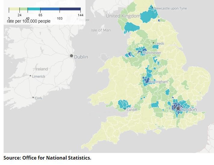
The ONS map on the next page shows the number of COVID-19 deaths across
England. Much of the country is shown in yellow indicating that the rate of deaths
per 100,000 people was 24 or lower. The rate in Brighton and Hove is 27 (see page
9 for more information) which means that whilst the local rate is not in the lowest
category it falls in the bottom part of the next category (shown in green). Areas
with higher rates appear to be largely urban regions.
17Map five: COVID-19 deaths across England.
Further ONS data shows provisional counts of the number of deaths and age-
standardised mortality rates involving the coronavirus (COVID-19) between 1 March
and 30 April 2020 in the UK. This ONS release has some interesting findings relating
to deaths from COVID-19:
• More deaths occurred in March and April 2020 than the five-year average in
all types of location, with care homes having 97.6% more deaths, at home
having 40.3% more deaths, hospitals having 22.9% more deaths, and those
dying elsewhere having 9.1% more deaths.
• The total number of deaths in the UK occurring in March and April 2020 that
were registered by 15 May 2020 was 147,785; this is 44,449 (43.0%) more
than the average for the same time period over the last five years, 2015 to
2019.
• Of the total number of deaths, 38,156 (25.8%) involved the coronavirus
(COVID-19); male deaths involving COVID-19 accounted for 56.6% of these,
with females accounting for 43.4%.
ONS data also shows that London had the highest age-standardised mortality rate
of deaths involving the coronavirus (COVID-19) occurring between 1 March 2020
and 31 May 2020 and registered by 6 June 2020. The South East had the second
lowest rate. This is shown in graph 10 below.
18Graph ten: age standardised mortality rates for death involving COVID-19 (1 March – 31
May)
The table below shows the affect that COVID-19 has had on older people (70 years
and over) up to 15 July, both in terms of confirmed cases and death rates. Overall,
the highest rate of death involving COVID-19 was in males aged 90 years and over.
Graph eleven:
19Annex B. Wider impacts
This section includes some limited data from reports which show the impacts of
COVID-19 on Black, Asian and minority ethnic (BAME) communities and people
living with a disability. This data only relates to the wider impacts and does not
show the impact at a local level. Healthwatch has not identified any local data.
The impact of COVID-19 on Black, Asian and minority ethnic (BAME)
communities.
A government report indicated that there is clear evidence that COVID-19 does not
affect all population groups equally. A review conducted by Public Health England
has shown that people of Bangladeshi ethnicity had around twice the risk of death
when compared to people of White British ethnicity. People of Chinese, Indian,
Pakistani, Other Asian, Caribbean and Other Black ethnicity had between 10 and
50% higher risk of death when compared to White British. Death rates from COVID-
19 were higher for Black and Asian ethnic groups when compared to White ethnic
groups.
A ONS report looked at deaths related to the coronavirus (COVID-19) by ethnic
group, including death counts, age-standardised mortality rates, and hazard rate
ratios by age, sex and ethnic group. This revealed that for all ages the rate of
deaths involving COVID-19 for Black males was 3.3 times greater than that for
White males of the same age, while the rate for Black females was 2.4 times
greater than for White females.
The Care Quality Commission published data on deaths in care settings broken
down by ethnicity. This data indicates a disproportionate number of deaths among
people from BME groups. They state that there is a lack of data on ethnicity across
adult social care as a whole. It shows that while the vast majority of all reported
deaths from adult social care settings were White people the proportion of deaths
in all adult social care services due to confirmed or suspected COVID-19 was higher
for Black (49%) and Asian (42%) people compared to White people (41%) and people
from mixed or multiple ethnic groups (41%).
The impact of COVID-19 on people with disabilities (14 May to 24 May
2020).
The Care Quality Commission has published data on deaths of people with a
learning disability to better understand the impact of coronavirus (COVID-19). This
analysis looked at all deaths notified to CQC (Care Quality Commission) between 10
April and 15 May. It shows that 386 people with a learning disability were receiving
care from services which provide support for people with a learning disability
and/or autism. For the same period last year 165 people with a learning disability,
some of whom may also be autistic, died who were receiving care from services
which provide support for people with a learning disability and/or autism. This is
a 134% increase in the number of death notifications this year. Of the 386 people
who have died this year, 206 were as a result of suspected and/or confirmed
COVID-19 as notified by the provider and 180 were not related to COVID-19.
20Glossary of some terms
Definition of testing pillars
• pillar 1: swab (antigen) testing in Public Health England (PHE) labs and NHS
hospitals for those with a clinical need, and health and care workers
• pillar 2: swab (antigen) testing for the wider population
• pillar 3: serology testing to show if people have antibodies from having had
coronavirus
• pillar 4: blood and swab testing for national surveillance supported by Public
Health England, the Office for National Statistics, and research, academic,
and scientific partners to learn more about the prevalence and spread of
the virus and for other testing research purposes, such as the accuracy and
ease of use of home testing.
Cumulative number
A running total, or cumulative sum. This is a sequence of partial sums of a given
data set. It is used to show the summation of data as it grows with time (updated
every time a new number is added to the sequence)
Median
Is a value separating the higher half from the lower half of a data sample. For a
data set, it may be thought of as "the middle" value. If all the individual data is
listed the median is the one half way along that list.
The reproduction number (R)
is the average number of secondary infections produced by 1 infected person. A
high R number implies the transmission rate is increasing, a low number means it is
declining. The R number range for the UK as a whole is currently estimated to be
between 0.7-0.9 as of 5 June 2020 which implies the transmission rate is declining
(for up-to-date numbers of coronavirus (COVID-19) cases and risk in the UK,
click here).
The growth rate
Reflects how quickly the number of infections are changing day-by-day. It is an
approximation of the change of number infections each day and If the growth rate
is greater than zero (+ positive), then the disease will grow, and if the growth rate
is less than zero then the disease will shrink. The size of the growth rate indicates
the speed of change. A growth rate of +5% will grow faster than one with a growth
rate of +1%. Likewise, a disease with a growth rate of -4% will be shrinking faster
than a disease with growth rate of -1%. The current growth rate for the UK as a
whole is -4% to -2% which implies that infection rates are shrinking.
21How to contact Healthwatch
Healthwatch Brighton and Hove:
Healthwatch Brighton and Hove
Community Base
113 Queens Road,
Brighton
BN1 3XG
Share your experiences of health and social care services with us:
office@healthwatchbrightonandhove.co.uk
01273 234040
Facebook @healthwatchbrightonandhove
Twitter @HealthwatchBH
Instagram healthwatchbh
Website: www.healthwatchbrightonandhove.co.uk
22You can also read