Presentation-Oriented Visualization Techniques
←
→
Page content transcription
If your browser does not render page correctly, please read the page content below
Visualization Viewpoints
                                                                                             Editor:
                                                                                             Theresa-Marie Rhyne

    Presentation-Oriented Visualization Techniques
    Robert Kosara
    Tableau Research

    D        ata visualization research focuses on
             data exploration and analysis, yet the
             vast majority of visualizations people see
    were created for a different purpose: presentation.
    Whether we are talking about charts showing data
                                                                  Two criteria are specific to presentation tech-
                                                               niques, but not helpful (or even counterproduc-
                                                               tive) for analysis: memorability and engagement.
                                                                  Memory is not a goal in analysis, where the user
                                                               wants to switch between many different views
    to help make a presenter’s point, data visuals cre-        and ask many different questions (see Figure 1).
    ated to accompany a news story, or the ubiquitous          Unique, memorable charts would be more confus-
    infographics, many more people consume charts              ing and distracting than useful in that context.
    than make them.                                            But presentation is all about getting a point across
      The techniques used to present data are mostly           and making it stick. To achieve that goal, there
    those used in analysis: bar charts, line charts, and       need to be hooks your audience’s memories can
    so on. Although we understand them well, that              latch onto. The slick, clean, but forgettable stan-
    understanding is based on their role in analysis.          dard chart types don’t help with that. More un-
    What if the presentation goals were different?             usual techniques that create memorable shapes, or
    How would that impact how the techniques we                that allow the use of icons to represent what the
    used? And are there techniques uniquely suited to          data is about, will be more memorable.
    data presentation but not necessarily as ideal for            To get people to actually pay attention to a pre-
    exploration and analysis?                                  sentation, they need to find the views interesting
      Meet the class of visualization techniques I call        and engaging. This is not only important in a news
    presentation-oriented techniques. Let’s turn around        media setting, where a story needs to stand out
    the usual view of visualization that treats presen-        among many distractions, but also when trying to
    tation as an afterthought and instead focus on             keep an audience’s attention during a long presen-
    this use. These techniques are not restricted to           tation. Learnability is part of this, especially for
    presentation, but I consider their usefulness for          unusual techniques. If the way the visualization
    presentation first and any usefulness for analysis         works cannot be grasped quickly, potential viewers
    as merely a nice bonus.                                    will get frustrated and move on.
                                                                  The second pair of criteria goes against the
    Criteria and Goals                                         ideas much visualization research is based on. I
    First, we need to look at what data presentation           argue that presentation-oriented techniques need
    and communication mean in terms of what we                 to be specific rather than general and compact rather
    expect from the techniques. In analysis, we tend           than scalable.
    to use the same techniques everywhere because we              Of course it’s important to have analysis tech-
    know they almost always work. Bar charts, scat-            niques that don’t turn into an unreadable mess
    terplots, and such are great tools for that purpose,       when you apply a filter or change the mapping on
    but presenting different data with the same tech-          one of your axes—that would disrupt the flow of
    niques will not help make a lasting impression.            the analysis. But that is not a concern in presenta-
    Did that last bar chart you saw show the number            tions. A presentation is much more deliberate and
    of cell phones used or life expectancy? Which of           curated, so it can use niche techniques that only
    the 15 scatterplots was the one showing correla-           work in a small number of cases. For example, news
    tion between income and fertility rate?                    media like The New York Times and The Washing-

6   Janaury/February 2016                 Published by the IEEE Computer Society           0272-1716/16/$33.00 © 2016 IEEE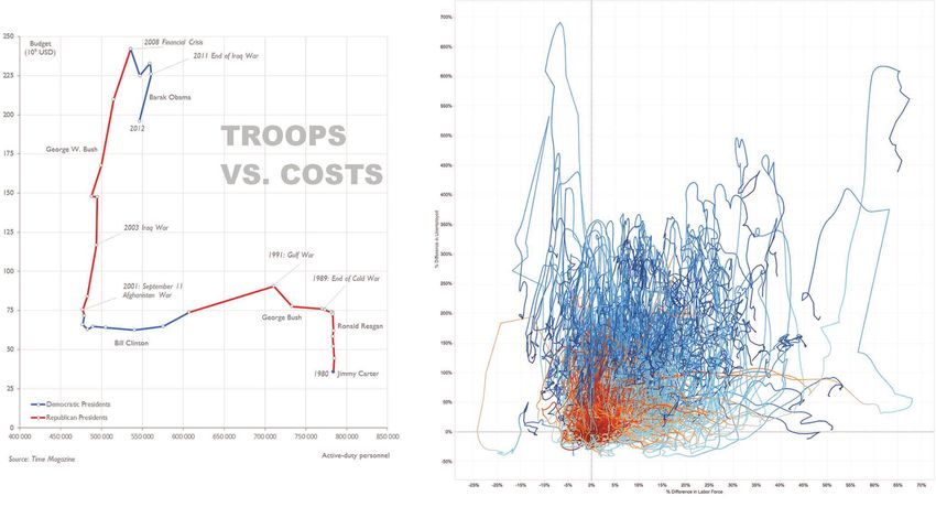
Figure 1. Example of a typical analysis session showing business data. Such line charts are effective but
forgettable, which is fine in an analysis setting. The requirements are different in presentation, however.

ton Post can explore unusual and niche techniques:        to different data and custom-built information
they want something that works for a particular           graphics (such as the ones Nigel Holmes created1).
dataset without worrying about generality.                Custom designs are clearly outside the scope of
   Finally, presentation techniques do not need to        visualization, whereas techniques—however lim-
scale as much as ones used for analysis. Although         ited—fit.
the data amounts used during analysis can be
huge, results are usually presented at a much             ISOTYPE
coarser level or with a much smaller subset of the        It’s not always clear why techniques were devel-
data. Scaling to large data is a general problem in       oped, and sometimes the initial idea was really
visualization, but most techniques can handle at          analysis rather than presentation. This is not the
least thousands of data points. Most presentation         case with the International System of Typographic
techniques do not, but that’s okay; they don’t usu-       Picture Education (ISOTYPE), however. Otto and
ally need to. Their ability to present a few dozen        Marie Neurath developed it in the 1930s to com-
or maybe hundreds of data points well is all that’s       municate knowledge through data, rather than for
needed for most use cases.                                analysis.2
   Just as certain general analysis techniques work          ISOTYPE is a broad system, but its most inter-
well for certain types of questions—scatterplots          esting feature from a visualization point of view
for finding correlations, bar charts for ranking          are the unit charts, which stack objects on top of
and comparison, and so on—presentation-oriented           or next to each other to represent quantities (see
techniques have particular strengths that make            Figure 2). Each little symbol represents a multiple,
them well suited for certain uses and datasets.           such as 10,000 workers or 5 million heads of cattle.
Understanding these is important to turning pre-          On a higher level, these charts can still be read as
sentation into a first-class citizen in visualization.    bar charts by comparing the length of the result-
   There is a key difference, however, between            ing bars. They are also quite universal because the
techniques that may be limited but still applicable       objects are recognizable across language barriers

                                                                      IEEE Computer Graphics and Applications   7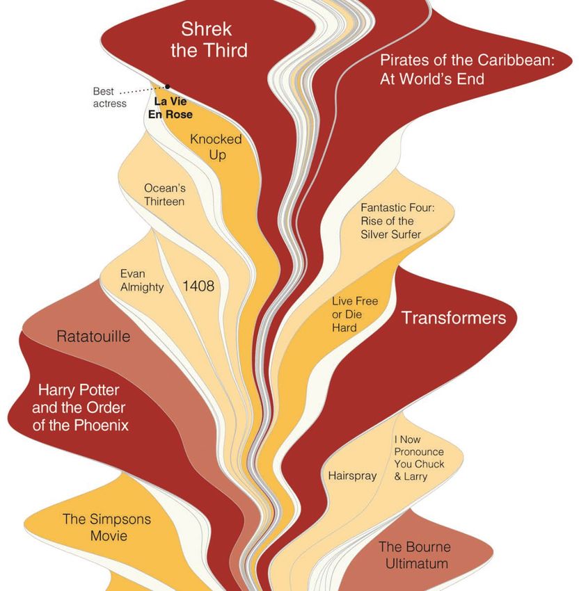
Visualization Viewpoints

                                                                           ues), which restricts the use to cases where the
                                                                           samples are equidistant. This is commonly the
                                                                           case for data that is reported on a schedule (such
                                                                           as monthly, quarterly, or yearly), however, which
                                                                           is of interest for news pieces.
                                                                              The great strength of the connected scatterplot
                                                                           is the interesting shape it can create, which invites
                                                                           closer study. It also lends itself to annotation, both
                                                                           of points and stretches of the line with particular
                                                                           shapes or directions (which all encode certain pat-
                                                                           terns between the two time series). We recently
                                                                           studied the technique5 and found that users were
                                                                           able to read and understand the charts. They also
Figure 2. ISOTYPE charts stack objects on top of or next to each other     found them more engaging than dual-axis line
to represent quantities. Our study found that the technique does not       charts of the same data.
hurt reading, but does help memory and produces charts that are more          That said, the technique often fails. Tangled lines
engaging.3                                                                 that are otherwise the domain of node-link dia-
                                                                           grams are common, as are jaggy shapes that are
                  and do not require viewers to read a title or legend.    hard to read and comprehend. The pay-off in the
                     In a recent paper, Steve Haroz, Steven Franco-        cases where it works is an engaging and interest-
                  neri, and I showed that ISOTYPE charts are equal         ing technique that provides for much more inter-
                  in terms of reading speed and accuracy to bar            esting reading than dual-axis line charts or small
                  charts, and the added visual information helps           multiples.
                  people remember what they saw.3 We did not find
                  a single instance where an ISOTYPE chart per-            ThemeRiver and Streamgraph
                  formed worse than a bar chart.                           The ThemeRiver was published in 2001 without
                     Clearly, ISOTYPE charts are not likely to be use-     much fanfare.6 Several years later, the rather simi-
                  ful in analysis. Finding good shapes to represent        lar Streamgraph caused quite a stir at InfoVis 2008
                  the different categories is a nontrivial problem.        (see Figure 4).7 Streamgraph was used in a New
                  The numbers each object represents would also            York Times piece about blockbuster movies8 that
                  keep changing throughout an analysis session             won some of the most prestigious awards in news
                  as the user filters the data, which would require        graphics, including Best of Show at Malofiej 2009,
                  readjusting that number. And the memory ben-             the Pulitzer Prize for News Graphics.
                  efits are of little use when digging through data,          At the InfoVis conference, however, there was
                  where remembering individual charts is simply            much criticism of the Streamgraph: it’s a stacked
                  not important.                                           area chart with many irregularly shaped items
                     However, none of this takes away from the use-        stacked on top of each other, making precise read-
                  fulness of ISOTYPE as a visually compelling, read-       ing of any one of them impossible. But it worked
                  able, and friendly way of representing information.      to show the common shapes of the key blockbust-
                  It is an effective presentation-oriented technique.      ers: a quick increase and a smoother but relatively
                                                                           quick drop back to almost zero. It also made for a
                  The Connected Scatterplot                                much more interesting and exciting piece than a
                  A technique that has seen some use in the news           proven, general, but boring chart like so many area
                  media in recent years, but hasn’t gotten any atten-      or bar charts in small multiples would have.
                  tion from the research community so far, is the             ThemeRiver and Streamgraph are not general
                  connected scatterplot. It’s a simple technique at its    techniques. I’ve seen implementations of the
                  core but can be visually interesting and effective. It   ThemeRiver that tried to deal with spiky data or
                  also fails spectacularly for many datasets.              many streams, and they were a disaster. The tech-
                     As the name suggests, the technique consists of       nique does not scale beyond 20 or so streams, and
                  a scatterplot with points that are connected in a        it does not work well when the width of the stream
                  sequence, which is usually temporal (see Figure          changes dramatically between time steps. It also
                  3).5 This means that the two axes really represent       isn’t appropriate for streams that appear and dis-
                  two time series, with points that coincide in time.      appear suddenly. But it does work well for some
                  The resulting chart shows time along the line but        uses, where the point is more the overall shape
                  does not show distance in time (only in the val-         and relative width of a small number of streams,

8                 January/February 2015
(a) (b)
Figure 3. The connected scatterplot technique. This example plots two time series against each other, one on each axis.
(a) This can work well to show data and allow for annotations, (b) but it can also devolve into an incomprehensible hairball.
Understanding the limitations of the technique helps make the right choice. (Left image courtesy of Jorge Camoes.4)
or where the shapes of most of the streams are
similar and only large differences in size are of in-
terest. Those are perfectly valid presentation uses
for this technique.
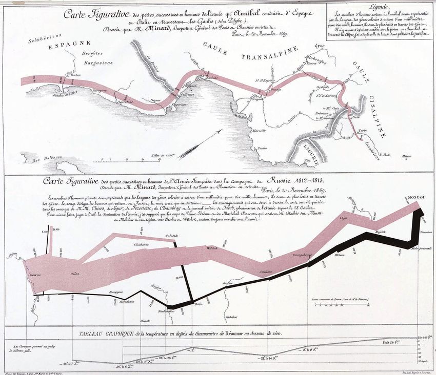
Napoleon’s and Hannibal’s Troop Movements
Charles Minard’s depiction of the number of soldiers
in Napoleon’s army during the 1812/1813 Russian
campaign is perhaps the most famous example of
data visualization (see Figure 5, top). Often referred
to as Napoleon’s March, it uses a technique that is
sometimes called a flow map, sometimes compared
with a Sankey diagram, and some might argue that
it is really a connected scatterplot.
Whatever the case may be, it is not a com-
monly useful technique. While the variations on
the famous chart are legion (and mostly terrible9),
the technique is not one you actually find used
in many other cases. There is no question that it
works well for this particular data and use, but
it does not lend itself well to other datasets, and
certainly not analysis.
It is so limited, in fact, that even Minard strug-
gled to use it for another, similar map. On the same
sheet as the map of Napoleon’s troop movements Figure 4. A Streamgraph example. The similar ThemeRiver was
(also dated 20 November 1869), he drew a map introduced as an analytic tool, but both have limitations that make
of Hannibal’s troops crossing the Alps in 218 BCE them mostly useful when the number of streams and their shapes can
(see Figure 5, bottom). Unfortunately, Hannibal be precisely controlled. This Streamgraph shows the ebb and flow of
did not conveniently travel from west to east for weekly movie box office revenues over time. (Courtesy of Lee Byron and
a neat left-to-right movement, but at an annoying Martin Wattenberg.7 )
IEEE Computer Graphics and Applications 9Visualization Viewpoints
Figure 5. Minard march visualizations. (bottom) Minard’s famous visualization of the troop strength in Napoleon’s army is a
decidedly single-use technique that does not generalize well and depends on the shape of the particular dataset shown. (top)
Even Minard recognized this when creating this chart showing Hannibal’s troops crossing the Alps, which required rotating the
underlying map. (Courtesy of École nationale des ponts et chaussées.)
angle along the Spanish, French, and Italian coasts. that accompany news stories, information graphics,
Minard’s solution was to rotate the map clockwise and informational pamphlets.
45 degrees to create a more readable version than Pie charts are often used to present, rather than
the more common north-is-up orientation. to analyze, data. That needs to be taken into ac-
Minard’s map is certainly impressive, but it count when evaluating their usefulness. Perhaps
needs to be seen for what it is: a tool for data pre- the pie chart’s attractiveness and familiarity out-
sentation, not analysis, of a very particular data- weigh its low precision when a number of condi-
set (and also a historical document). It does not tions hold, such as the number of items being low
generalize well to other data, in particular when or the differences between values being large. It
the direction of travel does not coincide with our might get the attention that a bar chart won’t.
common Western, left-to-right reading direction. The Voronoi treemap10 is an interesting exercise
and visually attractive, but it is much less readable
Presentation Contexts than the more traditional rectangular treemap. It
Many techniques are used in presentation contexts, has been used in a number of information graphics
regardless of whether they are primarily analysis or and news stories to show part-whole data. While
presentation techniques. These include graphics clearly more visually appealing and engaging than
10 January/February 2015the rectangular treemap, it is also more limited in References
the number of data items it can show. Compared 1. S. Bateman et al., “Useful Junk? The Effects of Visual
with a pie chart, it may be more readable when the Embellishment on Comprehension and Memorability
range between small and large values is large be- of Charts,” Proc. SIGCHI Conf. Human Factors in
cause thin pie slices become even harder to judge. Computing Systems (CHI), 2010, pp. 2573–2582.
It is certainly much more interesting to look at 2. O. Neurath, From Hieroglyphs to Isotype: A Visual
and more unusual, though. Autobiography, Hyphen Press, 2010.
Presentation is a concern that can go beyond 3. S. Haroz, R. Kosara, and S. L. Franconeri, “ISOTYPE
the pure representation of data. Periscopic’s gun Visualization – Working Memory, Performance, and
deaths piece adds to the actual data of homicide Engagement with Pictographs,” Proc. SIGCHI Conf.
victims by extrapolating their potential lifespans.11 Human Factors in Computing Systems (CHI), 2015,
Whatever the merits of doing this, the way the pp. 1191–1200.
data is depicted is unique and does not fit any 4. J. Camoes, “Chart Redraw: Troops vs. Cost (Time
existing category. It does not appear to be terri- Magazine),” 2013; www.excelcharts.com/blog/redraw
bly effective for analysis, but it is impressive (and -troops-vs-cost-time-magazine/.
memorable) as a presentation piece. 5. S. Haroz, R. Kosara, and S.L. Franconeri, “The
There are more techniques that are more com- Connected Scatterplot for Presenting Paired Time
monly used in presentation than analysis, includ- Series,” IEEE Trans. Visualization and Computer
ing Sankey diagrams, unit charts (like ISOTYPE), Graphics (TVCG), preprint, 20 Nov. 2015, doi:10.1109/
bubble charts, and word clouds. A technique does TVCG.2015.2502587.
not exist in isolation, and it can be more or less 6. S. Havre, B. Hetzler, and L. Nowell, “ThemeRiver:
effective depending on where and how it is used. Visualizing Theme Changes over Time,” Proc. IEEE
Symp. Information Visualization, 2000, pp. 115–123.
N
7. L. Byron and M. Wattenberg, “Stacked Graphs:
ews graphics are fascinating because journal- Geometry & Aesthetics,” IEEE Trans. Visualization
ists seem much more willing to experiment and Computer Graphics, vol. 14, no. 6, 2008, pp.
beyond currently established ideas than most 1245–1252.
academics. The results don’t always work, but the 8. M. Bloch et al., “The Ebb and Flow of Movies: Box
experiment is still valuable. We can learn much Office Receipts 1986–2008,” New York Times, 23 Feb.
more from failure than from not trying. 2008; www.nytimes.com/interactive/2008/02/23/
Even the resulting ideas that do work are often movies/20080223_REVENUE_GRAPHIC.html?_r=0.
limited. Rather than lamenting those limitations 9. M.-J. Kraak, Mapping Time: Illustrated by Minard’s
and ignoring the techniques, academic research in Map of Napoleon’s Russian Campaign of 1812, Esri
visualization would do well to study and under- Press, 2014.
stand them. There are undoubtedly interesting and 10. M. Balzer and O. Deussen, “Voronoi Treemaps,”
important lessons to be learned. Limitations can Proc. IEEE Symp. Information Visualization, 2005, pp.
also be valuable when they demonstrate issues or 49–56.
mechanisms that underlie visualization. 11. Periscopic, “U.S. Gun Deaths in 2013,” http://guns.
I believe that it is paramount for the academic periscopic.com.
visualization field to start thinking about pre-
sentation as an equal part of data visualization, Robert Kosara is research scientist at Tableau Research.
together with exploration and analysis. Ignoring Contact him at rkosara@tableau.com.
the cutting edge of visualization work that is be-
ing done outside of academia would be a mistake, Contact department editor T heresa-Marie Rhyne at
and much of this work is focused on presentation. theresamarierhyne@gmail.com.
We need to develop the tools and criteria to un-
derstand those techniques and their use cases, so
we can understand how and when they work, and
when they do not. Then we can come up with new
ways of representing data that are effective under
these criteria and guide people who want to use
the best means for presenting their data and in-
sights. We have a good body of existing work for
data analysis in visualization. It’s time we started Selected CS articles and columns are also available
to build up the same for data presentation. for free at http://ComputingNow.computer.org.
IEEE Computer Graphics and Applications 11You can also read