CASE CARDS
HOW CAN MODERN VISITOR GUIDANCE BE
INCORPORATED INTO MUSEUM PLANNING
(BUILDING AND EXHIBITION SPACE)?
←
→
Page content transcription
If your browser does not render page correctly, please read the page content below
CASE CARDS HOW CAN MODERN VISITOR GUIDANCE BE INCORPORATED INTO MUSEUM PLANNING (BUILDING AND EXHIBITION SPACE)?
Royal Museums Greenwich and CCD

           Who RMG and CCD (UK)                                                              What Wayfinding systems

         Where London, UK                                                                    When 2018

    Description In 2018, to accompany the opening of four new galleries, Royal Museums Greenwich (RMG) undertook the development of a new wayfinding
                   system aimed at visitor experience enhancement. For this, they teamed up with the London-based service design provider CCD. According to
                   CCD, the new wayfinding scheme needed to align with Royal Museums Greenwich’s new brand strategy, launched in April 2018, positioning
                   the museum as “an epic place of exploration”. Museum’s aims encompassed showcasing the world-class collections and encouraging wider
                   awareness, visitation and up-sell to the other Royal Museums Greenwich sites: Royal Observatory, Cutty Sark and Queen’s House.

                   CCD and National Maritime Museum
                   Challenges:
                         − the architectural disconnect between the original museum building and the extension (the task was to make the museum
                              permeable and unite the two spaces);
                         − in the course of gathering feedback from the staff and visitors within workshops, it was identified that visitors struggled to find
                              facilities, such as toilets and were often unaware that there were two entrances.

                   Generally, the project was meant to tackle three major issues: visitors weren’t leaving the ground floor, the existing wayfinding lacked visual
                   appeal and the museum lacked clear orientation and flow.
                   Methods used to understand visitors and develop a holistic view of their experience:
                        − behavioural observations;
                        − working “undercover” and asking visitors where to find specific things;
                        − interviews with visitors (revealing exhibitions or notable pieces visitors weren’t aware of, missed or couldn’t find).

                   CCD underline that the above research helped to learn more about the visitor experience, including its before and after-visit phases (arriving in
                   the area, navigating to the museum, exploration and discovery at the museum and onward travel or activities).
                   According to CCD, the boldness and non-conventionality of their approach to RMG entailed departure from standard museum wayfinding that is
                   usually text-based and reliant on mapping. The approach, thus, comprised:
                         − establishing a certain hierarchy of information within signage that was offering a preview of what can be seen in the museum and
                               aimed at nudging the visitors to explore it;
                         − the wayfinding design was extended to digital screens and info desks at the entrances.

                   CCD and the in-house design team co-designed the so-called “Welcome Hubs”, large-scale displays acting as an access point to find out more
                   about the museum offers (through maps and “what’s on” information). These hubs also highlight the three other RMG institutions, urging
                   visitors to continue their exploration and discovery of the family.
Wayfinding
design solutions:
     − a bespoke set of pictograms was designed to provide maximum legibility and to align with National Maritime Museum’s branding.
           RMG have originally used the font Cera Pro for all their communications, so CCD designed the pictograms to match the
           characteristics of Cera and to make them “look and feel like an extension of the character set”.

     − signs made out of laser-cut aluminium, in a battleship grey to match the museum’s colour, featuring a bespoke nautical-themed
       pattern “inspired by movement through water and windspeed maps”;
     − a pinboard mechanism with wayfinding panels attached – white, with “highly legible”, “bold” text and featuring imagery from
       around the gallery (providing so-called highlights of what can be discovered in the museum);
     − the flexibility of the whole system providing an opportunity for the museum to make quick and easy updates as exhibitions change;
     − the split of the gallery into zones, with a north, east, south and west wing, “following the nautical theme and making it easier for
       people to find specific galleries”;
     − cafés, shops and toilets highlighted in blue on every museum map (the same colour demarcates a dedicated strip of facilities
       information placed at the foot of directional signs).
CCD highlight that the wayfinding needed to echo the museum’s theme and “to encourage visitors to do as maritime adventurers did before
them: explore and discover”. Inspired by the museum’s maritime heritage, the laser-cut bespoke water pattern on the aluminium was
designed and installed on the ceiling next to the Welcome Hubs. This acts as a pinboard system to mount multi-sized panels with 3D-printed
fixing plugs, aligning to a square grid. This gives the NMM flexibility to update or re-arrange panels, introduce digital signage or even
donation touch points.
The project for National Maritime Museum led CCD to further work with RMG, comprising the development of the wayfinding strategy and
design for the Prince Philip Maritime Collections Centre and Cutty Sark.

CCD and Cutty Sark
After completion of the wayfinding project for the National Maritime Museum, CCD was invited to design a new wayfinding scheme for
another RMG’s member, Cutty Sark. Once again, the design of the wayfinding had to encompass the peculiarities of Cutty Sark and, at the
same time, to align with Royal Museums’ Greenwich brand. Cutty Sark is an iconic British clipper ship built in Scotland in 1869. It is famous
for being one of the last tea clippers to be built and one of the fastest.

Project’s challenges:
      − to maintain a pattern design that was similar in style to the pattern used at the National Maritime Museum, yet unique to Cutty
            Sark;
      − the ship itself was considered an object and part of the collection.

Additionally, as the ship itself is an historic piece there were practical constraints, such as limitations in regard to fixing signage to the ship
itself. The product design used creative fixing methods such as wrapping signs around existing architecture and using high strength magnets.

CCD’s visitor research at the initial phase of the wayfinding system development identified:
     − the route around the ship wasn’t immediately obvious;
     − visitors got confused and lost and even missed sections of the ship (e.g. the tower connecting parts of the ship felt more like a
            back-of-house area, rather than a through-route to the next part of the visitor journey).

Wayfinding solutions:
     − “arrival” signs at each level featured a brand new map design so visitors could understand where they are;
     − the signs were finished in a real metal copper paint to match the cladding of the ship’s hull which was the central element in
          terms of design;
     − directional signs were placed in key locations encouraging visitors to keep moving through the tower down to see under the hull of
          the ship – arguably one of the ship’s best features and the one that some visitors were missing during their visit;
     − strategically positioned simple directional signs to keep visitors on the right route around, up and down the levels.
Benefits        − a careful visitor behaviour research through a number of means providing the insights to lean the process of wayfinding system
                           development on;
                         − the signage system with an accent on certain highlights and featured galleries from where further signs help visitors explore more
                           of the museum.

Additional info & Transform Awards Europe 2019, Winner (Gold), Wayfinding or Signage award
       comments British Sign Awards 2018: Highly Commended – Wayfinding Scheme of the Year award

         Contacts RMG:                                                                       CCD:
                    Ritchie Forbes                                                          Chris Girling
                    Visitor Experience Manager                                              Head of Wayfinding
                    rforbes@rmg.co.uk                                                       chris.girling@designbyccd.com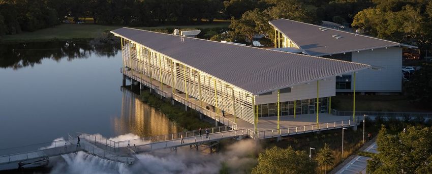
Applied

           Who Applied (UK)                                                                   What Wayfinding systems

          Where London, UK                                                                   When ongoing

    Description Applied is a design and wayfinding studio “with a blend of complimentary urban and information skills”. The company operates for more than
                   20 years and has offices in New York, Vancouver, Montréal and Seoul. Applied’s focus is on making journeys through spaces effortless “by
                   better explaining environments and making them more intuitive, legible and memorable”. In company’s portfolio, there are collaborations with
                   Google, Princeton University, Heathrow Airport, Transport for London, Metrolinx, Queen Elizabeth Olympic Park and many more. Applied
                   delivered assistance in wayfinding systems development to such well-known cultural institutions as The MET and The National Gallery London.
                   Sharing their approach to the wayfinding systems development for cultural institutions, Applied highlight four areas and major questions focus
                   on which is essential for delivering meaningful experience to visitors:
                         − people: who is the audience; how do they experience the museum; how can you ensure an equitable experience for all, which
                              communities are the museum's focus – local, domestic, international, academic, specialist;
                         − place: how easy or intuitive is the museum to find, enter and navigate; how legible is the building; what does the museum offer
                              – galleries, exhibitions, events, retail, free or paid; is it part of a campus, partnership or museum group;
                         − experience: what kind of experience does the museum provide – hands-on, active, passive; pre and post-visit experiences;
                              curatorial, educational, or informational focus;
                         − organisation: what are the museum's objectives for its visitors and for wayfinding; does its budgets, operational capacity, and
                              capability align with its objectives.
                   Aligning these four factors is of a crucial importance for the success of the project and requires from the museum adopting a clear strategy,
                   supported by the teams who will implement, maintain and adapt the system.

                   Challenges
                   Based on their experience with cultural institutions, Applied underline that what makes museums unique is the motivations of the institutions
                   and the mindsets of the people who visit them. Wayfinding system must weave together three interdependencies of the museum navigation
                   experience – curatorial, educational and informational. Additionally, these three elements should be tightly wound, seamless and almost
                   indistinguishable, in a way that is not emulated in other environments. Thus, the team thinks of this part “as similar to the role of a valet, a
                   briefing, guiding hand that appears when needed” and sees the challenge in getting this balance right.

                   The Met
                   The Met welcomes 7 million visitors a year. Being one of the world’s largest museums, The Met offers around 250 exhibition rooms to be
                   explored. As a result, the museum forms a very busy and complex space to navigate. Applied underline that “unsurprisingly, research showed
                   how little visitors could see in one visit”. Hence, company’s strategy was aimed at reimagining the wayfinding experience in order to increase
                   visitor confidence in exploration of the museum’s space. To achieve feasible results, Applied held visitor flow modelling which showed the
                   necessity to re-configure the layout and naming of key spaces.
                   Applied reveal that the key aspects of The Met were to simplify the layout in order to make the building more legible and to bring the content
                   to the foreground. It was done by introducing a digital mapping system that connected the visitor experience. The printed guides and wall
                   maps used in the museum were derived from the same data as its digital mapping, which could be interrogated down to individual artefacts
                   and art-specific content.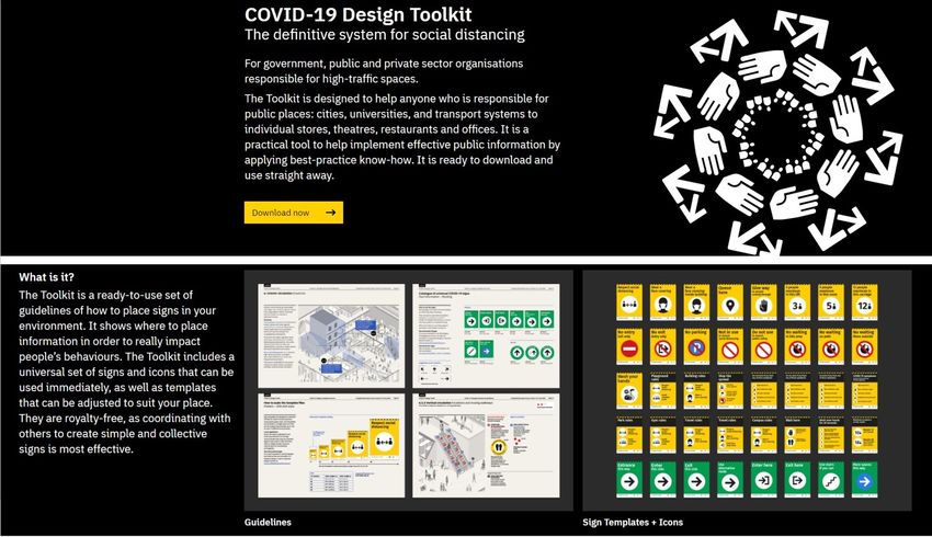
Approach and realisation
     − mapping information (50% of visitors pick up the new printed map);
     − optimisation of the visitor information placement (information placed in the right place allows visitors to better explore the
          museum);
     − offering information in multiple languages (maps and information is available in eleven languages);
     − introduction of the digital interactive map (an interactive version of the map for the Met’s website and mobile apps, powered by
          Living Map technology, providing extra information on every gallery);
     − graphic representation (landmarks proved to be valuable markers to help understand location throughout the complex interior
          spaces; determined according to their wayfinding significance, they help visitors recall location and make better decisions);
     − custom, user-tested wayfinding icons for use on signage and mapping applications (each icon is crafted at two levels of detail for
          different applications).

Challenges
At The Met, the Great Hall is an asset and a liability. It is an exceptional and beautiful space that functions as the museum's front door
welcoming 6 million visitors per year before they pay to enter, and it is the key orientation space for visitors after they have paid to enter.
These twin functions created a series of conflicting behaviours – dwelling vs movement, browsing vs finding, paid vs unpaid, familiarisation vs
awareness – which in turn felt chaotic and created a poor visitor experience. Within the confines of the project, Applied redesigned the Great
Hall to optimise all movements supporting clear behaviours allowing visitors to enjoy the space as intended.

The National Gallery
The National Gallery is a renowned cultural institution which hosts more than 6 million annual visitors. Among a number of visitor issues the
institution addressed Applied with, the 19th Century Portico entrance which was struggling to perform as a 21st Century welcome, confusing
visitors at the start of their viewing experience. Thus, the key aspects of the National Gallery were to help create a better arrival experience
connected to a logical flow through the building. This required clear and intuitive sequencing on arrival and guidance through a series of
           nudges for curated experiences.
           Applied’s wayfinding strategy identified the key issues and highlighted the principal interventions needed to improve the visitor experience. This
           involved a comprehensive overhaul in the museum’s signage and printed maps, to promote primary pathways of the building and architectural
           changes, to open up view-lines.
           Interestingly, The National Gallery’s intimate structure offering a wandering experience as if the journey around someone’s Georgian house
           had wayfinding implications. According to Applied, too many signs would ruin this unique atmosphere, too few would leave visitors feeling lost
           and unable to explore the space.

           Approach and realisation:
                − studying movement patterns (using anonymised Wi-Fi data, user flow counts, observational studies and anecdotes created a picture
                     of how visitors used the space);
                − introduction of a sympathetic system (the new wayfinding system strikes a balance between helping the visitors navigate while
                     giving them freedom to explore and wander; while deploying minimum quantities of information, thumbnails of key paintings were
                     introduced to the maps as important visual landmarks);
                − highlighting the zones which weren’t accentuated before (the new system also reinforces the existing zoning systems for the four
                     wings of the Gallery);
                − prototyping and testing;
                − language of the Gallery (reaching a solution involved debate about the use of language; the names of iconic artists, rather than
                     more nebulous art periods, provided directional choices).

Benefits        − company’s special attention to visitor research at the initial stages of the project development and has a cohesive framework to
                  lean on while developing projects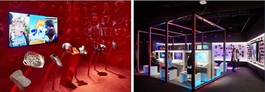
Challenges When speaking about their specific approach, Applied highlight that each museum is different: its visitors, exhibitions, events, spaces,
                        architecture, connections, budgets, team skills and abilities are different, and systems appropriate for one museum are not always appropriate
                        for another. So while the company builds systems around a common set of principles, they must reflect the specific characteristics and
                        requirements of the museum and its visitors. For example, each system is aligned to the abilities and budgets of the institutions to develop
                        and maintain them.

Costs & Timeframe The Met project took the timeframe from 2015 to 2017.
                        The National Gallery project ran from 2016 to 2018.

 Additional info & In 2020, Applied developed and published a COVID-19 Design Toolkit for social distancing and wayfinding. The kit includes a set of guidelines,
        comments icons and templates on how to design systems for high-traffic areas which require safer public behaviors in response to the pandemic.
                        As Applied outline, the Toolkit draws upon the company's planning knowledge for projects like Legible London, TransLink and Metronlinx, as
                        well as consultation in the private sector with international companies. The practice has been working with clients on COVID-19 recovery, and
                        the Design Toolkit has been developed with a wide variety of industries and operators in mind. The kit is available royalty-free to any public or
                        private landowner, place manager or policy leader. The manual sets out a road map for implementation across three sections:
                              − Practical Principles (an overview of COVID-19, behavioural science and practical principles, as well as challenges in physical
                                   environments);
                              − Message and Placement Guidelines (a practical how-to guide to help users implement effective signage and information including
                                   detailed sign placement plans);
                              − Designs, Templates and Icons (the section describes the design elements required to create local, site-specific systems outlined in
                                   Section 2).

   Involved Parties The Met, The National Gallery London

           Contacts Applied:
                        Louise Carlsen
                        Communications Manger
                        press@appliedinformation.group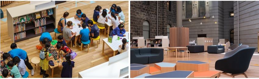
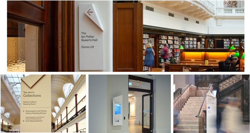
State Library of Victoria

             Who State Library of Victoria, ID-Lab, Schmidt Hammer Lassen,                       What Visitor orientation system
                      Architectus

          Where Melbourne (AU)                                                                   When 2019

     Description State Library of Victoria is the busiest public library in Australia, attracting 1,8 million visitors and 3,3 million online users each year. State
                      Library Victoria is one of Melbourne’s most loved institutions. This Swanston Street landmark is the busiest state library in Australia and the
                      fourth most visited library in the world. Victoria’s State Library takes up a full city block and comprises 23 buildings that have evolved over the
                      last 160 years.

                      A few years ago the library embarked the Vision 2020 journey, a redevelopment project aimed at increasing the library's public space by 40%
                      and seating by 70%. The project was designed to respond to the changing needs of the library's growing community by providing new spaces,
                      services and better access to world-class knowledge. According to the State Library of Victoria’s team, “at the heart of Vision 2020 was the
                      refurbishment of the Library's incomparable heritage spaces, the creation of innovative new spaces for children and teenagers, and the
                      reinvention of services” with an eye towards new technologies and digital. The design was led by an international, award-winning team
                      combining the talents of Australian design firm Architectus, wayfinding provider ID-Lab and Scandinavia's Schmidt Hammer Lassen Architects.
                      The library opened to the public on 5 December 2019.

                      Key outcomes of the Vision 2020 project:
                           − creating 40% additional public space to accommodate the ever-growing number of visitors, researchers and students;
                           − redeveloping existing public spaces, making them more accessible, adaptable, modern and innovative;
                           − refurbishing The Ian Potter Queen's Hall, returning it to public use as a reading room and event space;
                           − introducing fresh services and experiences to breathe new life into the institution’s heritage assets and extraordinary collections;
                           − creating engaging, purpose-built spaces for children, families and teenagers to nurture creative learning, literacy and play;
                           − creating a centre for digital living, promoting digital literacy and providing technology-enabled spaces for entrepreneurship and
                                 innovation to support and stimulate Victoria's creative economy;
                           − strengthening the library's position as the hub of Victoria's learning community, connecting audiences and libraries across the state;
                           − increasing connection with regional Victorians through the digital delivery of programs;
                           − increasing contribution to Victoria's education economy by supporting the state's growing number of international students with
                                 improved access and spaces;
                           − increasing contribution to Victoria's tourism economy through the restoration and enhancement of heritage and exhibition spaces;
                           − reinforcing Melbourne's position as a UNESCO City of Literature and its reputation as a world-class centre for culture, arts and
                                 events.
                      Fun facts about State Library Victoria’s Vision 2020 redevelopment

                      Schmidt Hammer Lassen highlight that, working in partnership with Architectus, they were aimed at rethinking and revitalising the existing
                      spaces of the library in order to unlock possibilities, create connections and provide a framework for the library’s ongoing and future evolution.
                      According to the studio, the concept of transformation was framed by three principles:
                           − unlocking possibilities (possibilities of the space as a range of individual spaces but also as one whole organism; possibilities for the
                                 visitors, to wonder, explore and interact with the space);
                           − creating connections (again, in terms of the space but also between people);
− framework for evolution (acknowledging public ownership of the library, making decisions leaning on the ideas of adaptability and
flexibility of the space).
Project development stage comprised:
− holding a series of co-creation workshops (over 200 sessions) to engage the users directly in the library’s redevelopment;
− gathering input and feedback from children, teens and their families to understand better the future user needs (primary and
secondary school children and young adults were actively engaged in a process of co-design which has shaped such elements as
the Children’s Quarter “castle” evolving from children’s wishes to climb, hide and discover spaces described in their drawings of
tree-houses, castles and spaceships);
− determining the core of the architectural design concept – users – and providing an open, accessible and welcoming experience
for people of all ages and cultural backgrounds.
In 2018, the first phase of the development project was completed. The redeveloped sites were serviced by two new additional entrances –
“a universally accessible entrance on La Trobe Street and the historic Russell Street entrance that was closed for more than a decade”. The
new Russell Street entrance leads visitors to the new Baldwin Spencer Hall, a warm, welcoming space that “anchored the library on an urban
scale”. Baldwin Spencer Hall hosts a lounge and meeting space called the Russell Street Welcome Zone, which includes the new Guild café,
and the Readings bookshop that was relocated from the western end of the library.Library’s other redesigned spaces:
− moving further into the library, the redeveloped McArthur and Swinburne Galleries house reading rooms designated as quiet space
for reading and research;
− the Isabella Fraser Room now hosts the state-of-the-art audio-visual technology and a new production kitchen, a new special
events venue named after the library’s first female employee;
− the adjacent Victoria Gallery is a 500-square-metre exhibition space that offers an immersive and interactive experience for visitors;
− the 163-year-old Ian Potter Queen’s Hall has now reopened to the public after 16 years. The space has been “stripped back,
revealing its former beauty and original paint work, while drawing a modern design line through the Hall and the rest of the
library to link rooms together”.
The project helped to make library’s spaces more visible and directly accessible allowing visitors to freely move through the library exploring
and uncovering all of its treasures. As Schmidt Hammer Lassen underline, “before the redevelopment, the layout of the 164-year-old library
drew visitors through a sequence of spaces that made it easy to leave the building without being fully aware of the library’s diverse offering”.
In its turn, the new design concept “creates a more holistic experience with a clear hierarchy of thresholds and spaces, connecting the various
zones of the library physically and visually”. Additionally, in order to make the visitor journey even more meaningful and intuitive, throughout
State Library Victoria, all furniture, fittings and equipment were carefully selected and designed to complement the architectural interventions.
This includes moveable elements and fixed pieces “that work together in aesthetic harmony, tying the project together”.
Commenting on the integrity and meaningfulness of the design solutions within the project, Architectus studio highlight that “the design
focuses on revealing rather than replicating the heritage elements of the Library, at the same time a consistent language for the new
elements is created that will thread the spaces together to achieve a cohesive and satisfying visitor experience”.
John Sprunt of Architectus outline main constituents of the design concept:− opening the space to the public and urging visitors to experience it;
− outlining the central idea of the library as an artefact and providing ways to experience it in a meaningful way;
− providing the clarity around the space and navigation.
Wayfinding
Melbourne-based ID-Lab focused on wayfinding in the library and as its director, Michel Verheem highlights adopted and applied the concept
of being “lost in confidence”. He reveals that the aim behind the visitor orientation project was to design the system that didn’t have to spell
out every step, allowing for some wandering around and exploring the environment.
Solutions contributing to the visitor navigation facilitation:
− using lighting in a strategic way;
− the lightness of the approach, not overloading the visitors with the signage;
− bringing more light, openness and welcoming features to entrances accompanying them with the sense of arrival (the brief set the
aim for all entrances to have the equal level of presentation);
− blurring the security lines, making the space more civic;
− turning the reception areas into the information points and welcoming spaces rather than control stations and barriers and, thus,
changing the ways in which staff interacts with visitors.
Margharet Ford, Building Facilities Manager of the State Library Victoria underlines that the project helped to better define the connections
between the spaces of the library’s “complex maze” and especially marks the adaptability of the architecture.
In terms of the outreach, the project helped to make the library more welcoming for children and families as its “Children’s Quarter” was
redesigned. Before the renovation, the library provided services for children but didn’t have the specially designed spaces for them.
Generally, the cooperation between the parties and the outcomes of the renovation project can be summarised by the following key points:
− cultural change framed by the physical change of the space;
− shift in the service delivery;
− inspiration for the programming and institutional services (revealing some of the library’s spaces to visitors served as a pivot for the
public programming; thus, some of the “new” spaces were integrated into the educational offers and public events (e.g. the
library’s membership programme offers “white gloves tours” to the formerly unknown library’s spaces));
− highlighting different ways of engaging with the librarya to the audiences (not only though the books, but also through
programmes, tours, artifacts);
− adding more transparency to the spaces, not necessarily physical.
Benefits − the project enabled the expansion of the library’s function, making the institution more open, accessible and inclusive for all ages
and cultural backgrounds;
− the project contributed greatly to expanding the library’s community outreach and enhancing the visitor experience.Challenges and − the complexity of the library space with multiple galleries and level changes;
limitations − the project was aimed at changing the visitors’ attitude towards the library space as intimidating and as such that limits access and
lacks the welcoming vibe;
− recognising all various work streams and needs of the staff members (some staff members could float around but some preferred
fixed working space);
− climatising library’s staff helping them to adapt.
Costs & Timeframe Vision 2020 was an $88,1 million project funded by $60,4 million from the Victorian Government, with the remainder raised through
philanthropic support.
Additional info & Among project’s awards:
comments − Australian Library and Information Association (ALIA) 2021
− Victorian Premier’s Design Award 2020 for Architectural Design
− AIA IR 2020 Merit Award for Open International Architecture, Sustainable Future Award
− Commendation for Public Architecture at the 2020 Australian Institute of Architects’ National Architecture Awards
− Australian Institute of Architects Victorian Chapter Awards 2020 in the Heritage – Conservation and Public architecture categories
− Melbourne Prize 2020.
Contacts State Library of Victoria: Schmidt Hammer Lassen:
Margaret Ford Elif Tinaztepe
Building Facilities Manager State Library Director of Schmidt Henning Lassen Architects
mford@slv.vic.gov.au eti@shl.dk
Architectus:
ID-Lab: Ruth Wilson
Michel Verheem Director
Director ruth.wilson@architectus.com.au
michel.verheem@idlab.globalLouisiana Children’s Museum
Who Louisiana Children’s Museum (US) What Visitor Orientation System
Where New Orleans (US) When 2019
Description Louisiana Children’s museum is a New-Orleans’ museum whose mission comprises being “a place where kids use play, shared exploration, and
conversation to connect with the people and world around them”. Since opening its doors in 1986, the Louisiana Children’s Museum has been
one of the city’s top attractions for children. It welcomes 147,000 visitors annually, engaging children, families, caregivers and school groups
in memorable interactive experiences designed to make learning fun. Museum’s almost 3,000 square meters of the exhibition space host vivid
programming for children encompassing a diverse set of activities “that promote learning across many disciplines – from reading and math
skills to architectural ideas and the nuances of grocery shopping – through interactive play”. It is one of the museum’s major goals, to
promote hands-on participatory learning for children of all ages: “encouraging discovery through observation, inquiry, creative construction,
role-playing, problem-solving and free play, the museum motivates children to develop their cognitive, physical and social skills while enjoying
fruitful interaction with adults and peers”.
Louisiana Children’s Museum was housed for 30 years in the Warehouse District of New Orleans before expanding, in 2019, to a new 3,4-
hectare site in City Park, designed by Mithun Architects. This museum’s transformation set a unique model for children’s museums showing the
example of integrating indoor and outdoor interactive experiences in a park setting. The City Park location uniquely supports outdoor
experiences and environmental education, which was not possible at the previous Warehouse District location. The museum’s new site is
distributed into two linked buildings, “carefully sited to protect existing live oaks while enhancing the lagoon and open space for
environmental education”. Mithun Architects underline that the uniqueness of the site and architecture was meant to ensure the “the
choreography of the visitor experience” and to “connect people and nature”.
The co-location of a two-story exhibit wing, which hosts centers for literacy, parenting, early childhood research and environmental education,
creates a holistic and supportive environment for families. Among other newly introduced developments within the space: café; sensory and
edible gardens, play hummocks, floating classroom barge, living shoreline and a freshwater marsh.
To develop a brand identity and visitor orientation system, Louisiana Children’s Museum teamed up with the Seattle-based studio Studio
Matthews. The studio designed the new brand as well as signage, interpretation, environmental graphics and donor recognition throughout the
new indoor/outdoor site. According to Studio Matthews, when getting acquainted with the original museum, they were impressed by thecreative workshop space for kids and incredible drawings and sculpture on the walls. This resulted in a very important design step – to
incorporate authentic children’s drawings created at the museum in the new brand and throughout the new site. Another design element was
the installation of quotes from grandparents describing their hopes and dreams for the children of New Orleans.
Thus, the visitor experience planning team applied a very special approach when developing the museum's master plan, using a Reggio
Emilia-inspired process to engage very young children in the master planning. This approach was adopted for the brand, wayfinding and
interpretation design.
Challenges:
− to change the visual identity of a well-established brand and beloved a local institution;
− “to embrace a lagoon-side site far from the original location in the Warehouse District”;
− “on the fabrication front, everything needed to be very hard-wearing to withstand heat, sun, humidity and of course the small
hands of thousands of child visitors”.
Design solutions:
− the new brand featuring children's illustrations, fresh typography and an updated colour palette to complement the new park
setting;
− the wayfinding system featuring children's drawings allowing to make the work of children more visible but also to make it serve
important functions throughout the space.
Scope of Project: exterior building name signage, exterior wayfinding and building signage, interior wayfinding and building signage, design of
flexible programming displays, donor recognition, interior environmental graphics, landscape Interpretation, stairway mural, entry quotes,
grandparent quotes installation, incidental signage, new Identity/logo, brand guidelines and collateral, newsletter design.
Project results:
− nomination for USA Today's 10 Best Awards for New Museum and Best New Children's Museum;
− membership has quadrupled;
− in the first 100 days alone, the Museum welcomed 60,000 guests from 44 different states;
− it has become a "Third Place" in New Orleans: many families come several times every week
Project awards:
Communication Arts 2020 Design Annual, Award of Excellence
Core77 Design Awards 2020, Visual Communication Notable Award
SEGD Global Design Awards 2020, Placemaking and Identity Honor Award
Benefits − the museum’s unique setting in the natural environment and the outdoor experiences as a way to enrich the visitor journey;− a refreshing decision to base the visitor orientation system on the drawings created by the main users of the museum – children –
as a means to familiarise the visitors with the space.
Additional info & One of the other Studio Matthews’ collaborations which can be seen as a good example of the visitor experience enhancement and visitor
comments activation through the means of the spatial design solutions is their project for the Pacific Seas Aquarium in Washington. The studio designed
custom illustrations of the underwater world placed on the wall of the aquarium. At the digital stations, which are installed in front of the
wall, visitors can take a self-portrait and become an “underwater local”—a sea lion, an octopus, or even a wolf eel—as their photo gets
displayed as part of a large wall mural. Apart from this, the aquarium offers multiple engaging experiences for kids and families. Thus,
families can play in the sea kitchen, answering the phone (the ocean is calling) and “sampling” Coho Puffs and Mackerel & Cheese.
Additionally, other low-tech interactives and illustrations augment the live animal exhibits that feature in the aquarium.
Involved Parties Waggonner & Ball Architects (collaborating architect)
Gyroscope, Inc. (exhibit/interpretive design)
Contacts Louisiana Children’s Museum: Studio Matthews:
Lauren Clay info@studiomatthews.com
Chief Operating Officer Mithun:
lclay@lcm.org
info@mithun.comACMI and BKK Architects
Who ACMI and BKK Architects What Newly developed visitor orientation system, the “Living
Stair”
Where Melbourne, AU When 2019
Description In 2019, ACMI partnered with the Melbourne-based BKK Architects to work on its renewal project which was aimed at “reimagining of the
museum and creating a more open and welcoming environment”. The project was particularly focused on refreshing of ACMI’s free exhibition
space, creating smaller gallery space for public programmes and enhancing public spaces to encourage dwelling.
According to BKK Architects, the focal point of the project was ACMI’s ambition to expand the experiences beyond the physical museum itself.
To ensure this, ACMI offered its visitors a technology which allowed them to collect “experiences” along their ways through the exhibition
spaces and dive deeper into those experiences at home. Another solution was centered around extending the presence of the museum in a
wider context of the city. In this regard, BKK Architects focused on the following key points:
− reimagining the main spine of the museum as a laneway, aligning it to the Melbourne’s famous laneways that connect its major
streets;
− reinvigorating the building that ACMI had long occupied with the principle access to the laneway that connects all various functions
of the centre and provides a civic space that allows people to dwell and engage with much of the content that was previously
hidden away within exhibition spaces;
− positioning public spaces as not just foyer spaces but extensions of the general public realm of the city and refreshing them with
the democratic approach of inviting everyone to dwell, either these are people who come specifically to the museums or just come
across it.
Generally, the key design move of the project was to establish a new laneway running though the centre of the building, along with a “living
stair” that had to encourage visitors to pause and look around. The idea behind was to attract new groups of visitors to engage with ACMI,
while also “allowing for cross-pollination between the different demographics that are already attracted to the centre, such as the generally
older crowd who go to the ACMI cinema and the young families and children who frequent the Screen Worlds permanent exhibition”.
While realising the project, BKK Architects had to tackle a range of challenges connected to visitor journey and wayfinding:
− the Alfred Deakin Building that ACMI occupies is a multi-level building which hosts more than one tenant;
− the building was originally designed as a shopping centre and had original escalators and circular paths that were particularly
defined;
− ACMI is on multiple levels and has two entrances (the studies shows that the number of visitors coming from both entrances is
equal);
− the building sits on the fringe of the city centre grid.
The “Living Stair”
According to BKK Architects, one of the key aims of the project was to “rationalise” ACMI’s difficult multi-level nature to make the building
feel legible and cohesive. As the solution, the team introduced the so-called “Living Stair” which not only provided a visual link between two
building’s levels but offered a place of dwell and rest for the visitors. The cut-through stair connected the Federation Square entry and the
Flinder Square entry and fully linked the ground floor level and street level.
Another key feature of this area’s design was pulling out some of the original museum content into the main pedestrian access space to
better connect ACMI’s offerings (a new dining experience, new and modernised learning spaces, a revitalised ticketing experience, etc).Tim Black, the principal of BKK Architects explains that the studio’s proposition was “thoroughly an urban one” insofar as they looked “to leverage the very best of the Alfred Deakin Building”. He highlights that reimagining the atrium as a laneway not only helped to guide pedestrians from Flinders Street up to Federation Square but also allowed “to stitch back together all of those different offerings that ACMI has always had available to them.” This approach, according to Tim, was also informed by Lab Architecture Studio’s original vision for Federation Square, which promised improved connections between the city and the river. In terms of the architectural language and materials of the new additions, BKK has attempted to differentiate ACMI from the rest of Federation Square, so that it reads as a separate institution. Civic space for dwelling One of the challenges for ACMI was that in its previous incarnation it couldn’t offer visitors the space to dwell and enjoy the space without ticketed obligation. Thus, to tackle this issue, the renewed first floor was designed to provide a public space that allows visitors to interact with the museum in a more relaxed way. The space is termed “urban lounge” and is equipped with a series of seating plats beside the central stair. This powerful democratic gesture was meant to convey that the institution is for everyone and not just for professionals. Another thing the architectural project was directed at, was reaching to different segments of audiences, for example those who often came to the cinema in the afternoon and wouldn’t make it to other parts of the museum as opposed to young families who would make it to the permanent exhibition but might never see a film. These third spaces were designed to start to connect those different communities of ACMI users with each other and with other members of the public. Another part of the atrium, the Federation square foyer on level 1, according to BKK Architects’ design, serves much the same purpose but is a little more flexible flat-floored space that allows for occasional industry participation events, changing exhibitions, etc. Additionally, it includes a showcase of some of the permanent gallery offerings available downstairs and really tells the story of what this institution is about.
The journey through ACMI’s experiences
Working with experience designers, BKK focused on servicing a new division of segments that were less about different experiences on offer
but really addressing a different level of engagement of visitors. With respect to the moving image culture, the team leaned on three different
categories of engagement:
      − Watchers (those who are relatively passive consumers of the moving image culture);
      − Makers (so-called prosumers – consumers involved in the very production of what they are consuming (e.g. people engaged with
            such platforms as Tik Tok, Instagram);
      − Players (those who engage in a much more active sense (e.g. online gaming culture), much more engaged with each other and
            with the moving image content that they are playing with).

Different types of experiences through the ACMI’s exhibition spaces include:
      − Digital Preservation Lab showcasing contemporary techniques of preserving all the disappearing forms of moving image media (60
            mm film, windows 7 games, etc); the visitors can come into the lab at certain times of the year or peer into the space through the
            window;
      − Educational space for various educational events promoting media literacy.

Permanent exhibition’s interactive experiences
Among the interactive experiences the permanent exhibition offers, there is, for example, Foley Studio that presents traditional techniques of
audio production and offers visitors to create recordings for films and games using professional equipment.
Another hands-on experience offered is Edit Line. It allows visitors to edit a simple story by moving physical story-board pieces which trigger
edits on a large screen. This experience combines physical editing film and digital editing on screen. Visitors get the chance to play their story
on the large screen once they have completed editing and then take it home via their Lens.

The permanent exhibition experience is underpinned by ACMI’s Lens, a piece of embedded technology device that is free for all visitors and
allows them to collect and tag their favourite works and experiences. The Lens provides the opportunity to go back to the exhibits after the
visit and dive deeper into them off-site, later on and within the web browser. BKK Architects, underline that this is one of the examples of
extending the experience beyond the physical boundaries of the museum.
One of the peculiarities of ACMI’s Lens in terms of the visitor navigation is that with it, the visitors’ journey though the exhibition becomes
more independent and predetermined by what visitors themselves would like to see and to collect. At the end of the exhibition the space
offers a so-called “Constellation”, an interactive space where the a giant touched-screen table is installed. This station allows visitors to save
all the information that they collected.
The main permanent gallery runs a circuit loom through a sequence of exhibition experiences and return the visitor back out to the primary
foyer.
Wayfinding
One of the major BKK Architects’ ambitions connected to visitor navigation and wayfinding was to have as little signage as possible and to
allow visitors to be led by the space itself. Another concern about using signage was not to overwhelm visitors of the centre which offered a
lot of moving image content. Thus, the approach to the wayfinding design comprised:
− the most significant architectural move within the project –the “Living Stair” offering a linear way through the space which led the
visitors;
− freeing up the line to the atrium in order to let people see where they would like to navigate to (rather than explicitly spelling it
out);
− delineation of the route by the means of the lighting;
− the Lens, which was meant to help visitors develop their own way throughout the space based on their interests and preferences.
ArchitectureAU’s overview of the case
-
Benefits The project provided:
− the space where people can dwell to get over the museum fatigue;
− clearly defined circulation;
− legibility and the opportunity to navigate without much of the signage (universality of means of communication);
− interrogation and reconceptualisation of the the institution’s spaces.
Costs & Timeframe The Victorian government allocated $31,6 million to the project in its 2018/2019 budget.
Additional info & Other BKK Architects’ wayfinding projects:
comments Dandenong Public City Park Amenities
Involved Parties Razorfish (brands, design), Second Story (experience design)
Contacts ACMI: BKK Architects:
Seb Chan Deb Adams
Chief Experience Officer Senior Associate
seb.chan@acmi.net.au deb@b-k-k.com.au
Tim Black
Principal
black@b-k-k.com.auInteresting Projects and Isometric Studio
Who InterestingProjects (UK) and Isometric Studio (US) What Navigating through the exhibition spaces in times of Covid
Where London, UK; New York City (US) When 2020
Description InterestingProjects and “Good Measures”
“Good Measures” project is the result of a collaboration between the London-based design studio InterestingProjects and vinyl graphic experts
PUCK Studio, who were working together on the exhibition for the Design Museum when their work was interrupted by the pandemic. In
response to the situation, the collaboration resulted in developing “Good Measures”, a range of wayfinding signage aimed at and assisting in
ensuring social distancing for retail, hospitality, office and exhibition spaces.
“Good Measures” is a modular range of wayfinding tools and graphic stickers that “puts a positive spin on traditional health and safety
signage”. The project offers:
− a new approach to conventional wayfinding to help companies function effectively under the circumstances of social distancing and
new government guidelines, “without making their work environments feel like danger zones covered in hazard warning tape”;
− important changes to how people should navigate the spaces communicating a range of safety messages, from new routes and one
way systems to single-use lifts and spacing at hygiene stations.
In terms of design, InterestingProjects highlight that, “visually, the range draws inspiration from technical drawings in interior design and
includes lines, representations of textures, space markers and rulers, all repurposed with style and humour”.
Technical features:
− developed modular system can be used for both interiors and exteriors;
− it can be installed by the customers themselves, while an installation service is also available;
− the system is flexible and can be adopted to a certain space or location since it has a good selection of colours and patterns;
− the system allows for creating bespoke, customised designs.Joana Filipe and James Mason, the team behind InterestingProjects, revealed that “Good Measures” were created in response to many local
businesses’ coming up with temporary, DIY solutions to the current health and safety challenges and underline that although these efforts are
praiseworthy, “the haphazard tape sends the wrong message in a space when we want people to feel safe and inspired”.
Isometric Studio and “Toolkit for Museum Reopening”
Similarly to InterestingProjects’, Isometric Studio, US-based design studio, decided to respond to Covid-19’s affecting cultural institutions and
focused their efforts on the project Toolkit for Museum Reopening: Design Strategies and Considerations. The toolkit summarises design
strategies developed for museums’ safe reopening while also outlining the measures essential for the safety of visitors such as, for example,
air sanitisation and protective barriers.
Isometric Studio outline the mission statement behind the toolkit: “Before the pandemic, exhibitions were designed to be creative, engaging,
and educational. This will not change, but they will now need to be redesigned with another factor in mind—keeping visitors safe. Rethinking
the architecture and visual design of exhibitions can allow us to build a better museum experience in a post-COVID world”.
As part of the toolkit, Isometric offer guidelines on ensuring safety and optimising the visitor journey in indoor, outdoor and online realms.
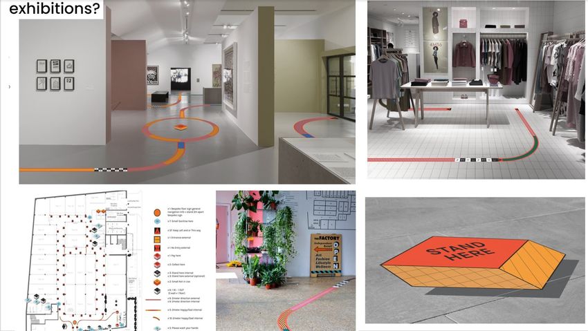
Indoor exhibition design overview encompasses the following strategies and considerations:
− calculating new occupancy limits for social distancing based on the size of galleries;
− subdivising the galleries into zones indicated with floor decals;
− regulating the number of visitors per zone (e.g. 3 non-affiliated visitors; or friend group of 6);
− designating a single direction of circulation indicated with the floor decals;
− ensuring the clear space for museum staff to guide visitors safely;
− establishing zones that limit the number of individuals or groups at any given time, etc.
Application examples
Single-direction navigationTimed entry and contact tracing solutions
Encouraging visitor personal responsibility
Outdoor exhibition design guidelines and recommendations
− identifying a site on the museum grounds or elsewhere;
− establishing wide circulation pathways to allow groups to move around one another;
− displaying multiple exhibit labels to be visible from different sides;
− designating clearer exhibit labels that are easy to read from afar;
− establishing an exhibition scale that is socially distanced yet manageable;
− sharing maps that clearly communicate the layout of the exhibit;
− establishing timed entry to maintain social distance.
Application examples
Sidewalk and entrance sequencesOutdoor Exhibition Experiences
Movable and Collapsible Outdoor Frameworks
Virtual Exhibition Design
Design recommendations:
− designing online exhibits that encourage visitors to explore as they would in a museum;
− selecting topics that are relevant to this moment in time;
− offering virtual tours of museum collections;
− using multimedia storytelling to annotate and enhance pieces from existing collections;
− allowing visitors to curate and share exhibits and to save their favourites.
Application Examples
Immersive Online ExhibitionsHosting Virtual Events
“Toolkit for Museum Reopening’s” overview on Dezeen
Additional info & Among other peculiar examples of ensuring the social distance in times of pandemic, there is Lisbon's Museum of Art, Architecture and
comments Technology’s case. The museum reopened after the 2020 lockdown with a series of 3D signs to encourage visitors to practice social
distancing. Lisbon-based designer Sam Baron has created a set of signs made from bricks, tape and mirrors which allow visitors to navigate
around the building in accordance with the safety guidelines. Bricks with bright green arrows were used to mark a one-way system that has
been implemented at the MAAT and as weights to keep a series of mirrors in position. Safety information has been printed on the mirrors in
matching bright green.
Contacts InterestingProjects:
studio@interestingprojects.co.uk
Isometric Studio:
Waqas Jawaid
Partner
waqas@isometricstudio.comYou can also read