Communicating Our Brand - A Guide to SMARTER FINANCE
←
→
Page content transcription
If your browser does not render page correctly, please read the page content below
A Guide to
Communicating Our Brand

Version 1.1
February 2020

                          SMARTER
                          FINANCE
                          FOR
                          FAMILIES
The Primary Logo Mark About the Logo Mark
The SMARTER logo is a combination logo made up of
two parts - a logotype (text) and a logomark (image).
Logomark
Primary Logo The logo mark is shaped by Mobius loops and arrows
that represent circularity and the positive feedback
cycle. It stands for the relationship between a
SMARTER healthy environment, family health and wellbeing,
green building and green finance.
FINANCE Within the shapes there are three symbols, the leaf,
family and euro. They are designed to be
FOR
recognisable as good for the environment, benefits
for families and affordability that families experience
with the Green Home Green Mortgage programme.
FAMILIES Logotype
The logotype is drawn in capitals to match the
boldness of the logo mark and is in similar colours.
Its emphasis is on SMARTER FINANCE and
FAMILIES - making green homes affordable for
families is the most important goal of the SMARTER
Logo Colours initiative.
Logo colours
Blue represents blue infrastructure, water, trust and
responsibility. Green represents green infrastructure,
growth and new beginnings. Together they signify
the planetary health of our environment trees,
CMYK - 85/50/0/0 CMYK - 88/27/94/14 animals, oceans, lands and sky. White is the colour of
RGB - 27/117/188 RGB - 10/126/69 goodness and is used in the symbols to show the
HEX - 1b75bc HEX - 0a7e45 good intentions and relationship between the actors
and elements of the SMARTER initiative working
towards a prosperous planet.The Logo Mark - Alternative Usage Options
Greyscale Logo - Light Background Greyscale Logo - Dark Background
SMARTER SMARTER
FINANCE FINANCE
FOR FOR
FAMILIES FAMILIES
Logo Colours
CMYK - 0/0/0/100 CMYK - 0/0/0/60 CMYK - 0/0/0/0 CMYK - 0/0/0/40
RGB - 0/0/0 RGB - 130/130/130 RGB - 255/255/255 RGB - 168/168/168
HEX - 000000 HEX - 828282 HEX - ffffff HEX - a8a8a8Colour Palette
The colour palette available for use in the project is The light shades above the Primary palette are
based on a grid of opacities originating from the percentage transparencies (75%, 50%, 25%), while
Primary pallete of five core colours, as shown below. the darker shades below the Primary palette contain
increasing levels of black.
LIGHTER
CMYK - 70/15/0/0 CMYK - 75/0/75/0 CMYK - 0/56/65/0 CMYK - 3/89/68/0 CMYK - 55/0/100/0 PRIMARY
RGB - 39/170/225 RGB - 43/182/115 RGB - 246/138/96 RGB - 231/67/78 RGB - 128/195/66
HEX - 27aae1 HEX - 2bb673 HEX - f68a60 HEX - e7434e HEX - 80c342
DARKERTypography
To ensure consistency and wide availability across The Headline font (Monserrat) and the Body font
consortium members, each typeface within the (IBM Plex Sans) each have a large variety of weights
house font collection has been selected from the available for use, ranging from thin/light to
free Google Fonts collection and can be downloaded bold/black.
from https://fonts.google.com
Headline font Body font Highlight font
Monserrat Black IBM Plex Sans Light Anton Regular
The quick brown fox jumps The quick brown fox jumps
over the lazy dog over the lazy dog
The quick brown fox jumps
over the lazy dog
Monserrat Bold IBM Plex Sans Regular
The quick brown fox jumps The quick brown fox jumps
over the lazy dog over the lazy dog
Monserrat Medium IBM Plex Sans Semi-bold
The quick brown fox jumps The quick brown fox jumps
over the lazy dog over the lazy dog
Monserrat Light IBM Plex Sans Bold
The quick brown fox jumps The quick brown fox jumps
over the lazy dog over the lazy dogGraphic Devices
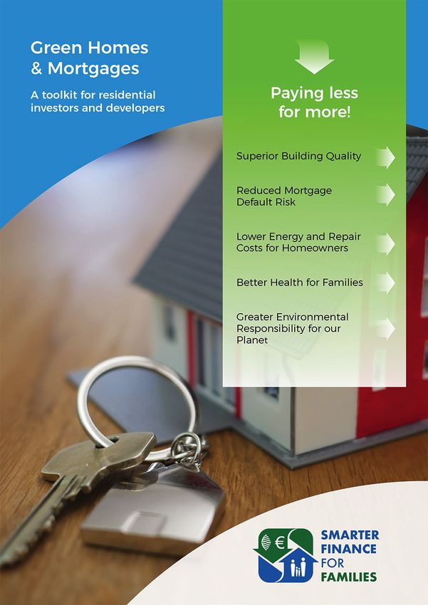
Title Background Bar Arc and Stripe devices
The title background bar, as illustrated at the top of The Arc and Stripe devices can be seen on the
this page, is a fluid solid bar of the blue logo colour cover of the Toolkits. Each device may be used
(see section on logo) with an offset underlay of 15% on its own - for example, the Arc device is used
grey (e.g. CMYK - 0/0/0/15). on the inner front and back covers, while the
Stripe device is used on the outside back cover
Text contained within the background bar should be against a solid block of colour.
vertically centered. The bar should be anchored on
its left side and should be aligned to the left-most The Arc device should always appear in the blue
content in the design. colour of the Primary palette (e.g. CMYK -
70/15/0/0)
The width of the background bar, and underlay,
should expand sufficiently to the right to The Stripe device can either be used as a solid of
accommodate the included text so that the text the vibrant green from the Primary palette (e.g.
appear centered. CMYK - 55/0/100/0), or as a vertical gradient
commencing at the top with that green and
ending in white. The white bottom of the Stripe
Grey Information Vertical Bar may be set at 10% opacity, if required.
A vertical bar of 15% grey may be used as a
background to highlight information on a page.
The bar itself should align to the margins of an text
columns, with sufficient padding of its own content so
that it is not flush to the edges of the bar. Detail of cover showing the arc
(blue) and stripe (green) device.
The width of the bar may be extended to the edge of In this example a vertical
the canvas where required. gradient is deployed in the stripe.Icons
Circular illustrated icons may be used and generated The content of the icon circle must never reach the
for purpose, but must adhere to the following criteria edges of the circle and must be formed using
for consistency of visual language across the project: primarily the two tones of green from the Primary
colour palette. Other colours from that palette may
Icons must be circular with a background colour of be judiciously added for effect, but only after the two
10% grey (e.g. CMYK - 0/0/0/10). green shades have been utilised.
Icon examplesSMARTER
FINANCE
FOR
FAMILIES
For more information
please contact
Steven Borncamp
Steven.Borncamp@GreenHomes.Solutions
Office: +40.738.182.421
This project has received funding from the European Union's
Horizon 2020 coordination and support program under
grant agreement 847141.You can also read


