Earth and Space Science - A Study of Atmosphere, Climate, and Air Chemistry
←
→
Page content transcription
If your browser does not render page correctly, please read the page content below
Earth and Space Science
                 A Study of Atmosphere, Climate, and Air Chemistry
                                PM2.5/Air Pollution

                   Rebekka Joslin*, Richard Malatesta*, James Harris*, Alexander Jacques✚,
                                Erik Crosman✚, John Horel✚, Lindsey Nesbitt✧

Many educators and researchers in the Salt Lake Valley are passionate in teaching our communities
about the air quality issues we face. There are existing resources for teachers to use in their classrooms
that explore and describe the fundamentals of air chemistry and pollution, the role geography plays in
forming inversions, the types and relative sizes of particulate matter pollution, and hands-on ways of
collecting visual particulate matter pollution samples. The purpose of this curriculum is to list these
resources and complement them by providing learning activities focused on skills related to analyzing
inversion event data.

As technological capabilities continue to grow at astounding rates, so do the number and size of data
sets. Consequently, there is growing need for scientists to organize, analyze and help society learn from
this information. The need exists for preparing students for the field of data science and training all
students how to use data to ask and answer scientific questions. In high school, especially, teachers
should be helping students practice the skills of making predictions, analyzing graphs and using data to
support ideas, and apply their learning to real world issues.

This teaching module contains detailed background information, teacher preparation materials, lesson
plans, and MesoWest website directions for an engaging lecture on air quality. The module can be used
to create an interactive learning experience for your students to increase their air pollution knowledge
base and interest level in their local environment. We encourage you to print out information from any
website you visit as websites are not permanent.

              *
               The Waterford School, ✚Department of Atmospheric Sciences, University of Utah,
                         ✧
                          Department of Geology and Geophysics, University of Utah.

                                                                                                            1
Table of Contents

       Standards Alignment
       Curricular Goal
       Target Grade Level
       How to Use the Lessons
              Teacher Preparation
              Academic Information for Lesson Plans
              Activities
              Teacher Materials
              Student Materials
       Academic Information for Lesson Plans
       Additional Resources
              Supplemental Slides
              MesoWest Tutorial
       Lesson Plans
       Student Worksheets

Standards Alignment

This curriculum can be used to meet new Utah Science with Engineering Education (SEED) Standards
implemented for the 2020/2021 academic year. Each of the included lessons are designed to give
students practice making informed predictions, analyzing real-world data, and critically evaluating
scientific hypotheses. It includes exercises that align with:

       Strand ESS.3: System Interactions: Atmosphere, Hydrosphere, and
       Geosphere
       Standard ESS.3.4
       Analyze and interpret patterns in data about the factors influencing weather of a given location.
       Emphasize the amount of solar energy received due to latitude, elevation, the proximity to
       mountains and/ or large bodies of water, air mass formation and movement, and air pressure
       gradients. (ESS2.D)

       Strand ESS.4: Stability and Change in Natural Resources
       Standard ESS.4.4
       Evaluate design solutions for a major global or local environmental problem based on one of
       Earth’s systems. Define the problem, identify criteria and constraints, analyze available data on
       proposed solutions, and determine an optimal solution. Examples of major global or local
       problems could include water pollution or availability, air pollution, deforestation, or energy
       production. (ESS3.C, ETS1.A, ETS1.B, ETS1.C)

       This material can be used as class experiments for:
       Standard ESS.4.1
       Construct an explanation for how the availability of natural resources, the occurrence of natural
       hazards, and changes in climate affect human activity. Examples of natural resources could
       include access to fresh water, clean air, or regions of fertile soils. Examples of factors that affect
       human activity could include that rising sea levels cause humans to move farther from the coast
                                                                                                                2
or that humans build railroads to transport mineral resources from one location to another.
(ESS3.A, ESS3.B)
Curricular Goal
The goal of this curriculum is to develop in students data science skills using existing data related to air
quality in the Salt Lake Valley, and can be extended to include other areas. The MesoWest website
provides real time as well as historical air quality data from a variety of sensors across the state of Utah.
These data sets can be used by teachers to achieve the goal(s) of asking and answering scientific
questions using data.
Target Grade Level
These lessons are designed for use in high school Earth Science courses. However, parts of the lessons
could be easily adapted for use with middle school age students. The lesson plans are designed in a
modular format, so that they may be used independently to supplement existing curriculum in the
classroom or integrated together as an entire unit.
3How To Use The Lessons
Teacher Preparation
Depending on a teacher’s existing knowledge of air quality issues, individual teachers will need to
familiarize themselves with a) the basics of air quality dynamics in the Salt Lake Valley and b) the
process for using and retrieving data from the MesoWest website before working with students on the
lessons. The resources in “Additional Resources” provide relevant background information, slides to use,
and MesoWest navigation information.
Academic Information for Lesson Plans
To provide flexibility for using the lessons and incorporating them into pre-existing curricula, this
curriculum includes a variety of “Academic Information”. The purpose of the Academic Information is to
provide links to already established material prepared by other authors that provide background
information and skills to students new to Atmospheric Science and data analysis. Depending on student
knowledge and individual teacher needs, these activities can be incorporated, modified, or ignored. We
advise saving this information as pdf files because websites change or sometimes are deleted. Please
site the information you choose to use.
Activities
Each of the included lessons are designed to give students practice making informed predictions,
analyzing real-world data, and critically evaluating scientific hypotheses.
We present each of activity with three “Options”, depending on an individual teacher’s needs:
1. Option A: The lesson is offered with a complete set of graphs (from the MesoWest website) and
all other material needed to complete the lesson. This option does not require any time spent
retrieving data or generating graphs and allows teachers to focus their time on the analysis of
graphs.
2. Option B: The lesson is identical to “Option A” but replaces pre-constructed graphs with a link to
a Google Sheet data set. This option allows teachers to incorporate student practice with
generating graphs either by hand or using spreadsheet applications.
3. Option C: This option is geared toward teachers that want to have their students interface with
the MesoWest website. This website contains real-time and historical air quality data that are
used in these lessons. Teachers choosing to use Option C can walk their students through
retrieving the data directly from the MesoWest website for analysis. This option is a great choice
for teachers that want their students to do one of the extension activities suggested in Lesson #4
or for teachers that want to design a project of their own that incorporates data from the
MesoWest website.
Each of the included lessons include directions for Options A, B and C and teachers may choose the
option that is best for their curriculum and students.
4Teacher Materials
Each lesson includes a “Teacher’s Lesson Plan” section that gives special instructions to help the
teacher prepare the lesson. There is a “purpose” statement for each lesson that gives teachers the goal
of the particular lesson and they should make sure students achieve this goal. Each of the lessons are
broken down into specific instructions for Options A, B and C.
Student Materials
Each lesson includes a series of worksheets that students use to complete the lesson. Student
worksheets come in two forms. One form is for use by students with access to laptops or other
technology that allows them to write directly onto a Google Docs document. The other form is a printable
PDF that is ready for students to fill in by hand. Teachers may choose the form that works best for their
students.
MesoWest website: http://meso2.chpc.utah.edu/aq/
5Academic Information for Lesson Plans - Curriculum materials from other authors
Academic Information, Lesson #1: Components of the Atmosphere
In order to understand issues of air quality it is essential to be familiar with the basic structure and
composition of the atmosphere.
● http://www.cpalms.org/Public/PreviewResourceLesson/Preview/129989
○ Atmospheric Composition lesson plan from the state of Florida’s “CPALMS” program.
Using guided and independent practices, students are led through the basics of the
physical components of the atmosphere.
● https://climate.ncsu.edu/edu/Atmosphere
○ This website from the North Carolina Climate Office includes some great basic information
on atmospheric composition, weather phenomena and other climatic issues.
● http://forces.si.edu/atmosphere/pdf/Atmo-Activity-1.pdf.
○ This activity from the Smithsonian National Museum of Natural History includes a hands-
on project that engages students in diagraming atmospheric structure.
Academic Information, Lesson #2: Climate
Patterns in local climate (long term averages of weather) needs to be understood before interpreting data
sets.
● https://cleanet.org/clean/literacy/climate/index.html
○ The Climate Literacy and Energy Awareness Network (CLEAN) has an excellent climate
curriculum that leads students through the essentials of climate science.
Academic Information, Lesson #3: Anthropogenic Inputs to the Atmosphere
Man-made pollutants are a significant component of smog and photochemical smog.
● https://energyeducation.ca/encyclopedia/Smog
○ A good summary from the University of Calgary on the basic components, formation and
health consequences of smog.
● https://www.teachengineering.org/activities/view/cub_air_lesson02_activity1
○ Hands-on activity from “Teach Engineering” for a student-built smog collection device.
● https://www.kued.org/whatson/the-air-we-breathe/background/pollution-sources
○ A discussion of man-made pollution sources from a Salt Lake City - local news
organization, KUED.org.
6Academic Information, Lesson #4: Graphing Time-Series Data
The exercises we present include the need to graph temperatures and particle density through time. If
students lack these skills (or just need practice) the links below are some good practice activities for
them.
● https://nzmaths.co.nz/resource/time-series
○ New Zealand Maths have an excellent set of practice data sets (having nothing to do with
air quality) that allow students to practice time series graphs. Graphs can be constructed
by hand or easily cut and pasted into graphing software or Excel.
● https://maths.nayland.school.nz/3-8-time-series/
○ Nayland College has an excellent series of exercises (with video tutorials) that lead
students through more complex time series analysis. Links to Excel data sets are
included.
Academic Information, Lesson #5: Inversion Events
Inversion events are not unique to Salt Lake Valley, but they are a characteristic of the winter climate of
the region. Understanding how inversions form and trap particulates is critical to the exercises below.
● https://www.ag.ndsu.edu/publications/crops/air-temperature-inversions-causes-characteristics-
and-potential-effects-on-pesticide-spray-drift
○ Scroll to the discussion on inversions.
● https://www.stevespanglerscience.com/lab/experiments/colorful-convection-currents/
○ Hands-on demonstration From Steve Spangler Science on the effect of temperature on
the movement of fluids. This demo uses water, but it demonstrates how cold air can also
be trapped.
Academic Information, Lesson #6: PM 2.5
Particles smaller than 2.5 micrometers have some important health concerns. They are usually elevated
during inversion events - this is the theme of the Teacher Lesson Plans we present. A good introduction
along with links to the MesoWest data this document uses can be found at:
● http://home.chpc.utah.edu/~whiteman/PM 2.5/PM 2.5.html#big
○ This site developed by the University of Utah’s Atmospheric Sciences Department
includes excellent discussions of the importance of tracking PM 2.5 and links to current
weather and short-term forecasts. This is a nice introduction to the lessons below which
use the idea of prediction in a scientific context using real-world data.
● http://www.health.utah.gov/utahair/pollutants/PM/
○ This site developed by the State of Utah, Department of Health gives information on
current air quality conditions, pollutants, and health effects of air pollution. This is an
official state site that is important for referencing and comparing to surrounding air quality
instruments.
7Additional Resources
Appendix A includes PowerPoint slides from a lecture created by Erik Crosman at the University
of Utah that can be used as teaching materials in class.
Appendix B is a description of how to navigate the MesoWest website.
Additional classroom and background resources on air quality can be found in the URLs below. In
addition to the Academic Information section included above, these websites can be used to complement
this curriculum.
AIRU College of Engineering Teaching Modules
https://airu.coe.utah.edu/teaching-modules/
Breathe Utah Air Aware Programs
https://www.breatheutah.org/education/air-aware-school-programs
Utah Genetics Size and Scale Interactive
http://learn.genetics.utah.edu/content/cells/scale/
Air Pollution: What’s the Solution Lessons
http://ciese.org/curriculum/airproj/
Winter PM 2.5 Pollution in Salt Lake Valley
http://home.chpc.utah.edu/~whiteman/PM 2.5/PM 2.5.html#big
Recess Guidance Tool
https://schools.graniteschools.org/frost/files/2017/01/recessguidancetool.pdf
8Lesson Plans
Lesson #1 – Components of the Atmosphere-
Phenomenon: In the winter time there are days where the air in Utah appears cloudy or foggy all day.
Purpose – To use changes in PM2.5 during an inversion event to understand air chemistry, to identify
local atmospheric chemical patterns, to analyze real-time events to understand cause and effect of
trends, and to understand stability and change in local atmospheric chemical reactions.
Overview - Students first predict and sketch a graph of PM 2.5 during an inversion event. They then
create and/or analyze a graph of an inversion event (Systems and models), while thinking about how all
the different components of the system affect the results (temperature, time of day, pollution source,
etc.). A series of questions walks them through comparing their prediction to the actual graph, analyzing
change over time and considering why the graph has this shape. Finally, students create a set of data
and a graph for a fictional inversion event.
Background Concepts - For students lacking graphing skills, we recommend Academic Information,
Lesson #2 (which covers graph-reading skills) and Academic Information, Lesson #4 (which discusses
graph creation). You can choose to spend more or less time developing these concepts based on your
curriculum and available time.
Prediction - Using their student handout, ask your students to draw a graph that predicts what happens
to PM 2.5 concentrations during an inversion event (keeping in mind the system as a whole, including
temperature of day, time of event, pollution source, etc.). If needed, use some of the questions below to
prompt them in making their predictions (what type of graph should they make, what will be on the X
axis, what will be on the Y axis, what is your scale on the Y axis, etc).
Procedure - Based on your goals, you can choose Option A, B or C for your students (See: How To Use
These Lessons above). Pass out the appropriate student worksheet (A, B or C) and encourage students
to follow the procedure on their handout. You can choose to walk students through each step as a class
or allow students to work at their own pace.
Option A - All instructions needed for this option are on the student handout.
Option B - Here is a link to the data set you can use for this lesson. Click on the link to open the data set
in Google Sheets. Depending on the access your students have to spreadsheet applications, you can
choose to have them create their graphs in Google Sheets or in another spreadsheet application such as
Numbers or Excel. Given the diversity of graphing applications that exist, we have not provided specific
instructions for creating the graph for this lesson. Rather, as teachers you can customize this section of
the lesson to meet your needs. To see a sample of the graph your students will make, refer to the
student handout for Option A. Once students have graphed their data, the procedure is identical to
Option A.
Option C - Here is a link to the MesoWest Air Quality website. This website houses the air quality data for
the sensors in the Salt Lake Valley. Use the map to display the different sites in the Salt Lake valley.
You can compare how the data compares to the Utah Department of Env. Quality here. You can also
use this website for a direct link to a few sensors. It is highly recommended to go through this procedure
9before completing the activity with your students. Specific instructions are provided on the student
handout for how to use the MesoWest website to generate a graph of a specific inversion event. To see
a sample of the graph your students will make, refer to the student handout for Option A. Once students
have generated their graph on the MesoWest website, the procedure is identical to Option A.
Student worksheets are provided separately - see below in curriculum documents.
10Lesson #2 – Climate -
Phenomenon: ‘Bad air days’ and other changes in our sky have a pattern, every winter they reoccur.
Purpose – To use multiple variables to understand the structure and function of various components of
our local atmosphere, to better understand air chemistry, to identify local atmospheric chemical patterns,
to analyze real-time events to understand cause and effect of trends, and to understand stability and
change in local atmospheric chemical reactions.
Overview - Students predict and sketch a graph of how PM 2.5 concentrations (quantity) and
temperature change before, during and after an inversion event to understand how the system works,
thinking about how all the different components of the system affect the results (temperature, time of day,
pollution source, etc.). They then create and/or analyze graphs of these two variables before, during and
after an inversion event. A series of questions walks them through comparing their prediction to the
actual graph, analyzing how the two variables change over time and considering whether or not these
two variables have a relationship. Finally, students make predictions about the relationship between PM
2.5 and other variables (temperature, air pressure).
Background Concepts - This lesson requires students to be able to create and interpret graphical data.
For students lacking graphing skills, we recommend Academic Information, Lesson #2 (which covers
graph-reading skills) and Academic Information, Lesson #4 (which discusses graph creation). In addition,
information concerning inversion events is covered in Academic Information, Lesson #5.
Prediction - Using their student handout, ask your students to draw graphs that predict what happens to
PM 2.5 concentrations and temperature before, during and after an inversion event. If needed, use some
of the questions below to prompt them in making their predictions (what type of graphs should they
make, what will be on the X axis, what will be on the Y axis, what is your scale on the Y axis, etc).
Procedure - Based on your goals, you can choose Option A, B or C for your students (See: How To Use
These Lessons above). Pass out the appropriate student worksheet (A, B or C) and encourage students
to follow the procedure on their handout. You can choose to walk students through each step as a class
or allow students to work at their own pace.
Option A - All instructions needed for this option are on the student handout.
Option B - Here is a link to the data set you can use for this lesson. Click on the link to open the data set
in Google Sheets. Depending on the access your students have to spreadsheet applications, you can
choose to have them create their graphs in Google Sheets or in another spreadsheet application such as
Numbers or Excel. Given the diversity of graphing applications that exist, we have not provided specific
instructions for creating the graph for this lesson. Rather, as teachers you can customize this section of
the lesson to meet your needs. To see a sample of the graphs your students will make, refer to the
student handout for Option A. Once students have graphed their data, the procedure is identical to
Option A.
Option C - Here is a link to the MesoWest Air Quality website. This website houses the air quality data for
the sensors in the Salt Lake Valley. Use the map to display the different sites in the Salt Lake valley.
You can compare how the data compares to the Utah Department of Env. Quality here. You can also
use this website for a direct link to a few sensors. It is a good idea to go through this procedure once
11before completing the activity with your students. Specific instructions are provided on the student
handout for how to use the MesoWest website to generate a graphs of a specific inversion event. To see
a sample of the graphs your students will make, refer to the student handout for Option A. Once students
have generated their graphs on the MesoWest website, the procedure is identical to Option A.
Student worksheets are provided separately - see below in curriculum documents.
12Lesson #3 – Anthropogenic Inputs to the Atmosphere -Spatial Variation of a Variable
Phenomenon: On bad air days, the pollution starts from the north part of town and moves to the south,
so is the air cleaner in the south?
Purpose – To examine the spatial variability of a variable, PM 2.5, during an inversion event, to identify
patterns across a valley, to identify local atmospheric chemical patterns, and to predict various causes of
movement. This will allow the students to further understand stability and change in local atmospheric
patterns, both with and without pollutants.
Overview - Students predict how PM 2.5 varies across the Salt Lake Valley. They then create and/or
analyze graphs to compare PM 2.5 concentrations at different sensor locations in the valley. Finally,
students overlay the PM 2.5 data on a map to examine how this parameter varies spatially. A series of
questions walks them through comparing their prediction to the actual spatial variability, analyzing how
PM 2.5 varies spatially and considering why this relationship exists.
Background Concepts - This lesson requires students to be able to create and interpret graphical data.
For students lacking graphing skills, we recommend Academic Information, Lesson #2 (which covers
graph-reading skills) and Academic Information, Lesson #4 (which specifically discusses graphing time
series type data).
Prediction - Using their student handout, ask your students to make a color coded map that predicts how
PM 2.5 concentrations will vary throughout the valley during an inversion event. Ask your students to
construct an explanation (4-6 sentence justification for their prediction below their map), while thinking
about how all the different components of the system affect the results (temperature, time of day,
pollution source, etc.). If needed, use some of the questions below to prompt them in making their
predictions (what direction is North, how does elevation vary across the map, how do other weather
variables vary across the valley, what colors will you use to represent different ranges of PM 2.5, etc).
Procedure - Based on your goals, you can choose Option A, B or C for your students (See: How To Use
These Lessons above). Pass out the appropriate student worksheet (A, B or C) and encourage students
to follow the procedure on their handout. You can choose to walk students through each step as a class
or allow students to work at their own pace.
Option A - All instructions needed for this option are on the student handout.
Option B - Here is a link to the data set you can use for this lesson. Click on the link to open the data set
in Google Sheets. Depending on the access your students have to spreadsheet applications, you can
choose to have them create their graphs in Google Sheets or in another spreadsheet application such as
Numbers or Excel. Given the diversity of graphing applications that exist, we have not provided specific
instructions for creating the graph for this lesson. Rather, as teachers you can customize this section of
the lesson to meet your needs. To see a sample of the graphs your students will make, refer to the
student handout for Option A. Once students have graphed their data, the procedure is identical to
Option A.
Option C - Here is a link to the MesoWest Air Quality website. This website houses the air quality data for
the sensors in the Salt Lake Valley. Use the map to display the different sites in the Salt Lake valley.
You can compare how the data compares to the Utah Department of Env. Quality here. You can also
13use this website for a direct link to a few sensors. It is a good idea to go through this procedure once
before completing the activity with your students. Specific instructions are provided on the student
handout for how to use the MesoWest website to view a map of current PM 2.5 concentrations at various
sensor locations. The map can then be used to select sensors across the valley and compare data from
a specific PM 2.5 event. To see a sample of the graph your students will make, refer to the student
handout for Option A. You can have your students manually select the data, input it into a spreadsheet
application and generate their graph. Alternatively, you can click here for a link to the data set you can
use for this lesson. Click on the link to open the data set in Google Sheets. Depending on the access
your students have to spreadsheet applications, you can choose to have them create their graphs in
Google Sheets or in another spreadsheet application such as Numbers or Excel. Given the diversity of
graphing applications that exist, we have not provided specific instructions for creating the graph for this
lesson. Rather, as teachers you can customize this section of the lesson to meet your needs. To see a
sample of the graphs your students will make, refer to the student handout for Option A. Once students
have graphed their data, the procedure is identical to Option A.
Student worksheets are provided separately - see below in curriculum documents.
14Lesson #4 - Extension Project
Phenomenon: HOW DO WE MAKE SENSE OF ALL THIS DATA?
Purpose – To allow students the opportunity to: practice asking and/or define problems and analyze and
interpret data while using mathematics and computational thinking, construct explanations and design
solutions, engage in an argument from evidence, and obtain evaluate and communicate information
using data science.
Overview - Teachers can build upon Lessons #1-3 by creating a data science project opportunity for their
students. These can be single topic data analysis projects or long-term time series analyses. Below we
have provided a few possible questions that might be of interest to explore using the data provided on
the MesoWest website. Feel free to use one of these, alter one of these, or have your students come up
with their own ideas! Make sure students think about all the different components of the system and how
they can affect the results (temperature, time of day, pollution source, etc.).
Possible Research Questions
● What is the pattern between PM 2.5 concentration and elevation?
● How do student-constructed particulate collectors (e.g. like those from the Academic Information-
Lesson #3 activity) correspond to PM 2.5 concentration data, what could be the cause of the
difference? How does that effect the results?
● Has the duration of inversion events changed over time, does the spatial scale change over time?
● Has the number of inversion events per winter changed over time?
● What is the relationship between PM 2.5 concentration and air pressure, temperature, humidity,
or another variable, what patterns do you see?
● What are the different types of PM 2.5 sensors on the MesoWest website and how closely do
their data correspond, are these sensors stable, how are they changing between sensors?
● Is there a relationship between PM 2.5 concentration and socioeconomic indicators in the Salt
Lake Valley?
● Has the maximum PM 2.5 concentration been increasing as population has increased in the Salt
Lake Valley?
● How does smoke from forest fires influence PM 2.5 concentrations in the Salt Lake Valley in the
summer?
15Student Worksheets - Google Doc Version
---------------------------------------------------
16Student Worksheets
Lesson #1 - Predicting and Drawing Graphs
17Name _________________________ Date _____________
Lesson #1 - Predicting and Drawing Graphs Prediction Worksheet
Phenomenon: In the winter time there are days where the air in Utah appears cloudy or foggy all day.
Prediction - draw a graph that predicts what happens to PM 2.5 concentrations during an inversion event.
Be sure to label both axes with the appropriate variables and units.
18Name _________________________ Date _____________
Lesson #1 - Predicting and Drawing Graphs Procedure and Analysis Worksheet
Phenomenon: In the winter time there are days where the air in Utah appears cloudy or foggy all day.
OPTION A
1. Examine the graph. Be sure to notice the following (you are not drawing any conclusions, just
making observations):
a. Variable(s) on the X axis
b. Variable(s) on the Y axis
c. Title of the graph
d. Location or Date/Time of Data
e. General patterns in the data
f. High and Low data points
g. Is there anything else you notice?
2. Develop questions from the patterns you see in the data.
3. Construct an explanation for what you think could be occurring (minimum 4 sentences) that
summarizes your findings in the graph. This summary (predictions) should include many of the
observations you made in #1.
4. How did your prediction compare to the actual graph?
5. What was the maximum PM 2.5 concentration during this inversion event?
6. Look at the recess guidance tool linked here. What would schools in the valley have chosen for
recess that day?
7. Over what period of time did the PM 2.5 concentrations exceed the acceptable level for all
students?
8. Create an argument for evidence This graph represents a typical inversion event in the valley.
Answer the following questions to describe this event.
a. How long did the event last?
b. Over what period of time were PM 2.5 concentrations increasing?
c. Over what period of time were PM 2.5 concentrations decreasing?
d. How many times bigger is the max event as compared to the minimum event?
e. Did PM 2.5 concentrations increase and decrease at the same rate or different rates?
199. On the graph paper below, create a graph/model that represents an inversion event during
which students with respiratory symptoms would have been advised to stay indoors. Be sure to
scale and label both axes. Optional to help with planning your graph, complete the prompts
below.
a. Over what period of time will your inversion event occur (what dates/times)?
b. What will be the max PM 2.5 concentration?
c. What will be the min PM 2.5 concentration?
d. How long will it take for PM 2.5 to reach the max concentration?
10. With information from above and the lecture, evaluate and communicate your findings and
design a set of solutions.
2021
Name _________________________                                                Date _____________
Lesson #1 - Predicting and Drawing Graphs                        Procedure and Analysis Worksheet

Phenomenon: In the winter time there are days where the air in Utah appears cloudy or foggy all day.

OPTION B
  1. Use the data set provided by your teacher to create a graph of PM 2.5 concentration over time for
      this inversion event. Follow your teacher’s instructions to graph this data.
  2. Examine the graph. Be sure to notice the following (you are not drawing any conclusions, just
      making observations):
          a. Variable(s) on the X axis
          b. Variable(s) on the Y axis
          c. Title of the graph
          d. Location or Date/Time of Data
          e. General patterns in the data
          f. High and Low data points
          g. Is there anything else you notice?
  3. Develop questions from the patterns you see in the data.
  4. Construct an explanation for what you think could be occurring (6-8 sentences) that summarizes
      your findings in the graph. This summary (predictions) should include many of the observations
      you made in #2.
  5. What was the maximum PM 2.5 concentration during this inversion event?
  6. Look at the recess guidance tool linked here. What would schools in the valley have chosen for
      recess that day?
  7. Over what period of time did the PM 2.5 concentrations exceed the acceptable level for all
      students?
  8. Create an argument for evidence from your prediction verses other data.
  9. This graph represents a typical inversion event in the valley. Answer the following questions to
      describe this event.
          a. How long did the event last?
          b. Over what period of time were PM 2.5 concentrations increasing?
          c. Over what period of time were PM 2.5 concentrations decreasing?
          d. How many times bigger is the max event as compared to the minimum event?
          e. Did PM 2.5 concentrations increase and decrease at the same rate or different rates?
  10. On the graph paper below, create a graph/model that represents an inversion event during which
      students with respiratory symptoms would have been advised to stay indoors. Be sure to scale
      and label both axes. Optional to help with planning your graph, complete the prompts below.
          a. Over what period of time will your inversion event occur (what dates/times)?
          b. What will be the max PM 2.5 concentration?
          c. What will be the min PM 2.5 concentration?
          d. How long will it take for PM 2.5 to reach the max concentration?
  11. With information from above and the lecture, evaluate and communicate your findings and design
      a set of solutions.

                                                                                                       22
23
Name _________________________ Date _____________
Lesson #1 - Predicting and Drawing Graphs Procedure and Analysis Worksheet
Phenomenon: In the winter time there are days where the air in Utah appears cloudy or foggy all day.
OPTION C
1. Click here to open the MesoWest website.
2. Follow the steps below VERY carefully. They will walk you through how to use the MesoWest
website to generate a graph of an inversion event.
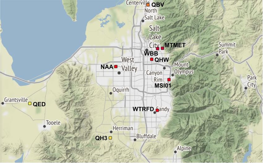
a. Zoom in on the map to find the Hawthorne Elementary sensor (QHW). It is a square on
700 East just North of the 215 Belt Route.
b. Click on the square and then click on the QHW link at the top of the box. This will take you
to the data page for that specific sensor. The Hawthorne sensor is a Department of Air
Quality sensor and is the longest running sensor on the MesoWest network, which are the
reasons we have chosen this sensor to work with for this activity.
c. This page shows real time data so we now need to select the data set for the PM 2.5
event we want to examine. Click on the option in the left hand column “Change
Date/Time.”
d. Choose 16 December 2017 at 23:00.
e. Click on the option in the left hand column “Change to Graphical Display.”
f. For the time period, select “Previous 14 Days” for the variable select “PM_2.5
Concentration.” Then click “Change Graph.” The graph should display two lines (one for
each of the two sensors on the QHW device).
3. Examine the graph. Be sure to notice the following (you are not drawing any conclusions, just
making observations):
a. Variable(s) on the X axis
b. Variable(s) on the Y axis
c. Title of the graph
d. Location or Date/Time of Data
e. General patterns in the data
f. High and Low data points
g. Is there anything else you notice?
4. Develop questions from the patterns you see in the data.
5. Construct an explanation for what you think could be occurring (6-8 sentences) that summarizes
your findings in the graph. This summary (predictions) should include many of the observations
you made in #3.
6. What was the maximum PM 2.5 concentration during this inversion event?
7. Look at the recess guidance tool linked here. What would schools in the valley have chosen for
recess that day?
8. Over what period of time did the PM 2.5 concentrations exceed the acceptable level for all
students?
9. Create an argument for evidence from your prediction verses other data.
10. This graph represents a typical inversion event in the valley. Answer the following questions to
describe this event.
a. How long did the event last?
b. Over what period of time were PM 2.5 concentrations increasing?
c. Over what period of time were PM 2.5 concentrations decreasing?
24d. How many times bigger is the max event as compared to the minimum event?
e. Did PM 2.5 concentrations increase and decrease at the same rate or different rates?
11. On the graph paper below, create a graph/model that represents an inversion event during which
students with respiratory symptoms would have been advised to stay indoors. Be sure to scale
and label both axes. Optional to help with planning your graph, complete the prompts below.
a. Over what period of time will your inversion event occur (what dates/times)?
b. What will be the max PM 2.5 concentration?
c. What will be the min PM 2.5 concentration?
d. How long will it take for PM 2.5 to reach the max concentration?
12. With information from above and the lecture, evaluate and communicate your findings and design
a set of solutions.
2526
Student Worksheets

Lesson #2 - Relationships Between Two
Variables

                                        27
Name _________________________ Date _____________
Lesson #2 - Relationships Between Two Variables Prediction Worksheet
Phenomenon: ‘Bad air days’ and other changes in our sky have a pattern, every winter they reoccur.
Prediction - draw two graphs that predict what happens to PM 2.5 concentrations and temperature
before, during and after an inversion event. Use the front and back of this page.
2829
Name _________________________                                                Date _____________
Lesson #2 - Relationships Between Two Variables                  Procedure and Analysis Worksheet

Phenomenon: ‘Bad air days’ and other changes in our sky have a pattern, every winter they reoccur.

OPTION A

   1. Examine the graph. Be sure to notice the following (you are not drawing any conclusions, just
      making observations):
         a. Variable(s) on the X axis
         b. Variable(s) on the Y axis
         c. Title of the graph
         d. Location or Date/Time of Data
         e. General patterns in the data
         f. High and Low data points
         g. Is there anything else you notice?
   2. Develop questions from the patterns you see in the data.
                                                                                                      30
3. Construct an explanation for what you think could be occurring (6-8 sentences) that summarizes
your findings in the graph. This summary (predictions) should include many of the observations
you made in #1.
4. What relationship do you see between PM 2.5 and Temperature in the graphs?
5. How did your predictions compare to the actual graphs?
6. Create an argument for evidence from your prediction.
7. Make predictions about the relationship between PM 2.5 and other variables such as humidity or
wind speed.
8. With information from above and the lecture, evaluate and communicate your findings and design
a set of solutions.
31Name _________________________ Date _____________
Lesson #2 - Relationships Between Two Variables Procedure and Analysis Worksheet
Phenomenon: ‘Bad air days’ and other changes in our sky have a pattern, every winter they reoccur.
OPTION B
1. Use the data set provided by your teacher to create two graphs, one of PM 2.5 concentration and
the other for temperature over time for this inversion event. Follow your teacher’s instructions to
graph this data.
2. Examine the graph. Be sure to notice the following (you are not drawing any conclusions, just
making observations):
a. Variable(s) on the X axis
b. Variable(s) on the Y axis
c. Title of the graph
d. Location or Date/Time of Data
e. General patterns in the data
f. High and Low data points
g. Is there anything else you notice?
3. Develop questions from the patterns you see in the data.
4. Construct an explanation for what you think could be occurring (6-8 sentences) that summarizes your
findings in the graph. This summary (predictions) should include many of the observations you made in
#2.
5. How did your prediction compare to the actual graphs?
6. What relationship do you see between PM 2.5 and Temperature in the graphs?
7. Create an argument for evidence from your prediction.
8. Make predictions about the relationship between PM 2.5 and other variables such as humidity or wind
speed.
9. With information from above and the lecture, evaluate and communicate your findings and design a set
of solutions.
32Name _________________________ Date _____________
Lesson #2 - Relationships Between Two Variables Procedure and Analysis Worksheet
Phenomenon: ‘Bad air days’ and other changes in our sky have a pattern, every winter they reoccur.
OPTION C
1. Click here to open the MesoWest website.
2. Follow the steps below VERY carefully. They will walk you through how to use the MesoWest
website to generate a graph of an inversion event.
a. Zoom in on the map to find the Hawthorne Elementary sensor (QHW). It is a square on
700 East just North of the 215 Belt Route.
b. Click on the square and then click on the QHW link at the top of the box. This will take you
to the data page for that specific sensor. The Hawthorne sensor is a Department of Air
Quality sensor and is the longest running sensor on the MesoWest network, which are the
reasons we have chosen this sensor to work with for this activity.
c. This page shows real time data so we now need to select the data set for the PM 2.5
event we want to examine. Click on the option in the left hand column “Change
Date/Time.”
d. Choose 16 December 2017 at 23:00.
e. Click on the option in the left hand column “Change to Graphical Display.”
f. For the time period, select “Previous 14 Days” for the variable in the top graph select
“PM_2.5 Concentration.” Then click “Change Graph.” The graph should display two lines
(one for each of the two sensors on the QHW device).
3. Use the data set provided by your teacher to create two graphs, one of PM 2.5 concentration and
the other for temperature over time for this inversion event. Follow your teacher’s instructions to
graph this data.
4. Examine the graph. Be sure to notice the following (you are not drawing any conclusions, just
making observations):
a. Variable(s) on the X axis
b. Variable(s) on the Y axis
c. Title of the graph
d. Location or Date/Time of Data
e. General patterns in the data
f. High and Low data points
g. Is there anything else you notice?
5. Develop questions from the patterns you see in the data.
6. Construct an explanation for what you think could be occurring (6-8 sentences) that summarizes
your findings in the graph. This summary (predictions) should include many of the observations
you made in #4.
7. What relationship do you see between PM 2.5 and Temperature in the graphs?
8. Create an argument for evidence from your prediction.
9. Make predictions about the relationship between PM 2.5 and other variables such as humidity or wind
speed.
10. With information from above and the lecture, evaluate and communicate your findings and design a set
of solutions.
11. As an extension, use the MesoWest website to create graphs of relative humidity and wind speed for the
same time frame and compare the results to the PM 2.5 graph
3334
Student Worksheets

Lesson #3 - Spatial Variation of a Variable

                                              35
Name _________________________ Date _____________
Lesson #3 - Spatial Variation of a Variable Prediction Worksheet
Phenomenon: On bad air days, the pollution starts from the north part of town and moves to the south,
so is the air cleaner in the south?
Prediction - create a color coded map that predicts how PM 2.5 concentrations will vary across the Salt
Lake Valley during an inversion event. Construct an explanation with a minimum of 4-6 sentences to
justify for your prediction.
36Name _________________________ Date _____________
Lesson #3 - Spatial Variation of a Variable Procedure and Analysis Worksheet
Phenomenon: On bad air days, the pollution starts from the north part of town and moves to the south,
so is the air cleaner in the south?
OPTION A
1. Examine the graph. Be sure to notice the following (you are not drawing any conclusions, just
making observations):
a. Variable(s) on the X axis
b. Variable(s) on the Y axis
c. Title of the graph
d. Location or Date/Time of Data
e. General pattern in the data
f. High and Low data points
g. Is there anything else you notice?
2. Develop questions from the patterns you see in the data.
3. Construct an explanation for what you think could be occurring (6-8 sentences) that summarizes
your findings in the graph. This summary (predictions) should include many of the observations
you made in #1.
4. Look at your map template of the Salt Lake Valley. Each label represents a PM 2.5 sensor that
collects data for the MesoWest website. Using your graph, write in the PM 2.5 concentration for
each sensor during this particular inversion event.
5. Make a prediction about what you observe about PM 2.5 variation across the valley.
6. What relationships or factors might be responsible for the patterns we see in spatial variability of
PM 2.5?
7. Create an argument for evidence from your prediction.
378. What other variables (weather, geographic, geologic, environmental, biological, etc) have
predictable spatial variability across the Salt Lake Valley?
38Name _________________________ Date _____________
Lesson #3 - Spatial Variation of a Variable Procedure and Analysis Worksheet
Phenomenon: On bad air days, the pollution starts from the north part of town and moves to the south,
so is the air cleaner in the south?
OPTION B
1. Use the data set provided by your teacher to create a graph of PM 2.5 concentration at different
sensor locations in the Salt Lake Valley during this inversion event. Follow your teacher’s
instructions to graph this data.
2. Examine the graph. Be sure to notice the following (you are not drawing any conclusions, just
making observations):
a. Variable(s) on the X axis
b. Variable(s) on the Y axis
c. Title of the graph
d. Location or Date/Time of Data
e. General pattern in the data
f. High and Low data points
g. Is there anything else you notice?
3. Develop questions from the patterns you see in the data.
4. Construct an explanation for what you think could be occurring (6-8 sentences) that summarizes your
findings in the graph. This summary (predictions) should include many of the observations you made in
#2.
5. Look at your map template of the Salt Lake Valley. Each label represents a PM 2.5 sensor that
collects data for the MesoWest website. Using your graph, write in the PM 2.5 concentration for
each sensor during this particular inversion event.
6. Make a prediction about what you observe about PM 2.5 variation across the valley.
7. What relationships or factors might be responsible for the patterns we see in spatial variability of
PM 2.5?
8. Create an argument for evidence from your prediction.
9. What factors might be responsible for the patterns we see in spatial variability of PM 2.5?
10. What other variables (weather, geographic, geologic, environmental, biological, etc) have
predictable spatial variability across the Salt Lake Valley?
3940
Name _________________________                                                Date _____________
Lesson #3 - Spatial Variation of a Variable                      Procedure and Analysis Worksheet

Phenomenon: On bad air days, the pollution starts from the north part of town and moves to the south,
so is the air cleaner in the south?

OPTION C
  1. Click here to open the MesoWest website.
  2. Follow the steps below VERY carefully. They will walk you through how to use the MesoWest
      website to gather data to create a graph of PM 2.5 concentration at different sensor locations in
      the Salt Lake Valley during this inversion event. Follow your teacher’s instructions to graph this
      data.
          a. At the top of the page, hover over “Air Quality Data” and then click on “Map Archive.”
          b. Select the parameters for December 12, 2017 at 12:00 for PM 2.5 Concentration. Click
              “Update Time and Primary Options.”
          c. Center the map around Salt Lake City and click the zoom button once.
          d. Notice the color coded squares, each corresponds to an air quality sensor.
          e. Click on each sensor and record the sensor label and PM 2.5 concentration in a
              spreadsheet. You should have data for 9 different sensors.
          f. Use this data to create a bar graph showing PM 2.5 concentration for the 9 different
              sensors in the Salt Lake Valley.
  3. Use the data set provided by your teacher to create a graph of PM 2.5 concentration at different
      sensor locations in the Salt Lake Valley during this inversion event. Follow your teacher’s
      instructions to graph this data.
  4. Examine the graph. Be sure to notice the following (you are not drawing any conclusions, just
      making observations):
          a. Variable(s) on the X axis
          b. Variable(s) on the Y axis
          c. Title of the graph
          d. Location or Date/Time of Data
          e. General pattern in the data
          f. High and Low data points
          g. Is there anything else you notice?
  5. Develop questions from the patterns you see in the data.
  6. Construct an explanation for what you think could be occurring (6-8 sentences) that summarizes your
      findings in the graph. This summary (predictions) should include many of the observations you made in
      #4.
  7. Look at your map template of the Salt Lake Valley. Each label represents a PM 2.5 sensor that
      collects data for the MesoWest website. Using your graph, write in the PM 2.5 concentration for
      each sensor during this particular inversion event.
  8. Make a prediction about what you observe about PM 2.5 variation across the valley.
  9. What relationships or factors might be responsible for the patterns we see in spatial variability of
      PM 2.5?
  10. Create an argument for evidence from your prediction.
  11. What other variables (weather, geographic, geologic, environmental, biological, etc) have
      predictable spatial variability across the Salt Lake Valley?

                                                                                                    41
42
Student Worksheets - Printable PDF Version

---------------------------------------------------

Student Worksheets

Lesson #1 - Predicting and Drawing Graphs

                                                 43
Name _________________________ Date _____________
Lesson #1 - Predicting and Drawing Graphs Prediction Worksheet
Phenomenon: In the winter time there are days where the air in Utah appears cloudy or foggy all day.
Prediction - draw a graph that predicts what happens to PM 2.5 concentrations during an inversion event.
Be sure to label both axes with the appropriate variables and units.
44Name _________________________ Date _____________
Lesson #1 - Predicting and Drawing Graphs Procedure and Analysis Worksheet
Phenomenon: In the winter time there are days where the air in Utah appears cloudy or foggy all day.
OPTION A
1. Examine the graph. Be sure to notice the following (you are not drawing any conclusions, just
making observations):
a. Variable(s) on the X axis
b. Variable(s) on the Y axis
c. Title of the graph
d. Location or Date/Time of Data
e. General pattern in the data
f. High and Low data points
g. Is there anything else you notice?
2. Develop questions from the patterns you see in the data.
3. Construct an explanation for what you think could be occurring (6-8 sentences) that summarizes
your findings in the graph. This summary (predictions) should include many of the observations
you made in #1.
___________________________________________________________________________________
___________________________________________________________________________________
___________________________________________________________________________________
___________________________________________________________________________________
___________________________________________________________________________________
___________________________________________________________________________________
45___________________________________________________________________________________
4. How did your prediction compare to the actual graph?
___________________________________________________________________________________
___________________________________________________________________________________
5. What was the maximum PM 2.5 concentration during this inversion event? __________________
6. Look at the recess guidance tool linked here. What would schools in the valley have chosen for
recess that day?
___________________________________________________________________________________
___________________________________________________________________________________
7. Over what period of time did the PM 2.5 concentrations exceed the acceptable level for all
students?
___________________________________________________________________________________
8. Create an argument for evidence from your prediction verses other data.
___________________________________________________________________________________
___________________________________________________________________________________
9. This graph represents a typical inversion event in the valley. Answer the following questions to
describe this event.
a. How long did the event last? ________________________________________________
b. Over what period of time were PM 2.5 concentrations increasing? ___________________
c. Over what period of time were PM 2.5 concentrations decreasing?
___________________
d. How many times bigger is the max event as compared to the minimum event?
___________________
e. Did PM 2.5 concentrations increase and decrease at the same rate or different rates?
___________________________________________________________________________________
46___________________________________________________________________________________
10. On the graph paper below, create a graph that represents an inversion event during which
students with respiratory symptoms would have been advised to stay indoors. Be sure to scale
and label both axes. Optional to help with planning your graph, complete the prompts below.
a. Over what period of time will your inversion event occur (what dates/times)?
b. What will be the max PM 2.5 concentration?
c. What will be the min PM 2.5 concentration?
d. How long will it take for PM 2.5 to reach the max concentration?
11. With information from above and the lecture, evaluate and communicate your findings and design
a set of solutions.
___________________________________________________________________________________
___________________________________________________________________________________
___________________________________________________________________________________
___________________________________________________________________________________
___________________________________________________________________________________
___________________________________________________________________________________
___________________________________________________________________________________
___________________________________________________________________________________
___________________________________________________________________________________
___________________________________________________________________________________
___________________________________________________________________________________
___________________________________________________________________________________
4748
Name _________________________                                                Date _____________
Lesson #1 - Predicting and Drawing Graphs                        Procedure and Analysis Worksheet

Phenomenon: In the winter time there are days where the air in Utah appears cloudy or foggy all day.

OPTION B
  1. Use the data set provided by your teacher to create a graph of PM 2.5 concentration over time for
     this inversion event. Follow your teacher’s instructions to graph this data.

   2. Examine the graph. Be sure to notice the following (you are not drawing any conclusions, just
      making observations):
         a. Variable(s) on the X axis
         b. Variable(s) on the Y axis
         c. Title of the graph
         d. Location or Date/Time of Data
         e. General patterns in the data
         f. High and Low data points
         g. Is there anything else you notice?

   3. Develop questions from the patterns you see in the data.

___________________________________________________________________________________

___________________________________________________________________________________

___________________________________________________________________________________

___________________________________________________________________________________

___________________________________________________________________________________

___________________________________________________________________________________

___________________________________________________________________________________

   4. Construct an explanation for what you think could be occurring (6-8 sentences) that summarizes
       your findings in the graph. This summary (predictions) should include many of the observations
       you made in #2.

___________________________________________________________________________________

___________________________________________________________________________________

___________________________________________________________________________________

___________________________________________________________________________________

                                                                                                        49
You can also read