Effective tables and graphs in official statistics - Guidance for producers Second Edi on Version 2.1 February 2018
←
→
Page content transcription
If your browser does not render page correctly, please read the page content below
Effective tables and graphs in official statistics
Guidance for producers

Second Edi on
Version 2.1
February 2018
Wri ng about sta s cs                                                                                                                   Guidance for producers

                                                       Contacts
                                                       Good Prac ce Team
                                                       Government Sta s cal Service
                                                       1 Drummond Gate                      Twi er: @GSSGoodPrac ce, @UKGSS
                                                       London SW1V 2QQ                      Email us: goodprac ceteam@sta s cs.gov.uk

   There are more resources on this topic on the GSS website: h p://bit.ly/goodprac ceresources

   Acknowledgements
   This is the second edi on of “Effec ve tables and graphs in official sta s cs”. It was first released in January 2015. We have updated it to include a new
   sec on on maps and to include other minor changes based on our experience delivering the associated course, feedback from colleagues and finding
   out more about data visualisa on.

   This guidance was developed in collabora on with the Office for Na onal Sta s cs Data Visualisa on Centre (ONS DVC). It was based on original source
   material developed by ONS DVC for the one‐day course “Data visualisa on – an introduc on”. The Good Prac ce Team would like to thank Alan Smith,
   Steve Rogers, John Nixon, Zoe Hartland and Rob Fry for developing the original content and advising and suppor ng us in wri ng this guidance.

   We draw on material developed by Adam Li le, Greg Wye and colleagues from NHS Digital in their document “Presen ng informa on visually” and Full
   Fact’s internal “Charts in brief” guide. Other source material (including web content wri en by other authors) is cited in the text and described in the
   references sec on at the end of the document. The guidance on tables was devised originally by Nicole Choong during her Fast Stream summer intern‐
   ship with the Good Prac ce Team, while the guidance on maps was devised and collated by Sylvia Bolton (née Kwan) during her 2016 secondment to
   the Good Prac ce Team.

   Finally, we would like to thank colleagues from the GSS and wider government who have par cipated in the “Effec ve Tables and Graphs” course and
   provided feedback and construc ve comments about this material.

                                                                                Page 2
Wri ng about sta s cs                                                                                                                                       Guidance for producers

 Contents
 Introduc on .................................. 5                    Posi oning summary rows and columns10                          Dot maps ............................................ 20
   Who is this guidance for? ..................... 5                 Shading ............................................... 10     Propor onal symbol maps ................. 20
   What is its aim? .................................... 5           Titles and labelling .............................. 11         Cartograms ......................................... 21
   Why do we need it?.............................. 5                                                                               Colour on maps .................................. 22
   What does it cover?.............................. 5             Graphs ........................................ 12               Map projec ons ................................. 22
   Don’t forget... ....................................... 5         When to use a graph........................... 12              Legend ................................................ 22
 The big picture .............................. 6                    Choose the right graph for the job ..... 12                    Insets .................................................. 22

 Tables............................................ 7                Bar graphs ........................................... 13      Labels .................................................. 22
                                                                     Line graphs .......................................... 13
   Reference and demonstra on tables ... 7
                                                                     Pie charts ............................................ 14   Colour .........................................23
      When to use a demonstra on table
      instead of a graph ............................. 7             Focus on the story .............................. 15           Using colour: what users need ........... 23
   Presen ng numbers for comparison .... 8                           Should the y–axis start at zero?.......... 16                  Consider accessibility ......................... 25
   Rounding............................................... 8            On bar charts…................................ 16           Defining colour digitally...................... 26
   Grid lines ............................................... 9         On line charts… ............................... 16          Hue ..................................................... 26
   Grouping ............................................... 9                                                                       Satura on (Chroma) ........................... 26
   Fonts ..................................................... 9   Maps .......................................... 18               Luminance (Lightness) ........................ 26
   White space .......................................... 9          Choropleth maps ................................ 18            Alterna ng colours ............................. 27
   Alignment ............................................. 9         Categorising the values ....................... 19             Shading edges to improve contrast.... 27
   Ordering categories ............................ 10               Isolines and grid shading .................... 20              Colours on line graphs ........................ 30
                                                                                                                                    Colour and highligh ng ...................... 31

                                                                                              Page 3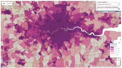
Wri ng about sta s cs                                                                                               Guidance for producers

 Contents
   Background colour.............................. 32
   A word about images.......................... 32
 References and resources............ 33
   References cited in the text ............... 33
   Other useful material ......................... 35
      General references ......................... 35
      On colour ....................................... 35

                                                                                                                       © Crown copyright 2018
                                                                You may re‐use this document (not including logos) free of charge in any format
                                                                or medium, under the terms of the Open Government Licence v3.0. To view this
                                                                licence visit h p://www.na onalarchives.gov.uk/doc/open‐government‐
                                                                licence or write to the Informa on Policy Team, The Na onal Archives, Kew,
                                                                Richmond, Surrey, TW9 4DU; or email: psi@na onalarchives.gsi.gov.uk.
                                                                This document is available at www.sta s csauthority.gov.uk
                                                                Any enquiries regarding this document should be sent to us at:
                                                                Office for Na onal Sta s cs
                                                                1 Drummond Gate
                                                                London
                                                                SW1V 2QQ

                                                                Email: goodprac ceteam@sta s cs.gov.uk

                                                             Page 4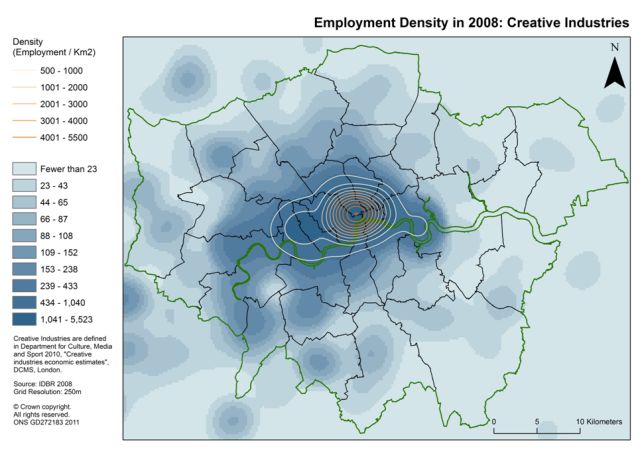
Wri ng about sta s cs                                                                                                    Guidance for producers

 Introduction
 Who is this guidance for?                           Sta s cal tools provide all sorts of techniques
                                                     for graphing and tabula on. Some are useful,
                                                                                                        Don’t forget...
 This guidance is primarily for producers of         but many of these features can encourage bad       Think clearly and carefully about the
 official sta s cs who must design data                prac ce. For example, it is simple to introduce    informa on you are trying to convey when
 visualisa ons that are clear, consistent,           3D effects and shadows which reduce clarity         crea ng tables, graphs and maps. Consider
 informa ve and easy to use.                         and obscure the message. It is vital that we get   the requirements of your audience. Choose
                                                     the basics right.                                  and tailor your visualisa on method
 What is its aim?                                                                                       accordingly.
 The aim of the guidance is to ensure that the
                                                     What does it cover?
 visualisa ons we produce convey key messages        The guidance explores principles and               “The use of tables and
 quickly and effec vely.                              approaches for the effec ve presenta on of          graphs to communicate
 The guidance is not a set of standards. Instead,    sta s cal data in tables, graphs and maps. It
 it sets out some principles to think about when     also discusses principles around the effec ve       quan ta ve informa on is
                                                     use of colour.
 visualising and presen ng sta s cal data and                                                           common prac ce, yet few
 illustrates them with examples.                     It brings together good prac ce from a range of
                                                     exis ng sources and provides references for        of us have learned the
 Why do we need it?                                  further reading.
                                                                                                        design prac ces that make
 It is our responsibility to ensure that important   While the guidance does not cover dynamic or
 pa erns and trends in sta s cs are clearly          interac ve visualisa on directly, the principles   them effec ve.”
 described and easy to see.                          outlined here are also generally applicable in
 This helps informed decision making and             those contexts.                                    Stephen Few
 debate.                                                                                                Show Me the Numbers [1]

                                                                         Page 5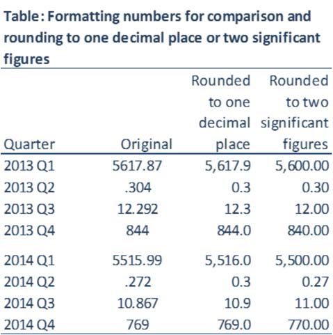
Wri ng about sta s cs                                                         Guidance for producers

 The big picture
 The UK Sta s cs Authority requires that
 producers of official sta s cs ensure that                     “[Sta s cs] should be
 charts, tables and maps conform to good
 prac ce standards. Graphs and tables must be
                                                              illustrated by suitable data
 presented impar ally, so that they avoid
 favouring a par cular viewpoint.
                                                              visualisa ons, including
 We must also follow good prac ce in mee ng                   charts, maps and tables,
 requirements for accessibility. This ensures that
 the informa on we produce is helpful to the
                                                              where this helps aid
 widest possible audience.
                                                              appropriate
 As members of the Government Sta s cal
 Service, it is our role to show people what the              interpreta on.”
 numbers mean – clearly and consistently. We
 must also think carefully about choosing
 appropriate visualisa ons to convey the
 messages in the numbers. Careful design                      Prac ce V3.2
 underpins and supports this role.
                                                              Code of Prac ce for Sta s cs [2]

                                                     Page 6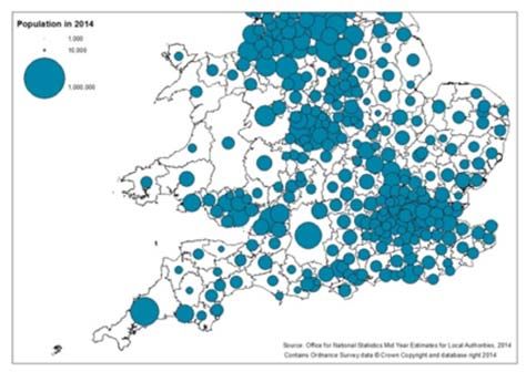
Wri ng about sta s cs Guidance for producers
Tables
Tables should be used to present numbers in a When to use a demonstra on
clear and systema c way. “Na on sizes will look different in
table instead of a graph
Reference and demonstra on the future”
Messages may be illustrated using
tables demonstra on tables or graphs. Any differences in growth rate
When we want to make sta s cs available for Use a graph when you want to show pa erns, accumulate into significant
future reference, we supply them in a reference trends and rela onships in the sta s cs, where changes. Note how the United
table. These typically have a large number of the actual values are not required to make the
entries covering a wide variety of different point and all values share the same units. States and the Soviet Union grow
sta s cs broken down into different categories. Use a demonstra on table:
rela ve to Western Europe.
They are usually supplied away from the main
commentary in an appendix or an If you are asking the reader to compare (Source: United Na ons)
accompanying spreadsheet. Because of this individual values.
volume of informa on, it is important that the If you want to include both the values and
design of the tables allows the user to iden fy derived measures such as percentages or
the right sta s cs with minimum effort. indices.
If we are using a table to demonstrate a point If you want to include summary sta s cs
that we are making in the text, we create a such as means or totals.
demonstraƟon table. These use sta s cs,
extracted from reference tables, laid out so as
to quickly reinforce the point. The design
should ensure that “the pa erns, and
excep ons should be obvious at a glance, at
least once one knows what they are.” [3], [4]
Page 7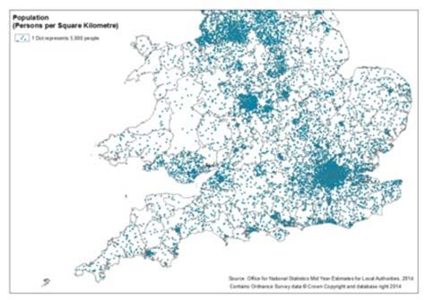
Wri ng about sta s cs Guidance for producers
Tables
Presen ng numbers for Rounding
comparison Simplifying by rounding assists comparisons by
making numbers easier to read and remember
If you are invi ng the reader to compare
[5] [6]. In making decisions, we usually focus on
numbers, try to ensure that those numbers are
the most significant digits. By presen ng too
physically close together.
much detail we can make things harder.
If this is a series of numbers, it is simpler to
The extent of rounding will depend on the
make the comparison and discern pa erns if
intended use: a commentator may be content
the numbers are arranged in a column.
to report that the popula on of the UK is 64m,
To help the reader make comparisons: or that this has changed from 63.7m to 64.1m.
use the same level of precision in each An analyst performing further calcula ons will
column, want to work with more precise figures.
use commas to separate thousands, and Rounding does reduce precision. This also
usually means that the reported totals no
right align the figures. longer equal the sum of the component parts.
Decimal frac ons less than one should always While demonstra on tables should present Making a decision on rounding can be difficult
begin with a zero. suitably rounded numbers to illustrate the point when the values show a variety of magnitudes
being made, reference tables usually retain (as in the table above). If so, consider rounding
most or all of the precision so that users can to a fixed number of (for example two)
decide on their own rounding. significant figures, as in the third column of the
table, to enable rapid comparison, or similarly
to two effec ve digits [7].
Page 8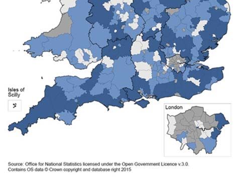
Wri ng about sta s cs Guidance for producers
Tables
Grid lines White space Alignment
Grid lines can help to separate different parts of
As well as separa ng groups, white space can The rates on the right of the table are
a table and group together related items. In this
be used to associate items together through associated with par cular age groups through
example, lines are used:
con nuity. alignment. To achieve this associa on, it is
to indicate where the body of the table important that the columns are not too far
Here the age group‐specific sta s cs are
starts and finishes; apart. This ensures that there is no break in the
grouped with the headline sta s cs, but shown
to separate the headings and bring together
implied con nuity when reading across.
to be together at the lower‐level through
the columns for the two sets of sta s cs; indenta on.
to show that two of the columns refer to
change rather than level.
Excessive use of grid lines clu ers the page,
confusing foreground and background objects
and interrup ng numerical comparisons.
Grouping
Objects grouped together are assumed to be
associated. Here the different measures are
grouped in rows and the different types of
es mate in columns.
Fonts
Different fonts can signal related items through
similarity. Here, they indicate main headings
and differen ate between es mated totals and
rates.
Page 9
Wri ng about sta s cs                                                                                     Guidance for producers

 Tables
 Ordering categories                                 It’s interes ng to note that   Posi oning summary rows and
 Ordering the categories in a table is a very
                                                     Samuelson didn’t include       columns
 effec ve way to aid rapid interpreta on. In the
                                                                                    Summary rows and columns, par cularly for
 example on the right, the table from page 7 is
 re‐ordered to emphasise annual growth levels.
                                                     Japan in his comparison of     totals, were tradi onally placed at the bo om
                                                                                    or right of the table. To help set the context for
 For some categorical variables, like me or age      growth rates                   the subsequent sta s cs, it may be more
 group, there is a natural order for presenta on.                                   helpful to place the totals at the top or le .
 Others may have standard or harmonised
 orderings. Use these whenever possible. An                                         Shading
 appropriate order may also be obvious from                                         In reference tables, shading is some mes used
 knowledge of the subject ma er.                                                    to indicate the degree of uncertainty in an
 Alterna vely, consider ordering categories                                         es mate.
 according to the sta s cs in one of the                                            For demonstra on tables, shading can be used
 columns. In our example, the rows are ordered                                      to highlight the point being made in the
 using the summary column on the le with the                                        commentary. We return to this point in the
 largest value at the top. This shows the rankings                                  sec on on colour.
 of the categories on that sta s c, and may also
 show where some of the sta s cs depart from
 the overall pa ern.
 Be aware when ranking a table by outcome that
 this deliberately emphasises the rela ve
 posi ons of the entries, even in cases where
 this is largely determined by random varia on.

                                                                Page 10
Wri ng about sta s cs Guidance for producers
Tables
Titles and labelling
When designing a table, bear in mind that the
reader may not read the commentary or that
the table could be copied and used in another
context.
We cannot be completely prescrip ve about
what should be included, but you should
consider including the following informa on in
the tles, labels, headings and footnotes
accompanying the tables:
Analysis units (people, households,
enterprises)
Types of sta s cs (totals, rates, means, etc)
Units (thousands, km, £, etc)
Classifica ons used to categorise
Geographical or sector coverage
Time periods
Source of data
Informa on about where sta s cs are not
comparable, e.g. over me
Where to find further guidance
Page 11Wri ng about sta s cs Guidance for producers
Graphs
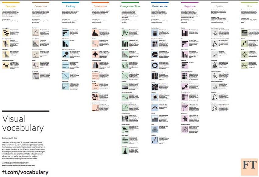
Distribu on e.g. popula on by age group several graph op ons. The effec veness will
When to use a graph
Correla on e.g. exploring rela onship depend on both the sta s cal rela onship and
Graphs are an excellent way to tell a between weight and height) the par cular values in your data. We
memorable story or summarise something Spa al e.g. iden fying geographical clusters recommend you try out different op ons, look
complex. They can also reveal insight that of no fiable diseases cri cally at how well each graph works for your
would otherwise be hidden if the sta s cs were Flow e.g. value of trade between countries par cular situa on and pick the best one.
only presented in a table. For any sta s cal rela onship there are usually
Use a graph when you want to show pa erns,
trends and rela onships in the sta s cs, where
the actual values are not required to make the
point.
Choose the right graph for the
job
What is the sta s cal story that you want to tell
with your graph and what type of rela onships
does that involve?
We think the sta s cal rela onships you may
want to represent can be covered by nine
categories [8].
Magnitude, e.g. average income by region
Time series e.g. price infla on shown over
months
Ranking e.g. schools ranked by performance
Part‐to‐whole e.g. economic produc on by
industrial sector
Devia on e.g. rail company performance
compared with target h p://bit.ly/FTVisVoc
Page 12Wri ng about sta s cs Guidance for producers
Graphs
Bar graphs If you find yourself labelling individual bar Line graphs
values, consider whether a table would be
Bar graphs are versa le, used for comparing be er. If you do add bar values, make sure Line graphs are the default op on for me
magnitude, showing me series, ranking, part‐ they are well presented for comparison, as series. They are also used to represent
to‐whole, devia on and distribu on. described in the tables sec on. cumula ve distribu ons and in a simple form as
a slope chart to compare ranks.
You could also try using spark lines [9]. This
When you can, label lines directly rather than
approach combines table text and a miniature
using a legend. This reduces effort because
graph, and can be very effec ve. Here is an
readers do not have to look across the page. If a
example:
legend is unavoidable, place it prominently near
the lines.
They can be used ver cally or horizontally.
Horizontal bar graphs are useful when you have
long category labels that do not fit under
ver cal bars.
When you have clustered bars, as in the
example above, the gap between the clusters Line graphs with more than four lines are
should be slightly wider than a single bar. For usually hard to follow, even if you vary line
non‐clustered graphs, the gap should be slightly textures and point markers. Consider using
narrower than a bar. small mulƟples (“panel charts”, “la ce plots”)
to present many series in a line graph. See page
30 for an example.
Page 13Wri ng about sta s cs Guidance for producers
Graphs
Pie charts Use a pie chart or donut chart: You can also represent a part‐to‐whole
If there is a dominant value in the sta s cs,
rela onship using stacked bars. For the sec ons
Pie charts (or donut charts) are designed for at each end of the stacked bars, the size of the
which would dwarf the other categories in a
showing part‐to‐whole rela onships, clearly sec on and comparisons with neighbouring
bar graph
indica ng that the ‘parts’ add to the ‘whole’. bars are clear, but for sec ons in the middle,
If the varia ons shown are not significant without a common base, this is more difficult.
To break up a page of bar graphs
Donut charts are an alterna ve to pie charts.
The central space is a convenient place to show
the value of the total, as in this example from
ONS, or for an icon to indicate the category. It is
As for many rela onships, the bar chart is an some mes argued that it is simpler to compare
alterna ve, but does not give the same the sizes in a donut than in a pie chart.
immediate indica on of the whole.
Use a bar graph for part‐to‐whole:
To accurately show small varia ons across
categories which aren’t obvious in a pie chart
The impact of this will depend on whether the
(as in the example above)
outcome variable is categorical or ordinal: for
When there are more than four or five an ordinal variable, each level of the stack has a
categories meaning and can clearly be compared.
Page 14Wri ng about sta s cs Guidance for producers
Graphs
Set the scene Focus on the story Unemployment Rate
A graph should always make sense when seen Some graphing packages include numerous Labour Force Survey
on its own as it could poten ally be copied and chart features by default and these can distract
re‐used elsewhere. from the story you’re trying to tell. Aim to
Title and source. Give your graph a meaningful simplify your graph, focusing on the story for
tle, so readers know what it shows, even if your readers.
removed from its original context. Include the Maximise the data to ink ra o [9]
source of the sta s cs underneath your graph.
Remove anything from your graph which isn’t
Axes. Label the axes so it is clear what the required. Some common “chart junk” includes:
graph is showing. Horizontal labels are much legends
easier to read and interpret than ver cal or
diagonal ones. In par cular, it’s usually best to shaded backgrounds
place the ver cal axis label on the top of the borders
axis.
pa erns, textures and shadows
Annota ons. Consider adding annota ons to
3D shapes
the graph, if this helps to tell the story. Work
Programme Sta s cs [22] by the Department data markers on line charts
for Work and Pensions includes good examples
of annota on, explaining some of the features
of the series and avoiding misinterpreta on. Grid lines. Keep them to a minimum, so they
They also include a descrip on of the overall don’t clu er the graph. Mul ples of two, five
pa ern in an ac ve tle, above a more formal and ten work well for grid line increments.
sub tle. Make the grid lines pale grey.
Page 15Wri ng about sta s cs Guidance for producers
Graphs
Should the y–axis start at zero? With bar charts, the length of bars gives an On line charts…
immediate indica on of the rela ve magnitude
Including zero in the scale for the outcome of different quan es. Even if the axis is clearly In contrast to bars, lines do not give as strong
variable can concentrate the main story in a labelled and a break signalled with a gap, this an implica on of a ra o scale. So, we think it is
small part of the plot area. Whether to break impression of a ra o scale is s ll conveyed. acceptable, with clear labelling, to break the
the axis to focus in on the story is a point of axis here.
So always include zero on bar charts and, if this
conten on.
prevents telling the story clearly, consider using
On bar charts… an alterna ve like a dot plot, which removes
the invita on to the reader to compare rela ve
lengths.
With line graphs, the most precise indica on of
the movement in the series is given when the
lines are banked at around 45° [10]. You should
also consider the quality of the sta s cs, to
avoid focusing too closely on a vola le series. In
some cases there will be a substan ve point in
the scale, such as a policy target or, for an
index, the ‘100%’ line that is important to
include in the scale.
Finally, if you are describing a substan al
rela ve change in a series, like a halving of a
rate, it makes sense to include the zero in the
chart to reinforce that point.
Page 16Wri ng about sta s cs Guidance for producers
Graphs
Graphs should be the same size as a
paragraph of text
A graph that is about the same size as a
paragraph of text becomes part of the natural
flow of content.
When a graph is too big, it interrupts the eye’s
journey through the page. Over‐sized graphs
are perceived as being unprofessional and lack
authority.
If a graph is too small the change to a smaller
font disrupts the flow of text and it is hard to
see what the graph is showing.
Graph text should be about the same size as the
body text in the document, with the tle a li le
larger, as in the example on the right.
The reader should be able to take in a graph at
a glance. They should not need to click, scroll
or enlarge a graph to view it
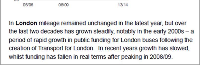
Source: Department for Transport [20]
Page 17Wri ng about sta s cs Guidance for producers
Maps
Thema c maps are a powerful way of within each area is skewed, use the median
visualising geographical varia on in official rather than the mean for averages.
sta s cs. Before you start mapping, think Explore other demographic data at your
about whether a map is the right tool for chosen geographic level to check how this
displaying your data. Maps are there to reveal may affect the pa erns seen. For example, a
geographical pa erns. Success depends on the map of cancer incidence may look very
input data, the geographical areas that are different once rates have been age‐adjusted.
relevant to your message and the level of
granularity that you require. Qualify your conclusions. Be clear about the
geographical level used and the limita ons
Choropleth maps associated with this. This flags to users that
different trends may appear at other levels
Choropleth maps are the most common type of
of aggrega on.
sta s cal map and the “go to” op on in most
cases. Sta s cs are linked to predefined
geographical areas and values are represented
by shading those areas in different colours. The level of geographical aggrega on may
impact on the message conveyed because
Choropleth maps are appropriate for: aggrega on can smooth out differences. The
Data that follow geographical boundaries. posi on of boundaries can also affect the
message (a property that is abused in
Con nuous or categorical data.
‘gerrymandering’).
Standardised data like rates, percentages or
Try the map at different levels of
densi es, rather than counts or totals.
geographical aggrega on to assess the
Counts usually increase with area size, and
impact on the pa erns you see.
can be misleading.
Check that you have enough data for your
chosen geographical breakdown ‐ ensure
that pa erns are not just noise.
Use appropriate measures. If the distribu on
Page 18Wri ng about sta s cs Guidance for producers
Maps
Categorising the values Natural breaks minimise within‐class difference
and maximise varia on between classes.
How many categories? Results are usually good, but be aware that
class intervals are unlikely to be consistent
Aim to group your values into no more than six
across a series of maps.
non‐overlapping categories. It may be difficult
to dis nguish between colours if there are Standard devia on measures distance from the
more. mean. It is best used with data that are
normally distributed, although the median and
Where should the breaks be? suitable quan les can be used to build a more
This depends on the distribu on of your data. robust alterna ve.
Examine the distribu on and consider the Manual adjustments can make intervals more
pa erns you see and what works best to intui ve – but consider the impact on
convey the important messages in your data. comparability across a series of maps. You
Equal intervals divide the data into equal class might also consider inser ng breaks at key
sizes. Use it with normally distributed data, or target value, to show areas that fall above or
to highlight the differences between a small below them.
number of areas and the rest. It is not very
How to deal with outliers?
effec ve for represen ng skewed data.
If they are important, outliers should be
Quan les assign an equal number of
highlighted in a unique category. If they are
observa ons per class. This produces a more
simply noise, they can be hidden by widening a
balanced map for non‐uniformly distributed
range.
data and works well in most cases. However,
categories may have very different ranges and
different values may be grouped together.
Check that ed values are assigned to the same
category.
Page 19Wri ng about sta s cs Guidance for producers
Maps
There are other, more specialised mapping Dot maps
op ons. Here are three common ones.
Dot maps can provide a quick visual impression
Isolines and grid shading of the density of observa ons in space. Each
These maps are designed for visualising dot represents a fixed number of events.
measures which vary con nuously across space Ge ng this right requires careful
like density, temperature, or rainfall. They are experimenta on. The size, posi oning and
number of dots can give very different
normally based on a surface model built from
impressions.
point measures. They use lines of equal value
(“isolines”) or equally sized shaded grid cells to
visualise density. The two techniques are
some mes combined to enhance clarity.
Propor onal symbol maps
Here, symbols are placed in each area on the Most readers find it hard to compare the
map (or at given data points) and sized rela ve sizes of propor onal symbols, especially
according to the variable of interest. A variant circles. Careful legend design can help, but a
(the second map on the right) is the graduated choropleth map or cartogram is a safer way to
symbol map, where a fixed set of symbols convey varying magnitude if your data are area‐
depict the data classes. based.
Page 20Wri ng about sta s cs Guidance for producers
Maps
Cartograms Area cartograms (where the size of an area is Equal area cartograms use equally sized units
propor onal to its value) are useful for to represent areas. They are useful when areas
Cartograms distort map geometry to convey a highligh ng contextual informa on, par cularly are very different in size but the land area is
specific message about the data. They can be in small areas. However they cannot display irrelevant to the message. Larger areas
very effec ve, especially if displayed areas with zero, nega ve, or missing values. The dominate regular choropleth maps. Equal area
interac vely alongside a standard map, but are cartogram below showing bus journeys per cartograms solve this problem, but it is harder
less familiar than other types and will require head across the country is scaled by the to iden fy specific areas. Appropriate labels
some suppor ng explana on. number of journeys in each area. This gives a may be needed.
Areas on cartograms will not be recognisable sense of the overall impact for the whole
by their shape. If they need to be country.
iden fiable, use labels.
A standard choropleth map should normally
be displayed for reference alongside the
cartogram in a sta c display.
Page 21Wri ng about sta s cs Guidance for producers
Maps
Colour on maps Legend
Use a single colour with dark Use appropriately rounded numbers.
shades for high values and lighter Show the number of areas contained within
shades for lower values. each category or include a bar chart or
Use a diverging colour scale if the frequency distribu on with the key. This is
purpose is to show devia on par cularly helpful when large areas dominate.
from a value, such as a na onal
average. Insets
If there is no natural order to Use an inset to dis nguish small areas, or to
categories, use a different hue highlight details for a par cular region or
for each. provide context. Insets for Greater London are
common, for example.
Avoid white as a foreground colour except to
represent 0, “no data” or the centre of a Labels
diverging scheme.
Include meaningful tles, footnotes, source
Check that colours are dis nct when viewing on statements and annota on, as with tables and
the intended display (see Colour sec on).
graphs. Aim for your map to be self‐contained.
Map projec ons Include a copyright statement when required,
e.g. if the map is based on Ordnance Survey
Map projec ons affect the size and shape of informa on.
areas. Maps for prin ng should use the Bri sh
Na onal Grid projec on and you should also
use it when calcula ng densi es or areas.
Page 22Wri ng about sta s cs Guidance for producers
Colour
Colour can fundamentally change how we Colours are usually chosen because of a
understand the informa on in graphs and combina on of three factors: “Avoiding catastrophe
tables. Colour used well can enhance and clarify
sta s cal content. Colour used poorly will
Graphic design. Illustrators may prefer becomes the first principle
par cular colour combina ons. House styles
obscure, muddle and confuse [11].
might use specific pale es. in bringing colour to
This sec on sets out some key principles for
working with colour in graphs and tables. It also
Cultural context. Colours can have cultural
associa ons. We react to these consciously and
informa on.
provides examples of their applica on in
unconsciously and they vary widely across
prac ce.
countries and groups. Recent research [12]
Above all, do no harm.”
Using colour: what users need shows that using colours that people would
expect to see when represen ng familiar Edward Tu e
We add colour to make graphs, tables and maps concepts (like blue for water) can improve the
more effec ve. Users need to be able to tell quality and speed of informa on processing. Envisioning Informa on [19]
which colour is which (idenƟficaƟon) and to tell Counter‐intui ve colours (red for grass) do the
the difference between dis nct colours opposite.
(discriminaƟon).
Think about whether your choice of colours
The way the brain perceives colour can affect could have a cultural associa on, and, whether
the ability to do this, as can the context in this is appropriate in the context of the
which the colours are used. informa on that you are presen ng. Take care
not to mislead.
Science. Biological and psychological knowledge
can help us to design colour schemes that take
account of how the human brain and visual
system process informa on. This can really
improve the usability of graphs and tables.
Page 23Wri ng about sta s cs Guidance for producers
Colour
Use colour sparingly and with restraint The colours in this first graph add no
informa on value, but their presence suggests
Never use colour to specify something on its
that they do.
own. People o en print documents in black and
white and some users are colour‐blind.
Use different colours only when they represent
helpful differences of meaning in the data.
Colours are most effec ve when they are not
overused. Limi ng colour increases its impact
by drawing on the brain’s ability to highlight
differences quickly.
Think carefully before you introduce addi onal
colours into a table or graph. Do you really need
them? Do they enhance the clarity of the
message that you want to get across? When people look at a data display like this one
and see visual differences, they try to
This example, adapted from Stephen Few’s determine the meaning of those differences.
Perceptual Edge website [13] illustrates the Sugges ng meanings which aren’t there makes
point. The two graphs show the same data on the reader waste me and effort trying to
sales levels by country for a product. The labels understand them.
along the x‐axis tell us which countries the bars
represent. The second version of the graph, on the right, is
more effec ve. The reader is much more likely
to compare the bars when they look alike than
when they look different.
Page 24Wri ng about sta s cs Guidance for producers
Colour
Consider accessibility A safe star ng point is a blue pale e:
Colour blindness affects the ability to
dis nguish between some groups of colours,
especially reds and greens. It affects about 1 in
12 men and 1 in 200 women – 4.5% of the UK
popula on – with varying levels of severity [14].
Consider this graph, which uses a red, green
and grey colour scheme:
This scheme has the addi onal issue that it is
not helpful to anybody in greyscale:
This one also works be er in greyscale because
the colours have been chosen to be op mally
dis nct from one another.
While the graph is reasonably clear for a reader
with normal vision, it is much less effec ve for a To minimise the impact on colour blind readers,
reader with red‐green colour blindness, as the avoid using greens and reds in the same display.
next graph shows.
Page 25Wri ng about sta s cs Guidance for producers
Colour
Defining colour digitally Luminance (Lightness)
Colours are represented digitally using several Luminance is the brightness of colour. It is
common schemes. For our purposes, the most perceived as a con nuous, ordered scale from
useful of these is the HSL model [15]. HSL allows dark to light. Changes in luminance are easy to
us to define colours uniquely using three detect, and humans can rank levels of lightness
proper es which are fairly intui ve: quite well unless the change is very subtle.
Hue How we perceive luminance depends on hue.
Consider these coloured squares:
Hues are colours like red, blue or yellow. They
Although they all have the same luminance and Source: Robert Simmon / NASA [15]
are not generally perceived as having an agreed
satura on, the yellow and green squares look
sequence, so readers may have difficulty in
assigning a logical order to them. Small changes
in hue are easy to detect – but colour blindness
can have an impact here. This is discussed later.
lighter than the blue, red and purple ones.
Satura on (Chroma) Colour pale es can be designed to adjust for
SaturaƟon is the intensity of colour. It varies this effect.
from grey or white (no satura on at all) to rich, The diagrams on the right provide a visual
glowing colour. Satura on is perceived on a representa on of hue, satura on and
con nuous scale, but small changes are hard to luminance and how they are inter‐related.
detect.
Source: Wikipedia [18]
Page 26Wri ng about sta s cs Guidance for producers
Colour
Because luminance is perceived as having a Changes in luminance of 10‐20% are enough to Shading edges to improve
natural order, it can help us to op mise colour dis nguish shades in bar graphs, pie and donut
schemes for maximum dis nc on and charts. Changes of 30‐40% are needed to contrast
differen a on. achieve the same effect in line graphs.
Edges can also enhance clarity. Using a dark nt
Consider this chart. It is easy to dis nguish Alterna ng colours for the edges of light bars makes them stand
between the bars. The only changing colour out more.
parameter is luminance. Consider alterna ng dark and light colours for
The dark bars below have the same outline and
categorical data to improve clarity. This graph
fill colour, while the light bars have darker
uses the same pale e as before, but alternates
outlines than the fill colour to improve contrast.
the dark and light colours to improve
differen a on.
Here is the colour sequence from the bar chart
above, with the percentage changes in
luminance shown.
Page 27Wri ng about sta s cs Guidance for producers
Colour
Do not overuse saturated colours Consider the three graphs on the right. Hue and No Satura on
luminance are held constant as the colours
Use bold, saturated colours only when you
move from no satura on at all in the top graph
want to draw a en on to a specific piece of
through to full satura on in the bo om graph.
informa on, rather than for all of the colours in
a graph. The third graph is actually quite uncomfortable
to look at on a screen. Saturated colours like
Do not use saturated colours to highlight
this are best le for highligh ng key messages
informa on in a table.
or to draw a en on to small, hard to see
Bold, saturated colours have a powerful and elements like points on a graph. Avoid using
drama c impact. This can include unse ling them to cover large expanses in a graph or
visual side‐effects. They may appear to glow for table. Medium Satura on
many readers, can generate a er‐images and
For point and line graphs, experiment with
their presence can affect how colours viewed
colours of medium satura on to see if you can
subsequently or nearby appear.
achieve an effec ve result before resor ng to
Lots of saturated colour actually reduces impact bold, saturated ones.
and clarity. If all the colours in a graph are bold,
this can destroy any logical visual hierarchy in
the data.
Mid to low levels of satura on are easy on the
eye. High levels are bright and vibrant.
Full Satura on
Page 28Wri ng about sta s cs Guidance for producers
Colour
Be consistent in your use of colour Use colour logically in sequences
Use the same colour to mean the same thing in For sequences of colours, ensure that these
a series of graphs. progress in a way that the user would expect
(e.g. in luminance order).
Make sure that your use of colour is consistent
When represen ng a sequence, use a single
and logical. Where possible, use colours that
hue (or small set of closely related hues) and
users would expect to see to represent familiar
vary lightness from pale colours to dark colours,
concepts.
rather than alterna ng.
Changing what colours represent in a sequence
This example uses a sequen al blue pale e to
of graphs or tables increases the reader’s
portray ascending age bands. The order of the
cogni ve workload. It can also cause them to
colours is a ma er of experimenta on. A logical
mistake one data series for another, especially
sequence here might be to go from light
if skim reading.
(young) to dark (old). However, the reverse
Using unexpected colours to represent familiar means that the small bars are easier to pick out
concepts (such as red for grass) slows down and the biggest are less overly dominant.
informa on processing [12] and forces the
Use colours that are clearly dis nct from one
reader to work harder. These effects are small
another given your choice of hue.
and subtle, but do accumulate.
Page 29Wri ng about sta s cs Guidance for producers
Colour
Colours on line graphs
We have already seen that graphs with more
than four lines are o en hard to follow, even
with varia ons in line texture and shading.
Introducing addi onal colour is unlikely to solve
the problem.
The example on this page includes seven lines.
We have used Stephen Few’s op mised, mul ‐
colour, medium satura on pale e from the
book “Show Me the Numbers” [1]. A pale e like
this is sufficient for four lines (although prin ng
it in greyscale may s ll be problema c), but
with seven lines, the graph is hard to follow.
Even this pale e is not very successful for so
many lines.
A be er approach to visualise five or more lines
is to use a “small mul ples” plot (also known as
a la ce or panel chart) [16], which picks out
varia ons in the different series at a glance. In
this example, the UK data series appears in all
of the plots for easy comparison with other
countries.
Page 30Wri ng about sta s cs Guidance for producers
Colour
Colour and highligh ng
Colour can be used to highlight elements of
graphs and tables to aid interpreta on.
In graphs, use a dis nct foreground colour to
draw a en on to specific features. Muted
pastel or grey shades can be used to reduce the
impact of the other elements in the graphic.
The graphs on this page use a red highlight
colour, with muted greys for the other
elements. Note the use of a more saturated red The following colours and mixtures of colours
on the line chart than on the bar chart. Even work well for this purpose:
here, it is not usually necessary to use very high Grey
levels of satura on to achieve helpful results.
Blue
Carefully chosen background colours can also
Grey with any one of blue, purple, red, pink
be used to improve the clarity of tables by
or orange
highligh ng par cular rows or columns. Use
subtle shades rather than bold, saturated ones Blue with any one of purple, red, pink or
for highligh ng in tables. orange
Unless you use very light shades green, cyan
and yellow should be avoided. Remember not
to mix greens and reds.
Don’t overdo highligh ng in tables. It is best to
restrict this to one or two columns.
Page 31Wri ng about sta s cs Guidance for producers
Colour
In general, background colour should be
Background colour avoided completely in tables unless it is to
Effec ve use of colour applies as much to graph provide subtle highligh ng in a limited
annota on and background as it does to data subset of cells.
elements like bars and lines.
Avoid using white as a foreground colour in
Use a white background graphs. It should also be avoided on maps
unless it represents 0, “no data” or the
Most colour pale es are designed to appear on
centre of a diverging distribu on.
a white background.
Human vision adopts colour percep on rela ve A word about images
to the local defini on of white. A white
Never use images as backdrops in graphs or
background provides a helpful reference
tables. These simply distract the reader and
“anchor” for the visual system.
make it more difficult to pick up the
The only func onal reason to use a non‐white important messages.
background is for viewing the image in the dark.
Maps some mes include backgrounds such
The use of modern digital projectors, which
as aerial photography or Google Map data to
work well under normal ligh ng condi ons [10],
provide context. If you do this, take care to
make this issue is largely irrelevant today.
ensure that the messages of your map are
Confine use of colour to foreground items in not obscured or compromised by the
graphs. Always use white for background. addi onal complexity of the background.
Use grey pale es for drawing and labelling
axes and annota on.
Page 32Wri ng about sta s cs Guidance for producers
References and resources
References cited in the text
[1] S. Few, Show Me The Numbers ‐ Designing Tables and Graphs to Enlighten (2nd. Edi on), Burlingame, CA: Analy cs Press, 2012.
[2] UK Sta s cs Authority, Code of Prac ce for Sta s cs, 2018. Available at h ps://www.sta s csauthority.gov.uk/code‐of‐prac ce
[3] A. Ehrenberg, “Rudiments of numeracy,” Journal of the Royal Sta s cal Society, Series A, vol. 140, no. 3, pp. 277‐297, 1977.
[4] M. Chapman and C. Wykes, Plain Figures, London: HMSO, 1996.
[5] J. Anseau, “Sta s cal literacy guide: rounding and significant places,” July 2007. [Online]. Available: h p://www.parliament.uk/briefing‐papers/
sn04443.pdf. [Accessed 11 December 2014].
[6] S. Bigwood and M. Spore, “Rounding figures for clarity,” in The designer's guide to presen ng numbers, figures and charts, New York, Allworth Press,
2013, pp. 16‐21.
[7] E. Swires‐Hennessy, Presen ng Data: How to Communicate Your Message Effec vely, Chichester: John Wiley & Sons, 2014.
[8] A. Smith, “Simple techniques for bridging the graphics language gap,” Financial Times, 17 August 2016. [Online]. Available: h ps://www. .com/
content/304419ec‐63a3‐11e6‐8310‐ecf0bddad227. [Accessed 16 11 2016].
[9] E. R. Tu e, “Sparklines: Intense, simple, word‐sized graphics,” in The visual display of quan ta ve informa on, Connec cut, Graphics Press, 2001, pp.
171‐175.
[10] N. B. Robbins, in Crea ng more effec ve graphs, Wiley, 2005.
[11] M. Stone, “Choosing colors for data visualiza on,” 17 January 2006. [Online]. Available: h p://www.perceptualedge.com/ar cles/b‐eye/
choosing_colors.pdf. [Accessed 25 September 2014].
[12] S. Lin, J. Fortuna, K. Chinmay, M. Stone and J. Heer, “Selec ng seman cally resonant colours for data visualisa on,” 2013. [Online]. Available: h p://
idl.cs.washington.edu/files/2013‐Seman cColor‐EuroVis.pdf. [Accessed September 2014].
[13] S. Few, “Prac cal rules for using color in charts,” February 2008. [Online]. Available: h p://www.perceptualedge.com/ar cles/visual.../
rules_for_using_color.pdf. [Accessed September 2014].
[14] Colour Blind Awareness, “Colour Blind Awareness,” [Online]. Available: h p://www.colourblindawareness.org/colour‐blindness/. [Accessed
September 2014].
Page 33Wri ng about sta s cs Guidance for producers
References and resources
[15] R. Simmon, “Subtle es of color,” 5 August 2013. [Online]. Available: h p://earthobservatory.nasa.gov/blogs/elegan igures/2013/08/05/subtle es‐of
‐color‐part‐1‐of‐6/. [Accessed 5 October 2014].
[16] E. R. Tu e, “Small mul ples,” in The visual display of quan ta ve informa on, Connec cut, Graphics Press, 2001, pp. 168‐170.
[17] J. Camoes, “Is your chart really answering your ques on?,” 24 November 2008. [Online]. Available: h p://www.excelcharts.com/blog/2008/11/.
[Accessed 15 08 2014].
[18] Wikpedia, “HSL and HSV,” Wikipedia, 28 November 2014. [Online]. Available: h p://en.wikipedia.org/wiki/HSL_and_HSV. [Accessed 3 December
2014].
[19] E. R. Tu e, Envisioning informa on, Connec cut: Graphics Press, 1990.
[20] Department for Transport, “Annual Bus Sta s cs: England 2013/14,” Department for Transport, London, 2014.
[21] A. Li le and G. Wye, “Presen ng informa on visually,” Health and Social Care Informa on Centre, Leeds, 2014.
[22] Department of Work and Pensions, “Work Programme Sta s cs,” 6 October 2014. [Online]. Available: h ps://www.gov.uk/government/sta s cs/
work‐programme‐sta s cal‐summary‐data‐to‐30‐june‐2014 . [Accessed 16 October 2014].
Page 34Wri ng about sta s cs Guidance for producers
References and resources
Other useful material
General references
Bigwood, S., and Spore, M., 2013, The designer’s guide to presen ng numbers, figures and charts, Allworth Press, New York.
Camoes, Jose, Excel Charts blog, h p://www.excelcharts.com.
Cleveland, W.S. and McGill, Robert, Graphical percep on: theory, experimenta on and applica on to the development of graphical methods, Journal of
the American Sta s cal Associa on, Vol. 79, No. 387, pp. 531 – 554, 1984.
Evergreen, Stephanie D., 2014, Presen ng data effec vely – communica ng your findings for maximum impact, Sage Publica ons.
Ferdio.com, 2017, h p://datavizproject.com.
Few, Stephen, 2013, Informa on Dashboard Design, Analy cs Press.
Few, Stephen: Perceptual Edge website: h p://www.perceptualedge.com.
Government Sta s cal Service: “Communica ng Sta s cs” web resources: h ps://gss.civilservice.gov.uk/sta s cs/presenta on‐and‐dissemina on/.
McCandless, David: Informa on Is Beau ful website: h p://www.informa onisbeau ful.net/
Office for Na onal Sta s cs, Infographic Guidelines, Version 1.0, h ps://gss.civilservice.gov.uk/wp‐content/uploads/2012/12/infographic‐guidelines‐v1‐
0.pdf
Office for Na onal Sta s cs: The Infographic Superhighway blog h ps://blog.ons.digital/2013/10/29/the‐infographic‐superhighway/
Office for Na onal Sta s cs: Style.ONS guidance on data visualisa on: h p://style.ons.gov.uk/category/data‐visualisa on/
Robbins, Naomi B., 2005, Crea ng more effec ve graphs, Wiley.
Schwabish, J., and Ribecca, S., 2014, The Graphic Con nuum, h ps://policyviz.com/2014/11/11/graphic‐con nuum‐desktop‐version/
Swires‐Hennessy, E., 2014, Presen ng data: how to communicate your message effec vely, Wiley.
Page 35Wri ng about sta s cs Guidance for producers
References and resources
Tu e, E.R., 1990, Envisioning Informa on, Graphics Press.
United Na ons Economic Commission for Europe, Making data meaningful Part 2: A guide to presen ng sta s cs, available from h p://www.unece.org/
stats/documents/wri ng/ .
Visualising data website: h p://www.visualisingdata.com/
Yau, N., Flowingdata.com website: h p://www.flowingdata.com
Yau, N., 2011, Visualize this: The FlowingData guide to design, visualisa on and sta s cs, Wiley.
Yau, N., 2013, Data points: visualisa on that means something, Wiley.
On colour
Brewer pale es website: h p://mkweb.bcgsc.ca/brewer/
Colorbrewer website: h p://colorbrewer2.org
Colour usage guidance and tools at NASA Ames Research Laboratory: h p://colorusage.arc.nasa.gov/guidelines.php
Colour FAQ: h p://www.poynton.com/PDFs/ColorFAQ.pdf
I Want Hue website – colours for data visualisa on: h p://tools.medialab.sciences‐po.fr/iwanthue/
Kosara, R., 2013, How the rainbow color map misleads, available at h p://eagereyes.org/basics/rainbow‐color‐map
Page 36You can also read