Enhancing Parallel Coordinates: Statistical Visualizations for Analyzing Soccer Data - BIB Vis LS Keim
←
→
Page content transcription
If your browser does not render page correctly, please read the page content below
Enhancing Parallel Coordinates: Statistical Visualizations for
Analyzing Soccer Data
Halldór Janetzko, Manuel Stein, Dominik Sacha (University of Konstanz, Germany)
Tobias Schreck (Graz University of Technology, Austria)

Abstract                                                                      correlation-based ordering, and Brushing & Linking
      Visualizing multi-dimensional data in an easy and inter-              • Visual Analysis of movement phases in professional soccer
pretable way is one of the key features of Parallel Coordinate                matches
Plots. However, limitations as overplotting or missing density
informations have resulted in many enhancements proposed for                   Soccer is a representative for geospatial movement with high
Parallel Coordinates. In this paper, we will include density in-         degrees of overplotting and strong interdependencies between the
formation along each axis for clustered data. The main idea is           movements of all actors. In our use cases, we analyze the move-
to visually represent the density distribution of each cluster along     ment of professional soccer matches recorded and provided by
the axes. We will show the applicability of our method by ana-           Prozone. We believe that collecting and analyzing soccer move-
lyzing the activity phases of professional soccer players. A final       ment data will help coaches and professional soccer game ana-
discussion and conclusion will complement this paper.                    lysts in their daily business. We proposed in [10] a comprehensive
                                                                         and versatile framework for the feature-based analysis of soccer
Introduction                                                             matches. Based on this starting point, we clustered the move-
      Parallel Coordinates have a long history in information vi-        ment into so-called movement phases and implemented Parallel
sualization. In 1880, Parallel Coordinate plots (PCP) were used          Coordinates to investigate the resulting movement phases. Due to
by Henry Gannets visualizing ranks of the states of the United           overplotting problems of Parallel Coordinate plots, we decided to
States of America for several categories. Today, the popularity of       enhance them by phase-aware density visualizations along each
Parallel Coordinates is originating from the works of Alfred In-         axis.
selberg systematically investigating the mathematical foundations              In the next section, we will outline previous works and relate
and showing the usefulness for visualization purposes.                   them to our approach. In the third technique related section, we
      Parallel Coordinates allow to visually explore a high-             describe the technical details of our Parallel Coordinates imple-
dimensional data set by connecting for each data point the re-           mentation. Based on the applied clustering approach, use cases
spective dimension values. With each data point being repre-             will exemplify the benefits of the proposed technique and high-
sented by a polyline, overplotting can cause severe readability          light some interesting findings. In the discussion section, we will
problems. Consequently, many techniques enhancing the read-              discuss our methods and potential perspectives for future work.
ability of Parallel Coordinates have been developed and proposed.        Finally, we will conclude our paper by a brief summary.
Sampling and Smart Lenses reduce overplotting by plotting fewer
data points. Aggregations and density visualization on each axis         Related Work
have been described to show the frequency distribution along each             Exploration of high-dimensional data is a fundamental prob-
axis. Coloring of the polylines according to the numerical values        lem studied extensively to date in Information Visualization and
of one axis has been discussed to reveal dependencies. We will           Visual Analytics. We briefly discuss related work from high-
discuss the proposed enhancements in detail in the subsequent re-        dimensional data visualization in general, and Parallel Coordi-
lated work section.                                                      nates and its extensions in particular.
      In this paper, we focus on the visualization of frequency dis-
tributions of categorized data points. Previous enhancements for         High-Dimensional Data Visualization and Parallel Coor-
Parallel Coordinate plots show only the global density distribu-         dinate Plots Well-known visualization techniques for high-
tion and do not regard additional class information. We integrated       dimensional data include multivariate glyphs (mapping data vari-
three state-of-the-art statistical visualizations representing density   ables to glyph shape properties), stacked displays (recursively
distributions along each axis regarding class information. Den-          mapping dimensions to a given schema), and scatter plot matri-
sity Distributions will help to detect interesting patterns in highly    ces (showing pairwise dimension combinations) [15]. The at-
overplotted Parallel Coordinate plots and interactive filtering and      tribute explorer maps multiple data dimensions to parallel, ver-
Brushing & Linking techniques help to narrow the analysis down           tical histograms, allowing to the brush and link data records [14].
to the interesting portions in the data. The contributions of this       Parallel Coordinate plots [9] show many data records by poly-
paper are as follows:                                                    lines intersecting a vertical, parallel coordinate setup at the re-
                                                                         spective positions. Parallel Coordinate plots support many tasks
   • Integration of frequency visualizations for multiple classes        in visual high-dimensional data analysis, including finding clus-
   • Highly interactive Parallel Coordinates with filtering,             ters of records, correlating dimensions, and identifying outliers.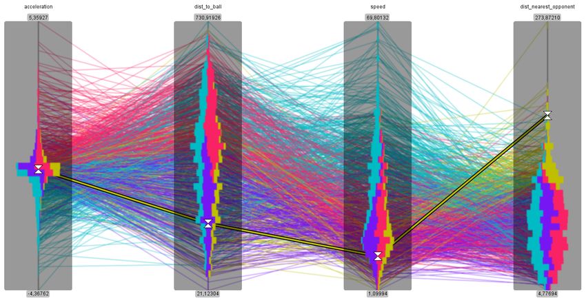
(a) Default Axis                   (b) Stacked Bar Charts                 (c) Violin Plot                        (d) Box Plot
Figure 1: Implemented frequency visualizations for Parallel Coordinates plot to overcome overplotting issues. The cluster frequencies
are computed and visualized along the dimension axis.

While typically used for quantitative data, there exist extensions      by means of dimensionality reduction. Specifically, Multidimen-
to categorical data [2]. Among others, the idea of parallel coordi-     sional Scaling is applied to form 2D Scatter Plots (SP) for se-
nate axes has also been applied to glyph layouts as shown in [5].       lected dimension subsets: The Scatter Plots are shown inline to-
A good overview of techniques for Parallel Coordinate plots can         gether with the Parallel Coordinate plots, with connectors relating
be found in the state-of-the-art report by Heinrich and Weiskopf        data between both representations. Furthermore, there are works
in [8].                                                                 which define interest measures which can in turn be used to filter
                                                                        dimension subsets or find appropriate dimension orderings. The
                                                                        so-called Pargnostics approach [3] uses measures for pairs of co-
Visual Extensions to Parallel Coordinate Plots Extensions
                                                                        ordinates like number of line crossings to rank and select good
have been proposed to improve the basic PCP, motivated by the
                                                                        views. In [13], among others, the HoughTransform image analy-
need to scale with large numbers of records and dimensions. Sort-
                                                                        sis method was proposed to identify PCP views of potential inter-
ing of dimensions is useful to reduce clutter and overlaps [4], and
                                                                        est to a user.
help users navigate better. In [16], dimensions are clustered and
grouped by similarity, also removing outliers from the display.
In [1, 6], the use of opacity bands is proposed to visually group       Distinction to our Approach In our approach, we propose a
(aggregate) similar polylines, helping to distinguish data clusters     diagrammatic extension to the Parallel Coordinate plots. We ob-
and distinguish dimension intervals they reside in. Another visual      serve that e.g., the Opacity Bundle technique [6] allows well
extensions are the use of so-called edge bundles, which visually        to discern clusters by their overall shape differences (across all
aggregate similar polyline segments, again helping with distin-         axes). However, this and other cluster-based techniques are often
guishing groups and reducing clutter. In [12], a density-based          less effective in discerning clusters with respect to data intervals
clustering is applied per dimension, and used together with an          spanned on individual axes. To this end, we extend the visual
efficient rendering algorithm. In [11], Illustrative Parallel Coordi-   depiction of each PCP axis by different density visualizations, in-
nate plots are proposed. The approach includes several area-based       dicating the distribution of clusters across the axis values. Specif-
abstractions for clusters, giving rise to a larger abstraction design   ically, we propose to use stacked bar charts, violin plots, or box
space to chose from.                                                    plots visualizing a binning (histogram) over the individual dimen-
                                                                        sions. Together with a color-coding consistent with the coloring
Analytical Extensions to Parallel Coordinate Plots Also sev-            of the polylines, this can provide a more complete representation
eral analytical extensions of Parallel Coordinate plots exist. De-      of cluster properties and differences.
pending on the data set and analysis task, there may exist subsets
of dimensions which could be aggregated and considered jointly,         Technique
without dedicating one parallel coordinate to each dimensions.              In this section, we will describe our implemented Parallel
In [17], the authors propose to summarize subsets of dimensions         Coordinate plots in detail. We will focus on both the visual en-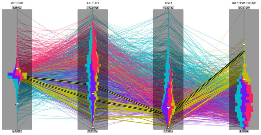
hancements and the interaction capabilities. In order to show
the implementation in a real application, we provide a video at maxA maxB
http://files.dbvis.de/files/vda2016janetzko.mp4.
Visual Enhancements
Overplotting of lines is a common problem occurring in Par-
allel Coordinates visualizing medium amounts of data. Other I
methods like sampling or global aggregations hide many of the
underlying patterns. As we employ Parallel Coordinates to inves- II
tigate segments of trajectories being clustered it is important to IV
see local distribution patterns. Therefore, it is crucial to explore
the value distributions for the different clusters in each dimen- III
sion. We consequently support the user in investigating the Paral-
lel Coordinates plot by integrating several state-of-the-art statis-
tical density visualizations. We visualize the frequency distribu-
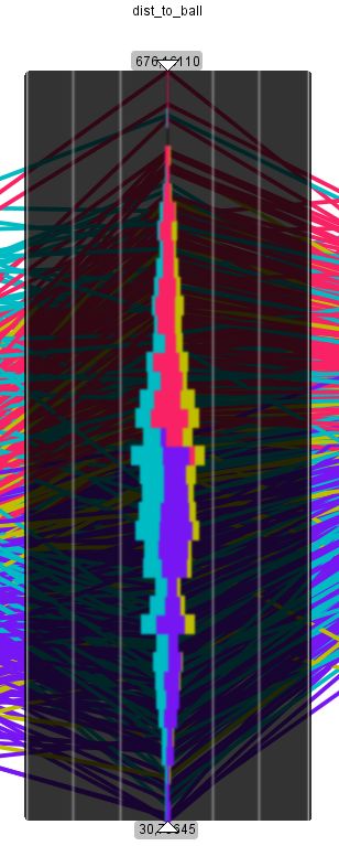
tion of clusters along a dimension axis as exemplified in Figure 1.
In Figure 1a), the default axis of a Parallel Coordinates plot is
depicted. The painting order and the overplotting are highly im- minA minB
pacting the visualization. We implemented stacked bar charts in
Figure 1b) being normalized according to all dimensions. Vio- Dimension A Dimension B
lin plots, shown in Figure 1c), are commonly used in Statistics to
Figure 2: Schematic Parallel Coordinates implementation show-
show a kernel density estimation of the density distribution. For
ing the interaction capabilities and the visual presentation of the
further statistical measures (e.g., median, quartiles, and outliers),
filtering results.
we integrated box plots as depicted in Figure 1d). Although the
implemented visualization technique have drawbacks concerning
scalability with respect to the number of different clusters, the ing feature by drag-and-drop. The analyst can freely change the
analyst get a feeling for the feature distribution of clusters and in- ordering of the dimensions according to his interests. Addition-
terdependencies of dimensions. We will discuss merits and draw- ally, we implemented a correlation-based arrangement of the di-
back in detail in a later discussion section. mensions applying the Pearson product-moment correlation coef-
ficient. By clicking on a dimension labels all other dimensions
Interaction Capabilities will be either placed to the left (negative correlated) or placed to
We integrated several interaction and visual boosting tech- the right (in case of a positive correlation). The dimension are or-
niques into our Parallel Coordinates implementation. In Figure 2, dered by the absolute correlation value with the highest absolute
we show a schematic depiction of our Parallel Coordinates im- numbers being placed nearest to the chosen dimension.
plementation for two dimensions with focus on the filtering capa-
bilities. We added to each dimension interactive range selectors Use Case
providing the following interaction possibilities: We will show the applicability of our enhancements for Par-
allel Coordinates by analyzing recorded soccer movement. The
(I) The upper boundary of the respective selection can be either data analyzed in this section was provided within a collaboration
moved individually or all upper bounds can be moved si- with the sport analytics provider Prozone1 . The data set consists
multaneously. of overall 66 professional soccer matches. For each of the 22
(II) Instead of increasing or shrinking the selected range, the an- players two-dimensional position data are available with a tempo-
alyst can just drag the selection range on the axis up and ral resolution of 100 milliseconds. Furthermore, the data includes
down. manually annotated events (e.g., fouls, passes, crosses) containing
(III) The lower selection limit can be either dragged individually information about position, time and event-specific information
or all lower limits can be moved simultaneously. as the involved player. These events are less frequent and lack in
(IV) Mouse hovering will highlight only the data items fulfilling accuracy as they are manually recorded.
the currently applied filtering criteria.
Clustering Activity Phases for Soccer
Allowing the user to simultaneously change all upper and In this paragraph, we describe a clustering approach for soc-
lower limits helps in performing manual nearest-neighbor queries. cer movements into activity phases previously proposed in [10].
In this case, the filter intervals would be initialized by the system Our use cases and the visual analysis of activity phases is based
to fit one single, user-selected Parallel Coordinates line. The an- on the outcome of the clustering process.
alyst is then able to adjust all upper and lower filter boundaries In order to detect when a player is actively participating dur-
simultaneously. All lines in the Parallel Coordinates plot fulfilling ing a match, player features (e.g., speed, acceleration or distance
the filter criteria (denoted by the blue hatched area in Figure 2) are to the ball) will be of use for this kind of analysis. The different
drawn unblurred. All other lines are blurred to guide the analyst’s activity phases are identified using clustering of the motion and
pre-attentive focus to date items fulfilling the filtering criteria. feature patterns. The features being relevant for a single player
Another very important aspect in Parallel Coordinate plots
is the ordering of dimensions. We provide an interactive reorder- 1 http://www.prozonesports.com/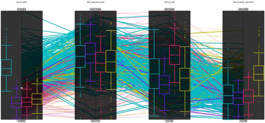
analysis can be divided into two categories: Individual Charac-
teristics (e.g., coordinates and speed) and Game Context (e.g.,
distance to ball). These time series with numerical attributes are
analyzed in the subsequently described process.
      Similar phases are found by clustering the above mentioned
feature dimensions. We exemplify the overall analysis process in
Figure 3. In a first step, we first partition all time series into small,
fixed-size intervals and aggregate the values into a linear normal-
ized, numerical feature vector describing the respective time inter-
val. Furthermore, a Principal Component Analysis is applied in
order to remove noise. We use the library WEKA [7] to perform
the PCA and automatically reduce the number of dimensions with
a threshold of 95 percent of the variance being still explained.
Afterwards, we cluster the intervals with respect to user-chosen
parameters. In our analyses, we apply k-Means (allowing us to
control the number of resulting clusters) and DBSCAN (being a
robust clustering technique with respect to noise and outliers). As
a last step, we will merge adjacent intervals to larger phases, if
they belong to the same cluster.

                                                                            Figure 4: Clustering and segmentation results of a defender. The
                                                                            movement is colored according to cluster (top) and the temporal
                                                                            changes is depicted by colored bars with the width representing
           Player‘s Features                                                the length of the respective phase (bottom).

                                                                            ing to cluster membership as shown in Figure 4. From a spatial
                                                                            perspective, the defender stays always on his assigned right side.
 Normalized Feature Vectors                                                 More interesting and insightful is that the purple phases seem to
                                                                            be the only ones occurring around the own goal. All other clusters
   Dimension Reduced FVs
                                                                            are mostly located outside the penalty area. We will further dis-
           Clustering Result
                                                                            cuss this finding when analyzing the corresponding Parallel Co-
                     Phases                                                 ordinates visualization.
Figure 3: Feature-based approach to detect similar activity phases
                                                                                  There seems to be no clear spatial explanation for the other
of a single player. Reprinted from [10].
                                                                            three clusters (red, yellow, and turquois). For this purpose, we in-
                                                                            tegrated Parallel Coordinates visualization and enhanced them by
Single Player Analysis                                                      a distribution visualization introduced previously. We visualize
      The first step of our analysis is to investigate and explore          all phases of the defender’s movement in a Parallel Coordinates
movement patterns of single players. Analyzing single players               plot and represent each single phase as one data item (one line
will already result in overplotting issues making enhanced and in-          in the Parallel Coordinates plot). We compute average values of
teractive Parallel Coordinate plots necessary. We will first focus          each phase and use them in the Parallel Coordinates plot. The
on the analysis of a defender and later on investigate the move-            corresponding visualization are depicted in Figure 5.
ment of a forward.                                                                We show in Figure 5 two different filtering steps during the
                                                                            analysis process. In the upper figure, the analyst selected one
Feature Analysis for Defender Movement                                      single phase to investigate the corresponding Parallel Coordinate
     We introduced in a previous section our Parallel Coordinates           line (highlighted by black borders). The filtering intervals will be
implementation allowing interactive filtering and additionally vi-          automatically adjusted to fit the selected phase. As the analyst
sualizing the cluster distribution on each axis. In this section, we        wants to understand the properties of yellow phases, he moves all
will investigate the clustering and segmentation results for a de-          range sliders simultaneously starting from the single selected yel-
fender. We clustered the movement data using the following four             low phase (lower figure). The analyst hovers over the previously
dimensions: speed, acceleration, distance to ball, and distance to          selected line on the axis labeled distance to the nearest opponent,
the nearest opponent. We applied k-Means clustering with a de-              in order to similar phases with the same distance to the nearest
sired cluster number of four. Four clusters relate to the four phases       opponent. All Parallel Coordinate lines at the mouse position ful-
in a soccer game described by ball possession and whether the               filling the filter criteria will be highlighted by black borders and
teams are organized or not during ball possession switches. The             will be rendered unblurred (lower figure). Analyzing the phases
resulting phases are depicted in Figure 4 with color representing           visualized in Figure 5 we were able to derive the following find-
the four clusters.                                                          ings:
     Without any further visualizations, the analyst is unfortu-
nately not able to interpret the clusters completely. Nevertheless,            • Yellow phases correspond to movement with high distances
there are some patterns visible by coloring the trajectory accord-               to the nearest opponent, low speed, and low to medium dis-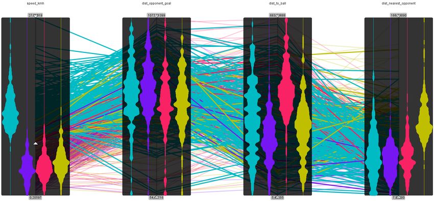
Analysis of a Forward
                                                                                In the second part of our use case we focus on detecting of-
                                                                          fensive phases of a forward. A forward is a player that is mainly
                                                                          responsible for attacks of a team. Therefore, he tries to get in po-
                                                                          sitions where he is able to score a goal. As the opposite team will
                                                                          try to hinder him he needs to be fast and move in a way that he
                                                                          has no player of the opposite team nearby. To analyze his phases
                                                                          accordingly we decided to focus on features that might describe
                                                                          dangerous phases. We initially decided for speed, distance to the
                                                                          next opponent, distance to the goal of the opposite team, and dis-
                                                                          tance to the ball.
                        (a) single phase selected                               To compare the distribution of our different clusters we
                                                                          choose violin plots, see Figure 6. The turquoise cluster stands out
                                                                          for phases with high speed, which is very interesting for us be-
                                                                          cause high speed indicates situations where a player is participat-
                                                                          ing in, for example, a fast counter attack. As a result we filter for
                                                                          the turquoise cluster and phases with a higher speed. As we can
                                                                          see in the violin plots the clusters of the other features are more
                                                                          equally distributed, hence we switch to the box plot distribution
                                                                          visualization to earn additional details about the data distribution.

                        (b) nearby phases filtered
Figure 5: Parallel coordinate plots for segmentation results with
interactive filtering. A phase of interest is selected (top) and inter-
actively the filtering range is increased resulting in similar phases
being selected (bottom). The data items emphasized by black bor-
ders are highlighted either by phase selection (top) or mouse hov-
ering (bottom).

                                                                          Figure 6: Violin plots denoting the density distributions of phases
       tances to the ball.                                                for a forward. The turqoise phases are dependent on the speed
   •   Red phases describe movement with a high distance to the           dimension.
       ball. Red phases have a positive acceleration and by trend
       lower speed compared to turquois phases.                                 We are interested in the distributions and the differences of
   •   Turquoise phases are independent of the distance to the ball       the clusters, therefore we switch to the box plot visualization. As
       and describe movement with negative acceleration. Nega-            expected, the turquoise clusters differs significantly from the oth-
       tive acceleration values will only occur if the speed is suffi-    ers in the speed dimension. Interestingly, there is no significant
       ciently high.                                                      difference regarding the distance to the opponent goal meaning
   •   The purple phases being very visual salient in the geospa-         that the clustering did not use this dimension for partitioning. The
       tial representation are described by below-average values of       whiskers in the third dimension (distance to the ball) describe that
       distance to the ball, speed, and distance to the nearest oppo-     the lowest value in this dimension are common for the turquoise
       nent. Furthermore, the acceleration values are around zero.        cluster.
   •   The difference between purple and yellow phases is only
       dependent on the distance to the nearest opponent. This
       is reflected in the spatial visualization as opponents are
       mostly near to defenders when opponents attack and de-
       fenders should to be near their own goals during opposite
       attacks.

     From these observations, we see that we need several views
to the data. For instance, the difference between yellow and pur-
ple phases could be only fully understood when combining the
spatial and the multi-dimensional feature visualization. We be-
                                                                          Figure 7: Box plots denoting density and statistical information
lieve that combining several views and connecting them inter-
                                                                          for each cluster in each dimension. Statistically significant differ-
actively by Brushing & Linking is an effective way to support
                                                                          ences can be easily detected by comparing the boxes of the box
the analyst. Visualizing frequencies along the dimension axes en-
                                                                          plots.
abled us to reveal these interesting patterns.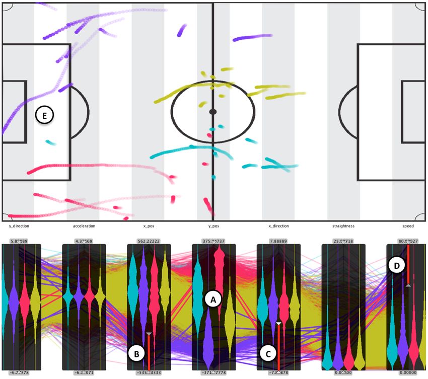
Multi-Player Analysis
In this section we used our Parallel Coordinates plot in com-
bination with the soccer pitch trajectory visualization in order
to investigate the behavior of multiple players at the same time.
This enables us to compare feature characteristics (Parallel Coor-
dinates) as well as the spatial movement (trajectories) in combi-
nation. Therefore we applied the clustering (as described in the
previous section) to all players of interest.
Back Runs This use case investigates the behavior of the de-
fense players within the back-four-formation of a team. First,
we are interested in investigating typical dangerous defense sit-
uations which are fast attacks by the opposing team (also known
as counter attacks). In this case, all the defenders have to run
back towards their own goal in order protect it. Therefore we
applied a clustering with many features that may be of interest.
Note that it is not necessary to chose the optimal feature set be-
cause our experiences and evaluations revealed that an analyst is
able to make sense of phase clusters by interactively exploring the
Parallel Coordinates plot. As a first result the system shows visu-
alizations that suffer from overplotting due to the massive amount
of visualized data items. To investigate the data we can effectively
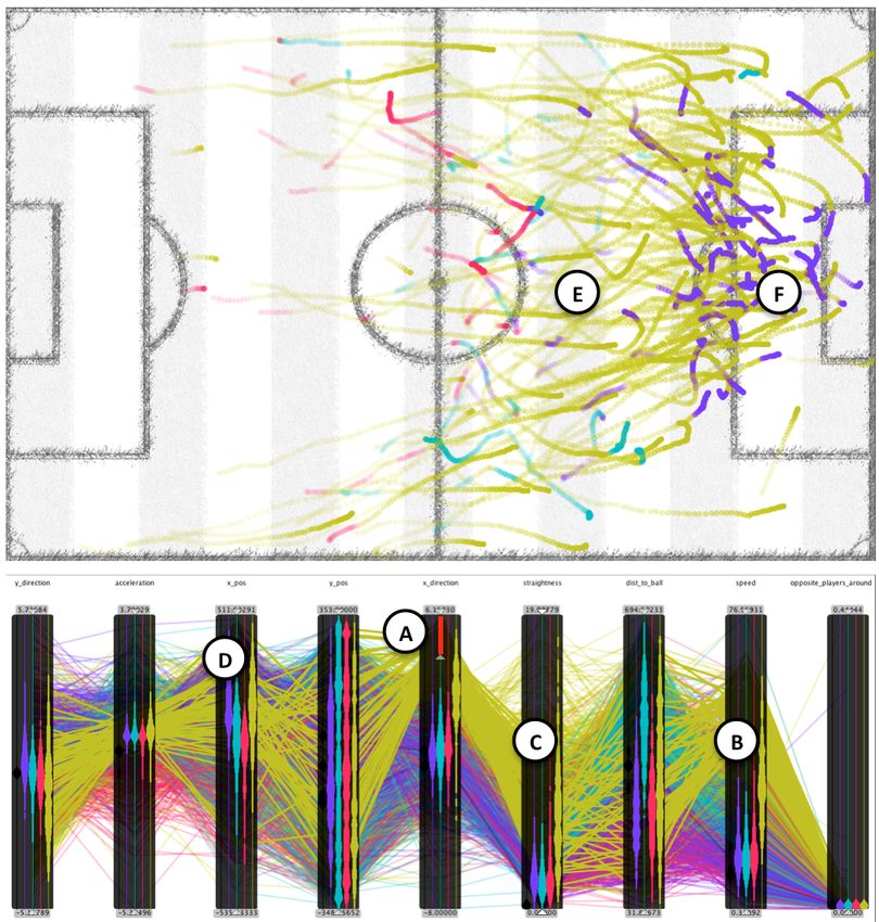
Figure 8: Back runs of all back four formation defenders. Top:
make use of the enhanced axis-visualizations and filtering capa-
Spatial trajectory visualization, bottom: Parallel coordinates en-
bilities of the Parallel Coordinates visualization which is linked
hanced with violin plots. Color represents the different activity
to the soccer pitch visualization. First, we filter the data for all
phases of the players. Yellow back run phases are followed by
back movements (towards the right hand side of the soccer pitch)
purple finishing/ending phases near the penalty area of the own
by setting the filter for the x-direction axis (Figure 8-A). The re-
goal.
sulting visualizations reveal some interesting patterns (Figure 8).
From the Parallel Coordinates plot we can clearly see that the yel-
low phases are of interest. By investigating the axis plots (in this filtering capabilities. This time we set the filters for negative x-
case the violin plots) we can see that the yellow phases cover positions (Figure 9-B), and negative x-direction (Figure 9-C) in
higher speed (Figure 8-B) and we therefore do not need to fil- order to identify the movements on the left hand side of the soccer
ter this dimension further in order to detect runs (speed axis). In pitch and towards the opposing goal. In order to filter further,
addition, these phases are much more straight than the others (Fig- we set the speed filter for high speed phases (Figure 9-D). As a
ure 8-C). From the x-axis plots and the selected (and yellow) data result the soccer pitch visualization shows all the situations where
items we clearly see that the defenders run back most of the time one of the defenders had a fast forward run. From the spatial
(positive distribution of yellow phases in the x-pos axis) instead visualization we are able to interpret that only the wide defenders
of towards the opposing goal (Figure 8-D). Also the soccer pitch participated in fast attacks (purple and red trajectories near the
visualization reveals a typical back run pattern with all the sprints opponent’s goal, Figure 9-E).
(yellow phases) starting in the middle of the soccer pitch an end-
ing in the own penalty area (Figure 8-E). In the soccer pitch all Intensity Analysis
the selected situations for all defenders are drawn. Interestingly,
This section illustrates the benefits of the axis visualizations
all the phases ending within the penalty area are followed by a
which enable to investigate vast amounts of data items within a
purple phase (Figure 8-F). By investigating the purple axis violin
single Parallel Coordinates plot. Therefore, we include all phases
plots, we find that these phases cover less speed, low distance to
of all players of a whole soccer match in our analysis. In this
the ball, and are near the own goal which can be interpreted as
case the colors represent again the different players. This last ex-
counter-attack-ending/finishing phases.
ample analyzes stop moments of the different players which are
especially interesting for fitness coaches because stop moments
Forward Runs We analyze in this use case the defensive back- are high intense actions that have to be performed and are a valu-
four formation in attack situations. In order to distinguish the able fitness indicator for soccer players. In order to identify the
different players we changed the color coding for all the phases. stop moments we created a Parallel Coordinates plot with the fea-
Instead of assigning a color to a specific cluster, all phases of the tures acceleration, straightness, and speed. The box plots allow
same player are drawn with the same color. All the phases of to compare the different player features directly within each axis.
the players are shown in Figure 9. From the y-pos axis in the For example, we are able to compare the players by their speed
Parallel Coordinates plot we can clearly see that the purple and distributions in order to find fast and slow players. We set the
red players are the wide-defenders which are differentiated from filters for high speed (Figure 10-A) and high-negative accelera-
the central defenders (yellow and blue, Figure 9-A). In order to tion (Figure 10-B). The result is shown in Figure 10 where all the
reveal the forward runs of all the defenders we make use of the moments are also drawn onto the soccer pitch. A fitness coach is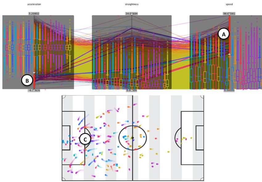
used to define other density histograms, how to do this and where
                                                                        the scalability limits are, remains to be researched in future work.
                                                                        Further, regarding human perception, there may be interrelations
                                                                        between the stacked bar charts and the Parallel Coordinate poly-
                                                                        lines. Specifically, for many records and classes, there may be
                                                                        clutter effects and/or unwanted pre-attentive perception effects. A
                                                                        solution may be to define a local quality function for the display
                                                                        that rates the perceptional effects. For perceptional difficult ar-
                                                                        eas, based on rules the system could resort to techniques for low-
                                                                        ering the clutter and perception effects. Sampling of polylines,
                                                                        or switching to edge bundles and routing the connectors appro-
                                                                        priately around density histogram areas, could be possible as a
                                                                        response.
                                                                              Recent works in Parallel Coordinate plots extension have in-
                                                                        cluded dimension reduction and adapted axis displays (i.e., Scat-
                                                                        ter Plots in [17]) to scale Parallel Coordinate plots with large num-
                                                                        bers of dimensions. The idea of dimensionality reduction is also
                                                                        relevant to our approach. We may, for example, combine the idea
Figure 9: Forward runs of all back four formation defenders. Top:       of class-density visualization with in-line SP representations pro-
Spatial trajectory visualization, bottom: Parallel coordinates en-      posed in [17]. A first idea to do so could be to run a kernel density
hanced with violin plots. Color represents the different players.       estimation for the resultant SPs, apply a contour-based density vi-
Wide defenders (purple and red) are involved in side attacks.           sualization, and link this to the colors of the remaining stacked bar
                                                                        chart representations. Finally, interest measures for the density
                                                                        plots could be defined and added into existing Parallel Coordinate
now able to hover over a trajectory in order to highlight all stop      plots quality measure systems like Pargnostics [3], eventually sup-
moments of this player which can be used to compare these mo-           porting automatic selection of best views or Parallel Coordinate
ments also spatially. As another interesting aspect, all high intense   plots segments.
phases (which are the stop moments) are mainly taking place on
the left hand side of the soccer pitch (Figure 10-C) which is an
indication that the team which is playing from right to left domi-      Conclusion
nates the other team (tactically or physically). In order to analyse         We presented in this paper an extension for Parallel Co-
this further it would be interesting to observe the two teams sepa-     ordinate Plots tackling the overplotting problem. In compari-
rately (or to assign another color coding).                             son to other approaches, we use cluster information to show lo-
                                                                        cal density distribution by state-of-the-art density visualization
Discussion                                                              techniques. We applied our implemented prototype to analyze
      Instead of applying sampling or aggregation of polylines,         real-world soccer matches. The investigation of clustered move-
we add further density visualizations to overcome overplotting is-      ment patterns with the help of our enhanced Parallel Coordinate
sures in Parallel Coordinate plots. Cluster-aware density visual-       Plots revealed interesting findings. We believe Parallel Coordi-
izations help to reveal data inherent structures otherwise hidden in    nate Plots to be really powerful and beneficial for the in-depth
overplotting polylines. The interactive filtering capabilities help     analysis of clustered or annotated data.
furthermore to narrow down analyses to the interesting data por-
tions.                                                                  References
      While our density visualization is a useful extension for Par-     [1] Gennady Andrienko and Natalia Andrienko. Parallel coordinates for
allel Coordinate plots analysis, there remain points to improve              exploring properties of subsets. Coordinated and Multiple Views in
or understand better. First, as we use a stacked bar chart rep-              Exploratory Visualization, International Conference on, 0:93–104,
resentation, we require an ordering of the classes per dimension             2004.
histogram, which allows good perception of classes across dimen-         [2] F. Bendix, R. Kosara, and H. Hauser. Parallel sets: visual analysis
sions. While such sorting can be done straightforward for individ-           of categorical data. IEEE Symposium on Information Visualization,
ual axes, for a Parallel Coordinate plot with several axes this may          2005. INFOVIS 2005., (1):133–140.
be a difficult problem. On the one hand, a globally stable ordering      [3] Aritra Dasgupta and Robert Kosara. Pargnostics: Screen-space met-
of classes across all axes is desirable to retain the users’ mental          rics for parallel coordinates. IEEE Trans. Vis. Comput. Graph.,
maps for comparing classes. This gives rise to a global sorting              16(6):1017–1026, 2010.
problem, and we would need to define appropriate tradeoffs for           [4] Geoffrey P. Ellis and Alan J. Dix. A taxonomy of clutter reduction
input to a sorting algorithm. The latter may depend also on user             for information visualisation. IEEE Trans. Vis. Comput. Graph.,
preferences and class sizes, among others.                                   13(6):1216–1223, 2007.
      Then, a natural limitation in using stacked bar chars is the       [5] Elena Fanea, Sheelagh Carpendale, and Tobias Isenberg. An inter-
limited perceptional distinction of colors. It is assumed that usu-          active 3d integration of parallel coordinates and star glyphs. Infor-
ally one cannot distinct more than about ten different classes by            mation Visualization, IEEE Symposium on, 0:20, 2005.
color. While other visual attributes like texture or shape could be      [6] Y.-H. Fua, M. Ward, and E. Rundensteiner. Hierarchical parallel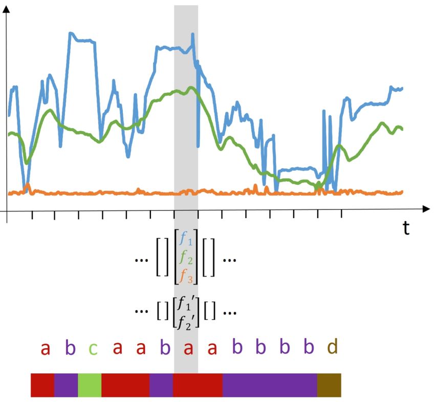
Figure 10: Stop moments of all players. Top: Parallel coordinates enhanced with axis box plots, bottom: Trajectory visualization. Color
represents the different players. Stop moments mainly occur on the left hand side of the soccer pitch.

       coordinates for exploration of large datasets. In Proc. IEEE Confer-         Foundations, Techniques, and Applications. CRC Press, 2015.
       ence on Visualization, pages 43–50, 1999.                               [16] Jing Yang, Wei Peng, Matthew O. Ward, and Elke A. Rundensteiner.
 [7]   Mark Hall, Eibe Frank, Geoffrey Holmes, Bernhard Pfahringer, Pe-             Interactive Hierarchical Dimension Ordering, Spacing and Filtering
       ter Reutemann, and Ian H. Witten. The weka data mining software:             for Exploration of High Dimensional Datasets. In Proc. IEEE Sym-
       An update. SIGKDD Explor. Newsl., 11(1):10–18, November 2009.                posium on Information Visualization, pages 105–112, 2003.
 [8]   Julian Heinrich and Daniel Weiskopf. State of the Art of Parallel Co-   [17] Xiaoru Yuan, Peihong Guo, He Xiao, Hong Zhou, and Huamin Qu.
       ordinates. In M. Sbert and L. Szirmay-Kalos, editors, Eurographics           Scattering points in parallel coordinates. IEEE transactions on visu-
       2013 - State of the Art Reports. The Eurographics Association, 2013.         alization and computer graphics, 15(6):1001–8, 2009.
 [9]   Alfred Inselberg. Parallel Coordinates: Visual Multidimensional
       Geometry and Its Applications. Springer, 2009.                          Author Biography
[10]   Halldor Janetzko, Dominik Sacha, Manuel Stein, Tobias Schreck,                Halldór Janetzko received his M.Sc. (2010) and PhD (2015) in com-
       Daniel A. Keim, and Oliver Deussen. Feature-Driven Visual Ana-          puter science from the University of Konstanz. Since 2010, he worked
       lytics of Soccer Data. Proceedings of the 2014 IEEE Symposium on        as a research associate at the Data Analysis and Visualization group at
       Visual Analytics Science and Technology (VAST ’14), 20(12), De-         the University of Konstanz. Halldór Janetzko works currently as a post
       cember 2014.                                                            doctorate researcher at the Data Analysis and Visualization group at the
[11]   Kevin T. McDonnell and Klaus Mueller. Illustrative parallel coordi-     University of Konstanz.
       nates. Comput. Graph. Forum, 27(3):1031–1038, 2008.                           Manuel Stein received his M.Sc. in computer science from the Uni-
[12]   G. Palmas, M. Bachynskyi, A. Oulasvirta, H.-P. Seidel, and              versity of Konstanz (2014). Since then he is a research associate at the
       T. Weinkauf. An edge-bundling layout for interactive parallel co-       Data Analysis and Visualization group at the University of Konstanz.
       ordinates. In Proc. IEEE PacificVis, Yokohama, Japan, March 2014.             Dominik Sacha received his M.Sc. in computer science from the
[13]   Andrada Tatu, Georgia Albuquerque, Martin Eisemann, Peter Bak,          University of Applied Sciences Konstanz (2012). Since 2013, he works as
       Holger Theisel, Marcus A. Magnor, and Daniel A. Keim. Au-               a research associate at the Data Analysis and Visualization group at the
       tomated analytical methods to support visual exploration of high-       University of Konstanz.
       dimensional data. IEEE Trans. Vis. Comput. Graph., 17(5):584–597,             Tobias Schreck received his M.Sc. (2002) and PhD (2006) in com-
       2011.                                                                   puter science from the University of Konstanz. He held positions as a
[14]   L. Tweedie, B. Spence, D. Williams, and R. Bhogal. The attribute        Postdoc Researcher and research group leader with TU Darmstadt (2007-
       explorer. In CHI 1994 Conference Companion, pages 435–436,              2011) and as an Assistant Professor with University of Konstanz (2011-
       1994.                                                                   2015). Since then, he is a Professor with Graz University of Technology,
[15]   M. Ward, G. Grinstein, and D. Keim. Interactive Data Visualization:     Austria.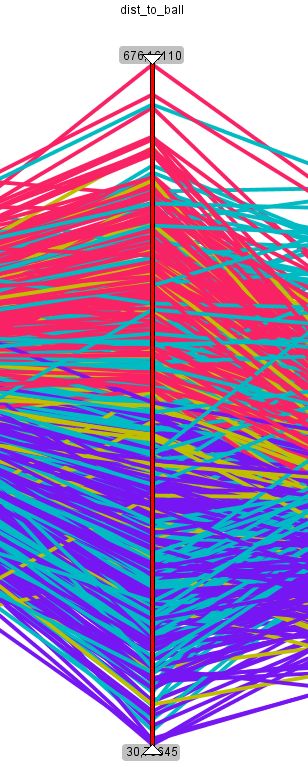
You can also read