Improving Efficiency of Air Travel Bookings Aggregator with Digital Marketing and Usability Features - Mikhail Popov - Bachelor's Thesis Degree ...
←
→
Page content transcription
If your browser does not render page correctly, please read the page content below
Improving Efficiency of Air Travel Bookings Aggregator
with Digital Marketing and Usability Features
Mikhail Popov

                                     Bachelor’s Thesis
                                     Degree Programme in
                                     International Business
                                     2018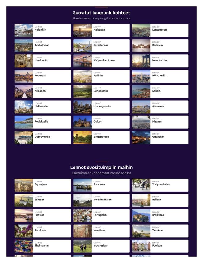
Abstract

                                                        19 November 2018

Author
Mikhail Popov
Degree programme
Degree Programme in International Business
Thesis title                                                              Number of pages
Improving Efficiency of Air Travel Bookings Aggregator with Digital       and appendix pages
Marketing and Usability Features                                          40 + 32

The main objective of this thesis was to find out how to improve the efficiency of an eTravel
booking service with the help of digital marketing and usability features. The purpose was to
study the factors that are implemented in the field of digital marketing and usability design
with the example of air travel booking aggregator services.

The theoretical framework was based on the concepts of digital marketing, introduced by
Chaffey D., and usability and communication design, described by McKay E.N and Jackson
K. & Ciolek N. Throughout the study, the author connected the concepts of both fields in or-
der to show how the digital marketing communication is implemented through the concept of
the communication design.

The study was executed in the form of competitive benchmarking, conducted by the author.
Competitive benchmarking allowed to compare the best practices of digital marketing and
usability design that were implemented on three leading air travel booking aggregator plat-
forms. This methodology used a quantitative approach. Additionally, an online illustrated sur-
vey (a quantitative method) was conducted among the users of the platforms.

The findings indicated the most popular user interface elements (e.g. booking forms, filters)
and usability features (e.g. interface informativeness and affordance) used on momondo.fi,
skyscsanner.fi and ebookers.fi platforms with the help of competitive benchmarking. The us-
ers’ preferences for usage of those elements and features were determined on the basis of
the online illustrated survey.

In the conclusion of this thesis, the author provided some recommendations on the usage of
the usability features that help to establish better communication with the users of the air
travel booking aggregator platforms and, therefore, improve the efficiency of such kind of
platforms. For instance, it’s good to engage users in filtering the content in the search results
of the platform as it triggers in the enjoyment part of the positive online experience.

Keywords
Digital marketing, eTravel, eCommerce, Usability Design, UI design, UX design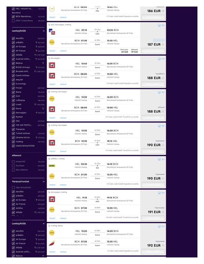
Table of contents

1 Introduction ..................................................................................................................... 1
    1.1 Background ............................................................................................................ 1
    1.2 Research Question................................................................................................. 2
    1.3 Demarcation ........................................................................................................... 3
    1.4 International aspect ................................................................................................ 3
    1.5 Benefits .................................................................................................................. 3
    1.6 Key concepts .......................................................................................................... 4
    1.7 Risks and risk management ................................................................................... 4
2 Usability design in digital marketing ............................................................................... 5
    2.1 Digital marketing overview ..................................................................................... 6
    2.2 Online consumer behaviour ................................................................................... 8
    2.3 Principles of the communication design ............................................................... 10
    2.4 UI and UX interaction design................................................................................ 12
3 Research methods........................................................................................................ 17
    3.1 Competitive benchmarking ................................................................................... 17
    3.2 Online survey design ............................................................................................ 19
4 Results .......................................................................................................................... 22
    4.1 Competitive benchmarking of the websites .......................................................... 22
            4.1.1 Momondo.fi ............................................................................................... 22
            4.1.2 Ebookers.fi ................................................................................................ 24
            4.1.3 Skyscanner.fi ............................................................................................. 26
            4.1.4 Summary ................................................................................................... 28
    4.2 Survey results....................................................................................................... 30
5 Discussion .................................................................................................................... 35
    5.1 Summary and recommendations ......................................................................... 35
    5.2 Evaluation of learning ........................................................................................... 37
References ........................................................................................................................ 38
Appendices........................................................................................................................ 41
    Appendix 1. Momondo.fi home page capture ............................................................... 41
    Appendix 2. Momondo.fi search results page capture ................................................. 44
    Appendix 3. Ebookers.fi home page capture ................................................................ 47
    Appendix 4. Ebookers.fi search results page capture .................................................. 50
    Appendix 5. Ebookers.fi order confirmation page capture ............................................ 52
    Appendix 6. Skyscanner.fi home page capture ............................................................ 53
    Appendix 7. Skyscanner.fi search results page capture ............................................... 55
    Appendix 8. Skyscanner order confirmation page capture ........................................... 58
    Appendix 9. Online survey design ................................................................................ 59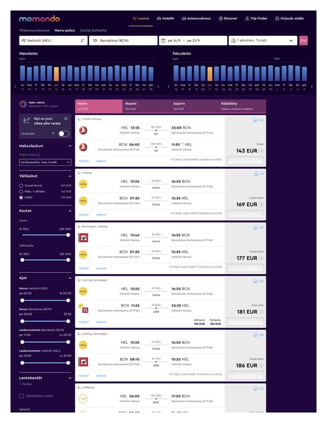
Appendix 10. Online survey results .............................................................................. 66
1   Introduction

This chapter will introduce background and purpose of this research, state research ques-
tion and investigative questions, demarcate the scope of the study, provide explanation of
the international aspect of the research, state the benefits to different stakeholders of the
thesis, explain key concepts that are used in this research and provide risk analysis of this
thesis’ topic.

    1.1    Background

The global eCommerce (electronic commerce) industry has been steadily growing within
the past few decades. In 2017 worldwide sales turnover of its digital retail sector reached
2 304 billion U.S. dollars and expected to grow up to 4 878 billion U.S. dollars by 2021.
The industry of eTravel is a huge market segment of the eCommerce industry – it includes
travel bookings, vacation rentals, package holidays, flight, bus, train tickets bookings
made through digital channels of the online travel agency (e.g. Expedia) or tour operator
(e.g. TUI). (Statista 2018a.) The revenues in the eTravel market segment in Finland
amounts to 2 360 million euros in 2018 and expected to grow with a rate of 8.1% annually
by 2022 (Statista 2018b).

This research will be built around the fields of digital marketing (focusing on the eTravel
field of the eCommerce industry) and UI/UX (user interface/user experience) or usability
design, taking into consideration the user interfaces and user experience of the online
travel booking platforms. The choice of the topic is related to the work experience of the
author in the eCommerce business and a desire to discover the correlation between the
UI/UX design elements and the efficiency of the websites in the industry of eTravel. In the
prior work experience of the author, the problem of low conversion rate – the core KPI
(Key Performance Indicator) in one of the projects – occurred frequently, which required
finding solutions of better user interfaces and improving the user experience in the plat-
form, thus, improving the whole efficiency of the platform.

The aim is to discover how the efficiency of an online travel booking service, in particular,
an airfare booking service, could be increased with the help of the UI/UX design. In the
planned research, there will be no particular commissioning company. Instead, the author
is intended to conduct an independent research by benchmarking the existing solutions
implemented by the major eTravel businesses, studying the user behaviour and prefer-
ences in terms of UI and UX in a qualitative method and compare the observations to the
opinions of the website users, gathered with a survey. As a result of this thesis, recom-
                                              1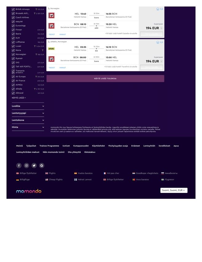
mendations for implementation of the digital marketing and usability features in the
eTravel industry will be provided.

    1.2    Research Question

This thesis aims to study the influence of the UI design on the conversion rate of air travel
booking websites. The research question can be worded as “How to improve the effi-
ciency of an eTravel booking service with the help of digital marketing and usability
features?”. RQ is divided into investigative questions (IQ) as follows:

IQ 1. What UI design features are used by the major air travel booking services for getting
more reservations?
IQ 2. What are the users’ preferences in UI design elements of air travel booking web-
sites?
IQ 3. What are the recommendations for implementation of the digital marketing and usa-
bility features in the air travel aggregator service?

Table 1 below presents the theoretical framework, research methods and results chapters
for each investigative question.

Table 1. Overlay matrix
Investigative                 Theoretical           Research Methods      Results
question                      Framework                                   (chapter)
IQ 1. What UI design fea-     Digital market-       Competitive bench-    4.1
tures are used by the ma-     ing                   marking
jor air travel booking ser-   UI design
vices for getting more
reservations?
IQ 2. What are the users’     Digital market-       Online survey         4.2
preferences in UI design      ing
elements of air travel        UI design
booking websites?
IQ 3. What are the rec-       Digital market-       Competitive bench-    4.1, 4.2, 5.1
ommendations for imple-       ing                   marking and online
mentation of the digital      UI design             survey
marketing and usability
features in the air travel
aggregator service?

                                                2
1.3    Demarcation

This research will not be based on any particular commissioning company, however, the
projects of the companies involved in the eTravel industry (airfares booking) will be
benchmarked and the users of those platforms will participate in a survey.

The survey will be targeted on average Finnish internet users, who have ever booked their
plane tickets through an eTravel aggregator website. This thesis will only concentrate on
the B2C market segment of the online air travel booking and the focus country of the re-
search is Finland.

Benchmarking will be conducted on the eTravel aggregator websites, which are focusing
on airfare bookings. The web platform should not be a direct sales channel of any airline.
The benchmarked platform should also target users in Finland and has a steady number
of monthly visitors from Finland. The user interfaces and the user experience will be only
studied from the design point of view. No technical aspects (code or development) will be
covered by this study.

    1.4    International aspect

The international aspect of this research fully matches the degree programme require-
ments and supported by the international and multicultural experience and background of
the author. The country, where the research is conducted (Finland) is not the country of
origin of the author. Moreover, studying Finnish internet users, as the sample audience in
this study, will bring more internationality to this work.

    1.5    Benefits

The topic provided above fully matches the field of specialisation and degree programme
of the author – it covers the business and marketing aspects with a touch of the design
field. The author has previously been involved in the eCommerce industry and is intended
to continue his career in the digital marketing sector after this research work.

Analysing the previous work and study experience, the author discovered an interest in
continuing the studies with a postgraduate degree with a possible specialisation in Digital
Marketing or UX/UI design. This is also proven by the author been previously involved in
developing interfaces, accessing them for different companies and suggesting the ways of
improvement.
                                                3
This thesis will give benefits to the companies that are being studied in the research part
or business similar to them. The provided recommendations and research results will al-
low the air travel aggregators to improve their operations.

    1.6   Key concepts

Digital Marketing (Internet marketing, e-marketing, web marketing, etc.) can be de-
fined as achieving marketing objectives through applying digital technologies and media
(Chaffey 2016, 11).

eCommerce (electronic commerce) is a digital marketing industry of promoting, buying
and selling merchandise or services over the internet (Technopedia 2018).

UI (User Interface) Design is the design for a software or a machine in the form of an
application, website or other interface with a focus on easiness of use and pleasurably for
the end user. User interfaces are used for interaction with the software with usability and
efficiency, which, in turn, help to achieve the goal in the easiest way. (Interaction Design
Foundation 2018.)

Usability is an approach to design that intends to enable the completion of user tasks is
an efficient, effective way considering the satisfaction of the users (Chaffey 2016, 375).

User Behaviour is the set of actions taken by a user interacting with the system in order
to reach a goal or complete a task (IGI Global 2018).

    1.7   Risks and risk management

The possible risks, foreseen by the author on the stage of planning the research include a
low number (100 respondents are desired) of the respondents to the quantitative survey
used for the IQ 2. The solution to this could be redesigning and simplifying the survey,
using more channels of distribution of the survey link or broadening the focus audience.

                                              4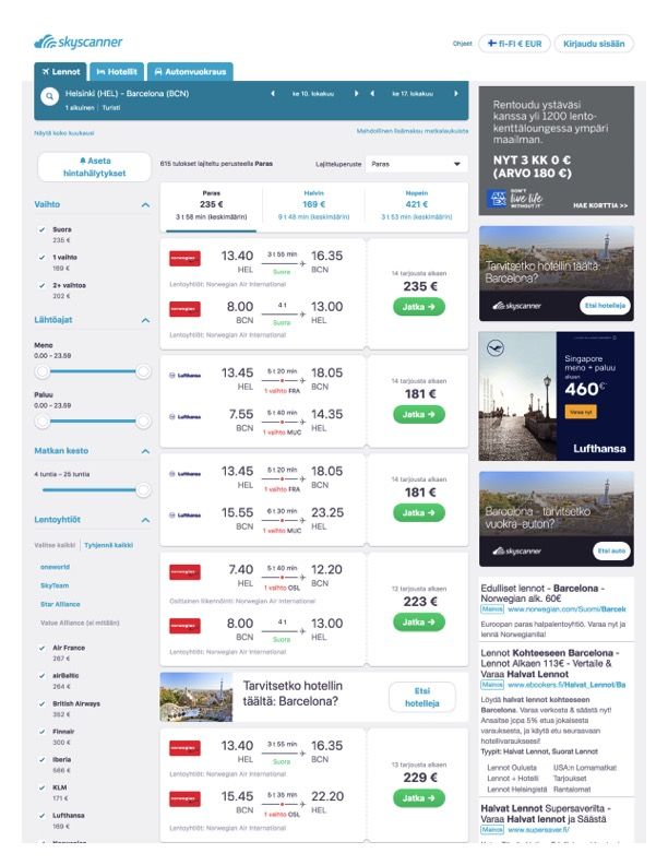
2   Usability design in digital marketing

This chapter will introduce the image of the theoretical framework that will be used as a
basis for answering the investigative questions of this thesis. The central phenomena that
will be discussed in this thesis will be built around the digital marketing and the usability
design in UI. As Figure 1 suggests, the main focus of the theoretical framework will be on
studying the aspects of both the digital marketing and UI design.

Figure 1. Conceptual Image of the Theoretical Framework

This chapter is split into four sub-chapters linking the central phenomena of digital market-
ing to the usability design. After studying these theories and conducting the research
phase, it will be possible to reflect the influence of digital marketing and the interface de-
sign on the efficiency of the air travel aggregator platform.

                                               5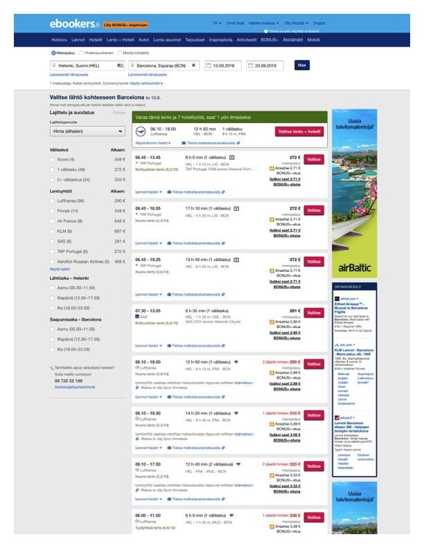
2.1   Digital marketing overview

With the appearance of the internet and the first website in 1991, over 3.5 billion people
have been using this channel of communications to find products, services, entertainment
and friends on a daily basis (Statista 2018c). Nowadays, with such a big potential of the
web space, the companies need digital marketers, strategies and agencies with know-how
in order to develop their presence in the online marketplace. This process requires con-
stant innovation, as digital technologies pose many opportunities and challenges that
have to be monitored daily. (Chaffey 2016, 6.)

The biggest challenge for digital marketers today is to determine the right innovations that
are suitable for their company at the right moment. As many traditional marketing models
and techniques can be applied on the digital marketing as well; the aim of the people in
charge is to integrate those practices effectively with the company’s marketing communi-
cations strategy. Therefore, comes a definition of the digital marketing “Achieving market-
ing objectives through applying digital technologies and media”, including the aspects of
usability design. (Chaffey 2016, 8-11.)

In a nutshell, digital marketing includes different channels of online company presence –
websites, social media communities, SEM (Search Engine Marketing), SMM (Social Me-
dia Marketing), online ads, partnerships with other websites, etc. These channels are
usually used for customer acquisition, whereas the retention of the customers is usually
done in relation to an established E-CRM (Electronic Customer Relationship Manage-
ment).

The term eCommerce covers not only the buying and selling over the internet, but also
involves “all electronically mediated information exchanges between an organization and
its external stakeholders” (Chaffey 2014, 10). According to this term, all the non-financial
transactions, such as customer requests, pre-sale and post-sale activities, are also in the
scope of the eCommerce industry (Chaffey 2014, 10-11). There are several perspectives
on the eCommerce business model and this thesis is focused on the communications
perspective – the delivery of information, products or services or payment by electronic
means (Kalakota & Whinston, 1997).

Another term, similar to eCommerce, is the eBusiness – the transformation of key busi-
ness processes through the use of internet technologies (Chaffey 2014, 13). It is broader
in scope and requires digital technology to control the business processes. In this thesis,
the term of eBusiness will be used to describe the businesses that have no physical pres-

                                              6
ence and seek to minimise their expenses through enabling “web self-service”, where the
customers are being served themselves before, during and after sales online (Chaffey
2014, 13). In this thesis, this “web self-service” is studied through the air travel booking
aggregators.
For the purpose of communications with their stakeholders, eBusinesses facilitate the
technologies of the digital marketing; the operations of the organisations are usually sub-
divided into buy-side eCommerce and sell-side eCommerce. The buy-side is referred to
getting the resources needed by the organisation from its suppliers, whereas the sell-side
represents the transactions of selling the products to the clients. (Chaffey 2014, 11.)
Since not all products can be sold online, the sell-side eCommerce platforms can be split
into several categories. Each of the types of online presence has different aims and is
suitable for certain markets. Companies can combine these types of their eCommerce
presence in accordance with their needs. (Chaffey 2015, 17.)
Establishing a successfully working eCommerce strategy requires eBusinesses to conduct
an analysis of their online marketplace and find their place in the path to purchase that the
customer undertakes in order to get the final product. As mentioned above, eBusinesses
use different channels in order to attract customers. However, the customer journey may
also include passing different intermediaries. (Chaffey 2015, 42.)
Berryman, Harrington, Layton-Rodin & Rerolle (1998, 152-159) identified three major
types of players in the online marketplace. Seller-controlled sites represent the company
or the seller and allow the direct purchases. Buyer-controlled platforms act as intermediar-
ies that have an aim to let the buyer initiate the market-making. The third type of websites
– aggregators – involve multiple buyers that are matched to the offers given by the sellers.
Such websites provide price and product comparison as independent evaluators. This
type of website is studied in this thesis.
The eTravel aggregators such as Opodo (www.opodo.com) has been separated into a
special category of seller-oriented websites by McDonald and Wilson (2002). Such web-
sites are controlled by third parties such as distributors and agents. The aggregators of
the eTravel tend to use commission-based sales revenue model, where a certain percent-
age from the entire order is paid to the publisher (the aggregator). Such an arrangement is
also known as CPA (Cost-Per-Acquisition) (Chaffey 2015, 63).
72.2 Online consumer behaviour
Online customer choice is a valuable part of the entire purchasing process. The internet
has become a vital tool for research before the customer makes a purchase decision.
Nowadays, even before buying the product offline many people use the internet to explore
the available alternatives and compare the offers. With the help of the internet, the con-
sumer has become more knowledgeable and can refer to a variety of online sources be-
fore making the final decision of purchase. (Chaffey 2016, 72-73.)
The tools that the companies can implement in order to increase their brand awareness
and give added value to their products can be, for example, brand websites, social media,
review sites, traditional print media, recommendations, etc. Understanding the target au-
dience, the potential reach of the platform in question and the behaviour of the potential
customers is important for setting and achieving the digital marketing objectives. (Chaffey
2016, 73.)
Convenience and around the clock availability of the online platforms is the crucial driver
for the online shoppers. However, the number of internet users who are willing to pur-
chase different types of products online varies on the basis of the characteristics and de-
mographics, product category and past experiences. The research of the online custom-
ers can give the marketers a great insight into online user behaviour; the key points of
managing the conversion rates can be understood by researching the dimensions affect-
ing the user interaction with online marketplaces. (Chaffey 2016, 74.)
For the purpose of building a more complete picture of the online user behaviour, the
marketers should understand how different types of individual behaviour affect the digital
marketplace engagement by users of various customer characteristics. There is an indi-
vidual nature of customers that help to build segmentation profiles through consumer be-
haviour variables. The variables can be based on demographics of the audience (e.g.
age, gender, lifestyle, education, income, etc.) and psychography and behaviour (e.g.
knowledge, attitude, innovativeness and risk aversion). (Chaffey 2016, 76.)
The design (in this thesis – communication design and usability), convenience or security
measures of a website can have an impact on the overall user experience and satisfac-
tion. By conducting a research on these factors the marketers can also increase the loyal-
ty and trust of their customers through website improvements or using other digital chan-
nels. (Chaffey 2016, 77.) Rose & Hair (2011) claim that “the customer interactions with an
organisation’s website creates opportunities for positive experiences that can lead to long-
8term relationship building”. This explains a close relation between digital marketing and
communication design.
According to Arnold, Reynolds, Ponder & Lueg (2005), the following concepts can either
positively or negatively affect the online consumer behaviour with a digital offer:
- IP (Information Processing) defines the consumer’s engagement with the available
data and information; it involves the mental processes and senses of a person and af-
fects the future behaviour of the customer.
- Perceived ease of use determines how easy it is for the user to navigate and use the
website; the easier the interface, the more likely it is for the customer to get the positive
experiences.
- Perceived usefulness is the match of the digital offer to the customer’s daily life.
- Perceived benefits occur when the customer feels rewarded in a positive way by the
offer.
- Perceived control determines how experienced and familiar the customer with the
digital technology and how confident they feel on the website.
- Skills. The customers learn by doing on the internet and develop skills by using a digi-
tal platform.
- Trust and risk. Customers must achieve their buying goals without the feeling of un-
safety or uncertainty.
- Enjoyment is the goal of a positive online experience.
These concepts can affect the customer’s thinking and feelings regarding their online ex-
perience, which, in turn, affects the outcomes of any subsequent behaviour. It’s necessary
to note that these points can influence the user’s motivation to engage with the website,
thus, it’s vital to create a competitive advantage, also in form of various usability features,
to overcome any potential difficulties. (Chaffey 2016, 78.)
The traditional model of customer behaviour in the offline marketing is described by Ko-
tler, Armstrong, Saunders, & Wong (2001) include the following steps that are affected
from both buyer’s and seller’s perspective: awareness, interest, evaluation, trial, adoption.
Caffey & Smith (2012) modified those steps to fit into the digital marketing hierarchy of
response model: problem recognition, information search, evaluation, decision, action
(sale or use of online service), post-purchase. This thesis is concentrating on the infor-
mation search, evaluation and decision stages on the air travel booking websites.
Once the customers are attracted to the website, their behaviour can be monitored. For
instance, the duration of their visit can be recorded and in case their engagement with the
website leads to satisfactory marketing outcomes such as a purchase or use of online
service; such customer is considered to create a sale or a lead. The measure of the chan-
nel outcome is usually the conversion rate – the percentage of site visitors who perform a
particular action on the website. For instance, such action can be a booking of a flight and
9the conversion rate determines the percentage of total visitors who booked the flight tick-
ets. (Chaffey 2016, 558.)
2.3 Principles of the communication design
When building a web platform, communication design is a vital part of the digital customer
experience on the stage of implementing and practising the digital marketing strategy
(Chaffey 2016, 352-356). The overall customer satisfaction with the website, its usability,
availability, efficiency and ability to communicate the message to the end user is achieved
with the communication design, which, in turn, affects the user behaviour and, subse-
quently, conversions and sales for the business.
The purpose of the well-designed UI is to establish the conversation and communication
between the user and the product that allows completing tasks in order to achieve the
users’ goals. Efficiency, easiness to understand, user-friendliness and natural appearance
are the core principles that allow the UI to communicate directly to the user in a meaning-
ful way. If a user experiences difficulty with the interface – needs to apply thought, exper-
imentation, memorisation or needs prior training before using the UI, these are definitely
the signs of a poor design which requires improvement or complete rebuilding. (McKay
2013, 3.)
UI that is expected to communicate efficiently also needs to follow a few more principles
defined by McKay (2013, 15-16):
- The interface has to explain tasks clearly and concisely – UI is a type of language that
communicates with the user.
- The value of every interface element needs to be evaluated; if any of the elements
(control selection, layout, graphic elements, etc.) doesn’t bring any value or meaning to
the user, it needs to be removed.
- UI has to be polite, respectful and intelligent – just like in a human-to-human dialogue,
the interface has to respect the user by showing a good personality, tone and attitude.
- Good design feels natural, professional and friendly – this technique of design evalua-
tion is simple and yet effective; if a user interacts with the UI and feels the qualities
mentioned above, this design is most likely to be a good design.
Effective communication is also achieved when the features of the design are useful, rele-
vant and necessary for the particular task. The well-built interface doesn’t under-
communicate and provides the explicit and specific information on all the actions that are
required from the user. On the other hand, the design of the elements must be concise
and efficient, meaning that it shouldn’t over-communicate with the user – the right level of
information should be provided when the user needs it. A natural design doesn’t overex-
10aggerate warn-ings or problems, providing the user with confidence that they are doing
the right thing. (McKay 2013, 17-19.)
Building an intuitive interface is one of the main challenges that both designers and digital
marketers strive to overcome (McKay 2013, 21). The definition for an intuitive interface is
presented by McKay (2013, 22) as follows: “A UI is intuitive when target users understand
its behaviour and effect without the use of reason, memorization, experimentation, assis-
tance, or training”. In practice, it means that users can quickly understand how the inter-
face works on their own without any prior explanation. An intuitive interface requires nei-
ther manual nor instruction no matter how advanced the task could be. (McKay 2013, 22.)
The intuitiveness of the interface is a part of the usability quality of the interface.
UI can be considered intuitive when as many of the following attributes, defined by McKay
(2013, 26), reached as possible:
- Discoverability. This feature lets the users easily find the starting point and commands
whenever they need them in the right location.
- Understandability. Users are able to make decisions confidently. Users don’t have to
experiment or get any assistance.
- Affordance. This attribute defines if the interface has visual properties that help the
user understand how to perform an interaction.
- Predictability. This means that the interface delivers the expected results with no com-
plications or confusion.
- Efficiency. The actions performed by the user of the interface require minimum effort or
tweaking.
- Responsive feedback. UI makes it clear when some action is in the process or whether
the user’s input was successful or unsuccessful.
- Forgiveness. If the user makes mistake with the input, the interface should allow them
to fix or undo the action with ease. The UI must not punish the user for the mistakes.
- Explorability. Users can explore the UI without being afraid of doing something wrong.
The expectations of the users about the intuitive attributes come from the experience with
all the software they have previously used. If the designed product is crucially different
from its alternatives, the users would need to relearn using it. (McKay 2013, 27.) However,
there are a few cases, when the intuitiveness of the interface is not necessary when: (1) a
command is achieved via a shortcut or a gesture, (2) the discoverability is inevitable (e.g.
in full-screen video the player usually hides all the controls, but displays them at first inter-
action), (3) there are advanced and infrequent commands, (4) hidden delighters (some
unintuitive interactions are hidden and users are awarded when they find them), (5) ad-
vanced modes (such modes are purposefully made unintuitive so the users would not
accidentally enter them) (McKay 2013, 30-33).
Besides the intuitiveness of the UI, there’s another property that has to be kept in mind by
the designers when developing a new interface – UI inductiveness. This property explains
11how easily the interface could be understood and perceived by the user. The key to im-
plementing this property in the interface is breaking down the complicated tasks or manu-
als into individual steps and describing them with a clear, comprehensible and reasonable
explanation. Also, the quality and inductiveness of the page depending on the focus on its
role, thus, the purpose of the page must be described concisely. (McKay 2013, 38-39.)
MacKay (2013, 56-60) builds a model for users, considering the user behaviour and inter-
actions with the UI; the model is used as a starting point of evaluating the assumptions
about the target users:
- User knowledge. The UI must be described clearly and the users must not be expected
to remember any comprehensive variables; the interface should let the users know
what tasks it achieves.
- User motivation. Designers must take the user motivation into account; the users are
motivated by value and the use of the UI must be worthwhile.
- The interface must be designed in a way so it could answer the following users’ ques-
tions: (1) What does this UI do and am I at the right place?, (2) What am I supposed to
do here?, (3) Will it meet my needs?, (4) Which option should I select?
- It’s easier for users to figure out how to use a simple, standard, intuitive, self-
explanatory and consistent interface.
- Users are focused on reaching their goals through the UI and most likely will not spend
time on learning how an unfamiliar interface works.
- Don’t waste the user’s time and effort
- Users will not complete a task if they lack the confidence – make sure your UI builds
confidence.
2.4 UI and UX interaction design
As the UIs are used to establish a conversation between a program and a user, there is a
certain language that allows transmitting the message among the two parties. In UIs this
language is expressed in such elements as controls, labels, feedback, pages, dialogue
boxes, error messages, etc. The main objective for the interface designers is to use those
elements properly based on what they communicate. (McKay 2013, 65.)
Almost any UI element must have the following properties to communicate efficiently with
the user: purpose, affordance, body language, interaction and labelling. Purpose de-
scribes what the element does (e.g. the purpose of the textbox is to let the users insert
text); affordance gives visual guidance to the user how to perform an action (e.g. the box
around the text means the text is editable); body language provides additional information
about the element based on its appearance (e.g. size of the textbox determines the vol-
ume of the text expected for input); interaction requires a specific action from the user
(e.g. tapping on the text field to input the text); labelling is done by text labels, placehold-
12ers, icons, which explain the function of the UI element (e.g. textbox must have a label to
explain what information is expected for the input). (McKay 2013, 66-67.)
Table 2 below describes the most common control elements that are used on both desk-
top and mobile devices. These controls are widely used to interact with the user of the
interface. Usually, the existence of any control in the UI is explained by the purpose and
the body language of the control describes the decision of putting it to the particular place
in the interface. (McKay 2013, 70.)
Table 2. Common control elements of desktop and mobile platforms (McKay 2013, 71-76)
Control Purpose Body language Visual
name
Textbox Used to input text. Control width suggests
the maximum input size;
control height shows the
maximum numbers of
text lines.
Numeric Used to input numeric Control width suggests
textboxes values (e.g. a date). the maximum input size
Sliders Used to select a value Requires immediate ef-
from a range of values. fect (e.g. updating the
The exact value is not page considering the
important, so the users value input), encourages
can experiment to change and experimenta-
choose the needed tion.
value.
Radio Used for selecting a Requires enough screen
buttons single choice out of a space to display all the
small number of choic- choices.
es.
Check- Used to select several Requires enough screen
boxes options out of a small space to display all the
number of choices. choices.
Drop- Used for selecting a Requires fixed screen
down lists single choice out of a space; discourages
big number of choices. change as the presenta-
tion of options is closed.
13Combo Used to input text, but Requires fixed screen
boxes most likely selection will space; discourages
be made from a drop- change as the presenta-
down list. tion of options is closed.
Single- Used to select a single List height is proportional
and or a few choices out of to the number of options
multiple- a large number of it contains; encourages
selection choices. change as it has an open
boxes presentation of choices;
in order to select multiple
choices in the multiple
selection box, the user is
required to hold an extra
button on the keyboard
(usually Shift or Control).
Checkbox Used to select multiple Multiple selection doesn’t
list choices from a large require holding an extra
number of options. button.
Tabs Used to show different Requires screen space to
information on the display all the tabs.
same page or display
the same information in
different views.
Command Used to initiate an ac- Can be used for any
buttons tion. command, but usually
are used for primary
commands due to easy
discoverability.
Links Used to initiate an ac- Reduced discoverability;
tion or navigate to an- suitable for secondary
other page. commands.
Switches Used to turn the func- Have a role of a check-
tion on or off. box, but mostly suitable
for touch-interfaces.
Page in- Used to show the num- Sequential and unla-
dicators ber of view options belled; it may take the
available; display the user time to find what
14currently visible view. they are looking for.
Users interact with the interfaces depending on the device they use. The typical website
interaction is usually done through the web browser either on a desktop or on a mobile
device. The usual interactions that are used by desktop UIs are: left-click, double-left-click,
hover, right-click, left-click+drag, etc. Mobile-based platforms tend to use touch-based
interactions and gestures such as tap, double tap, touch and hold, drag, pinch, rotate,
swipe shake, etc. However, with simple interfaces (e.g. websites) only a few of these in-
teractions can come into use due to the platform restrictions. It is also not recommendable
for an intuitive UI to ask users to use advanced interactions that they might not be familiar
with. (McKay 2013, 67-69.)
The concept of the User Experience (UX) design, in turn, studies the usefulness and en-
joyability of the final interaction experience the user has undertaken, using the interface.
The following design processes help to determine the efficiency of the interface and how
pleasant the overall user experience of the interface was: Information Architecture (how
organised and structured the content is), Visual Design (the communication of content and
its perception by the user on their device), Interaction Design (methods by which users
control the content) and Usability Testing (if the performance of the interactions meets the
needs and goals of the users). (Jackson & Ciolek 2017, 77.)
In the UX, the properties that provide the user with an indication of how to interact with an
object are determined by the concept of affordances. A common way of enhancing the
affordances of the project is to make the control elements of the UI look like the objects
from a real life. For example, an icon of scissors can be used as an illustration of a cut
action, or a recycle bin visual reminds the user of a delete action. This method helps users
to relate to the properties (words, shapes, colours, movements) of the objects on the icons
in real life and, therefore, understand the purpose of the icons instinctively. (Jackson &
Ciolek 2017, 79.)
The UIs are commonly built using an image map system or a metaphor. Image maps in-
clude visual controls and elements that display the content and navigate through it. The
user may click on an icon to know more about the topic that is related to it. A metaphor
integrates the image map into an activity, object, environment that the user is familiar with
or can relate to. It allows explaining the complex systems in the format of an object from
the outside the digital world. For example, a reader application can be illustrated as a
15physical book. A metaphor should be used appropriately together with the content and
create a meaning for it. (Jackson & Ciolek 2017, 85.)
According to Jackson & Ciolek (2017, 80-81), there are several stages of affordances,
depending on how much of action is expected from the user in a current interface:
- Explicit affordance clearly and quickly communicates to the user how to interact with an
object through the visual appearance and text. This kind of affordance is suitable for
non-experienced users, who rarely interact with UIs. Call-to-action button is an exam-
ple of a UI element with an explicit affordance.
- UI elements with pattern affordance are more suitable for experienced users, who can
recognise not so obvious control elements, for example, an underlined blue text usually
represents a hyperlink. If the user knows the basic patterns of communication with the
interfaces, then this type of affordance will work effectively.
- Hidden affordance is usually used to simplify complicated interfaces. It is revealed only
when a certain action or condition has been met. For example, the button can change
its colour once the mouse is over meaning that it’s clickable.
- Negative affordance lets the user know that the element or function exists but is not
available at the moment. The most common way to implement this affordance is to
grey-out text or button and make it unclickable.
There are several laws of the human behaviour that are based on the psychological and
mathematical studies that apply to the UX design. According to Paul Fitts’s law, the inter-
active element should be big enough for the user to be able to click it. This law also en-
courages users to place the control buttons and menus at the edges of the interface, so
the probability that the user would interact with them will be higher. Additionally, this law
considers the time it takes for the user to move from a starting point to the destination – it
shouldn’t be too long. (Jackson & Ciolek 2017, 82.)
Another law is the Magical Number Seven rule, presented by George Miller, a cognitive
psychologist, says that people are generally able to keep five to nine items in their short-
term memory, after that they are more likely to forget or make mistakes. This rule doesn’t
necessarily limit all the interfaces to only nine elements but suggests “chunking” content
into meaningful groups. This is similar to Hick’s Law, that explains that the time it takes for
the user to make a decision depends on the number of choices available and how familiar
those choices are to the user. Larry Tesler, a pioneer in interaction design, developed
Tesler’s Law of Conservation of Complexity, which suggests eliminating as much com-
plexity as possible from the UI. However, it’s necessary to keep in mind that some things
can only be simplified to a certain extent, where they no longer bring any function. (Jack-
son & Ciolek 2017, 83-84.)
163 Research methods
This thesis utilises both quantitative and qualitative research methods. As figure 2 sug-
gests, the research is conducted in two phases, with two groups of respondents/sources –
travel booking websites and their users. The data collection methods used are competitive
benchmarking and illustrated online survey. The analysis of the results is conducted in a
mixed manner, utilising both qualitative and quantitative methods. To answer the IQ 1, the
qualitative competitive benchmarking will be conducted; IQ 2 will be answered with a
quantitative illustrated online survey; IQ3 will be answered on the basis of both of the two
methods.
Figure 2. Research design
3.1 Competitive benchmarking
Competitive benchmarking will be used as a research method for answering the IQ 1 and
IQ 3. Competitive benchmarking is the process of determining the best processes, strate-
gies, and techniques for achieving business goals (Kajabi 2017). It is a method of struc-
tured comparison of digital services, capabilities and performance of an organisation
(Chaffey 2016, 92). This research method has different perspectives and requires certain
performance metrics to be established before execution. This thesis is focusing on the
usability features of the air travel platforms. The data will be gathered by the author of this
thesis.
17Benchmarking, being a qualitative method, is used to study a person’s experience or be-
haviour, thus its common in social and behavioural studies. The data in qualitative re-
search is often gathered through interviews and observations; the analysis is done with an
interpretive or analytical procedure and the report is presented in a written form. (Ghauri &
Grönhaug 2002, 87.)
To start answering IQ 1 (What UI design features are used by the major air travel booking
services for getting more reservations?), it is necessary to determine the platforms that
will be studied in the benchmarking. The selection of most visited platforms is made by the
following criteria:
- eTravel aggregator website with a focus on airfare bookings
- not a direct sales channel of an airline
- targeting audience in Finland with a domain name in Finnish zone (.fi)
- has a steady number of monthly visits from Finland.
SimilarWeb (www.similarweb.com) is the tool used for determining Monthly Visits, Aver-
age Pages per Visit and Average Session Duration time on each of the major airfares ag-
gregators present in Finland. Table 3 shows the biggest players in the air eTravel industry
on the Finnish market that match the selection criteria. Even though these numerical indi-
cators do not allow to estimate precise conversion rate of each of the websites, Average
Pages per Visit and Average Session duration help to understand the quality and depth of
each of the websites’ visits.
Table 3. Ranking of the air travel aggregators in Finland (SimilarWeb 2018).
Website Name Monthly Visits Average Pages per Average Session
Visit Duration
momondo.fi 472 426 12.77 00:07:03
ebookers.fi 431 044 5.75 00:06:12
skyscanner.fi 364 694 7.28 00:06:23
travellink.fi 213 559 3.52 00:03:24
supersaver.fi 185 963 4.09 00:04:56
expedia.fi 158 981 3.54 00:03:43
halvatlennot.fi 154 032 5.6 00:05:02
ticket.fi 111 063 4.5 00:04.31
This phase of the research will only concentrate on the top 3, aggregators with audiences
wider than 350 000 visits per month, presented in grey colour in Table 3. Those websites
also have the highest Average Pages per Visit and Average Session Duration indicators,
18which supposedly determines the higher interest of the audience in the content, thus,
those platforms generate the most conversions.
This research will follow the buying process of an airfare on three of the chosen aggrega-
tor websites. The respondent to this part of the research is the author of the thesis. The
observation in the form of the competitive benchmarking will start on the homepage of the
website, will be followed by filling in the search form with sample information and making
the platforms to display valid offers. The observation will stop on the point where the user
is supposed to leave the website or redirect to the page of inputting personal/payment
information. The best/common practices of usability features will be noted and compared
between the chosen platforms.
3.2 Online survey design
An online survey is used to answer the IQ 2 (What are the users’ preferences in UI design
elements of air travel booking websites?) and IQ 3 (What are the recommendations for
implementation of the digital marketing and usability features in the air travel aggregator
service?). A survey is an effective tool to study the opinions, attitudes and descriptions as
well as getting cause-and-effect relationships (Ghauri & Grönhaug 2002, 93). The online
questionnaire contains questions regarding the usability features of the interfaces of the
air travel aggregators, including samples taken from those websites in order for users to
give their responses on the basis of those samples.
The design ideas for the prototypes of the interfaces are based on the data collected from
the IQ 1. The focus audience of the survey will be Finnish people, who use websites for
their travel bookings. The sample size is expected to be 100 people. The survey with a
few filtering questions will be spread on the internet among the friends of the author as
well as on online travel communities and groups. The data will be retrieved in a numerical
format, then interpreted and discussed by the author. The survey, as a research method,
puts the emphasis on understanding a phenomenon from the respondent’s point of view,
utilises interpretation and rational approach, is explorative and process oriented.
The survey (Appendix 9) starts with a set of screening questions (Q1, Q2) about user’s
experience with online airfare aggregators (which price comparison websites for booking
flights have they used), country of residence (this survey is targeted on people, who re-
side in Finland) and the age (Q3) to determine the demographics of the respondents. In
case the user answers that they have never used online flight comparison services, or
19they only use direct sales channels of the airline, or if they do not reside in Finland, the
survey ends immediately.
The survey is continued with questions about the user’s interest in the travel destinations,
suggested by the travel aggregators. Firstly, the respondent is suggested to estimate how
often they search for ideas for new flight destinations on price comparison websites (Q4).
After that the respondent is presented with three samples from eTravel aggregators with
different types of banners on their homepages; the respondents are supposed to choose
the most attractive way of suggesting new travel destinations (Q5). This question helps to
understand user motivation.
As the next step of the survey (Q6), the respondents are presented with the list of usability
features from the benchmarked websites and are suggested to rank their importance
(Scale: Not important at all, Not very important, Somewhat important, Very important, I
don’t know = 0). The statements that evaluate the efficiency, explorability and affordance
of the interface are presented as follows:
- My current location is filled in automatically to the “departure” field
- I can choose the whole month as departure time and select particular dates later, de-
pending on the price
- I can select the number of adult travellers and kids
- I can select to see only direct flights
- I can select to see the prices for a higher class of travelling (e.g. business class)
- I can book a hotel together with the flight
- I can hire a car additionally to booking the flight
- The website has a customer loyalty programme
The next step of the survey (Q7) suggests three command buttons from each of the
benchmarked websites. The user is suggested to pick “the most attractive one”, which
justifies the explorability and understandability property of the interface (chapter 2.3 of the
theoretical framework). The following question about the use of filtering tools on the
search result page (Q8) is the screening question as well – if the user chooses the nega-
tive option, they will skip the next question.
The next question asks about the importance of the filters for the user on the search re-
sults page (Q9). The question is “How important are the following factors for you when
you start looking for flights?”. This question is aimed to determine which of the filtering
features of the interface are demanded the most by the users. The statements that are
evaluated on the scale 1 – 4 from “Not important at all” to “Very important” (“I don’t know”
option is available) are suggested as follows:
- Sorting by price
- Sorting by flight duration
20- Sorting by departure time
- Sorting by arrival time
- Sorting by the airline
- Sorting by airline alliance
- Sorting by travel class
The last section of the survey displays three samples of airfare offers taken from the
benchmarked websites. The questions evaluate the affordances of each of the interfaces,
as well as their efficiency, discoverability, intuitiveness and informativeness of the com-
munication, according to the theoretical framework in chapters 2.3 and 2.4. After being
presented with the samples, the user is firstly suggested to answer the question “Which of
the samples above informs you the best about” by picking the best matching sample to
the following descriptions (option “None” is available”):
- The name of the airline
- Departure and arrival time
- Airports of departure and arrival
- Duration of the flight
- Possibilities to save money
or get benefits
- Flexibility of the price
- Good experience of booking by other users
- Fast payment option
214 Results
This chapter is intended to provide the results by the research by answering the IQs:
IQ 1. What UI design features are used by the major air travel booking services for getting
the reservations?
IQ 2. What are the users’ preferences in UI/UX design elements of air travel booking web-
sites?
IQ 3. What are the recommendations for implementation of the digital marketing and usa-
bility features in the air travel aggregator service?
4.1 Competitive benchmarking of the websites
This sub-chapter contains the results the competitive benchmarking method, analysing
three websites – momondo.fi, ebookers.fi and skyscanner.fi. The table with a comparison
of the usability features used on three of these websites is provided at the end of this sub-
chapter.
4.1.1 Momondo.fi
Momondo is an international travel search website that provides its users with free and
inspirational services of finding cheap flights, hotels and car rentals. The service gives
travellers an overview of available travel options and doesn’t add any additional fees. This
website claims that they don’t sell tickets, hotel rooms or car rental deals directly, but they
show the fares and let the user choose the best suitable option. Momondo serves travel-
lers in 30 international markets; it was founded in 2006 and now employs over 250 people
at their headquarters in Copenhagen, Denmark. It is operated by KAYAK, an independent
subsidiary of Booking Holdings Inc. (Momondo 2018.)
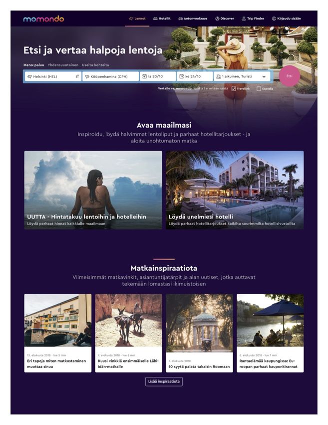
Appendix 1 provides a screen capture of Momondo.fi home page as of 15 August 2018.
The main page of the website is “chunked” into several thematical pieces. The upper part
of the website invites the user to “Find and compare cheap flights” in the format of a big,
noticeable heading. The heading is followed by the booking form (Figure 3) consisting of
two textboxes: the first textbox automatically determines the city of departure based on
the location of the user, the second textbox suggest the user to input the desired destina-
tion of travelling. After that, the user is offered to input outbound and return flights dates in
a numerical textbox with a helping calendar tool. The next element of the booking form is
22the dropdown menu that allows configuring the flight details (travelling class, number of
passengers, etc.). This is the information search step from the digital marketing hierarchy
of response model offered by Caffey & Smith (2012). The last element of the booking form
is a command button with a “Search” (Etsi – Finnish) label.
Figure 3. Booking form at the homepage of momondo.fi (background photo has been
blurred due to copyright issues)
When the search button is pressed, the user is redirected to the flight options comparison
page. Meanwhile, on the background, a pop-up window with another airfare aggregator
website – travellink.fi – is launched. The price comparison page (Appendix 2) contains the
same booking form from the homepage – this allows the user to change the basic param-
eters of the search easily. Underneath the booking form, there are bars that indicate the
prices for outbound and return flights on other dates – this intuitive element allows to in-
volve the user into experimentation with the content. Moreover, when the user sees other,
cheaper options available for nearest dates, they are more likely to click, which leads to
loading a new page, which, in turn, rises up the overall Average Pages per Visit indicator
for the website.
The left-hand side of the webpage has filters expressed in radio buttons, switches,
dropdown lists, sliders and checkboxes, which makes it possible to search more accurate-
ly according to the user’s preferences, thus lead to more experimentation by the user.
The centre part of the page is represented with tabs that organise the search results on
the basis of the price or flight duration. The user is initially suggested to choose from the
cheapest flight options, however, if for some reason, the cheapest option is not suitable,
they can easily switch to “the fastest” or “the most suitable options” – this is the additional
value that the service offers.
Every offer (Figure 4) initially contains brief, but the most important information about the
airfare – the name of an airline, outbound and return flights times and duration, layover
23You can also read