Monitoring the Repeated Calls at IKEA - Bachelor Thesis Assignment Emma A. Vlaswinkel - University of Twente ...
←
→
Page content transcription
If your browser does not render page correctly, please read the page content below
Monitoring the Repeated Calls at IKEA
               Bachelor Thesis Assignment

                 Emma A. Vlaswinkel

                   University of Twente
      Bachelor Industrial Engineering and Management
                           M. Iacob
                          June, 2021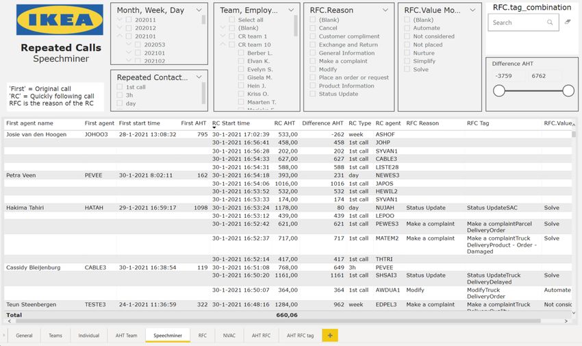
Bachelor thesis Industrial Engineering and Management

                Monitoring the repeated calls at IKEA

                              Author:
                      E.A. Vlaswinkel (Emma)

     University of Twente                                  CSC IKEA
        Drienerlolaan 5                                     Sontweg 9
      7522 NB Enschede                                  9723 AT Groningen

Supervisors University of Twente                   Supervisor CSC IKEA
   prof. dr. M.E. Iacob (Maria)                     R. IJsbrandy (Richard)
      dr. A.I. Aldea (Adina)                                  hoi

                                                                             1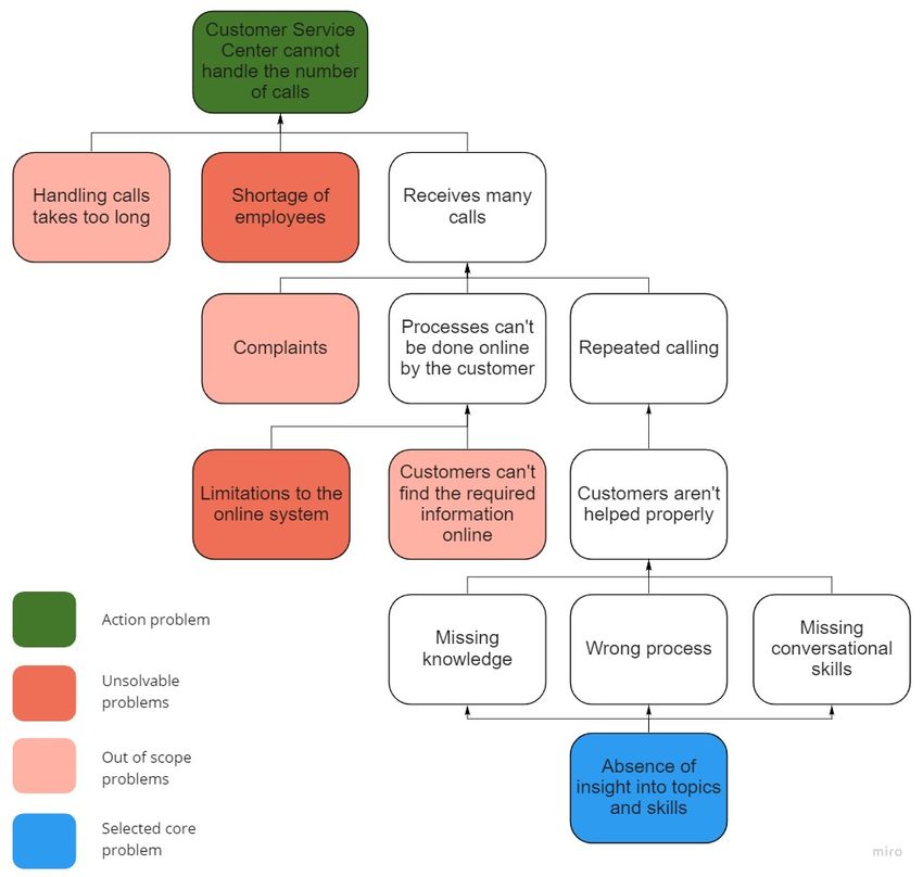
Management summary
This research has been conducted for the Customer Support Center of IKEA. This Customer Sup-
port Center handles the questions and requests of all of the customers of IKEA via social media,
chat, mail and phone. Currently, they are dealing with a very high number of calls. After looking
into the reasons customers might have to reach out, the repeated calls have been established as
one of these. The main focus of this research is to provide the Customer Support Center with a
tool that provides them with insight into this topic.

   Repeated calls have been identified as calls by the same phone number within either 3 hours,
a day, a week, or a month. The customer will call again when he thinks that he is not helped
properly. This can have three underlying reasons. Either the agent who helped him did not have
the required knowledge, the agent did not have the right conversational skills, or the process which
was started simply required the customer to call again. Since IKEA currently does not have any
idea which part of the calls is repeated, nor which underlying reason is actually the biggest cause,
they cannot reduce this number. Once they have more insight into this topic, they can improve
the situation.

   Since the Support Center already works with PowerBI to provide dashboards to the employees
which translate the data to helpful information, a dashboard in this program has been chosen as
the correct product. To determine which Key Performance Indicators should be included using
which visualizations, two literature researches were performed.

   Afterwards, focus group sessions were held to determine which Key Performance Indicators
from the different possible ones are actually wished for by the employees. Since two separate de-
partments will be using this dashboard intensively, their wishes were discussed separately. The
development department will mainly use the pages focusing on the performances of the teams or
individual agents, whereas the operations department will mainly use the pages showing the influ-
ence of different topics and processes on the repeated calls.

    Simultaneously with determining the wishes for the dashboard, the possibilities were consid-
ered. In order to visualize the requested information, the correct datasets to include had to be
selected. The Interaction Flow Report, containing the details of the calls themselves, and the
Reason For Contact report, containing the information regarding the topic of the call, will be used.
Using the Interaction Resource Fact report these two can be matched. Unfortunately, this overlap
is not complete, and only a part of the calls can be assigned a reason for contact.

    Using all this input, the dashboard was created. During this process, more focus group sessions
were held to keep improving the product. Using row-level security, the right functions have access
to the right pages. Multiple pages for both of the departments are included, as well as a page to
make the step to Speechminer. In this program, the individual calls which are represented in the
dashboard can be listened to. To determine whether this step can actually be performed properly,
a case study has been performed. Focusing on one team and one day, the repeated calls have been
analyzed, and the recurring aspects highlighted. The remarkable features have been communicated
to the employees responsible for these topics, after which directly steps were taken to improve the
situation.

   To determine whether the dashboard actually fulfils the wishes indicated, an evaluation form
has been sent out and filled in by different departments and involved employees. The results were
very positive, and the given tips were directly implemented when possible.

   To conclude, a dashboard in PowerBI has been created which will help the Customer Support
Center of IKEA with gaining insight into the topic of repeated calls. Finding out what are the
main causes enables the company to improve these, and thus the situation of such high demand.

                                                                                                  2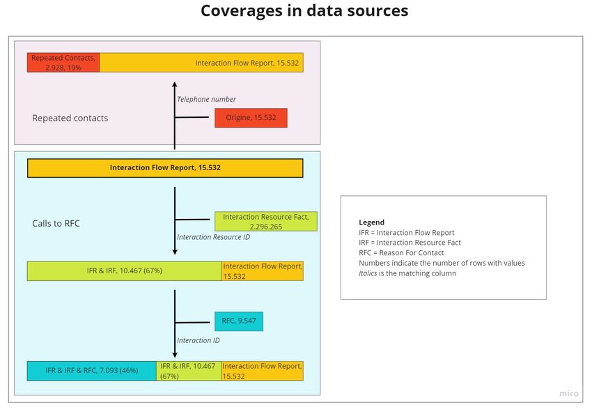
Preface
This research is performed as a final assignment before finishing the Bachelor of Industrial Engi-
neering and Management at the University of Twente. The research has been conducted with the
Customer Support Center of IKEA from February to June 2021.

   In this preface, I would like to thank everyone who helped me to complete this research. Firstly,
I would like to thank both my supervisors for the University of Twente, Maria Iacob and Adina
Aldea. Maria Iacob has been my first supervisor, guiding me through the entire process. She
helped me find direction in the academic part of the thesis and gave feedback during multiple
meetings. Adina Aldea was my second supervisor, providing feedback from a second perspective.

    Secondly, I would like to thank everyone at IKEA. Richard IJsbrandy, my supervisor, has been
very supportive of the research and helped me reach out to the correct people. My colleagues in the
Business Analysts team have taught me very much about PowerBI and other programs and reports
used. Together with my colleagues in the Customer Knowledge and Insights team, we made the
valuable step from data analysis to action. Additionally to helping me complete my research, they
also helped tremendously at keeping working from home fun, improving my online drawing skills
week by week.

    Lastly, I want to thank my friends and family for their personal support during this period.
Talking about our experiences with fellow students helped a lot with finding direction with the
research.

   Enjoy reading this thesis!

Emma Vlaswinkel
June 2021

                                                                                                  3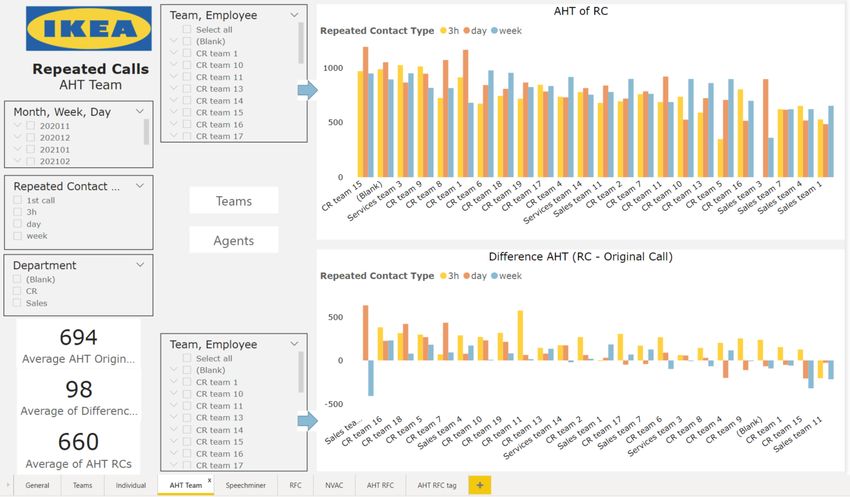
Contents
Management summary 2
Preface 3
List of Figures 6
List of Tables 6
Acronyms 7
1 Introduction 8
1.1 Company introduction . . . . . . . . . . . . . . . . . . . . . . . . . . . . . 8
1.2 Problem identification . . . . . . . . . . . . . . . . . . . . . . . . . . . . . 8
1.2.1 Action problem . . . . . . . . . . . . . . . . . . . . . . . . . . . . . . 8
1.2.2 Problem cluster and core problem . . . . . . . . . . . . . . . . . . . . 8
1.2.3 Stakeholder analysis . . . . . . . . . . . . . . . . . . . . . . . . . . . 10
2 Research design 11
2.1 Research approach . . . . . . . . . . . . . . . . . . . . . . . . . . . . . . . 11
2.2 Scope . . . . . . . . . . . . . . . . . . . . . . . . . . . . . . . . . . . . . . . 12
2.3 Deliverables . . . . . . . . . . . . . . . . . . . . . . . . . . . . . . . . . . . 12
2.4 Research questions . . . . . . . . . . . . . . . . . . . . . . . . . . . . . . . 12
3 Key performance indicators: A literature study 15
4 Visualizations in PowerBI: A literature study 18
5 Requirements 23
5.1 Data collection of requirements . . . . . . . . . . . . . . . . . . . . . . . . 23
5.2 General specifics . . . . . . . . . . . . . . . . . . . . . . . . . . . . . . . . . 24
5.3 Development . . . . . . . . . . . . . . . . . . . . . . . . . . . . . . . . . . . 24
5.4 Operations . . . . . . . . . . . . . . . . . . . . . . . . . . . . . . . . . . . . 26
5.5 Conclusion . . . . . . . . . . . . . . . . . . . . . . . . . . . . . . . . . . . . 27
6 Context analysis: Structure of required data 28
6.1 Interaction Flow Report . . . . . . . . . . . . . . . . . . . . . . . . . . . . 28
6.2 RFC . . . . . . . . . . . . . . . . . . . . . . . . . . . . . . . . . . . . . . . 28
6.3 Connection . . . . . . . . . . . . . . . . . . . . . . . . . . . . . . . . . . . . 28
6.4 Conclusion . . . . . . . . . . . . . . . . . . . . . . . . . . . . . . . . . . . . 30
7 Dashboard 31
7.1 Structure . . . . . . . . . . . . . . . . . . . . . . . . . . . . . . . . . . . . . 31
7.2 KPIs . . . . . . . . . . . . . . . . . . . . . . . . . . . . . . . . . . . . . . . 31
7.3 Pages . . . . . . . . . . . . . . . . . . . . . . . . . . . . . . . . . . . . . . . 32
7.4 Conclusion . . . . . . . . . . . . . . . . . . . . . . . . . . . . . . . . . . . . 45
8 Implementation 46
8.1 Access and communication . . . . . . . . . . . . . . . . . . . . . . . . . . . 46
8.2 Detailed investigation . . . . . . . . . . . . . . . . . . . . . . . . . . . . . . 46
8.2.1 Recurring aspects . . . . . . . . . . . . . . . . . . . . . . . . . . . . . 47
8.2.2 Communication and further steps . . . . . . . . . . . . . . . . . . . . 47
9 Evaluation 49
9.1 Method . . . . . . . . . . . . . . . . . . . . . . . . . . . . . . . . . . . . . . 49
9.2 Results . . . . . . . . . . . . . . . . . . . . . . . . . . . . . . . . . . . . . . 49
9.3 Conclusion . . . . . . . . . . . . . . . . . . . . . . . . . . . . . . . . . . . . 50
CONTENTS 4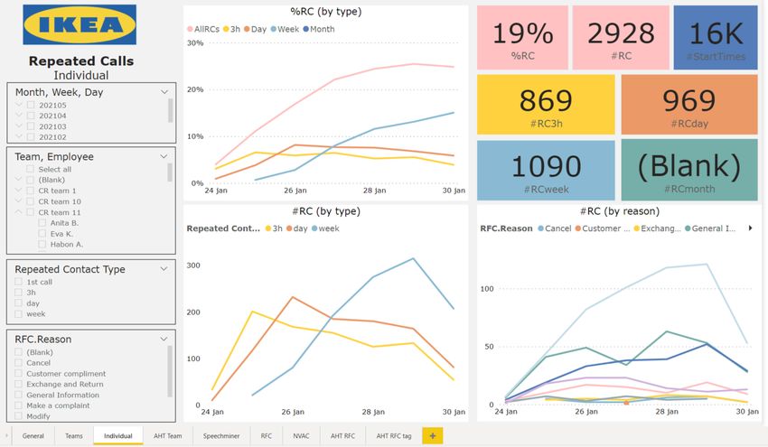
10                   Conclusions and discussion                                                                                               51
     10.1             Conclusions . . . . . . . . . . . .   . . . . . .   .   .   .   .   .   .   .   .   .   .   .   .   .   .   .   .   .   51
            10.1.1         Core problem . . . . . . . .     . . . . . .   .   .   .   .   .   .   .   .   .   .   .   .   .   .   .   .   .   51
            10.1.2         Research question . . . . . .    . . . . . .   .   .   .   .   .   .   .   .   .   .   .   .   .   .   .   .   .   51
            10.1.3         Sub research questions . . .     . . . . . .   .   .   .   .   .   .   .   .   .   .   .   .   .   .   .   .   .   51
            10.1.4         Answering the main research      question .    .   .   .   .   .   .   .   .   .   .   .   .   .   .   .   .   .   51
     10.2             Limitations . . . . . . . . . . . .   . . . . . .   .   .   .   .   .   .   .   .   .   .   .   .   .   .   .   .   .   52
     10.3             Future work . . . . . . . . . . . .   . . . . . .   .   .   .   .   .   .   .   .   .   .   .   .   .   .   .   .   .   52

References                                                                                                                                    54

Appendices                                                                                                                                    56
  Appendix A          Stakeholders . . . . . . . . . . . . . . . . . . .      .   .   .   .   .   .   .   .   .   .   .   .   .   .   .   .   56
  Appendix B          Literature research KPIs validity . . . . . . .         .   .   .   .   .   .   .   .   .   .   .   .   .   .   .   .   56
  Appendix C          Literature research visualizations validity . . .       .   .   .   .   .   .   .   .   .   .   .   .   .   .   .   .   57
  Appendix D          Quality monitoring form . . . . . . . . . . . .         .   .   .   .   .   .   .   .   .   .   .   .   .   .   .   .   58
  Appendix E          NVAC quadrant . . . . . . . . . . . . . . . . .         .   .   .   .   .   .   .   .   .   .   .   .   .   .   .   .   59
  Appendix F          RFC Tool . . . . . . . . . . . . . . . . . . . .        .   .   .   .   .   .   .   .   .   .   .   .   .   .   .   .   60
  Appendix G          Connections in initial dataset . . . . . . . . .        .   .   .   .   .   .   .   .   .   .   .   .   .   .   .   .   61
  Appendix H          Calculation of KPIs in PowerBI . . . . . . . .          .   .   .   .   .   .   .   .   .   .   .   .   .   .   .   .   62
  Appendix I          Case study CR team 10 . . . . . . . . . . . .           .   .   .   .   .   .   .   .   .   .   .   .   .   .   .   .   64
  Appendix J          Questionnaire regarding use of the dashboard            .   .   .   .   .   .   .   .   .   .   .   .   .   .   .   .   65
  Appendix K          Evaluation results . . . . . . . . . . . . . . . .      .   .   .   .   .   .   .   .   .   .   .   .   .   .   .   .   66
  Appendix L          Reflection on professional functioning . . . .          .   .   .   .   .   .   .   .   .   .   .   .   .   .   .   .   67

                                                 CONTENTS                                                                                      5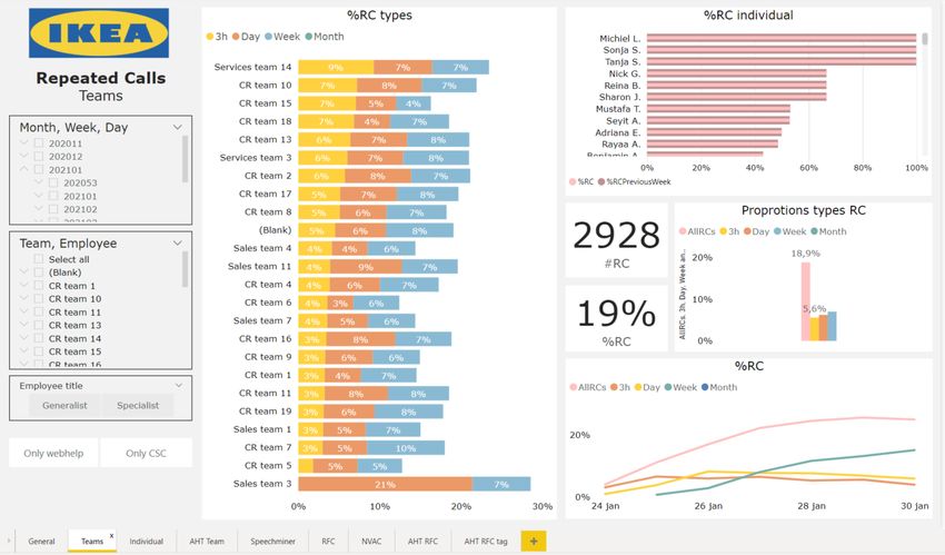
List of Figures
  1        Problem cluster . . . . . . . .      . . .       .   .   .   .   .   .   .   .   .   .   .   .   .   .   .   .   .   .   .   .   .   .   10
  2        Design Thinking process . . .        . . .       .   .   .   .   .   .   .   .   .   .   .   .   .   .   .   .   .   .   .   .   .   .   12
  3        Color . . . . . . . . . . . . . .    . . .       .   .   .   .   .   .   .   .   .   .   .   .   .   .   .   .   .   .   .   .   .   .   19
  4        Spatial positioning . . . . . .      . . .       .   .   .   .   .   .   .   .   .   .   .   .   .   .   .   .   .   .   .   .   .   .   19
  5        Combo Chart . . . . . . . . .        . . .       .   .   .   .   .   .   .   .   .   .   .   .   .   .   .   .   .   .   .   .   .   .   19
  6        Sparkline . . . . . . . . . . . .    . . .       .   .   .   .   .   .   .   .   .   .   .   .   .   .   .   .   .   .   .   .   .   .   20
  7        Boxplot . . . . . . . . . . . .      . . .       .   .   .   .   .   .   .   .   .   .   .   .   .   .   .   .   .   .   .   .   .   .   20
  8        Treemap . . . . . . . . . . . .      . . .       .   .   .   .   .   .   .   .   .   .   .   .   .   .   .   .   .   .   .   .   .   .   20
  9        Color deficiency interpretation      . . .       .   .   .   .   .   .   .   .   .   .   .   .   .   .   .   .   .   .   .   .   .   .   21
  10       Data model . . . . . . . . . .       . . .       .   .   .   .   .   .   .   .   .   .   .   .   .   .   .   .   .   .   .   .   .   .   29
  11       General page . . . . . . . . .       . . .       .   .   .   .   .   .   .   .   .   .   .   .   .   .   .   .   .   .   .   .   .   .   32
  12       Teams page . . . . . . . . . .       . . .       .   .   .   .   .   .   .   .   .   .   .   .   .   .   .   .   .   .   .   .   .   .   34
  13       Individual page . . . . . . . .      . . .       .   .   .   .   .   .   .   .   .   .   .   .   .   .   .   .   .   .   .   .   .   .   36
  14       AHT Team page . . . . . . .          . . .       .   .   .   .   .   .   .   .   .   .   .   .   .   .   .   .   .   .   .   .   .   .   37
  15       Speechminer page . . . . . . .       . . .       .   .   .   .   .   .   .   .   .   .   .   .   .   .   .   .   .   .   .   .   .   .   39
  16       RFC page . . . . . . . . . . .       . . .       .   .   .   .   .   .   .   .   .   .   .   .   .   .   .   .   .   .   .   .   .   .   40
  17       NVAC page . . . . . . . . . .        . . .       .   .   .   .   .   .   .   .   .   .   .   .   .   .   .   .   .   .   .   .   .   .   42
  18       AHT RFC page . . . . . . . .         . . .       .   .   .   .   .   .   .   .   .   .   .   .   .   .   .   .   .   .   .   .   .   .   44
  19       AHT RFC Tag page . . . . .           . . .       .   .   .   .   .   .   .   .   .   .   .   .   .   .   .   .   .   .   .   .   .   .   45
  20       Stakeholders . . . . . . . . . .     . . .       .   .   .   .   .   .   .   .   .   .   .   .   .   .   .   .   .   .   .   .   .   .   56
  21       NVAC quadrant . . . . . . . .        . . .       .   .   .   .   .   .   .   .   .   .   .   .   .   .   .   .   .   .   .   .   .   .   59
  22       RFC Tool . . . . . . . . . . .       . . .       .   .   .   .   .   .   .   .   .   .   .   .   .   .   .   .   .   .   .   .   .   .   60
  23       RFC Tool, Modify . . . . . .         . . .       .   .   .   .   .   .   .   .   .   .   .   .   .   .   .   .   .   .   .   .   .   .   60
  24       RFC Tool, full entry . . . . .       . . .       .   .   .   .   .   .   .   .   .   .   .   .   .   .   .   .   .   .   .   .   .   .   61
  25       Coverages . . . . . . . . . . .      . . .       .   .   .   .   .   .   .   .   .   .   .   .   .   .   .   .   .   .   .   .   .   .   61
  26       Hein Jager RCs . . . . . . . .       . . .       .   .   .   .   .   .   .   .   .   .   .   .   .   .   .   .   .   .   .   .   .   .   64
  27       Overview CR team 10, 25th of         May         .   .   .   .   .   .   .   .   .   .   .   .   .   .   .   .   .   .   .   .   .   .   64
  28       Analysis RCs . . . . . . . . .       . . .       .   .   .   .   .   .   .   .   .   .   .   .   .   .   .   .   .   .   .   .   .   .   65

List of Tables
  1        KPIs used in call centers . .    .   .   .   .   .   .   .   .   .   .   .   .   .   .   .   .   .   .   .   .   .   .   .   .   .   .   17
  2        General page . . . . . . . .     .   .   .   .   .   .   .   .   .   .   .   .   .   .   .   .   .   .   .   .   .   .   .   .   .   .   32
  3        General page . . . . . . . .     .   .   .   .   .   .   .   .   .   .   .   .   .   .   .   .   .   .   .   .   .   .   .   .   .   .   32
  4        Teams page . . . . . . . . .     .   .   .   .   .   .   .   .   .   .   .   .   .   .   .   .   .   .   .   .   .   .   .   .   .   .   34
  5        Teams page . . . . . . . . .     .   .   .   .   .   .   .   .   .   .   .   .   .   .   .   .   .   .   .   .   .   .   .   .   .   .   34
  6        Individual page . . . . . . .    .   .   .   .   .   .   .   .   .   .   .   .   .   .   .   .   .   .   .   .   .   .   .   .   .   .   35
  7        Individual page . . . . . . .    .   .   .   .   .   .   .   .   .   .   .   .   .   .   .   .   .   .   .   .   .   .   .   .   .   .   35
  8        AHT Team page . . . . . .        .   .   .   .   .   .   .   .   .   .   .   .   .   .   .   .   .   .   .   .   .   .   .   .   .   .   37
  9        AHT Team page . . . . . .        .   .   .   .   .   .   .   .   .   .   .   .   .   .   .   .   .   .   .   .   .   .   .   .   .   .   37
  10       Speechminer page . . . . . .     .   .   .   .   .   .   .   .   .   .   .   .   .   .   .   .   .   .   .   .   .   .   .   .   .   .   38
  11       Speechminer page . . . . . .     .   .   .   .   .   .   .   .   .   .   .   .   .   .   .   .   .   .   .   .   .   .   .   .   .   .   38
  12       RFC page . . . . . . . . . .     .   .   .   .   .   .   .   .   .   .   .   .   .   .   .   .   .   .   .   .   .   .   .   .   .   .   40
  13       RFC page . . . . . . . . . .     .   .   .   .   .   .   .   .   .   .   .   .   .   .   .   .   .   .   .   .   .   .   .   .   .   .   40
  14       NVAC page . . . . . . . . .      .   .   .   .   .   .   .   .   .   .   .   .   .   .   .   .   .   .   .   .   .   .   .   .   .   .   42
  15       NVAC page . . . . . . . . .      .   .   .   .   .   .   .   .   .   .   .   .   .   .   .   .   .   .   .   .   .   .   .   .   .   .   42
  16       AHT RFC page . . . . . . .       .   .   .   .   .   .   .   .   .   .   .   .   .   .   .   .   .   .   .   .   .   .   .   .   .   .   43
  17       AHT RFC page . . . . . . .       .   .   .   .   .   .   .   .   .   .   .   .   .   .   .   .   .   .   .   .   .   .   .   .   .   .   43
  18       AHT RFC Tag page . . . .         .   .   .   .   .   .   .   .   .   .   .   .   .   .   .   .   .   .   .   .   .   .   .   .   .   .   45
  19       AHT RFC Tag page . . . .         .   .   .   .   .   .   .   .   .   .   .   .   .   .   .   .   .   .   .   .   .   .   .   .   .   .   45
  20       Stakeholders . . . . . . . . .   .   .   .   .   .   .   .   .   .   .   .   .   .   .   .   .   .   .   .   .   .   .   .   .   .   .   56
  21       Search String . . . . . . . .    .   .   .   .   .   .   .   .   .   .   .   .   .   .   .   .   .   .   .   .   .   .   .   .   .   .   57
  22       Evaluation numerical results     .   .   .   .   .   .   .   .   .   .   .   .   .   .   .   .   .   .   .   .   .   .   .   .   .   .   66
  23       Evaluation comments . . . .      .   .   .   .   .   .   .   .   .   .   .   .   .   .   .   .   .   .   .   .   .   .   .   .   .   .   67

                                  LIST OF TABLES                                                                                                    6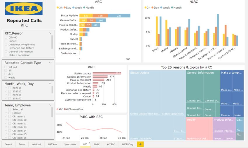
Acronyms
AHT Average Handling Time.

CK&I Customer Knowledge and Insights.
CSC Customer Support Centre.

IFR Interaction Flow Report.
IRF Interaction Resource Fact.

KPI Key Performance Indicator.
KPIs Key Performance Indicators.

NVAC Non Value Adding Contact.
NVACs Non Value Adding Contacts.

RC Repeated Call.

RCs Repeated Calls.
RFC Reason For Contact.

                                        Acronyms   7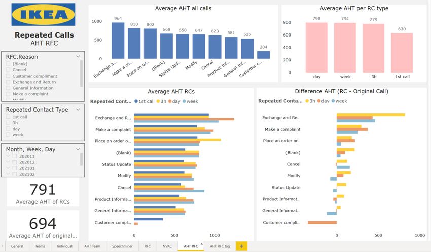
1       Introduction
1.1     Company introduction
IKEA is a very well-known worldwide company. Founded in Småland in Sweden by Ingvar Kam-
prad in 1943 at the age of 17, the company has now grown to be a worldwide leader in furniture
retail. The vision of the company is "to create a better everyday life for the many people". The
corresponding business idea is "to offer a wide range of well-designed, functional home furnishing
products at prices so low that as many people as possible will be able to afford them". In the year
2020, IKEA had 445 stores worldwide (IKEA 2021).

    Such a gigantic company comes with many processes and a lot of documentation. The company
has therefore chosen a franchise system, which allows for their international expansion. One of
these 12 franchises of the Inter IKEA Systems B.V., which is the owner of the IKEA concept and
worldwide IKEA franchisor, is Ingka Holding B.V. Ingka is then again separated into three busi-
nesses, of which IKEA Retail is the core business. They are responsible for operating the IKEA
stores in 30 countries (INGKA 2021).

   With operating the stores comes the responsibility of offering the desired customer support.
Therefore, there are many customer support centers all over the world to answer the questions cus-
tomers might have. In the Netherlands, there is a Customer Support Centre (CSC) in Groningen.
They take care of requests, complaints, and suggestions via telephone, mail, chat, and social media.

1.2     Problem identification
1.2.1    Action problem
In the current COVID-19 situation, many difficulties arise for the customers as well as for the CSC.
The customer will be served differently than he is used to. The delivery services are dealing with
delays, the customer cannot go to the store to try out the products he is interested in, he cannot
go to the store to ask questions to the employees, and he will probably have questions regarding
the replacing lockdown-related services. On the other hand, the CSC will have to improvise to get
these new services, such as Click & Collect or shopping on appointment, going, without previous
experience on how to properly arrange this. They can hardly predict what the situation will be
like in the short term future, making it difficult to plan and schedule.

    To sum up, the customer will have a lot of questions, which he cannot ask in ways he could
before, regarding topics which were never an issue before. On the other hand, the CSC is in a
more uncertain situation than before. Their problem is that they are receiving incredibly many
questions. Up to 80.000 initiated calls are received per week, of which only a part can be handled.
Not everyone can join a waiting queue due to the blocking of the support channel to keep the num-
bers under control. The exact number of calls that are blocked is unknown. If a call is ’accepted’,
they get to a selection menu, which is a part of the Interactive Voice Response. After having
specified the reason for contact, they will be placed in a matching specific waiting queue. Even
after entering, about 20% of the calls leave their waiting queue before speaking to an employee.
This can have different causes, such as a change in the need for an answer, but a likely reason is
an irritation over the long waiting times.

1.2.2    Problem cluster and core problem
The direct problem is therefore clear, the CSC of IKEA is unable to handle all the calls they are
receiving. Since this channel is the main one used, chat and socials will not be included in the
research. The problem of not being able to keep up has three big underlying causes. This struc-
ture is also visualized in figure 9 Color deficiency interpretation. The first one is that the time it
takes to help the customer, the Average Handling Time (AHT) is too long. The second cause is
a possible shortage of employees. The third cause concerns the fact that they are receiving many
calls. The employee shortage is a problem that can only be solved in the long term, which is why
it is not considered now. This leaves two research-able causes. The company requested further

                                       1   INTRODUCTION                                             8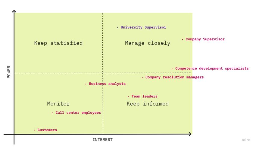
research into the high number of calls because they do not have insight into this yet, which is why
this will be the focus. When looking into the underlying causes of this, three divisions can be made.

    The first reason which could cause a customer to reach out to the CSC is when they have a
complaint regarding a product or a service. A second reason is when a question or a request of the
customer cannot be fulfilled via online services. This could mean that something went wrong when
ordering online, they have a question regarding putting together their orders, or they have a ques-
tion regarding the service of IKEA. This situation can have two clear causes, namely limitations
to the online system, they might not be able to alter their order information themselves, or they
want information that they cannot find online. The online system can not be altered considerably
on short notice, which is why this cause is not considered further. A third reason to reach out to
IKEA is when a previous contact moment did not solve the issue. This is called a Repeated Call
(RC). After having looked into the possible research topics of complaints, the online information
and the Repeated Calls (RCs), in consultation with the company, a focus on the RCs was chosen.

    The main reason for RCs is a first contact moment which did not answer the question properly.
Even when someone calls again within a short time frame for a new question, this might have been
avoided by asking whether there are any further issues at the end of the original call. This can be
summarized as customers are not being helped properly. The three aspects which have the most
influence on this are the knowledge of the employee, the process answered and the conversational
skills of the employee. If the employee does not give the right answer, the customer will call again
when he finds out that the answer did not help him. Another cause is when the answer which is
given requires a process in which multiple contacts are unavoidable, such as calling again when a
certain situation occurs, for example receiving a specific confirmation email. Lastly, the conversa-
tional skills of the employee might not be sufficient. For example, an insecure tone of voice will
make the customer doubt the validity of the answer, which might encourage him to call again.

    Currently, it is not known which aspects of a call and which aspects of the knowledge of the
employees are missing in cases of repeated calling. They were not yet able to find out which
employee causes many RCs, nor which topics are often the subject of a RC. Combining this
information, finding out which employee causes many RCs regarding which topic leads to valuable
information which can be used to reduce this number. Therefore, the core problem is that there is
currently an absence of insight into the topics and skills concerning these RCs.

                                       1   INTRODUCTION                                            9
Figure 1: Problem cluster
1.2.3 Stakeholder analysis
Regarding the topic of Repeated Calls, multiple people and functions are involved. A stakeholder
analysis has been done, to consider the different interests and involved parties. These stakeholders
are my university supervisor, the company supervisor, the competence development specialists, the
customer resolution managers, the business analysts, the team leaders, the call centers employees
and the customers. This analysis can be found in Appendix A Stakeholders.
1 INTRODUCTION 102 Research design
2.1 Research approach
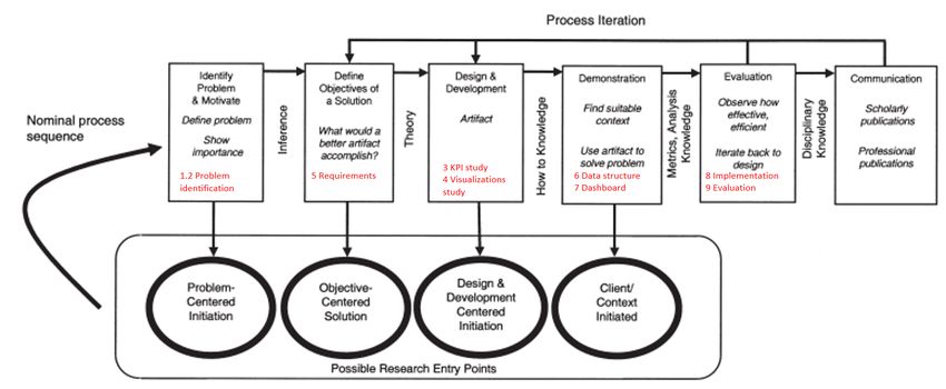
The problem-solving method which will be used in this research is the Design Thinking approach.
This method is identified as an exciting new paradigm for dealing with problems in many pro-
fessions, most notably Information Technology (IT) and Business (Dorst 2011). It is an iterative
process in which we seek to understand the user, challenge assumptions, and redefine problems
in an attempt to identify alternative strategies and solutions while providing a solution-based
approach to solving problems (Friis Dam and Yu Siang 2020). Instead of focusing on trying to
understand reality, design science attempts to create things that serve human purposes (Peffers
et al. 2007). The chosen design thinking approach of Peffers et al. 2007 uses six activities in a
nominal sequence (see also figure 2 Design Thinking process);
1. Problem identification and motivation; For this first activity, the research problem is defined,
and the value of a solution is justified. This has been done in the previous sections 1.2.1
Action problem and 1.2.2 Problem cluster and core problem. This way, the researcher and
audience of the research are motivated to pursue the solution, and the reasoning associated
with the researcher’s understanding of the problem can be understood better.
2. Define the objectives for a solution; The objectives of a solution and knowledge of what is
possible and feasible should be inferred. This understanding will be gained via focus group
brainstorm sessions with employees in various departments within the organization. The
result of this can be found in section 5 Requirements.
3. Design and development: The desired artifactt, most likely a dashboard resulted from the
brainstorm sessions, should be created. In this activity, also the desired functionality and its
architectures should be determined. In this research, a first version of the dashboard will be
created after first doing the required literature research regarding the functionalities (KPIs
and visualizations). This can be found in sections 3 Key performance indicators: A literature
study and 4 Visualizations in PowerBI: A literature study.
4. Demonstration: Demonstration of the use of the artifact to solve one or more instances of
the problem. It is important that it is known how to effectively use the artifact to solve the
problem. The dashboard will be shared with the employees consulted before. The thought
process behind the different elements present will be shared, and how the employees could
use the dashboard to minimize the problem of repeated contacts. The prototype dashboard
which is demonstrated as well as the underlying data structure can be found in sections 6
Context analysis: Structure of required data and 7 Dashboard.
5. Evaluation: After the demonstration, it should be measured how well the artifact supports
a solution to the problem. This involves comparing the objectives of a solution to actual
observed results from the use of the dashboard in the demonstration. Then, it can be de-
cided whether to iterate back to activity 3, design and development, to try to improve the
effectiveness of the artifact or to continue to the last activity of communication and leave
further improvement to subsequent projects. Sections 8 Implementation and 9 Evaluation
describes this phase.
6. Communication: The problem, its importance, the artifact, its utility and novelty, the rigour
of its design, and its effectiveness to relevant audiences should be communicated. In this
research, this will consist out of the full final thesis, which will be presented to the involved
employees at the end of the research.
This process is carried out in a flexible fashion. The stages do not have to be sequential, and the
iterative aspect of the method is essential (Friis Dam and Yu Siang 2021). This way, the artifact
will be improved constantly, while keeping close contact with the users.
2 RESEARCH DESIGN 11Figure 2: Design Thinking process
2.2 Scope
Again, the scope of the research is limited to the customer contacts via telephone. Although the
CSC also handles chat and social media, to simplify the data source handling, only calls will be
taken into consideration.
Employees can also transfer calls to other departments or consult them if they are not comfortable
answering the question. Although looking into the topics of repeated consults is also an interesting
subject, these internal calls are not considered now since this involves many more calls with slightly
different characteristics. Leaving these out of this research enlarges the likeliness of a useful result,
without sacrificing too many new insights.
2.3 Deliverables
The main intended deliverable of this research is a dashboard. This dashboard will have two
focuses, providing information for training purposes, as well as information regarding the perfor-
mance of operations. This dashboard will be made in PowerBI. The included visualizations and
KPIs will be based on the user needs, which have been determined via focus group discussions and
meetings to give updates and get new input.
Having this dashboard will make it possible to analyze the Repeated Calls, and find out what
can be improved. A second deliverable will therefore be a broad recommendation regarding the
cause of the RCs and how to diminish this number. This recommendation will also be based on a
detailed analysis of some of the calls which caused further calling.
2.4 Research questions
In this research, the goal is to solve the core problem of a lack of insight into the RCs. Via a dash-
board, insight will be provided so that then these RCs can be monitored. The research question
to answer is, therefore;
How can the Customer Support Center of IKEA monitor the Repeated Calls?
Solving the core problem will be done in smaller steps. For each of these steps, knowledge
questions have been determined. Answering these questions will help with answering the main
research question, and therefore solving the core problem. These questions are answered in the
different activities involved in the design thinking approach.
1. What does the current data analysis process look like?
The input of the dashboard will be the data that is created while calling. In order to find out what
2 RESEARCH DESIGN 12can be used to get more insight into the RCs, the current data structure needs to be understood.
Only then, the possible calculations and analyses can be determined since this will depend on the
availability of the data. The CSC of IKEA uses PowerBI to visualize the processed data. With this
Microsoft program, organizations can meet their self-service and enterprise business intelligence
needs. The latest advances in Microsoft AI can be used to prepare data, build machine learning
models, and find insights quickly (Microsoft 2021c). It is worth looking into how the CSC uses
this program to be able to adjust the dashboard to their way of working.
1.1. Which types of data are collected which could be relevant for the case of Repeated Calls?
1.2. How is PowerBI used in the CSC for the analysis of data?
2. Which Key Performance Indicators should be visualized on the dashboard?
In order to make data understandable, Key Performance Indicators are used. These are general
indicators of performance that focus on critical aspects of outputs or outcomes. Only a limited,
manageable number of KPIs is maintainable for regular use, and having too many (and too com-
plex) KPIs can be time- and resource-consuming. Systematic use of KPIs is essential as the value
of these is almost completely derived from their consistent use over a number of projects. For per-
formance measurement to be effective, the measures or indicators should be accepted, understood,
and owned across the organization (Albert P.C. Chan and Ada P.L. Chan 2004). To be able to be
consistent, first, literature research will be conducted to analyze KPIs used in call centers. Then,
the KPIs which are relevant to the employees of the CSC will be selected. Currently, no KPIs
regarding the RCs are in place. The first subquestion will be answered via literature research, the
second by performing focus group sessions.
2.1. Which Key Performance Indicators are used in call centers?
2.2. Which Key Performance Indicators are relevant to the employees of the CSC?
3. Which visualizations should be used to represent the Key Performance Indica-
tors?
Using KPIs only makes sense when the users actually understand the value they represent. Choos-
ing the correct visualizations is therefore of importance. Graphic displays of KPIs need to be
simple in design, easy to update, and accessible (Albert P.C. Chan and Ada P.L. Chan 2004). The
different options will be evaluated based on the knowledge found in the literature research, after
which the optimal ones will be processed further.
3.1. Which visualizations are used for which purposes?
4. How should the dashboard structure be designed?
The dashboard will give insight in the RCs to multiple departments in the CSC. It is, therefore,
important to determine a clear structure beforehand to make sure that everyone can easily find the
information they are looking for. Making clear which groups of end-users can be made based on
shared interest will provide structure. These groups can be given the same access rights, and their
desired information can be shown on one page. The different interests are determined via focus
group sessions, and by discussing the existing structure with the business analysts, these groups
can be formed.
4.1. Which end-user groups can be formed?
5. Which aspects of handling a phone call might influence the probability of a
Repeated Call?
Before giving the recommendation regarding which changes could be made to diminish the num-
ber of Repeated Calls, the different possible aspects should be considered. The CSC already uses
a format to determine the quality of a call. Looking into this will give insight into the impor-
tant characteristics of calls. These characteristics can then be compared with calls that actually
caused RCs to be able to quantify the influence on the probability of a RC. The characteristics are
well-known to the development specialists. They provide information on this current method by
showing which programs and questions they use.
2 RESEARCH DESIGN 135.1. What is already measured to determine the quality of the call?
6. Does the created artifact fulfil the established objectives?
In order to make sure that the artifact which was created in this research actually functions as a
solution to the determined problem, an evaluation should be performed. The involved employees
should get the chance to evaluate the product and communicate additional remarks. Sending out
a questionnaire via e-mail is a suitable data collection method for this.
7. What recommendations can be made from this research?
Finally, after having made the dashboard and having used this to analyze which calls caused RCs,
recommendations regarding the characteristics of calls that influence the probability can be made.
These recommendations can be used to improve the quality of the calls and reduce the number of
RCs to the CSC of IKEA.
7.1. Which steps are taken in calls that cause Repeated Calls?
2 RESEARCH DESIGN 143 Key performance indicators: A literature study
In this section, knowledge question 2.1. Which Key Performance Indicators are used in call cen-
ters? will be answered. The validity of this research has been described in Appendix B Literature
research KPIs validity. In order to find out which KPIs are relevant to show on the RCs dashboard,
first, the available options will be considered. This is part of the Design and development activity
of the design thinking approach.
A call center is a centralized office used for the purpose of receiving or transmitting a large
volume of requests by telephone (Manzoor 2018). Outbound and inbound-focused call centers will
have different interests. In this research, the CSC and thus an inbound call center is analyzed.
This type is operated by a company to administer incoming product support or information in-
quiries from consumers (Manzoor 2018). With the current abundance of management information,
many call centers have become preoccupied with measurements. A well-known concern is that
call center management is measuring what is easy to measure rather than what is important to
measure (Robinson and Morley 2006). For example, companies could use indicators like the total
number of calls handled per day. As a result, the focus may be on increasing the average number
of calls being handled per day by minimizing the time spent per call. However, such activities do
not guarantee that the needs of the customer are being met. The objectives of the customer should
therefore be aligned with the objectives of the company through the identification of appropriate
Key Performance Indicators (Tate and Valk 2008).
In the case of a customer support center, customer satisfaction is the most important perfor-
mance indicator. Top management and employees should therefore concentrate and take appropri-
ate efforts to satisfy the needs and expectations of customers in the most efficient and economical
ways (Manzoor 2018). Knowledge of KPIs is very important for optimizing customer support cen-
ter operations, as they facilitate easy identification of elements that either positively or negatively
affect the achieved results, thus making it easy to define areas that require improvement (Plaza and
Pawlik 2021). They are also very good means for assessment of an organization’s current position
and useful in future strategy and planning. KPIs have the biggest impact on call center quality
and call center cost by helping to reduce costs without sacrificing quality or affecting customer
satisfaction (Manzoor 2018).
Among the large variability of KPIs available, similarities and differences can be considered, af-
ter which they can be captured in the most appropriate category. Since performance measurement
implies a focus on individuals, groups, organizations, or systems, the following three groups have
been extracted; employee attitude, employee performance, and company’s system performance
(Chicu, Ryan, and Valverde-Aparicio 2016).
Employee attitude
Employees play the leading role in the actions which lead to customer satisfaction. Only human
service quality can bring about customer satisfaction, as tangible dimensions lead to customer dis-
satisfactions (Chicu, Ryan, and Valverde-Aparicio 2016). It has been found throughout call center
literature that the correlation between employee satisfaction and customer satisfaction is recipro-
cal. Employee satisfaction and behavior can lead to customer satisfaction, and customer feedback,
such as recognition or abuse, can create satisfaction, dissatisfaction, or emotional dissonance among
employees. Therefore, not only will determinants of employee’s attitude give an insight into how
the calls are handled, but they also reflect customer satisfaction. Well-known for this type of de-
terminant are employee satisfaction and communication, which can be specified into attentiveness,
perceptiveness, and responsiveness (Chicu, Ryan, and Valverde-Aparicio 2016).
Employee’s satisfaction can be measured by their attrition rate (Manzoor 2018), attendance,
and punctuality. Here, attendance is defined as an agent showing up for work on the scheduled
day. Punctuality is defined as an agent showing up on time for the shift, as well as being on time
after breaks and lunch (Jouini, Koole, and Roubos 2013).
Communication quality can be determined when listening to tapes of the recorded conversa-
tions and assessing this via a comprehensive evaluation form. Common quality criteria include the
3 KEY PERFORMANCE INDICATORS: A LITERATURE STUDY 15use of appropriate greetings and other call scripts, courtesy, and professionalism (Jouini, Koole,
and Roubos 2013). For this, also the process of determining fatal flaws adds value. When these
are determined and the occurrence of these has been measured, the cause of these flaws can be
analyzed. These might then be avoided by better and additional training (Tate and Valk 2008).
Employee performance
The category of employee performance concerns the practicalities of the actual call. Again, the
focus should be on measuring KPIs which contribute to customer satisfaction. Although it is not
known yet whether it is a determinant of customer satisfaction or simply a related factor, in gen-
eral, research does suggest a positive link between customer satisfaction and service level (Chicu,
Ryan, and Valverde-Aparicio 2016). Service level is defined as the percentage of calls answered
within a specified time limit (Jouini, Koole, and Roubos 2013). Other important performance
indicators are the average handling time, and the number of calls handled per agent (Chicu, Ryan,
and Valverde-Aparicio 2016; Manzoor 2018; Plaza and Pawlik 2021; Robinson and Morley 2006).
The average handling time (AHT) is built up of three different segments; the talk/engage time,
the hold time, and the after-call work/wrap time. The engage time is the time that is spent actu-
ally talking with the customer, getting to know the issue, and giving the answer (Plaza and Pawlik
2021). The hold time only occurs when an agent does not know the answer to the customer’s
question or cannot fulfil the request. During this time period, the agent will consult a source of
knowledge such as another employee, most likely a specialist in the required topic. The customer
does stay connected but is not actively conversing. The third segment, the wrap time, takes place
when the agent has to start a process at the request of the customer after having ended the call.
This could be altering or cancelling an order (Chicu, Ryan, and Valverde-Aparicio 2016).
The number of calls handled per agent is a KPI that is easy to measure but should be used
carefully. When call centers adopt the production-line approach and emphasize handling a large
number of calls, they usually do not take the quality of the service provided into account (Chicu,
Ryan, and Valverde-Aparicio 2016).
Company performance
Not only the call itself will influence the level of satisfaction of the customer, but also the
performance of the system plays a role in this. Thus, determinants of caller satisfaction regarding
this performance are of importance as well.
Among the important indicators is the abandonment rate. This can be calculated by dividing
the number of callers who leave the waiting queue before speaking to an agent by the total number
of callers. The customer will be dissatisfied if he finds himself forced to abandon the call without
interacting with the agent (Abdullateef, Mokhtar, and Yusoff 2011). The reason for this could be
the complexity of technology, busy signals, long waiting times, or answering machines. However,
even if the system does not perform properly by making the customer wait longer than they were
expecting to, employees can still achieve customer satisfaction by providing quality information
(Chicu, Ryan, and Valverde-Aparicio 2016).
A second indicator regarding the management of the queues and waiting times is the probability
of blocking. This measures the percentage of customers that are not able to access the center at a
given time due to insufficient network facilities in place. By blocking the excess calls, a call cen-
ter can always meet its speed-of-answer goal. Customer accessibility and satisfaction are greatly
harmed, even though the call center appears to be doing a great job concerning queue management
(Jouini, Koole, and Roubos 2013).
On a more individual level, queue management can be indicated via the longest delay in queue
measure. This is the time the oldest call in the queue has been waiting. A real-time longest delay
in the queue can be used to indicate when more staff need to be made immediately available. Also,
past performance of the queue management can be evaluated using the historical longest delay to
quantify the ’worst case’ experience of a customer (Jouini, Koole, and Roubos 2013).
3 KEY PERFORMANCE INDICATORS: A LITERATURE STUDY 16Whether the previously mentioned opportunity to improve customer satisfaction after a neg-
ative experience in the queue is fulfilled can be determined with the first call resolution (Chicu,
Ryan, and Valverde-Aparicio 2016). This measures the percentage of customer issues resolved the
first time. Maintaining a good first call resolution rate leads to a small number of calls coming
from customers who call back because their issue was not resolved the first time. This way, high
costs due to higher call volume, increased operating expenses, and dissatisfied customers can be
avoided. It is therefore also used as a vague indicator of the RCs. Complicated with this indicator
is that it is dependent on the opinion of the customer, which must first be collected. Since it is
opinion-based, the KPI is also referred to as perceived first contact resolution (Jouini, Koole, and
Roubos 2013).
Another way to determine whether the question of the customer is answered is by calculating the
repeat call rate. Then, by going through the history of such cases, you can find the similarities in
the issues that aren’t being resolved in the first attempt by agents. The repeat call rate can be
determined by dividing the number of repeat calls by the total number of calls (Chicu, Ryan, and
Valverde-Aparicio 2016). This rate can then also be specified into different types of repeated calls,
for example by subject or by the time between two calls.
Conclusion
The knowledge question of this literature research regarding the KPIs used in call centers has
been answered. The relevant KPIs can be divided into three segments. Regarding the attitude
of the employee, employee satisfaction can be measured by their attrition rate, attendance, and
punctuality. Their communication quality can be assessed via a comprehensive evaluation form.
The performance of the employee can be expressed in service level, the Average Handling Time and
the number of calls handled per agent. Lastly, the performance of the company can be indicated
via the abandonment rate, the probability of blocking, the longest delay in the queue, and the
first call resolution. These different options can now be evaluated and possibly implemented in the
further process of this research.
Table 1: KPIs used in call centers
Category Aim KPI
Employee attitude Employee’s satisfaction Attrition rate, attendance, punc-
tuality
Communication quality Results on evaluation form
Employee performance Service level, Average Handling
Time, number of calls handled
Company performance Queue management Abandonment rate, probability of
blocking, longest delay in queue
Question answered First call resolution, Repeat call
rate
3 KEY PERFORMANCE INDICATORS: A LITERATURE STUDY 174 Visualizations in PowerBI: A literature study
Knowledge question 3.1 Which visualizations are used for which purposes? has been chosen to
find out which visualizations should be placed on the dashboard representing the desired KPIs.
This section, answering this question, is also part of the Design and development activity. The
validity of this research is described in Appendix C Literature research visualizations validity. This
research is done to find out which visualizations are used in general, to later specify the ones to
use for IKEA. It must be easy to interpret the values of these KPIs and understand the current
situation. The visualizations can help to make the step from the data to the understanding, but
only if the correct ones are chosen.
The rise of information technologies has led to the improvement of data storage and acquisition
techniques (Few 2006). This caused huge accumulated data volumes in many applications. A
significant challenge with these datasets is to gain insights from them to discover patterns or to
originate relationships (Ibrahim, Albarrak, and Li 2017). The problem is not, at least not primar-
ily, in the technology but in the inferior visual design. In order to discover the insights, dashboards
must display a dense array of information in a small amount of space in a manner that communi-
cates clearly and immediately. The design should therefore use the power of visual perception and
it should process large quantities of information rapidly. To achieve this, this visual design should
be central to the development process (Few 2006).
When working with high-dimensional datasets, identifying visualizations and determining the
correct design which shows interesting variations and trends in data is not trivial. The analyst must
manually specify the number of visualizations, explore relationships among various attributes, and
examine different subsets of data before discovering visualizations that are interesting or insightful
(Ibrahim, Albarrak, and Li 2017). However, if those who implement dashboards understand visual
perception and apply that understanding through design principles and practices aligned with the
way people see and think, the dashboards can tap into the tremendous power of visual perception
to communicate (Few 2006).
Purpose
Within the category of ’dashboards’, there is still great a variety of products. Although it is known
that they are widely used for monitoring and analysis of business processes (Kintz 2012), this
still leaves much space for interpretation. A broad definition creates confusion and makes it quite
impossible to say anything useful about dashboards. A well-known definition is one established
by Few 2006, who says that a dashboard is a "visual display of the most important information
needed to achieve one or more objectives which fits entirely on a single computer screen so it can
be monitored at a glance". These aspects are the essence of the product; the focus on objectives, it
fits on one screen, and it is used for monitoring at a glance. Additionally, there are two supporting
attributes; dashboards have small, concise, clear, and intuitive display mechanisms, and they are
customized (Few 2006).
It is important to distinguish different types of screen-based displays which combine more than
a single chart since not all of them can directly be classified as a dashboard. Whereas dashboards
are used to monitor what is going on, displays combine several charts on a screen for analysis.
A definition for this type of display comes from Few 2007, "a ’faceted analytical display’ is a set
of interactive charts (...) that simultaneously reside on a single screen, each of which presents
a somewhat different view of a common dataset, and is used to analyze that information. When
looking for guidelines on designing the desired product, the creator needs to have the purpose of
the display clear. Displays used for monitoring require functionalities that are quite different from
those of displays used to analyze data (Few 2006).
Rapid perception
In line with the purpose of a dashboard to monitor what is going on, much of the presented in-
formation is only of importance when something unusual is happening. These exceptional values,
which require attention, should be highlighted and easily recognizable.
The early stage of visual perception that rapidly occurs below the level of consciousness, pre-
attentive processing, is tuned to detect a specific set of visual attributes. The step afterwards,
4 VISUALIZATIONS IN POWERBI: A LITERATURE STUDY 18attentive processing, is much slower. The four pre-attentive processing properties of visualization
are color, form, spatial position, and motion (Hossain 2018). These properties should thus be used
to highlight the aspects of the data which require attention.
Color is often described by three attributes, hue, saturation, and brightness. It is one of the
most common properties to call attention (Hossain 2018). An interesting thing about color is
that we don’t perceive it in an absolute way, but it dramatically influences our view (Few 2006).
The grey squares in the picture on the right are the same color each time but appear different.
Taking this context into account and using it for the better is therefore essential. This means that
consistency is key, and adding more colors should be only done when valuable.
Form applies to various attributes such as shape, size,
grouping, distance, and more (Hossain 2018). An example
of this is how bar charts are used; the bars that are longer or
shorter than others will immediately catch attention.
Spatial positioning concerns the ability to perceive two or
more object’s positions in space relative to oneself and relative
to each other. This psychology includes categories such as
proximity, closure, continuity, connectedness, and similarity
(Hossain 2018). Because of this, things that are aligned with
one another appear to belong to the same group (Few 2006),
as the separated lines in the picture on the right are often
Figure 3: Color
perceived as one dashed line.
Lastly, motion; something suddenly appearing within
our field of vision, is a powerful method to get at-
tention. When typing, for example, a cursor flick-
ering helps to locate it. However, flicking objects
on a screen will quickly become annoying to look
at. It is most useful when immediate response is re-
quired in case of working with real-time data (Few
2006).
Media displays
Figure 4: Spatial positioning
However the analyst chooses to show the data will emphasize
one feature over another. The previously described properties
can be used in different types of visualizations to emphasize the proper aspect. In a single chart,
not every possible question of comparison can be answered. Therefore, one should assess whether
the chosen chart answers the question being asked (Wexler, Shaffer, and Cotgreave 2017). In dif-
ferent scenarios, different visualization types should be chosen to fulfil a particular task. Here, the
five most used categories of media displays used to present actual data are discussed.
Graphs
Most dashboard display media are of the first cat-
egory, graphs. This, because of the predominance
of quantitative data on most dashboards. Almost
all items in this category display quantitative data in
the form of a 2D graph with X and Y axes (Few
2006).
A bar chart uses length to represent a measure. Human
beings are extremely good at seeing even minor differences in
length from a common baseline. Especially when the bars are
sorted, it can be a beneficial graph to spot the biggest/smallest
items (Wexler, Shaffer, and Cotgreave 2017). Bar charts are
standard for looking at a specific value across different cat-
egories (Microsoft 2021b), focusing on the individual values Figure 5: Combo Chart
rather than the overall shape. A variation of this graph is the
4 VISUALIZATIONS IN POWERBI: A LITERATURE STUDY 19stacked bar graph, which is helpful for specific purposes but
can easily be misused. Using this stacked bar graph to display a single series of part-to-whole data
is recommended against. It can be a suitable choice when displaying multiple instances of a whole
and its parts, emphasizing the whole. However, details regarding the changes in the distributions
are still easily lost; using multiple bar charts is then a better option (Few 2006). Another good
option for this situation is using a combo chart, where a column chart and a line chart are combined
(Microsoft 2021b). The line can then represent the whole, and the bars the individual distributions.
Line charts are used to emphasize the overall shape of an entire series of values, usually over
time (Microsoft 2021b). The time is represented by position on the horizontal x-axis, and the height
and slopes of the lines let us see trends (Wexler, Shaffer, and Cotgreave 2017). The clearness of
the overall shape of the data comes through, especially for line graphs, because their quantitative
scale need not begin at zero (Few 2006).
Similar to line charts are the sparklines. These graph-
ics are a highly condensed form of data display with-
out a quantitative scale. The purpose is to provide a
quick sense of historical context to enrich the meaning
of the measure. Rectangles can give more information,
such as the minimal or maximal acceptable number (Few Figure 6: Sparkline
2006).
When a set of data is not fit to be summa-
rized in a measure such as a sum or average, a box
plot can be used to describe how the values are dis-
tributed across the entire range (Few 2006). In this
box plot, the lowest value, the median, and the high-
est value are shown. This gives insight into the vari-
ety of the values, as well as the value of the major-
ity.
Treemaps is one type of graph that does not use a 2D
graph with two axes. These maps are charts of colored rect-
angles, with size representing value. They can be hierarchi-
cal, with smaller rectangles nested within the main rectangles
(Microsoft 2021b). Treemaps are usually interactive, provid-
ing the means to select a particular item in the hierarchy and
then drill down into the next level of items that belong to the Figure 7: Boxplot
higher-level item selected (Few 2006). This makes it possible
to gain further insights into the conditions occurring at the
lower levels.
Then there are also types of graphs which are often left
out of the recommendations. This, because there is a better
option mentioned above or because they are not suitable for
a dashboard. A well-known example is the pie chart. Al-
though they were designed to represent part-of-a-whole com-
munication, in many cases, a bar chart is more helpful for
this purpose. However, when only a minimal number of slices
is required, it might still be an option (Wexler, Shaffer, and
Cotgreave 2017). Another graph in this category is the radar
graph, a circular graph that encodes quantitative values using
lines that radiate from the circle’s center to meet the boundary
formed by its circumference. This is simply a line graph with
a categorical scale along the circular axis, making it harder Figure 8: Treemap
to read. It can be tolerable when referring to, for example,
hours of the day, which are also represented circularly on a
clock (Few 2006).
4 VISUALIZATIONS IN POWERBI: A LITERATURE STUDY 20Icons
Icons are simple images that communicate a clear and straightforward meaning. There are three
main types of icons.
Alert icons are designed to draw attention to particular information on a dashboard. Although
looking at what is going well is nice, the things going wrong are more likely to require attention.
In order to let the icon work well, it should be simple and noticeable. Using too many variations
of an alert icon is too complex, and also alert levels should be limited. A single alert icon catches
the eye much more effectively than multiple icons with various meanings (Few 2006).
When choosing a scheme for the different alert levels, the
traffic light scheme is a common one. However, approximately
8 percent of males and 0.5 percent of females have color vision
deficiency. The most common form of color deficiency is red-
green. People with this color vision deficiency have a harder
time differentiating between red and green (American Opto-
metric Association 2021). Therefore, making the alert icon
these colors will make it hard for them to figure out what the
icon is saying. There are color-blind-friendly palettes avail-
able, or using distinct intensities of the same hue is a suit- Figure 9: Color deficiency inter-
able option in this situation (Wexler, Shaffer, and Cotgreave pretation
2017).
The second type of icon used is the up/down icon. They convey the simple message that a
measure has gone up or down compared to some point in the past, or is greater or lesser than
something else (Few 2006). Proper use could be whether the sales have increased compared to last
month, or whether a target was met.
Lastly, there are on/off icons. These serve as flags to identify some items as different from
others (Few 2006). They can be used to indicate whether products are sold in a specific country
or not. Again, sticking to a minimal range of icons is beneficial for the clearness of the dashboard.
Text
In every dashboard, some information will be encoded as text. Text is, for example, used for
categorical labels to identify what is shown on graphs, and it is also appropriate to use when a
single measure should be reported, without comparison (Wexler, Shaffer, and Cotgreave 2017).
Images
Placing images on dashboards is hardly ever valuable for typical business uses. A situation where
they might add value is, for example, when including pictures of the employees for a trainer, but
a name will quickly be sufficient as well (Few 2006).
Tables
Arranging sets of information in a particular manner can help to communicate clearly. All of the
above displays can be placed into columns and rows to form tables. A table is already a familiar
arrangement for text, but also structurally arranging graphs and icons is useful (Few 2006).
Multiple-view
Once all visualizations have been chosen and made, their structure on the dashboard should be
considered. These multiple views of different types should be composited into a single cohesive
representation (Chen et al. 2021).
Each visualization has at least two perspective attributes. The view type is the type of data
display, often one of those described above, which is chosen. Menus, legends, and narrative texts
are described as Panels. The second attribute is the bounding box which specifies the center posi-
tion and size of the view in the display space. Then, additional attributes include the aimed users
and the visualized data (Chen et al. 2021).
After having specified each of the visualizations, a proper arrangement should be designed. A
suitable first step is to form groups aligned with business functions, with entities, or with uses of
4 VISUALIZATIONS IN POWERBI: A LITERATURE STUDY 21You can also read