MOTIVATING GOOD PRACTICES FOR THE CREATION OF CONTIGUOUS AREA CARTOGRAMS
←
→
Page content transcription
If your browser does not render page correctly, please read the page content below
Proceedings Vol. 1, 8th International Conference on Cartography and GIS, 2020, Nessebar, Bulgaria
                                                                            ISSN: 1314-0604, Eds: Bandrova T., Konečný M., Marinova S.

   MOTIVATING GOOD PRACTICES FOR THE CREATION OF
           CONTIGUOUS AREA CARTOGRAMS

        Shi Tingsheng, Ian K. Duncan, Yen-Ning Chang, Michael T. Gastner*
Yale-NUS College, 28 College Avenue West, #01-501 Singapore 138533
*
 Corresponding author: michael.gastner@yale-nus.edu.sg
Abstract
Cartograms are maps in which the areas of regions (e.g., countries or provinces) are proportional to a thematic
mapping variable (e.g., population or gross domestic product). A cartogram is called contiguous if it keeps
geographically adjacent regions connected. Over the past few years, several web tools have been developed for the
creation of contiguous cartograms. However, most of these tools do not advise how to use cartograms correctly. To
mitigate these shortcomings, we attempt to establish good practices through our recently developed web application go-
cart.io: (1) use cartograms to show numeric data that add up to an interpretable total, (2) present a cartogram
alongside a conventional map that uses the same color scheme, (3) indicate whether the data for a region are missing,
(4) include a legend so that readers can infer the magnitude of the mapping variable, (5) if a cartogram is presented
electronically, assist readers with interactive graphics.

Keywords: Cartogram, style guidelines, web-based mapping application

INTRODUCTION

Visualizing quantitative data associated with geographic regions is a common task in cartography. Conventionally,
quantitative data are shown on choropleth, dot-density, or proportional symbol maps (Dent et al., 2008). Typically,
these maps are based on standard map projections (e.g., a transverse Mercator or Albers projection) so that the regions’
boundaries have shapes that look familiar to most readers. The most salient feature of a region on a map is arguably the
size of the area that the region occupies. However, the area of a region on a conventional map is usually not related to
the data the map aims to communicate. For example, Vienna occupies only 0.5% of the area in the choropleth map of
Austria in Figure 1a, where Vienna is abbreviated as “WI”. Even though the color legend indicates that Vienna is
densely populated (data from Wikipedia, 2020a), it is not immediately apparent from the choropleth map how large
Vienna’s population size is in comparison with the population of other regions.

Cartograms promise a way to overcome the limitations of conventional thematic maps (Raisz, 1934; Hennig, 2013). On
a cartogram, every region has an area proportional to its numeric data value. For instance, on the cartogram in Figure
1b, Vienna occupies 21.4% of Austria’s area, which accurately represents Vienna’s share of the nationwide population.
In addition to scaling all areas in proportion to population, the cartogram in Figure 1b is also contiguous (i.e., all
neighbors on the conventional map projection in Figure 1a are also neighbors in Figure 1b, and vice versa). Several
algorithms have been proposed that create contiguous cartograms (e.g., Dougenik et al., 1985; Merrill et al., 1992;
Gusein-Zade and Tikunov, 1993; Sun, 2013). The example in Figure 1b was generated with the fast flow-based method
by Gastner et al. (2018), but the principles we propose in this paper are not specific to contiguous cartograms produced
with this technique.

Contiguous cartograms have often been criticized as difficult to read because they inevitably appear distorted when they
are compared to traditional maps (Fotheringham et al., 2007; Eckert et al., 2008; Woodruff, 2008). We argue that the
difficulty is partly caused by the way cartograms are often presented. In this paper, we propose a set of guidelines for
the presentation of cartograms that should alleviate some of the concerns about their use. We advocate the adoption of
these practices to ensure that cartograms are used appropriately and remain accessible to readers. We also describe the
cartogram web application go-cart.io (Gastner, 2020) that nudges users to adhere to these guidelines.

                                                                                                                                    589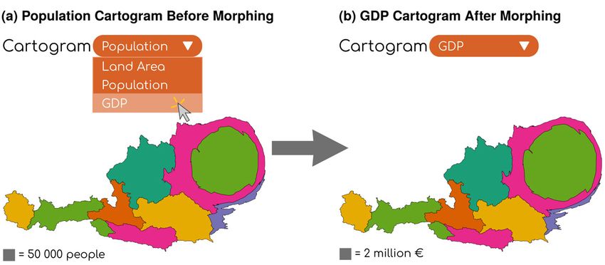
Proceedings Vol. 1, 8th International Conference on Cartography and GIS, 2020, Nessebar, Bulgaria
                                                                             ISSN: 1314-0604, Eds: Bandrova T., Konečný M., Marinova S.

Figure 1. Two maps that visualize the population distribution of Austria by federal state (Bundesland). (a) Choropleth
          map of the population density. (b) Cartogram in which areas are proportional to population size.

PREVIOUS WORK

In recent years, several software tools have been developed for the creation of cartograms. Markowska and Korycka-
Skorupa (2015) conducted an evaluation of five existing cartogram generation tools: Cartogram Utility for ArcGIS
(ESRI, 2007), ScapeToad (Andrieu et al., 2008), OpenGeoDa (Anselin and McCann, 2009), MapViewer (Golden
Software, 2010), and MAPresso (Herzog, 2005). They assessed whether these five tools contain certain features that
may help users to better read and generate cartograms. Cartogram Utility for ArcGIS and ScapeToad received the
highest scores. For example, these cartogram tools were the only two in the list that enabled users to save and export the
cartograms as vector graphics. However, not even these two cartogram generators intend to guide users towards proper
use of cartograms. None of the available software informs users whether their data are suitable to be shown on a
cartogram, how to handle missing data, or how to add meaningful legends.

Clear guidelines for the proper use of cartograms have generally been lacking in the cartogram literature. A noteworthy
exception is a user evaluation by Dent (1975). Based on experimental results, he advises to label all administrative units
on the cartogram, show a conventional map as an inset in the cartogram, and provide an “anchor stimulus”. The
intention of the anchor stimulus is to allow map readers to convert between cartogram areas and the numbers that the
areas represent. Dent (1975) presents as an example a population cartogram of the northeastern United States. The
anchor stimulus in his example takes the form of a square next to the cartogram that is accompanied by the label:
“represents 1,500,000 persons”. We show a similar anchor stimulus in the cartogram of Austria in Figure 1b.

Since the publication of Dent’s (1975) guidelines, cartograms have become a more frequent form of data visualization,
but only few cartogram designers have strictly followed his advice. The news media nowadays often adopt cartograms
as visualizations accompanying their online content. Some of these cartograms indeed contain an inset map (Los
Angeles Times, 2012; New York Times, 2012) or an anchor stimulus (Fairfield, 2008), but the use of these features is
not universal. It is understandable that there has been no uniform approach to presenting cartograms so far because their
production has required manual adjustments specific to each individual data set. Because of the increasing interest in
cartograms, it is timely to implement Dent’s (1975) guidelines as an integral part of software that can automate many of
the steps needed to convert raw data into a cartogram. A fresh look at the problem also presents an opportunity to
establish best practices for cartograms that are presented on a computer screen rather than on printed paper.

When cartograms are shown in a web browser, we can take advantage of modern web technologies (e.g., D3.js or
AJAX) to add new elements of interactivity that have the potential to make cartograms more understandable and more
enjoyable to users. On news portals, there are already many online cartograms that allow readers to explore the data
interactively (Byron et al., 2008; Clark and Houston, 2012; Los Angeles Times, 2012; New York Times, 2012; The
Telegraph, 2015; Franklin et al., 2016; BBC News, 2019; Kommenda et al., 2019). There are three categories of
interactive features that either have been implemented on these websites or have been proposed in the cartogram
literature: animations, linked brushing, and infotips. Animations can help visualize how one map morphs into another.
Ware (1998) strongly advocated the use of animations that show a continuous transformation from a conventional map
to a cartogram and vice versa. In an experiment, she found that participants with access to animations were more likely
to give correct answers, though at the expense of a longer response time. While an animation only displays a single map
at a time, linked brushing enables users to compare a cartogram shown alongside a corresponding conventional map.
Linked brushing is a mouse-hover effect where the user pointing at one region on the conventional map causes the
corresponding region on the cartogram to be highlighted (e.g., by changing its color) and vice versa. Dykes (1997),
Haining (2003), and Tobler (2004) all proposed linked brushing as a method of visually communicating the thematic
connection between the conventional map and the cartogram. Another mouse-hover effect is an infotip that appears as a

                                                                                                                                     590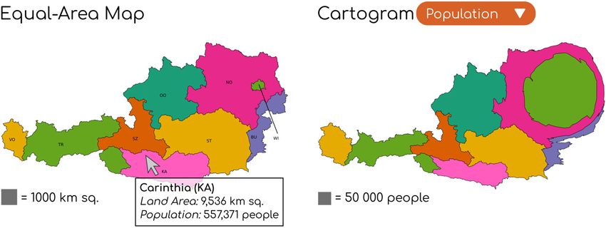
Proceedings Vol. 1, 8th International Conference on Cartography and GIS, 2020, Nessebar, Bulgaria
                                                                              ISSN: 1314-0604, Eds: Bandrova T., Konečný M., Marinova S.

       Figure 2. Screenshot of the go-cart.io user interface. A conventional equal-area map of Austria (left) and a
                             population cartogram (right) are shown alongside each other.

pop-up with data about the region under the mouse pointer (Figure 2). Nusrat et al. (2018) proposed infotips as a way to
reveal the exact value of the numeric data represented by the region's area. Infotips have been implemented in
cartogram software such as GeoViz Toolkit (Hardisty and Robinson, 2011) and MAPresso (Herzog, 2005). However,
these software tools are no longer up to date. The cartogram feature of GeoViz Toolkit has been reported to be broken 1,
and MAPresso is no longer supported by contemporary web browsers because it is a Java Applet.

GO-CART.IO

We have developed the web application go-cart.io (Gastner, 2020) as a free alternative to existing cartogram software
that takes advantage of state-of-the-art web technology. It aims to provide an intuitive interface to create cartograms
supported by backend computer code that outputs the desired cartograms within seconds (Gastner et al., 2018;
Tingsheng et al., 2019). By design, go-cart.io neither requires technical knowledge about programming nor access to
geographic information system software so that even non-experts can create cartograms from their own data. To
generate a new cartogram with go-cart.io, users first select a desired input map (e.g., a map of Austria). By default, the
website displays a conventional equal-area projection of the chosen map region alongside a population cartogram
(Figure 2). Users can fill in their own numeric data for each administrative region either by typing directly in the
browser or by uploading a CSV spreadsheet. The website then visualizes the input as a pie chart and as a cartogram. By
selecting different data sets from a drop-down menu, users can compare different cartograms (Figure 3). Users can
explore the maps with interactive features—animations, linked brushing, and infotips—implemented with the D3.js
library. With a simple mouse click, users can download the maps in GeoJSON or SVG vector graphics format. A
tutorial with an explanation of the cartogram generation process is available on go-cart.io.

At this point in time, the development of go-cart.io is still work in progress. While working on the software, we had to
make many design decisions that, in our opinion, set an example for the appropriate use of cartograms. The purpose of
this paper is to summarize our design decisions as guidelines that we regard as essential if cartograms are to become an
effective form of data visualization.

1
    https://code.google.com/archive/p/geoviz/issues/39, accessed on 2020-24-05.

                                                                                                                                      591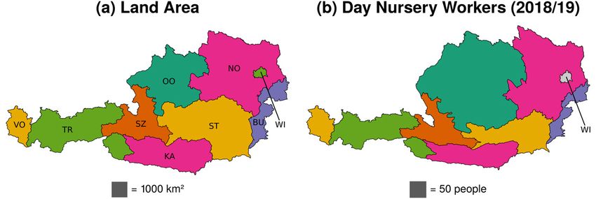
Proceedings Vol. 1, 8th International Conference on Cartography and GIS, 2020, Nessebar, Bulgaria
ISSN: 1314-0604, Eds: Bandrova T., Konečný M., Marinova S.
RECOMMENDED PRACTICES
Interpretable Total
Figure 3. Users can select a cartogram from a drop-down menu. In this example, the user previously uploaded GDP
data. Upon selecting “GDP”, the cartogram continuously morphs from a cartogram where areas are proportional to
population to a new cartogram where areas are proportional to GDP.
The main purpose of a cartogram is to show the share of a region’s importance in the context of a larger geographic
entity. For instance, we may want to show the proportion of Austria’s GDP that originates in each federal state
(Bundesland). We can visualize these numbers on a cartogram where each Austrian state has an area in proportion to its
GDP (data from Wikipedia, 2020b). On such a cartogram, the states’ GDPs add up to an interpretable total: Austria’s
national GDP. Unfortunately, many cartograms have been presented in the literature where cartogram regions are
proportional to non-additive statistics. The most common mistake is the use of per-capita statistics for the regions’
areas. For example, it is not appropriate to make a cartogram of Austria where each state has an area in proportion to the
state GDP per capita. The states’ per-capita GDPs do not add up to an interpretable total, so such a per-capita cartogram
would not reveal the contribution of a state to the federal GDP. Examples of cartograms incorrectly based on non-
additive statistics can be found in Rittschof et al. (1996; books read per capita), Sui and Holt (2008; mortality rate
instead of number of fatalities), and Pleger et al. (2014; citations per publication instead of total citations), to name only
a few.
To understand why non-additive statistics are unsuitable for cartograms, it helps to draw an analogy with a more
common form of data visualization: pie charts. The numbers associated with the slices of the pie must add up to a
number that we can attribute to the whole pie. For example, if each slice represents the GDP of one state, the entire pie
represents the national GDP—a meaningful quantity that we can show as a label on top of the pie chart. If instead we
were to make slices proportional to GDP per capita, we would not be able to describe the sum of these numbers with a
simple label. The analogy between cartograms and pie charts was first made explicit by the Worldmapper team (Dorling
et al., 2007). We find this analogy intuitive and easy to communicate to non-experts. We have, therefore, decided to
integrate the pie chart analogy into go-cart.io’s cartogram generation process.
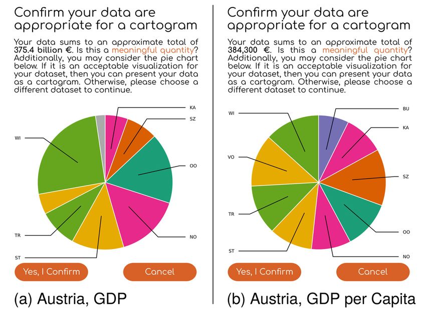
Before a cartogram is shown to the user, we first present the input data as a pie chart (Figure 4). Above the pie chart, we
state the sum of the input numbers and pose the question: “Is this a meaningful quantity?” The cartogram is only
computed after the user confirms that the total number is interpretable. We hope that the pie chart and the
accompanying text nudge users to think about whether their data are suitable and, if not, to amend their input. Figure 4a
shows an example where the input numbers add up to a meaningful total, namely the total GDP of Austria. The example
in Figure 4b illustrates what happens if the input is unsuitable (GDP per capita): the total of 384,300 € is clearly too
small to be the total GDP of Austria and too large to be the nationwide GDP per capita.
592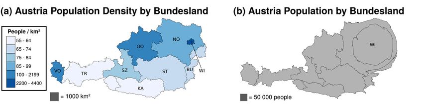
Proceedings Vol. 1, 8th International Conference on Cartography and GIS, 2020, Nessebar, Bulgaria
                                                                             ISSN: 1314-0604, Eds: Bandrova T., Konečný M., Marinova S.

Color Scheme

While Dent (1975) already advised to show conventional map and cartogram alongside each other, he gave no rule how
to choose colors on the two maps. Most cartograms are univariate maps: they represent only one variable (e.g.,
population in Figure 3a or GDP in Figure 3b), and the area is the only visual stimulus that represents this variable. In
univariate cartograms, we are free to choose the colors for each region so that regions are easy to identify. We color the
regions such that no neighboring regions share the same color, but corresponding regions on the juxtaposed
onventional map and cartogram have the same color (see Figure 2 for an example).

            Figure 4. Examples of pie charts shown by go-cart.io during the cartogram generation process.

By default, go-cart.io uses the six-class Dark2 palette from ColorBrewer (Brewer, 2002; Figure 5), which is designed to
work well on liquid-crystal displays. Although we believe that the default colors work well in most cases, we allow
users to input other color choices, either as Hex codes or with a web-based color picker. The freedom to choose colors
may in fact be necessary when representing bivariate data on a cartogram. The website ensures that corresponding
regions of the conventional map and the cartogram still share the same color.

Handling of Missing Data

Real-world geospatial data sometimes contain missing entries for some regions. Conventional thematic maps usually
reserve a special color to indicate missing values. We apply the same method in go-cart.io. In the default color scheme,
we choose light gray for missing data because it clearly stands apart from all other colors in the palette (Figure 5).

Besides setting a special color, we must also specify how large the area of a region with missing data should be on a
cartogram. At first glance, it might appear natural to set the area equal to zero. In practice, however, this choice would
be a bad solution. If a region’s area is equal to zero, it completely disappears from the cartogram, which makes it
difficult to compare the cartogram to a conventional map. An area of zero would also incorrectly imply that the
statistical variable is known to be zero. A more appropriate choice is to symbolize the absence of knowledge on the
cartogram by keeping the region’s area the same as on the conventional reference map.

In Figure 6, we illustrate with an example how to represent missing data on a cartogram. On the left, we show a
conventional equal-area map of Austria as a reference. On the right, we show a cartogram where the states’ areas are
proportional to the number of workers in day nurseries. The number for Vienna (WI) is unknown according to the data
available from Statistik Austria (2020) We indicate the missing data with a gray fill color. We also keep the area of
Vienna in the cartogram the same as Vienna’s area in the equal-area map on the left.

                                                                                                                                     593
Proceedings Vol. 1, 8th International Conference on Cartography and GIS, 2020, Nessebar, Bulgaria
                                                                              ISSN: 1314-0604, Eds: Bandrova T., Konečný M., Marinova S.

Value-to-Area Legend

Without any additional labels or legends, a cartogram shows the importance of the administrative units only in relative
terms. For example, the viewer can judge from the areas of the Austrian states in Figure 1b that Vienna’s population is
approximately one fifth of Austria’s total population. This knowledge is valuable, but users can gain even more insight
if they know what magnitude each area represents in absolute terms. Therefore, we regard it as good practice to include
a value-to-area legend in every cartogram.

  Figure 5. Six-class color scheme used for cartograms in go-cart.io. The text strings are the Hex codes of each color.
                                          Gray is reserved for missing values.

Dent (1975) recommends a square as the legend symbol with an “anchor stimulus” (i.e., area in the square) “at the low
end of the value range”. Unfortunately, he does not give an explanation how to obtain the area of the square key for a
given data set. In his paper, he shows a sample cartogram of the northeastern United States, where the key represents
approximately 1.1% of the total population (1.5 million inhabitants out of a total of 132.0 million). We have chosen
slightly smaller keys, ranging from 0.5% for the GDP cartogram in Figure 3 to 0.9% for the day-nursery-personnel
cartogram in Figure 6b. On a computer screen, the square is approximately 30×30 pixels. The exact percentage that is
represented by the key depends on the aspect ratio of the cartogram. We restrict the keys to be “nice numbers” (sensu
Wilkinson, 2013; i.e., powers of 10 multiplied by 1, 2, or 5). If users provide a unit as part of their input data, go-cart.io
inserts the unit as part of the legend string (e.g. € in Figure 3).

In our current implementation, the legend is always placed below the map. The color of the legend is dark gray (Hex
code #707070) to avoid confusion with any of the six colors in the Dark2 color scheme and the light gray used for
missing data (Figure 5). In future versions, we may allow users to interactively change the legend color and position.

Interactive Graphics

We integrate three interactive features into go-cart.io to render more readable and understandable cartograms. These
interactive features are cartogram-switching animations, linked brushing, and infotips.

    •    Cartogram-switching animations: Users can choose between different data sets from a drop-down menu on
         the screen, as shown in Figure 3. When the user selects a data set, the previously displayed cartogram morphs
         into a new cartogram that visualizes the selected data. In go-cart.io, the transition from one cartogram to
         another is implemented as a smooth shift of the polygon vertices from start to end position during a one-second
         time interval. Figure 3 shows the start and end point of the animation when the user chooses to view the GDP
         cartogram whereas the original cartogram displayed is the population cartogram.
    •    Linked brushing: The cartogram is always displayed alongside a conventional map in go-cart.io. As the user
         hovers the mouse over an administrative region on one of these two maps, the corresponding region is
         simultaneously highlighted on the other map. In our current implementation, we highlight the region by
         increasing the brightness of its fill color. Other forms of highlighting (e.g., changing the border color or
         thickness) are also conceivable and may be implemented in future versions. We demonstrate linked brushing in
         Figure 2, where we show a population cartogram of Austria alongside a conventional equal-area map. Because
         the mouse is hovering over Carinthia on the equal-area map, the fill color has become a lighter shade of purple
         (#FF5CBD) than the default (#E7298A, see Figure 5) on both the equal-area map and the cartogram.
    •    Infotips: As the user hovers the mouse over an administrative region, a pop-up automatically appears at the
         position of the pointer. The text in the pop-up consists of the region's name and the data (e.g., population and
         GDP) represented by the areas in the juxtaposed conventional map and cartogram. An example is shown in
         Figure 2.

                                                                                                                                      594
Proceedings Vol. 1, 8th International Conference on Cartography and GIS, 2020, Nessebar, Bulgaria
ISSN: 1314-0604, Eds: Bandrova T., Konečný M., Marinova S.
Figure 6. Maps of Austria. (a) Conventional equal-area map. (b) Cartogram where the areas of the states are
proportional to the number of day nursery workers. The number for Vienna (WI) is unknown. We symbolize the
missing data with a gray fill color (Figure 5) and with an area that is equal on both maps.
DISCUSSION
The effectiveness of cartograms has been under discussion for the past few decades. In previous literature, cartograms
have often been characterized as confusing and difficult to read (e.g., Dent, 1975; Rittschof et al., 1996; Fotheringham
et al., 2007; Woodruff, 2008). We acknowledge that cartograms are inherently distorted, but we believe that the
previous criticism of cartograms has often been triggered by poor usage rather than a fundamental flaw in the concept
of a cartogram. Previous experiments sometimes presented cartograms to the participants without showing a
conventional map as a reference (Sun and Li, 2010; Nusrat et al., 2018), which increases the perceived difficulty of
understanding cartograms. If there is no value-to-area legend, interpreting a cartogram becomes even more challenging
because it is unclear to the reader how to translate the areas to concrete numbers. Moreover, cartograms in the previous
literature often translated non-additive statistics into region areas (e.g., Rittschof et al., 1996; Sui and Holt, 2008; Pleger
et al., 2014), which renders cartograms almost uninterpretable. However, there is evidence that cartograms have great
potential if they are used appropriately. For example, when Dent (1975) tested cartograms based on additive statistics
with a value-to-area legend and a conventional map as inset, users described them as “exhibiting a definite style”,
“interesting”, and “innovative”.
At the time of Dent’s (1975) experiment, readers encountered maps mostly on printed paper. With the rapid
development of map-making technologies, cartograms nowadays appear more often on a computer screen than in print.
If presented electronically, we can convey information with interactive features that are not possible on printed paper.
Three interactive features have been described in the literature: cartogram-switching animations (Ware, 1998), linked
brushing (Dykes, 1997; Haining, 2003; Tobler, 2004), and infotips (Nusrat et al., 2018). While other interactive features
exist in the general literature on data visualization or cartography (e.g., zooming, panning), they would not add obvious
value to cartograms. We have recently completed an experiment in which we tested how these interactive features affect
participants’ performance in cartogram reading tasks. Our initial results suggest that animations are especially helpful in
synoptic tasks (i.e., tasks in which users must summarize large-scale information about the cartogram). For elementary
tasks, participants performed well without any interactivity, but the combination of the three investigated interactive
features never had any negative impact. Therefore, we recommend the full suite of features (i.e., animations, linked
brushing, and infotips) to be available whenever cartograms are presented on a computer screen. All three features are
automatically implemented if cartograms are generated with go-cart.io.
We are unaware of any experiment that has specifically tested the influence of our other guidelines (i.e., interpretable
total, combining conventional map and cartogram with matching colors, indicating missing values, and value-to-area
legends). To judge how well the recommended practices integrate as a whole in go-cart.io, we conducted a pilot study
with 13 college students in Singapore. We used Brooke’s (1996) System Usability Scale, which is a widely used tool
for the evaluation of user interfaces in industry. In our pilot study, go-cart.io received an average score of 70.45 out of
100. This score is close to the median 70.91 for a large sample of System Usability Scale scores collected by Bangor et
al. (2008).
595Proceedings Vol. 1, 8th International Conference on Cartography and GIS, 2020, Nessebar, Bulgaria
ISSN: 1314-0604, Eds: Bandrova T., Konečný M., Marinova S.
Considering that go-cart.io is still work in progress, this result is encouraging. Still, more work needs to be done to
ensure an even more satisfactory user experience. Currently, administrative units are only labeled on the conventional
map, not on the cartogram. Automatic label placement is a complex problem (Freeman, 2007). We are not aware of an
existing algorithmic approach to label placement that we can easily adopt for our needs. We also acknowledge that the
current version of go-cart.io is not ideally suited to making bivariate cartograms. Users who are interested in bivariate
cartograms must currently change the regions’ colors manually and add a legend with other software.
ACKNOWLEDGMENTS
We thank Bernard Boey Khai Chen for help with implementing the algorithm to handle missing data. This work was
supported by the Singapore Ministry of Education (grant R-607-000-401-114) and a Yale-NUS College start-up grant
(R-607-263-043-121).
REFERENCES
Andrieu, D., Kaiser, C., Ourednik, A., 2008. ScapeToad: not just one metric [WWW Document]. URL
http://scapetoad.choros.place/index.php (accessed 5.20.20).
Anselin, L., McCann, M., 2009. OpenGeoDa, open source software for the exploration and visualization of geospatial data, in: Proc.
17th ACM SIGSPATIAL Int. Conf. Adv. Geogr. Inf. Syst., GIS ’09. ACM, Seattle, Washington, pp. 550–551.
https://doi.org/10.1145/1653771.1653871
Bangor, A., Kortum, P.T., Miller, J.T., 2008. An empirical evaluation of the System Usability Scale. Int. J. Hum.-Comput. Interact.
24, 574–594. https://doi.org/10.1080/10447310802205776
BBC News, 2019. Results of the 2019 General Election [WWW Document]. URL https://www.bbc.com/news/election/2019/results
(accessed 4.11.20).
Brewer, C.A., 2002. ColorBrewer: Color Advice for Maps [WWW Document]. URL https://colorbrewer2.org/# (accessed 4.25.20).
Brooke, J., 1996. SUS: A “Quick and Dirty” Usability Scale, in: Usability Evaluation In Industry. CRC Press, London, pp. 189–194.
https://doi.org/10.1201/9781498710411-35
Byron, L., Cox, A., Ericson, M., 2008. A map of Olympic medals [WWW Document]. URL
https://archive.nytimes.com/www.nytimes.com/interactive/2008/08/04/sports/olympics/20080804_MEDALCOUNT_MAP.html?_r=
0 (accessed 7.2.19).
Clark, D., Houston, R., 2012. The carbon map [WWW Document]. URL https://www.carbonmap.org/ (accessed 4.11.20).
Dent, B.D., 1975. Communication aspects of value-by-area cartograms. Am. Cartographer 2, 154–168.
https://doi.org/10.1559/152304075784313278
Dent, B.D., Torguson, J.S., Hodler, T.W., 2008. Cartography: Thematic Map Design, 6th ed. McGraw-Hill Education, New York.
Dorling, D., Newman, M.E.J., Allsopp, G., Barford, A., Wheeler, B., Pritchard, J., 2007. Worldmapper: The world as you’ve never
seen it before [WWW Document]. URL https://web.archive.org/web/20070427102218/http://www.worldmapper.org/faq.html
(accessed 5.22.20).
Dougenik, J.A., Chrisman, N.R., Niemeyer, D.R., 1985. An algorithm to construct continuous area cartograms. Prof. Geogr. 37, 75–
81. https://doi.org/10.1111/j.0033-0124.1985.00075.x
Dykes, J.A., 1997. Exploring spatial data representation with dynamic graphics. Comput. and Geosci. 23, 345–370.
https://doi.org/10.1016/S0098-3004(97)00009-5
Eckert, D., Fontanabona, J., Jégou, L., Robert, S., Sillère, G., 2008. Le site worldmapper. Commentaire sur l’article d’Anna Barford.
Mappemonde 89, 08106.
ESRI, 2007. Cartogram Utility for ArcGIS. Redlands, CA, USA.
Fairfield, H., 2008. The changing face of American Catholics [WWW Document]. URL
https://archive.nytimes.com/www.nytimes.com/interactive/2008/04/13/us/20080412_CATHOLIC_GRAPHIC.html (accessed
7.2.19).
Fotheringham, A., Brunsdon, C., Charlton, M., 2007. Quantitative Geography. SAGE Publications, London.
https://doi.org/10.4135/9781849209755
596Proceedings Vol. 1, 8th International Conference on Cartography and GIS, 2020, Nessebar, Bulgaria
ISSN: 1314-0604, Eds: Bandrova T., Konečný M., Marinova S.
Franklin, W., Holder, J., Osborn, M., Clarke, S., Kommenda, N., 2016. EU referendum full results – find out how your area voted
[WWW Document]. The Guardian. URL http://www.theguardian.com/politics/ng-interactive/2016/jun/23/eu-referendum-live-
results-and-analysis (accessed 7.3.19).
Freeman, H., 2007. On the problem of placing names on a map. J. Visual Lang. Comput., In honour of Stefano Levialdi 18, 458–469.
https://doi.org/10.1016/j.jvlc.2007.08.006
Gastner, M.T., 2020. Creating Cartograms Online [WWW Document]. URL https://go-cart.io/ (accessed 5.24.20).
Gastner, M.T., Seguy, V., More, P., 2018. Fast flow-based algorithm for creating density-equalizing map projections. Proc. Natl.
Acad. Sci. U.S.A. 115, E2156–E2164. https://doi.org/10.1073/pnas.1712674115
Golden Software, 2010. MapViewer. Golden, CO, USA.
Gusein-Zade, S.M., Tikunov, V.S., 1993. A new technique for constructing continuous cartograms. Cartogr. Geogr. Inf. Syst. 20,
167–173. https://doi.org/10.1559/152304093782637424
Haining, R., 2003. Spatial Data Analysis: Theory and Practice, 1st ed. Cambridge University Press, Cambridge.
Hardisty, F., Robinson, A.C., 2011. The GeoViz toolkit: using component-oriented coordination methods for geographic
visualization and analysis. Int. J. Geogr. Inf. Sci. 25, 191–210. https://doi.org/10.1080/13658810903214203
Hennig, B., 2013. Rediscovering the World: Map Transformations of Human and Physical Space, Springer Theses. Springer-Verlag,
Berlin. https://doi.org/10.1007/978-3-642-34848-8
Herzog, A., 2005. Developing cartographic applets for the Internet, in: Peterson, M. (Ed.), Maps and the Internet. Elsevier,
Amsterdam.
Kommenda, N., Clarke, S., Hulley-Jones, F., 2019. Election results 2019: Boris Johnson returned as PM with all constituencies
declared [WWW Document]. The Guardian. URL https://www.theguardian.com/politics/ng-interactive/2019/dec/12/uk-general-
election-2019-full-results-live-labour-conservatives-tories (accessed 4.11.20).
Los Angeles Times, 2012. U.S. election results [WWW Document]. URL http://graphics.latimes.com/2012-election-results-national-
map/ (accessed 7.2.19).
Markowska, A., Korycka-Skorupa, J., 2015. An evaluation of GIS tools for generating area cartograms. Pol. Cartogr. Rev. 47, 19–29.
https://doi.org/10.1515/pcr-2015-0002
Merrill, D., Selvin, S., Mohr, M., 1992. Density Equalizing Map Projections: A New Algorithm (LBNL Report No. LBL-31984).
Lawrence Berkeley National Laboratory.
New York Times, 2012. The electoral map: building a path to victory [WWW Document]. URL
https://www.nytimes.com/elections/2012/ratings/electoral-map.html (accessed 7.2.19).
Nusrat, S., Alam, M.J., Kobourov, S., 2018. Evaluating cartogram effectiveness. IEEE Trans. Vis. Comput. Graph. 24, 1077–1090.
https://doi.org/10.1109/TVCG.2016.2642109
Pleger, N., Kloft, B., Quarcoo, D., Zitnik, S., Mache, S., Klingelhoefer, D., Groneberg, D.A., 2014. Bacterial meningitis: a density-
equalizing mapping analysis of the global research architecture. Int. J. Environ. Res. Public Health 11, 10202–10214.
https://doi.org/10.3390/ijerph111010202
Raisz, E., 1934. The rectangular statistical cartogram. Geogr. Rev. 24, 292–296. https://doi.org/10.2307/208794
Rittschof, K.A., Stock, W.A., Kulhavy, R.W., Verdi, M.P., Johnson, J.T., 1996. Learning from cartograms: the effects of region
familiarity. J. Geogr. 95, 50–58. https://doi.org/10.1080/00221349608978925
Statistik Austria, 2020. Kindertagesheime, Kinderbetreuung [WWW Document]. URL
https://www.statistik.at/web_de/statistiken/menschen_und_gesellschaft/bildung/kindertagesheime_kinderbetreuung/index.html
(accessed 5.24.20).
Sui, D.Z., Holt, J.B., 2008. Visualizing and analysing public-health data using value-by-area cartograms: toward a new synthetic
framework. Cartographica: Int. J. Geogr. Inf. Geovisualization. https://doi.org/10.3138/carto.43.1.3
Sun, H., Li, Z., 2010. Effectiveness of cartogram for the representation of spatial data. Cartogr. J. 47, 12–21.
https://doi.org/10.1179/000870409X12525737905169
Sun, S., 2013. A fast, free-form rubber-sheet algorithm for contiguous area cartograms. Int. J. Geogr. Inf. Sci. 27, 567–593.
https://doi.org/10.1080/13658816.2012.709247
597Proceedings Vol. 1, 8th International Conference on Cartography and GIS, 2020, Nessebar, Bulgaria
ISSN: 1314-0604, Eds: Bandrova T., Konečný M., Marinova S.
The Telegraph, 2015. Election 2015 results mapped: 2015 full list [WWW Document]. URL
https://www.telegraph.co.uk/news/general-election-2015/11584325/full-results-map-uk-2015.html (accessed 7.2.19).
Tingsheng, S., Duncan, I.K., Gastner, M.T., 2019. go-cart.io: a web application for generating contiguous cartograms. Abstr. Int.
Cartogr. Assoc. 1, 333. https://doi.org/10.5194/ica-abs-1-333-2019
Tobler, W., 2004. Thirty five years of computer cartograms. Ann. Am. Assoc. Geogr. 94, 58–73. https://doi.org/10.1111/j.1467-
8306.2004.09401004.x
Ware, J.A., 1998. Using animation to improve the communicative aspect of cartograms. Michigan State University.
https://doi.org/10.25335/m5ms3k49w
Wikipedia, 2020a. States of Austria. Wikipedia.
Wikipedia, 2020b. List of Austrian states by GDP. Wikipedia.
Wilkinson, L., 2013. The Grammar of Graphics. Springer Science & Business Media, New York.
Woodruff, A., 2008. I hate your favorite election map [WWW Document]. URL http://andywoodruff.com/blog/i-hate-your-favorite-
election-map/ (accessed 9.5.19).
BIOGRAPHY
Shi Tingsheng is a student at Yale-NUS College in Singapore. He is pursuing a B.Sc. in
Mathematical, Computational, and Statistical Sciences, and will graduate in 2020.
Ian K. Duncan is a student at Yale-NUS College in Singapore. He is pursuing a B.Sc. in
Mathematical, Computational, and Statistical Sciences with a minor in Philosophy, and will
graduate in 2021.
Chang, Yen-Ning is pursuing a B.Sc. in Mathematical, Computational, and Statistical Sciences
major at Yale-NUS College. She will graduate in 2021.
Michael T. Gastner is Assistant Professor for Mathematics, Computer Science and Statistics at
Yale-NUS College in Singapore. He received the PhD in Physics from the University of Michigan
and held postdoctoral positions at the Santa Fe Institute, the University of Oldenburg, and Imperial
College London. Before moving to Singapore, he was a faculty member at the University of Bristol
and the Hungarian Academy of Sciences.
598You can also read