Sketched Graph Drawing: A Lesson in Empirical Studies
←
→
Page content transcription
If your browser does not render page correctly, please read the page content below
Sketched Graph Drawing:
                       A Lesson in Empirical Studies

                                       Helen C. Purchase

                   School of Computing Science, University of Glasgow, UK

        Abstract. This paper reports on a series of three similar graph drawing empir-
        ical studies, and describes the results of investigating subtle variations on the
        experimental method. Its purpose is two-fold: to report the results of the exper-
        iments, as well as to illustrate how easy it is to inadvertently make conclusions
        that may not stand up to scrutiny. While the results of the initial experiment were
        validated, instances of speculative conclusions and inherent bias were identified.
        This research highlights the importance of stating the limitations of any experi-
        ment, being clear about conclusions that are speculative, and not assuming that
        (even minor) experimental decisions will not affect the results.

        Keywords: graph sketching, empirical studies, replication, limitations.

1 Introduction
This paper reports on a series of three similar experiments with a common aim: to deter-
mine the graph drawing layout principles favored when participants draw graphs. The
first experiment of the series was peer-reviewed and published in a reputable journal [1].
    Typically in information visualization or HCI research, researchers run an experi-
ment, form conclusions, publish, and then move on to the next interesting question. The
second and third experiments reported here arose from a reflective critique of the first
experiment. In this case, the experimenter (the author of this paper) did not “publish
and move on”, but explored subtle aspects of the experimental design, attempting to
replicate and confirm the initial results.
    The focus of this paper is therefore two-fold: to present the experiments and their
results, but also to describe a process whereby revisiting empirical work has highlighted
interesting facts about the process of conducting empirical studies.
    This motivation for this paper relates to the idea of reflective critique, an idea bor-
rowed from the practice of action learning projects. Action learning projects [2] do not
aim to address specified research questions, and their approach is formative rather than
summative, resulting in a cycle of continuous improvement. This approach is unlike the
typical experimental research project, where a research question is clearly defined, a
methodology is designed to address it, data is collected, and final conclusions made and
published. In contrast, an action learning methodology encourages honest reflection on
outcomes, and these reflections are fed into another cycle of the process.
    This paper, therefore, reports on the results of two experiments conducted ‘after the
fact’, i.e. after conclusions from the first experiment had been disseminated, with the
latter two experiments being designed as a result of reflection and critique.

S. Wismath and A. Wolff (Eds.): GD 2013, LNCS 8242, pp. 232–243, 2013.
c Springer International Publishing Switzerland 2013
Sketched Graph Drawing: A Lesson in Empirical Studies 233
2 Background
The design of automatic graph layout algorithms tend to be based on common ‘aes-
thetic principles’, for example, the elimination of edge crossings or the minimisation of
adjacent edge angles. Early experimental research investigating how graphs may best
be laid out tended to use a task-based performance approach (e.g. [3,4,5]), and estab-
lished key findings such as the fact that a high occurrence of crossed edges reduced
performance and prominent depiction of symmetry increased performance.
More recent empirical research has instead focussed on the manner in which par-
ticipants create their own visual layout of relational information as a graph drawing.
Van Ham and Rogowitz [6] (HR08) asked participants to adjust manually the layout
of existing graph drawings. They used four graphs of 16 nodes, each with two clusters
separated by one, two, three and four edges respectively. The graphs were presented
in a circular and a spring layout [7], giving a total of eight starting diagrams, shown
in random order. They collected 73 unique drawings, and found that most participants
separated the two clusters, that the human drawings contained 60% fewer edge cross-
ings than the automatically produced drawings, and that humans did not value uniform
edge length as much as the spring algorithm did.
Dwyer et. al [8] (D+09) performed a similar hands-on experiment, asking partici-
pants to lay out two social networks, each with a circular initial arrangement.
Participants were encouraged to lay the graphs out in a way that would best support
the identification of cliques, chains, cut nodes and leaf nodes. With a focus on the pro-
cess of layout rather than on the product, the only observation that they make about the
graphs produced is that users removed edge crossings.
The first experiment in the series reported here (Experiment 1, [1]) was designed
to address a similar research goal as HR08 and D+09, using a different methodology.
The research question is Which graph drawing layout principles do people favour when
creating their own drawings of graphs?
There are five main design features of Experiment 1 that differentiate it from HR08
and D+09, the differentiating design features (DDFs):
DDF-1. The participants had to both draw the graph, as well as lay it out, a more
complex task than both HR08 and D+09;
DDF-2. The participants drew the graphs from scratch, so were not biased by any initial
layout (both HR08 and D+09 used an initial configuration);
DDF-3. A sketching tool was used, so the physical drawing process was unhindered
by an intermediate editing interface;
DDF-4. Video data was collected, so both the process and product of creation were
able to be analysed (this was done by D+09, but not HR08);
DDF-5. Layout preferences were discussed with the participants in a post-experiment
interview (this was done by D+09, but not HR08).
Four graphs were used, two practise graphs and two experimental graphs. Data on prod-
uct, process and preferences were collected1.
1
Note that the publication arising from Experiment 1 also included graphs drawn in a point-
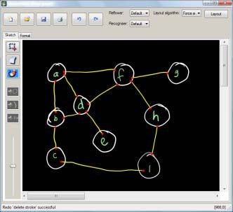
and-click mode, but only the sketched graph experiment is considered here.234 H.C. Purchase The several conclusions of Experiment 1 as published [1] included: CONC-1 The layout principles that participants favoured during the process of laying out their drawings were often not evident in the final product. CONC-2 The principle of fixing nodes and edges to an underlying unit grid was promi- nent. 2.1 Reflective Critique: Issues Arising After peer-review, publication, presentation, and independent citation of this first exper- iment and its results, audience members at two seminars suggested some subtle vari- ations on the experimental method: not new research questions, simply small amend- ments. As is typical in such situations, this author responded that such variations could be addressed as part of ‘future work’. It was not necessary to investigate these issues (the paper had already been published after all), but they led the experimenter to reflect on the research, and to question to what extent results might be biased by a method. Three issues arose as a result of this reflection: – If participants compromise their layout design during creation of the drawing (CONC-1), does this mean that they are not happy with their final product? Ex- periment 2 addressed the issue of whether participants were satisfied with their final drawing, or whether they expressed disappointment that they were unable to conform to their desired layout. – If participants favour a grid-based layout (CONC-2), would they prefer a drawing laid out using an algorithm that aligns nodes and edges to an underlying grid to their own? Experiment 2 investigated whether the participants preferred their own sketched graph drawing to a similar one that conformed to a grid layout. – Was the tendency to favour a grid layout and straight lines (CONC-2) a conse- quence of the way in which the graph information stimuli were presented as a list of edges? Experiment 3 investigated whether representing the graph structure in an alternative text format also produces results that favour grid layout. 3 The Experiments 3.1 Experimental Process for all Three Experiments The primary research question in all three of these graph sketching experiments is: Which graph drawing layout principles do people favour when creating their own draw- ings of graphs? Participants were asked to draw graphs and their drawings were anal- ysed for evidence of common graph drawing layout principles. Equipment: A graph-drawing sketch tool, SketchNode [9] was used, allowing nodes, edges and node labels to be sketched, edited and moved with a stylus on a tablet screen, laid flat.
Sketched Graph Drawing: A Lesson in Empirical Studies      235

Task: Participants were given a textual description of a
graph and asked to draw it in SketchNode, with the in-
struction to Please draw this graph as best as you can so
to make it “easy to understand”. They were deliberately
not given any further instruction as to what “easy to un-
derstand” means, nor primed with any information about
common graph layout principles (e.g. minimising edge
crossings, use of straight edges, etc,). They had as long
as they liked to draw and adjust the layout of the graphs.
Graphs: Two experimental graphs were used in all three experiments: graph A (10
nodes, 14 edges) and graph B (10 nodes, 18 edges).
Experimental method: Participants completed required ethical procedures and provided
demographic information. All the relevant features of SketchNode were demonstrated,
and participants were given the opportunity to practice and ask questions. Two practice
graphs ensured participants were comfortable with the task and system.
   The two experimental graphs A and B, were then presented to the participants, with
the graph edges presented in different random order for each participant, and coun-
terbalanced between participants. At the end of the experiment, the participants were
asked “Why did you arrange the graphs in the way you did?” in a recorded interview.
The participants: Participants in all three experiments were of a similar profile: a mix-
ture of students and non-students, of both sexes, with around half the student partici-
pants in each experiment studying some form of computer science.

3.2 Differences between the Experiments
In Experiment 1, the most important differentiating feature in comparison with prior
research was the way the graphs were presented (DDF-2). HR08 and D+09 presented
their graphs as graph drawings which already had some layout properties (circular and
spring in HR08 and circular in D+09). So as not to bias the participants towards any
layout principles, the graphs in Experiment 1 were presented in textual form, as a list
of edges (Table 1, column 1).
   Experiments 2 and 3 addressed four issues arising from Experiment 1.
Compromised layout: CONC-1 suggests participants may not have been entirely happy
with their final drawing, as they had been obliged to compromise their favoured layout
as the graph became more complex. Experiment 2 investigated the extent of this com-
promise, and whether participants acknowledged it.
   The first research question for this experiment was “Do participants like the layout of
their final product?” We speculated they would express dissatisfaction with their final
product. Once they had drawn their graph, we asked them to indicate on a scale of 1–5
how “happy” they were with their drawing.
236     H.C. Purchase

Preference for a grid: CONC-2: Experiment 1 suggested a grid layout was favoured;
we anticipated participants would prefer a grid layout to their own.
   The second research question was “Do participants prefer their sketched drawing to
be laid out in a grid format to their own layout?”
   Experiment 2 used the two automatic graph layout algorithms in SketchNode: spring
(based on Fruchterman and Reingold [10]) and grid (placing nodes and edges on the
lines and vertices of an underlying unit grid). After layout, the visual sketched appear-
ance of the nodes and labels remains the same, so the resultant diagram can be directly
compared with original sketched drawing.
   At the end of the sketching stage of Experiment 2, the participant’s own drawing was
laid out using these two algorithms. Participants were asked to rank the three drawings
according to their preference.
   In an attempt to eliminate any personal bias or recency effects, a willing subset of
the participants chose between hand-drawn and the two automatically laid out drawings
two weeks after the experiment.
Validation: As both changes to the experimental method for Experiment 2 were post-
experiment activities, Experiment 2 also served as a means to validate the results of
Experiment 1.
Effect of graph format: One of the main differentiating features between Experiment 1
and prior research was that the graph information was presented in abstract form, rather
than as a graph drawing (DDF-2), and the participants drew the graphs from scratch.
Here we investigated whether even this abstract form had produced a bias.
   The research question for this experiment was “Does the format in which the graph
structure is represented affect the layout of the sketched graph drawings produced?” For
Experiment 3, we presented the graphs as an adjacency list (Table 1, column 3), and
followed exactly the same process as Experiment 1. This format is visually quite differ-
ent from the simple list of edges, as each edge is not clearly specified as an individual
pair, and it is more obvious which nodes have a higher degree. We wished to investigate
whether a format that does not focus on the individual node pairs (as in Experiment 1)
would still result in user-sketched drawings that conform to a grid structure.
   Table 1 shows the differences between the experiments, as well as those factors that
remained the same. Figure 1 shows example sketches from all three experiments.

4 Data Analysis

Compromised layout (Experiment 2): The participants in Experiment 2 indicated how
happy they were with their own sketches (five-point scale, 5=perfectly happy). Graph
A’s mean: 4.14, graph Bs’ mean: 3.5; both graphs together: 3.91.
   Participants were asked what they didn’t like about their drawings, and how they
would improve them. None mentioned that they would have liked to conform to a grid
layout; most comments related to local issues like the size and shape of the nodes, and
connections between the nodes and edges. The few comments that referred to overall
layout of the drawing were concerned with spreading the nodes out, symmetry and
circular layout. There were also several comments about the need to plan in advance.
Sketched Graph Drawing: A Lesson in Empirical Studies        237

                 Table 1. Summary of the differences between the three experiments

                             Experiment 1             Experiment 2             Experiment 3
                             A (n = 10, e = 14)
     experimental graphs                              as Experiment 1          as Experiment 1
                             B (n = 10, e = 18)
                             After introduction and
                             training activities,
     experimental task                                as Experiment 1          as Experiment 1
                             participants sketched
                             the two graphs
     equipment               SketchNode               as Experiment 1          as Experiment 1
     number of participants 17                        22                       26
                                                                               S    UR
                                                                               Q    S
                             (A, D) (A, C) (B, D)                              V    WZ
                             (C, D) (B, C) (B, E)                              Y    XV
     form of graph presented
                             (C, E) (E, J) (F, G) as Experiment 1              R    U
     to participants
                             (J, F ) (F, I) (G, I)                             W    Y
                             (J, H) (I, H)                                     U    Z
                                                                               T    RQS
                                                                               X    Z
                                                      participants indicated
     post-experiment
                             none                     how happy they were      as Experiment 1
     discussion
                                                      with their drawing
                                                      participants ranked
                                                      sketched drawings
     post-experiment
                             none                     against associated       as Experiment 1
     ranking
                                                      spring and grid
                                                      drawings

Preference for a grid (Experiment 2): Once participants had sketched their graph, the
two graph layout algorithms (Section 3.2 above) were applied to their drawing.
   A three-way-set (TWS) is a set of three drawings: a participant’s sketched drawing,
and two versions of this sketch produced by the algorithms. Each participant has a
TWS-GA and TWS-GB. Figure 2 shows a TWS for one of the participant’s graphs.
   Participants ranked the drawings in their own TWS-GA and TWS-GB at the end of
Experiment 2. After two weeks, we contacted all participants for a follow-up ranking
experiment; fourteen took part. They ranked their own TWS-GA and TWS-GB (as be-
fore), as well as the TWS-GA and TWS-GB for two other participants. They were not
told their own drawings were included in these sets (Table 2).
   The data were analysed with Friedman tests with adjusted pairwise comparisons.
The only significant results related to graph B (highlighted in Table 2):

 2
     The notational convention is: graph A drawn by participant 3 is 3A; graph B drawn by partic-
     ipant number 8 is 8B. The suffix -1, -2 or -3 indicates experiment 1, 2 or 3.
238 H.C. Purchase
Experiment 1 Experiment 2 Experiment 3
4A-1 9A-2 1A-3
7A-1 15A-2 3A-3
16A-1 26A-2 26A-3
9B-1 7B-2 4B-3
14B-1 12B-2 7B-3
18B-1 27B-2 20B-3
Fig. 1. Example drawings from all three experiments2
Original Spring Grid
Fig. 2. The TWS-GA for participant 17. Note that the hand-drawn nature and form of the nodes
and their labels is retained.Sketched Graph Drawing: A Lesson in Empirical Studies 239
Table 2. Mean ranking of TWSs (3=most preferred). Significant results in italics.
number of mean mean mean % times % times
participants : rank: rank: rank: sketch grid
TWSs sketch spring grid preferred preferred
After drawing the graph
GA 2.45 1.77 1.77 50% 23%
(own TWS) 22:22
GB 2.54 1.41 2.05 68% 23%
Two weeks later (own TWS) GA 2.07 1.86 2.07 36% 29%
14:14
GB 1.79 1.79 2.43 29% 43%
Two weeks later (own + two
GA 2.00 1.79 2.21 36% 36%
other TWSs) 14:42
GB 1.90 1.60 2.50 26% 55%
– immediately after the experiment, the participants’ ranking for their own sketched
graph was higher than that for the spring layout (p < 0.001);
– two weeks after the experiment, the participants’ ranking for the grid layout was
higher than the spring layout (p ¡ 0.001), and higher than their own drawing (p =
0.019) in the set of three sketched graphs that included their own.
Validation (Experiment 2): Experiment 1 found that participants appeared to favour
a grid layout and horizontal and vertical edges in their sketched graph drawings. We
analysed the 44 graph drawings from Experiment 2 for the following key layout features
(Table 3):
– Number of edge crossings: points outside of the node boundaries where one or more
edges cross.
– Number of straight lines. A visual assessment as to whether an edge was intended
to be straight was agreed by two independent coders.
– Number of vertical or horizontal edges, and grid structure. A visual assessment
was agreed by two independent coders as to whether edges were intended to be
horizontal or vertical, and whether drawings had been drawn with a grid in mind.
Independent samples two-tailed t-tests were conducted using the 34 drawings from
Experiment 1 and the 44 drawings from Experiment 2 (Table 3).
Effect of graph format (Experiment 3): We analysed the 52 graph drawings from Ex-
periment 3 using the same layout features as for Experiments 1 and 2.
Independent samples two-tailed t-tests were conducted using the 34 drawings from
Experiment 1 and the 52 drawings from Experiment 3 were used (Table 3).
In the interviews, as before, no participants spoke directly of a grid layout; there were
comments about local features (size of the nodes, the need for straight lines), and layout
(crossings, symmetry, distance between nodes). When asked why they drew the graph
as they did, many said the adjacency list itself suggested the structure of the drawing:
they ‘worked from top to bottom.’240 H.C. Purchase
Table 3. Comparing key layout features in the graphs produced in the experiments.
E1 E2 E3 validation: effect of format:
n = 34 n = 44 n = 52 E1 v. E2 E1 vs E3
t p t p
Number of crosses/drawing 2.21 4.05 2.38 1.410 0.163 0.216 0.829
Number of crosses/drawing (excl.
1.24 2.05 1.62 1.400 0.166 0.776 0.440
outliers)
% HV edges 33.6% 28.0% 23.3% 1.232 0.222 2.842 0.006a
% straight edges 88.1% 85.8% 90.3% 0.472 0.638 0.541 0.590
Drawn with grid in mind 10(29%) 7(16%) 4(8%) 1.433 0.156 2.478 0.007b
a
More HV edges in Experiment 1. b More grids in Experiment 1
5 Results
Compromised layout: We wished to see whether participants expressed any dissatisfac-
tion with their drawings as a result of having to compromise the layout while creating
the drawing: a stated conclusion of Experiment 1.
In general, the participants were satisfied with the layout of their own drawings: their
satisfaction ratings were high; they expressed little dissatisfaction, and did not mention
that they would have liked to have been able to conform to a grid.
This is an instance of stating a conclusion based on insufficient data. In Experi-
ment 1, observation of the videos (by two independent coders) suggested that partici-
pants conformed to a grid in the initial stages of drawing, but that this layout feature
was abandoned later in the drawing process. This conclusion was, however, simply sug-
gestive, and there was no qualitative interview data to back it up. It appears that, even if
layout compromises had been made, participants were not aware of having done so.
Preference for a grid: We wished to see whether participants would prefer a grid-based
layout to their own layout.
While initially they preferred their own drawings in Experiment 2, when the recency
effect of having just drawn the graph was eliminated, the grid layout was ranked as
substantially better than the sketches for the more complex graph. However, none of
the participants mentioned a grid formation or horizontal or vertical edges in their com-
ments.
It appears that participants know what they like when they see it (and when it is not
in competition with a drawing that they know is their own), but cannot independently
articulate the layout features that contribute to what they like.
This is an instance of stating an incorrect conclusion based on qualitative data.
Despite the Experiment 1 drawings being analyzed by two independent coders who
formed the same conclusion (that participants preferred a grid), this inferred conclusion
does not hold when more direct data is collected.
Validation: The fact that there are no significant differences in the values for the key
metrics for Experiment 2 suggests validation of the results of Experiment 1: when theSketched Graph Drawing: A Lesson in Empirical Studies 241
graph is presented as a list of edges, participants tend to favour a grid layout and straight
lines.
This is an instance of validating data. Using identical methodologies for experi-
ments 1 and 2, we would expect similar values for the dependent data variables.
Effect of graph format: We wished to see whether the form in which the graph stimuli
are presented would affect the results.
The drawings produced in Experiment 3 from adjacency list stimuli did not favour a
grid layout; there is a significant difference on the key metrics of horizontal and vertical
edges, and grid formation, between Experiments 1 and 3.
The format in which the relational graph information is presented to the participants
thus affects the final layout of their drawing, a result echoing experimental results on vi-
sual metaphors [11]. The participants spoke of ‘following the table from top to bottom’
in Experiment 3; it is likely that the participants in Experiment 1 followed the edge list
from left to right.
There is an irony here: Experiment 1 presented the graph as a list of edges so to
address possible layout biases in HR08 and D+09, who presented graphs as drawings.
It seems even using a simple list of edges can introduce a bias.
This is an instance of unintended bias. Even a simple (and seemingly innocuous)
decision in Experiment 1 introduced a factor that biased the results.
Table 4. Summary and comparison of the findings for the three experiments
Experiment 1 Experiment 2 Experiment 3
assumed, from video
compromised layout not proven not investigated
data
some support after
preferring a grid assumed, from sketch
elimination of recency not investigated
over own drawing graph drawing data
effects
validation of key graph
validation not applicable not appropriate
drawing metrics
effect of graph
not considered not investigated effect found
format
6 Discussion
6.1 Implications for this Research
Our speculation that participants prefer the result of a grid-based algorithm over their
own drawing was partially confirmed, but only when the ‘personal pride’ factor had
diminished over time, and for the more complex graph. It is still clear, however, that
while participants might prefer a grid layout in both creation and recognition, they are
less able to articulate this preference.
The most surprising result is that how the graph is presented to the participants has a
significant effect on the form of their drawing — this was something that had not been242 H.C. Purchase considered originally. It suggests that the only way bias may be eliminated entirely would be by asking the participant to draw a graph based on their internal cognitive structure, and not on an externally visible form. This may mean describing a scenario to the participant while attempting to avoid verbal bias (for example, a social network) and then asking the participant to draw the graph representing the relational information. Of course, this story could not simply end here, as there are several outstanding issues to address about all three of these experiments. Do these results extend to larger graphs? What would happen if the participants were all novice computer users? Or if a digital whiteboard were used? Of if participants were told that the graphs related to a domain (e.g. a transport network or a circuit diagram)? Or if they were explicitly advised to plan in advance? Further experiments would no doubt shed more light on these initial studies (and would probably reveal some unexpected results). 6.2 Implications for Experimental Research The results of our investigation of subtle experimental variations suggest that: – There will always be a bias relating to the manner in which information is presented to an experimental participant; – Even if the results of an experiment are validated by repeating it, these results may still be compromised by bias; – Firm experimental conclusions need validation through replication and multiple sources of data. We did not set out to investigate the effect of experimental subtleties: our original aim was not to run a series of comparative experiments. If it had been, then we might have conducted a broader experiments-within-an-experiment study, preferably using the same participants throughout, and followed a systematic process of enquiry. No: we initially set out to investigate what happens when participants draw graphs from scratch — and we published a peer-reviewed paper in a reputable journal presenting the results of this study, as is common practice: researchers run an experiment, collect data, form conclusions, and publish. And then typically move on to their next experiment. The contribution of this paper is therefore broader than the simple ‘run an experiment and report’ model: by reflecting on and critiquing our own experimental work, and investigating issues arising from the critique, we have demonstrated the limitations of this common practice. It is rare that researchers repeat an experiment with subtle variations — doing so has revealed that there is still much to learn about the nature of user-sketched graphs, that even a carefully-conducted experiment may have flaws, that there is value in not simply moving on to the next ‘big’ question, and that repeating an experiment so as to investi- gate subtleties may produce surprising results. All experiments have limitations — no experiment can ever be perfect. This paper demonstrates the importance of acknowl- edging these limitations, of validating results where possible, and of reading published experimental results with healthy critical attitude. Acknowledgments. SketchNode is the result of significant efforts of Beryl Plimmer and Hong Yul, of the University of Auckland. The experiments were conducted by
Sketched Graph Drawing: A Lesson in Empirical Studies          243

Christopher Pilcher, Rosemary Baker, Anastasia Giachanou, and Gareth Renaud. John
Hamer assisted with data analysis, coding and editing. Ethical approval was given by
the Universities of Auckland and Glasgow.

References
 1. Purchase, H.C., Pilcher, C., Plimmer, B.: Graph drawing aesthetics — created by users not
    algorithms. IEEE Trans. Vis. and Computer Graphics 18(1), 81–92 (2012)
 2. Kemmis, S., McTaggart, R.: The Action Research Planner, 3rd edn. Deakin University Press
    (1988)
 3. Huang, W.: Using eye-tracking to investigate graph layout effects. In: Hong, S.H., Ma, K.L.
    (eds.) Proc. Asia Pacific Symp. on Visualisation, pp. 97–100. IEEE (2007)
 4. Ware, C., et al.: Cognitive measurements of graph aesthetics. Information Visualization 1(2),
    103–110 (2002)
 5. Purchase, H.C., Cohen, R.F., James, M.: An experimental study of the basis for graph draw-
    ing algorithms. ACM J. Experimental Algorithmics 2(4), 1–17 (1997)
 6. van Ham, F., Rogowitz, B.E.: Perceptual organisation in user-generated graph layouts. IEEE
    Trans. Vis. and Computer Graphics 14(6), 1333–1339 (2008)
 7. Gansner, E.R., Koren, Y., North, S.C.: Graph Drawing by Stress Majorization. In: Pach, J.
    (ed.) GD 2004. LNCS, vol. 3383, pp. 239–250. Springer, Heidelberg (2005)
 8. Dwyer, T., et al.: A comparison of user-generated and automatic graph layouts. IEEE Trans.
    on Vis. and Computer Graphics 15(6), 961–968 (2009)
 9. Plimmer, B., Purchase, H.C., Yang, H.Y.: SketchNode: Intelligent sketching support and for-
    mal diagramming. In: Brereton, M., Viller, S., Kraal, B. (eds.) OzChi Conference, Brisbane,
    Australia, pp. 136–143 (2010)
10. Fruchterman, T.M.J., Reingold, E.M.: Graph drawing by force-directed placement. Software
    — Practice and Experience 21(11), 1129–1164 (1991)
11. Ziemkiewicz, C., Kosara, R.: The shaping of information by visual metaphors. IEEE Trans.
    on Vis. and Computer Graphics 14(6), 1269–1276 (2008)
You can also read