State University of Malang Mascott Design as A Support of Brand Identity - Universitas Negeri Malang
←
→
Page content transcription
If your browser does not render page correctly, please read the page content below
Proceeding: International Conference on Art, Design,
                                                                     Education, and Cultural Studies (ICADECS) 2019
                                                                                              (ISSN:XXX.XXX.XXX)
                                                            Universitas Negeri Malang, Malang, Jawa Timur, Indonesia

 State University of Malang Mascott Design as A
            Support of Brand Identity
         Annisa Larasati                                   Sarjono                            Yon Ade Lose Hermanto
     Department Art & Design                       Department Art & Design                    Department Art & Design
     Malang State University                       Malang State University                    Malang State University
        Malang, Indonesia                             Malang, Indonesia                          Malang, Indonesia
      tomatorou@gmail.com                            sarjono.fs@um.ac.id                        yonade.fs@um.ac.id

     Abstract— The competition between universities in           impression to the community. The use of the mascot can
Malang has become increasingly tighter, due to the               enliven an event that is held and get back information
increasing number of new universities causing people             about a company. Each mascot made with a nickname that
become more selective in choosing universities. Therefore,       matches the character of the mascot itself.
the Universitas Negeri Malang is creating an identity brand
by trying to restate the brand to the community so that it is        The emergence of the mascot as an identity and
still well recognized. In an effort to strengthen the existing   provide memory to the public with its charm, is one of the
UM identity brand, a figure is needed which can help the         right strategies to promote brand identity creatively and
community to recognize the brand better and clearer. This        communicatively for Malang State University, which until
requires a mascot. The mascot was chosen because of the          now has not had a mascot. As happened in the new city of
character and attractive appearance that can interact            Malang, a mascot design named 'Osi' and 'Ji' [3] in the
directly with the community. So the process to design the        form of a lion and a lotar bird has been inaugurated,
mascot of the Universitas Negeri Malang as an endorser of        enabling the public to better recognize Malang through
brand identity has begun.                                        the promotion of the mascot. The existence of the mascot
                                                                 as a form of creative representation by highlighting the
   Keywords: Designing, Mascot, Brand Identity.                  visual character that can give a strong impression on
                                                                 people's memories and strengthen the brand identity of the
                    I. INTRODUCTION                              State University of Malang.
    Competition between universities in Malang is getting
tougher now, due to the addition of new universities so                              II. METHODOLOGY
that people are more selective in choosing universities. In         The design model used for the design of the mascot of
handling this competition, a brand identity is needed in the     Malang State University is a procedural design model.
effort to reintroduce the university to the public. Brand        The design model for Malang State University mascot
identity is a way for a company to build and introduce a         design refers to the design model of Alina Wheeler[4].
brand that represents the company's identity to consumers
so as to shape consumer perceptions of the brand[1]. The             In designing the UM mascot using the design method
benefit of using brand identity is to strengthen the             by Alina Wheeler which contains conducting research,
existence of the brand so that the relationship between the      clarifying strategy, designing identity, creating
brand and consumers is maintained. The type of visual            touchpoints, and Managing assets.
brand identity commonly used by companies is logos,              1. Conducting Research
slogans, and application media.
                                                                     The background is in the effort to strengthen the
    Malang State University as a corporate academy also          existing UM brand identity, a figure is needed that can
needs a brand identity. Malang State University's brand          help recognize better and more clearly to the community.
identity currently has a circle UM symbol with a symbol          Which requires a mascot. The existence of a mascot as a
of the Kalpataru tree and the UM logo brand with the             form of creative representation by highlighting the visual
slogan 'THE LEARNING UNIVERSITY'[2]. The brand                   character that can give a strong impression on people's
identity of the State University of Malang has been              memories and strengthen the brand identity of the State
applied to print and digital forms of promotional media          University of Malang. Therefore, the designer raised the
and merchandise. One of the activities carried out by            topic of the problem by presenting the Malang State
Malang State University is to release UM branding                University mascot as a figure who can enhance brand
through Lustrum and Dies Natalis activities.                     identity[5][6][7].
    In an effort to strengthen the existing UM brand                Based on the background that has been discussed, then
identity, a figure is needed that can help recognize better      the main problem can be formulated namely, how to
and more clearly to the community. Which requires a              design a mascot design in accordance with the character
mascot. Mascot is a promotional media in the form of             identity of the State University of Malang ..
visualization in the form of characters that represent the
identity of something or company and give a strong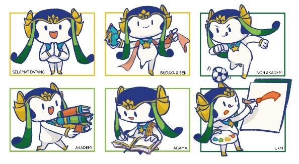
2. Clarifying Strategy
    The interviews and documentation explained that UM           The following sketches[9] the concept of form
did not have an official mascot, so in 2019 a UM mascot       comprehensively.
contest will be open to the public and the results will be
taken from the first prize. Like what has been done by the
UM symbol contest and UM logo. The UM mascot was
created by the UM creative team which was later canceled
because it did not constitute observations and
documentation that represented the MW itself.
    The meaning of the writing 'The Learning University'
explains that UM has an identity with two meanings,
namely as a learning organization and as a learning
resource. The writing is contained in the UM logo.
Concluding UM’s as inspirations in learning that makes
places and referrals together after UM's vision, mission,                Fig. 1 Comprehensive chosen UM mascott
and goals.
                                                                 b) Color Concept
    Based on the UM symbol and UM logo, there are
similarities, namely curved lines, circle shapes, and three       The synthesis result explains that there is a similarity
colors attached to the two symbols. In the statute book       between the UM symbol and the UM logo, which has
written on the UM symbol, the meaning of the green            three dominant colors. Dark blue, golden yellow and
curve has the meaning of institutional continuity and the     green are the three colors of the UM brand name. Which
meaning of the blue circle has the meaning of anticipating    means the color taken from the development of the UM
global developments. The last color is yellow on the star     logo. The meaning of each color follows the UM brand
which means Pancasila as the philosophy of the nation         name logo application manual as follows:
and the foundation of the country. Whereas on the UM
                                                                 •    Dark blue symbolizes stability and depth. Two
logo, the meaning of three curved lines has the meaning of
                                                                      things are essential in the administration of
tridharma as a form of UM's contribution to global,
                                                                      education in a tertiary institution.
national, regional and local developments. As well as the
meaning of the interlocking circle has the meaning of a          •    Green symbolizes growth and life. And
continuous learning process taking place at UM and                    symbolizes the campus which is a place for
implies a close and positive relationship between the                 academicians to live and grow.
Academic Community and the community. The colors on
the UM logo are written as follows; the blue color has the       •    The golden yellow symbolizes glory and energy.
meaning of a young soul who continues to learn to                     Excellence is the main thing that will be achieved
progress, the green color has a campus meaning which is a             with a burning passion.
place for academicians to live and grow, and the golden          In addition to the above three also include other colors
yellow color has the meaning of glory and energy. So that     namely white as a unifying three colors. White on the
the two UM symbols are identical to the shape of a circle,    brand means something that is clean, simple and becomes
curved lines, and three colors.                               something of quality. So that the resulting mascot[10][11]
3. Designing Identity                                         becomes a clean and neat mascot.

a) Concept of Shape                                              The chosen color concept is combined with the shape
                                                              concept as follows.
    Shaped human who looks friendly and active. Humans
in the form of simple and rounded in order to look
attractive and adorable to be visited. Choosing human
form because it has a process of continuous learning
ability and has a high creative power compared to other
creatures, so it is in line with the purpose of the UM
which makes an inspiring figure and superior to others. In
addition, the mascot's gender will be unisex which means
that the designer does not consider his gender. To not
leave the impression of local culture in Malang on the
mascot design, it took one of the distinctive cultures of
Malang, namely, Mask of Malangan[8].
    In the end the mascot accessories will take elements
from the UM symbol and the Malangan Mask. The
                                                                           Fig. 2 Comprehensive color UM mascot
elements contained in the UM symbol are the kalpataru
tree, lotus flower, star, arch, circle and writing of State      c) Typography Concepts
University of Malang. While the elements contained in the
Malangan Mask are headband (irah-irahan), decorative              UM has a characteristic that is a curved line so the
decoration accents (Isen) crown (jamang), crowns on the       selected font is a rounded serif font. To match the mascot
left and right temples (sumping), engraving on the            that has an Indonesian cultural accent, the font also has an
forehead (urna), the upper part on crown (horn).              accent that is similar to the decoration on the mascot later.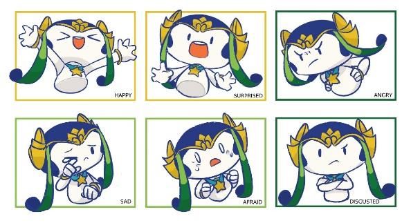
The selected font is Fox Grotesque Font with the modified
one.
Fig. 3 Comprehensive typography that has been modified
4. Creating Touchpoint
Explain about perfecting designs and developing Fig. 7 Mascot expression
designs further so as to produce creative briefs and
application designs.
5. Managing Assets
The last stage in the release of the latest brand
products. This stage is carried out if the work has been
approved and used by Malang State University.
III. DESIGN RESULT
Based on the results of the synthesis produces a
mascot using 3 concepts, namely:
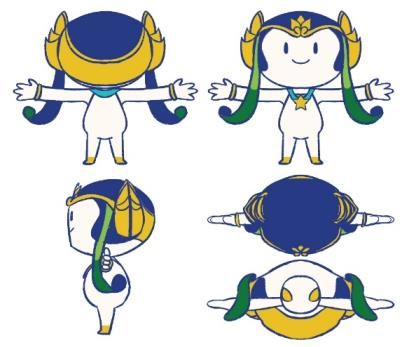
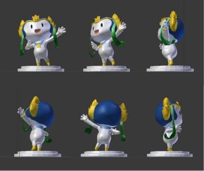
Fig. 8 Mascot gesture
The mascot application uses media branding that
serves as introducing a new brand and as a medium of
promotion in the long run.
Table 1. Media Branding
Fig. 4 Final layout
Here are the kinds of look and feel in the design of the
mascot as follows:
Fig. 9 Design of Other Custom Packaging
CONCLUSIONS
Malang State University has a brand identity in the
form of symbols, brand logos, and slogans. However,
Malang State University does not yet have an official
mascot. Designing the mascot design of Malang State
University using the Alina Wheeler design method
Fig. 5 The projection appears 2D scheme. The concept of the mascot shape resembles a
human being with decorations such as the Malangan
Mask symbolized by the UM symbol. Having high spirits
and friendly smiles in accordance with UM slogan. The
concept of the mascot color is dominated by dark blue,
green, and golden yellow. Adjusts to the dominant color
on the UM symbol and logo. The mascot of Malang State
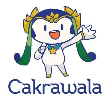
University is called 'Horizon' taken from the Graha
Cakrawala building. The tagline uses the Fox Grotesque
font with a local accent. The results of the finished
design, applied to 2D and 3D forms. Various types of 2D
application media are stickers, key chains, tote bags, T-
shirts, pins and GSM books. While the 3D application
Fig. 6 3D perspective media is a statue.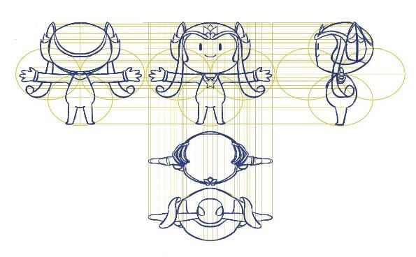
There was an obstacle in determining the shape of
the visual design of the mascot between humans and
animals, which represented that identity. Because in the
UM symbol there are no animal symbols, but rather plant
symbols. While the logo is only written. And also in
determining animals as a form of visual design mascot
because UM is not only located in Malang, but also
located in Blitar City. So that if forced to be incompatible
with the existing brand identity.
                             .REFERENCES

[1]    Kumar, Vijay. 2014. 101 Metode Desain. Jakarta:Elex Media
       Komputindo.
[2]    Jakfar, Papang. 2018. Osi & Ji. (online), (www.osidanji.com)
       Accessed on 20 March 2019.
[3]    Universitas Negeri Malang. 2018. Buku Saku. Malang:Universitas
       Negeri Malang.
[4]    Wheeler, Alina.2013. Designing Brand Identity 4th Edition.
       Canada: John Wiley & Sons.
[5]    Creative Market. 2017. The Beginner’s Guide to Branding.
       (online), (https://creativemarket.com/blog/how-to-design-a-brand-
       identity-visual-
       recap?utm_source=ownedsocial&utm_medium=social&utm_cam
       paign=blogposts&utm_content=infographicscheatsheets)
       Accessed on 13 September 2018.
[6]    Debara, Deanna, 2017. What is Brand Identity? And How to
       Design       and     Develop      A     Great     One.     (online),
       (https://99designs.com/blog/tips/brand-identity/), Accessed on 28
       August 2018.
[7]    IS Creative. 2017. Brand, Branding, Brand Identity Apa Bedanya.
       (online), (http://blog.iscreativeworks.com/idealist/brand-branding-
       brand-identity-apa-bedanya) Accessed on 28 August 2018.
[8]    Hidajat, Robbi. 2014. Fungsi dan Proses Pembuatan Topeng di
       Kabupaten           Malang        Jawa       Timur.        (online),
       (http://ejournal.kemenperin.go.id/dkb/article/view/1044) Accessed
       on 27 March 2019.
[9]    Moreno, Laura. 2014. The Creation Process of 2D Animated
       Movies.(online),https://www.edubcn.cat/rcs_gene/treballs_recerca
       /2014-2015-02-4-TR_baixa.pdf) Accessed 29 October 2018.
[10]   The Tokyo Organising Committee of the Olympic and Paralympic
       Games. 2017. Creative Brief for the Olympic and Paralympic
       Games       Tokyo       2020     Mascots.    IOC/IPC.      (online),
       (https://tokyo2020.org/jp/games/mascot/data/mascot-
       guideline_EN.pdf) Accessed on 28 August 2018.
[11]   WBM1 Broadcast Information Manual, hlm.13. (online),
       (http://asiangames2018.igbs.tv/wp-
       content/uploads/2018/06/AG18_WBM1_C1_18th-Asian-
       Games_FINAL.pdf) Accessed on 28 August 2018.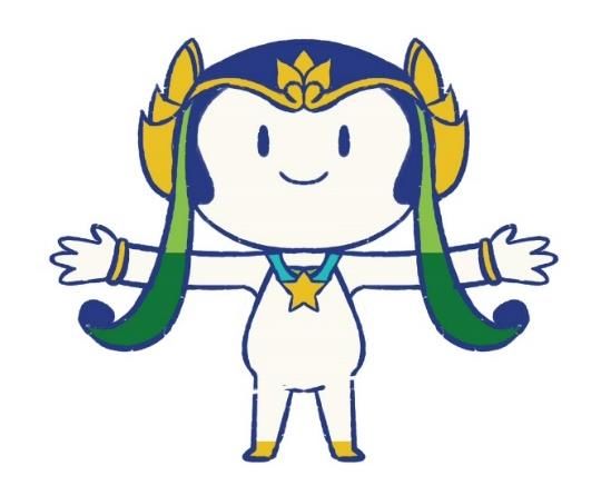
You can also read