TOP 3
COLOUR
TRENDS IN
WORKPLACE
DESIGN 2020
←
→
Page content transcription
If your browser does not render page correctly, please read the page content below
TOP 3 COLOUR TRENDS IN WORKPLACE DESIGN 2020
INTO
                                                                             THE BLUE

A SOURCEBOOK                                                                   04

OF INSPIRATION,
SELECTED FOR
 WORKPLACES

                                                               SUBTLE
                                                               BLUSH
You want to create a workplace environment that will help
people to work in a way that best suits their needs. Which
is why the choice of colour is so important.
                                                                 20
With its natural ability to alter our behaviour and mood,
colour plays a vital role in workplace design. Creating
spaces that are conducive to concentration and focus,
along with environments that feel uplifting, sociable and
inclusive.

To inspire your creative vision, we’ve put together a series
of palettes to highlight the top 3 colours influencing
workplace design. Exploring the type of mood and
experiences they evoke, and the kind of behaviour and
activity they support.
                                                                             GOLDEN
                                                                             OCHRE
Whatever the size and scale of your workplace, our visual
sourcebook will help you to select the colours, patterns and
textures that are guaranteed to set the right tone.                            34

                             02                                         03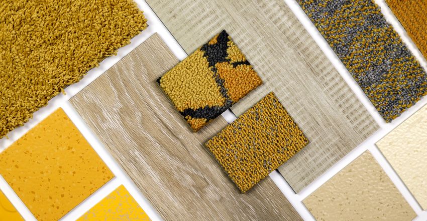
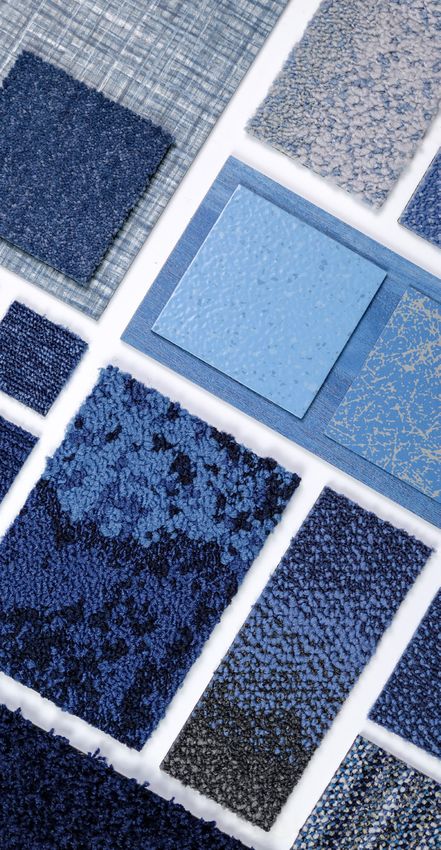
INTO THE BLUE

                       Taking a deep dive into the naturally soothing shades of
                       indigo, denim and lavender blue, our palette spans dark,
                       rich mid-tones and pale hues and provides a reassuring
                       and comforting backdrop to the workplace.

                       Rich and intense tones emulate the velvet inkiness and
                       intensity of the deep pacific ocean, while crisp, light and
                       bright shades of powder blue remind us of expansive clear
                       blue skies and the wonder of cloud formations.

                       Frosted lilac, violet and blueberry tinged with lavender,
                       signal a significant shift from the true blues that
                       have dominated in recent seasons. Providing a new and
                       perhaps unexpected shade to see in the workplace.

Human Nature - HN830
608004 Cobalt
Drawn Lines
A00907 Onyx

                                            INTO THE BLUE | 05
ORIGINS &
                                  INFLUENCES

                             While so many shades go in and out of vogue, it seems
                             our love of blue stays true. The world over, blue remains
                             the most popular colour and is the most democratic and
                             accessible shade of all.

                             Perhaps it’s because blue is a colour that has so many
                             positive associations in the natural world; reminding us of
                             bright, expansive blue skies and warm, calm seas. It is also
                             said to imbue a sense of peace and tranquillity. Indigo in
                             particular is often referred to as the ‘third eye’, inspiring
                             contemplation, mindfulness, serenity and calm.

                             It may also be because it’s one of the only shades that
                             is truly timeless. Deep inky and stonewashed hues are
                             bringing the everyday beauty of denim into interiors. Much
                             like your most cherished pair of jeans, it’s a look you’ll never
                             tire of. In such uncertain economic and political times, it’s
                             perhaps unsurprising that blue has become one of the
                             most popular shades of the day.

                             Blending comfortably into this palette are subtle, chalky
                             shades of purple, mixed with blue and grey for intensity
                             and depth. These paler hues represent the transition from
                             Ultra Violet, which was Pantone’s colour of the year back in
                             2018, towards paler, cooler, more liveable shades.

                             It’s interesting to note the iconic beauty brand Aesop
                             embracing subtle purple tones in their latest store in
                             London.

06 | INTO THE BLUE   INTO THE BLUE | 07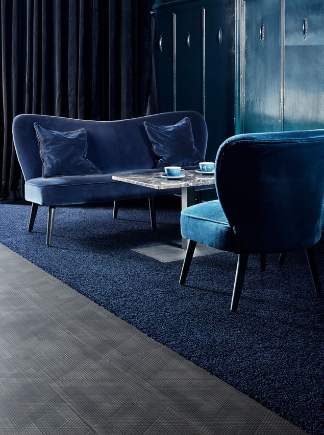
INTERIORS                                                01
                                                                                                                     03

      INSPIRATION
                                                                                                              02

Indigo, denim and lavender were prevalent in Milan, with
many of the most notable designers and leading furniture
brands sharing collections in these shades.

Celebrating the beauty of denim in all its glory, the Indigo
Experience Lab by Moooi, in partnership with ECCO                                                             05
leather, Shin-Denim and Denim City, invited visitors to take
part in interactive workshops and get acquainted with some
of the new materials and methods the brand has been
experimenting with.

The apartment installation named ‘Perfect Darkness’
was purposefully designed as the antithesis of the “cold”       06
showroom, with every room in the apartment decorated in                                                              04
rich and intense shades.

As our affection for this colour strengthens, we’re beginning
to see these hues filter into our homes.

Ripples of blue have become a recurring theme in
bathroom design, as watery and inky-tones create deeply
relaxing and luxurious spaces.

Bolder blues are also adding character to kitchen design,
with many designers opting for variations in tone, with
irregular finishes or a mix of materials in the same shade.
Flashes of bright white and metallics shine particularly well
when backed by blue.

                                                                     SEE PAGE 51 FOR PHOTOGRAPHY REFERENCE DETAILS

                       08 | INTO THE BLUE                                          INTO THE BLUE | 09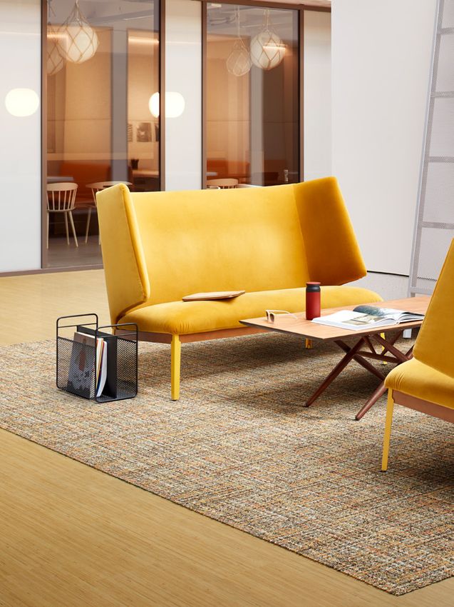
Our colour palette reflects the differences between night

COMBINATIONS             and day, emulating the feelings and mood they create.
                         From crisp and light tones that awaken our minds, to warm
                         inky-tones which naturally aid concentration.

    10 | INTO THE BLUE                        INTO THE BLUE | 11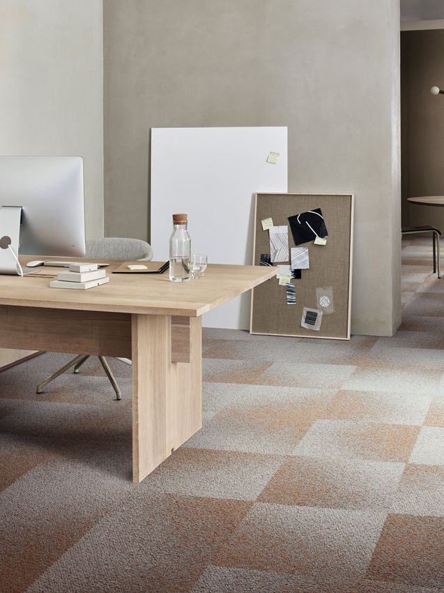
01

                                      03

         01
         Composure
         4169060 Sailing

         02
         Net Effect
         B601 - 332906 Pacific
         B602 - 332914 Pacific
         B603 - 332922 Pacific
                                           Brighter, lighter shades of blue pave the way for fresh
                                           thinking by creating an uplifting workplace that helps us
         03
                                           to think calmly and clearly.
         Heuga 530 II
         4288017 Dove Blue
         Level Set - Natural Stones
02
         A00103 Cool Impala Marble

12 | INTO THE BLUE                                              INTO THE BLUE | 13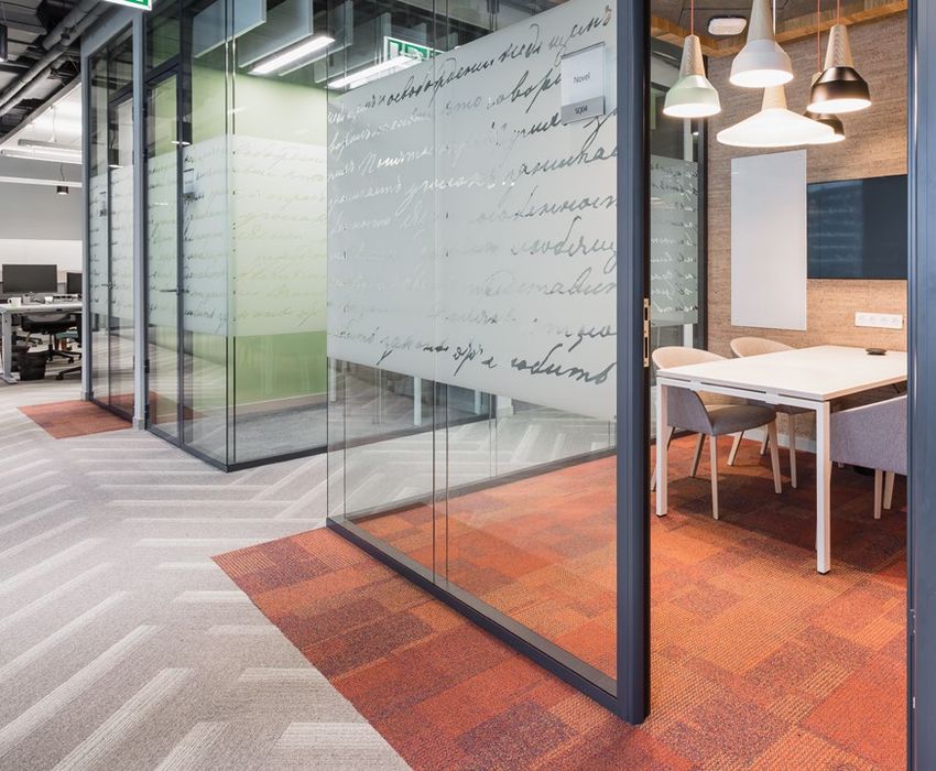
01    02

                                                                  01
                                                                  Polichrome
                                                                  4266010 Distant
                                                                  4265014 Infinity
                                                                  4265003 Caviar
                                                                  4266004 Liquorice

                                                                  02
                                                                  Case Study: Dimension Data - Belgium
Swathes of deep, intense colour set the scene for more            Heuga 727
focused concentration and discussion.
                                                                  03
                                                                  Look Both Ways - Step in Time
A heavy dose of navy or indigo add a sense of depth, while        9403005 Indigo
clearly defining the space - ideal for open-plan areas.           Walk the Aisle
                                                                  A01303 Cool Ash

Layer differently textured surfaces in these eye-catching
hues to add further depth.

                                                                                                                              03

                      14 | INTO THE BLUE                                                                 INTO THE BLUE | 15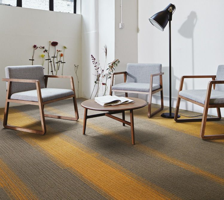
01   03

     01
     Employ Loop
     4197023 Lavender
     Works Hype
     4275005 Violet

     02
     Radial
     4272010 Projection
     4272007 Vertex
     4272005 Atomized

     03
     Composure
     4169063 Aubergine
                                         Soothing shades of lilac, violet and lavender blue combine
     4169062 Lavender                    with pewter and neutral tones to create a calming
     4169061 Pewter                      environment with an unexpected twist.

02

          16 | INTO THE BLUE                                      INTO THE BLUE | 17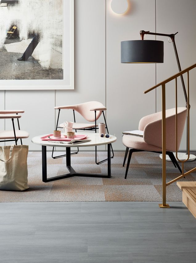
03                          06                            10                           14        17                          20                                   25                                          31

  01                                05             07                                         13                   15                               21                      23           26             27            28

                  02                               08                            11    12                               18                               22                                                           29             32

                       04                          09                                                         16        19                                                  24                                        30

01                          05                                     09                       13                               17                               21                                     25                     29
noraplan® signa             On Line                                Net Effect - B602        Native Fabric                    norament® 926 satura             Composure Edge                         Composure              Ice Breaker
7077                        7335027 Cobalt                         332914 Pacific           A00807 Bluegrass                 5122                             4274006 Sapphire/Diffuse               4169016 Reserved       4282004 Chalk
Rubber Flooring             Carpet Tile                            Carpet Tile              LVT                              Rubber Flooring                  Carpet Tile                            Carpet Tile            Carpet Tile

02                          06                                     10                       14                               18                               22                                     26                     30
Monochrome                  Employ Loop                            noraplan® signa          Composure                        Works Flow                       World Woven - WW895                    Touch of Timber        Composure
346708 Lobelia              4197020 Oxford                         7046                     4169059 Marine                   4276012 Cobalt                   8114003 Highland Weave                 4191009 Blue Spruce    4169061 Pewter
Carpet Tile                 Carpet Tile                            Rubber Flooring          Carpet Tile                      Carpet Tile                      Carpet Tile                            Carpet Tile            Carpet Tile

03                          07                                     11                       15                               19                               23                                     27                     31
Human Nature - HN830        Touch & Tones 103                      Studio Set               Studio Set                       Polichrome                       World Woven - WW895                    Human Nature - HN820   Heuga 530 II
608004 Cobalt               4176013 Ultra Marine                   A00713 Slate             A00709 Ocean                     4266014 Powderblue               8110003 Highland Warp                  308064 Limestone       4288016 Frosted Lilac
Carpet Tile                 Carpet Tile                            LVT                      LVT                              Carpet Tile                      Carpet Tile                            Carpet Tile            Carpet Tile

04                          08                                     12                       16                               20                               24                                     28                     32
Touch & Tones 101           Polichrome                             Heuga 530 II             noraplan® lona                   Composure                        Ice Breaker                            Works Flow             norament® 926 satura
4174013 Ultra Marine        4266015 Blue Nights                    4288020 Blue Moon        6918                             4169058 Sapphire                 4282002 Granite                        4276011 Violet         5122
Carpet Tile                 Carpet Tile                            Carpet Tile              Rubber Flooring                  Carpet Tile                      Carpet Tile                            Carpet Tile            Rubber Flooring

                                                        18 | INTO THE BLUE                                                                                                               INTO THE BLUE | 19
20
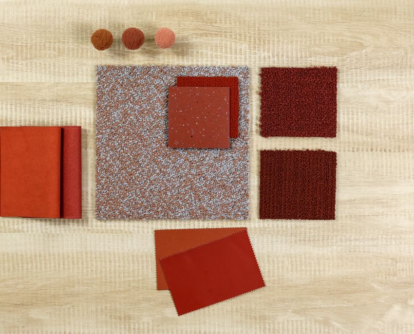
SUBTLE BLUSH
Our warm and nurturing palette creates a welcoming and
familiar working environment that has a softened tone.
A calm and serene mix of pale plaster-like pink, salmon
and rose blush bring a sense of revitalisation and new-
beginnings, creating spaces that feel sociable and spirited.
In contrast, sumptuous colours of the earth including red
clay, terracotta, burnt umber and russet tones, radiate a
sense of nostalgia for simpler times.
Collectively, these shades create workplaces that feel both
uplifting and nourishing - inviting people to settle into their
work with comfort and buoyancy.
Radial
Signal 4272004
Studio Set
A00701 Silverlight
SUBTLE BLUSH | 21ORIGINS &
INFLUENCES
Building on the seemingly unstoppable rise of Millennial
Pink, Pantone’s selection of Living Coral as their colour of
the year in 2019 further amplified the popularity of these
feminine shades.
For 2020, we see a natural evolution of these light-hearted
and vivacious hues towards an altogether more grounded
collection of muted, chalky and softened tones.
The naturally heart-warming qualities of this colour palette
resonates very deeply with consumers today, many of
whom are seeking the antidote to their digital lives and
craving authentic, personal connection.
The fashion catwalks of London, Paris and New York were
ablaze with rich, burnished shades of terracotta and muted
clay, as many of the most influential designers shared their
AW20 collections.
It’s interesting to note the translation of these hues into
restaurant and hotel design, with two of the most luxurious
and iconic hotels in London - The Berkeley and The
Connaught - recently unveiling new restaurant and bar
concepts enriched with shades of salmon and dusty pink.
Equally, in retail design, these shades create an vibrant
yet comforting space, with Gina Tricot in Stockholm and
Le Cube skate bowl installation in Le Bon Marche, proving
that pink isn’t just for girls.
22 | SUBTLE BLUSH SUBTLE BLUSH | 2301
03 INTERIORS
INSPIRATION
02
Ever the barometer of what’s to come, Milan Design Week
2019 was rich with references to this light-spirited palette.
Not only in the design of the furniture on display, but in the
set-design of the exhibits.
05 The ‘Tell Me More’ installation explored the intersection
of spatial experience and emotional connection. Inspired
by the feeling of entering a beloved space, the two-part
installation consists of an arrival chamber and expansive
lounge, which served as a backdrop to explore human
connection.
06 It seems that interior designers are also rapidly falling
04 for these shades, bringing this powdery palette into the
comfort of our own homes.
At one end of the spectrum, designers like Bergman & Co.
are adding a burst of sunshine to bathroom design and
creating a statement with hedonistic colours and a vibrant
cocktail of shades.
Taking a more reserved approach, ‘Rosa Perlino’ tumbled
marble brings a subtle rosy glow into kitchen design with
putty and clay tones. Used sparingly, a barely-there blush
provides a delicate, grown-up glow to contemporary kitchen
design.
SEE PAGE 51 FOR PHOTOGRAPHY REFERENCE DETAILS
24 | SUBTLE BLUSH SUBTLE BLUSH | 25COMBINATIONS Louder than pink and softer than red, our colour palette
creates a refreshingly different workspace environment.
26 | SUBTLE BLUSH SUBTLE BLUSH | 2702
01
Radial
4272004 Signal
02
Composure
4169011 Soothe
Human Nature - HN840
The lighter hues in our colour palette combine together to
308076 Shale create an uplifting workplace that feels calm and serene.
Human Nature - HN830
01
608008 Bone
To complete this look, explore tone-on-tone patterns, along
with a thoughtful and considered selection of tactile and
textural fabrics and materials.
28 | SUBTLE BLUSH SUBTLE BLUSH | 2901 02
01
Look Both Ways - Step it Up
9406006 Sienna
Look Both Ways - Step in Time
9403003 Ebony
02
Case Study: Microsoft, Russia
Transormation
1628024 Lava
Transform spaces into striking statement pieces by Off Line
introducing playful accents and highlights. 7559001 Mushroom/Biscuit
03
Not only will this help to create distinct zones, it will Heuga 530 II
naturally introduce character and warmth. 4288014 Terracotta
03
30 | SUBTLE BLUSH SUBTLE BLUSH | 3105 11 17
01 04 06 09 14 18 19 20
02 08 10 12 13 15 21
03 07 16
01 04 07 10 13 16 19
norament® 926 satura Drawn Lines Native Fabric Polichrome Look Both Ways - Step it Up norament® 926 satura Human Nature - HN850
5120 A00904 Smokey Quartz A00801 Flax 4265024 Mulberry 9406006 Sienna 5119 308086 Shale
Rubber Flooring LVT LVT Carpet Tile Carpet Tile Rubber Flooring Carpet Tile
02 05 08 11 14 17 20
Heuga 530 II Radial Drawn Lines noraplan® ultra grip Heuga 727 Heuga 530 II Touch of Timber
4288014 Terracotta 4272001 Axis A00911 Amethyst 6021 672718 Paprika 4288015 Dusty Rose 4191003 Oak
Carpet Tile Carpet Tile LVT Rubber Flooring Carpet Tile Carpet Tile Carpet Tile
03 06 09 12 15 18 21
Look Both Ways - Step Aside Monochrome Heuga 727 noraplan® lona Transformation Boundary Metallics Radial
9404001 Alba 346722 Malt 672715 Camel 6915 1628024 Lava A00605 Fawn 4272004 Signal
Carpet Tile Carpet Tile Carpet Tile Rubber Flooring Carpet Tile LVT Carpet Tile
32 | SUBTLE BLUSH SUBTLE BLUSH | 33GOLDEN OCHRE
A palette of classic new neutrals are uplifted with a dollop
of spice to create an energising workplace.
Warm sunbeams of golden yellow, mimosa and citrine
combine with a pinch of mustard to add a playful twist to
softer shades of cream, barley, and cashew.
While a delicious mix of earthy and rich terracotta, saffron
and tumeric creates spaces that ooze warmth and comfort.
These gleaming golden and ochre-based tones are
guaranteed to take the edge of a stressful working day.
World Woven - WW895
8114006 Autumn Weave
Level Set Natural Woodgrains
A00214 Bamboo
GOLDEN OCHRE | 35ORIGINS &
INFLUENCES
The zesty yellows of previous seasons make way for calmer,
ochre-based tones, as yellow remains a key colour for
interiors in 2020 and beyond. This is a deviation of pure
yellows towards a palette of more muted shades.
In many ways they provide a subtle nod to the 70’s revival
we are witnessing in interior design today; with nostalgic
shades with a deep, aged quality.
This colour direction also mirrors and reflects the uneasy
economic and political climate, as we naturally welcome
those colours associated with optimism. These rich jewel
and spice tones ooze luxury and warmth, as they gather
you in and naturally evoke positive thoughts.
In architecture, the burnished bronze hues of Thomas
Heatherwicks’ infamous and iconic ‘The Vessel’ in New
York perfectly reflects the trend.
It’s interesting to note the translation of these hues into
restaurant, hotel and retail design, with the awe-inspiring
restoration of the historic Fondaco dei Tedeschi
department store in Venice, and the recent renovation
of Harrods’ food hall; whereby the designers salvaged
remnants of the original tiles and painstakingly recreated
the exact shades.
These golden shades instil a much-needed sense of
light-heartedness within retail environments, with
precious yellow onyx and inserts of gold leaf adding
glimmers of warmth to the Forte Forte store in
Chelsea, and homely pastel tones infused with bursts of
sunshine yellow in the Ganni store in Soho, London.
36 | GOLDEN OCHRE GOLDEN OCHRE | 37INTERIORS 01
03
INSPIRATION
02
Golden, buttery tones are an instant way to energise
interiors and lift our moods.
Many designers are opting for a single shade and sticking
to it, using it over as big a space as they dare. Pairing with
neutral accents, or picking out the same bright hue on
patterned tiles.
Vogue Italia opened its office to a host of designers, who
gave the Milan headquarters a temporary makeover for the
city’s annual design festival. The exhibition, called ‘Life in
Vogue’, saw eight creatives reinterpret the interiors of the
magazine’s editorial offices, including JW Anderson who 05
painted the fashion editor’s room in a vibrant shade of 04
yellow typically found in British stately homes.
These tones of mustard, ochre and burnished bronze are
also overwhelmingly popular in furniture design, as almost
all of the most notable brands have embraced these hues.
Reflecting the more earthy and neutral shades of our
colour palette, the pared-back gallery and workspace
for Kinfolk magazine in Copenhagen perfectly illustrates
how a lightness of touch can create a calm yet uplifting
environment.
SEE PAGE 51 FOR PHOTOGRAPHY REFERENCE DETAILS
38 | GOLDEN OCHRE GOLDEN OCHRE | 39Whether used in moderation - with just a dollop of spice or
COMBINATIONS a burst of bright - or embraced in it’s entirety, our warming
palette has the potential to create an energising and
upbeat workplace.
40 | GOLDEN OCHRE GOLDEN OCHRE | 4101
01
Polichrome
4266018 Mimosa
On Line
7335004 Sage
Off Line
7559004 Sage/Canary
02 03
Urban Retreat - UR501
327500 Gold
327514 Granite
03
Off Line
7559004 Sage/Canary
On Line
7335005 Canary Nuggets of gold, saffron and mustard spice up an
02 7335004 Sage otherwise neutral interiors scheme.
42 | GOLDEN OCHRE GOLDEN OCHRE | 4303
01
Visual Code - Circuit Board
01 02
9280002 Yellow Circuit
02
Composure
01 01 4169073 Sunburst
4169017 Seclusion
Composure Edge
4274004 Sunburst/Seclusion
03
Superflor
9101 Yippee
Sunbeams of golden tones add a burst of brightness
9169 Siberian Frost
to workplace environments and zone areas in a playful,
energetic way. 04
Level Set - Natural Woodgrains
A00214 Bamboo
04
44 | GOLDEN OCHRE GOLDEN OCHRE | 4501
Native Fabric
A00804 Straw
02
On Line
7335003 Mustard
03
Radial
4272003 Rays
Level Set - Textured Stones
A00301 Polished Cement
04
World Woven - WW865
8110006 Autumn Warp
01
03 04
02
Warming shades of straw, opal and ginger provide a natural glow.
46 | GOLDEN OCHRE GOLDEN OCHRE | 4703 06 09 12 16 23 29
01 05 07 13 15 17 19 21 24 25 26
02 10 11 18 20 27 30
04 08 14 22 28
01 05 09 13 17 21 25 29
noraplan® uni Off Line noraplan® sentica Human Connections - Rue norament® 926 satura Drawn Lines Level Set - Natural Woodgrains Radial
2144 7559004 Sage/Canary 6513 8344004 Yellow 5124 A00910 Opal A00214 Bamboo 4272003 Rays
Rubber Flooring Carpet Tile Rubber Flooring Carpet Tile Rubber Flooring LVT LVT Carpet Tile
02 06 10 14 18 22 26 30
Polichrome Superflor Visual Code - Circuit Board noraplan® lona On Line Monochrome Monochrome World Woven - WW895
4266021 Marzipan 9101 Yippee 9280002 Yellow Circuit 6920 7335005 Canary 346726 Cream 346730 Barley 8114006 Autumn Weave
Carpet Tile Carpet Tile Carpet Tile Rubber Flooring Carpet Tile Carpet Tile Carpet Tile Carpet Tile
03 07 11 15 19 23 27
Level Set - Textured Woodgrains Composure norament® 926/825 Human Nature - HN830 Works Flow norament® 926 satura norament® 926 satura
A00421 Rustic Oak 4169073 Sunburst 6191 608002 Maize 4276007 Canary 5101 5123
LVT Carpet Tile Rubber Flooring Carpet Tile Carpet Tile Rubber Flooring Rubber Flooring
04 08 12 16 20 24 28
Native Fabric Look Both Ways - Step it Up Composure Edge noraplan® uni Studio Set Level Set - Natural Woodgrains noraplan® sentica
A00804 Straw 9406004 Citrine 4274004 Sunburst/Seclusion 6179 A00712 Marigold A00207 Washed Wheat 6536
LVT Carpet Tile Carpet Tile Rubber Flooring LVT LVT Rubber Flooring
48 | GOLDEN OCHRE GOLDEN OCHRE | 49SUBTLE BLUSH
pg 24
01. Rapt Studio’s Tell Me More installation
design-milk.com/ventura-projects-returns-to-milan-design-week-with-its-future-and-centrale-exhibitions/
REFERENCES
02. Introvert Extrovert Pendant, Haberdashery
www.haberdashery.com/work/introvert-extrovert/
03. The Office Group, Summit House, London
www.theofficegroup.com/uk/summit-house
04. & Tradition, Copenhagen
www.andtradition.com/
05. The Berkeley Bar, London
https://www.dezeen.com/2019/07/16/berkeley-bar-terrace-interiors-bryan-osullivan-studio/
06. The Office Group, Summit House, London
www.theofficegroup.com/uk/summit-house
INTO THE BLUE GOLDEN OCHRE
pg 09 pg 39
01. Aria installation at Ventura Centrale 01. Fondaco dei Tedeschi, Milan
www.dezeen.com/2019/02/26/ventura-future-ventura-centrale-milan-design-week-2019/ www.designboom.com/architecture/rem-koolhaas-oma-fondaco-dei-tedeschi-venice-department-store-06-0
02. Bakken & Bæck HQ, Design by Kvistad 02. Forte Forte, London
www.dezeen.com/2019/10/10/scandinavian-spaceship-office-interiors-kvistad/ https://www.dezeen.com/2019/12/11/forte-forte-london-shop-interiors/
03. The Office Group, Summit House 03. JNYB Home, China
www.theofficegroup.com/uk/summit-house Bugatti Home www.frameweb.com/news/greyoffice-jnbyhome-makers-grocery-store-hangzhou
04. Bugatti Home Collection 04. Harrods Food Hall, London
newsroom.bugatti/de/pressemeldungen/salone-internazionale-del-mobile-2016-milan- www.bighospitality.co.uk/Article/2019/06/25/Harrods-unveils-Dining-Hall-concept
05. Kimpton De Witt. Amsterdam 05. Ganni, London
www.kimptondewitthotel.com/us/en/index.html?cm_mmc=GoogleMaps-_-NLD-_-AMSNL www.dezeen.com/2019/08/19/ganni-beak-street-london-store-interiors/
06. Perfect Darkness installation
www.dezeen.com/2019/04/18/ho-perfect-darkness-tiles-exhibition-interior-design-milan/
50 51Carbon Neutral Floors™
Create a climate fit for life. All Interface flooring
sold globally is third party verified carbon neutral.
See more at interface.com
Europe, Middle East & Africa
AE +971 (0)4 8189077
AT +43 1 8102839
BA +387 33 522 534
BE +32 2 475 27 27
BG +359 2 808 303
BY +375 17 226 75 14
CH +41 44 913 68 00
CZ +42 0 233 087 111
DE +49 2151 3718 0
DK +45 33 79 70 55
ES +34 932 418 750
EG +(202) 3760 7818
FR +33 1 58 10 20 20
GR +30 211 2120820
HR +385 14 62 30 63
HU +36 1 349 6545
IE +353 1 679 8466
IL +972 546602102
IT +39 02 890 93678
KZ +7 495 234 57 27
NL +31 33 277 5555
ME +381 11 414 92 00
MK +389 2 323 01 89
NO +47 23 12 01 70
PL +48 500 151 101
PT +351 217 122 740
RO +40 21 317 12
40/42/43/44
RS +381 11 414 92 00
RU +7 495 234 57 27
SA +966 554622263
SE 08-241 230
SK +421 911 104 073
SI +386 1 520 0500
+386 8 20 54 007
TR +90 212 365 5506
UA +38(044)238 27 67
UK +44 (0)800 3134465
ZA +27 11 6083324
www.interface.comYou can also read