Topography of Violence: Considerations for Ethical and Collaborative Visualization Design
←
→
Page content transcription
If your browser does not render page correctly, please read the page content below
Eurographics Conference on Visualization (EuroVis) 2021                                                                          Volume 40 (2021), Number 3
R. Borgo, G. E. Marai, and T. von Landesberger
(Guest Editors)

                       Topography of Violence:
   Considerations for Ethical and Collaborative Visualization Design

                                                             F. Ehmel   , V. Brüggemann   , and M. Dörk

                                                         UCLAB, University of Applied Sciences Potsdam, Germany

        Abstract
        Based on a collaborative visualization design process involving sensitive historical data and historiographical expertise, we
        investigate the relevance of ethical principles in visualization design. While fundamental ethical norms like truthfulness and
        accuracy are already well-described and common goals in visualization design, datasets that are accompanied by specific
        ethical concerns need to be processed and visualized with an additional level of carefulness and thought. There has been little
        research on adequate visualization design incorporating such considerations. To address this gap we present insights from
        Topography of Violence, a visualization project with the Jewish Museum Berlin that focuses on a dataset of more than 4,500
        acts of violence against Jews in Germany between 1930 and 1938. Drawing from the joint project, we develop an approach
        to the visualization of sensitive data, which features both conceptual and procedural considerations for visualization design.
        Our findings provide value for both visualization researchers and practitioners by highlighting challenges and opportunities
        for ethical data visualization.

1. Introduction                                                                       Jews, Jewish institutions, and Jewish-owned firms and stores in the
                                                                                      German Reich were subjected to increasing violence long before
How can records of antisemitic acts of violence be visualized in
                                                                                      9 November 1938, the date that is commonly associated with the
a museum? This question relates not only to the historiographic
                                                                                      November Pogroms against Jewish life in Nazi Germany. As a re-
challenge of remembering the past, but also to the visualization de-
                                                                                      sult of this violence, many of Germany’s two thousand Jewish com-
sign challenge to arrive at appropriate representations for sensitive
                                                                                      munities ceased to exist by the end of 1938.
data. Through a design study [SMM12], we present our findings
from and insights into a collaborative visualization design process                      With this research we pursue the question of how insightful and
that places ethical questions at its center: How can we find visual                   sensitive visualization forms can be found by involving relevant
forms and interactive representations for sensitive historical data?                  expertises and perspectives into the design process, transparently
How can we pursue a design process which engenders sensitivity                        conveying data limitations, and enabling different levels of engage-
towards the dataset and interdisciplinary collaboration? To find an-                  ment with the topic. This work builds on a growing body of re-
swers to these questions, we frame our design study by ethical as-                    search on ethics and criticality in data visualization advancing the
pirations and critical reflections about collaborative design of data                 need to consider empathy, context, and power in data visualiza-
visualizations.                                                                       tion [Cor19,DFCC13,DK20]. While we extensively draw from this
   In cooperation with the Jewish Museum Berlin, we present To-                       work, we noticed a lack of practical implications for collaborative
pography of Violence, a set of visualizations that convey informa-                    visualization design that incorporates ethical considerations. To ad-
tion about numerous acts of antisemitic violence that were commit-                    dress this, we contribute ethical considerations for collaborative vi-
ted between 1930 and 1938 in the German Reich. The results are an                     sualization design, apply them in a case study focused on the visu-
animated wall map and an interactive media station, which are inte-                   alization of sensitive data in a museum, and share critical reflections
grated into the new permanent exhibition of the museum, as well as                    for future work in visualization research and design.
a web-based visualization† [JU20]. The project forms part of ongo-
ing historical research that examines allegedly spontaneous mani-
festations of growing antisemitism before the Holocaust [Fri19].
                                                                                      2. Background

                                                                                      Our research relates to prior work in the context of visualization in
† Available online at:                                                                museums and for digital humanities as well as critical and ethical
https://www.jmberlin.de/topographie-gewalt/                                           considerations in cartography and visualization.

 c 2021 The Author(s)
Computer Graphics Forum c 2021 The Eurographics Association and John
Wiley & Sons Ltd. Published by John Wiley & Sons Ltd.
F. Ehmel et al. / Topography of Violence

2.1. Data Visualizations in Museums                                           map’s viewers and all other participants [Har91, Mon91a]. Cartog-
                                                                              raphy should also be open to other disciplines to understand such
Questions of how humanistic and cultural heritage data can be vi-
                                                                              contexts properly [Har91].
sualized and presented to a broad public have long reached cul-
tural institutions and triggered a variety of theoretical and practical          The ethical considerations start with the selection of data, dur-
research projects on visualizing cultural heritage data [WFS∗ 19].            ing which the omission of important information—whether con-
Most certainly, humanistic data are multidimensional, but what is             sciously or unconsciously—can lead to massive ethical conse-
more, they can be imprecise, incomplete, biased, and highly depen-            quences [Har90]. Cartographers should not see their task solely in
dent on the interpreter [Dru11]. The humanities in general, but es-           the representation of data, but should also critically question the
pecially the digital humanities, consider themselves influenced and           origin and selection of the data to be represented in the interest of
guided by critical thinking, asking for a reflection of their research        an ethical result. Furthermore, Harley advocates against the undue
questions, data, and methods [Reh17]. Still, questions of inclusion,          reliance on proven cartographic conventions. Rather, ethical cartog-
ethics, and intersectionality occupy the digital humanities both on           raphy must always search for new graphic forms to achieve a situ-
a theoretical and practical level [Ris15, LW19, GMD15]. Accord-               ationally appropriate representation of data [Har90]. Towards this
ingly, the claim of building a digital—but also visual—literacy               end, Monmonier suggests to conduct extensive experiments with
among humanities scholars has reverberated long in the digital hu-            different design variants to find visual representations that are as
manities [DB18]. This is especially relevant among historians, who            appropriate as possible for a given dataset [Mon91a]. We are build-
have long felt confident in choosing prose as their main method of            ing on these principles in cartography and seek to translate them to
communication, while implying that illustrations and visualizations           data visualization in the context of museums.
were not more than a form of decoration [Sta03]. In contrast, the
recently formed field of digital public history aims to document,
                                                                              2.3. Ethical Dimensions of Data Visualization
present, and convey historical research to a broad public through
digital methods, including mapping and visualizing their data, and            Visualizations can have a lasting impact on their viewers and
conceiving advanced visual interfaces [Noi15].                                are sometimes even created to influence them [PMN∗ 14]. There-
                                                                              fore, the usage of visualizations should be evaluated on ethical
   Museums, however, already present cultural artifacts in a vi-
                                                                              terms [DFCC13, Cai14, HC18]. While retracing how visualiza-
sual form by arranging and contextualizing them in exhibitions.
                                                                              tion can knowingly be used to deceive or mislead—for instance,
Furthermore, museums have a long history of using (static or
                                                                              through hiding or distorting relevant data [Cai15]—visualization
animated) data visualizations to communicate historical develop-
                                                                              research has also triggered concepts and methods to visualize in
ments, such as urbanization [Vos06]. Since the rise of personal
                                                                              an ethical manner. Diakopoulos specifies a “range of ethical con-
computing, digital tools have become an important supplement to
                                                                              siderations” that support ethical decision-making throughout data-
museum experiences, with the aim to convey further information
                                                                              driven visual storytelling processes [Dia18]. Tufte proposed six
and enable active participation of visitors [Hor16, MMF20]. Mu-
                                                                              principles aiming to maximize graphical integrity: For instance, vi-
seums experiment with visualizations as interactive exhibits that
                                                                              sualization designers and scholars are supposed to visualize num-
offer an additional mode of engaging with cultural content, such as
                                                                              bers in proportion to their underlying value, or to visualize data
an artist’s oeuvre [HSC08], and to enter into dialogues with other
                                                                              within and never outside of their original context [Tuf01]. Ar-
visitors [HC11]. Especially when including complex visualizations
                                                                              guably, these principles have prescribed an austerity of forms in
in exhibition spaces, an aesthetic and informational scaffolding can
                                                                              visualization design to the detriment of their communicative and
help to first evoke interest and then gradually increase the analyti-
                                                                              cognitive functions [BMG∗ 10].
cal depth of a visualization [NPD16]. While museums increasingly
implement data visualizations, they tend to be created either for                Looking at visualization in the context of the digital humani-
use within the museum or entirely separate from the museum ex-                ties, Hepworth and Church define ethical visualization as “the pre-
perience via the museum’s website, yet seldom for both situations.            sentation of visualized information in ways that acknowledge and
In our research, we investigate how animated and interactive visu-            mitigate the potential for harm engendered within the visualization
alizations of sensitive data can be collaboratively designed for use          form and content” [HC18]. While subsequently defining an ethi-
on the museum website and in its exhibition space.                            cal visualization workflow, the authors also add a moral compo-
                                                                              nent to this definition, as an ethical visualization practice should
                                                                              consciously consider the societal impact of the design choices.
2.2. Ethics in Cartography
                                                                              What is more, visualizations in this view are never complete repre-
The field of visualization draws from multiple disciplines, in par-           sentations of a dataset, but should rather be opened to interven-
ticular cartography [Ber83]. With the growing influence of compu-             tions from and with users. Considering a wider societal frame,
tational methods in the 1990s, cartography experienced lively aca-            D’Ignazio and Klein put forward feminist principles to recognize
demic discussions on its ethical dimensions. Many academics state             the hegemonic categories and power structures embedded in data
that cartographers are responsible for the content and morality of            practices [DK20]. Campbell proposes “Techniques for Appealing
the maps they design [Har90, Mon91a]. This includes the aware-                to Emotion” that engage, humanize, and personalize visualizations
ness that every map has ethical dimensions and that cartographic              for a specific public [CO19]. Nevertheless, the visual abstraction
design can never be neutral. Consequently, cartographers should               used in information visualization can also lead to a loss of empa-
set themselves ethical guidelines to shape their work, consider the           thy towards the people or topics they represent [Cor19]. To counter
usage context of a map and the effects of all design decisions on the         this distancing, visualization designers should work in interdisci-

                                                                                                                                                  c 2021 The Author(s)
                                                                                 Computer Graphics Forum c 2021 The Eurographics Association and John Wiley & Sons Ltd.
F. Ehmel et al. / Topography of Violence
plinary teams and borrow techniques from related disciplines such the visualization should use visual encodings that are suitable to
as data journalism or rhetorics, and search for individual, nuanced, express the datasets’ nature or ethos [BPE∗ 17]. EA3: Consider un-
and novel representations to foster empathy [BPE∗ 17, Lup17]. intended associations with visual encodings and practice sensitivity
and care in the use of symbols and other visual forms.
3. Towards Ethical and Collaborative Visualization Design To ensure interaction on the basis of different interests and to
convey the complexity of topics and datasets appropriately, the vi-
While our study builds on design as a subjective method which sualization should allow for various levels of engagement with it.
tackles a concrete problem in close collaboration with domain ex- Viewers or visitors should be able to explore and learn about the
perts [MD20], our work has been particularly inspired by prior topic on a level and detail of information that they see as suitable for
writings on ethics in cartography and visualization that define prin- themselves. The visualization should therefore allow them to start
ciples and propositions for an ethical orientation of the visualiza- by gaining a basic overview of the topic in a simple and easily com-
tion design process. To be able to assess the used methods and taken prehensible way, while offering more detailed information on de-
decisions in our design process, we propose a series of aims, which mand [Shn96]. Particularly interested users can aim for an in-depth
are derived from these writings, to imbue the collaboration pro- form of engagement and seek to actively participate in contributing
cess of visualization design with ethical aspirations (EA). These to the visualization and its underlying dataset [VJTVM13]. Such
aspirations form the foundation for an ethical visualization design interactions should be encouraged by the visualization itself. EA4:
process that outlines concrete qualities for the collaboration with Support various levels of engagement with the visualization and the
experts and stakeholders as well as a deep engagement with data overall topic.
and visualization.
Visualizations should be useful and informative for a variety of 4. Case Study: Topography of Violence
users: considering both the use of visualizations and the thematical
background knowledge, different people bring different knowledge To assess the viability of the ethical aspirations, we present a case
and demands—from novice to professional. Designing for poten- study about the visualization of sensitive historical data in a mu-
tial users and stakeholders includes the study of their needs, the seum setting with the involvement of historiographical and muse-
development and design of concepts and design solutions, as well ological expertise. The project Topography of Violence was based
as the testing of resulting products [Nor88]. Too often, informa- on an interdisciplinary cooperation between the Jewish Museum
tion visualization focuses on design processes that are either mainly Berlin (JMB) and the UCLAB, a visualization research group at the
data-driven or only involve users for testing or evaluation purposes. University of Applied Sciences Potsdam. The core project group
Methods like participatory design or co-design are suitable to estab- consisted of two staff members of the museum’s department of
lish a productive and trustful work-environment: Here, experts and digital publishing, the chief archivist with a research background in
audiences become active participants in the design process them- Judaism, the curator of the exhibition section, as well as three mem-
selves [SS08]. EA1: Involve target groups and domain experts ac- bers of our research group with backgrounds in interface design, in-
tively in all relevant decisions of the design process to ensure an formation visualization, and digital humanities. The collaboration
appropriate and sensitive outcome. was carried out between September 2019 and August 2020. Meet-
ings were held—first in person and later remotely—approximately
Besides the visualization design process and the context of a vi- every second month to discuss the progress, exchange feedback,
sualization, a main factor which adds to a visualization’s trustwor- and decide about further steps.
thiness is the underlying data [MHSW19]. Here, criteria such as
The JMB thematizes Jewish life and culture in Germany’s
accuracy, coverage, objectivity and validity can be seen as a mea-
present and past. Its permanent exhibition progresses in time lin-
sures that lead to a high trustworthiness of a dataset [KFW08].
early, from the first traces of Jewish life and culture in Germany to
It is therefore important to openly consider, confront, and convey
the present. Our research focuses on a crucial span in this timeline:
any biases, issues, or flaws that might occur inside the data. This
the years 1930 to 1938, during which the National Socialist move-
does not only include gaining a deep understanding of the dataset,
ment seized power over Germany. For German Jews, this devel-
but also discussing these topics with the experts, and ultimately
opment was increasingly life-threatening, as violence against them
searching for design options that are able to convey the limits of
rose rapidly. The aim of the case study was to design two visual-
the dataset through the visualization itself. EA2: Openly commu-
izations showing the rising numbers of antisemitic attacks in these
nicate limitations of the underlying dataset throughout the process
years: An animated wall map geographically and chronologically
and in the resulting visualization.
visualizes the acts of violence and is displayed in the exhibition
When people perceive and make sense of a chart, diagram, space; and an exploratory interface allows for in-depth research
or visualization, they bring with them their personal and cultural during an exhibition visit or via the JMB website. In the follow-
perspectives and a variety of memories, associations, and emo- ing, we share insights into our collaboration, from the underlying
tions. Any visualization itself is part of a tradition of graphical dataset and the design process to the resulting visualizations.
forms for knowledge representations [Dru14]. When striving to-
wards sensitivity in visualization design, it is paramount—though
4.1. Dataset
challenging—to consider these latent qualities of a visualization.
Visualization abstraction can lead to a gap between the proven in- In light of our ethical aspirations (EA1), the domain experts work-
justice of a matter and its visual representation [Cor19]. Therefore, ing on the dataset were included in the process from the beginning
c 2021 The Author(s)
Computer Graphics Forum c 2021 The Eurographics Association and John Wiley & Sons Ltd.F. Ehmel et al. / Topography of Violence
and invited to share their insights and inputs throughout the col-
laboration. The dataset was researched and aggregated in a prior
meta-study [Fri19, FK20] and ultimately combined with a second
one containing historical information about all known German syn-
agogues at the time. The merged dataset includes 4,660 acts of vi-
olence between the years 1930 and 1938. Each of these records
belongs to a category based on the attack’s target: Violence against
Jews, against Jewish organizations, or Jewish businesses. Each en-
try may also include a date, information about perpetrators, the
place, a descriptive text, and the sources. Despite the effort of evalu-
ating both primary and secondary sources on the subject, the dataset
cannot be considered as representative and complete, neither from Figure 1: Overview of the utilized visual artifacts, grouped by un-
a geographical nor temporal point of view: favorable (left) and favorable (right) inspirations.
Geographical bias: The underlying historical research project
aimed to research acts of violence in as many places as possible but
was naturally limited in time and resources. Therefore, not all acts As an additional insight, the museum’s staff members were able to
of violence in bigger cities were fully researched. Some cities might share insights into the target groups and regular visitors of the mu-
therefore be underrepresented in the dataset. For other geographical seum, which helped to align the workshop’s focus to the expected
areas, no comprehensive sources and studies exist so far and the target groups (EA1). Based on the previously defined objectives,
data must therefore be seen as indefinitely incomplete. we divided the workshop into three phases: First, a brainstorming
session on the desired effect of the animated wall map; second, a
Time bias: The interest of historical research often focuses on
discussion about appropriate visual forms; and third, the design of
the years 1933, 1935, and 1938, when the majority of antisemitic
collages to open new perspectives on the data for visualization.
attacks took place. The sources suggest that antisemitic attacks in
the second half of the 1930s were no longer systematically recorded Brainstorming. We asked the participants what knowledge and
by authorities and journalists due to a “habituation effect” [Fri19]. impression the animated wall map should leave on visitors. Their
The authorship of the sources, which are largely based on infor- written answers were collected, grouped, and discussed. In this
mation provided by perpetrators, also has a distorting, sometimes way, we identified several relevant requirements for the visualiza-
“tendentious” effect. The dates for many attacks are incomplete in tion, which were associated with four different categories:
the historical sources, often including only the year of the incident. • Meaning for visitors. The animated wall map should raise ques-
These limitations became evident in the first data analysis and tions (e.g., about historical backgrounds) and arouse curiosity
talks with the experts. The insights from these early analyses and (e.g., to find out more about the events in one’s own home town).
basic visualizations were shared within the project group and dis- In this way, visitors should ideally be directed to the research sta-
cussed throughout the process to find appropriate solutions to dis- tion, where they can obtain detailed information.
close them in the resulting visualizations (as per EA2). • Geography of violence. The animated wall map should give an
overview over the spatial distribution of the assaults. Particular
regional differences should also be visible.
4.2. Co-Design Workshop
• Time course. The animated wall map should make the temporal
The workshop represented the transition between two phases in the development of the outbreaks of violence visible. It is intended
design process. Prior to the workshop, the main focus was the ini- to illustrate the growing pressure on Jews and the drastic increase
tial exploration of the data, research on historical backgrounds, and in violence over the years [FK20].
the definition of the basic goals of the visualizations. The results of • Context. The animated wall map is located in a room together
the workshop served as a basis for the following conception and the with a collection of antisemitic laws from the 1930s. Before en-
visual design and also ensured the implementation of the ethical as- tering, visitors already visited rooms that provide information
pirations. Therefore, several concrete objectives for the realization and exhibits on Jewish life prior to these years. It can therefore
of the workshop were formulated: be assumed that visitors to the museum are sufficiently informed
about the basic historical contexts and that the animated wall
1. Expectations of experts. Determine which (a) associations and
map itself requires little explanatory information. Nevertheless,
(b) knowledge the animated wall map should convey.
for the web interface, which can be used by both visitors in the
2. Suitability of visual representations. Discuss which forms corre-
museum and remotely, a narrative introduction is needed.
spond to experts’ expectations and are suitable for visualization.
3. Relevant perspectives on data. Find out which parts of the data These collectively defined requirements formed the cognitive ba-
and which perspectives on them might be interesting for visitors. sis for the second part of the workshop, which dealt with the selec-
tion of suitable visual forms for interactive visualization.
In addition to the core project team, the project manager for the
conception of the new permanent exhibition and one of the histo- Visual forms. To facilitate a productive exchange about suitable
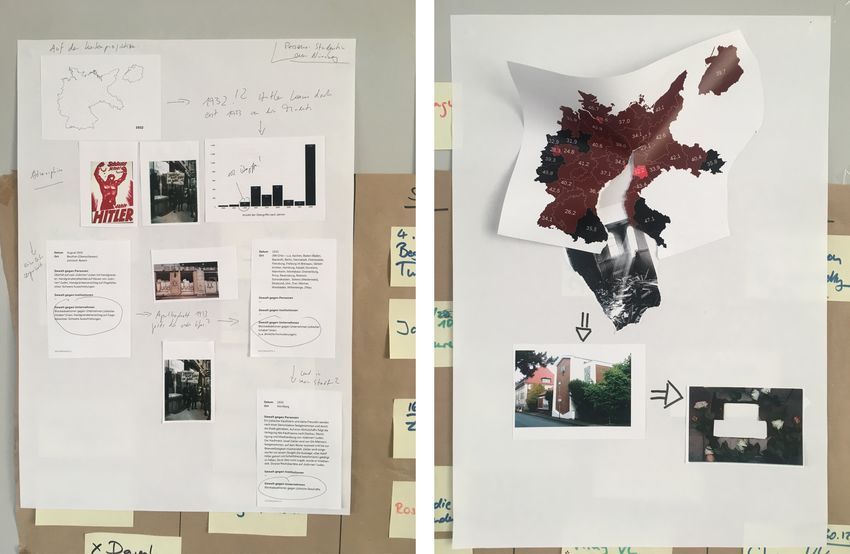
rians responsible for the dataset participated in the workshop. The visual forms, 26 visual artifacts were selected as a basis for dis-
participants had different levels of knowledge regarding the exist- cussion (see Figure 1). They were excerpts from existing visualiza-
ing data, but also regarding design, cartography, and visualization. tions or maps [DW16, Inf19], but also partly artistic or completely
c 2021 The Author(s)
Computer Graphics Forum c 2021 The Eurographics Association and John Wiley & Sons Ltd.F. Ehmel et al. / Topography of Violence
abstract works. The artifacts represented a wide graphical range ipants were asked to imagine a particular visitor (or group of visi-
of different colors, shapes, and visual complexity and were cho- tors) as a representative persona and express their possible interests
sen with this diversity in mind. This was intended to expand the and perspectives on the topic in a collage individually. Afterwards,
participants’ imagination about possible visual aesthetics and en- the group interpreted the collages together. The resulting collages
courage them to articulate visual ideas using the examples (EA3). showed several perspectives on the data and ways to explore them
In order to guarantee a discussion that was as open-ended as pos- (see Figure 2):
sible, it was ensured that the selected visual artifacts did not tell
what kind of data they represent. During the discussion, the partici-
pants discussed the visual artifacts one by one and gradually sorted
them into two groups. While a large part of them did not appear
to be suitable for use, several of the artifacts encouraged an open
exchange:
• Animation. Participants repeatedly expressed interest in artifacts
that represented elements additively, e.g., different sizes of over-
lapping circles. Additive forms were favored for a gradual ap-
pearance in the animation to ensure a lasting visual presence of
data points and to make their temporal development visible.
• Impacts. The group generally considered visual forms that re-
sembled “impacts” to be interesting, however, had reservations
about too figurative resemblance with bombs or explosions.
• Arrangements. The group expressed skepticism about forms that
created a “grid-like”, “physical”, or “organic” impression be- Figure 2: Two collages created during co-design workshop.
cause of the direct and controlled character of antisemitic vio-
lence in the German Reich. The same applies to map sections
that are based on classical topographic representations, for in- • Time. Exploration could happen through the visualization of
stance, the usage of isoline-like shapes. temporal patterns and outliers in the data. As usual, explo-
• Colors. Black-and-white representations were believed to be less ration could start from an overview and offer details on demand
suggestive and therefore more appropriate than saturated colors through interactive functions, e.g., applying filters.
that may carry blatant associations (e.g., red equals blood). • Location. A starting point could be on a specific location of in-
• Textures. The group instinctively associated some visual textures terest. The available data entries for this location would subse-
with associations such as “cloud pictures”, “wildfire”, “blood”, quently be examined in more detail.
or “ashes.” Such associative visuals were rejected. • Target. The exploration could also begin with the selection of a
• Omissions. An artifact that contained blank spaces as omissions target of assaults—such as institutions, symbols, buildings, or
in various forms was taken up the most and the omissions were life. This involves searching for specific targets or keywords,
associated with the terms “erased” or “taken out.” such as “cemeteries” or “synagogues.”
Some collages showed multidimensional perspectives on the data:
It is noticeable that there was considerable agreement among
the participants on some points, such as the rejection of color or • Time and place. The combination of time and place could serve
specific visual forms. This stemmed mostly from a historiographic as a common filter, for example, to show the number of attacks
and Judaistic perspective which has to carefully weigh the need at a location on a certain date.
for visual representation against an inappropriate choice of forms • Combination of all perspectives. Starting from the location, all
which might for instance replicate the oppressors’ language (e.g., the perspectives mentioned above could be combined. This sce-
“bombing”) or show the violence as something that happened “nat- nario is conceivable, for example, for a group of visitors who
urally” (e.g., clouds, wildfire). Over all, it was concluded by the want to learn every detail about the events in their home town.
participants that it might be necessary to generate new visual forms
specifically for this project. During the interpretation round and the closing discussion of the
workshop, the participants exchanged preferences and weighed in
Collages. In addition to seeing the introductory animation in the on promising and problematic ways of visually encoding and inter-
exhibition space, visitors should be able to engage more deeply actively exploring the data records. Given the created collages, it is
with the data via an exploratory interface (EA4). To determine noticeable that the majority of participants regarded the local distri-
which perspectives on the dataset and what kind of interactions bution of the assaults as relevant. Also, they considered the use of
would be interesting and suitable, the participants in the workshop combined perspectives to be beneficial. It was thus a wish for the in-
worked on possible approaches by creating collages [CDDR14]. teractive prototype to be able to filter data by their different dimen-
We provided the group with historical material, such as photos and sions and focus on a specific section of the dataset. Concerning the
texts from the 1930s as well as a data package. Each of the data animated wall map, the participants emphasized that it should focus
packages contained excerpts from the dataset, a simplified carto- on the presentation of the main historical developments, mapping
graphic illustration of the data from 1930 to 1938, and a graph the time and place of attacks on a map. At the same time, as in the
showing the overall chronological course of the dataset. The partic- exploratory web interface, each individual event should be visually
c 2021 The Author(s)
Computer Graphics Forum c 2021 The Eurographics Association and John Wiley & Sons Ltd.F. Ehmel et al. / Topography of Violence
Figure 3: The co-design process resulted in two visualizations displayed side-by-side in the permanent exhibition of the Jewish Museum
Berlin: a cartographic animation projected on a map silhouette (left) and an exploratory interface accessible via a touch display (right).
discernible to convey both an overview, see connections between of the visitors on the topic, the exploratory interface deals with
the attacks, and give access to all individual records (EA4). the topic more intensively. Users can explore the dataset via a web
interface on a touch screen. In addition to a map view, further visu-
alizations are offered that show the dataset from different perspec-
4.3. Design
tives (places and targets of violence, timespan, and perpetrators).
The co-design workshop was the start of a continuously collab- While designed primarily for use on a touch screen in the museum,
orative design process involving frequent feedback sessions. The the JMB also hosts a web-accessible version online [JU20].
ideation was guided by the ethical aspirations and the iterative ex-
As both visualizations are part of a single project, they have a
changes with our collaborators. In this section we present the final
common, coherent visual language—both in terms of the visual
results yielded from this process. Within the scope of the case study,
design and encoding. In the following, we will therefore discuss
two visualizations were designed, implemented, and deployed in
the basic visual representation and the design considerations be-
the museum’s re-opened permanent exhibition: an animated wall
hind them. According to the iterative approach and ethical aspi-
map and an exploratory web interface (see Figure 3).
rations, a large number of variants and intermediate results were
The cartographic animation is produced as a video loop and produced. Those were evaluated with domain experts to ensure that
projected onto a physical wall map using a projector. It serves as they represent the topic and the data in an appropriate and sensi-
an introduction to the exhibition section that deals with the years tive way (EA1, EA3). The most important of these decisions are
1930–1938. The wall map was therefore supposed to have a scenic discussed here and related to the workshop results, the ethical aspi-
effect and introduce the visitors to the topic. It has the shape of the rations, and feedback from exchanges with our collaborators.
German Reich within the borders of 1937, the last undisputed ge-
ographical extent before the expansion in violation of international 4.3.1. Visual Representation and Cartographic Visualization
law, and is mounted floating in front of a white wall, about 4.5 me-
All acts of violence are shown in a single cartographic visualiza-
ters wide and three meters high.
tion. This visualization is used as a basis for both the animated
While the animated wall map was intended to arouse the interest wall map as well as the interactive application. Each act of vio-
c 2021 The Author(s)
Computer Graphics Forum c 2021 The Eurographics Association and John Wiley & Sons Ltd.F. Ehmel et al. / Topography of Violence
Figure 4: Visual encoding based on the Star of David.
Figure 5: Comparison of examined spatial alignment techniques.
lence should be represented by a symbol that encodes the target of
the attack—against Jews, against Jewish institutions or Jewish busi-
nesses. To make them distinguishable, different shapes and orienta- supposed to be projected onto a physical map, we opted to display
tions were taken into consideration and discussed with the experts, the symbols in white. To ensure visual consistency, we applied this
while taking the following criteria into account: coloring principle in the exploratory interface, too.
1. Power of expression. All symbols must have equal power of ex- The spatial alignment of events raised a difficult challenge
pression. Thematic symbols must not be used as generic shapes. about the accurate and appropriate visualization of the data (EA2).
2. Differentiability. All symbols must be easily distinguishable As many acts of violence occurred in densely populated areas, vi-
from each other. sualizing them as single icons on their correct geographic posi-
3. Formal language. All symbols must appear in an equal and fit- tion would lead to numerous overlaps and visual clutter. To en-
ting graphic style. sure the equal visibility of every single event, do justice to the vic-
tims, and take into account the preferences expressed in the co-
During the design process, various combinations of symbols
design workshop, overlaps needed to be avoided. A method de-
were developed and evaluated on the basis of these criteria (EA3).
scribed by [Mon91b] as displacement was used to reach this goal.
While generic shapes such as circles or squares are easily distin-
To implement displacement and layout symbols on a map, two ba-
guishable, however, their assignment to the three categories above
sic methods could be used: (a) aligning all symbols to a grid or
seems arbitrary and detached from the topic of the visualization.
(b) aligning them dynamically, using a circle packing algorithm
The use of Hebrew glyphs, on the other hand, promised a meaning-
(see Figure 5, middle and right). Using a grid leads to a coherent,
ful symbolization for the three targets of attack, but was met with
but artificially aligned result, which was met with skepticism dur-
clear rejection by the experts and Jewish people at the museum.
ing the workshop and does not do justice to the nature of the data:
The final idea comprised the graphical modification of the Star the violence occurred not in a grid, but in irregular geographical
of David, which is formed by two triangles interwoven in the shape patterns. Circle packing allows to preserve this impression and was
of a hexagon. Today, the Star of David is a central symbol of Ju- therefore used to position the acts of violence on the map.
daism and can be found in Jewish cemeteries, in synagogues, and
on the Israeli flag. To represent three categories in the visualization, 4.3.2. Cartographic Animation
the star was geometrically deconstructed to extract three hexagons
The cartographic animation (see map silhouette in Figure 3 and still
(see Figure 4). The vertically oriented hexagon is used to illus-
frame in Figure 6) runs through the years 1930 to 1938 at a con-
trate attacks directed against humans, as it is remotely reminis-
stant speed of about one second per month. At each turn of the year,
cent of the human silhouette. Jewish institutions are encoded by a
the respective year is displayed to allow viewers to locate the visu-
hexagon leading from the bottom left to the top right. The remain-
alized attacks in time. For each act of violence, a symbol fades in
ing hexagon, leading from top left to bottom right, is used to depict
once the event’s date is reached. All symbols remain on the map
assaults against companies. The usage of these shapes also offers
until the end of the animation. As suggested during the co-design
the possibility of visually representing combinations of categories:
workshop, this creates an additive, complete representation of the
For instance, attacks that were directed against several targets can
assaults from the observation period. The simultaneous presence of
be encoded. In talks with the experts, the symbols found broad ap-
all prior attacks reflects the increasingly growing pressure and the
proval since they established new visual forms while being slightly
high density of violence against the Jewish population. When fad-
reminiscent of a traditional Jewish symbol. The grouped represen-
ing in, the symbols initially appear large and almost transparent.
tation of the symbols was found to create interesting patterns and
Immediately after their appearance, they transition their size and
a graphically evocative effect. Furthermore, the symbols were seen
opacity and are finally displayed smaller and opaque. This speed
to be easily distinguishable even in small scales.
of the individual transition is not the same for all symbols, but is
Colors can have an associative effect, even when they are not slightly randomized in several points to create subtle visual differ-
directly linked to a specific symbolic meaning [Hol11]. During ences. During the transition, individual symbols also change their
the co-design workshop, all participants consistently expressed that opacity and size randomly against the trend and are thus displayed
some colors had a suggestive impact on them or that colors lead to larger and more transparent for a fraction of a second. This adjust-
unintended associations, which they deemed unsuitable. This effect ment leads to the impression of a short flickering or rearing up.
was not observable for achromatic colors, such as white, gray, or Animations adapted in this way appear less peaceful or fluid and
black shades. We built upon this observation and limited the color more abrupt, disturbing, or violent to appropriately convey the vio-
use in the visualization to achromatic colors. As the animation is lent character of the assaults.
c 2021 The Author(s)
Computer Graphics Forum c 2021 The Eurographics Association and John Wiley & Sons Ltd.F. Ehmel et al. / Topography of Violence
Figure 7: A part of the visualization without (left) and with (right)
active filtering.
selection as a geographical filter for the dataset, and only attacks
within the visible map area are displayed in the list panel. When
Figure 6: Still frame of the cartographic animation. applying a time filter, a temporal visualization replaces the map
which represents the historical course of the attacks in a histogram
(see Figure 8, top right). Cluster visualizations are used to visualize
data regarding the perpetrators and targets of violence (see Figure 8,
4.3.3. Exploratory Interface bottom right). Here, the data points are grouped into circular clus-
The exploratory interface also contains the cartographic visualiza- ters. Each individual cluster can be selected to be applied as a filter
tion included in the animation (see Figure 8). The interface is in- on the dataset. When switching between the cartographic, tempo-
tended to be used on a touch screen in the museum as well as ral, and clustered view, the symbols transition to their new positions
for web-based use on various devices. It consists of three inter- fluidly [EMJ∗ 11]. Through visualization changes and transitions, a
connected parts: the filter panel on the left side of the screen, the filter never leads to the disappearance of an attack. Acts of vio-
visualization in the middle, and the list panel on the right side of lence that are not matched by the current filter are not displayed in
the screen. Visually, the interface is kept in dark colors to provide a bright gray, but in a darker shade (see Figure 7). Like this, the
a clear contrast to the light hexagons representing the attacks. Its complete extent of violence is always visible and present, while it
background is a very dark, almost black blue-grey and the interface is clear which attacks are currently selected and available in the list
elements are colored in dark grey or blue tones. Active elements panel.
are displayed in a lighter blue tone. Texts are set in white or light The list panel on the right side shows information about all dis-
grey tones. played attacks in a scrollable list of cards. To preserve a clear visual
The upper part of the filter panel on the left displays the number layout, each card initially shows only the date, place, and descrip-
of currently visible events. The phrase “3,174 of 4,660 registered tion of an act of violence. A card can be expanded to display ad-
acts of violence” indicates that the dataset cannot be considered ditional data like sources and classifications into categories. The
complete, as described above. The interface thus follows the aspi- cards are ordered by the level of detail their data provides. This en-
ration for transparent data handling (EA2). The search field placed sures that cards with a high informational value are easy to reach.
below allows a guided search in the dataset, searching for matches
along the different categories. In addition, it is possible to find re- 5. Critical Reflections about Ethical Visualization Design
sults in the descriptive texts of the assaults using a full-text search.
At the beginning of our design process, we formulated a combi-
The application also allows to filter the dataset along different cat-
nation of requirements that we aimed to reach. The ethical aspi-
egories: Places of attacks, targets of attacks, time and perpetrators.
rations represent those requirements. They enabled us to pinpoint
The filtering is not done on separate interface elements, but directly
a set of desirable sensitive outcomes and allowed us to discuss,
in the visualization itself. All filters work in combination across the
check, and argue potential decisions between the collaborating ex-
individual perspectives. They are applied to the visualizations as
perts and ourselves. Throughout the case study, we recorded obser-
well as to the detail view. At the bottom of the panel, visitors are
vations concerning the viability of the approach and the resulting
invited to enter a contact form to report further attacks that have
design. While we are confident that the result of the case study deals
not yet been recorded. This offering allows users to go beyond in-
with the historical data responsibly, there are some aspects of this
teraction with the visualization itself and to actively contribute to
research that need further discussion. Based on our own observa-
its base data (EA4).
tions, the responses by others, and related research, we share crit-
The main view initially contains a cartographic map that visual- ical reflections along our ethical aspirations. These reflections are
izes all acts of violence at once. All applied filters or searches are explicitly not formulated as design guidelines, considerations, or
applied to the symbols, which are either faded out into a darker tone recommendations, but may rather serve as potential anchor points
or rearranged accordingly. Zooming on a map section applies this for ethical visualization design in other contexts.
c 2021 The Author(s)
Computer Graphics Forum c 2021 The Eurographics Association and John Wiley & Sons Ltd.F. Ehmel et al. / Topography of Violence
Figure 8: Initial state of the exploratory interface; right: View of the visualization for time (on top) and perpetrators (below).
5.1. Limits to Involvement ploy time into the project [SMM12]. For future work, the prototype
could be discussed and tested for use and effect with both victim’s
Collaborative and participatory methods are well-established tech-
descendants and visitors in the museum.
niques in interaction and visualization design, and are destined to
be included in an ethical visualization design process. For example,
domain experts as well as those who are potentially affected by or 5.2. Data Issues
will make use of a visualization need to be involved (EA1). With
Topography of Violence, the involvement of experts—from histor- The data underlying a visualization has to be verifiable and trans-
ical, Judaistic, and museological backgrounds—has significantly parent (EA2). Criticism, objections, suggestions, or additions to the
contributed to the design process, both in terms of idea generation data basis and visualizations must be heard and taken into account.
and deliberation about different variants. The co-design workshop It should be ensured that relevant additions and criticism are pos-
at the beginning of the process stands out, yet the iterative process sible at each step of the process and also after the visualization’s
that followed in the form of meetings and discussions ensured the completion. The visualization process should be seen as a research
frequent exchange of feedback, negotiation of design directions, tool itself, as it can convey the limitations of a dataset: In our case,
and the coordination of the joint work. this meant the disclosure of blank spots on a map, which lead to
a revision of and addition to the dataset. While such iterations and
There are limitations to the circle of people involved in this pro- discussions about the limitations of the data are important, the vi-
cess. While the detailed records by historical scholars and accounts sualization itself should also make them visible.
shared by survivors form the foundation of the visualization, it is
In the case of our project, it was important to include the limita-
important to note that neither visitors nor descendants of victims
tions of the dataset in terms of its incompleteness. Accordingly, the
were directly involved in the project. Arguably, this is a missed
visualization shows the total number of documented cases (“4,660
opportunity to include the perspectives of the people whose lives
registered acts of violence”) and explains the circumstances of the
or livelihoods have been destroyed by the visualized acts of vio-
incompleteness in detail on demand (museum version) or in an in-
lence. The potential group of experts to be included into such a
troduction (web version). What is more, it is possible for users to
visualization design process is typically larger than seems to be
submit further cases via the web interface (EA4). The visualization
practically feasible at first. While the data collection and historical
also allows users to learn about each single attack by reading its
research have been explicitly set up to be ongoing and open-ended,
description or researching it in the historic sources that are listed
this framing could also be extended to the data visualization.
for each entry. Still, the utilized dataset shows geographical and
Unfortunately, we were also unable to evaluate or validate the temporal biases that could not fully be taken into account for vi-
visualization with exhibition visitors or other potential users due sualization. Early acts of violence were often well described and
to the ongoing pandemic. While we are confident that the work included the victims’ names and even personal details, while the
with domain experts led to valid and sensitive results, we would ar- historic sources got less detailed as the number of attacks rose over
gue and recommend to involve additional groups of people (EA1) the years. To treat all attacks and victims equally, we intentionally
to strengthen the project’s outcome and to include sufficient de- decided not to show any personal specifics about victims to achieve
c 2021 The Author(s)
Computer Graphics Forum c 2021 The Eurographics Association and John Wiley & Sons Ltd.F. Ehmel et al. / Topography of Violence
a similar level of detail for all entries. While this poses an oppor- case study, this included getting involved in the refinement, selec-
tunity for future research, both on a project as well as on a more tion, and extension of the utilized dataset. We could spot gaps and
general level, we believe that new narrative and visual forms need biases in it and initialize the addition of further entries together
to be found to better acknowledge the gaps and biases in data. with our partners. These exchanges have also led to inviting users
of the visualization to add missing knowledge via a form, and thus
engaging much more actively with the issue. Still, as mentioned
5.3. Visual Sensitivity for (EA1), the inclusion of a more diverse audience would have
benefitted the project and probably have lead to even more ideas
An ethical approach to visualization design needs to carefully con-
of participation and levels of engagement. For this, a user testing
sider unintended associations with visual encodings such as sym-
would have been beneficial, although the wishes and needs of the
bols (EA3). In our visualization, the Star of David lays the graphic
audience arguably have to be balanced with what is possible in a
foundation for the symbolization of violent acts against Jews, Jew-
given amount of time and resources.
ish institutions, and Jewish businesses. While this symbol is to-
day commonly known as a representation of Judaism itself, in the Another form of engagement emerged briefly after the opening
1930s, the National Socialists perverted its usage and misused it as of the new permanent exhibition of the JMB and thus the launch of
a symbol of oppression and exclusion. We are aware that there is the visualizations. We had the chance to collaborate with a German
a risk of unintentionally replicating the attackers’ visual language, newspaper which featured the exploratory interface on their web-
symbolism, or intention and discussed this with the experts. Con- site as an embedded data visualization along with an interview with
sequently, we use a deconstructed version of the Star of David and the historian and archivist we collaborated with [LM20]. While
tried to frame it oppositely: not as a badge to separate Jews from so- these discursive and public engagements could not be planned for,
ciety but to indicate where the society failed their Jewish members we believe that it is of great importance for projects to actively
and committed attacks and injustice against them. search for contact and cooperation with related disciplines and try
to incorporate a diverse set of methods into the design process, mar-
It nonetheless needs to be considered that statistical forms and
keting its results, and broaden its impact.
visual symbols can be used in an ethical, but also in a deeply un-
ethical way. A telling example is the usage of statistics and info-
graphics during the German National Socialism [Cor19]. Statisti- 6. Conclusion
cal methods were also central mechanisms of the lethal machinery
of the Holocaust, and information graphics were used to cover the Based on the notion that datasets on sensitive topics need to be
cruelty and injustice committed against minorities. It is our respon- processed and visualized with an additional level of carefulness
sibility as visualization designers to find a way to differentiate our and thought, we formulated a set of ethical aspirations and de-
work from perpetuating the aesthetics and techniques of destructive scribed their application throughout our work on Topography of
and hateful quantification. As for visual encoding, there cannot be a Violence. With this case study, we presented results and reflections
single solution for such a task. The boundary between our own eth- from a participatory design process, including a co-design work-
ical standards and the misuse of related techniques must be defined shop with domain experts and further partners. By describing and
and made clear each and every time. explaining our major design decisions, we demonstrated how a
participatory approach can foster an ethical and collaborative de-
What is more, visual forms can disguise individuality. In our vi- sign process. The case study resulted in the creation of two visu-
sualization, every hexagon stands for the suffering of humans, the alizations that represent a dataset of 4,660 acts of violence against
destruction of a building, or even lives. Considering that personal Jews and Jewish institutions in 1930s National Socialist Germany.
and relatable aspects of data and visualizations have a broad impact Both visualizations—an animated wall map and an interactive me-
on potential viewers [PAEE19], we have to ask whether empathy dia station—depict the increasing pressure that these antisemitic
can be felt towards a symbol which will to a certain extent hide attacks created on Jewish life. While the animated map serves to
the individual fates of people affected by this violence. For future provide an overview of the temporal and spatial distribution of the
work, it might be possible to include selected cases in detail, for in- attacks, the exploratory interface allows researching the dataset in
stance by showing names of victims in the animation or including more detail and along further dimensions . Resulting from our ex-
more elaborate accounts by the victims. But seen from a different periences and in response to our own ethical aspirations, we shared
angle, it would be neither possible nor ethical to quantify the im- a set of critical reflections that sum up our lessons and may be suit-
pact of an attack, as it would allow to compare different violent acts able for similar efforts by both visualization practitioners and re-
and individual fates with each other. Here, we see a great need for searchers. However, these reflections are based solely on one case
future work to investigate the sensitive representation of oppressed study. We see great potential for future research in widening this
groups and individual fates within them. view and developing more robust guidelines based on the experi-
ences from several comparable projects.
5.4. Levels of Engagement
7. Acknowledgments
An ethical design process cannot be limited to the visual repre-
sentation: it needs to consider the entire process from the thematic We would like to thank the project team at the Jewish Mu-
conception, the data collection and processing to the implementa- seum Berlin, especially Sarah Binz, Michael Dorrmann, Dagmar
tion of the visualization and supported interactivity (EA4). In our Ganßloser, Mischa Geiger, and Aubrey Pomerance. Furthermore,
c 2021 The Author(s)
Computer Graphics Forum c 2021 The Eurographics Association and John Wiley & Sons Ltd.F. Ehmel et al. / Topography of Violence
we would like to express our gratitude to Christoph Kreutzmüller, [GMD15] G LINKA K., M EIER S., D ÖRK M.: Visualising the un-seen:
Jana Fritsche, and Marc Grellert for the underlying data and his- Towards critical approaches and strategies of inclusion in digital cultural
torical research and to Boris Müller for his advice on visual and heritage interfaces. In Kultur und Informatik. vwh, 2015, pp. 105–118. 2
interaction design. We are grateful to Mark-Jan Bludau, Sabine de [Har90] H ARLEY J. B.: Cartography, ethics and social theory. Carto-
graphica: The International Journal for Geographic Information and
Günther, Francesca Morini, and Fidel Thomet for their feedback on
Geovisualization 27, 2 (1990), 1–23. 2
drafts of this paper. Finally, we would like to thank the anonymous
[Har91] H ARLEY J. B.: Can there be a cartographic ethics? Cartographic
reviewers for their positive feedback and constructive suggestions. Perspectives, 10 (1991), 9–16. 2
[HC11] H INRICHS U., C ARPENDALE S.: Gestures in the wild. In Pro-
References ceedings of the 2011 Annual Conference on Human Factors in Comput-
ing Systems - CHI’11 (2011), pp. 3023–3032. 2
[Ber83] B ERTIN J.: Semiology of Graphics. University of Wisconsin
Press, 1983. 2 [HC18] H EPWORTH K., C HURCH C.: Racism in the machine: Visual-
ization ethics in digital humanities projects. DHQ: Digital Humanities
[BMG∗ 10] BATEMAN S., M ANDRYK R. L., G UTWIN C., G ENEST A., Quarterly 12, 4 (2018). 2
M C D INE D., B ROOKS C.: Useful junk? The effects of visual embellish-
[Hol11] H OLTZSCHUE L.: Understanding color: an introduction for de-
ment on comprehension and memorability of charts. ACM, New York,
signers, 4 ed. John Wiley & Sons, Hoboken, New Jersey, 2011. 7
New York, USA, Apr. 2010. 2
[Hor16] H ORNECKER E.: The to-and-fro of sense making: Supporting
[BPE∗ 17] B OY J., PANDEY A. V., E MERSON J., S ATTERTHWAITE M.,
users’ active indexing in museums. ACM Transactions on Computer-
N OV O., B ERTINI E.: Showing people behind data: Does anthropomor-
Human Interaction 23, 2 (2016). 2
phizing visualizations elicit more empathy for human rights data? In
Proceedings of the 2017 CHI Conference on Human Factors in Comput- [HSC08] H INRICHS U., S CHMIDT H., C ARPENDALE S.: EMDialog:
ing Systems (2017), ACM, pp. 5462–5474. 3 Bringing information visualization into the museum. IEEE Transactions
on Visualization and Computer Graphics 14, 6 (Nov/Dec 2008), 1181–
[Cai14] C AIRO A.: Ethical infographics: In data visualization, journalism
1188. 2
meets engineering. The IRE Journal (2014), 25–27. 2
[Inf19] I NFORMATION IS B EAUTIFUL:. Information is Beautiful Awards
[Cai15] C AIRO A.: Graphics Lies, Misleading Visuals. In New Chal- [online]. 2019. Accessed 04.12.2020. URL: https://www.
lenges for Data Design. Springer, 2015, pp. 103–116. 2 informationisbeautifulawards.com. 4
[CDDR14] C HEN K.- L ., D ÖRK M., DADE -ROBERTSON M.: Exploring [JU20] J ÜDISCHES M USEUM B ERLIN , UCLAB: Topography of Vi-
the promises and potentials of visual archive interfaces. iConference olence: Antisemitic violence in Germany 1930–1938, 2020. URL:
2014 Proceedings (2014). 5 https://www.jmberlin.de/topographie-gewalt/. 1, 6
[CO19] C AMPBELL S., O FFENHUBER D.: Feeling numbers: The emo- [KFW08] K ELTON K., F LEISCHMANN K. R., WALLACE W. A.: Trust
tional impact of proximity techniques in visualization. Information De- in digital information. Journal of the American Society for Information
sign Journal 25, 1 (2019), 71–86. 2 Science and Technology 59, 3 (2008), 363–374. doi:https://doi.
[Cor19] C ORRELL M.: Ethical dimensions of visualization research. In org/10.1002/asi.20722. 3
Proceedings of the 2019 CHI Conference on Human Factors in Comput- [LM20] L EHMANN H., M EIDINGER D.: Antisemitische Übergriffe
ing Systems (2019), ACM, p. 188. 1, 2, 3, 10 1930-38: So wurde die Gewalt zum Flächenbrand. Tagesspiegel (26 Aug
[DB18] D’I GNAZIO C., B HARGAVA R.: Creative data literacy: A con- 2020). URL: https://interaktiv.tagesspiegel.de/lab/
structionist approach to teaching information visualization. DHQ: Digi- antisemitische-uebergriffe-so-wurde-die-gewalt-
tal Humanities Quarterly 12, 4 (2018). 2 zum-flaechenbrand/. 10
[DFCC13] D ÖRK M., F ENG P., C OLLINS C., C ARPENDALE S.: Critical [Lup17] L UPI G.: Data humanism: the revolutionary future of data visu-
infovis: Exploring the politics of visualization. In alt.chi 2013: Extended alization. Print Magazine 30 (2017). 3
Abstracts of the SIGCHI Conference on Human Factors in Computing [LW19] L OSH E., W ERNIMONT J.: Bodies of Information: Intersec-
Systems (2013), ACM, pp. 2189–2198. 1, 2 tional Feminism and the Digital Humanities. Debates in the Digital Hu-
[Dia18] D IAKOPOULOS N.: Ethics in Data-Driven Visual Storytelling, manities. University of Minnesota Press, 2019. 2
1 ed. A K Peters/CRC Press, 2018, pp. 233–248. 2 [MD20] M EYER M., DYKES J.: Criteria for rigor in visualization design
[DK20] D’I GNAZIO C., K LEIN L. F.: Data Feminism. MIT Press, 2020. study. IEEE Transactions on Visualization and Computer Graphics 26
1, 2 (2020), 87–97. 3
[Dru11] D RUCKER J.: Humanities approaches to graphical display. [MHSW19] M AYR E., H YNEK N., S ALISU S., W INDHAGER F.: Trust
DHQ: Digital Humanities Quarterly 5, 1 (2011). 2 in Information Visualization. In EuroVis Workshop on Trustworthy Vi-
sualization (TrustVis) (2019), Kosara R., Lawonn K., Linsen L., Smit
[Dru14] D RUCKER J.: Graphesis: Visual forms of knowledge production. N., (Eds.), The Eurographics Association. doi:10.2312/trvis.
MetaLABprojects. Harvard Univ. Press, Cambridge, Mass., 2014. 3 20191187. 3
[DW16] D ESIMINI J., WALDHEIM C.: Cartographic grounds: projecting [MMF20] M A J., M A K. L., F RAZIER J.: Decoding a complex visu-
the landscape imaginary. Princeton Architectural Press, 2016. 4 alization in a science museum – an empirical study. IEEE Transac-
[EMJ∗ 11] E LMQVIST N., M OERE A. V., J ETTER H.-C., C ERNEA D., tions on Visualization and Computer Graphics 26, 1 (2020), 472–481.
R EITERER H., JANKUN -K ELLY T. J.: Fluid interaction for information doi:10.1109/TVCG.2019.2934401. 2
visualization. Information Visualization 10, 4 (Oct. 2011), 327–340. 8 [Mon91a] M ONMONIER M.: Ethics and map design: Six strategies for
[FK20] F RITSCHE J., K REUTZMUELLER C.: Eine Topographie der confronting the traditional one-map solution. Cartographic Perspectives,
Gewalt – Übergriffe auf Jüdinnen und Juden im Deutschen Reich 10 (1991), 3–8. 2
1930–1938. Zeitschrift für Geschichtswissenschaft 68, 6 (2020), 493– [Mon91b] M ONMONIER M.: How to lie with maps. Tech. rep., University
517. 4 of Chicago Press, 1991. 7
[Fri19] F RITSCHE J.: Eine Spektralanalyse des Gewaltraums „Deutsches [Noi15] N OIRET S.: Digital public history: bringing the public back
Reich“: Antisemitische Übergriffe zwischen 1930 und 1939. Masterar- in. Public History Weekly, 13 (2015). doi:10.1515/phw-2015-
beit, Humboldt-Universität zu Berlin, 2019. 1, 4 3931. 2
c 2021 The Author(s)
Computer Graphics Forum c 2021 The Eurographics Association and John Wiley & Sons Ltd.You can also read