Visual Comparison of Organism-Specific Metabolic Pathways - CG TU Wien
←
→
Page content transcription
If your browser does not render page correctly, please read the page content below
Visual Comparison of Organism-Specific Metabolic Pathways
                                                  Katharina Unger∗
                                          Supervised by: Manuela Waldner†

                           Institute of Visual Computing & Human-Centered Technology
                                       Research Division of Computer Graphics
                                           Vienna University of Technology
                                                  Vienna / Austria

Abstract                                                        views of metabolic pathways in a static way. Biologists
                                                                refer to these maps to gain a better understanding of re-
The Kyoto Encyclopaedia of Genes and Genomes                    actions and compounds in a larger context, e.g. inside
(KEGG) resource is a combination of multiple databases,         organisms. These maps have fixed layouts, which were
containing information about biochemical compounds, re-         manually created. According to a collaborating domain
actions, pathways, genes and much more. This database           expert, the preservation of these layouts is important as bi-
is one of the main resources for bioinformaticians and bi-      ologists are used to it and can orientate fast in these maps.
ologists to gain an understanding of molecular functional-      When new genes are identified, those genes are mapped to
ity inside organisms. The Orthology (KO) database from          existing graph elements of these maps. Subsequently, the
KEGG assigns pathways and genes with identical func-            mapping between graphical elements and metabolic struc-
tionality to the same ortholog groups (KO entries). There-      tures is not unique. Therefore interactive tools are desired,
fore it is possible to map genes onto the pathway maps          which allow to explore the complex layout and the struc-
and obtain organism-specific visualizations. KEGG of-           tures mapped to it. Existing tools, however, use ineffi-
fers a web-based graph visualization to explore these path-     cient rendering and therefore the interaction possibilities
ways, however, the interaction possibilities are restricted     are limited. Additionally, those tools do not offer the pos-
and the rendering is inefficient. It is possible to visualize   sibility to easily compare more than two organisms with
organism-specific pathways but a visual analysis tool to        each other. However, this is a common task for biologists
compare ortholog groups of multiple organisms is missing.       but is also of potential interest to the general public.
In this work, we present an efficient interactive web appli-       In this work, we contribute the design and implemen-
cation to compare ortholog groups of multiple organisms         tation of an interactive, web application. We introduce a
in the metabolic reference pathway. We introduce a graph        new graph overlay technique to compare multiple organ-
overlay technique to mark the differences and similarities      isms in the context of complex global reference pathways.
between multiple organisms and demonstrate it with two          Furthermore, we describe the implementation of our web
use cases. Additionally, we compare it against an existing      application, which allows efficient rendering and therefore
point set membership visualization.                             smooth interaction. We validate our visualizations by in-
Keywords: Metabolic Pathways, KEGG: Kyoto Ency-                 troducing use cases and report feedback from our domain
clopedia of Genes and Genomes, Functional Orthologs,            expert.
Ortholog Groups, Organism-Specific Metabolic Pathways,
HCL Color Space
                                                                2    Kyoto Encyclopaedia of Genes
                                                                     and Genomes (KEGG)
1     Introduction
                                                                The goal of the Kyoto Encyclopaedia of Genes and
The Kyoto Encyclopaedia of Genes and Genomes                    Genomes (KEGG) [13, 15, 23] is to create a representa-
(KEGG) resource [13, 15, 23] is a collection of fifteen dif-    tion of biological processes consisting of four categories of
ferent databases with the intent to connect genes to net-       databases: systems information (networks of reactions and
works of molecular reactions in the cell. KEGG offers           relations), genomic information (genes and organisms),
many possibilities for bioinformaticians and biologists to      chemical information (molecules, metabolites, enzymes)
explore complex information about relations and depen-          and health information (diseases, drugs). To visualize re-
dencies of organisms at the molecular level. It provides        lations and dependencies between metabolic compounds
multiple maps visualizing overviews and more detailed           and reactions, KEGG introduced the pathway maps. These
    ∗ e1325652@student.tuwien.ac.at                             maps were created manually and therefore have a fixed
    † waldner@cg.tuwien.ac.at                                   layout.

      Proceedings of CESCG 2019: The 23rd Central European Seminar on Computer Graphics (non-peer-reviewed)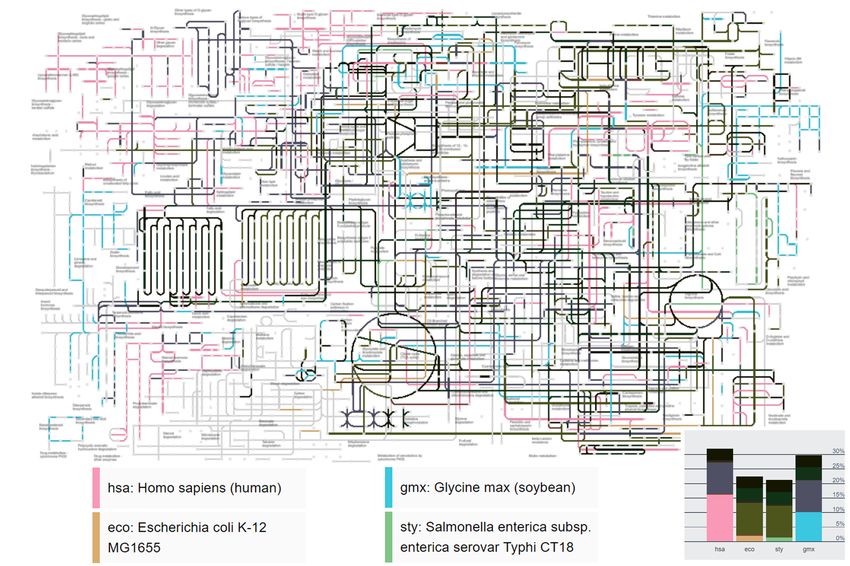
A common task is to explore organism-specific relations     existing set membership visualization techniques.
in the context of the global reference pathway. Therefore,
KEGG has a mapping procedure to map genes to the com-
                                                               3.1   Existing Tools
pounds and reactions on pathway maps. It also provides
online tools to highlight a single selected organism within    The KEGG Atlas [24], Pathway Projector [16] and iPath
the reference pathway map or to manually enter multiple        [8] are existing tools which offer visualizations of Path-
genes and specify a color for them. According to our col-      ways. All of them are web applications which use the
laborating domain expert, biologists prefer graph overlays     KEGG global pathway map as a starting point for the vi-
compared to showing an optimized sub-graph, as they are        sualization of queries based on the KEGG resource [23].
used to the layout and can orient fast in these maps.          Every tool provides basic zooming and panning interac-
   The KEGG Orthology (KO) database, which is part of          tion to explore the global map and additional information
the genomic information, provides a characterization of        of elements by clicking on nodes or edges. They allow to
pathways and genes into KO entries. These KO entries           filter pathways per organism and to apply further, limited,
are mapped to the graph layout. KO entries are manually        filtering inside the selected organism.
defined by creating ortholog groups. Ortholog groups con-          KEGG provides some mapping tools for their applica-
sist of pathways and genes with identical or similar func-     tion. With the Search&Color Pathway mapping tool or the
tionality, which have a common ancestor gene. The map-         Reconstruct Pathway tool it is possible to enter single KO
ping process of the KO entries consists of the KO assign-      entries and specify colors for them, but it is not possible
ment and the KEGG mapping. In the KO assignment step,          for whole organisms. With manual filtering of KO entries
pathways and genes of the genome are assigned to KO en-        of different organisms and finding the correspondences be-
tries. The KEGG mapping is then about reconstructing           tween the organisms, one can enter the whole information
the KEGG pathway maps with the newly assigned infor-           to visualize in this tool.
mation.                                                            IPath is the most active web application in pathways
   The KEGG API [17] enables access to the databases and       visualization where the founders are still adding knowl-
allows to create more complex queries linking data across      edge and interaction tools. The newest version is iPath3
these databases. Pathway maps can be accessed via this         [8], which is based on JavaScript and SVG, as opposed to
API as XML files. The format is defined by the KEGG            the previous versions iPath1 [19] and iPath2 [31], which
Markup Language (KGML) [14]. These files contain the           used a Flash-based framework. In the last version, the
graphical data, like the coordinates of the graph elements,    authors added a helper tool to compare two species and
the type and the color of the element. Additionally, they      encode their differences and similarities in the overview
contain basic information of the data mapped to the ele-       map. However, this tool only provides a comparison of
ments: the names, type and a link leading to additional in-    two organisms.
formation of the entry. This gives the possibility to recon-       The Roche Pathways [25] is another tool handling
struct and adapt pathways arbitrarily from these files. For    metabolic pathways. The focus is on the visualization of
our purpose, we can request organism-specific pathways         the underlying data of the graph. They use the JavaScript
in the context of the global reference map (map01100).         library Leaflet [1] for their interactive map, providing se-
   To visualize shared KO entries of multiple organisms,       mantic zooming. Another example in this domain for in-
we request all KO entries mapped to the global metabolic       teractive visualization are Recon Maps [22]. This tool is
reference pathway (map ko01100). The KO entries which          implemented using the Google Maps API.
are part of single organisms are obtained by requesting the
genes of an organism and then finding the corresponding        3.2   Set Membership Visualization
KO entry for each gene. With the mapping of the KO en-
tries to the map and the organism-specific KO entries we       The pathway maps introduced by KEGG have a fixed lay-
can compute which entries are shared by which organisms        out. Domain experts are used to this layout, therefore it is
and visualize them.                                            important to keep the structure and visualize information
   Unfortunately, the servers provided by KEGG are rather      on top of it. Subsequently, overlay techniques [30] are of
slow. To speed up the data acquisition process, we use         most interest for us. These techniques are specified on the
server-side caching (see Section 5).                           set membership of points. However, in the context of path-
                                                               way maps, the entries we want to visualize in sets are not
                                                               the points, but the edges of the graph.
3    Related Work                                                 The drawback of region-based approaches like Bubble
                                                               Sets [7] or the approach by Byelas and Telea [5] is that
As our work addresses the visualization of biochemical         a visualization of whole regions is not useful in our con-
pathways, as well as visualization of overlapping sets, we     text. The elements in pathways are placed very compact
will split the related work into these two sections. We will   and the data is linked in complex ways. The organisms we
first cover existing tools in the context of metabolic path-   want to highlight on this graph, however, do not form re-
ways and related topics. Subsequently, we will introduce       gions. Additionally, our sets are highly overlapping, there-

    Proceedings of CESCG 2019: The 23rd Central European Seminar on Computer Graphics (non-peer-reviewed)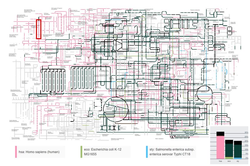
fore graph visualizations like GMap [10], which only work         In Figure 1, we illustrate this color calculation with nine
with non-overlapping sets, are also not useful. Line-based      colors. To represent overlaps between sets, we interpolate
approaches like Line Sets [2] and Kelp Diagrams [9] add
line connections between nodes of common sets. How-
ever, our goal is to visualize set membership of edges.
Combinations of region- and line-based techniques, like
Kelp Fusion [21], have the same limitations. Hatching
techniques, as used in Kelp Diagramms [9] can not be ap-
plied, because our graph is too dense, to see structures like
this. However, we do adapt their presented overlay nesting
technique for visualizing a small number of sets.
   Visualizations which rearrange the data, like Eu-
lerView [28] or SetNet [26], are not useful as they do not
preserve the well-known fixed layout of the pathway maps.
   Apart from the visualization superimposed on the graph,
overview visualizations of set relations are useful for the
user, for better understanding. All kinds of diagrams based
on Euler and Venn-diagrams have the drawback that they
do not scale well on more than three sets [3]. However, our
goal is not to restrict the user in the number of organisms
to compare. UpSet [20] or SEEM [11] scale better than
Venn diagrams and allow for easier comparison of the set
cardinalities, but they can still become rather large with      Figure 1: Selection of nine isoluminant colors in the HCL
a higher number of sets [20] or do not show all possible        color space at luminance 75.
combinations of overlapping sets [11].
                                                                the set colors and decrease the luminance with respect to
                                                                the number of overlapping sets. For KO entries which are
4    Comparative Graph Overlay                                  shared among multiple organisms, we transform the color
                                                                into the cartesian LAB color space and interpolate the a
The goal of our graph overlay edge coloring technique is        and b values. Then, we compute the luminance with re-
to visualize where multiple organisms overlap in the ref-       spect to the amount of organisms that share this entry. We
erence pathway and how they differ from each other. We          use an interpolation of the following form
use a technique that keeps the known graph structure, to                                     m − 1 a
facilitate orientation for domain experts.                                       lm = 75 1 −                             (1)
                                                                                               n−1
   For the color encoding we use the Hue-Chroma-
Luminance color space (HCL). This color space is per-           where n is the total number of sets (organisms) and m is
ceptually linear. This means that colors with equal dis-        the number of overlapping sets. KO entries which are
tance inside this color space are perceived equally distant     shared by all organisms will therefore be colored black.
by humans [32]. The colors are coordinates in the 3D color      The more organisms, the darker the color. All graphical
space, where Hue and Chroma are polar coordinates in the        elements with a KO entry, which occurs in at least one or-
color plane and the orthogonal Luminance corresponds to         ganism, are colored with the calculated color, whereas all
the brightness.                                                 other elements are colored in a light gray, as it can be seen
   Every organism gets a base color assigned, where the         in Figure 2.
hue between those colors is as distinct as possible, and the       For each edge, we find all organisms that are associated
luminance and the chroma is constant. The base colors           with any KO assigned to the respective edge and compute
for the organisms are selected at luminance 75. At this lu-     the interpolated A and B color components, as well as the
minance the chroma can be maximized within the sRGB             corresponding luminance using Equation 1. We then ren-
gamut (i.e., the colors available at a computer monitor).       der the edge using this LAB color. This way, the user can
To calculate the hues, we divide the 360◦ representing all      identify edges associated with a single organism only by
possible hues by the number of organisms. For even num-         a bright edge color and edges shared by many organisms
bers of organisms, the color interpolation for organisms        by a very dark color. Mouse-over tooltips show the exact
opposite to each other, would result in the same gray color,    associations.
where chroma is zero. To avoid this, we always divide by           To further support the user in the orientation of col-
an odd number. To maximize the chroma, we start with            ors and the numbers of KO entries, we visualize the KO
a value of 100 and iteratively reduce it until the value is     entries of the organisms in stacked bar charts. Each bar
valid (until we receive an RGB value, where no color com-       shows the ratio of KO entries of one organism with respect
ponent is clamped).                                             to the total amount of KO entries in the graph. The bars are

    Proceedings of CESCG 2019: The 23rd Central European Seminar on Computer Graphics (non-peer-reviewed)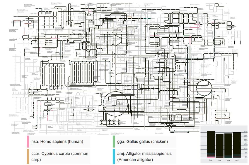
subdivided according to the set overlaps, where the lowest        cles and lines. SVG rendering can become a bottleneck
bar segment shows the ratio of KO entries that is occupied        when visualizing thousands of items. This is why we de-
only by the respective organism and the highest bar seg-          cided to use WebGL [12]-hardware-accelerated rendering,
ment in black shows the ratio of KO entries shared by all         exposed through the HTML5 Canvas API. To render to
organisms. Each of these bar segments is colored in the           the  element, we use Three.js [6], which is a
corresponding color, dependent on the organisms, which            JavaScript scenegraph library based on WebGL [12]. Ac-
are part of it. An example of the stacked bar charts can be       cording to the WebGL specification, it is not possible to
seen in Figure 3 in the lower right corner.                       render line width other than 1.0. Therefore, the lines with
   In our implementation, we do not restrict the number of        a line width higher than 1.0 need to be created with tri-
organisms. However, as one can already see in Figure 1,           angle meshes. To improve performance, by minimizing
it may get hard to distinguish between nine isoluminant           draw calls, we created large meshes containing multiple
colors, particularly when the different colors are widely         lines instead of small meshes for each line.
spread in the visualization. In Figure 2, we use our stacked         For zooming and panning interactions, we use the event
bar charts to show how the color interpolation develops           listeners from D3.js [4], which is a data-driven JavaScript
with respect to the number of organisms and its impact            library to manipulate documents. From the events, we re-
to the overlay. The bar charts are generated manually to          ceive the mouse coordinates, which we multiply with the
show the different colors, and therefore do not represent         inverse camera projection matrix. We then calculate the
any relations of KOs in the images below.                         new distance and scale according to the mouse wheel delta
   Additionally to our edge color style, we implemented           and update the camera position. The hover and clicking in-
a visualization technique with a layer structure, inspired        teractions of our tool are obtained by raycasting the scene
by Kelp Diagrams [9]. However, we do not use any type             at the mouse position with the Three.js raycaster.
or routing algorithm but just adapted their nested style to
indicate overlapping sets.
   For each organism, we create a layer with all elements,        6     Results
where a KO entry of this organism is assigned. To render
multiple organisms above each other, each of the organ-           Our web application is accessible online [29] and is tested
isms gets a different line width assigned. Due to the grow-       with Google Chrome Version 71 and Firefox 64 on Win-
ing line width, this approach is restricted to the selection      dows 10. To view organism-specific pathways it is re-
of three organisms. With more organisms, the increasing           quired to write the KEGG organism code into the search
line width in this dense graph results in lines, which vi-        field and press enter. The organism codes consist of three
sually merge. On top of the organism-specific layers, we          to four letters and are listed online [18]. For visualizations
add an overlay, which is colored in gray values. This layer       of multiple organisms, the user enters the organism codes
indicates how many organisms share KO entries on this             concatenated with ’+’. For example, ’hsa+eco+sty’ visu-
element. If a KO entry of this edge is shared by all organ-       alizes the human organism, one type of e-coli and one type
isms, this overlay is black, if it is only shared by two, it is   of salmonella. We will show two use cases and compare
gray. When the KO entry only appears in one organism, no          the edge coloring overlay with the nested overlay visual-
edge is drawn in this layer. This layer is not part of Kelp       ization in the following paragraphs. After that we com-
Diagrams, but it is our attempt to handle the ambiguous           pare the rendering performance with the KEGG Atlas [24],
mapping of KOs on the map in this technique.                      iPath3 [8] and the Roche Pathways [25].

                                                                  6.1   Use Cases
5    Implementation
                                                                  In this section we present a few use cases. In the first
For our implementation, we use a client-server infrastruc-        example in Figure 3, we compare the human organism,
ture. The server handles the requests to the KEGG API             against one type of e-coli and one type of salmonella. In
and preprocesses the data to reduce the computation on            Figure 4 we present the corresponding nested style visual-
the client-side and therefore improve performance. Addi-          ization as comparison.
tionally, the server caches resources from the KEGG API              In the nested style visualization, it can be seen that we
which are often used, to work independently from the API          are loosing some of the underlying structure of the graph
and reduce response times.                                        in dense areas. Due to the increasing line width, some of
   As backend we use Python with a Flask [27] server. All         the lines cannot be distinguished from each other. This is
requests from the frontend are sent to this server and, if        the reason why we restrict it to three organisms. In the
necessary, are forwarded to the KEGG servers. We use              edge color visualization, however, we maintain the orig-
server-side caching to further reduce response times.             inal structure of the graph and just recolor the elements.
   As previously described, the existing tools mostly use         Even in the overview it is easy to see which elements in
Scalable Vector Graphics (SVG) for rendering. The global          the graph are KO entries that only appear in one organism
pathway map consists of more than 4000 entries of cir-            (bright color) or in all organisms (black). Additionally,

     Proceedings of CESCG 2019: The 23rd Central European Seminar on Computer Graphics (non-peer-reviewed)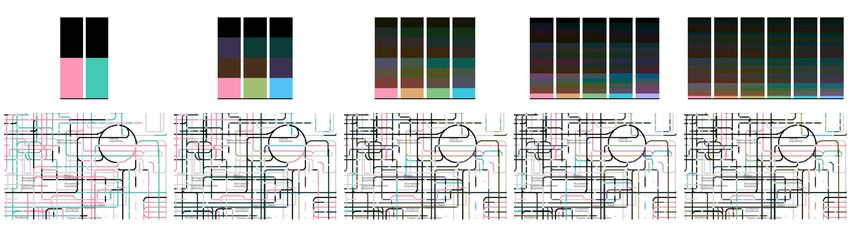
Figure 2: Colors indicating the individual organisms as well as all possible overlaps in the visualization, beginning with
two organisms at the left column up to six organisms in the right column. The top row shows stacked bar charts with
synthetic, equally sized overlap quantities to show the colors. The bottom row shows a small part of the global pathway
map, with the colors illustrated in the charts above them.
one can see the stacked bar charts showing the ratio of KO not just because it has much more isolated KO entries in
entries per organisms with respect to the total number of the graph, but also due to the selection as the first organism
KO entries in the map. with the highest line width. This kind of emphasis can be
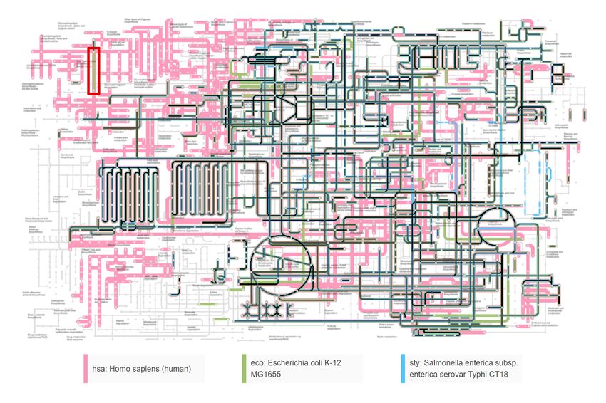
When comparing the visualizations in Figure 3 and Fig- desired or not, dependent on the use case.
ure 4 with each other, one can see that there are some Overall, what we can see in this visualizations in Fig-
differences. One reason is that there are different edges, ure 3 and Figure 4 is that e-coli and salmonella are very
which on some parts are overlapping with each other. De- similar and that there are only a few entries which differ.
pending on the rendering order, different edges may be in The human, however, has a lot of structures not in com-
the foreground and therefore not unique in static represen- mon with e-coli and salmonella. This are mostly Glycan
tations like these figures. Another difference of these vi- structures, which are mapped in the upper left corner of the
sualization is how the information of shared entries is en- pathway, Lipide in the lower left corner and Amino Acids
coded. In contrast to the edge color style, the nested style on the right side.
with the overlap layer explicitly shows whether KO entries An example with four very distinct organisms can be
associated with an edge are shared by different organisms. seen in Figure 5. We compare human, e-coli , salmonella
For instance, in the red box in Figure 3 and 4, there is an and soybean against each other. From both, the visualiza-
edge associated with multiple KO entries, which are not tion and the stacked bar charts, we can see, that the human
shared among human and e-coli. In the nested style this and the soybean have the most isolated KO entries. Still,
is visible as there is no overlap layer, but still two colors we can detect some isolated entries of the other organisms
on this edge. In the edge color style, this property is not in the overview as well. The differences between KO en-
revealed. We can only see, that there is at least one KO tries shared among some of the organisms and those shared
entry belonging to the human organism. Additional infor- among all of them can be seen, too.
mation is provided as tooltip in our interactive application. Figure 6 illustrates an example of our edge color over-
However, in the color computation of one element we give lay with four similar organisms: human, carp, chicken and
priority to the entries which are shared by multiple organ- alligator. Even in this small-scaled version of the visual-
isms. ization, as well as in the stacked bar chart, we can easily
One drawback of the nested style is, that the user does see that most of the KO entries are shared due to the dark
not see which organisms share an entry if the overlay layer colors. Furthermore, those which are isolated by one or-
indicates sp. As in the edge color style, this additional in- ganism can be easily detected because of their bright color.
formation is provided in the tooltip. The color blending
approach in the edge color visualization already gives the 6.2 Performance
information which organisms share entries. Dark green
edges indicate, that there are KO entries which are shared For our performance measurements we used a PC with
by e-coli and salmonella. There also are a few brown 8GB RAM, using an Intel i5 6300 CPU with a built-in In-
edges, where the human and e-coli share KO entries and tel HD Graphics 520 GPU with 4GB on Windows 10. We
also some violet edges with KO entries shared by the hu- used Google Chrome version 71 and the Chrome Devtools
man and salmonella. Another thing to mention is that the to record the performances when loading the pages. For
nested visualization introduces some kind of prioritising all websites, client-side caching was disabled. Figure 7 il-
of the organisms depending on the order. In the provided lustrates the page loading times of the KEGG Atlas [24],
example, a lot of emphasis lies on the human organism, iPath3 [8], Roche Pathways [25] and our approach. The
Proceedings of CESCG 2019: The 23rd Central European Seminar on Computer Graphics (non-peer-reviewed)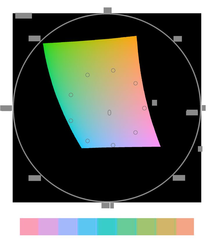
Figure 3: Our edge coloring overlay to compare the human organism with e-coli and salmonella.

     Figure 4: Kelp-inspired, nested overlay to compare the human organism with e-coli and salmonella.
                                                      .
Proceedings of CESCG 2019: The 23rd Central European Seminar on Computer Graphics (non-peer-reviewed)
Figure 7: Comparison of loading times in seconds of
KEGG Atlas [24], iPath3 [8], Roche Pathways [25] and
our approach when loading the page without client-side
caching.
Figure 5: Example edge color overlay with four different
organisms: human, e-coli, salmonella, soybean.
tions in this context. The introduced edge color technique
allows the user to identify which related genes are present
in the selected organisms. Due to the dense graph layout,
it was necessary to come up with a new set overlay visu-
alization. The ambiguous mapping of KO entries to graph
elements requires real-time interactive exploration meth-
ods to retrieve precise mapping information.
For future work, we consider a more powerful visual-
ization with linked views, allowing to explore different
aspects of the relations between multiple organisms. Ex-
tended interaction, may be useful, like highlighting the el-
ements of one organism in the visualization when hov-
ering over its label. Another interesting extension may
be semantic zooming, similar to that of the Roche Path-
ways [25]. At some level we could, for instance, render
Figure 6: Example edge color overlay with four similar the chemical structure of the compounds to support better
organisms: human, carp, chicken and alligator. exploration of the pathway. With our efficient rendering,
. such dynamic representation changes are seamlessly pos-
sible.
According to our collaborating domain expert, a useful
KEGG Atlas took 8.72s, iPath3 5.19s, Roche Pathways future extension might be the possibility to enter genomes,
1.24s and our approach 0.98s. However, these measure- which are not present in the KEGG databases. Addition-
ments do not properly represent when the actual content is ally, reverse searches, for instance, if given the name of a
visible to the user. compound, a highlighting of the KO entries related with
Since our approach constantly executes draw calls on this compound, are of interest.
the GPU, the rendering performance in terms of FPS is
important. Google Chrome limits the FPS to 60, therefore
it is hard to actually measure what we can achieve with our References
application, but the current version renders with at least 60
FPS. [1] Vladimir Agafonkin. Leaflet: an open-source
Unfortunately, requests during runtime may take long, JavaScript library for mobile-friendly interactive
since we have to forward many of the requests to the maps. https://leafletjs.com/, accessed 26.01.2019.
KEGG servers. Requesting the organism-specific pathway
of the human takes about 30s in the KEGG Atlas. Directly [2] Basak Alper, Nathalie Riche, Gonzalo Ramos, and
requesting it over the KEGG API takes about 9s, whereas Mary Czerwinski. Design study of linesets, a novel
loading the resource from our server only takes 0.5s. set visualization technique. IEEE Transactions on Vi-
sualization & Computer Graphics, (12):2259–2267,
2011.
7 Conclusion and Future Work
[3] Bilal Alsallakh, Luana Micallef, Wolfgang Aigner,
Our pathway visualization tool allows interaction in real Helwig Hauser, Silvia Miksch, and Peter Rodgers.
time and is more efficient than other existing web applica- Visualizing sets and set-typed data: State-of-the-art
Proceedings of CESCG 2019: The 23rd Central European Seminar on Computer Graphics (non-peer-reviewed)and future challenges. In Eurographics conference [15] Minoru Kanehisa, Yoko Sato, Masayuki Kawashima,
on Visualization (EuroVis)–State of The Art Reports, Miho Furumichi, and Mao Tanabe. Kegg as a refer-
pages 1–21. The Eurographics Association, 2014. ence resource for gene and protein annotation. Nu-
cleic acids research, 44(D1):D457–D462, 2015.
[4] Michael Bostock, Vadim Ogievetsky, and Jeffrey
Heer. D3 data-driven documents. IEEE Transactions [16] Nobuaki Kono, Kazuharu Arakawa, Ryu Ogawa,
on Visualization & Computer Graphics, (12):2301– Nobuhiro Kido, Kazuki Oshita, Keita Ikegami,
2309, 2011. Satoshi Tamaki, and Masaru Tomita. Pathway pro-
jector: web-based zoomable pathway browser us-
[5] Heorhiy Byelas and Alexandru Telea. Visualization ing kegg atlas and google maps api. PloS one,
of areas of interest in software architecture diagrams. 4(11):e7710, 2009.
In Proceedings of the 2006 ACM symposium on Soft-
ware visualization, pages 105–114. ACM, 2006. [17] Kanehisa Laboratories. KEGG API.
https://www.kegg.jp/kegg/rest/keggapi.html, ac-
[6] Ricardo Cabello. JavaScript 3D library. cessed 16.10.2018.
https://threejs.org/, accessed 27.01.2019.
[18] Kanehisa Laboratories. KEGG Organism
[7] Christopher Collins, Gerald Penn, and Sheelagh List. http://rest.kegg.jp/list/organism, accessed
Carpendale. Bubble sets: Revealing set relations 04.02.2019.
with isocontours over existing visualizations. IEEE
Transactions on Visualization & Computer Graph- [19] Ivica Letunic, Takuji Yamada, Minoru Kanehisa, and
ics, (6):1009–1016, 2009. Peer Bork. ipath: interactive exploration of biochem-
ical pathways and networks. Trends in biochemical
[8] Youssef Darzi, Takuji Yamada, Ivica Letunic, and sciences, 33(3):101103, March 2008.
Peer Bork. iPath3.0: interactive pathways explorer
v3. Nucleic Acids Research, 46(W1):W510–W513, [20] Alexander Lex, Nils Gehlenborg, Hendrik Strobelt,
04 2018. Romain Vuillemot, and Hanspeter Pfister. Upset: vi-
sualization of intersecting sets. IEEE transactions on
[9] Kasper Dinkla, Marc J van Kreveld, Bettina Speck- visualization and computer graphics, 20(12):1983–
mann, and Michel A Westenberg. Kelp diagrams: 1992, 2014.
Point set membership visualization. In Computer
Graphics Forum, volume 31, pages 875–884. Wiley [21] Wouter Meulemans, Nathalie Henry Riche, Bettina
Online Library, 2012. Speckmann, Basak Alper, and Tim Dwyer. Kelp-
fusion: A hybrid set visualization technique. IEEE
[10] Emden R Gansner, Yifan Hu, and Stephen G transactions on visualization and computer graphics,
Kobourov. Gmap: Drawing graphs as maps. In Inter- 19(11):1846–1858, 2013.
national Symposium on Graph Drawing, pages 405–
407. Springer, 2009. [22] Alberto Noronha, Anna Dröfn Danı́elsdóttir, Pi-
otr Gawron, Freyr Jóhannsson, Soffı́a Jónsdóttir,
[11] Robert Gove, Joshua Saxe, Sigfried Gold, Alex Sindri Jarlsson, Jón Pétur Gunnarsson, Sigurdur
Long, and Giacomo Bergamo. Seem: a scalable vi- Brynjólfsson, Reinhard Schneider, Ines Thiele, et al.
sualization for comparing multiple large sets of at- Reconmap: an interactive visualization of human
tributes for malware analysis. In Proceedings of the metabolism. Bioinformatics, 33(4):605–607, 2016.
Eleventh Workshop on Visualization for Cyber Secu-
rity, pages 72–79. ACM, 2014. [23] Hiroyuki Ogata, Susumu Goto, Kazushige Sato,
Wataru Fujibuchi, Hidemasa Bono, and Minoru
[12] Khronos WebGL Working Group. OpenGL ES for Kanehisa. KEGG: Kyoto Encyclopedia of Genes and
the Web. https://www.khronos.org/webgl/, accessed Genomes. Nucleic Acids Research, 27(1):29–34, 01
27.01.2019. 1999.
[13] Minoru Kanehisa, Miho Furumichi, Mao Tanabe, [24] Shujiro Okuda, Takuji Yamada, Masami Hama-
Yoko Sato, and Kanae Morishima. Kegg: new per- jima, Masumi Itoh, Toshiaki Katayama, Peer Bork,
spectives on genomes, pathways, diseases and drugs. Susumu Goto, and Minoru Kanehisa. Kegg atlas
Nucleic acids research, 45(D1):D353–D361, 2016. mapping for global analysis of metabolic pathways.
Nucleic acids research, 36(suppl 2):W423–W426,
[14] Minoru Kanehisa, Susumu Goto, Shuichi 2008.
Kawashima, Yasushi Okuno, and Masahiro Hattori.
The kegg resource for deciphering the genome. [25] F. Hoffmann-La Roche. Roche Biochemical Path-
Nucleic acids research, 32(suppl 1):D277–D280, ways. http://biochemical-pathways.com/#/map/1,
2004. accessed 23.01.2019.
Proceedings of CESCG 2019: The 23rd Central European Seminar on Computer Graphics (non-peer-reviewed)[26] Peter Rodgers, Gem Stapleton, Bilal Alsallakh, Lu-
ana Michallef, Rob Baker, and Simon Thompson.
A task-based evaluation of combined set and net-
work visualization. Information Sciences, 367:58–
79, 2016.
[27] Armin Ronacher. Flask. Web Development, one
drop at a time. http://flask.pocoo.org/, accessed
27.01.2019.
[28] Paolo Simonetto. Visualisation of overlapping sets
and clusters with Euler diagrams. PhD thesis, Uni-
versité Sciences et Technologies-Bordeaux I, 2012.
[29] Katharina Unger. Visual Comparison of
Organism-Specific Metabolic Pathways.
https://users.cg.tuwien.ac.at/kunger/pr-pathway-
exploration/, accessed 04.02.2019.
[30] Corinna Vehlow, Fabian Beck, and Daniel Weiskopf.
The state of the art in visualizing group structures in
graphs. In Eurographics Conference on Visualiza-
tion (EuroVis)-STARs, volume 2. The Eurographics
Association, 2015.
[31] Takuji Yamada, Ivica Letunic, Shujiro Okuda, Mi-
noru Kanehisa, and Peer Bork. ipath2. 0: inter-
active pathway explorer. Nucleic acids research,
39(suppl 2):W412–W415, 2011.
[32] Achim Zeileis, Kurt Hornik, and Paul Murrell. Es-
caping rgbland: Selecting colors for statistical graph-
ics. Computational Statistics & Data Analysis,
53(9):3259–3270, 2009.
Proceedings of CESCG 2019: The 23rd Central European Seminar on Computer Graphics (non-peer-reviewed)You can also read