Widen the big tent for big data: Understanding business student perceptions of Tableau
←
→
Page content transcription
If your browser does not render page correctly, please read the page content below
Issues in Information Systems
Volume 22, Issue 4, pp. 49-58, 2021

DOI: https://doi.org/10.48009/4_iis_2021_51-62

Widen the big tent for big data: Understanding business student
perceptions of Tableau
Heidi L. Dent, Western Carolina University, hdent@email.wcu.edu
Barbara Jo White, Western Carolina University, whiteb@email.wcu.edu
William A. Kapakos, Western Carolina University, wakapakos@email.wcu.edu
H. Kevin Fulk, Western Carolina University, hfulk@email.wcu.edu

                                                  Abstract

 Business majors will encounter big data, and many will use data visualization tools to gain valuable
 insights and make strategic business decisions. However, core information systems classes for all business
 majors focus on improving information literacy but rarely include exercises with data visualization tools
 like Tableau. This study seeks to understand the perceptions business students have of Tableau after using
 it for several activities during a semester-long core business class. Specifically, the study examines the
 effects of gender, age, and major to understand how each factor affects student perceptions of Tableau
 including how easy it is to use, its value in the workplace, and how it compares to Excel. Tableau appealed
 to females just as much as males and to older students just as much as younger students. Tableau engaged
 with some majors more than others and appealed to CIS, Finance and Entrepreneurship majors more so
 than Marketing and Management majors (which include Management, Sport Management, Hospitality
 and Tourism, and Business Law). All majors saw the value of Tableau in workplaces for their future
 careers. Complete Tableau lab assignments available upon request.

Keywords: Tableau, Big Data, Data Visualization, Information Literacy, Excel

                                                 Introduction

Visual communication design is a necessary component across disciplines in preparation for industry
applications. Educational planning for visual communication design endeavors to mirror rapidly developing
technology while also evolving to accommodate multidisciplinary work (Dur, 2014). Research suggests
that individuals are challenged with identifying and understanding data visualizations. Yet, improving the
level of data visualization literacy should be a priority for academic institutions.

Frequently, experts in industry and higher education are calling for college students to have opportunities
to graduate with valuable data visualization skills (Ryan, et al., 2019). Colleges and universities are
attempting to answer this call for data visualization learning opportunities in various forms. Opportunities
to learn data visualization skills can take the form of dedicated courses (Usova and Laws, 2021),
components of existing courses (Kapakos, et al., 2020), and certification programs (Schuetz et al., 2020).
Data visualization offerings are starting to be found in a variety of programs, such as science, technology,
engineering, and mathematics (STEM) fields (Ryan, et al., 2019), social sciences (Henshaw and Meinke,
2018), and the focus of this study – business fields (Andiola, et al., 2020). Often, a sought-after outcome
for these learning opportunities is data visualization literacy.

                                                      49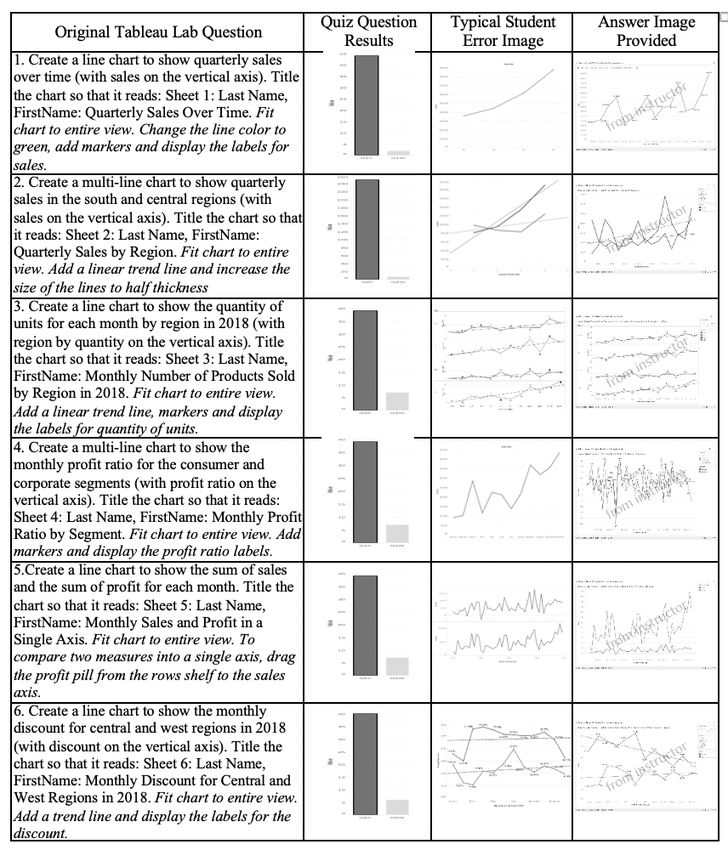
Issues in Information Systems
Volume 22, Issue 4, pp. 51-62, 2021

Data visualization literacy (DVL) is defined as the “the ability to confidently use a given data visualization
to translate questions specified in the data domain into visual queries in the visual domain, as well as
interpreting visual patterns in the visual domain as properties in the data domain” (Boy et al, 2014). Data
visualization literacy can be construed as a component of digital literacy and digital literacy a component
of information literacy. Information literacy is cross-disciplinary, the need extending beyond information
systems or computer science to meet the demands of industry post-graduation. While the importance of
digital visualization literacy is commonly accepted, there is less agreement on how to effectively teach data
visualization. Frameworks have been suggested in order to create a more cohesive “typology, process
model, and exercises for defining, teaching, and assessing DVL” (Börner et al., 2019).

Information literacy is the competence of users to determine when information is needed and then locate,
evaluate, and apply that information. Visualization literacy, with data visualization, falls under the broader
umbrella of information literacy, which often involves technology. Today’s students typically enter college
with previous experience and exposure to technology which influences how they learn and their interest in
learning computer and information technology in the classroom (Ciampa, 2013).

This paper presents a multidisciplinary study of student responses to data visualization activities using
Tableau in a core undergraduate business information systems class. Specifically, the study examines how
age, gender, and major affect student perceptions of Tableau compared to Excel, their perceptions of
Tableau in the workplace and their perceptions of Tableau activities.

                                               Background

Major and Information Literacy

Research shows there are differences relating to information technology and technology usage among
business majors. For example, research indicates that some majors believe their knowledge to be superior
to others in evaluating different forms of messages, the quality and credibility of the content, and their
ability to utilize search and create multimedia (O’Callaghan et.al., 2021). Students, dependent upon major,
have established a hierarchy of their perceptions of their digital literacy skills, with Accounting majors
feeling superior to Finance majors and CIS majors feeling superior to Accounting majors (O’Callaghan
et.al., 2021).

More recently established majors such as Entrepreneurship have also embraced the value of information
literacy. This is evidenced by an increasing textbook coverage of IT topics such as IT management,
computer literacy, e-commerce and the Internet, as well as office productivity software (Davidson et al.,
2012).

Early studies of student appraisal and use of various office productivity applications also show differences
between business majors. Bartholomew and colleagues (2003) showed business management majors
reporting lower appraisal scores than IS or Accounting majors. Finance majors, Accounting majors and CIS
majors all reported using office productivity applications (such as Word and Excel) more than business
management or marketing majors (Bartholomew et al, 2003). Beyond office productivity software
applications, other software, such as data visualization software may also show differences due to major
but few, if any, studies have been conducted. Data visualization typically has been targeted to majors in
information systems in classes at the graduate level or at the undergraduate level. Rarely and only recently
have data visualization activities been used with students in other disciplines in undergraduate courses
(Andiola, et al., 2020; Kapakos, et al., 2020).

                                                     50
Issues in Information Systems Volume 22, Issue 4, pp. 51-62, 2021 Age and Information Literacy Age has been studied in a variety of digital literacy and technology-related studies using various methods examined for enhancing the learning of technology in the classroom. For example, using a visual gamification application that used integrated software in classroom learning environments, Ashtari and Taylor (2021) studied age and how it interacts with gamification. They found that age functions as a moderator of the relationship between ability and motivation and the perception of learning (Ashtari and Taylor, 2021). Regarding age and computers and technology, research is mixed. For example, some research shows age differences with younger students having higher ratings than older students in technology and digital literacy studies. O'Callaghan and colleagues (2021) studied age and digital literacy with results showing that age impacted two of the measures of digital literacy. Specifically, younger students (
Issues in Information Systems
Volume 22, Issue 4, pp. 51-62, 2021

Typically, attendance on campus was 10% of the expected amount making the hybrid sections mostly taught
like distance sections too. All sections used the same course shell with instructional videos showing students
how to use Tableau. These instructional videos included a corresponding PowerPoint file that students could
follow along with that provided information about the user interface and terminology of Tableau, sorting
data by ascending and descending values, changing color palettes, interpreting sales data, etc. Recorded
video solutions were made available for students as well.

Tableau was introduced midway through the semester, after students were exposed to working with Excel.
In an effort to maintain consistency between assignments that focused on different software, Tableau
activities followed a similar format to the Excel assignments. In total, there were four Tableau activities:
two labs and two practice labs that preceded each lab. The first practice lab and lab dealt with bar charts.
In these labs students were tasked with creating stacked bar charts showing total amounts broken down into
sub-amounts where parts of the data are stacked, in addition to comparing multiple sets of data with grouped
bar charts. The second practice lab and lab dealt primarily with line charts. Students leveraged what they
learned in the prior labs and built upon their skills by focusing on creating grouped and multi-line charts,
adding trend lines and other line chart attributes. Each assignment had a lab component asking students to
create two to six charts using a large data set that is included with Tableau. In all cases, students were shown
images of the solution charts, so they knew where they were headed. Following the lab components, a set
of quiz questions asked students to alter their charts according to a prompt and then choose a multiple-
choice answer in response.

                                                   Results

A summary of Tableau lab questions is available in Appendix B and Appendix C. The results of student
performance on the Tableau activities are below (Figure 1):

Figure 1: Measure Names include quiz questions correct and wrong. Data is broken out by quiz 1 (q1)
                                        and quiz 2 (q2)

A total of 304 students completed the survey, with approximately equal numbers of male (48.4%) and
female (51.6%) respondents, although most of them were 34 or younger (84.9%). Most of the female

                                                      52
Issues in Information Systems
Volume 22, Issue 4, pp. 51-62, 2021
respondents were in the management area working on a business law degree taught through a distance
program.
Figure 2: Tableau Visualization of Demographic data by age, gender and major
Most of the surveys (79.3%) were completed immediately after the students finished the second Tableau
lab while a smaller group of students (20.7%) completed surveys approximately 5 weeks later. An
independent samples T-test showed no difference between respondents who completed the survey
immediately after (M = 33.35, SD = 7.77) or five weeks after (M = 33.02, SD = 7.72) taking the Tableau
lab and their perceptions as a whole. There were also no significant differences regarding Tableau’s ease
of use between respondents who completed the survey immediately after (M = 15.04, SD = 4.12) or five
weeks after (M = 14.94, SD = 3.95) completing the Tableau lab; Tableau’s workplace value between
respondents who completed the survey immediately after (M = 11.46, SD = 2.48) or five weeks after (M =
11.54, SD = 2.65) completing the Tableau lab; or how Tableau compared to Excel between respondents
who completed the survey immediately after (M = 10.18, SD = 3.28) or five weeks after (M = 9.54, SD =
3.05) taking the Tableau lab.
One-sample T-tests showed that, overall, students had very positive perceptions about Tableau (M = 33.28,
SD = 7.75), t(303) = 7.29, p < .000), that students valued Tableau in the workplace and in their disciplines
(M = 11.48, SD = 2.51), t(303) = 17.23, p < .000), that Tableau appealed to students more than Excel (M =
10.05, SD = 3.24), t(303) = 5.65, p < .000), and that students found Tableau easy to use (M = 15.02, SD =
4.07), t(303) = 12.93, p < .000).
An independent samples T-test showed no difference between males (M = 32.73, SD = 7.80) and females
(M = 33.80, SD = 7.69) and their perceptions of Tableau as a whole, or its ease of use between males (M =
14.79, SD = 4.07) and females (M = 15.23, SD = 4.07), workplace value between males (M = 11.42, SD =
53Issues in Information Systems
Volume 22, Issue 4, pp. 51-62, 2021
2.59) and females (M = 11.54, SD = 2.44), or how Tableau compared to Excel between males (M = 9.80,
SD = 3.14) and females (M = 10.28, SD = 3.32). While there were no significant differences, in all cases,
females scored higher than males.
An independent samples T-test showed no difference between younger (M = 33.15, SD = 7.85) and older
(M = 34.15, SD = 7.08) respondents and their perceptions of Tableau as a whole, or its ease of use between
younger (M = 14.95, SD = 4.15) and older (M = 15.45, SD = 3.47) respondents, workplace value between
younger (M = 11.42, SD = 2.51) and older (M = 11.88, SD = 2.49) respondents, or how Tableau compared
to Excel between younger (M = 10.02, SD = 3.27) and older (M = 10.28, SD = 3.09) respondents. While
there were no significant differences, in all cases, older respondents scored higher than younger students.
A one-way ANOVA showed that, overall, perceptions of Tableau differed depending on student majors
[F(6, 297) = 3.30, p = .004], which were grouped into CIS, Finance, Accounting, Entrepreneurship,
Marketing, and the Management group (which included Management, Business Law, Sport Management,
and Hospitality and Tourism). Specifically, CIS students differed significantly from Marketing students (M
= 6.71, SD = 2.25) and from the group of Management students (M = 6.07, SD = 1.93). In terms of ease of
use [F (6, 297) = 3.96, p = .001], Finance students differed significantly from Marketing students (M = -
3.83, SD = 1.15) and the Management group (M = 3.45, SD = 0.98).
Discussion
This study’s objective was to understand the value of adding opportunities to learn an industry-leading data
visualization tool to an existing CIS course taken by business students as part of their degree requirements.
In this way, this study differed from research that has examined students’ behavioral intentions to use
technologies in voluntary use settings with the Technology Acceptance Model (Davis, 1989). It is
heartening to know that students, regardless of gender, age or major, believe that Tableau is useful in their
future workplaces, that it is easy for them to use, and that they like it more than Excel. Though all majors
have positive feelings about Tableau, some majors have stronger positive feelings compared to other
majors. For example, CIS, Accounting, Finance, and Entrepreneurship majors all had stronger positive
feelings about Tableau compared to Management and Marketing majors. The fact that there are no
significant differences between males and females and younger and older students when it comes to
perceptions of Tableau offers a very optimistic view in closing the age and gender gaps.
As with all research, the current study has multiple limitations. First, it is possible that students preferred
Tableau to Excel simply because Tableau was a novel, new technology to them and people are generally
drawn to what is novel or unique (Brown and White, 2009). Another potential limitation might have been
due to the timing of the labs. The Excel lab that directly preceded the Tableau labs did not have the answers
visible (only the first two Excel labs did) which might have increased the difficulty of Excel in the minds
of students. In addition, due to losing access as part of converting from one learning management system
to another, some student Tableau assignment scores were not accessible. Lastly, the timing of this study
during the ongoing pandemic means that readers should interpret findings with care.
As faculty progress with constructing pedagogy to address data visualization and information literacy,
Tableau proves to be an application that supports more inclusive environments in the classroom. This is a
useful implication for faculty members who are considering including data visualization in similar courses
to the core information systems course used in this study. In addition, the value that students taking part in
this study found in using Tableau should be encouraging to other students who may question the merits of
taking a course that includes learning data visualization skills.
54Issues in Information Systems
Volume 22, Issue 4, pp. 51-62, 2021
References
Andiola, L. M., Masters, E., & Norman, C. (2020). Integrating technology and data analytic skills into the
accounting curriculum: Accounting department leaders’ experiences and insights. Journal of
Accounting Education, 50, 1-18.
Arslan, F., Bagchi, K., & Ryu, S. (2015). A preliminary evaluation of the determinants of certification
success in MOOCs: A multi-level study. Proceedings of the Twenty-First Americas Conference on
Information Systems, Puerto Rico, 21, 1-13.
Ashtari, S., & Taylor, J. (2021). Winning Together: Using game-based response systems to boost
perception of learning. International Journal of Education and Development using Information and
Communication Technology, 21(1), 123-141.
Bartholomew, K. W., Johnson, D. W., Ormond, P. R., & Mulbery, K. R. (2003). Computer literacy: Use IT
or lose it! The Journal of Business Inquiry, 1(2), 6-14.
Börner, K., Bueckle, A., & Ginda, M. (2019). Data visualization literacy: Definitions, conceptual
frameworks, exercises, and assessments. Proceedings of the National Academy of Sciences, USA,
116(6), 1857-1864.
Boy J., Rensink R.A., Bertini E., & Fekete J-D. (2014) A principled way of assessing visualization literacy.
IEEE Transactions on Visualization and Computer Graphics, 20(12), 1963–1972.
Brown, J. A. E., & White, B. J. (2009). Modeling desired behaviors: Do leaders need new
technology? Leadership & Organization Development Journal, 30(2), 124-138.
Ciampa, M. (2013). Student perceived importance and correlations of selected computer literacy course
topics. Journal of Instructional Pedagogies, 11, 1-17.
Davidson, B., White, B. J., & Taylor, M. (2012). The rise of IT for entrepreneurs and the increasing
entrepreneurial focus for IT professionals. Issues in Information Systems, 13(2), 104-111.
D’Ignazio, C., & Bhargava, R. (2020). Data visualization literacy: A feminist starting point. In M.
Engebretsen, & H. Kennedy (Eds.), Data visualization in society (pp. 207-222). Amsterdam
University Press.
Dur, B.I. (2014). Data visualization and infographics in visual communication design education at the age
of information. Journal of Arts and Humanities, 3(5), 39-50.
Goswami, A., & Dutta, S. (2015). Gender differences in technology usage—A literature review. Open
Journal of Business and Management, 4(1), 51-59.
He, J., & Freeman, L. A. (2010). Are men more technology-oriented than women? The role of gender on
the development of general computer self-efficacy of college students. Journal of Information
Systems Education, 21(2), 203-212.
Henshaw, A. L., & Meinke, S. R. (2018). Data analysis and data visualization as active learning in political
science. Journal of Political Science Education, 14(4), 423-439.
55Issues in Information Systems
Volume 22, Issue 4, pp. 51-62, 2021
Kapakos, W. A., White, B. J., Clapper, D. L., & Willey, L. (2020). Emerging technology: Introducing
Tableau to CIS and non-CIS majors in a core business class. Issues in Information Systems, 21(3),
31-40.
Jackson, L.A., Ervin, K.S., Gardner, P.D., & Schmitt, N. (2001). Gender and the internet: Women
communicating and men searching. Sex Roles, 44, 363–379.
O'Callaghan, S., Calloway, L. J., Walker, J. P., Elson, R. J., Dwyer, C., Boumediene, S., & Boumediene,
S. (2021). Digital literacy and accounting students: Implications for the profession. Global
Journal of Accounting and Finance, 5(1), 45-63.
Orji, R. (2010). Impact of gender and nationality on acceptance of a digital library: An empirical validation of
nationality based UTAUT using SEM. Journal of Emerging Trends in Computing and Information
Sciences, 1(2), 68-79.
Ryan, L., Silver, D., Laramee, R. S., & Ebert, D. (2019). Teaching data visualization as a skill. IEEE Computer
Graphics and Applications, 39(2), 95-103.
Schuetz, C., Been, J., & Chan-Park, C. Y. (2020). Here and hereafter: Preparing business students for a
data-driven world. Journal of Business & Finance Librarianship, 25(3-4), 1-23.
Usova, T., & Laws, R. (2021). Teaching a one-credit course on data literacy and data visualization. Journal
of Information Literacy, 15(1), 84-95.
Appendix A: Survey Items
In addition to recording whether there was a lapse between students taking the survey after the activity or
not, the survey asked demographic questions regarding age, gender, and major. The following items were
also included (see Table 2 below):
Table 2. Survey Items
(5-point Likert Scale: 1=Strongly Disagree; 5=Strongly Agree)
Tableau and Excel Survey Items
1. I feel more successful with Tableau than Excel
2. I liked Tableau more than Excel
3. It takes longer to learn Tableau than Excel (Reverse Coded)
Workplace Value of Tableau Survey Items
1. Tableau is useful in the workplace
2. Knowing something about Tableau can help me find a job in my discipline.
3. Majors in my discipline would benefit from knowing Tableau
The Use of Tableau Survey Items
1. Learning to use Tableau was easy for me
2. I find it easy to use Tableau
3. My interaction with Tableau was clear and understandable
4. It would be easy for me to become skillful using Tableau
56Issues in Information Systems
Volume 22, Issue 4, pp. 51-62, 2021
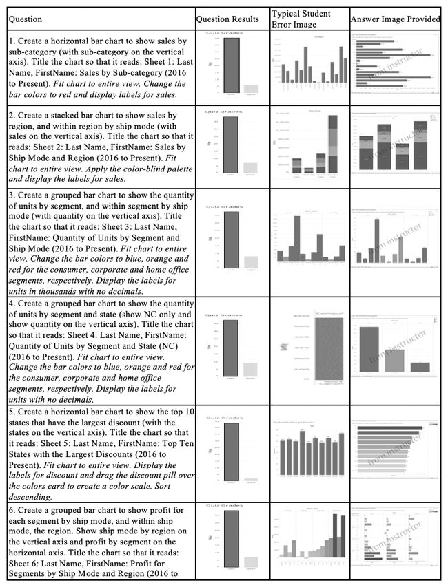
Appendix B: Data from Tableau Lab Quiz 1: Bar Charts
Figure 3: Quiz 1 Questions, Results, Typical Error and Image Provided
57Issues in Information Systems
Volume 22, Issue 4, pp. 51-62, 2021
Appendix C: Data from Tableau Lab Quiz 2: Line Charts
Figure 4: Quiz 2 Questions, Results, Typical Error and Image Provided
58You can also read