Baby Names, Visualization, and Social Data Analysis
←
→
Page content transcription
If your browser does not render page correctly, please read the page content below
Baby Names, Visualization, and Social Data Analysis

                                                              Martin Wattenberg

                                                                 IBM Research

                                                                        known categorization of online game players [Bartle 1996] as
ABSTRACT                                                                explorers, achievers, socializers, or killers. This stands in contrast
                                                                        to the traditional view of information visualization as a task-
   The NameVoyager, a web-based visualization of historical             oriented problem-solving activity. We hypothesize that the broad
trends in baby naming, has proven remarkably popular. This paper        popularity of the NameVoyager stems from features that not only
discusses the display techniques used for smooth visual                 give it a game-like sense of fun, but that make it especially
exploration of thousands of time series and the application's           suitable for “social” data analysis. We then suggest some general
simple keyboard-based mechanism for filtering the view. We also         properties which may encourage this type of usage of
describe design decisions behind the application and lessons            visualizations.
learned in creating an application that makes do-it-yourself data
mining fun. The prime lesson, it is hypothesized, is that a web-
based information visualization is fruitfully viewed not as a tool
but as part of an online social environment. In other words, to
design a successful exploratory data analysis tool, one good
strategy is to create a system that enables “social” data analysis.

 CR Categories and Subject Descriptors: Design Study, Time-
Varying Data Visualization, Human-Computer Interaction

1     INTRODUCTION
   In February of 2005, my wife published her first book, a guide
to American baby names called The Baby Name Wizard
[Wattenberg 2005] which used a data-analysis approach to                                        Figure 1. The NameVoyager
understanding name styles. To help call attention to the book, I
created a web-based visualization applet, the NameVoyager [6],
which lets users interactively explore name data—specifically,
historical name popularity figures. The gambit succeeded and
without any advertising it drew more than 500,000 site visits in        2       THE NAMEVOYAGER
the first two weeks after launch. Two months afterwards it is
maintaining an average of 10,000 visits a day. Perhaps more             2.1     Data
important is that evidence suggests many people are engaging               The NameVoyager is based on a data set, derived from public
deeply with the visualization, spending considerable time and           Social Security Administration (SSA) information that tracks
discovering for themselves facts and insights about name trends.        baby name trends in the United States. For each decade since
   The broad popularity and effectiveness of the NameVoyager is         1900, and each year since 2001, the SSA publishes separate lists
especially interesting because it is, in essence, an exploratory data   of the most popular 1,000 boys and girls names, along with the
analysis application for a data set of 6,000 time series. In many       exact number of babies given these names. These lists were
situations, ranging from education to retirement planning, it is        downloaded, collated, cleaned, and normalized by the author of
important to encourage users to interact with complex data sets.        the Baby Name Wizard book to produce a data set containing
Understanding the factors that led a statistical exploration            popularity time series for roughly 6,000 distinct names.
program to become a minor fad may shed light on the broader                These time series turn out to be meaningful in many ways. A
problem of encouraging users to engage in their own personal data       graph of the popularity of a given name reveals a great deal about
mining expeditions.                                                     its overall cultural connotations and “feel,” and names whose
   An important piece of the puzzle is the public nature of a web-      popularity is correlated over time tend to seem similar. (For more
based application. As of April 2005, Google finds more than             information, see The Baby Name Wizard.)
11,000 references to the NameVoyager, many of which turn out to
be lengthy sequences of comments on blogs and discussion sites.         2.2      Visualization method
These comments provide clues as to how and why users are
spending time with the applet. This data is in no way a scientific
survey, but it does represent a large body of field usage               The method used to visualize the data is straightforward: given a
information in which patterns emerge.                                   set of name popularity time series, a set of stacked graphs is
   In hundreds of spontaneous comments, users are seen to be            produced, as in Figure TK. The x-axis corresponds to date, and
engaged in extended exploratory data analysis, identifying trends       the y-axis to total frequency for all names currently in view, in
and anomalies and forming conjectures. These self-reports also          terms of names per million babies. Each stripe represents a name,
lead to an observation about the NameVoyager: usage patterns are        and the thickness of a stripe is proportional to its frequency of use
strongly social, and seem more closely related to those of online       at the given time step.
multiplayer games than to a conventional single-user statistical
tool. Indeed, users seem to fall neatly into Richard Bartle’s well-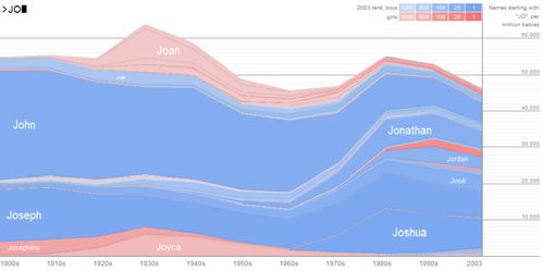
In keeping with American tradition, the stripes are colored either 1994b] or TimeSearcher [Hochheiser & Shneiderman, 2004]. The
pink for girls or blue for boys. The brightness of each stripe varies keyboard interaction may be viewed as an alternative to the
according to the most recent popularity data, so that currently Alphaslider of [Ahlberg & Shneiderman, 1994a]. A key
popular names are darkest and stand out the most. The idea behind distinction between the graphical display of the NameVoyager
this color scheme is twofold. First, names that are currently and the visualization used in TimeSearcher, is the
popular are more likely to be of interest to viewers—many people NameVoyager’s use of a graph that sums all the time series. This
will probably want to know statistics on Jennifer, but few are technique seems likely to be of use in many other situations where
looking for Cloyd. Second, the fact that the brightness varies summing is a natural operation, such as investigating product
provides a way to distinguish neighboring name stripes without sales data.
relying on visually heavy borders.
2.3 Interaction
The NameVoyager follows Shneiderman’s mantra of “overview
first, zoom and filter, details on demand.” (Shneiderman, 1996)
When the applet starts, the viewer sees a set of stripes
representing all names in the database. Filtering this data is
achieved via an extremely simple mechanism. A user may type in
letters, forming a prefix; the applet will then visualize data on
only those names beginning with that prefix.
The applet reacts directly with each keystroke, so it is not
necessary for the user to press return or to click a submit button.
Figure 3. Names Beginning with LAT
Not only does this instant interaction save the user some work, but
it helps demonstrate how to mine the data. A user might not think
that searching the data set by prefix would be interesting, but
seeing the striking patterns for single letters like O or K could 2.4 Technical Implementation
encourage further exploration. In addition, the applet moves
smoothly between states, so that when a letter is typed, an The NameVoyager is a Java applet, written using JDK 1.1 so
animated transition helps preserve context. that it may run in a wide variety of browsers. All the name data (a
Figure 1 shows an example: typing “JO” will yield a graph with 60K zip file) is loaded at startup and parsed into Java objects, so
prominent stripes for popular names such as John, Jonathan, that it may be accessed rapidly.
Joseph, and Joyce, along with many thinner stripes for less To make the animated transitions run smoothly, not all 6,000
popular names like Josette. Because the initial letters of a name stripes are drawn; instead, a simple level-of-detail calculation is
contribute strongly to its sound, names that start with the same performed so that only stripes wider than 2 pixels are rendered to
letters often have similar graph patterns. As a result, the simple the screen. As a result, in practice the applet only draws about 200
mechanism of filtering by prefix is effective in highlighting or fewer stripes per frame. In an initial version of the applet, this
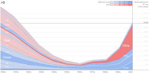
interesting name trends. Typing “O” produces the graph in Figure culling of names caused prominent and irritating white stripes in
2, with an easily identifiable pattern of popularity of O names at the graph, where the background would “show through” the
the beginning and end of the 1900s, but a significant dip mid- undrawn stripes. Replacing the white background with a neutral
century. Typing “LAT” highlights a trend in the African- gray, halfway between the blue and pink tones of the name
American community in the 1970s, comprising names such as stripes, proved effective in removing this annoying effect.
LaToya, LaTanya, LaTisha, and so on, as in Figure 3. Name
stripes are ordered alphabetically on the screen from top to bottom 3 RESULTS
to aid in identifying such prefix-based cultural clusters.
3.1 Traffic and Web Comments
As mentioned in the introduction, the NameVoyager received a
remarkable number of visits within weeks of launch. The applet
has been downloaded more than 900,000 times as of mid-April. It
has also been extensively discussed on the web, in blogs,
discussion forums, and similar sites. This web-based conversation
is important for two reasons. First, it is further evidence that users
were engaging deeply with the applet and of its widespread
popularity. It is not uncommon to find discussions in the
comments section of a blog that contain dozens of posts. Such
long discussions occur even when it is not related to the topic of
the web site—for instance, one of the most extensive sets of
Figure 2. Names beginning with O comments was found on a forum in a well-known libertarian
To learn details of a name, a viewer can use the mouse. magazine site.
Hovering over a name stripe will produce a pop-up box with The second reason these comments are important is that they
numerical details for a given name at a given point in time. provide a window into the user experience, and we quote them
Clicking on a name stripe produces a graph of the popularity of extensively below. Comments that have been posted to the web
that name alone. are clearly not a scientific sample, since only the most enthusiastic
This interaction technique may be compared to dynamic query users will comment. Nonetheless, examining these comments
systems such as starfield displays [Ahlberg & Shneiderman,suggests some interesting hypotheses regarding the source of
popularity of the NameVoyager. The original poster responds, “You’re right, W has gone most
consistently down, although F is pretty close (if it weren’t for
3.2 The Target Audience and the Surprise Factor Faith…)”
As one might expect, there are many positive comments from These quotes, which are just a small part of the full exchange,
people in the target audience for the visualization—users who illustrate two points. First, they show how a group of people is
have a strong interest in names and therefore might be interested using the NameVoyager as a stimulus to conversation and
in buying the book. Two examples (all quotes in this paper are repartee.
taken from public web sites) illustrate this: They also reveal an effective style of data analysis: this group
of people is diving very deeply into the data set! They are setting
“This is perfect, as baby names weigh heavily on my mind these each other pattern-finding challenges, noting outlying data points,
days.” and making guesses about causal relations. Each person seems to
be building on the findings of the others, making the group as a
“Useful fodder for historical fiction, too, if you’re looking for whole extremely effective at mining the data—and having fun at
typical names for a given age and time period.” the same time. Strange or surprising pieces of information serve
as a kind of trophy for the finder. We refer to this process of data
mining through dialogue, one-upmanship, and repartee as social
A surprising observation is that many people outside the target data analysis. It is a version of exploratory data analysis that relies
audience found themselves enjoying the applet. The surprise here on social interaction as source of inspiration and motivation.
is not the author’s, but of the users themselves. Some sample We hypothesize that viewing exploratory data analysis as a
quotes: social activity may explain much of the reaction to the
NameVoyager. Its popularity among people who do not find the
“Surprisingly addictive” data intrinsically interesting, for instance, could partly be due to
the fact that these users are enjoying the social activity
“This rules, even though it’s about baby names” surrounding the applet. In the next sections, to understand better
the social structure of this type of exploratory data analysis, we
“Cool… by the way, I don’t like babies or children.” consider the different roles that users may play.
4.1 Roles in Social Data Analysis
This “surprise factor” is a reason for optimism. It is common to
want users to explore a set of data that they may have little
inherent interest in. A good example is the amount of effort and As in any social system, it seems that people using the
money that American companies spend to encourage their NameVoyager have a wide range of styles of interaction with each
employees to understand 401(k) plans. It is therefore worthwhile other. Comments on the web suggest that there are four distinct
to look for clues to what made the NameVoyager appeal to people types of users. Interestingly, these types seem to align closely with
who profess inherent boredom with the topic of baby names. a taxonomy developed by Richard Bartle [Bartle, 1996] in the
context of an early class of online social environment called a
4 SOCIAL DATA ANALYSIS MUD.
Bartle suggested that denizens of such online multiplayer
One of the most consistent themes seen in comments about the
environments typically fall into one of four types: achievers,
NameVoyager is that exploring the data has become a social
socializers, explorers, and killers. Below we describe how each of
activity. Many people mention group usage, for instance:
these roles corresponds to a particular type of NameVoyager user.
“I happened upon it at work today and it affected the 4.2 Achievers
productivity of our entire department.”
The context of the NameVoyager is a site designed to help
Of special interest, however, is that when a group of people expectant parents name their babies, so the stated “goal” of the
uses the applet, they often do so in a social, collaborative fashion, applet is to find a good name. As described in Section 3.3, many
engaging in a dialogue as they mine the data. This is true even for people do exactly that:
loosely knit groups of web users. For example, here are some
quotes from the comments section of one blog: "We want something slightly retro, nice, and not too popular,
and this visualization gives us all that."
“For a challenge, try finding a name that was popular at the
beginning of the sample (around 1900), went out of style, then Such users correspond to the Achievers in Bartle’s
came back into vogue recently” classification: people who try to “achieve within the game’s
context.”
Another person responds, “Take a look at Grace, #18 in the
1900s, #13 in 2003, and down in the 200s and 300s during mid- 4.3 Socializers
century”. A second class of NameVoyager users consists of people whose
main concern is their interactions with others, and who place their
A third writes “1900’s comeback: Porter. Another one, with a data exploration in a personal social context. These people,
mini-peak in trough: Caroline,” and then adds, “More challenges: corresponding to Bartle’s “Socializers,” use screenshots and data
which is the steadiest popular name? Victor?” and “Which letter from the applet as a catalyst for conversation and storytelling
has gone down most consistently? W? Observation: Note the about themselves and their friends and family. A common sight
recent upsurge in Y; basically all due to Hispanic (and some on a blog is a person posting a screenshot of the graph of their
Middle Eastern) names”own name’s popularity, or a friend’s, with humorous comments. 5 DESIGN HYPOTHESES FOR SOCIAL DATA ANALYSIS
A typical quote of this type is: The evidence above suggests that a large part of the power and
popularity of the NameVoyager derives from the fact that it
“Runes name doesnt show up at all… but my name has encourages a social style of data analysis. What leads users to
suddenly gotten popular … I HAD IT FIRST! heh” approach data analysis as a social activity? Certain factors are
obvious. The NameVoyager is easily accessible on the web so that
Often people talk about family members as they speculate about a large group of people can see it. The interaction design, referred
names, and see the changing popularity numbers as a kind of to on the web with such terms as “cool,” “fantastic,” and
personal plotline: “whizzy,” means that applet is something that people may be
eager to associate themselves with, like a fashionable piece of
"my grandmother was named Coral and from what I can tell the clothing.
name appeared out of nowhere in 1880…is it from a celebrity or These factors, however, would apply to anything trendy on the
something?" web, whether a funny Flash animation or witty personality quiz.
Are there any aspects of the NameVoyager’s popularity that are
“I got: ‘No names starting with LINUS were in the top 1,000 specific to information visualization? We present three hypotheses
names in any decade.’ Translation: Your son's name will NEVER below.
be cool."
5.1 Common Ground
"Woo! Emily (being me) was number 1 in 2003! go me!"
Such relationship-oriented and storytelling behavior in the The first hypothesis is that some degree of common knowledge
context of information visualization has been observed before in of the underlying data set is necessary for social data analysis to
depictions of email archives [Viégas & Donath, 2002]. take place. The data set used in the NameVoyager pertains to
names that are largely familiar to its users. Almost everyone in the
4.4 Explorers U.S. has a sense of the connotations of a large number of names:
although people may differ in their tastes, most Americans would
Many users of the NameVoyager seemed to delight in agree on the likely ethnicity of a Rodrigo or a LaTanya, or the
unearthing odd names or unusual clusters. One person posted a likely age of an Ethel versus a Heather. Similarly, many names
screenshot created after typing “ETH”: it showed the name Ethel relate to celebrities, pop culture icons, or historical figures.
being gradually and completely eclipsed by the trendy name This common ground is what makes conversation about the
Ethan. Another found the dramatic cluster of names starting with data possible and interesting. Some sample quotes:
“LAT” (Latisha, Latoya, etc.) described in section 2.3. A well-
known pundit used the NameVoyager to comment on the “Look what the Simpsons did to the name Bart.”
changing statistical distribution of names over the past century
These users were certainly not using the NameVoyager to name "Roosevelt has two spikes right about where you'd expect
children, but rather were mining for nuggets of information that them."
they could show to others as trophies of their expedition. They are
directly analogous to Bartle’s Explorers, people who want to learn “I love the fact that Xander and Willow show up on the list in
as much as possible about the environment and who delight in the 90s, thereby confirming the existence of Buffy fans as
discovering odd or unexpected features. hardcore as me.”
4.5 Killers
The authors of these comments are sharing results of their data
mining because they know that their readers will understand the
The last type in Bartle’s taxonomy is the Killer, someone who cultural references.
enjoys imposing themselves on others and causing distress. One The fact that the data is presented as a timeline over a standard
might think that there would be no Killers in the gentle world of period, 1900 to present, also provides a common context. A time
baby names, but one would be wrong. A common theme is that period can serve as a shared grid on which users overlay personal
certain users take pleasure in singling out names for ridicule. For and cultural knowlege.
these people the NameVoyager is a delightful source of fresh So how might one design a visualization to emphasize common
targets: ground? In some cases, of course, the data set is fixed. But in
many situations there is some flexibility. For example, in an
“It is also damn entertaining to me (and the real reason why I educational setting a teacher might want to use a cartographic
am writing this) that I can type in Lexus and find that people visualization of pollution data, but have a choice of possible
actually name their kids Lexus.” locations. The common-ground principle suggests that it might be
helpful to choose some area that many students are familiar with
(Lest there be any doubt about the pugilistic nature of the already, so they would want to share discoveries they make as
author of this quote, note that it was found on a site called they explore.
www.youandwhosearmy.com.)
5.2 Personal Perspective
“Britney, Brittney, Britany, Brittany, Brittani, Britannie, Britni.
Enough already.” The next hypothesis is that, once common ground is
established, it is helpful for each person to have a naturally unique
This quote shows how Killers are often willing, as Bartle noted, perspective on the data. This unique perspective can serve as a
to do a fair amount of exploration to uncover targets. Thus they kind of icebreaker in the conversation. It also means that, because
too have a useful role to play in the setting of social data analysis. each person is approaching the data in a different way, a group
may collectively explore more pieces of the data. Evidence forthis hypothesis comes from [Ludford et al, 2004], which described manipulations; these algorithms might need to be modified to
a system that encouraged community participation by highlighting allow different people to see consistent views.
unique pieces of knowledge that an individual might have.
In the case of the NameVoyager, each person has one obvious 6 CONCLUSION AND FUTURE DIRECTIONS
point of entry: their own name. Names of relatives and close The NameVoyager is a visualization of baby name popularity
friends are also common conversation starters. Some sample data. This visualization uses keyboard-based interaction and
comments illustrate this: smooth animation to allow users to explore a set of 6,000 time
series. The applet has proven extremely popular, with hundreds of
“I was appalled to note that my name is now in the top 100, thousands of users in the space of two months. In addition,
th
while it was about 700 when I was born…” thousands of comments about the visualization have been written
on the web.
“My given name peaked in 1900 (or earlier) and has been on This paper has explored the reaction to the NameVoyager,
the slide ever since. Seems to be off the radar now. Elmer is more using these web comments as evidence. This methodology is
popular these days!” somewhat unusual, but the sheer amount of online discussion of
the NameVoyager provides a useful source of detailed
“It also confirmed my suspicion that our eight-month-old son’s descriptions from real users, and is a fruitful source of hypotheses
name, Jackson, was rapidly gaining in popularity. Dangit, and we about how and why the NameVoyager is effective.
thought he would avoid having 4 kids in kindergarten with the The comments reveal that the NameVoyager is popular even
same name!!!” among people who have no vested interest in looking for names—
the applet is somehow appealing to people even when it is not
“We spent hours typing in the names of everyone we know.” solving an immediate problem. Moreover, users seem to be doing
extensive data mining with the application, finding for themselves
Applying the personal perspective principle may require some new patterns in the data. These facts make it all the more
flexibility in the data set, but it may also be possible to guide interesting to understand the NameVoyager’s popularity, since it
people without modifying the data. For instance, imagine a may serve as a model for other situations, especially in education,
visualization tool designed to help people understand different where the goal is to impart insight into a set of data that may not
stock market investment strategies. There are several unique be immediately relevant to a user.
perspectives that people might take: for instance, looking at how A central observation made from comments found on the web
their own company’s stock has performed, or how the market as a is that usage of the NameVoyager often involves a high degree of
whole did at significant points in their life. It is possible that the dialogue between users. It seems, at least in some cases, to be a
visualization could be tailored to bring out these perspectives. social activity in which users discuss findings, set each other
puzzles, and draw inspiration from one another. We believe this
5.3 Deep Pointers type of activity, which we term social data analysis, is the key to
the efficacy and popularity of the applet. The collaborative,
The final hypothesis about how the NameVoyager encourages distributed nature means that people can join forces and share
social data exploration is that it allows people to share the state of knowledge; the social aspect, because it is intrinsically enjoyable
the visualization at any point in their explorations. Because the may explain the applet’s appeal to users who state that they do not
interaction model is so simple—just a matter of typing a few like babies or are not interested in baby names.
letters—it is very easy to guide other people to the same state. Understanding the patterns of social data analysis seems like a
And indeed, many comments on the web are written in the promising area for future research. This paper makes use of
imperative voice: Bartle’s taxonomy of players in multi-user online games as a
starting point for understanding the different roles of people
“Take a look at K and see how it exploded in the last decade or interacting with the NameVoyager. Identifying further
two” frameworks and design principles related to social data analysis
may be a fruitful avenue of investigation.
“Type in Adolph for example”
“You want some real fun, run ‘Hillary’”
REFERENCES
What people are doing here, by hand, is creating a kind of [1] Ahlberg, C. and Shneiderman, B. (1994) The alphaslider: a compact
“deep pointer” into the application—that is, making a reference and rapid selector. ACM Conference on Human Factors in
into a particular state following interaction. The ability to do this Computing System
may be critical to the conversation surrounding the [2] Ahlberg, C. and Shneiderman, B. (1994) Visual Information
NameVoyager, since it means that people can quickly share not Seeking: Tight Coupling of Dynamic Query Filters with Starfield
just the results of their investigations, but the exact state of the Displays. ACM Conference on Human Factors in Computing
visualization. Solitary, asychronous usage can easily become a Systems.
shared experience. The ease of "showing off" discoveries also [3] Bartle, R. (1996) Players Who Suit MUDs, Journal of MUD
fosters a motivating sense of pride and competitiveness. Research, 1:1. Available at http://www.mud.co.uk/richard/hcds.htm
Thus a natural design principle might be that information [4] Hochheiser, H., Shneiderman, B., (2004) Dynamic Query Tools for
visualization software ought to provide “deep pointers” if it is Time Series Data Sets, Timebox Widgets for Interactive Exploration,
intended to support collaborative analysis. Such pointers could Information Visualization 3, 1.
involve creating special URLs for later reference or some other [5] Ludford, P., Cosley, D., Frankowski, D., and Terveen, L. (2004)
technology. Note that this principle may impose some subtle Think different: increasing online community participation using
constraints. Some graph layout algorithms, for example, involve uniqueness and group dissimilarity. Proceedings of the SIGCHI
random numbers, or depend on a long history of user[6] NameVoyager:
http://babynamewizard.com/namevoyager/lnv0105.html
[7] Shneiderman, B. (1996) The eyes have it: A task by data type
taxonomy for information visualizations, Proc. 1996 IEEE, Visual
Languages.
[8] Viégas, F. and Donath, J. (2002) PostHistory: Visualizing Email
Networks Over Time. Sunbelt Social Network Conference XXII.
New Orleans, USA.
[9] Wattenberg, L. 2005. The Baby Name Wizard. New York: Broadway
conference on Human factors in computing systems.You can also read