COVID-Pro in Italy: A dashboard for a province-based analysis
←
→
Page content transcription
If your browser does not render page correctly, please read the page content below
COVID-Pro in Italy:
                                                    A dashboard for a province-based analysis
arXiv:2004.12779v3 [q-bio.PE] 1 Jun 2020

                                            Luisa Ferrari1 , Giuseppe Gerardi1 , Giancarlo Manzi1 , Alessandra
                                                   Micheletti2 , Federica Nicolussi1 , and Silvia Salini1
                                                1
                                                Department of Economics, Management and Quantitative
                                                          Methods, University of Milan, Italy
                                            2
                                              Department of Environmental Science and Policy, University of
                                                                    Milan, Italy

                                                                  Last updated: April 27th, 2020

                                                                                 Abstract
                                                     This paper presents an dashboard developed to analyse the outbreak of
                                                 the Covid-19 infection in Italy considering daily NUTS-3 data on positive
                                                 cases provided by the Italian Ministry of Health and on deaths derived
                                                 from Italian regional authorities’ official press conferences. Descriptive
                                                 time series plots are provided together with a map describing the spatial
                                                 distribution of province cumulative cases and rates. A section on a pro-
                                                 posed time-dependent adjusted SIRD model for NUTS-3 regions is also
                                                 provided in the dashboard.
                                               Keywords Covid-19, Italy, NUTS-3 regions, SIRD model

                                           1     Introduction
                                           This dashboard (http://demm.ceeds.unimi.it/covid/) is focused on the analysis
                                           of the SARS-Cov2 outbreak in Italy at a provincial (i.e. EU NUTS-3) level. It
                                           has been developed using Shiny, an easy web application in R from RStudio Inc,
                                           (http://www.rstudio.com/shiny/).
                                               Our choice to focus on Italian provinces, rather than on Italian regions (i.e. at EU
                                           NUT-2 level), has been dictated by the fact that the outbreak of SARS-Cov2 in Italy
                                           has been so far not homogeneously spread within regions, with many differences from
                                           province to province.
                                               According to the characteristics of the virus spreading, it seems difficult to think
                                           of a homogeneous propagation behavior at the regional level. Even the timing of
                                           the initial stages of the infection and its dynamics seem to have been very different
                                           even among contiguous provinces and inside the provinces themselves, as clusters of
                                           Covid-19 contagion have been often located in very restricted areas.

                                                                                      1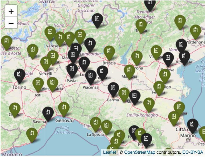
Antigen testing had been initially conducted depending on the choices of the lo-
cal health authorities, and hospital admissions in the early stages of the emergency
depended on the management and absorption capacity of the local health units.
    Only data on total cases are currently available at a provincial level. We integrated
these data deriving the provincial Covid-19 deaths from press reports downloaded from
regional authorities.

1.1     Provincial deaths data collection
The official data repository of the Italian Ministry of Health and the Civil Protection
Agency does not provide Covid-19 data on the daily number of deaths at a provincial
level. However,by scraping the daily press conferences and Covid-19 bulletins provided
by 13 regions out of 20, we were able to obtain provincial data on a daily basis regarding
the number of deaths due to the Covid-19 infection for a vast majority of the Italian
provinces. The Aosta province and the provinces of Bolzano/Bozen and Trento are
included in the Italian Ministry of Health regional data as they are either coincident
with the region (Valle d’Aosta) or are autonomous provinces (Bolzano/Bozen and
Trento) and considered as regions. In Table 1 for each Italian region we provide the
main source where we scraped these data.
    Regions for which we were not able to obtain provincial death data from official
bulletins or press conferences were Liguria, Lombardia, Veneto, Friuli-Venezia-Giulia
and Campania. However, for Imperia in the Liguria region and for Lodi and Cremona
provinces in the Lombardia region we were able to obtain data on Covid-19 deaths from
local newspapers. Table 1 contains all the sources we scraped for obtaining provincial
Covid-19 death data.

1.2     List of provinces with Covid-19 provincial deaths
The following is the list of Italian provinces for which we obtained deaths data.
    Agrigento, Alessandria, Ancona, Aosta, Arezzo, Ascoli Piceno, Asti, Bari, Barletta-
Andria-Trani, Biella, Bologna, Bolzano, Brindisi, Cagliari, Caltanissetta, Campobasso,
Catania, Catanzaro, Chieti, Cosenza, Cremona, Crotone, Cuneo, Enna, Fermo, Fer-
rara, Firenze, Foggia, Forli-Cesena, Frosinone, Grosseto, Imperia, Isernia, L’Aquila,
Latina, Lecce, Livorno, Lodi, Lucca, Macerata, Massa Carrara, Matera, Messina, Mod-
ena, Novara, Nuoro, Oristano, Palermo, Parma, Perugia, Pesaro e Urbino, Pescara,
Piacenza, Pisa, Pistoia, Potenza, Prato, Ragusa, Ravenna, Reggio di Calabria, Reggio
nell’Emilia, Rieti, Rimini, Roma, Sassari, Siena, Siracusa, Sud Sardegna, Taranto, Ter-
amo, Terni, Torino, Trapani, Trento, Verbano-Cusio-Ossola, Vercelli, Vibo Valentia,
Viterbo

2     Province maps
From the dashboard, it is possible to see a map of Italy with provinces highlighted
according to their cumulative Covid-19 cases and rates per 100,000 inhabitants (Figure
1), the latter being computed as1 :
   1 Sources: Italian Ministry of Health for cases, Italian National Statistical Institute (ISTAT)

for the population.

                                                2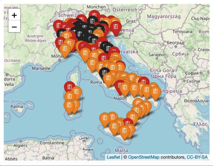
Region                  Main source
Valle d’Aosta           https://github.com/pcm-dpc/COVID-19
Piemonte                https://www.regione.piemonte.it/web/pinforma
Lombardia               https://www.ilcittadinodilodi.it and
                        https://laprovinciacr.it (data only for Lodi
                        and Cremona provinces)
Veneto                  no available data
Friuli-Venezia-Giulia   no available data
Trentino-Alto-Adige     https://github.com/pcm-dpc/COVID-19
Emilia-Romagna          https://www.regione.emilia-romagna.it/notizie/2020
Liguria                 http://sanremonews.it (data only for Imperia province)
Toscana                 https://www.toscana-notizie.it/coronavirus
Marche                  http://www.regione.marche.it/News-ed-Eventi
Umbria                  http://www.regione.umbria.it
Lazio                   https://www.facebook.com/SaluteLazio
Abruzzo                 https://www.regione.abruzzo.it/notizie stampa
Molise                  http://www3.regione.molise.it
Campania                no available data
Puglia                  http://www.regione.puglia.it
Basilicata              https://www.regione.basilicata.it
Calabria                https://portale.regione.calabria.it
Sicilia                 http://pti.regione.sicilia.it
Sardegna                https://www.regione.sardegna.it

         Table 1: Main data sources for provincial covid-19 deaths

                                     3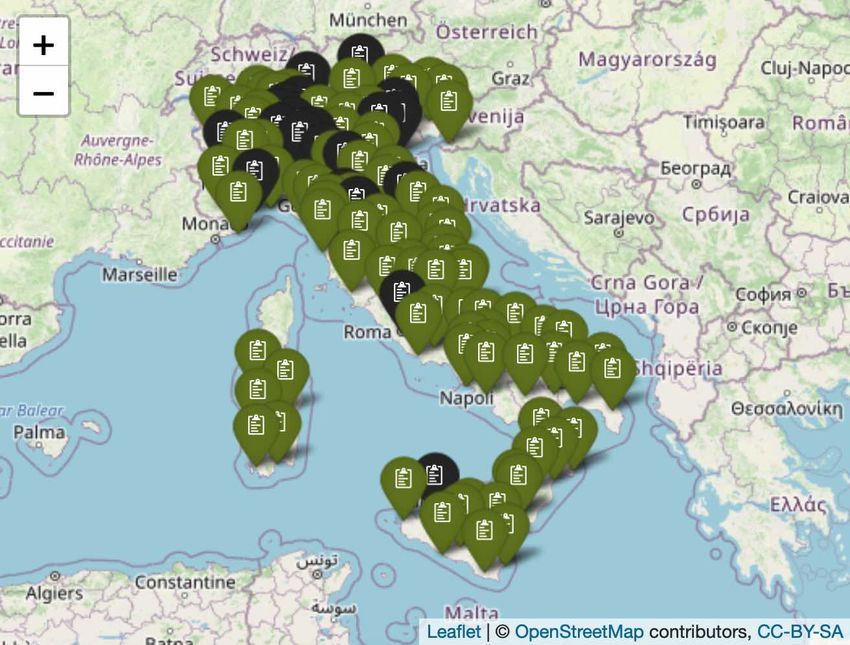
Cases
∗ 100000
P opulation
From the main menu it is possible to switch between cumulative cases and cumulative
rates and choose the reference period. Figure 1 shows the situation in late February
and late April for cumulative rates.
(a) Cumulative rates late February (b) Cumulative rates late April in
in Italy Italy
Figure 1: Maps for provincial cumulative rates in Italy - Late February and
April, 2020
By zooming individual areas, cumulative rates or cases relating to provinces can be
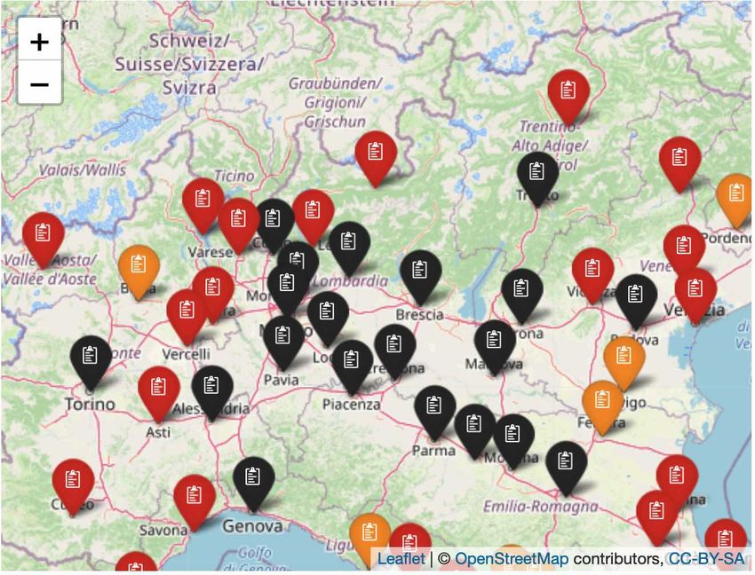
seen. Figure 2 shows the most affected areas in Northern Italy in late February and late
April, the so-called ’initial red-zone’. The colors represent the intensity of cumulative
cases or rates, from green (0%), orange (lower than 50%), red (between 50% and 80%),
black (higher than 80%)
(a) Cumulative rates in late Febru- (b) Cumulative rates in late April
ary in Italy in Italy
Figure 2: Maps for the initial ’red zone’
4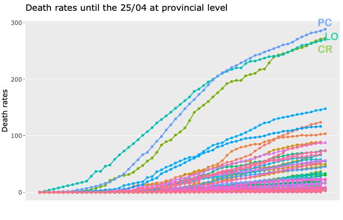
3     Time series
3.1     Deaths rate by province
Death rates are the ratio between the cumulative death cases and the total population
for the selected provinces multiplied by 100,000. To build this time series we used data
collected by scraping the daily press conferences and Covid-19 bulletins provided by
regions, as the official data repository of the Italian Ministry of Health and the Civil
Protection Agency does not provide Covid-19 data on the daily number of deaths at
a provincial level, but only on a regional level.
    Figure 3 shows the cumulative death rate by province. According to [7] the
provinces with the largest value are Piacenza, Lodi and Cremona, it is possible to
see the province and the value by clicking on the points.

                          Figure 3: Cumulative death rates

     Piacenza, Lodi and Cremona are the neighboring cities of Codogno, the first out-
break, which, moreover, had closed the hospital almost immediately, so patients from
Codogno and neighboring areas turned to the hospitals of Piacenza, Lodi and Cremona.
In addition, in the early days, deaths were recorded based on where the anti-gen tests
were made and not based on the patient’s areas of residence. Those cities first had
to deal with the emergency starting with patient 1 diagnosed on February 20, 2020.
These are the cities that had to manage the surprise effect. In most other cities, hos-
pitalizations and deaths started at least a week later, probably giving ASL more time
to organize. Moreover, Piacenza, Lodi and Cremona were also not included in the
first red zone, thus suffering from the spreading effects of the epidemic but with lower
immediate protection measures.

3.2     Cumulative cases and cumulative rates by province
From the ’Time series’ menu, it is possible to select multiple provinces and plot the
series of their cumulative cases per 100,000 inhabitants (Figure 4(a)). It is also possible
to plot the series of the cumulative rates of multiple selected provinces (Figure 4(b)).

                                            5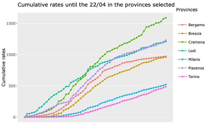
Provinces to be compared with one of the two measures can also belong to different
regions. In the example in Figure 4(a) the time series of the provinces of Milan, Berg-
amo, Brescia, Cremona, Lodi and Piacenza in the case of total cases are represented,
whereas in Figure4(b) the time series of the same provinces together with the province
of Torino in the case of cumulative. These are some of the provinces most affected by
Covid-19 in Italy.
It can be seen that, considering the total cases, among the provinces represented in
Figure 4(a), the most affected province is Milan with 17,000 cases, followed by Brescia,
Turin and Bergamo and then by Cremona, Piacenza and Lodi. On the other hand,
considering the cumulative rates as in Figure 4(b), Cremona stands on top with 1,590
cases per 100,000 inhabitants, followed by Piacenza and Lodi with 1,230 and 1,211,
and then by Bergamo, Brescia and finally by Torino with 470 and Milan with 523
cases per 100,000 inhabitants.

3.3    Cumulative cases and cumulative rates by region
Figure 5 shows an example of time series of provinces within the same region. The
region is in this case Emilia-Romagna. The comparison is made on the basis of the
cumulative cases and cumulative rates per 100,000 inhabitants.
Notice that the trajectory of the provinces within the same region are very different.
Therefore, it is difficult to think of a model that represents the whole region. Con-
sidering the total cases in 5(a), Reggio Emilia, with 4,437 case, seems to be the most
affected province in Emilia-Romagna. However, if one looks at the cumulative rates
represented in 5(b), the province of Piacenza stands on top of the league table with a
trajectory quite apart from those of the other provinces in the region. Piacenza is on
the border between Emilia-Romagna and Lombardia and is very close to the city of
Codogno in the Lodi province which was the first epicenter of the Covid-19 outbreak
in Italy at the end of February 2020, so the contagion may have spread much faster
there than in the rest of the Emilia-Romagna region. Newspapers reported that the
so-called ’patient 1’ (i.e. the first patient detected with the infection in Codogno) had
multiple contacts with people from the Piacenza province since a few weeks before be-
ing hospitalized. In addition, in the last week of February many positive sick patients
from the ’Basso Lodigiano’ (i.e. the area of the initial ’red zone’) were admitted at
the main Piacenza hospital.

3.4    Comparison between weekly deaths in January-April
       2015-2020 and Covid-19 deaths in March 2020
Figure 6 reports for a selected province the weekly series of deaths from January to
April for 2015 to 2020 (red line: overall deaths in Jan-Apr 2020; grey lines: overall
deaths in Jan-Apr 2015-2019; black line: Covid-19 deaths in March 20202 ).
Notice that data from ISTAT include only deaths from a proportion of municipalities
in the province. The number of deaths made available by ISTAT is not for a random
sample of municipalities, but a selection of them (1,689 out of 5,909 municipalities)
obtained according to the completeness and timeliness of the information collected, as
well as the statistical criteria described in the explanatory note available by ISTAT3 ,
which should be read very carefully before using the data. In its web page, ISTAT shows
  2 Source   for overall deaths: ISTAT (https://www.istat.it/it/archivio/240401).
  3 https://www.istat.it/it/archivio/240401.

                                            6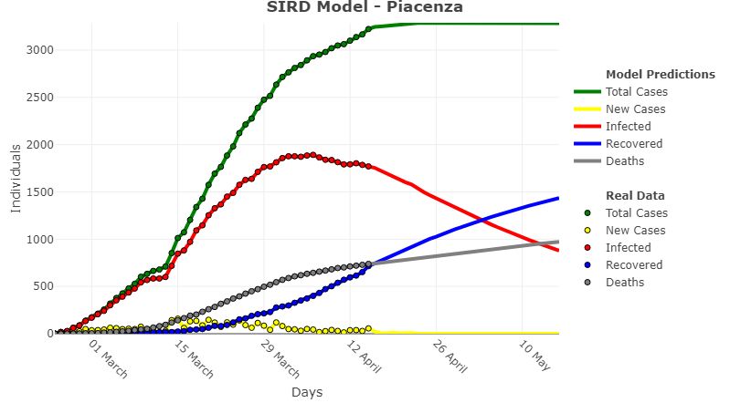
(a)

                                        (b)

Figure 4: Provinces most affected by Covid-19 in Italy. (a): total cases for Milan,
Bergamo, Brescia, Cremona, Lodi and Piacenza provinces, (b): cumulative rates
for the same provinces and Torino province

                                        7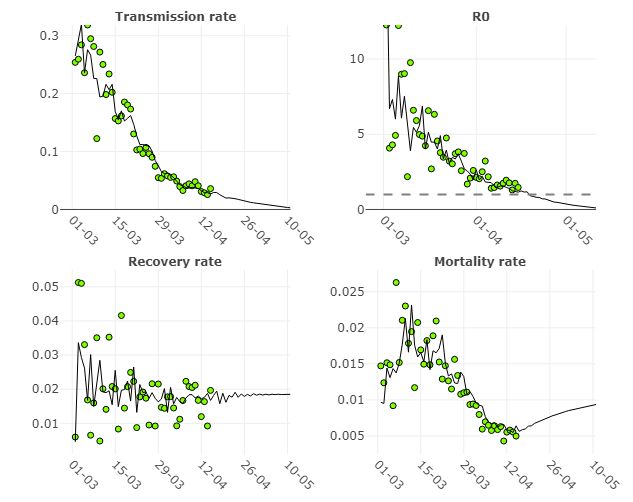
(a)

                                        (b)

Figure 5: Emilia-Romagna provinces (a): cumulative cases; (b): cumulative
rates

graphs at the municipal level and specifies that the data cannot simply be aggregated

                                         8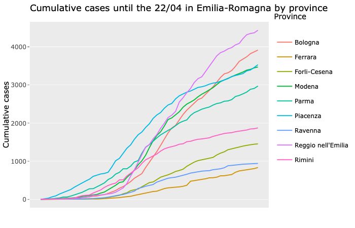
at the provincial, regional or national level. We show this plot for purely exploratory
purposes.
In addition, the weekly series of deaths reported for Covid-19 is plotted in black for
provinces for which we managed to obtain death data.
In Figure 6 the Piacenza province time series of the overall deaths and Covid-19 deaths
are plotted. The number of municipalities included in the overall deaths time series is
25 (out of 46).

Figure 6: Weekly overall deaths in Jan-Apr, 2015-2020, and Covid-19 deaths,
Mar 2020 in Piacenza province

For the Piacenza province we have reconstructed the series of deaths for Covid-19 using
the information provided in press reports taken from the site of the Emilia-Romagna
region authority.
We can firstly note that there is a significant increase in the overall deaths in 2020
(red line) starting from the first week of March 2020. The total deaths from Covid-19
declared for the whole province of Piacenza (red line) are however much less than those
recorded by ISTAT which, however, only take into account a little more than a half of
the municipalities. In the week from 15/03 to 21/03 280 deaths were reported in the
ISTAT series and 165 deaths were reported in the Covid-19 series. In the week from
22/03 to 28/03 224 deaths were reported in the ISTAT series and 188 deaths were
reported in the Covid-19 series. In the week from 29/03 to 04/04 170 deaths were
reported in the ISTAT series and 148 deaths were reported in the Covid- 19 series.
The gap between the two series resulted decreasing at the end of March 2020.
Two important questions cannot be fully answered here:
   • are the additional deaths really due to Covid-19 but these deaths wasn’t declared
     as such because it was not possible to carry out the anti-gen tests completely
     for at least part of the dead people?

                                          9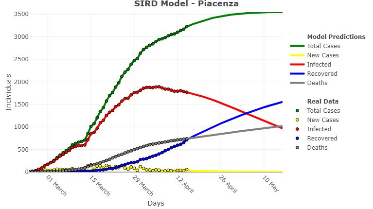
• is there a generalized increase in deaths due to the fact that the medical staff
      and hospital wards were all busy in that period and therefore people with other
      serious conditions were not treated appropriately because of the Covid-19 emer-
      gency?
Probably both the above events have happened, but certainly there have been an
unusual number of deaths in that period caused directly or indirectly by the Covid-19
outbreak.

4     An adjusted SIRD model
The SIRD model is a compartmental model used in epidemiology to design the spread
of a disease that divides the population into four different groups: susceptible, cur-
rently infected, recovered, and deaths [4, 6]. The size of the population is given by
the sum of these four variables and it is supposed to be considered constant. The
parameters governing the model are the transmission rate, the recovery rate, and the
mortality rate.

    Another important parameter that wholly describes the spread of an outbreak is
the basic reproduction number (R0 ), that is computed as the ratio between the trans-
mission rate and the sum of recovery and specific mortality rate. It is the expected
number of individuals that are directly infected by one infected individual, in a pop-
ulation where everyone is susceptible to infection. If it is less than 1, the epidemic
will eventually be controlled; if it is larger than 1, the transmission of the disease will
increase in the population.

    Building on Chen et al. (2020) work [2], a time-dependent model is proposed in
the dashboard (section ’SIRD models’) in order to let the parameters change over
time. More technical details of the model can be founded in [3]. By allowing the
parameters to vary over time, the effect of containment measures, such as lock-downs,
can be somewhat included in the model. Moreover, recovery and mortality rate are
likely to depend on the pressure under which hospitals are in, which increases sharply
at the beginning of an epidemic (i.e. when a high mortality rate is reported) and
then relaxes after the health system capacity is enhanced. The number of recovered
patients is obtained proportionally from that of the region where the province is in.
The reason for this is that patient treatment for the illness due to Covid-19 could be
considered more uniform across the various provinces (with almost the same recovery
rate across provinces within the region) than for the number of deaths. In any case
we are working on obtaining the series of provincial recovered cases in the same way
we obtained the series of the Covid-19 deaths, i.e. from press conferences and official
bulletins of regional authorities.

   Figure 7 shows the development of these parameters at the national level from the
beginning of the outbreak: points indicate real data values while the solid black lines
show the model predictions. The dashed line in the R0 plot represents the threshold
where R0 is equal to 1.

    Given the considerable variability of the provincial data, the model is trained on
the regional-aggregated data that show smoother trends. Another reason for this
choice is that, although lock-downs have been declared almost simultaneously in every

                                            10
Figure 7: Parameters’ real values and model predictions - Italy
Italian province, the virus has spread irregularly in different geographical zones, with
the southern areas reporting considerably fewer cases.
In Figure 8, an example on the Piacenza province is shown. Piacenza is one of
the provinces in northern Italy with the highest cumulative rate index (i.e. the ratio
between reported cases and total population).
The number of lag days represents the number of previous values included in the
auto-regressive models used to estimate each parameter’s evolution. This parameter
is set by default to 7 but in the dashboard it can be changed within a range: as the
number of employed lags grows, the predictions show a more optimistic scenario. Fig-
ure 9 shows the model predictions using a number of lags equal to 10, applied to the
Piacenza province.
Note that this is a preliminary model whose accuracy tends to decrease as pre-
dictions are done further ahead in the future. Adjustments and improvements are
currently being studied and results will be updated regularly in the dashboard.
11Figure 8: SIRD model applied to Piacenza province (number of lags: 7)
Figure 9: SIRD model applied to Piacenza province (number of lags: 10)
5 Discussion and future work
Official data from the Italian Ministry of Health on the Covid-19 outbreak in Italy
presents many issues mainly related to delay in reporting new cases and deaths, in-
congruities (negative values in the series), and missing data. For example the number
of deaths at province level is not reported in the official data repositories. Menchetti
and Noirjean [5] reported widely on the flaws and biases of these official data. The
problem of unreliable data becomes even more cogent with epidemiological models,
both deterministic and stochastic, when many parameters should be estimated on
the basis of these unreliable data, especially for long-range estimates which are even
more important for an outbreak with such dramatic consequences the whole world is
12experiencing. In this context, future work will be dedicated to obtaining the series
of provincial recovered cases in the same fashion we obtained the series of provincial
deceased cases, i.e. scraping websites of regional authorities.
It is our personal opinion that caution should always be used when modeling and
predicting the outcomes of events like this outbreak which has many different facets
to be considered and changes continuously during the time, see also [1].
However, the difficulty in obtaining acceptable estimates should not be an ”excuse”
not to try to contribute to the knowledge of phenomenons like this one which is
changing all our lives. Therefore our efforts to obtain more reliable estimates will
continue by exploring improved adjusted models, included more SIRD-type models
(like the SIERD model, an extension of the SIR model to consider exposed people)
and a stochastic models taking into consideration the uncertainty in the estimates.
References
[1] Bartoszek, K., Guidotti, e., Iacus, S.M., Okroj, O. (2020). Are official confirmed
cases and fatalities counts good enough to study the COVID–19 pandemic dy-
namics? A critical assessment through the case of Italy
[2] Chen, Y.C., Lu, P.E., Chang, C.S., Liu, T.H.(2020). A Time-dependent SIR
model for COVID-19 with Undetectable Infected Persons. Pre-print, National
Tsing Hua University, Taiwan.
[3] Ferrari, L., Gerardi, G., Manzi, G., Micheletti, A., Nicolussi, F., Salini, A. (2020).
Modelling provincial Covid-19 epidemic data in Italy using an adjusted time-
dependent SIRD model, http://arxiv.org/abs/2005.12170
[4] Kermack, W. O., McKendrick, A. G. (1927). A contribution to the mathematical
theory of epidemics, Proc. R. Soc. Lond. A, 115, 700–721.
[5] Menchetti, F., Noirjean, S. (2020). Guida alla lettura e all’interpretazione dei dati
COVID-19 [A guide to reading and interpreting COVID-19 data], Università degli
Studi di Firenze, Italy (https://datascience.unifi.it/wp-content/uploads/
2020/03/Guida_al_trattamento_dei_dati_Covid_19.pdf).
[6] Newman, M. (2018). Networks: An Introduction. Oxford: Oxford University
Press.
[7] Signorelli, C., Odone, A., Gianfredi, V., Bossi, E., Bucci, D., Oradini-Alacreu, A.,
Frascella, B., Capraro, M., Chiappa, F., Blandi, L., Ciceri, F. (2020). The spread
of COVID-19 in six western metropolitan regions: a false myth on the excess of
mortality in Lombardy and the defense of the city of Milan, Acta Biomedica, 1–8.
DOI: 10.23750/abm.v91i2.9600.
13You can also read


