COVID-TRACK: WORLD AND USA SARS-COV- 2 TESTING AND COVID-19 TRACKING
←
→
Page content transcription
If your browser does not render page correctly, please read the page content below
COVID-TRACK: WORLD AND USA SARS-COV-
2 TESTING AND COVID-19 TRACKING
Ye Emma Zohner1*, Jeffrey S. Morris2

* Correspondence: emma.zohner@rice.edu
1 Department   of Statistics, Rice University, 6100 Main Street, Houston, TX 77005
2Department of Biostatistics, Epidemiology and Informatics, Perelman School of Medicine, University of Pennsylvania, 600
Blockley Hall, 423 Guardian Drive, Philadelphia, PA 19104

                                                                1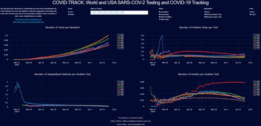
Abstract
Background
The COVID-19 pandemic has caused major health and socio-economic disruptions worldwide. Accurate
investigation of emerging data is crucial to inform policy makers as they construct viral mitigation
strategies. Complications such as variable testing rates and time lags in counting cases, hospitalizations
and deaths make it challenging to accurately track and identify true infectious surges from available data,
and requires a multi-modal approach that simultaneously considers testing, incidence, hospitalizations,
and deaths. Although many websites and applications report a subset of these data, none of them provide
graphical displays capable of comparing different states or countries on all these measures as well as
various useful quantities derived from them. Here we introduce a freely available dynamic representation
tool, COVID-TRACK, that allows the user to simultaneously assess time trends in these measures and
compare various states or countries, equipping them with a tool to investigate the potential effects of the
different mitigation strategies and timelines used by various jurisdictions.

Findings
COVID-TRACK is a Python based web-application that provides a platform for tracking testing, incidence,
hospitalizations, and deaths related to COVID-19 along with various derived quantities. Our application
makes the comparison across states or countries in the world easy to explore, with useful transformation
options including per capita, log scale, and/or moving averages. We illustrate its use by assessing various
viral trends in the USA and Europe.

Conclusion
The COVID-TRACK web-application is a user-friendly analytical tool to compare data and trends related to
the COVID-19 pandemic across areas in the United States and worldwide. Our tracking tool provides a
unique platform where trends can be monitored across geographical areas in the coming months to watch
how the pandemic waxes and wanes throughout the summer and into a potential second wave in the fall.

Keywords: COVID-19, SARS-COV-2, web-application, COVID data science, COVID Tracking

                                                    2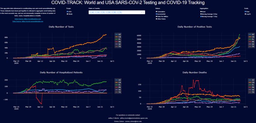
Background
Coronavirus-2019 (COVID-19) is an infectious disease caused by a newly discovered coronavirus, SARS-
CoV-2. The novel coronavirus was declared a Public Health Emergency of International Concern on January
30, 2020 and declared a pandemic on March 11, 2020 by the World Health Organization (WHO) [6]. Most
people infected with the COVID-19 virus experience mild to moderate respiratory illness and recover
without requiring special treatment [8]. However, a subset suffers severe symptoms and is at risk of long-
term hospitalization or death, especially older people and those with underlying medical problems such
as cardiovascular disease, obesity, diabetes, chronic respiratory disease, and cancer [17]. It is thought to
spread mainly from person to person, mainly through respiratory or aerosol droplets produced when an
infected person coughs or sneezes, or sometimes through touching infected surfaces [9]. Infections can
occur when enough volume of the virus enters the respiratory system through the mouth or nose through
these respiratory or aerosol droplets, or by touching one’s face after contracting sufficient volume of viral
particles from touching contaminated surfaces [6]. The median incubation period of COVID-19 is
estimated at 5.1 days and most cases who develop symptoms will do so within 14 days [18].
As of June 2020, there are no vaccines or proven treatments for COVID-19, although numerous vaccines
are under rapid development [14] and many ongoing clinical trials of numerous treatments [15]. The
COVID-19 pandemic has caused major socioeconomic disruptions in the United States and worldwide. As
SARS-CoV-2 has spread throughout the world, different places have encountered the pandemic with
varying degrees of severity, and different municipalities have approached testing and viral mitigation in
different ways, with some countries quickly ramping up testing and others lagging, with some quickly
instituting social distancing measures and stay-at-home orders, and others using less aggressive
strategies, and different places relaxing these social distancing measures at different rates. Upticks and
surges of SARS-CoV-2 have resulted after reopening of businesses and stay-at-home orders in some USA
states, in particularly in the south and west, while other states have showed continuing decline or
stabilization of cases after reopening. This diversity in response makes the tracking of data and study of
outcomes crucial for documenting and learning from the COVID-19 outbreak.

To understand how the pandemic has unfolded and follow how it changes over time, it is important to be
able to compare different countries and different states to identify potential emerging hotspots and
assess potential effects of different mitigation strategies. These comparisons must necessarily include
simultaneous assessments of incidence, mortality, testing, and hospitalization given that these different
measures each contain complementary information about the disease and their interpretations are
interrelated. For example, incidence is directly affected by testing rate, so to assess whether increasing
incidence is evidence of a surge in infections one must check the corresponding increase in testing. Test
positivity rate seems to be a useful derived measure, tending to decrease as testing practices change to
include more mild or moderate cases and tending to increase during a surge in infections [3]. Similarly,
death rate per case, if higher, could indicate an overwhelmed hospital system or older demographic, or
more likely could simply be an indication that local testing practices are only capturing severe, not
moderate or mild cases.

Finding accurate data for tracking facets of the COVID-19 pandemic is challenging. Different jurisdictions
record and report data differently, and it is challenging to compile this complex data in a timely manner.
Two sources have worked to provide accurate and reliable data: The COVID Tracking Project at

                                                     3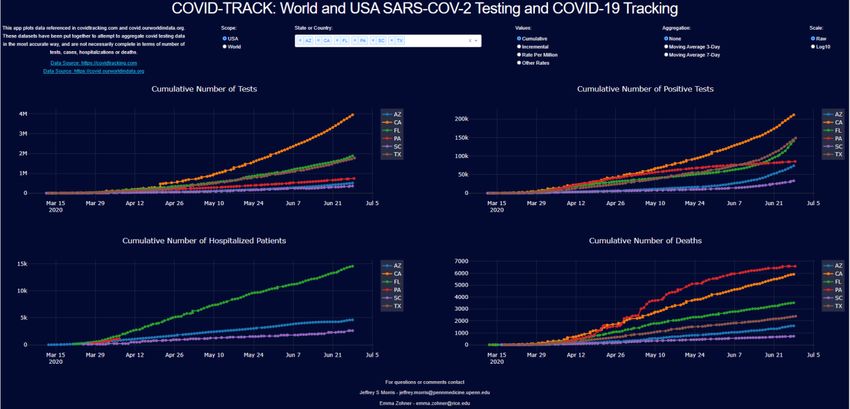
https://covidtracking.com for United States data, and Our World in Data at
https://covid.ourworldindata.org for international data. The COVID Tracking project has aggregated and
curated data on SARS-CoV-2 testing across states in the United States, while documenting specific
recording practices of individual states, e.g. whether duplicate tests on same person are reported, and
also recording cases, deaths, and hospitalizations where available. The Our World In Data site aggregates
testing, incidence, and deaths from all around the world. These rich data sources are the most complete
assembled, but unfortunately their websites do not have complete plotting capabilities to accommodate
detailed comparisons of viral characteristics of different states or countries. Covidtracking.com does not
provide direct plotting routines, and ourworldindata.org allows plotting of deaths, cases, and tests, but
has some limitations, e.g. not computing or plotting derived quantities like test positivity rate or deaths
per case.

There are currently many websites and web-applications for tracking data related to COVID-19. [20] plots
worldwide and US cases, hospitalizations, and deaths. The plots show number of days since first case as
well as a heatmap of daily changes in new cases and deaths. However, they do not provide testing
information, per capita values, moving average or derived quantities such as proportion of deaths per
positive test. [13] shows world map, US map and critical trends. Total cases, deaths, fatality rates (and
recovered at the country level). [5] provides a single map of US cases by state, and the user can hover on
the figure for death numbers, cases in last 7 days and cases per 100k. [10] shows tables, bar charts and
line charts for worldwide and US cases, deaths and number recovered at the country and state level. For
some states, county level data is given. [22] shows cases, cases per 100k residents, deaths, and deaths per
100k residents by state, with tables and a map. They also provide case growth rates in the US and by state,
as well as bar charts and trend line for daily new cases. [11] provides world and US map of cases, cases
per 100k, deaths, deaths per 100k, and a growth rate heatmap. There are bar charts of countries/states
where cases are increasing, mostly the same and decreasing. [2] shows world and US, State and County
maps, bar charts and line charts of active, recovered and fatal cases, for cumulative and daily. [23] reports
world and US data with line charts and bar charts for cases, recovered, deaths as well as fatality and
recovery rates.

 Although all these websites present useful data and figures about the virus and the disease, they all have
limitations, and no single source offers a complete picture of the situation. As a result, we set out to
develop a dynamic representation tool to provide a readily accessible visual representation of the daily
evolution of testing, incidence, hospitalization, and deaths for states or countries, providing a flexible set
of transformations and derived quantities to allow users to explore many different aspects of the
pandemic and compare various states or countries. The web-application provides:

    1. Different figures for testing, incidence, hospitalizations, and death which provides a holistic view
       of the situation: Incidence data is impossible to interpret relative to growth unless we understand
       the testing rate. In addition, not all cases are equally severe in all places. Hospitalization and death
       data convey information about severe cases in each area.
    2. Comparisons between USA states or countries worldwide: different jurisdictions have different
       levels of outbreak and implemented different testing and social distancing policies at different
       timelines. Significant insights can be obtained by the concurrent analysis of trends across several
       states or countries.

                                                      4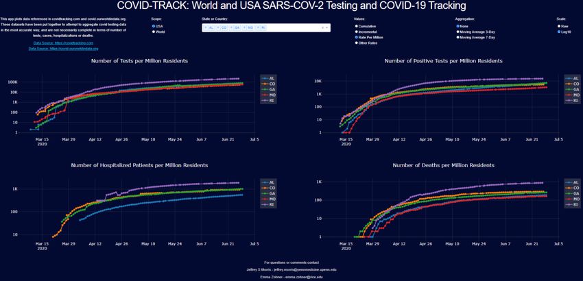
3. Cumulative, per capita or incremental results: Testing, cases, hospitalizations or deaths can be
       viewed cumulatively or per day, depending on the need, and raw counts or per capita counts can
       be used to allow adjustment for heterogeneous population sizes.
    4. Raw data, 3-day moving average, 7-day moving average: Some municipalities report test, cases,
       deaths unevenly overtime that lead to visual artifacts in the raw data that obscure time trends.
       Moving averages smooth out the discrepancies in reporting intervals.
    5. Raw data or log scale: Raw or log scale data can provide different views of the outbreak, e.g.
       assessing whether growth trends are linear or exponential.
    6. Transformations and rates: Various derived quantities are useful to track to assess local outbreak
       characteristics, including test positivity rate, deaths per case, and hospitalizations per case.

To our knowledge, no website or web-application plots all of these data and provides all of these options.

We have developed COVID-TRACK and make it freely available to scientists and the community at large.
This provides a platform to:

    1. Aggregate and present daily SARS-CoV-2 testing, and COVID-19 incidence, hospitalization, and
       death as accurately as possible, in the United States and worldwide.
    2. Compare states and countries in a way that allows users to gain a complete picture of how the
       pandemic experience has varied across locations and changed over time
    3. Identify emerging patterns and compare locations incorporating different mitigation strategies.

Our application is connected to the daily-updated data sources, and automatically updates with each
day’s new data.

Implementation
We developed the web-application in Python Dash. Dash is an Open Source Python library for creating
reactive, analytical web-based applications. Data sources included The COVID Tracking Project and Our
World in Data, and USA and world population data. The web-application can be found at
https://covid19usny.herokuapp.com. In our implementation, the user can choose any number of states
in United States, or number of countries in world, and plot the following information in 4 figures:

    1.   Tests conducted,
    2.   Positive tests,
    3.   Hospitalizations, and
    4.   Deaths

The user can plot the data (a) cumulatively, (b) incrementally, i.e. values for each day, (c) cumulatively per
million residents or (d) other rates. The “other rates” option plots various derived quantities or rates,
including:
     1. Proportion of tests per resident in the jurisdiction,
     2. Proportion of positive tests,
     3. Proportion of hospitalized per positive test, and
     4. Proportion of deaths per positive test.

                                                      5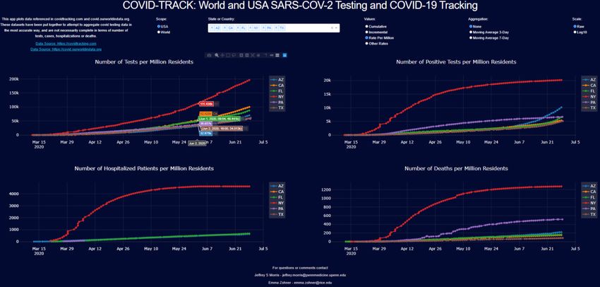
Additionally, the data can be plotted in raw numbers, or 3-day and 7-day moving averages. The user can
select a raw scale or a log base 10 scale. To see actual numbers, the user can hover on a location in each
plot.

Figure 1 Web-app: user can select a scope, country or state, values (cumulative, incremental, per million or rates), aggregation
(raw, 3-day, 7-day moving averages) and scale (raw, log base 10)

Caveats about the Data
The COVID Tracking Project and Our World in Data have made attempts to gather and compile the data
as accurately as possible. However, because of inconsistent reporting across states and countries there
are some artifact such as negative and missing values. These are values that may be adjusted at a later
data and may change values in the data.

Different jurisdictions record data differently: for example, some count a case at the date a positive test
was received, which is clearly lagged since people are typically not tested until experiencing symptoms,
which are typically 4-10 days from infection, and there could be a week or more delay from when the
sample is taken until positive tests are receive. Others, including Georgia, record a case on the date
symptoms were first reported, or if unknown the day the sample was taken, or if unknown the day the
positive test result was received.

The rate of reporting also varies, since some report daily while others report every few days or weekly.
The 7-day moving average helps in smoothing these disparities.

Additionally, hospitalization data is not provided by most countries and many states. This measure
provides a reliable, if lagged, measure of infectious spread since independent of testing, if we believe a
constant proportion of infections lead to severe disease requiring hospitalization, then this should track
proportionally to infection rate.

Although the stated artifacts should be noted, the compiled data and related analyses give us valuable
information on characteristics of the pandemic in the United States and worldwide.

                                                               6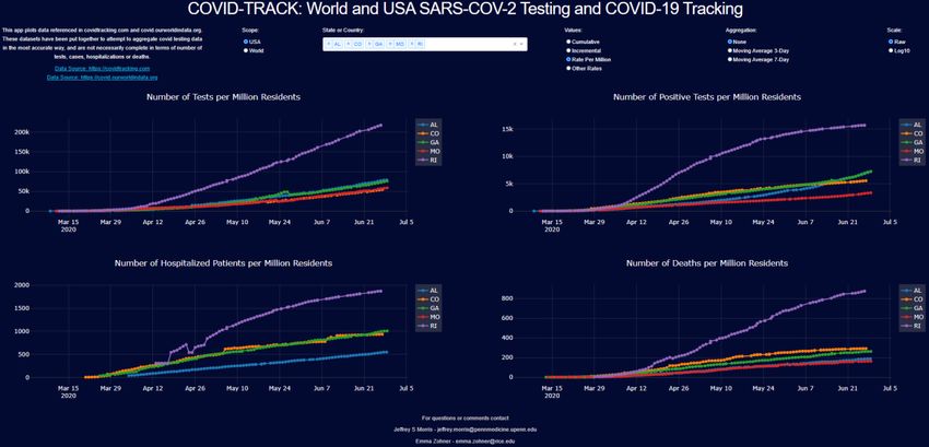
Results and Discussion
COVID-TRACK is useful for investigating how different countries or states have experienced the pandemic
over time. This analysis demonstrates how it is imperative to simultaneously consider testing, incidence,
and deaths as well as testing positivity rate in order to get a complete, accurate picture of pandemic
experience and make a fair comparison across countries or states with different testing practices,
populations, or testing practices varying over time.

Scandinavia and Europe
Sweden has drawn global attention because of its uniquely relaxed approach to the COVID-19 pandemic
[1]. Contrary to other Scandinavian and European countries, Sweden did not impose strict stay-at-home
restrictions or lockdowns or close schools or restaurants, but instead left society open while providing
some social distancing and mask-wearing recommendations. Comparing Sweden to its Scandinavian
neighbors (Norway, Denmark, Finland, and Iceland), the per capita trends in Figure 2 suggest that Sweden
has noticeably higher per capital incidence than Denmark, Finland, or Norway, and has recently surpassed
Iceland in per capita cases. Looking at testing data, we see Iceland’s high incidence is from its extremely
high per capita testing rate, among the highest in the world, which is also manifest in the extremely low
test positivity rate. This indicates that test is broadly done, and with exceptionally low deaths per positive
test, suggesting Iceland’s cases include many with far less severe disease that is not fatal, and is the result
of their aggressive population-level testing strategy. Not only is incidence high in Sweden, but testing also
lags behind its neighbors, with the lowest per capita testing rate in Scandinavia, and by far the highest
test positivity rate and deaths per positive test.

Figure 2 Scandinavia per capita cumulative counts - top left: number of tests, top right: number of cases, bottom right: number of
deaths

Moving from cumulative to daily results, Figure 3 shows that cases are still increasing in Sweden, while
the daily cases and deaths have been decreasing in the rest of Scandinavia.

                                                                7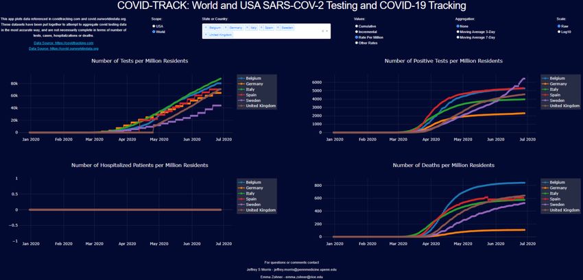
Figure 3 Scandinavia 7-day moving average of daily counts - top left: number of tests, top right: number of cases, bottom right::
number of deaths

The overall impact of the virus in Sweden was not the worst in Europe until recently, with other countries
such as Belgium, Spain, and the United Kingdom experiencing high death rates. However, while other
countries show flattening in incidence and death curves, Sweden still shows a steep slope. These data put
the Swedish experience into perspective, and any attempt at explanation using only a subset of these data
would miss an important part of the story.

Figure 4 European countries per capita cumulative counts - top left: number of tests, top right: number of cases, bottom right:
number of deaths

                                                               8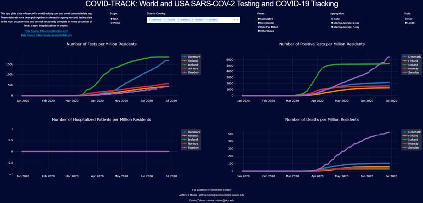
Worldwide Early Measures
In contrast to Sweden and other countries, Germany, South Korea, New Zealand, and Canada
implemented testing and tracing measures early [1]. In comparison, countries who took early measures
seem to have fared considerably better in terms of per capita incidence and death.

Figure 5 Early measure comparisons per capita cumulative counts - top left: number of tests, top right: number of cases, bottom
right: number of deaths

                                                              9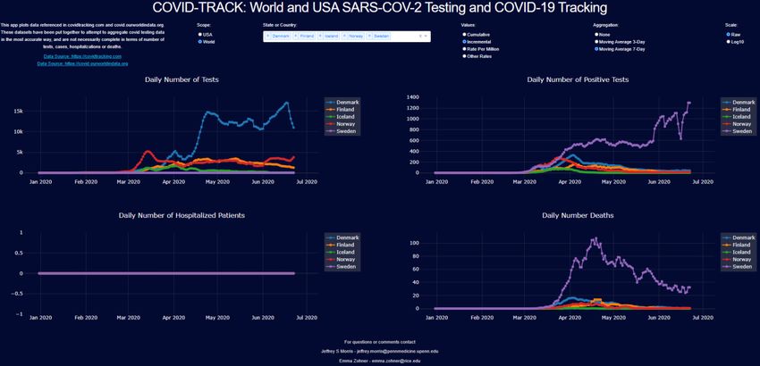
United States of America
In the United States, all states adopted restrictions related to the pandemic, with most implementing stay-
at-home orders, and all closing schools and non-essential businesses. The New York Times has a website
tracking the restrictions and timing of their relaxation [16]. It was broadly feared that when states
reopened, cases would immediately start increasing and exponential growth would kick in. Some of the
early opening states include Georgia, Missouri, Rhode Island, Colorado and Alabama, all opening the last
week of April to first week of May. Following are the cumulative per capita results for these states.
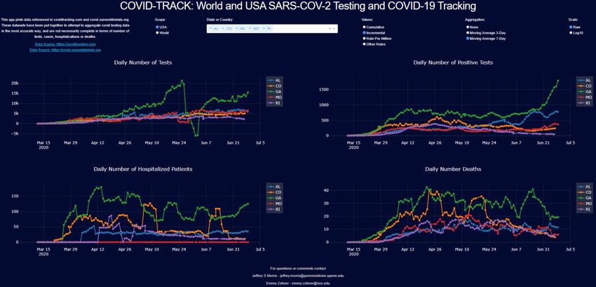
Figure 6 USA (AL, CO, GA, MO, RI) per capita cumulative counts - top left: number of tests, top right: number of cases, bottom left:
number of hospitalizations, bottom right: number of deaths
We see that Rhode Island, close to the initial outbreak in New York, had higher per capita incidence than
the other states, and even after opening has seen the growth of its tests, hospitalizations, and deaths
continue to flatten. Colorado, Missouri, and Georgia also do not seem to have substantially increased
after opening, although Alabama shows more evidence of increase. These trends are perhaps easier to
see on the log scale plots.
10Figure 7 USA (AL, CO, GA, MO, RI) per capita cumulative counts on the log scale - top left: number of tests, top right: number of
cases, bottom left: number of hospitalizations, bottom right: number of deaths
We can see the flattening of the curves more readily on the log scale. To follow the changes over time,
the incremental plots showing daily counts can be more informative. However, given uneven reporting
across days of the week, the daily numbers show high levels of noise that make it difficult to see the time
trend. Here are the daily case counts and 3-day and 7-day moving averages, from left to right.
11Figure 8 USA (AL, CO, GA, MO, RI) daily counts – no moving average, 3-day moving average and 7-day moving average
12Using the 7-day moving average, we see the full panel of daily results for these states.
Figure 9 USA (AL, CO, GA, MO, RI) 7-day moving average of daily counts - top left: number of tests, top right: number of cases,
bottom left: number of hospitalizations, bottom right: number of deaths
We can see the continuing decrease in daily counts in Rhode Island, Colorado, and stable levels in Missouri
since opening. For Georgia and Alabama, we see relatively stable values throughout the month of May,
followed by a recent uptick in the last week or two in June. Overall, these states do not show any evidence
of a surge or return to exponential growth, although the upticks for Georgia and Alabama in June raise
some concern for a possible surge. Some other states that opened in May but were initially stable have
also shown June increases that have raised concern. Let’s consider Florida, South Carolina, Texas, and
Arizona, the former which opened at the beginning of May and the latter which opened at the end of
May, and for comparison we will include other populous states that started opening in May, California
and Pennsylvania.
13Assessing the June Surge in the South and West
Here are the cumulative counts for these states:
Figure 10 USA states (AZ, CA, FL, PA, SC, TX) cumulative counts - top left: number of tests, top right: number of cases, bottom left:
number of hospitalizations, bottom right: number of deaths
We see that Pennsylvania has flattened out, while California, Texas, Arizona, South Carolina, and Florida
have shown increasing trends. Note that the testing rates have also climbed over time, so it is not
immediately clear whether the increase in cases could be explained by increases in testing or instead is
evidence of a surge in infections. Considering the test positivity rate, given under “other rates”, is helpful
for assessing this. We zoomed the y-axis of this plot to focus on the region (0,0.25) to remove early
artifacts from low testing rates.
14Figure 11 USA states (AZ, CA, FL, PA, SC, TX) rates counts - top left: number of tests per resident, top right: number of cases per
test, bottom left: number of hospitalizations per positive test, bottom right: number of deaths per positive test
The rate of increase in testing in California has increased as fast or slightly faster than the case count,
which is reflected in decreasing test positivity rate. This suggests much of the increase in cases for
California might be explainable by increased testing. This may have also been the case throughout the
month of May for South Carolina, Florida and Texas, as well, but in June we have seen an uptick in testing
positivity for these states as well as Arizona. This may indicate a surge in those states. Moving averages
of daily counts are useful for detecting changing points and possible surges.
Figure 12 USA states (AZ, CA, FL, PA, SC, TX) 7-day moving average of daily counts - top left: number of tests, top right: number of
cases, bottom left: number of hospitalizations, bottom right: number of deaths
15Here, we see that these states showed stable daily case counts that tracked closely with testing
throughout the month of May, but in early June we see a surge in daily case counts for Arizona, Texas,
Florida and South Carolina that is clearly of higher magnitude than any increase in testing. California’s
increase in daily case counts are still closely tracked by increased testing, so may still have stable disease
rates. These surges, however, show a return to exponential growth and raise concern of hospitals in
these states becoming overwhelmed. The hospitalization data from covidtracking.com are spotty as data
for Texas is missing and other states incomplete, so it is difficult to assess hospitalization increases for
these states – local city data including Houston [21] and Phoenix [12] show hospitalizations in these cities
experiencing this surge are also dramatically increasing. There is not an accompanying increase in deaths
yet from this surge, which may be partially due to the fact that deaths are lagged behind cases, the surge
contains more young adults infected, and possibly that the virus is less virulent in this surge.
Conclusion
The COVID-19 pandemic has caused countries to take unprecedented measures to protect the health of
their citizens while maintaining economic stability. The study of testing, incidence, hospitalization, and
death trends can reveal invaluable insights into the emerging pandemic and the effectiveness of measures
taken by different jurisdictions. The dynamic representation tool we have developed offers a tool to
scientists and others in the broader community to make comparisons at country level internationally, or
at state level in the United States. The options we included in COVID-TRACK give many angles and a holistic
view of available data in a clear concise manner. The insights learned from studying the data from the
current pandemic will inform policy making later in the pandemic as well as during future outbreaks.
16Declarations
Ethics approval and consent to participate
Not applicable
Consent for publication
Not applicable
Availability of data and material
The data used for COVID-TRACK are publicly available at the following two sources: The COVID Tracking
Project at https://covidtracking.com for United States data, and Our World in Data at
https://covid.ourworldindata.org for international data.
Competing interests
The authors declare that the have no competing interests.
Funding
None
Authors' contributions
YEZ and JSM contributed to the design and implementation of COVID-TRACK, to the analysis of the
results and to the writing of the manuscript. YEZ wrote the Python code for the software.
Acknowledgements
None
References
1. Ahlander J. Swedish antibody study shows long road to immunity as COVID-19 toll mounts.
Reuters. 2020. http://www.reuters.com/article/us-health-coronavirus-sweden-
strategy/swedish-antibody-study-shows-long-road-to-immunity-as-covid-19-toll-mounts-
idUSKBN22W2YC. Accessed 29 June 2020.
2. Bing. Microsoft. 2020. www.bing.com/covid. Accessed 29 June 2020.
3. Borjas G. Demographic Determinants of Testing Incidence and COVID-19 Infections in New York
City Neighborhoods. National Bureau of Economic Research. 2020; doi:10.3386/w26952.
4. Carey B. and Glanz J. Travel From New York City Seeded Wave of U.S. Outbreaks. The New York
Times. 2020. http://www.nytimes.com/2020/05/07/us/new-york-city-coronavirus-
outbreak.html. Accessed 29 June 2020.
5. CDC COVID Data Tracker. Centers for Disease Control and Prevention. 2020.
http://www.cdc.gov/covid-data-tracker/. Accessed 29 June 2020.
6. Chauhan S. Comprehensive review of coronavirus disease 2019 (COVID-19). Biomedical Journal.
2020; doi:10.1016/j.bj.2020.05.023.
7. Connolly K, Beaumont P. Covid-19 track and trace: what can UK learn from countries that got it
right? The Guardian. 2020. http://www.theguardian.com/world/2020/may/21/covid-19-track-
and-trace-what-can-uk-learn-from-countries-got-it-right. Accessed 29 June 2020.
8. Coronavirus. World Health Organization. 2020.
http://www.who.int/emergencies/diseases/novel-coronavirus-2019. Accessed 29 June 2020.
179. Coronavirus Disease 2019 (COVID-19). Centers for Disease Control and Prevention. 2020.
http://www.cdc.gov/coronavirus/2019-ncov/index.html. Accessed 29 June 2020.
10. Coronavirus Cases. Worldometer. 2020. http://www.worldometers.info/coronavirus/. Accessed
29 June 2020.
11. Coronavirus Map: Tracking the Global Outbreak. The New York Times. 2020.
www.nytimes.com/interactive/2020/world/coronavirus-maps.html. Accessed 29 June 2020.
12. COVID-19 Daily Report. Maricopa County Department of Public Health. 2020.
https://www.maricopa.gov/DocumentCenter/View/59661/COVID-19-Daily-Data-
Report?refer=home-button. Accessed 29 June 2020.
13. COVID-19 Map. Johns Hopkins Coronavirus Resource Center. 2020.
https://coronavirus.jhu.edu/map.html. Accessed 29 June 2020.
14. COVID-19 Vaccine Tracker. Regulatory Affairs Professionals Society (RAPS). 2020.
www.raps.org/news-and-articles/news-articles/2020/3/covid-19-vaccine-tracker. Accessed 29
June 2020.
15. Haelle, T. Use These COVID-19 Clinical Trial Trackers to Keep up with Research. Association of
Health Care Journalists. 2020. https://healthjournalism.org/blog/2020/04/use-these-covid-19-
clinical-trial-trackers-to-keep-up-with-research. Accessed 29 June 2020.
16. Jasmine C. Lee SM. See How All 50 States Are Reopening (and Closing Again). The New York Times.
2020. http://www.nytimes.com/interactive/2020/us/states-reopen-map-coronavirus.html.
Accessed 29 June 2020.
17. Jordan RE, Adab P, Cheng KK. Covid-19: risk factors for severe disease and death. Bmj.
2020;m1198.
18. Lauer SA, Grantz KH, Bi Q, Jones FK, Zheng Q, Meredith HR, et al. The Incubation Period of
Coronavirus Disease 2019 (COVID-19) From Publicly Reported Confirmed Cases: Estimation and
Application. Annals of Internal Medicine. 2020;172(9):577–82.
19. Morris JS. Covid-19 Data Science. Covid Data Science. 2020. Available from: http://www.covid-
datascience.com/. Accessed 29 June 2020.
20. The Covid-19 Tracker. STAT. 2020. www.statnews.com/feature/coronavirus/covid-19-tracker.
Accessed 29 June 2020.
21. TMC Daily New Covid-19 Hospitalizations. Texas Medical Center. 2020.
https://www.tmc.edu/coronavirus-updates/tmc-daily-new-covid-19-hospitalizations/. Accessed
29 June 2020.
22. Tracking Covid-19 Cases in the US. CNN, Cable News Network. 2020.
www.cnn.com/interactive/2020/health/coronavirus-us-maps-and-cases. Accessed 29 June 2020.
23. United States COVID-19 Corona Tracker. Corona Tracker. 2020.
www.coronatracker.com/country/us. Accessed 29 June 2020.
18You can also read